Beer Design by Constantin Bolimond
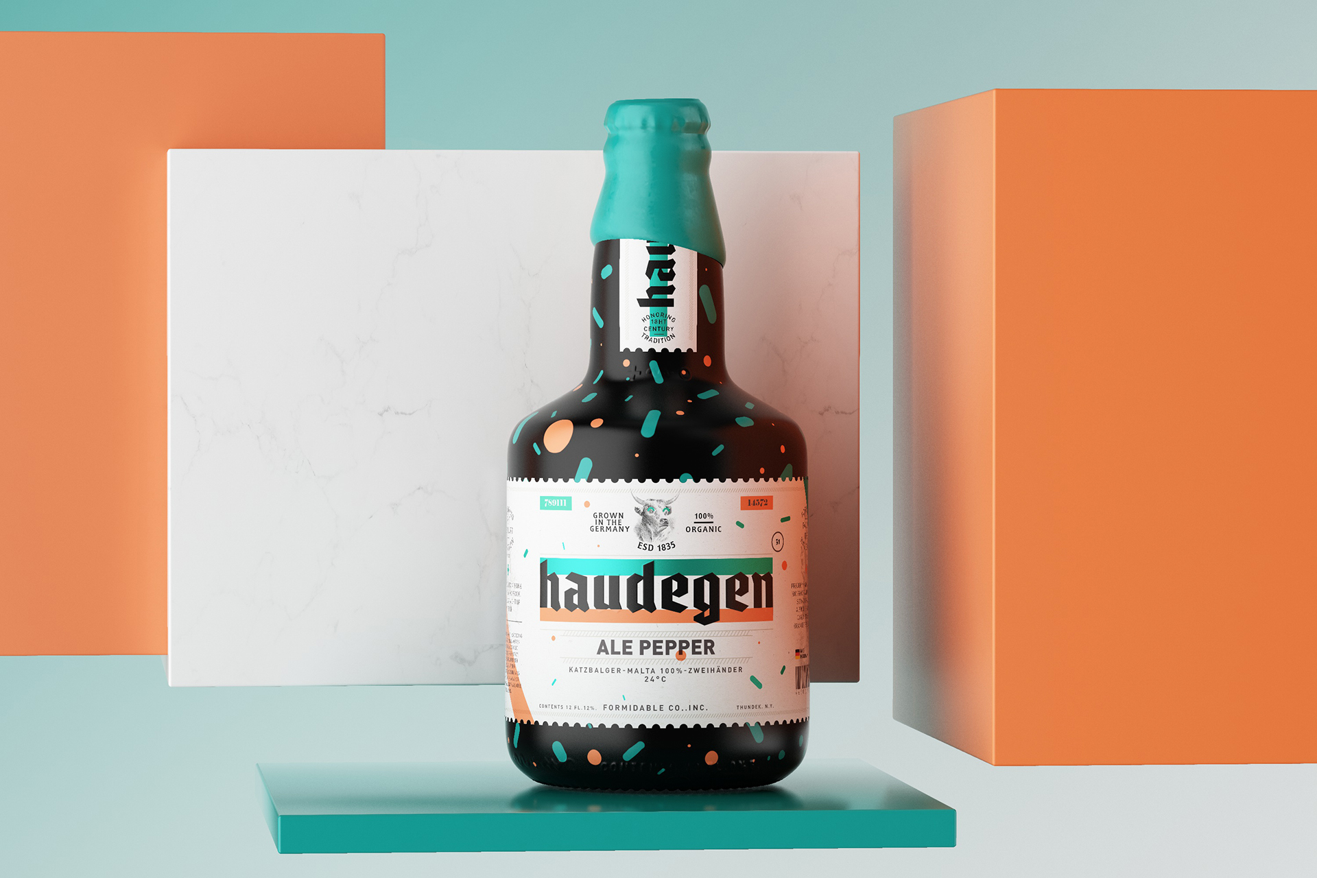
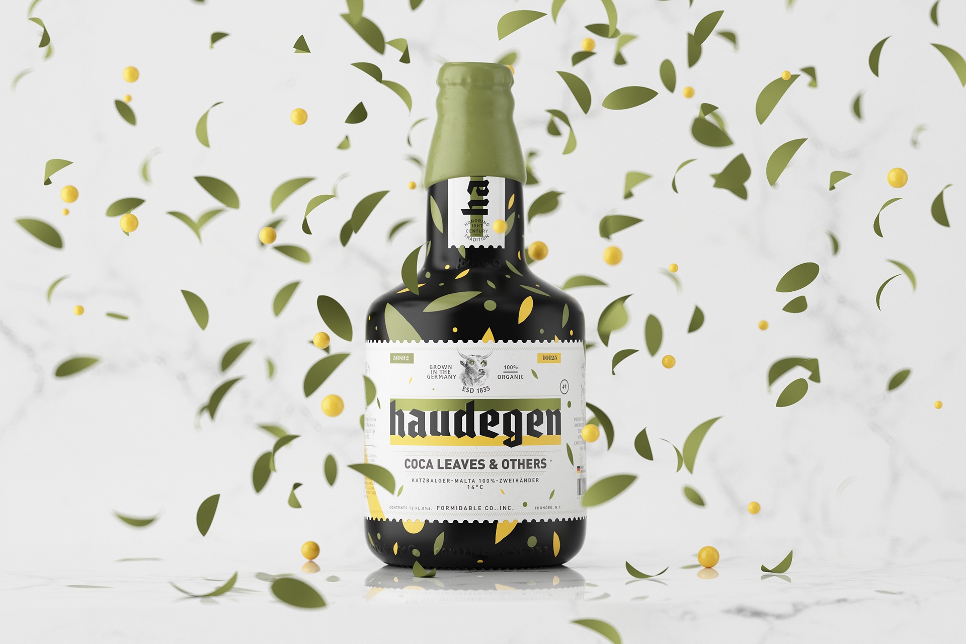
Minsk-based graphic designer Constantin Bolimond just completed the new design for Haudegen Beer including bottle and label concepts

Minsk-based graphic designer Constantin Bolimond just completed the new design for Haudegen Beer including bottle and label concepts

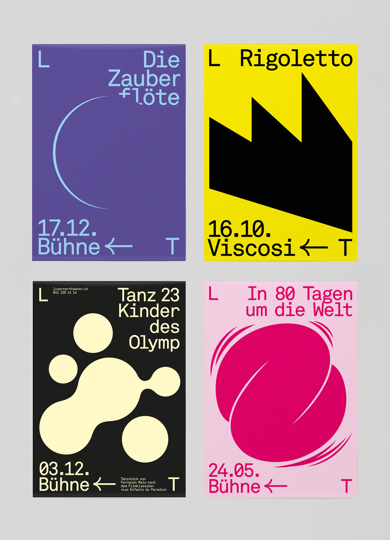
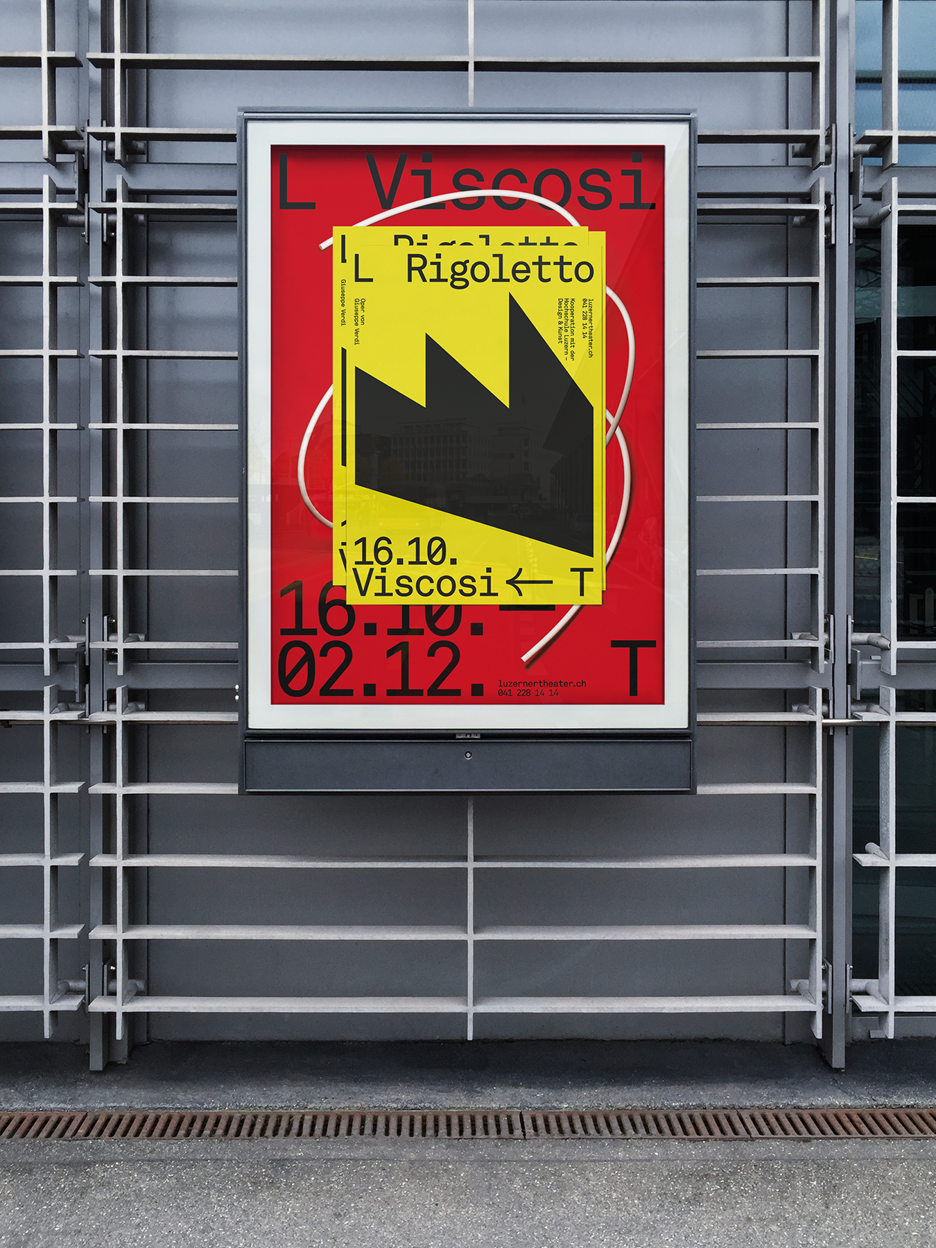
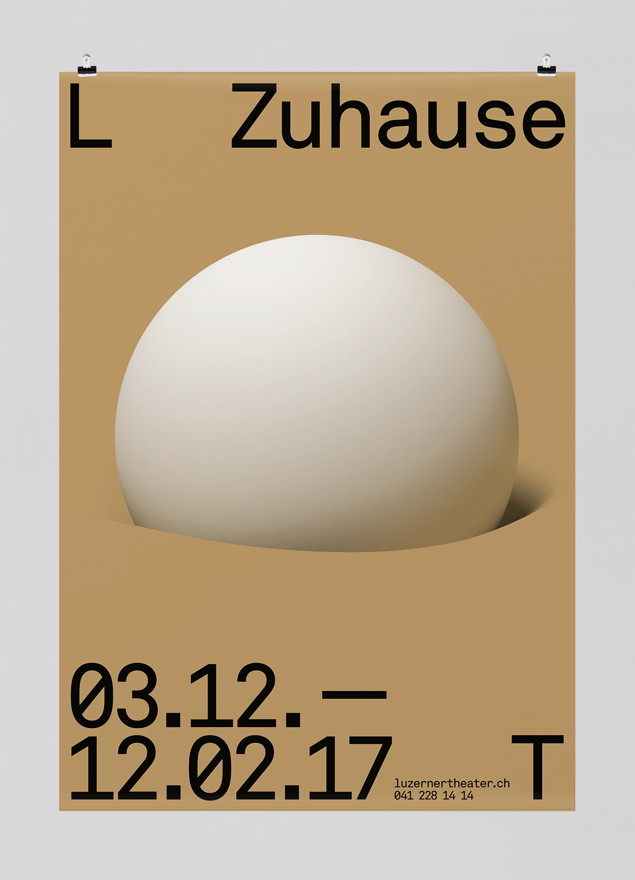
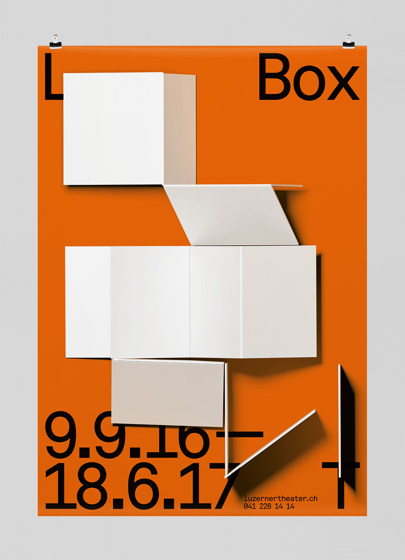
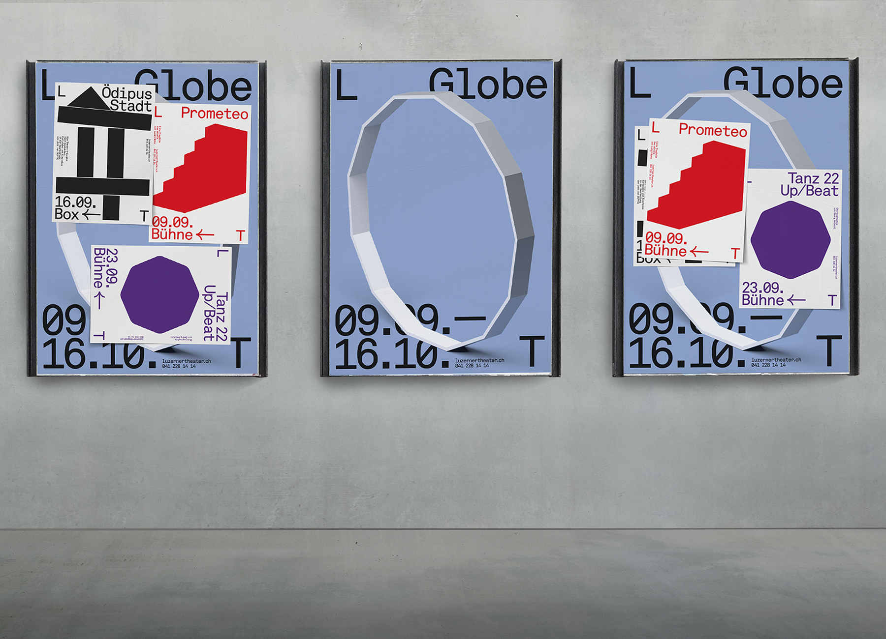
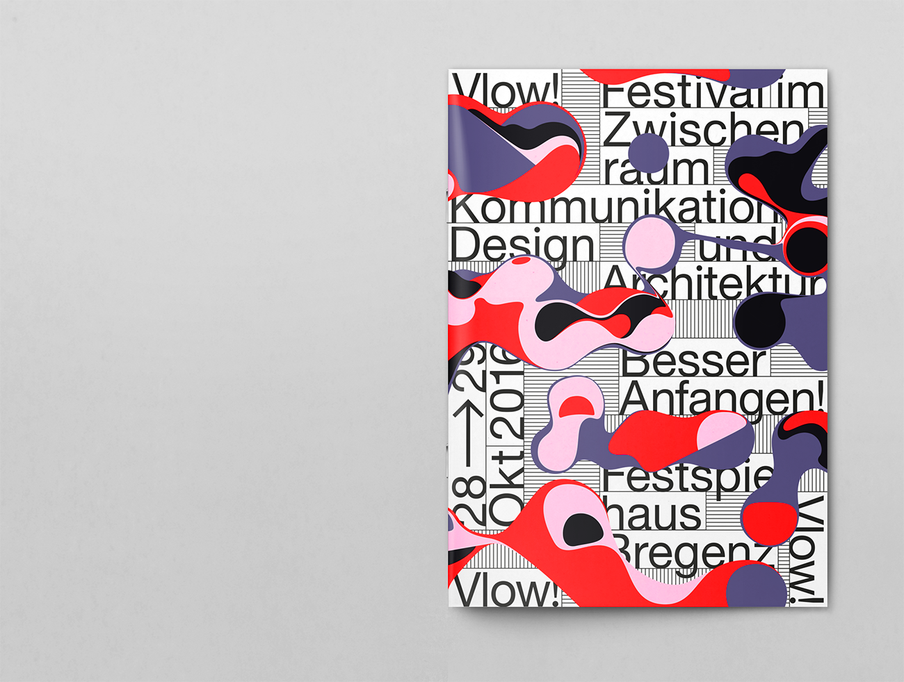
Studio Feixen is an independent Design Studio based in Lucerne, Switzerland that creates visual concepts.

“We focus specifically on nothing in particular. Whether it’s graphic design, interior design, fashion design, type design or animation – as long as it challenges us – we are interested.”


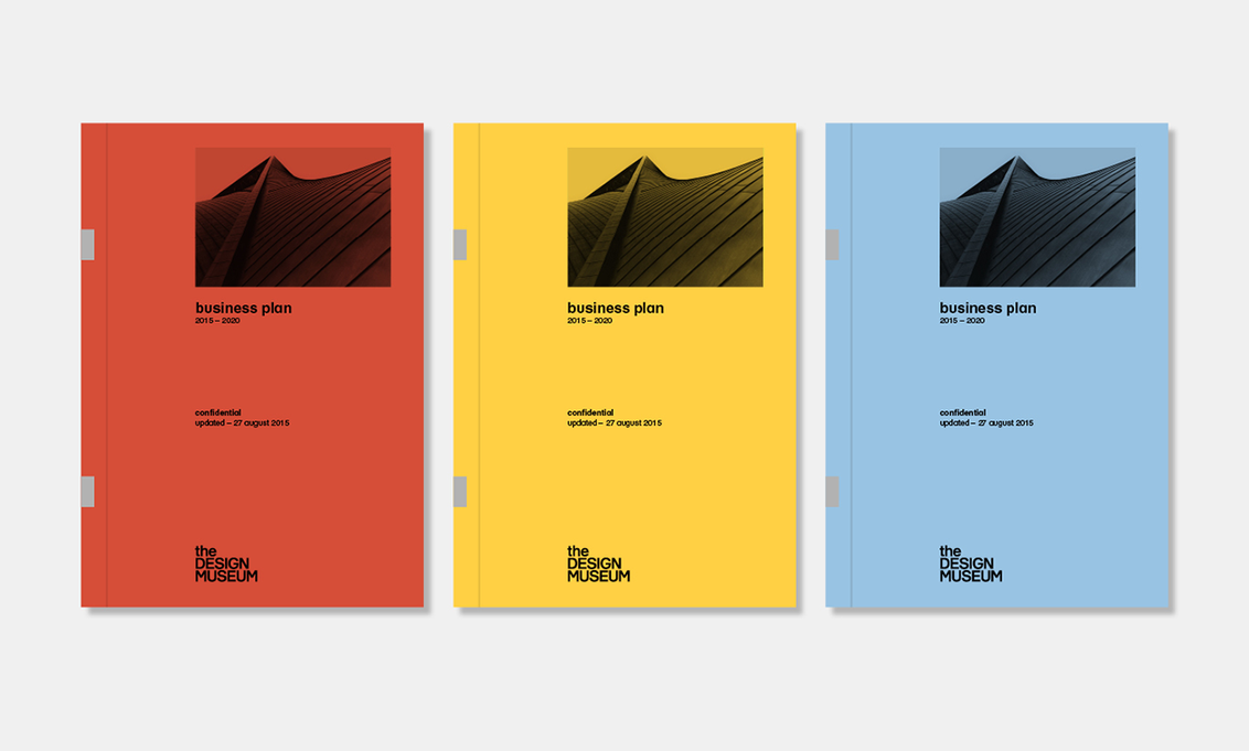
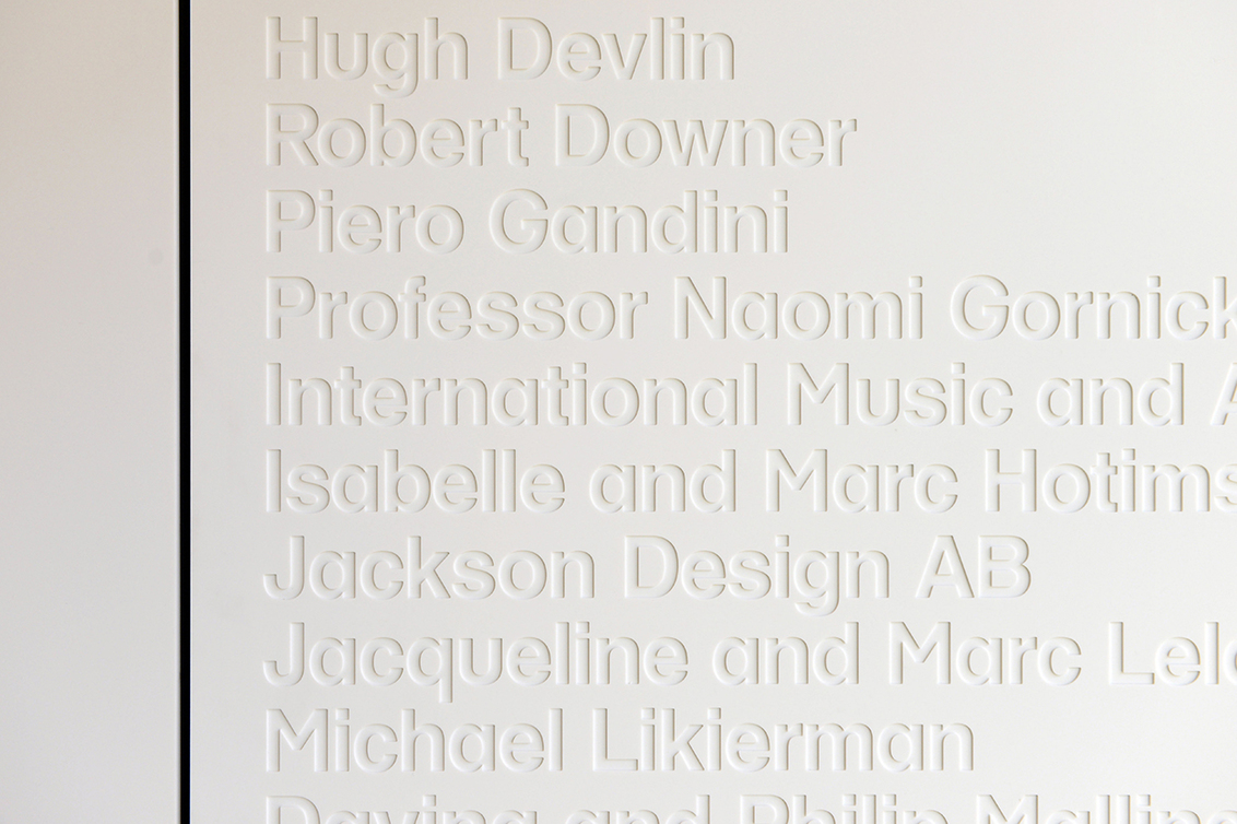
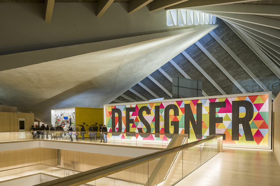
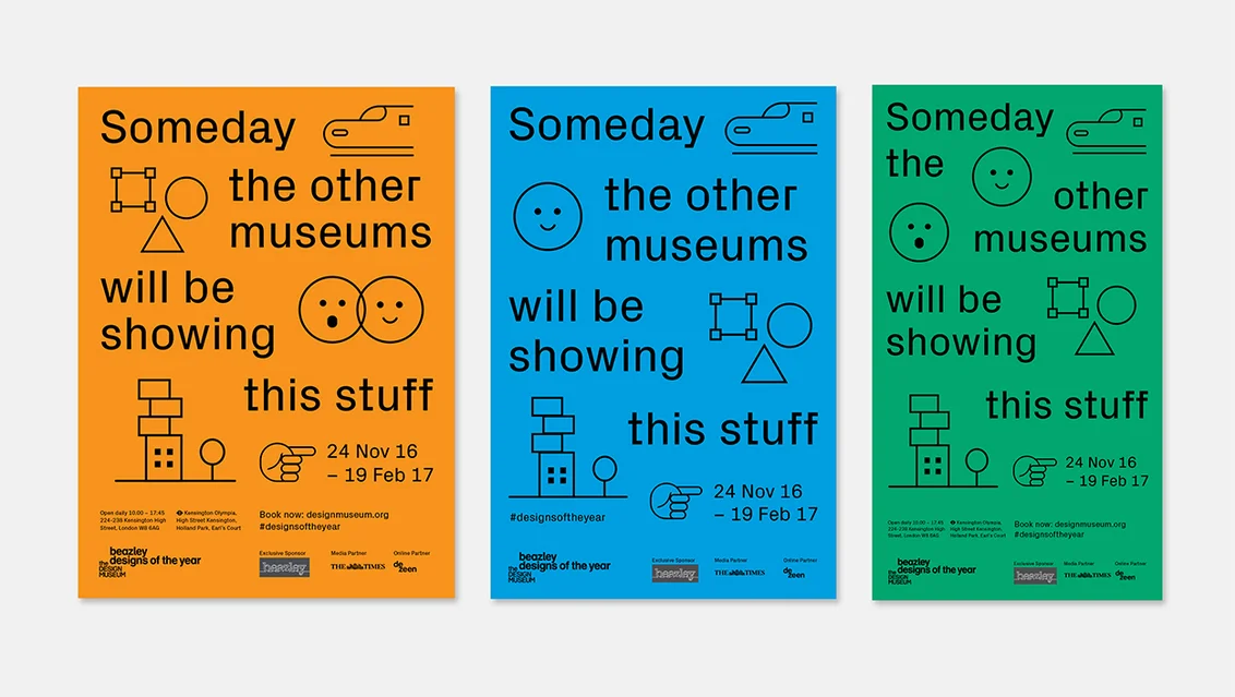
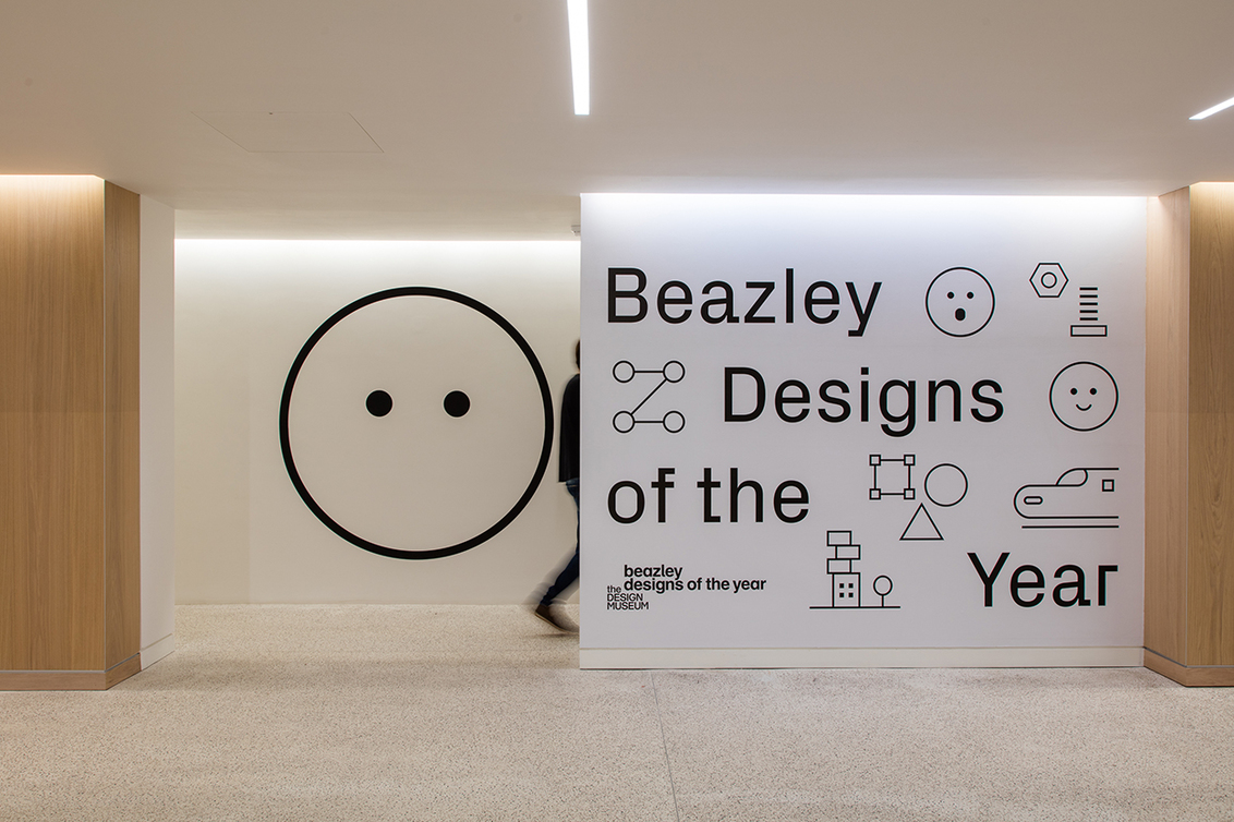
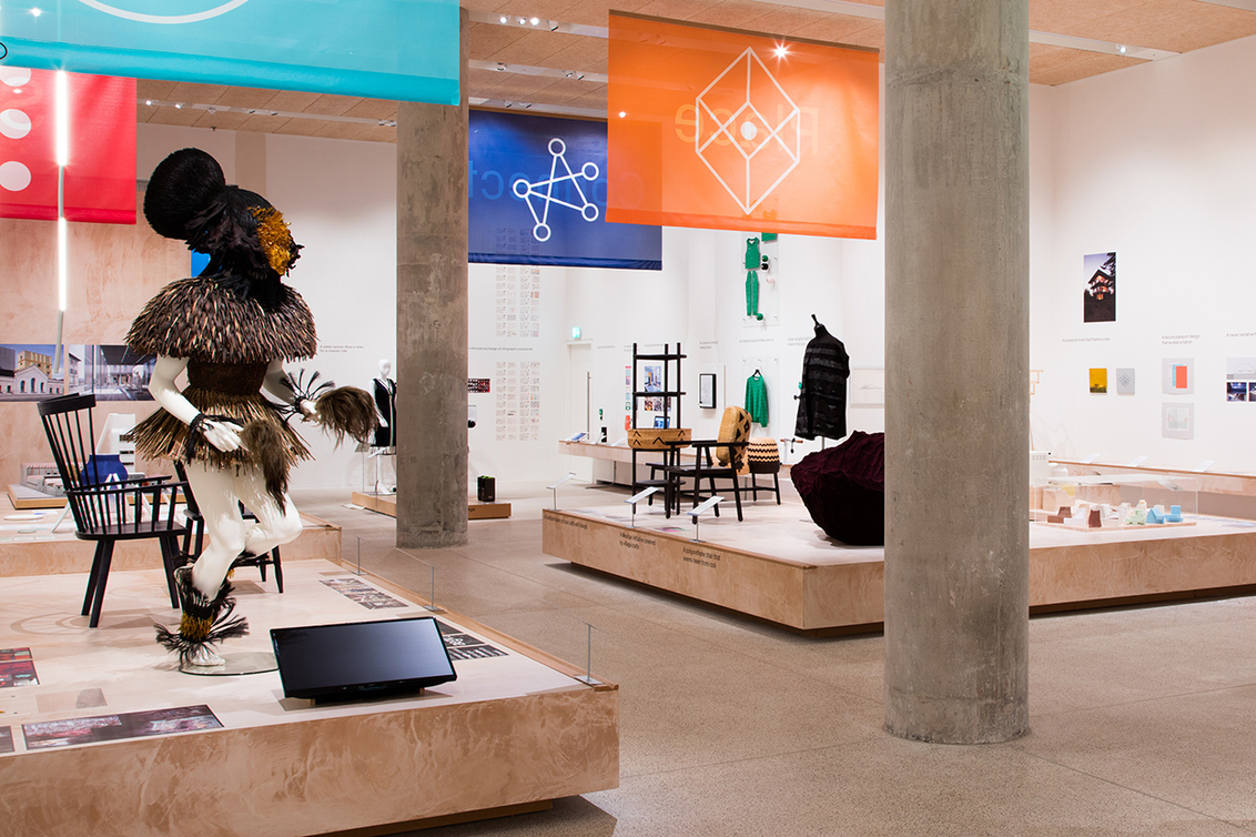
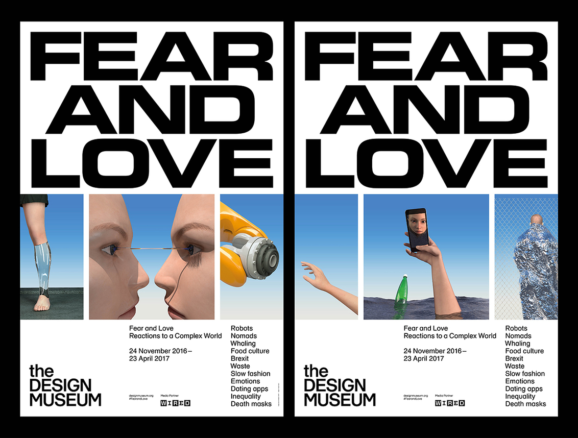
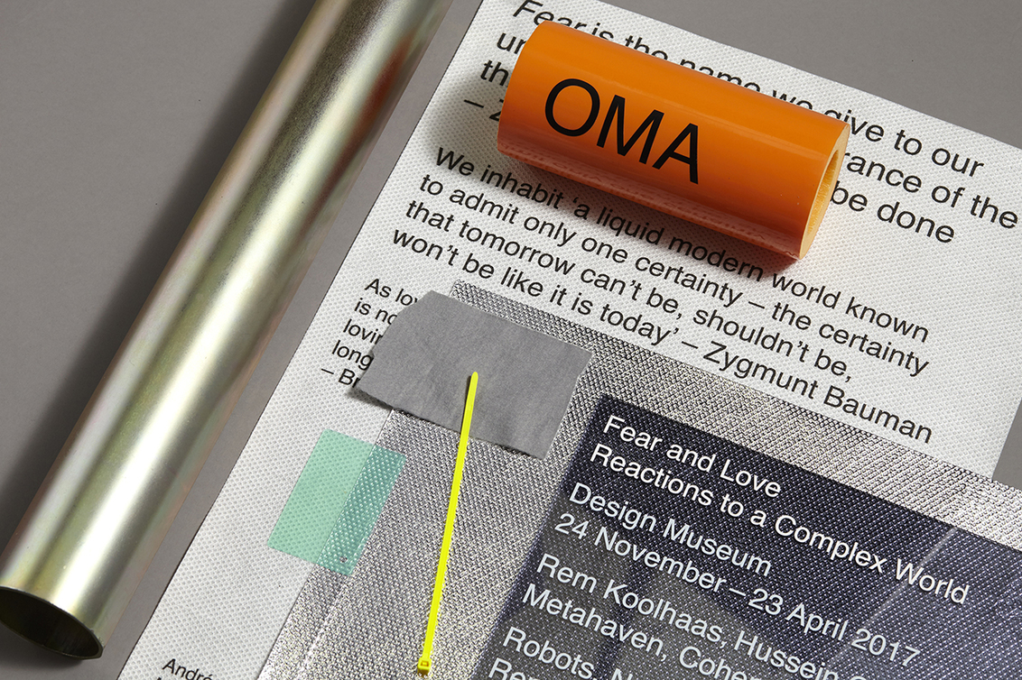
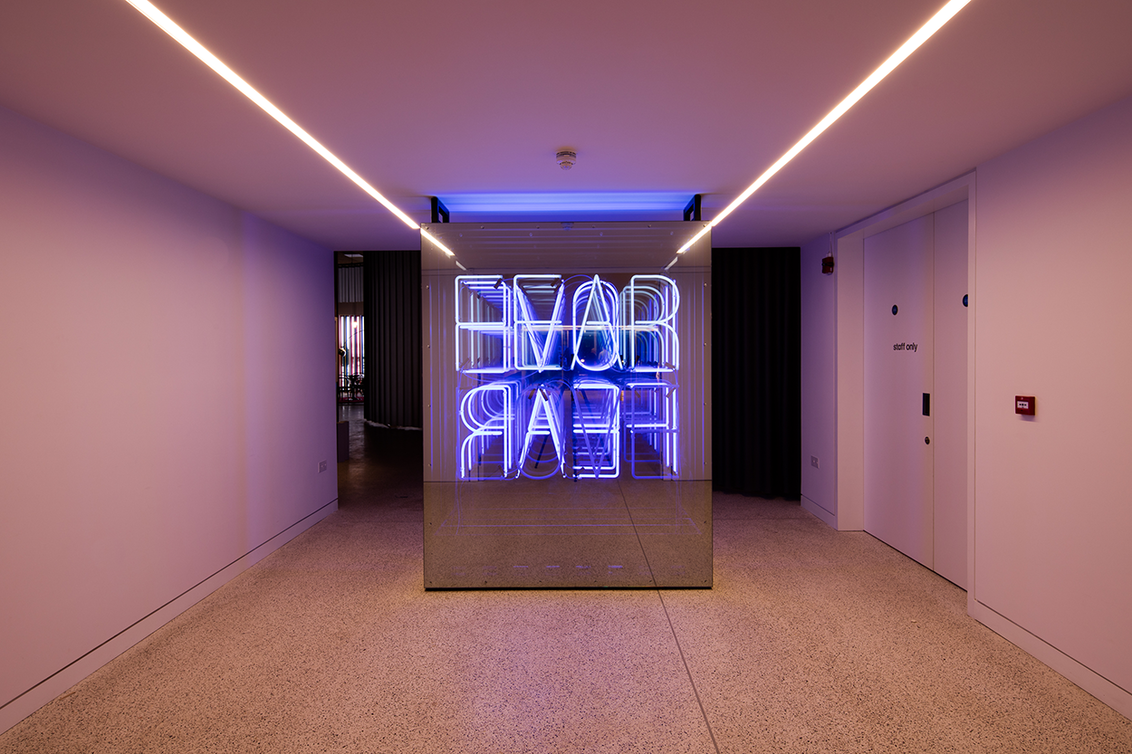
"The art of designing a museum is one filled with expectation and promise: a unique challenge for designers. It’s been a rare opportunity for the talents of Fernando Gutiérrez, Morag Myerscough, Cartlidge Levene, OK-RM and Hato to define the character and personality of this new incarnation of the Design Museum in South Kensington."
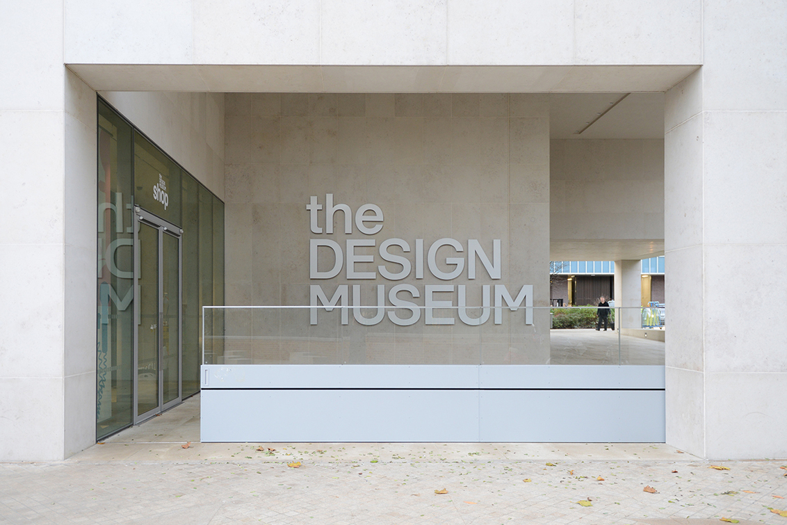
"The identity for the Design Museum is crisp, clean and acts as the nervous system of the museum. The job was given to Fernando Gutiérrez and his London-based studio of the same name, which has an international client list and a talent for creating identities, exhibitions and signage." Text by Rebecca Fulleylove via It's Nice That


Hopa Studio is a Warsaw-based design team specialising in branding, established by Piotr Hołub and Marcin Paściak.
“We believe that designing visual identity systems is a process that begins long before the creation of the logo. We learn about everything the brand wants to communicate – from the client’s actual business requirements to their values, their consumers and their everyday reality.”


Caravane is a tactile creative studio based in Montreal gathering art directors and designers Jean-Constant Guigue, Francis Dakin-Côté and Frédéric Bouin. The studio’s work is characterized by a strong use of matter and finds itself at the frontier between graphic design and contemporary art.


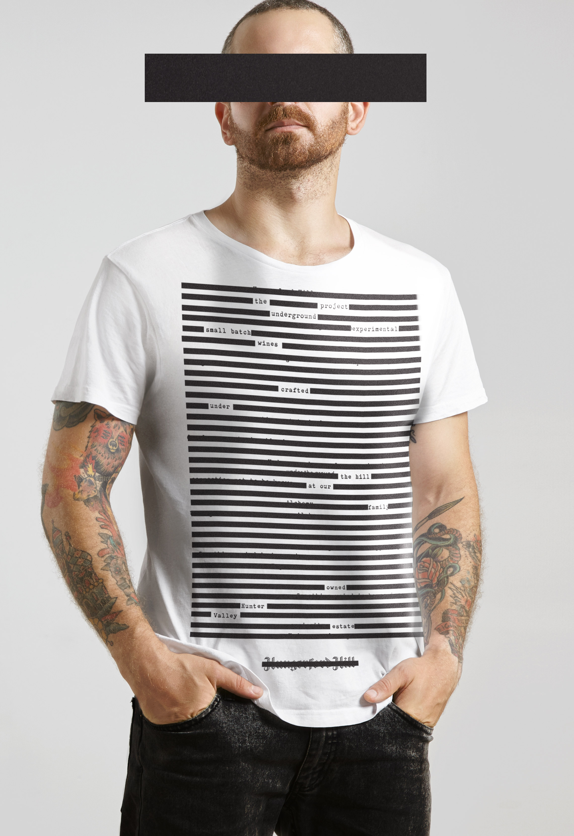
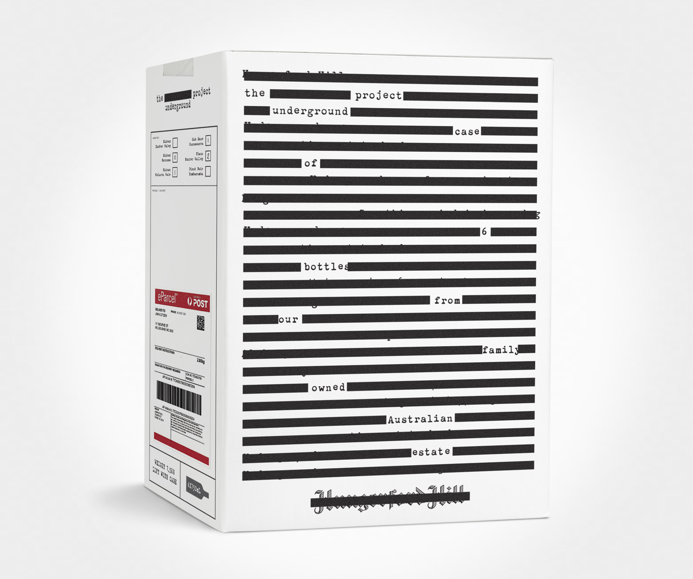
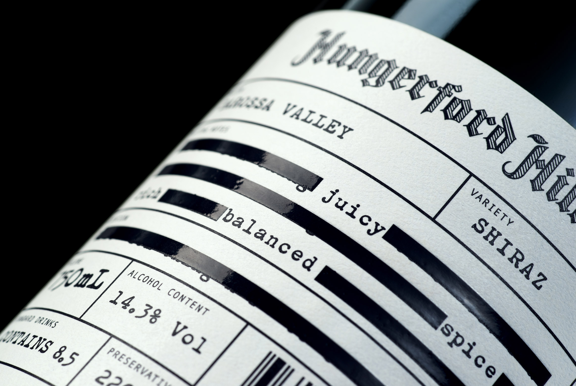
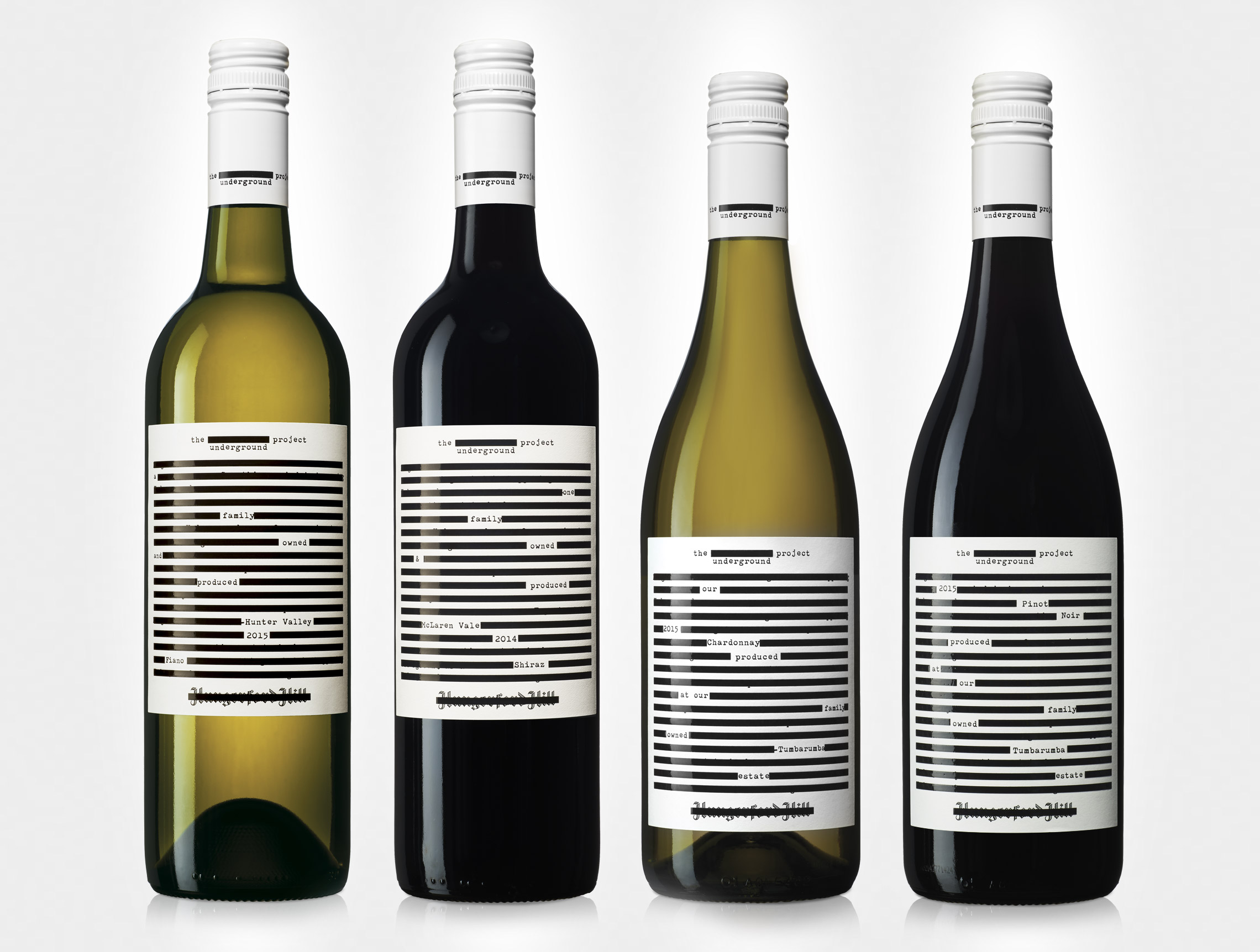
Australian graphic design studio Co Partnership released a sleek and minimal project for local winery Hungerford Hill. Using simple solution by printing wine description on front label and stroking out unnecessary words they made a radical look for the whole package concept

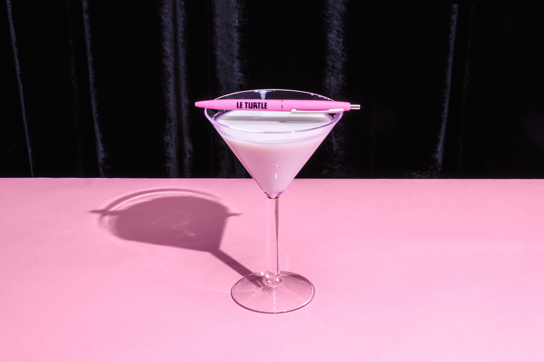
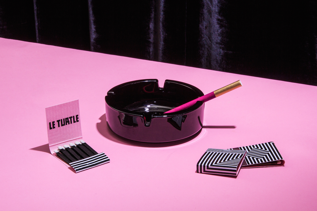
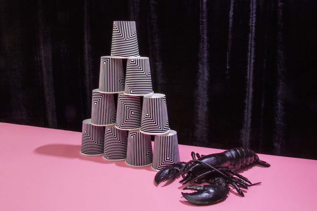
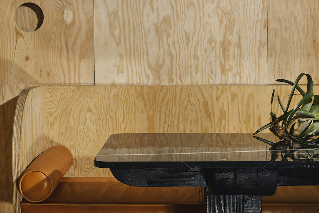
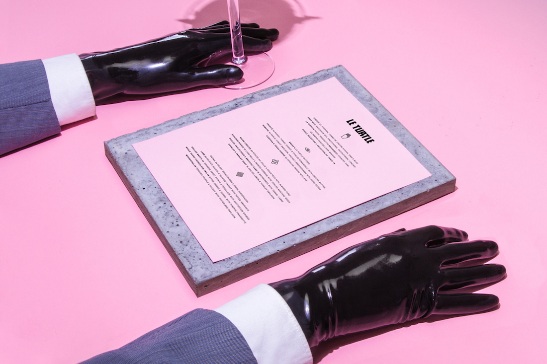
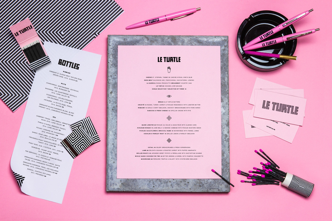
Le Turtle's branding Created by Leta Sobierajski and Wade Jeffree, is full of symbols and metaphors, from black lobster to the latex gloves. The interior uses raw materials, such as wood, concrete or marble, while neon lights or velvet curtains add a touch of extravagance. Inspired by new wave and visual occult, the restaurant color codes are pink and black that set the idea for the branding

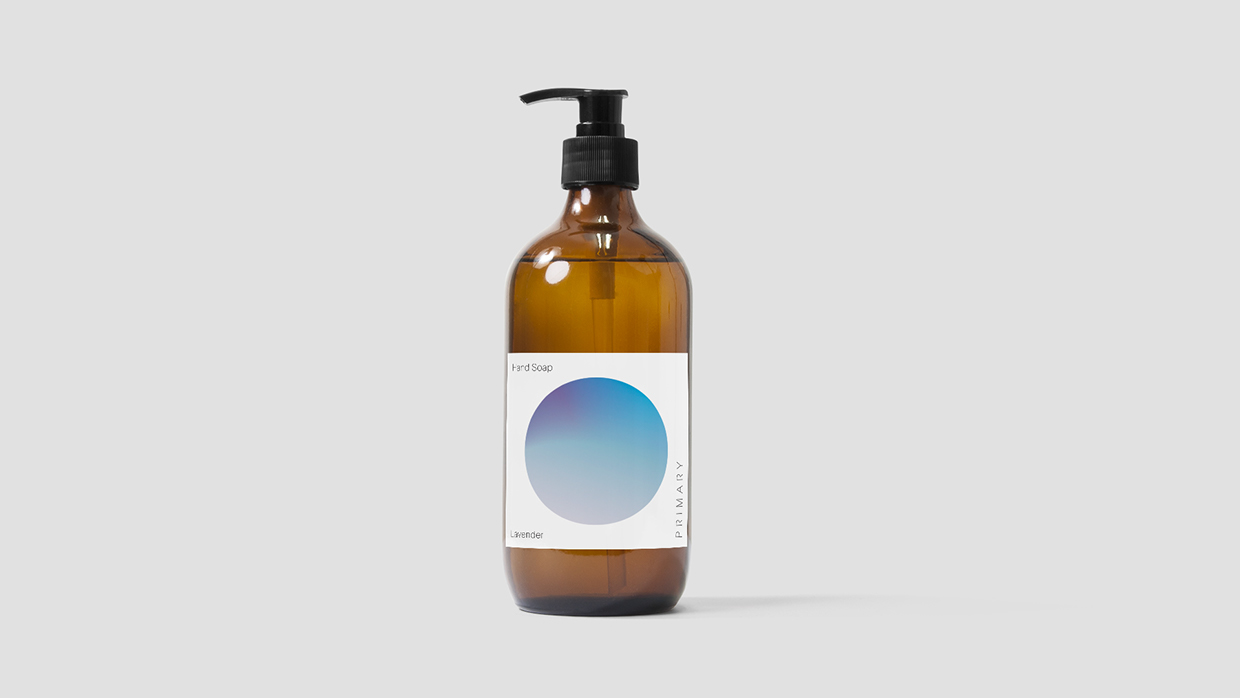
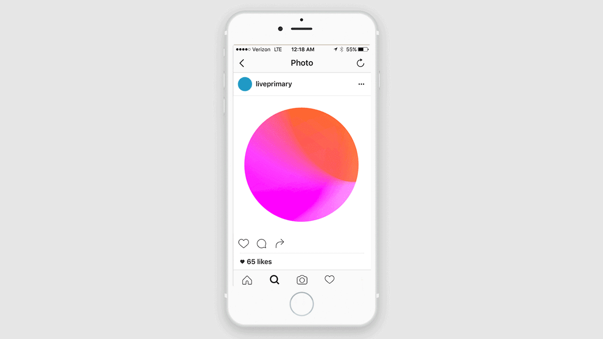
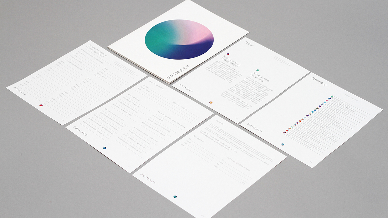
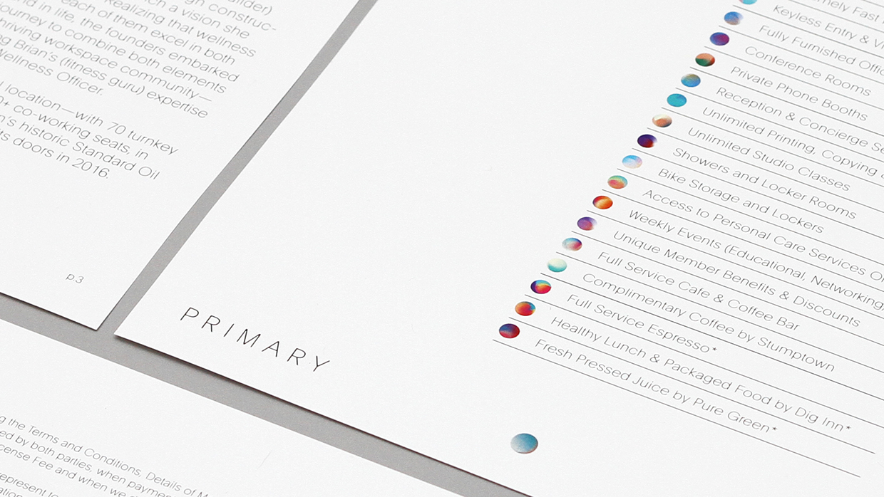
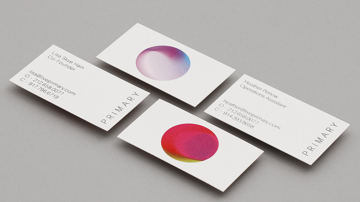
New York based studio DIA just completed a branding for wellness company Primary using generative graphic design approach
“We began collaborating with the Primary team before a space was secured, allowing the brand strategy and identity to help inform the overall feeling of the space. The Primary identity is based on specific color psychology. We developed a generative based platform that creates unique logos depending on desired moods or time of day. The mix of colors help shape the atmosphere of a room, office or specific piece of collateral. Different hues are used for different activities. For example, a Bikram yoga class would involve more heat and intensity than a meditation class, so the colors would vary accordingly. Additionally, each member or employee will be given an individual sphere matching their personality. The identity is a living and breathing experience that can evolve and change.”

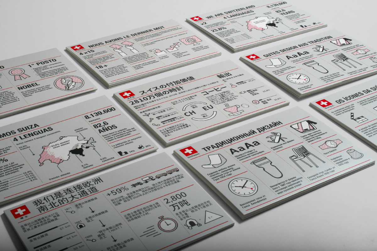
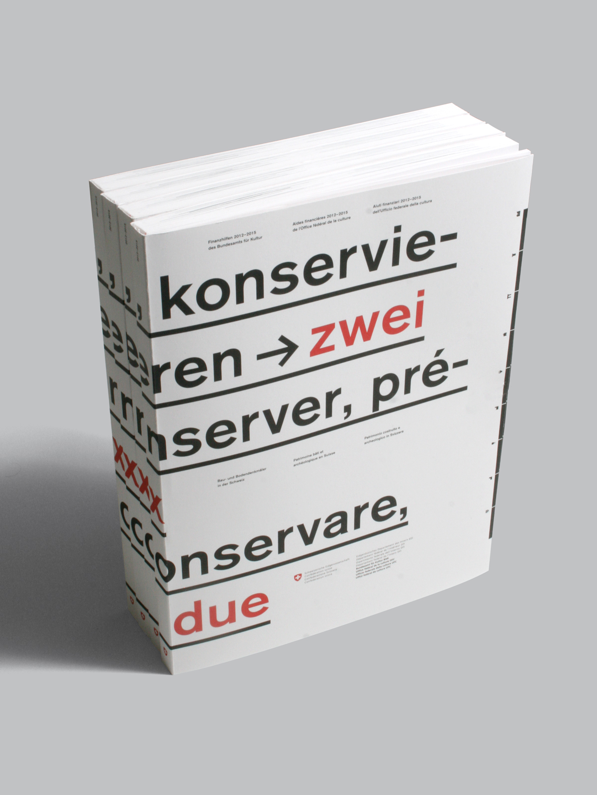
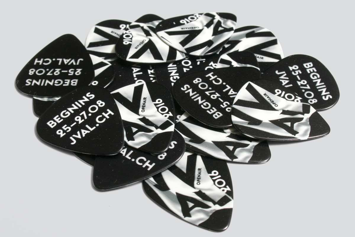
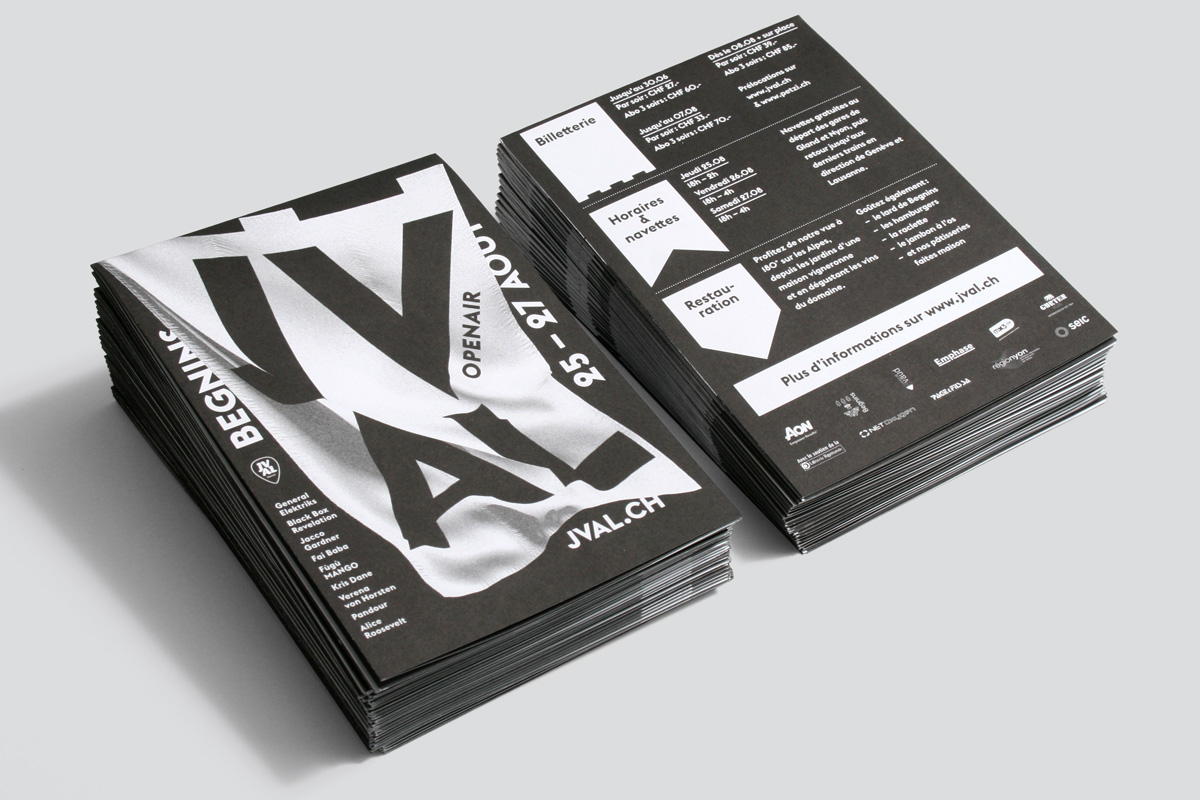
Emphase is a graphic design agency based in Lausanne, Switzerland. Since 2010, the two founders Fabienne Kilchör and Sébastien Fasel with their team are developing a wide range of visual communication solutions. Below we select few projects made by them


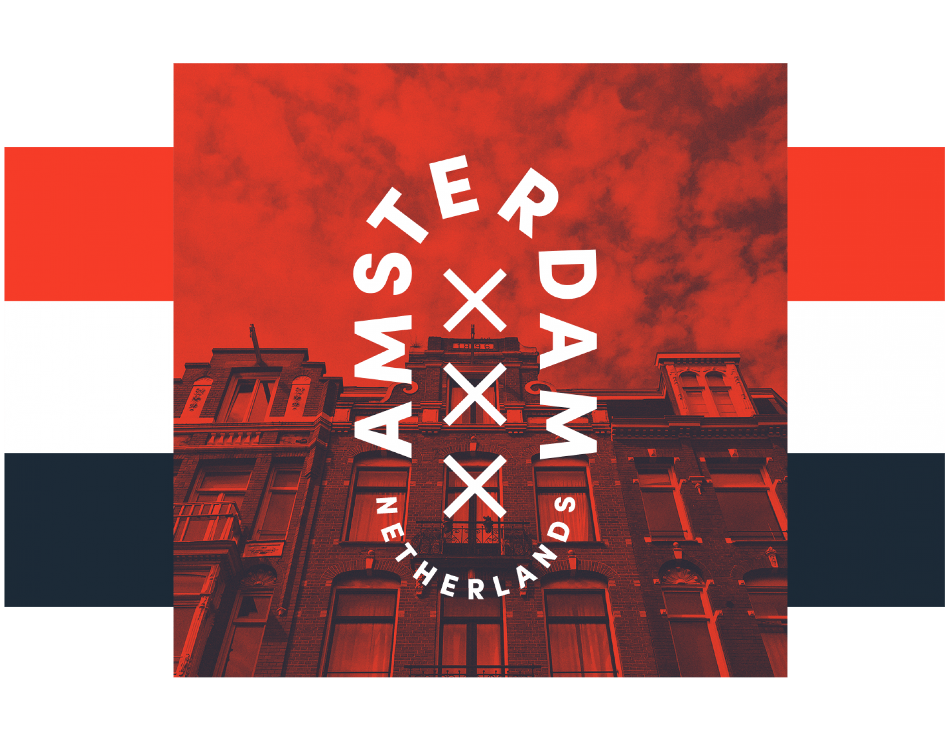
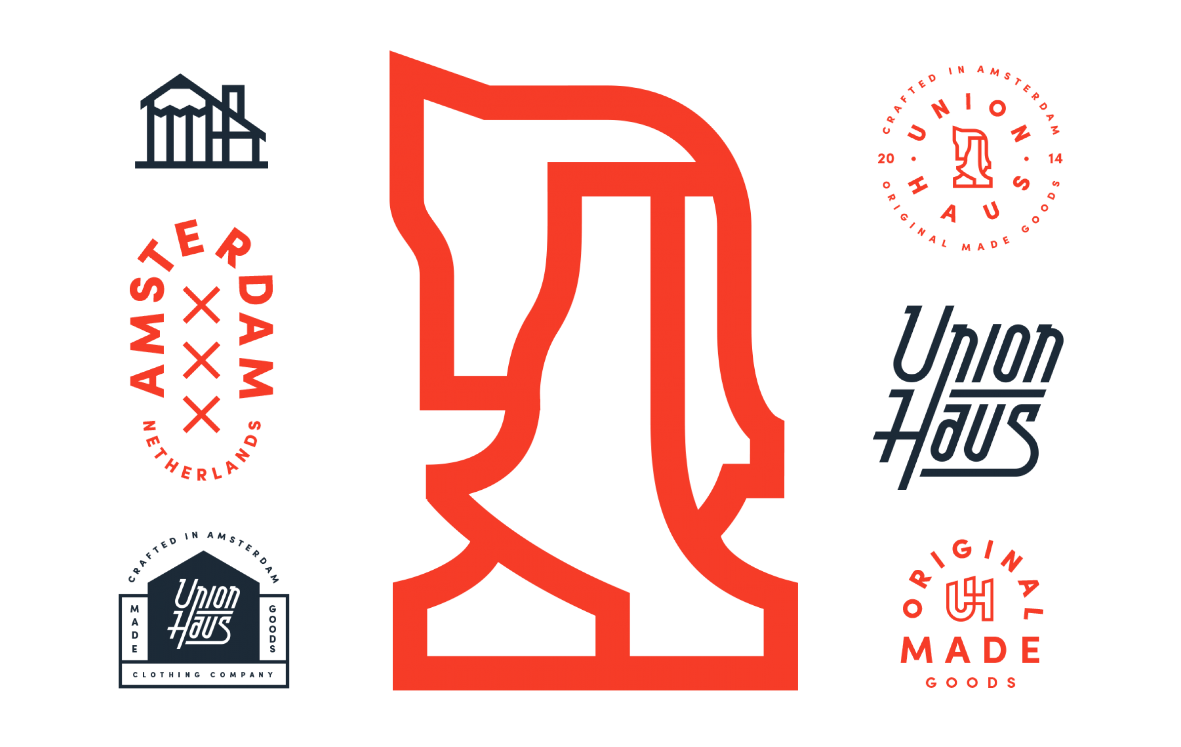
Pavlov Visuals is Calvin, Ryan and Josh. With headquarters in the US and Amsterdam they create branding and illustrations for commercial project, some of them you can see below

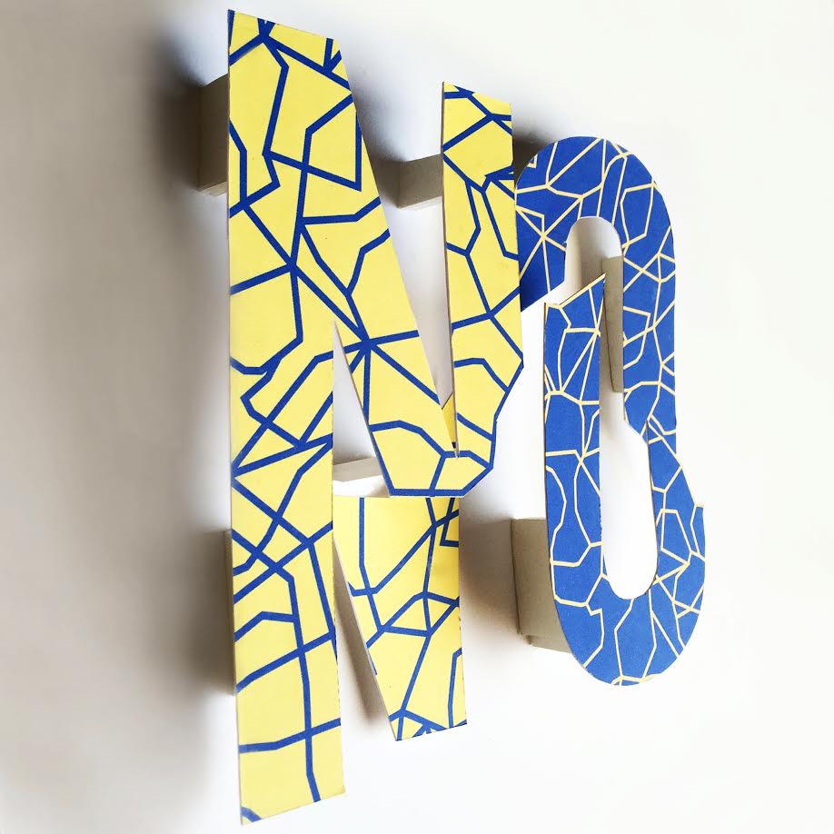
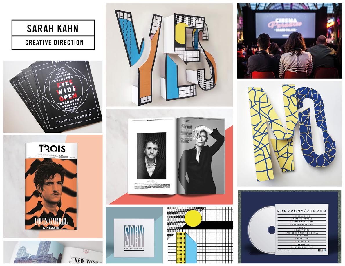
Sarah Kahn is a french graphic artist and art director based in Paris. Her work mixes commissioned work for high-profile clients and personal projects. Inspired by the worlds of visual arts, kids universe, sociology, innovation, she is constantly experimenting new perspectives and artistic collaborations. he launched her studio in 2015. Her client list includes New York Times, Adidas, Sony Music, Universal music, Tsumori Chisato, Wagram.

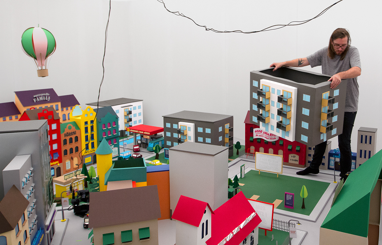
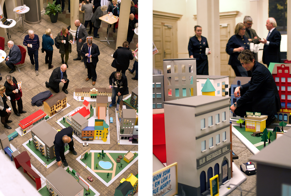
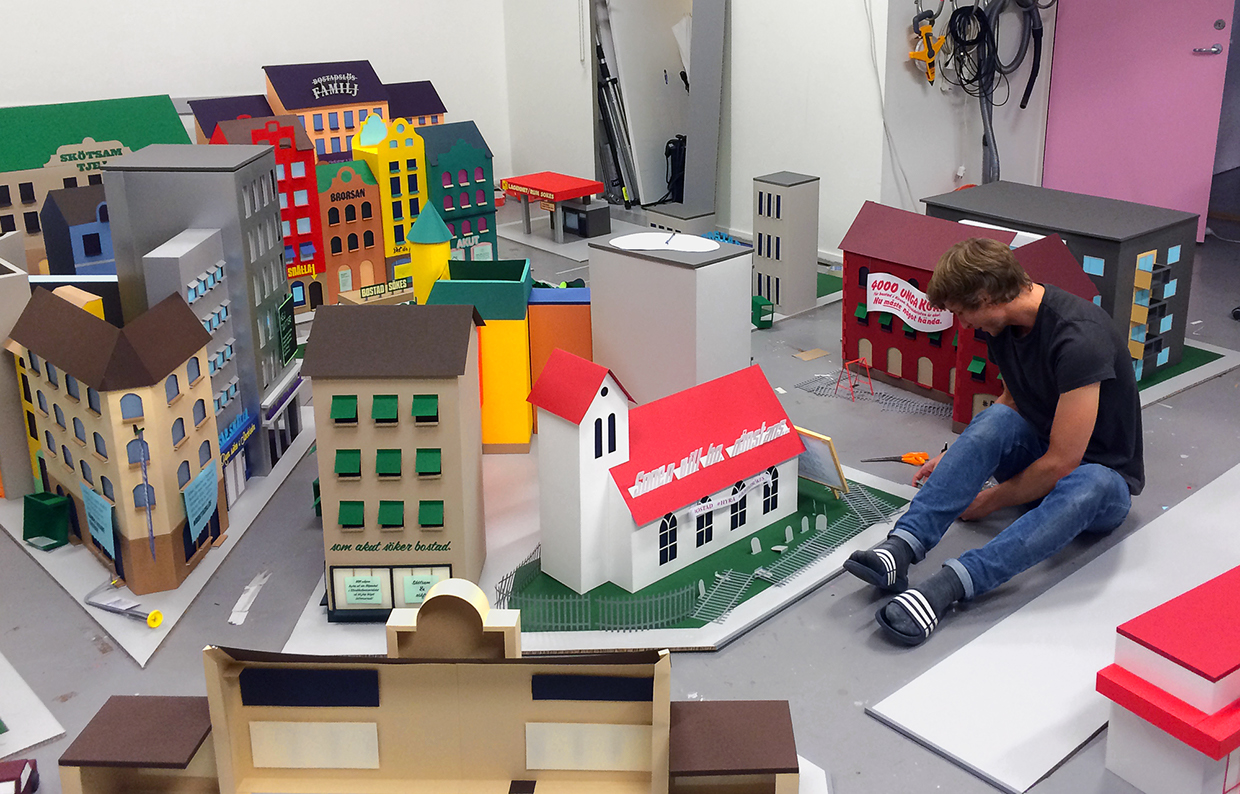
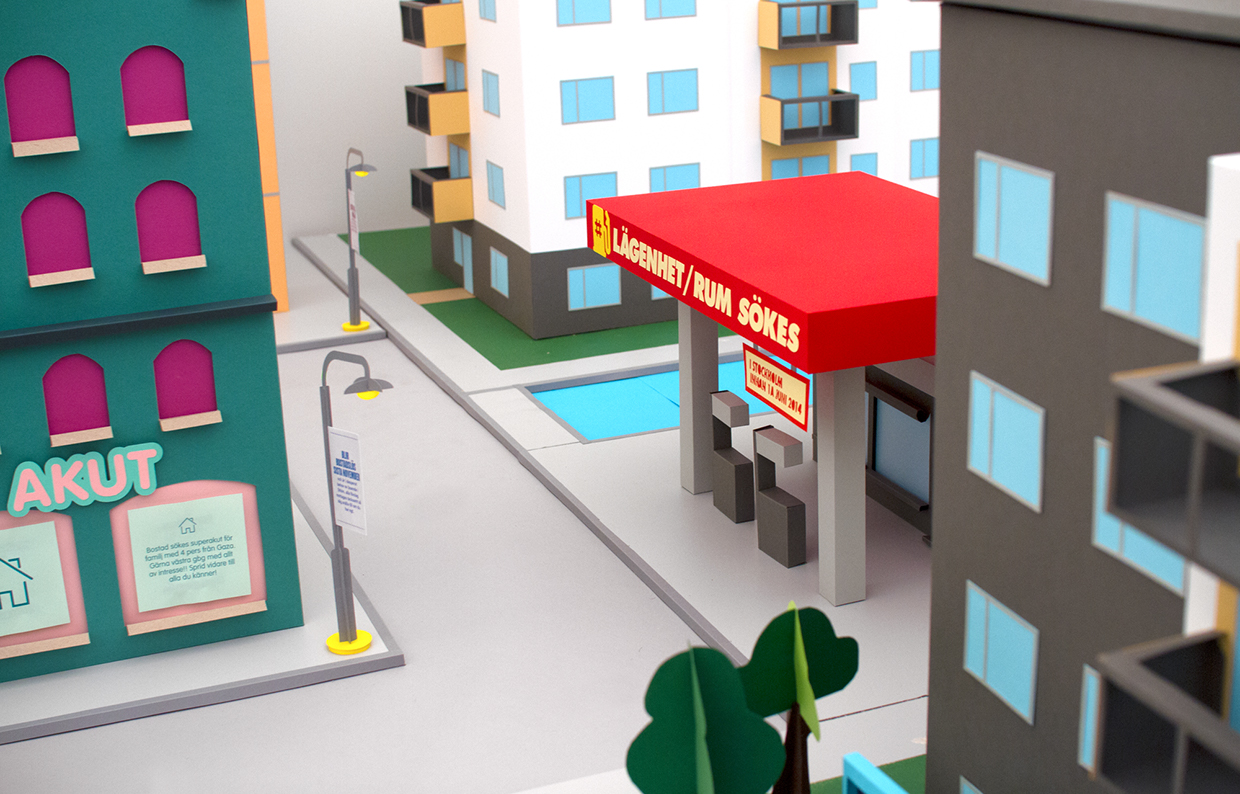
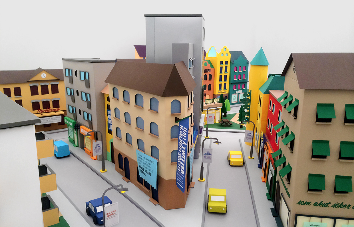
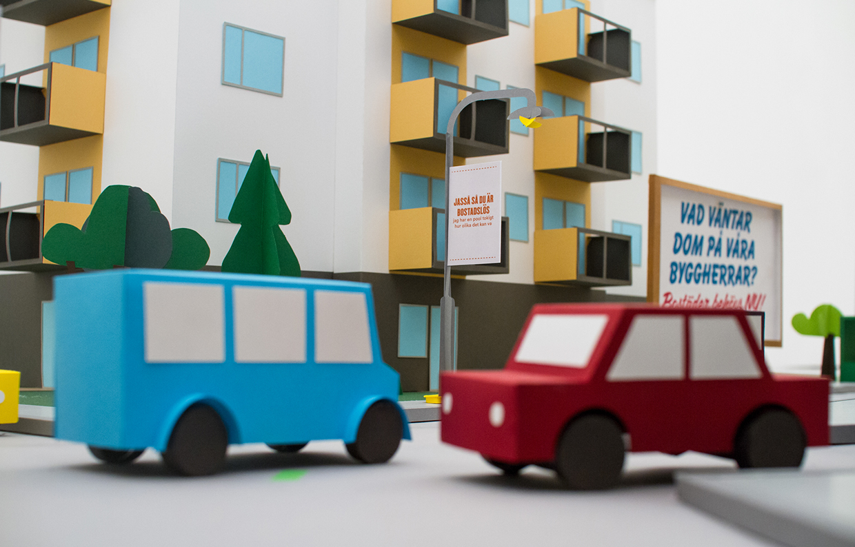
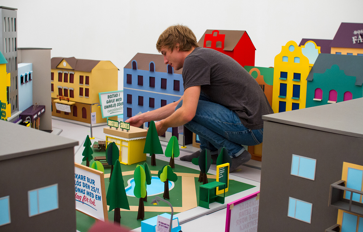
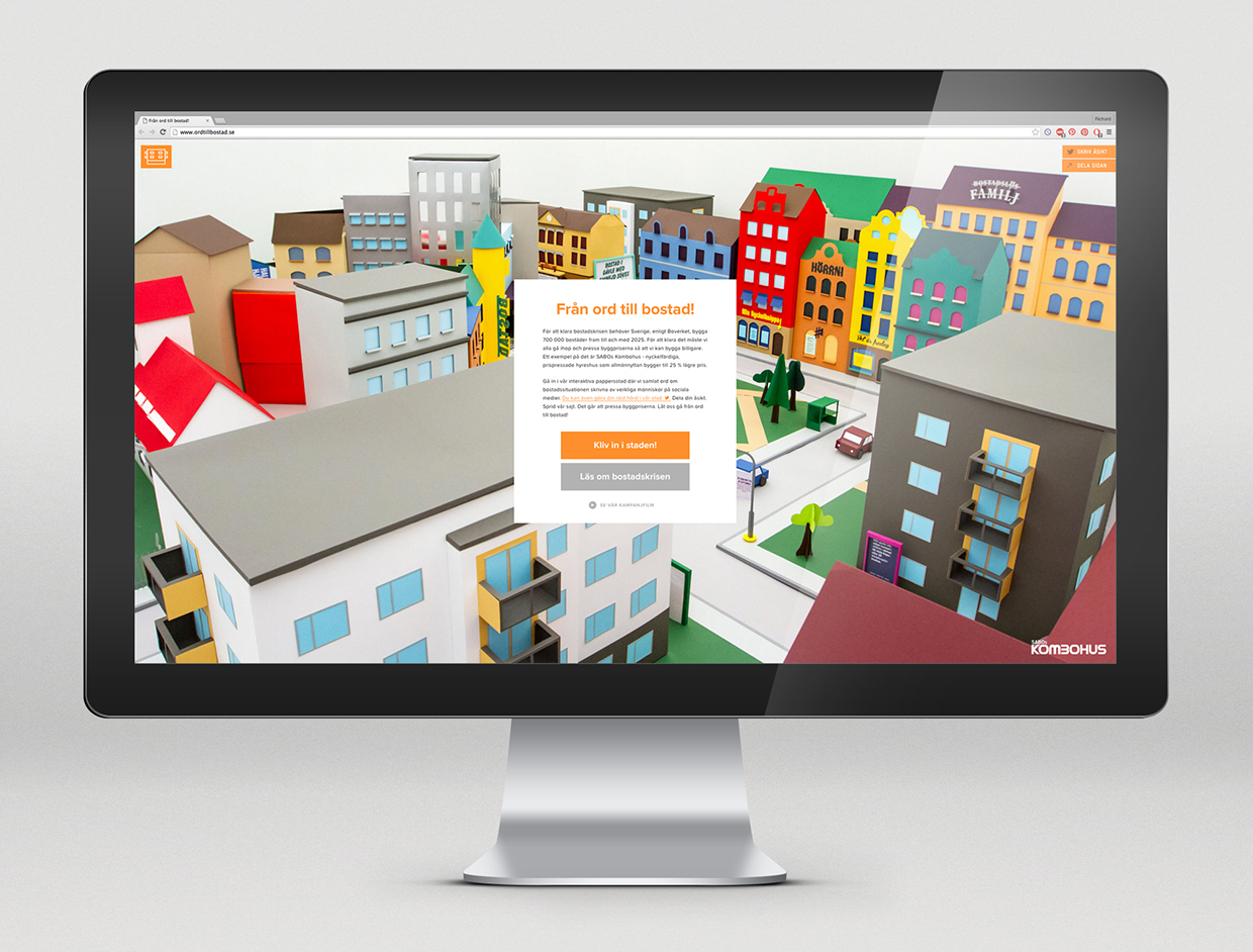
Talented guys from SNASK agency were commissioned by depressed Swedish Association of Public Housing Companies to promote their new initiative of "accessible house living" called Kombohus. SNASK created fully interactive paper city for the new program website

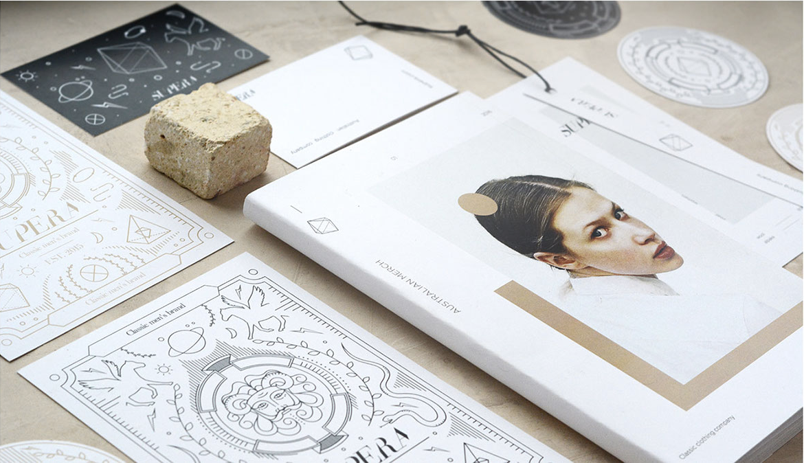
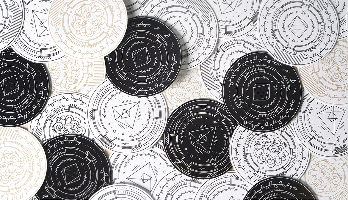
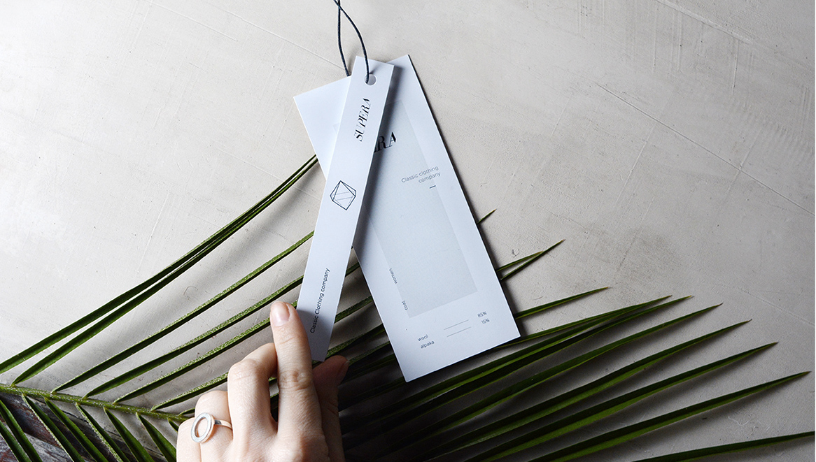
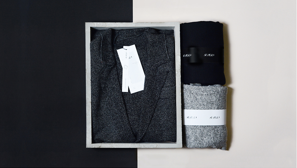
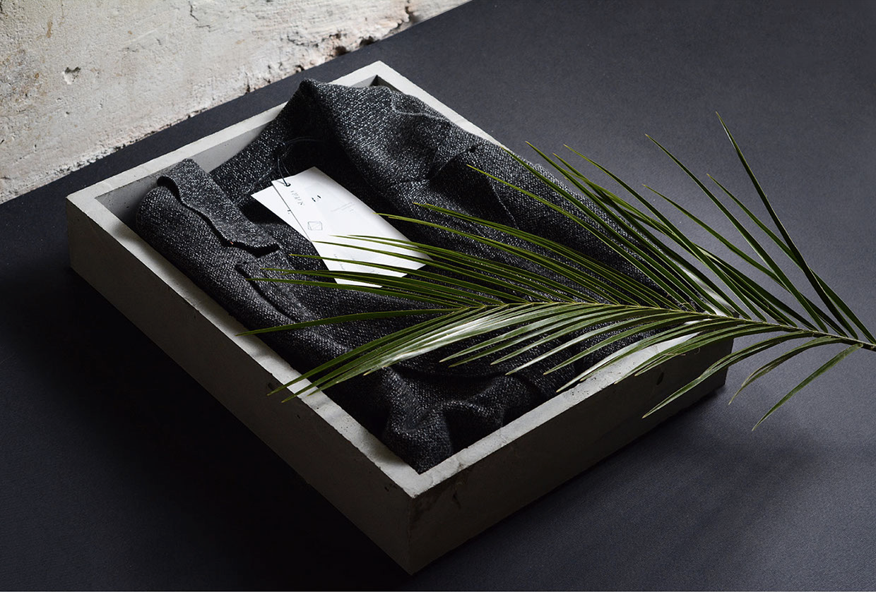
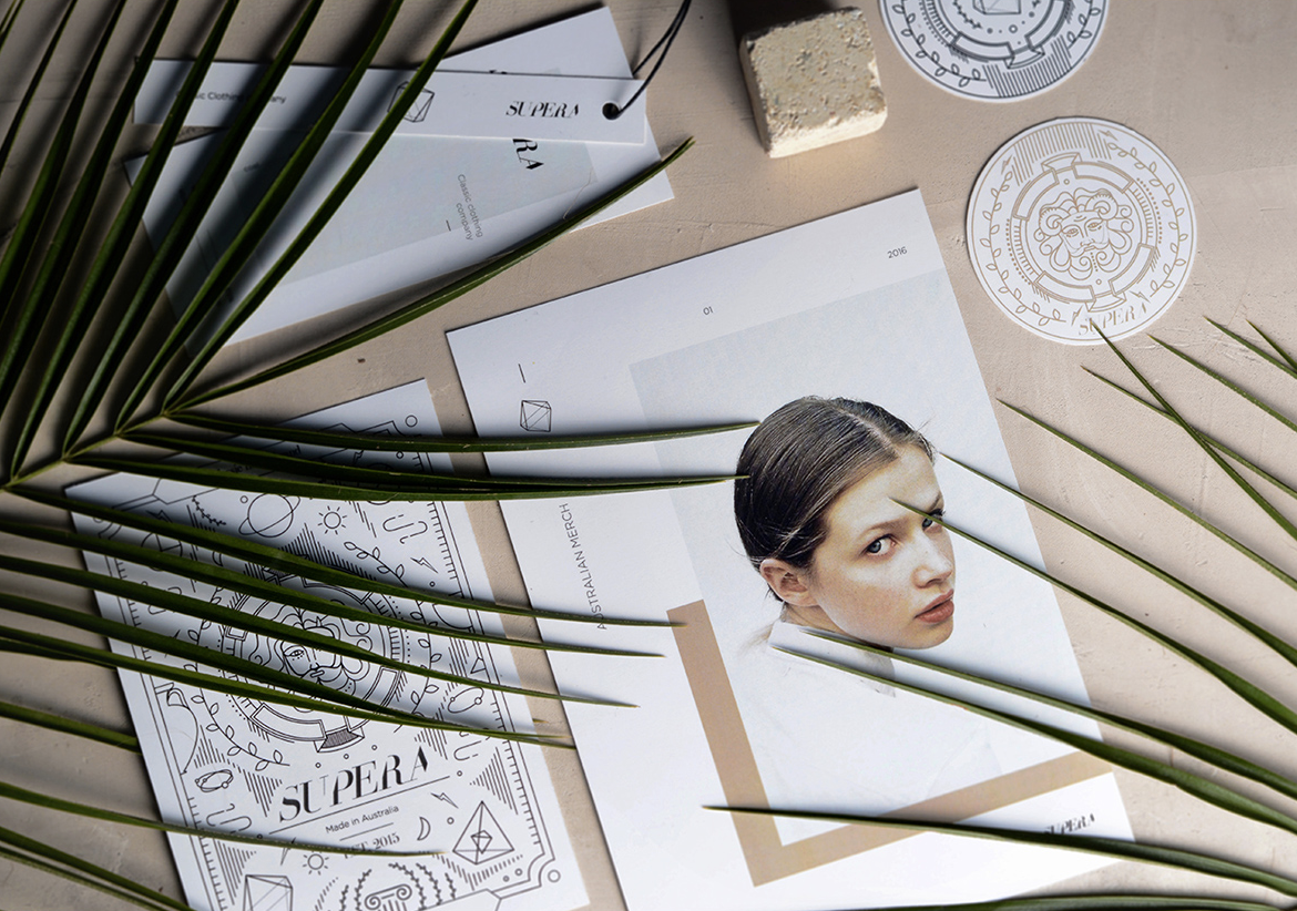
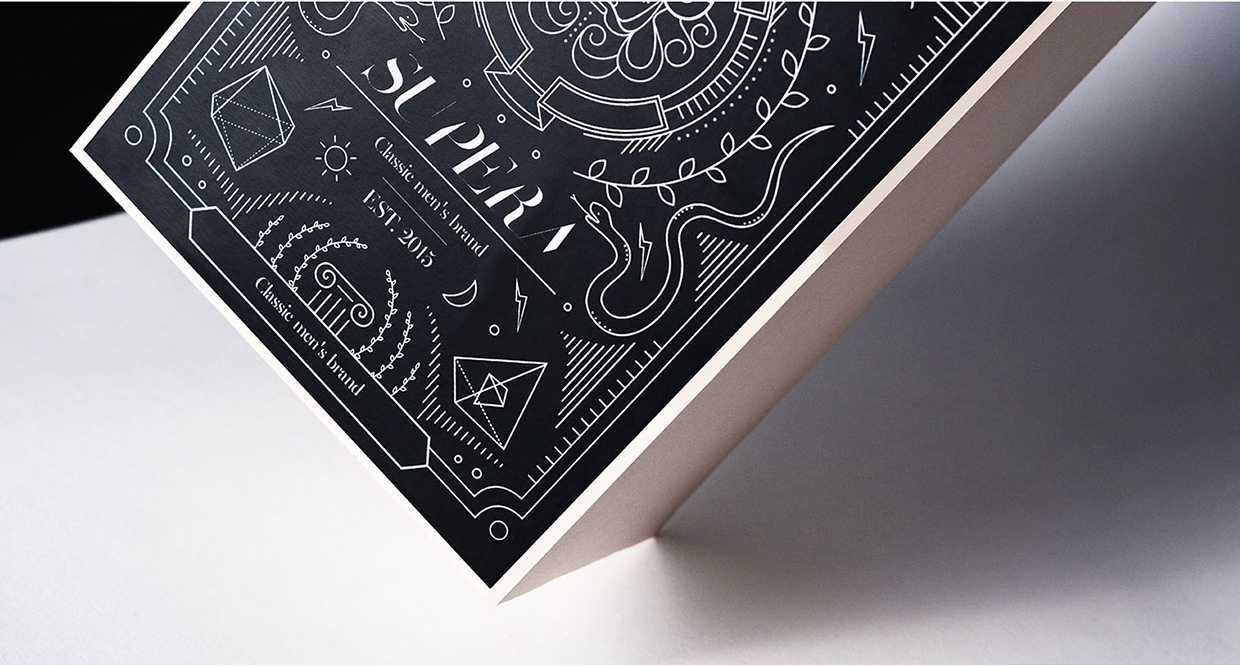
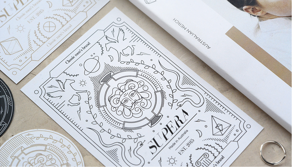
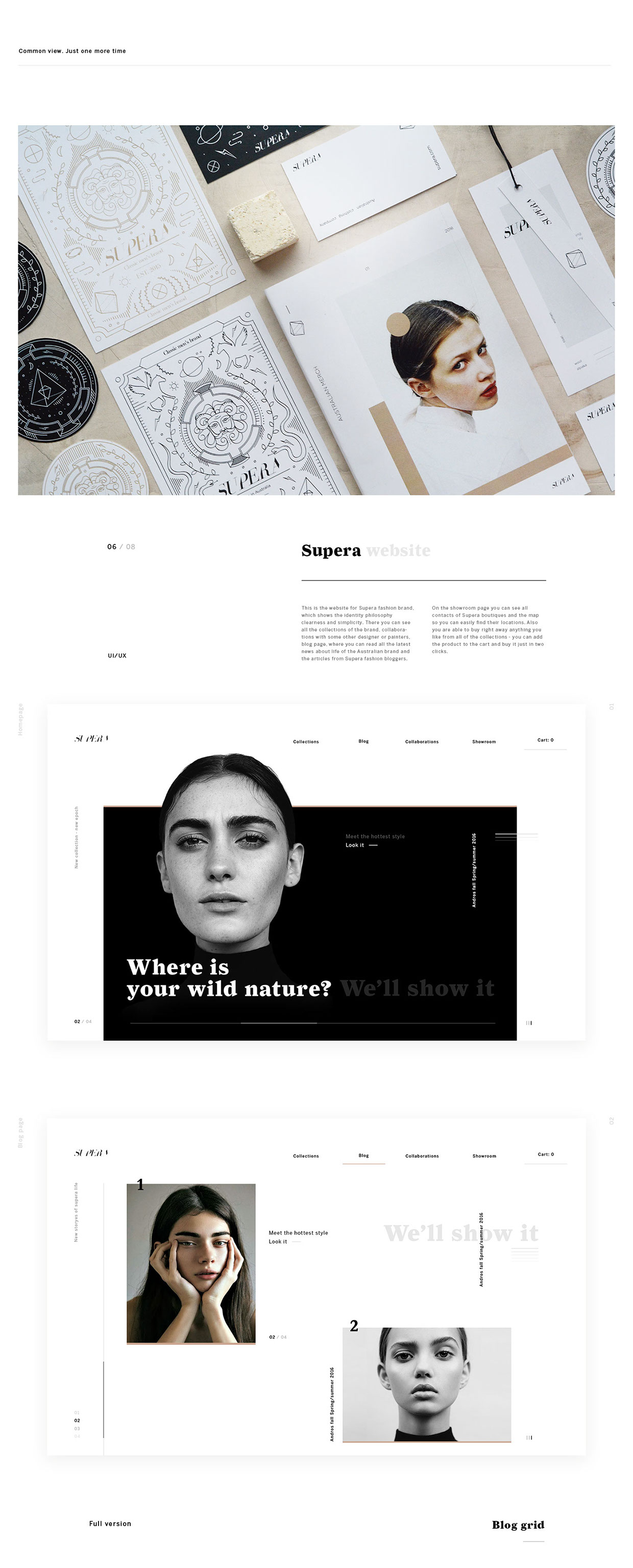
Trio of talented Ukrainian designers Zhenya Rynzhuk, Ann Bondarenko and Artem Golubtsov worked out a whole process from concept through branding to interactive design for Australian fashion project Supera. You must check the full case on Behance

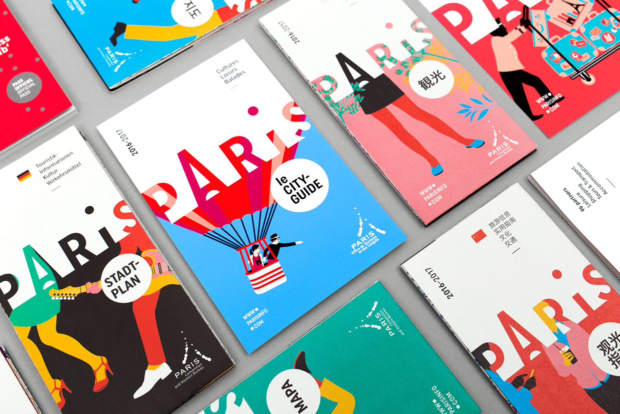
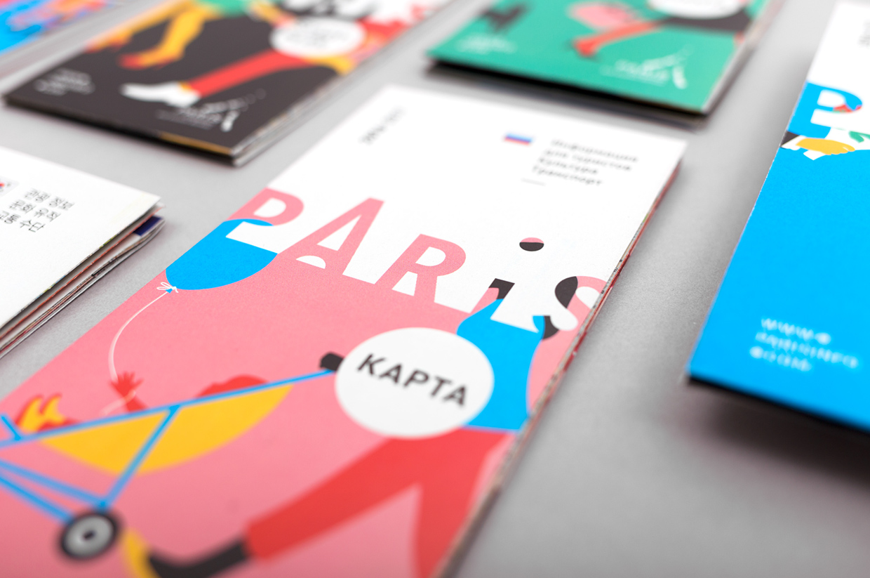
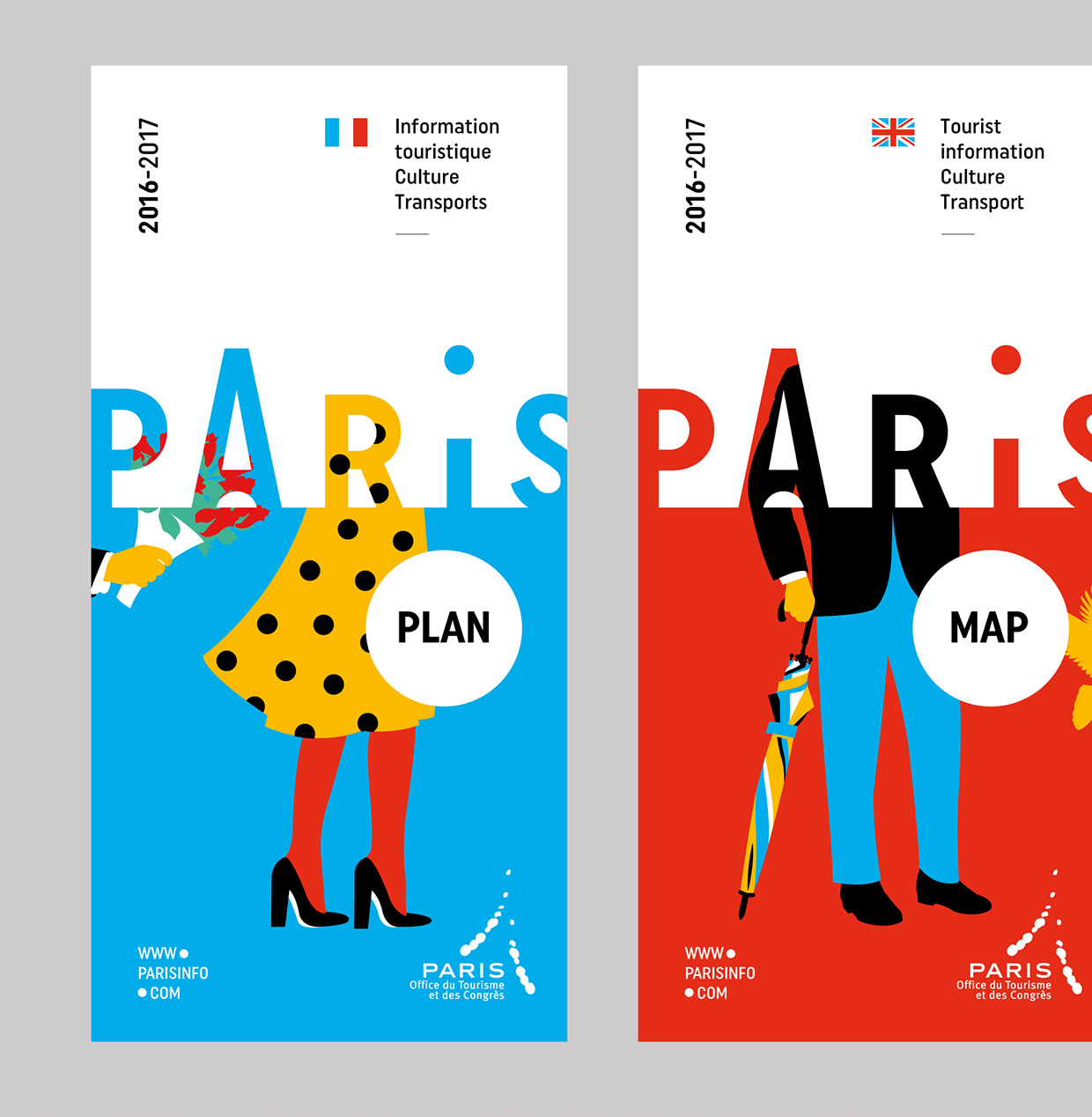
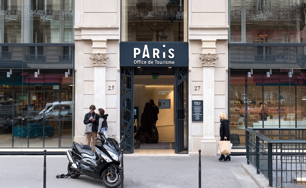
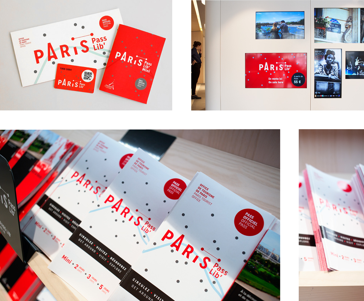
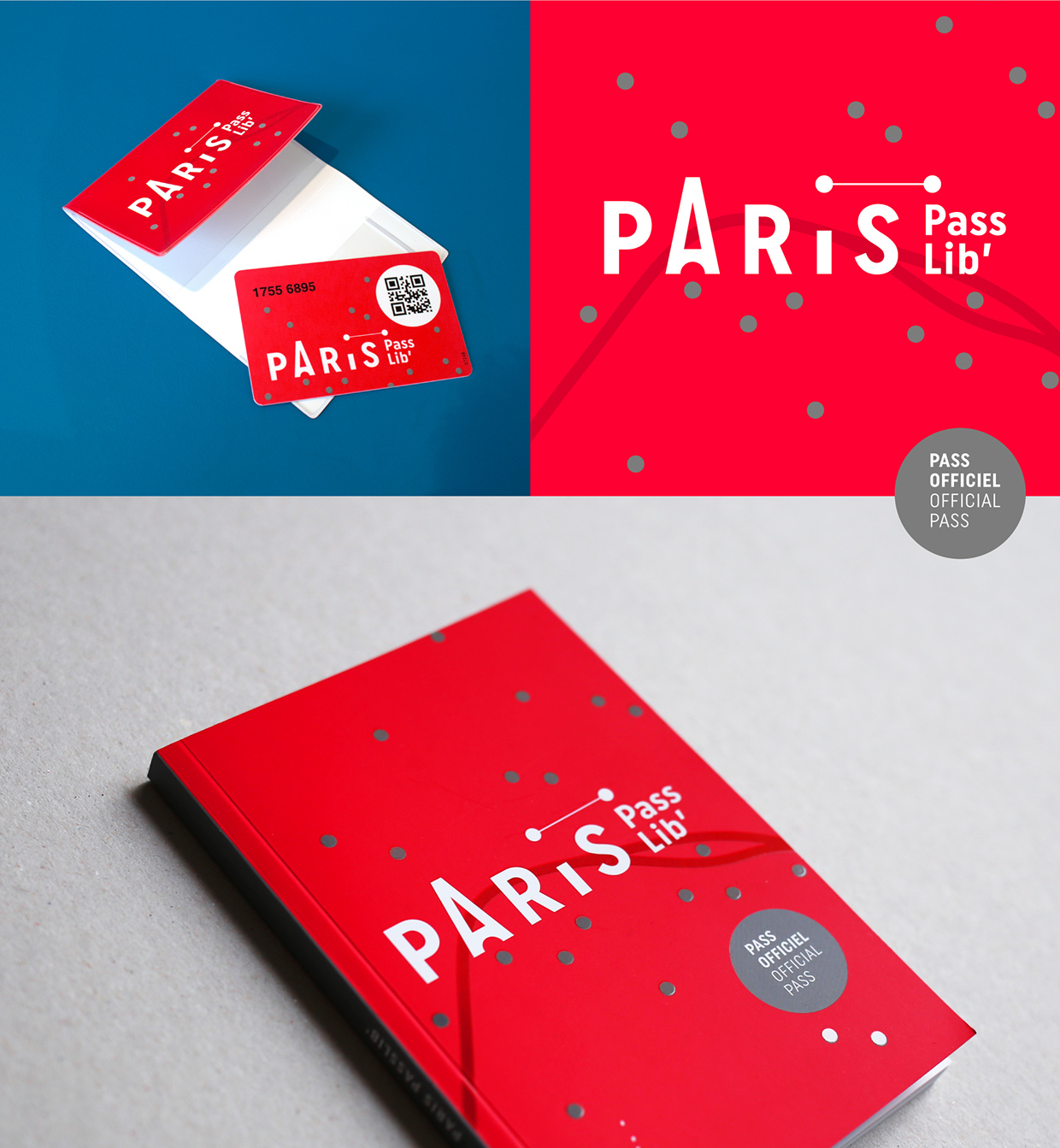
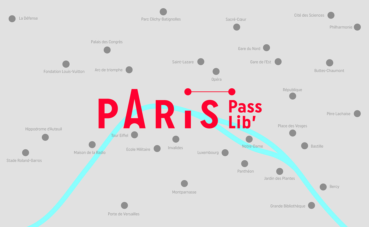
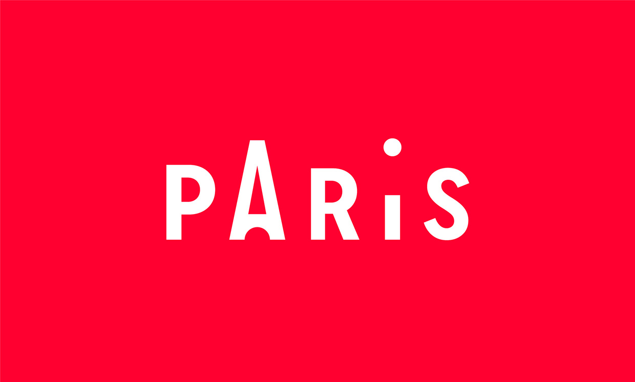
The Paris Convention and Visitors Bureau was created in 1971 at the joint initiative of the Paris City Council and the Paris Chamber of Commerce and Industry*. It carries out three specific missions: Welcome and informing visitors, and promoting the destination in France and abroad.
Last year the approached Graphéine studio to create a concept that covers the whole identity, then "Paris Passlib" tourist pass and Information Points redesign.
You can review the full case on Behance meanwhile enjoy the selected details of the project below


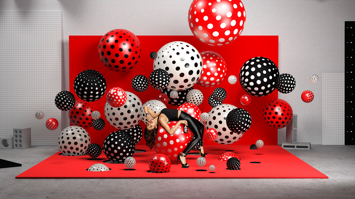
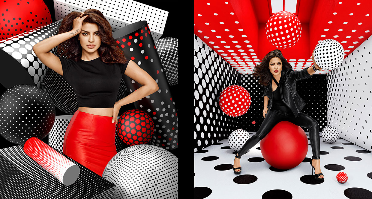
Sagmeister & Walsh (together with Daniel Brokstad, Fumi Omori, Liron Ashkenazi, Pol Solsona, Simón Sepúlveda, Zipeng Zhu, Esteban Diácono, Karan Singh, Pedro Veneziano and Pablo Alfieri) created a lively visual identity for Appy Fizz, India's first ever sparkling apple juice drink.
“The new Appy Fizz identity visualizes carbonated bubbles through a dynamic graphic language of 3d spheres and circles. From the print campaign to the television commercial, this circular language in the bold red/white/black color palette unites the various mediums with a distinct look and feel. We worked with brand ambassador & Bollywood star Priyanka Chopra for the TVC to create a bold film for Appy Fizz. In the film Priyanka “sheds” the sweeter tone of the brands past for a strong, bold, sexier tone that will continue for future campaigns. ”


Simple yet cute animations about little characters's life imagined inside "0 Calories" bakery identity, the work is done by Arthur Kondrashenkov and Denis Bashev

0-calories

0-calories-1

0-calories-2

0-calories-3

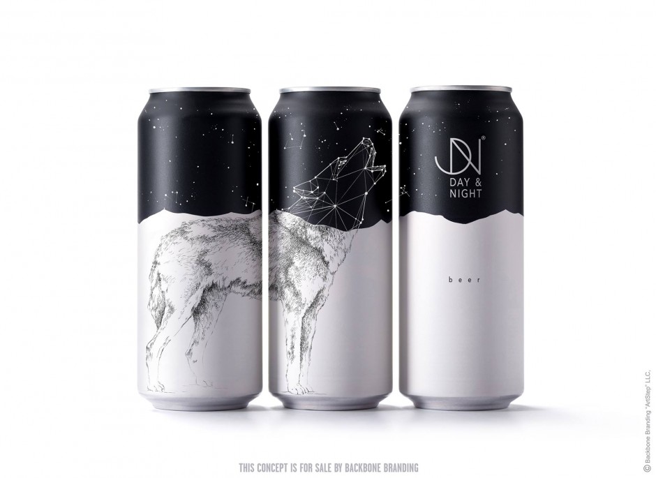
Day & Night is a concept project created by Armenian studio Backbone Branding that has a double-faced nature recalled in every design element. The main idea lays behind the typical restaurants that serve during the day and the bars working only at night. This duality of the restaurant living is clearly shown through the animals illustrated in two different states - Day and Night

backbone-day-night97

backbone-day-night

backbone-day-night1

backbone-day-night2

backbone-day-night3

backbone-day-night4

backbone-day-night5

backbone-day-night6

backbone-day-night7

backbone-day-night8

backbone-day-night9

backbone-day-night91

backbone-day-night92

backbone-day-night93

backbone-day-night94
backbone-day-night95

backbone-day-night96
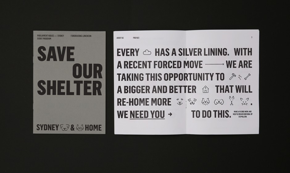
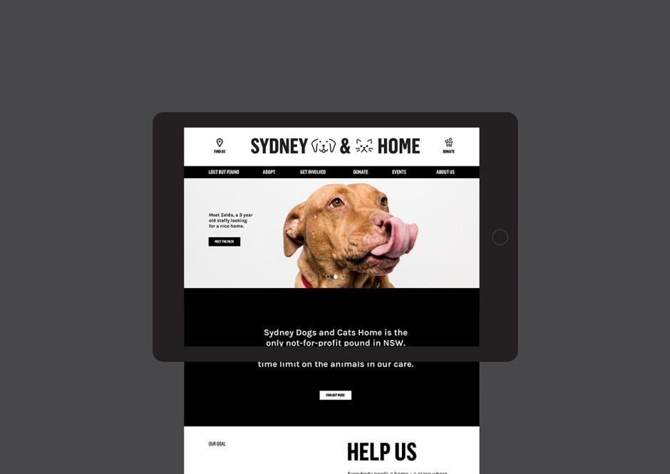
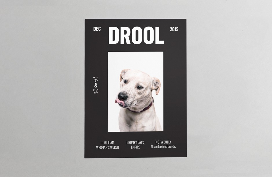
We have not been into good graphic design posts lately and promise to reveal more inspiring projects in 2016. Here is a group of Sydney based designers transform the low communication of local animal shelter by helping "Sydney Dogs & Cats Home" to get a new visual language. A versatile identity system was put in place to work across all manner of communications, with a boldness and clarity of message, whilst making sure playfulness was embedded throughout.
Sydney-Dogs-Cats-Home1

Sydney-Dogs-Cats-Home2

Sydney-Dogs-Cats-Home3

sdch_Website

Sydney-Dogs-Cats-Home6

Sydney-Dogs-Cats-Home7

SDCH logos - JL

Sydney-Dogs-Cats-Home9

Sydney-Dogs-Cats-Home91
Sydney-Dogs-Cats-Home92

Sydney-Dogs-Cats-Home93

spectre-ui-screens-1
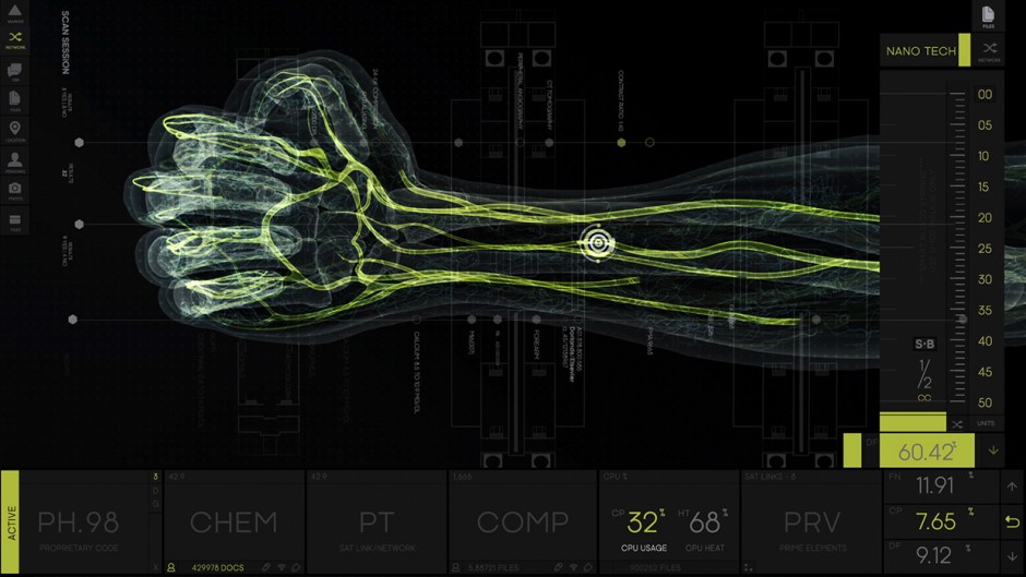
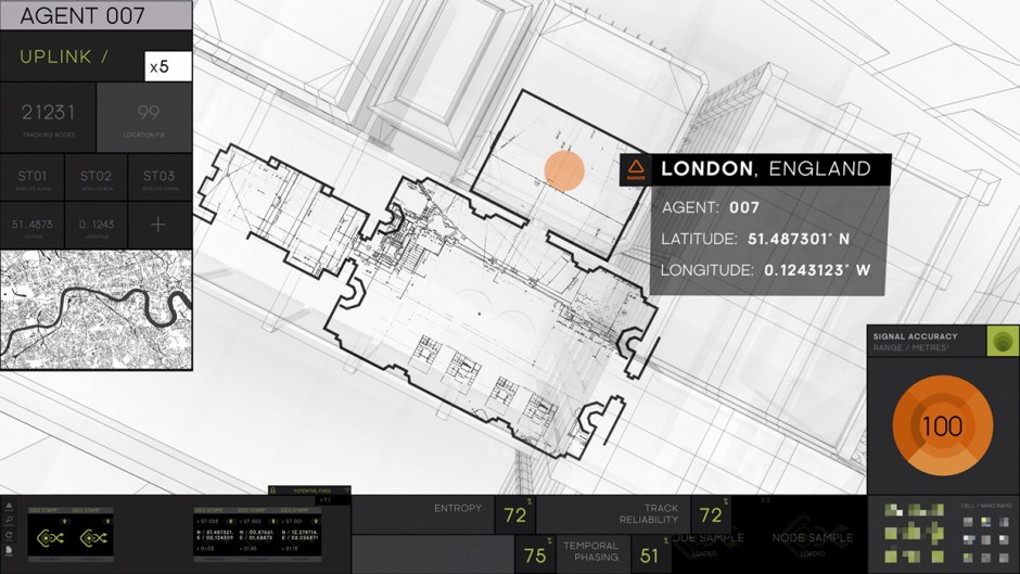
Following successful revealing of "The Martian" UI Screen Graphics (Territory Studio) another one agency Rushes MGFXStudio came out with a detailed case of James Bond's SPECTRE interfaces story. Rushes were tasked with designing and creating all on-set UI screen graphics for SPECTRE. Over a 13 month period of working on the 24th Bond film, from pre-production through to post, in total Rushes MGFX Studio created more than an hours’ worth of unique animations and motion graphic sequences that furnished over 300 screens, across 23 scenes in the film.

spectre-ui-screens-2

spectre-ui-screens-3

spectre-ui-screens-4

spectre-ui-screens-5

Ben Whishaw

spectre-ui-screens-7

spectre-ui-screens-8

spectre-ui-screens-9
spectre-ui-screens-91
spectre-ui-screens-11

spectre-ui-screens-92
Russian designer Stas Neretin shares award-winning a packaging concept for intimate care products. Using thermochromic paint the human touch of a packaging will make it shy red. Easy and clear message with humanity twist, view NAKED concept on Behance

shy-packaging-stas-neretin1

shy-packaging-stas-neretin2

shy-packaging-stas-neretin3

shy-packaging-stas-neretin4

shy-packaging-stas-neretin5