DESIGNCOLLECTOR

3rd Wave of Inspiration

Since 2003

  • Latest
    • FACE
    • All Posts
    • NFT & AI ART
    • Art
    • Design
    • Photography
    • Illustration
    • Videos
    • Digital Art
    • Interiors
  • Music
    • Latest
    • 2021
    • 2020
    • 2019
    • 2018
    • 2017
    • 2016
    • 2015
    • 2014
    • Mixtapes
  • Archive
    • 2023
    • 2022
    • 2021
    • 2020
    • 2019
    • 2018
    • 2017
    • 2016
    • 2015
  • Info
    • About
    • Submit
10-year-studio-marcus-kraft-0.jpeg

Studio Marcus Kraft

April 20, 2021 by Arseny Vesnin in 2021, Agencies, Graphic Design, Branding, Portfolios, Switzerland, Typography
@studiomarcuskraft

Zurich-base Marcus Kraft studio is celebrating its 10th anniversary of delivering top-notch graphic design projects with the bigger picture in mind, great attention to detail, and typographic quality. They strongly believe that design should be more than ‹just› beautiful and aesthetic. The following ten principles* build the foundation for Marcus Kraft work and available as a Manifesto

View fullsize 10-year-studio-marcus-kraft-1.jpeg
View fullsize 10-year-studio-marcus-kraft-10.jpeg
View fullsize 10-year-studio-marcus-kraft-9.jpeg
View fullsize 10-year-studio-marcus-kraft-8.jpeg
View fullsize 10-year-studio-marcus-kraft-7.jpeg
View fullsize 10-year-studio-marcus-kraft-6.jpeg
View fullsize 10-year-studio-marcus-kraft-5.jpeg
View fullsize 10-year-studio-marcus-kraft-4.jpeg
View fullsize 10-year-studio-marcus-kraft-3.jpeg
View fullsize 10-year-studio-marcus-kraft-2.jpeg
April 20, 2021 /Arseny Vesnin
APR
2021, Agencies, Graphic Design, Branding, Portfolios, Switzerland, Typography
swiss-grit-ashworthchris.jpg

Swiss grit by Chris Ashworth

July 06, 2020 by Arseny Vesnin in 2020, Graphic Design, Portfolios, Typography, United Kingdom

Chris Ashworth is an English graphic designer known for being the executive global creative director for Getty Images and the art director of the magazine Ray Gun in 1997. Ashworth graduated from the York College of Arts & Technology in 1990 with a degree in graphic design. In collaboration with some friends, he opened a design studio called Orange, which created black and white, easily photocopiable flyers for local nightclubs.

Ashworth is inspired by Swiss design aesthetics, and refers to his own style as "Swiss grit". This style is characterised by hyper detail, barcodes, horizontal lines, and the use of multiple transparent layers.

swiss-grit-ashworthchris-8.jpg
swiss-grit-ashworthchris-7.jpg
swiss-grit-ashworthchris-6.jpg
swiss-grit-ashworthchris-5.jpg
swiss-grit-ashworthchris-4.jpg
swiss-grit-ashworthchris-3.jpg
swiss-grit-ashworthchris-2.jpg
@ashworthchris
July 06, 2020 /Arseny Vesnin
JUL, British
2020, Graphic Design, Portfolios, Typography, United Kingdom

Tsto

June 30, 2020 by Arseny Vesnin in 2020, Branding, Finland, France, Graphic Design, Portfolios, Typography

Tsto is a graphic design agency based in Helsinki and Paris focusing on visual concepts and art direction.

tsto-2.jpg
tsto-5.jpg
tsto-6.jpg
tsto-4.jpg
tsto-3.jpg
@_tsto
June 30, 2020 /Arseny Vesnin
JUN
2020, Branding, Finland, France, Graphic Design, Portfolios, Typography

Nikita Iziev

January 17, 2020 by Arseny Vesnin in 2020, Digital Art, Graphic Design, Portfolios, Typography, United Kingdom

London based designer Nikita Iziev is focusing on the intersection between graphic, typography and motion design. Constantly aiming to find elegant solutions and further blur the lines between print and digital.

View fullsize nikita-iziev9.gif
View fullsize nikita-iziev8.gif
View fullsize nikita-iziev7.gif
View fullsize nikita-iziev6.gif
View fullsize nikita-iziev5.gif
View fullsize nikita-iziev4.gif
View fullsize nikita-iziev3.gif
View fullsize nikita-iziev2.gif
@nikitaiziev
January 17, 2020 /Arseny Vesnin
JAN, British
2020, Digital Art, Graphic Design, Portfolios, Typography, United Kingdom

Western Taiwanese by Mariia Ominina

March 20, 2019 by Arseny Vesnin in 2019, Art, Graphic Design, Portfolios, Russia, Typography
@mashaomi

Mariia is a poster designer from Russia, she works as a digital artist, but mostly creates posters. Also, Mariia is a student of the world-famous poster artist Peter Bankov.

For the past few years, Mariia has traveled and worked extensively in Asia. She explored cultural differences, the reasons for the immigration of Western people who come to live in Asia, and the difficulties they face living in Asian countries.

View fullsize Posters_final_exhibition_Masha -1-min.jpg
View fullsize Posters_final_exhibition_Masha -2-min.jpg

Mariia's travels and explorations resulted in a three-month solo exhibition entitled "Western Taiwanese", which opened in Dounan City in November 2018. For this exhibition, the artist prepared a series of poster, and also for the first time worked in video art and installation formats.

View fullsize Posters_final_exhibition_Masha -3-min.jpg
View fullsize Posters_final_exhibition_Masha -4-min.jpg

In her posters, Mariia tried to visually reflect her impression of Yunlin County, where she lived at the time. She used a variety of visual research methods to capture cultural landscapes while creating the style of her posters. For example, she used Google Earth footage for the visuals, and Mariia also worked with local historians in the archives department. Mariia has created a vibrant palette of 6 colors along with a dynamic composition that together reflects the brilliance and quirkiness of Taiwanese nature.

View fullsize Posters_final_exhibition_Masha -5-min.jpg
View fullsize Posters_final_exhibition_Masha -6-min.jpg

Wang Chia Wei, curator of this exhibition, says Maria's exhibition was a completely new way to see Taiwanese culture. She also added that these posters are more like hokku, where the artist expresses deep meaning in simple words.

View fullsize Posters_final_exhibition_Masha -7-min.jpg
View fullsize Posters_final_exhibition_Masha -8-min.jpg

Mariia Ominina's project "Wester Taiwanese" is a fresh look at the world of poster art, where the artist expresses herself not through direct visual clues, but via vague images or meanings. Mariia managed to capture the connection between meanings and the visual component in the paradigm of postmodern aesthetics, where the classical "laws" and "norms" in design have ceased to be decisive. Her posters are lively and interesting, plunging into the confluence of new-old art, that borders between meaning and visuality; conceptualism and avant-garde.   

March 20, 2019 /Arseny Vesnin
Russian
2019, Art, Graphic Design, Portfolios, Russia, Typography

Umbrella by Snask

February 21, 2019 by Arseny Vesnin in 2019, Advertising, Branding, Sweden, Typography

Snask Studio comes back with a new branding case made for consulting bureau Umbrella. Female founded and powered by two rising stars, Umbrella is rocking the consultant industry.

“We started out by visualizing the vision of the brand by choosing a strong and beautiful color scheme using a pale pink and a candy red along with off-white. We also chose a bold and strong display typeface to communicate strong messages and tag lines. With statements like “When we shine we shine together” and “Come play with us” the step to take the identity out into reality wasn’t far, but we also decided to do some 3D-animations to further elevate the brand. Whether you’re a developer, UX/UI-designer, QA, Product Owner or just share their values, get in touch with them and see how you can find ways of working together.”
— Snask
View fullsize umbrella poster1.jpg
View fullsize umbrella poster 4.jpg
View fullsize umbrella poster3.jpg
View fullsize umbrella poster2.jpg
View fullsize Snapback Umbrella.jpg
View fullsize umbrella_bossladies.jpg
View fullsize umbrella stickers.jpg
View fullsize Tapes-mockup-edit_web.jpg
View fullsize flag.png
View fullsize umbrella-branding-mockup-tekst-fin.jpg

Agency: Snask
Client: Umbrella
Photography: Per Björklund

@snasksthlm
February 21, 2019 /Arseny Vesnin
FEB
2019, Advertising, Branding, Sweden, Typography

Nairone

February 07, 2019 by Arseny Vesnin in Illustration, France, Typography, Lettering, Portfolios, 2019

Obsessed with black and white, the contrast is the source of his creativity, fascinated by the pop art movement and our contemporary pop culture, Nairone use elements from everyday life, his work is inspired by personal experiences from his childhood and the links with the milieu in which he lives mixed with his contrasted vision.


Les Gourmands Bakery

View fullsize nairone-2019.jpg
View fullsize nairone-2019-4.jpg
View fullsize nairone-2019-1.jpg
View fullsize nairone-2019-2.jpg
 

House of Vans

View fullsize nairone-2019-6.jpg
View fullsize nairone-2019-7.jpg
 

Adidas Glitch

View fullsize nairone-2019-9.jpg
View fullsize nairone-2019-91.jpg
 

PSG

@nairone
February 07, 2019 /Arseny Vesnin
FEB
Illustration, France, Typography, Lettering, Portfolios, 2019

IcoNYC Squarespace

December 05, 2018 by Arseny Vesnin in Advertising, Agencies, Branding, Graphic Design, Typography, USA, 2018

Being a Squarespace running blog we can’t miss their recent update of identity made by our friends from DIA Studio together with François Rappo (Typography), and Optimo

“Squarespace is one of very few technology companies that can truly call NYC home. The city has inspired our attitude, our aesthetic, and our mission to democratize good design for every ambitious entrepreneur, artist, or visionary with a dream. As we began to rethink our brand identity, we knew we needed to find a way to make New York a bigger part of the story.”

“New York is a study in movement; like jazz, it constantly heads in unpredictable directions. Since much of our output is interactive and screen based, we knew the brand needed to make sense in motion. So we developed a kinetic identity system that dimensionalizes our name and reinforces the two syllables in Squarespace.“

brand.squarespace.com
December 05, 2018 /Arseny Vesnin
DEC
Advertising, Agencies, Branding, Graphic Design, Typography, USA, 2018

The Senses: Design Beyond Vision

June 04, 2018 by Arseny Vesnin in Branding, Graphic Design, Portfolios, Typography, USA, 2018

Art Director David Genco presents his recent work of book design and exhibition graphics made in collaboration with Ellen Lupton.

View fullsize david-genco-93.jpg
View fullsize david-genco-92.jpg

The Senses: Design Beyond Vision invites visitors to encounter design with all their senses through several interactive installations. Currently on show at the Cooper Hewitt Smithsonian Design Museum, curated by Ellen Lupton & Andrea Lipps, exhibition design by Studio Joseph.

View fullsize david-genco-91.jpg
View fullsize david-genco-9.jpg


The book is a manifesto celebrating the sensory richness of design. A must-read and powerful reminder to anyone who thinks design is primarily a visual pursuit. Co-published by Princeton Architectural Press and Cooper Hewitt, by Andrea Lipps & Ellen Lupton.

View fullsize david-genco-6.jpg
View fullsize david-genco-4.jpg
View fullsize david-genco-3.jpg
View fullsize david-genco-2.jpg
View fullsize david-genco-1.jpg

Visual identity and exhibition graphics made for installation at Cooper Hewitt Smithsonian Design Museum, New York City

View fullsize david-genco-exh4.jpg
View fullsize david-genco-exh3.jpg
View fullsize david-genco-exh2.jpg
View fullsize david-genco-exh1.jpg
@david.genco
June 04, 2018 /Arseny Vesnin
Top 2018 Posts, JUN
Branding, Graphic Design, Portfolios, Typography, USA, 2018

36 Days of Type by Marv Castillo

May 14, 2018 by Arseny Vesnin in Graphic Design, Portfolios, Spain, Typography, 2018

For those of you living in the space, a good half of designers have been busy participating in 36 Days of Type recently run world-wide from Barcelona. We focus on Marv Castillo as he comes up with and idea to focus on "movies" and soft physical Play-Doh when a majority of participants stick to 3D renders.

1.jpg
2.jpg
3.jpg
4.jpg
5.jpg
6.jpg
7.jpg
8.jpg
9.jpg
10.jpg
11.jpg
12.jpg
Download Marv's Calendar
@marvcastillo
May 14, 2018 /Arseny Vesnin /Source
MAY
Graphic Design, Portfolios, Spain, Typography, 2018

Motion Motion 2018 Visual Identity by nöbl studio

April 24, 2018 by Arseny Vesnin in Agencies, Branding, Graphic Design, France, Events, Typography, 2018, Glitch

Motion Motion is the first event dedicated to the motion design and meanwhile, opened to all audiences. One day in Nantes (FR) with conferences, installations, workshops and concerts for everyone.
nöbl created the festival 2018 whole identity and craft the trailer by playing with a distorted typography treatment:

As the motion design, the concept of this identity talks about graphic design and movement. We choose to play with the most impactful visual system "typography" and then put it literally in movement.

Visual Identity by nöbl

Motion-motion_Gif01.gif
Motion-motion_Gif02.gif
View fullsize MOTION-MOTION_Serigraphie02.jpg
View fullsize MOTION-MOTION_Serigraphie01.jpg
Motion-Motion_print02.jpg
Motion-Motion_print07.jpg
Motion-Motion_print03.jpg
nöbl.tv
April 24, 2018 /Arseny Vesnin /Source
APR
Agencies, Branding, Graphic Design, France, Events, Typography, 2018, Glitch

Weird Type AR Application

March 20, 2018 by Arseny Vesnin in Digital Art, Mobile Applications, Typography, 2018

Zach Lieberman and Molmol Kuo’s AR app Weird Type lets you paint with type in space. 

Zach is an American artist and computer programmer whose daily sketches with code have earned him an impressive following on social media. Together with his partner Molmol they have released Weird Type – an iOS AR app that lets you draw with typography in 3D space.

A post shared by zach lieberman (@zach.lieberman) on Mar 12, 2018 at 2:12pm PDT

Available here, the application enables users to input type and choose from a variety of scenes that manipulate that type in different ways.

View fullsize weirdtype4.jpg
View fullsize weirdtype3.jpg
View fullsize weirdtype2.jpg
View fullsize weirdtype1.jpg
Weird Type App
March 20, 2018 /Arseny Vesnin /Source
MAR
Digital Art, Mobile Applications, Typography, 2018

Street Art Installations by Trevor Wheatley and Cosmo Dean

February 27, 2018 by Arseny Vesnin in Canada, Street Art, Typography, 2018

"Trevor Wheatley and Cosmo Dean work together to create large installations based around phrases and logos that are part of the common lexicon. Casually used terms like “all good” and the shrug emoji take on larger-than-life dimensions in the duo’s three dimensional versions, which are suspended from cables, integrated into chain link fences, toted in truck beds, and painted alongside graffiti. Wheatley and Dean have partnered with music festivals, fashion brands, and the creative house Justkids to install their work. Up next, the artists will be embarking on a trip to Mexico to create new paintings in rural areas." via Colossal

wheatley-17.jpg
wheatley-21.jpg
wheatley-14.jpg
wheatley-19.jpg
wheatley-22.jpg
wheatley-8.jpg
wheatley-25.jpg
wheatley-20.jpg
@treverferever
@cchdean
February 27, 2018 /Arseny Vesnin /Source
FEB
Canada, Street Art, Typography, 2018

Nike Statement House NYC Liquid Type by DIA Studio

January 30, 2018 by Arseny Vesnin in Graphic Design, Typography, Portfolios, 2018

Design studio now better known for their kinetic typography experiments recently did a motion identity for Nike Statement House in NYC


@dia_studio
January 30, 2018 /Arseny Vesnin
JAN
Graphic Design, Typography, Portfolios, 2018

Denis Bychkovskiy / @denbych

Shortcut Racing Car customised by Pokras Lampas

November 28, 2017 by Arseny Vesnin in Lettering, Typography, Russia, Portfolios, Street Art, Art, 2017
 
Featured
Pokras Lampas
Pokras Lampas
 

Leading calligraphy artist Pokras Lampas spent 30 hours to customise Shortcut Racing car in collaboration with DK Racing Team Russia. By applying his personal "Calligrafuturism" style Arseny (Pokras Lampas) brings dynamics of streets to typography patterns applied across the buggy car body.

Denis Bychkovskiy / @denbych

View fullsize _DSC2639.jpg
View fullsize _DSC2709.jpg
View fullsize _DSC2771.jpg
View fullsize _DSC2810.jpg
View fullsize _DSC2824.jpg
View fullsize _DSC2842.jpg
View fullsize _DSC2887.jpg
View fullsize _DSC2930.jpg
View fullsize _DSC2933.jpg
View fullsize _DSC2951.jpg
View fullsize _DSC2985.jpg
View fullsize _DSC2997.jpg

Photography: Denis Bychkovskiy /  @denbych

View fullsize pokraslampas-buggy6.jpg
View fullsize pokraslampas-buggy5.jpg
View fullsize pokraslampas-buggy7.jpg
@pokraslampas
November 28, 2017 /Arseny Vesnin
Pokras Lampas, Russian, NOV
Lettering, Typography, Russia, Portfolios, Street Art, Art, 2017

Xavier Monney

October 09, 2017 by Arseny Vesnin in Graphic Design, Portfolios, Switzerland, Typography, 2017

"Xavier Monney is the 23-year-old designer from Lausanne, Switzerland whose work caught our eye due to his refreshing but incredibly impressive manipulations of type. Xavier combines animation and typography to create three-dimensional experiments, often incorporating some form of optical illusion."

xavier-monney2.gif
xavier-monney1.gif
@xaviermonney
October 09, 2017 /Arseny Vesnin /Source
OCT
Graphic Design, Portfolios, Switzerland, Typography, 2017

Pokras Lampas x FENDI

Palazzo Della Civiltà Italiana
June 19, 2017 by Arseny Vesnin in Art, Fashion, Italy, Motioncollector, Lettering, Typography, Russia, 2017
 
Featured
Pokras Lampas
Pokras Lampas
 

Russian Calligrafiturism artist Pokras Lampas spent 500 l of yellow paint, 1250 sq.m of calligraphy for the fabulous "F.. is for Fendi" campaign performed on the top of monumental HQ of Fendi in Rome at Palazzo della Civiltà Italiana (Colosseo Quadrato)

pokras-fendi.jpg
pokras-fendi-1.jpg
pokras-fendi-2.jpg

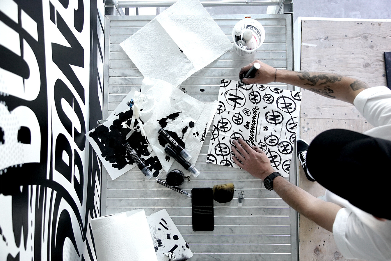
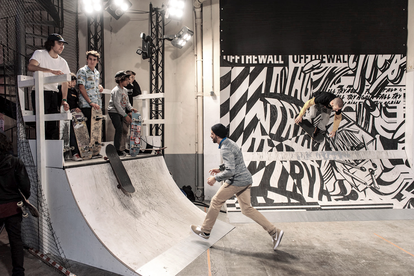
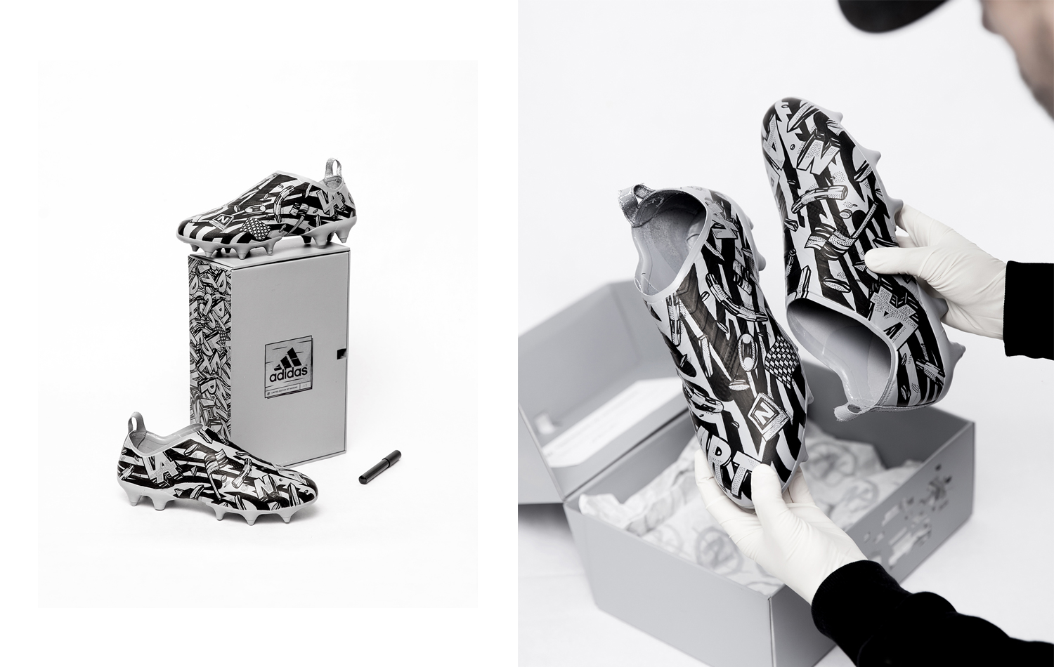
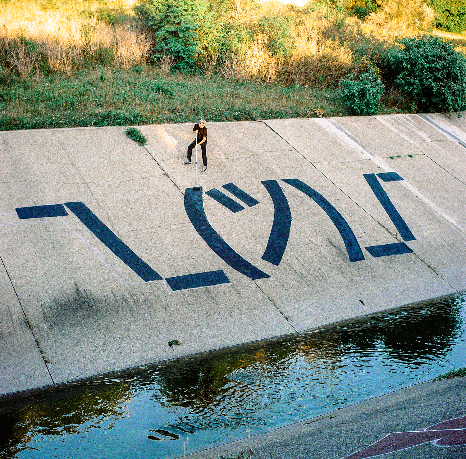
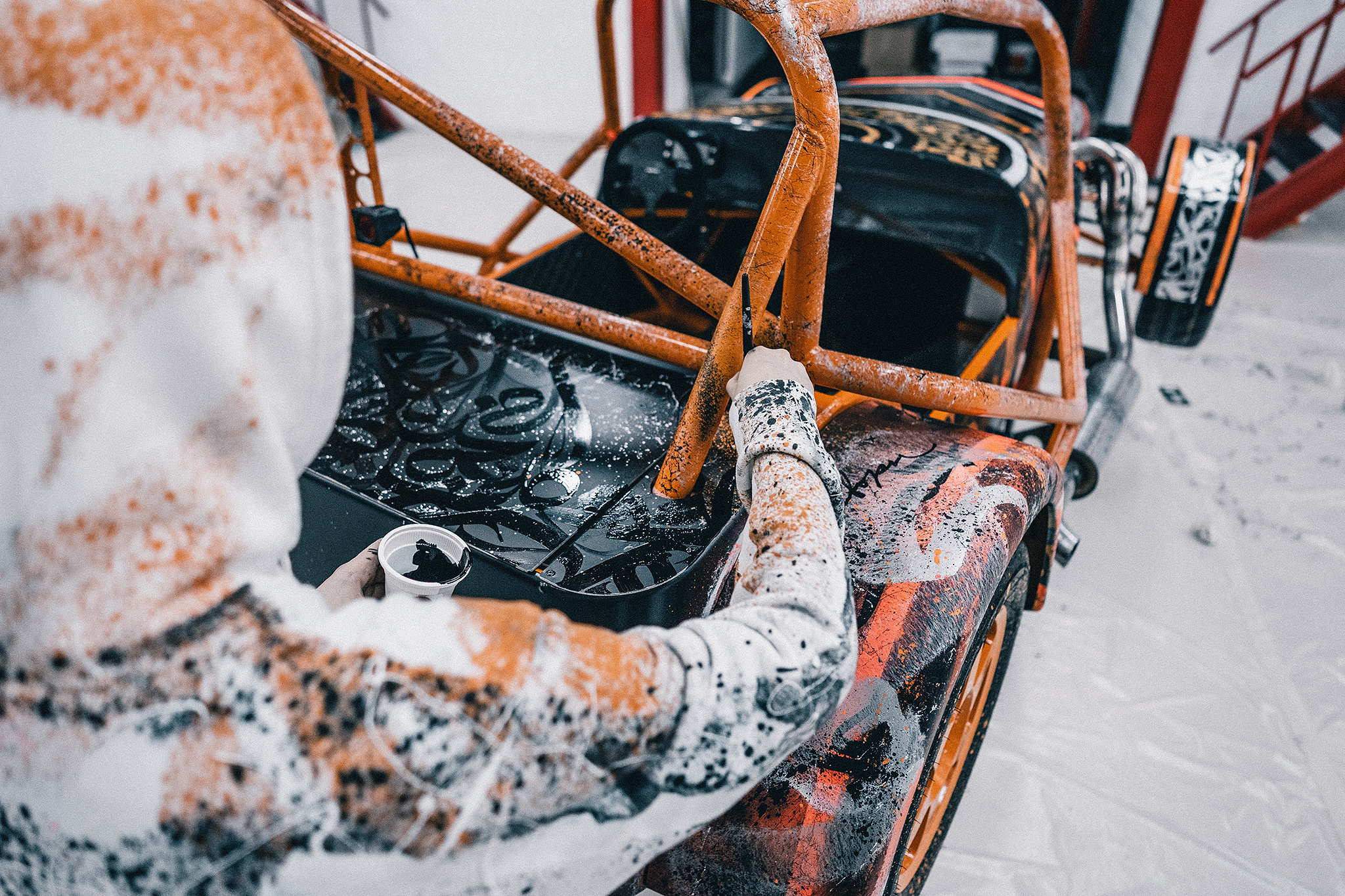
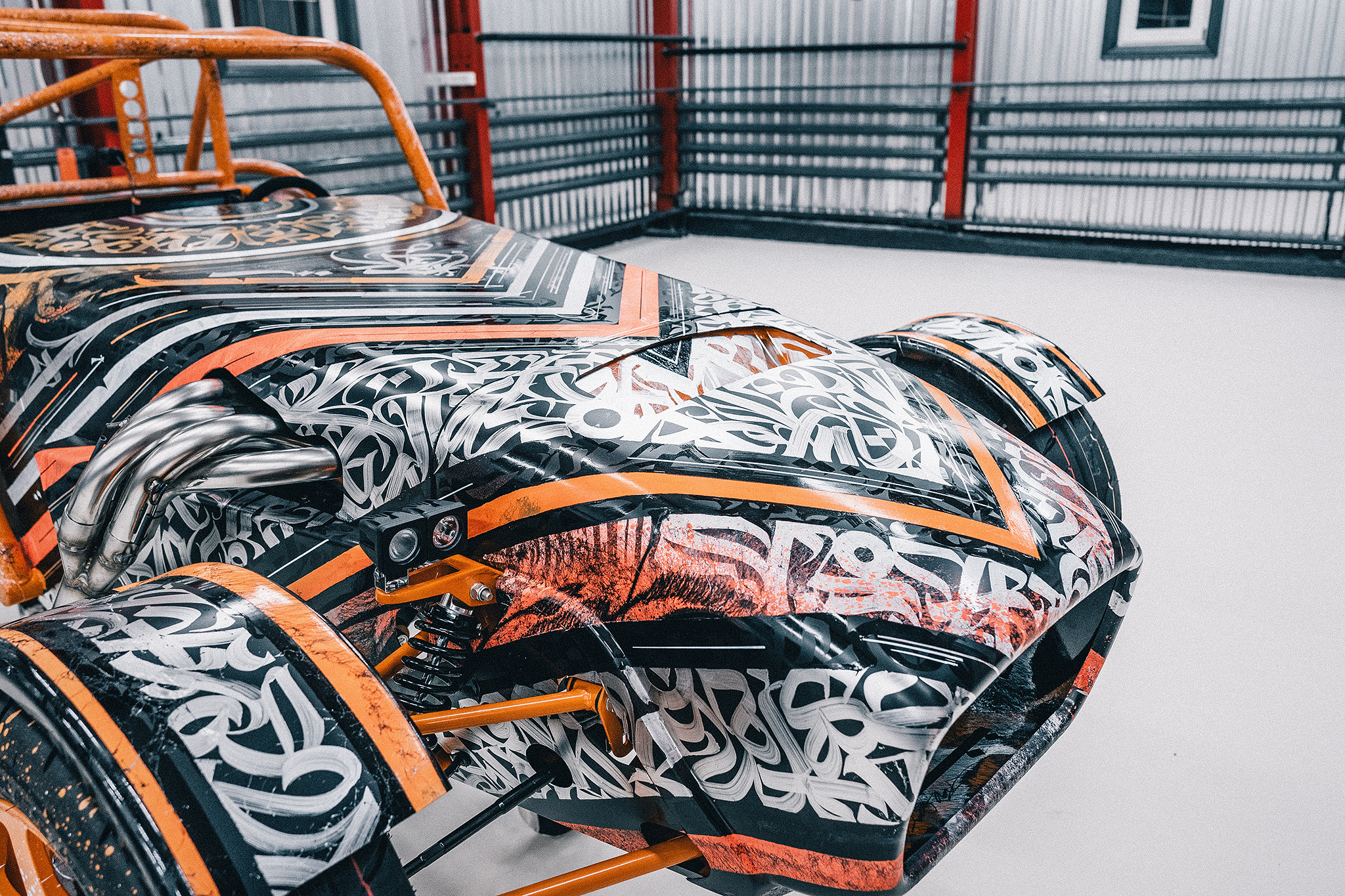
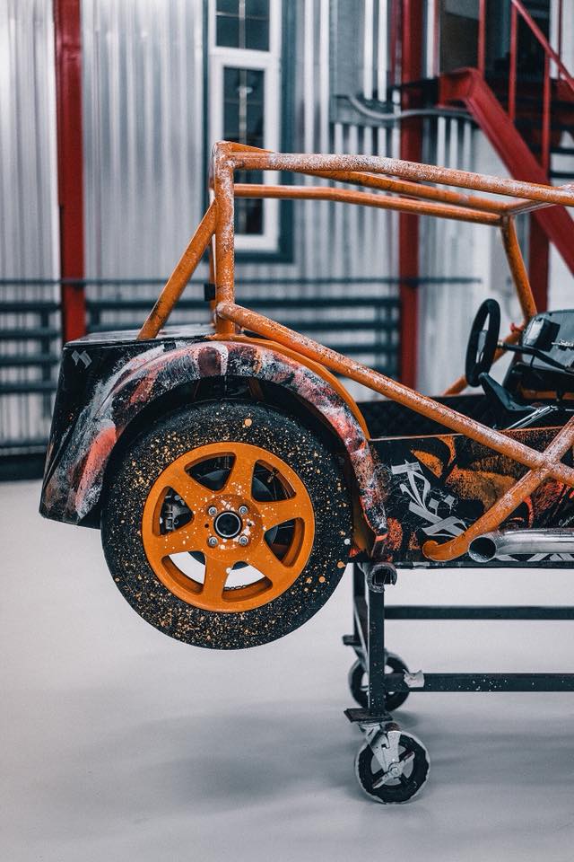
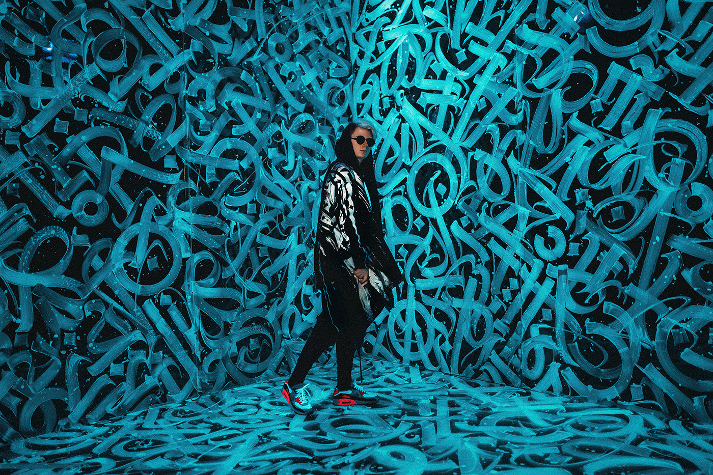
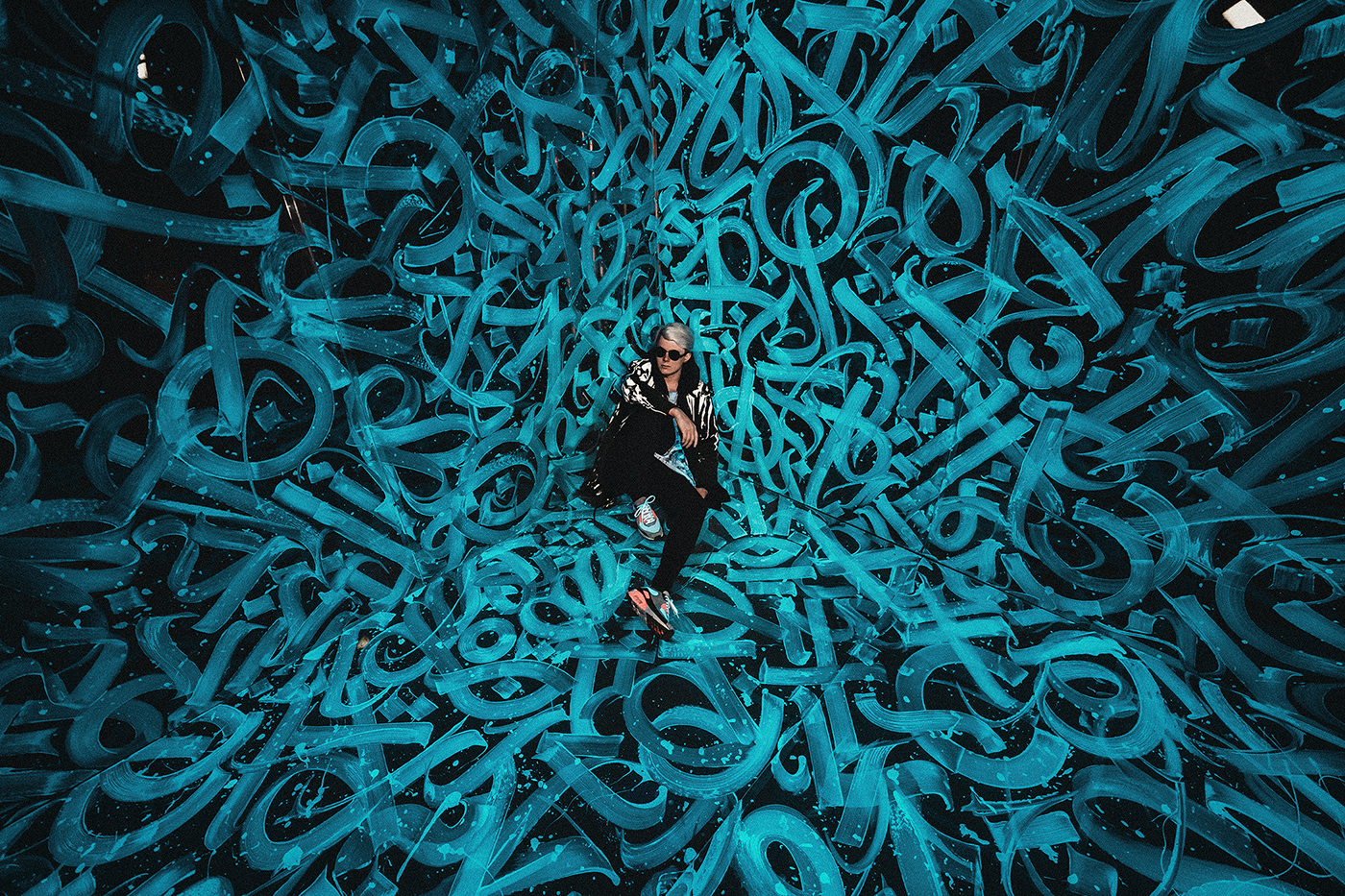
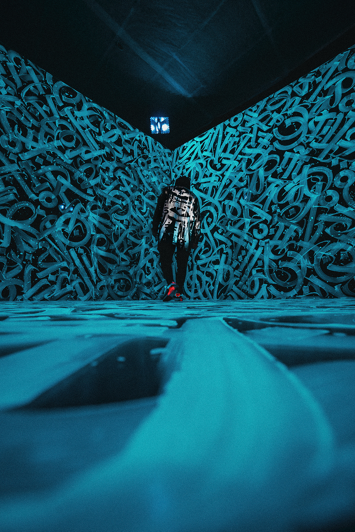
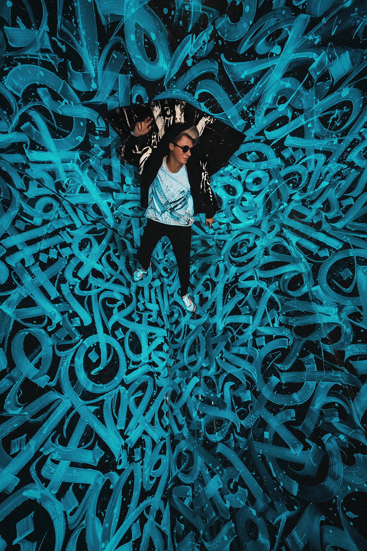
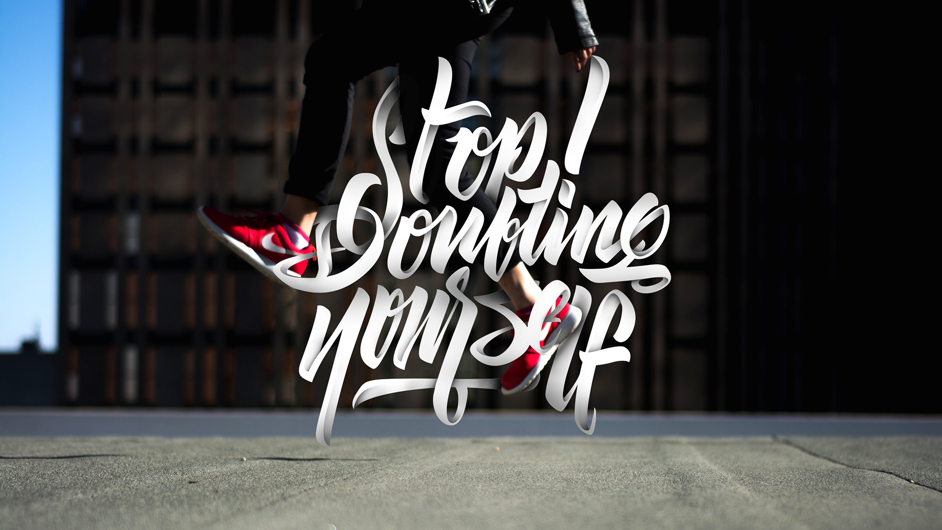
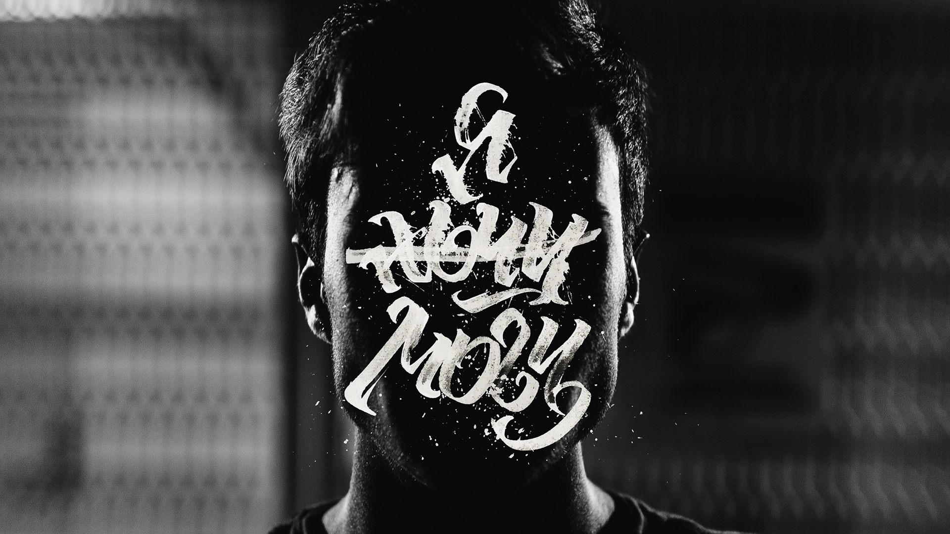
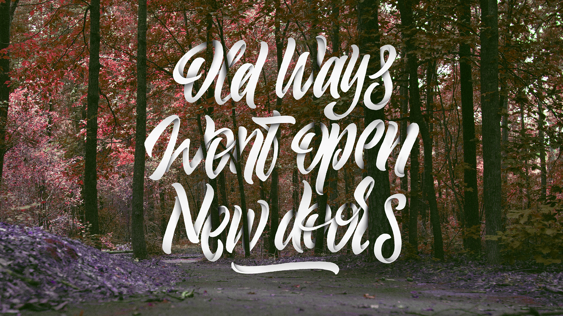
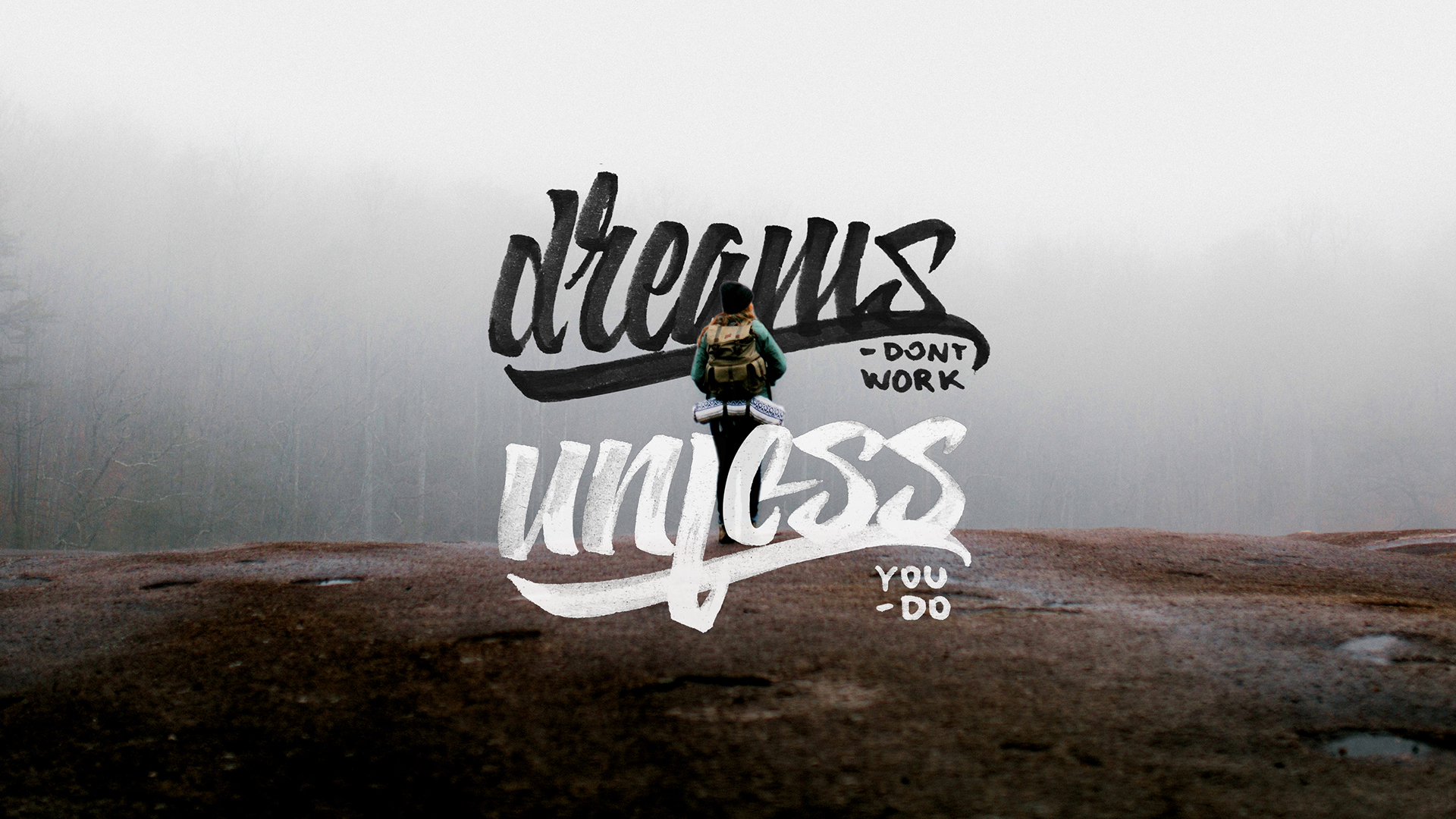
An official Calligraffiti ambassador (and freak), Pokras Lampas is blurring the frontiers with his brushes and paint buckets. He is one of the most talented modern artists, and is totally rewriting stuff through Calligrafuturism, his personal way of expressing his version of our uber-global and sometimes-crazy world. This globetrotter is also spreading the word about modern calligraphy and collaborating with crazy cool brands and artists.

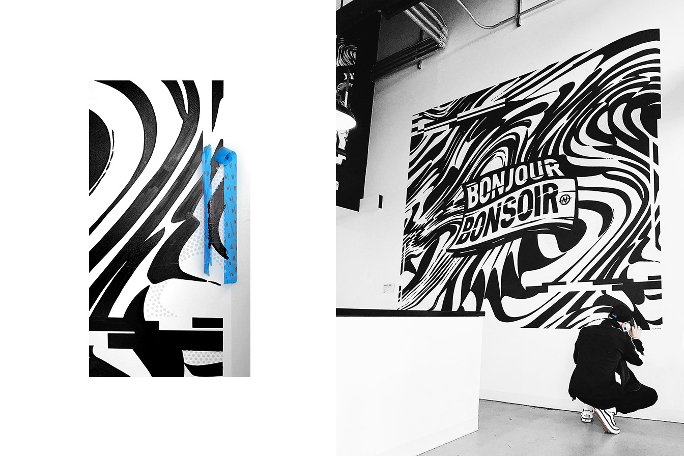
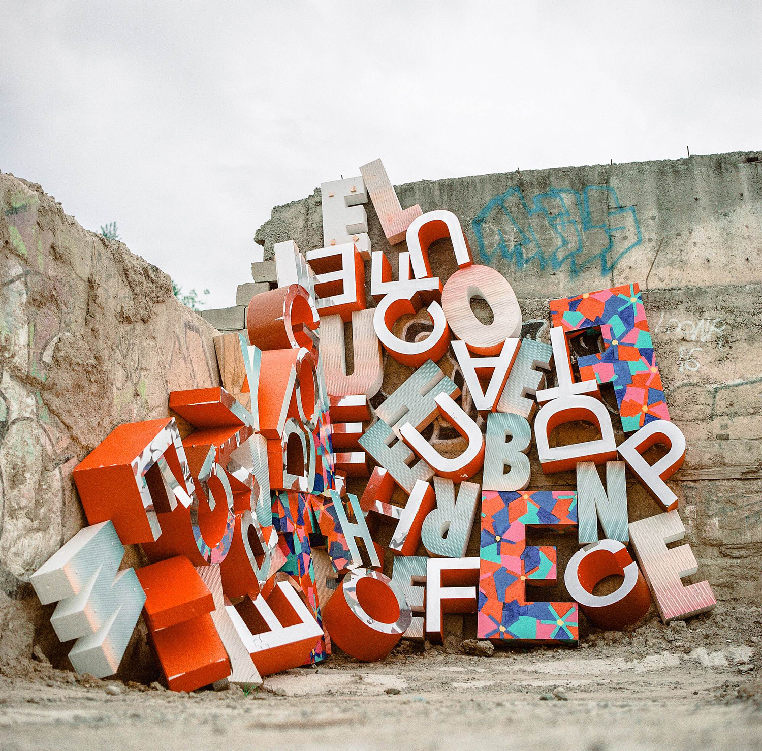
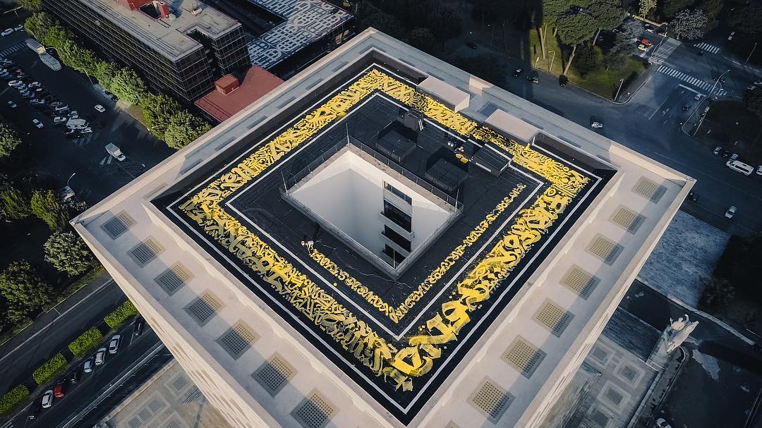
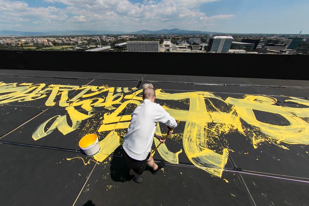
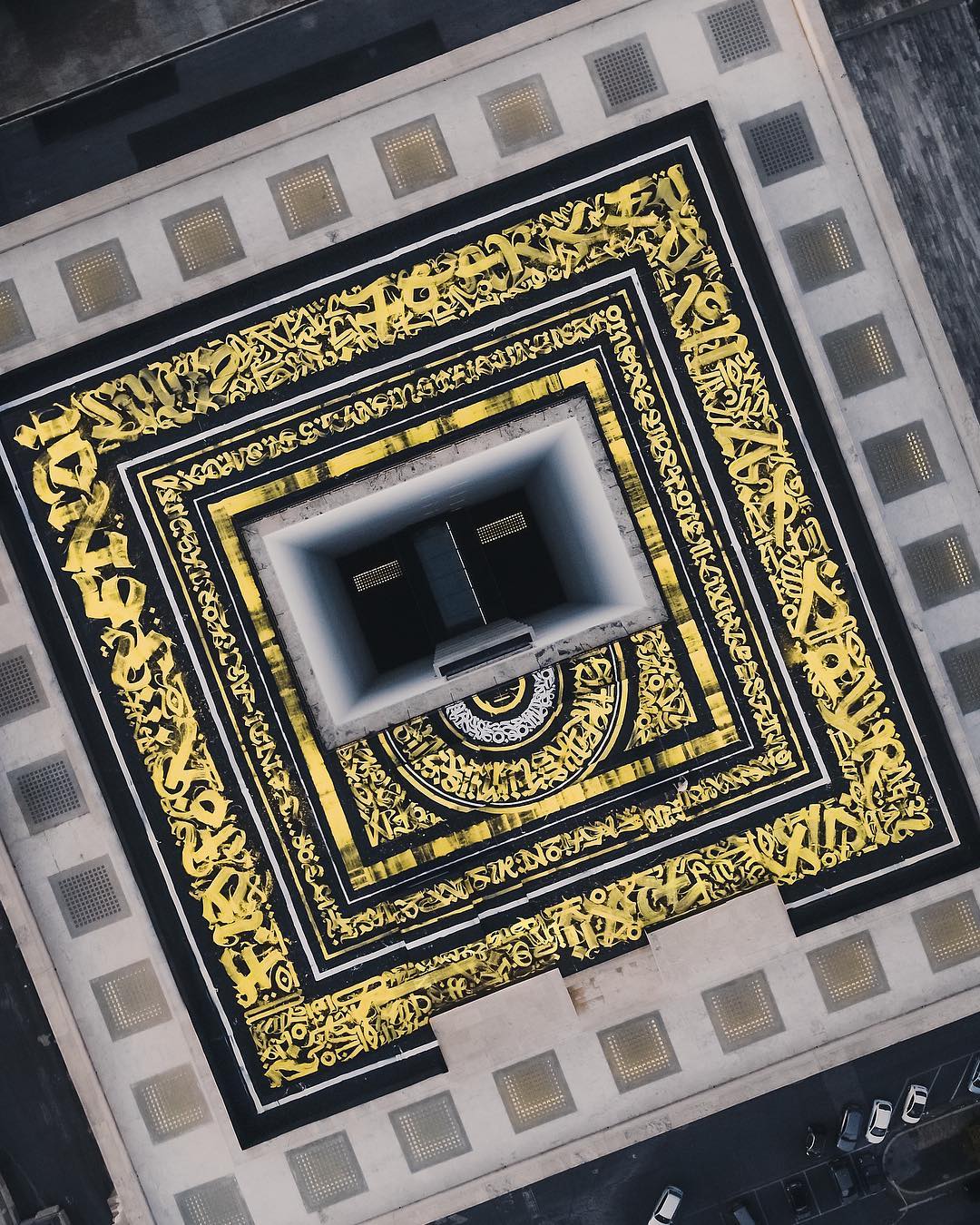
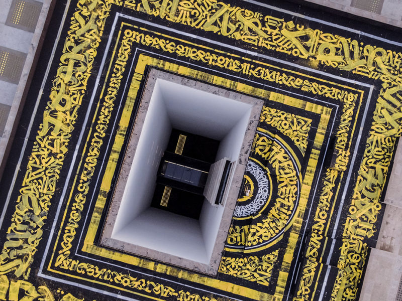
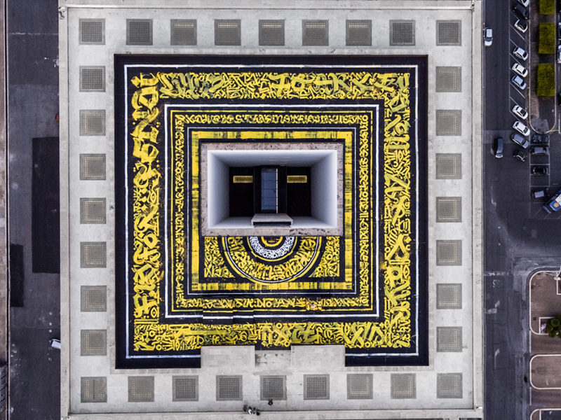
He realized the biggest Calligraffiti in Italy on FENDI rooftop at Palazzo Della Civiltà Italiana, reinterpreting the F IS FOR…manifesto throughout freedom of expression, art, culture and optimism all around!

Not only he’s a super fly freak – who happens to love Kanye West – but he is also an incredible masterpiece machine. Pokras Lampas captures, creates, interprets and simply makes magic magic.

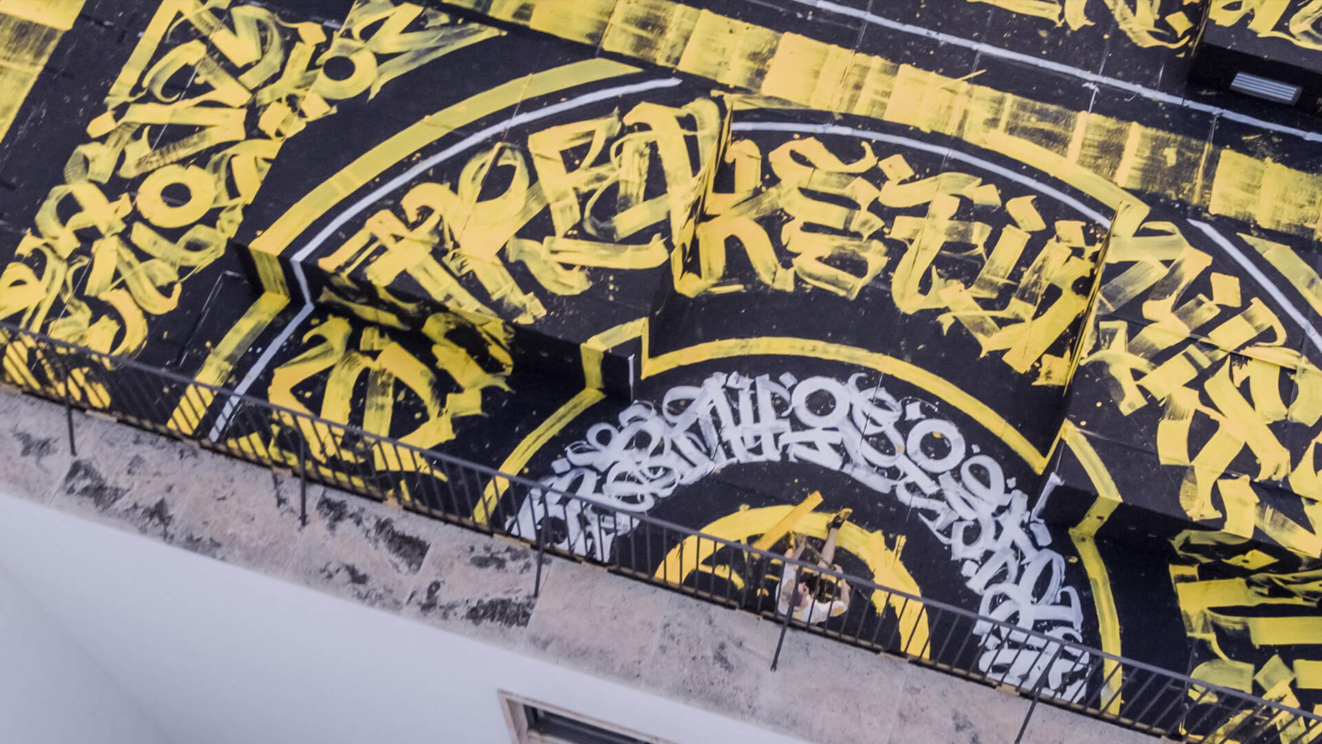
Totally goosebumps-worthy, his time in Rome with the F is For… crew was so rad, filled with an intense, gigantic-lettered poem, shapes and lines that basically set the standard once again for what we label as authentic talent.

pokras-fendi-6.jpg
pokras-fendi-5.jpg
pokras-fendi-4.jpg
@pokraslampas
June 19, 2017 /Arseny Vesnin
Russian, Pokras Lampas, JUN
Art, Fashion, Italy, Motioncollector, Lettering, Typography, Russia, 2017

Three Dimensional Calligrafuturism

June 12, 2017 by Arseny Vesnin in Street Art, Portfolios, Russia, Typography, 2017
 
Featured
Pokras Lampas
Pokras Lampas
 

Rising star of Russian street, fashion and calligraphy art scene Pokras Lampas shared one of his numerous commercial projects he did for Russian flagman Nike store

pokras3dnike8.jpg
pokras3dnike7.jpg
pokras3dnike6.jpg
pokras3dnike5.jpg
pokras3dnike4.jpg
pokras3dnike3.jpg
pokras3dnike2.jpg
pokras3dnike1.jpg
pokras3dnike.jpg

Photography: Den Bychkobvsky

@calligrafuturism
June 12, 2017 /Arseny Vesnin
Russian, Pokras Lampas, JUN
Street Art, Portfolios, Russia, Typography, 2017

Shaded Lettering by Dima Abrakadabra

May 25, 2017 by Arseny Vesnin in Illustration, Typography, Portfolios, Russia, 2017
abrakadabra92.jpg
abrakadabra91.jpg
abrakadabra9.jpg
abrakadabra8.jpg
abrakadabra7.jpg
abrakadabra6.jpg
abrakadabra52.jpg
abrakadabra4.jpg
abrakadabra3.jpg
abrakadabra2.jpg
abrakadabra1.jpg

Dima Luk'yanov aka Abrakadabra creates motivating quotes by using lettering techniques and photography collages. Quite obvious idea got fresh air with his attention to details and quality of typography lines

@abra_lu
May 25, 2017 /Arseny Vesnin
Russian, MAY
Illustration, Typography, Portfolios, Russia, 2017

Faux Mosaics by Nick Misani

May 09, 2017 by Arseny Vesnin in Instagram, Typography, Portfolios, USA, 2017

New York based designer Nick Misani shares his latest affair with floor mosaics he got in while still working at Louise Fili Studio she founded few decades ago. Formerly senior designer for Herb Lubalin, Louise Fili was art director of Pantheon Books from 1978 to 1989, where she designed close to 2,000 book jackets. The idea to run a small self-initiated project Fauxsaics came to Nick while he was digitally restoring Louise' books. He started to create faux digital mosaic inspired by the piece he saw in London

A post shared by Designcollector - 14 Years (@designcollector) on Apr 17, 2017 at 9:20am PDT

nick-misani5.jpg
nick-misani4.jpg
nick-misani3.jpg
nick-misani2.jpg
nick-misani1.jpg
nick-misani.jpg
@nickmisani
May 09, 2017 /Arseny Vesnin
MAY
Instagram, Typography, Portfolios, USA, 2017
  • Newer
  • Older