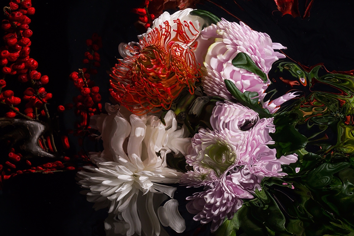
Colourful Splashes by Ruslan Khasanov for MAC
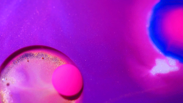
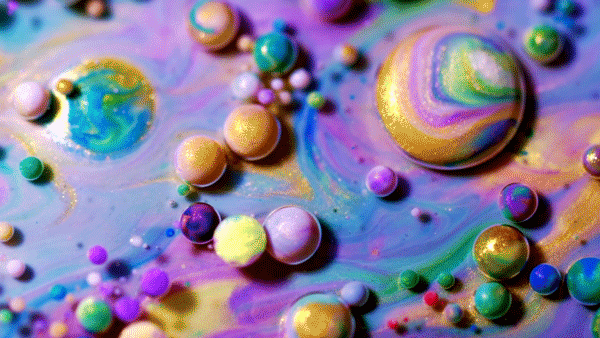
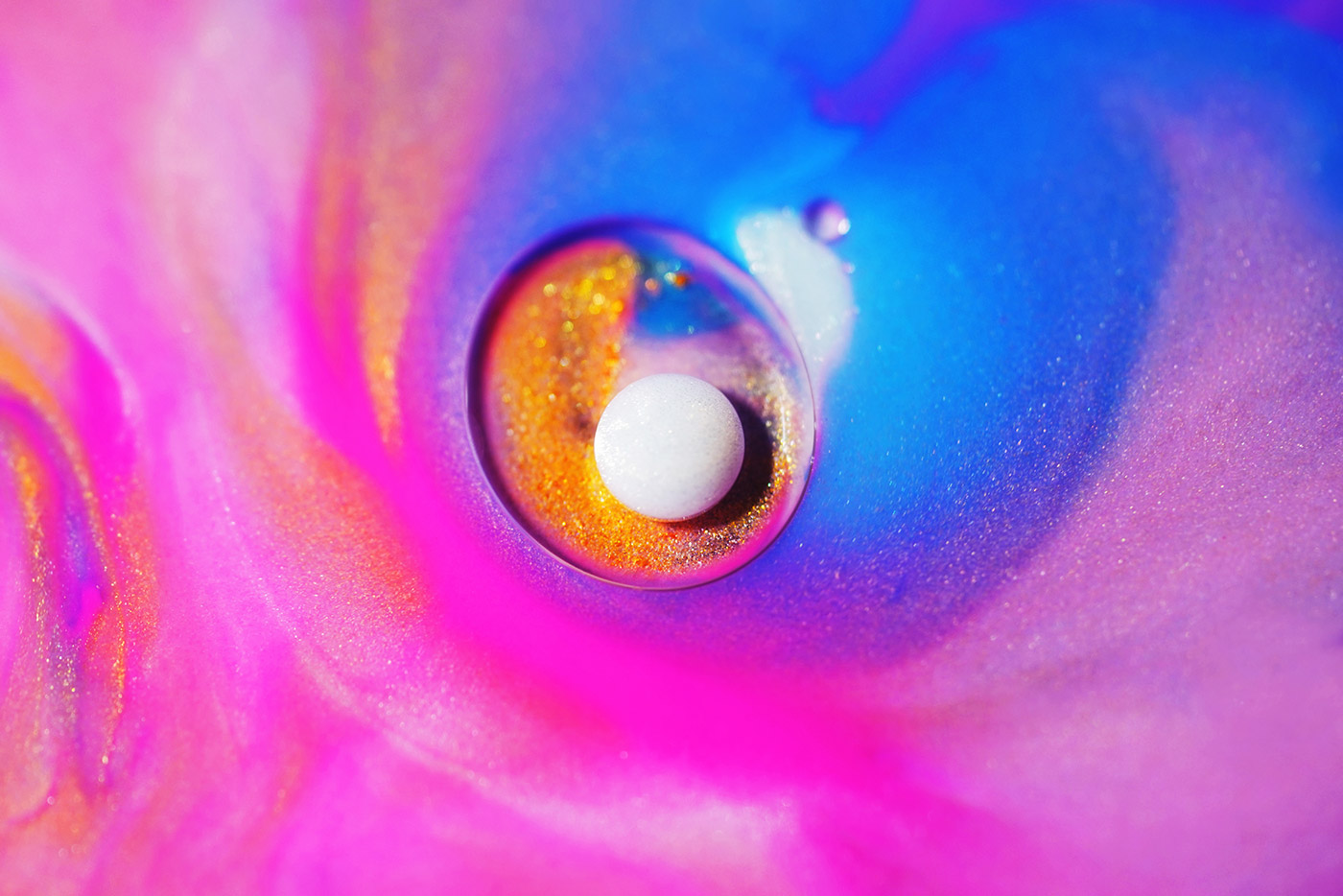
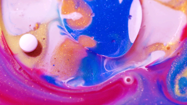
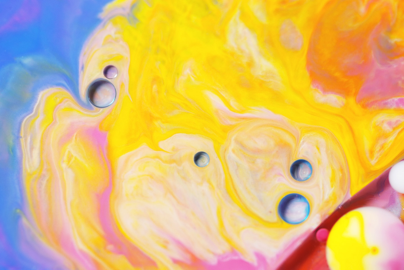
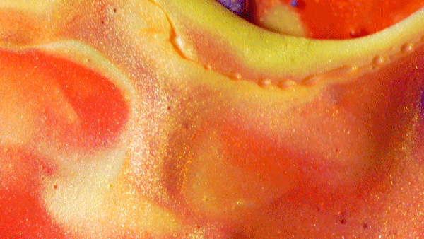
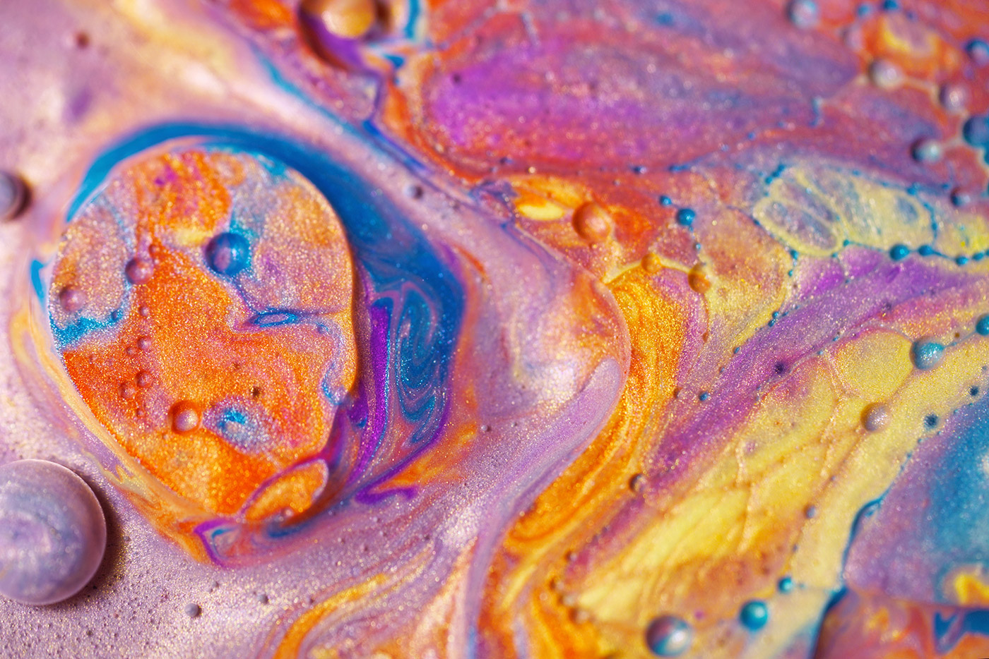
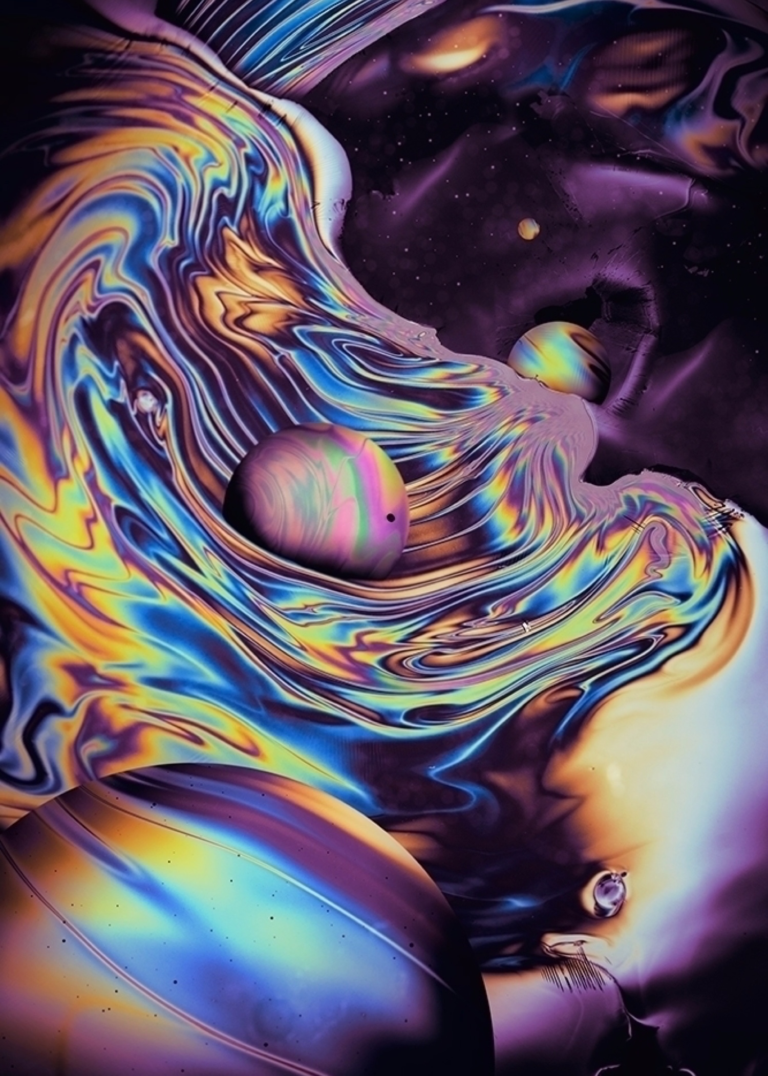
MAC Cosmetics approached talented "liquid designer" Ruslan Khasanov to create a unique and creative instagram content to highlight brand's lip color products


3rd Wave of Inspiration
Since 2003

MAC Cosmetics approached talented "liquid designer" Ruslan Khasanov to create a unique and creative instagram content to highlight brand's lip color products
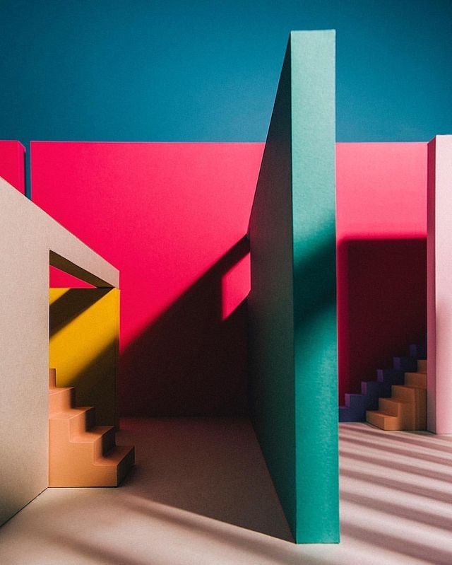
Venezuelan artist Raya (previously) and photographer Leo living and working in their studio in Barcelona. They were commissioned to create a new narrative with by Folch for Doiy Design - a joyful objects store in Barcelona too, with an aim to generate meaningful collaborations with diverse creatives. Inspired by the Mexican architects Luis Barragán and Ricardo Legorreta and Doiy’s recent Scala collection, together Raya and Leo created and filmed an artwork made entirely from paper that plays with textures, colours, clean cuts, light and perspectives.

Black and White
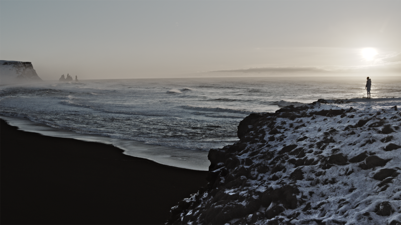
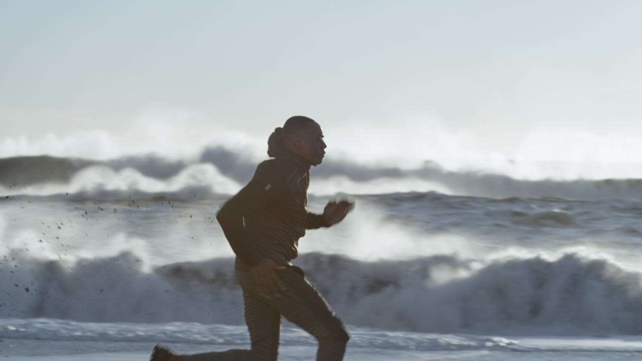
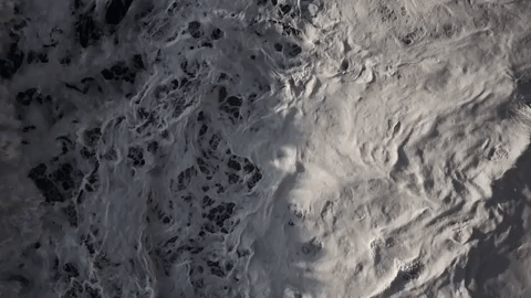
TRAUM INC
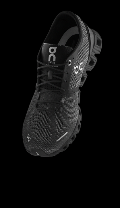

Shot in Iceland the film creates a world of black and white, brutalist and wild but technical, balancing sublime landscapes with technical closeups and 3D renderings of the shoe. The film pits a runner agains his alter ego, chasing each other until it comes to a final stand off between both.

DIRECTOR
Thomas Traum (TRAUM INC)
CREATIVE DIRECTION
Alex Griffin (On-Running), Thomas Traum
EDITING
Nikolaj Beltzer (OKAY Studio)
GRADING
Ludovic Roussaux (OKAY Studio)
DOP
Ruaraid Achilleos
1ST AC
Matthew Choules
TALENT
Kazeem Temiday
STYLIST
Erna Bergann
VFX
TRAUM INC (Safwaan Motara, Hayden Martin, Thomas Traum)
PRODUCTION
TRAUM INC


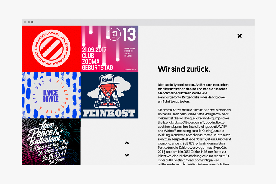
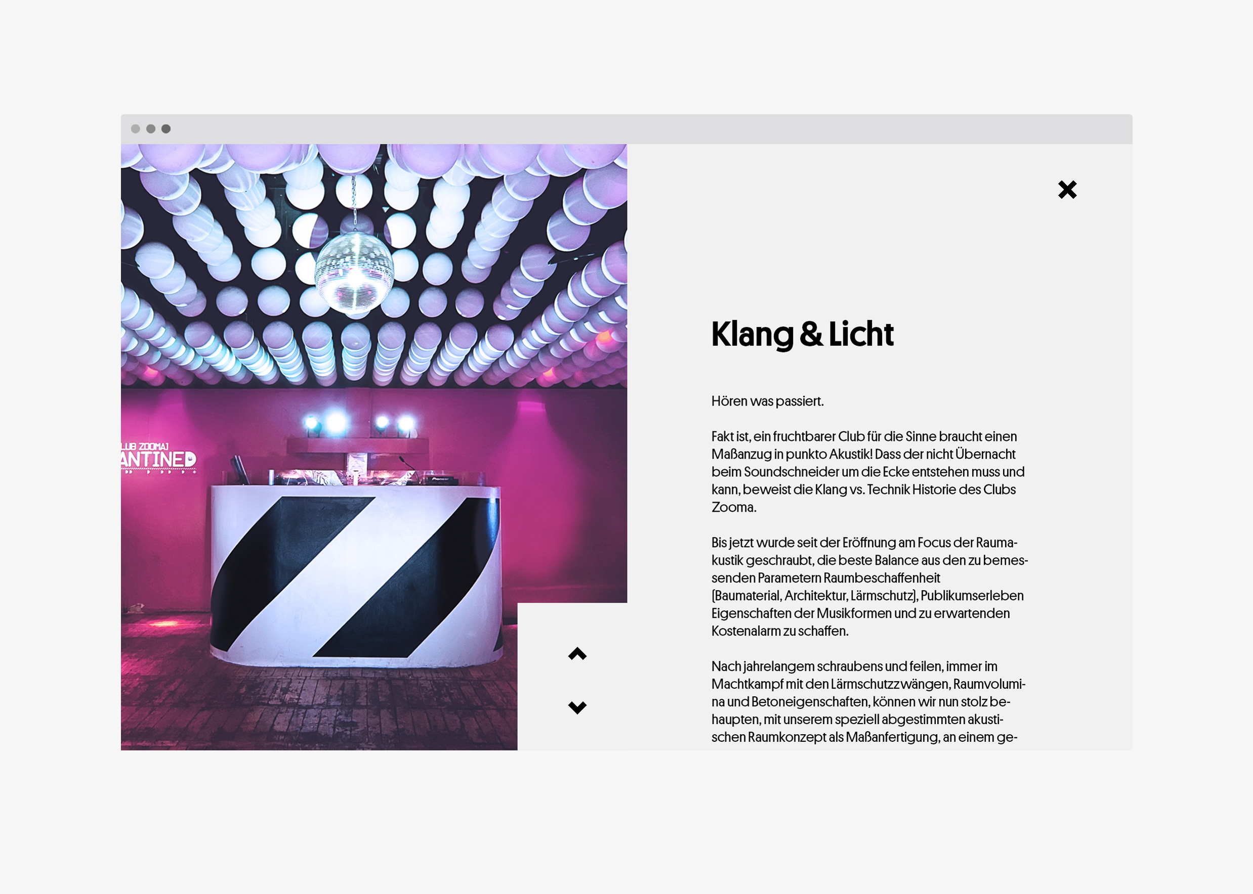
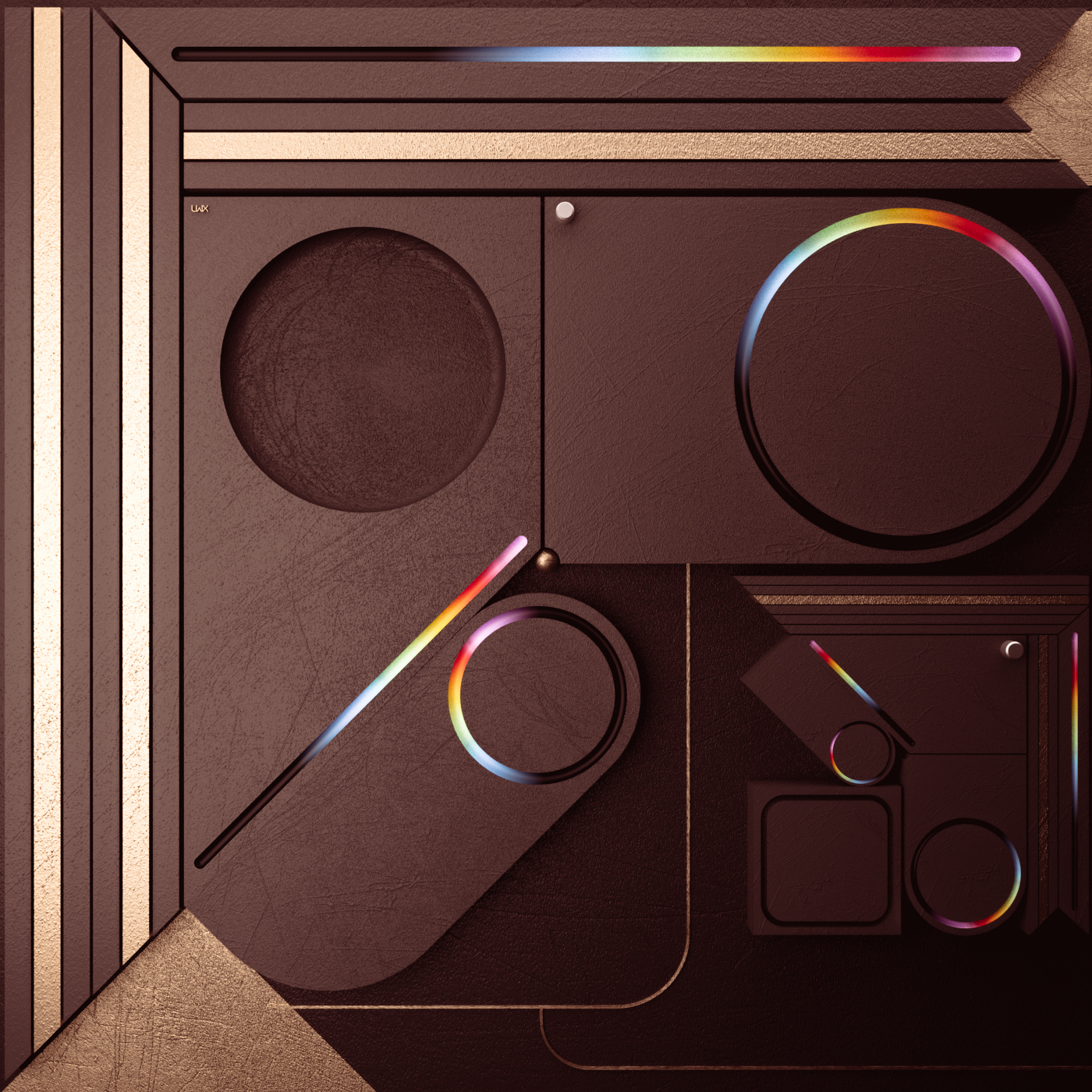
German Club Zooma approached graphic designer Ricky Korf to update their web identity. We personally liked his techno approach and simplicity of the layout

Ricky Korf is an award winning designer and art director, rooted in Leipzig Germany. Starting with graphic design in 2002. Flexibly working over the years from either the sleepy town in the countryside fields or from Hamburg, the gate to the world.
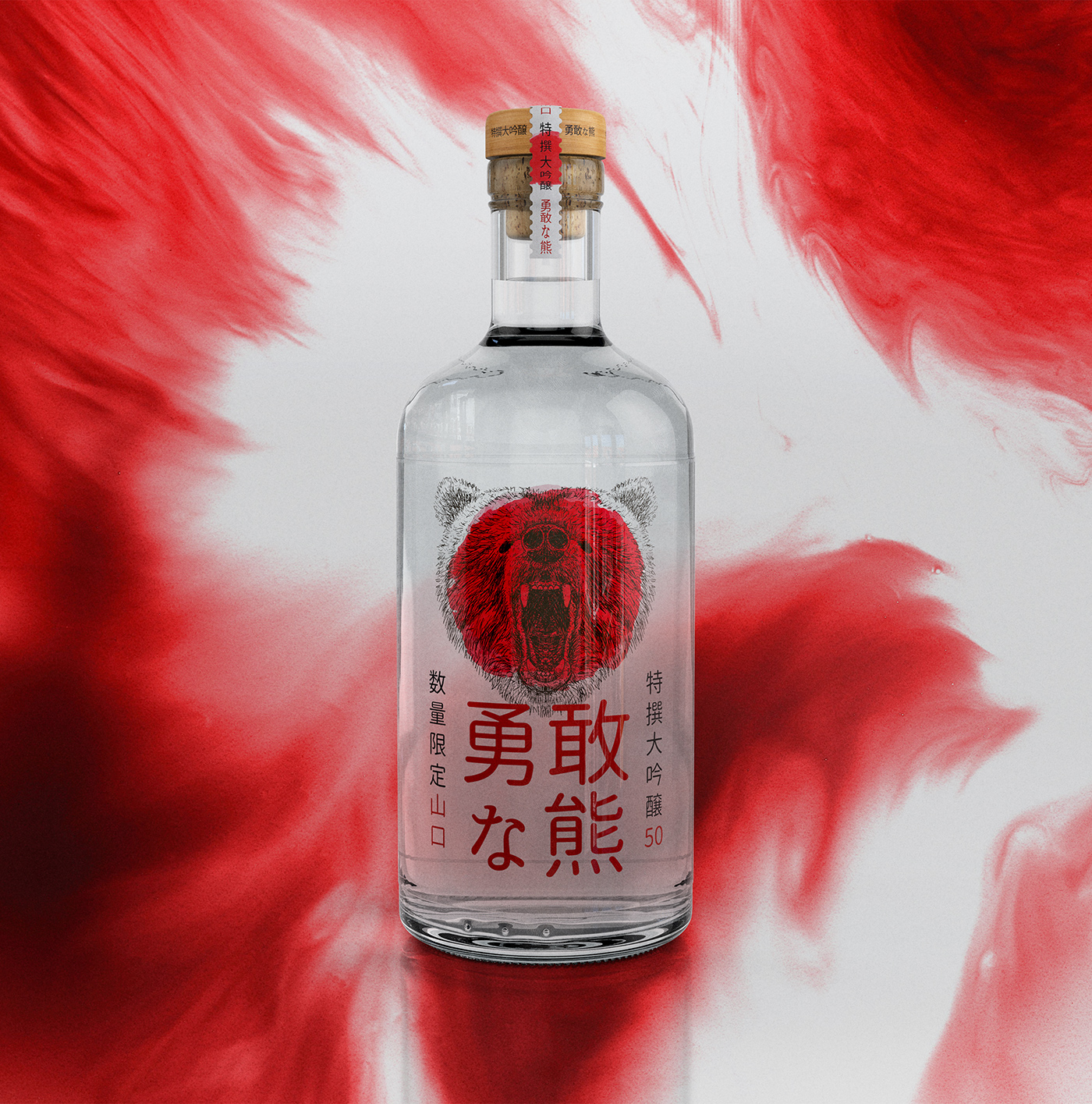
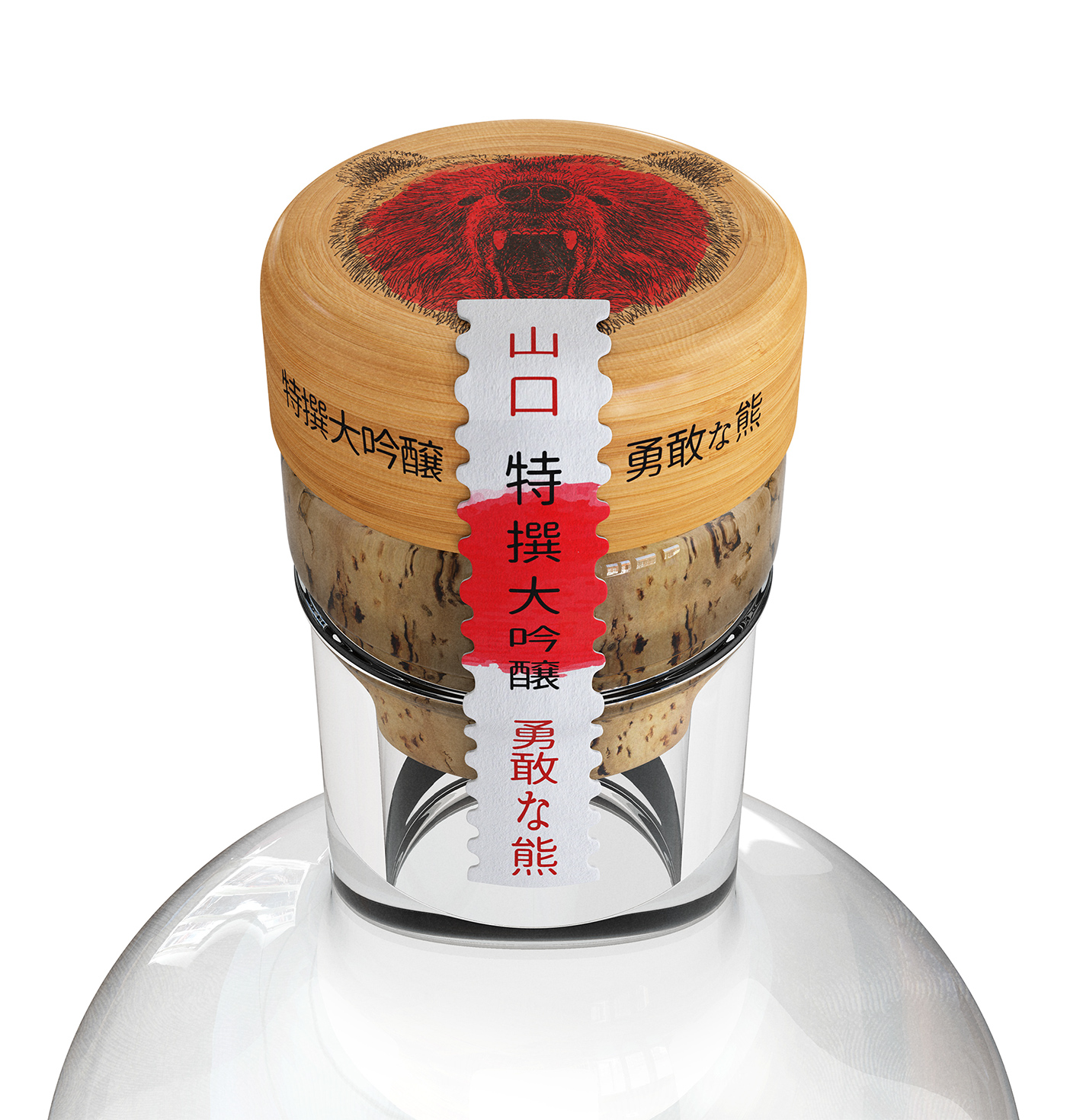
Creative Carbon is a creative studio specialized in branding, graphic design and CGI with clients around the world. Recently they finished a new packaging design for Japanes Sake brand "Brave Bear". Its special Junmai Daiginjo variety is the first product of its kind to incorporate a soft note of honey, providing a somewhat "wild" experience. The visual identity, packaging and communication exploit this unique feature of the product, further enhancing the experience.
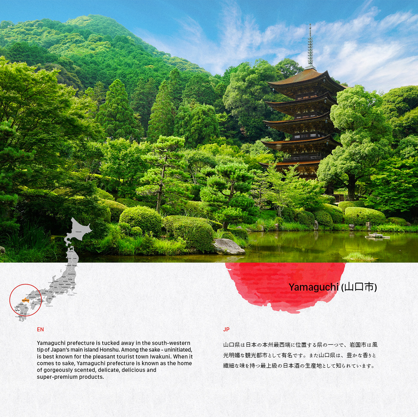
Yamaguchi prefecture is tucked away in the south-western tip of Japan’s main island Honshu. Among the sake - uninitiated, is best known for the pleasant tourist town Iwakuni. When it comes to sake, Yamaguchi prefecture is known as the home of gorgeously scented, delicate, delicious and super-premium products.

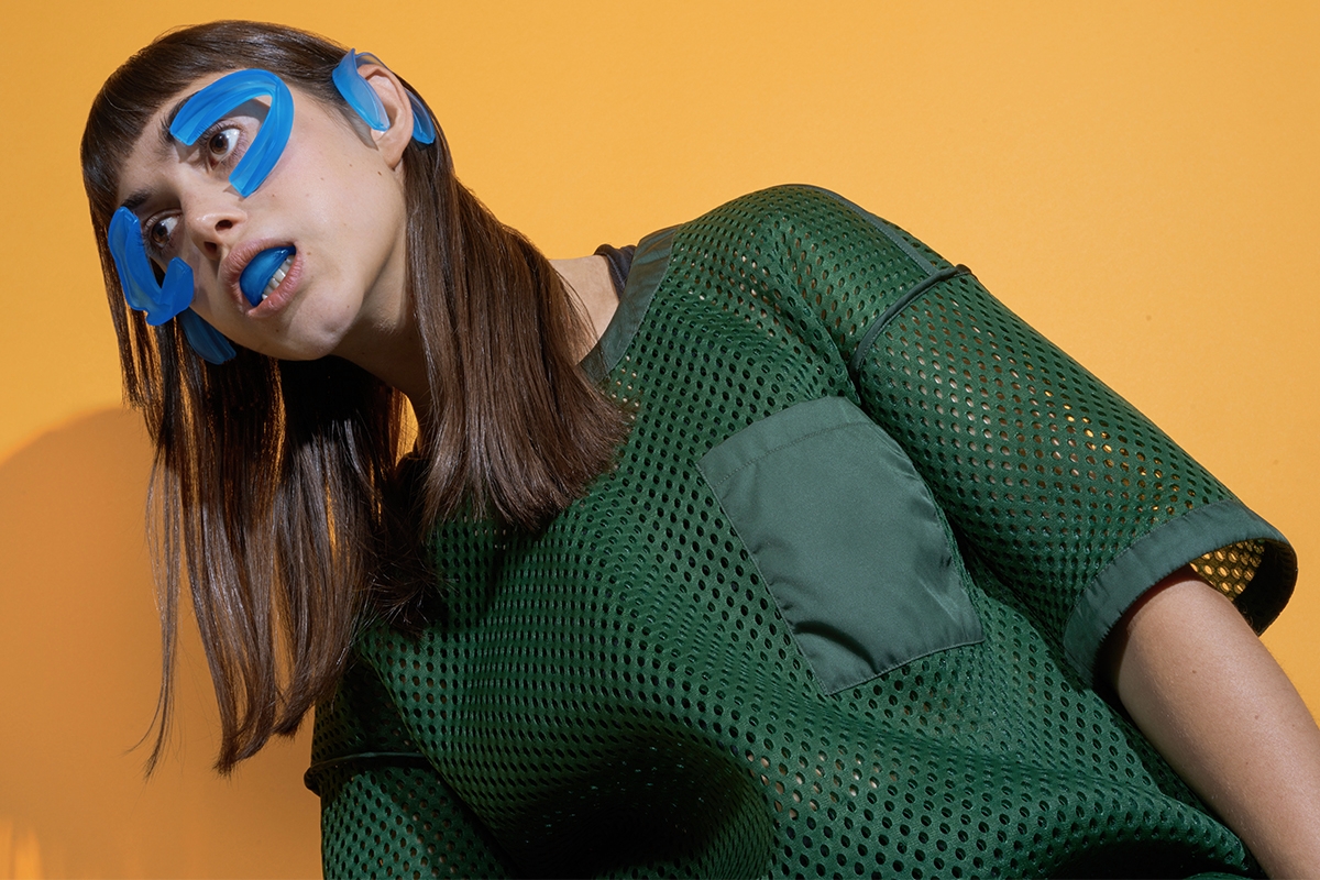
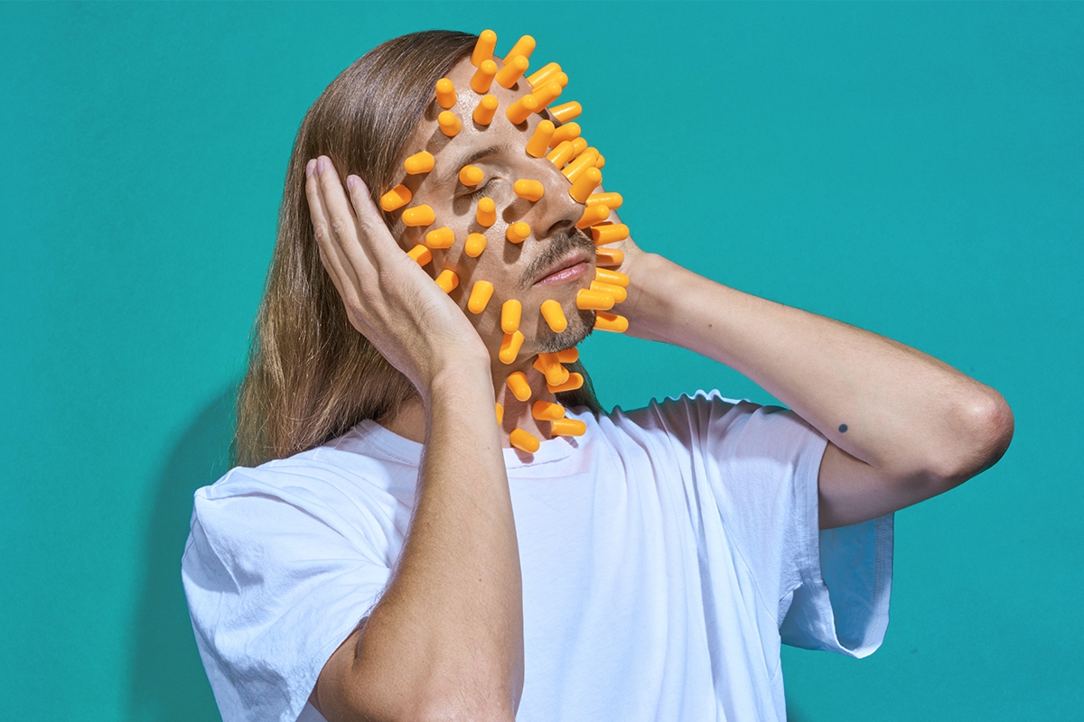
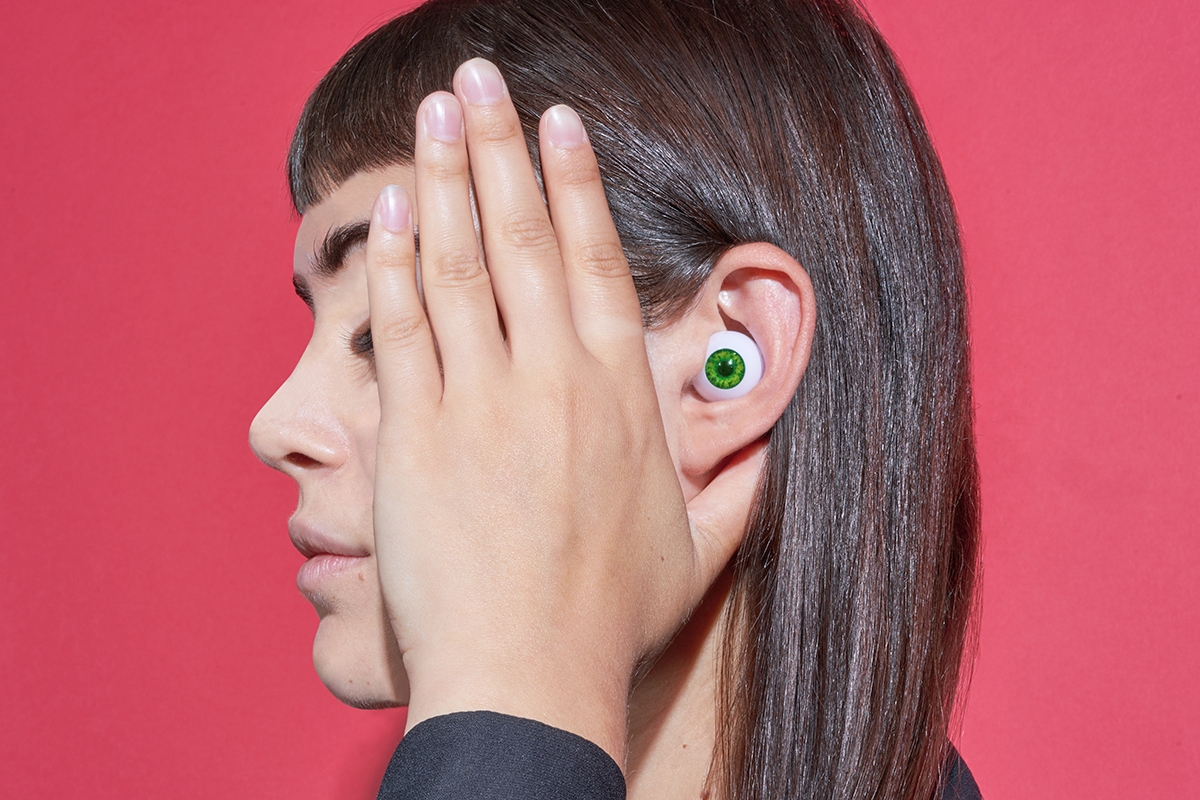
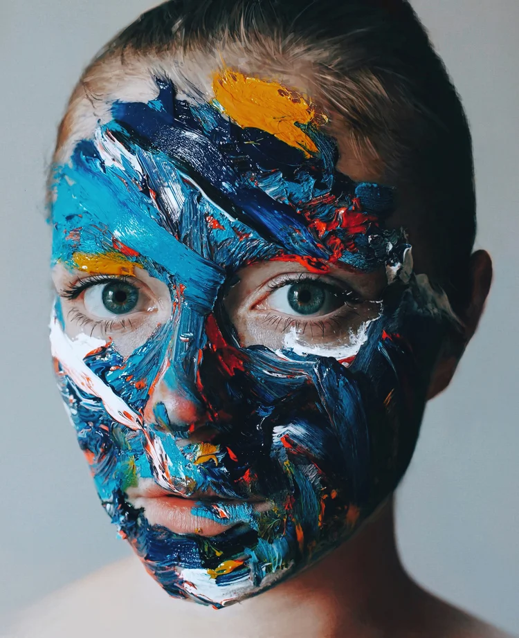
Young visual artist Lea Brisell creates creepy and fun anthropomorphic images that make you feel weird
Young designer Syddharth Mate released self initiated classroom project "Plastic Matters" what is an awareness campaign against plastic pollution. Also a satirical take on the plasticity of our society.
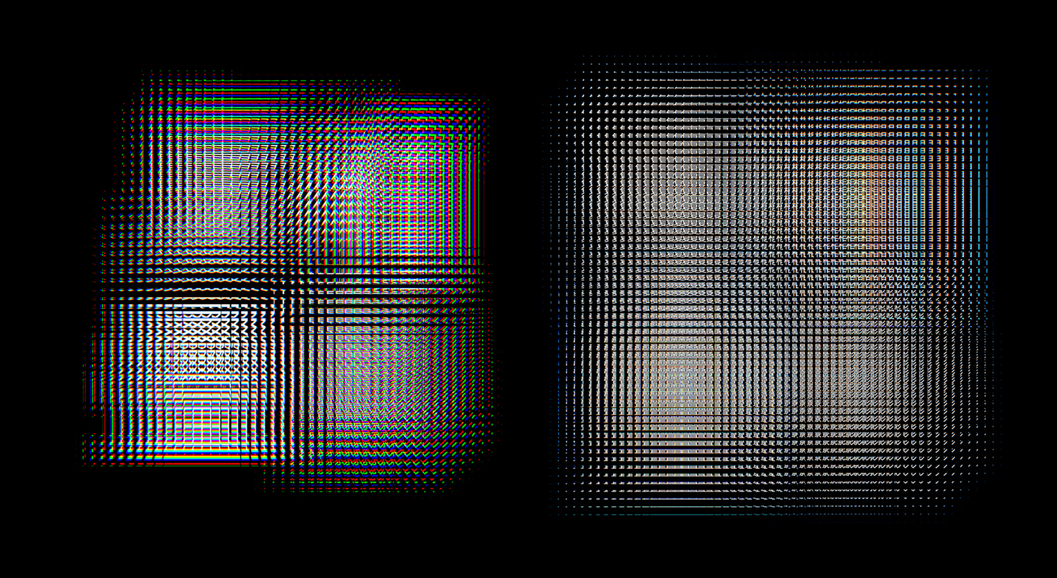
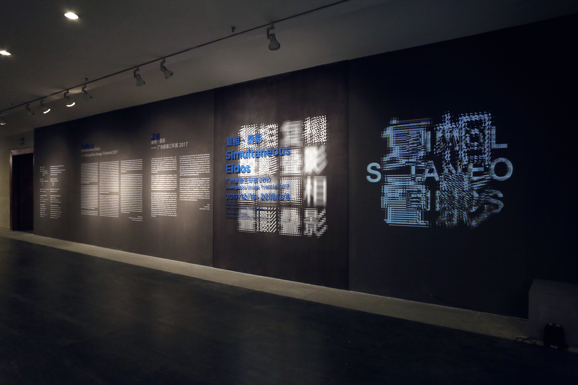
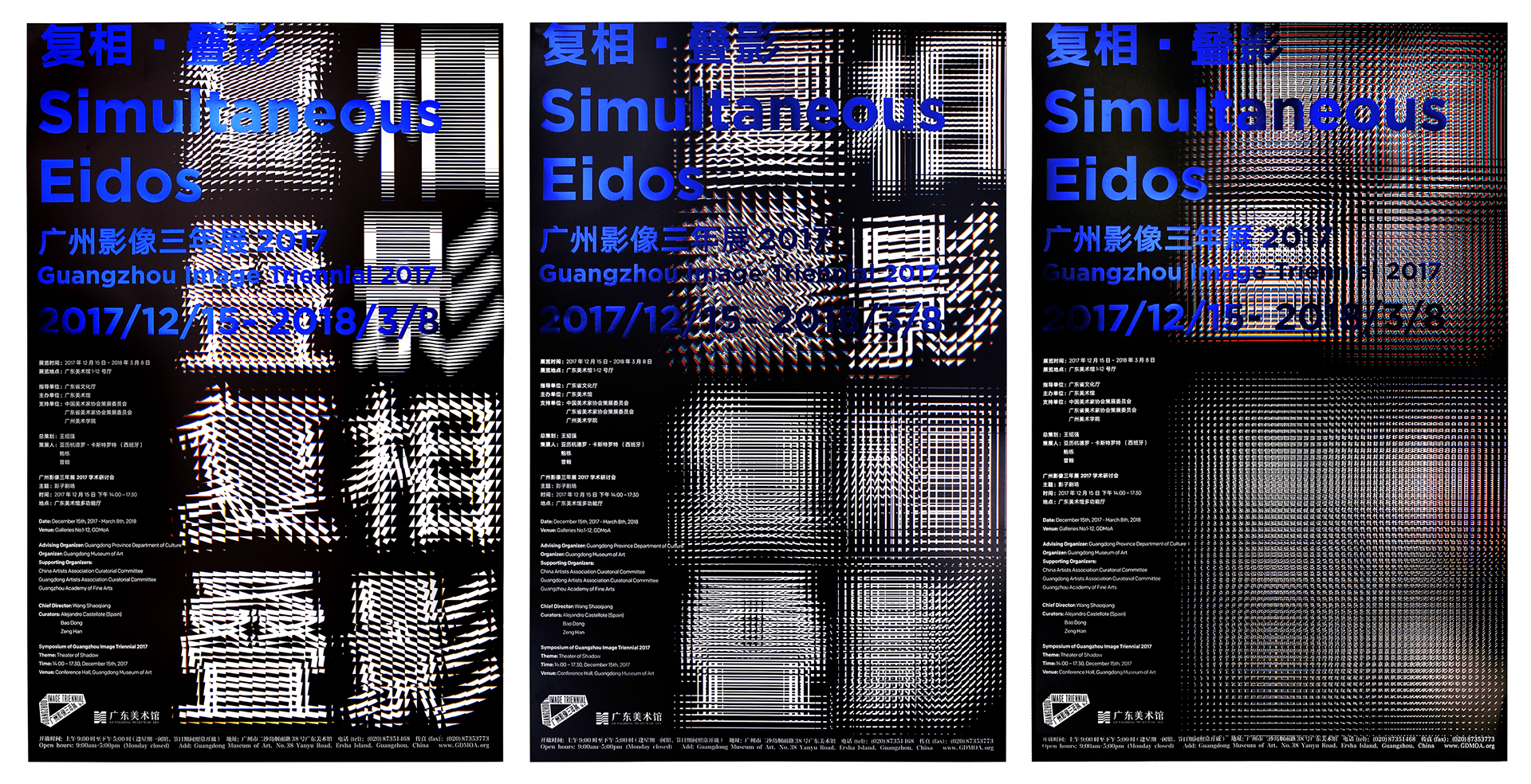
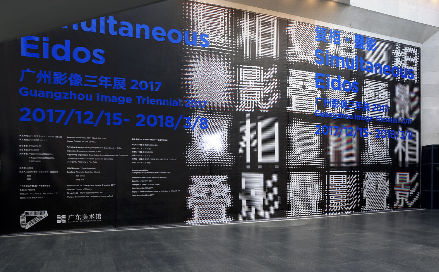
A Creative Lab another design delivered impressive identity for ongoing Triennial in Guangzhou merging visual language of Chinese typography with glitch aesthetics of modern technology

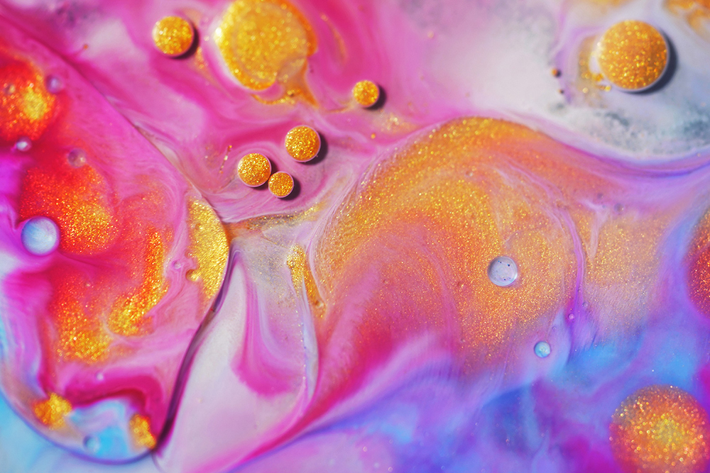
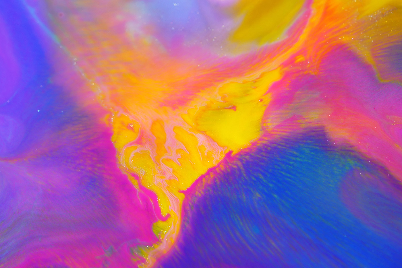
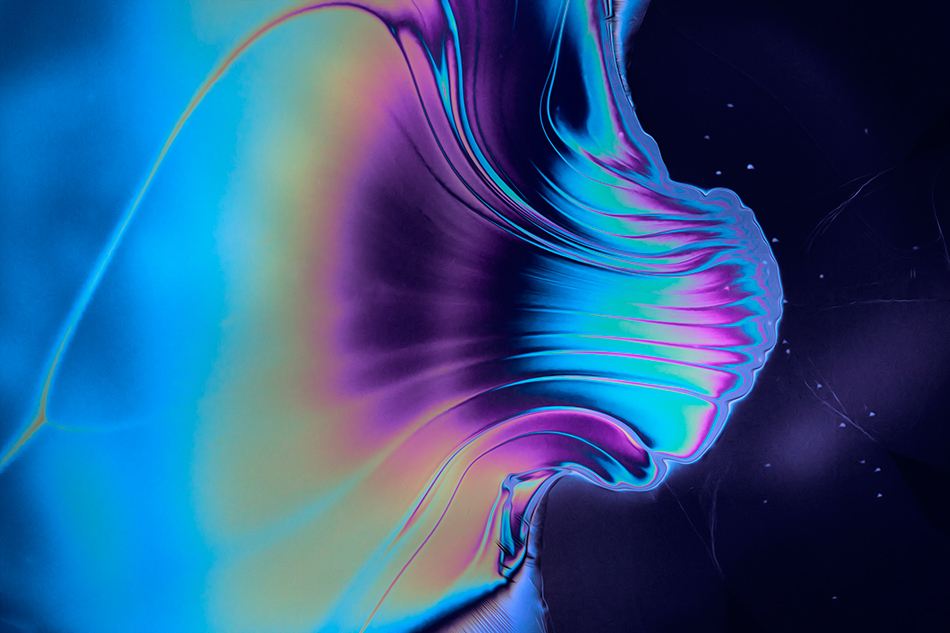
Davy Evans (@davyevans) is a multidisciplinary artist and designer based in Brighton. With a background in graphic design, Evans fuses analogue and digital techniques to create ethereal abstract imagery. He uses experimental photographic methods, combined with light and liquid to replicate colour, form, and distortions, inspired by those found in the natural world.
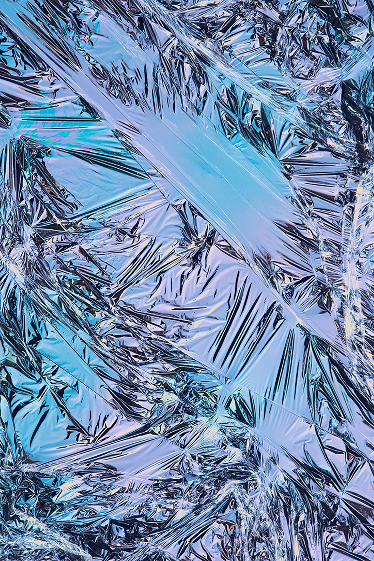
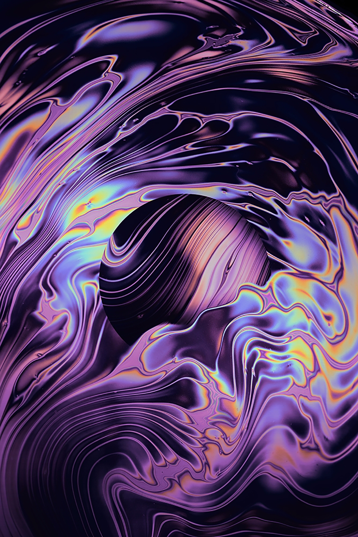
Davy was the winner of Ello x Designcollector contest that had selected 10 winners for "Digital Decade 5: Cyberia" exhibition in London last year.
Collaboration with Apple

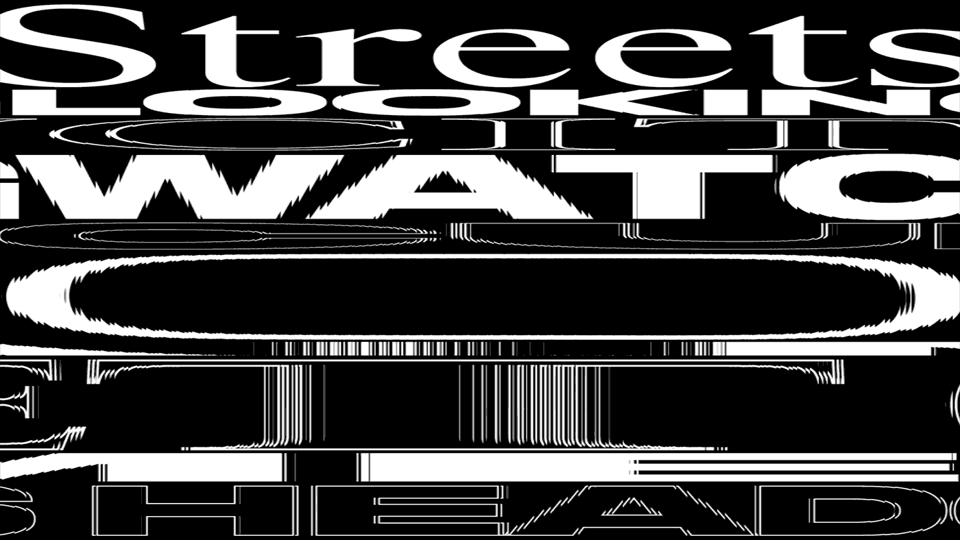
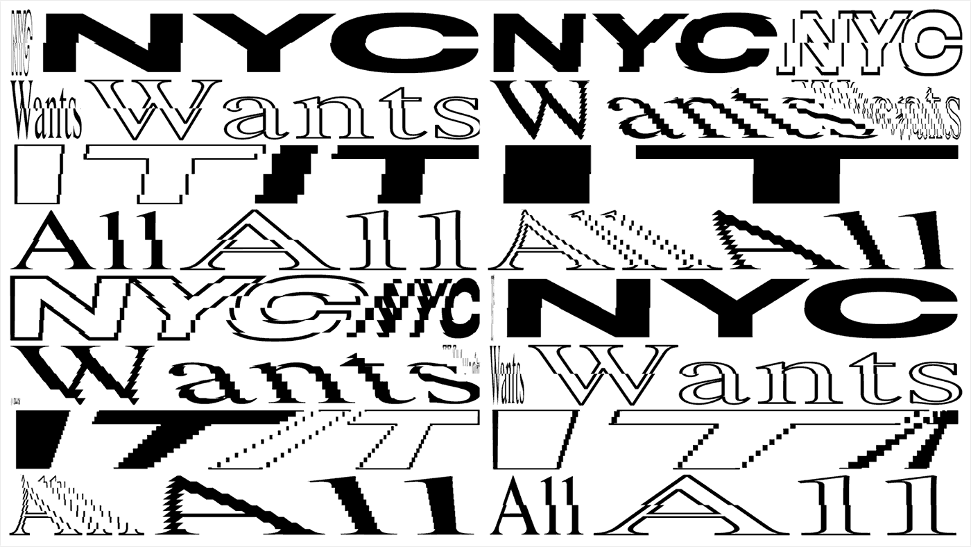
Design studio now better known for their kinetic typography experiments recently did a motion identity for Nike Statement House in NYC


"We started out by creating the identity with the hashtag as the initiative logo and colors and typography. After that we used groceries from the different categories of Ecological, Swedish, Vegetarian and Frozen and created headlines to be used in the campaign as well as printed material. The end result was very appreciated and the initiative is still as important and current as ever. We still need to change our behavior for a sustainable future."
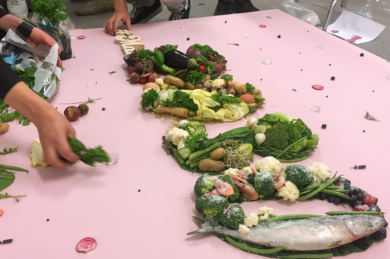
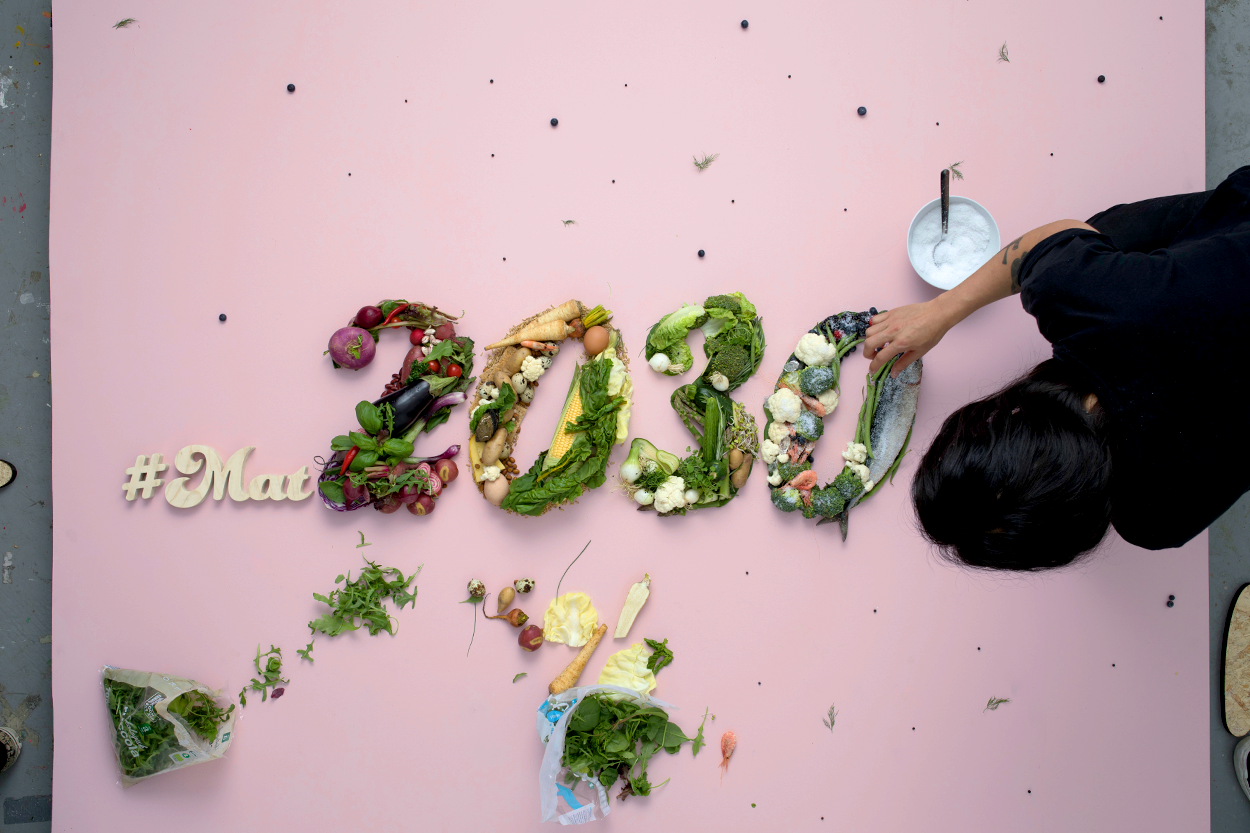
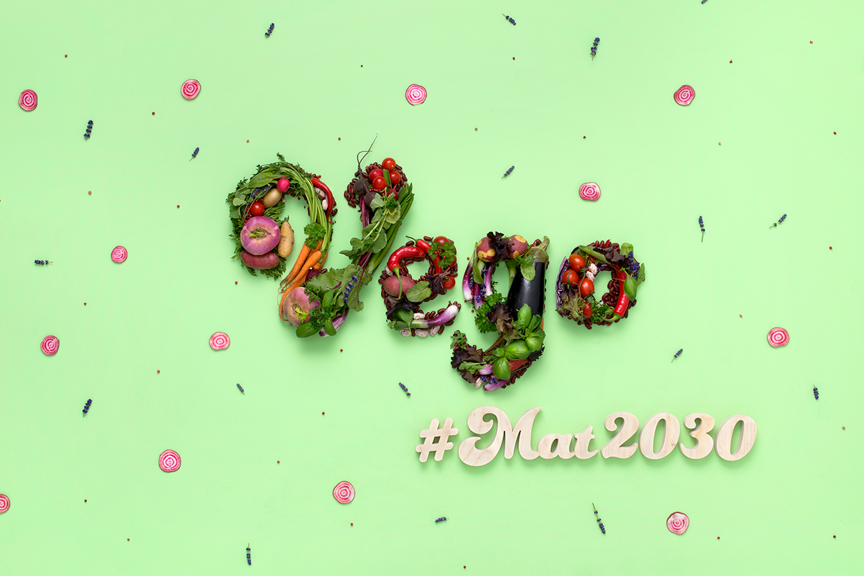
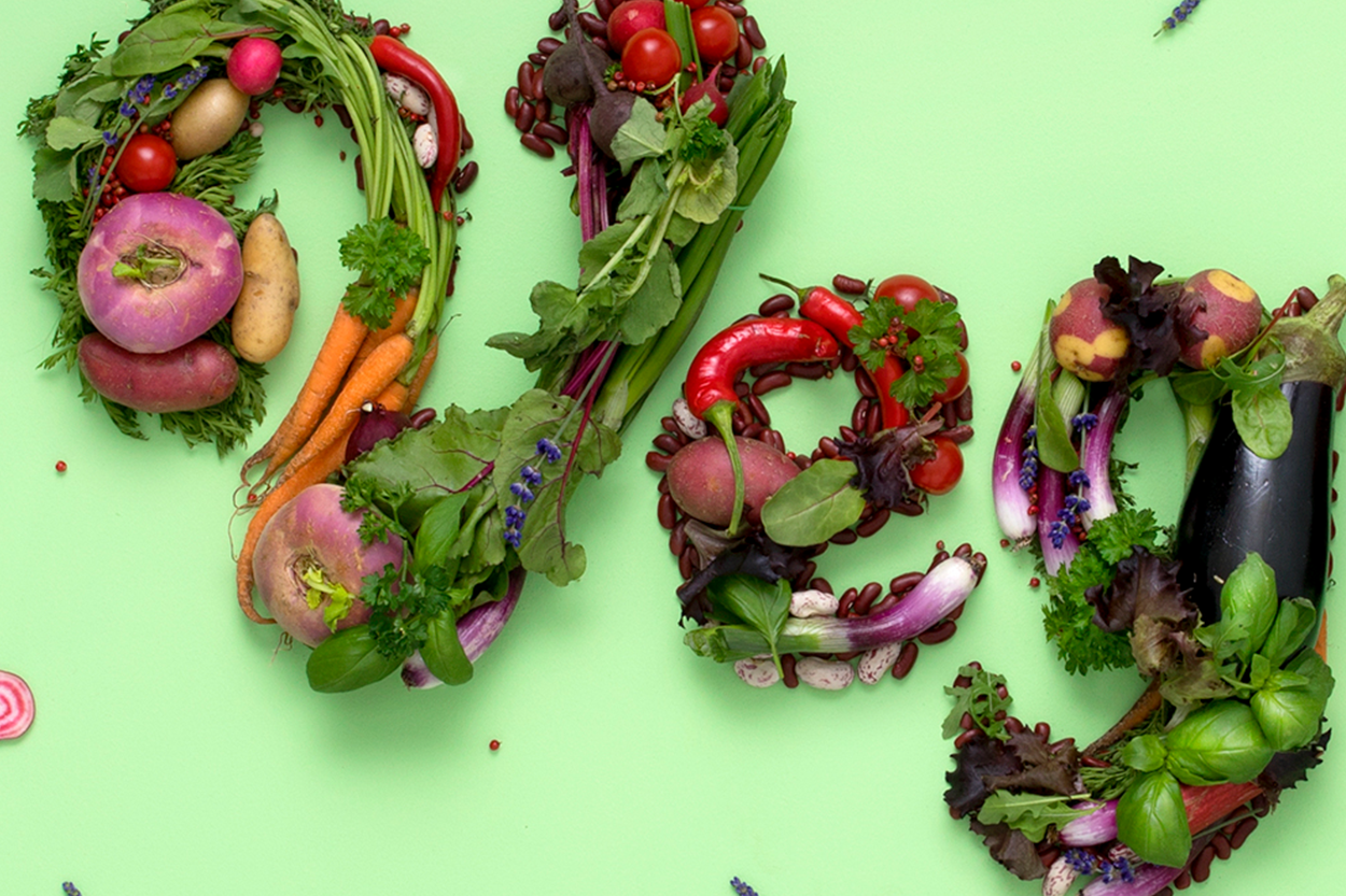
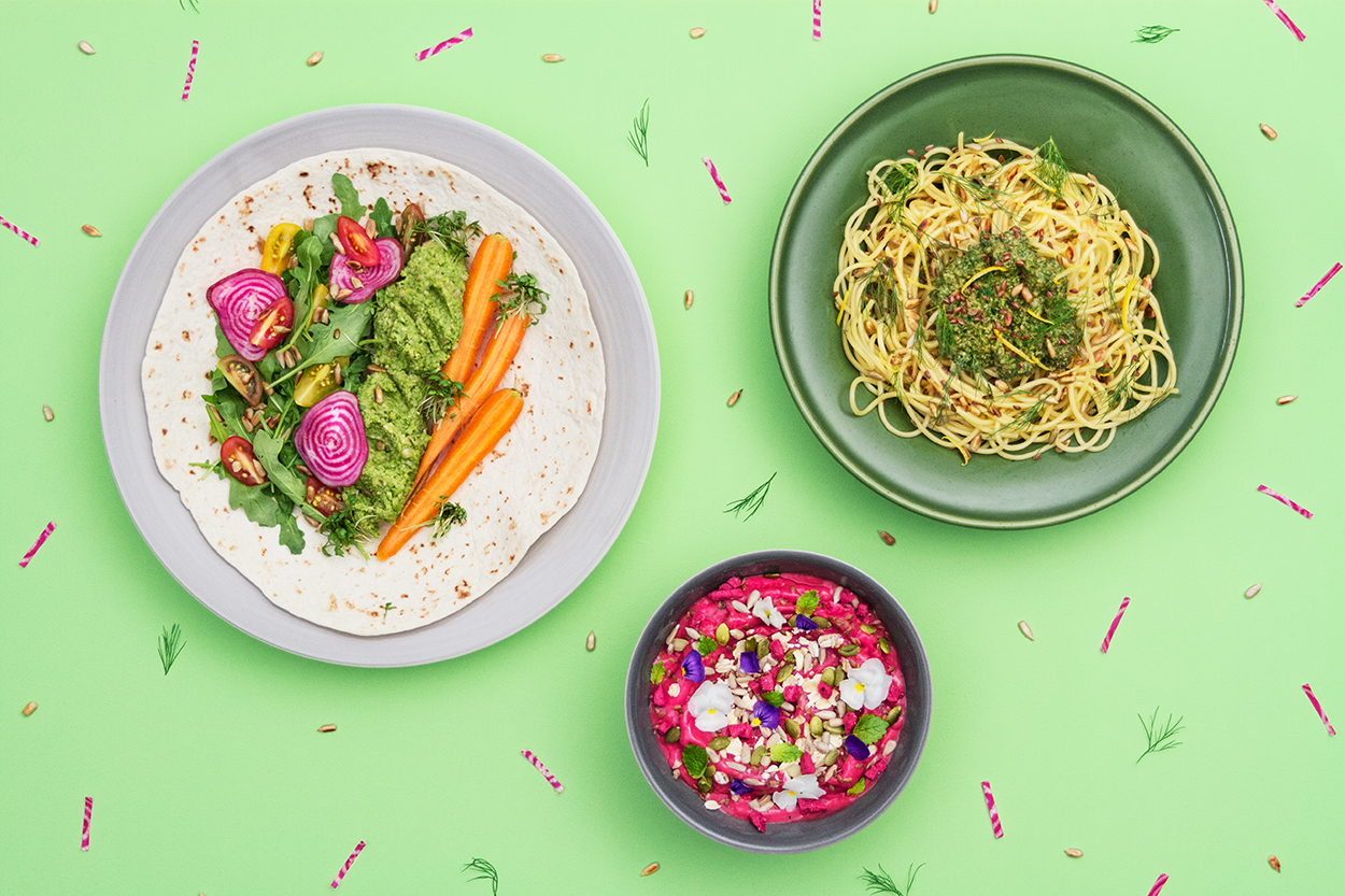
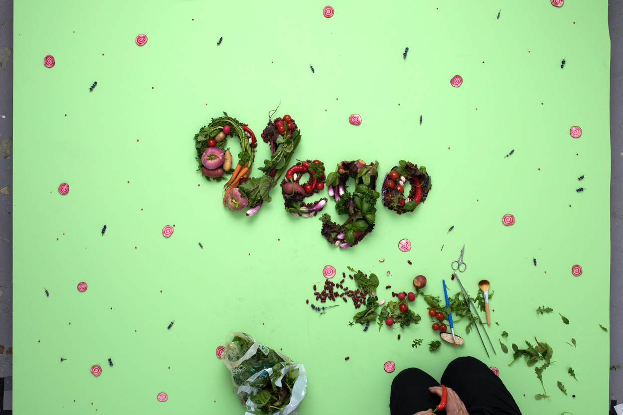
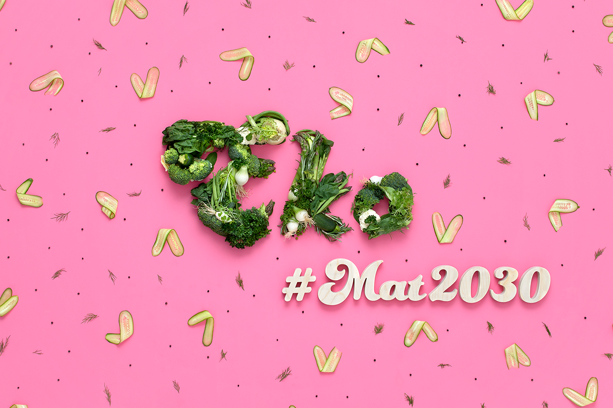
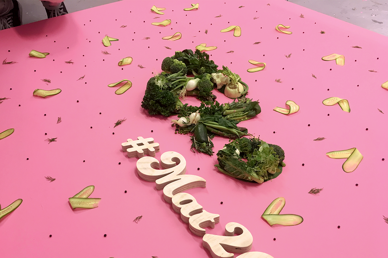
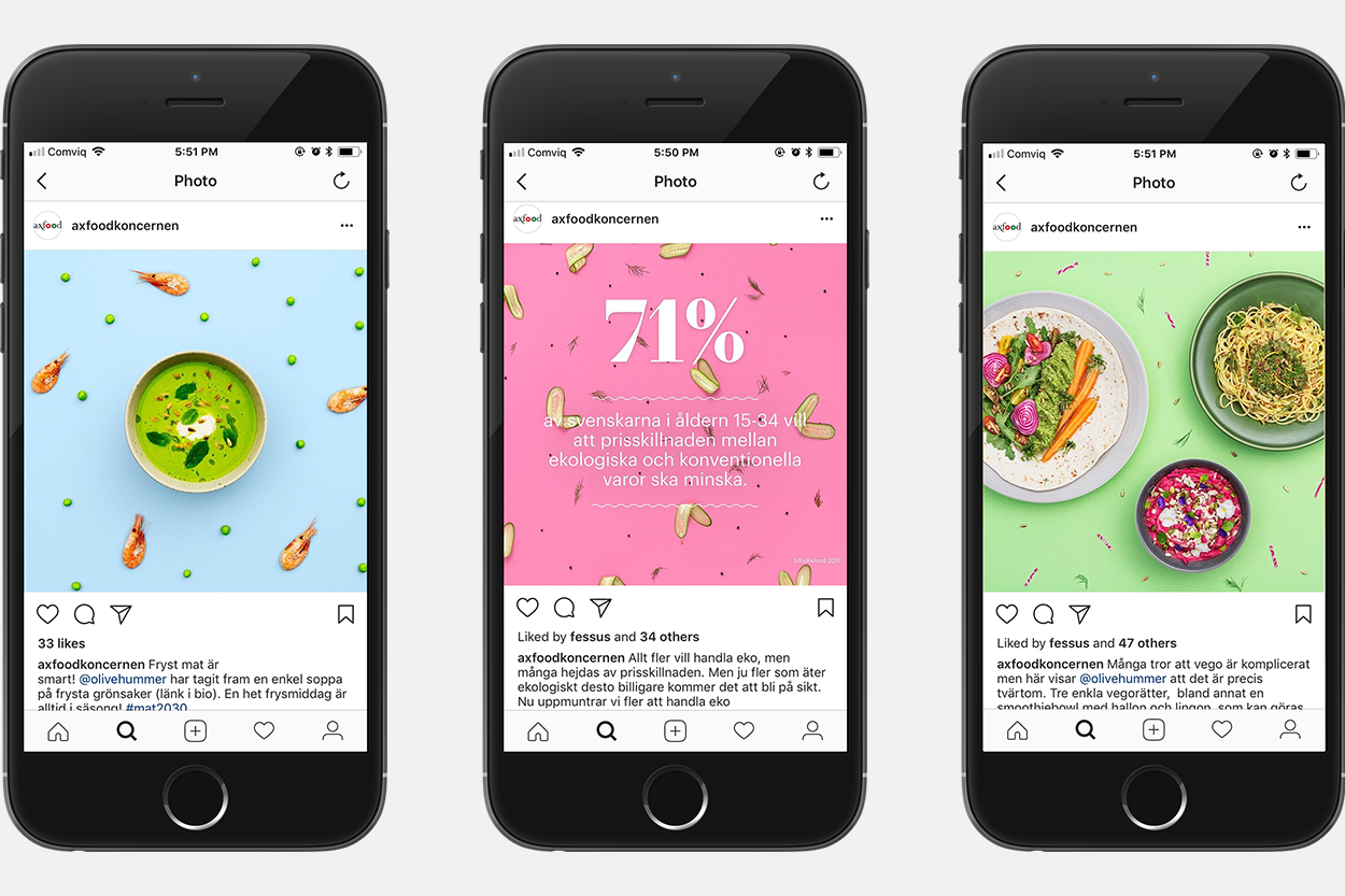
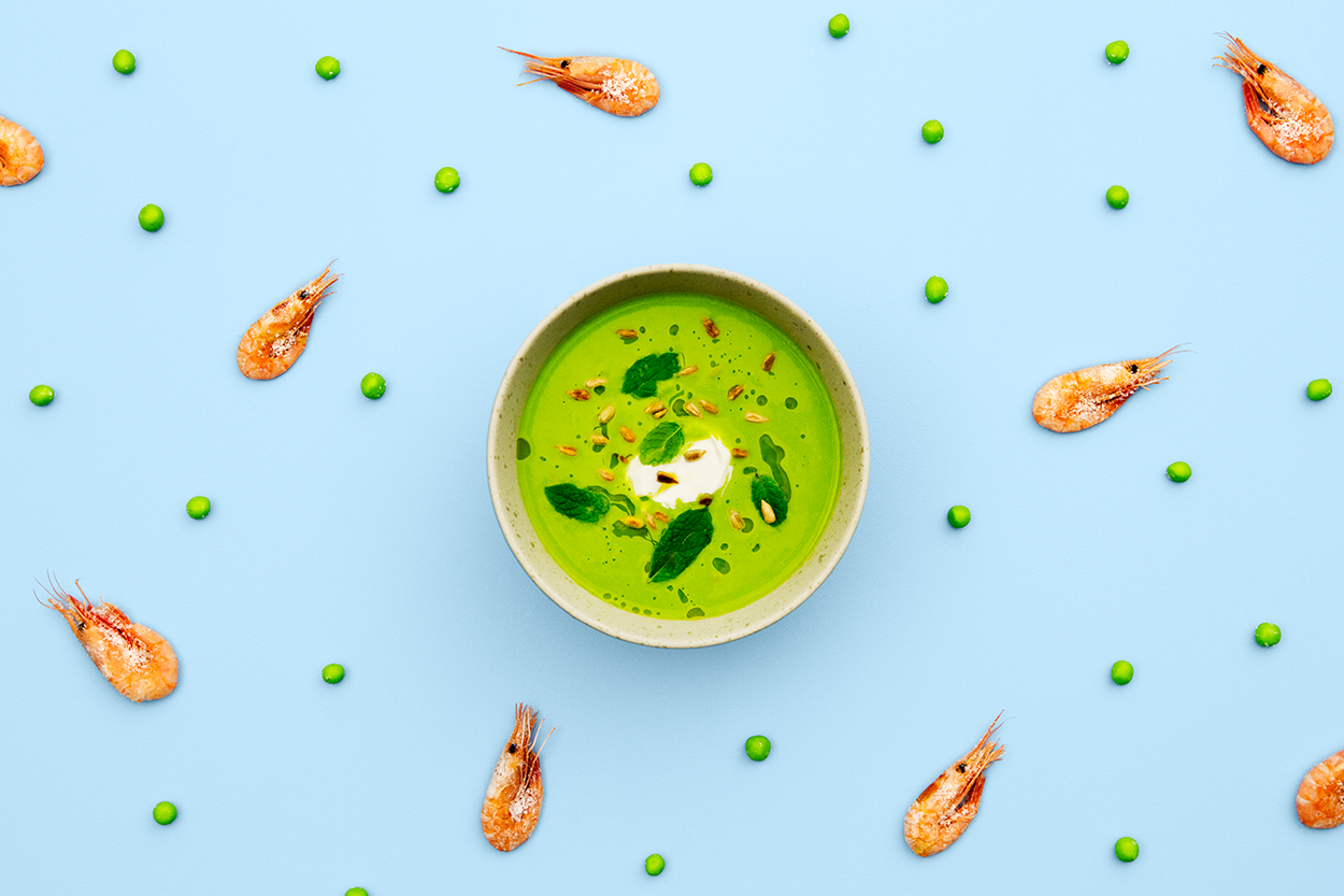
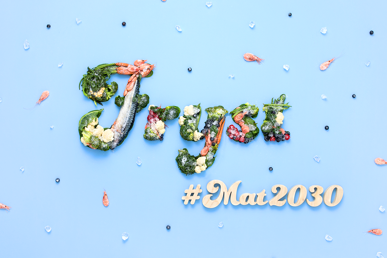
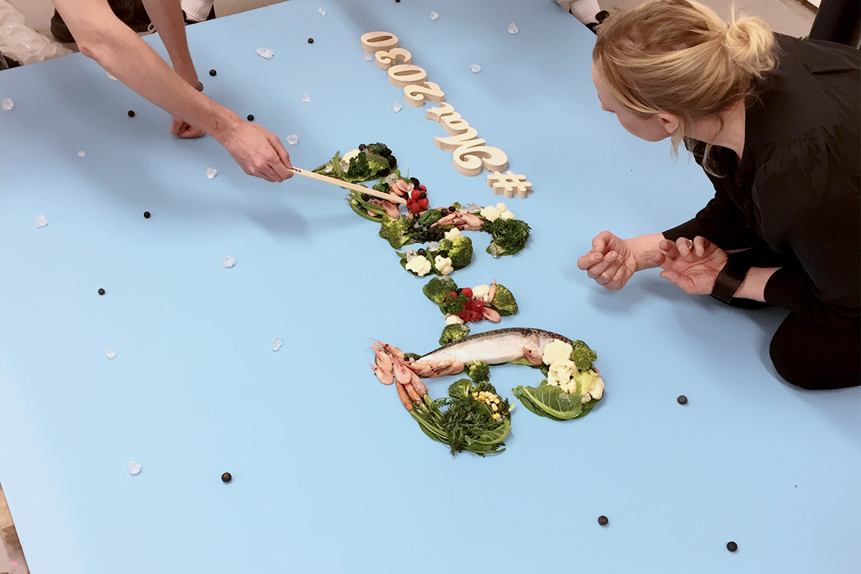
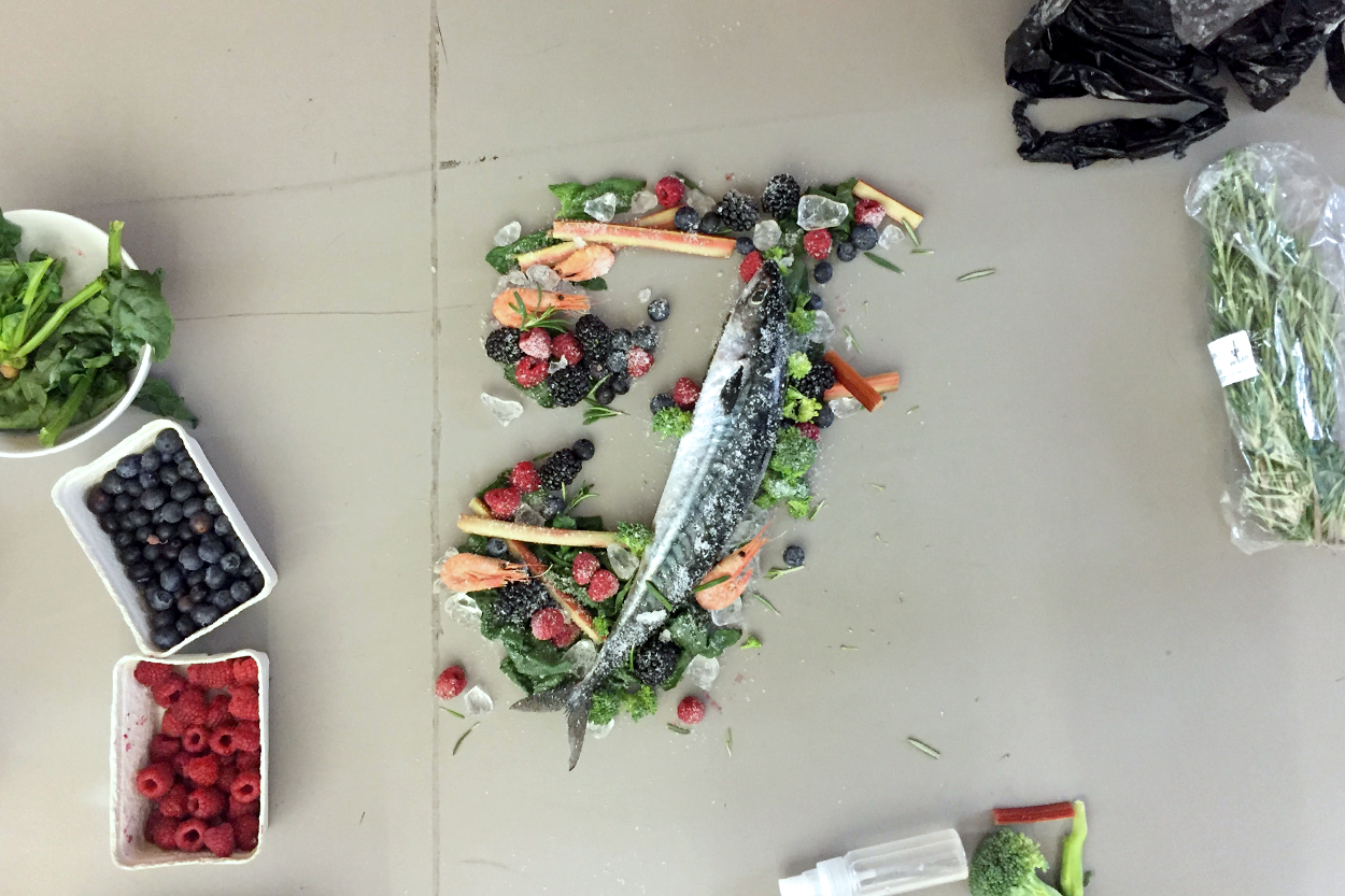
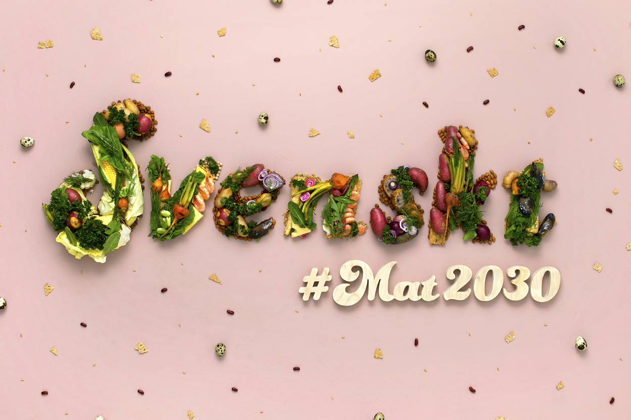
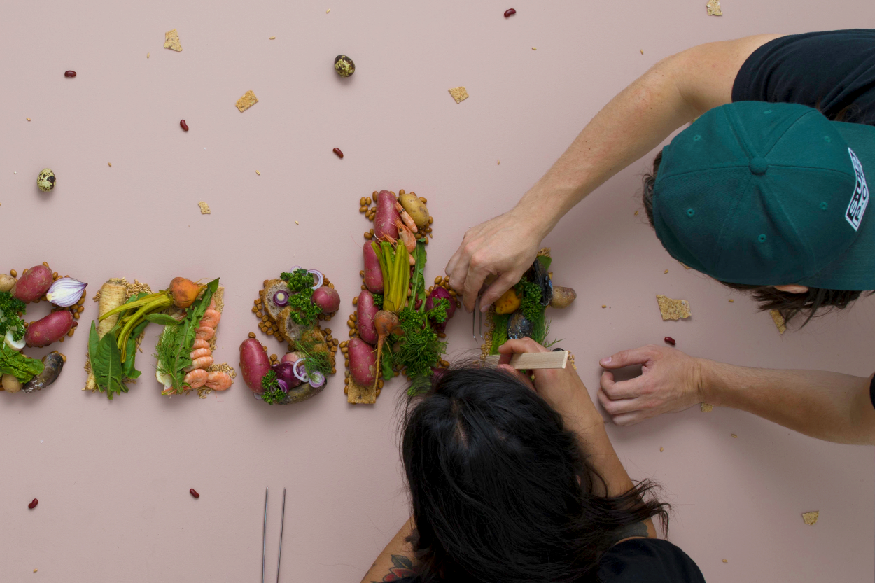
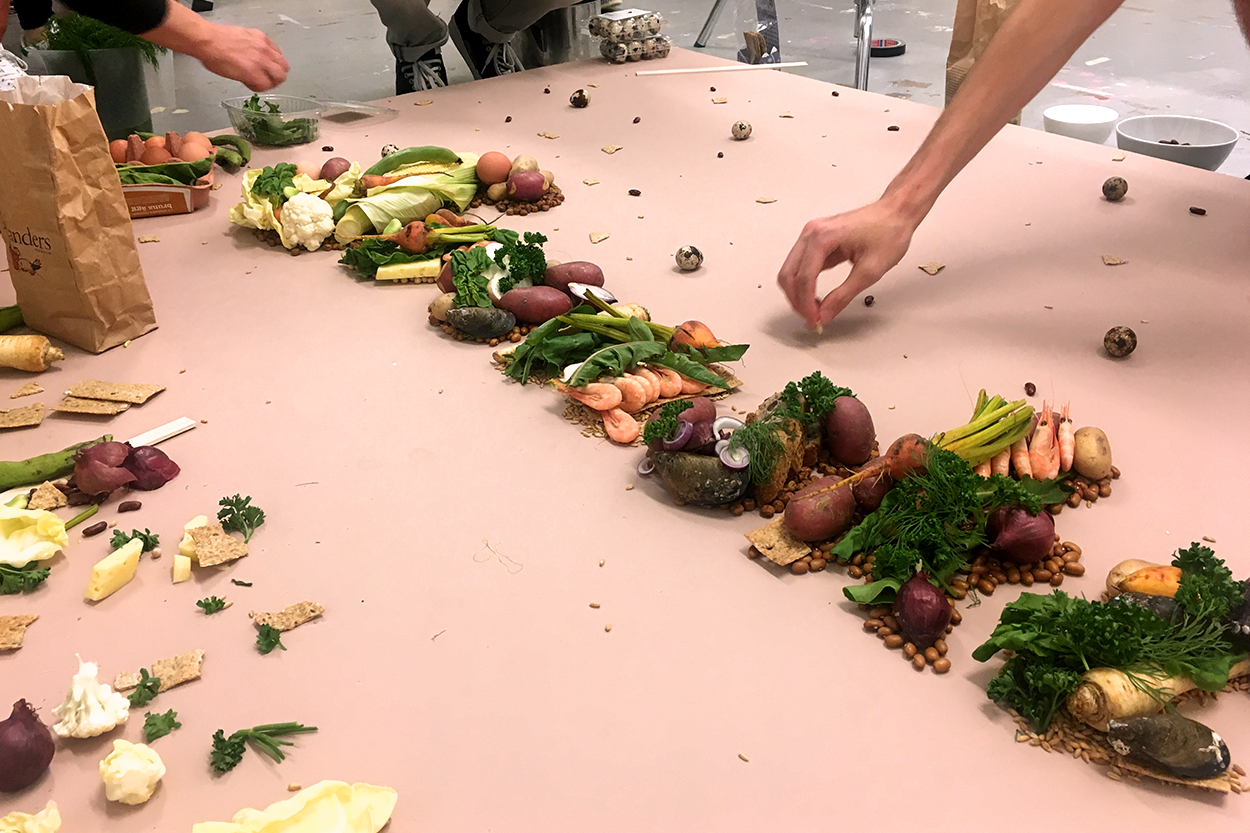
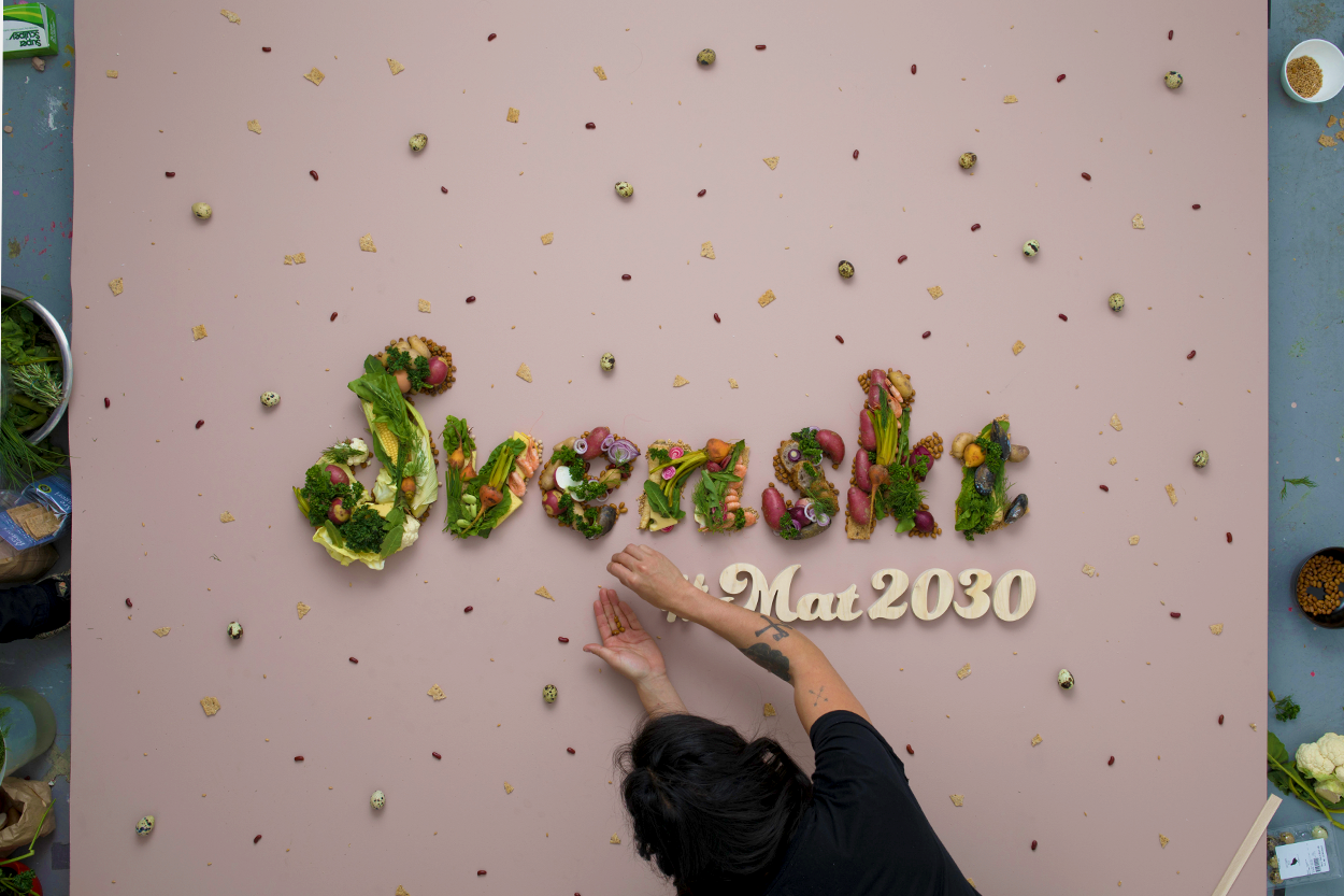
Photography by Mattias Lindbäck
Food styling by Ylva Bergqvist
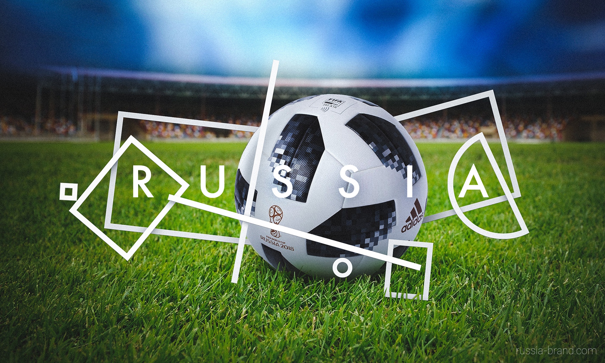
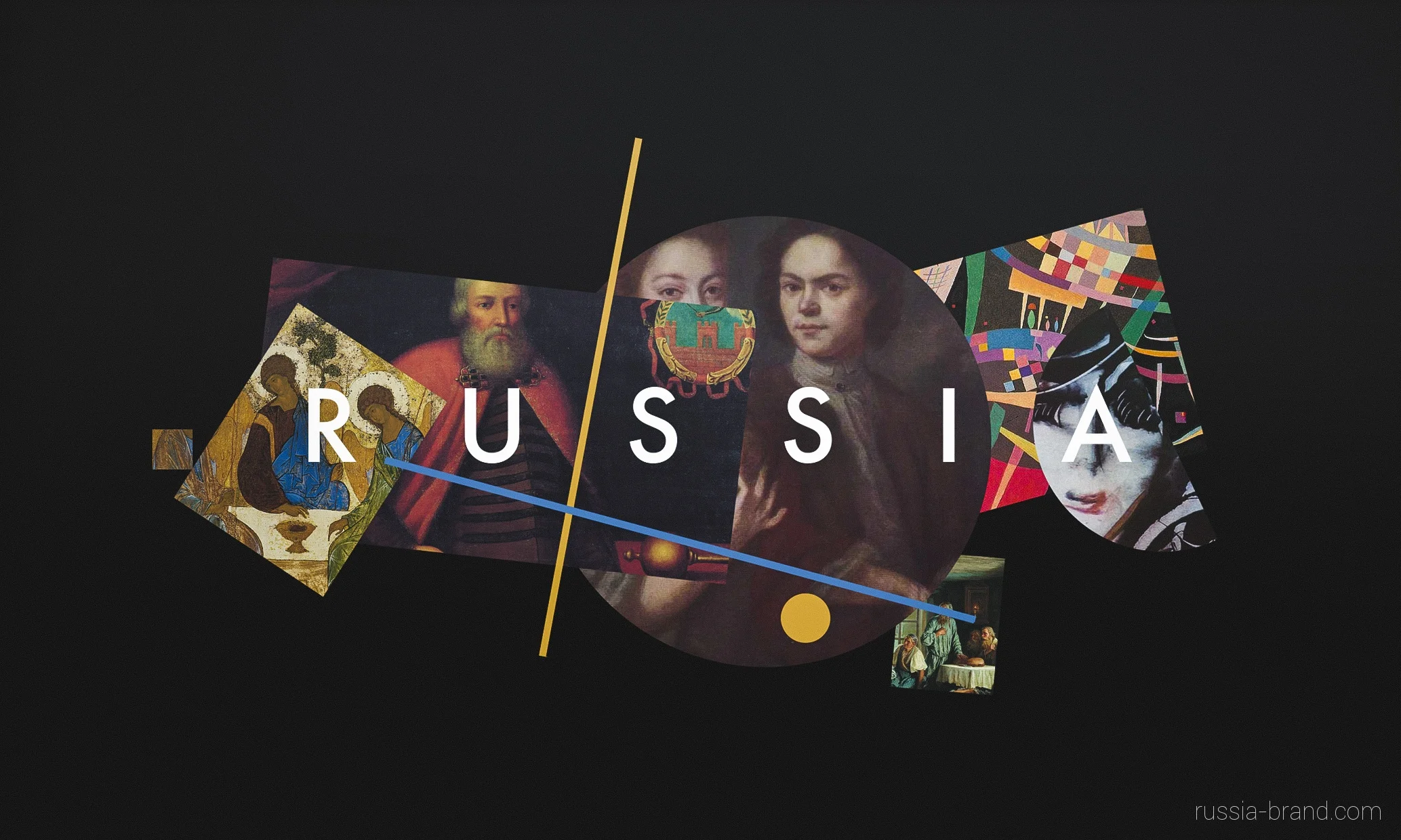
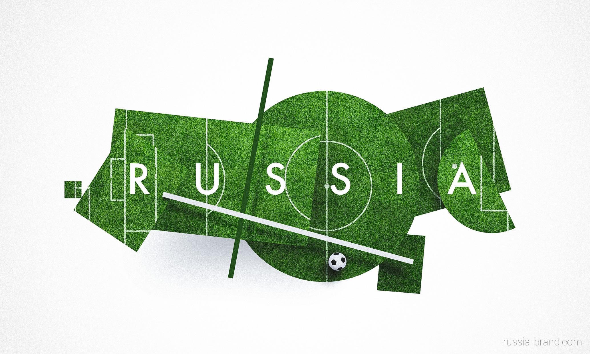
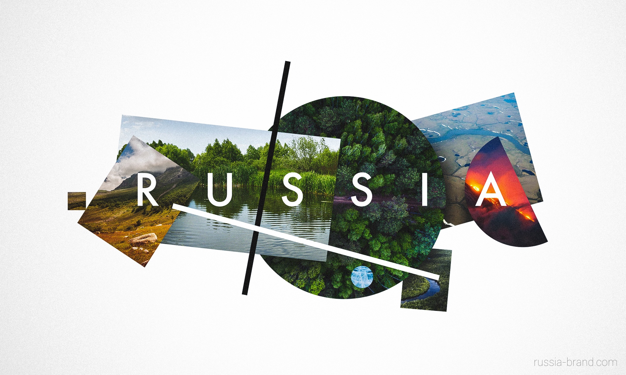
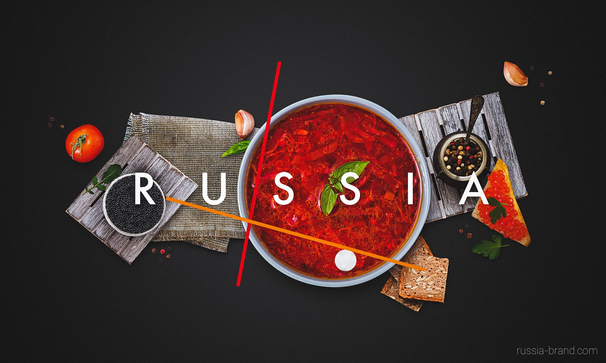
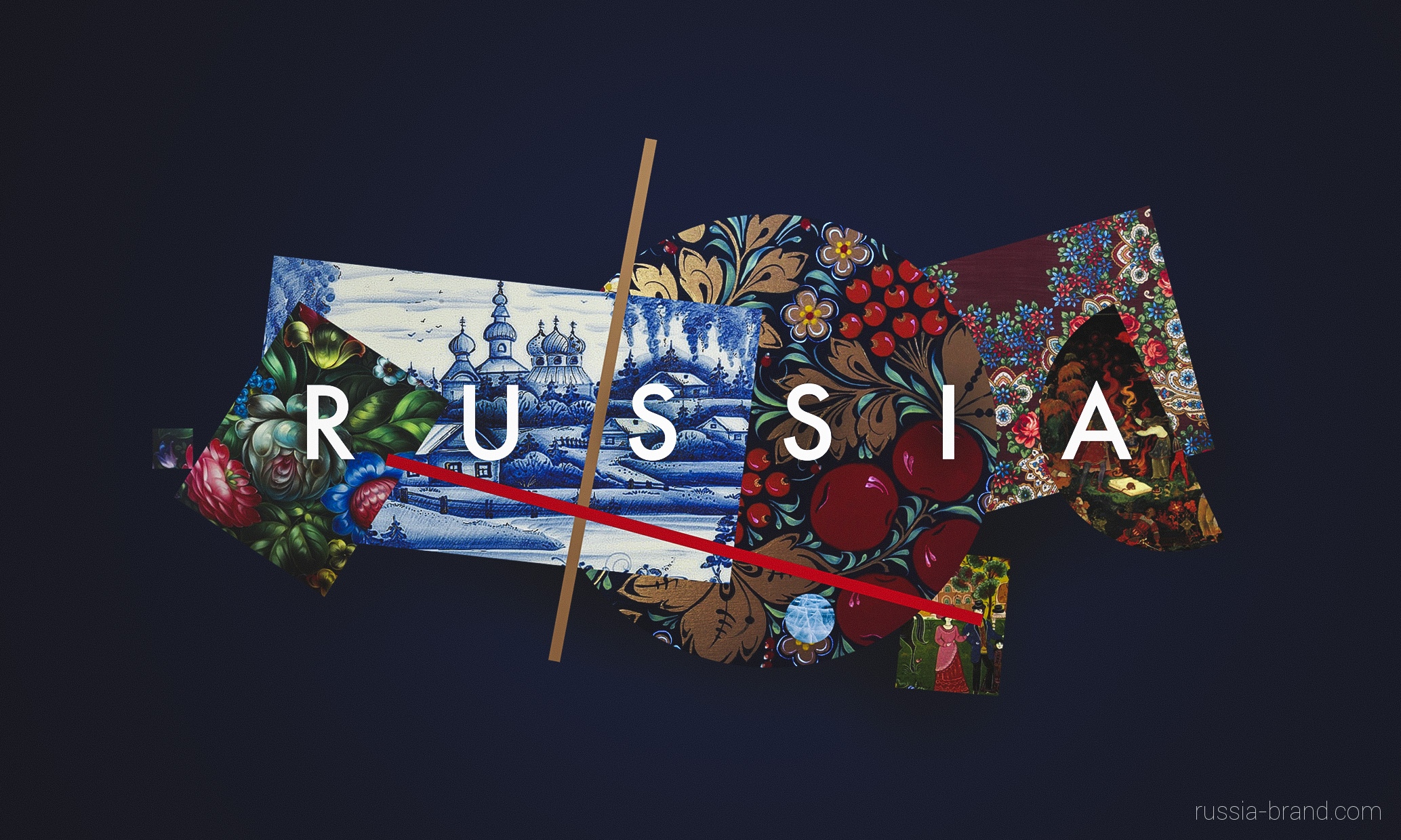
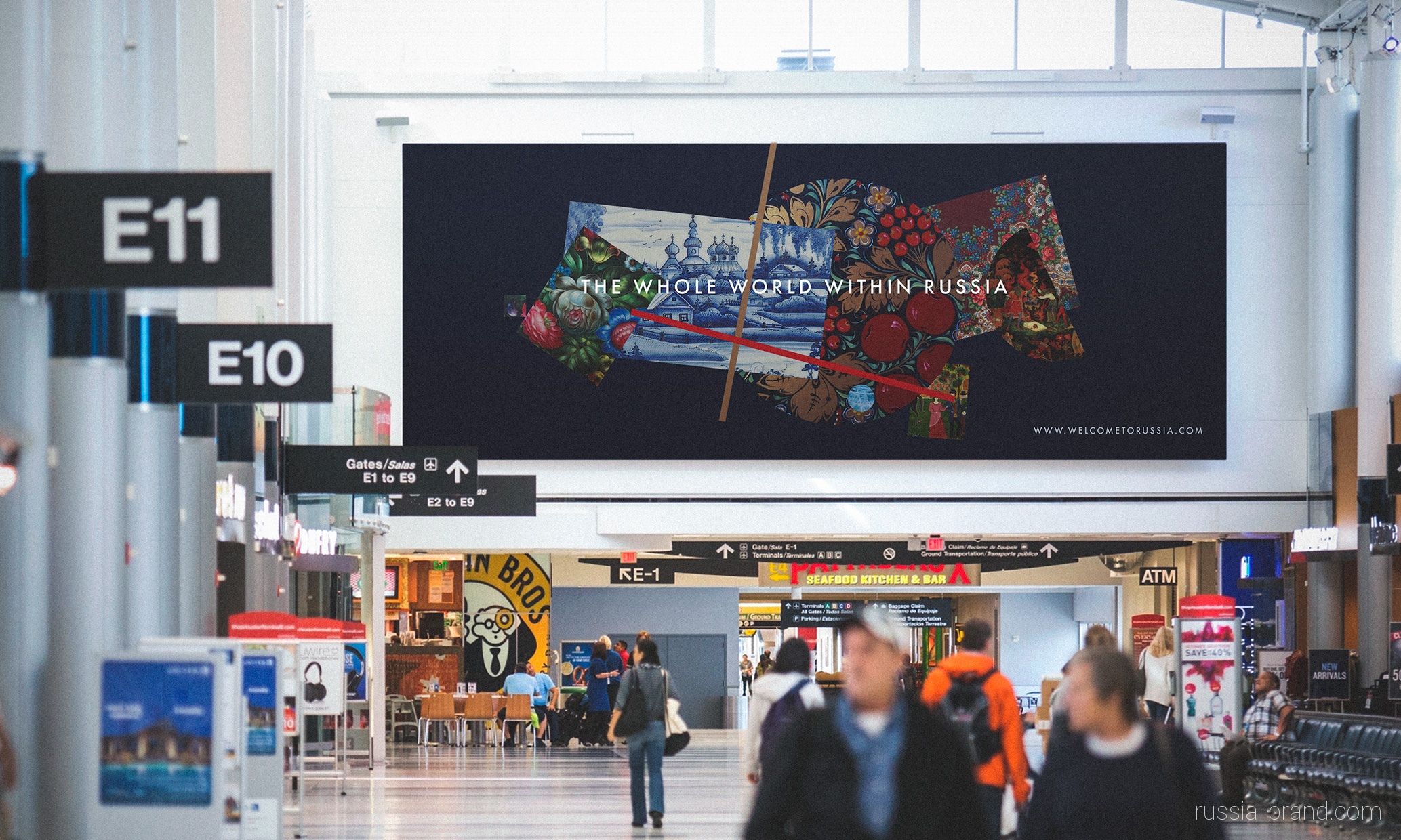
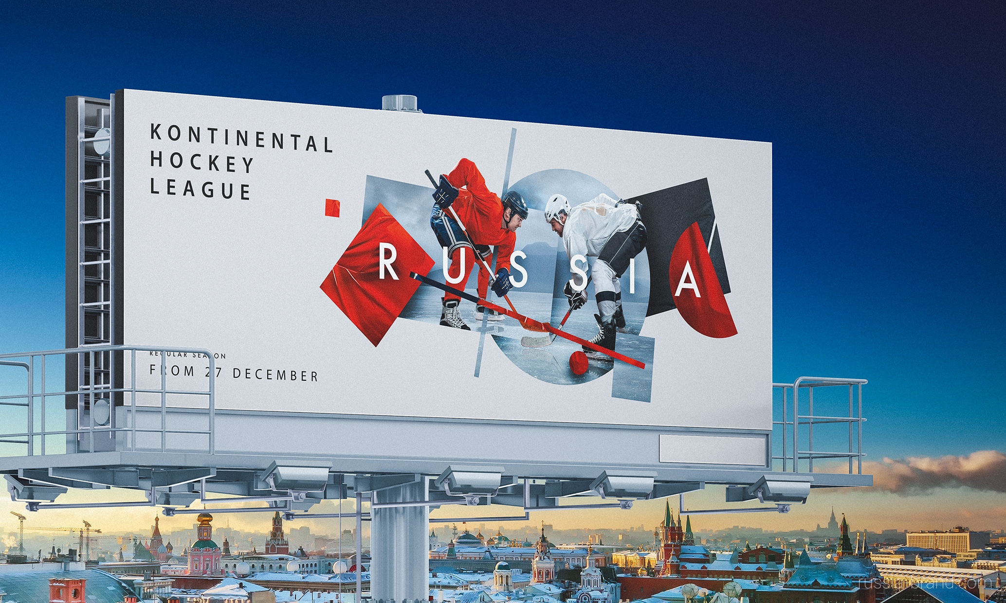
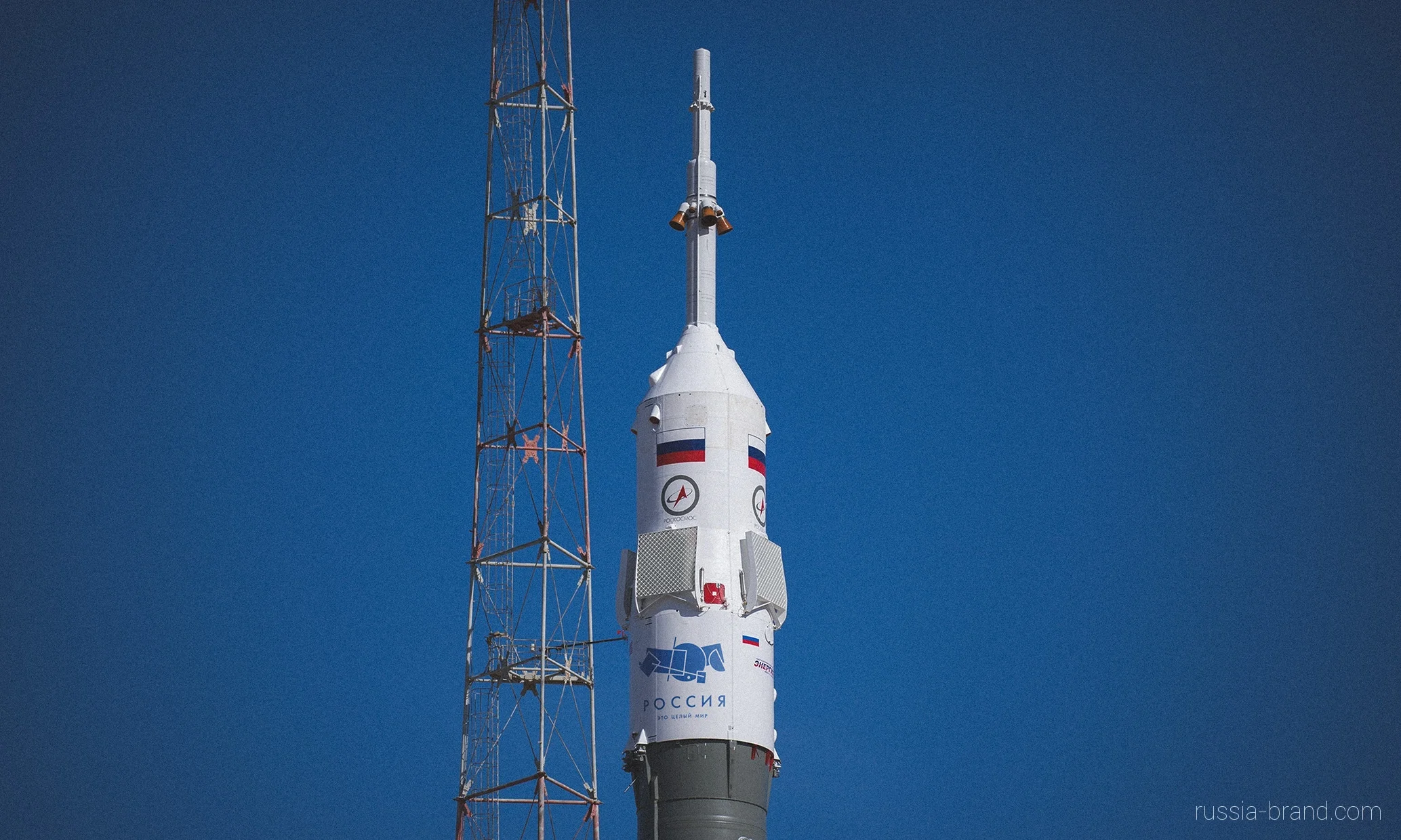
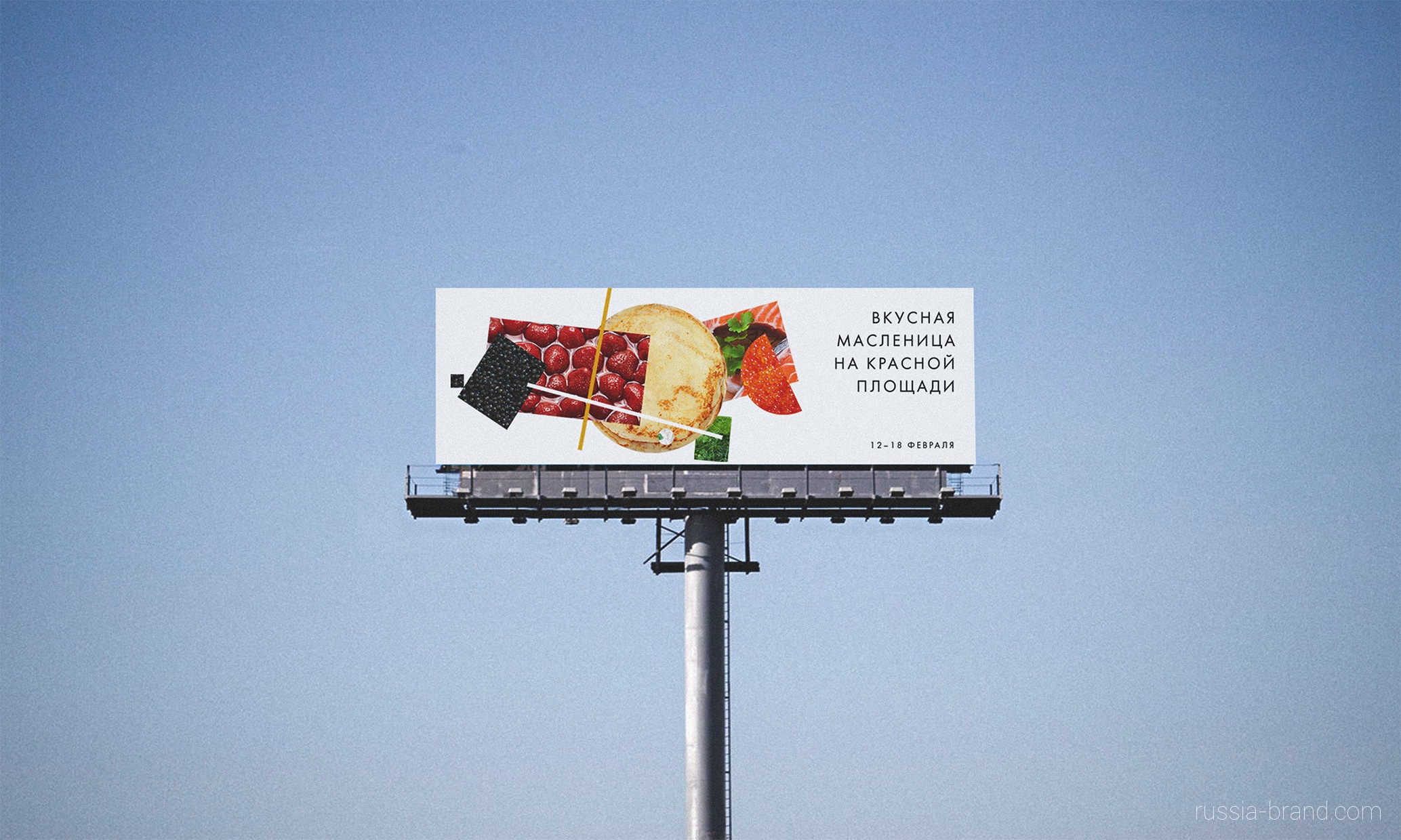
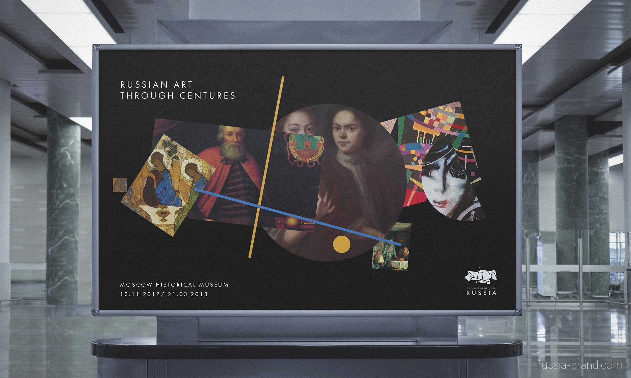
It is merely the first time we see adequate attempt of applying some identification to the most unpredictable and trending country in the world - mother Russia. "A team of five designers has created a new brand identity for Russia’s tourism board, using a logo that references the country’s cultural history and geography. Employing the aesthetics of Suprematism, an art movement coined by Russian artist Kasimir Malevich that featured abstract compositions of bold geometric shapes, the logo uses such shapes in the form of a map of Russia. An important, avant-garde era of Russian culture, not least thanks to its ties to the revolution, the design team says it used Suprematist techniques because – in its time – it “personified advanced thinking” in the country, and is still associated with Russia around the world." says It's Nice That

The idea behind main "centres" of Russia
The new brand identity was selected via competition within Russia, to which anyone could apply. From 480 logos and 600 slogans, 30 were developed and ten presented for public vote before a jury selected the winner. You can see these shortlisted designs here


Patti Smith, Horses
Reimagined by Julian Weise


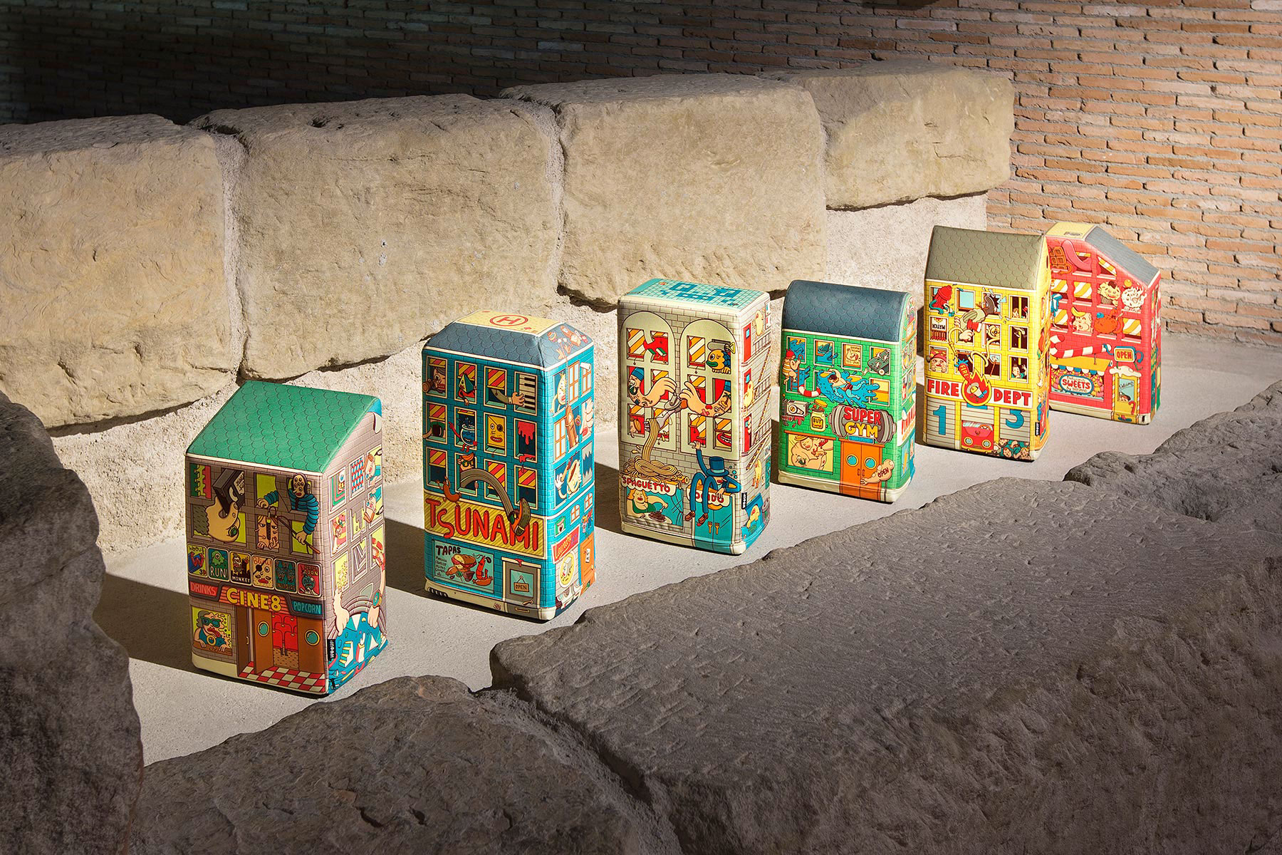
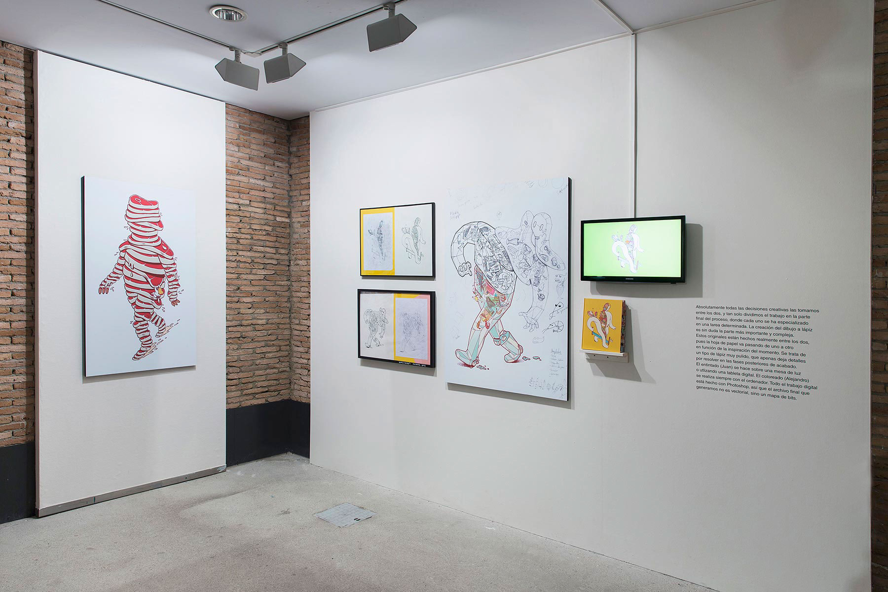
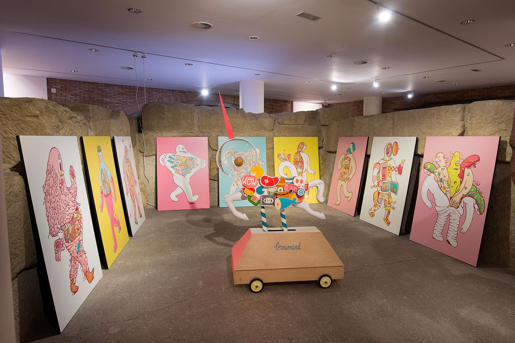
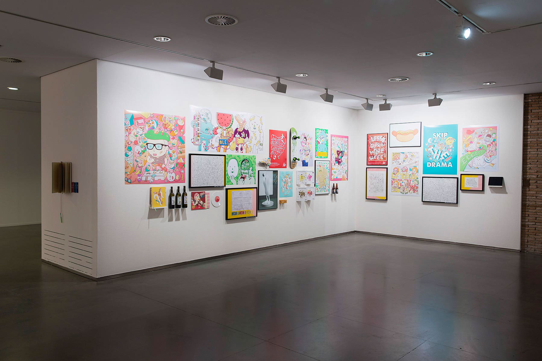
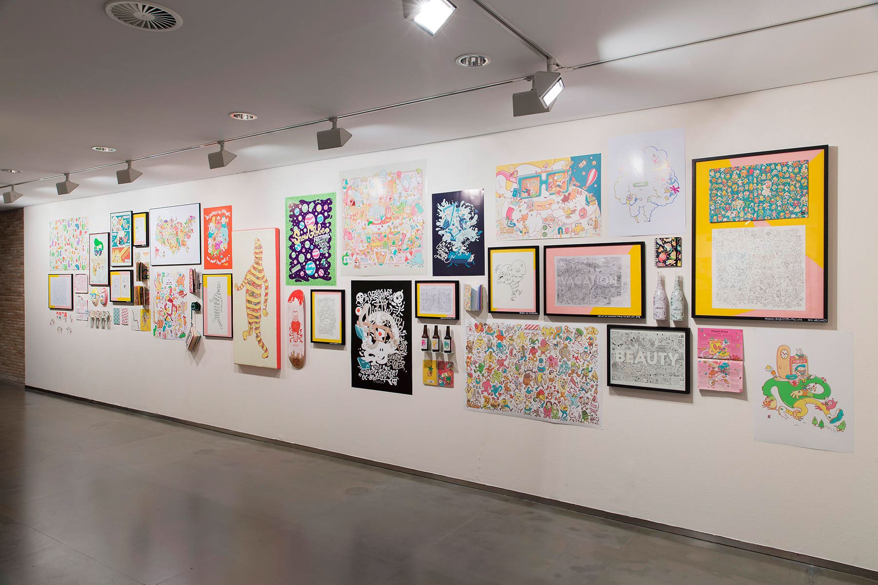
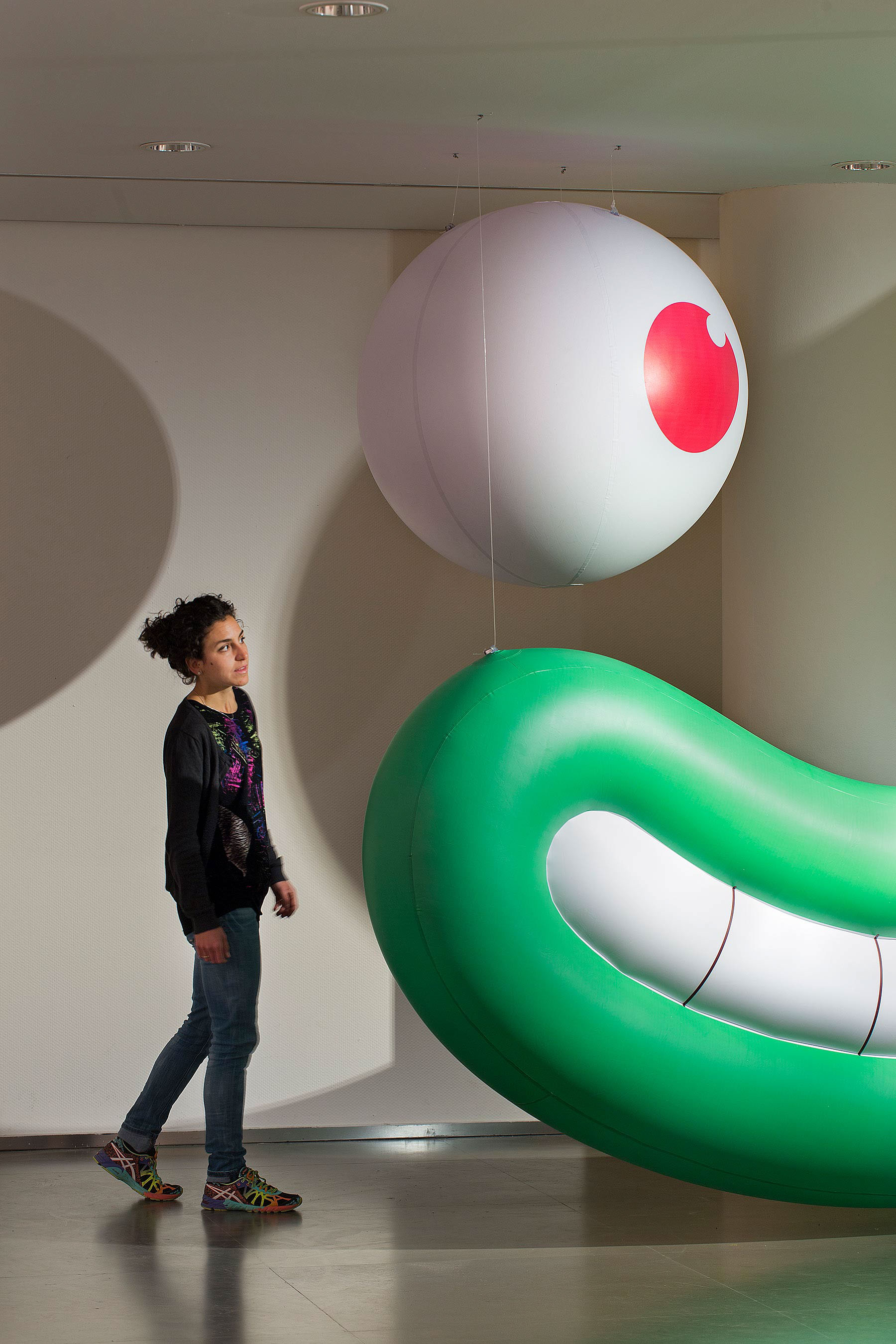
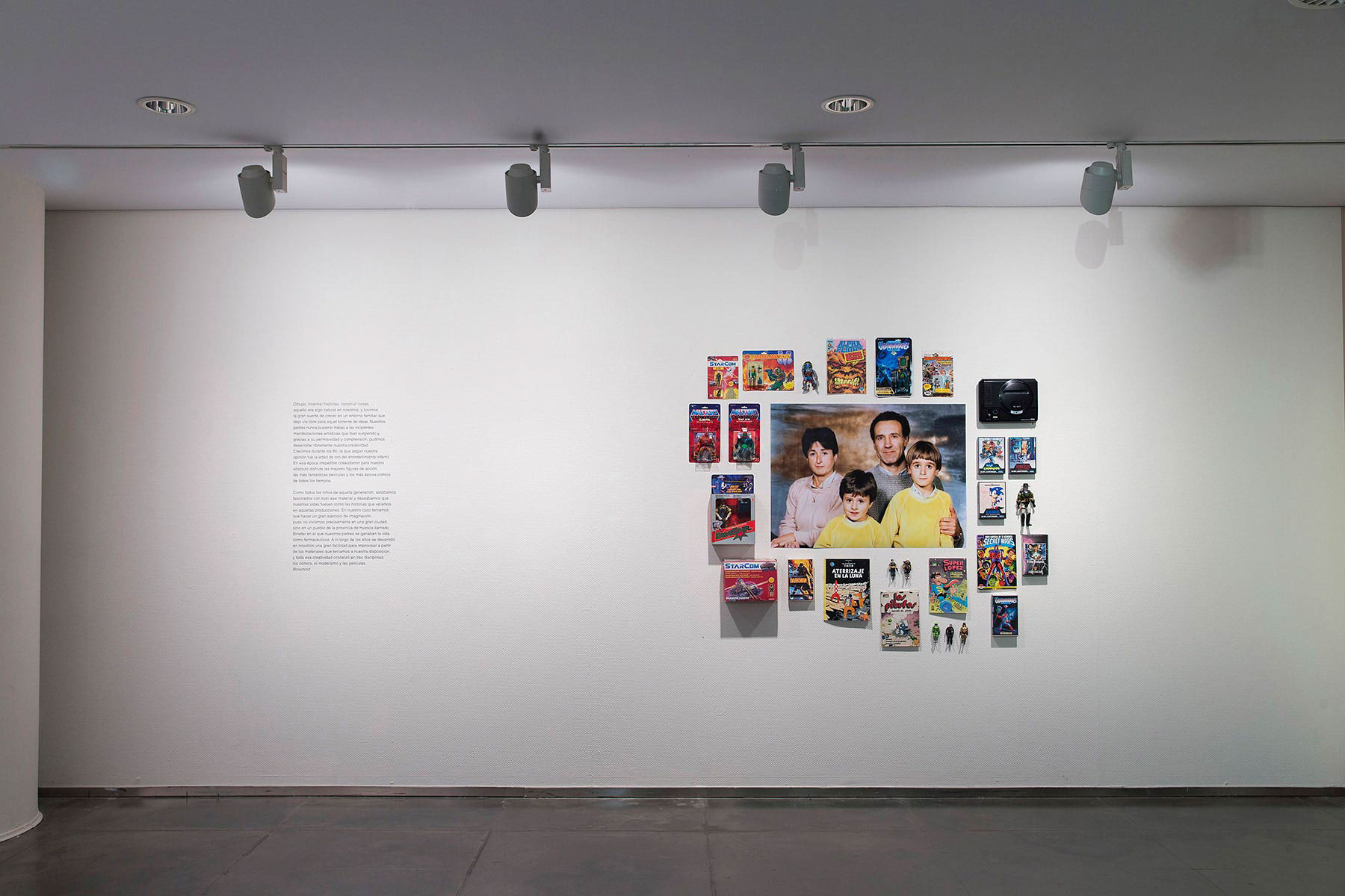
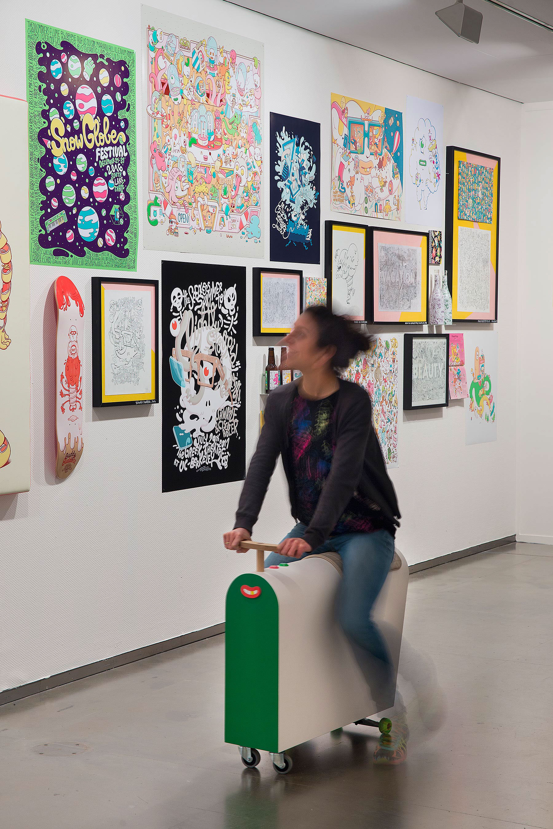
OFFF Festival residents BROSMIND is a creative duo of brothers Juan and Alejandro Mingarro. During his childhood, Juan and Alejandro already formed a prolific creative pair that could be considered as the germ of what is now its visual and conceptual universe. This fact personifies the essence of Brosmind, and is of great importance both in the contents that generate and in the mechanics of work.
To make a retrospective of their work BROSMIND ran the exhibition "Working with a brother" this year. The retrospective reflected on the importance of the fraternal bond that exists between the brothers and described how the present work can be considered an extrapolation of the childhood creations.

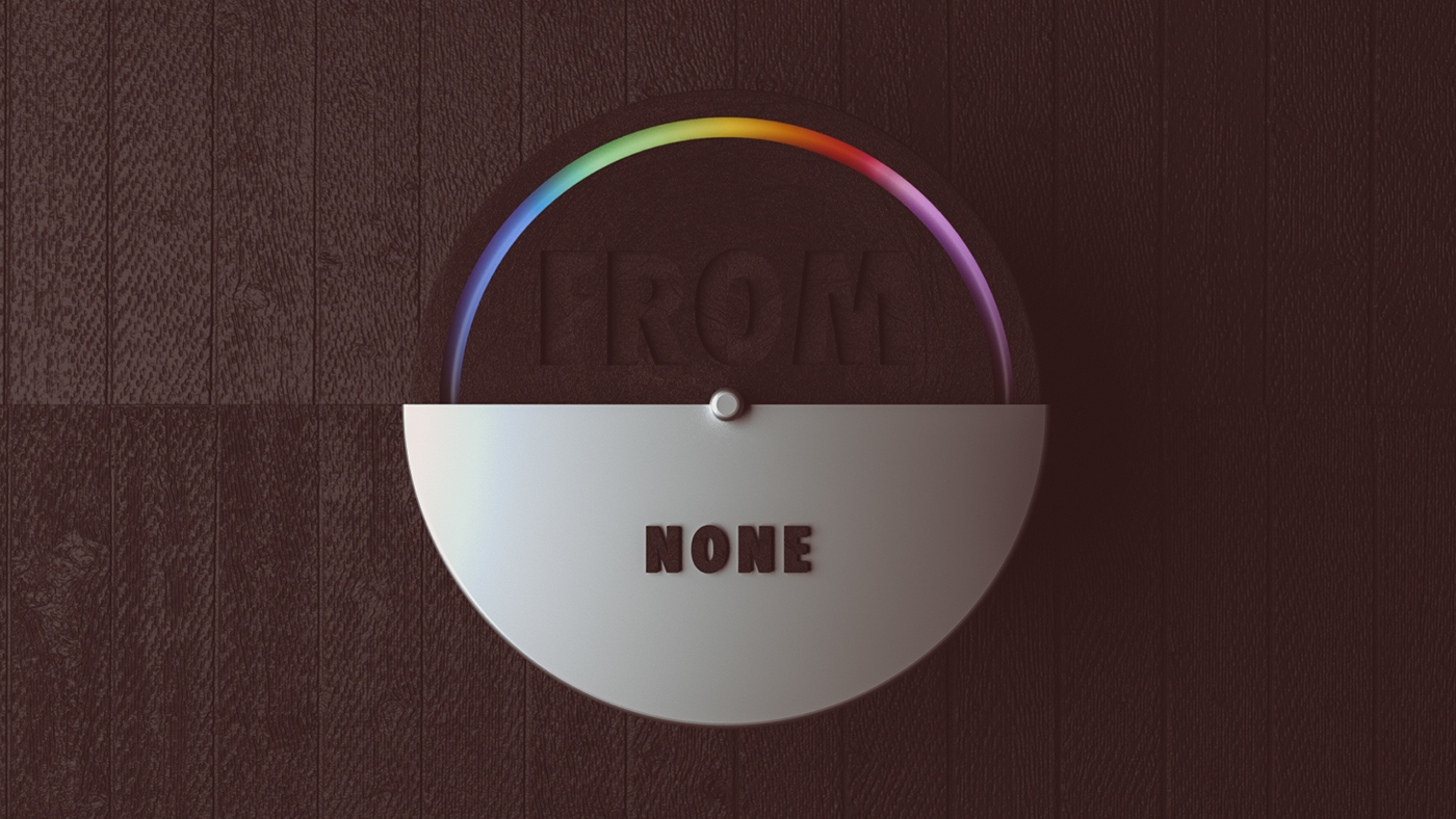
In the creative industry, we are overwhelmed by abstract CGI animation, most of the times made using presets, most of the times without a concept.
FROM COLORS TO NONE is a research about 3 human steps through colours. Each step is represented by a basic geometric form: A circle, a square and a triangle. The circle is humanity, Square is coherence, Triangle is relationships. Nowadays, these 3 aspects are, day by day, chocked by our digital routine. Sometimes we feel like swimming in the sand, blinded by powder. But when it seems all black, we try to survive and research for a new balance. So we build our Color Machine from none. Cause, maybe, from none we come… and our life is 100% colourful :)
Mr Doodle
Exhibition: 30th November - 4th December 10am - 5.30pm
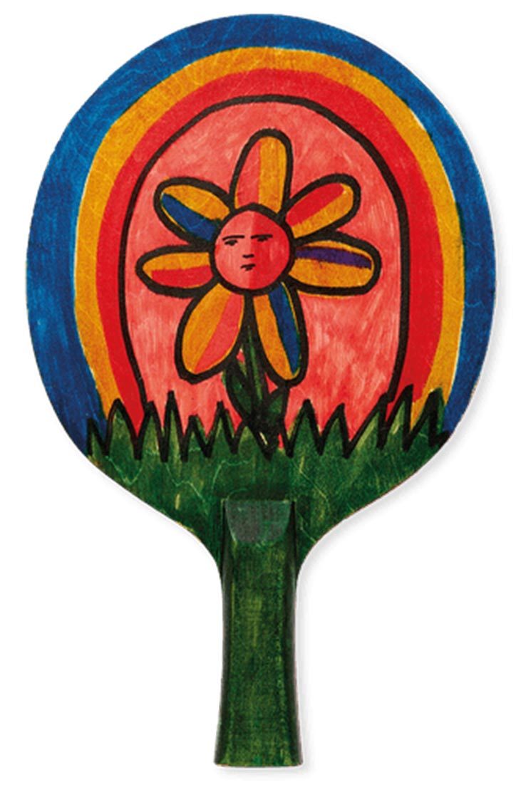
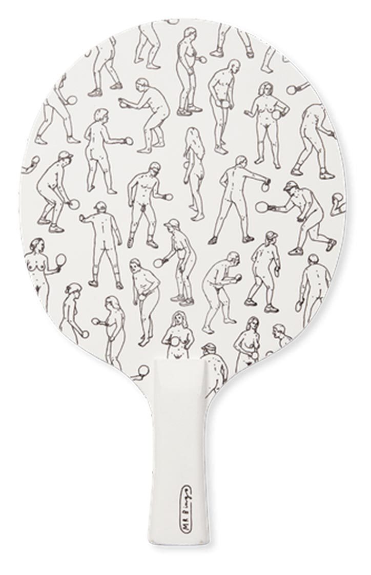
The Art of Ping Pong and @creativedebuts invite you to celebrate this year’s exhibition and auction in aid of @Trekstock
Yoni Alter
For the fifth year running, The Art of Ping Pong has asked 27 artists to customise a ping pong bat to be auctioned for charity. This year’s charity is Trekstock, which provides social and practical support for people with cancer in their 20s and 30s across the UK.
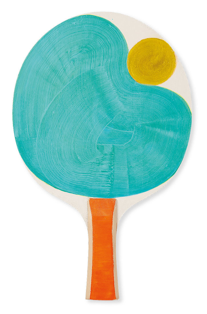
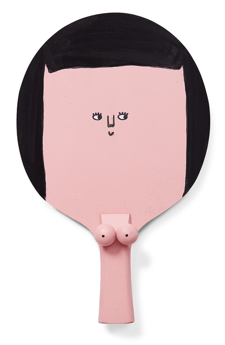
This year’s roster of artists in full is Yoni Alter, Mr Bingo, John Booth, Emma Brewin, Fred Butler, Alison Carmichael, Sebastian Cox, Mr Doodle, Marina Esmeraldo, Emily Forgot, George Hardie, Nigel Howlett, Kev Munday, Neasden Control Centre, Nous Vous, Zuza Mengham, Hattie Newman, Charlie Oscar Patterson, Stina Persson, Saskia Pomeroy, Pref, Benedict Radcliffe,Gemma Shiel, Adam Simpson, Sam Taylor, Louis Trew and Celia Washington.


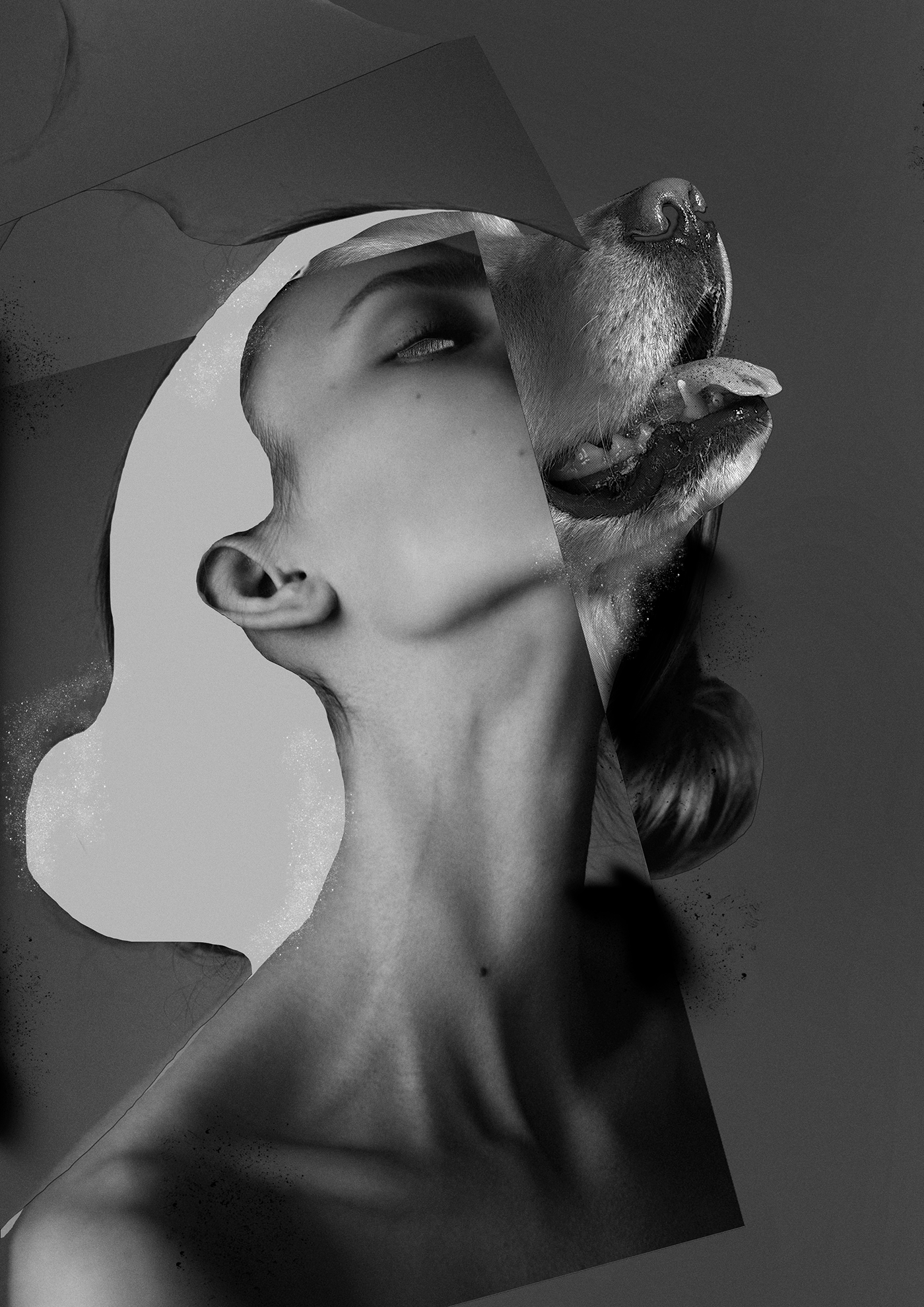
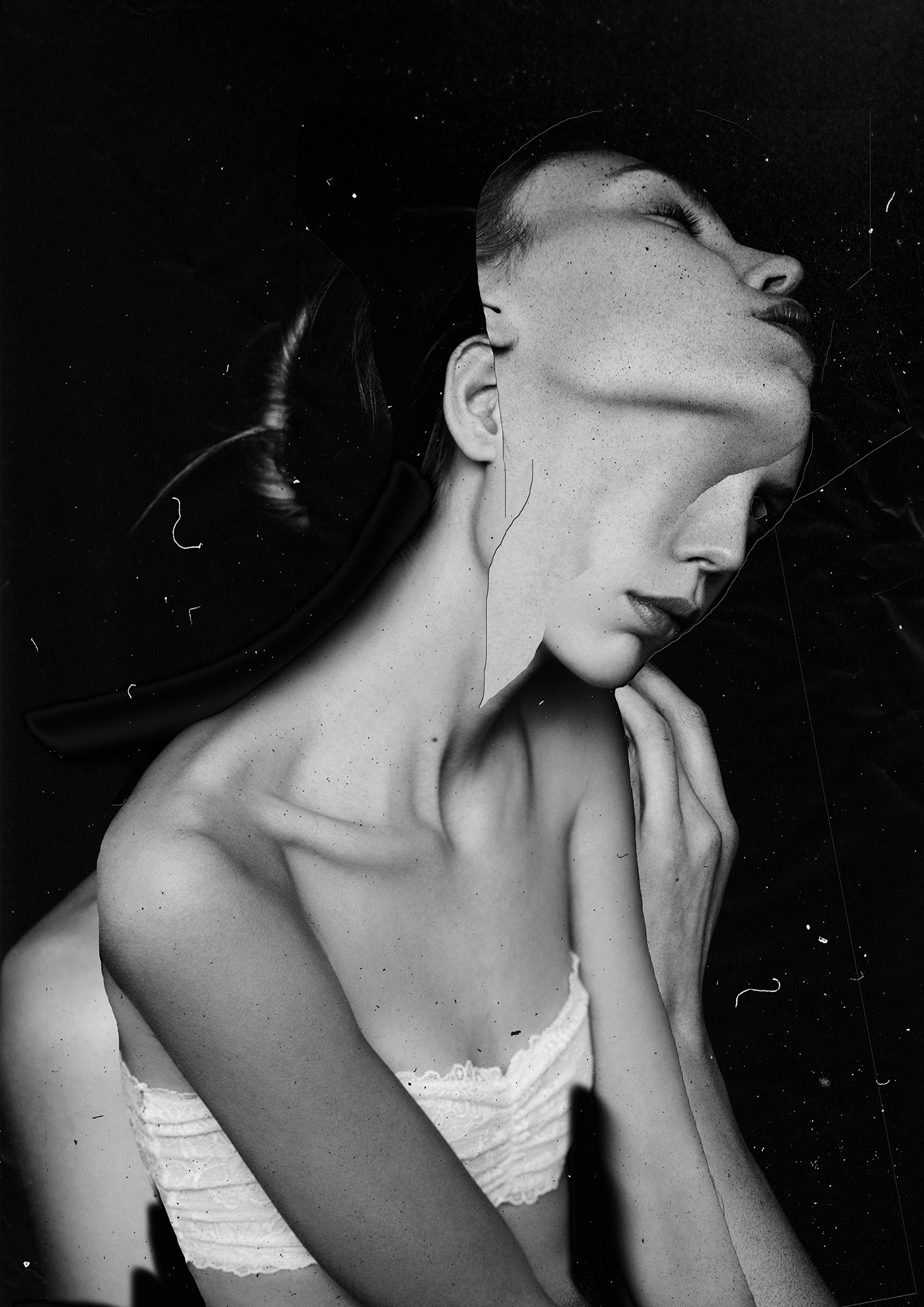
Young Polish graphic artist Mateusz Lengling decomposes perfectly fashion photography then rebuild it to a new forms of visual arts

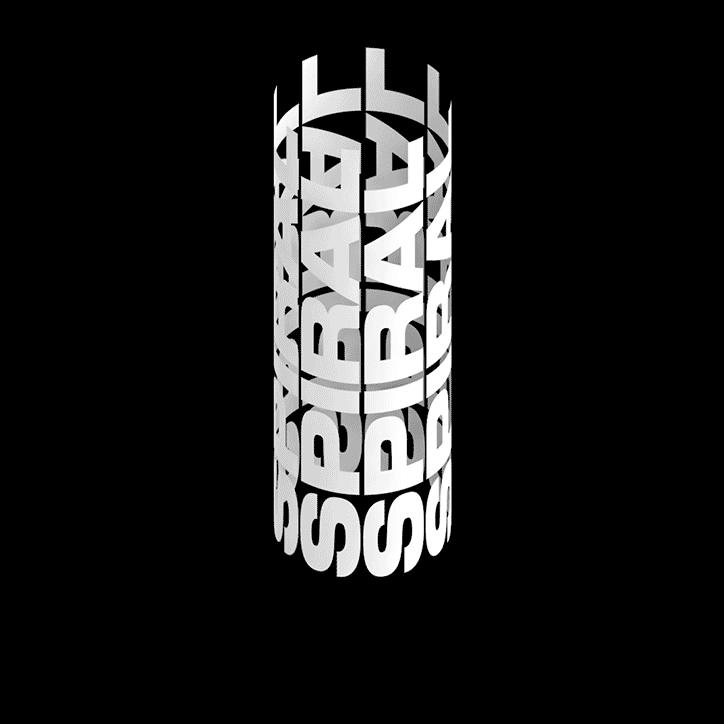
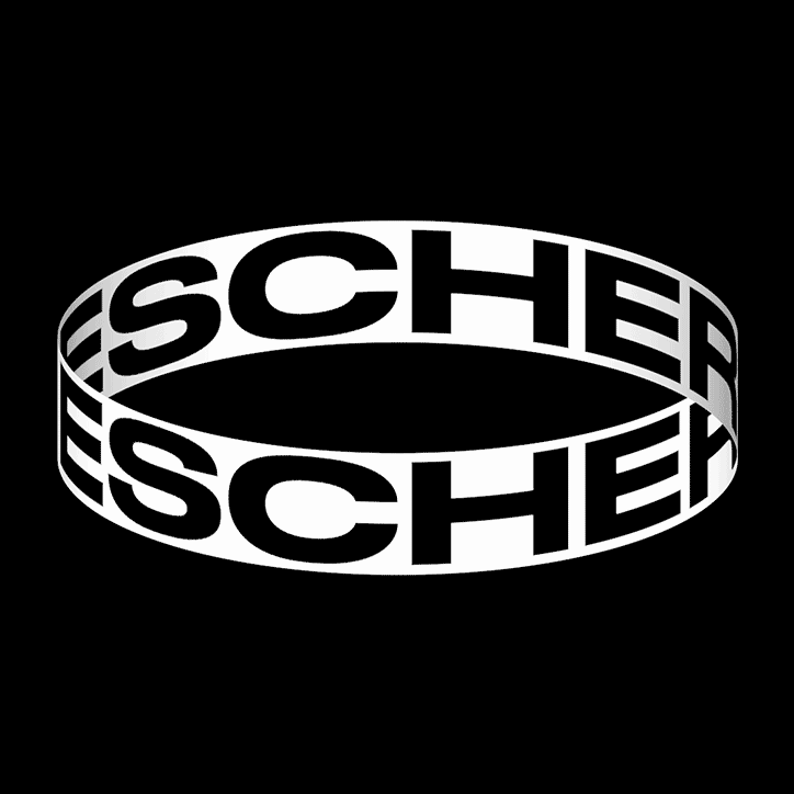
"Xavier Monney is the 23-year-old designer from Lausanne, Switzerland whose work caught our eye due to his refreshing but incredibly impressive manipulations of type. Xavier combines animation and typography to create three-dimensional experiments, often incorporating some form of optical illusion."
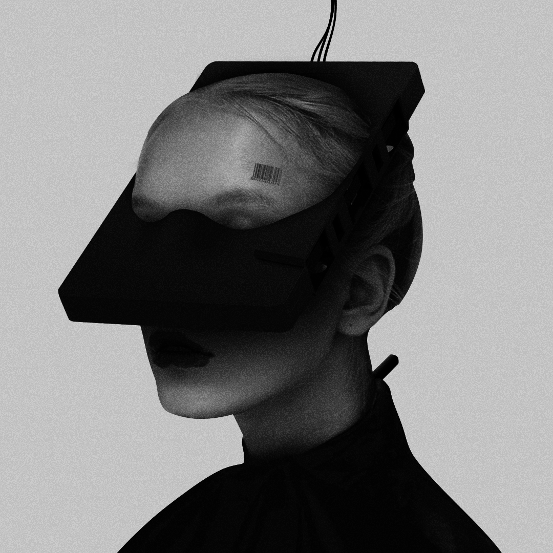
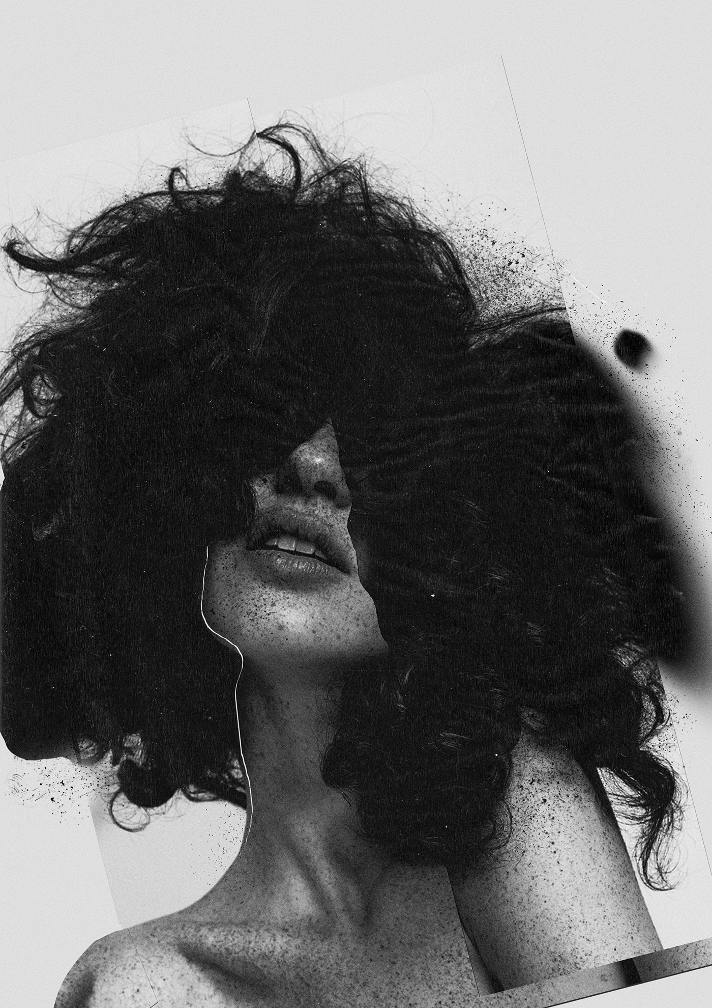
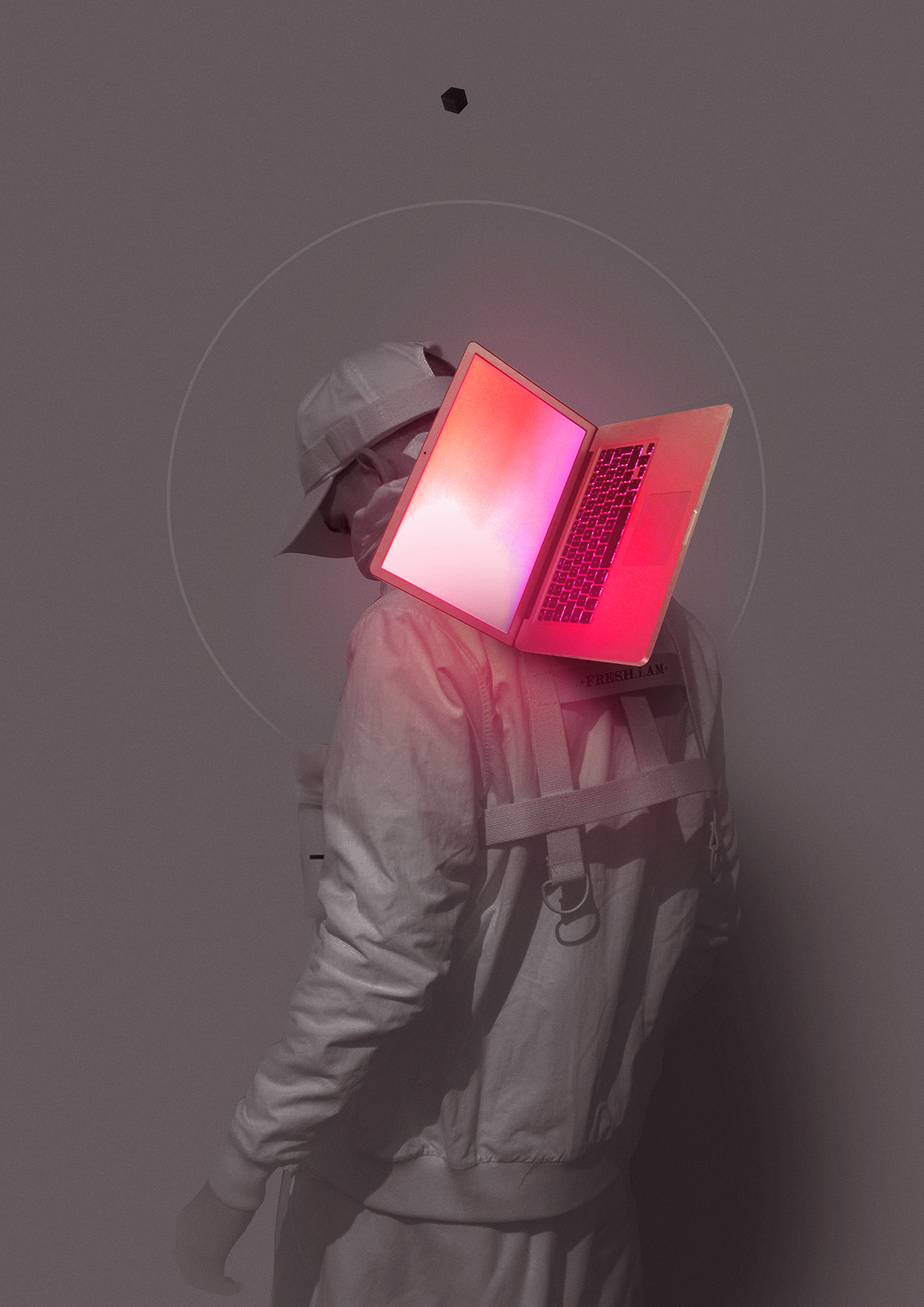
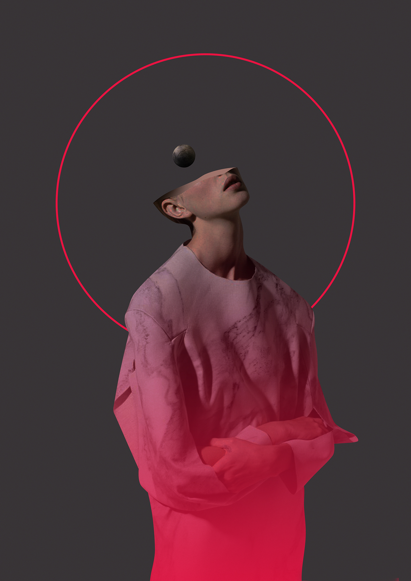
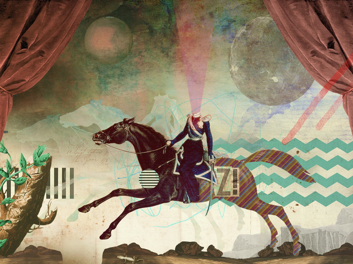
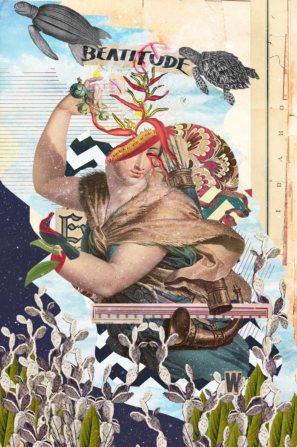
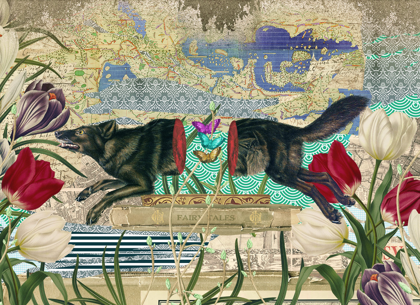
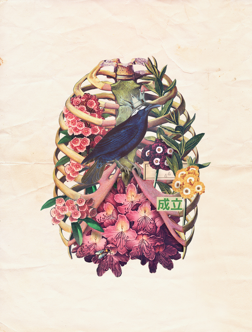
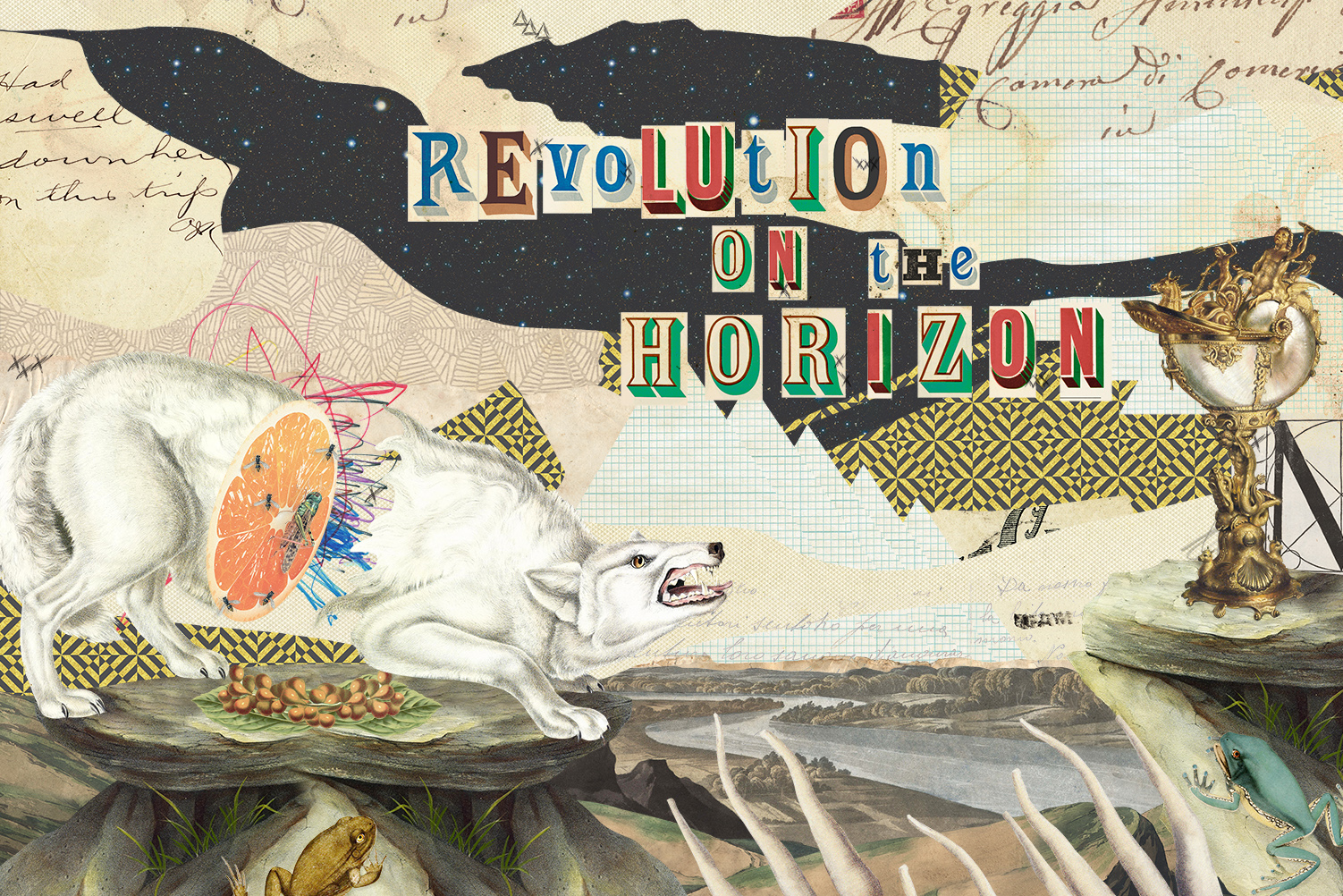
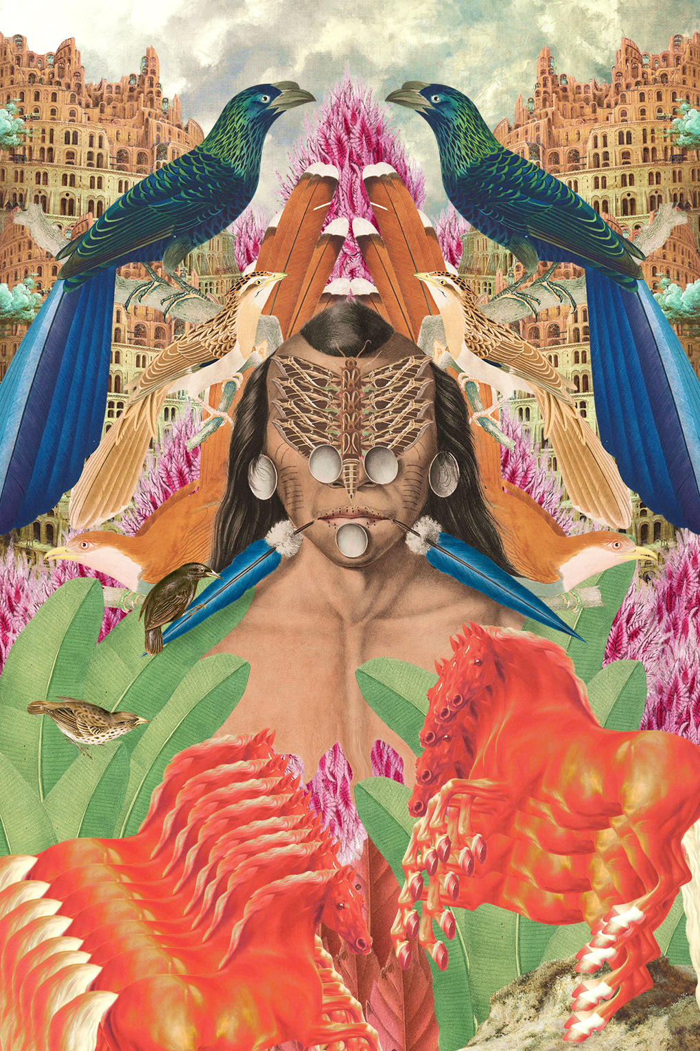
Marcel Lisboa - one of the ten winners of our recent Ello x Digital Decade 5 open contest became a base of Phygital Art Exhibition held in London last month at Ugly Duck

Marcel Lisboa for the Digital Decade 5
Graphic designer Marcel Lisboa, living and working in São Paulo/Brazil, uses digital means to create his utterly unique illustrations; all of which expressions of private worlds that reveal a distinct story and invite endless contemplation.
Through digital collage the artist reflects his key inspirations: the Renaissance, the Baroque and Neoclassicism. But by shunning the usual genealogy of the Dadaists, Lisboa creates an unique aesthetic based on stunning draftsmanship and evocative scenography.
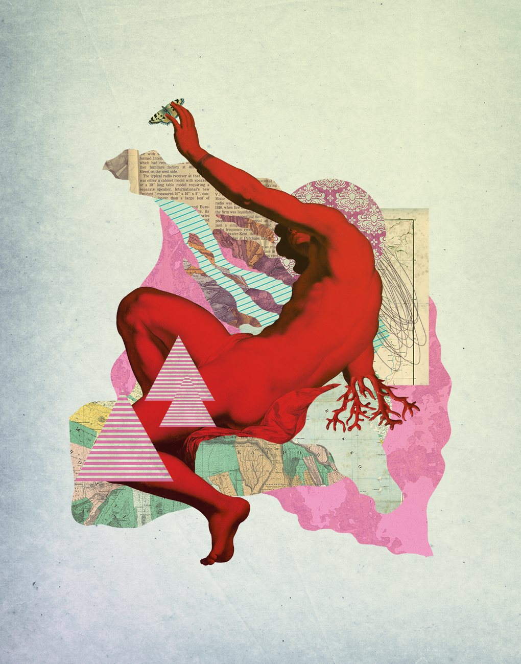
Creative Debuts, London is a platform celebrating the brightest emerging artists and designers. Designcollector is proud to have them as a new partners for upcoming Digital Decade events you won't miss if subscribed to the Newsletter
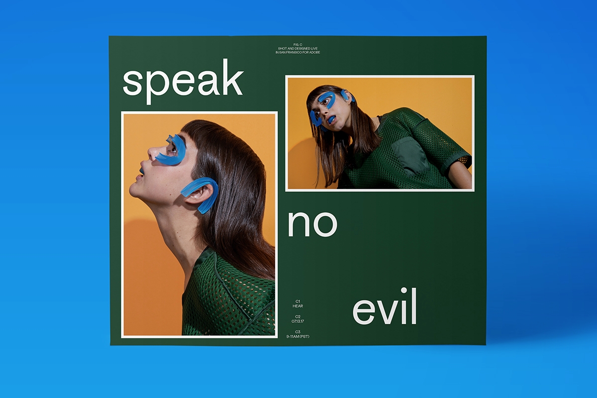
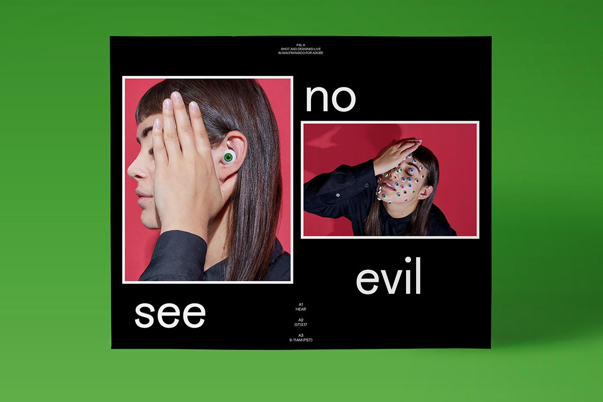
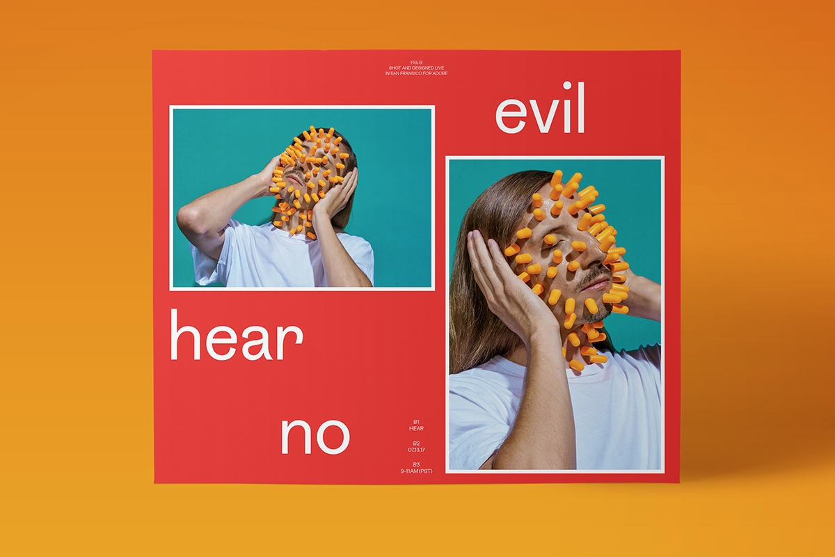
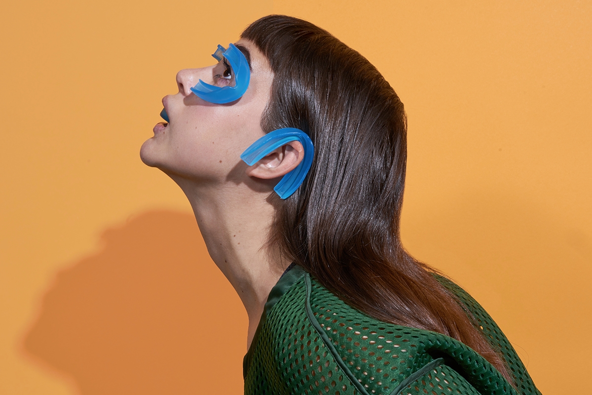
Wade Jeffree is a New York-based Designer and Art Director whose practice is based upon creating long-standing collaborative partnerships built on honesty and purpose within the fields of art, culture, and commerce. He believes in a life where work and play are forever intertwined. As of 2016, he runs a studio with his wife Leta Sobierajski from Brooklyn, New York.
“Wade and I had the pleasure of spending 3 days in San Francisco on Adobe Live Stream to create a 3 part photographic poster series following the theme of “Hear No Evil, See No Evil, Speak No Evil.””