The rebranding of Russia’s tourism board
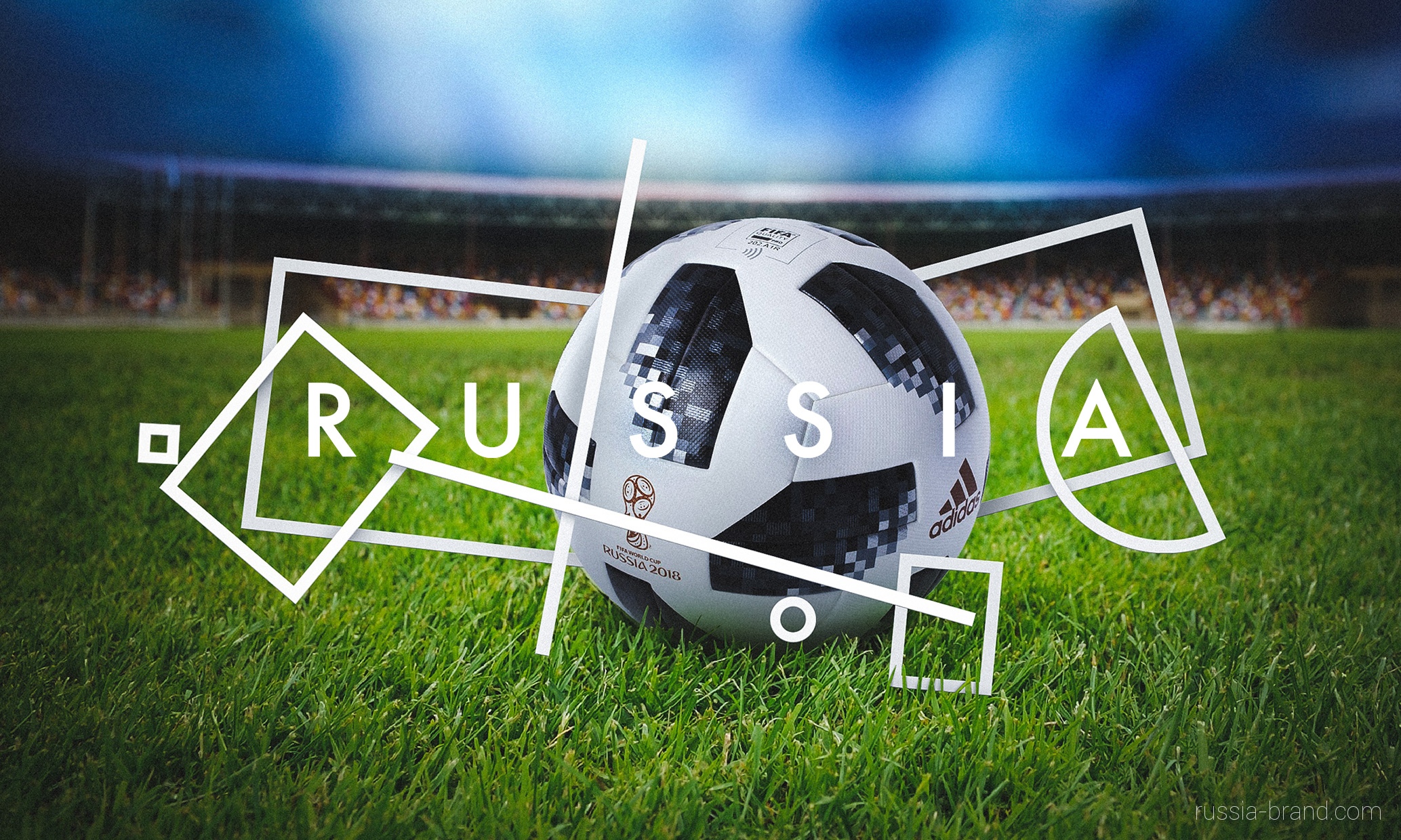
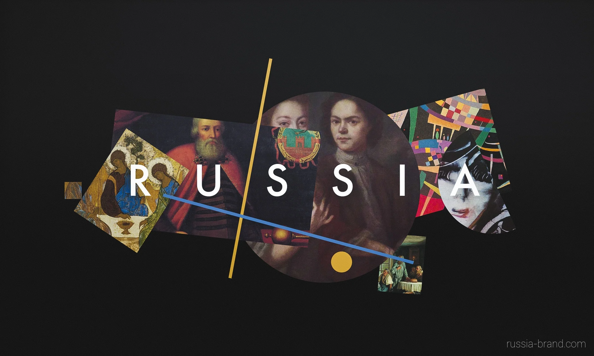
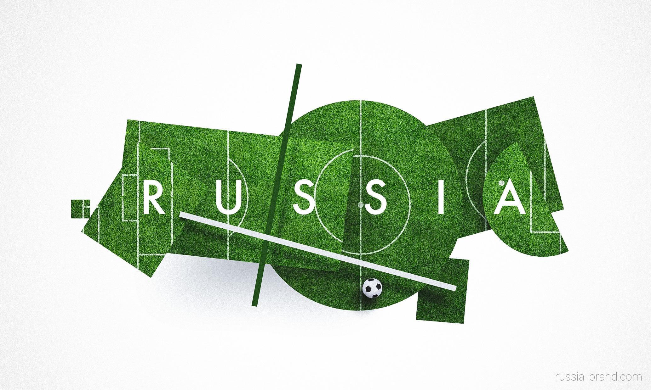
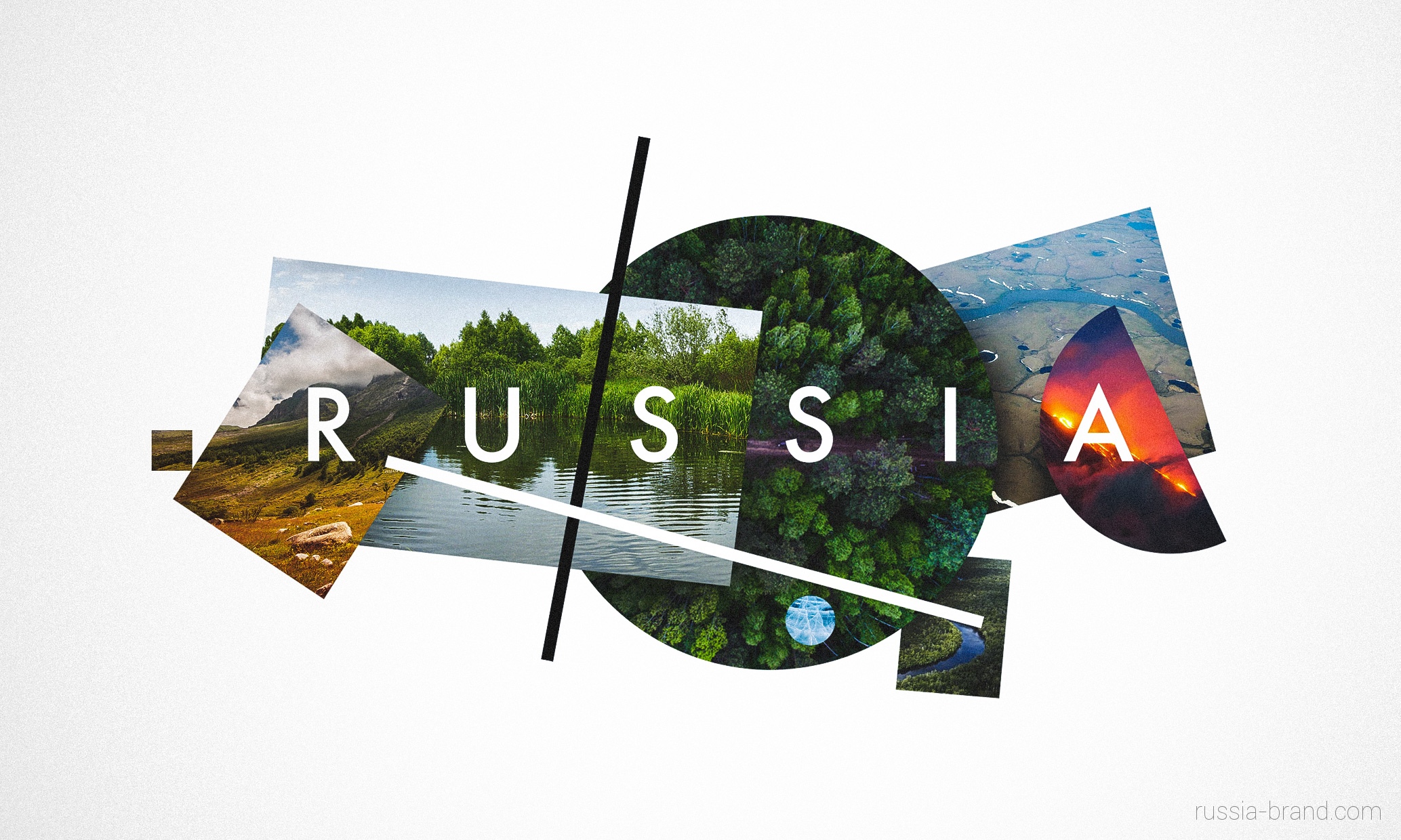
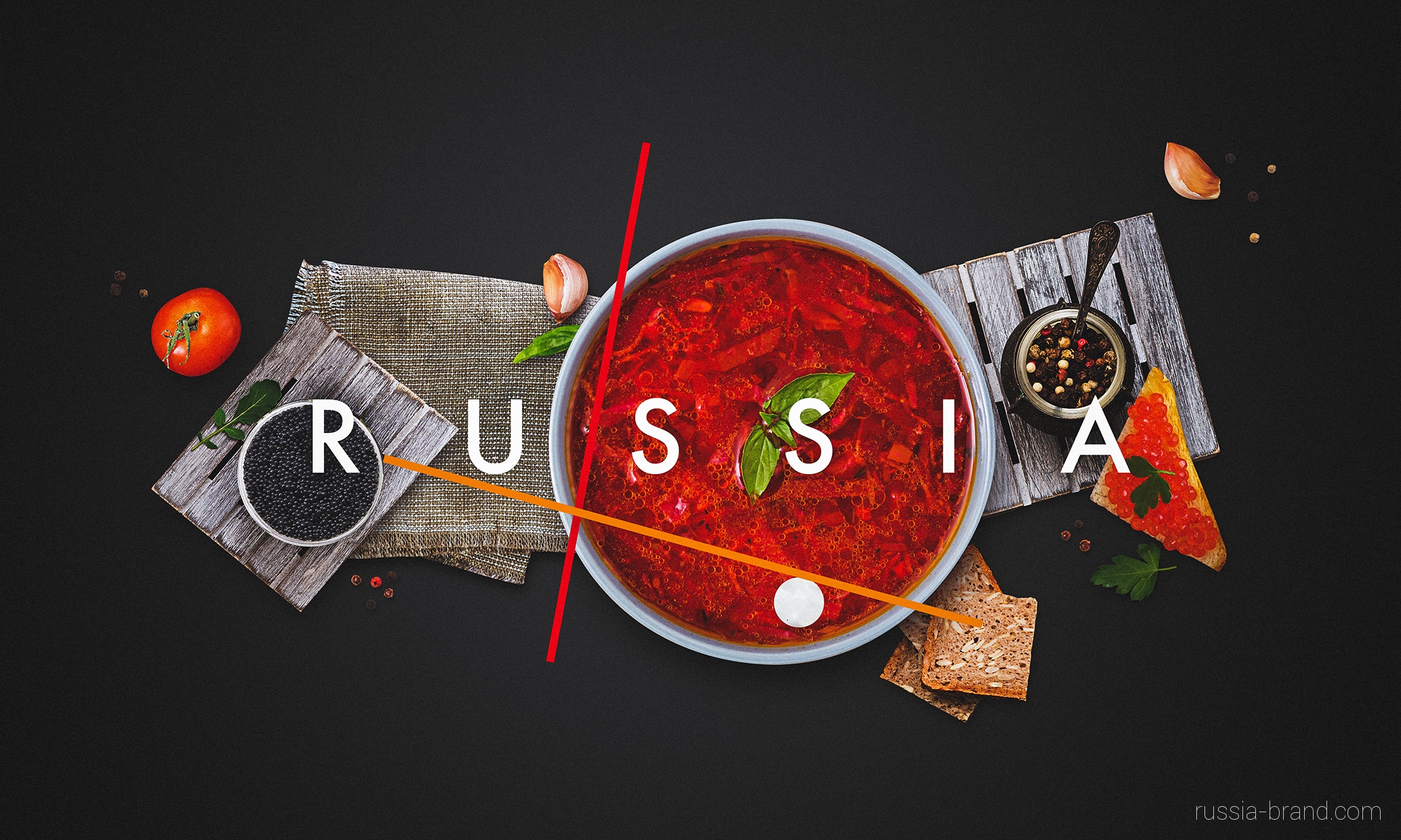
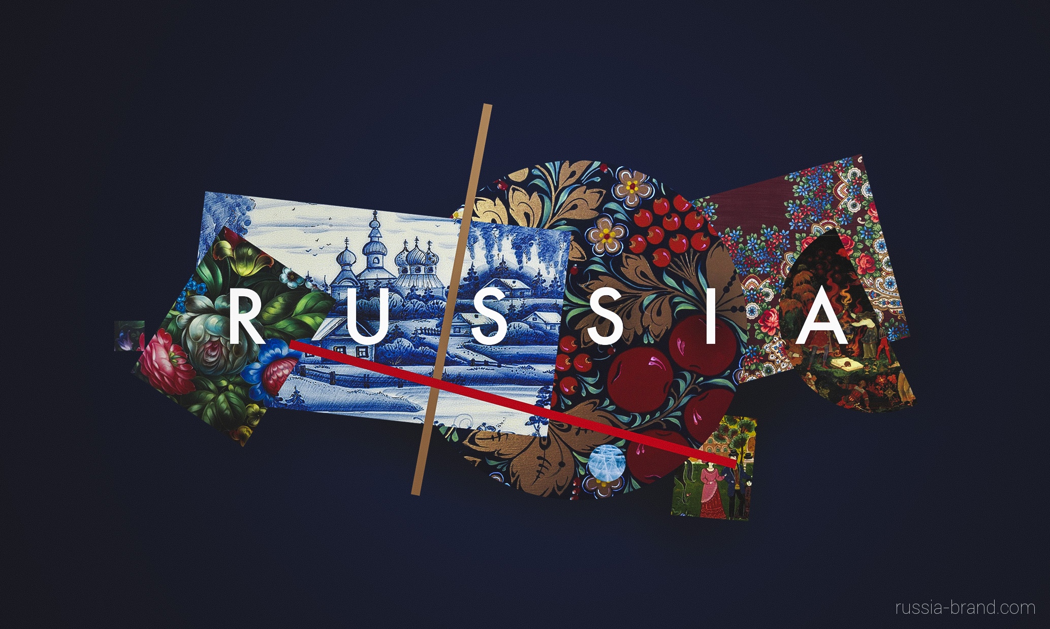
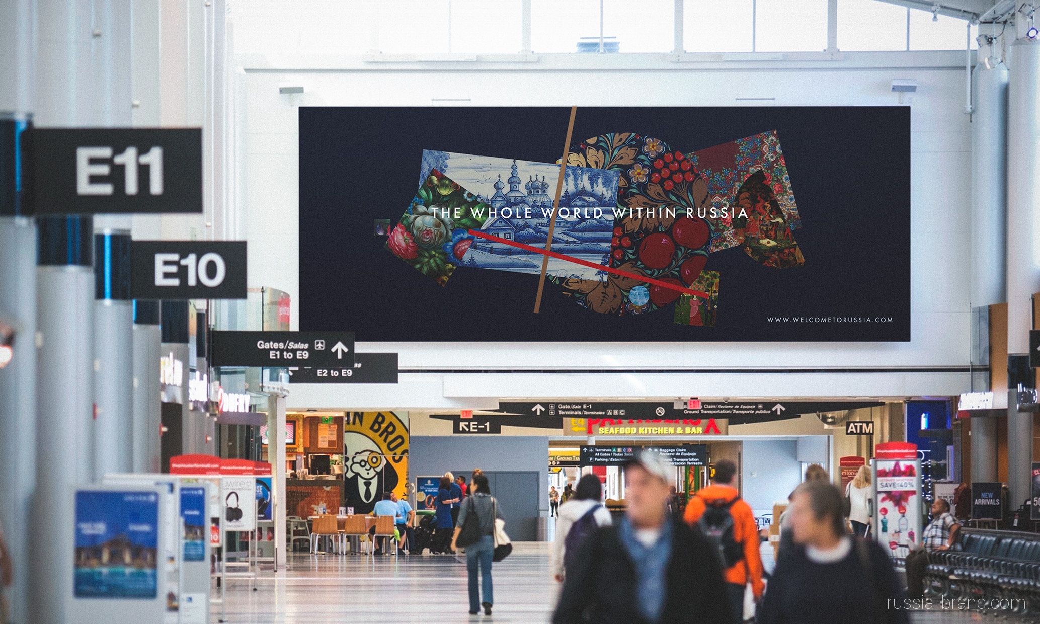
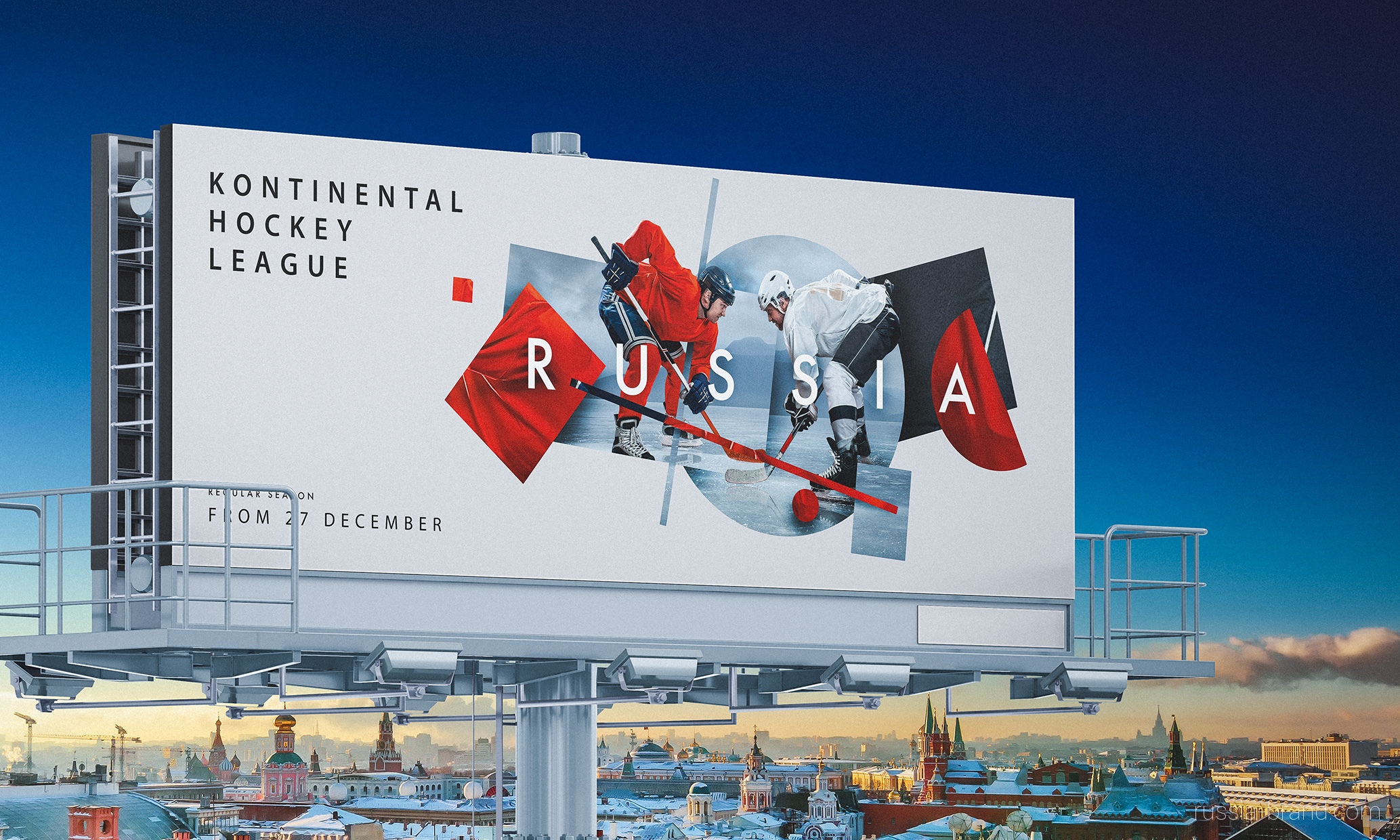
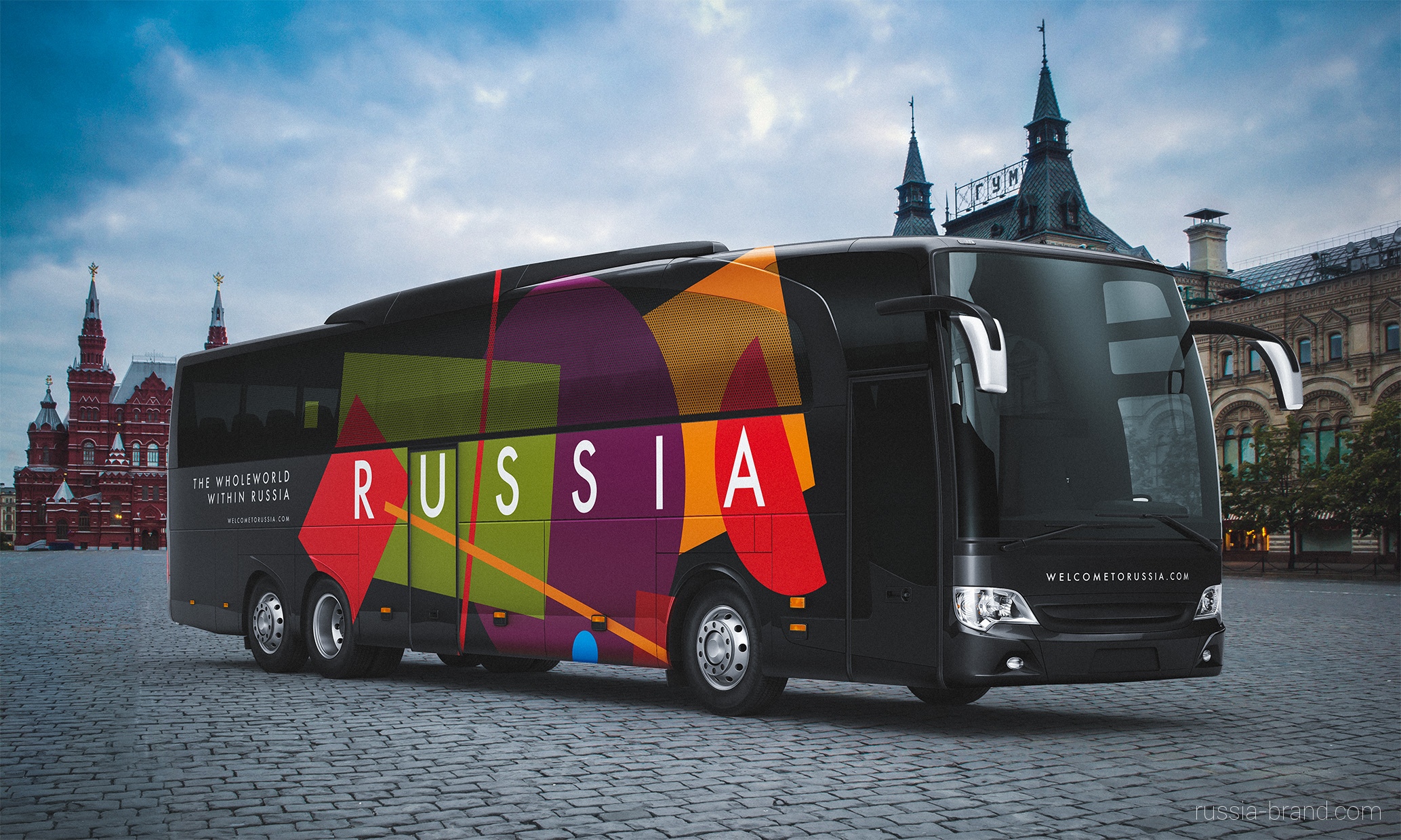
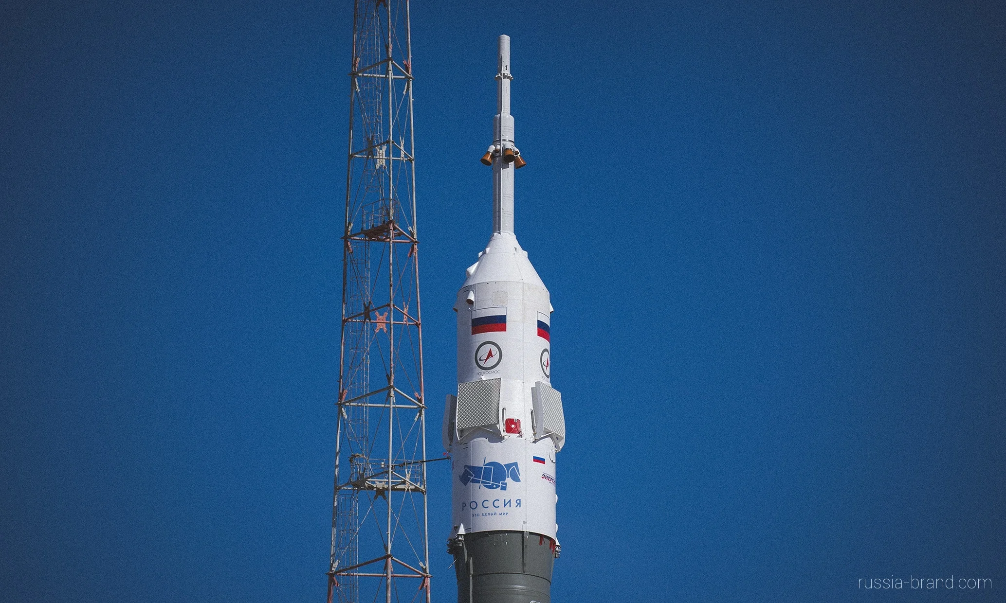
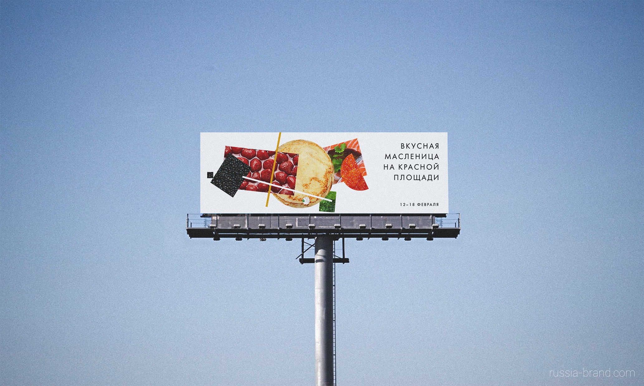
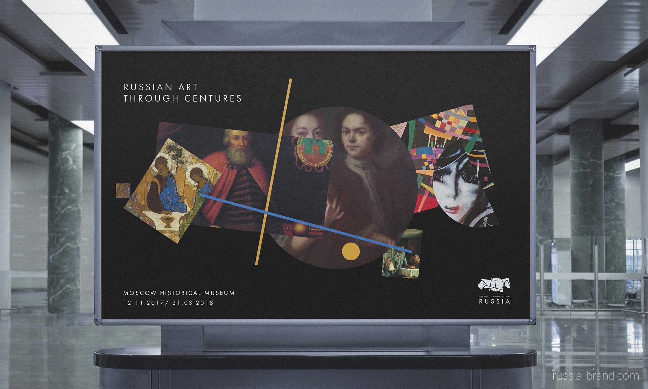
It is merely the first time we see adequate attempt of applying some identification to the most unpredictable and trending country in the world - mother Russia. "A team of five designers has created a new brand identity for Russia’s tourism board, using a logo that references the country’s cultural history and geography. Employing the aesthetics of Suprematism, an art movement coined by Russian artist Kasimir Malevich that featured abstract compositions of bold geometric shapes, the logo uses such shapes in the form of a map of Russia. An important, avant-garde era of Russian culture, not least thanks to its ties to the revolution, the design team says it used Suprematist techniques because – in its time – it “personified advanced thinking” in the country, and is still associated with Russia around the world." says It's Nice That
The idea behind main "centres" of Russia
The design team comprises Vladimir Lifanov, creative director of branding agency Suprematika; Ilya Lazuchenkov and Yegor Myznik from branding agency Plenum; Denis Schlesberg, ECD at agency Artonika; and Erken Kagarov, art director at design firm Art Lebedev Studio.
The new brand identity was selected via competition within Russia, to which anyone could apply. From 480 logos and 600 slogans, 30 were developed and ten presented for public vote before a jury selected the winner. You can see these shortlisted designs here


