Typography Inspiration 12
It's a new day - It's a new inspiration set for Typography lovers. Enjoy our picks and subscribe to our Pinterest account
3rd Wave of Inspiration
Since 2003
It's a new day - It's a new inspiration set for Typography lovers. Enjoy our picks and subscribe to our Pinterest account
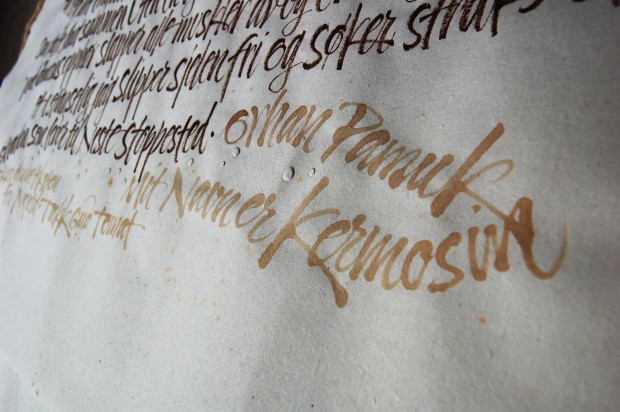
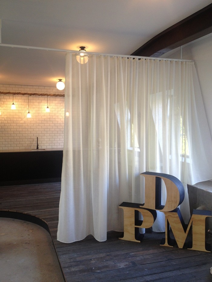
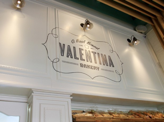
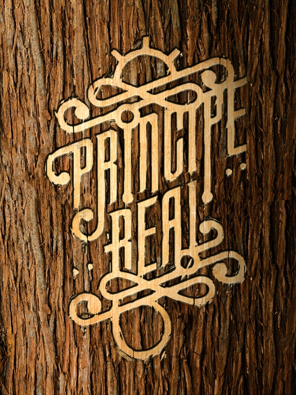
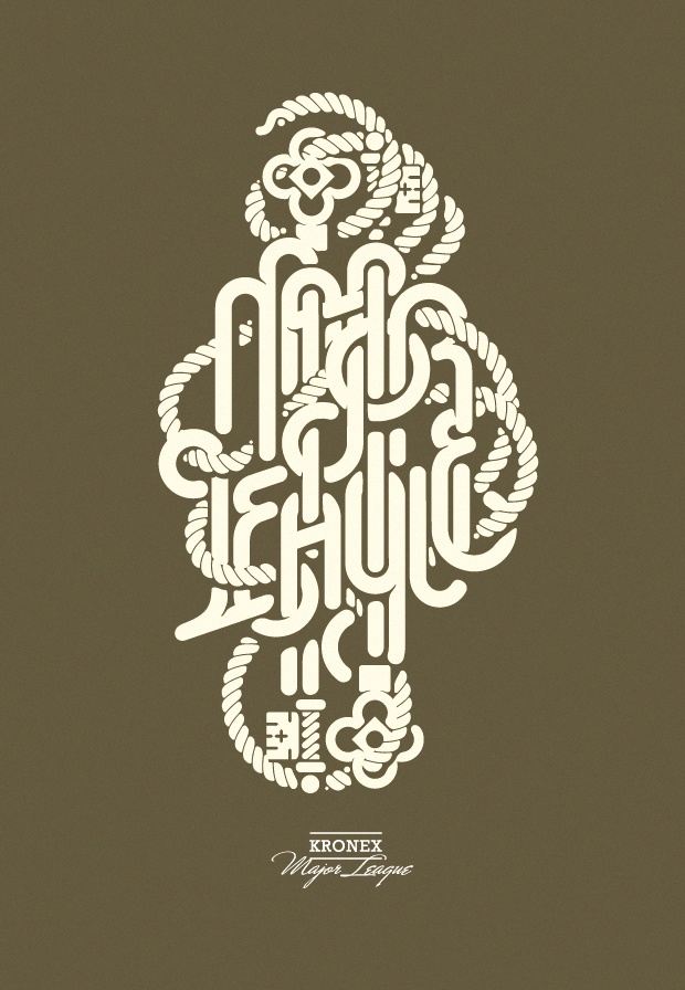
Colombian interior and graphic design studio Masif uses typography and custome lettering as a central element of each work http://www.behance.net/Masif

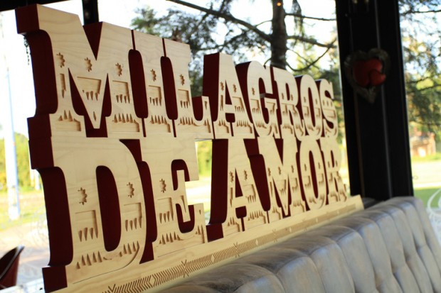
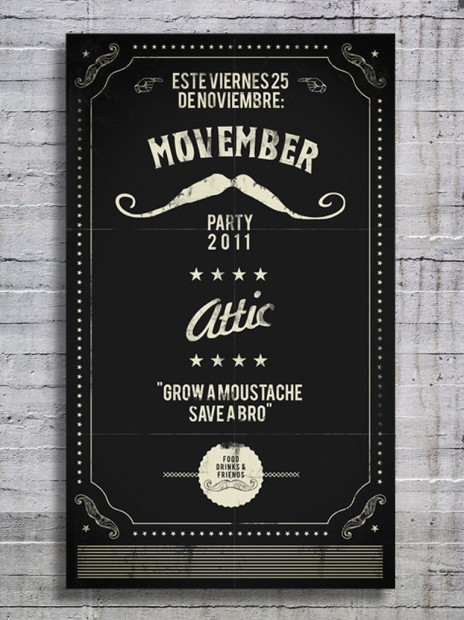
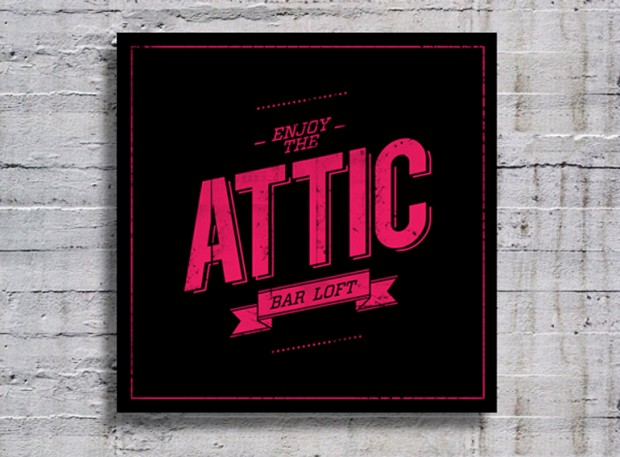
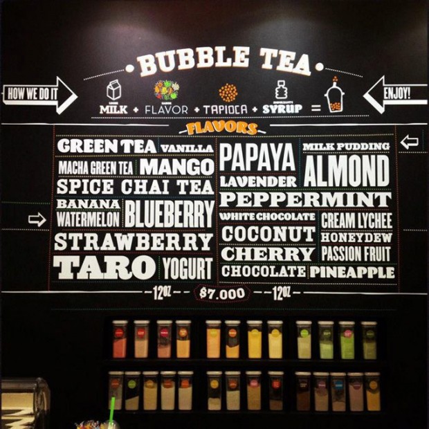
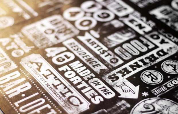

Photos by Masha Rastakaya
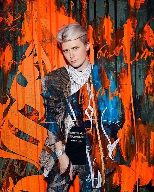
Jaw braking body calligraphy performed live in Moscow by Russian artist nicknamed Pokras Lampas, see more actions on his Facebook page (take a NSFW advise for viewing photos below)

pokras-lampas-7

pokras-lampas-4

pokras-lampas-3

pokras-lampas-2

pokras-lampas-1

pokras-lampas-5

pokras-lampas-6

pokras-lampas-8
These rustic handwritten signs and typography posters are floating all around the tumblr and inspiration sites - meet the designer behind them - Zachary Smith - brighthead illustrator from Florida


Even this coolest winter in European history has its pluses if you are a creative head. For Canadian environmental artist Nicole Dextras a severe weather is just another challenge to create massive ice messages to the human being or penguins. http://www.flickr.com/photos/ndextras/
When the ice texts are installed on site, the temperature determines how long it will take for them to change state from solid to liquid. This phase of transition becomes symbolic of the interconnectedness of language and culture to the land as they are affected by time and by a constant shifting and transforming nature.


Belgrade based illustrator and graphic designer Bratislav Milenkovic has many good artworks to share with visitors on http://www.bratislavmilenkovic.com/


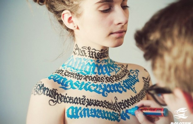
"The photographic series NAKED SILHOUETTE ALPHABET is a latin alphabet art, formed by the naked body and performance of experimental textures that depict the silhouette." says the creator Anastasia Mastrakouli
In this series the goal is to highlight the dialectical relationship between anatomy and visual arts. Each image displays the way in which the body turns into one illustrative and choreographic communication channel of a message. The body is cut off from its physical nature and is perceived as an imprint. The body shape becomes a letter through a deliberately abstract and other-worldly aesthetic.


In light of National Science Day in India, Mumbai-based graphic designer Kapil Bhagat created a series of typography graphics honoring some of the most famous scientists that have lived. via


The typography work of Drew Melton is something to explore and inspire for hours. I personally enjoyed the presentation of every hand drawn piece spiced with "making of" photographs.


It's a new day - It's a new inspiration set for Typography lovers. Enjoy our picks and subscribe to our Pinterest account

Source: designspiration.net via Designcollector Magazine on Pinterest

Source: tumblr.com via Designcollector Magazine on Pinterest

Source: theinspirationgrid.com via Designcollector Magazine on Pinterest

Source: designboom.com via Designcollector Magazine on Pinterest

Source: designspiration.net via Designcollector Magazine on Pinterest

Source: fab.com via Designcollector Magazine on Pinterest

Source: kickcanandconkers.blogspot.com via Designcollector Magazine on Pinterest

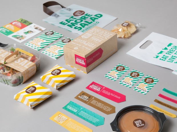
Source: thedieline.com via Designcollector Magazine on Pinterest

Source: dribbble.com via Designcollector Magazine on Pinterest

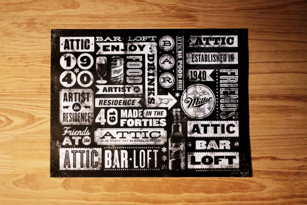
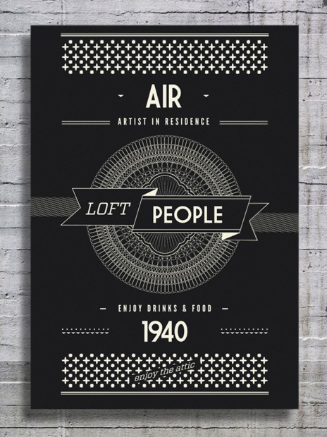
Source: typographyserved.com via Designcollector Magazine on Pinterest

Source: serialthriller.com via Designcollector Magazine on Pinterest

Source: serialthriller.com via Designcollector Magazine on Pinterest

Source: coffeemademedoit.com via Designcollector Magazine on Pinterest

Source: serialthriller.com via Designcollector Magazine on Pinterest

Source: coffeemademedoit.com via Designcollector Magazine on Pinterest

Source: coffeemademedoit.com via Designcollector Magazine on Pinterest

Source: friendsoftype.com via Designcollector Magazine on Pinterest

Source: serialthriller.com via Designcollector Magazine on Pinterest

Source: itskinshippress.com via Designcollector Magazine on Pinterest

Source: behance.net via Designcollector Magazine on Pinterest

Source: serialthriller.com via Designcollector Magazine on Pinterest

Source: serialthriller.com via Designcollector Magazine on Pinterest

Source: behance.net via Designcollector Magazine on Pinterest

Source: serialthriller.com via Designcollector Magazine on Pinterest

Source: behance.net via Designcollector Magazine on Pinterest

Source: fubiz.net via Designcollector Magazine on Pinterest

Source: serialthriller.com via Designcollector Magazine on Pinterest

Source: urbanic.bigcartel.com via Designcollector Magazine on Pinterest

Source: flickr.com via Designcollector Magazine on Pinterest

Source: hypnosky.com via Designcollector Magazine on Pinterest

Source: Uploaded by user via Designcollector Magazine on Pinterest

Source: thekdu.net via Designcollector Magazine on Pinterest

Source: yourjustlucky.com via Designcollector Magazine on Pinterest
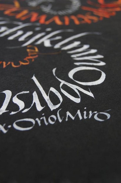
These are the typography works of Cape Town designer Ben Johnston that he did in collaborations for Type Exhibition "Back in 5 minutes"
http://vimeo.com/60153941


We have featured the lettering design work of Simon Walker in today's inspiration set but his portfolio worth of a full and detailed view. We like every bit of the screen he filled with a great hand-lettering examples, typography experiments and commercial works, just take a look at his website, flickr or dribbble for more inspiration.


Belgium based studio Coming Soon (featured before 1, 2, 3) were commissioned to make the cover in chalk for the march Learning issue of Modus Magazine.
http://www.behance.net/gallery/7x3m-Modus-cover/7414069


http://vimeo.com/60896365
Enjoy exploring typography and graphic design works of Will Miller on http://www.leftraggedright.com/


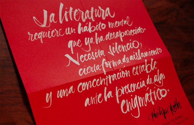
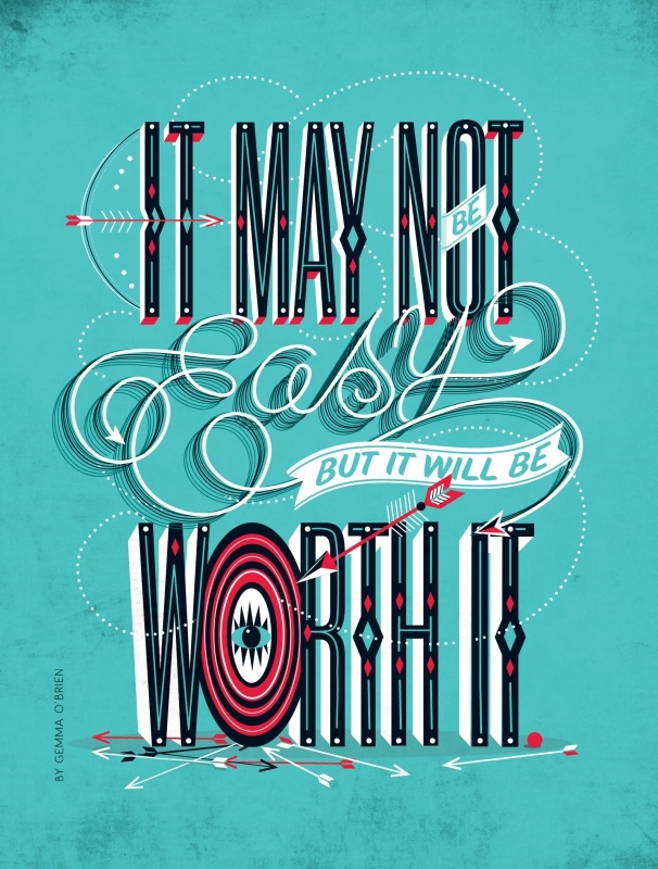
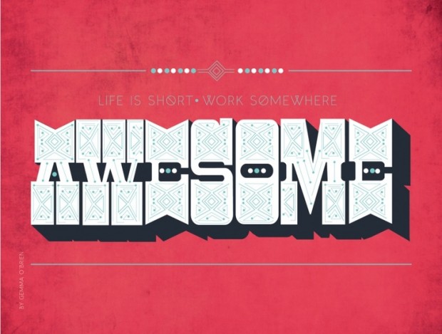
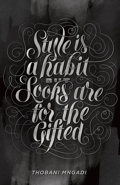
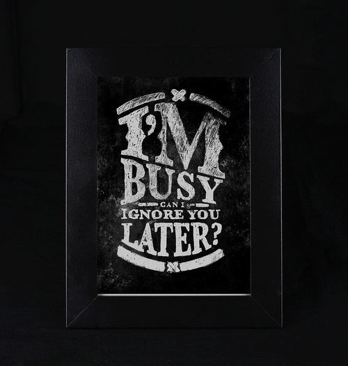
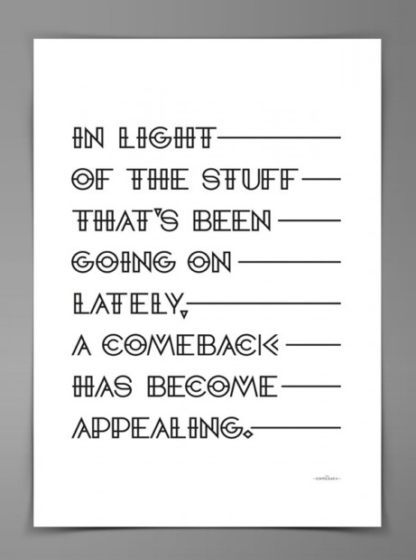
Toronto based graphic designer Ryan shares his visual view on famous and inspiring quotations that a worth to hang on a wall in a frame once being purchased from his store.


During the Graphic Design Festival Breda, Studio AIRPORT held a workshop called ‘Tempting Typography’. This three-day-long workshop was based on window-typography. Every participant joined a retailer on the St.Annastraat. On the basis of an assignment, the participants designed to reach a result which had to qualify and be able to stay on the shopping windows for a longer period of time.
http://www.typographyserved.com/Gallery/Tempting-Typography/5808989


http://vimeo.com/52160895
Not only did Ryan Feerer develop the identity, collateral and interiors (which he collaborated on with Dana Tanamachi and Jeff Rogers) for this awesome-looking restaurant, Abi-Haus, but he is also one of the restauranteurs behind the establishment. via


Designer Alander Wong has created a “Photo Quote” for each day of the year. That’s right for 365 days! He combines a diverse selection of typography with photography, and the end result is somewhat like visual poetry.via Illusion Scene360