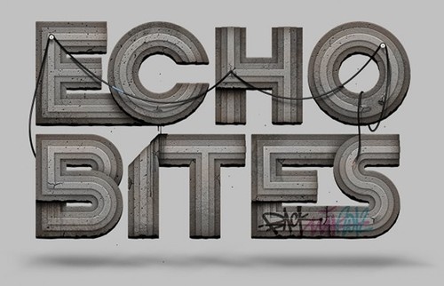
Concrete by HandMadeFont
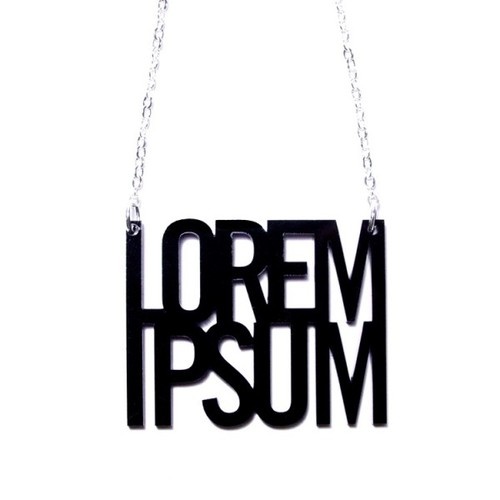
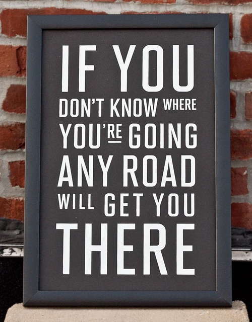
The typography magicians from HandMadeFont famous for their unusual fonts did it again and now in real concrete. All of their new objects can be purchased and set in your home.


The typography magicians from HandMadeFont famous for their unusual fonts did it again and now in real concrete. All of their new objects can be purchased and set in your home.
"Belgian studio Soon has made a promotional stop-motion video for Twixl media. The clip is an interesting watch because it is fully typographic and illustrated with chalk by Kelly De Ceuninck, and Pieter Vanhoutte. Additionally, it has been creatively directed by Jim Van Raemdonck, and typography and art direction by Lee Skinner." via Illusion Scene 360


http://vimeo.com/56277909
Work by Land, the design studio of Caleb Owen Everitt and Ryan Rhodes, produce some seriously cool work.


It's a new day - It's a new inspiration set for Typography lovers. Enjoy our picks and subscribe to our Pinterest account
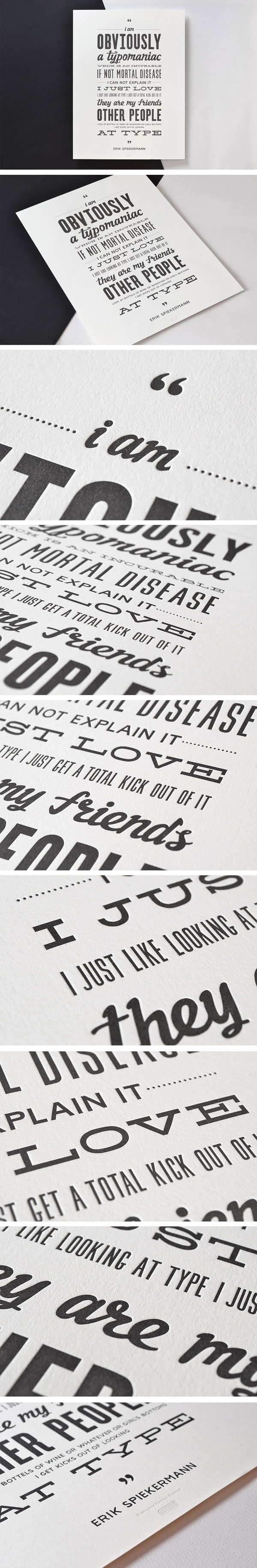
Swash & Kern is the bespoke lettering and typeface design alter ego of Positype‘s Neil Summerour.


"Kevin Devroo is a belgium illustrator & digital artist specialized in typographic works. Today we’re focusing on a serie of him entitled Iconic. Commissioned by agency Canada gent, he created an illustration using iconic furniture materials. "via Whitezine


Sao Paulo City, Brazil based typography and illustration print artist Adhemas Batistais a self-taught digital artist that is world-renowned for his colorful and distinctive illustrative style that he brings to his projects. Batista has worked for advertising agencies, design studios and interactive shops around the world and has developed skills in creative and art direction, illustration, interactive, photography and photo manipulation.


Pavel Paratov Motion designer of a new wave, shows off a new trend in typography animation with dynamic effects. His new work is an animated font ALQUIMIA
http://vimeo.com/53344583


Inspired by the light refraction Ruslan Khasanov created an experimental type "Lumen" based on a lens effect.


http://vimeo.com/52305654
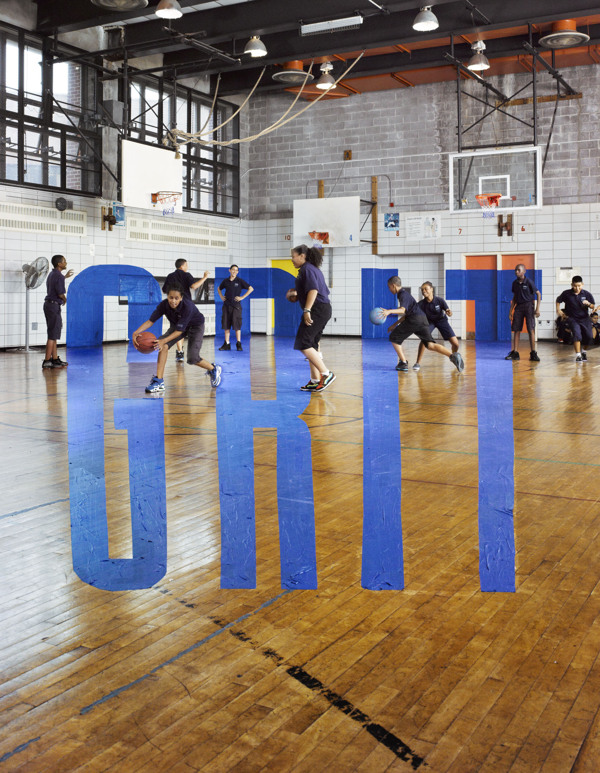
Teaching Characters is a series of indoors illusions (typography anamorphism) created by Stephen Doyle. A unique idea is cropping up in some American Schools, and that is the idea of teaching character as well as academics. In the story, seven traits are characterized: Grit, Optimism, Curiosity, Self-Control, Gratitude, Zest... and that old chestnut, Social Intelligence.


View full set on http://www.behance.net/gallery/Teaching-Character/5537699 Photography by Stephen Wilkes
Kiss Miklos is a Hungarian graphic designer that has a huge amount of great branding and graphic design works worth of a dozen of agencies. From the various projects we selected the lates made for local club Trafiq together with interior designers at 81Font but you must visit his site to check all other identities and typography works.


"Your Type of Book" is a student project from Aurelie Maron studying Digital Media at Griffith University in Brisbane, Australia. The book is a kind of a research of typography term through visual citations and quotes. "I decided to produce an alphabet of typography containing useful information related to a typographic term, a typographic artwork, a typographer and a typeface. In fact, the quote from Gerard Unger is what inspired me: "It is almost impossible to look and read at the same time: they are different actions." Every good typographer should have knowledge of both the art and science of typography and my aim in making this book was to create a source of inspiration and reference." Pity and due to copyrights issues this book can never be published. Don't hesitate to check all typography related project of Aurelie on http://www.aureliemaron.com/


New from Italian company Seletti: Neon Art, individual letters inspired by typewriter font that allow you to create your own signage.


Designers duo Gabriel Lefebvre and Rachel Lecompte did a top-notch identity for a small coffe shop. The Distributrice reinvents the takeout coffee service by taking over the smallest commercial space in Montréal.


To launch Typies, Barcelona-based Hungry Castle invited the people of Barcelona to help and literally launch every letter from the cushion alphabet onto a moving couch with wheels. All cushions available for purchase. http://www.hungrycastle.com/ http://typies.com/
http://vimeo.com/52953280


The project Alphabetical started in several years ago when Creative Review commissioned Dan Tobin Smith to create "a Letter A" for their Annual. "Each Letter has a different approach but uses Helvetica as the base typography. Most are temporary installations, some use landscape and some were conceived as primarily moving image (such as Letter T).
http://vimeo.com/32911741
New Letters will be added as they are finished and supporting material including work in progress will be added from time to time."


http://vimeo.com/26109378
http://vimeo.com/24924541
Two Arms Inc. is Michael Tabie and Karen Goheen, an illustration and design team from Brooklyn. They have a diverse portfolio but they excel at custom lettering and illustration. Their blog is well worth checking out and if you’re a big fan you can purchase some of their prints. via FFF


NY based design studio Tag Collective with a true passion for brand development delivers awesome visual and tactile solutions for local brands.


The history of Sony Music is charted in a typographic timeline installed in the company's London HQ, created by designer Alex Fowkes. The huge wall graphic features the names of nearly 1,000 artists signed to the major label and its affiliates, beginning with the foundation of Columbia Phonograph Company in 1887, to recent signings Post War Years and A$AP Rocky. The Sony Music Timeline celebrates 125 years of musical history covering almost 150 square meters of wall space in Sony’s Derry Street headquarters. Using just CNC cut vinyl as the sole medium, 54 columns measuring over 2 meters tall cover feature nearly 1000 of Sony Music's signed artists from 1887 to the present day.
Emma Pike, VP Industry Relations, who commissioned the piece said, “The brief was to bring the inspiration of our music into the heart of our building and make our office space live and breathe our incredible musical legacy. Alex’s beautiful graphics and illustrations do exactly that.”
More images on http://www.behance.net/gallery/Sony-Music-Timeline/5555472


http://vimeo.com/51460511
http://vimeo.com/51451449
