M I A M I by Vlad Likh
Moscow-based art director Vlad Likh shared a concept of fruit wine packaging inspired by Miami sky. Clean and nice work.
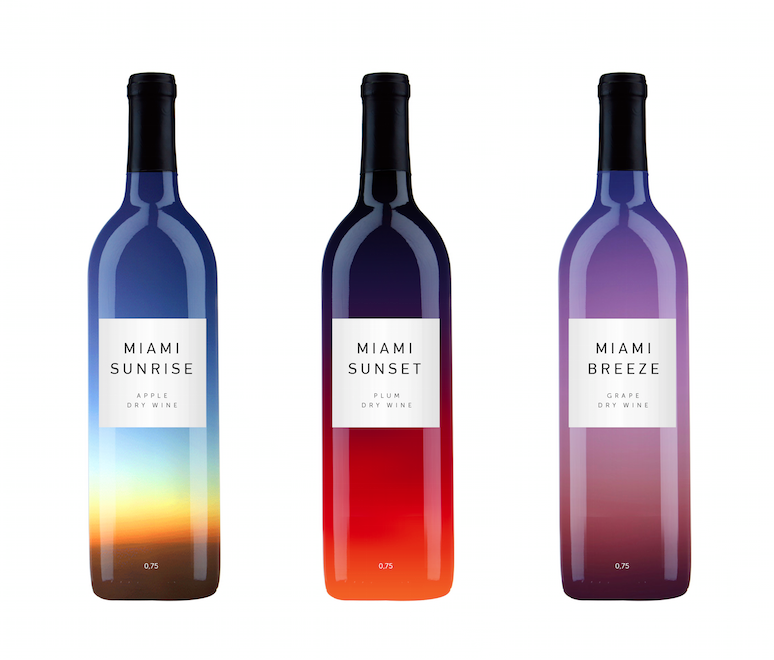

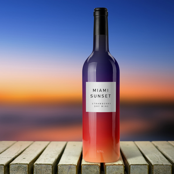
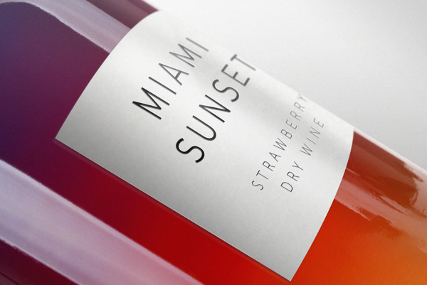
Moscow-based art director Vlad Likh shared a concept of fruit wine packaging inspired by Miami sky. Clean and nice work.


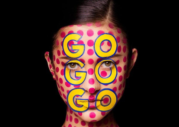
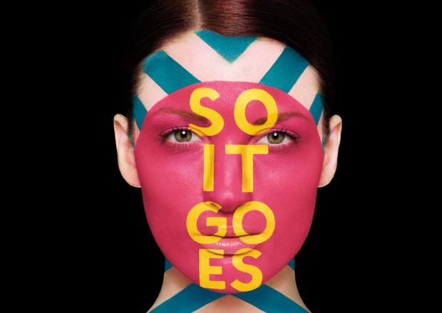
The Aizone Fall/Winter 2013 campaign is focused on bold colorful typography and positive and exuberant energy which reflects the dynamic, vibrant nature of the brand. The debuted the typography through colorful face painting with positive inspirational maxims "Play Hard", "Make Your Luck", "So It Goes", "Go Go Go" and "Be Free". Working with renowned body painter Anastasia Durasova, we painted the models' face with strong geometric graphic and bold playful typography. Art Direction, Design: Sagmeister & Walsh Makeup: Anastasia Durasova Photography: Henry Hargreaves

http://vimeo.com/72424814
San-Francisco based graphic designer and resident of Hatch Design studio Fred Carriedo has a lot of excellent works in portfolio http://www.mybestfred.com/
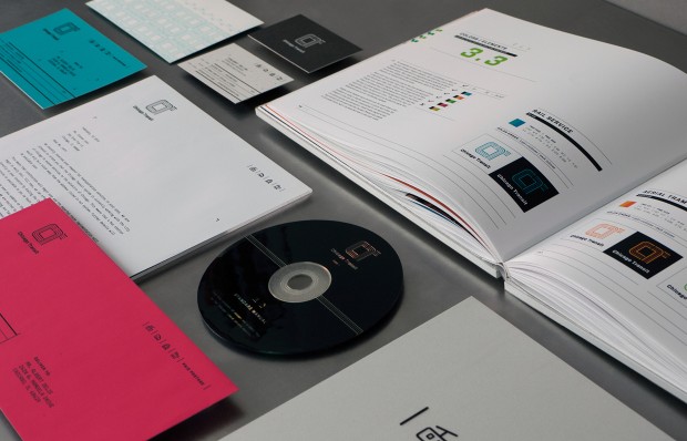

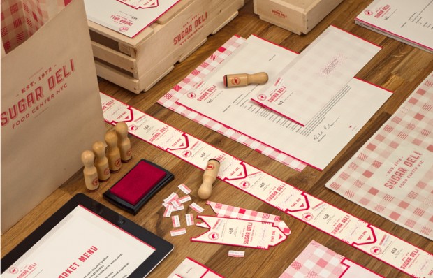
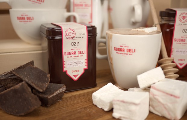
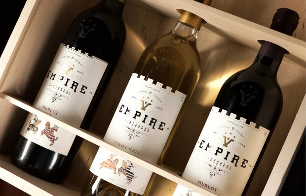
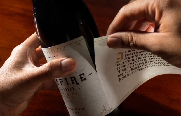
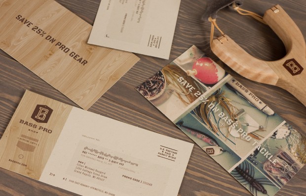
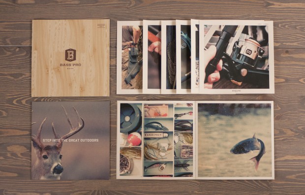
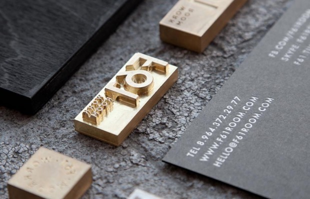
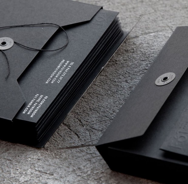
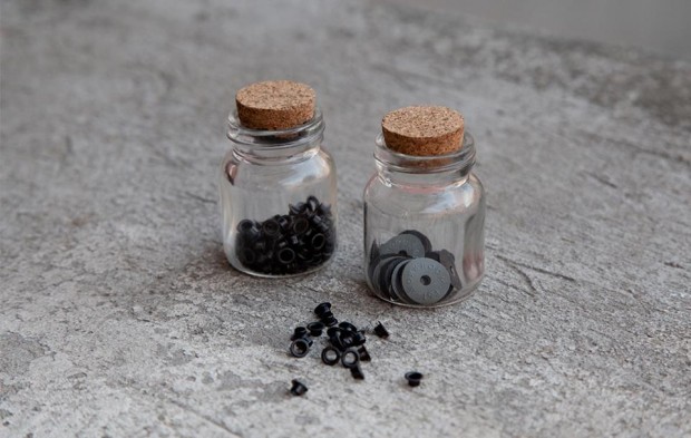
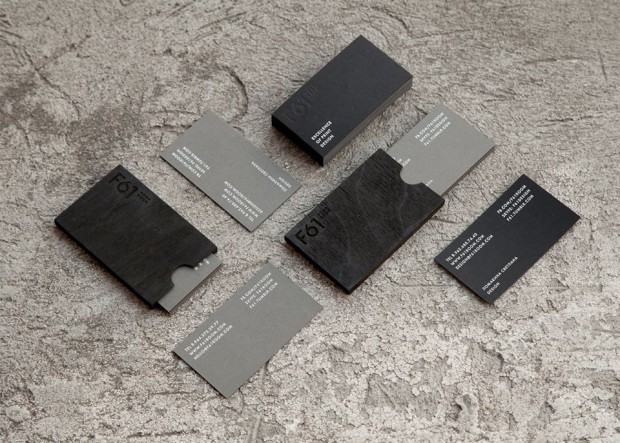
Our friend and very talented graphic designer Pavel Emelyanov has recently completed the work for local print studio F61




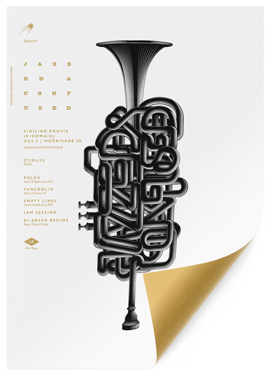
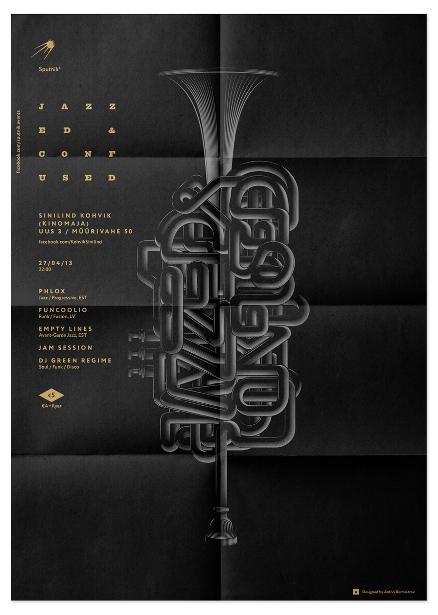
London based graphic designer originally from Russia does a whole lot great things that can be admired on antonburmistrov.com
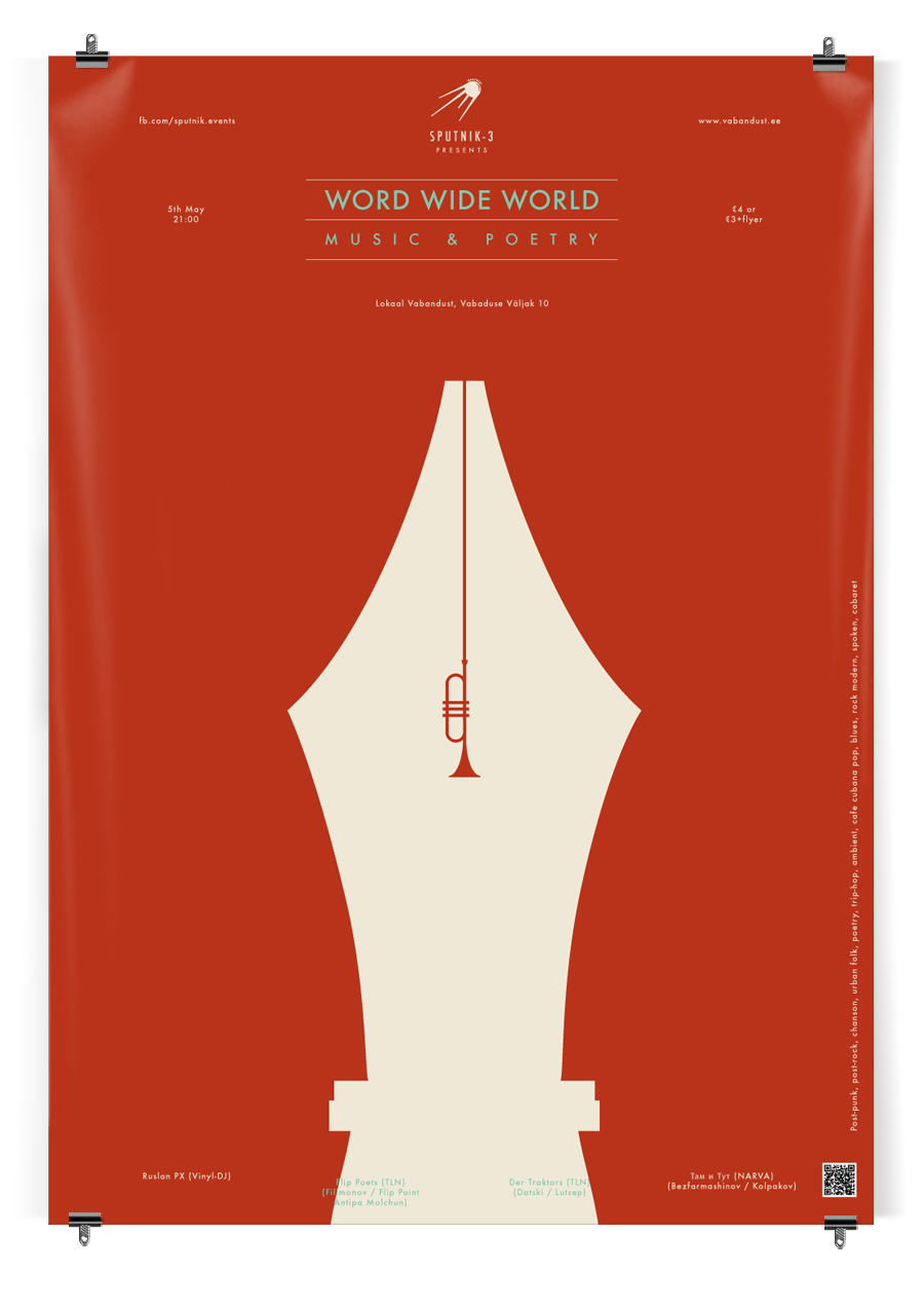
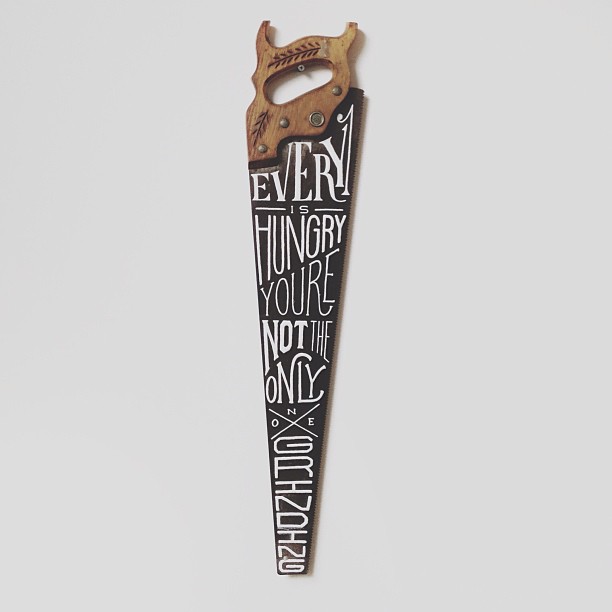
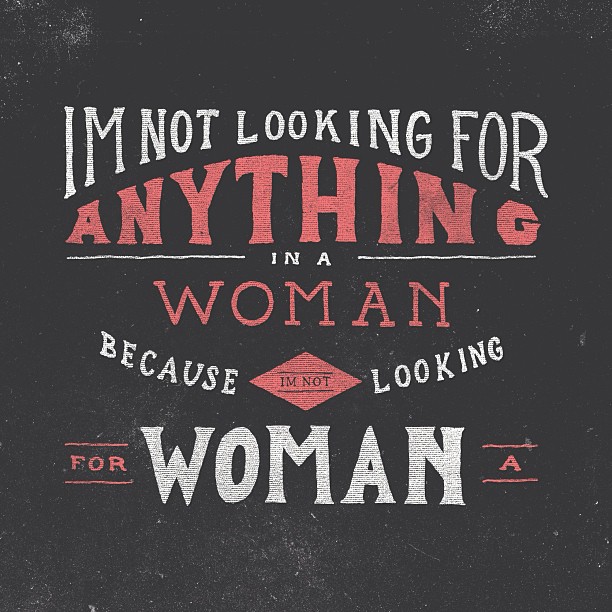
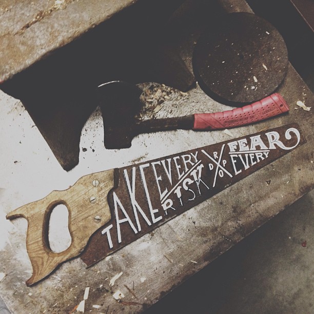
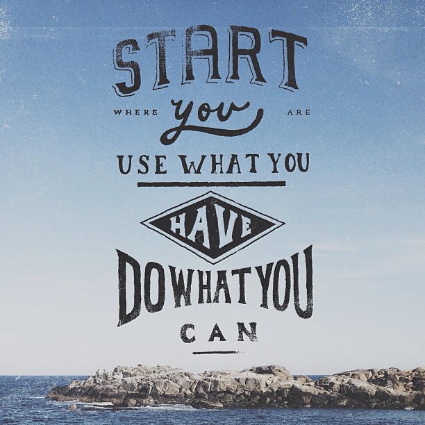
These rustic handwritten signs and typography posters are floating all around the tumblr and inspiration sites - meet the designer behind them - Zachary Smith - brighthead illustrator from Florida
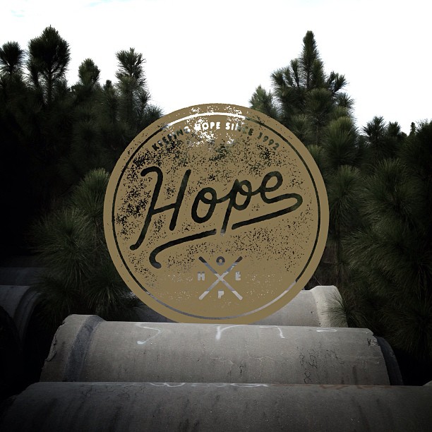
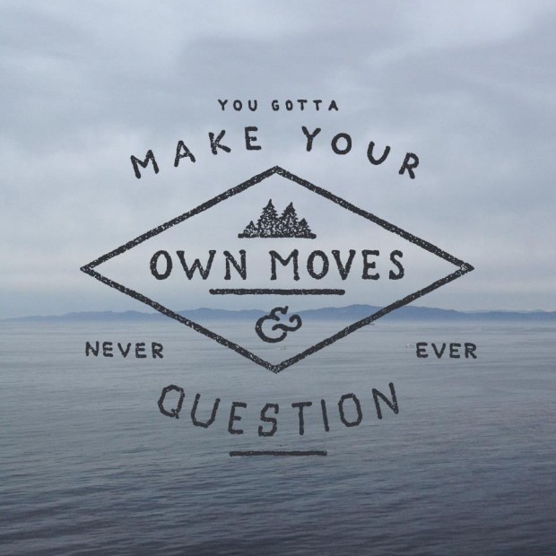

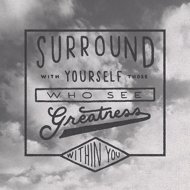

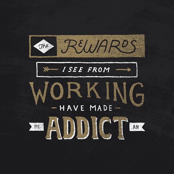
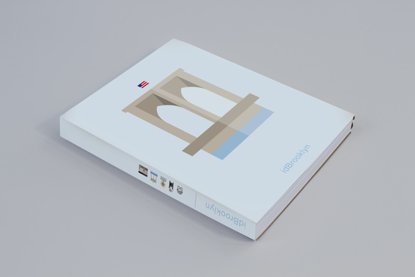
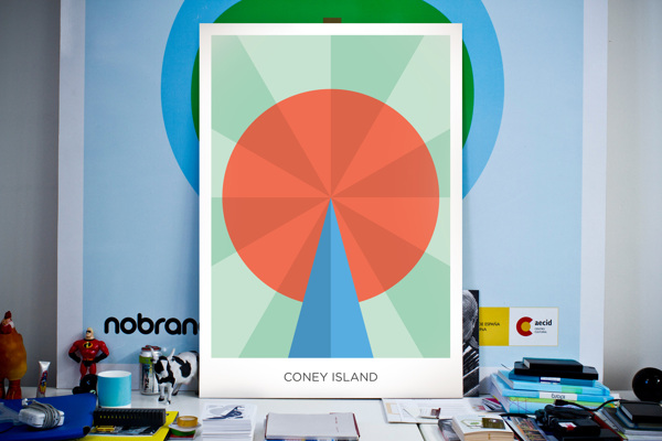
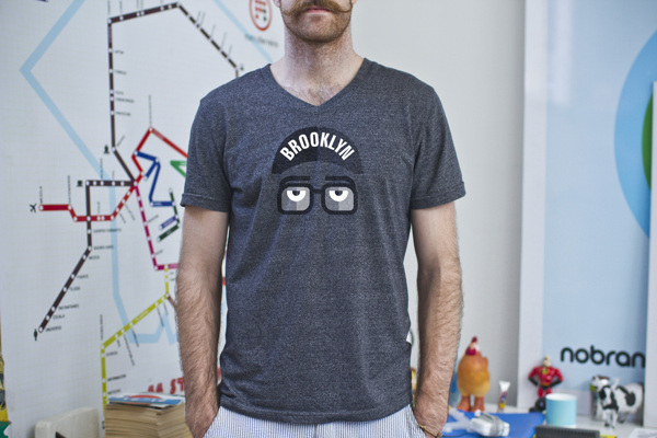
idBrooklyn is a large-scale design project aimed at creating the graphic identity of Brooklyn through crowdsourcing participation.
http://vimeo.com/63566416



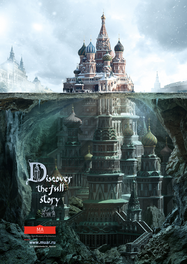
Saatchi&Saatchi Moscow rolled out smart and inspiring press campaign for Schusev State Museum of Architecture Moscow "Discover the full story of architecture"http://www.behance.net/gallery/MA/7868787
Agency: Saatchi&Saatchi Russia Creative Director: Stuart Robinson Account team: Khichtchenko Elena Creative team: Polonski Yuri, Demakov Anton Typography team: Sergey Sidorov, Anastasia Vedernikova Designers team: Mark Ignatiev PR team: Kristina Vorobieva, Yana Brekotkina Agency producer: Ekaterina Pastukh


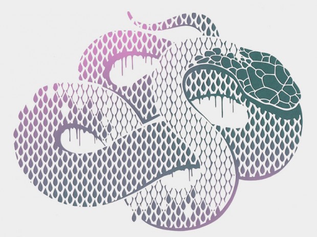
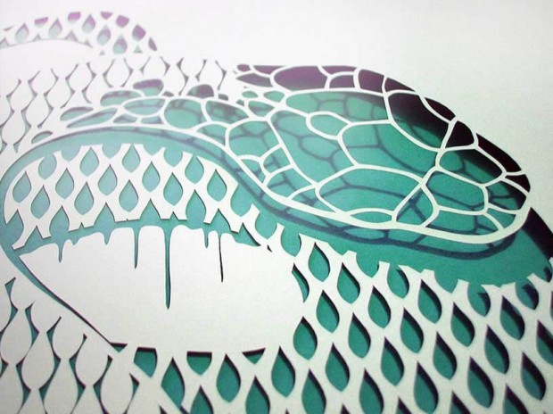
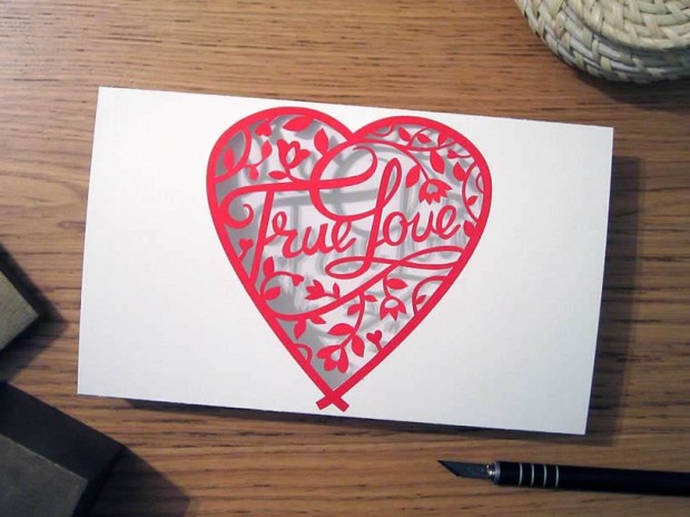
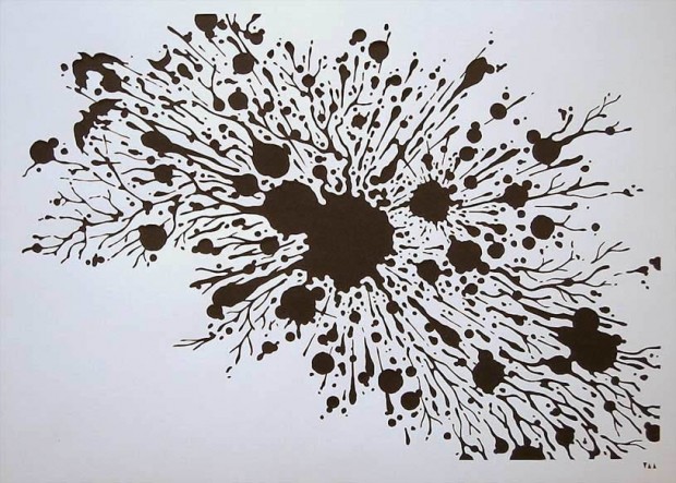
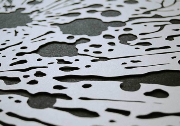
This is the delicate paper art of Anatoly Vorobyev from Siberia. Much of his work looks like regular printed illustrations, but the magical part is when you see a close-up picture of the cutout shapes. The patterns are detailed and precisely cut with a Japanese X-Acto knife. http://www.flickr.com/photos/v_a_a/ http://www.etsy.com/shop/Papercutout via

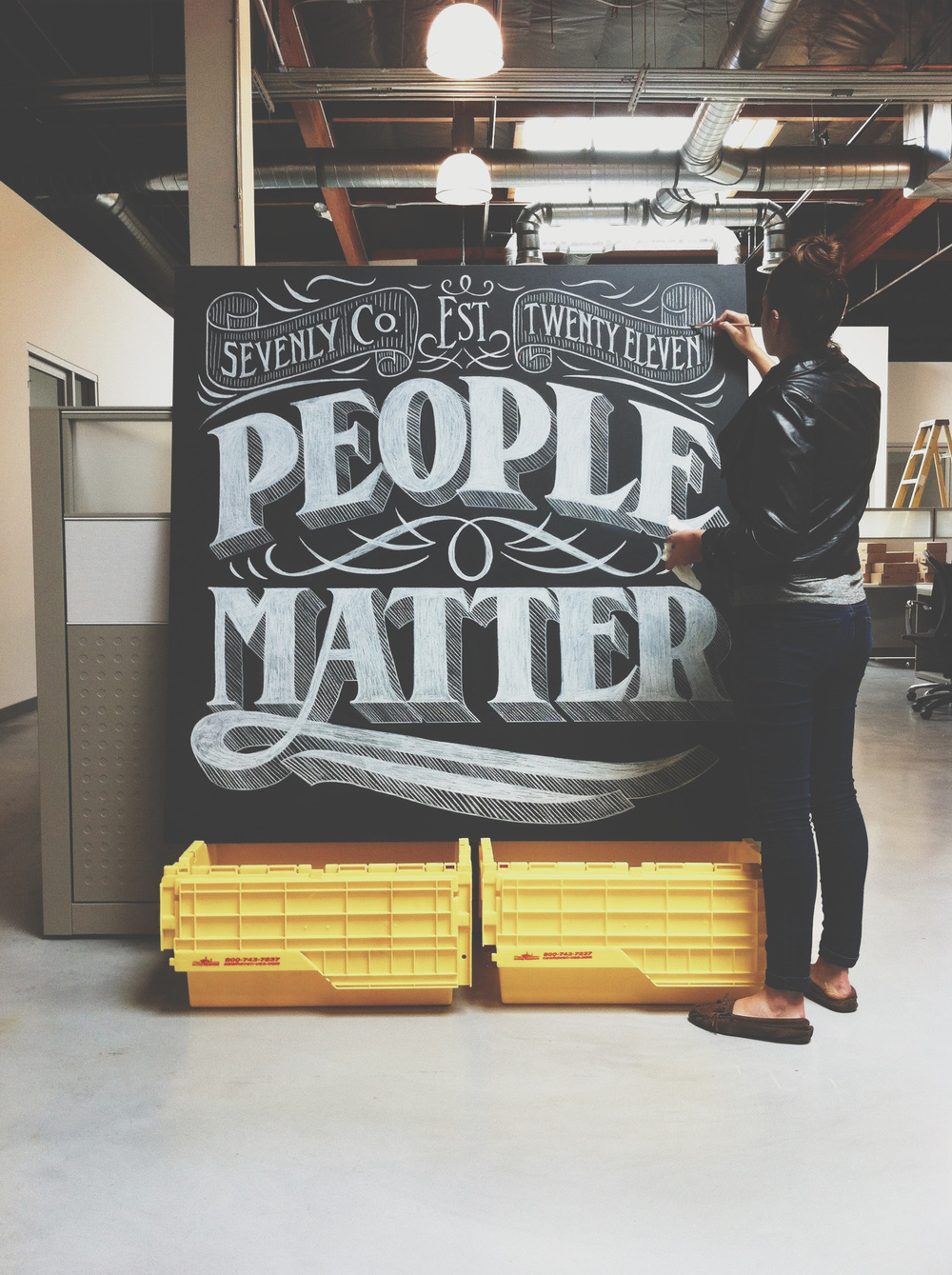
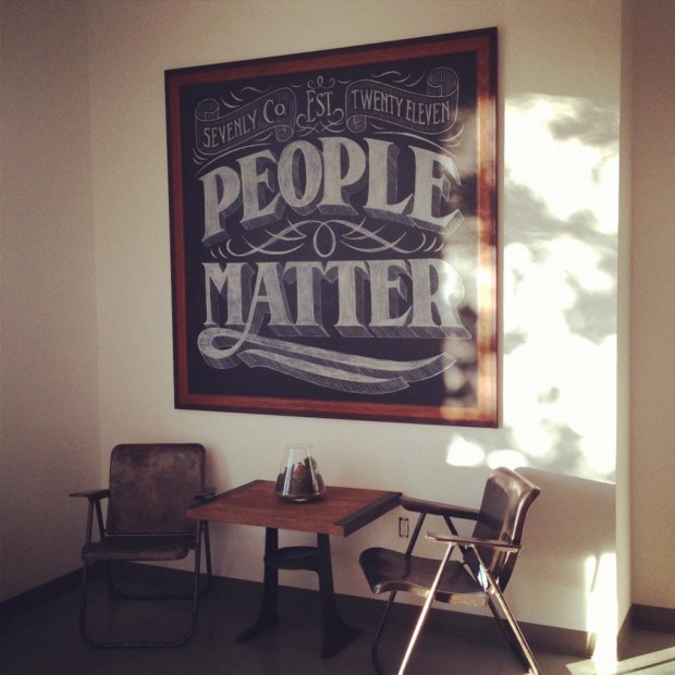
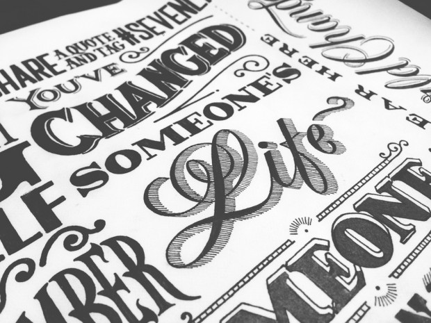
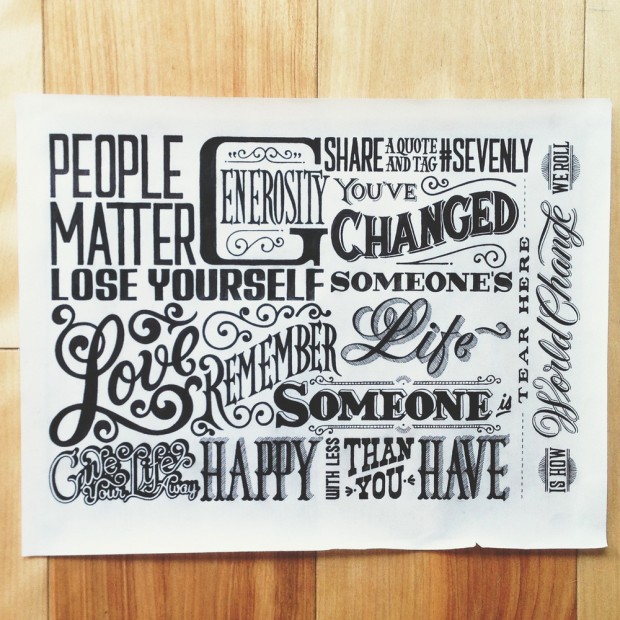
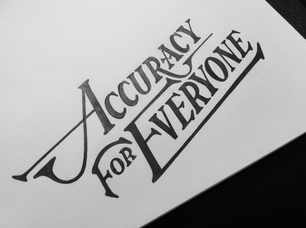
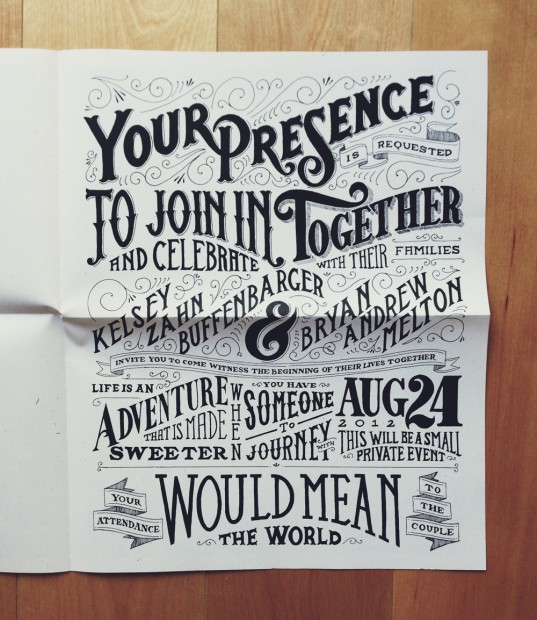
The typography work of Drew Melton is something to explore and inspire for hours. I personally enjoyed the presentation of every hand drawn piece spiced with "making of" photographs.

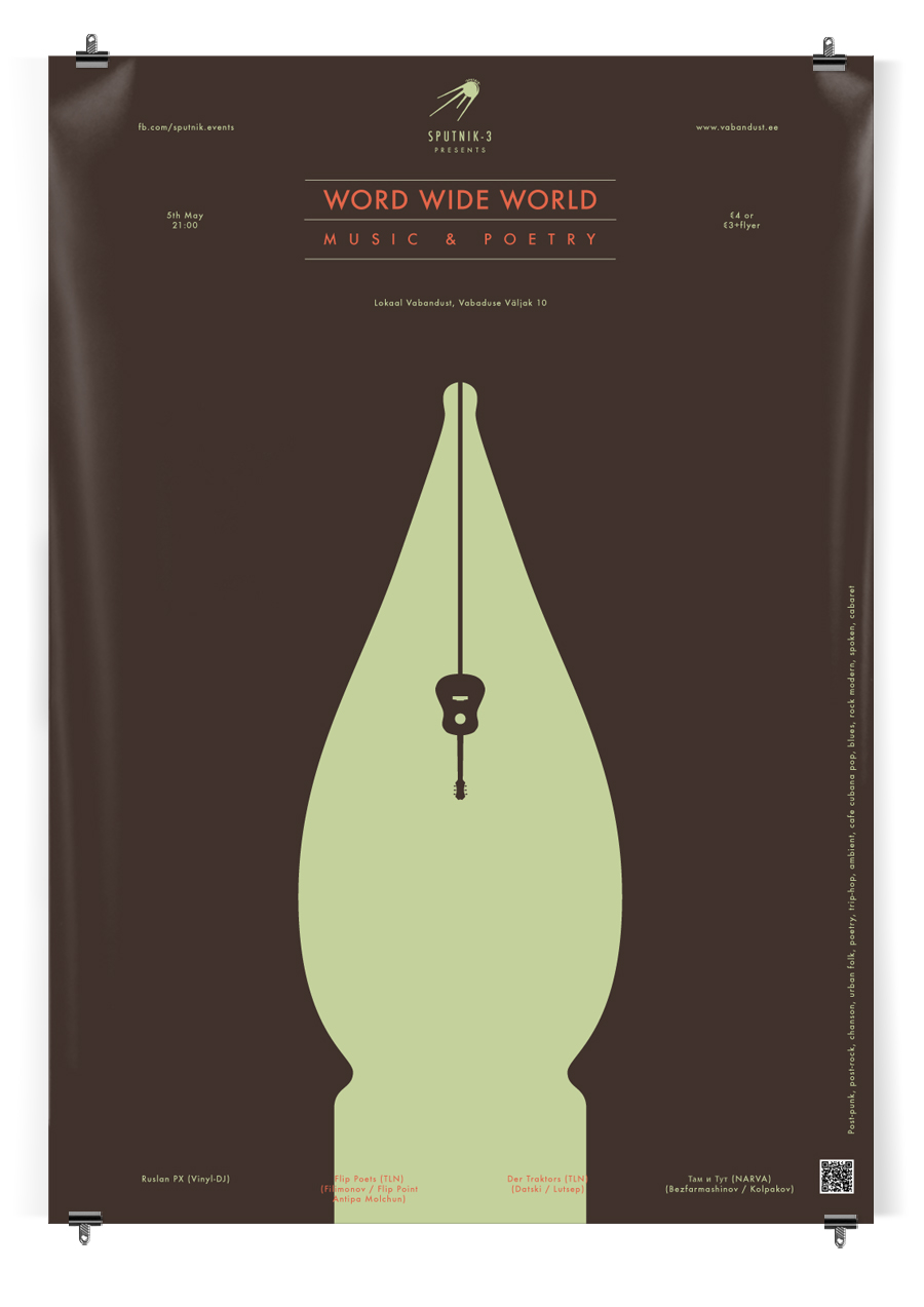
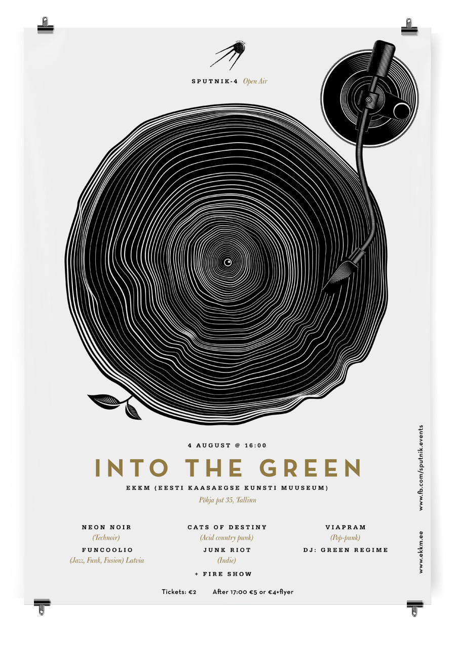
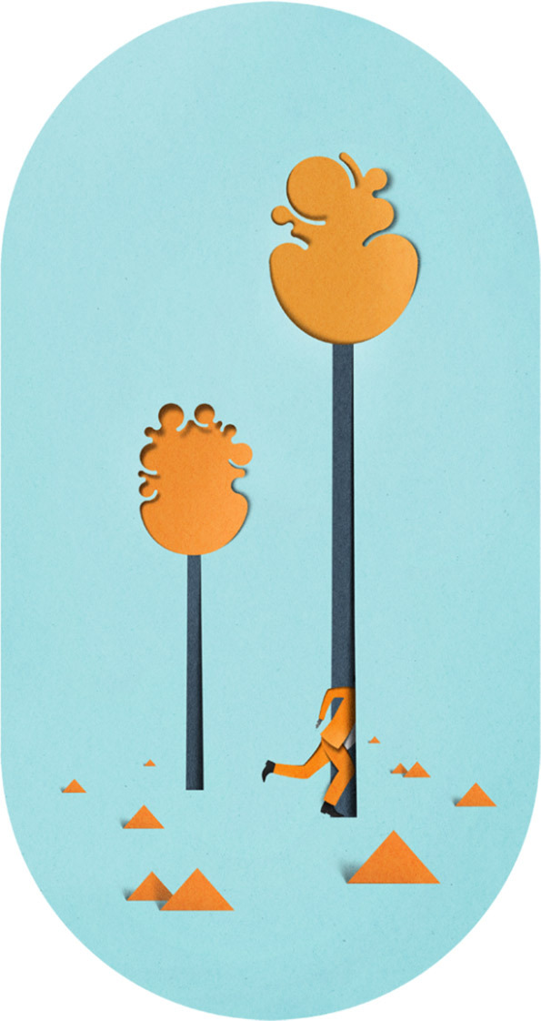
Eiko Olaja is an illustrator, graphic designer and art director based in Talinn, Estonia. He often uses paper-cut collages for graphic design works


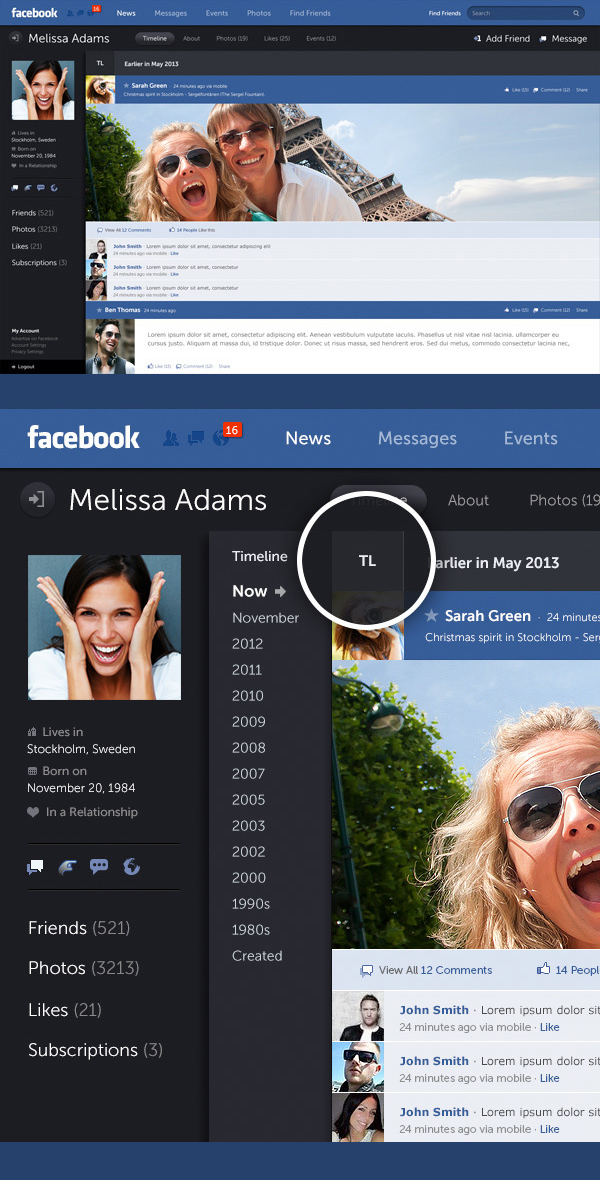
If you ask good user interface designer to come up with perfect layout for social network he will bury you under the tons of paper research and can eventually kill the idea. But if you ask bright UI designer to do the task he will get back to you with the Facebook he dreamed about for years. That what happened to Fred Nerby from Brisbane. He presents a conceptional and systematic design approach encouraging user behaviour and a greater control of data within a responsive grid.If this guy won't work for Facebook in a month than Zuckerberg does not exist.


http://vimeo.com/56488043
View full presentation on Behance