Coffee Art by Mike Breach
Tumblr team invites to meet Mike Breach, barista extraordinaire, who "paints" everything -- and everyone -- into his lattes. (via Colossal)

http://vimeo.com/63098055
Tumblr team invites to meet Mike Breach, barista extraordinaire, who "paints" everything -- and everyone -- into his lattes. (via Colossal)

http://vimeo.com/63098055
While scanning the internet for great motion graphics we tend to find huge amounts of amazing videos which we’ve chosen to present in our “Motion Graphics Inspiration” section. Take a first row and enjoy the latest gems from this week! Check our Video blog on Motioncollector.com.
Using a combination of figurative art and free-flowing abstraction, Serbian painter Milan Hrnjazovic endeavors to visually represent the emotional anxiety of the young adult female's evolving sense of self-image and burgeoning sexual desires. (via Juxtapoz)
Dark scary digital art of Artem Semenov tells me not to visit the attic or bad sites at night. He is a member of SlashTHREE and has few of his work on a high rotation during the last few years I can't rid off from the feeling that Anton was awesomely inspired (or just reminds) by the artworks of darkest illustrator in Russia - Cmart and fiction environment artist Alex Andreev
"Denver-based artist Chris Carlson who is known for his work with 3D chalk illusions created a great stop motion Tetris game. The shading, perspective and motion is incredibly spot-on. You can see more of his video game and pop-culture influenced chalk drawings over on Tumblr." (via Colossal)


 http://www.youtube.com/watch?feature=player_embedded&v=y0_lw5QXSvk
The 3rd and the last trailer for the epic movie about roaring twenties is here. You might be interested in director Baz Luhrmann speaks exclusively with JAY Z's Life + Times about The Great Gatsby: http://bit.ly/17fWWDA. Meanwhile enjoy the preview, it worth of it.
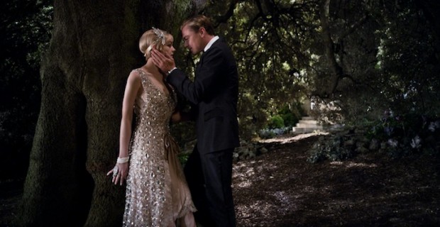
http://www.youtube.com/watch?feature=player_embedded&v=ozkOhXmijtk
Pop-illustrator duo Craig and Karl (Craig Redman from NY and Karl Maier from London) create impressive graphic designs in different collaboration with photographers and agencies for numerous clients. We selected their collabs with Bureau Mirko Borsche for Bavarian Opera and photographer Lacey for Vogue Japan
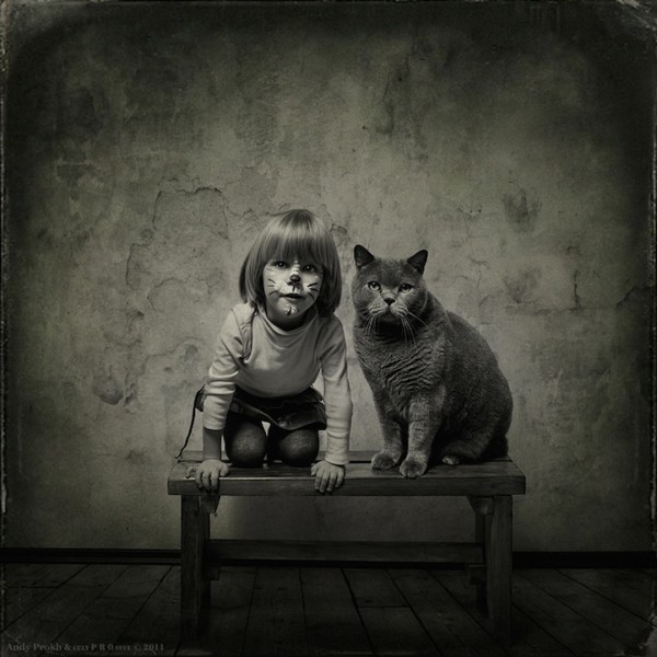
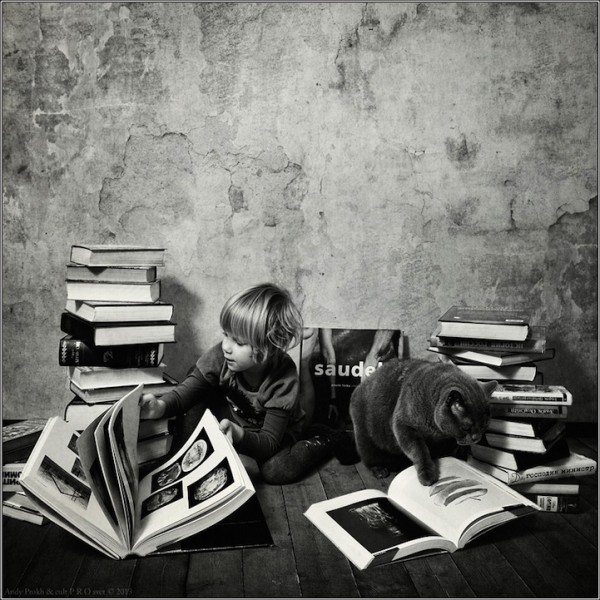
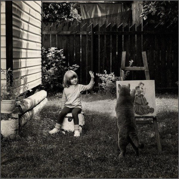
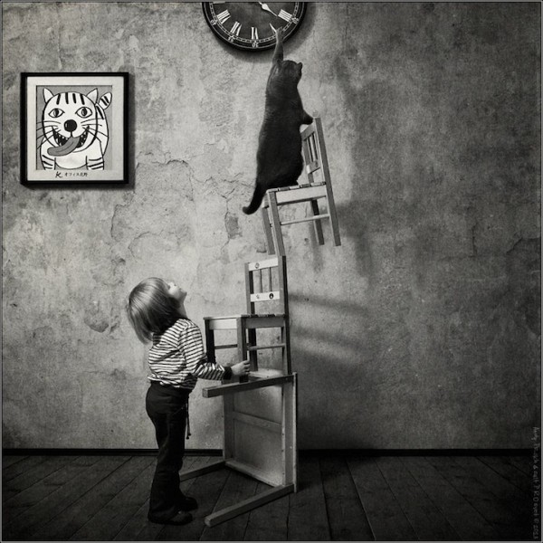
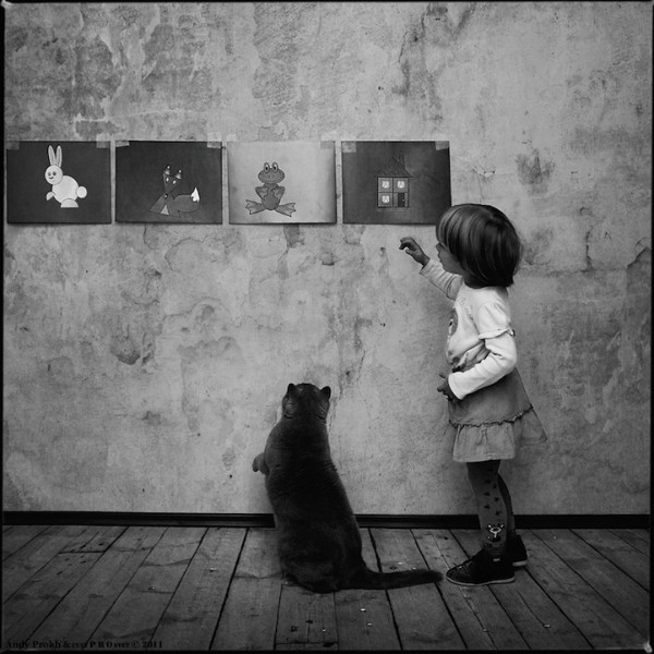
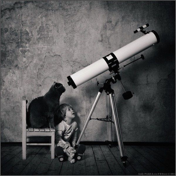
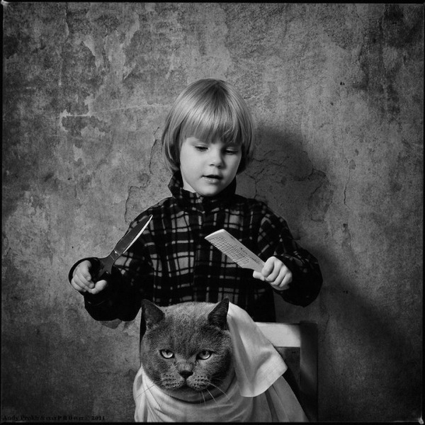
Russian photographer Andy Prokh has taken this sweet photo series of his daughter Katherine and their cat LiLu Blue Royal Lada






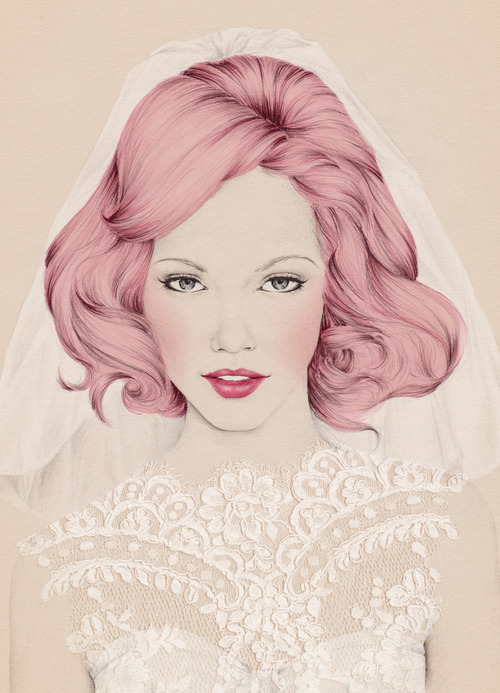
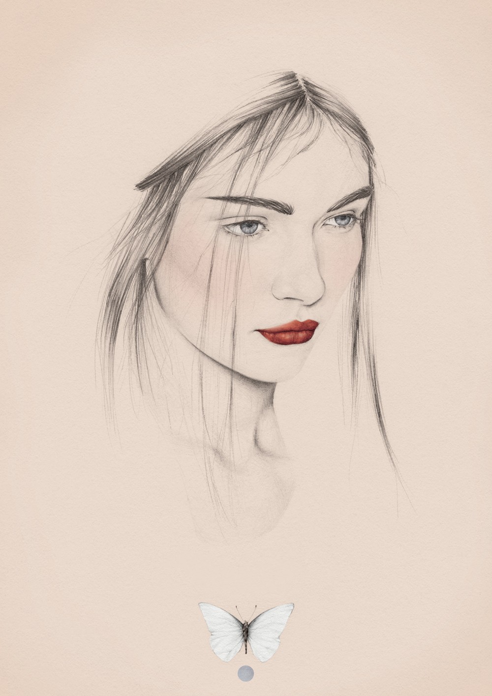
I rarely fall down with love in artworks but the works of Melbourne based Emma is the pleasant exception. Emma is a creator of shy, feminine and melancholy artworks and illustrations that have found favour with clients including book publishers and hotels. http://www.emmaleonard.com/
Read interview with artist on http://www.digitalartsonline.co.uk/portfolios/emma-leonard/




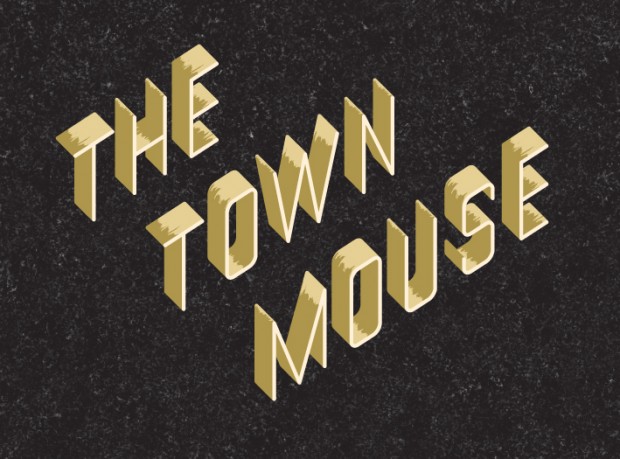
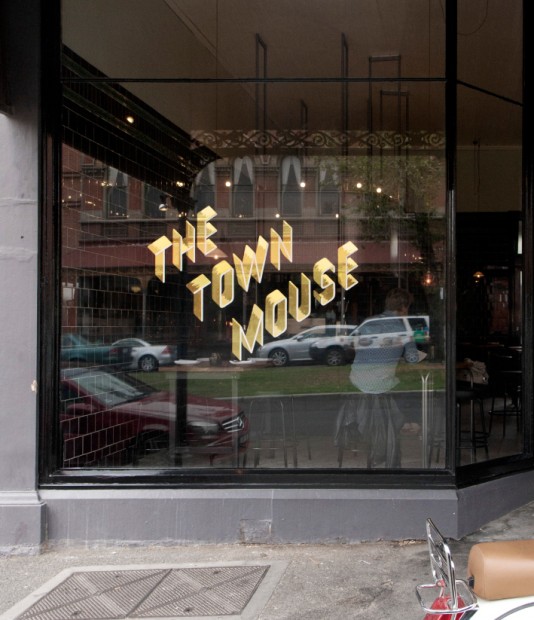
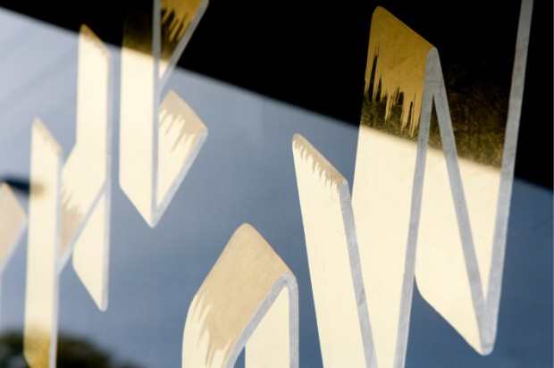
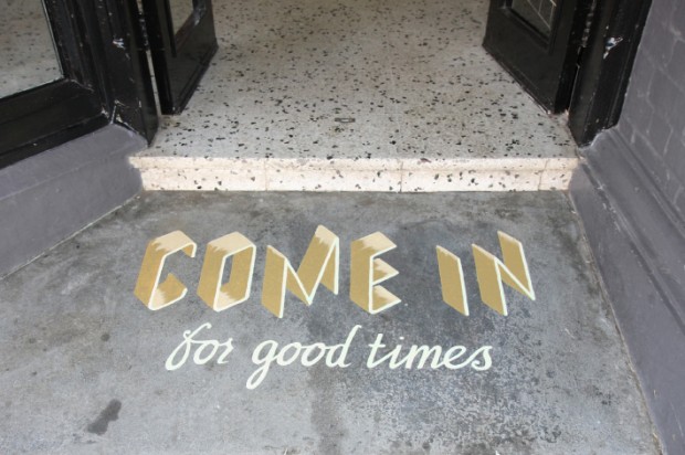
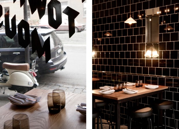
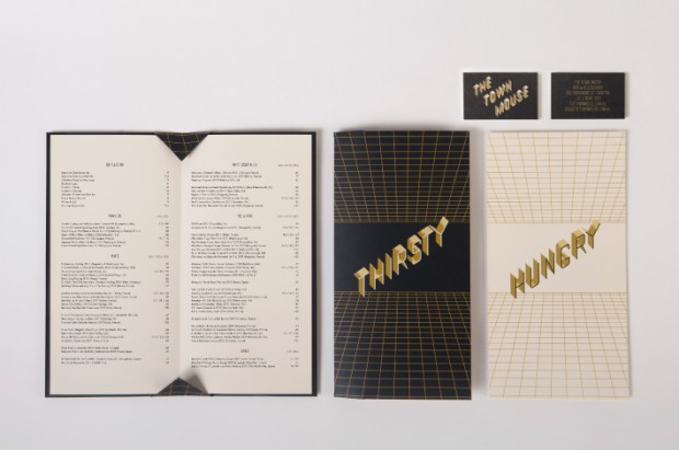
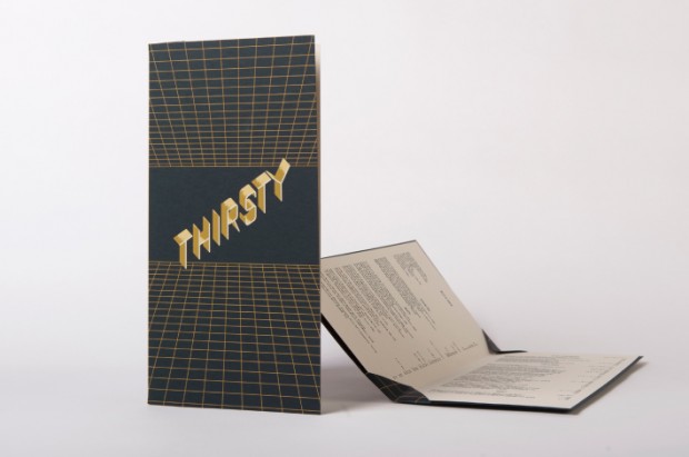
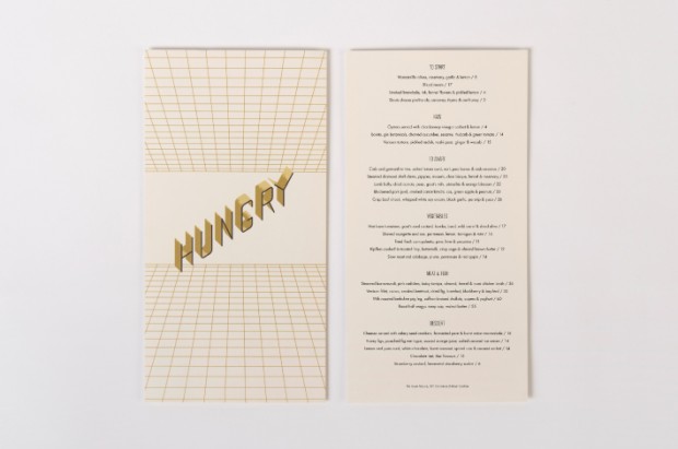
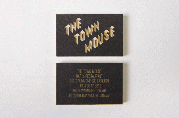
"The Town Mouse is a new Melbourne-based bar and restaurant owned by Christian McCabe and located in the space formerly occupied by the Embrasse Restaurant. Developed by A Friend Of Mine, the bar’s visual identity delivers impact through the ‘big city’ and slightly retrospective dimensionality of tall, slim, skyscraper-like, uppercase characters of the logo-type set within and alongside the grids of the collateral." Read more on BP&O
Take a rest and enjoy the most beautiful city in the world by the eyes of a stranger. Andrew Julian visited Paris this winter to enjoy its mesmerising loneliness
http://vimeo.com/62959319
The way you present your design project or concept is a half of success. Russian brand designer Pavel Emelyanov following this golden rule every time he rolls out another mouthwatering example of branding. This time a small chain of italian cuisine restaurants were lucky enough to get their graphic face from the most successful Russian identity art director Pavel Emelyanov.
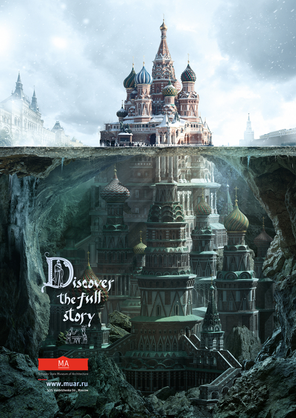
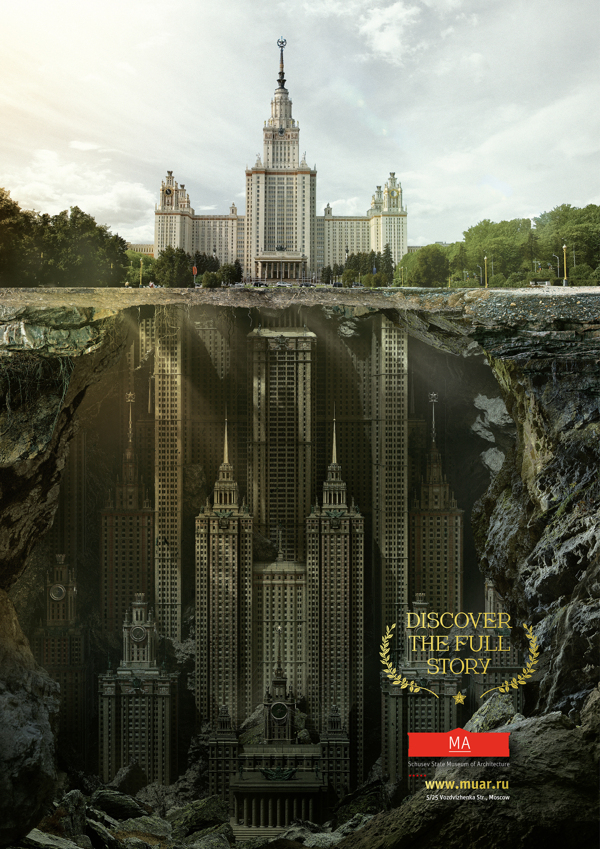
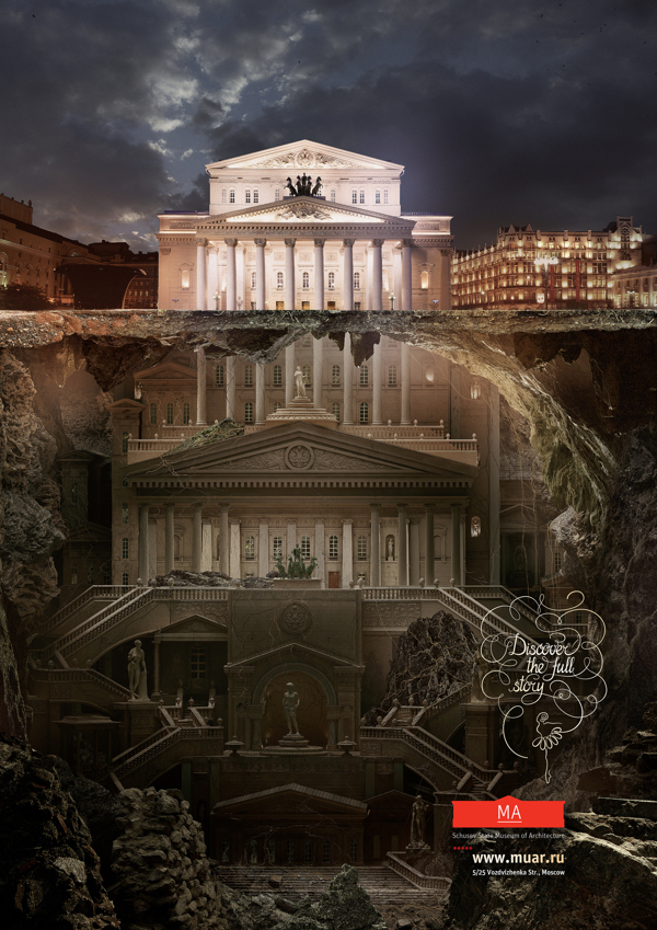
Saatchi&Saatchi Moscow rolled out smart and inspiring press campaign for Schusev State Museum of Architecture Moscow "Discover the full story of architecture"http://www.behance.net/gallery/MA/7868787
Agency: Saatchi&Saatchi Russia Creative Director: Stuart Robinson Account team: Khichtchenko Elena Creative team: Polonski Yuri, Demakov Anton Typography team: Sergey Sidorov, Anastasia Vedernikova Designers team: Mark Ignatiev PR team: Kristina Vorobieva, Yana Brekotkina Agency producer: Ekaterina Pastukh
Tim Reynolds is an exhibit designer and illustrator based in Milwaukee currently experimenting with low-polly 3D graphics. Tim’s work showcases some of the best examples of this technique. http://dribbble.com/turnislefthome


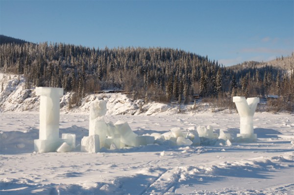
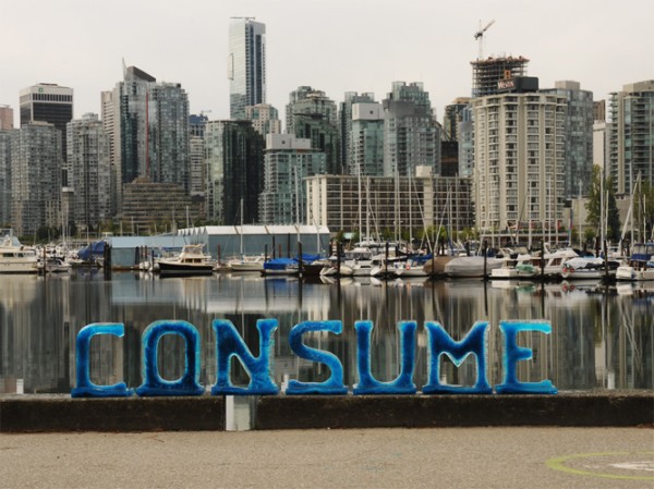
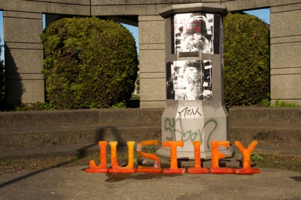
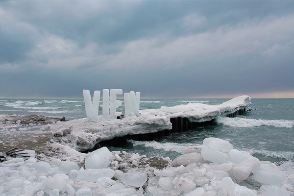
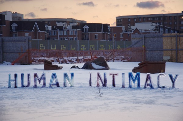
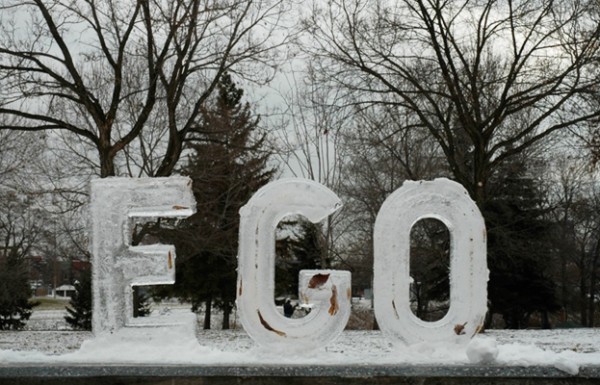
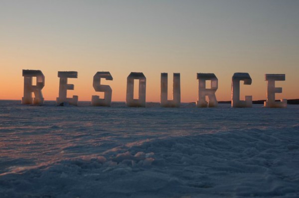
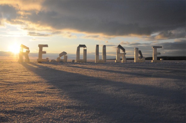
Even this coolest winter in European history has its pluses if you are a creative head. For Canadian environmental artist Nicole Dextras a severe weather is just another challenge to create massive ice messages to the human being or penguins. http://www.flickr.com/photos/ndextras/
When the ice texts are installed on site, the temperature determines how long it will take for them to change state from solid to liquid. This phase of transition becomes symbolic of the interconnectedness of language and culture to the land as they are affected by time and by a constant shifting and transforming nature.

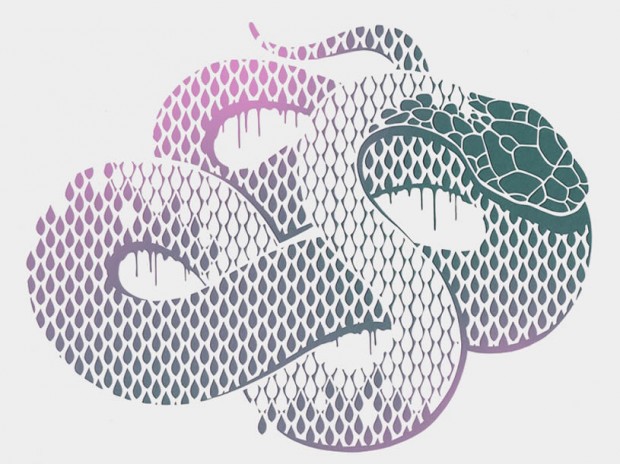
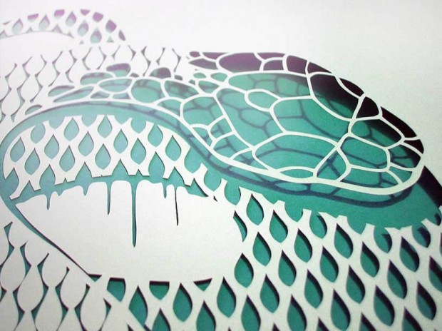
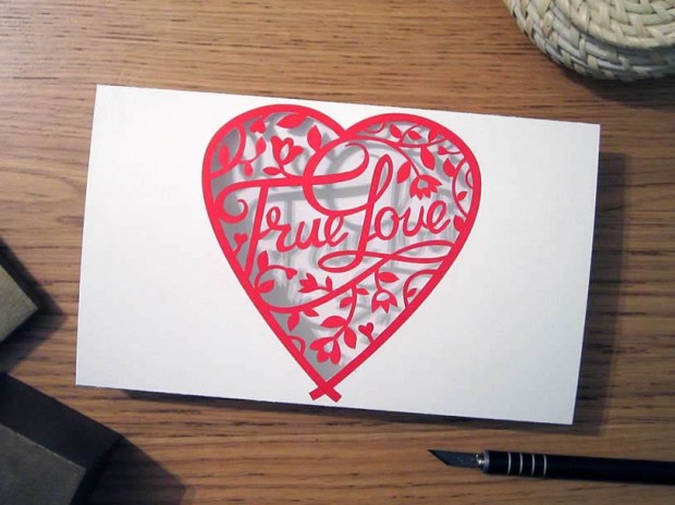
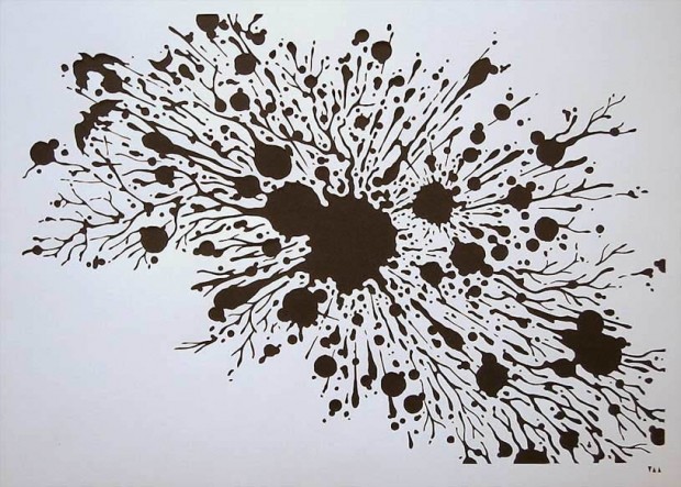
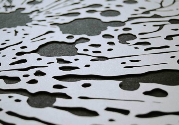
This is the delicate paper art of Anatoly Vorobyev from Siberia. Much of his work looks like regular printed illustrations, but the magical part is when you see a close-up picture of the cutout shapes. The patterns are detailed and precisely cut with a Japanese X-Acto knife. http://www.flickr.com/photos/v_a_a/ http://www.etsy.com/shop/Papercutout via

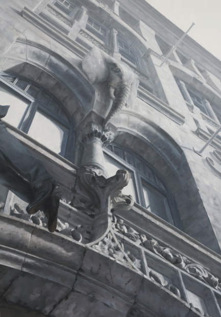
Impressive surreal paintings by Norway-base self-taught artist Henrik Aarrestad Uldalen. The atmosphere in his subject matter is often depict in a limbo or dream-like state. Despite his realistic approach, photographic accuracy is not what he seeks to achieve.




Have you ever played "Associations"? Imagine artist Dina Kelberman is doing that with images from Google. Everyday she starts with previous image and finds it siblings or close visual association sorting by many options from colour to objects used on it. Endless and priceless state of digital art! http://dinakelberman.tumblr.com/
I’m Google is an ongoing tumblr blog in which batches of images and videos that I cull from the internet are compiled into a long stream-of-consciousness. The batches move seamlessly from one subject to the next based on similarities in form, composition, color, and theme. [... ] I feel that my experience wandering through Google Image Search and YouTube hunting for obscure information and encountering unexpected results is a very common one. My blog serves as a visual representation of this phenomenon. This ability to endlessly drift from one topic to the next is the inherently fascinating quality that makes the internet so amazing.


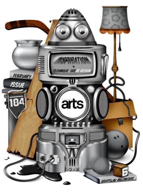
Belgrade based illustrator and graphic designer Bratislav Milenkovic has many good artworks to share with visitors on http://www.bratislavmilenkovic.com/


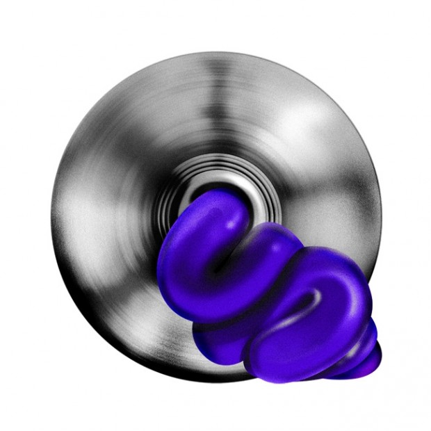
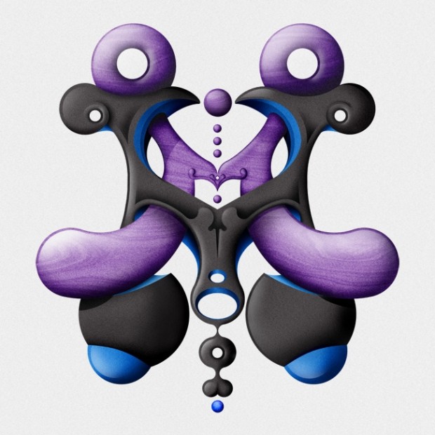
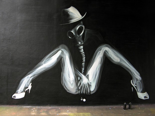
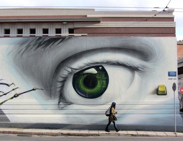
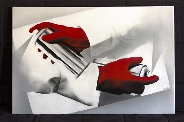
iNO has been a graffiti writer since 2000. The earlier years he produced mostly letters and bombing but after 2008 he focused in developing his style in characters. He studied Fine Arts and is active as a street artist. He is working constantly to evolute his spray painting technique and produce large scale murals.
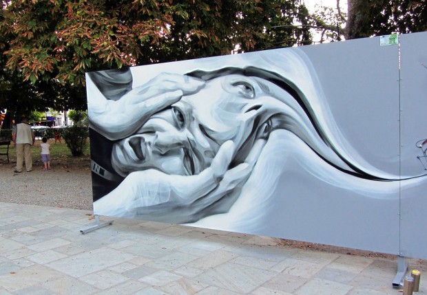
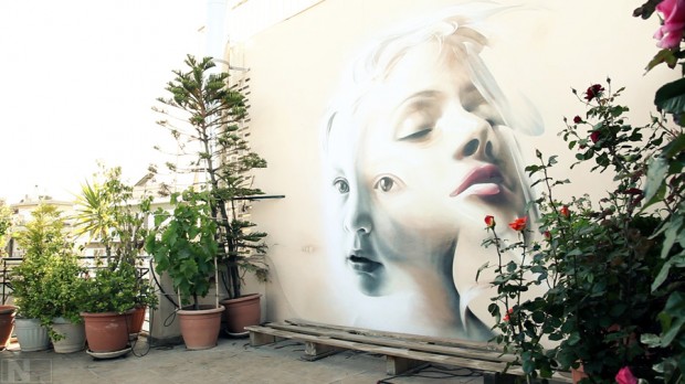

http://vimeo.com/62858341