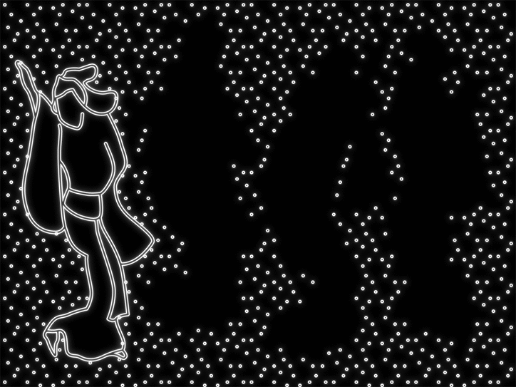
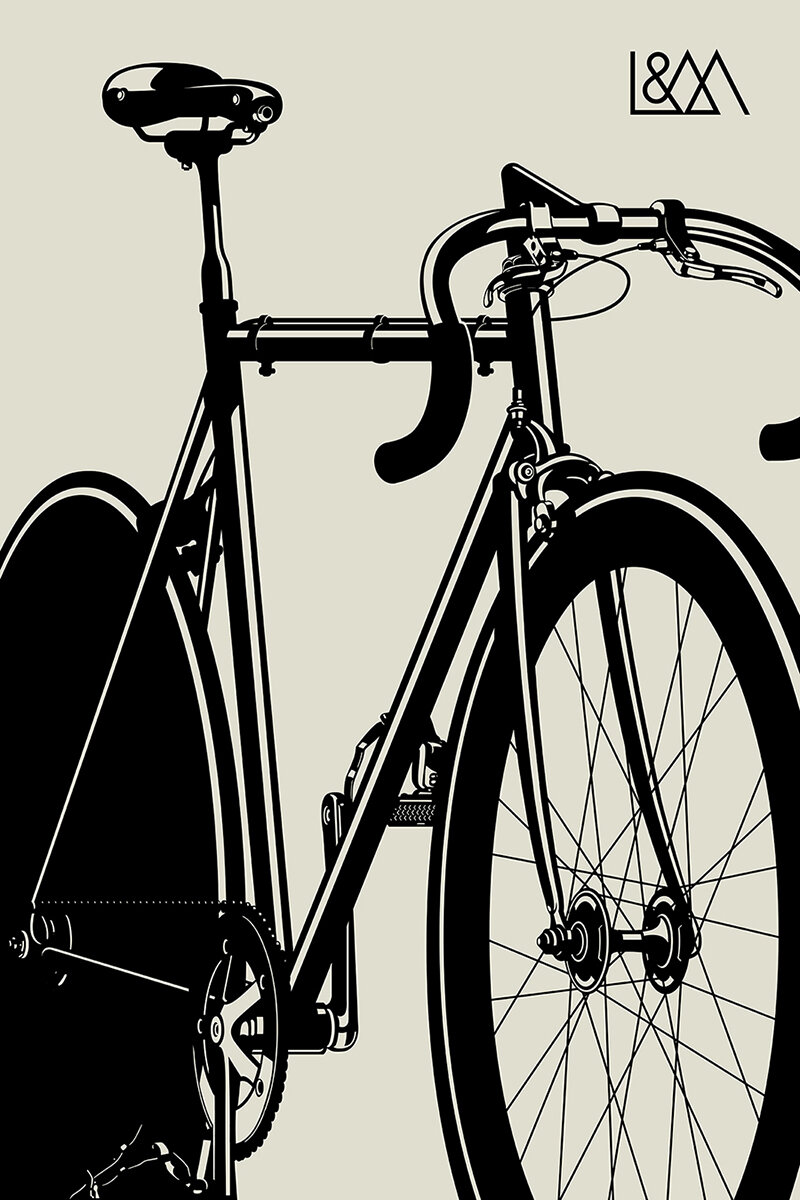
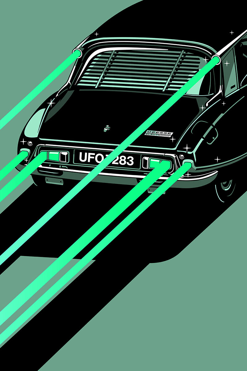
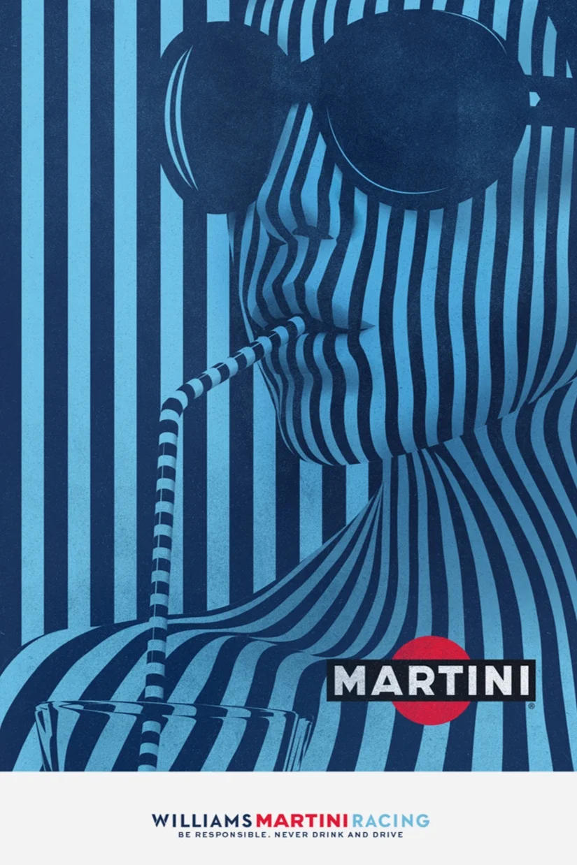
Gianmarco Magnani Ilustration
Illustration of Gianmarco Magnani follows the style of original Swiss movie posters - eye-catching attention to details and sleek graphics
3rd Wave of Inspiration
Since 2003
Illustration of Gianmarco Magnani follows the style of original Swiss movie posters - eye-catching attention to details and sleek graphics

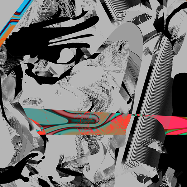
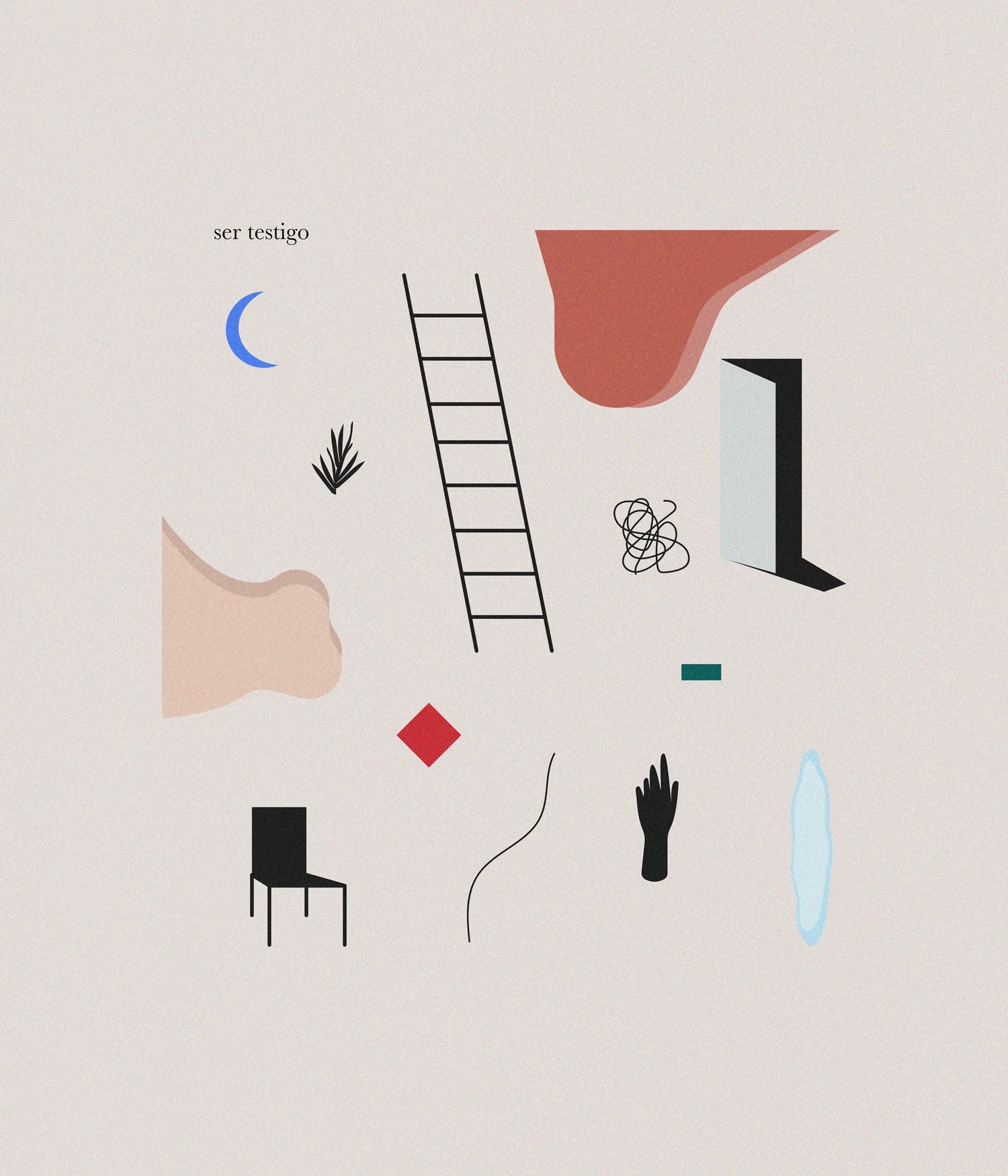
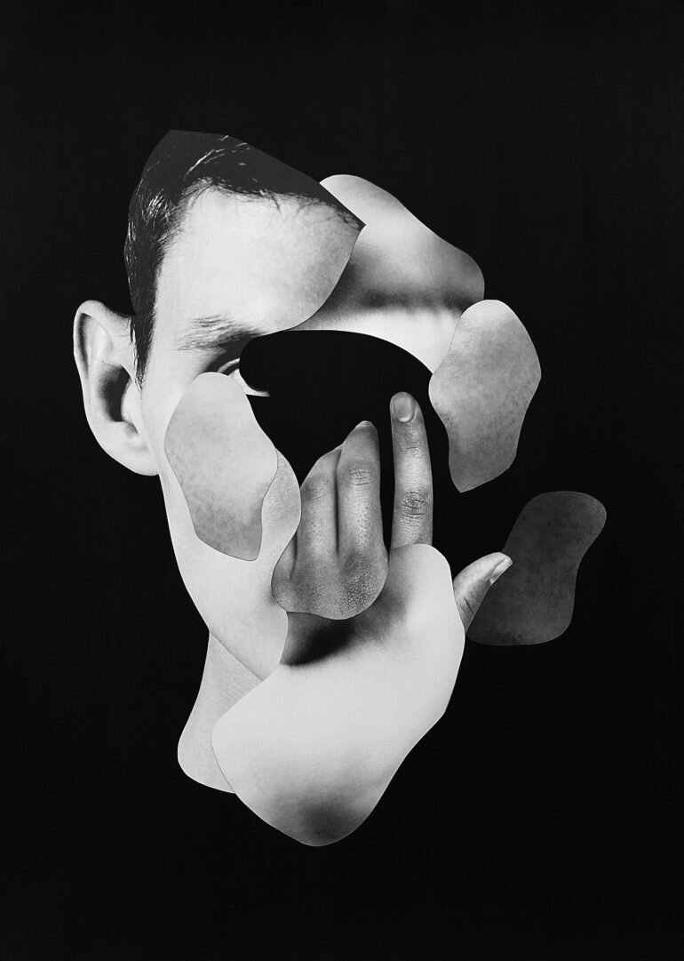
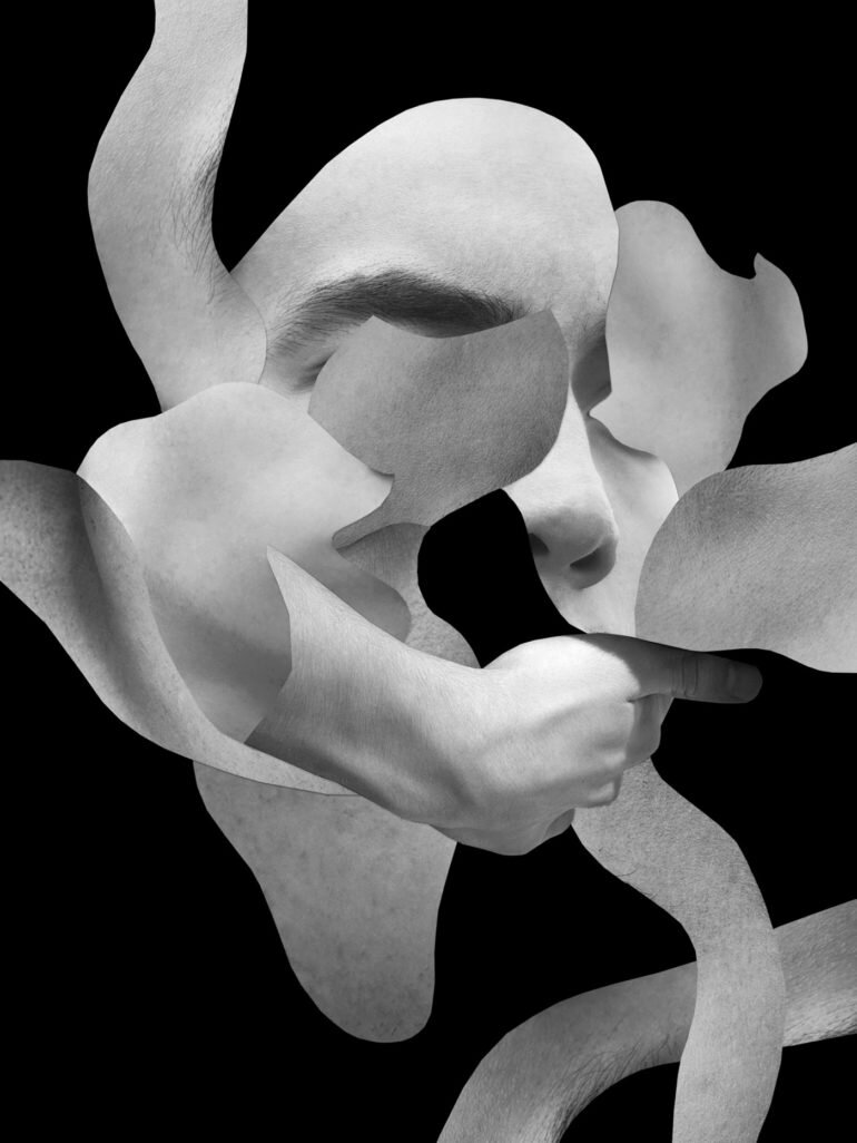
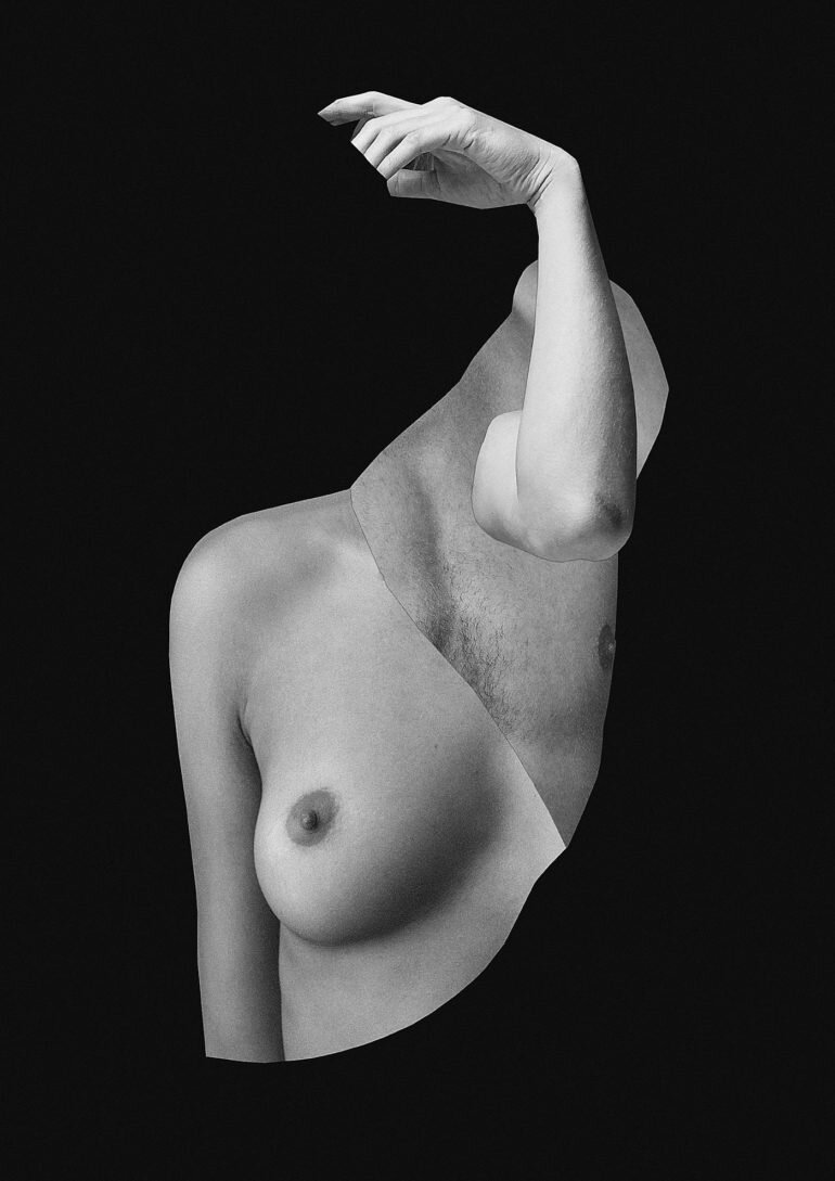
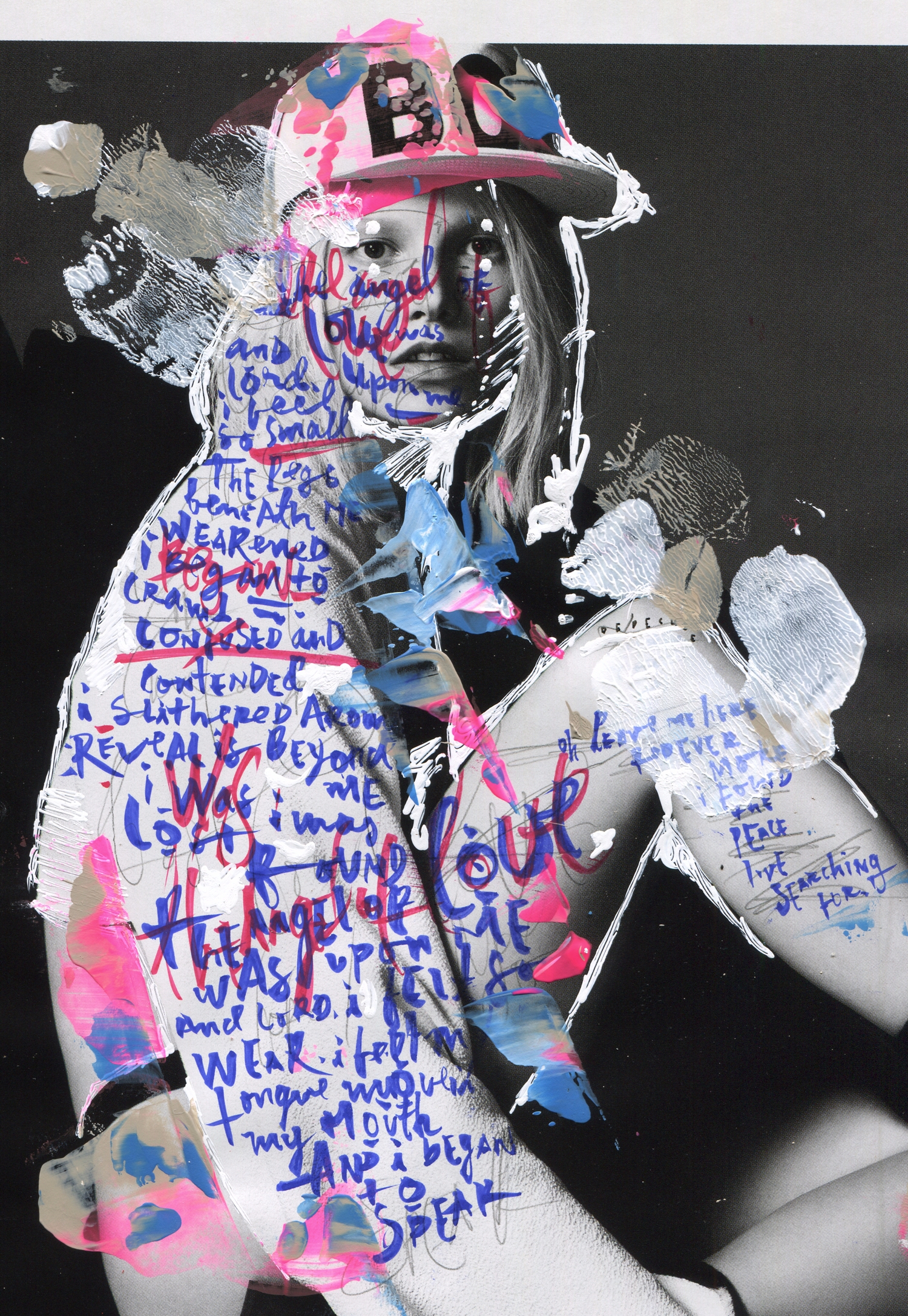
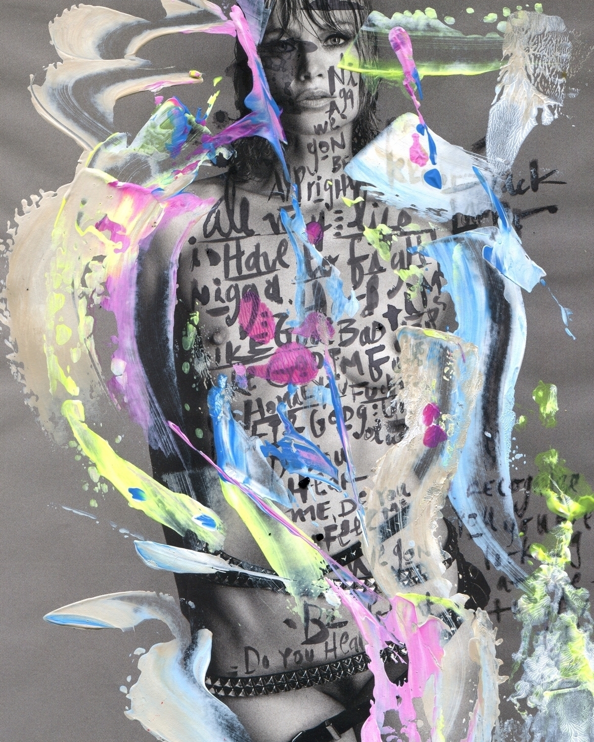
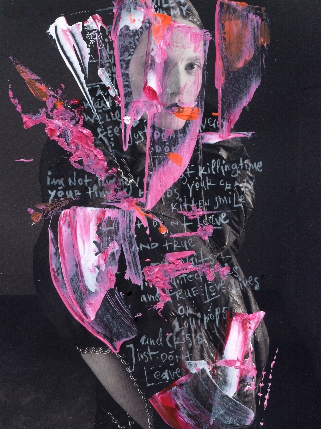
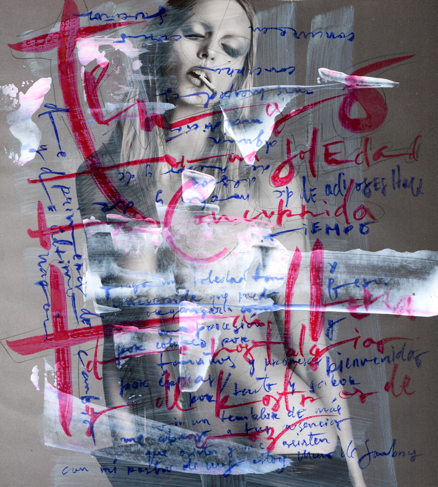
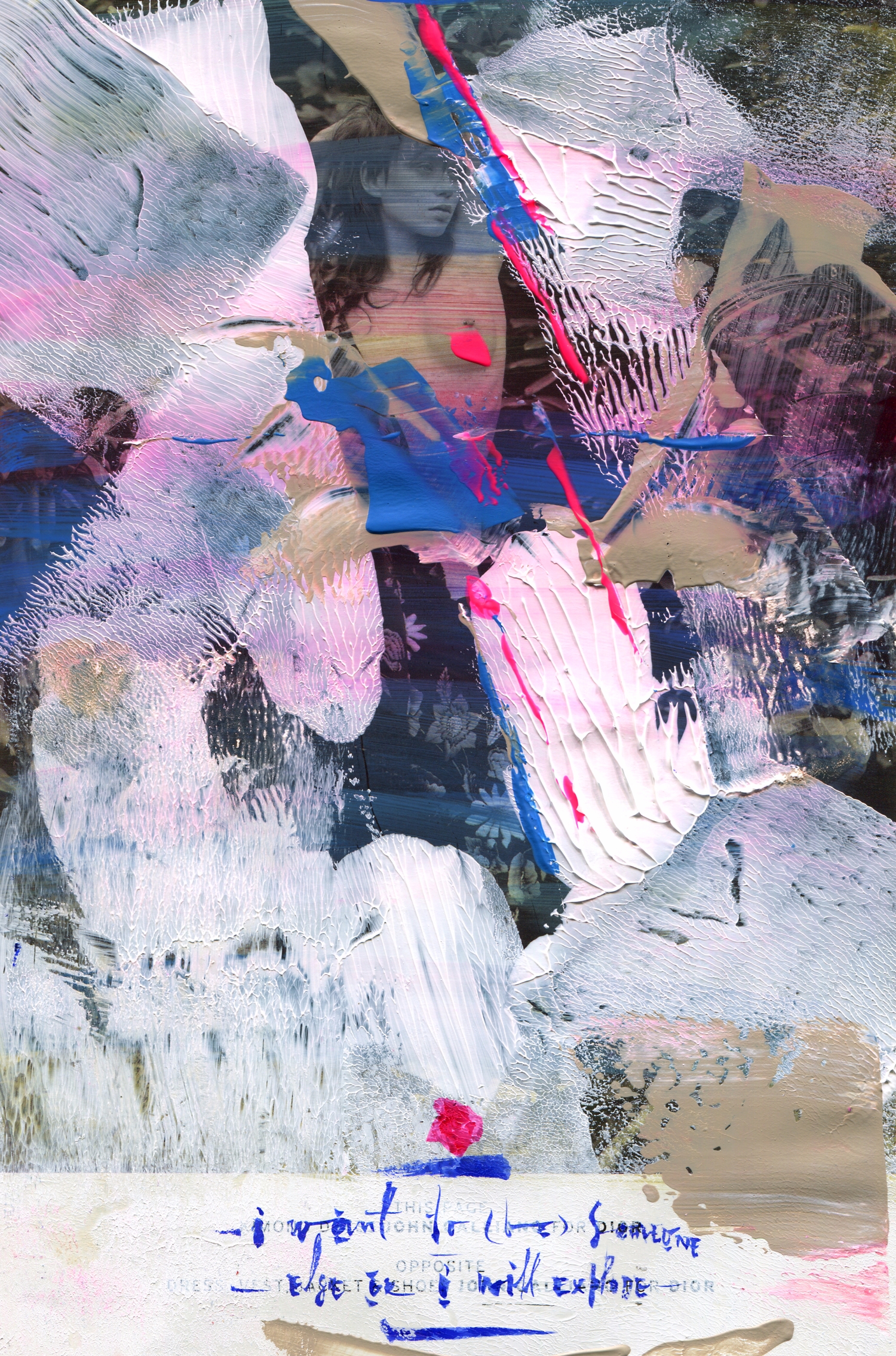
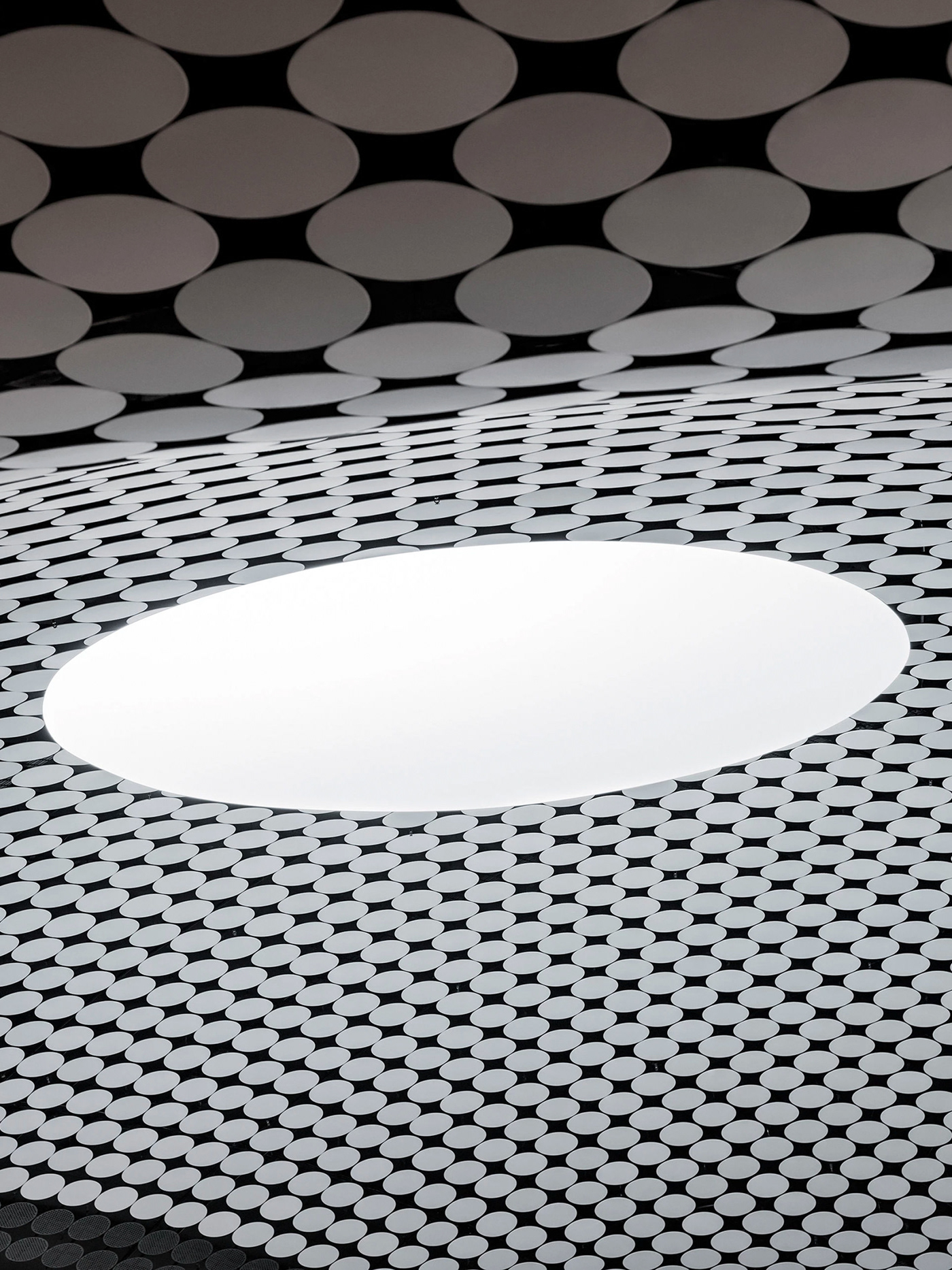
Graphic designer from Poland, Beata Szczecinska aka Cityabyss (you may know from our @Digital.Decade platform) releasing her ongoing project Metamorphosis
“Perception of the metamorphosis process of two systems, where one of them is dispersed in the other. Permeation, degrees of dispersion, fragmentation, liquidity - constansy, foginess and boundaries.”
“Metamorphosis of the system culture vs. nature is a phenomenon that has no permanent shape, evolving, with no expressive outlines, connected with changing roles, dominating one over the other, also the influence of foreign factors. The assumption that the transition must be organic is perceived as erroneous in the congitive functioning of the brain.”
mockups-design.com / www.graficzny.com.pl
The creative process of Nicolas mainly focus on the patterns and structures found in nature, observing and synthetizing their behavior, adapting their complex set of rules into a digital process, working with the idea of being only half controlling the shapes that he's generating and making abstract mathematical concepts taking shape, substance, and becoming new life forms.
The artist Stefan Gunnesch describes his work as reinventing continuously, nothing lasts for an eternity which makes us conscious about being in the moment

Read full interview on @trendland

Budapest-based graphic designer Tamás Birinyi challenged himself to create Deep Noise portraits of leading music artists: EPROM, Flume, Takami Nakamoto, Alex Banks and Jon Hopkins. He later ran an exhibition with a proper deep noise music which inspired the cause.

Brand designer at Behance Mark Brooks shares his love to bold and clear poster graphic desgin


Colombian artist Pablo Barreto shares his latest collages and mixed media artworks

Alejandro Garcia is a modern day child of Picasso and Kandinsky living in the land of colour - Mexico. Beside abstract lines-splashes-dots exploration she creates capsule collaborations for fashion brands that are obviously stick to her sense of form and colour. No doubts it is a win-win situation for both sides having artist developing her skills and industry catching their audience with bright patterns.


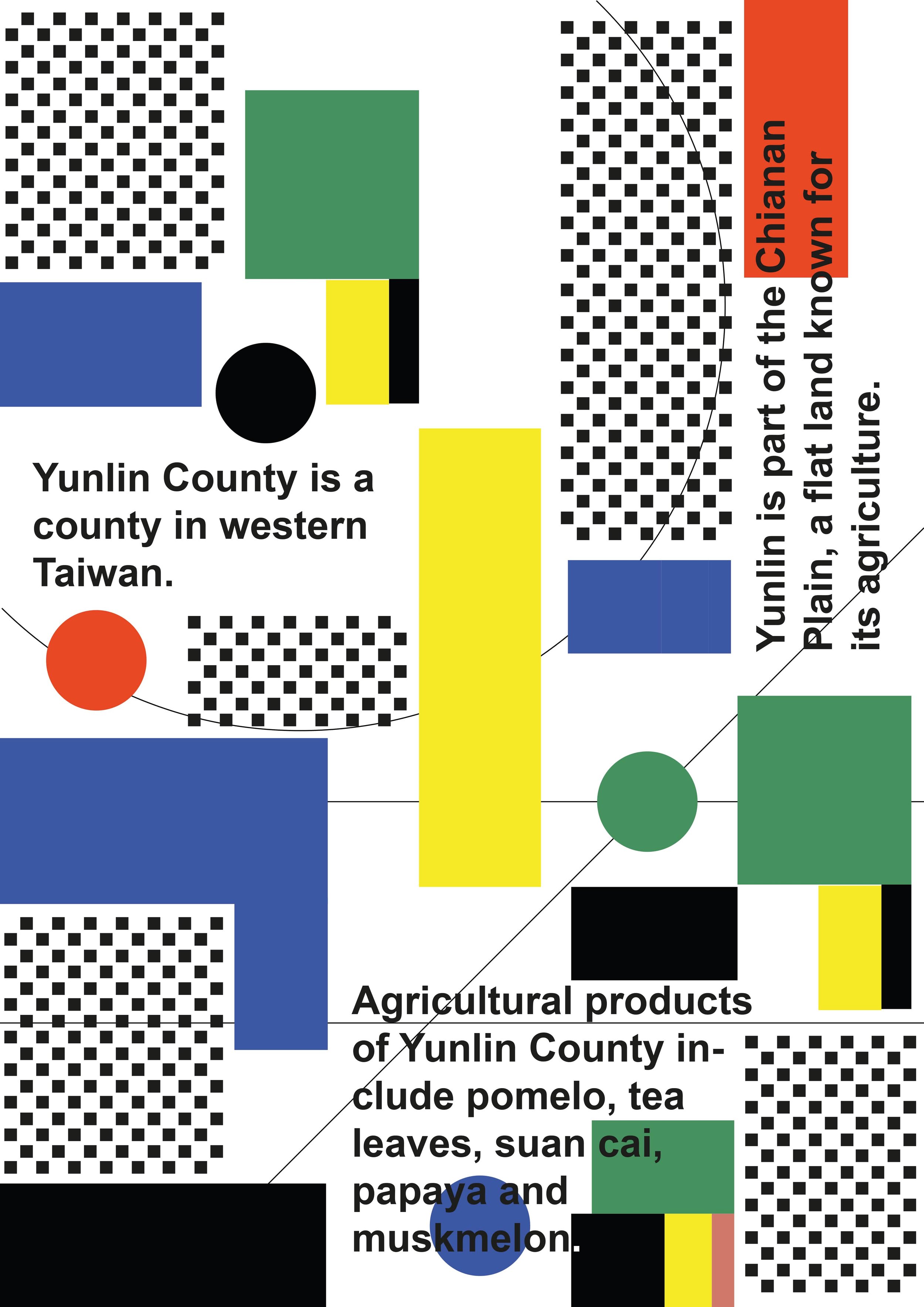
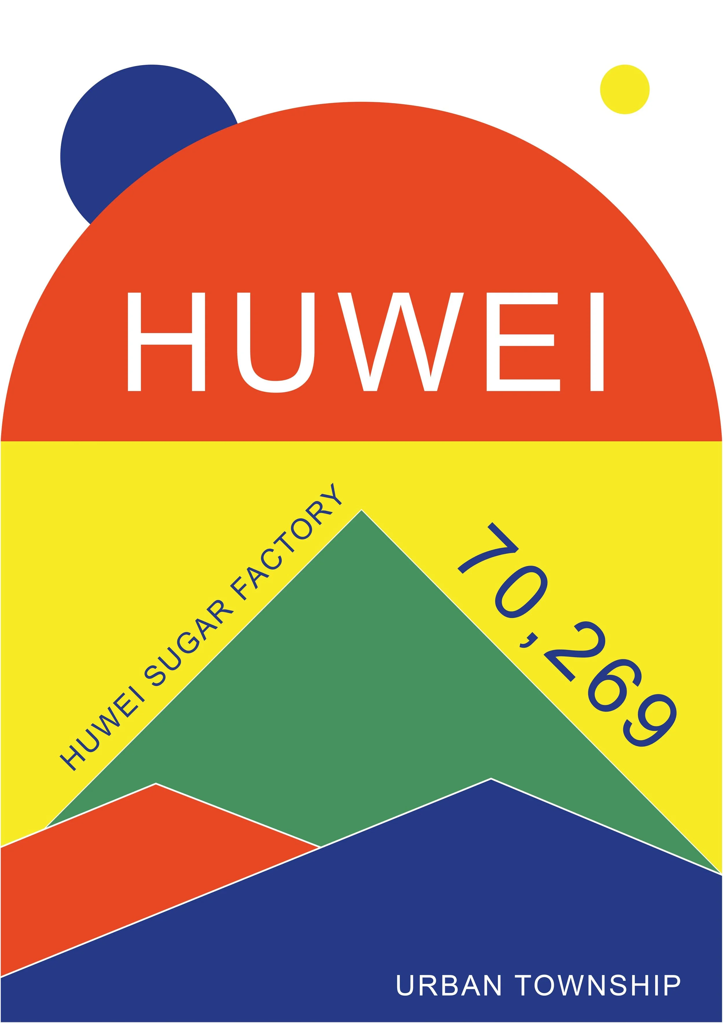
For the past few years, Mariia has traveled and worked extensively in Asia. She explored cultural differences, the reasons for the immigration of Western people who come to live in Asia, and the difficulties they face living in Asian countries.
Mariia's travels and explorations resulted in a three-month solo exhibition entitled "Western Taiwanese", which opened in Dounan City in November 2018. For this exhibition, the artist prepared a series of poster, and also for the first time worked in video art and installation formats.
In her posters, Mariia tried to visually reflect her impression of Yunlin County, where she lived at the time. She used a variety of visual research methods to capture cultural landscapes while creating the style of her posters. For example, she used Google Earth footage for the visuals, and Mariia also worked with local historians in the archives department. Mariia has created a vibrant palette of 6 colors along with a dynamic composition that together reflects the brilliance and quirkiness of Taiwanese nature.
Wang Chia Wei, curator of this exhibition, says Maria's exhibition was a completely new way to see Taiwanese culture. She also added that these posters are more like hokku, where the artist expresses deep meaning in simple words.
Mariia Ominina's project "Wester Taiwanese" is a fresh look at the world of poster art, where the artist expresses herself not through direct visual clues, but via vague images or meanings. Mariia managed to capture the connection between meanings and the visual component in the paradigm of postmodern aesthetics, where the classical "laws" and "norms" in design have ceased to be decisive. Her posters are lively and interesting, plunging into the confluence of new-old art, that borders between meaning and visuality; conceptualism and avant-garde.
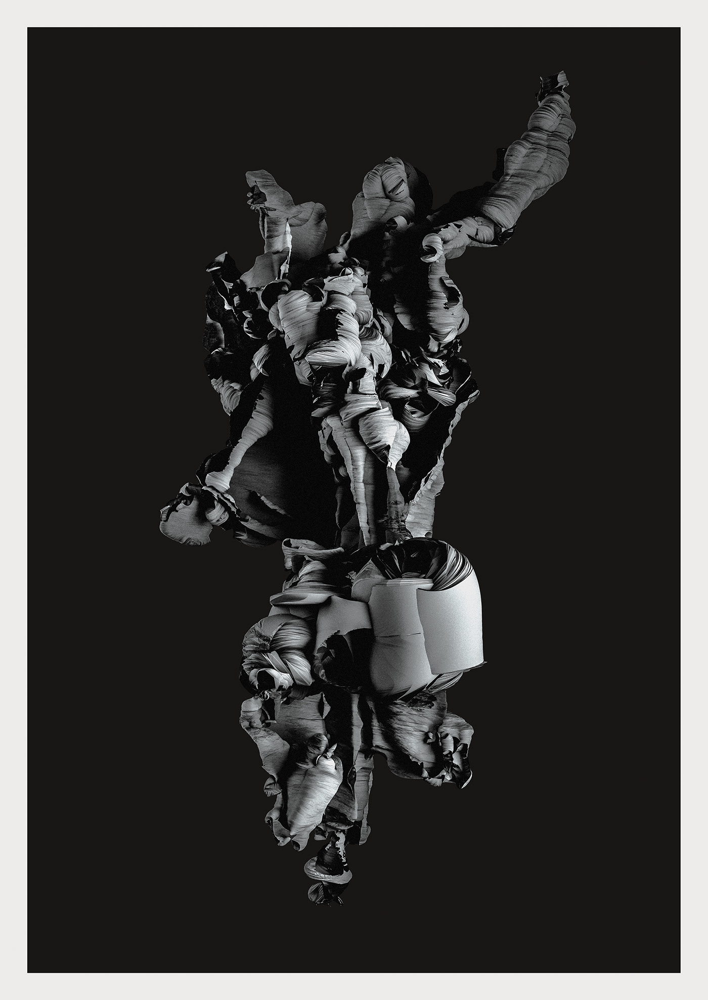
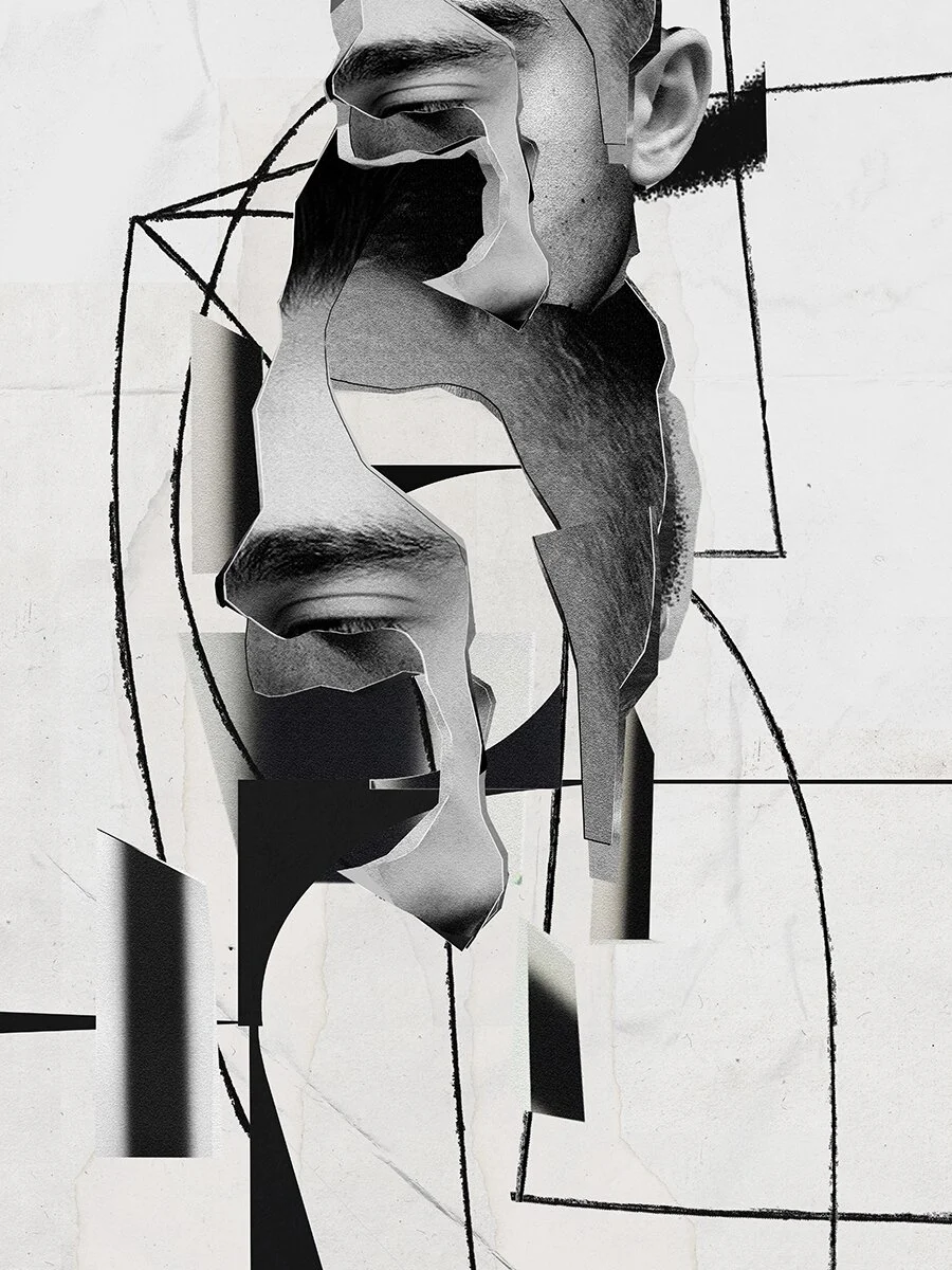
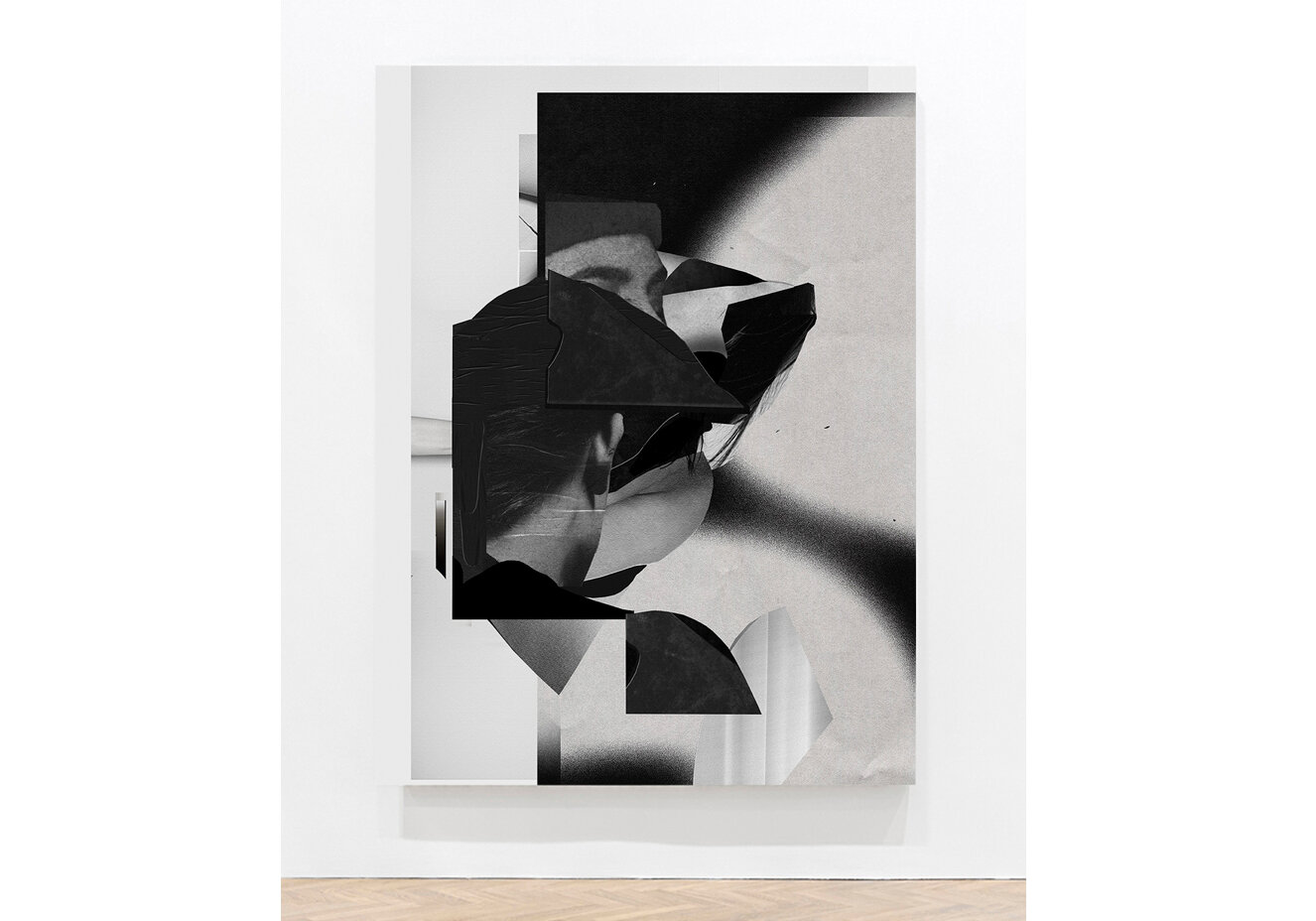
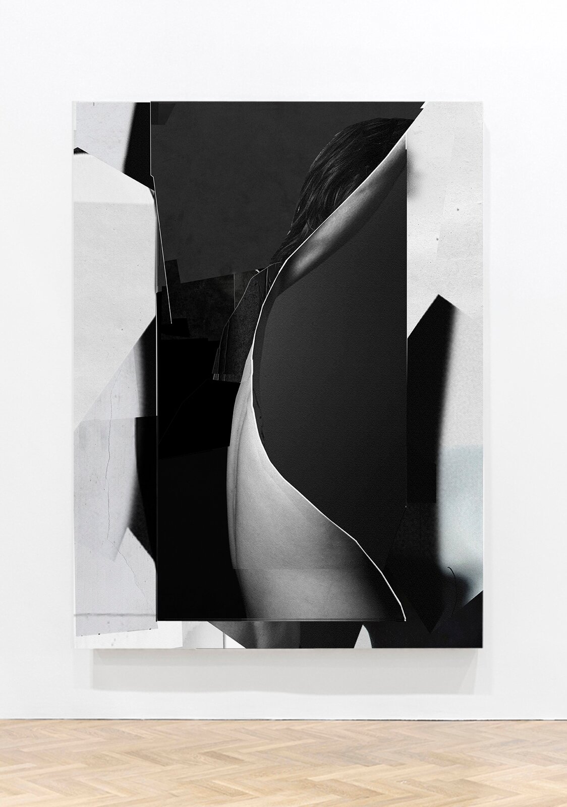
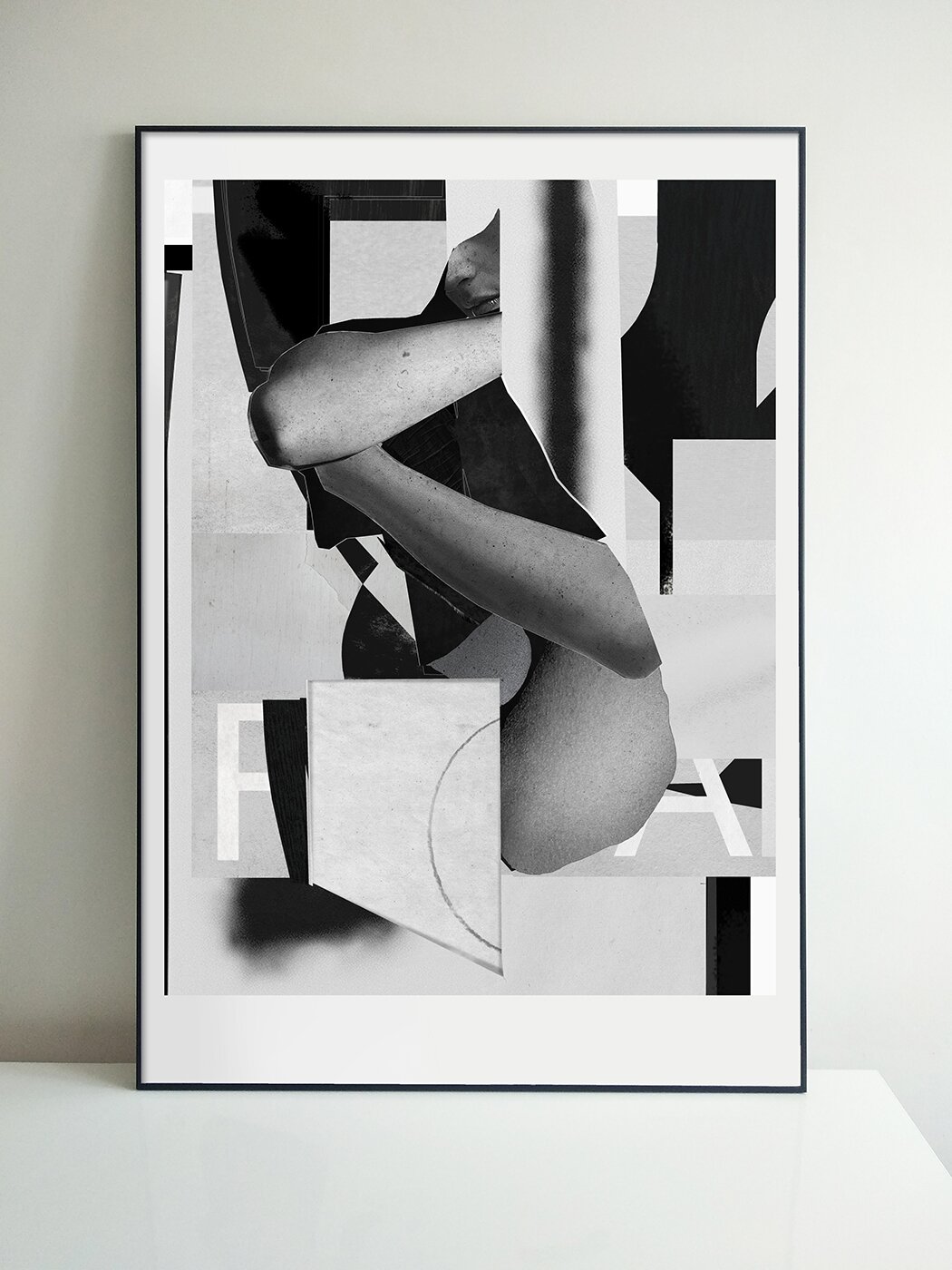
Reflecting the inner world or internal landscape is how artist Raphaël Vicenzi says about his body of works mainly done in collage art technique
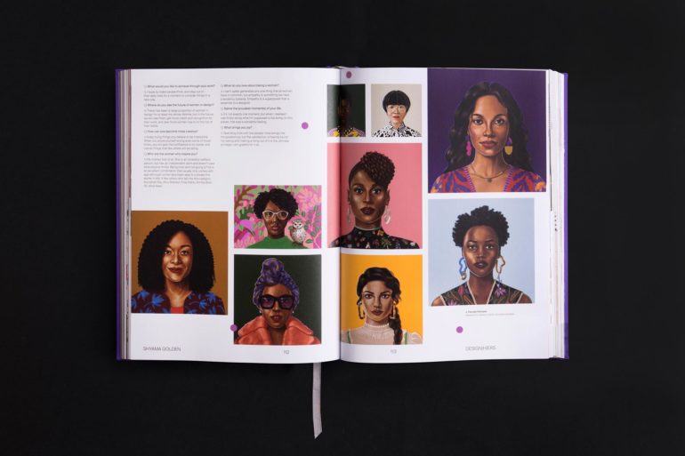
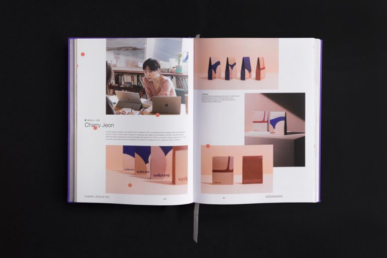
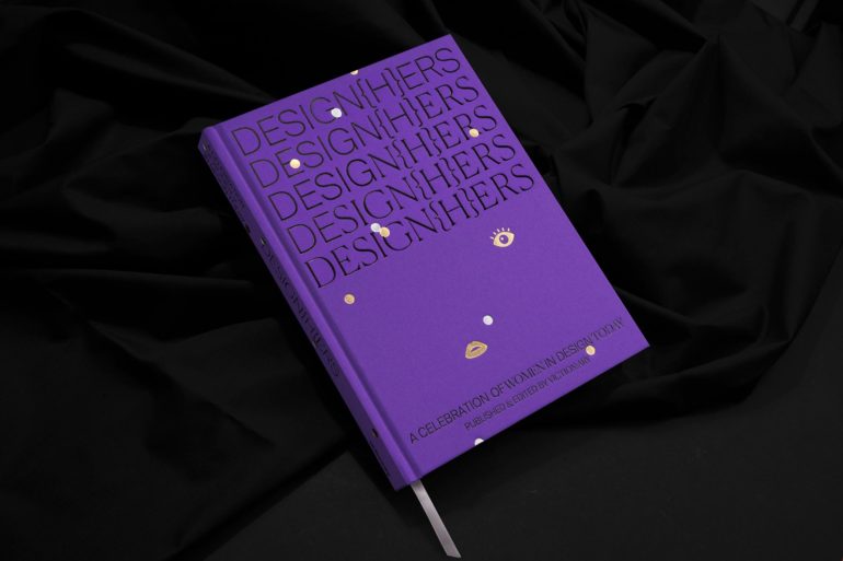
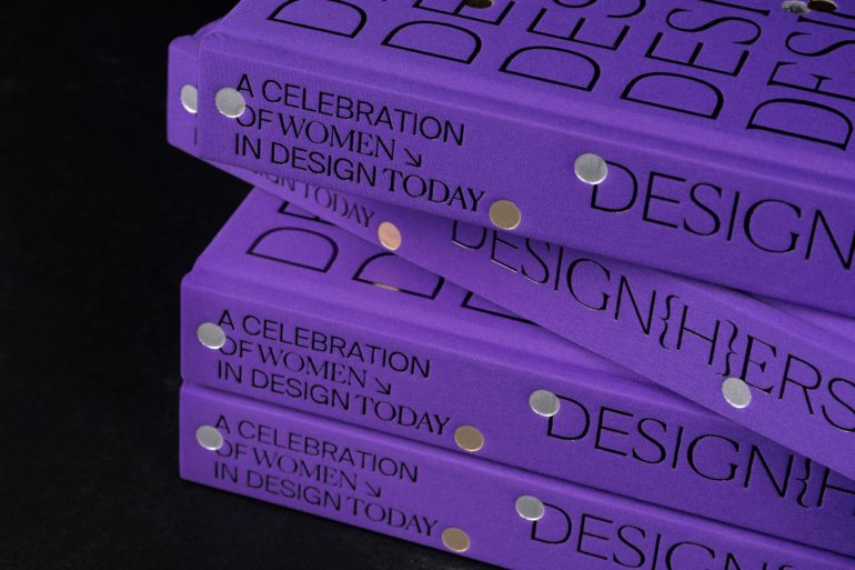
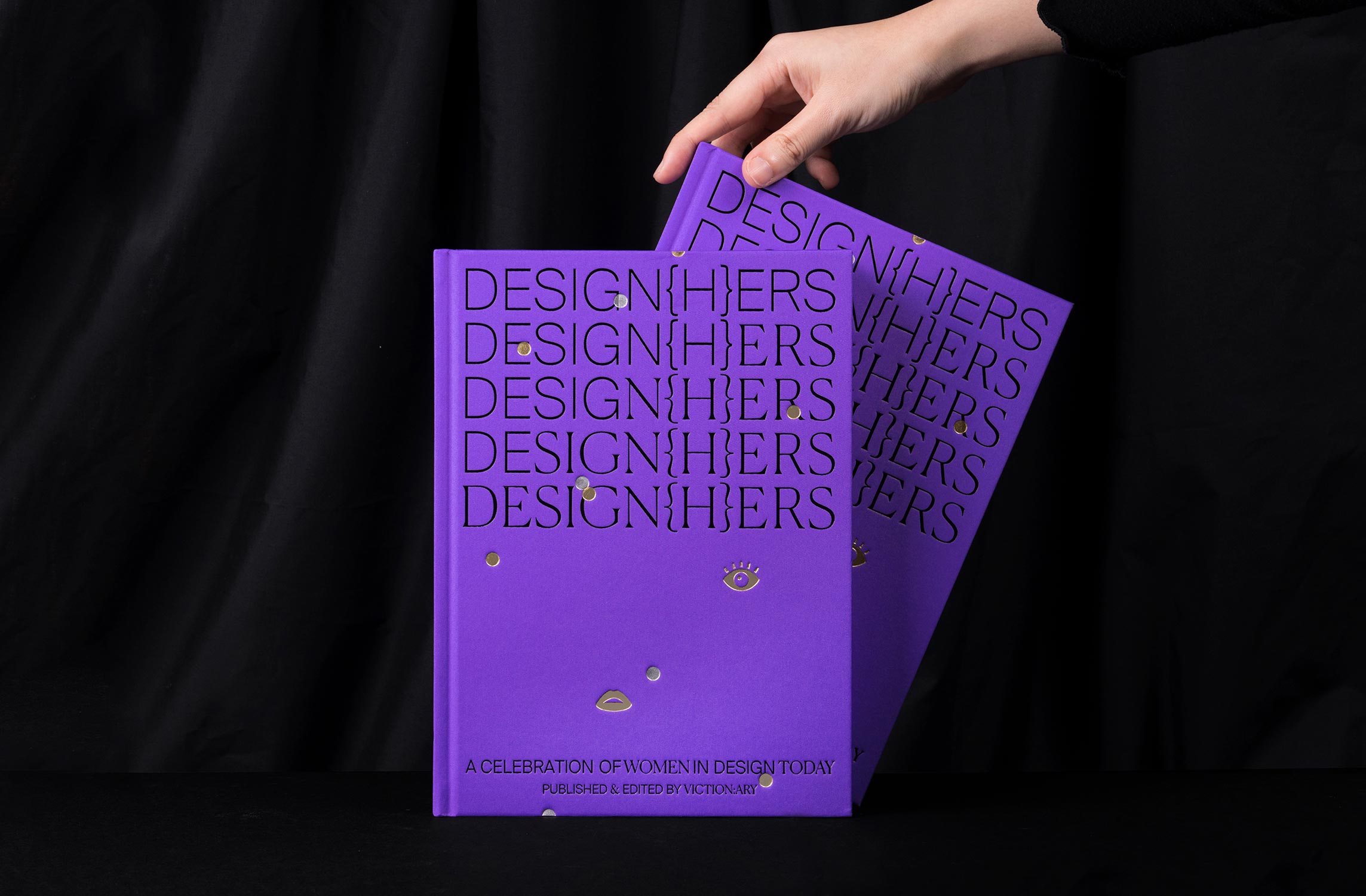
DESIGN{H}ERS is a stunning showcase of up-and-coming talent spanning across a variety of design mediums to highlight the distinction and diversity that women bring to their respective fields. Coupled with compelling stories revolving around the journeys of luminaries who have already made their mark, this book serves to intrigue and inspire the creatives of the future.
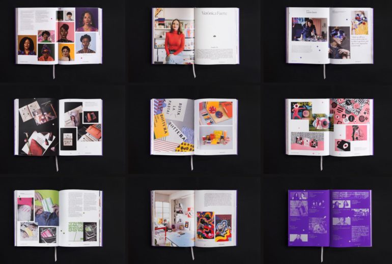
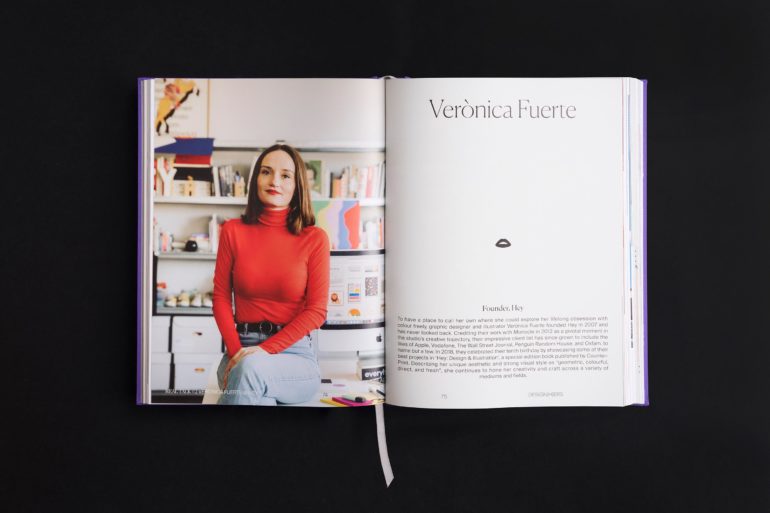
We are happy to see our friend and Digital Decade collaborator Louise Mertens (@louisemertens) in this book
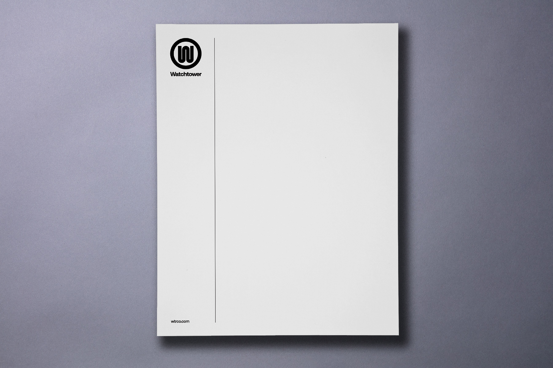
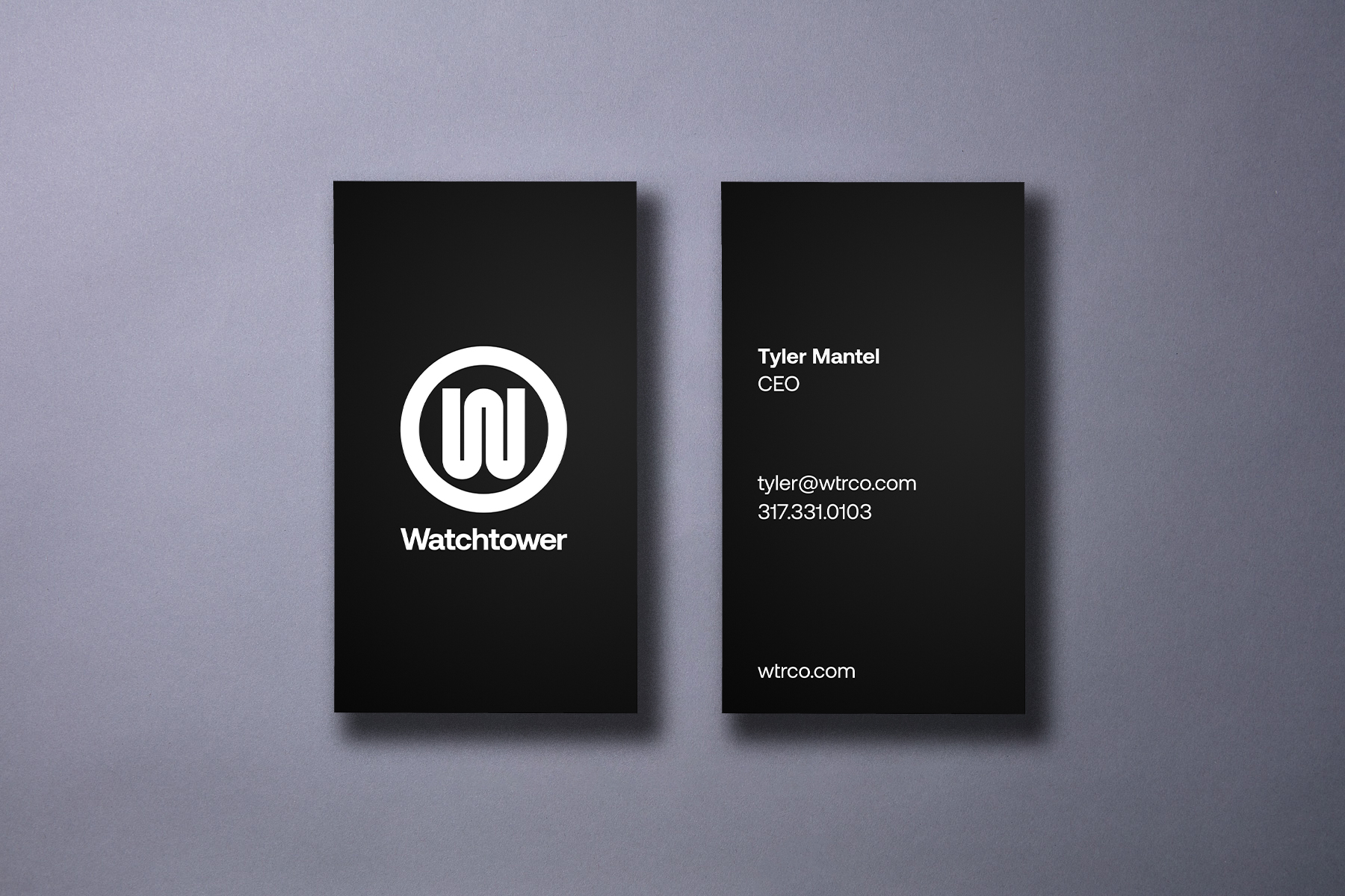
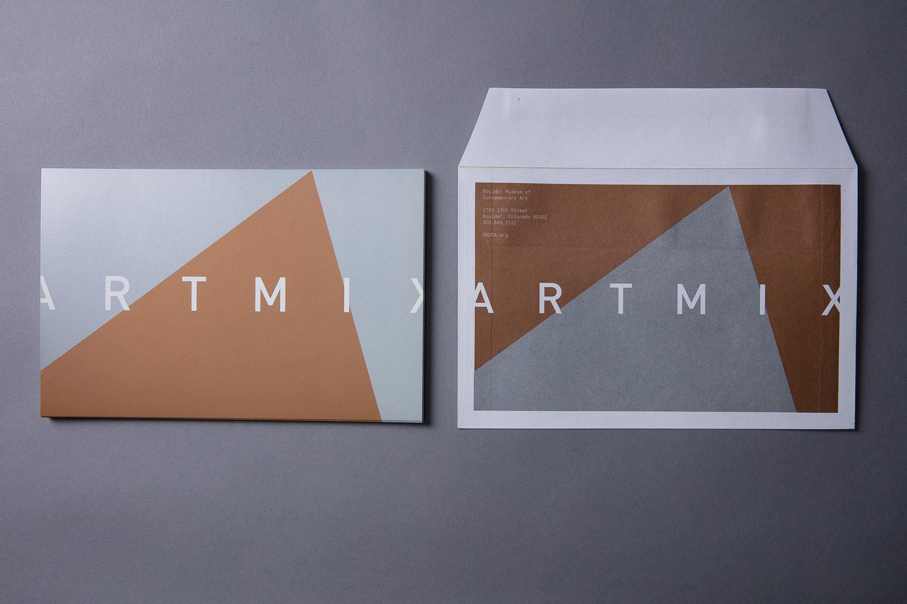
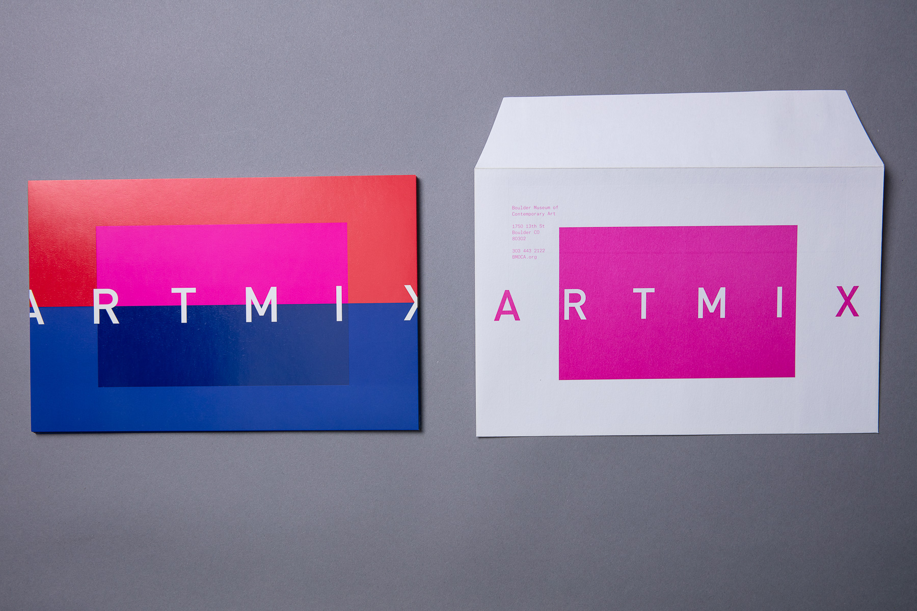
Todd Berger and Lucian Föhr have spent the past 16 years, side by side, practicing contemporary graphic design and brand strategy for cultural and commercial clients. They are co-founders of their namesake studio, Berger & Föhr, based in Boulder, Colorado.
Throughout their careers, they have created a volume of highly regarded brand identities, digital products, and bespoke printed collateral. While broadly international in style, their work spans discipline, sector, and clientele, often defying categorization.
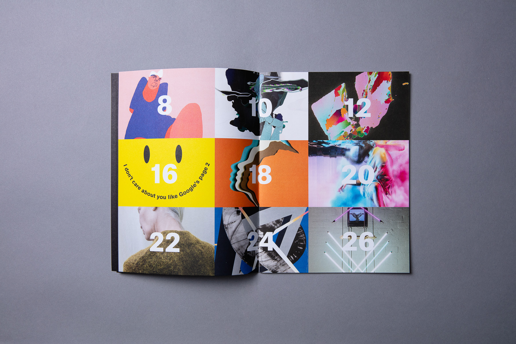
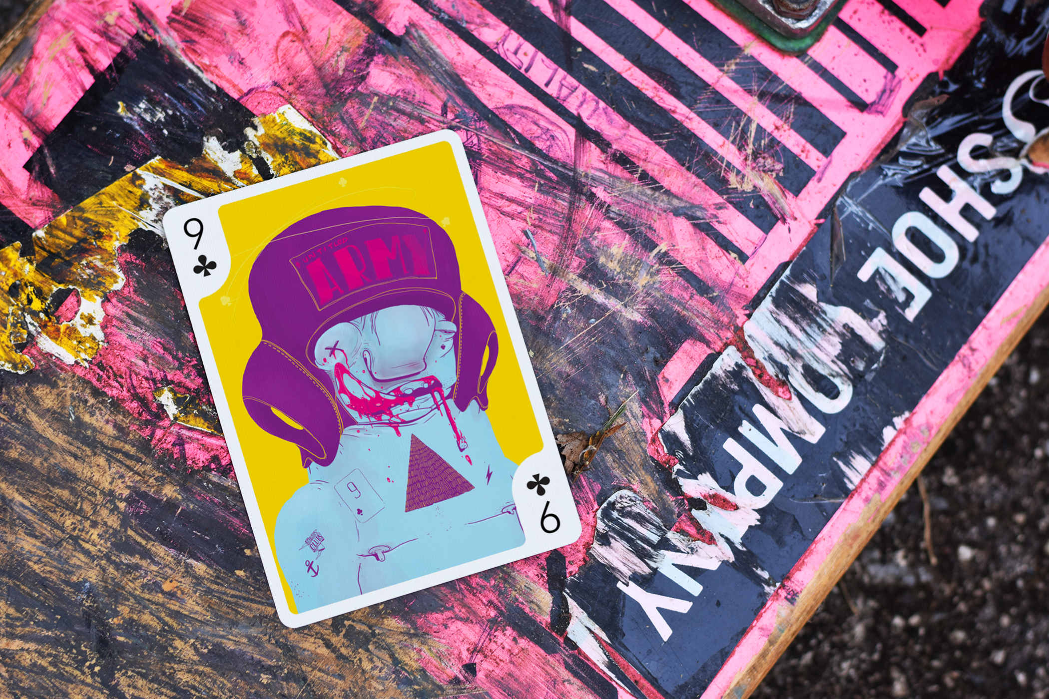
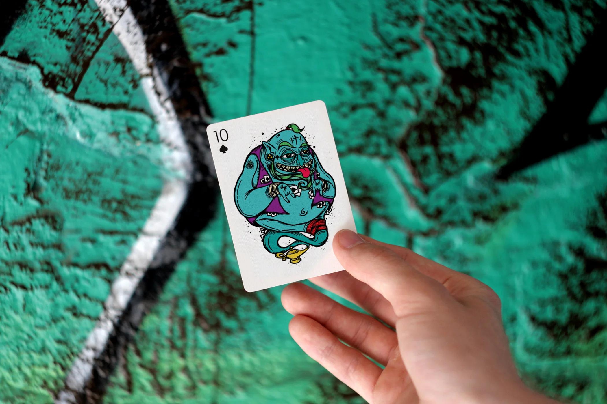
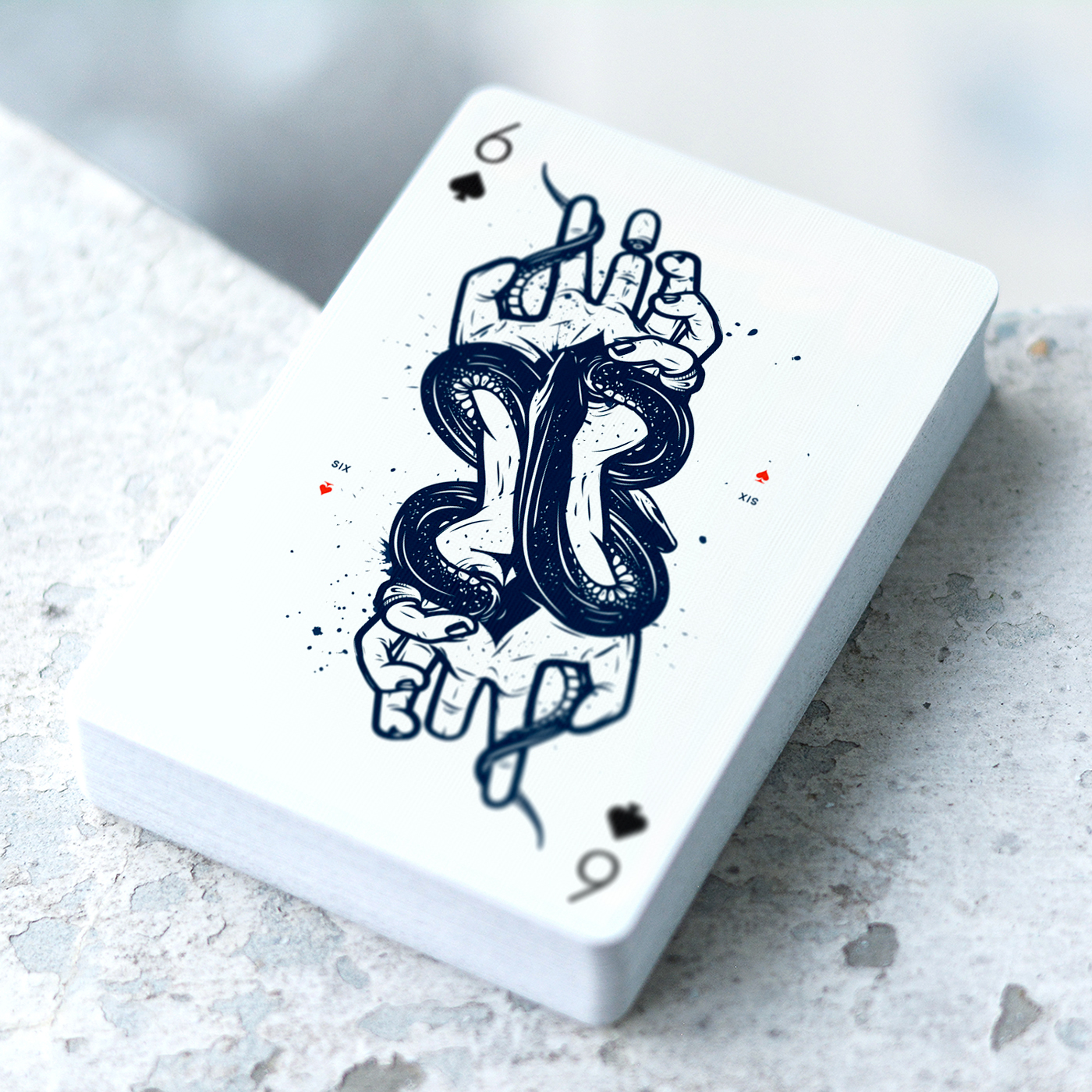
Playing Arts project originally launched in 2012 with the initial sensational playing cards deck called "Creative Cards". The idea of the project was to create a deck of playing cards where each card will be illustrated by different international artist in their own individual style and technique.
Edition ZERO Features
Illustrations for each of 55 playing cards were made specially for this deck by different international artists in their own individual style.
First ever artistic deck with AR experience. Animations will be experienced both on the website and through Augmented Reality mobile app.
Printed by US Playing Card Company on legendary Bicycle® paper with Air-cushion finish for the smoothest feel. It's the highest quality coated playing card stock, perfect for creating beautiful spreads and fans if you are cardist or magician.
The deck will come in poker size (88.9 × 63.5mm) with thin borders, so you can take it all from vibrant and colourful illustrations.
Inside the box you will find 54 playing cards plus info card that features the names of all amazing artists involved in this deck as well as instructions on how to use Augmented Reality app.
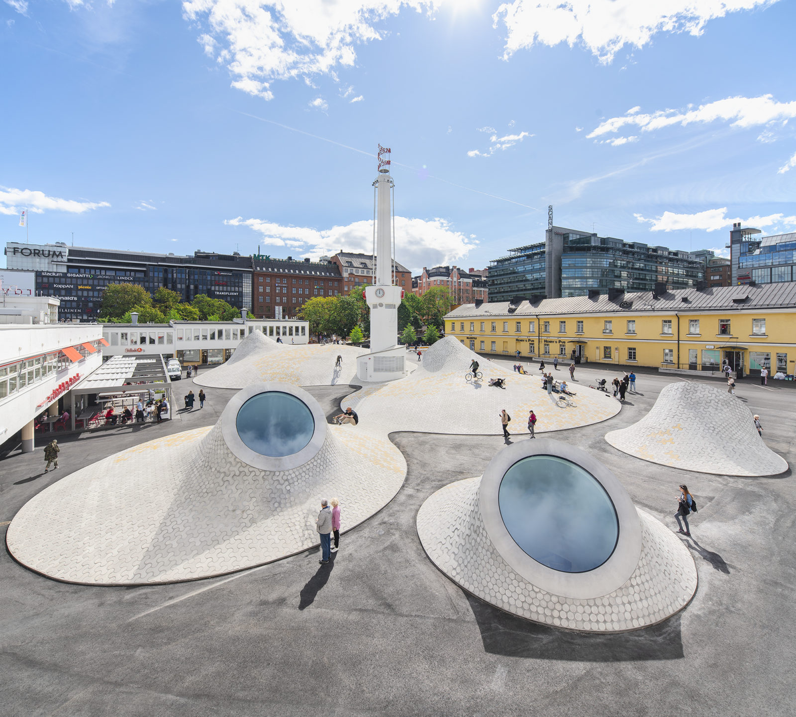
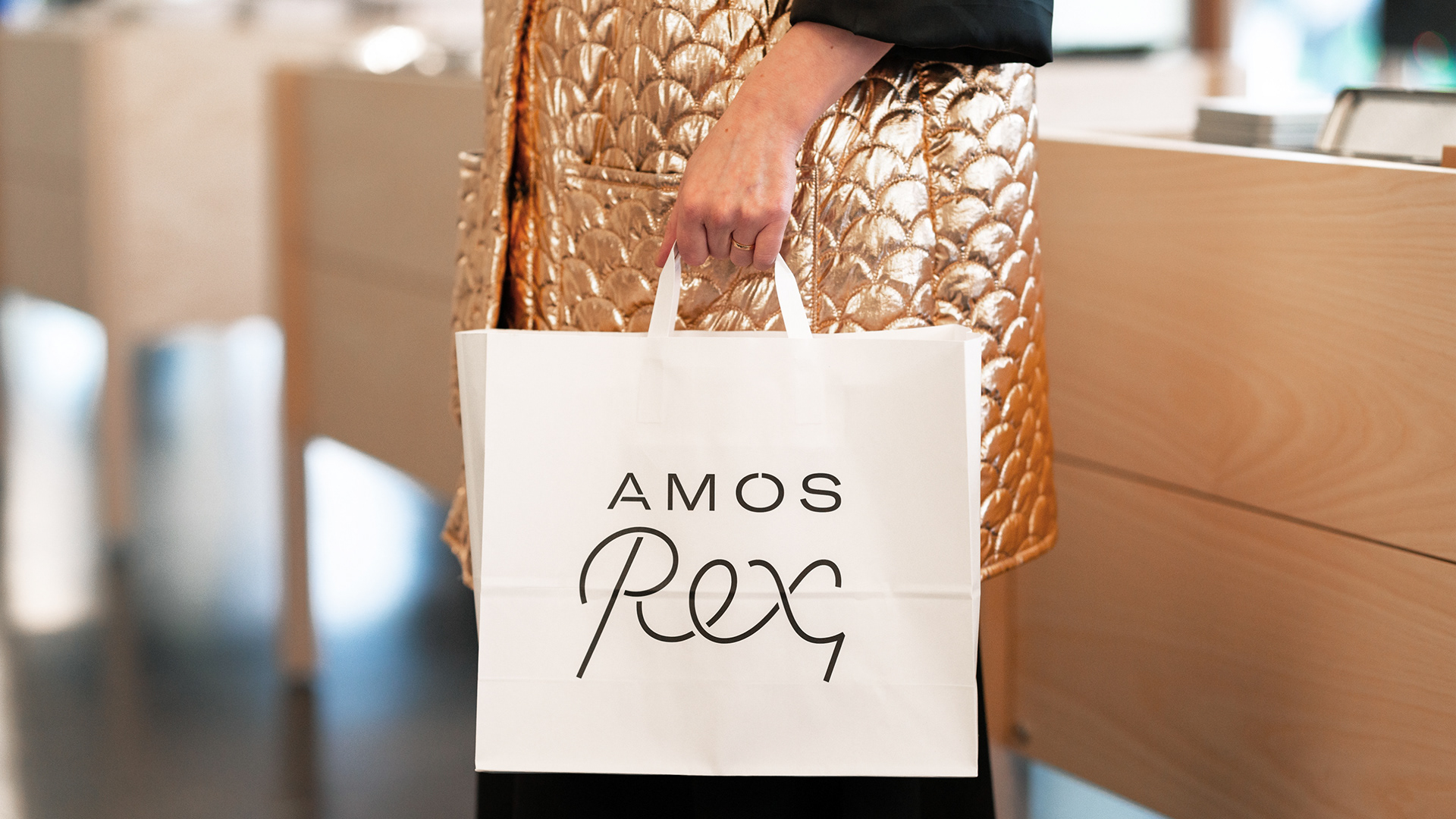
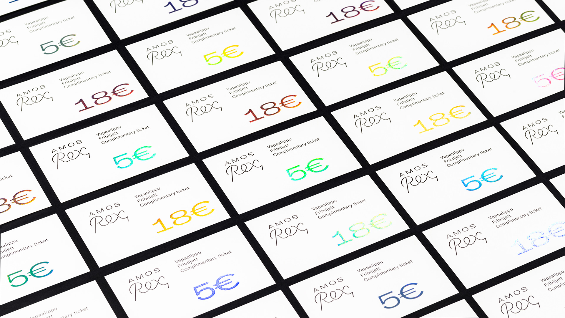
Last autumn, Helsinki got a new art point for visual hunters - Amos Rex space. Built in place of shopping centre parking, Amos Rex is a perfect example of smart architecture designed by JKMM. We already covered the debut exhibition of Japanese teamLab on Instagram and happy to mention their next affair with Studio Drift this Spring brining their anti-gravity show worth of visit.
Amos Rex identity was developed by local studio Werklig underlining the idea of a space where past, present and future meet together to create unforgettable experience


There is always a good chance for designers to imagine their favourite brand having a new identity. This happens with Slack (@SlackHQ) again after they rolled out new visual system designed by Pentagram (@pentagramdesign). We won’t comment on it as there is a huge backslash on social network regarding the new style. But we definitely want to show you another great example of “how it could be if”.. talented Russian art director Oleg Turbaba takes over it. Of course, we are not saying it is perfect, but take a look:


“This is my personal vision of how Slack’s logo could be represented with its new identity. My research was started with exploring brilliant work done by Pentagram with Slack’s redesign. Then I tried to search deeper and simplify both Slack’s old and new logos to their extremum.
As a symbol, I’ve decomposed an old Slack’s logo, taken one component (the message) and used it as a core of my concept. The way I see it, the message is the main theme of the Slack. Then I experimented with some modularity and dynamic logo things”

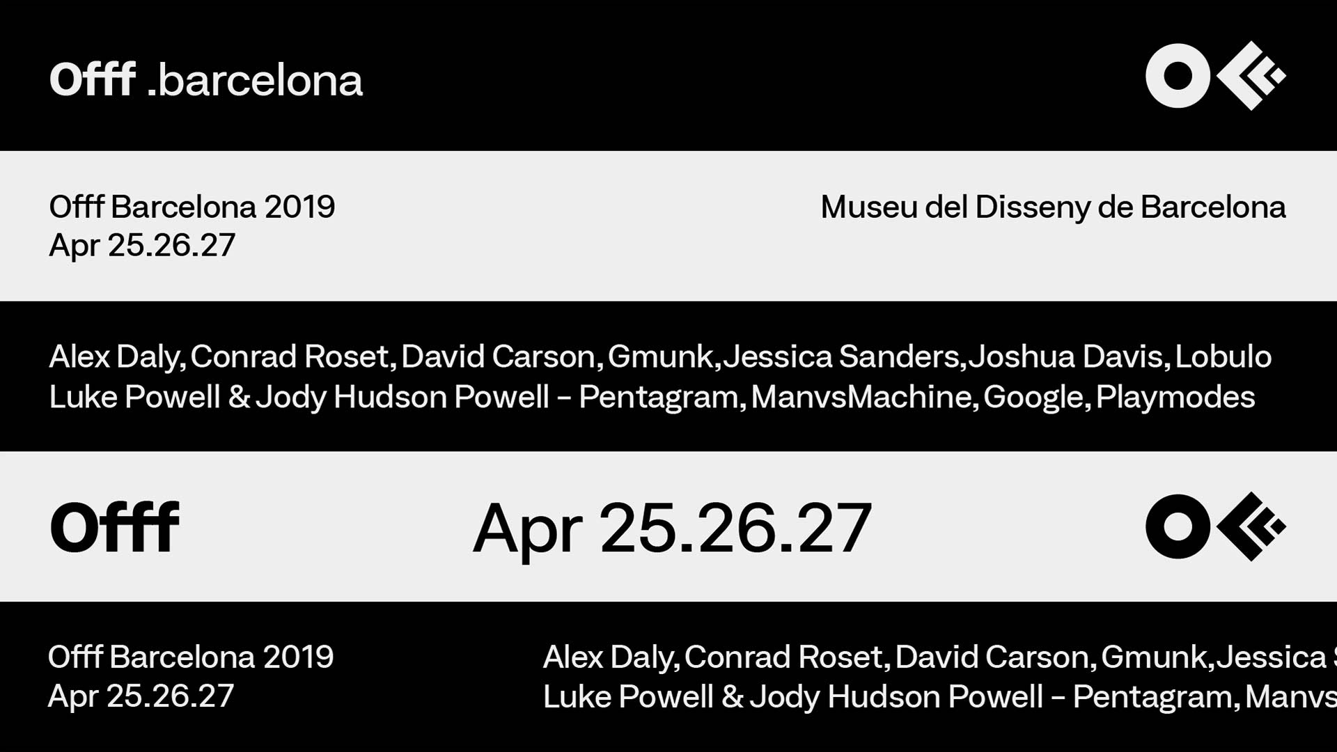
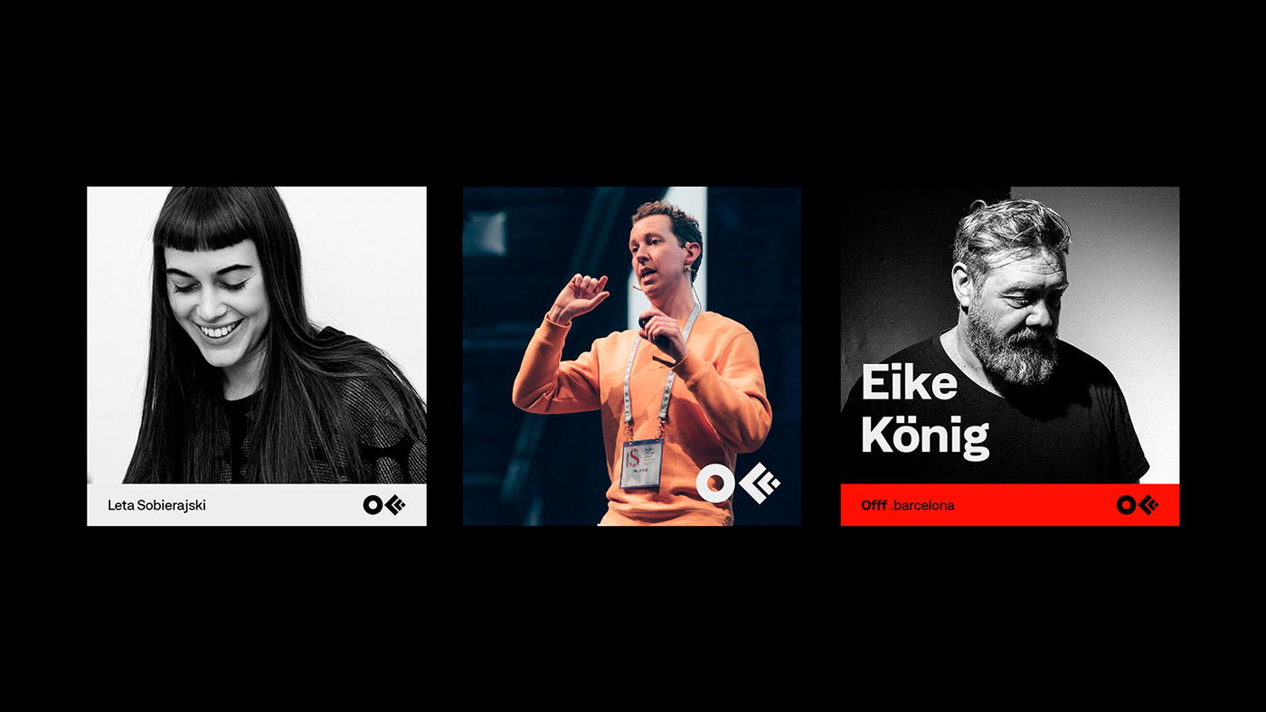
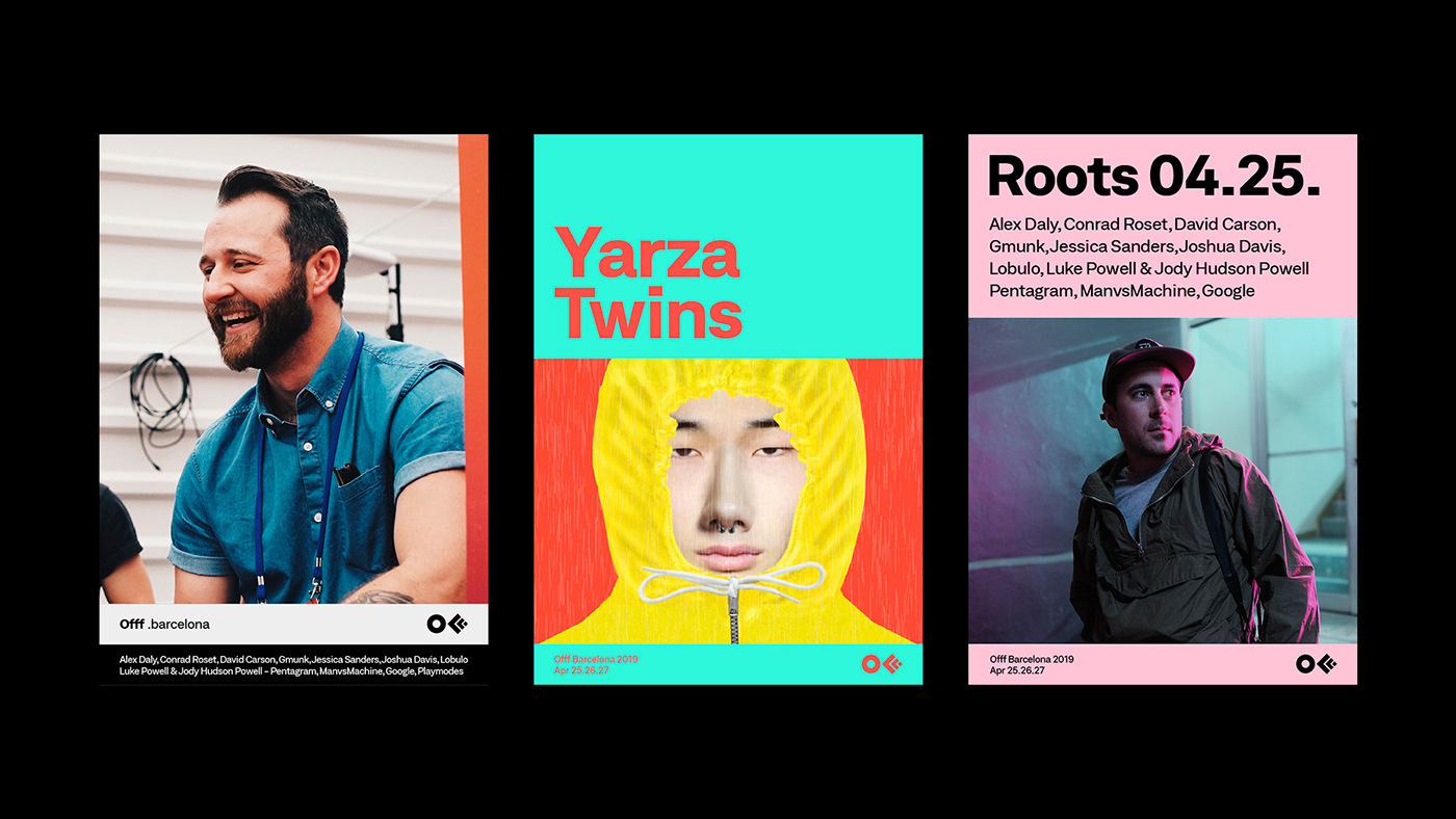
Founded by Héctor Ayuso over a decade ago, OFFF started as a concept that transformed into an event joining creative talents from all around the world all together in one place. The main goal of OFFF is to become the key meeting point for artists who share the same interests to be in one place. Today, OFFF is more than an event, it is more than a Festival, OFFF has become a community providing the ultimate creativity experience.
In 2013, CROWD studio, one of the most talented Barcelona based digital and design agency, has transformed the famous 3 “FFF” into one icon, it was the birth of the official OFFF logo that maintained its presence for 5 years. With with over 18 years of content and a Festival that is ever-evolving, growing every year to become one the most important event to attend worldwide while providing endless innovation, it was time for a change. The OFFF icon has finally become visually recognised by everyone, so it became unnecessary to conserve the 3 “FFF” in the logo. The OFFF icon is now visually abstract, simplified and more compact thanks to re-thickness of the symbols.
“OFFF has been conveying one true message: “our audience, our speakers and our attendees are our base. Without them this wouldn’t be possible” so for such an important brand, user-experience is very crucial. We had to create something valuable for both, past attendees and new comers, to understand the message behind OFFF and to be able to navigate through 18 years worth of contents. Starting with the typography, the most important element to the human being’s eyes, we decided to work with a corporate font, showcasing some seriousness yet with a touch of flexibility.”
“From concepts to various visual campaigns in every edition and with over 8 OFFF on Tour cities, OFFF Festival is always changing its aspects. But the unity of the brand and the team behind it is the Festival's foundation. Over the past few years, we have noticed an overall shift in the brand’s identity. OFFF, the brand proving itself with the concept of having no brief and giving the complete freedom plus the invitation to create, this also had its consequence. We noticed that with so many openness, the brand unfortunately lost its visual presence and visual aspect throughout the Festival, online and onsite. So how do we showcase the dynamic aspect of the brand while maintaining its base? By creating a definite strategy in the brand’s communication structure and building a branding system.”
“With this new approach we are adding more control to the brand use, where the brand gets more identified with the ability to adapt to other contents therefore the Festival becomes more firm and more strengthened.”
“While using this new system of communication grid, the website become one dynamic block of contents making it easier for the user to adapt. This allows us to recreate the whole website as a platform and as an archive of news, past speakers, new speakers and events. An organised clean space.”
“Squarespace is one of very few technology companies that can truly call NYC home. The city has inspired our attitude, our aesthetic, and our mission to democratize good design for every ambitious entrepreneur, artist, or visionary with a dream. As we began to rethink our brand identity, we knew we needed to find a way to make New York a bigger part of the story.”
“New York is a study in movement; like jazz, it constantly heads in unpredictable directions. Since much of our output is interactive and screen based, we knew the brand needed to make sense in motion. So we developed a kinetic identity system that dimensionalizes our name and reinforces the two syllables in Squarespace.“

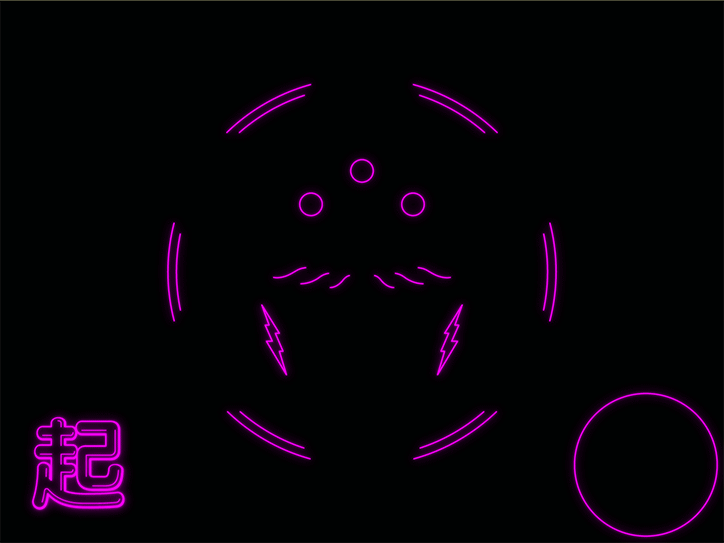
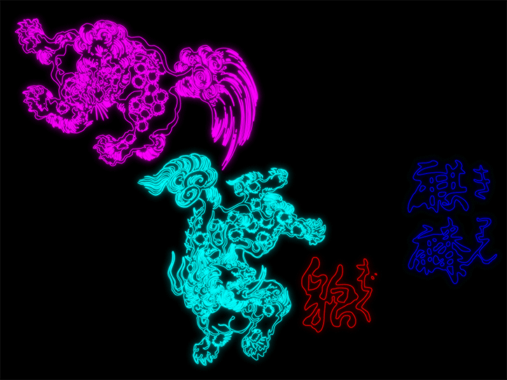
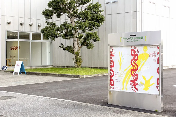
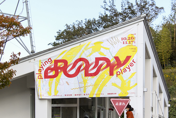
“Okuyama Taiki is a Japanese graphic designer incorporating a sense of liveliness and fun into his creative practice. While running a novelty book store in Tokyo that was free, Okuyama became interested in the values of exchange that led to a career in design.”
“Communication between information and people, and between people and people, is the most important issue to me”
This emphasis is seen in two of his projects, Playing Body Player as well as in the visuals for Owarhythm Benkai. Firstly, Playing Body Player is the visual identity for an exhibition of the same title organised by Seijo University of Art and Design.
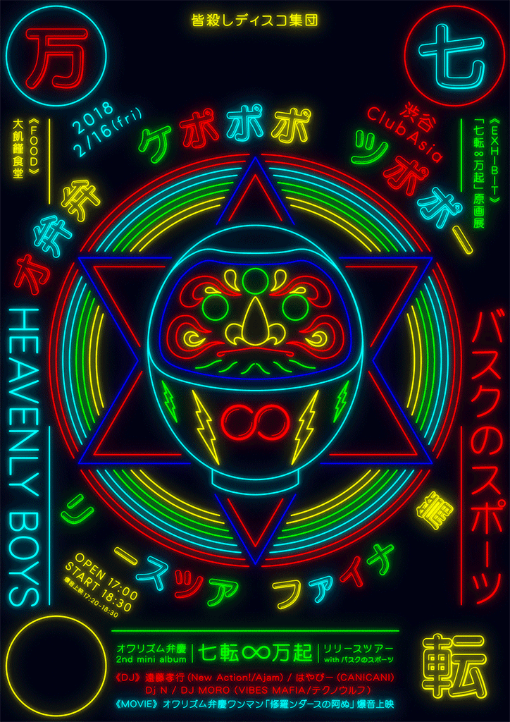
“For the visuals for the Japanese rock band Owarhythm Benkai, Okuyama pays tribute to the neon signage aesthetic. He concisely engages the viewer with the use of looping colours that aren’t too in your face while still grabbing attention; utilising the medium of gifs to simply animate striking visuals which in turn, maximises on intrigue.” via Its Nice That