AXIS by Leonardoworx
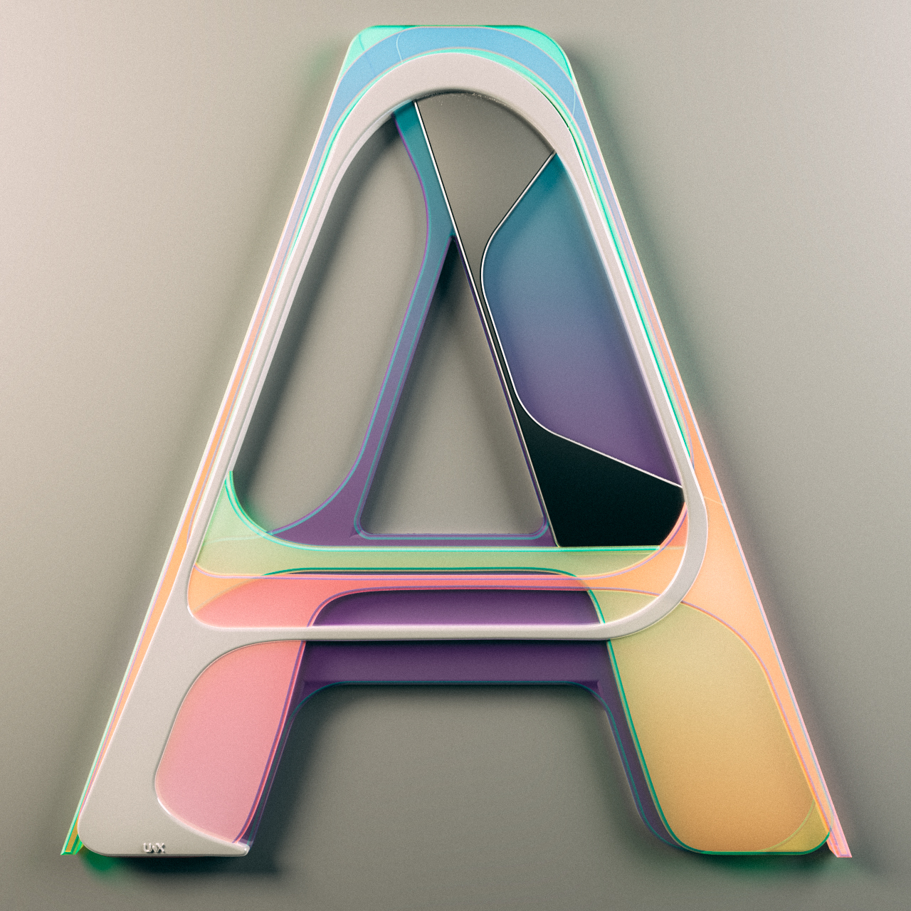
Italian digital artist Leonardoworx (previously) shares his new venture in creating CG Alphabet "AXIS" inspired by product design from 1970-80s

Italian digital artist Leonardoworx (previously) shares his new venture in creating CG Alphabet "AXIS" inspired by product design from 1970-80s
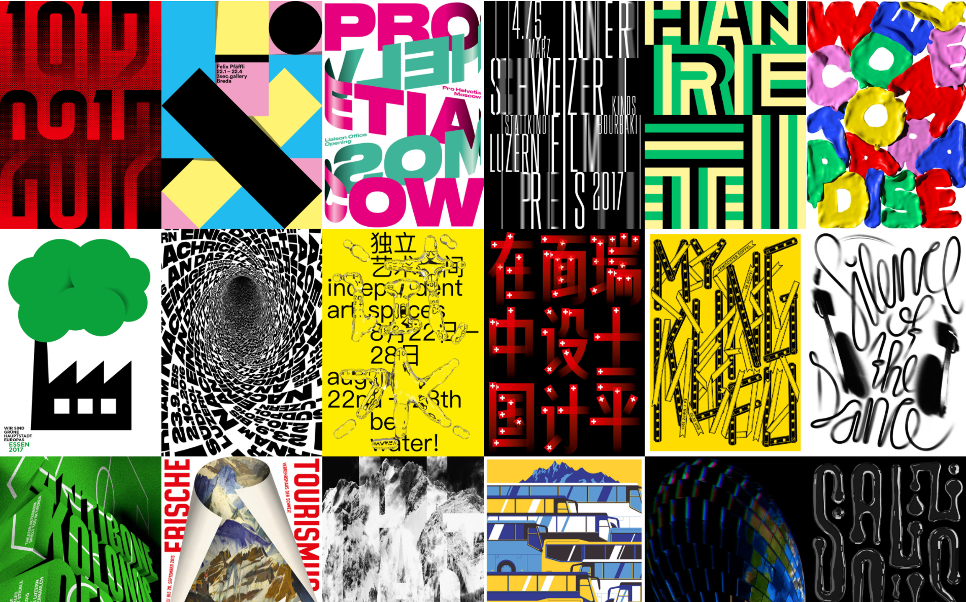
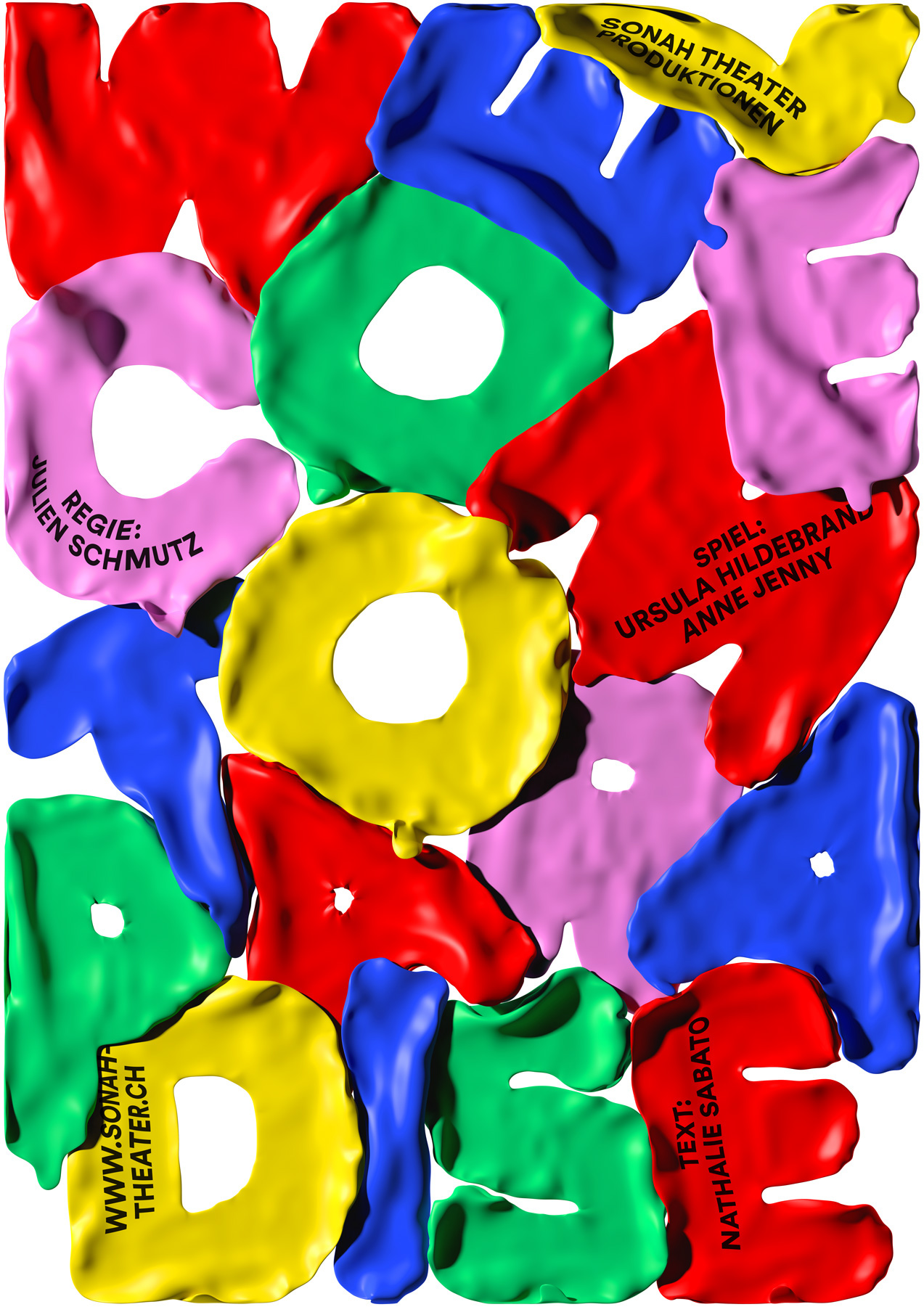
He was born on the 3rd of October 1977, and grew up in Sempach, Switzerland. In 1990, at the age of 13, he started his career with he foundation of Mix Pictures, an organisation for short film productions and cultural events. After a typography apprenticeship near Lucerne [1994-1998] he began an apprenticeship in graphic design at the studio of Niklaus Troxler in Willisau [1998-2002]. Then Erich moved to Germany where he did an internship at MetaDesign Berlin. Back in Lucerne he founded his own graphic design studio Mixer. Since 2007 he’s a member of the Alliance Graphique Internationale [AGI]. 2009 he was co-founder of the poster festival Weltformat in Lucerne and started the regular exchange meeting for graphic designers called Show & Tell in 2012.

Handmadefont believes good ideas can be applied to anything. Even if it’s a slice of bacon, a piece of bread, a handful of seeds or a dozen of eggs it has all chances to become a fabulous typeface.

That’s why in 2008 two brothers Vladimir and Maksim Loginov founded an Estonian-based company called Handmadefont. Back then neither the font industry was that well developed, nor the term ‘handmadefont’ itself was known. People used to consider fonts as keyable raster images. They suggested a new angle: fonts can be made of what-so-ever.
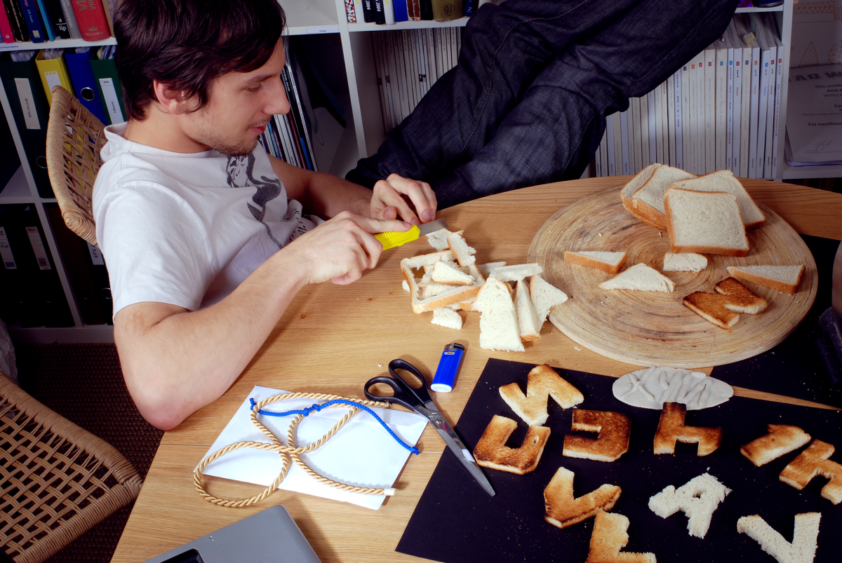
They started with developing selfmade fonts from some funny everyday life objects and ended up with loads of new fonts. On Handmadefont web page you can find more than 1000 unique handcrafted fonts and animated alphabets.
Handmadefont also launches lovely competitions on their Instagram and posts cute reports on Bechance. Just lately Handmadefont brothers set up a YouTube channel too.

Studio Feixen is an independent Design Studio based in Lucerne, Switzerland that creates visual concepts.

“We focus specifically on nothing in particular. Whether it’s graphic design, interior design, fashion design, type design or animation – as long as it challenges us – we are interested.”

Talented Russian designer Ruslan Khasanov, famous for his experiments with liquids and colour, shared his set of recent typography projects

Emphase is a graphic design agency based in Lausanne, Switzerland. Since 2010, the two founders Fabienne Kilchör and Sébastien Fasel with their team are developing a wide range of visual communication solutions. Below we select few projects made by them

Saint-Petersburg based typography artist Sergey Raskazov, founder of Type School and organiser of Typesburg event happening now, created a huge type lettering on historical building of recently refurbished Manege Art Expo Center. His team created a sign for exhibition of Russian group of contemporary artists that took a part in Venice Biennale of different years.

Jenue is a Spanish Artist and Art director, who divides his time between Madrid and London. He makes playful images for editorials, music, and advertisements with his own colourful view and style. Check his latest project made of famous designer's quotes commissioned by AIGA

As a kid born in the USSR I can't admit I have a lot of nostalgia for that period but it definitely has a good examples of graphic design especially typography. Keeping this in mind Saint-Petersburg based designer Mike Levchenko approached the idea of rebranding famous global trade marks using so say "USSR" or "Soviet" style.

Talented graphic designer and than young nuclear physics Marco Oggian born in Italy and working in Spain as a part of True Color Studio He started to do commercial works in his early ages, Zara bought his work when he was 15, since than Marco never stop dreaming of being big name in design
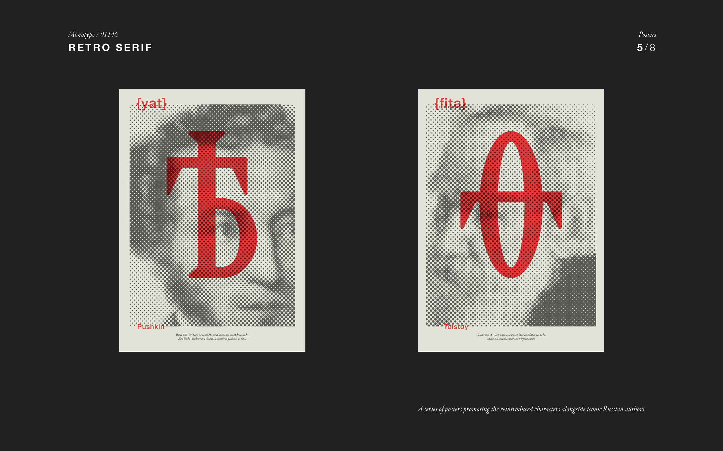
London based graphic designer Polina Hohonova was recently awarded by D&AD Yellow Pencil (Gold) for her graduation project at Chelsea College of Arts (Tutor: David Barnett)
Retro Serif is a project about the revival of glyphs in the Russian alphabet that had been omitted after the revolution. When the Bolsheviks came to power, says student Polina Hohonova, the letters I, Ѳ, Ѣ were omitted from the ‘new’ Russian alphabet as they were regarded as symbols of the aristocratic ‘High Russian’ and therefore representative of the defunct Tsarist Russia. Those symbols were part of the language of Pushkin and Tolstoy. “Reviving these characters is a protest against the prescribed dictatorship of the language,” she says.

French visual artist and graphic designer Laurent Monnet has a portfolio to dig through each piece

By the use of various media, the master thesis of Thomas Wirtz describes a free design experiment that has evolved over time into a modular system consisting of two components: The self-made font, produced by 3D printing, which is thereby associated with a variety of physical processes.
Concept and design: Thomas Wirtz
Supervision: Prof. Philipp Teufel Prof. Gabi Schillig
Dusseldorf University of Applied Sciences 2016
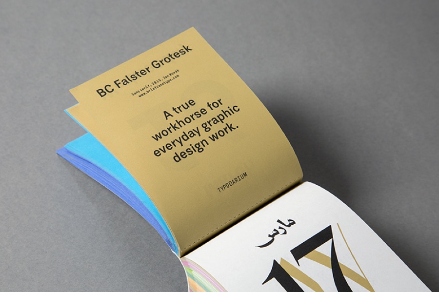
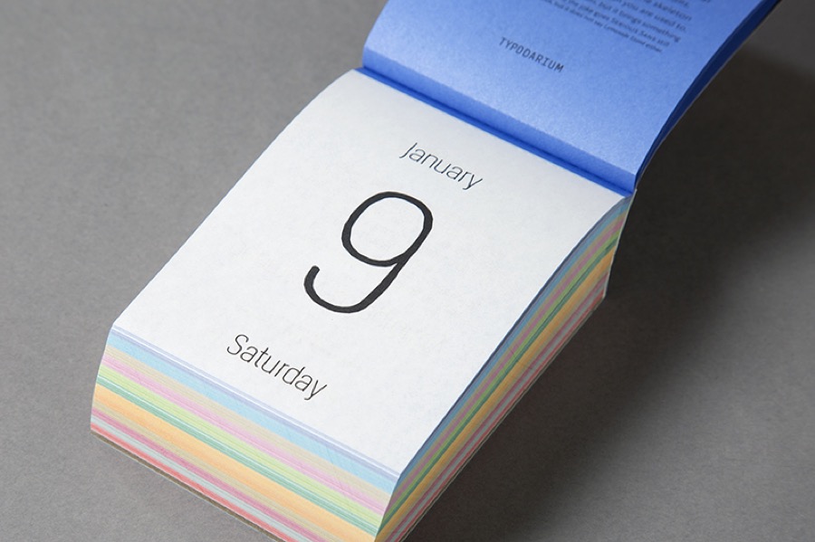
"Typodarium 2016 is the daily typography dose. A tear-off calendar, just like the one our grandma used to hang in the kitchen. But this calendar unveils a new font everyday. We can therefore have, a whole year long, the chance to broaden our knowledge, to discover the font’s history and developement, to possess a piece of jewellery that is new everyday. On the front, the font will be prominently displayed, and on the back it will be described in details. How it originated, from what or who came the inspiration and where we can obtain the font. We really want a story about your typeface!"

typodarium-1

typodarium-2
typodarium-3

typodarium-4

typodarium-5

typodarium-6

typodarium-7
typodarium-8

typodarium-9

typodarium-91
I just presented the best Russian talents on Argentinian festival Trimarchi today. The last project I talked about was the biggest calligraphy work we've ever seen made by Russian talent Pokras Lampas: Calligroof
The artist and his team spent nearly a ton of paint to create this work, its height equals to twenty-two storey building. Work's text dedicated to the moments of inspiration and creativity
"This project breaks records on the complexity and scale in Russia. It was a real challenge for me and my team. We designed a brush with an ink surface of 1 meter using four big brooms specifically for this event. We could fail this project many times due to the rains and problems with the delivery of hundreds of liters of paint from another city." says Pokras

calligroof1

calligroof2
See more on Calligroof.com
anna-kulachek-posters1
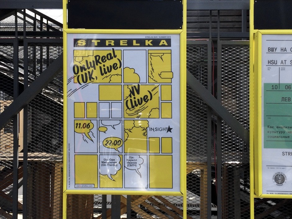
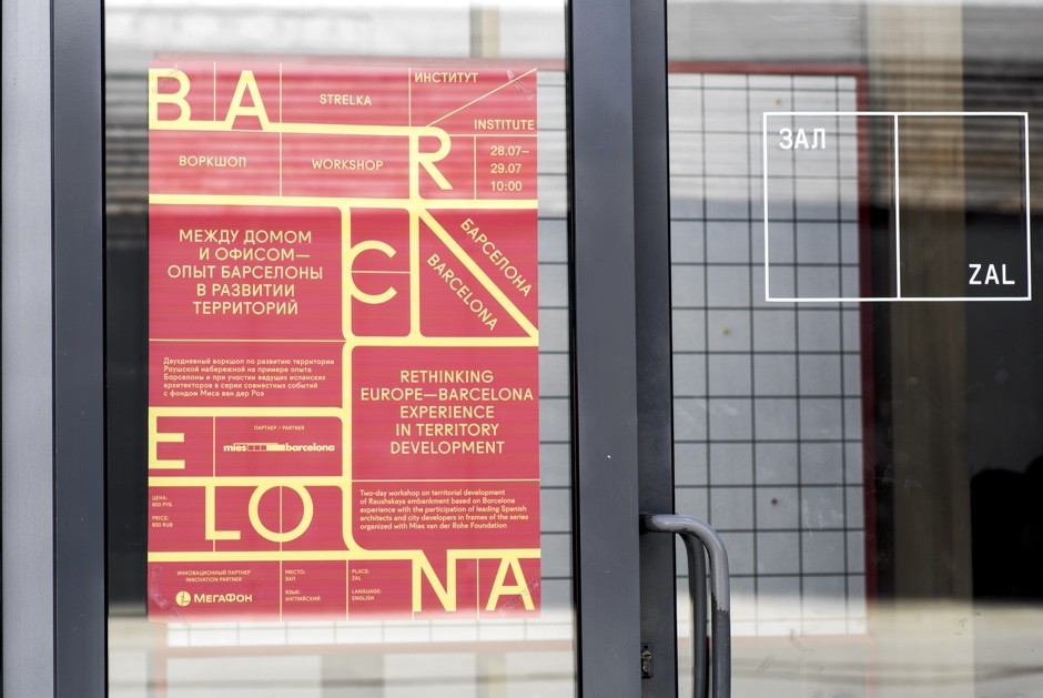
Russian graphic artist Anna Kulachek (previously) has a faith in good typography and practices in creating swiss-clean posters for different creative events around Moscow. Below you can find her latest works

anna-kulachek-posters2

anna-kulachek-posters3

anna-kulachek-posters4

anna-kulachek-posters5

anna-kulachek-posters6

anna-kulachek-posters7

anna-kulachek-posters8

anna-kulachek-posters9

anna-kulachek-posters10

anna-kulachek-posters11

anna-kulachek-posters12

anna-kulachek-posters13

anna-kulachek-posters14

anna-kulachek-posters15

anna-kulachek-posters16
anna-kulachek-posters17
See photos of Anna with her posters by Sergey Serov below

anna-kulachek-posters23

anna-kulachek-posters22

anna-kulachek-posters21

anna-kulachek-posters20jpg

anna-kulachek-posters19

anna-kulachek-posters18
And here is a graphic designer asking for her signings

anna-kulachek-posters24
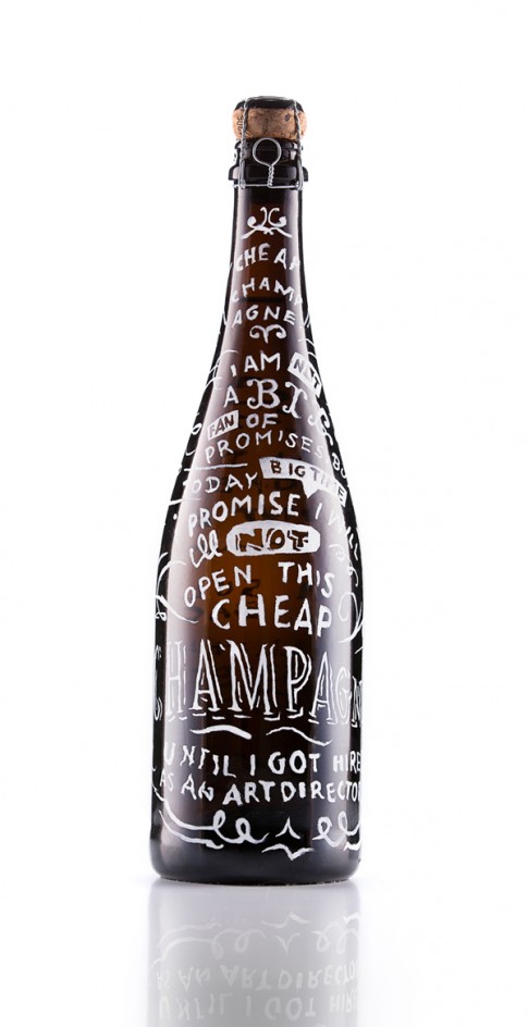
Talented graphic designer Martin Sulzbach (previously) just dropped a new case combining Direct Mail solution with all-in-one-problem solution - a bottle of Champagne. Trop bien!
sulzbach-champagne1

sulzbach-champagne2

sulzbach-champagne3

sulzbach-champagne4
Talented calligrapher Ian Bernard (previously) released a small video proving that there are no limits to tools if you have skills
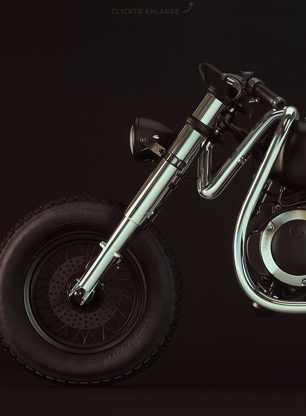
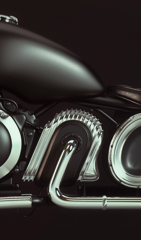
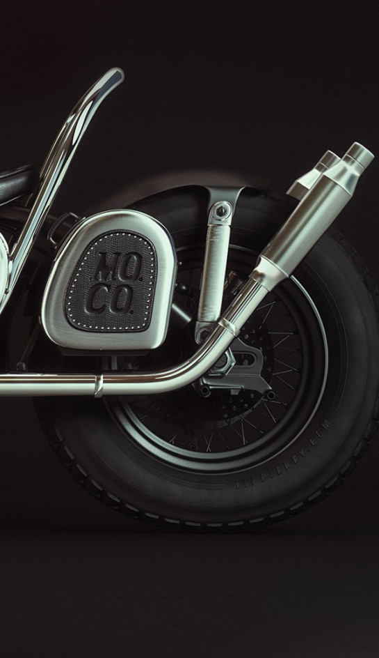
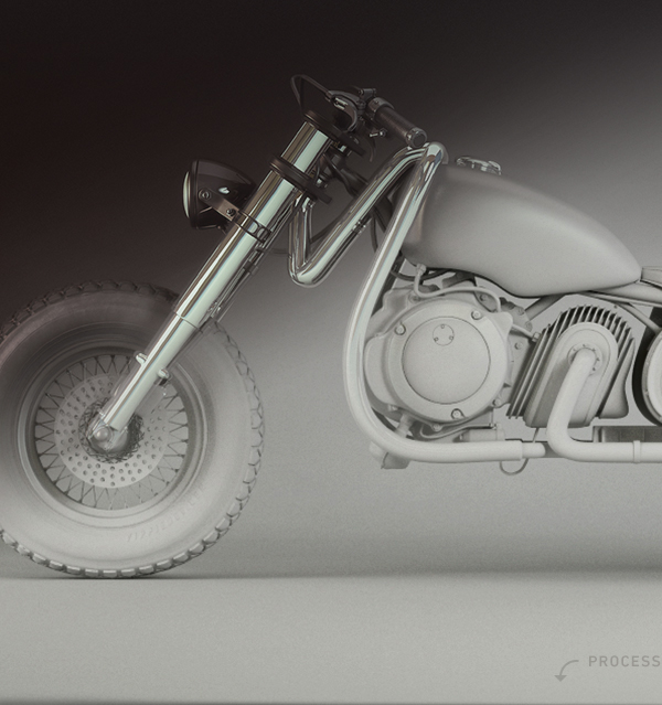
"Monday Mo. Co. is a new motorcycle clothing and lifestyle goods boutique opening soon in Birmingham. Illustration Studio I Love Dust teamed up with Boneshaker Bikes and Mutt Motorcycles to celebrate the mighty two-wheeler with an all new shop, including a gallery area where prints will be sold. They aproached me to create an artwork and this is what I came up with." says graphic designer Jacob Eisinger (Instagram)
P.s. Some of you might remember "Londong Bike" project created by Alex Trochut
http://vimeo.com/102424988
French art director running RDN Studio shares his latest series of typography experiments. Don't hesitate to check his profile online to explore more works