Lapka x Project Ara

I am not sure if you are familiar with Russia-born startup Lapka. Briefly speaking they produce tiny, beautifully designed personal environment monitor that connects to your phone to measure, collect and analyze the hidden qualities of your surroundings. Their latest addition to the family was a breathalyzer BAM. But what we are going to share is their proof of concept made for the well-known Project Ara, the new modular mobile device. Citing Lapka "At Lapka, we reimagine and redesign the scientific devices to turn them into stylish and accessible tools. Our products are healthcare accessories which connect to your smartphone. What if Lapka creates a separate line of these accessories in order to support Ara’s eco-system? Here is our concept of Project Ara modules."

"..we’ve imagined seven modules based on Lapka’s current and possible product line following our Environment + Body grid."

lapka-project-ara1

lapka-project-ara2

lapka-project-ara4

lapka-project-ara6

lapka-project-ara7

lapka-project-ara3

#TimeThroughPhoto by Maxim Zavyalov

"Time Through Photo" is ongoing project set on Instagram by Maxim Zavyalov from Khabarovsk, Far East, Russia. He takes an initial photo with his "polaroid"-like camera Instax mini 8 and then brings it to the Instagram in its natural environment with no tricks and mocks. Maxim believes it bring the photography its basic idea of "one shot in one breath". So do we!

maxim-zavyalov1

maxim-zavyalov2

maxim-zavyalov3

maxim-zavyalov4

maxim-zavyalov5

maxim-zavyalov6

maxim-zavyalov7

maxim-zavyalov8

maxim-zavyalov9

maxim-zavyalov10

maxim-zavyalov11

Famous Paintings recreated as Food Photography by Tatiana Shkondina

Leading Russian food- photographer and stylist Tatiana Shkondina recreates famous paintings with edible products that we use at kitchen on daily basis. Each photo required a lot of research in material and post-production that was made by Alex Tivanov

Wassily Kandinsky. Fruits and Berries

Pablo Picasso. Pasta and spices

Vincent Van Gogh. Peppers, lentils

Vincent Van Gogh. Wild rice, grapes, pasta, rice

Piet Mondrian. Watermelon, cheese, yoghurt, chocolate

Salvador Dali

Kazemir Malevich. Black caviar for Black Square

Gustav Klimt. Pasta and veggies

Hokusai. Salmon, rice and cha

Rene Magritte. Fruits and Veggies

Andy Warhol. Cabbages (in Russia "cabbage" means piles of banknotes)

Andy Warhol. Brussel Cabbage

Emoji Album Covers by @EmojiArtworks done with Glitche App

It's been a while since I spoke about Russian-born Glitche App at Digitized Festival this September in Athens. Started as a fun in 2013 the Glitche app reached the top of App Store in a few months, right after celebrities and photographers like Nicola Formichetti (Diesel) or Nick Knight (Showstudio) showed the world a new tool that saves a lot of efforts and money to bring a wow-effect. Basically the app give you an opportunity to become a contemporary artist just by distorting your photos with an awesome set of filters and glitch-hacks. After the release of the second version app rocked with a new features and filters like Emoji-art (I still remember the joy of ASCII-Art Christmas Cards my dad did in later 80ss for me). We didn't wait to long for a clever guy using Glitche App to create epic fan art over famous music covers. So he did it very well and buzz the social web with his artworks available on Twitter @emojiartworks. Find the cover you like or create and share your own Glitch Art using the app now. If you totally missed a thing, there is a second app from Glitche Team (Vladimir Shreyder) aimed to eliminate the sense of selfie by creating anti-selfie - SLMMSK. Go try on both apps! Meanwhile enjoy the selection of Emoji Music Cover Artworks below.

OFF MICE & MEN - RESTORING FORCE

Lower Than Atlantis - Lower Than Atlantis

Paramore - Paramore

Panic! At The Disco - Too Weird To Live, Too Rare To Die

Tonight Alive - The Other Side

My Chemical Romance - The Black Parade

Chalk lettering for Channel One Russia

Channel One Russia commissioned lettering master Igor Mustaev to work on winter festive TV splashes that he did on chalkboard. View it on Behance

Channel One Russia team: Art director: Dmitry Likin Photographer: Sergey Kholmanov

igor-mustaev-1

igor-mustaev-2

igor-mustaev-3

igor-mustaev-4

igor-mustaev-5

igor-mustaev-6

http://www.youtube.com/watch?v=vFh-uQkDZAc

Armstrong: The Light Trap

Russian designers Maxim Ali and Constantin Bolimond created a small interactive lamp with cork plugs to control the amount of light coming out of a sphere. They called it Amstrong with no doubts linking the name with the Moon mission.

amstrong-lamp6

amstrong-lamp

amstrong-lamp-1

amstrong-lamp-2

amstrong-lamp3

amstrong-lamp4

amstrong-lamp5

Wong Kar Wine Winebar, Saint-Petersburg by Plan-S23

The expansion of European wine culture to Asia have not been that huge so far as during the last decade. The juxtaposition of classic winery and asian food went very well, and inspired a lot of urban food points. St.Petersburg-based happy three friends were no exception to open a new bar with a tricky name of "Wong Kar Wine" that has mixed up the love to good wine, movies and asian food at one place. Guys asked Plan-S23 design studio to create the space, and without any doubts Maxim Scherbakov and Kate Tolstykh did their best. The clean-shaped bar furniture has been created by VERSTAK Studio and unique wooden panels - by PROKK. So it happens that the full trio of studios came from Saint-Petersburg what make a big sense when speaking about local Russian design.

wong-kar-wine-1

wong-kar-wine-2

wong-kar-wine-3

wong-kar-wine-4

wong-kar-wine-5

wong-kar-wine-6

wong-kar-wine-7

wong-kar-wine-8

wong-kar-wine-9

wong-kar-wine-10

wong-kar-wine-11

wong-kar-wine-12

wong-kar-wine-13

Saint Petersburg City Logotypes

Who said it will be easy? To create logotype for the city like Saint Petersburg is like to direct a play of "Lady Macbeth" or "The Master and Margarita". Everybody knows it but nobody got close to it, dead or alive. The city identity requires a lot of everything: starting from a very complicated history ending with citizens that has a lot of doubts and bits about living here. To understand the city as someone said you must "drown" in it, or it will spit you outside or even leave you dying. Literally, Saint Petersburg has a lot of faces, and everyone who gets here see its own face. So let's check the three version of Saint Petersburg City Logotypes.

1. Unknown Pitch

The first one is said to be done by Moscovian (sic 1!) design studio "Art.Lebedev", but it is not approved. Please take this in consideration while studying the logo. First posted on German website (sic 2!), it spread across Russian web with a lot of doubts over iconography and some typography issues.

saint-petersburg-city-logo-1

saint-petersburg-city-logo-2

saint-petersburg-city-logo-3

2. I Love SPB

Done by initiative group lead by Ruslan Chernobayev (St.Petersburg Design Week) and talented illustrator Alex Andreyev and supported by BCA Agency, ILOVESPB is a next pitch to have pros and contras. The logo has a personal website http://ilove.spb.ru/ and hope has a long journey to be real.

saint-petersburg-city-logotypes

saint-petersburg-city-logo-4

saint-petersburg-city-logo-7

saint-petersburg-city-logo-6

saint-petersburg-city-logo-5

3. Yakushev Design Studio Pitch

The third pitch is again from Moscovian studio of Yakushev Branding has a good typography designed by Ivan Gladkikh and lemon-faced trend of "generic" logotype, that we'll leave on your consideration. Personally, this project is a good moodboard and research of possible graphic design trends, but hardly represents the Saint Petersburg City itself.

saint-petersburg-city-logo-a

saint-petersburg-city-logo-b

saint-petersburg-city-logo-c

saint-petersburg-city-logo-d

saint-petersburg-city-logo-e

Meanwhile please enjoy the beauty of the city in different timelapse motions we collected all this time

Gorky Park Ice Cream Identity

With the nostalgic flashback to Soviet epoch designer Anastasia Genkina and art director Misha Gannushkin have created these beautiful branding and packaging designs for Gorky Park ice-cream, which are also shot in a fantastically playful way by Grigory Sobchenko.

“This ice-cream has been a treat inseparable from a walk in the Moscow Gorky Park for decades. It`s special taste of creamy vanilla and waffle cone became a memory of childhood for several generations, and it has remained true to the old fashioned recipe. The aim to connect the historical value with modern recognition through design was achieved by developing patterns, inspired by key symbols of the Park`s life. Each pattern corresponds with one of the six flavours.”

gorky-park-icecream

gorky-park-icecream1

gorky-park-icecream2

gorky-park-icecream3

gorky-park-icecream4

gorky-park-icecream5

gorky-park-icecream6

gorky-park-icecream7

gorky-park-icecream8

gorky-park-icecream9

gorky-park-icecream10

gorky-park-icecream11

gorky-park-icecream12

gorky-park-icecream13

gorky-park-icecream14

gorky-park-icecream15

Herotime by Lora Zombie

HEROTIME is a new fashion label and the creative canvas of artist Lora Zombie.

herotime-lora-zombie-1

Born in a small town in Russia, in 1990, Lora Zombie was set on becoming an artist a very early age. The self-taught painter first gained recognition in the late 2000s as her work circulated online, reaching millions of people through blogs, news outlets and social media as well as on Designcollector (search).

herotime-lora-zombie-2

In recent years, Lora has taken the gallery scene by storm with exhibitions in Los Angeles, Toronto, New York and Russia - bringing in the interest of collectors and fans worldwide. In 2010 Tom Co-Founded Eyes On Walls after seeing an opportunity in the market for publishing and promoting a collective of talented young visual artists, connecting their work with a new generation of art buyers. In the 4 years since then Eyes On Walls and Lora have created and sold hundreds of thousands of Prints, Limited Editions and Originals of Lora's work around the world. They also produced 3 solo art shows in Toronto (Canada), SoHo (New York) and Brooklyn (New York).

herotime-lora-zombie-3

herotime-lora-zombie-4

Creating Herotime

In the search of inspiration for a name for this new concept of a brand centered around Lora's artistic vision, we studied her vast archives of work.

herotime-lora-zombie-5

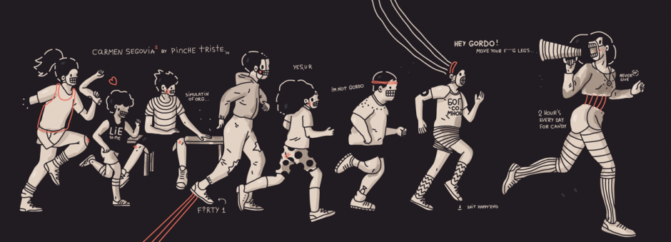
Among countless other subjects and ideas, we found a frequent theme of superheroes portrayed as much more human than we are used to. Lora's superheroes were often depressed, distraught, unsure of themselves, and performing mundane everyday tasks instead of saving the world. On the other hand, the everyday characters in Lora's works were often the most brave, acting as you would expect superheroes would. Protecting innocence, facing fear, and overcoming adversity.

herotime-lora-zombie-6

It was on the concept of these everyday heroes that the name and core principles of HEROTIME were born.

The Art of Herotime

Lora created an initial series of work building on the "Tom" panda character she created for the logo.

herotime-lora-zombie-7

She also experimented for the first time with creating art designed specifically for apparel.

herotime-lora-zombie-8

Herotime on Kickstarter

You can support Herotime on Kickstarter by pre-ordering sterling or golden "Rabbit Bomber" Pendants and other apparel as well as posters and different types of artwork.

herotime-lora-zombie-9

herotime-lora-zombie-10

herotime-lora-zombie-11

herotime-lora-zombie-12

herotime-lora-zombie-13

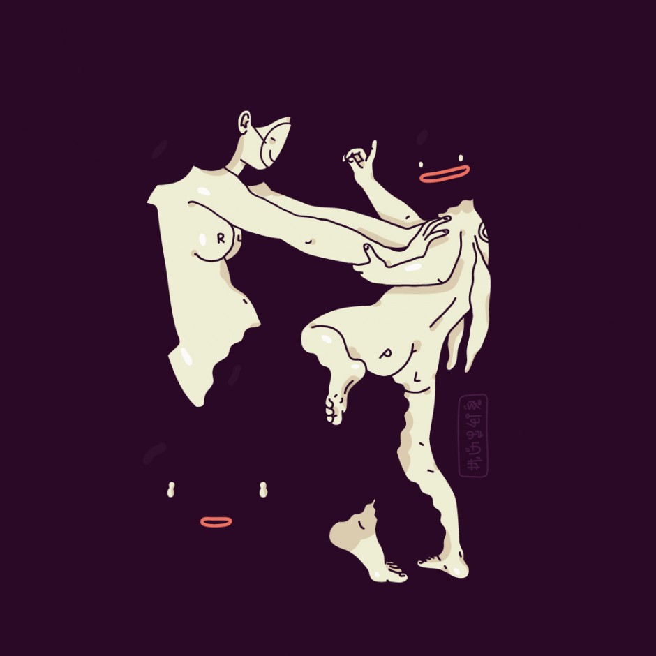
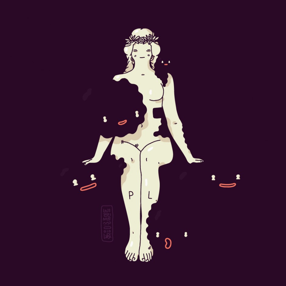
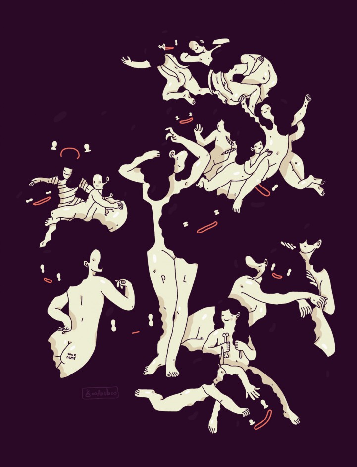
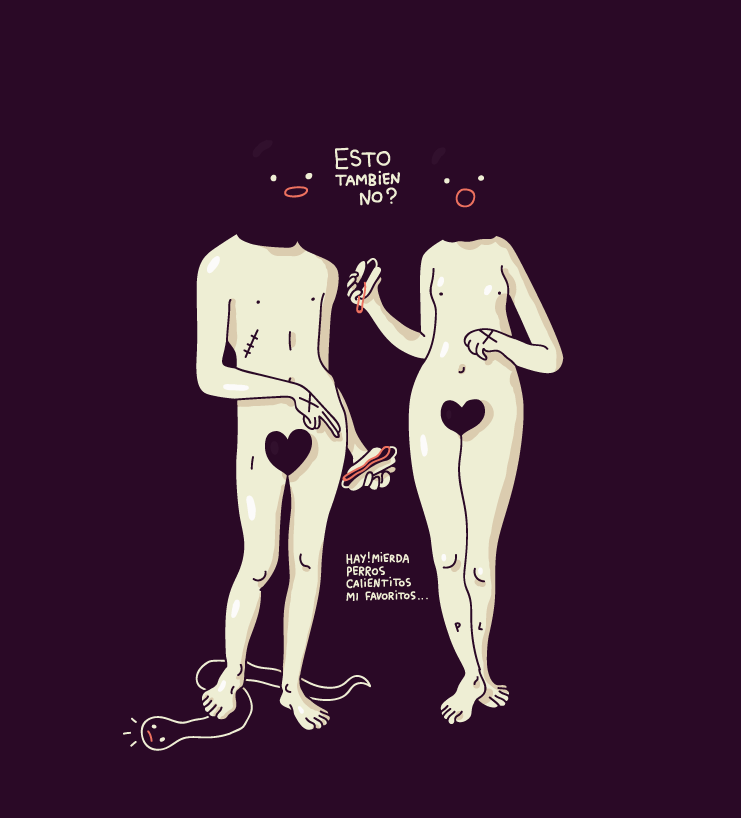
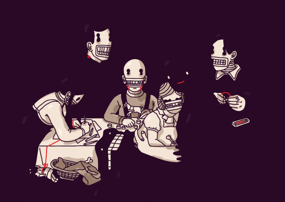
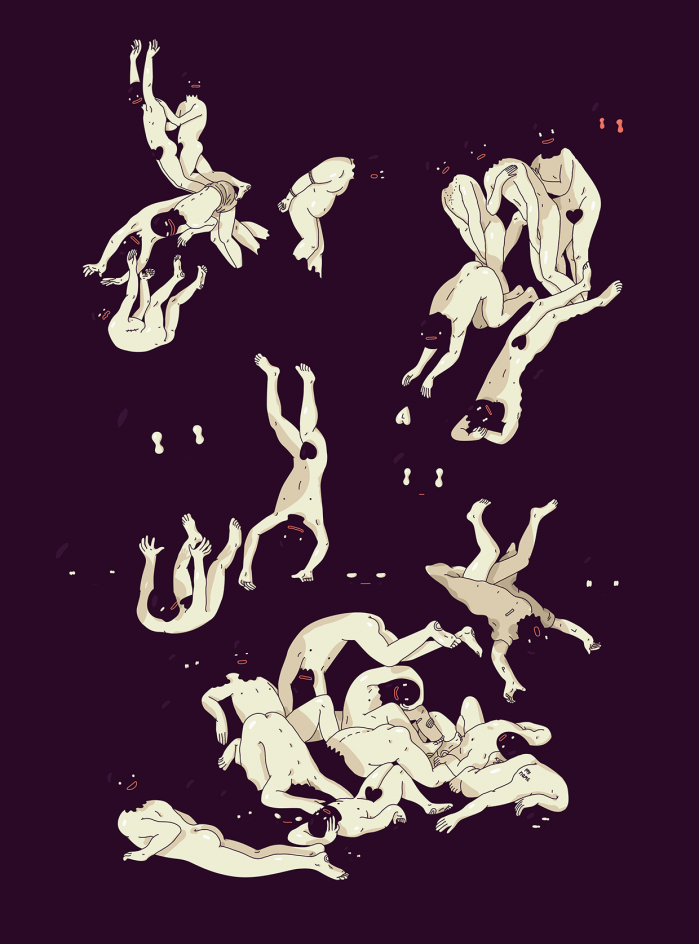
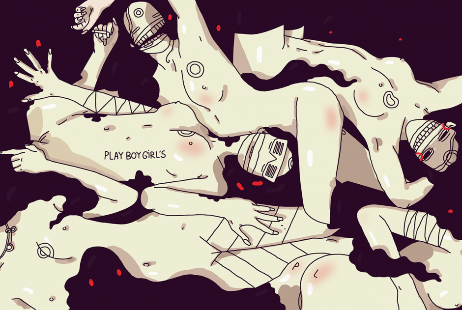
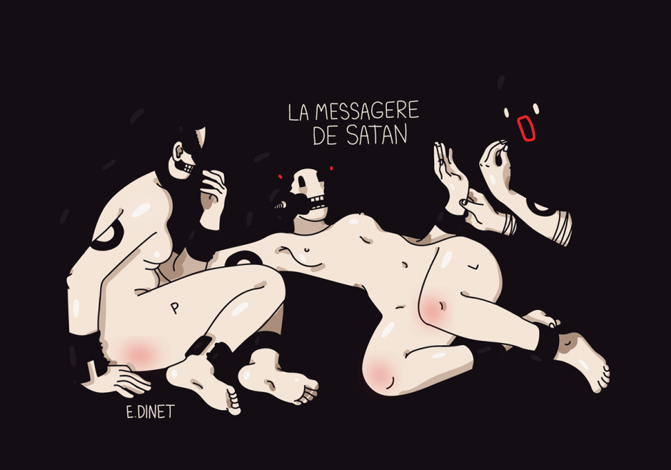
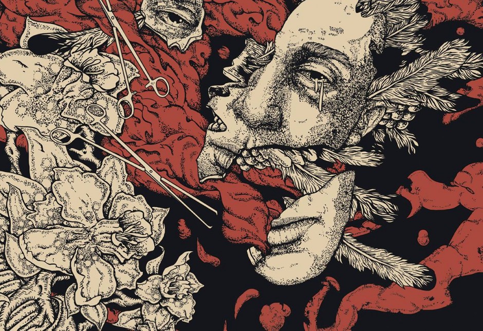
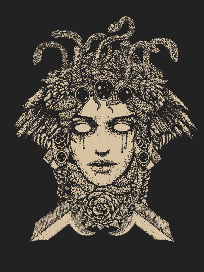
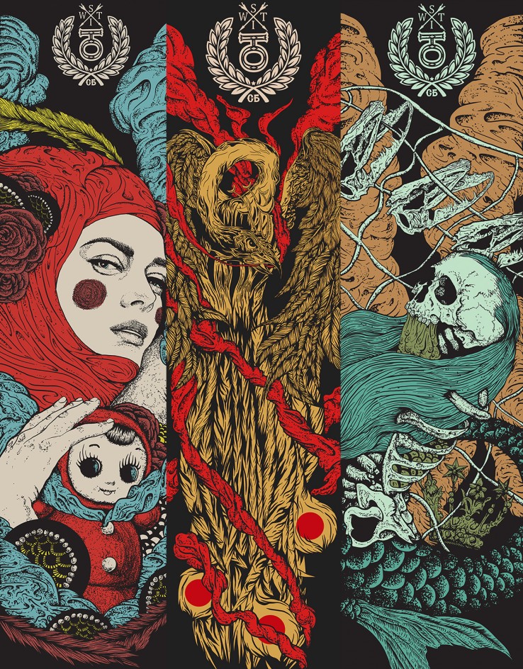
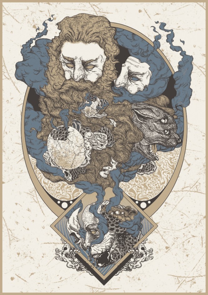
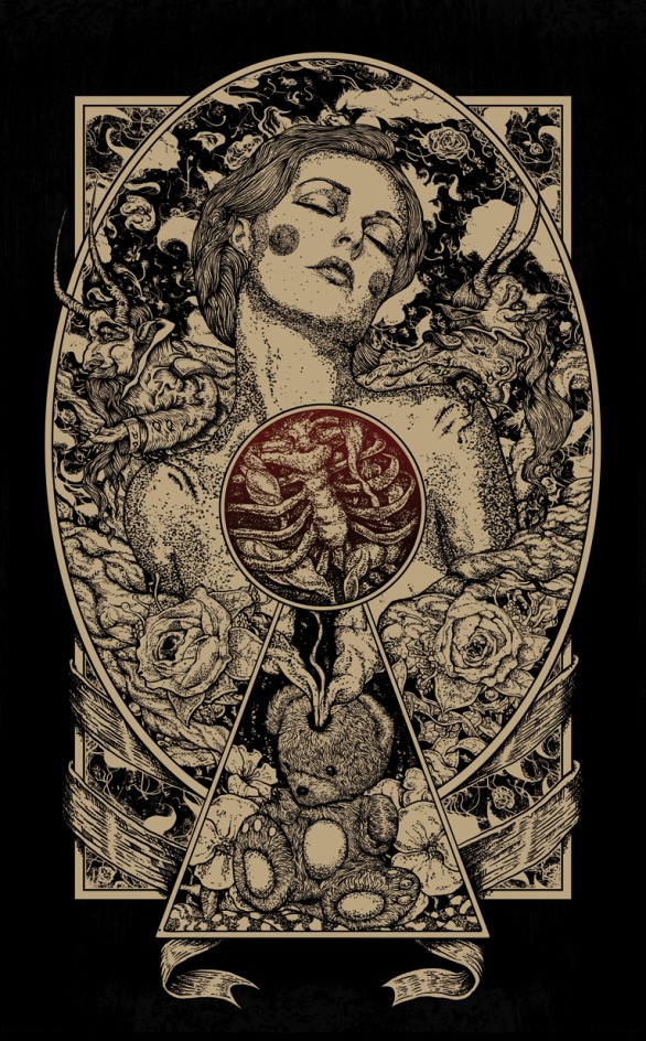
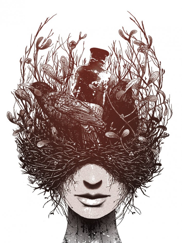
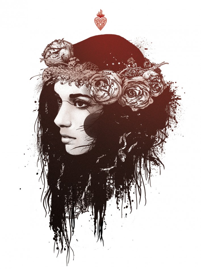
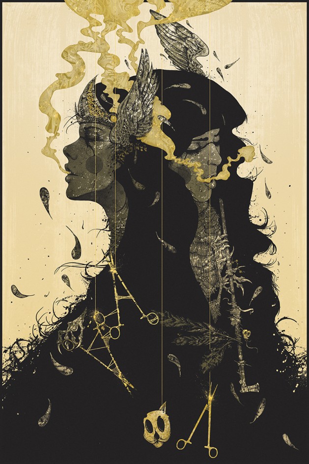
Lora Zombie Selected Artworks