Saint Petersburg City Logotypes
Who said it will be easy? To create logotype for the city like Saint Petersburg is like to direct a play of "Lady Macbeth" or "The Master and Margarita". Everybody knows it but nobody got close to it, dead or alive. The city identity requires a lot of everything: starting from a very complicated history ending with citizens that has a lot of doubts and bits about living here. To understand the city as someone said you must "drown" in it, or it will spit you outside or even leave you dying. Literally, Saint Petersburg has a lot of faces, and everyone who gets here see its own face. So let's check the three version of Saint Petersburg City Logotypes.
1. Unknown Pitch
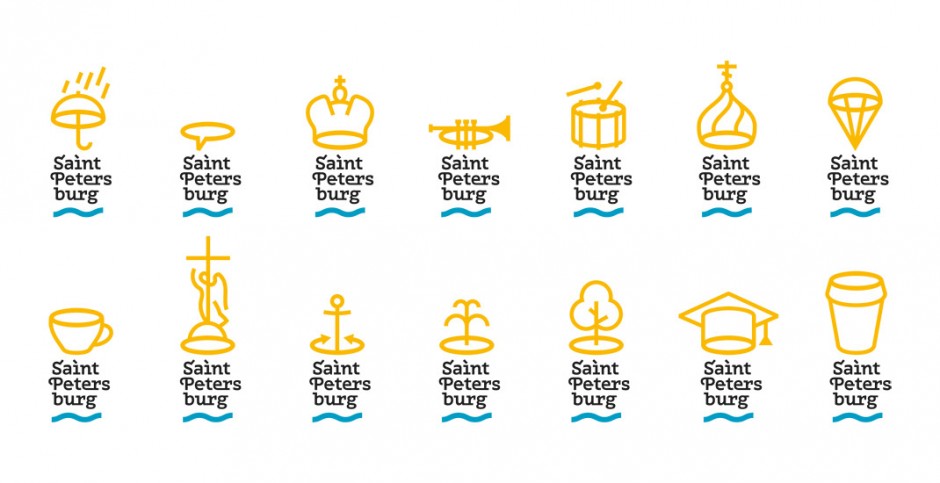
The first one is said to be done by Moscovian (sic 1!) design studio "Art.Lebedev", but it is not approved. Please take this in consideration while studying the logo. First posted on German website (sic 2!), it spread across Russian web with a lot of doubts over iconography and some typography issues.
2. I Love SPB
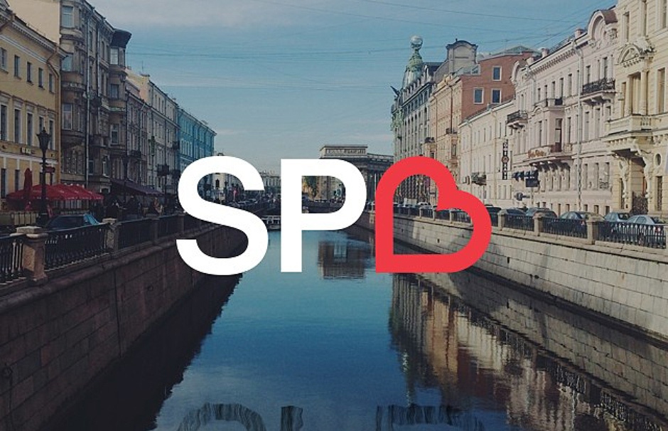
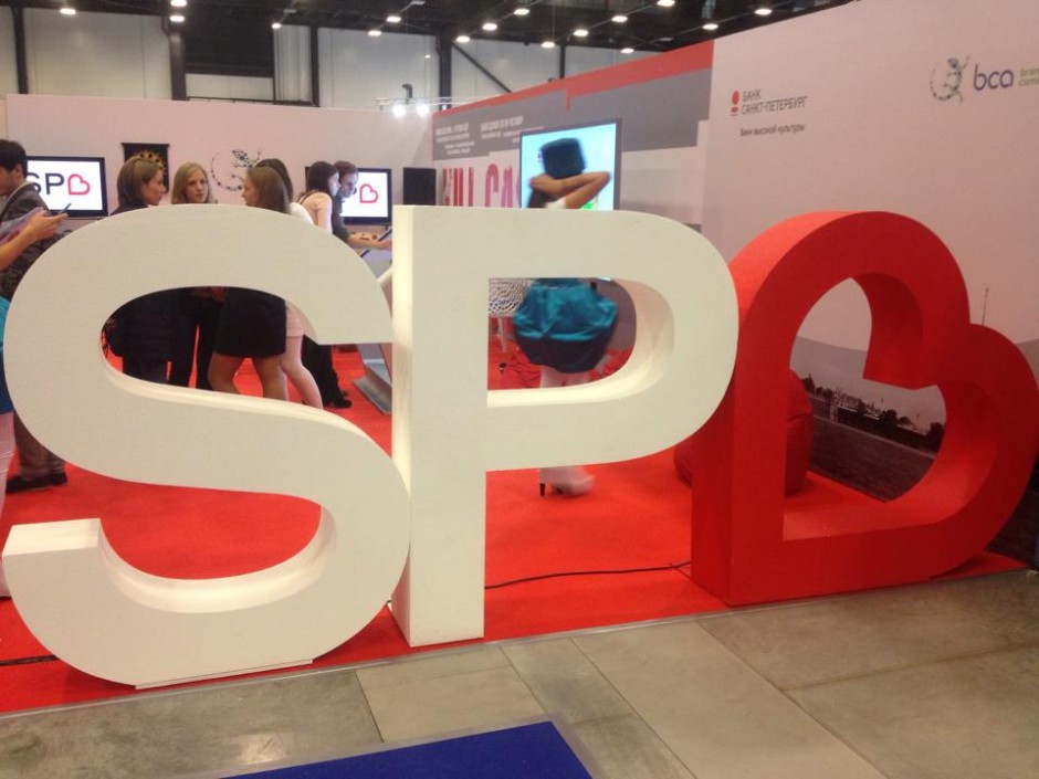
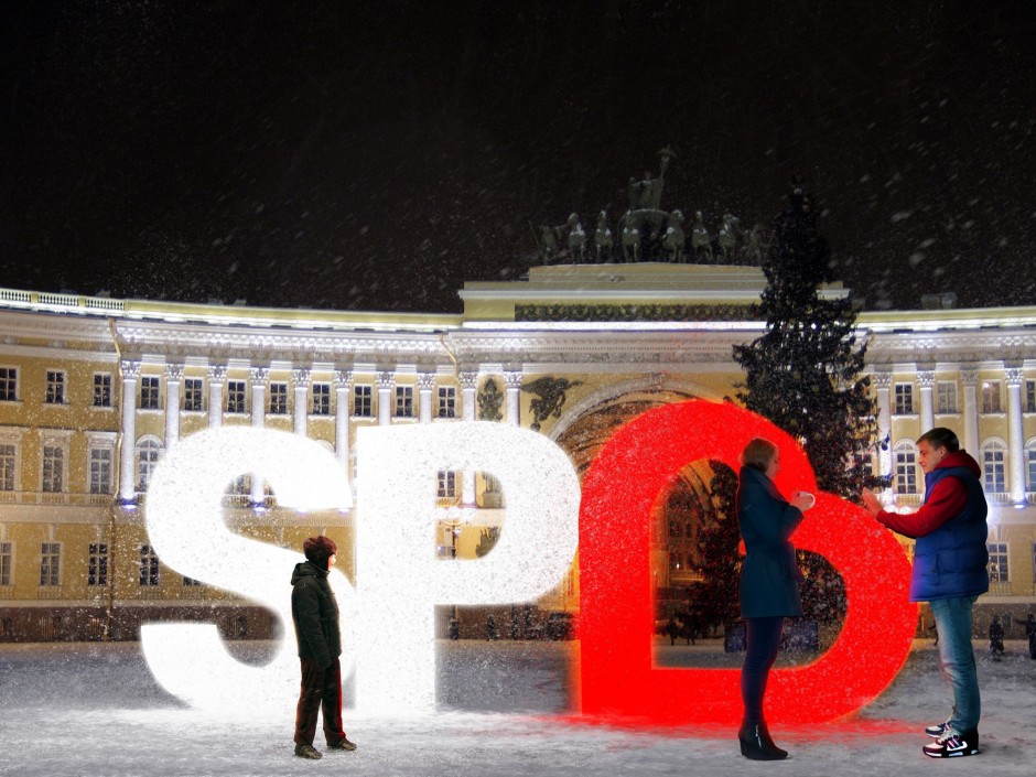
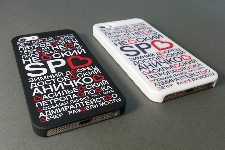
Done by initiative group lead by Ruslan Chernobayev (St.Petersburg Design Week) and talented illustrator Alex Andreyev and supported by BCA Agency, ILOVESPB is a next pitch to have pros and contras. The logo has a personal website http://ilove.spb.ru/ and hope has a long journey to be real.
3. Yakushev Design Studio Pitch
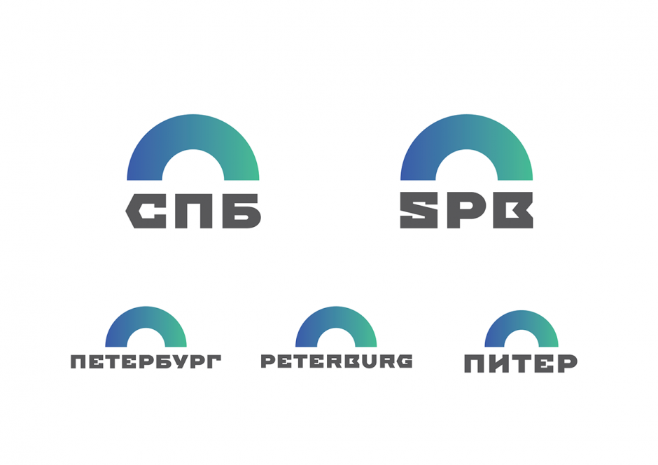
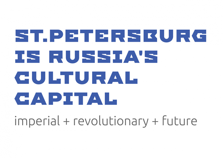
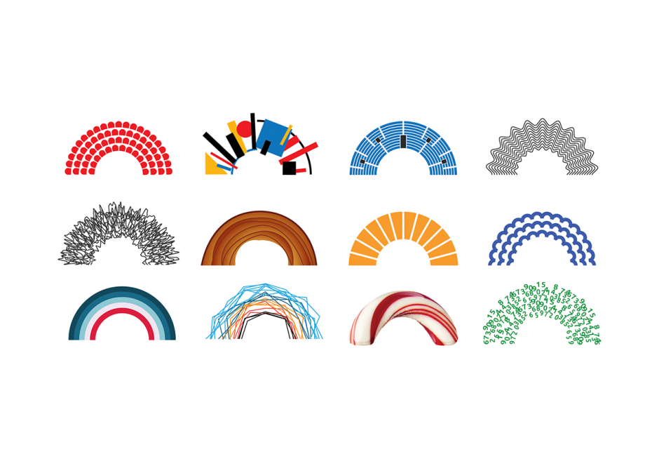
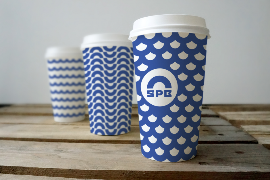
The third pitch is again from Moscovian studio of Yakushev Branding has a good typography designed by Ivan Gladkikh and lemon-faced trend of "generic" logotype, that we'll leave on your consideration. Personally, this project is a good moodboard and research of possible graphic design trends, but hardly represents the Saint Petersburg City itself.
Meanwhile please enjoy the beauty of the city in different timelapse motions we collected all this time

