DESIGNCOLLECTOR

3rd Wave of Inspiration

Since 2003

  • Latest
    • FACE
    • All Posts
    • NFT & AI ART
    • Art
    • Design
    • Photography
    • Illustration
    • Videos
    • Digital Art
    • Interiors
  • Music
    • Latest
    • 2021
    • 2020
    • 2019
    • 2018
    • 2017
    • 2016
    • 2015
    • 2014
    • Mixtapes
  • Archive
    • 2023
    • 2022
    • 2021
    • 2020
    • 2019
    • 2018
    • 2017
    • 2016
    • 2015
  • Info
    • About
    • Submit

Conceptual Slack Visual Identity by Oleg Turbaba

January 24, 2019 by Arseny Vesnin in Branding, Graphic Design, Portfolios, Russia, 2019

There is always a good chance for designers to imagine their favourite brand having a new identity. This happens with Slack (@SlackHQ) again after they rolled out new visual system designed by Pentagram (@pentagramdesign). We won’t comment on it as there is a huge backslash on social network regarding the new style. But we definitely want to show you another great example of “how it could be if”.. talented Russian art director Oleg Turbaba takes over it. Of course, we are not saying it is perfect, but take a look:

Old Logo
Old Logo
New Logo by Pentagram
Concept by Turbaba
Concept by Turbaba
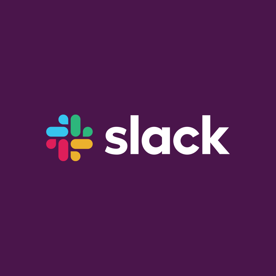
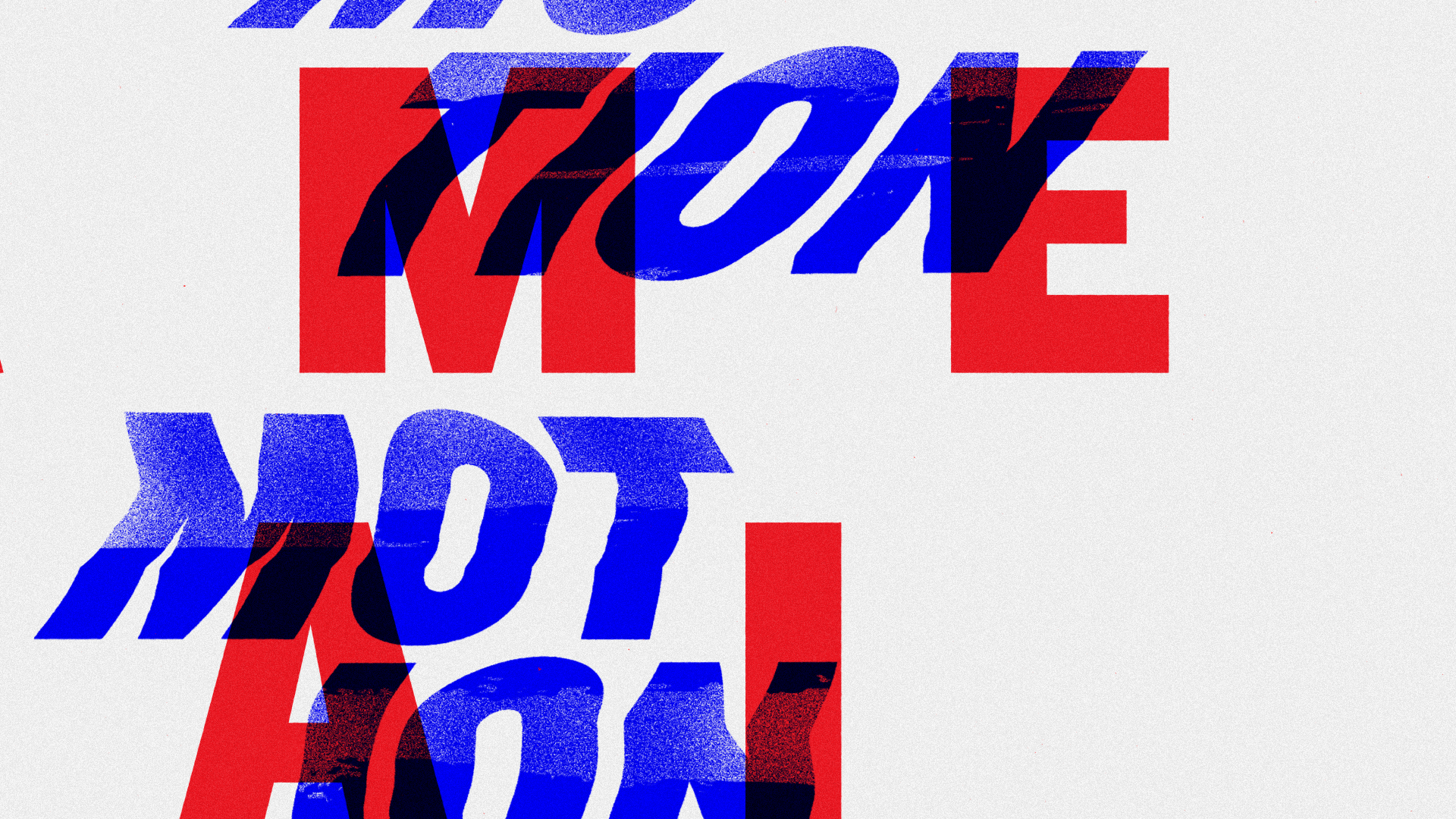
“This is my personal vision of how Slack’s logo could be represented with its new identity. My research was started with exploring brilliant work done by Pentagram with Slack’s redesign. Then I tried to search deeper and simplify both Slack’s old and new logos to their extremum.

As a symbol, I’ve decomposed an old Slack’s logo, taken one component (the message) and used it as a core of my concept. The way I see it, the message is the main theme of the Slack. Then I experimented with some modularity and dynamic logo things”
— Oleg Turbaba
View fullsize slack-turbaba-logo4.png
View fullsize slack-turbaba-logo5.png
View fullsize slack-turbaba-logo6.png
View fullsize slack-turbaba-logo7.png
@turbaba
January 24, 2019 /Arseny Vesnin
Russian, JAN
Branding, Graphic Design, Portfolios, Russia, 2019

The Rebirth of OFFF

January 21, 2019 by Arseny Vesnin in OFFF, Spain, Agencies, Graphic Design, Branding, 2019

Being a longtime fans, friends and supporters of the best design festival in the world (literally) - OFFF, we cannot skip their recent visual rebirth made by Crowd Studio

Founded by Héctor Ayuso over a decade ago, OFFF started as a concept that transformed into an event joining creative talents from all around the world all together in one place. The main goal of OFFF is to become the key meeting point for artists who share the same interests to be in one place. Today, OFFF is more than an event, it is more than a Festival, OFFF has become a community providing the ultimate creativity experience.

View fullsize 01_offf_aplicattions_COLOR_v3_A

Evolving context

In 2013, CROWD studio, one of the most talented Barcelona based digital and design agency, has transformed the famous 3 “FFF” into one icon, it was the birth of the official OFFF logo that maintained its presence for 5 years. With with over 18 years of content and a Festival that is ever-evolving, growing every year to become one the most important event to attend worldwide while providing endless innovation, it was time for a change. The OFFF icon has finally become visually recognised by everyone, so it became unnecessary to conserve the 3 “FFF” in the logo. The OFFF icon is now visually abstract, simplified and more compact thanks to re-thickness of the symbols.

View fullsize 01_offf_aplicattions_COLOR_v3_A

Typography

“OFFF has been conveying one true message: “our audience, our speakers and our attendees are our base. Without them this wouldn’t be possible” so for such an important brand, user-experience is very crucial. We had to create something valuable for both, past attendees and new comers, to understand the message behind OFFF and to be able to navigate through 18 years worth of contents. Starting with the typography, the most important element to the human being’s eyes, we decided to work with a corporate font, showcasing some seriousness yet with a touch of flexibility.”

View fullsize offff-rebirthtype1.jpg
View fullsize 01_offf_aplicattions_COLOR_v3_A

Problem solving

“From concepts to various visual campaigns in every edition and with over 8 OFFF on Tour cities, OFFF Festival is always changing its aspects. But the unity of the brand and the team behind it is the Festival's foundation. Over the past few years, we have noticed an overall shift in the brand’s identity. OFFF, the brand proving itself with the concept of having no brief and giving the complete freedom plus the invitation to create, this also had its consequence. We noticed that with so many openness, the brand unfortunately lost its visual presence and visual aspect throughout the Festival, online and onsite. So how do we showcase the dynamic aspect of the brand while maintaining its base? By creating a definite strategy in the brand’s communication structure and building a branding system.”

View fullsize 01_offf_aplicattions_COLOR_v3_A

“With this new approach we are adding more control to the brand use, where the brand gets more identified with the ability to adapt to other contents therefore the Festival becomes more firm and more strengthened.”

View fullsize 01_offf_aplicattions_COLOR_v3_A
View fullsize offff-rebirth7.jpg
View fullsize offff-rebirth6.jpg
View fullsize offff-rebirth5.jpg
View fullsize offff-rebirth4.jpg
View fullsize offff-rebirth3.jpg
View fullsize offff-rebirth2.jpg

“While using this new system of communication grid, the website become one dynamic block of contents making it easier for the user to adapt. This allows us to recreate the whole website as a platform and as an archive of news, past speakers, new speakers and events. An organised clean space.”

@crowdstudio_

OFFF 2019
April 25 - 27

Buy Tickets
January 21, 2019 /Arseny Vesnin
JAN
OFFF, Spain, Agencies, Graphic Design, Branding, 2019

IcoNYC Squarespace

December 05, 2018 by Arseny Vesnin in Advertising, Agencies, Branding, Graphic Design, Typography, USA, 2018

Being a Squarespace running blog we can’t miss their recent update of identity made by our friends from DIA Studio together with François Rappo (Typography), and Optimo

“Squarespace is one of very few technology companies that can truly call NYC home. The city has inspired our attitude, our aesthetic, and our mission to democratize good design for every ambitious entrepreneur, artist, or visionary with a dream. As we began to rethink our brand identity, we knew we needed to find a way to make New York a bigger part of the story.”

“New York is a study in movement; like jazz, it constantly heads in unpredictable directions. Since much of our output is interactive and screen based, we knew the brand needed to make sense in motion. So we developed a kinetic identity system that dimensionalizes our name and reinforces the two syllables in Squarespace.“

brand.squarespace.com
December 05, 2018 /Arseny Vesnin
DEC
Advertising, Agencies, Branding, Graphic Design, Typography, USA, 2018

BBC2 Idents by Future Deluxe

October 25, 2018 by Arseny Vesnin in Advertising, Agencies, Branding, Motioncollector, United Kingdom, 2018

Future Deluxe recently worked with BBC Creative and Superunion to design and produce a set of unique idents to help launch BBC2’s first identity update in over 25 years.

futuredeluxe-bbc2-5.jpg
futuredeluxe-bbc2-4.jpg
futuredeluxe-bbc2-3.jpg
futuredeluxe-bbc2-2.jpg
futuredeluxe-bbc2-1.jpg
@futuredeluxe
October 25, 2018 /Arseny Vesnin
British, OCT
Advertising, Agencies, Branding, Motioncollector, United Kingdom, 2018

OFFF Festival re-branding

October 09, 2018 by Arseny Vesnin in OFFF, Branding, Spain, 2018

OFFF was born as a festival. Today - as a way of understanding art

Please welcome new brand of the main creative festival, a Mecca for any intelligent designer and creative person. Started when millennials were born, festival grown up as the alma mater for many career starts, studios and even families. Whatever language you speak - creativity is the way to understand anyone from a first sight and OFFF is a platform to gather together and share the spirit of future.

Re-branding was made by CROWD Studio and touches all visual aspects from logo to the website

OFFF.BARCELONA

Don’t forget to book your future OFFF19

October 09, 2018 /Arseny Vesnin
OCT
OFFF, Branding, Spain, 2018

Yarza Twins

August 01, 2018 by Arseny Vesnin in Graphic Design, Branding, Portfolios, Spain, 2018

Eva & Marta Yarza are Spanish twins, multidisciplinary designers and artists based
in London. Beside their debut speech at OFFF 2018 they do a lot of graphic design projects worth to dig on their website

View fullsize YarzaTwins4.jpg
View fullsize YarzaTwins2.jpg
View fullsize YarzaTwins1.jpg
View fullsize YarzaTwins3.jpg
@yarza_twins
YarzaTwins91.jpg
YarzaTwins9.jpg
YarzaTwins8.jpg
YarzaTwins7.jpg
YarzaTwins6.jpg
YarzaTwins5.jpg

View on Ello

 
More from Ello
Blair Martin Cahill
Illustrations by Evgenia Chuvardina
Pablo Barreto Graphics
Joelle Grace Rosen Photography
Sense of Colour with Alejandra Garcia
Elodie Milan Photography
BIFF
Ginebra Siddal Photography
Digital Art of Mateusz Krol
Kim Leutwyler Art
August 01, 2018 /Arseny Vesnin
Ello, AUG
Graphic Design, Branding, Portfolios, Spain, 2018

The Senses: Design Beyond Vision

June 04, 2018 by Arseny Vesnin in Branding, Graphic Design, Portfolios, Typography, USA, 2018

Art Director David Genco presents his recent work of book design and exhibition graphics made in collaboration with Ellen Lupton.

View fullsize david-genco-93.jpg
View fullsize david-genco-92.jpg

The Senses: Design Beyond Vision invites visitors to encounter design with all their senses through several interactive installations. Currently on show at the Cooper Hewitt Smithsonian Design Museum, curated by Ellen Lupton & Andrea Lipps, exhibition design by Studio Joseph.

View fullsize david-genco-91.jpg
View fullsize david-genco-9.jpg


The book is a manifesto celebrating the sensory richness of design. A must-read and powerful reminder to anyone who thinks design is primarily a visual pursuit. Co-published by Princeton Architectural Press and Cooper Hewitt, by Andrea Lipps & Ellen Lupton.

View fullsize david-genco-6.jpg
View fullsize david-genco-4.jpg
View fullsize david-genco-3.jpg
View fullsize david-genco-2.jpg
View fullsize david-genco-1.jpg

Visual identity and exhibition graphics made for installation at Cooper Hewitt Smithsonian Design Museum, New York City

View fullsize david-genco-exh4.jpg
View fullsize david-genco-exh3.jpg
View fullsize david-genco-exh2.jpg
View fullsize david-genco-exh1.jpg
@david.genco
June 04, 2018 /Arseny Vesnin
Top 2018 Posts, JUN
Branding, Graphic Design, Portfolios, Typography, USA, 2018

Motion Motion 2018 Visual Identity by nöbl studio

April 24, 2018 by Arseny Vesnin in Agencies, Branding, Graphic Design, France, Events, Typography, 2018, Glitch

Motion Motion is the first event dedicated to the motion design and meanwhile, opened to all audiences. One day in Nantes (FR) with conferences, installations, workshops and concerts for everyone.
nöbl created the festival 2018 whole identity and craft the trailer by playing with a distorted typography treatment:

As the motion design, the concept of this identity talks about graphic design and movement. We choose to play with the most impactful visual system "typography" and then put it literally in movement.

Visual Identity by nöbl

Motion-motion_Gif01.gif
Motion-motion_Gif02.gif
View fullsize MOTION-MOTION_Serigraphie02.jpg
View fullsize MOTION-MOTION_Serigraphie01.jpg
Motion-Motion_print02.jpg
Motion-Motion_print07.jpg
Motion-Motion_print03.jpg
nöbl.tv
April 24, 2018 /Arseny Vesnin /Source
APR
Agencies, Branding, Graphic Design, France, Events, Typography, 2018, Glitch

Mathery Studio

April 10, 2018 by Arseny Vesnin in Branding, Agencies, Advertising, Italy, Graphic Design, 2018

"Mathery" is an award-winning Italian studio founded by duo of art directors Erika Zorzi and Matteo Sangalli. The catalysation of their ideas often turns as a long-term collaborations with leading agencies and producers, and even festivals like OFFF Barcelona. For their latest edition Mathery imagined "OFFF" name as abbreviation to "Oysters Flavoured Food Festival" brining the outstanding visuals for the campaign.


Mathery_Ueno_5.jpg
Mathery_Ueno_4.jpg
Mathery_Ueno_3.jpg
Mathery_Ueno_2.jpg
Mathery_Ueno_1.jpg
@matherystudio
April 10, 2018 /Arseny Vesnin
APR
Branding, Agencies, Advertising, Italy, Graphic Design, 2018

West Studios Branding by Andrew Millington

April 02, 2018 by Arseny Vesnin in Advertising, Agencies, Branding, Portfolios, Graphic Design, 2018

British art director based in Vietnam, Andrew Millington shares the latest branding work he did at Prophet with Hector Pottie for West Studios. This concept was all about transforming the home of British television into a place that people could call their home.

andrew-millington7.jpg
andrew-millington6.jpg
andrew-millington5.jpg
andrew-millington4.jpg
@andrew______m
April 02, 2018 /Arseny Vesnin /Source
British, APR
Advertising, Agencies, Branding, Portfolios, Graphic Design, 2018

Studio BLUP for Adidas Winter Olympics Team GB

March 27, 2018 by Arseny Vesnin in Advertising, Agencies, Branding, Graphic Design, United Kingdom, 2018, Glitch

London-based Studio BLUP has recently updated their nobles folio with a commission done for Adidas online campaign aimed to promote Team GB at Winter Olympics

The Brief
To create the social marketing material for Adidas's officia Winter Olympics Kit launch.

The BLUP way
There aren't many household names who represent GB in the Winter Olympics so there were no sports celebs to base the kit launch around. Thinking The Blup Way we decided to focus on the kit with no model at all giving each piece its own identity through a series of still and motion graphics. The soundtrack we added aims to act like an 'epic' movie trailer in order to create a dark, icy impact. 

View fullsize blup-adiki-teamgb4.gif
View fullsize blup-adiki-teamgb3.gif
View fullsize blup-adiki-teamgb2.gif
View fullsize blup-adiki-teamgb1.gif
View fullsize blup-adiki-teamgb91.gif
View fullsize blup-adiki-teamgb9.gif
View fullsize blup-adiki-teamgb8.jpg
View fullsize blup-adiki-teamgb7.gif
View fullsize blup-adiki-teamgb6.gif
View fullsize blup-adiki-teamgb5.jpg
@studio_blup
March 27, 2018 /Arseny Vesnin
British, MAR
Advertising, Agencies, Branding, Graphic Design, United Kingdom, 2018, Glitch

ON Running — “No Room For Grey Areas”

March 13, 2018 by Arseny Vesnin in Advertising, Branding, Germany, Graphic Design, Motioncollector, Portfolios, 2018

Black and White

TRAUM INC

Traum Inc. was commissioned by ON Running to promote their new shoe Cloud X released in a special all black and all white version. 


Shot in Iceland the film creates a world of black and white, brutalist and wild but technical, balancing sublime landscapes with technical closeups and 3D renderings of the shoe. The film pits a runner agains his alter ego, chasing each other until it comes to a final stand off between both.


DIRECTOR
Thomas Traum (TRAUM INC)
CREATIVE DIRECTION
Alex Griffin (On-Running), Thomas Traum
EDITING
Nikolaj Beltzer (OKAY Studio)
GRADING
Ludovic Roussaux (OKAY Studio)
DOP
Ruaraid Achilleos

1ST AC
Matthew Choules
TALENT
Kazeem Temiday
STYLIST
Erna Bergann
VFX
TRAUM INC (Safwaan Motara, Hayden Martin, Thomas Traum)
PRODUCTION
TRAUM INC

 
Traum Inc
March 13, 2018 /Arseny Vesnin /Source
MAR
Advertising, Branding, Germany, Graphic Design, Motioncollector, Portfolios, 2018

Club Zooma by Ricky Korf

March 12, 2018 by Arseny Vesnin in Advertising, Branding, Graphic Design, Germany, Portfolios, 2018

German Club Zooma approached graphic designer Ricky Korf to update their web identity. We personally liked his techno approach and simplicity of the layout

View fullsize 03_RickyKorf_CZ_website.jpg
View fullsize 08_RickyKorf_CZ_website.jpg
View fullsize 04_RickyKorf_CZ_website.jpg
View fullsize 05_RickyKorf_CZ_website.jpg
 
View fullsize 21_RickyKorf_CZ_website.jpg
View fullsize 22_RickyKorf_CZ_website.jpg
View fullsize 23_RickyKorf_CZ_website.jpg
View fullsize 24_RickyKorf_CZ_website.jpg
 
26_RickyKorf_CZ_website.jpg
28_RickyKorf_CZ_website.jpg
 

Ricky Korf is an award winning designer and art director, rooted in Leipzig Germany. Starting with graphic design in 2002. Flexibly working over the years from either the sleepy town in the countryside fields or from Hamburg, the gate to the world.

rickykorf.com
March 12, 2018 /Arseny Vesnin /Source
MAR
Advertising, Branding, Graphic Design, Germany, Portfolios, 2018

Brave Bear Sake packaging by Creative Carbon

March 06, 2018 by Arseny Vesnin in Advertising, Agencies, Branding, Graphic Design, Portugal, 2018

Creative Carbon is a creative studio specialized in branding, graphic design and CGI with clients around the world. Recently they finished a new packaging design for Japanes Sake brand "Brave Bear". Its special Junmai Daiginjo variety is the first product of its kind to incorporate a soft note of honey, providing a somewhat "wild" experience. The visual identity, packaging and communication exploit this unique feature of the product, further enhancing the experience.

Yamaguchi prefecture is tucked away in the south-western tip of Japan’s main island Honshu. Among the sake - uninitiated, is best known for the pleasant tourist town Iwakuni. When it comes to sake, Yamaguchi prefecture is known as the home of gorgeously scented, delicate, delicious and super-premium products.

brave-bear6.jpg
brave-bear4.jpg
brave-bear2.jpg
Appreciate on Behance
@rafaelpmaia
March 06, 2018 /Arseny Vesnin
MAR
Advertising, Agencies, Branding, Graphic Design, Portugal, 2018

The rebranding of Russia’s tourism board

January 15, 2018 by Arseny Vesnin in Advertising, Branding, Graphic Design, Russia, 2018

It is merely the first time we see adequate attempt of applying some identification to the most unpredictable and trending country in the world - mother Russia. "A team of five designers has created a new brand identity for Russia’s tourism board, using a logo that references the country’s cultural history and geography.  Employing the aesthetics of Suprematism, an art movement coined by Russian artist Kasimir Malevich that featured abstract compositions of bold geometric shapes, the logo uses such shapes in the form of a map of Russia. An important, avant-garde era of Russian culture, not least thanks to its ties to the revolution, the design team says it used Suprematist techniques because – in its time – it “personified advanced thinking” in the country, and is still associated with Russia around the world." says It's Nice That

The idea behind main "centres" of Russia

The design team comprises Vladimir Lifanov, creative director of branding agency Suprematika; Ilya Lazuchenkov and Yegor Myznik from branding agency Plenum; Denis Schlesberg, ECD at agency Artonika; and Erken Kagarov, art director at design firm Art Lebedev Studio.

russia-brand6.jpg russia-brand5.jpg russia-brand4.jpg russia-brand3.jpg russia-brand2.jpg russia-brand1.jpg

The new brand identity was selected via competition within Russia, to which anyone could apply. From 480 logos and 600 slogans, 30 were developed and ten presented for public vote before a jury selected the winner. You can see these shortlisted designs here

View fullsize russia-brand-a95.jpg
View fullsize russia-brand-a94.jpg
View fullsize russia-brand-a93.jpg
View fullsize russia-brand-a92.jpg
View fullsize russia-brand-a91.jpg
View fullsize russia-brand-a9.jpg
View fullsize russia-brand-a8.jpg
View fullsize russia-brand-a7.jpg
View fullsize russia-brand-a6.jpg
View fullsize russia-brand-a5.jpg
View fullsize russia-brand-a4.jpg
View fullsize russia-brand-a3.jpg
View fullsize russia-brand-a2.jpg
View fullsize russia-brand-a1.jpg
@russia__brand

http://russia-brand.com/en/

January 15, 2018 /Arseny Vesnin /Source
Russian, JAN
Advertising, Branding, Graphic Design, Russia, 2018

Identity Design for Latin American Design Festival

May 29, 2017 by Arseny Vesnin in Agencies, Graphic Design, Branding, Peru, 2017

Lima, Peru based IS Creative Studio was commissioned to create graphic identity for Latin American Design Festival went this February. Inspired by La Fiesta de la Calendaria. Catholic devotion and the festival spirit mix in the streets, thousands of musicians and dancers take the scene, performing throughout the city. With more than 2000 attendees in its 3rd edition LADFEST has been consolidated as one of the most creative, inspiring festivals in the world.

lamdf94.jpg
lamdf93.jpg
lamdf92.jpg
 OLYMPUS DIGITAL CAMERA

OLYMPUS DIGITAL CAMERA

 OLYMPUS DIGITAL CAMERA

OLYMPUS DIGITAL CAMERA

 OLYMPUS DIGITAL CAMERA

OLYMPUS DIGITAL CAMERA

 OLYMPUS DIGITAL CAMERA

OLYMPUS DIGITAL CAMERA

 OLYMPUS DIGITAL CAMERA

OLYMPUS DIGITAL CAMERA

lamdf5.jpg
lamdf4.jpg
lamdf3.jpg
 OLYMPUS DIGITAL CAMERA

OLYMPUS DIGITAL CAMERA

lamdf1.jpg
lamdf.jpg
Appreciate on Behance
May 29, 2017 /Arseny Vesnin
MAY
Agencies, Graphic Design, Branding, Peru, 2017

Michael Thorsby

April 26, 2017 by Arseny Vesnin in Branding, Graphic Design, France, Portfolios, 2017

Michael Thorsby is an Art Director and Graphic Designer based in Paris. His work is primarily focused on art direction for fashion businesses and the art world but also for clients in architecture and other aesthetically oriented industries.

Since leaving his native Sweden, more than a decade and a half ago, he has lived and worked in Tokyo, Copenhagen and London before settling in Paris.
The seven years he spent in Tokyo had a profound effect on his work, diversifying his visual expressions and uprooting him from his Scandinavian origins. 

Michael-Thorsby3.jpg
Michael-Thorsby92.jpg
Michael-Thorsby91.jpg
Michael-Thorsby9.jpg
Michael-Thorsby8.jpg
Michael-Thorsby7.jpg
Michael-Thorsby6.jpg
Michael-Thorsby5.jpg
Michael-Thorsby4.jpg
@michaelthorsby
April 26, 2017 /Arseny Vesnin
APR
Branding, Graphic Design, France, Portfolios, 2017

Mass Current

April 20, 2017 by Arseny Vesnin in Advertising, Agencies, Australia, Branding, Graphic Design, 2017

Melbourne-based agency Mass Current creates eye catchy solutions for events and brands. Worth to mention that their neon basketball ring for Stussy went viral last year

mass-current2.jpg
mass-current1.jpg
mass-current.jpg
mass-current9.jpg
mass-current8.jpg
mass-current7.jpg
mass-current6.jpg
mass-current5.jpg
mass-current4.jpg
April 20, 2017 /Arseny Vesnin
APR
Advertising, Agencies, Australia, Branding, Graphic Design, 2017

Branding by Studio Chapeaux

March 24, 2017 by Arseny Vesnin in Germany, Branding, Graphic Design, Agencies, 2017

Award-winning studio Chapeaux is a boutique of ideas and design bureau based in Hamburg. 

chapeaux2.jpg
chapeaux1.jpg
chapeaux3.jpg
chapeaux4.jpg
chapeaux9.jpg
chapeaux8.jpg
chapeaux91.jpg
chapeaux5.jpg
chapeaux7.jpg
chapeaux6.jpg
Appreciate on Behance
March 24, 2017 /Arseny Vesnin
MAR
Germany, Branding, Graphic Design, Agencies, 2017

Boys Don’t Cry by Zak Group

March 13, 2017 by Arseny Vesnin in Agencies, Branding, Graphic Design, United Kingdom, 2017

Zak Group was commissioned to design a bespoke type treatment for Frank Ocean’s magazine Boys Don’t Cry and to design the masthead.

Following its long-awaited public release Frank Ocean published the foil-wrapped magazine Boys Don’t Cry which included a special release of the album Blonde. The magazine, featuring three alternate covers, was launched at four pop-up newsstands in Chicago, Los Angeles, London, and New York on Saturday, 20 August 2016. The compendium of poetry, interviews, essays and photography includes contributions from Kanye West, Wolfgang Tillmans, Tyrone Lebon, Viviane Sassen and Tom Sachs among others.

The lettering of the hand-distorted masthead was made by scanning originals on a large-format scanner. The technique of printing, capturing and manipulating original artwork references historical works by artists such as Bob Cobbing or experiments made in the late 60s with the then-new photocopy technology.

zakgroup7.jpg
zakgroup6.jpg
zakgroup5.jpg
zakgroup4.jpg
zakgroup3.jpg
zakgroup2.jpg
March 13, 2017 /Arseny Vesnin
MAR, British
Agencies, Branding, Graphic Design, United Kingdom, 2017
  • Newer
  • Older