Peter Strain Typography Illustrations
Talented illustrator Peter Strain from UK creates artworks using lettering to form objects and silhouettes
Talented illustrator Peter Strain from UK creates artworks using lettering to form objects and silhouettes
Artist Michael Beitz is known for his entangled and wavy tables, benches and other furnitures. The 28-foot-long twisted and tangled table is not quite a conversation starter, at least not if you're sitting at it, as you almost can't see your dialogue partner on the other end. via iGNANT
Valspar proved that impossible is nothing with their new product - Glasses for Colorblind people. Nearly 300 million people experience the world without certain colors every day. ‘Color For the Colorblind’ is a short documentary about what happened when we partnered with EnChroma, maker of color blindness-correcting glasses, to help people experience colors for the first time.
http://www.youtube.com/watch?v=ea_xOqNvntA
"As urban streets are increasingly shared between drivers and cyclists, road safety is more of an issue than ever before. In the UK, more than 19,000 cyclists are involved in accidents every year. Many of these collisions take place in London, where the city’s often old, narrow streets make it difficult to accommodate both four-wheeled and two-wheeled drivers. Swedish car manufacturer Volvo (which has been making some noise in the design world lately) is now addressing the problem with the introduction of its new product Life Paint, which just launched in London."
http://www.youtube.com/watch?v=CfWzeGlaFvI
The family farm of Cheburashkini Brothers is a challenging project for the Russian market. Cheburashkini brothers are real people, who have restored four old farms in an ecologically clean Moscow region, transported highly productive European cow breed, and built up an ultramodern dairy factory. The called award-winning Ermolaev Bureau (Facebook) to create unique visual system for their dairy packaging.
The main idea of packaging design is based on typography, where initial letters of products are central elements of the design. We have designed a display sans-serif typeface with a set of weights, and for the text setting we have used the Cyrillic version of Euclid typeface from Swiss Typefaces.
They say you should observe a piece of art deeply to understand its concept and interpret it in your own way, we think that Jean-Paul Frenay took this idea and twisted it into something even bigger than just an interpretation. He made sure to create an introspective “sarcastic” adventure.
http://vimeo.com/122857896
Mischa Rozema and PostPanic Pictures debut film project SUNDAYS completes a first step towards its Feature Film goal with the release of the ambitious proof-of-concept short. Much-anticipated and widely-supported by the international creative community (over 50K US Dollars was donated on Kickstarter alone for the live action filming part in Mexico City), SUNDAYS is directed by Mischa Rozema.Set in Mexico City sometime in the future and starring US actor Brian Petsos and Mexican actress Sofia Sisniega, SUNDAYS is a philosophical science-fiction proof-of-concept short. The end of the world seems like a nightmare to Ben. A memory of a past life that doesn’t belong to him. When Ben starts to remember Isabelle, the only love he’s ever known, he realises she’s missing in his life. An existential descent into confusion and the desperate need to find out the truth begins. This reality depicts a stunning, surprising and dark world. A world that is clearly not his.
http://vimeo.com/122325664
"It almost seems like Cologne-based painter Mike Dargas was inspired by Blake Little's honey-covered people when he was painting these hyperreal works. He transfers images of women's faces covered in honey onto the canvas. We're once more impressed by the skill to transfer photographs utterly perfect into large-scale paintings." says iGNANT
St.Petersburg branding studio ESKIMO designed a modern face of the B.O.I.D Journal writing about the best worldwide identities and graphic designs.
"Our proposal takes inspiration in the legends of the dragon who guards his jewels in a dark cave. B.O.I.D’s logo is based on traditional European heraldic dragon images but stylised by adding sharp edges and little angularity common for cave stones. The idea of the hidden and guarded gold was implemented by designing triplex business cards (black-gold-black) and small gold accents applied to other mediums using foil block stamping technology. Each new journal project corresponds to a golden coin in the dragon’s treasury."
Italian artists exploring the post digital environment by creating mind-bending glitched canvases. Check Giacomo Carmagnol http://giacomocarmagnola.tumblr.com/ and facebook for more
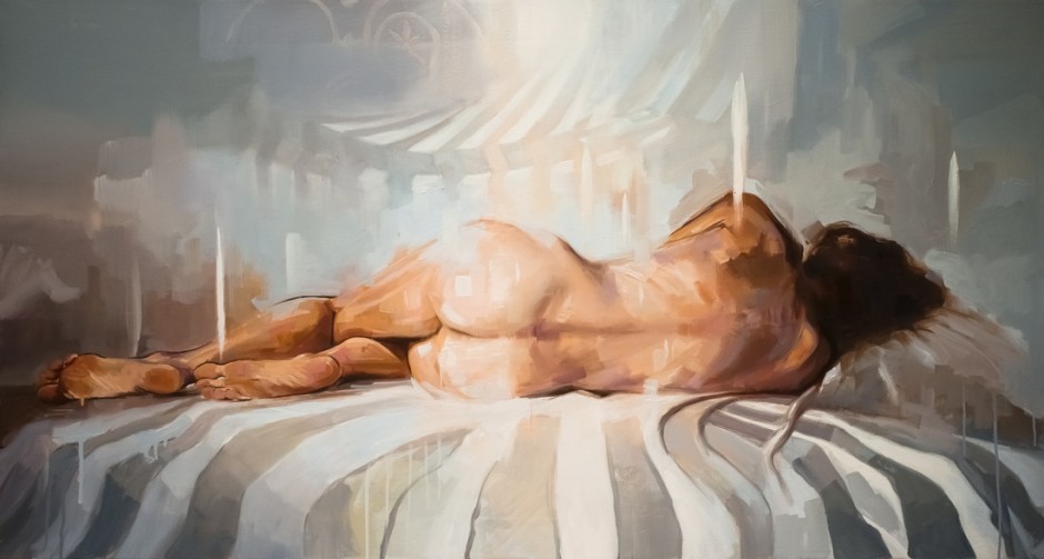
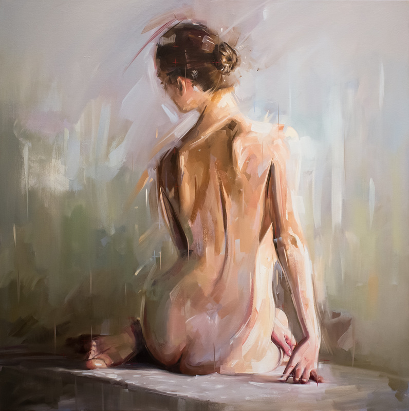
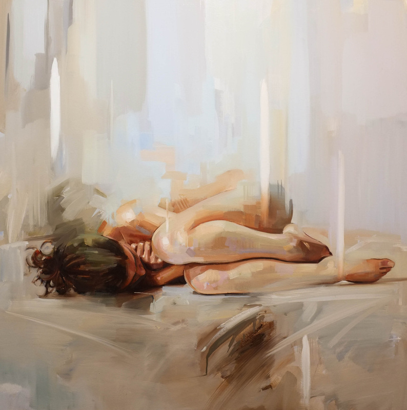
Young figurative artist Johnny Morant is steadily making a name for himself as an accomplished painter of the built environment and the people within it; "Playing on the border between clarity and suggestion my work prioritises the intuitive application of paint with an aim to capture the viscosity of light and insecurity of form."
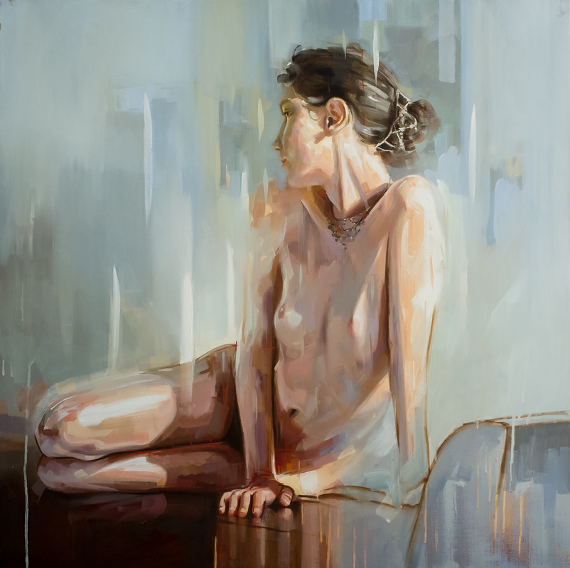
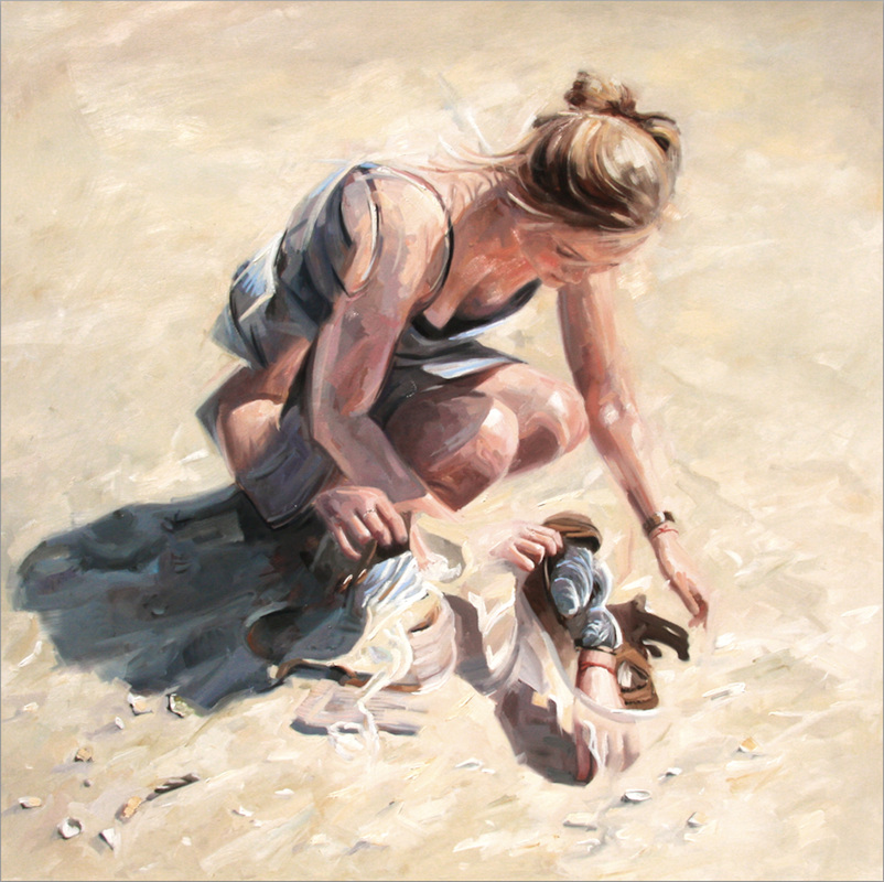
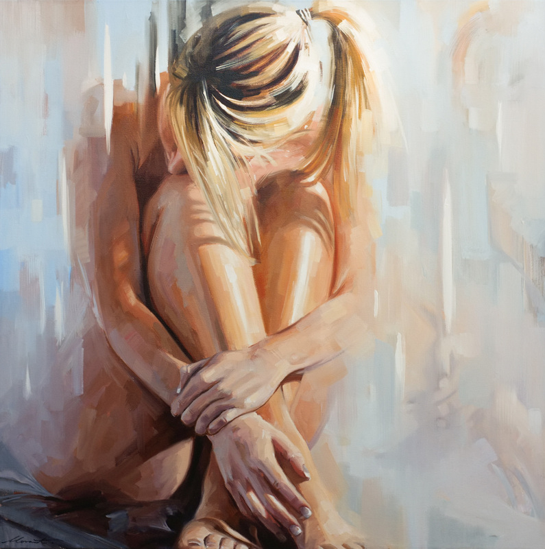
Channeling the meditative quality of flowing water, Xiang Pu Zhu has animated a battery of colorful fluid animations in a project called Fu Liu.
http://vimeo.com/120817873
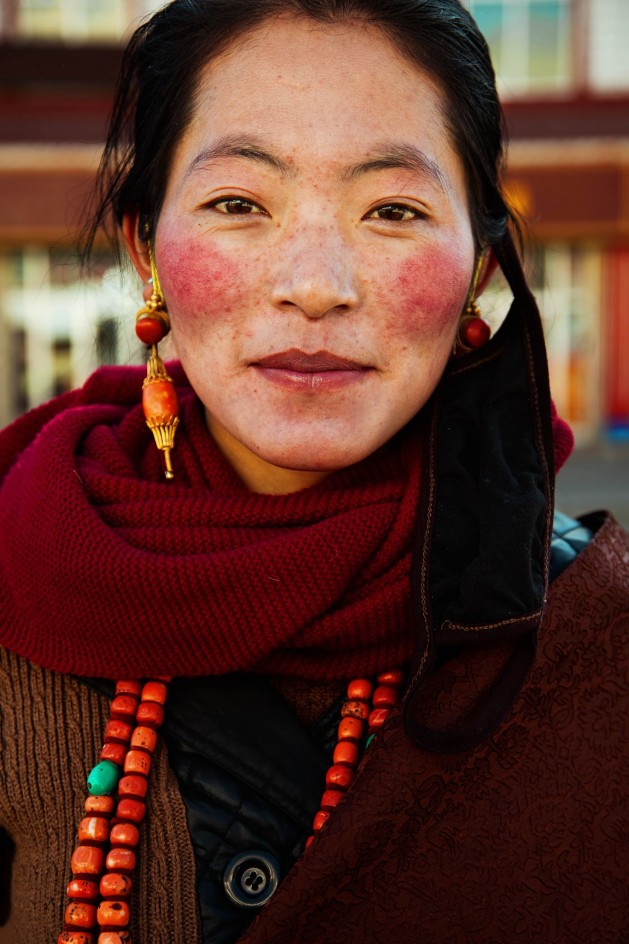
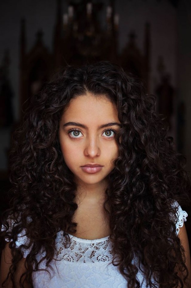
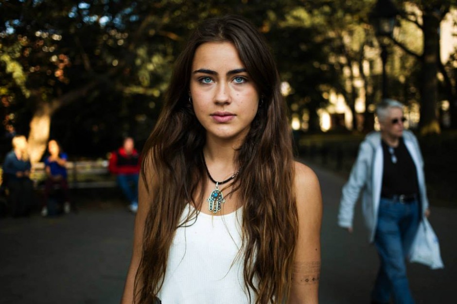
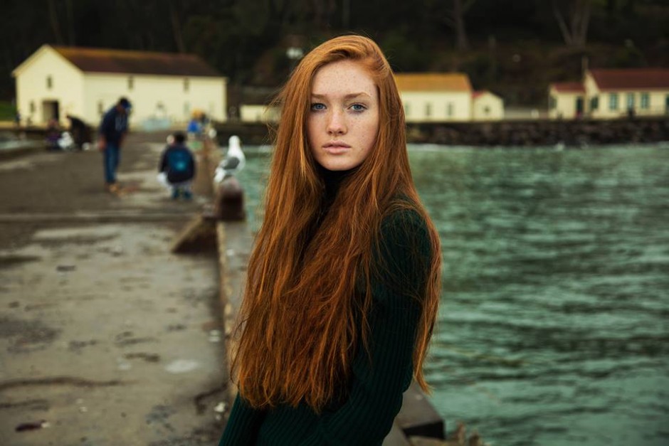
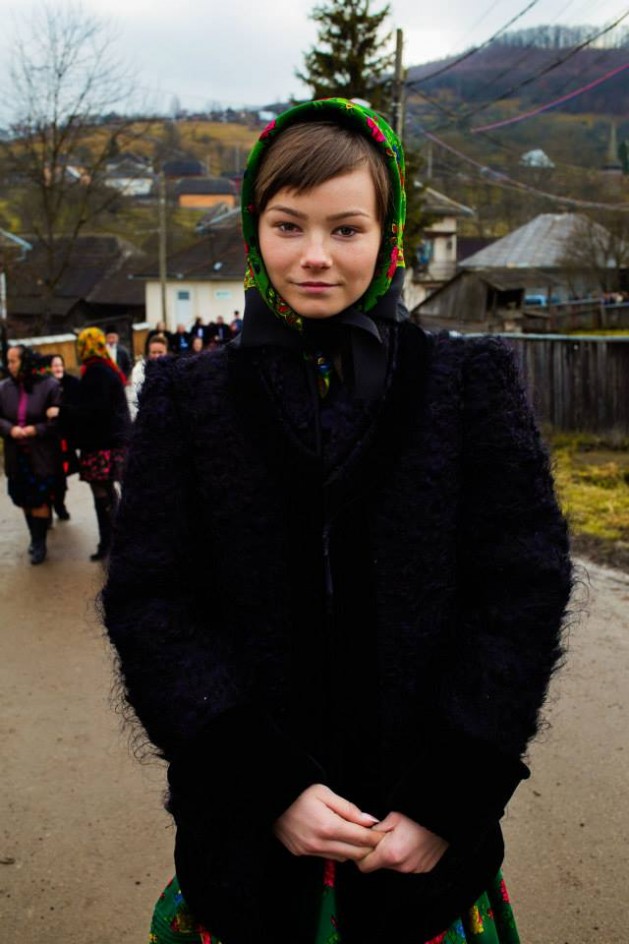
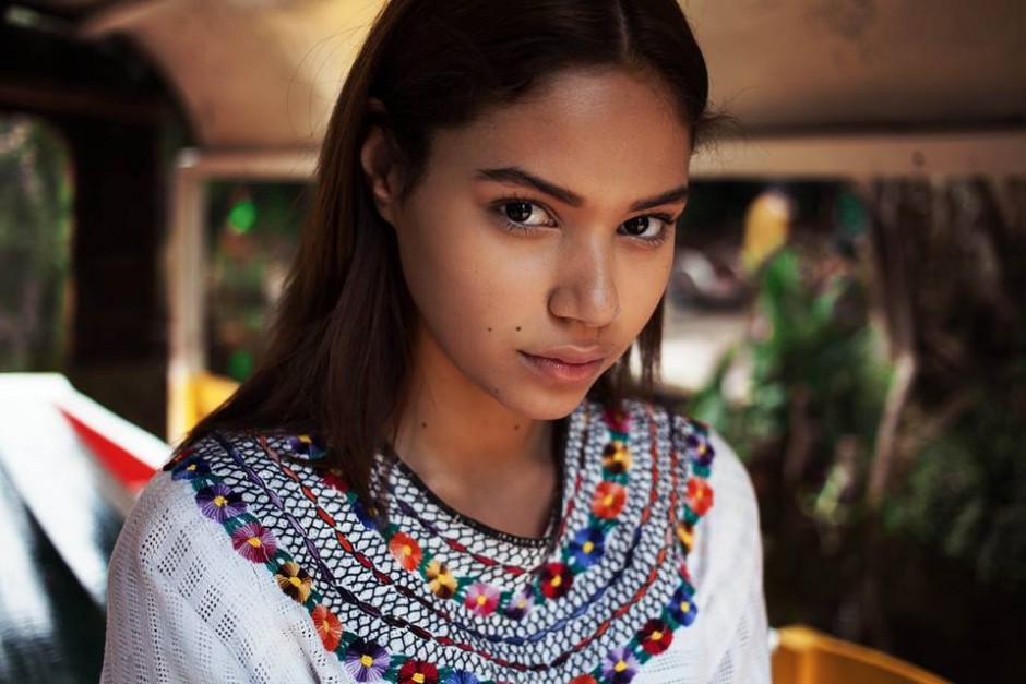
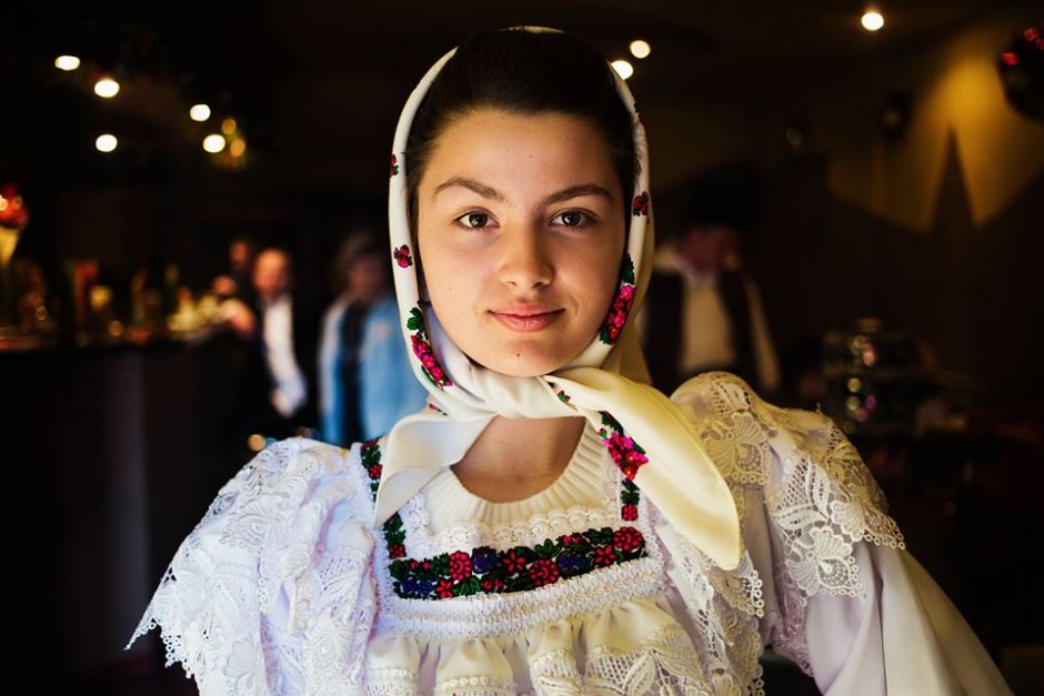
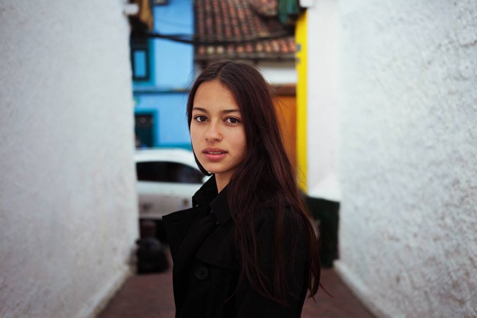
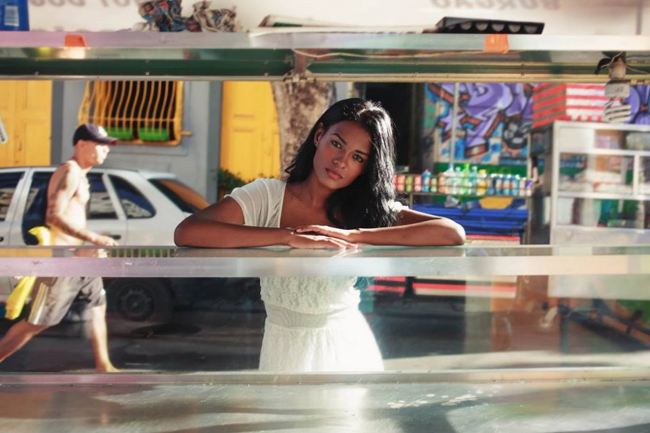
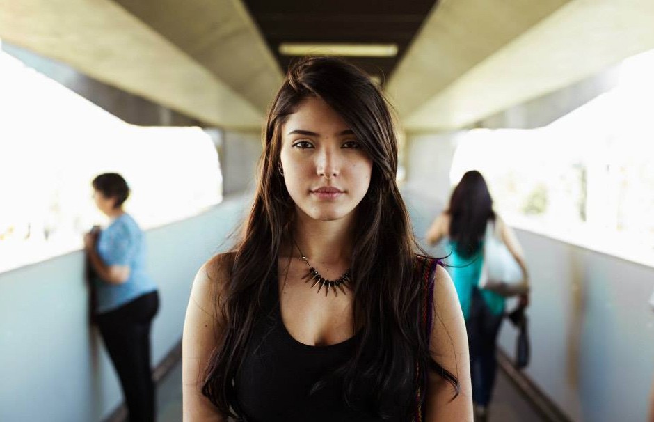
Romanian photographer Mihaela Noroc is on a mission to capture portraits of women from every country in the world in order to shed light on the beauty that exists everywhere. A little over two years ago, at the age of 27, Noroc quit her job, withdrew all her life savings, and embarked on an incredible journey across the globe with little more than her camera and backpack. Her travels so far are documented in The Atlas of Beauty, an ongoing project that features a diverse array of local women from 37 different countries and almost every single continent.
"Light fears Dark. Dark resents Light. Always at odds. Always in conflict. Pushing borders. Losing ground. Never ending. But what is one without the other? The stronger the light, the darker the shadow." London-based design studio Animade released a lovely animation Chronemics
http://vimeo.com/118801020
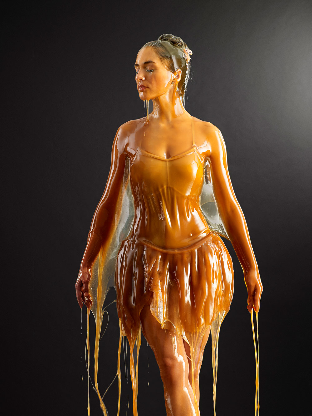
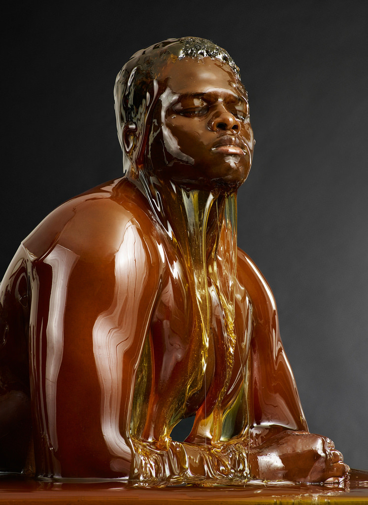
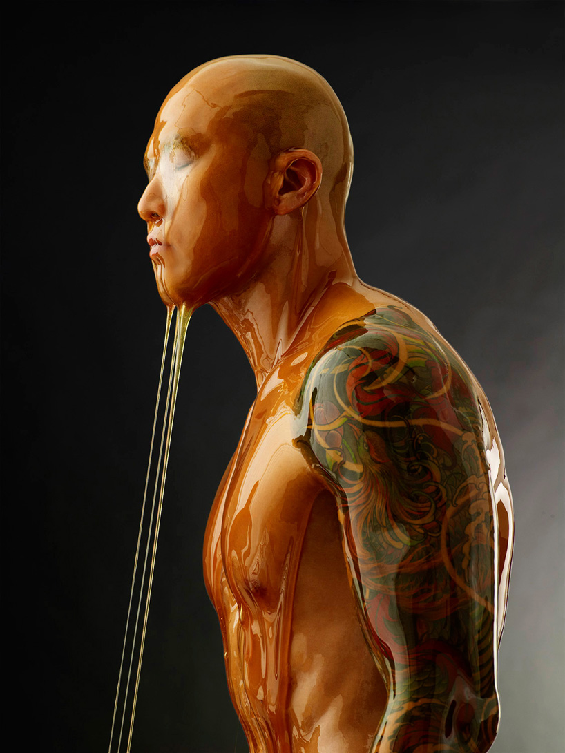
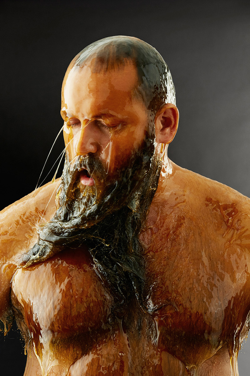
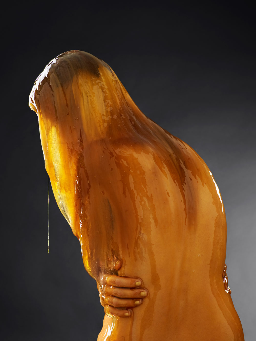
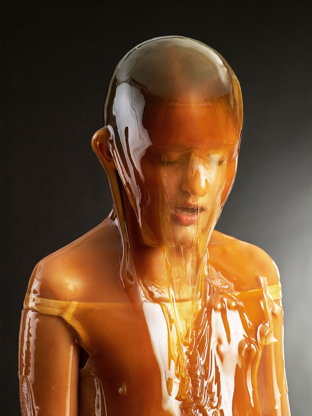
Friday is good for weird and beautiful. "When people showed up to Blake Little’s studio in response to a Craigslist ad calling for actors, the amateur thespians didn’t realize what they were in for. Fascinated with honey as a symbol and an artistic medium, Little asked his subjects to strip naked and pose in front of a monochromatic backdrop while his assistants doused them in gallons of the sticky, viscous substance. The experiment yielded a striking photo series in which people with a diverse array of body types and aesthetics appear transformed into statues. Little will exhibit the results in is solo show, “Preservation,” opening March 7 at Kopeikin Gallery in Culver City, CA." says Hi-Fructose
http://www.youtube.com/watch?v=0wVRClZhYxA
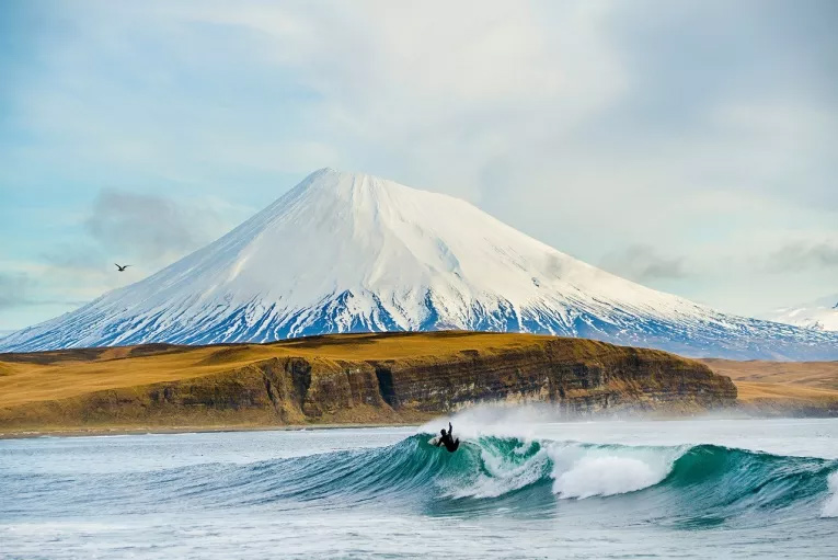
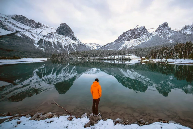
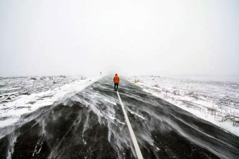
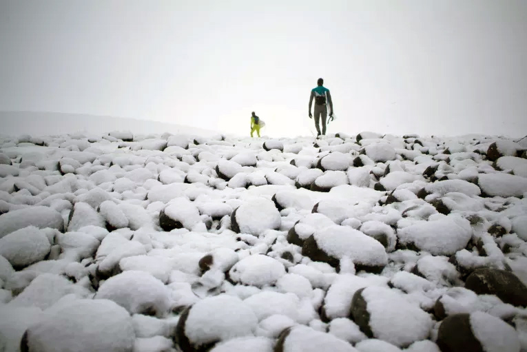
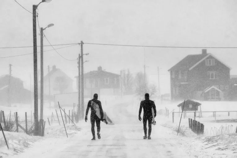
Chris Burkard is a photographer based in California, whose work is layered by surf, outdoor, lifestyle and travel subjects. Burkard’s images are punctuated by energized landscapes and moments of bliss, by adventure seeking and the lifestyle that ensues, by movement and intuitive light-working capabilities. via
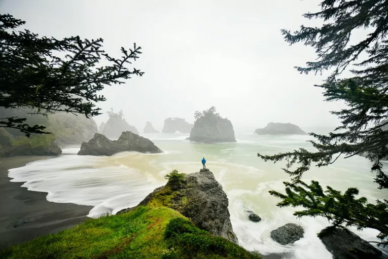
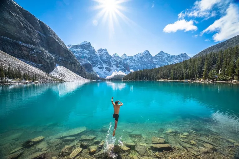

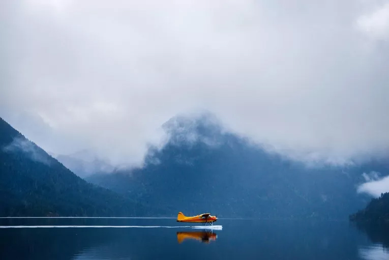
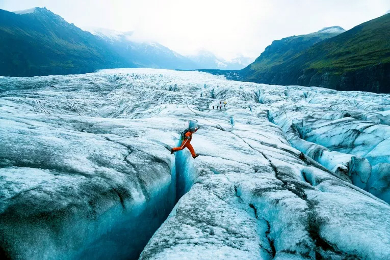
http://www.youtube.com/watch?v=dO7RRN-_LL4
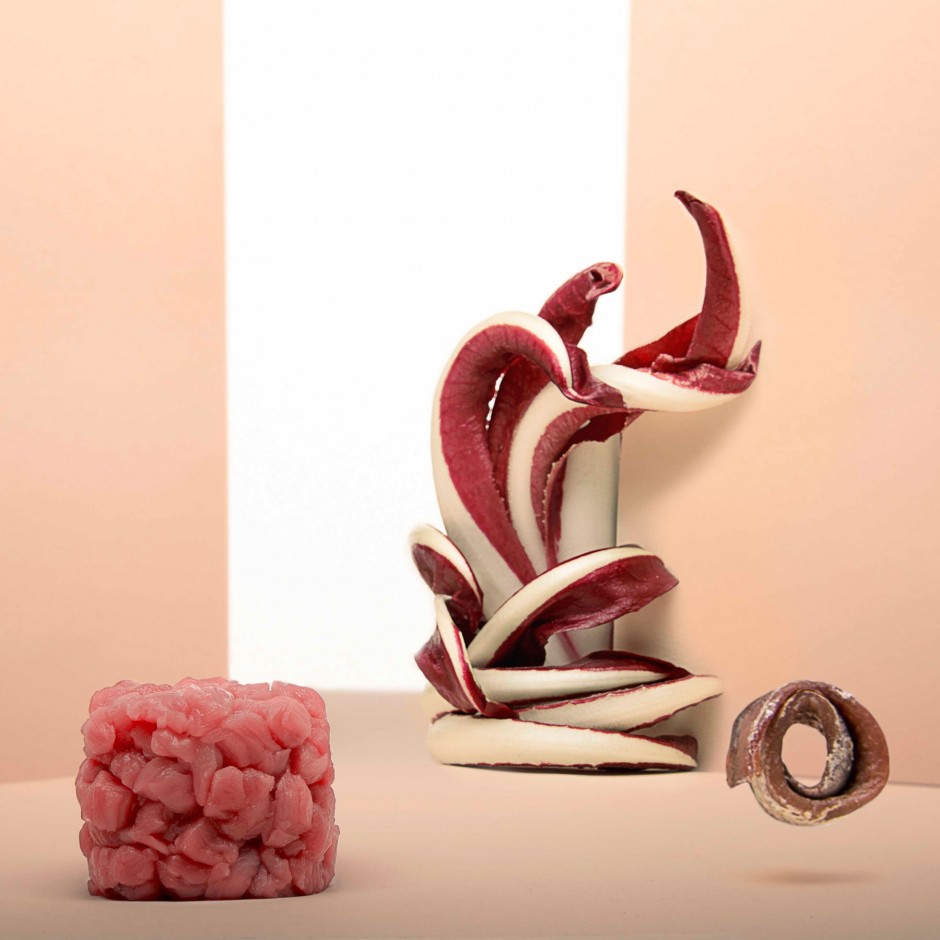
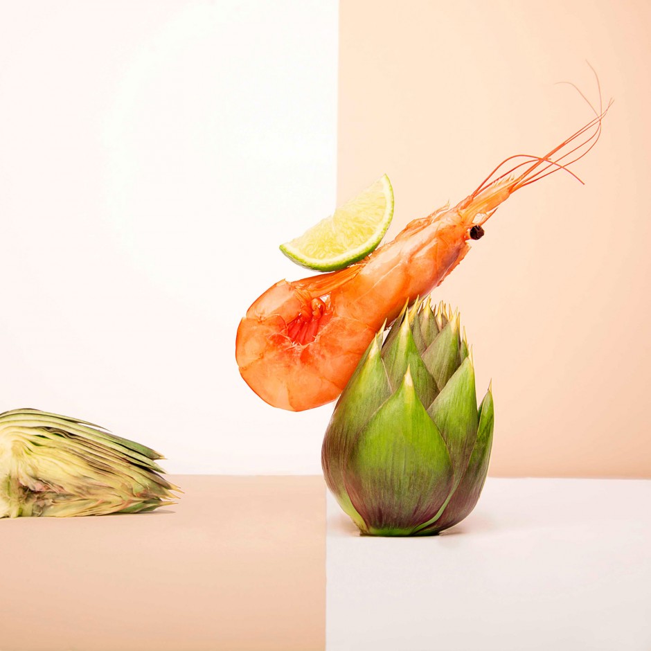
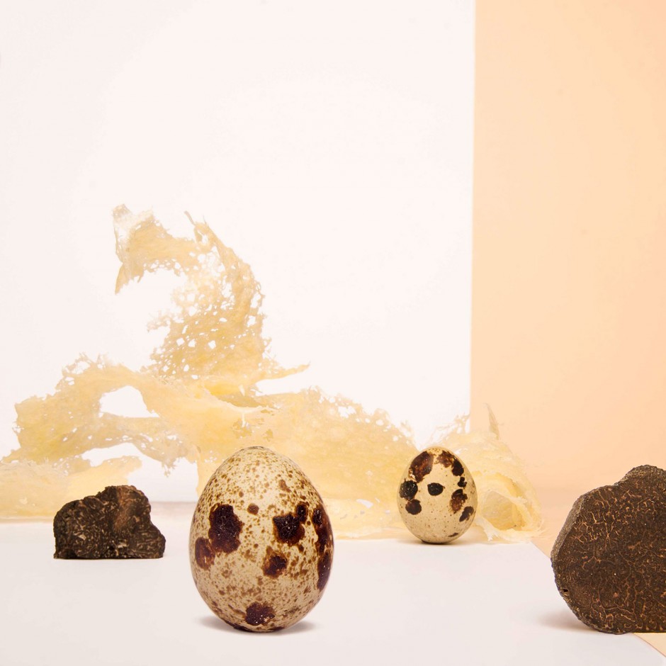
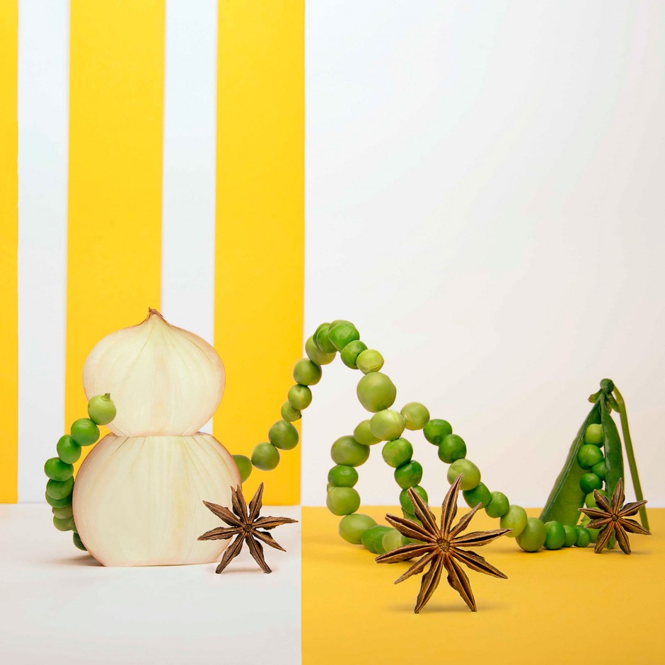
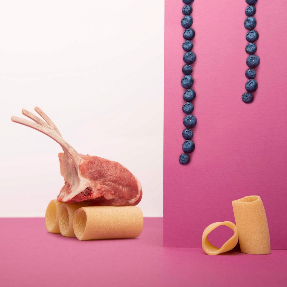
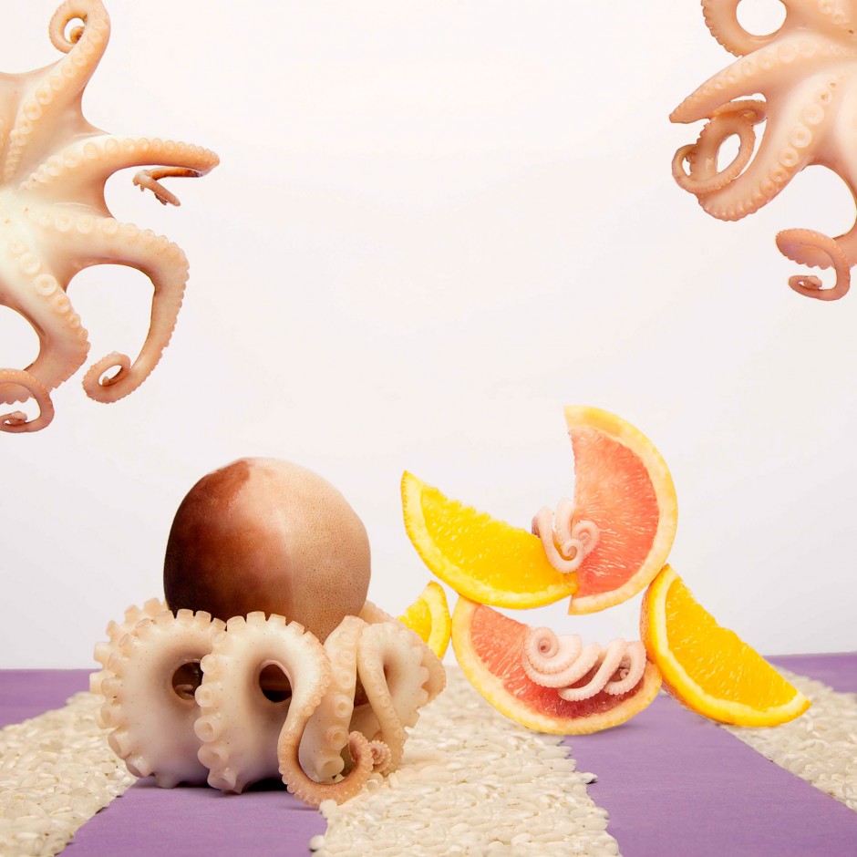
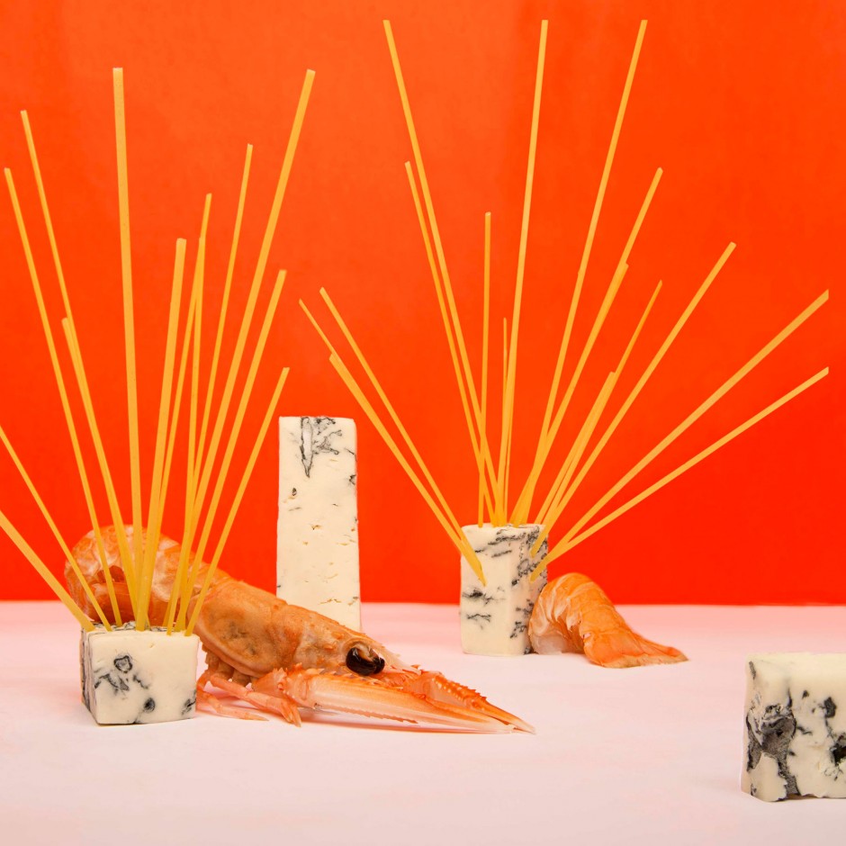
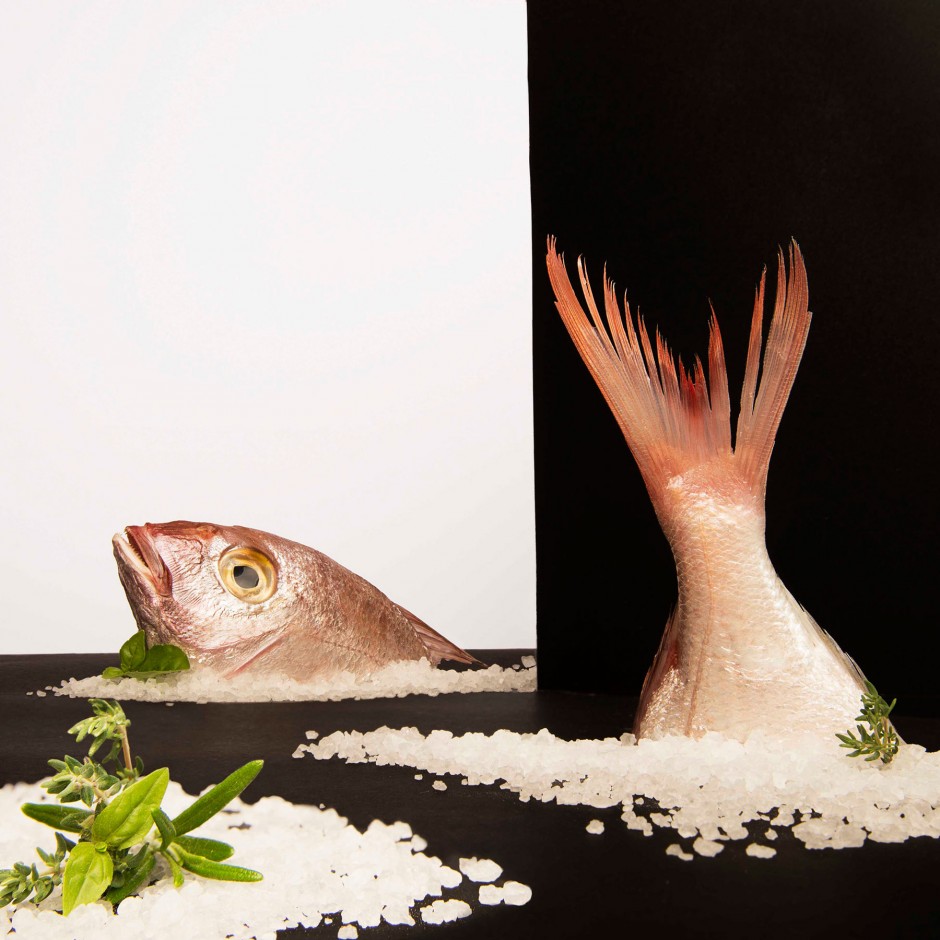
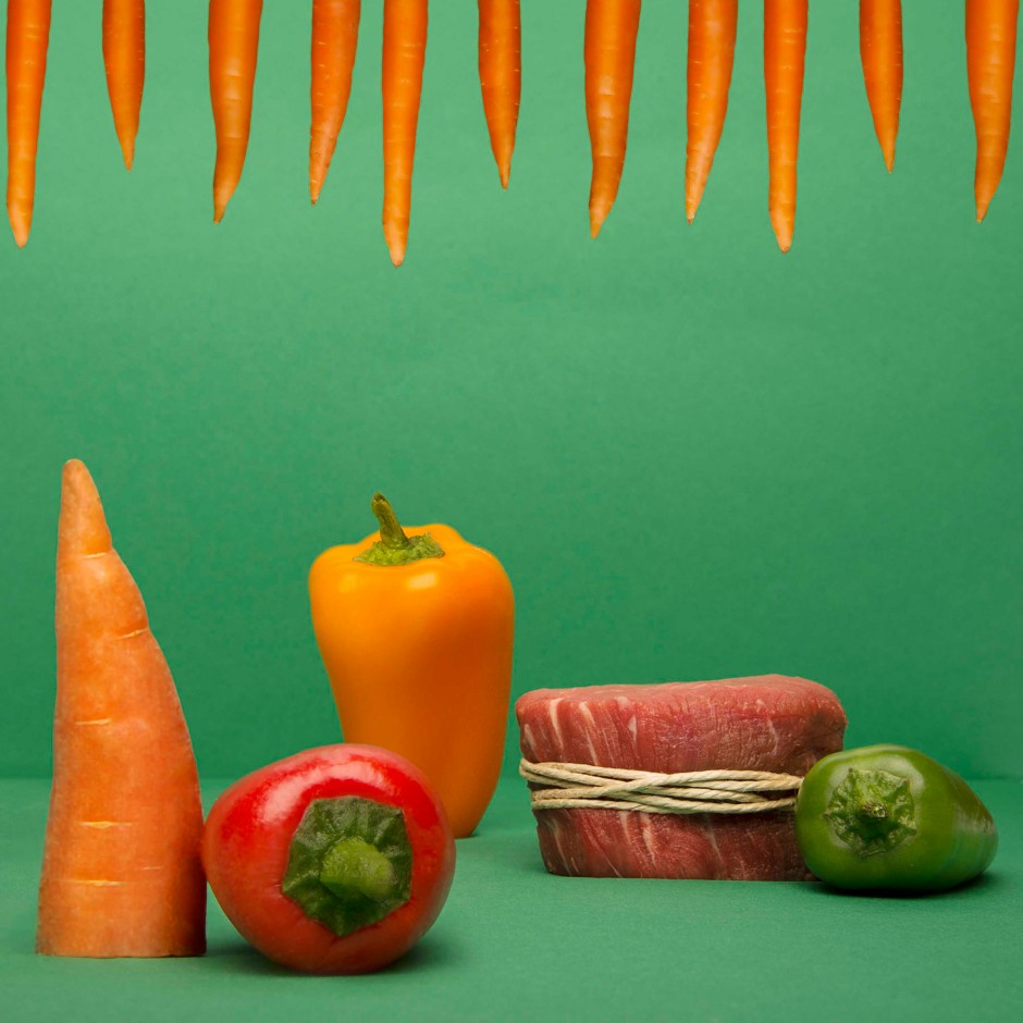
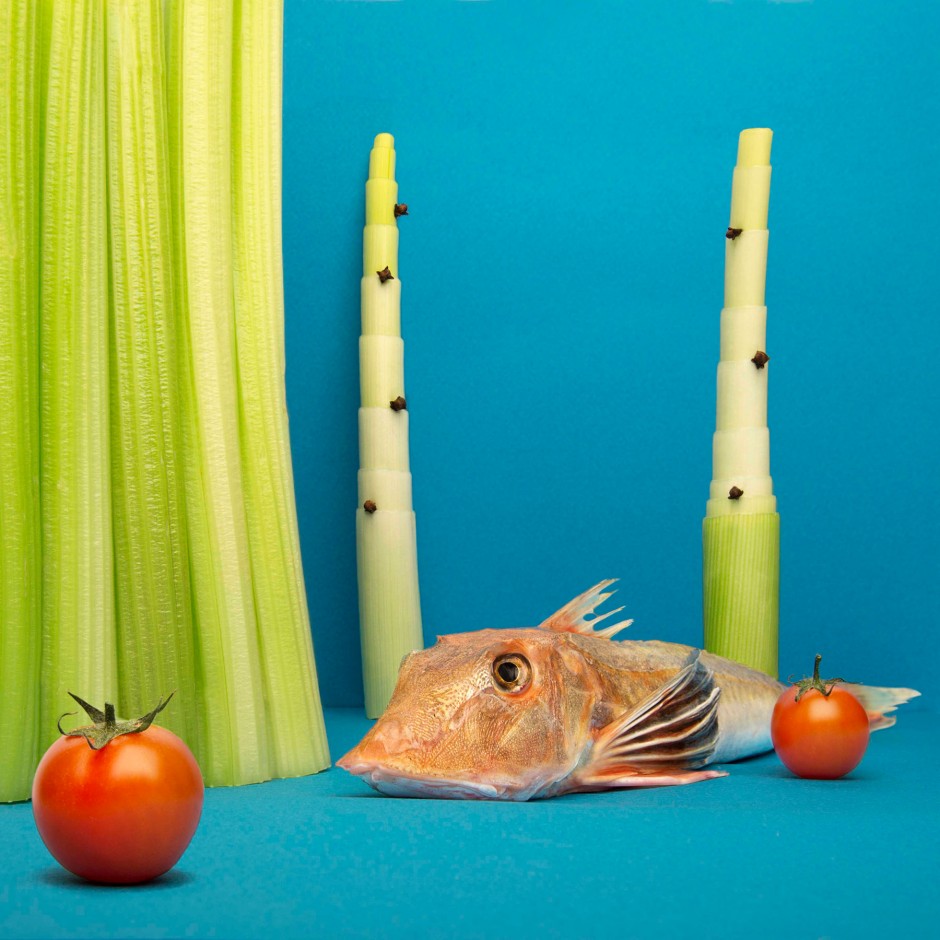
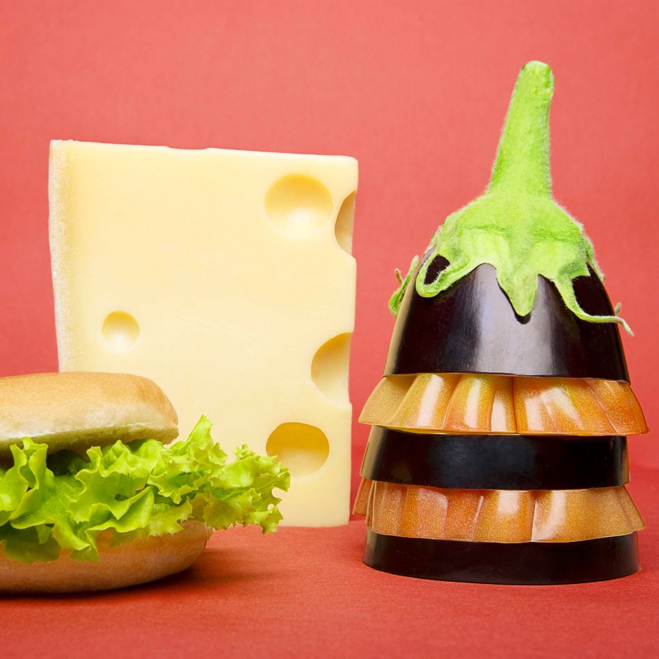
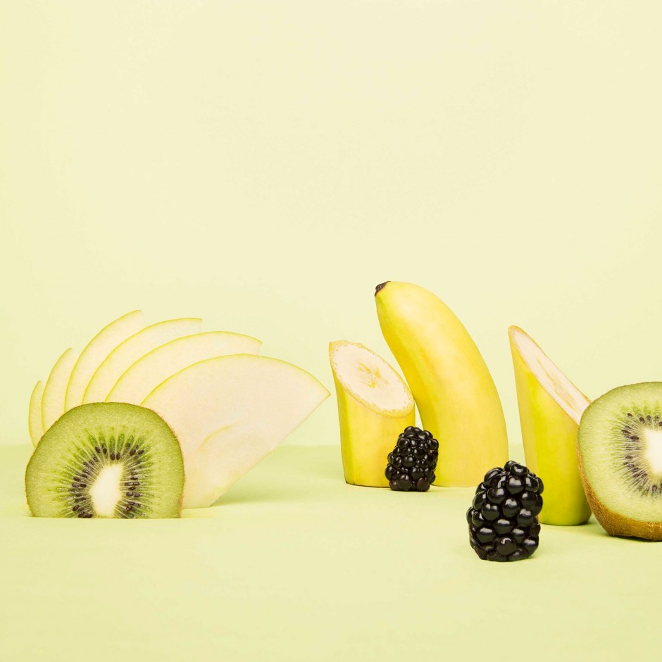
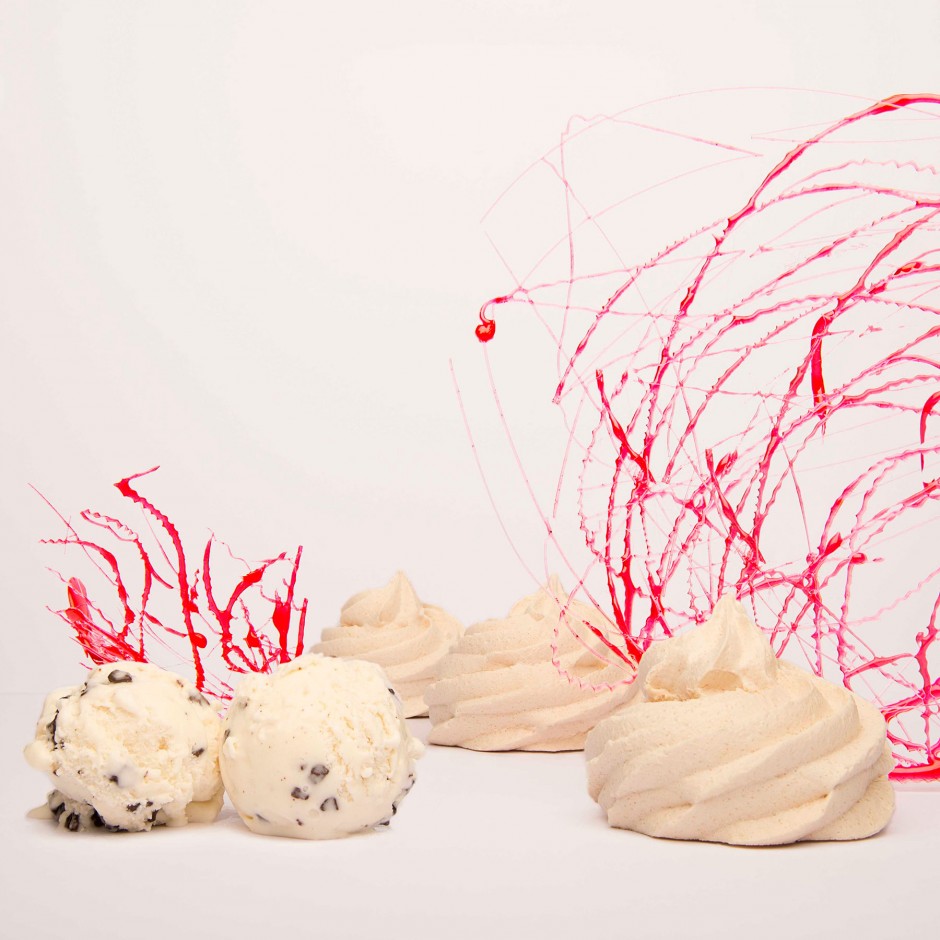
The Wonders Taste was inspired by a René Magritte’s picture named “The Invisible’s Taste”. Artist Francesca Fattori often take inspiration from the surrealist art. Fattori objectifies ordinary food ingredients by relating them to her personal perceptions of sinuosity; extravagance; limitation and fragility. The pictures are still scenes from a play and removed from their fluid natural sequence, which she likes to call “Metaphysical Landscapes”. via Trendland
