The BOID Journal Identity by ESKIMO Studio
St.Petersburg branding studio ESKIMO designed a modern face of the B.O.I.D Journal writing about the best worldwide identities and graphic designs.
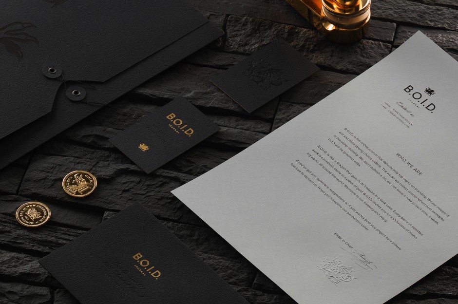
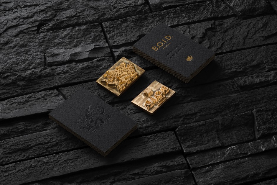
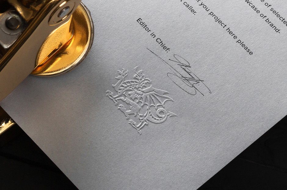
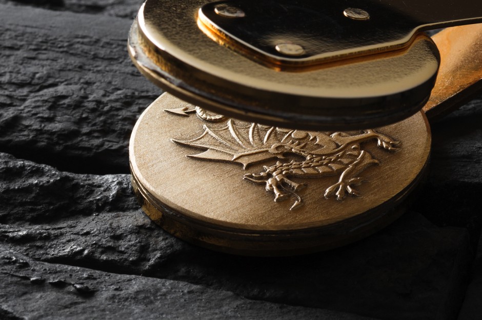
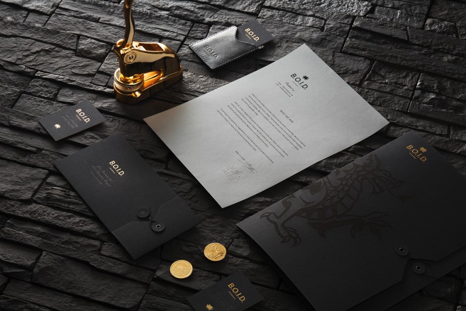
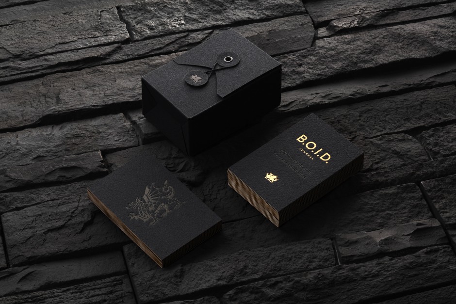
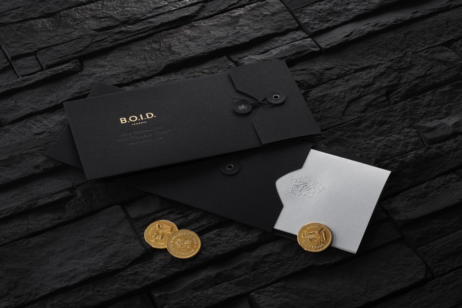
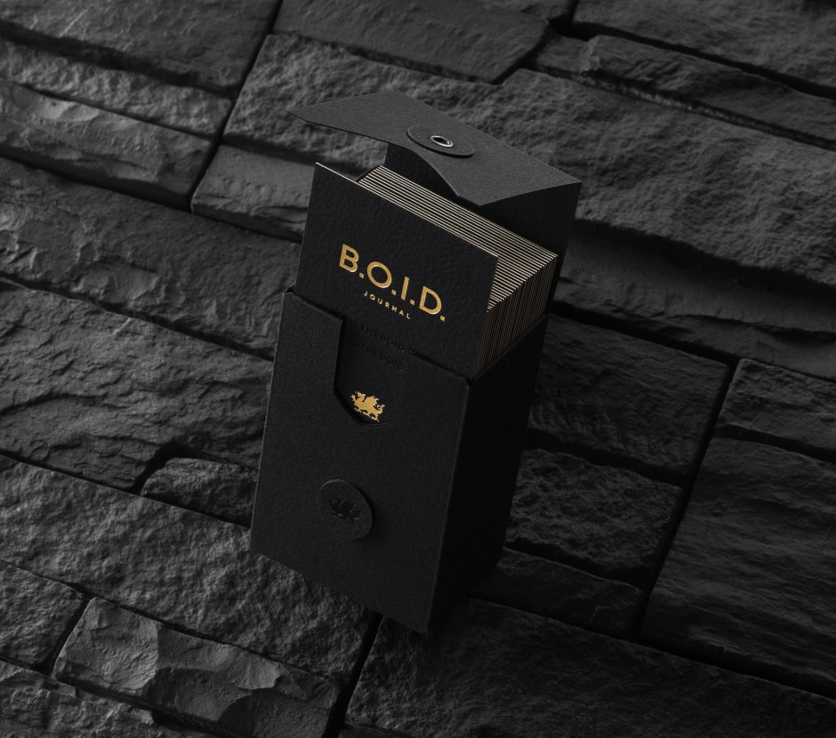
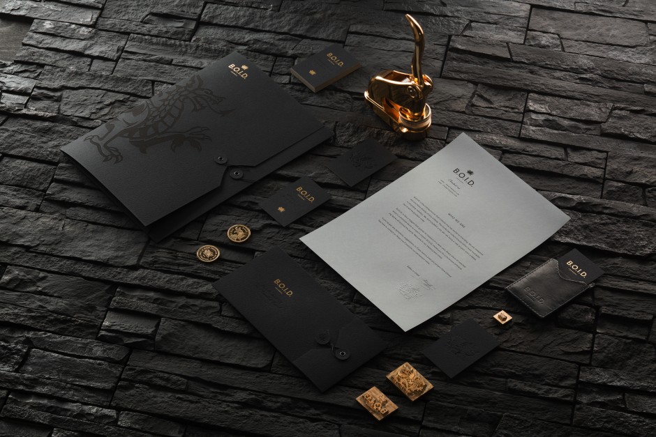
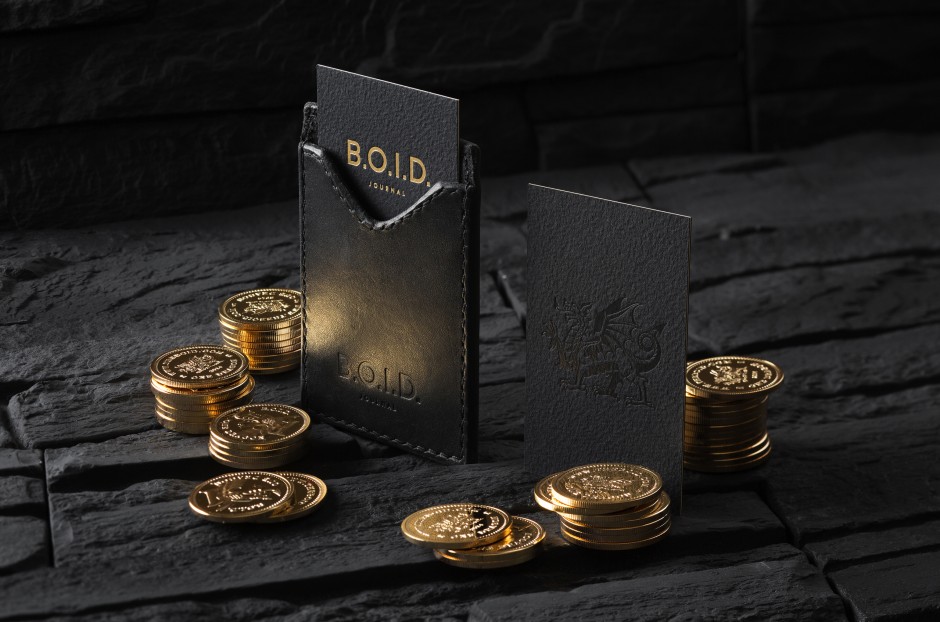
"Our proposal takes inspiration in the legends of the dragon who guards his jewels in a dark cave. B.O.I.D’s logo is based on traditional European heraldic dragon images but stylised by adding sharp edges and little angularity common for cave stones. The idea of the hidden and guarded gold was implemented by designing triplex business cards (black-gold-black) and small gold accents applied to other mediums using foil block stamping technology. Each new journal project corresponds to a golden coin in the dragon’s treasury."