Álvaro Peñalta
As a talented art director based in Barcelona, Álvaro Peñalta was responsible for a good set of project you can review on his Behance profile
http://vimeo.com/154124756

As a talented art director based in Barcelona, Álvaro Peñalta was responsible for a good set of project you can review on his Behance profile
http://vimeo.com/154124756

As we are planning to run our 4th Glitch Digital Art collaboration The Digital Decade 2016 very soon, we are all four into new names on pop art scene. Here is our new finding - Liron Ashkenazi, she is a multidisciplinary visual designer who thrives to create bold, complex and conceptually driven imagery using 3D illustration, animation, photography, experimental typography and colour. She spends most of her free time exploring new ways to develop her work & loves a good challenge.

Poland is an alma mater of alternative and totally independent cinema, during my trip and speech at Filmteractive conference in Lodz in 2013, I was able to go deep into the atmosphere of pure cinema in that Holywood of Europe. Here is the set of posters created by Krzysztof Iwanski, the student of Lodz Cinema School, for various festivals happening in town. Worth to check out his full portfolio representing him as a very strong graphic design with own visual language

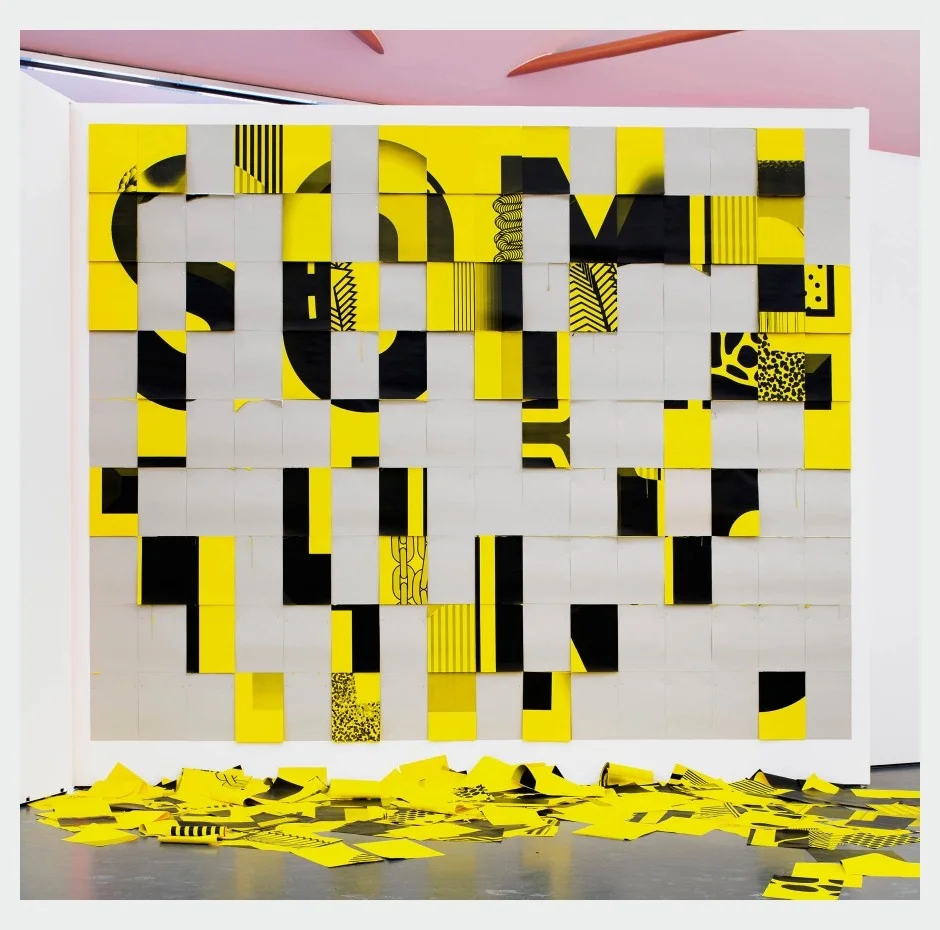
Rotterdam-based Studio Spass works across multiple disciplines and here is their recent work. "SO ME THING an interactive installation created for the exhibition ‘Do it’ at Kunsthal Rotterdam 2015. The piece, consisting of 50 layers of typography applied and divided over 7200 unique numbered pages, is our interpretation of Robert Barry’ s original doit #93 (2012) for the exhibition manual by curator Hans Ullrich Orbist"

so-me-thing1

so-me-thing2

so-me-thing3

so-me-thing4

so-me-thing5
so-me-thing6

so-me-thing7

so-me-thing8

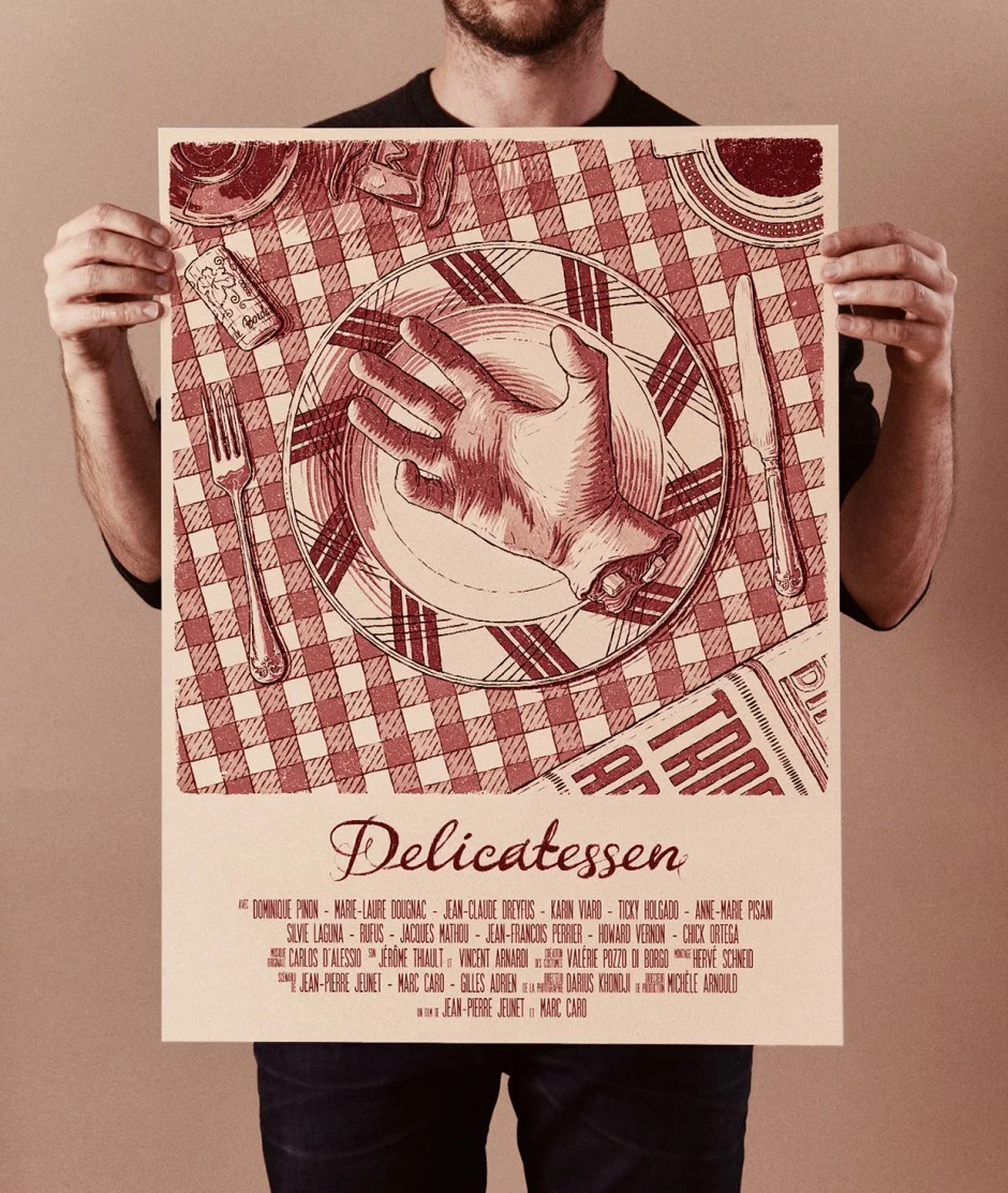
Talented graphic designer Bartosz Kosowski from Lodz, Poland creates posters for the movies and personalities he likes

bartosz-kosowski1

bartosz-kosowski2

bartosz-kosowski3
bartosz-kosowski4

bartosz-kosowski5

bartosz-kosowski6

bartosz-kosowski7
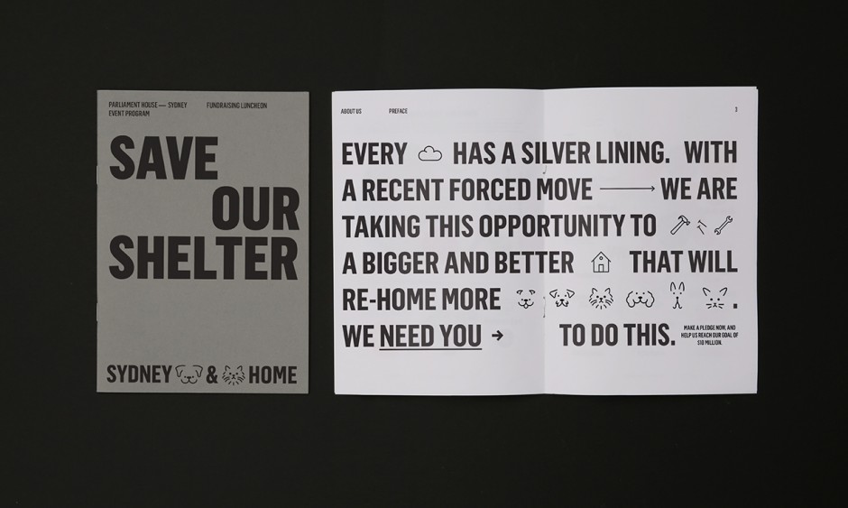
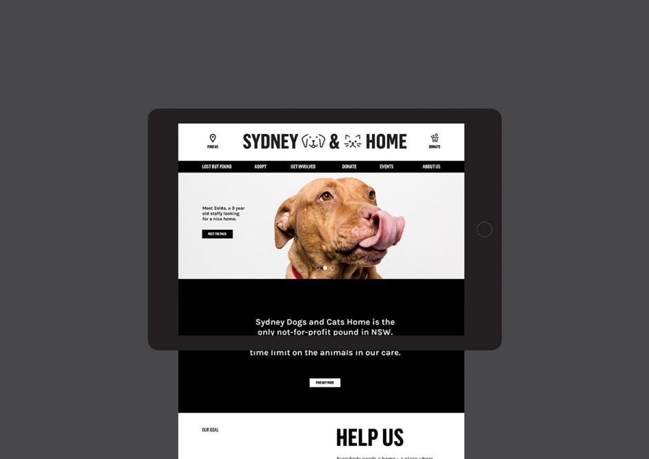
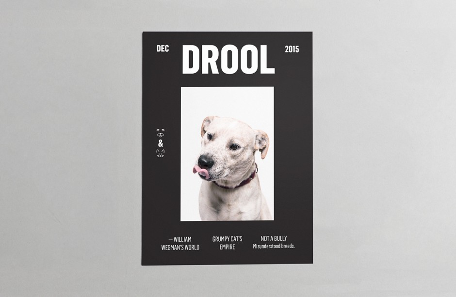
We have not been into good graphic design posts lately and promise to reveal more inspiring projects in 2016. Here is a group of Sydney based designers transform the low communication of local animal shelter by helping "Sydney Dogs & Cats Home" to get a new visual language. A versatile identity system was put in place to work across all manner of communications, with a boldness and clarity of message, whilst making sure playfulness was embedded throughout.
Sydney-Dogs-Cats-Home1

Sydney-Dogs-Cats-Home2

Sydney-Dogs-Cats-Home3

sdch_Website

Sydney-Dogs-Cats-Home6

Sydney-Dogs-Cats-Home7

SDCH logos - JL

Sydney-Dogs-Cats-Home9

Sydney-Dogs-Cats-Home91
Sydney-Dogs-Cats-Home92

Sydney-Dogs-Cats-Home93

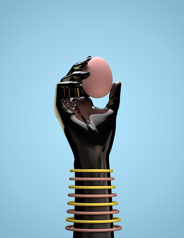
Colombian illustrator Daniel Aristizábal compacts the all-star mediums and genres of 20th century artistic movements into user-friendly, candy-colored graphics. As chronicled on his Instagram, Aristizábal applies V-Ray to dadaism, glitch art to cubism, and takes futurism digital, bundling it all up in the bubbly pastel palette of pop. In his projects, the artist has riffed on Salvador Dalí's eggs with his Huevos series and hits the warped waves with Joan Miró in his Sunny days are coming pieces. Despite the succession of stylistic influences, however, the artist sees his art as fundamentally uncomplicated: “My work is full of simplicity and organic shapes,” he tells the Instagram Blog. “It is nostalgic in its essence.” - via The Creators Project




spectre-ui-screens-1
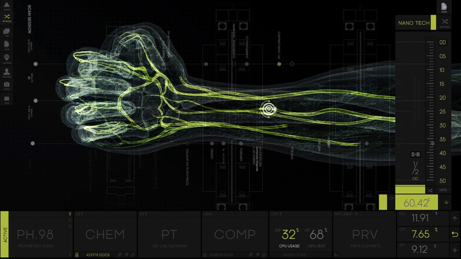
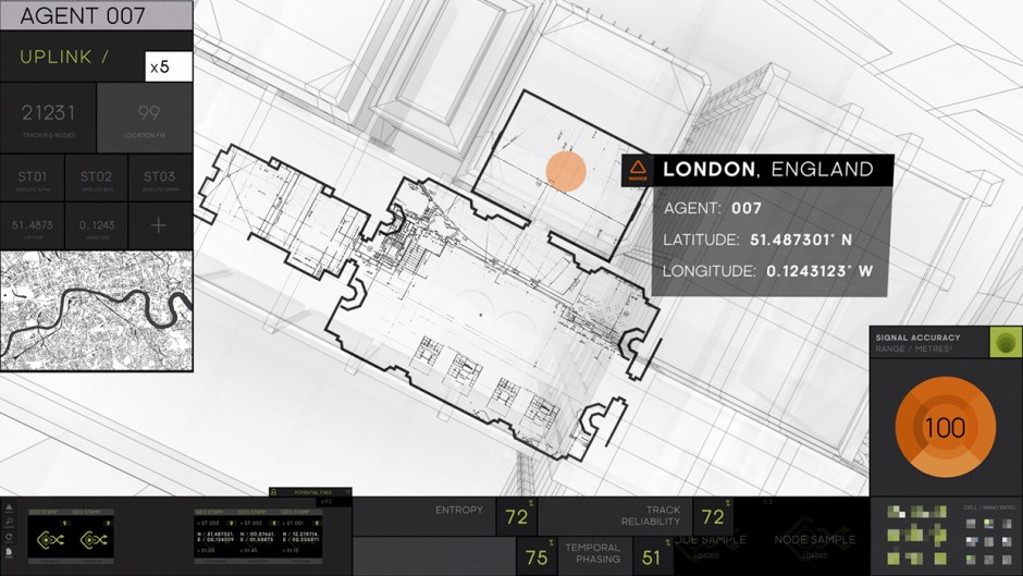
Following successful revealing of "The Martian" UI Screen Graphics (Territory Studio) another one agency Rushes MGFXStudio came out with a detailed case of James Bond's SPECTRE interfaces story. Rushes were tasked with designing and creating all on-set UI screen graphics for SPECTRE. Over a 13 month period of working on the 24th Bond film, from pre-production through to post, in total Rushes MGFX Studio created more than an hours’ worth of unique animations and motion graphic sequences that furnished over 300 screens, across 23 scenes in the film.

spectre-ui-screens-2

spectre-ui-screens-3

spectre-ui-screens-4

spectre-ui-screens-5

Ben Whishaw

spectre-ui-screens-7

spectre-ui-screens-8

spectre-ui-screens-9
spectre-ui-screens-91
spectre-ui-screens-11

spectre-ui-screens-92

ruben-montero4
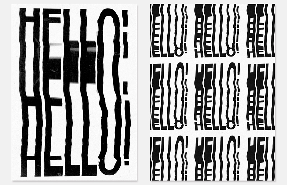
"Scanmania" is a kind of a handmade posters created by Spanish art director Ruben Montero using simple scanner to get the effect widely called "slitscan"
ruben-montero

ruben-montero1

ruben-montero2

ruben-montero3
Rafael Merino is former art director based in Madrid, focused on the creation of engaging graphics for all kinds of purposes. We consider his works more from digital art side neither graphic design

alexis-marcou-nike
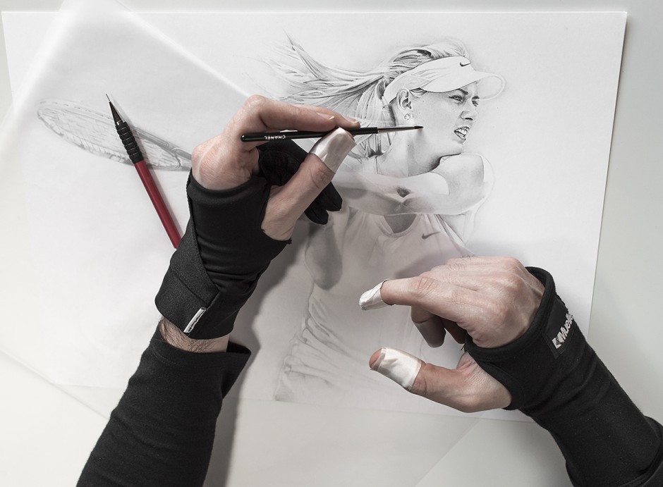
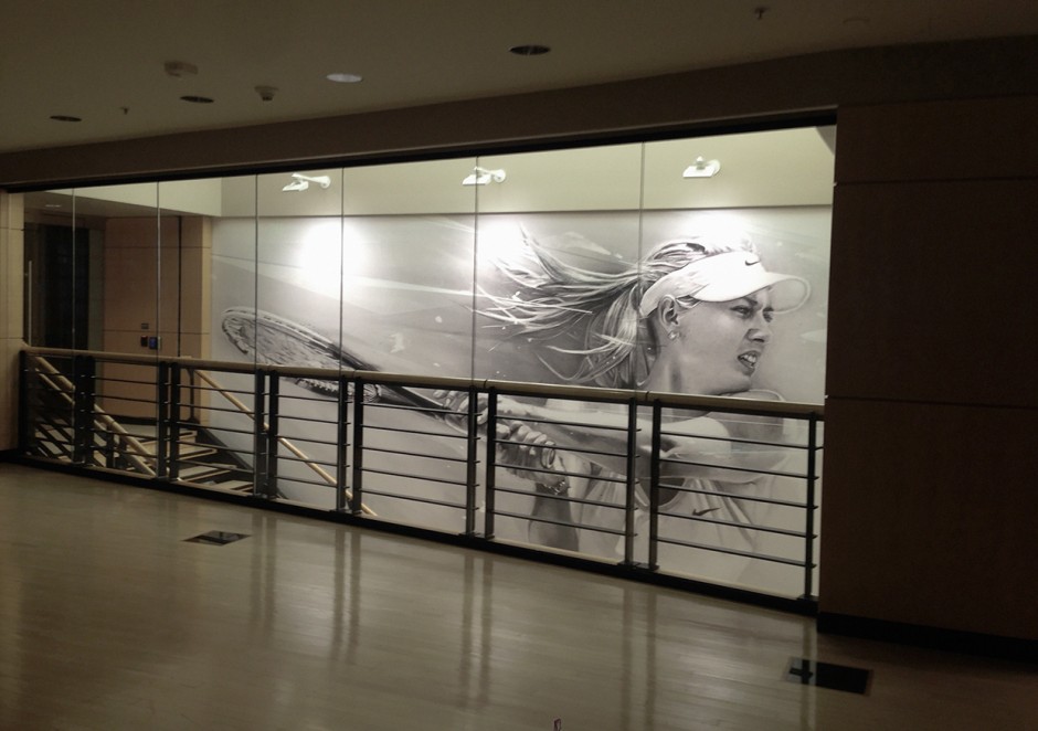
Talented graphic artist Alexis Marcou was recently commissioned by Nike to create inner murals for some of their offices

alexis-marcou-nike1

alexis-marcou-nike2

alexis-marcou-nike3

alexis-marcou-nike4

alexis-marcou-nike5

alexis-marcou-nike6
alexis-marcou-nike7
alexis-marcou-nike8

alexis-marcou-nike9

alexis-marcou-nike91
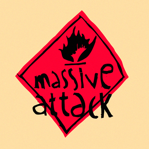
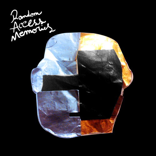
Nicolina Lorenza Vachetti is a six-years old cousin of quite famous Argentinian graphic artist and our friend Tano Veron. Two years ago he gave her a cover sleeve of Pink Floyd's "Dark Side of The Moon" and that's how it started. At her 6, she recreated over one hundred cover arts and won't stop being a proud member of creative scene in Buenos Aires. Please follow her art on Behance and check the several pictures we selected below.

tano-veron-Nicolina-Vachetti1

tano-veron-Nicolina-Vachetti2

tano-veron-Nicolina-Vachetti3

tano-veron-Nicolina-Vachetti4

tano-veron-Nicolina-Vachetti5

tano-veron-Nicolina-Vachetti6
tano-veron-Nicolina-Vachetti7

tano-veron-Nicolina-Vachetti8
tano-veron-Nicolina-Vachetti9
http://vimeo.com/63189848
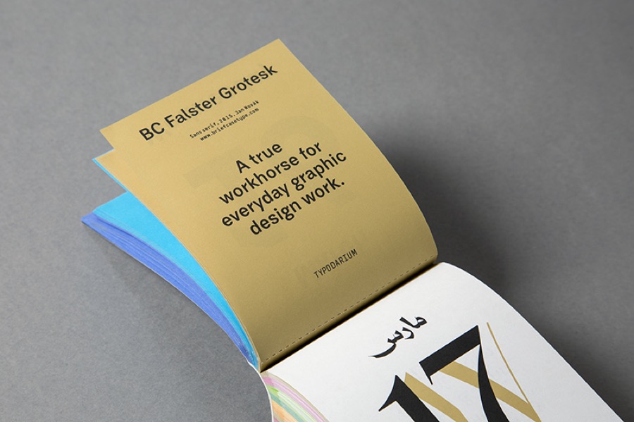
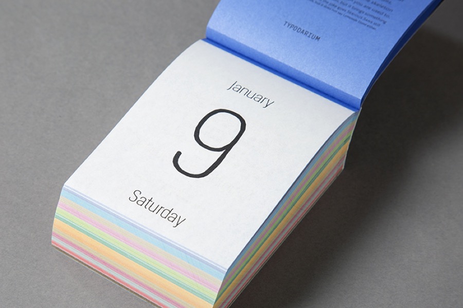
"Typodarium 2016 is the daily typography dose. A tear-off calendar, just like the one our grandma used to hang in the kitchen. But this calendar unveils a new font everyday. We can therefore have, a whole year long, the chance to broaden our knowledge, to discover the font’s history and developement, to possess a piece of jewellery that is new everyday. On the front, the font will be prominently displayed, and on the back it will be described in details. How it originated, from what or who came the inspiration and where we can obtain the font. We really want a story about your typeface!"

typodarium-1

typodarium-2
typodarium-3

typodarium-4

typodarium-5

typodarium-6

typodarium-7
typodarium-8

typodarium-9

typodarium-91
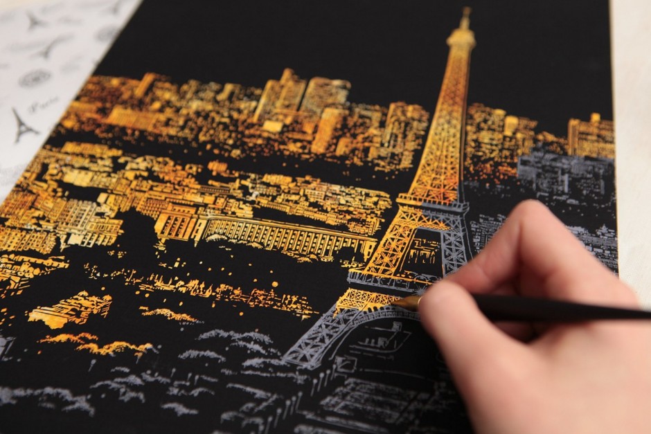
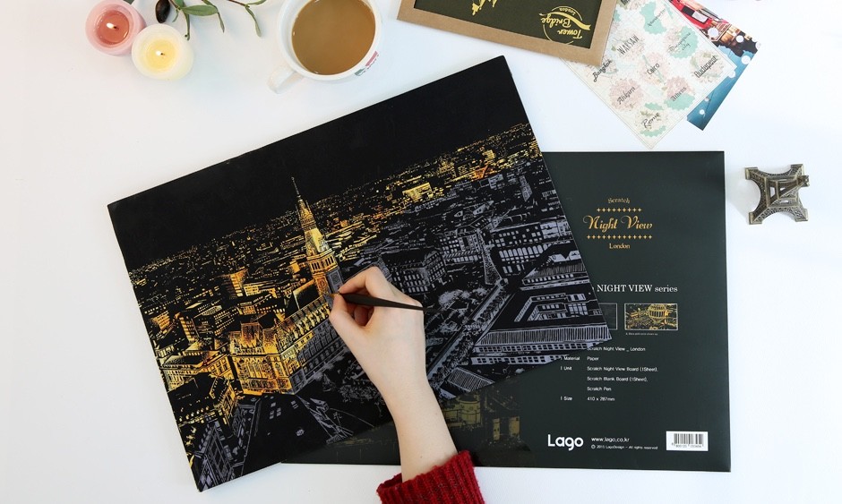
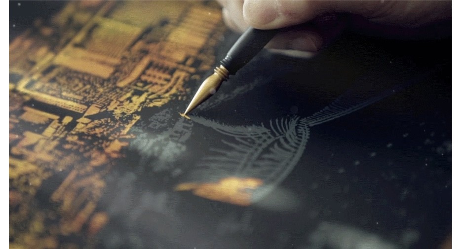
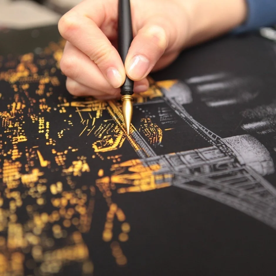
Korean design studio Lago specialised in awesome scratch postcards and posters using golden colour hidden by the grey layer.
lago-golden-scrath8
lago-golden-scrath1

lago-golden-scrath2

lago-golden-scrath3
lago-golden-scrath4
lago-golden-scrath5

lago-golden-scrath6

lago-golden-scrath7
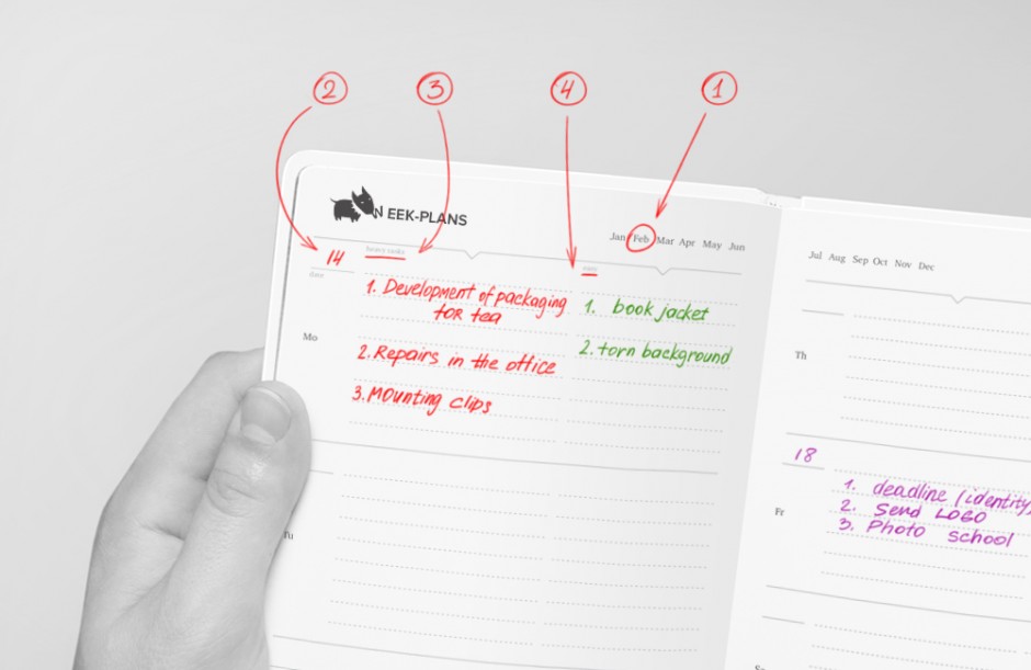
LEVSHA is the diary that helps to organise plans, structure the working schedule, make notes of your ideas, thoughts and wishes. The project delivered by Pavel Makhnatch & Lesha Limonov from Minsk, Belorussia. The name "Levsha" taken from favourite Russian tale of the Cross-eyed Lefty from Tula and the Steel Flea. The word literally means a person who can manage any tricky situation.

levsha-diary1

levsha-diary2

levsha-diary3

levsha-diary4

levsha-diary5
levsha-diary6

levsha-diary7

levsha-diary8

levsha-diary9

levsha-diary10

levsha-diary11
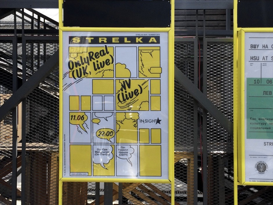
anna-kulachek-posters1
Russian graphic artist Anna Kulachek (previously) has a faith in good typography and practices in creating swiss-clean posters for different creative events around Moscow. Below you can find her latest works

anna-kulachek-posters2

anna-kulachek-posters3

anna-kulachek-posters4

anna-kulachek-posters5

anna-kulachek-posters6

anna-kulachek-posters7

anna-kulachek-posters8

anna-kulachek-posters9

anna-kulachek-posters10

anna-kulachek-posters11

anna-kulachek-posters12

anna-kulachek-posters13

anna-kulachek-posters14

anna-kulachek-posters15

anna-kulachek-posters16
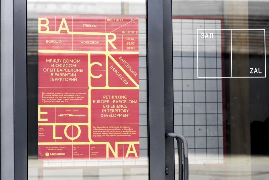
anna-kulachek-posters17
See photos of Anna with her posters by Sergey Serov below

anna-kulachek-posters23

anna-kulachek-posters22

anna-kulachek-posters21

anna-kulachek-posters20jpg

anna-kulachek-posters19

anna-kulachek-posters18
And here is a graphic designer asking for her signings

anna-kulachek-posters24
Talented graphic designer Martin Sulzbach (previously) just dropped a new case combining Direct Mail solution with all-in-one-problem solution - a bottle of Champagne. Trop bien!
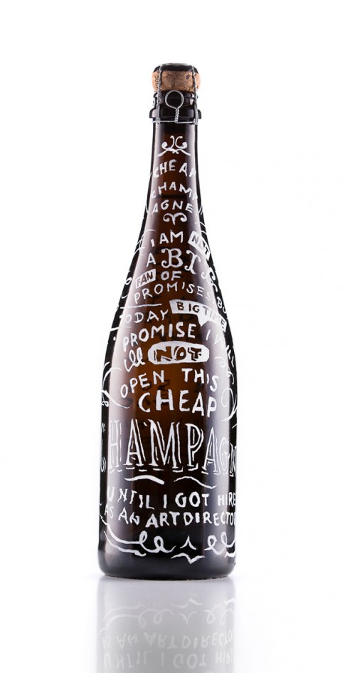
sulzbach-champagne1

sulzbach-champagne2

sulzbach-champagne3

sulzbach-champagne4

the taable is a multidisciplinary creative hub founded by Axel Oswith and Amanda Kusai, who have devoted themselves to art direction and photography, with works also at the intersection of art and design. Driven by passion for the visual culture, the taable are dedicated in transforming the ordinary to something much more with their witty and clever interpretations of everyday.


The must-read presentation of coffee bran Papa Palheta by Singapore-based studio Foreign Policy: "Taking their brand further to provide better user experience even online, the Papa Palheta Experience Kit is designed to reflect their philosophy of having strong coffee roots down to sustainability.
With meticulous consideration of the sensory elements within the kit, a card printed on recycled pulp paper made with blended coffee chaff (an underused by product of roasting coffee) prompts the user to repurpose it whether as a bookmark or thank-you card. Add-on inserts like a coffee connoisseur’s tasting notes record sheet; informative brewing guide that suggests the golden water-to-coffee ratio and a cake recipe card to create the perfect pairing with coffee, encourage the coffee drinker to explore the growing coffee culture. In contrast with the earth-tones of the paper stock, the color scheme of florescent orange and cobalt blue provides the pop of color, enlivening the common brown packaging of coffee"