Craig and Karl

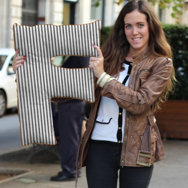
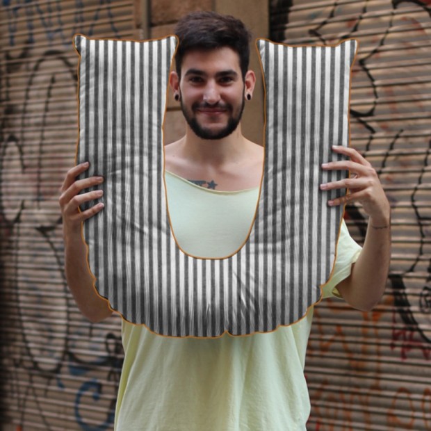
Pop-illustrator duo Craig and Karl (Craig Redman from NY and Karl Maier from London) create impressive graphic designs in different collaboration with photographers and agencies for numerous clients. We selected their collabs with Bureau Mirko Borsche for Bavarian Opera and photographer Lacey for Vogue Japan

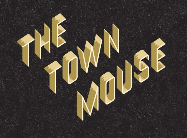
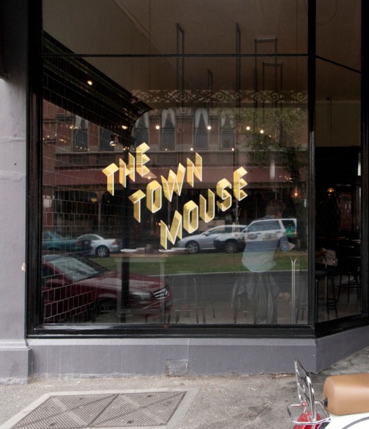
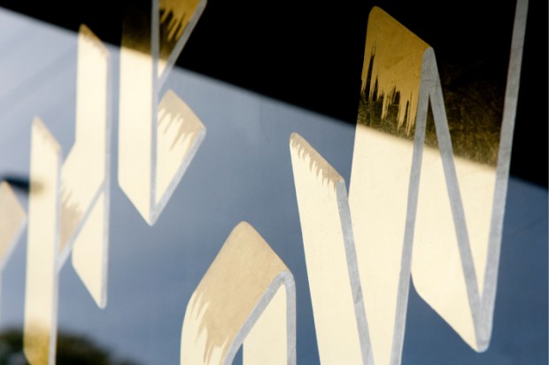
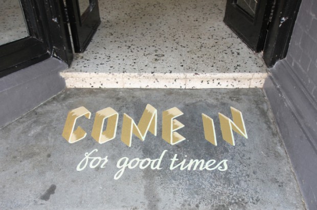
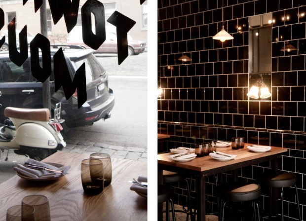
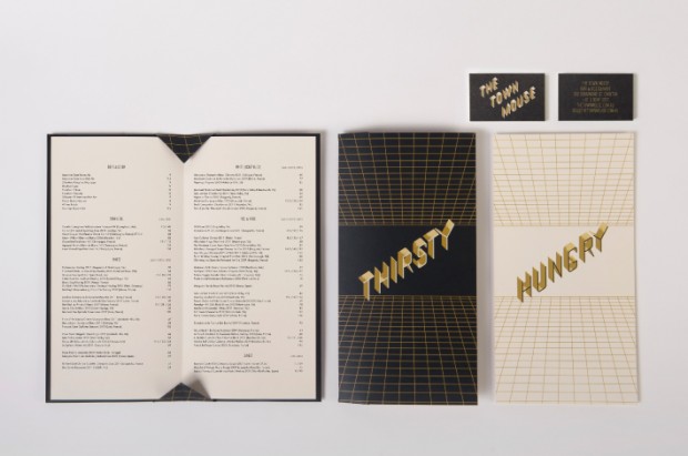
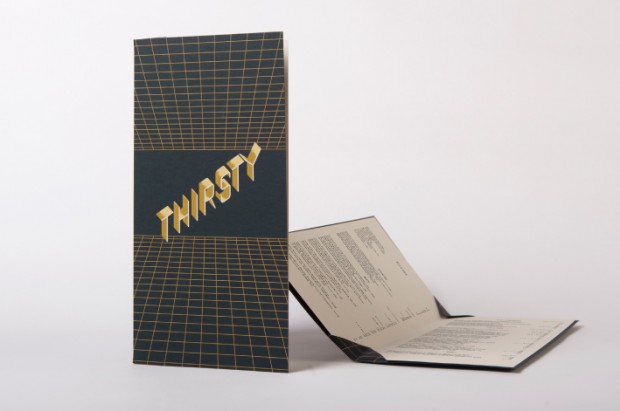
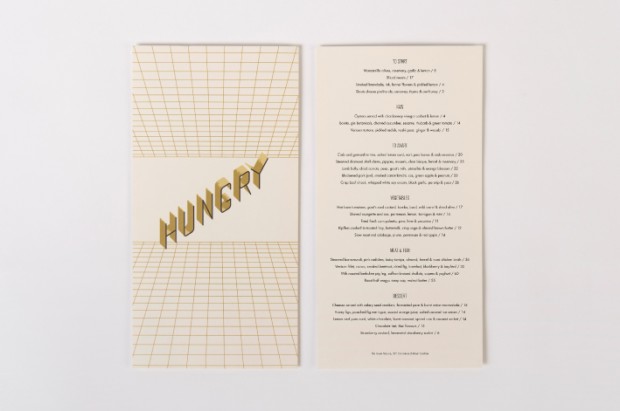
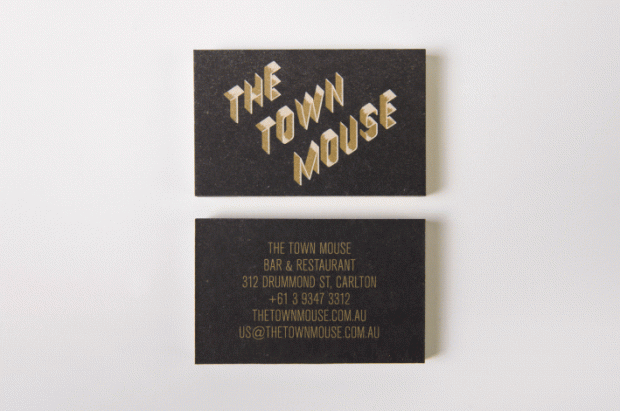
The Town Mouse branding by A Friend Of Mine

"The Town Mouse is a new Melbourne-based bar and restaurant owned by Christian McCabe and located in the space formerly occupied by the Embrasse Restaurant. Developed by A Friend Of Mine, the bar’s visual identity delivers impact through the ‘big city’ and slightly retrospective dimensionality of tall, slim, skyscraper-like, uppercase characters of the logo-type set within and alongside the grids of the collateral." Read more on BP&O

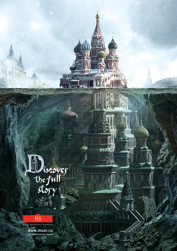
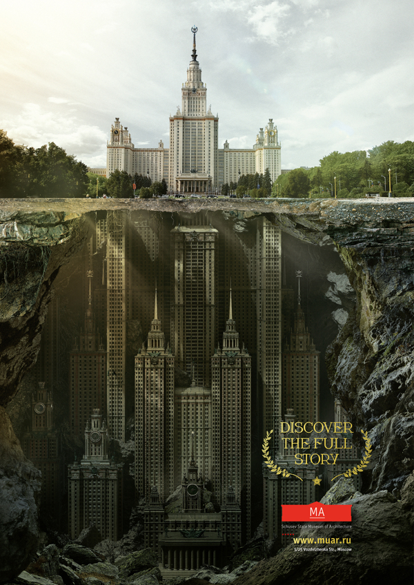
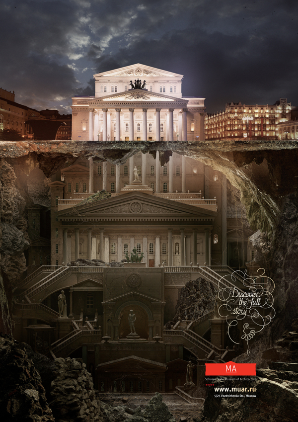
Schusev Museum Advertisement

Saatchi&Saatchi Moscow rolled out smart and inspiring press campaign for Schusev State Museum of Architecture Moscow "Discover the full story of architecture"http://www.behance.net/gallery/MA/7868787

Agency: Saatchi&Saatchi Russia Creative Director: Stuart Robinson Account team: Khichtchenko Elena Creative team: Polonski Yuri, Demakov Anton Typography team: Sergey Sidorov, Anastasia Vedernikova Designers team: Mark Ignatiev PR team: Kristina Vorobieva, Yana Brekotkina Agency producer: Ekaterina Pastukh

Jordan Cut Through LA
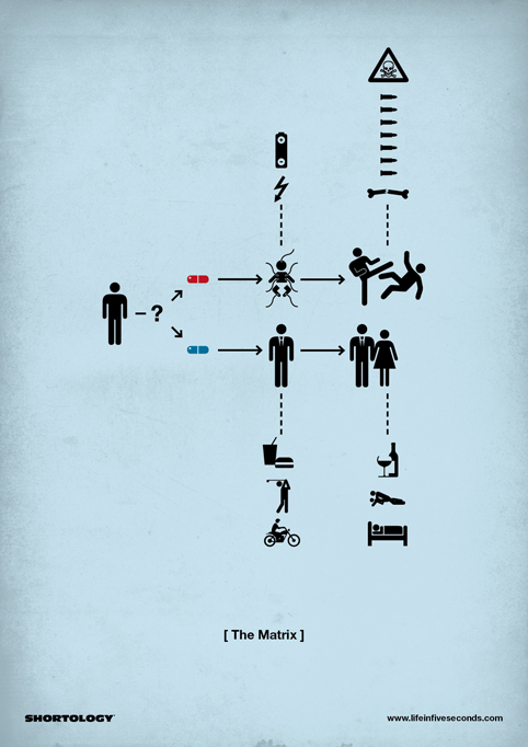
Filmed later last year in Venice Beach, CA. by director Andreas Nilsson, who has a background is set design, what unfolds is a unique traction story of how Jordan CP3 cuts through L.A. in an effort to launch the new Nike CP3.VI shoes from ad agency Weiden + Kennedy. The staged installation features a human chain of athletes dressed to look like Paul, each representing a freeze-framed position along the trajectory of one of his notorious journeys down the court.
via

http://www.youtube.com/watch?v=OPK-r4eU2Co

Making of http://vimeo.com/55813606

Nike Selfridges by ...,staat

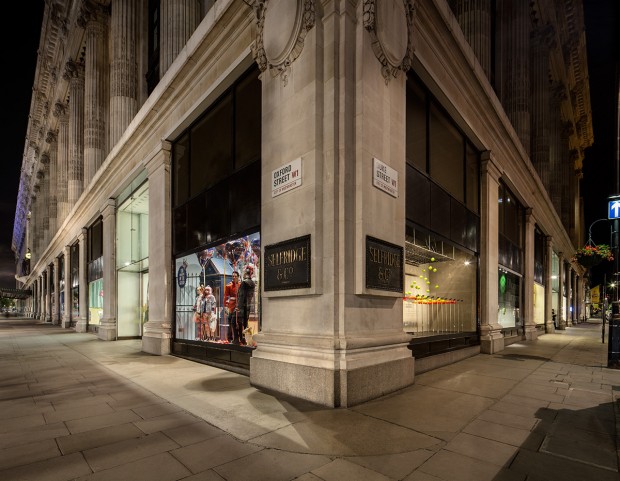
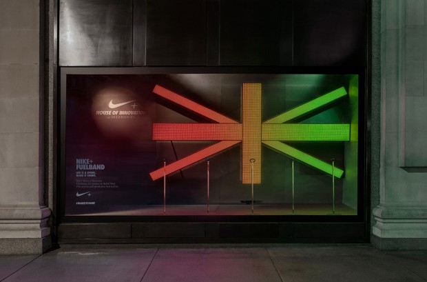
Series of 8 interactive windows at Selfridges London for Nike by ...,staat. In collaboration with Nike Brand Design EMEA.

Together with Nike Brand Design Europe …,staat designed eight stunning windows – each taking the main characteristics of each product and translating them into interactive and/or kinetic art installations. All were set within a concrete environment to ensure visual consistency throughout all the windows, as well as visually connect back to the Nike+ House of Innovation.

http://vimeo.com/60156741

UPD: Golden Cannes Lion 2013 in Design Point of Sale http://winners.canneslions.com/entries/485703/nike-house-of-innovation-selfridges-windows

Listen. Watch. Play. by Studio Output

"Following the success of our previous viral for the PlayStation Store, we were asked to create a short promo film for Sony Entertainment Network. Unlike the previous film, this piece of content had to work much more like a traditional advert, getting across all the services, features and benefits, albeit in an entertaining way." says Studio Output about their recent work "Listen. Watch. Play"

The film feels like a monster pop-up entertainment event, held in a large warehouse space somewhere in London with a vast labyrinth of different entertainment rooms showcasing music, movies and games. The rooms have everything from huge gaming simulators in an aircraft hangar, to a real-life version of LittleBigPlanet, plus EQ and Bravia installations, a content room to navigate through all the titles, an epic cinema room, murals, live art and graffiti.

http://www.youtube.com/watch?feature=player_embedded&v=DSsh9BclXaE

Anagrama

New updates from Monterrey, Mexico based branding design agency Anagrama"Ideas exchanged generate constant inspiration. Different points of view, opposite focus conciliation and comprehension of our own views, complement our success. That is why we open our doors with the best attitude to continuously collaborate with the press and education."

CATK

Colors And The Kids formed in 2008, having originally bonded over a mutual love of Bauhaus when they first met some years earlier in Weimar, Germany. Before long, Elisabeth Schulze (Fine Art, Visual Art), Sebastian Gerbert (Media Systems, Media Art) and Maik Bluhm (Media Art, Visual Art) discovered a shared fascination for film, photography, philosophy, architecture, design and art. It wasn’t until two years after they moved to Berlin, however, that they decided to unite their talents. They’ve never looked back since.

http://vimeo.com/52154082

http://vimeo.com/52156982

Branding by LSDK

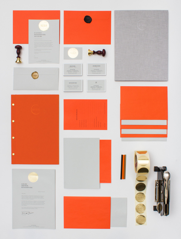
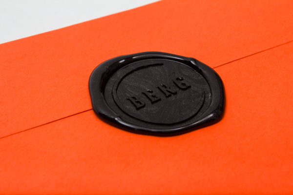
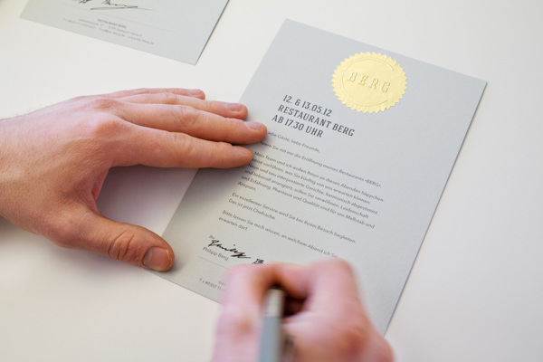
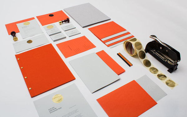
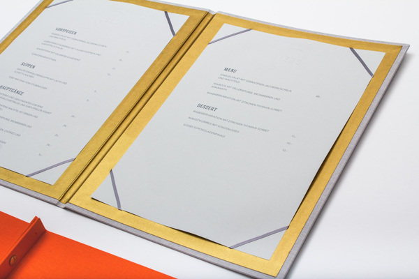
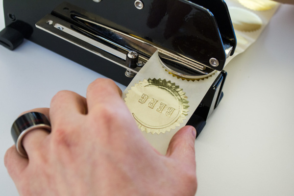
Branding buro from Stuttgart - LSDK, did this nice identity solution for restaurant worth to check inside the post and enjoy Project details: "The stylized imprint of a wine glass enfoldes the geometrical majuscule Letters of the Restaurants Name „BERG“, a reference to the owners reputation as a sommelier aswell as to the focus of the Restaurant. Main colours are a bright, vivid orange and a distinguished cool gray. Business cards and 500 invitations are refined with hand embossed gold foil stickers. Their envelopes are sealed with the emblem on a golden sealing wax. Menu and the list of beverages have a blind embossing on their wrapping which is made of Toile-du-Marais-Linen."

http://www.behance.net/gallery/RESTAURANT-BERG-branding-print-web-design/5763251