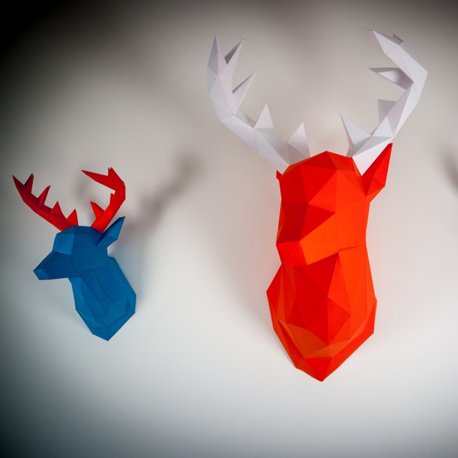
PaperTrophy by Holger Hoffmann

"Inspired by the classic animal trophies I set out to find a timeless design you love to look at every day. The complex yet simple polygon structure reflects the modern design-approach. The Papertrophy animals feature a minimalistic cubic design. It represents simplicity while offering an astonishing look through shadows and light on the trophies. Their bright and vibrant colors create depth and radiate an extravagant elegance." says Holger Hoffmann, the artist behind the project PaperThrophy

Papertrophy Deer blue

Papertrophy deer heads 1000

Papertrophy Deer pink

Papertrophy gorilla 1000

Papertrophy rhino

Papertrophy unicorn

Papertrophy wallart 1000

Papertrophy xl penguin1000

Paco Pomet

"The art of Paco Pomet is highly iconoclastic. He possesses a wonderfully bizarre sense of humor that manifests itself in his oil paintings which contain a strange or humorous visual twist. His subverted landscapes and portraits often borrow from sepia-toned photographs that look like historical documents or vintage photos. There is a parallel to traditional Western Art, mixed with a monochrome effect that restates the documentary character of the original piece." via Ignant

paco-pomet-1

paco-pomet-2

paco-pomet-3

paco-pomet-4

paco-pomet-5

paco-pomet-6

OFFF 2015 #finallyfuckingfifteen

More than a decade ago, OFFF was born as a festival. Today, OFFF is a way of understanding art. A way of life. Evolving and transforming. This time OFFF is celebrating its puberty age and it is #finalllyfuckingfifteenDesigncollector team join the celebration and will deliver you the latest information regarding the festival. Meanwhile head to the Ticket Section and secure your position in the near OFFFuture (Facebook).

Fifteen isn’t just an odd number, nor a year, nor a bunch of candles we’re blowing this May. Fifteen is this gigantic era of your life which you got to it once in your life and your whole world turned upside down: your first acne, your first lover, your first turn on, your first experience. That’s how the creative team at Atelier is presenting OFFF 15th Anniversary this year. It’s when you welcomed your innocence to a crazy world, it’s when you turned “Finally Fucking Fifteen”.

DUNA1200X1000

offf2015_finallyfuckingfifteen

offf15_finallyfuckingfifteen_2

The Room on the Roof by i29 Architects

Located in Amsterdam's Dam Square, the De Bijenkorf department store was first built in 1909 as a gorgeously cresselated neo-gothic structure pierced by a distinctive central turret. Since it was built, that tower has been mostly for show, but thanks to a partnership between the interior architects i29 and the nearby Rijksmuseum, De Bijenkorf is now turning the tower into a beautiful design haven. Called the Room on the Roof, the De Bijenkorf tower has been transformed into a bright, modern design studio, complete with a kitchen, a day bed, a sitting room, and a telescope. via

"The biggest challenge of designing the space was simply the size of the floor area: just 16 square meters," i29 directors Jaspar Jansen and Jeroen Dellensen told me by email. "That was one of the reasons why we ended up with a vertical installation, which creates a 'living cabinet' that allows artists-in-residence to experience the tower on different levels."

129interiorarchitects-amsterdam-1 129interiorarchitects-amsterdam-2

129interiorarchitects-amsterdam-3

129interiorarchitects-amsterdam-4

129interiorarchitects-amsterdam-5

129interiorarchitects-amsterdam-6

129interiorarchitects-amsterdam-7

129interiorarchitects-amsterdam-8

129interiorarchitects-amsterdam-9

129interiorarchitects-amsterdam-10

129interiorarchitects-amsterdam-11

Naoto Hattori

Japanese artist Naoto Hattori (Instagram) creates surreal characters for his canvases. Of his work, He says: "My vision is like a dream, whether it's a sweet dream, a nightmare, or just a trippy dream. I try to see what's really going on in my mind, and that's a practice to increase my awareness in stream-of-consciousness creativity. I try not to label or think about what is supposed to be, just take it in as it is and paint whatever I see in my mind with no compromise. That way, I create my own vision."

naoto-hattori-1

naoto-hattori-2

naoto-hattori-3

naoto-hattori-4

naoto-hattori-5

naoto-hattori-6

naoto-hattori-7

naoto-hattori-8

Uncommon Places by Reuben Wu

Uncommon Places is a long-term project run by British photographer Reuben Wu (Instagram) whose works have we started to share last year. Nowadays Reuben is back with the new works explaining the project "Uncommon Places" as "An attempt to convey my relationship to landscape and artefact. A perpetual search for unfamiliar terrain.."

reuben-wu2015-1

reuben-wu2015-2

reuben-wu2015-3

reuben-wu2015-4

reuben-wu2015-5

reuben-wu2015-6

reuben-wu2015-7

reuben-wu2015-8

reuben-wu2015-9

reuben-wu2015-10

reuben-wu2015-11

Type Made From Fragments Of Famous Artworks

"The latest project from quirky Israeli typographer Oded Ezer takes one feature of a famous artwork, like the Mona Lisa, Van Gogh's self-portrait or Vermeer's Girl With A Pearl Earring, and uses it to create a typeface, to hilarious and disturbing effect. The typeface made of the surf from Katsushika Hokusai's The Great Wave off Kanagawa is innocent enough. But things get weird when Mona Lisa's finger is used to form a letter V or Van Gogh's mustache to create a T. Ezer's best typeface by far uses a piece Michelangelo's David, but we'll leave the specifics of that one a surprise." writes FastCo

arttype-odedezer1

arttype-odedezer2

arttype-odedezer3

arttype-odedezer4

arttype-odedezer5

arttype-odedezer6

Yuri Shwedoff Creative Illustrations

Yuri Shwedoff is a young artist from Moscow who is still a student in art school but he already has a great talent in illustration. Last year we featured one of his works - Audrey. He made a lot of creative illustrations on various thematics like cinema and futuristic and surrealistic landscapes. A high quality work for a young student, a great promise for the future.

yuri-shwedoff-1

yuri-shwedoff-2

yuri-shwedoff-3

yuri-shwedoff-4

yuri-shwedoff-5

yuri-shwedoff-6

yuri-shwedoff-7

Voyageur du Temps Bakery Identity by Character

You may know that a half of success for any design project is its showcase. Another quarter is a story like this: "An old railway station in Los Altos, California, has been transformed into this exquisite new bakery and café by local entrepreneur Rie Rubin, with the help of the creative people at San Francisco-based design agency Character. Named Voyageur du Temps, which means time traveler in French, the café seeks to preserve the time-honoured art of baking by adding a dash of contemporary life to it. Here you will find freshly baked artisan breads and pastries, as well as a variety of courses that give a playful wink to continental breakfast staples like the Croque Monsieur and crepes with fresh fruit."

Voyageur-du-Temps

Voyageur-du-Temps1

Voyageur-du-Temps2

Voyageur-du-Temps3

Voyageur-du-Temps4

Voyageur-du-Temps5

Voyageur-du-Temps6

Voyageur-du-Temps7

Voyageur-du-Temps8

Voyageur-du-Temps9

Voyageur-du-Temps10

Voyageur-du-Temps11

Voyageur-du-Temps12

Voyageur-du-Temps13

Voyageur-du-Temps14

Marta Gawin Graphic Design

Marta Gawin is a Polish multidisciplinary graphic designer with some great experimental visual identity, sign system, poster, information, exhibition and editorial design work. Since her MA in Graphic Design (Academy of Fine Arts, Katowice) in 2011, she has been working as a freelancer for cultural institutions and commercial organisations. via FFF

marta-gawin1

marta-gawin2

marta-gawin3

marta-gawin4

marta-gawin5

marta-gawin6

marta-gawin7

marta-gawin8

marta-gawin9

marta-gawin10

marta-gawin11

marta-gawin12

marta-gawin13

marta-gawin14