Peter Strain Typography Illustrations
Talented illustrator Peter Strain from UK creates artworks using lettering to form objects and silhouettes
Talented illustrator Peter Strain from UK creates artworks using lettering to form objects and silhouettes
"Reflexió" is a typography project of Catalonian artist Ramon Carrete experimenting with simple effects that lead to impressive results.
http://vimeo.com/117475191
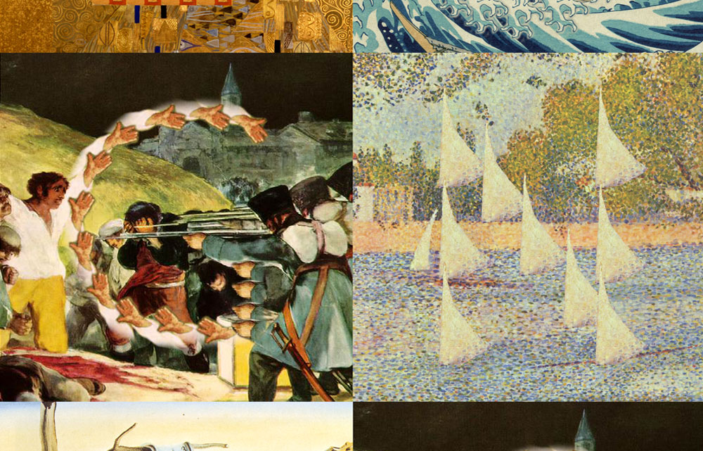
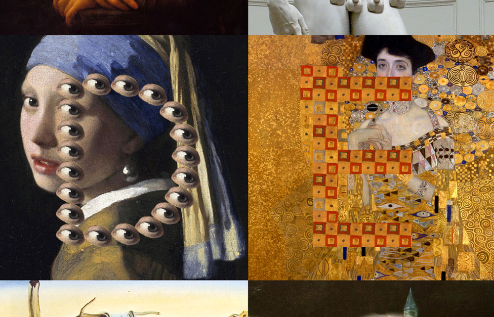
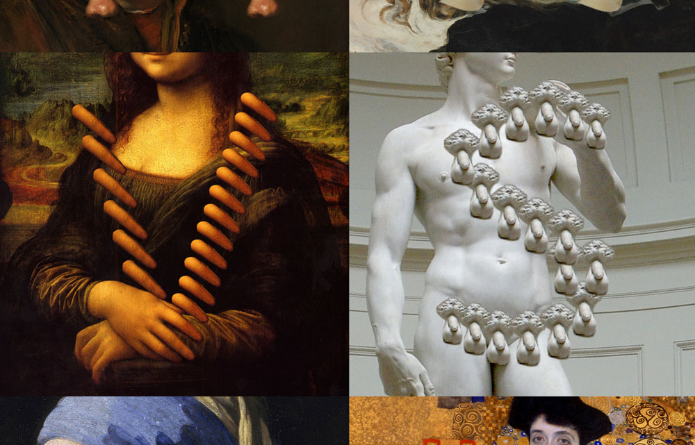
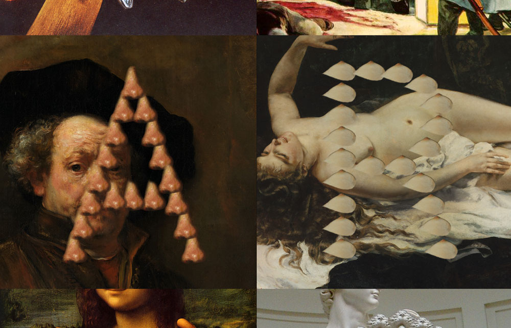
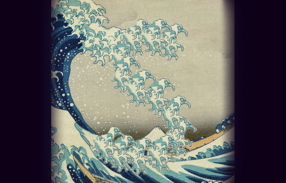
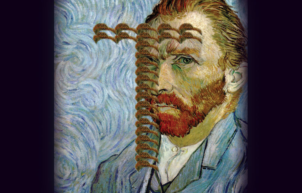
"The latest project from quirky Israeli typographer Oded Ezer takes one feature of a famous artwork, like the Mona Lisa, Van Gogh's self-portrait or Vermeer's Girl With A Pearl Earring, and uses it to create a typeface, to hilarious and disturbing effect. The typeface made of the surf from Katsushika Hokusai's The Great Wave off Kanagawa is innocent enough. But things get weird when Mona Lisa's finger is used to form a letter V or Van Gogh's mustache to create a T. Ezer's best typeface by far uses a piece Michelangelo's David, but we'll leave the specifics of that one a surprise." writes FastCo
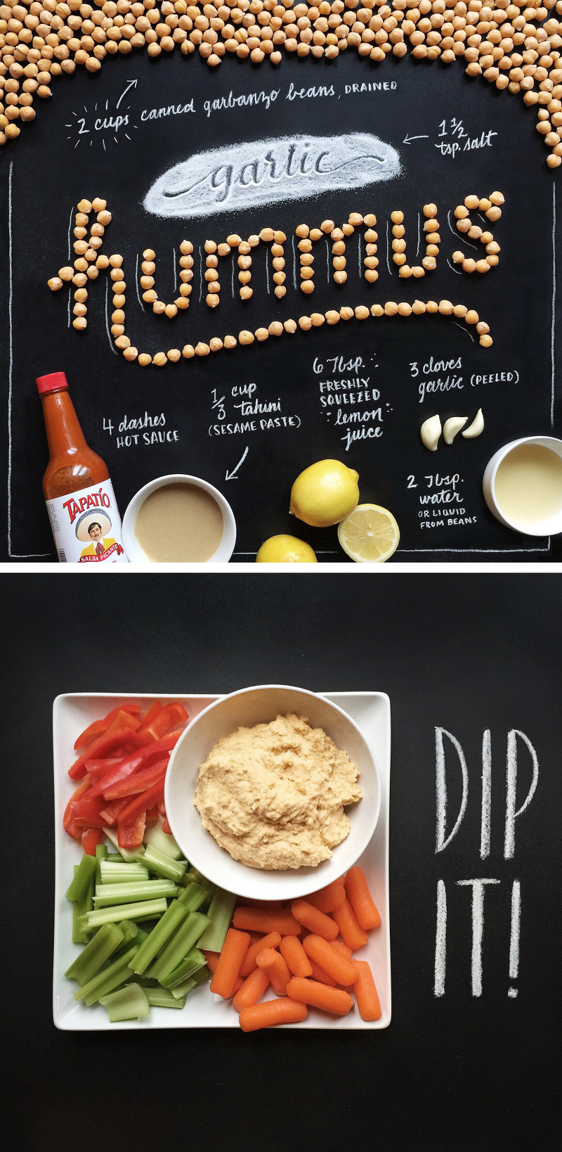
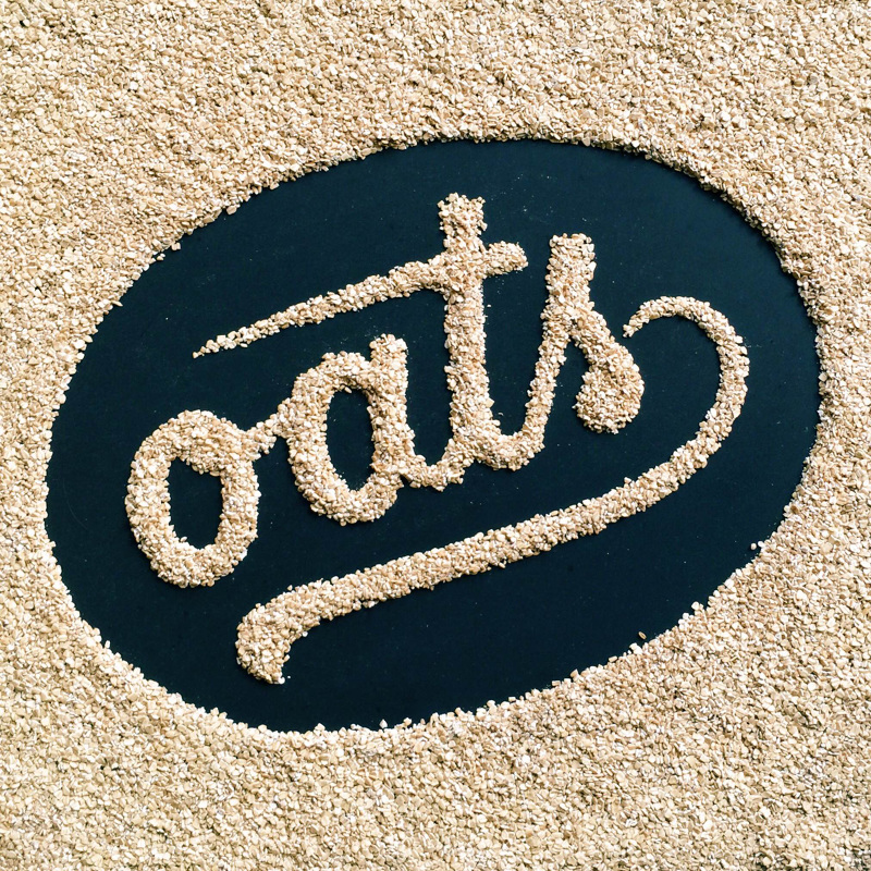
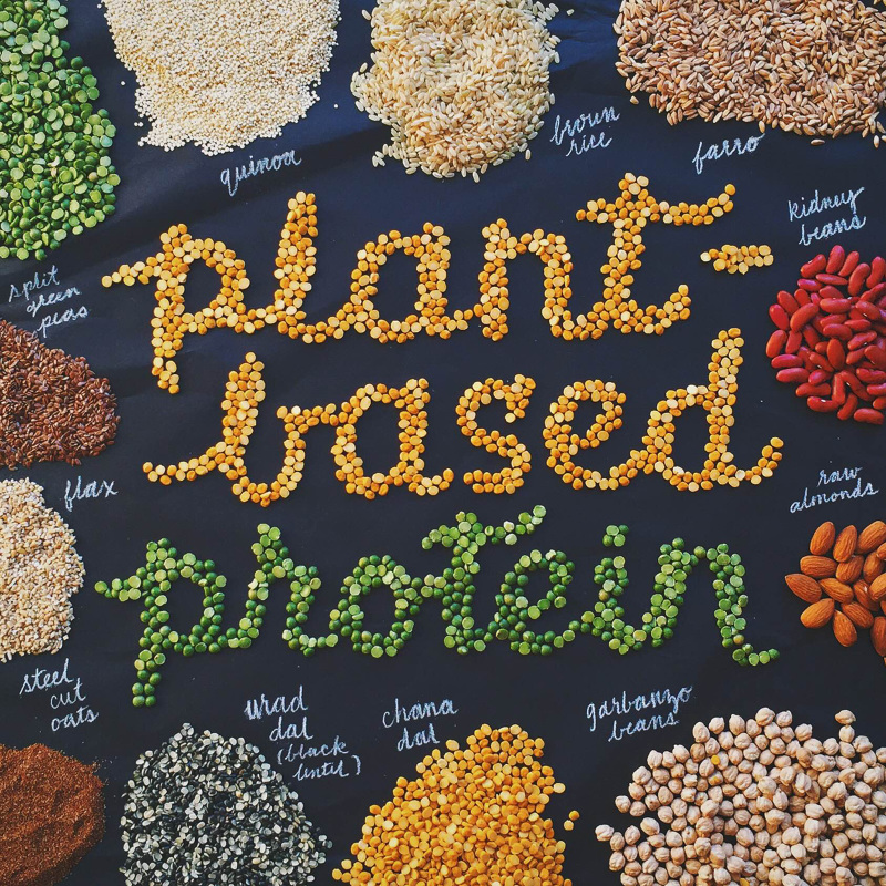
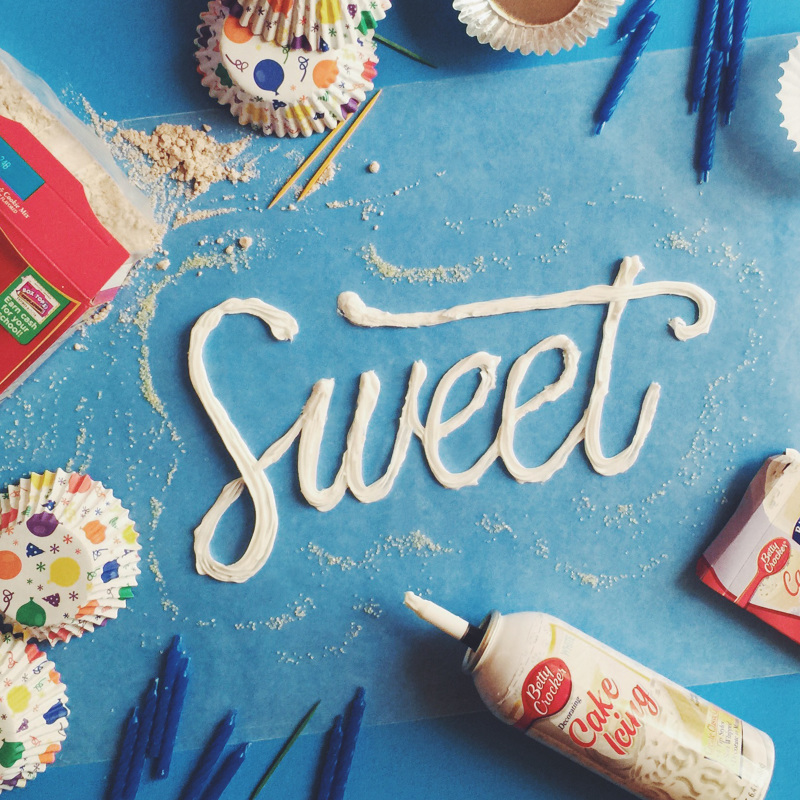
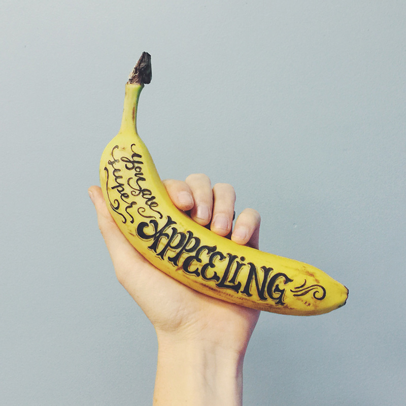
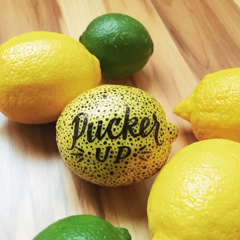
Here is a series of hand-lettering typography made by Becca Clason (founder of Cheerletter) based on food. Between precision, creativity and humour, Becca Clason pays attention to details and aesthetic of her gourmet messages.

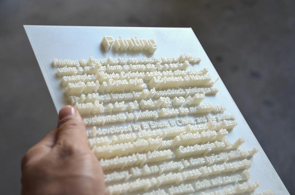
3D Printing brings new opportunities for creative persons, just take a look at typography project created by Hongtao Zhou. Textscape generates letter-sized 3D documents to visually profile the subject matters of the texts, such as cities, landscapes or figures. These documents make reading interactive for a general audience or blind people to read as knowledge, as well as art. This series of work has text variations of braille, language characters, calligraphy and number systems to bridge the text and its visuality in architecture, landscape, portraits and abstract matters.
Poster designs made by Jorgen Grotdal, designer and lettering specialist from Trondheim Norway. Grewing up in a rougher surrounding and handcrafted area, he is inspired by vintage accessories and ideaful simple inverted letterings. Made with pens and chalk his style expands in a set of interesting goods.
Channel One Russia commissioned lettering master Igor Mustaev to work on winter festive TV splashes that he did on chalkboard. View it on Behance
Channel One Russia team: Art director: Dmitry Likin Photographer: Sergey Kholmanov
http://www.youtube.com/watch?v=vFh-uQkDZAc
Who said it will be easy? To create logotype for the city like Saint Petersburg is like to direct a play of "Lady Macbeth" or "The Master and Margarita". Everybody knows it but nobody got close to it, dead or alive. The city identity requires a lot of everything: starting from a very complicated history ending with citizens that has a lot of doubts and bits about living here. To understand the city as someone said you must "drown" in it, or it will spit you outside or even leave you dying. Literally, Saint Petersburg has a lot of faces, and everyone who gets here see its own face. So let's check the three version of Saint Petersburg City Logotypes.
The first one is said to be done by Moscovian (sic 1!) design studio "Art.Lebedev", but it is not approved. Please take this in consideration while studying the logo. First posted on German website (sic 2!), it spread across Russian web with a lot of doubts over iconography and some typography issues.
Done by initiative group lead by Ruslan Chernobayev (St.Petersburg Design Week) and talented illustrator Alex Andreyev and supported by BCA Agency, ILOVESPB is a next pitch to have pros and contras. The logo has a personal website http://ilove.spb.ru/ and hope has a long journey to be real.
The third pitch is again from Moscovian studio of Yakushev Branding has a good typography designed by Ivan Gladkikh and lemon-faced trend of "generic" logotype, that we'll leave on your consideration. Personally, this project is a good moodboard and research of possible graphic design trends, but hardly represents the Saint Petersburg City itself.
Meanwhile please enjoy the beauty of the city in different timelapse motions we collected all this time
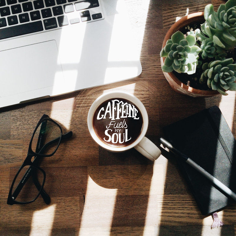
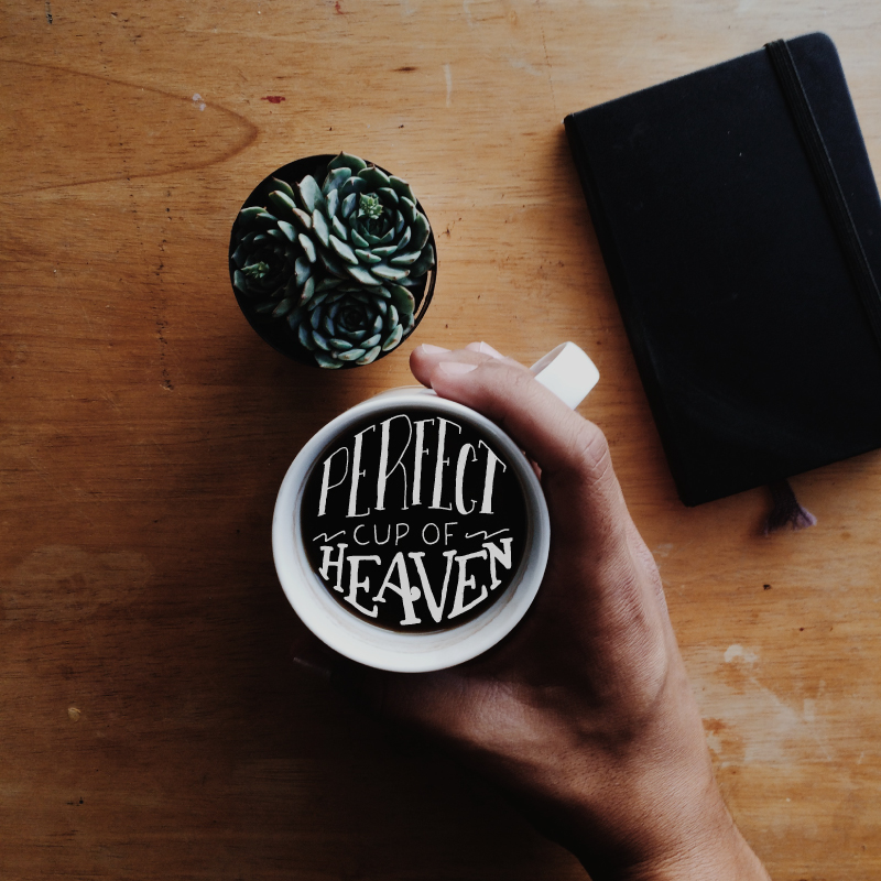
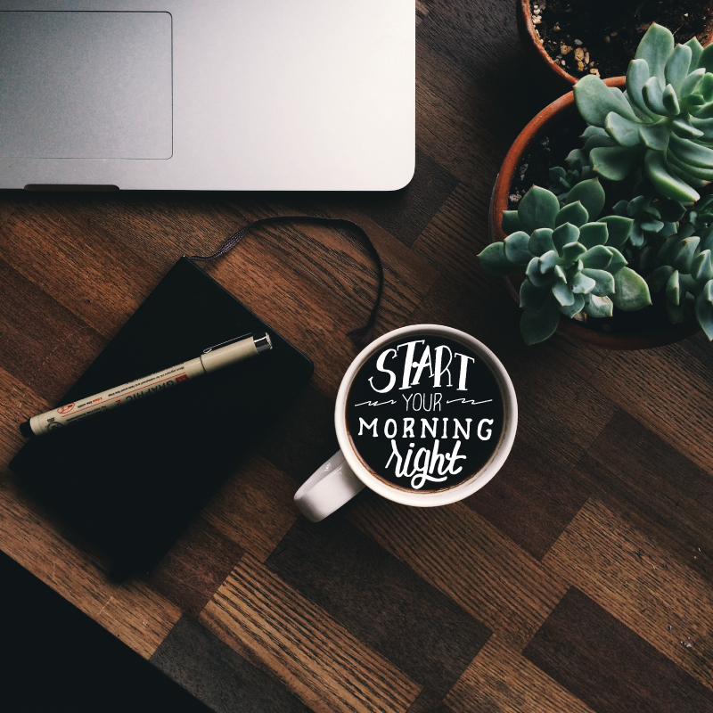
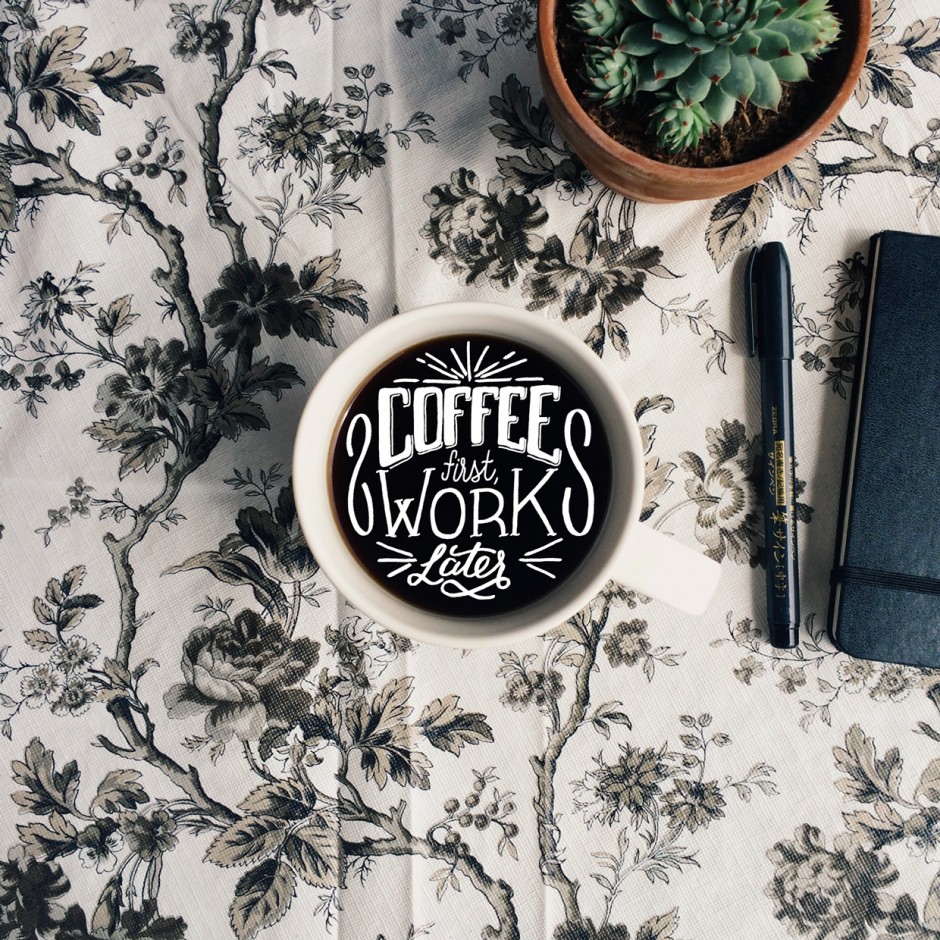
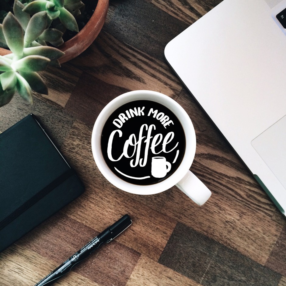
A set of personal lettering projects showing Louis's deep love for coffee. It is a part of his 365 lettering project on Instagram.


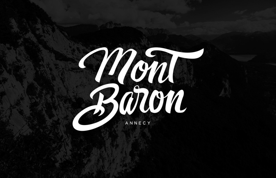
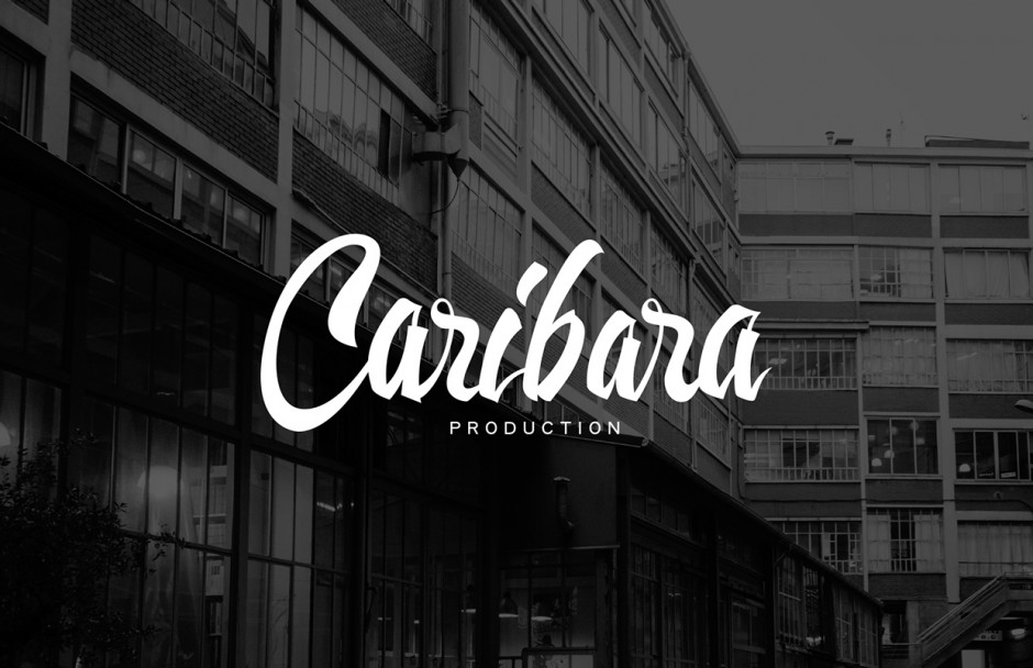
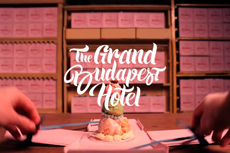
Paris-based artist shows off her awesome skills in lettering and illustration - meet Vivien Bertin on Behance

Our friend and a resident of Hellohikimori Paris - legendary illustrator and professional master of grafitti tagging mr. Nairone (Instagram) released his nice collaboration done with London based studio UNIT9. Hoxton Square Bar&Kitchen asked them to decorate a huge street window. Watch it below

nairone-unit9-hoxton2

nairone-unit9-hoxton1
"This is a tribute film to the amazing Montserrat typeface, recently designed by Julieta Ulanovsky. A tribute, also, to the Montserrat neighbourhood in Buenos Aires, which inspired the font. An finally a tribute to Jorge Luis Borges. The text is an extract from his wonderful poem Break Of Day (Amanecer) from the book Fervor de Buenos Aires (1923)."
Direction, design, animation: Fernando Lazzari http://www.popscience.tv/ Director of Photography: Matías Nicolás Music: Brian Eno / Black Planet Sound Design: Andrea Damiano Plataforma Buenos Aires, Carolina Tobal
http://vimeo.com/79733436
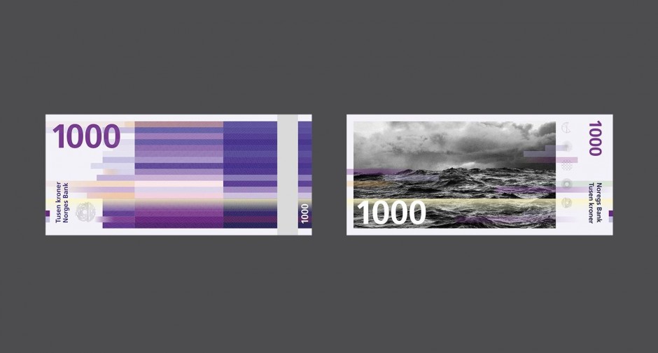
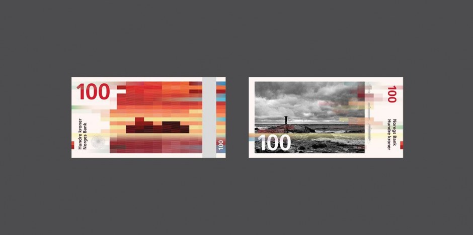
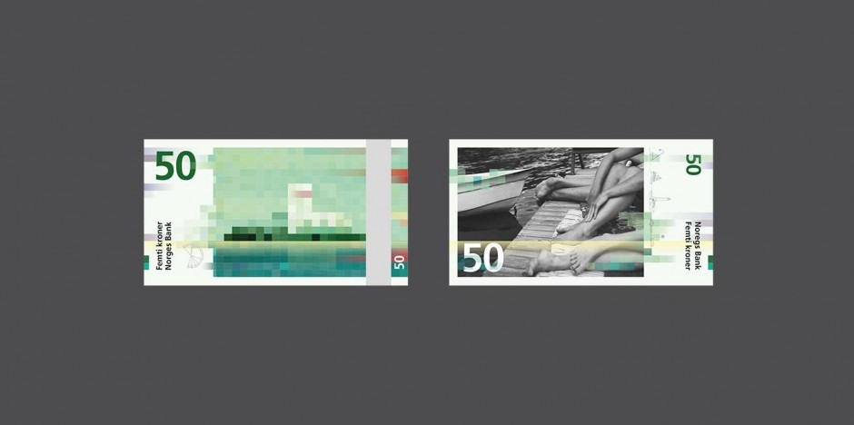
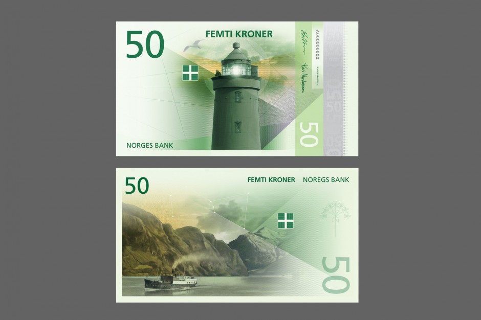
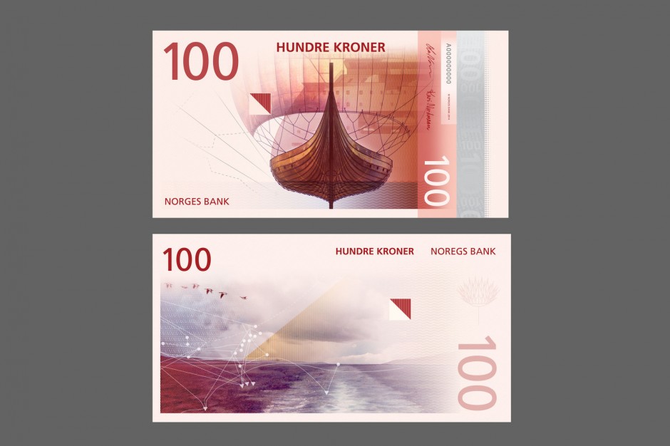
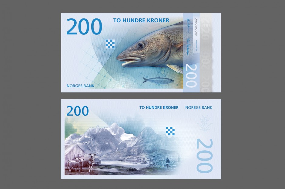
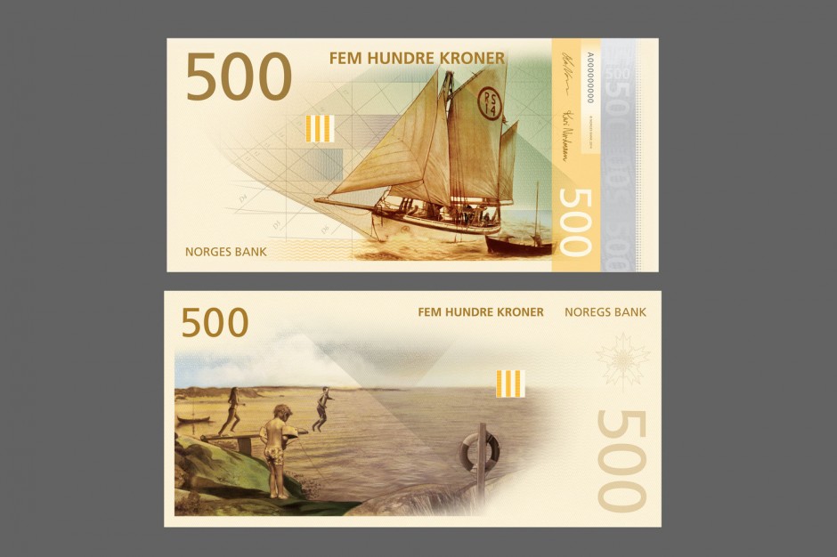
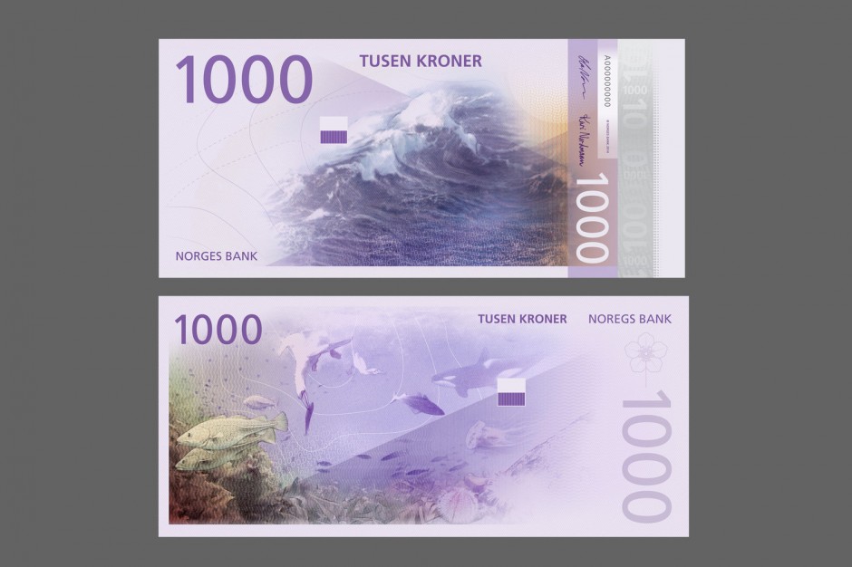
Last week it was revealed that Oslo-based design agency Snøhetta had jointly won a competition to redesign the Norwegian banknote. The Central Bank of Norway announced on October 7 two winner proposals for the design of the new banknotes. Snøhetta’s design will be the foundation for the backsides of the notes, while The Metric System’s design will be the starting point for the fronts.
"When contrasts come together, as when soft meets hard or digital meets analog, a dynamic is created. Our cubical pattern first of all represents pixels; our times visual language."
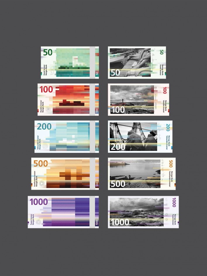
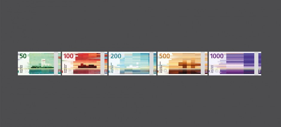
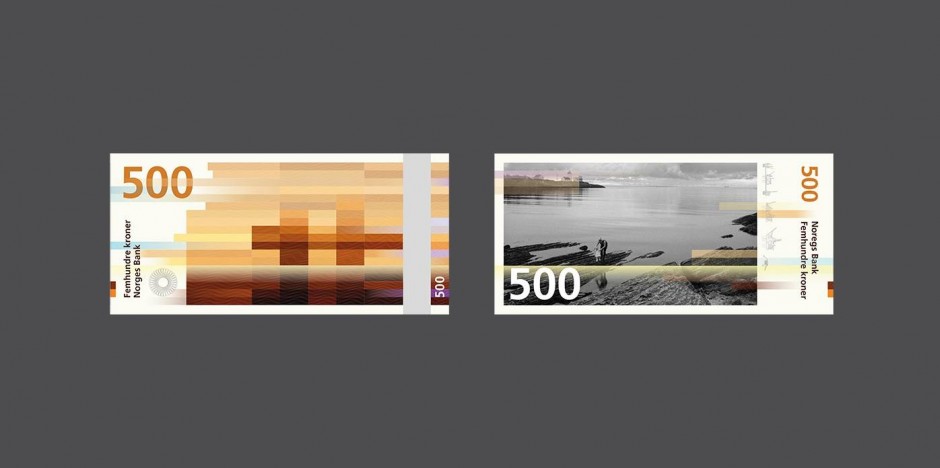
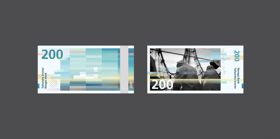
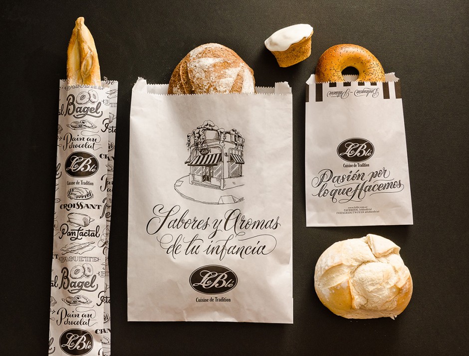
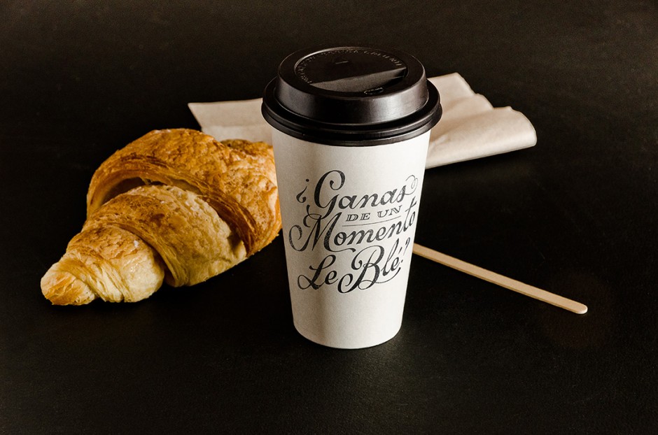
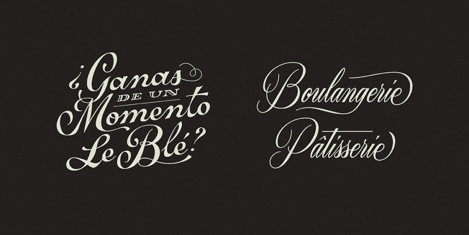
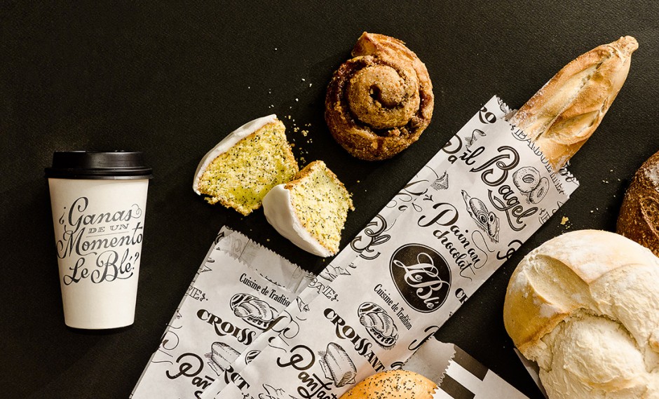
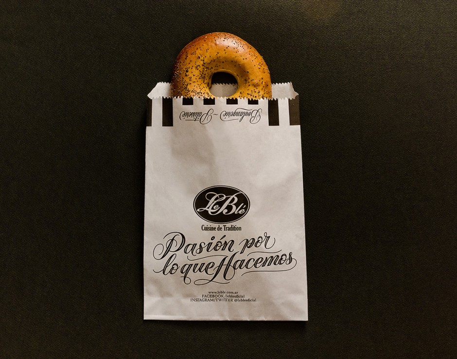
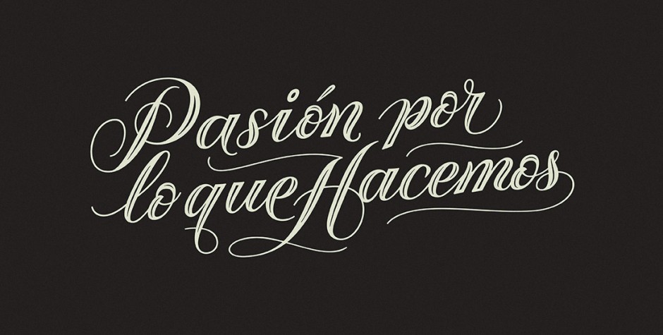
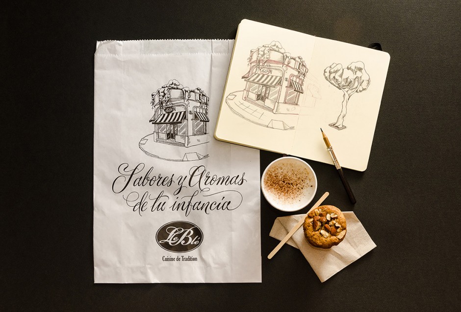
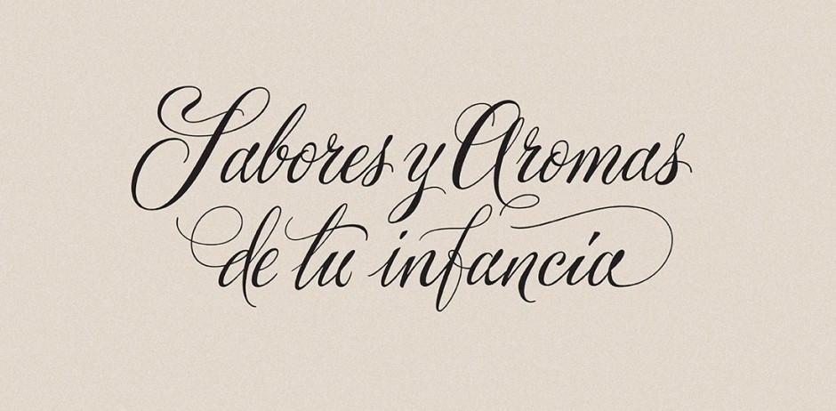
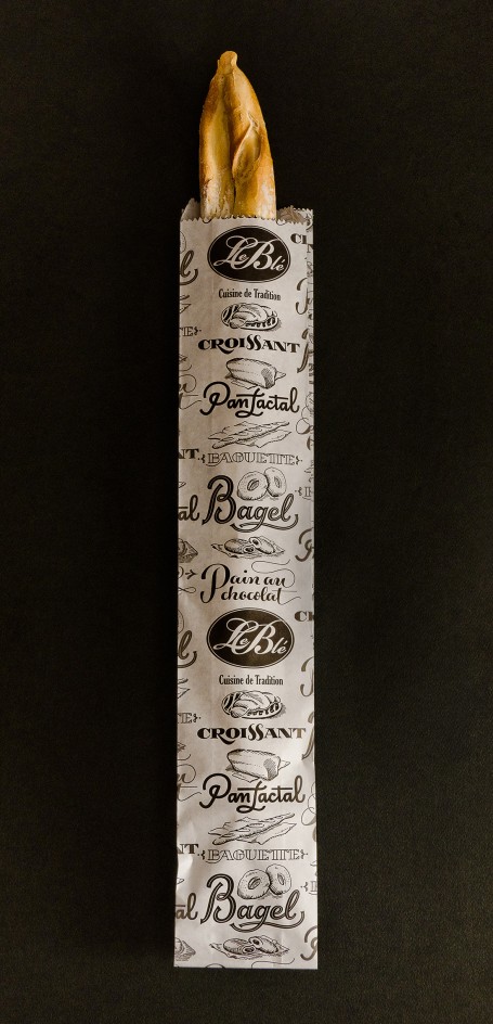
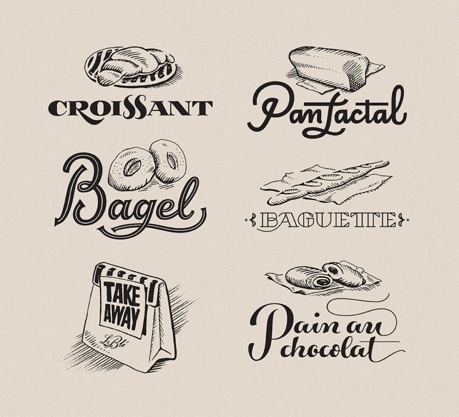
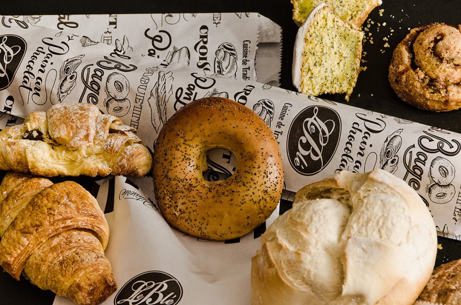
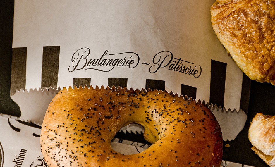
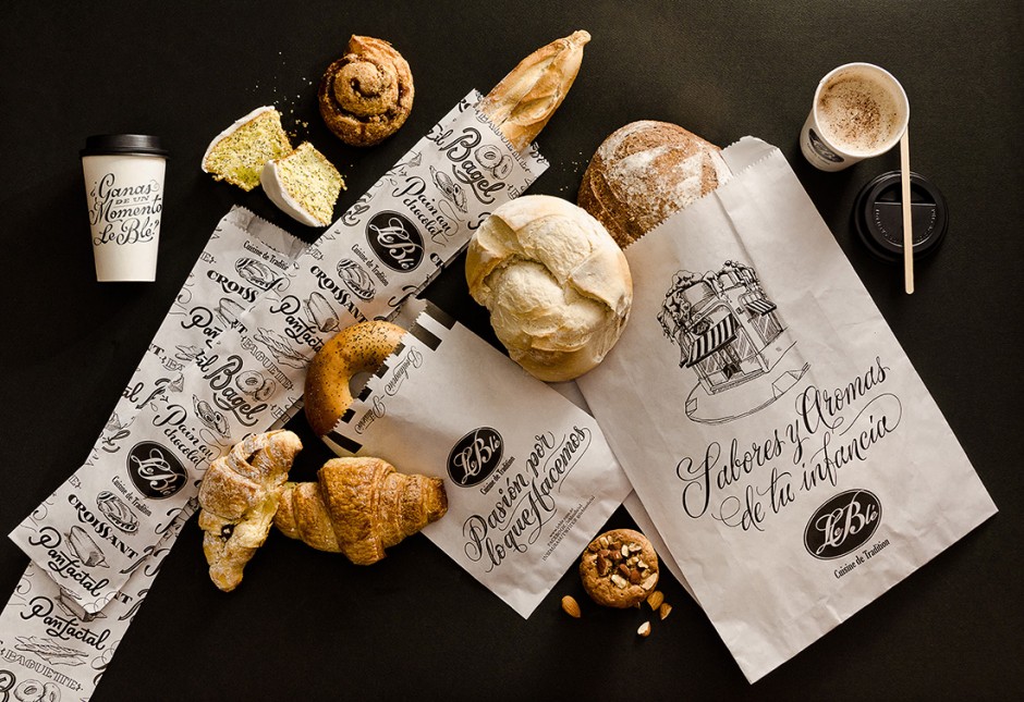
Check the latest awesome packaging and lettering design projects from Buenos Aires based designers Yanina Arabena and Guillermo Vizzari or simply Yani&Guille
«Le Blé» is a deli restaurant, with homemade and French kitchen, offering several locations throughout the city of Buenos Aires, Argentina. We designed a new line of paper bags and packaging, along with a series of illustrations and lettering that accompany the experience of the place.
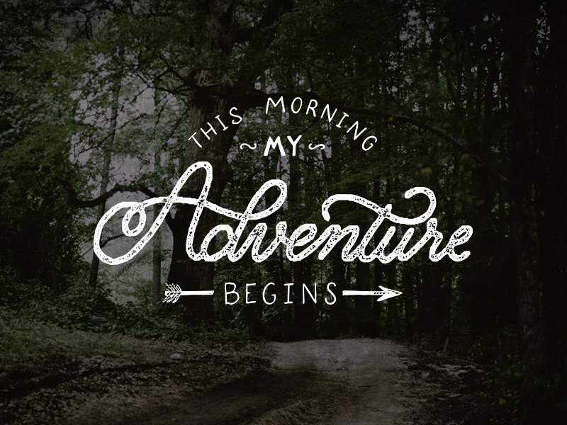
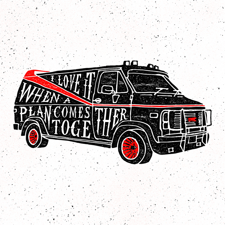
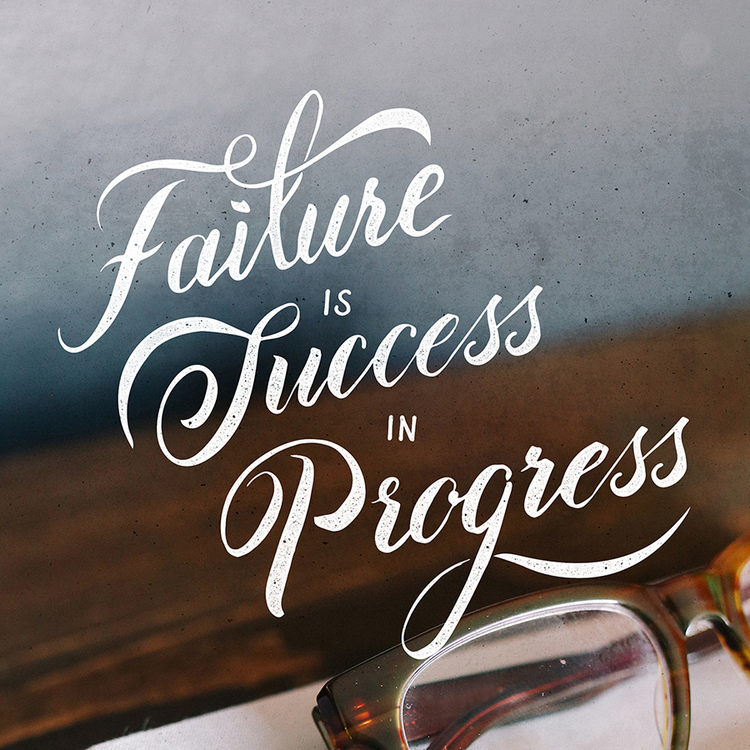
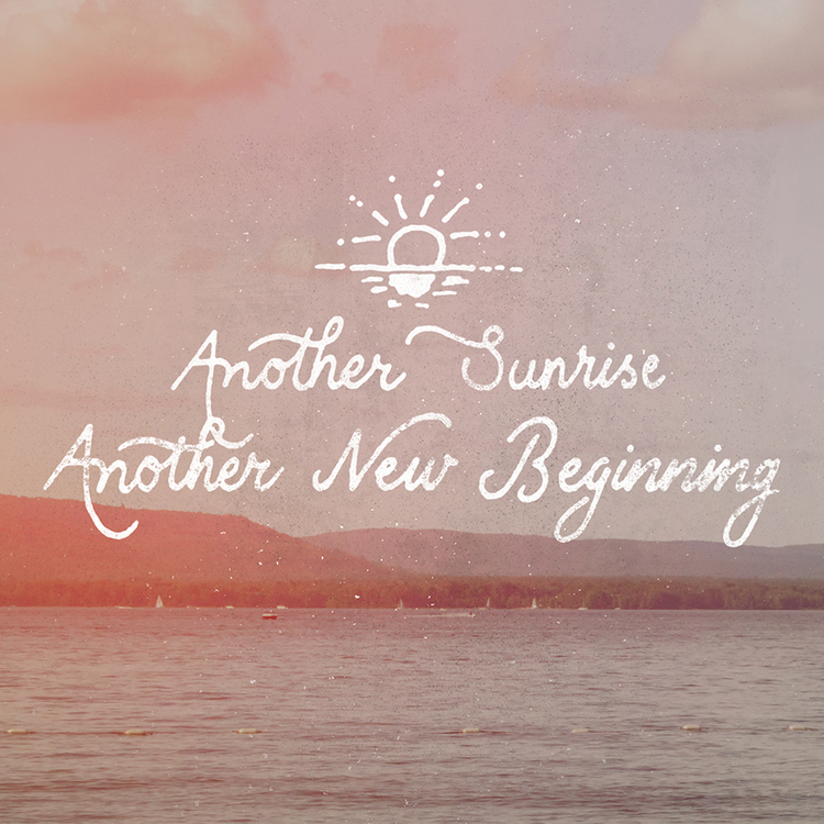
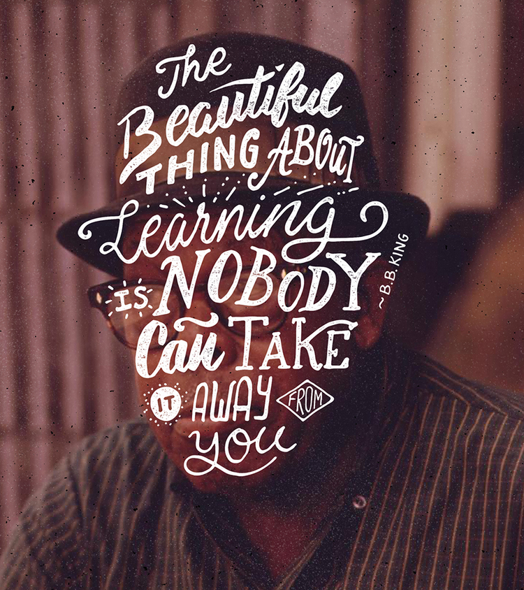
United Kingdom-based logo designer and hand letterer Ian Barnard creates beautiful typography lettering by hand. Taking quotes of famous personalities, encouraging phrases, words of wisdom and more, he creates beautiful art that will put a smile to your face.




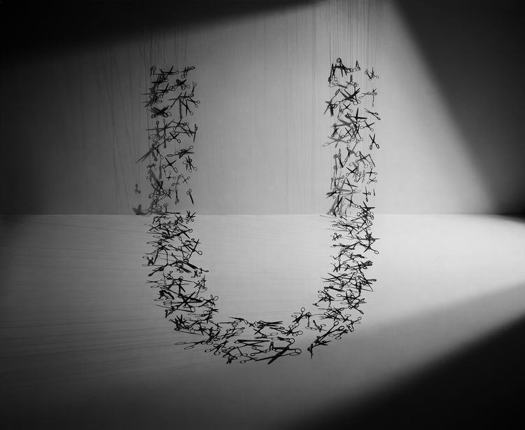
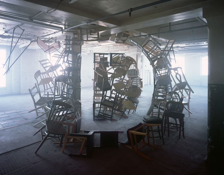
Set designer Nicola Yeoman has created a series of artworks, installations and set design for both editorial and advertising campaigns. Some of her projects showcase impressive works of typography—using everyday items such as chairs, scissors, twigs and fabric, she has created letters of the alphabet.
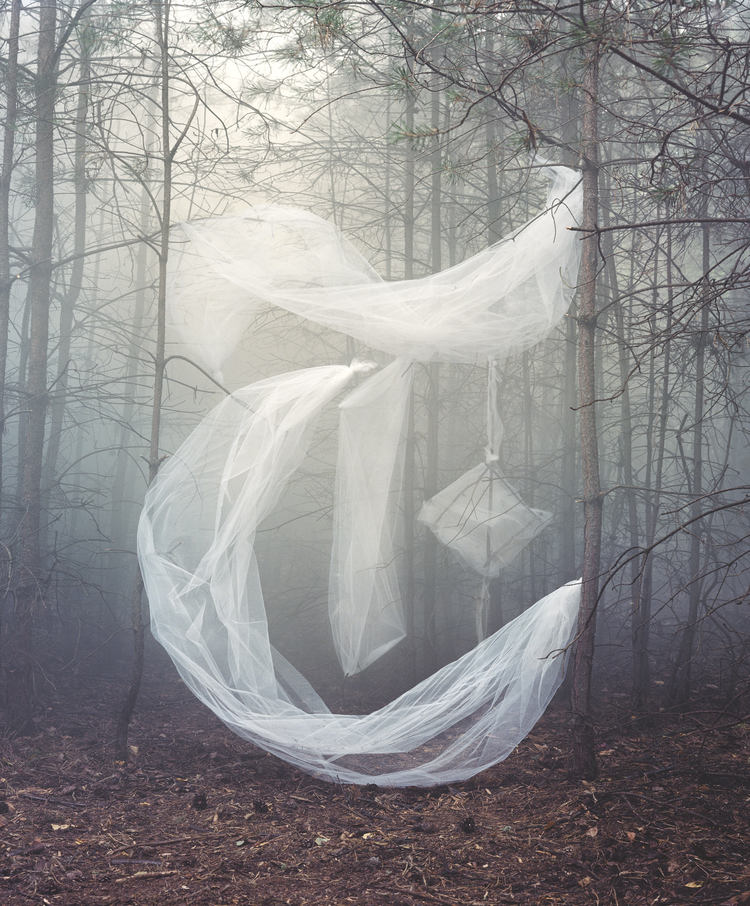
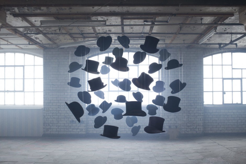
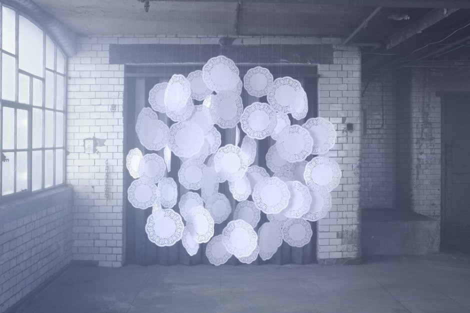
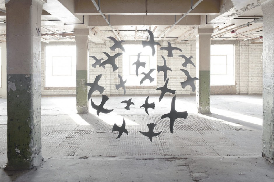
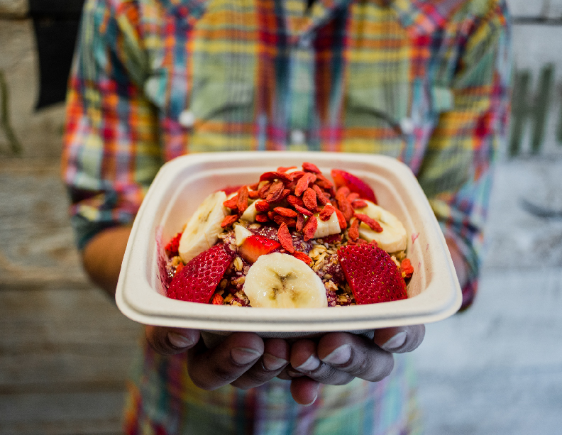
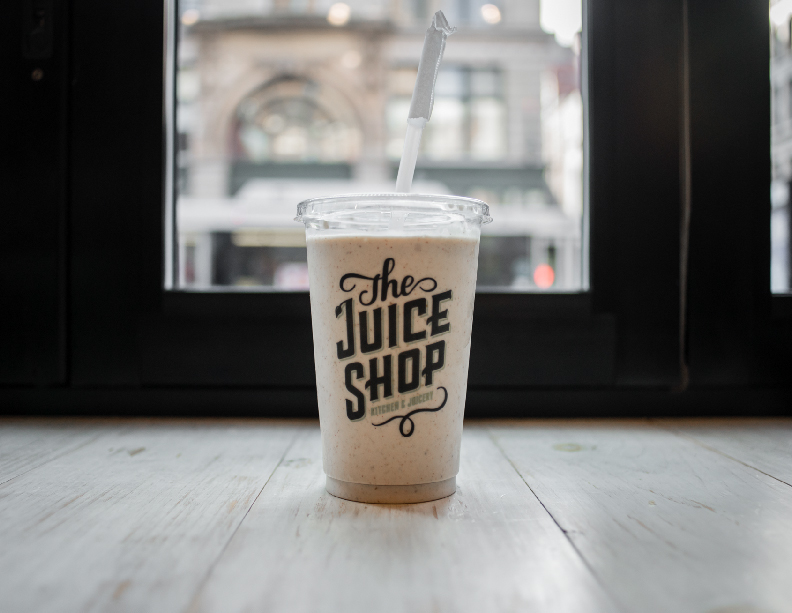
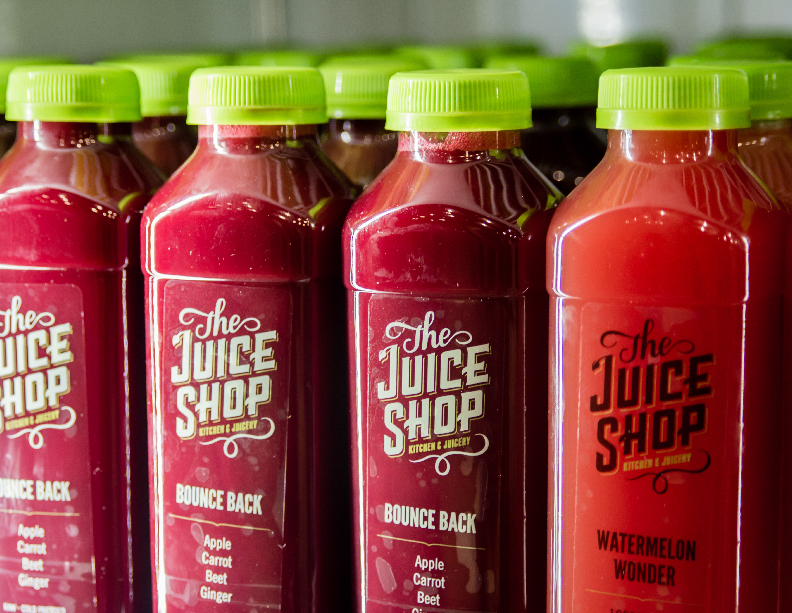
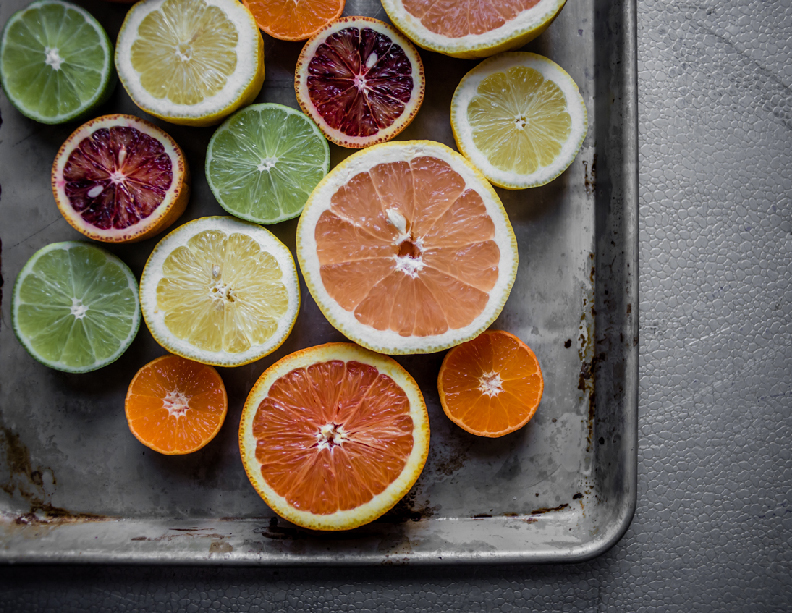
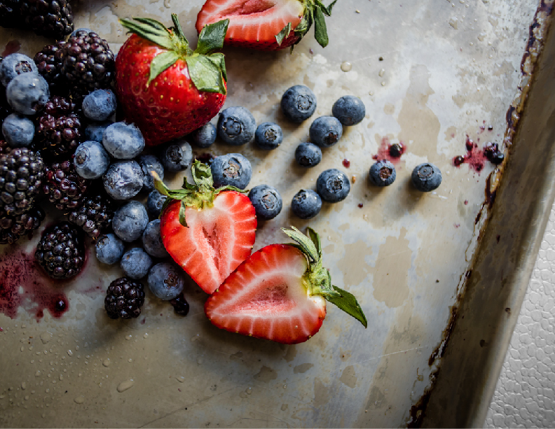
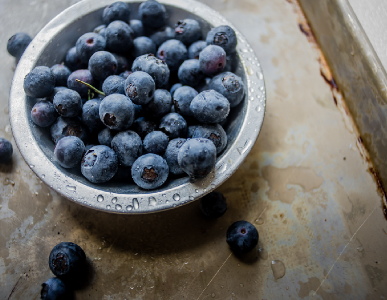
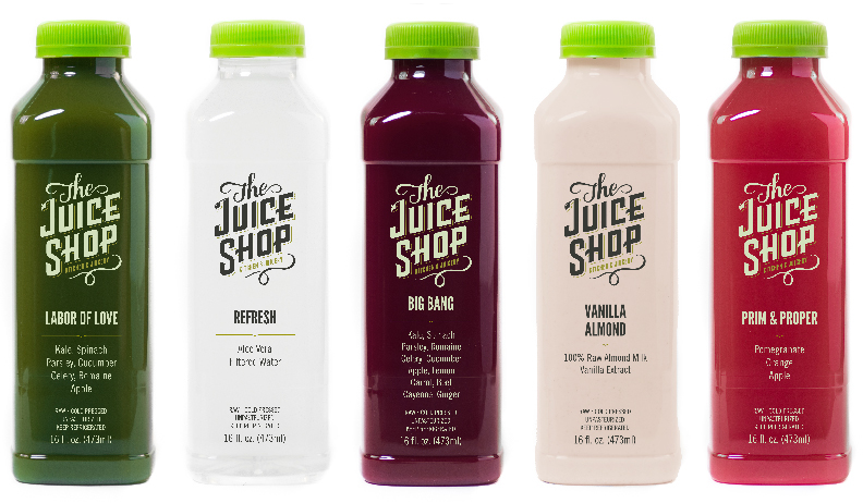
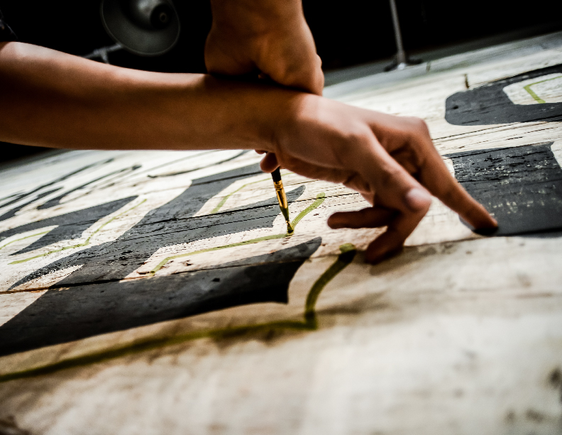
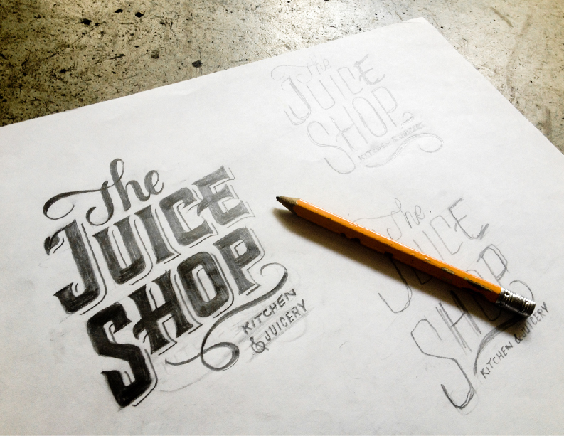
This project is a collaboration between No Entry Design and Josh Held Design. The Juice Shop Kitchen & Juicery is a new juice space that opened up it's first location in New York City's bustling Flat Iron District. Their goal is to provide fresh juices for a more reasonable price than all of the other juice places popping up around the city. More locations will be coming soon.
http://vimeo.com/90781773
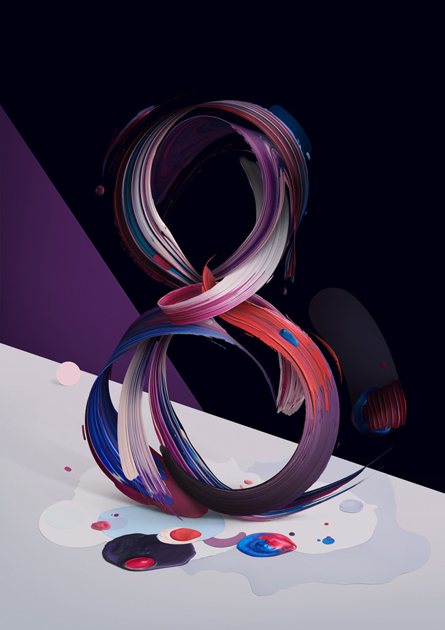
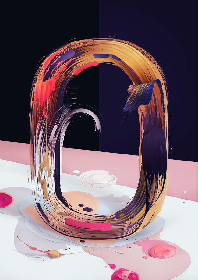
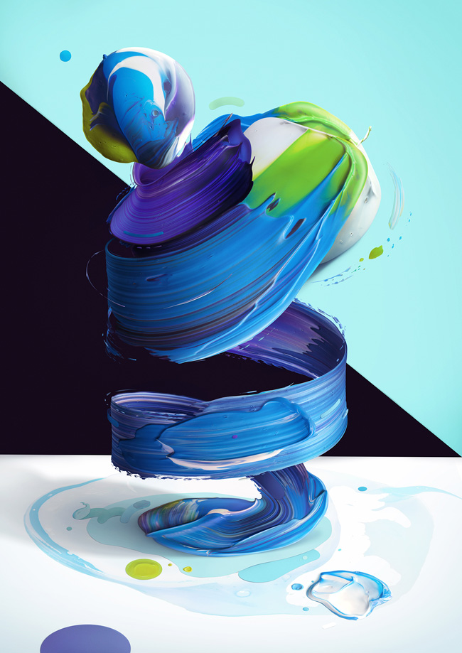
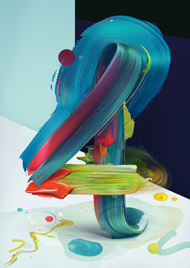
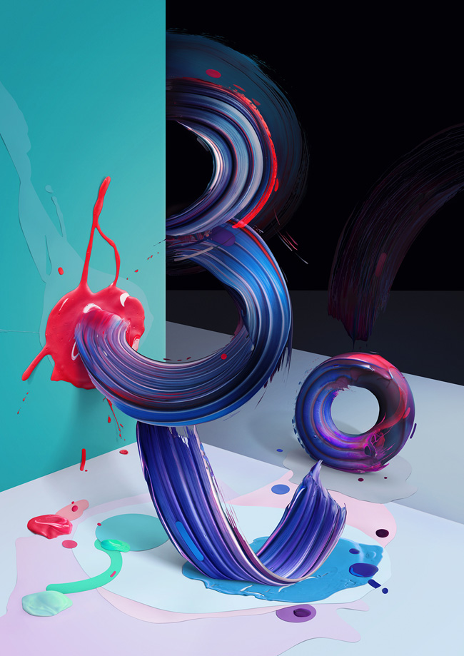
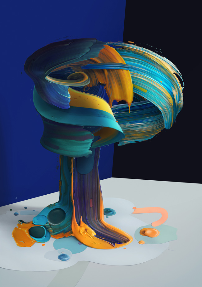
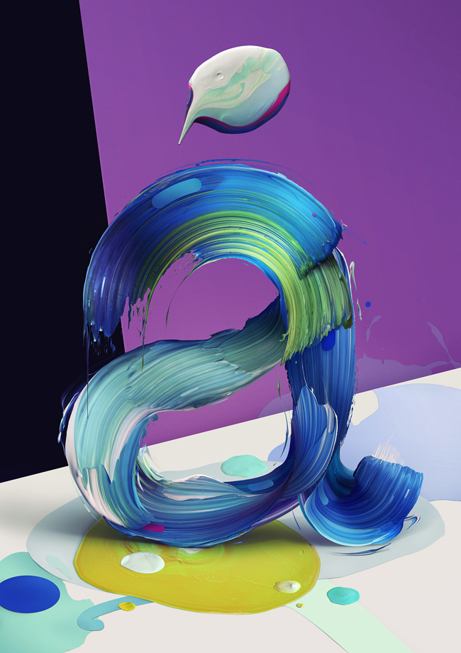
Well-known digital artist and graphic designer from Warsaw - Pawel Nolbert presents a series of posters exploring form and rhytm of letters or pseudo-letters presented as half-realistic, half-illustrative figurative sculptures. The artworks were built from an elaborate artistic painterly gestures into expressive arrangements – extending the aesthetic characteristic of typography.
