Erik Wernquist – Wanderers

Erik Wernquist is a character animator and a Visual Effects and Graphical Artist living in Stockholm, Sweden. His latest short movie entitled Wanderers is simply mind-blowing. Based on real photos and map data, we traveled through space discovering our ambition of humanity expansion. Check out Erik’s work erikwernquist.com. http://vimeo.com/108650530

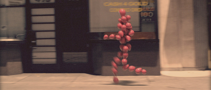
Air Surfing in New York

Creative directors Raul Mandru and Mihai Botarel, founders of Raul X Mihai, made the piece as an independent project. For their floating surfboard effect they used a special stand that allowed them to keep the original shadows. After each surfboard image, they shot a second photo of the street and removed the stand for the final cut.

http://vimeo.com/110802755

Sainsbury's Christmas 2014

Just in time of celebrating the 100th Anniversary of The First World War, UK largest retail chain Sainsbury released its beautiful cinematography aimed to remember people about peace. It's totally sick that we still don't have it on Earth.

http://www.youtube.com/watch?v=NWF2JBb1bvM

Paris / New York

"Paris & NY, like many large cities, have a lot in common ; transport, infrastructure, national monuments. I wanted to explore not only these comparisons but also the differences, in order to expose the beauty and individuality of each. What you cannot deny is the vibrancy and explosion of character each city has and I thought split-screen with timelapse would be a good way to help convey this." says director Franck Matellini.

http://vimeo.com/108552265

Montserrat

"This is a tribute film to the amazing Montserrat typeface, recently designed by Julieta Ulanovsky. A tribute, also, to the Montserrat neighbourhood in Buenos Aires, which inspired the font. An finally a tribute to Jorge Luis Borges. The text is an extract from his wonderful poem Break Of Day (Amanecer) from the book Fervor de Buenos Aires (1923)."

Direction, design, animation: Fernando Lazzari http://www.popscience.tv/ Director of Photography: Matías Nicolás Music: Brian Eno / Black Planet Sound Design: Andrea Damiano Plataforma Buenos Aires, Carolina Tobal

http://vimeo.com/79733436

Inside Me by Dmitry Zakharov

Cologne-based visual artist Dmitry Zakharov released a pretty awesome animation "Inside Me".

inside-me-zakharov1

inside-me-zakharov2

inside-me-zakharov3

inside-me-zakharov4

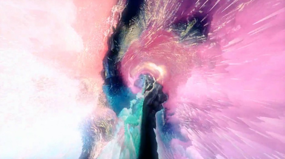
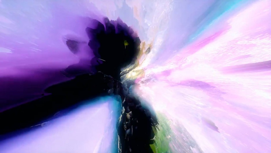
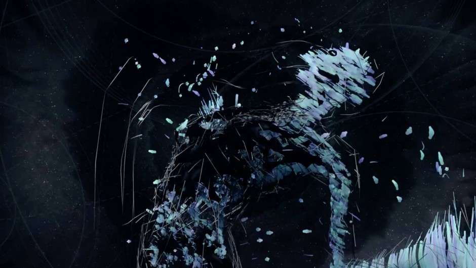
"This project is based on a 3D-scan technique, which allows me to reproduce an image of my own body as a 3D object in a software. It is possible to view this object not just from outside, but also from the inside as a negative as well, which creates abstract shapes.

The coloration was generated with the help of colour data I took from a real picture. The film reflects the invisible inner world of an individual, which owns a small universe in itself, created by experiences and feelings - as well in the digital world as in real life. We try to express ourselves and approach our world another being, but still, nobody can see in our souls entirely.

For me, the process of scanning is a very important part of this work itself. The idea of digitising a body and hence the creation and deformation of its computer generated self, reflects the digital world we live in today. We create an alternative world, in which everybody can be what they want to be. In some way, it resembles to an act of creation. We never stop building more worlds for ourselves, even though there are already various ones encircling us, that we don't even understand yet.

Each universe encloses another, which creates a new one, and the world next to us still seems far away. And so we look into infinity again, which inevitably surrounds us."

http://vimeo.com/106671329

My Big Brother

Jason Rayner is a skilled American animator. He drew since he was a child, started to learn 3D animatin at eleven and finally decided to do this job after seing the bonus features of pixar’s Monsters, Inc. In his latest cool short movie entitled My Big Brother, we follow a young kid’s struggle about his big brother who is literally big. via Whitezine

http://vimeo.com/103437078

Food in 60 seconds

You have never seen food motion video like this. The team of Food Film directors Michael Roulier and Philippe Lhomme together with food stylists Emmanuel Turiot and Gilles Poidevin created a short spot for Marks & Spenser Food. Don't forget to check their portfolio, especially if you work with food photography, pretty awesome examples over there www.foodfilm.fr

http://vimeo.com/105039041

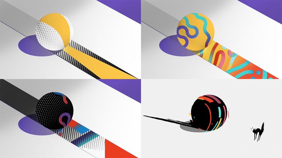
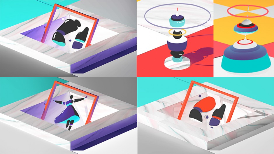
#OFFFSPB Main Titles by The Mill

This weekend we've experienced the first ever Russian OFFF on Tour in St.Petersburg - #OFFFSPB baked by IKRA School and a lot of partners worth to see on official website. Same time Designcollector was happy to held an exhibition of The Digital Decade winners and enjoyed the whole festival including the exclusive preview of the Official OFFFSPB Main Titles created and presented by The Mill magicians. Please enjoy it below and stay tuned with the next OFFF happening around you.

According to "the behind the scenes" the whole video is made using motion capture from professional dancers, watercolour and oil suspensions reactions and etc. Analog vs digital.

offfspb-titles-7

offfspb-titles-1

offfspb-titles-2

offfspb-titles-3

offfspb-titles-4

offfspb-titles-5

offfspb-titles-6

http://vimeo.com/100024795

Traveling Lights

As many other creative studios "We Think Things" has a lot of "geometric leftovers" after branding brainstorms spreading across the computer' disks , and one day guys eventually did a nice shape animation.

We liked the idea of combining simple shapes and then creating a completely new context, only by excluding intersecting shape areas.

In our case – a circle and a triangle became the snowy top of a mountain in front of the sun. With this picture in mind we started developing a minimalistic world, brought to life by the use of ambient noise and a haunting minimalistic score

http://vimeo.com/95943971

VAL

From February 15, 2013 to February 15 of this year, designer Simon Graham documented his life—first-person style—with his phone. Val, the name of Graham's resulting documentary, comes from both the artist’s mother’s and son’s full names. It serves as a commemoration to both Valerie Sheppard and Leonard Valentino Graham, who passed away and were born, respectively, in Graham’s single year of documentation. In Graham’s own words, he felt the name “truly represents this crazy circle of life” we live in.

Being a fan of documenting every day a second I am completely interested in the way Graham did his video. All the photos are hand stabilised and taken as a batch using iPhone.

val-3

val-2

val-1

http://vimeo.com/90479247

Wes Anderson Centred

I have not watched much of Wes Anderson films, but in Grand Hotel Budapest I was really impressed by the quality of each frame, colour and the amazing transitions he uses. Few days later I found a video that explained much of Wes' perfectionism - UK based director Kogonada did a nice research for Anderson's love to symmetry and centred composition.

P.s. One can point that Wes was inspired by Stanley Kubrick way of building a frame, so mister Kogonada has also explained master's obsession in a centred composition a year ago here

Walking City

Architecture + Evolution + Movement = Universal Everything Referencing the utopian visions of 1960’s architecture practice Archigram, Walking City is a slowly evolving video sculpture. The language of materials and patterns seen in radical architecture transform as the nomadic city walks endlessly, adapting to the environments she encounters.

http://vimeo.com/85596568