Tag Collective
NY based design studio Tag Collective with a true passion for brand development delivers awesome visual and tactile solutions for local brands.
NY based design studio Tag Collective with a true passion for brand development delivers awesome visual and tactile solutions for local brands.
The history of Sony Music is charted in a typographic timeline installed in the company's London HQ, created by designer Alex Fowkes. The huge wall graphic features the names of nearly 1,000 artists signed to the major label and its affiliates, beginning with the foundation of Columbia Phonograph Company in 1887, to recent signings Post War Years and A$AP Rocky. The Sony Music Timeline celebrates 125 years of musical history covering almost 150 square meters of wall space in Sony’s Derry Street headquarters. Using just CNC cut vinyl as the sole medium, 54 columns measuring over 2 meters tall cover feature nearly 1000 of Sony Music's signed artists from 1887 to the present day.
Emma Pike, VP Industry Relations, who commissioned the piece said, “The brief was to bring the inspiration of our music into the heart of our building and make our office space live and breathe our incredible musical legacy. Alex’s beautiful graphics and illustrations do exactly that.”
More images on http://www.behance.net/gallery/Sony-Music-Timeline/5555472


http://vimeo.com/51460511
http://vimeo.com/51451449
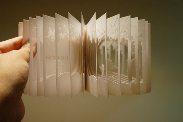
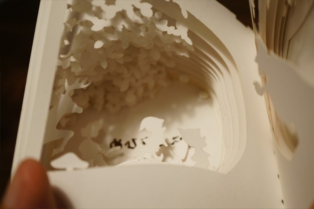
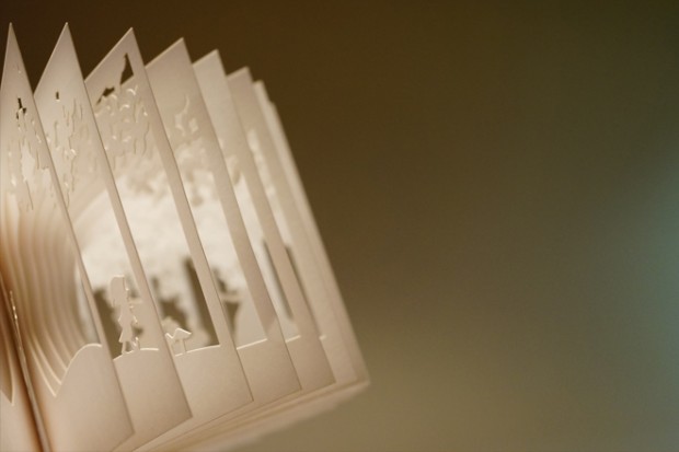
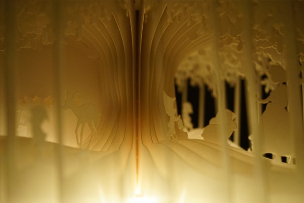
At first glance a traditional-looking palm-sized volume, 360° Book by Yusuke Ono (Noiz Architects partner) opens full-circle, transforming into a modern diorama. The book was the winner of the You Fab 2012 laser cutter design contest, based in Tokyo. Speaking about the project Yusuke said, "I am so thrilled to have been selected as the winner of the Free Fab category for You Fab 2012. I like finding new ways to express dimension, and it occurred to me to create this palm-sized book that opens out to form a 3D world. I hope that everyone who opens the book enjoys it and is surprised by the dramatic transformation."



Yes, I was also looking for a video :)
Young photo-magician from Chicago shares his internal world of illusions mainly surreal - http://kylethompsonphotography.com/
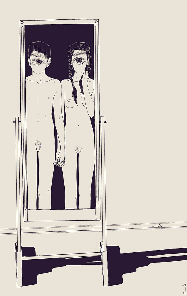
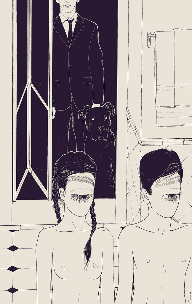
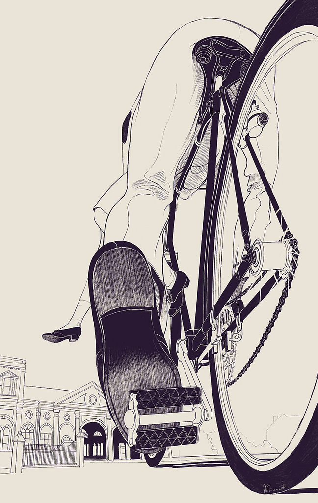
Gifted Russian illustrator from Barcelona - Anton Marrast (store) shows a part of upcoming series "Slow Story" basing on a personal stories






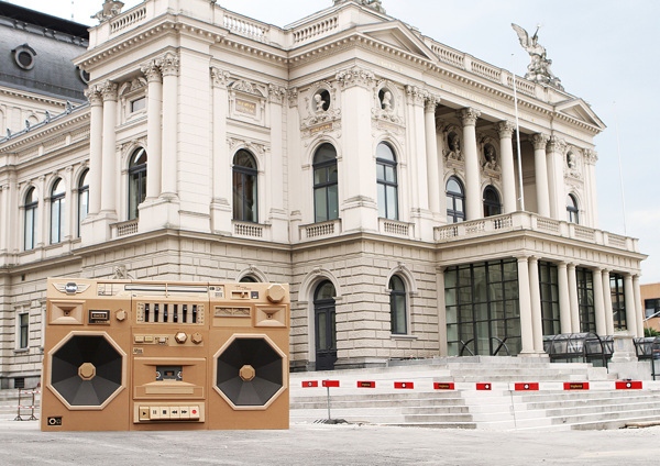
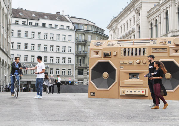
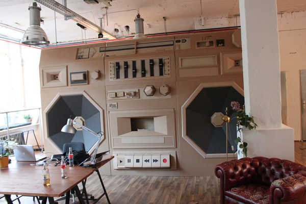
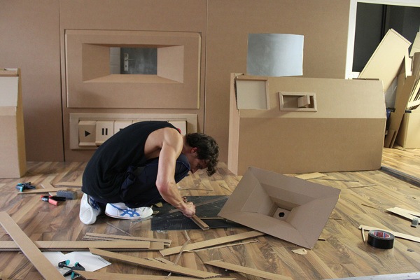
Cardboard promotion for the International Radio Festival 2012 in Zurich / Switzerland created by Bartek Elsner (check his folio for other cardboard installations and sculptures) for Draftfcb/Lowe Group, client MINI Schweiz.




Artist Conor Harrington uses faith and glory as a subject and walls and facades as a canvas - awesome mix of painting and graffiti
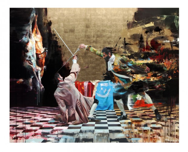

http://vimeo.com/51590457
We are pleased to present "Exhale", a series of new paintings by Melbourne-based artist Jeremy Geddes. We posted him few times but he did few new works since than. "Exhale" is a series of 17 paintings rendered in meticulous detail, an arduous process that combines scrupulous observation, fine brushwork and delicate layers of glaze. Geddes’ work generates a tension between man-made environments in flux and the fragility of living bodies.
Stranger & Stranger is a packaging design and branding company specialising in alcoholic drinks. They create over 100 drinks brands every year in markets all around the world. You can stick to the screen now, exploring some awesome picks in the post or later revealing the very best examples on their website http://www.strangerandstranger.com/
A short animated film about the other side. Created by Alex Gee & Pujesh Joshi as graduation project at Queensland College of Art in 2011.
http://vimeo.com/50742359
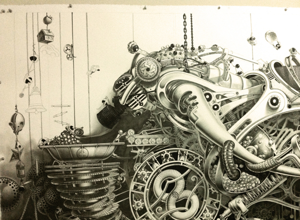
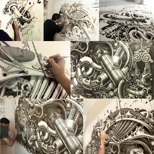
Samuel Gomez is working on a 1.5 x 2.2 m drawing made with graphite and ink on paper. It is the first image from a series entitled “Deadpan Comedy.”

Filmmaker Charles Lanceplaine went on a skate trip to Ordos, a test-tube city located in the remote area of Inner Mongolia. Dubbed “the Dubai of northern China” the city is crammed full of buildings, which seem to be built for the sole purpose of being skated on. Considering Ordos is designed to house a millions of people, but is actually inhabited by merely a few millions just adds to that feeling. Directed, filmed & edited by: Charles Lanceplaine Additional filming: Patrik Wallner & Tommy Zhao
http://vimeo.com/51333291
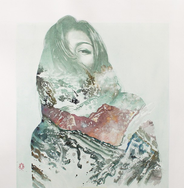
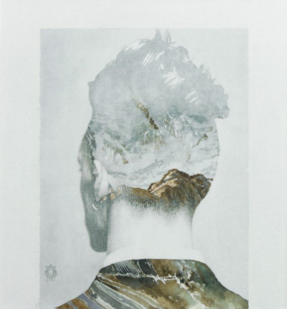
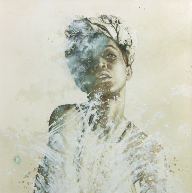
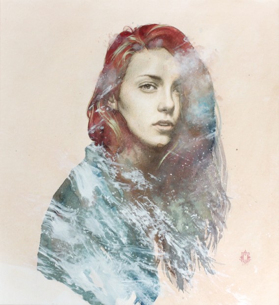
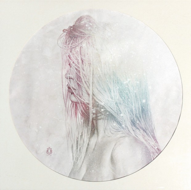
When looking at Oriol' artwork it is hard to recognize the material illustration did with no digital instruments and still looking like a sort of photography experiments. That what has caught my attention in Blendscapes series. Once I set up my Waterfall House I'd definitely buy few works of Oriol Angrill


http://www.youtube.com/watch?feature=player_embedded&v=W5NjjhTv0Lk
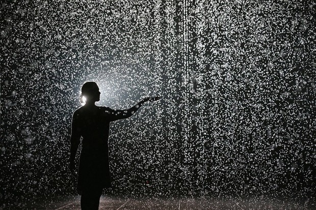
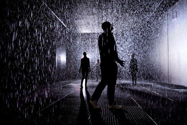
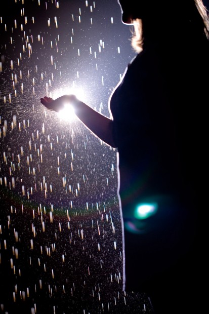
Barbican's Rain Room: it's raining, but you won't get wet.Architecture and design critic Oliver Wainwright steps into the Rain Room, a technical wonder by contemporary art studio rAndom International. The free installation, which runs at the Curve at the Barbican in London from 4 October until 3 March 2013, uses 2,500 litres of water, falling at 1,000 litres per minute
http://vimeo.com/50900861
http://vimeo.com/50987695
Photographies courtesy by Felix Clay via Oliver Wainwright from Guardian
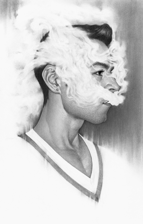
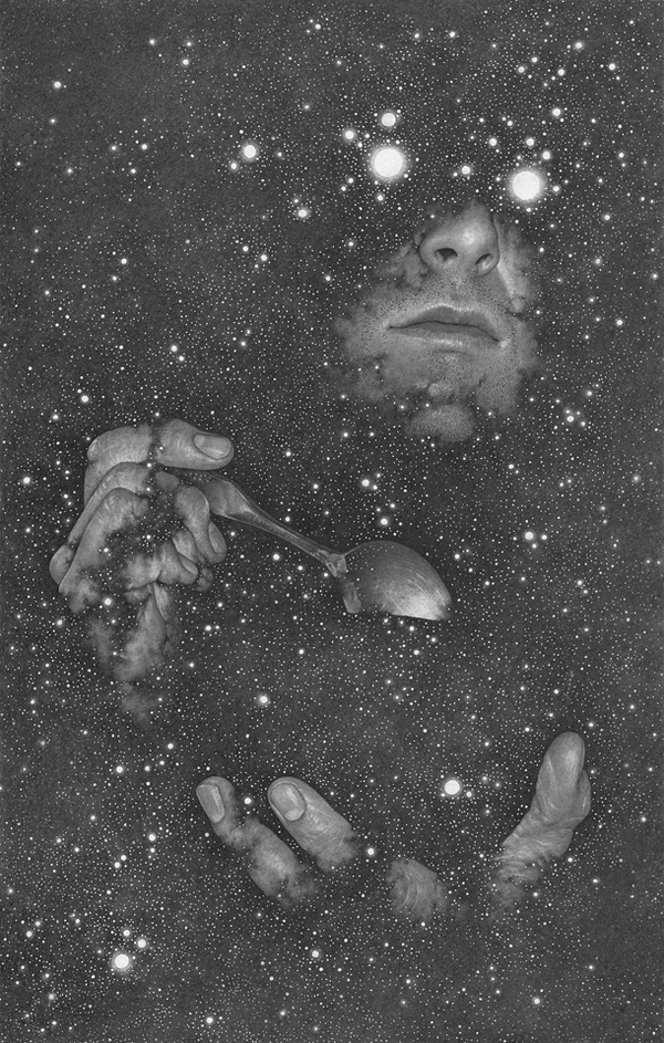
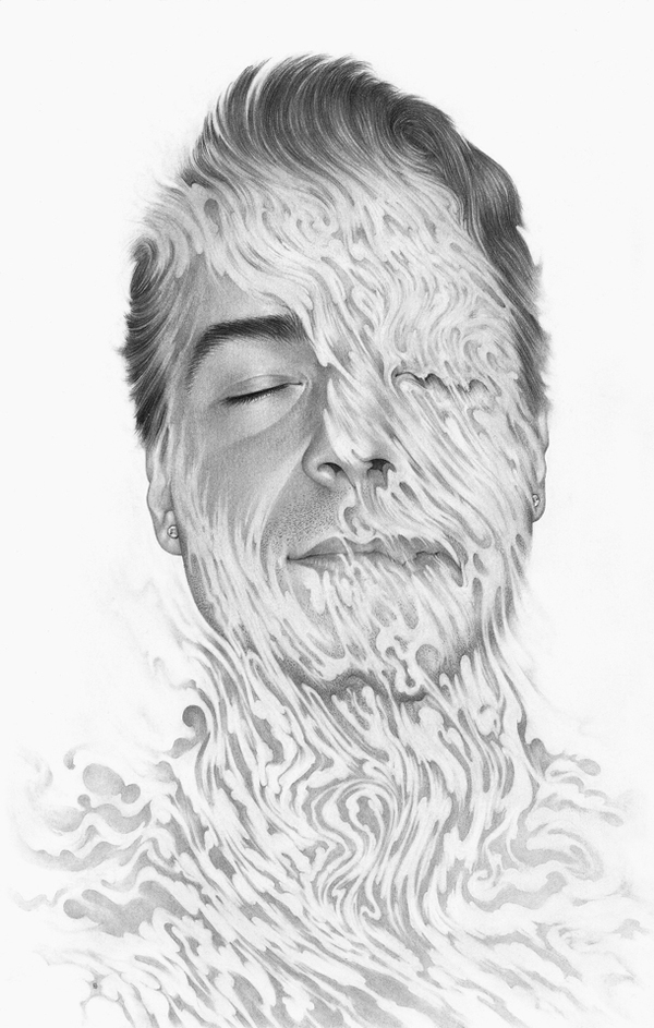
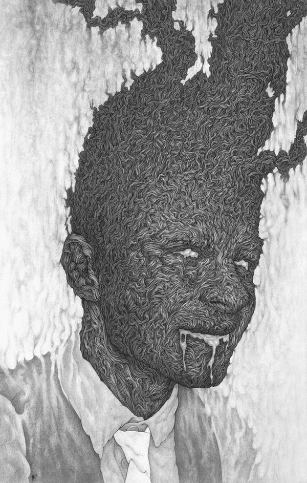
Talented artist Boris Pelcer from American Moscow city attracted us with his latest pencil works available for admiration and purchase

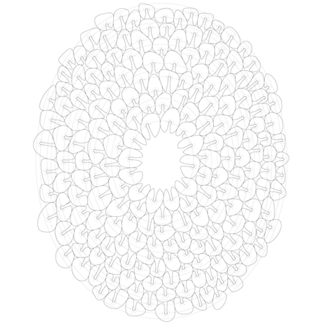
I am so happy that a friend of mine talented spatial designer Anna Neklesa is visiting a lecture of multi-talented British designer Thomas Heatherwick in London today. We faced the work of Thomas once when spoke about new Routmaster Bus. This time we will take a look at his latest contribution to the Olympic that shifted the image of the Olympic Fire - London 2012 Cauldron.
I can refer you to read more about the making of cauldron on Dezeen but please watch the film before this.
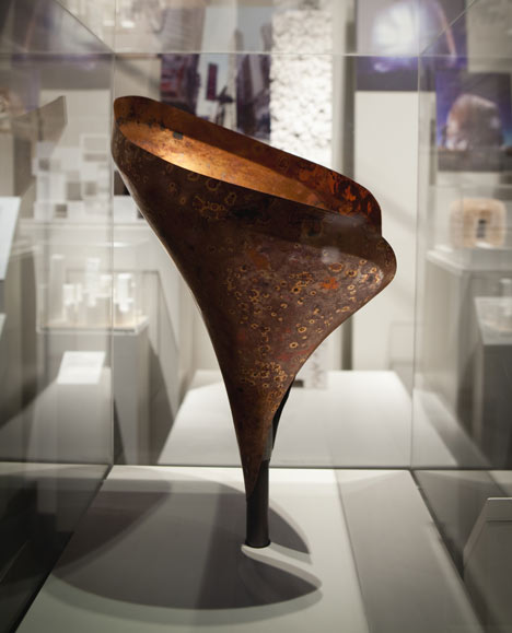


http://vimeo.com/50070330
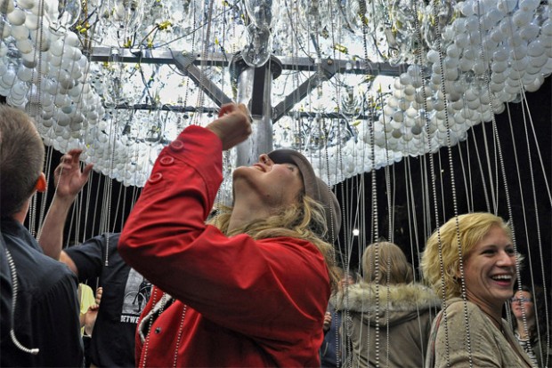
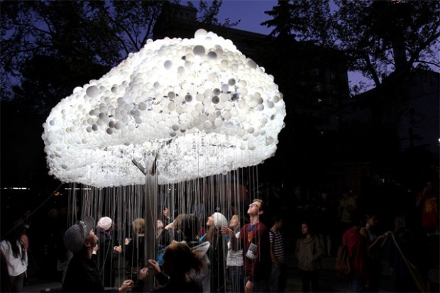
"CLOUD is a large scale interactive installation by artist Caitlind r.c. Brown that appeared September 15th as part of Nuit Blanche Calgary in Alberta, Canada. The piece is made from 1,000 working lightbulbs on pullchains and an additional 5,000 made from donated burnt out lights donated by the public." via Colossal


http://vimeo.com/49748983
Guru of stop-motion, master of illusions made from obvious objects - Mr. PES was commissioned by Academy Films to create this awesome short animation. http://www.youtube.com/watch?v=AK18bdUEWSs
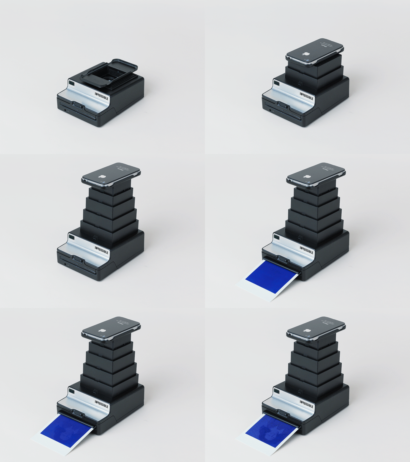
With the love to Instaprint project hence it went unsuccessful on Kickstater we look with a hope on another initiative. It is "The Instant Lab" from The Impossible Project (the guys behind Polaroid and its film resurrection), the mix of instant photography of two decades - analogue and digital or Polaroid Camera and iPhone. Watch it and join on Kickstarter!
