Digital Art of Mateusz Krol
When imagination meets right tools a new design star is born, please welcome Mateusz Krol - very promising digital artist and designer from Warsaw. His profile can be found on Ello as well as on Behance
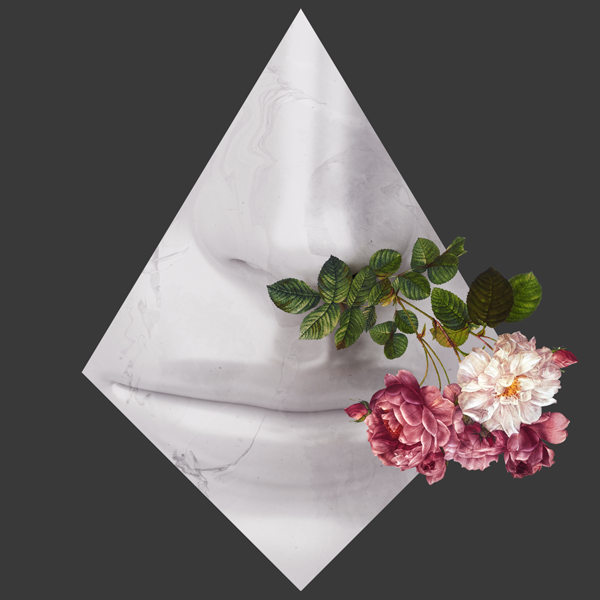
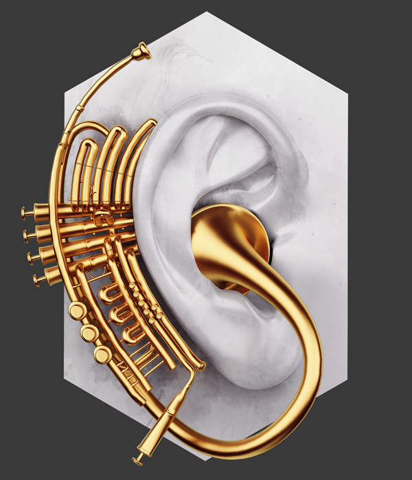
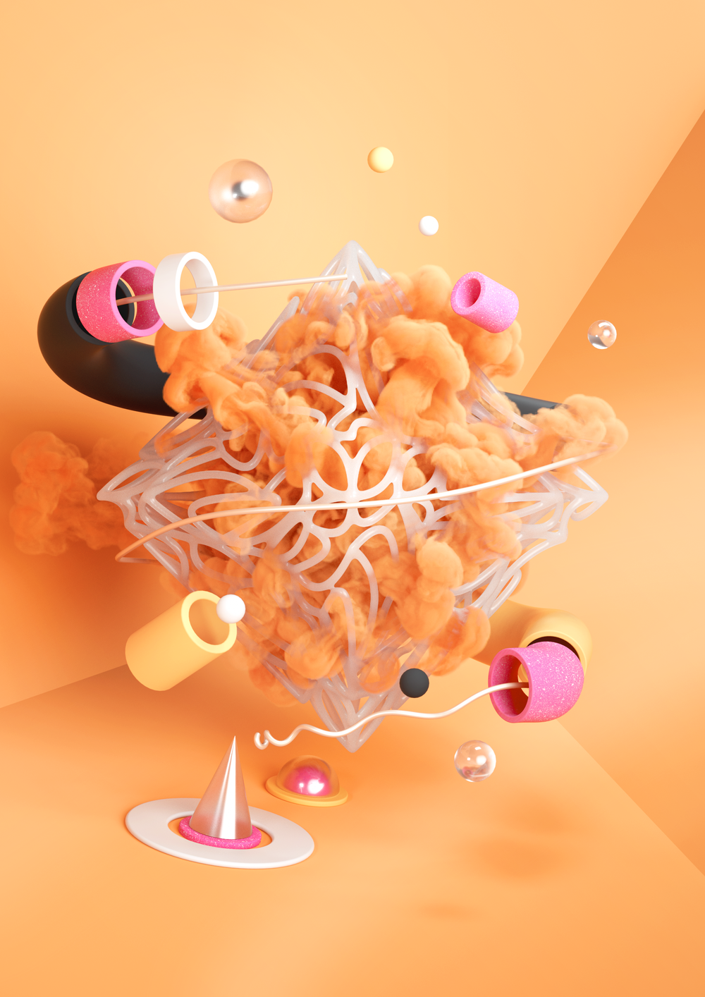
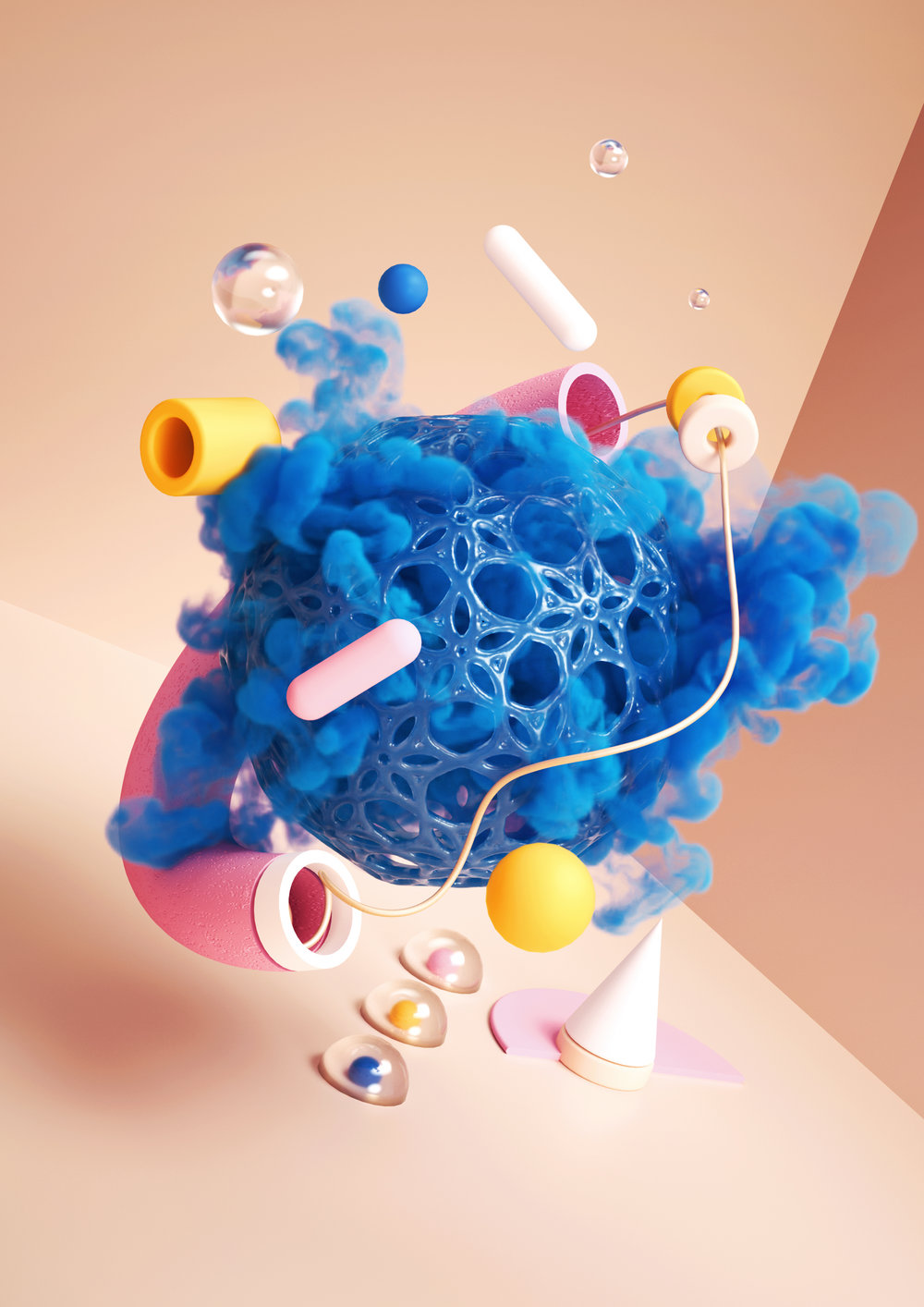
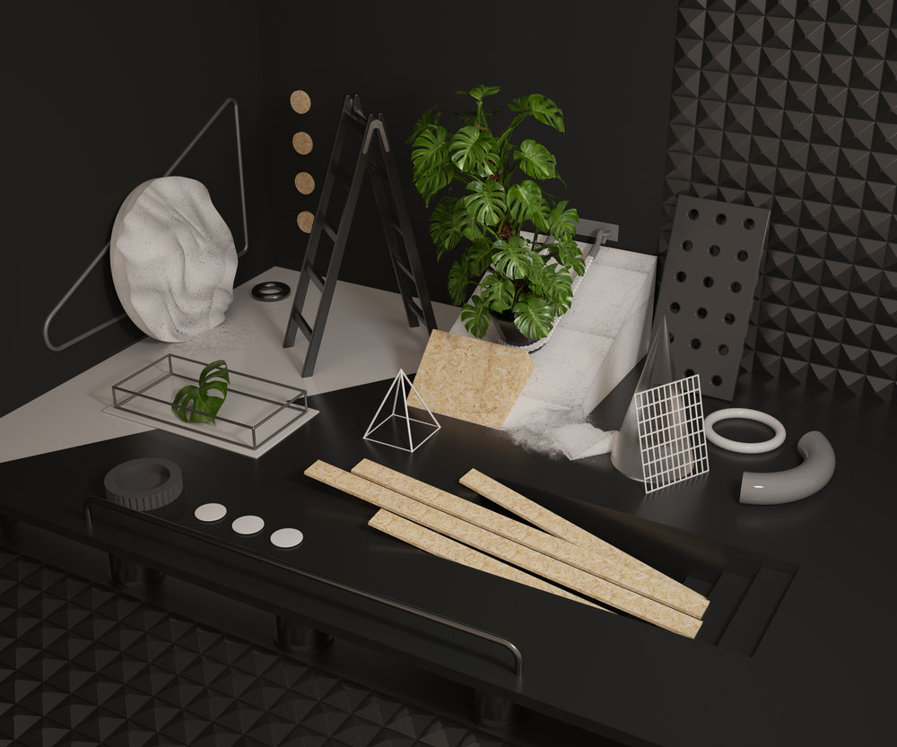
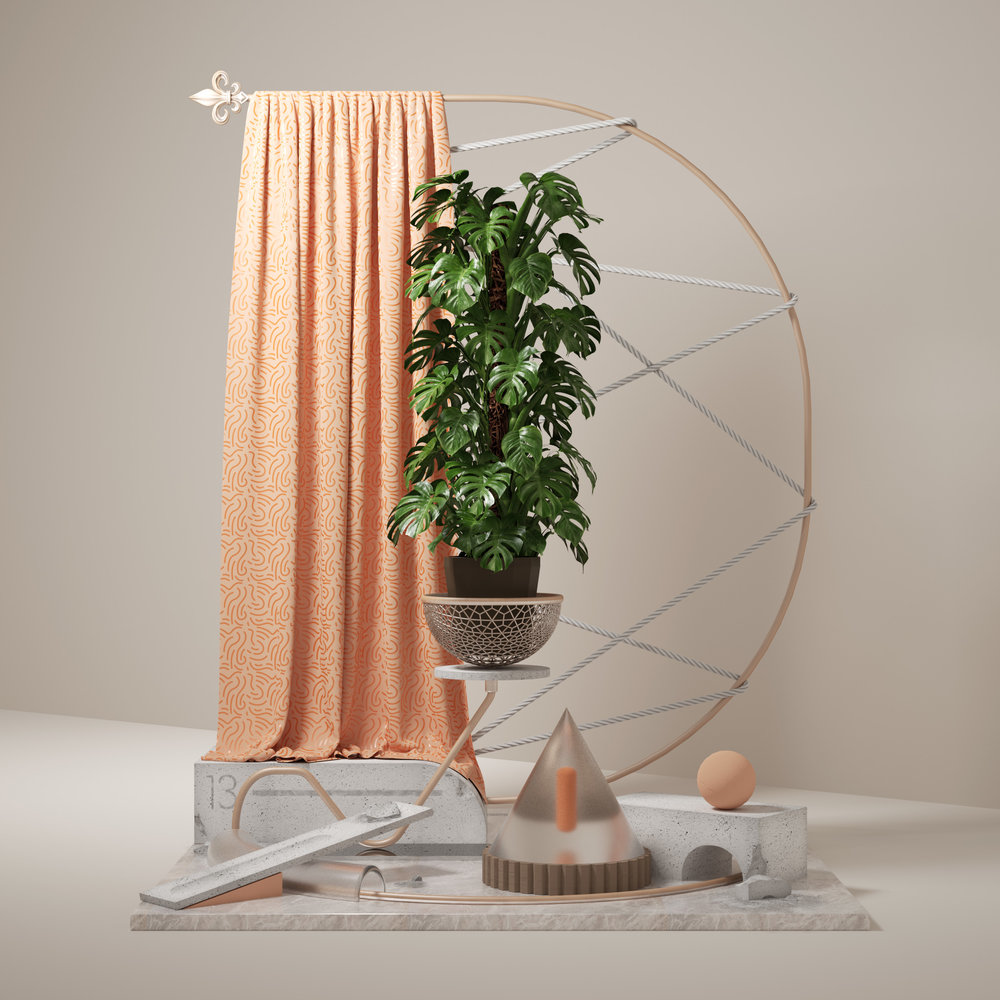
When imagination meets right tools a new design star is born, please welcome Mateusz Krol - very promising digital artist and designer from Warsaw. His profile can be found on Ello as well as on Behance
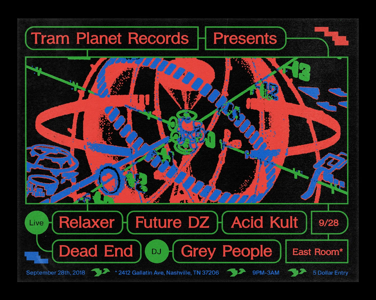
Eva & Marta Yarza are Spanish twins, multidisciplinary designers and artists based
in London. Beside their debut speech at OFFF 2018 they do a lot of graphic design projects worth to dig on their website
The moon landing is one of the greatest milestones in human history. hat if the moon landing wasn’t real? eet Jack Torrance, the man who made it all happen. The Trip is an Instagram interactive storytelling experience that tells his story. Follow his adventure to the dark side of politics and manipulation and learn how surveillance technologies have changed since 1969. The story blends original NASA footage and unclassified FBI documents in an immersive experience. Truth? Lies?
ABOUT THE AUTHORS
The Trip is written and directed by The Kissinger Twins, award-winning director duo, and was inspired by a real-life event. During their holiday on American Samoa, the Kissinger Twins met Jack Torrance, a singular 80-year-old, who claimed that he was the mastermind behind NASA’s moon landing. "Jack finds mobile technology and social media as a threat to privacy, so telling his story via Instagram became a subversive choice. He was initially reluctant, but soon understood that we needed to use the most relevant tools of modern storytelling to amplify his message.”
The Senses: Design Beyond Vision invites visitors to encounter design with all their senses through several interactive installations. Currently on show at the Cooper Hewitt Smithsonian Design Museum, curated by Ellen Lupton & Andrea Lipps, exhibition design by Studio Joseph.
The book is a manifesto celebrating the sensory richness of design. A must-read and powerful reminder to anyone who thinks design is primarily a visual pursuit. Co-published by Princeton Architectural Press and Cooper Hewitt, by Andrea Lipps & Ellen Lupton.
Visual identity and exhibition graphics made for installation at Cooper Hewitt Smithsonian Design Museum, New York City
London-based CG artist Peter Tarka shares his personal visual artworks done in between of heavy commercial projects. In his works he explores the interaction between real and surreal, physical and digital. We'd like to see his work in real made with the help of 3D printers to feel in the full the "phygital" nature of his experiments

It's Monday and time to enjoy your Beautiful Office same ways as fictional character Paul does. He is a creature of SUPERFICTION Studio based in Seoul, that focuses on 'fiction' in the word 'Science Fiction'. They lead a story using the term that means the 'great story' and the ‘real lie’ at the same time.
AWWWWARDS asked Madrid-based TAVO studio to come up with the visuals for festival video openers
“The friends of AWWWARDS called us again, this time it was for the complete creation of the image & identity of the event, both for the web, by the hand of the ADORATORIO STUDIO guys, and for the offline image of the event, print and editorial. The concept of these two conferences, Berlin and San Francisco, was DIGITAL THINKERS. We took care of materializing that concept with an explosion of colors and geometric shapes, making a wink to the banding effect that we have suffered so much digital designers with gradients”
For those of you living in the space, a good half of designers have been busy participating in 36 Days of Type recently run world-wide from Barcelona. We focus on Marv Castillo as he comes up with and idea to focus on "movies" and soft physical Play-Doh when a majority of participants stick to 3D renders.
Every day Artem Matyushkin goes to one exhibition at various New York galleries and designs a poster for each one of them. He says that while he was doing it he realized that the most interesting part about it and also the biggest challenge is finding something in the artists' style that can be translated into graphic design language.


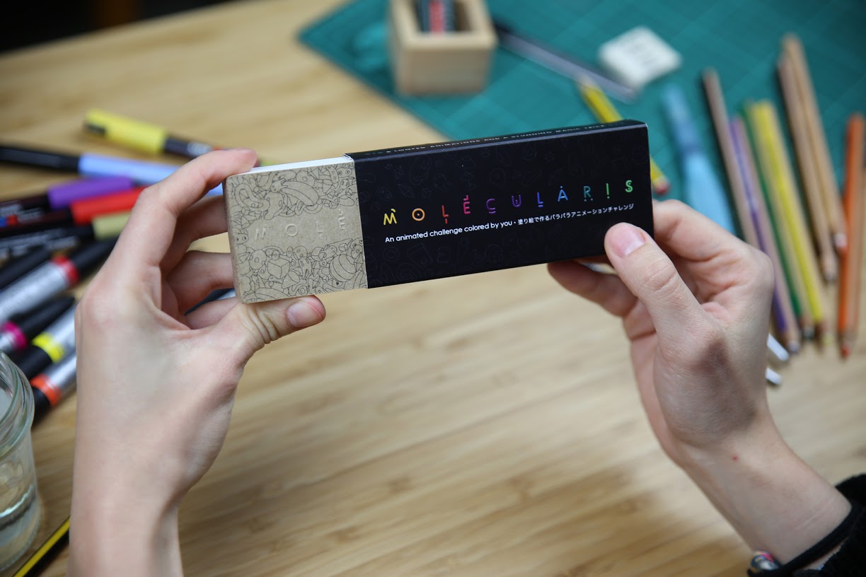
Molecularis is a one-of- a-kind flip book, beautifully presented, which features a series of engaging activities in one. Much more than just a flip book, it is also an animated colouring book, which can be used in a variety of exciting ways – you can color, re-draw and vary its content to produce an endless number of different results. Its high-quality paper allows you to use whichever colouring technique you prefer, such as pencils, markers, watercolours, graphite, brushes or technical pens. Besides, it contains not just two, but six different animated sequences, which can be triggered depending on the position of your thumb. To everyone but the person holding the book, the effect created is one of a sophisticated magic trick.
Flipboku is a flip book publishing project created by animator and designer Jossie Malis, best known for his award-winning animated series “Bendito Machine”, and music composer Julie Reier. Their mutual love of animation, design, and flip books, led them to embark upon this publishing adventure two years ago, after the success of their first flip book created for Bendito Machine. Their mission was to reinvent the flip book, and they combined that with brand new mechanics which are unique to Flipboku. Their mid-term aim is to be able to publish a series of flip books with these special characteristics, whilst maintaining the classic format which has been popular for over 150 years.
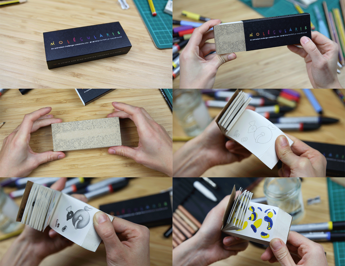
“We wanted to reinvent this almost-forgotten art form by giving it an interactive element. We have a drawer full of ideas for different types of flip books using different mechanics and techniques and our goal is to continue developing them after Molecularis”
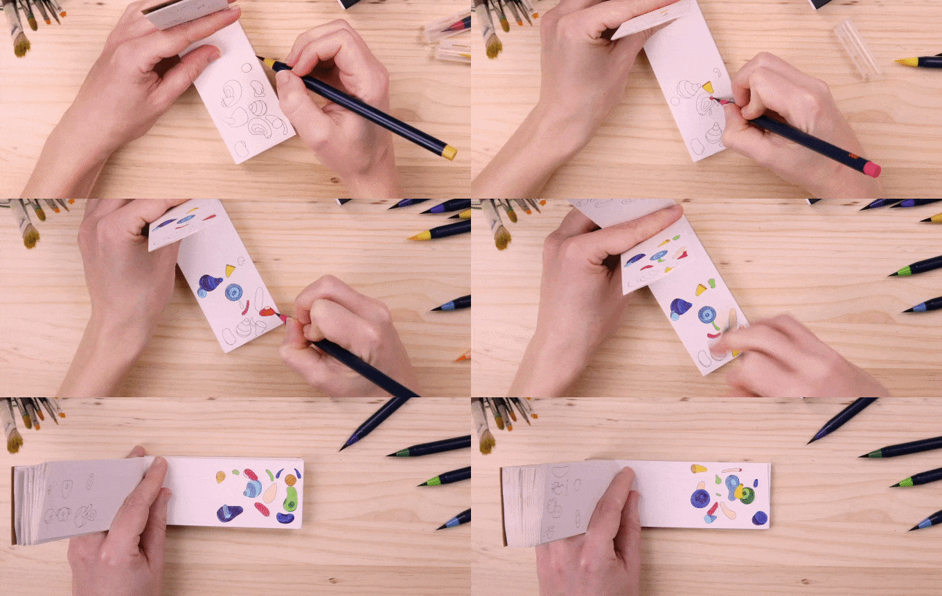
A special cutting technique is required to produce this 6-sequence flipbook and a large part of the production process has to be carried out by hand. This means that the manufacturing process is quite cost-intensive, which is why Flipboku is announcing their crowdfunding campaign, launched on Kickstarter, in order to fund the printing of this creative endeavor.
The team has a target of 40 days in which to achieve their publishing goal of €8000. Molecularis will be available in different combinations, and also as a bundle with “Blanko” - a freestyle animation flip book with blank pages for those inspired to animate on their own. Blanko is a learning flip book which features the basic principles of animation, so even complete beginner can try their hand at this quirky art form. For this campaign Flipboku has partnered with leading British color-makers Winsor&Newton to offer a limited edition reward only available through Kickstarter - offering Molecularis as a special combination with a stunning 12-piece Watercolor Marker Set.

Motion Motion is the first event dedicated to the motion design and meanwhile, opened to all audiences. One day in Nantes (FR) with conferences, installations, workshops and concerts for everyone.
nöbl created the festival 2018 whole identity and craft the trailer by playing with a distorted typography treatment:
As the motion design, the concept of this identity talks about graphic design and movement. We choose to play with the most impactful visual system "typography" and then put it literally in movement.

It's been a while since our friend and partner Alex Frukta (part of Nord Collective) shared new motion works with us. Here is the latest commission he did for Johnson&Johnson. Every year, brand hosts an conference, which brings together employees from all divisions from Russia and CIS countries. It sums up the year and celebrates its end.

Agency: Illuminarium 3000
Producer: Yura Pelin
Design/Motion: Alex Frukta
Audio/Soundesign: Finalsketch, Vasily Filatov

"Relentless with their mission of diffusing emerging music onto the scene, Red Bull launched Red Bull Radio. The web based radio station offers an eclectic programming that also includes interviews with musicians, critics, industry thinkers and music mavens. Recognizing that every show has its own identity, Baillat set a unique tone corresponding to each of their themes. In keeping with the modus operandi of the Baillat's Red Bull campaign concept, the studio called on various local illustrators and graphic designers to unleash a series of animated GIFs. Staying in true form, the results resonated in outstanding, eccentric and upbeat renditions."

"Mathery" is an award-winning Italian studio founded by duo of art directors Erika Zorzi and Matteo Sangalli. The catalysation of their ideas often turns as a long-term collaborations with leading agencies and producers, and even festivals like OFFF Barcelona. For their latest edition Mathery imagined "OFFF" name as abbreviation to "Oysters Flavoured Food Festival" brining the outstanding visuals for the campaign.

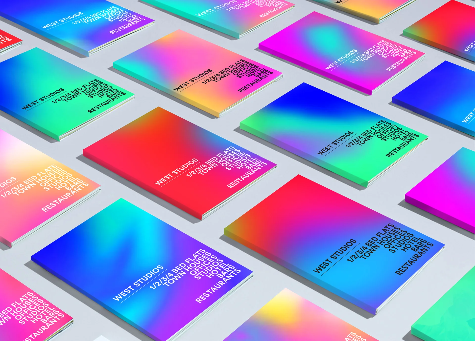
British art director based in Vietnam, Andrew Millington shares the latest branding work he did at Prophet with Hector Pottie for West Studios. This concept was all about transforming the home of British television into a place that people could call their home.


There is no doubt that future is female and bright, and the portfolio of Barcelona-based graphic artist Andrea Robescu you see below is a strong evidence of it. Worth to mention Andrea is a crime partner of our long-term friend Andrei Robu helping him with graphic projects on daily basis
Her art breaks the boundaries of how the body and facial features are illustrated through photography in the fashion industry and by using a more relaxed and fun way of looking at things she expressed and embraced the human sexuality in a playful and empowering way.
Bold colours and abstract shapes play a big part of Andreea’s work. She’s creating powerful visuals using everything from markers to acrylics, pencils and ink, sometimes even her bare hands making the whole process a very personal one. Her energetic illustrations attracted the eye of various global brands and publications.

“This technique of “hide / unveil” is really ideal for me to talk about nudity, sexuality and the body with poetry by ignoring the censorship imposed on social networks. Today, when I build an image, it’s a bit like having to take a challenge! By this I mean that this censorship that Instagram is enforcing is, for me, a kind of wall to brake”

The Brief
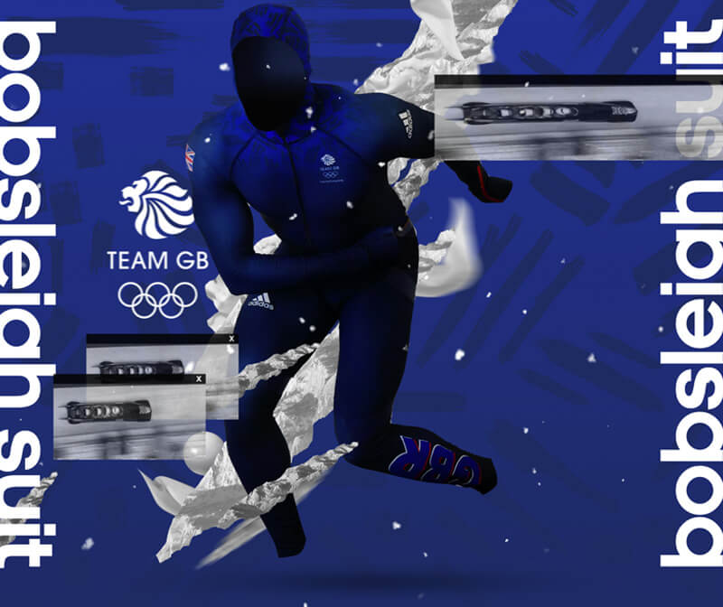
To create the social marketing material for Adidas's officia Winter Olympics Kit launch.
The BLUP way
There aren't many household names who represent GB in the Winter Olympics so there were no sports celebs to base the kit launch around. Thinking The Blup Way we decided to focus on the kit with no model at all giving each piece its own identity through a series of still and motion graphics. The soundtrack we added aims to act like an 'epic' movie trailer in order to create a dark, icy impact.


MAC Cosmetics approached talented "liquid designer" Ruslan Khasanov to create a unique and creative instagram content to highlight brand's lip color products