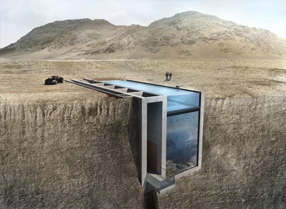
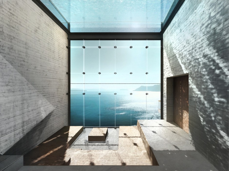
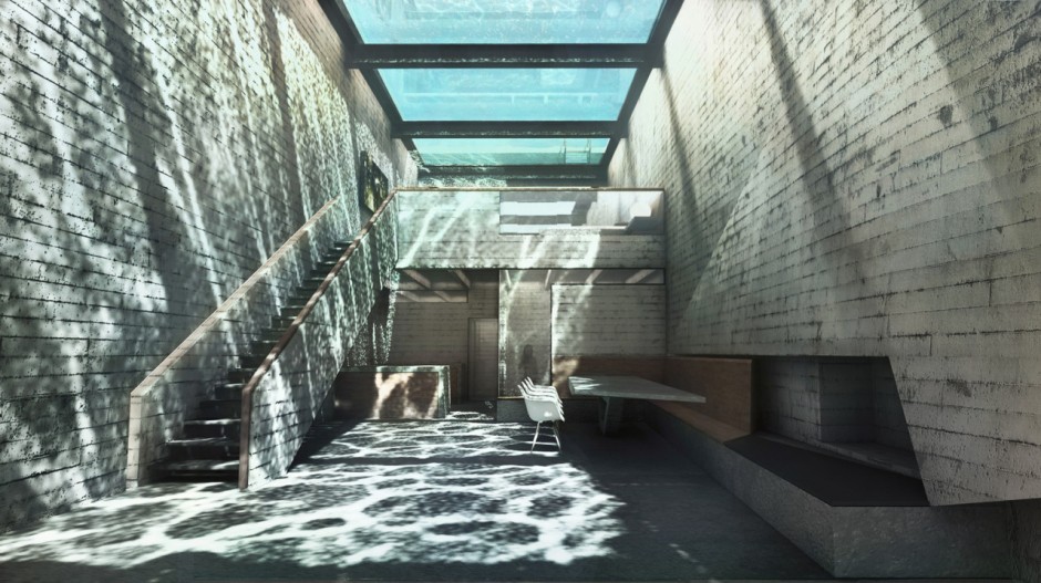
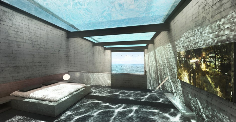
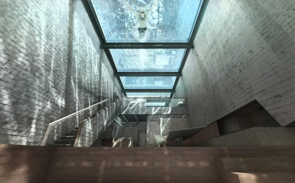
Live on the Edge with OPA’s Casa Brutale

You might remember the cliff-hanging project by Modscape published last year at Top 2014, but here is a new one concept from another studio OPA that will leave your mouth agape. Casa Brutale gives us wall-to-wall water and concrete set into cliffs above the Aegean Sea in what OPA promises will be a literally ground-breaking development.

opa-casa-brutale1

opa-casa-brutale2

opa-casa-brutale3

opa-casa-brutale4

opa-casa-brutale5

The Sound of Taste

"A recently released one-minute video called "The Sound of Taste" gives new meaning to the catchphrase "flavor explosion." This slow-motion video by director Chris Cairns (Grey London) was made as a commercial for a U.K. product called Flavour Shots. Rhythmic pyrotechnics send several colorful tons of black peppercorns, cardamom, turmeric, paprika, cumin seeds, coriander, and more soaring upward in great clouds of spicy fireworks." via

Making of

SLOCHE - The First Glitch Drink

Whatever advertising campaign is this I want this SLOCHE drink now. The first Sloche campaign produced by Havas Worldwide Canada marks a strategic shift for Couche-Tard's iconic product. It showcases the brand instead of a particular flavor

sloche1

sloche2

sloche3

sloche4

http://www.youtube.com/watch?v=Pf9WvFTBn28

http://www.youtube.com/watch?v=kVnmmNkPwa4

http://www.youtube.com/watch?v=iw7OH1VmsLg

Behind the scenes http://vimeo.com/130045135

WWF Just

To help spread WWF’s sustainability message in a new way Leo Burnett Sydney helped people rethink how they consume by creating a range products called just. 100% natural and packaged in recycled and biodegradable materials, each was an alternative to a mass-produced product, free from plastic containers. Made available at produce markets, just reminded people that they were already buying many of the ingredients they need to live more sustainably. A dedicated microsite also housed a series of simple and light-hearted ‘how-to’ videos to show how easy it is to use the products while promoting WWF’s core aim of creating a world where humanity and nature live in harmony.

wwf-just-leo-burnett0

wwf-just-leo-burnett1

wwf-just-leo-burnett2

wwf-just-leo-burnett3

wwf-just-leo-burnett6

wwf-just-leo-burnett4

wwf-just-leo-burnett5

http://www.youtube.com/watch?v=3fcrYg5gq7w

More videos on WWF JUST

http://www.youtube.com/watch?v=ejbhu5wAI9w

Urban Walks by Anton&Irene

"There's no other city in the world like New York. We wanted Urban Walks to be the kind of app that would allow visitors and curious locals to see New York the way we do — a city of larger-than-life characters, historical dramas, breathtaking architecture, and rich cultures." says Anton Repponen and Irene Pereyra - former Manhattan agency directors turned Brooklyn hands-on designers under the name "Anton&Irene". The application brought live with the help of Danil Krivoruchko and Hyperboloid team. Read the full case on A&I website or Behance, as well as see a "behind the scene" at Medium

urban-walks4

http://vimeo.com/124487364

urban-walks1

http://vimeo.com/124487605

urban-walks2

http://vimeo.com/124487606

urban-walks3

urban-walks5

urban-walks6

LOST BOY by PostPanic and Ash Thorp

Following in the successful footsteps of Mischa Rozema's SUNDAYS (presented at OFFF 2015), PostPanic Pictures loses no time in revealing the next project in line.LOST BOY is an ambitious sci-fi concept heavily influenced by the American action classics and Japanese samurai films, written and directed by visionary directing duo, Anthony Scott Burns and Ash Thorp (they did OFFF14 Titles last year).

PostPanic Pictures is developing LOST BOY along with its concept short, due for completion early 2016.

SUNDAYS and LOST BOY are only the beginning for PostPanic Pictures. With more films scheduled to be announced over the next few months, we advise you to watch this space. PostPanic Pictures is determined not only to create emotionally and visually memorable stories, but to also bring them to realisation in a fresh, new developmental approach.

lost-boy-postpanic-1

lost-boy-postpanic-2

lost-boy-postpanic-3

lost-boy-postpanic-4

lost-boy-postpanic-5

lost-boy-postpanic-6

lost-boy-postpanic-7

lost-boy-postpanic-8

lost-boy-postpanic-9

lost-boy-postpanic-10

lost-boy-postpanic-11

lost-boy-postpanic-18

SNASK

The first studio to have a rock band on stage during OFFF Festival - SNASK hails from Stockholm. Earlier they claimed to be the first studio to do the world's largest poster ever, SNASK loves to do things by hands. The latest example of it can be seen on Washington Post Magazine’s first Readers’ Favourites Issue released in April. Go dig their portfolio, and enjoy paper noise

snask-studio

snask-1

snask-studio-2

snask-2

snask-3

snask-4

snask-5

Audi - Birth by The Mill+

"Mill+ worked in close collaboration with BBH and Creative Consultant Rupert Sanders to push the boundaries of VFX, creating a fully CG commercial for Audi's 'Birth'. Directed by Mill+'s Andrew Proctor, the film sees Audi's iconic R8 model giving birth to the new sleek RS 3 Sportback in a futuristic and atmospheric birthing chamber. The Mill team of VFX artists carefully crafted the cars and environment entirely in CG to help create a powerful, mechanical and organic spot."

http://vimeo.com/126504539

ALEPH by Analog

Transforming Céline campaign girl Daria Werbowy into a primordial goddess rising from and returning to the earth, the CGI-powered film directed by Analog Studio explores ideas of nature, birth and death.

aleph-analog-daria-werbowy1

"Conceived in collaboration with Warren Du Preez and Nick Thornton Jones for Creative Review’s Annual Creative Awards. The capture side of the project was a one day shoot in Holborn studios London with FBFX Digital scanning, Frank Benhamou styling, Rebecca Louise Law creating floral installations, Raphael Salley on hair direction, and Ninni Nummela on makeup. An original music composition by Salvador Breed and Stijn Van Beek took a couple of weeks, as did the editing by Steve Ackroyd at Final Cut London."

aleph-analog-daria-werbowy2

aleph-analog-daria-werbowy3

aleph-analog-daria-werbowy4

aleph-analog-daria-werbowy5

http://vimeo.com/125678796

Spanish School Design in Valencia by Masquespacio

Masquespacio completed the interior design for 2Day Languages, a Spanish school in Valencia, Spain. The space is developed on an area of 183 square meters and contains three classrooms, a staff room and a lounge. Each of the classrooms and common rooms are a defragmentation from the brand identity of 2Day Languages and also incorporate parts of the Spanish language and the architecture of Valencia. The classrooms were imagined in the three brand colors, which in turn are a representation of the three levels A, B and C established by the Common European Framework of Reference for Languages, here seen as the colors blue, yellow and pink.

By Freshome via Fubiz

masquespacio1

masquespacio2

masquespacio3

masquespacio4

masquespacio5

masquespacio6

masquespacio7

masquespacio8

masquespacio9

masquespacio10

masquespacio11

masquespacio12

masquespacio13

masquespacio14

masquespacio15

masquespacio16

masquespacio17

masquespacio18

masquespacio19

Cheburashkini Brothers Dairy Packaging by Ermolaev Bureau

The family farm of Cheburashkini Brothers is a challenging project for the Russian market. Cheburashkini brothers are real people, who have restored four old farms in an ecologically clean Moscow region, transported highly productive European cow breed, and built up an ultramodern dairy factory. The called award-winning Ermolaev Bureau (Facebook) to create unique visual system for their dairy packaging.

The main idea of packaging design is based on typography, where initial letters of products are central elements of the design. We have designed a display sans-serif typeface with a set of weights, and for the text setting we have used the Cyrillic version of Euclid typeface from Swiss Typefaces.

chebueashkini-ermolaev1

chebueashkini-ermolaev2

chebueashkini-ermolaev3

chebueashkini-ermolaev4

chebueashkini-ermolaev5

chebueashkini-ermolaev6

chebueashkini-ermolaev7

chebueashkini-ermolaev8

chebueashkini-ermolaev9

chebueashkini-ermolaev10

chebueashkini-ermolaev11

chebueashkini-ermolaev12

chebueashkini-ermolaev13

chebueashkini-ermolaev14

chebueashkini-ermolaev15