Serial Cut
The Spanish masters of digital illusions, branding and other visual solutions Serial Cut are back with the brand new website
The Spanish masters of digital illusions, branding and other visual solutions Serial Cut are back with the brand new website
Sagmeister & Walsh created the graphic identity and everything else visual for Frooti, one of the largest and oldest mango juice brands in India.

sagmeister-walsh-frooti-mango1

sagmeister-walsh-frooti-mango2
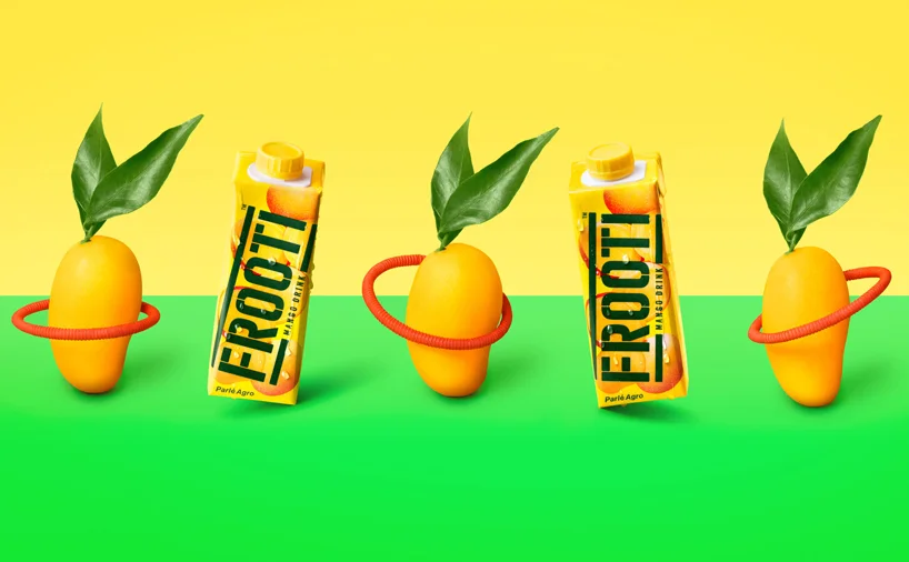
sagmeister-walsh-frooti-mango3

sagmeister-walsh-frooti-mango4

sagmeister-walsh-frooti-mango5

sagmeister-walsh-frooti-mango6

sagmeister-walsh-frooti-mango7
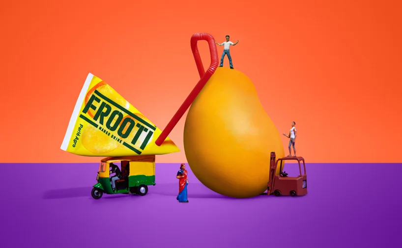
sagmeister-walsh-frooti-mango8

sagmeister-walsh-frooti-mango9

sagmeister-walsh-frooti-mango10

sagmeister-walsh-frooti-mango11

sagmeister-walsh-frooti-mango12

sagmeister-walsh-frooti-mango13
http://vimeo.com/121712272
http://vimeo.com/122351423
http://vimeo.com/123092635
http://vimeo.com/123101124
http://vimeo.com/123130269
http://vimeo.com/123221222
Mischa Rozema and PostPanic Pictures debut film project SUNDAYS completes a first step towards its Feature Film goal with the release of the ambitious proof-of-concept short. Much-anticipated and widely-supported by the international creative community (over 50K US Dollars was donated on Kickstarter alone for the live action filming part in Mexico City), SUNDAYS is directed by Mischa Rozema.Set in Mexico City sometime in the future and starring US actor Brian Petsos and Mexican actress Sofia Sisniega, SUNDAYS is a philosophical science-fiction proof-of-concept short. The end of the world seems like a nightmare to Ben. A memory of a past life that doesn’t belong to him. When Ben starts to remember Isabelle, the only love he’s ever known, he realises she’s missing in his life. An existential descent into confusion and the desperate need to find out the truth begins. This reality depicts a stunning, surprising and dark world. A world that is clearly not his.
http://vimeo.com/122325664
Duffy London did it again, we mean the table or the epic way they think table should look. Last year it was a glass underwater topography map table, now it is a total way different. The UP Balloon Coffee Table cleverly creates the illusion of a glass tabletop supported by 11 helium balloons. Duffy plans to make only 25 tables and they’re available in red, gold, and silver balloons.


"Piter - Moskva", a Russian TV comedy, got new titles created by NORD Collective, featuring lovely typography and retro-soviet movies design
http://vimeo.com/122274704
St.Petersburg branding studio ESKIMO designed a modern face of the B.O.I.D Journal writing about the best worldwide identities and graphic designs.
"Our proposal takes inspiration in the legends of the dragon who guards his jewels in a dark cave. B.O.I.D’s logo is based on traditional European heraldic dragon images but stylised by adding sharp edges and little angularity common for cave stones. The idea of the hidden and guarded gold was implemented by designing triplex business cards (black-gold-black) and small gold accents applied to other mediums using foil block stamping technology. Each new journal project corresponds to a golden coin in the dragon’s treasury."
Moved by color and motion, Psyop and McKinney bring consumers along an epic journey of exploration through bold and beautiful shades from Sherwin Williams’ Emerald Paint Collection. The team looked to fine art for inspiration, drawing from Mark Rothko and Georgia O’Keeffe as inspirations. “What’s important about looking toward these artists in our process is that their art brings to the table another era, another way of thinking about and creating great graphic design,” director Lauren Indovina explains. Thinking differently is just what they did.
http://vimeo.com/121926922
Peak Pictures released a captivating short animation "Isolated" with the next plot: "After finding himself in a wrecked taxi, Evan tries to figure out the pieces of the puzzle, while dealing with a dangerous threat, in a seemingly deserted city." Watch it below
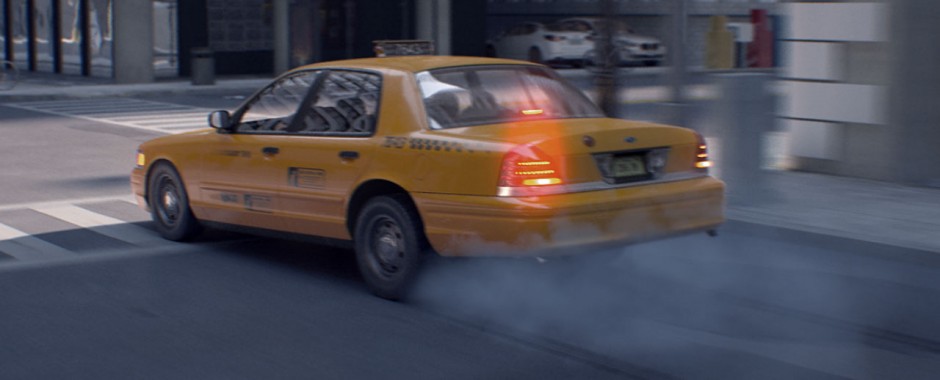
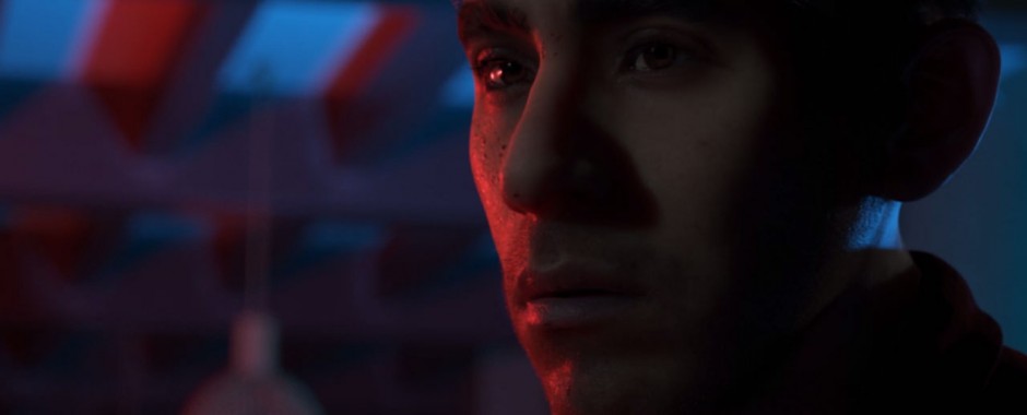
http://vimeo.com/116451815
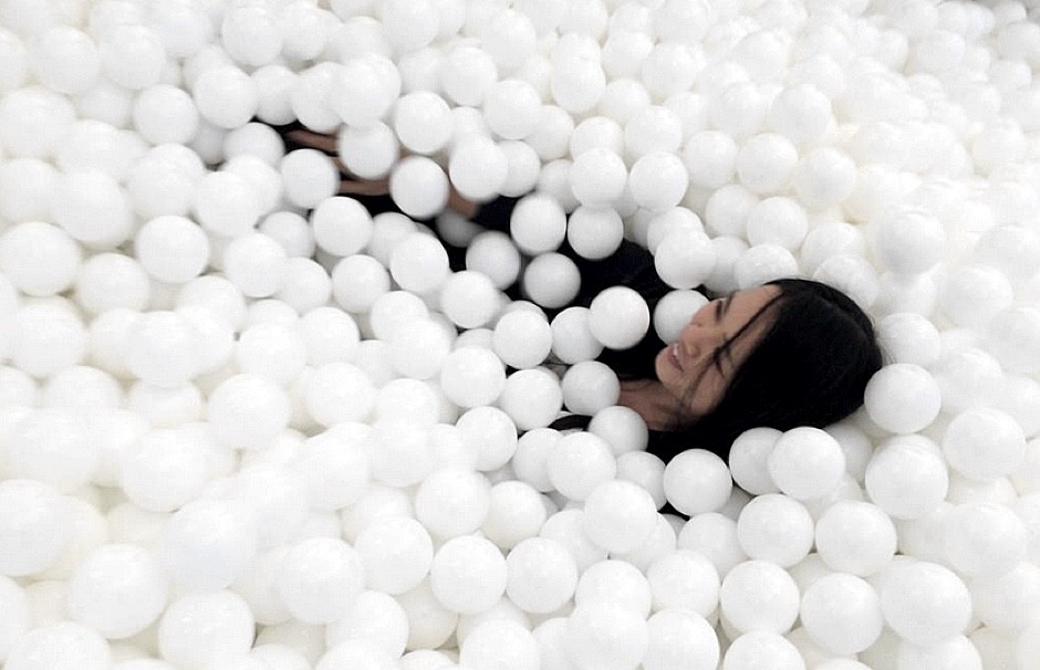
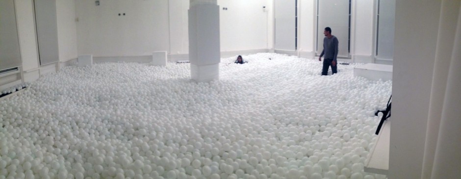
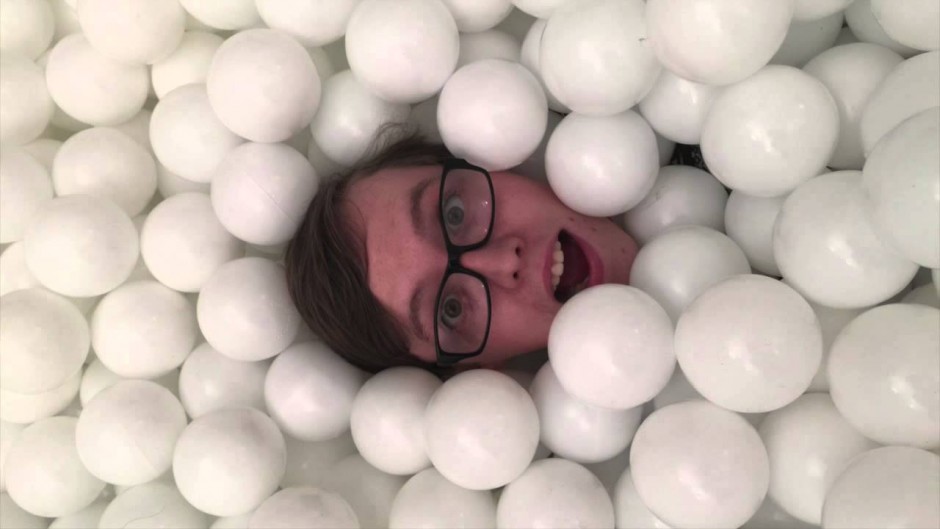
Ever wonder what every office on the planet needs to have? West London studio Pearlfisher has an answer - "Jump In!" they say. Containing 81,000 balls, the 30-person ball pit is meant to “champion the transformative power of joyful play”, and also support children’s charity organisation Right To Play.
In a global economy that bows to profits, deliverables, and bottom lines, creative play in the workplace is often overlooked and undervalued. Karen Welman, the founding creative partner of Pearlfisher, sees Jump In! as an important way for adults to relax, reenergize, and even work better.
“Jump In! helps to promote the idea that play is also important in the work place,” she asserts “and that actually interspersing play into the working day is good for productivity as well as creativity.”
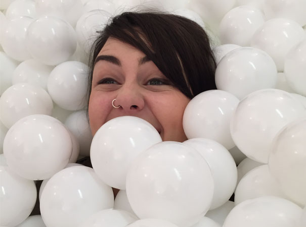
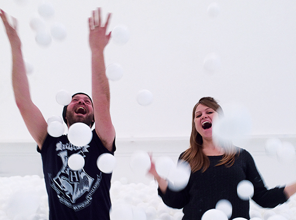
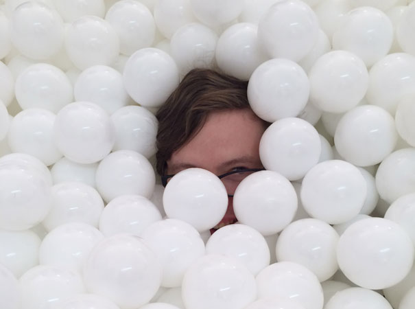
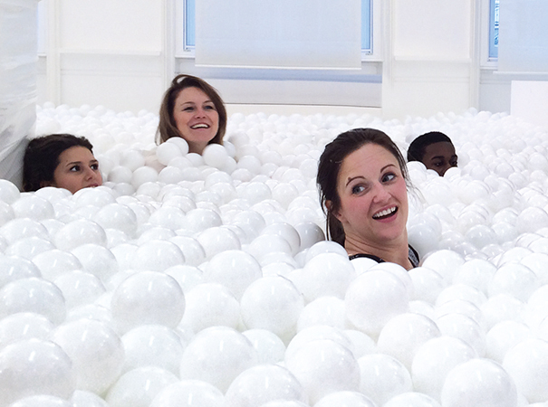
http://www.youtube.com/watch?v=Z67Q0ME6NsA
"Light fears Dark. Dark resents Light. Always at odds. Always in conflict. Pushing borders. Losing ground. Never ending. But what is one without the other? The stronger the light, the darker the shadow." London-based design studio Animade released a lovely animation Chronemics
http://vimeo.com/118801020
The most powerful design mill, or just The Mill released their new showreel of best motion works including Skazka System used for creating OFFFSPB Official Titles last year.Music: 'The Arsonist' by Hatt & Mosely
http://vimeo.com/119953947
Brolly Design have designed Flipboard, a tiny multi-level cafe in Melbourne, Australia. Flipboard Cafe, carved from a lost site in the city, is a tiny multi-level nook that serves fine space with a side of excellent coffee and healthy food. The cafe is nestled in the intersection of an emergency exit from Bennetts Lane Jazz Club below, the thoroughfare to Brolly Studios behind, and a two decade old unused shop-front window.
Mir is a creative studio that specialises in portraying unbuilt architecture. They are dedicated to what they call a Natural Visualisation.
Natural visualisation is our way of honouring each architect and each piece of architecture. Our design process is based on four guiding principles.
Kiev-based design studio ODESD2 creates practical yet awesome pieces of furniture, lighting and decoration (you might remember few from The Cake Cafe interior we posted earlier this year). Check everything they do on odesd2.com.ua
Brutal London is a project of Polish design studio Zupagrafika. A collection of paper cut-out models representing brutalist architecture of London from 1960s-1970s. The series features various buildings scattered around the districts of Camden, Southwark and Tower Hamlet. The `raw concrete` London tour begins with iconic tower blocks (Balfron Tower and Space House), leads through council estates doomed to premature demolition (Robin Hood Gardens and Aylesbury Estate) and concludes with a classic prefab panel block (Ledbury Estate). The collection is made up of five illustrated models to assemble and exhibits all kinds of original details present on the buildings` facades.
"Looking at the visual identity for http://aruliden.com/work/cooklyn, a Brooklyn restaurant specializing in "micro seasonal cuisine," is like wandering into a 19th-century warehouse inhabited by cowboys and cleaned by Mary Poppins." says FastCo, and we can't disagree. This "authentic rustic chic" design system built by Aruliden is something to study or collect as an inspiration for further projects.

Barcelona-based design studio TAVO has updated their portfolio with new showcases. Worth to check them on www.tavo.es
http://vimeo.com/77444617
You may know that a half of success for any design project is its showcase. Another quarter is a story like this: "An old railway station in Los Altos, California, has been transformed into this exquisite new bakery and café by local entrepreneur Rie Rubin, with the help of the creative people at San Francisco-based design agency Character. Named Voyageur du Temps, which means time traveler in French, the café seeks to preserve the time-honoured art of baking by adding a dash of contemporary life to it. Here you will find freshly baked artisan breads and pastries, as well as a variety of courses that give a playful wink to continental breakfast staples like the Croque Monsieur and crepes with fresh fruit."


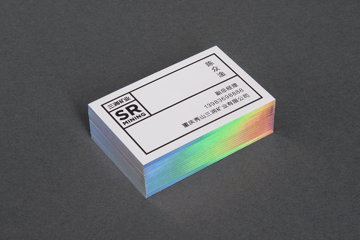
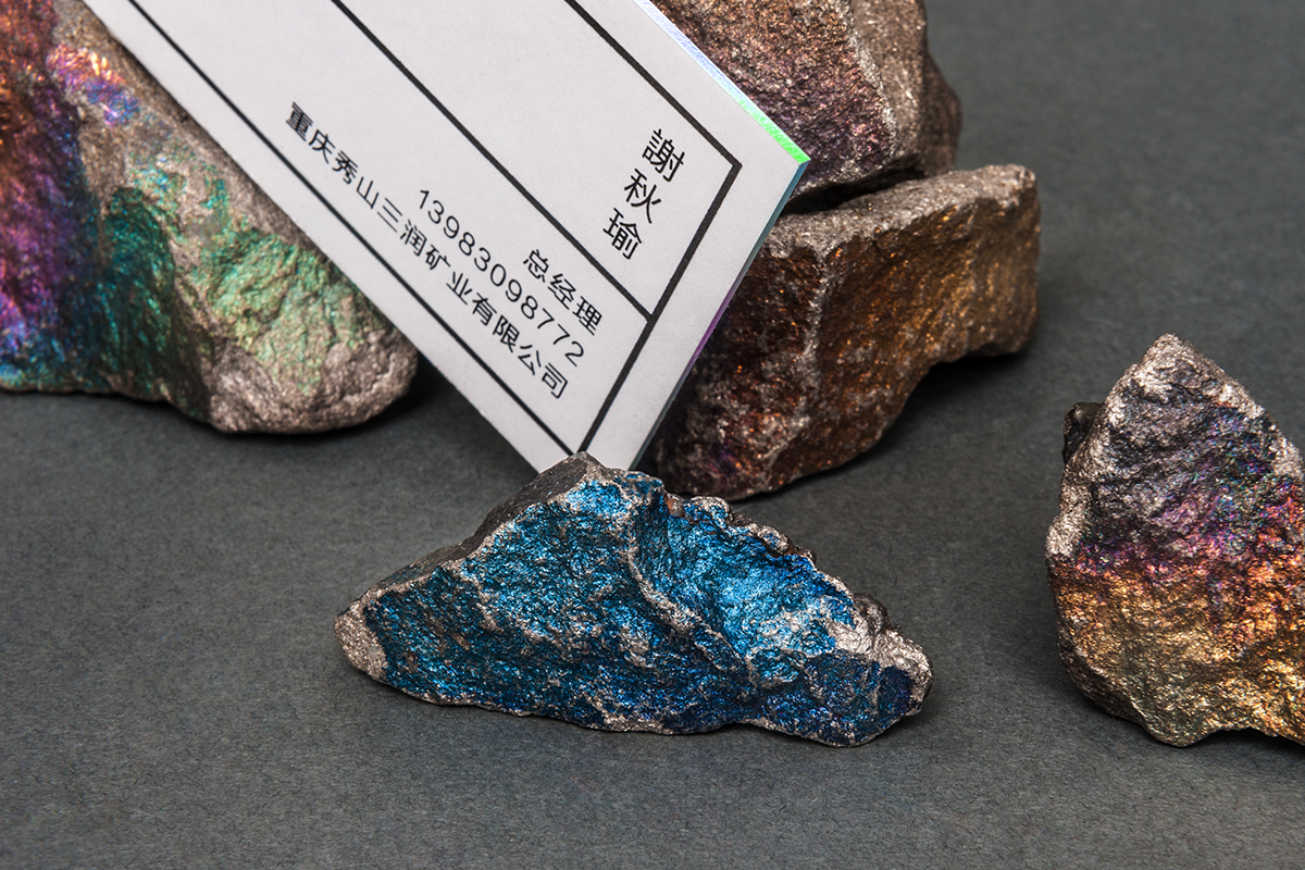
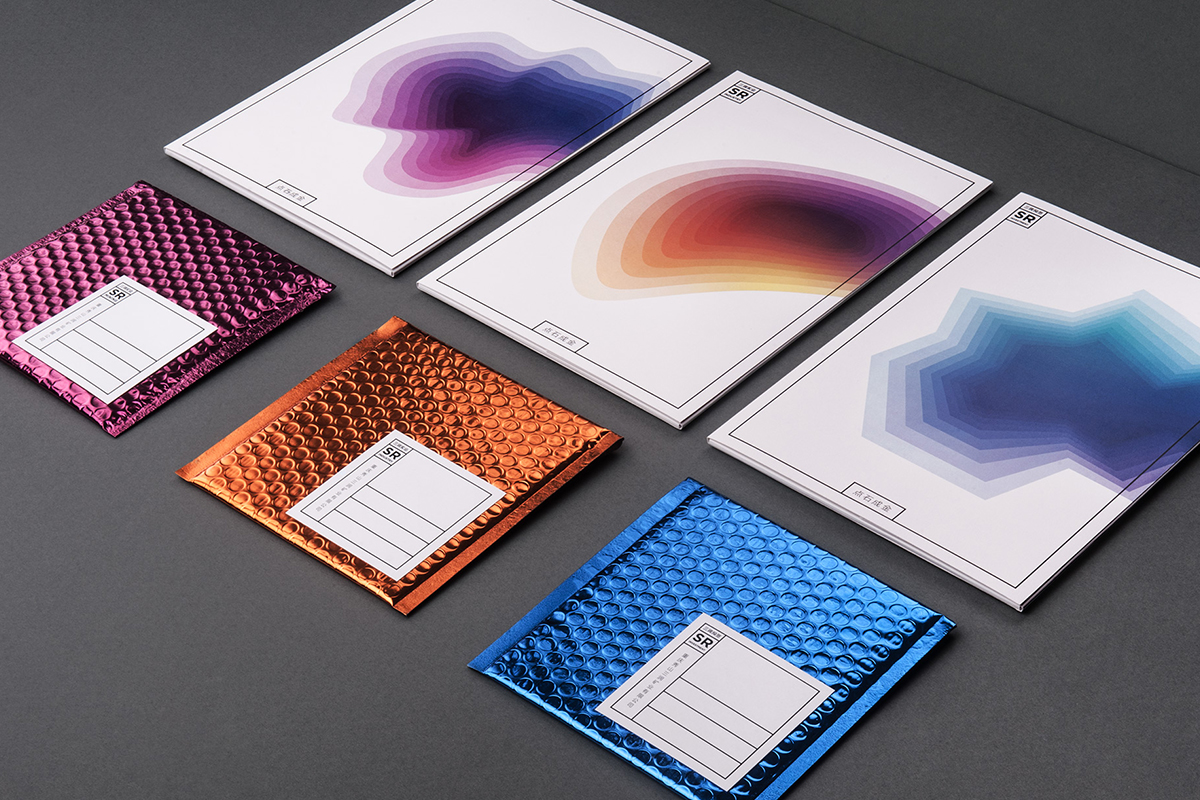
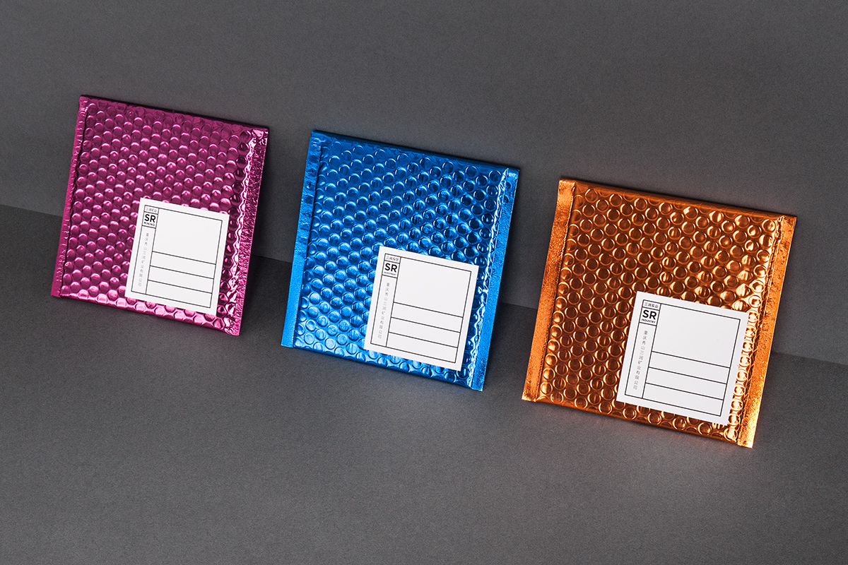
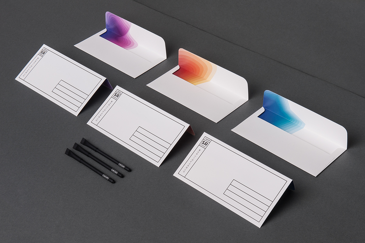
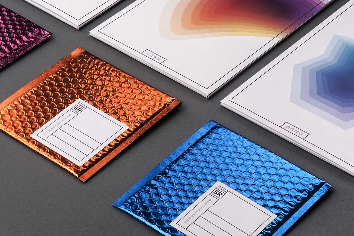
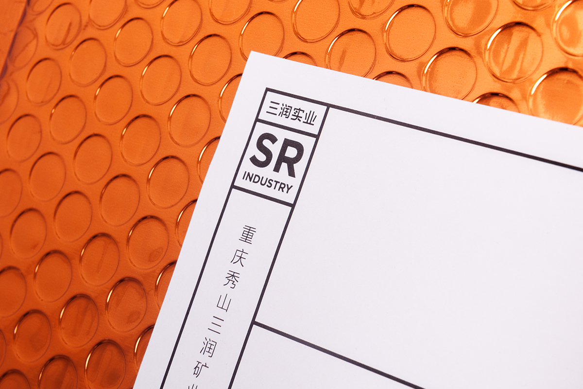
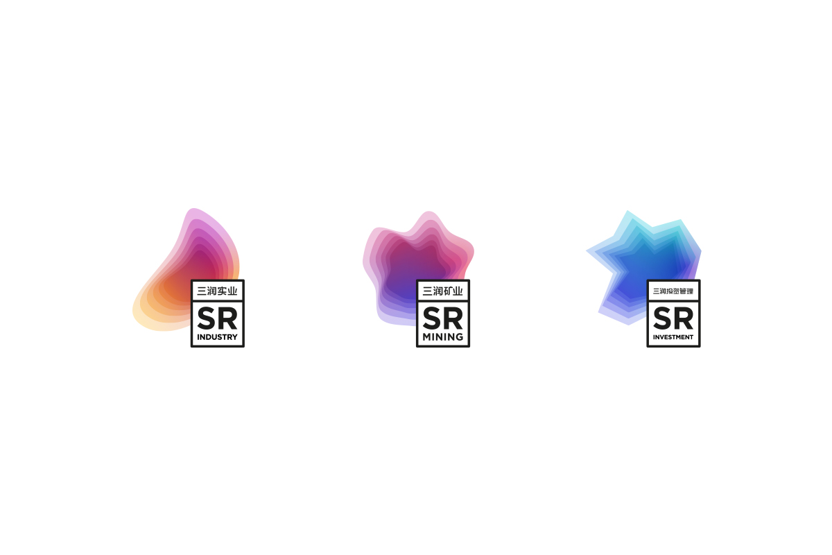
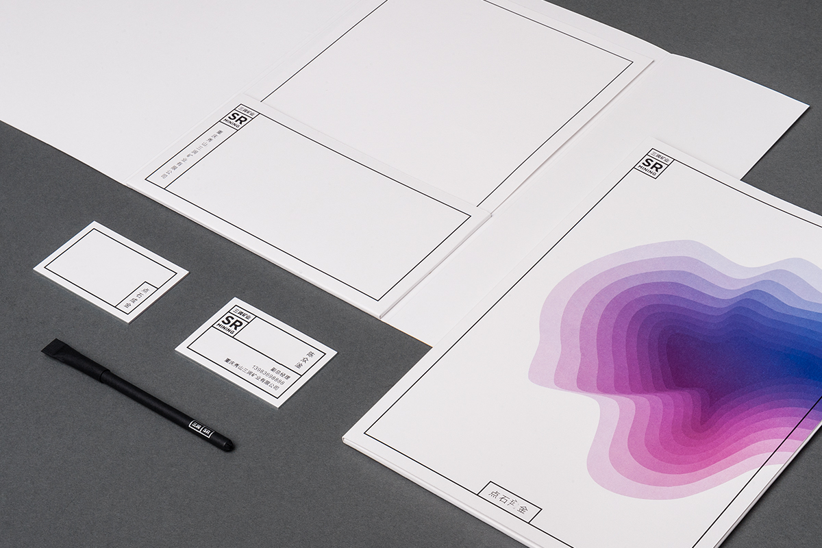
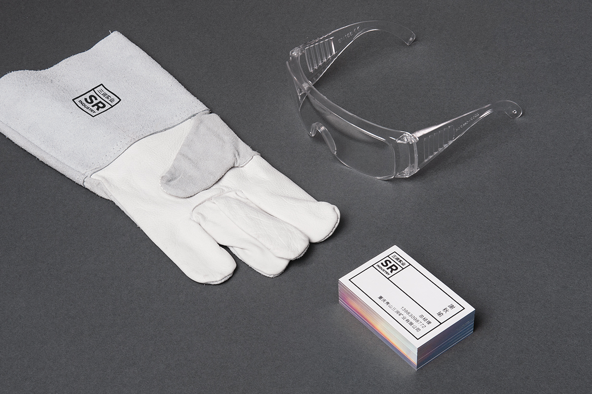
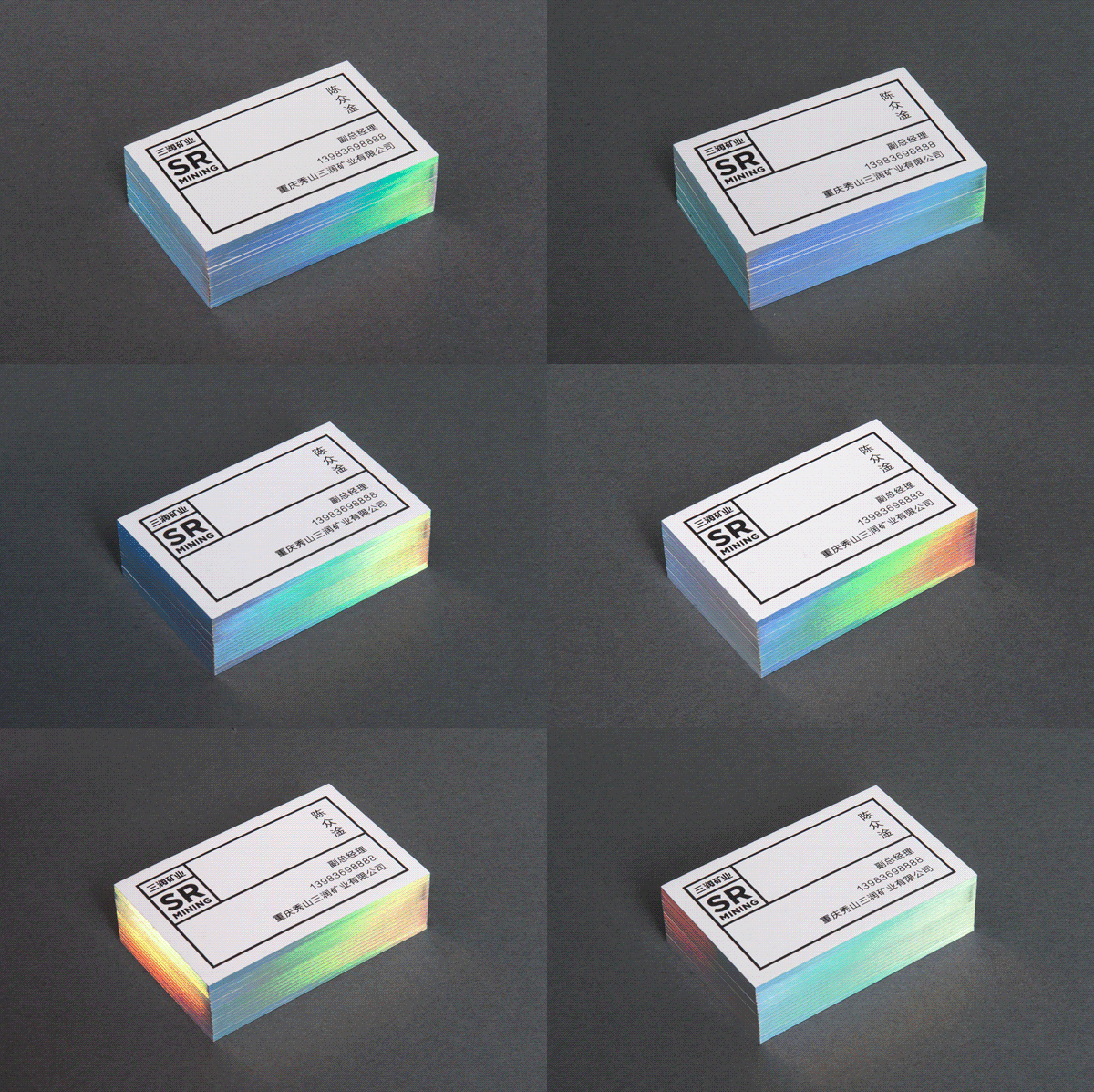
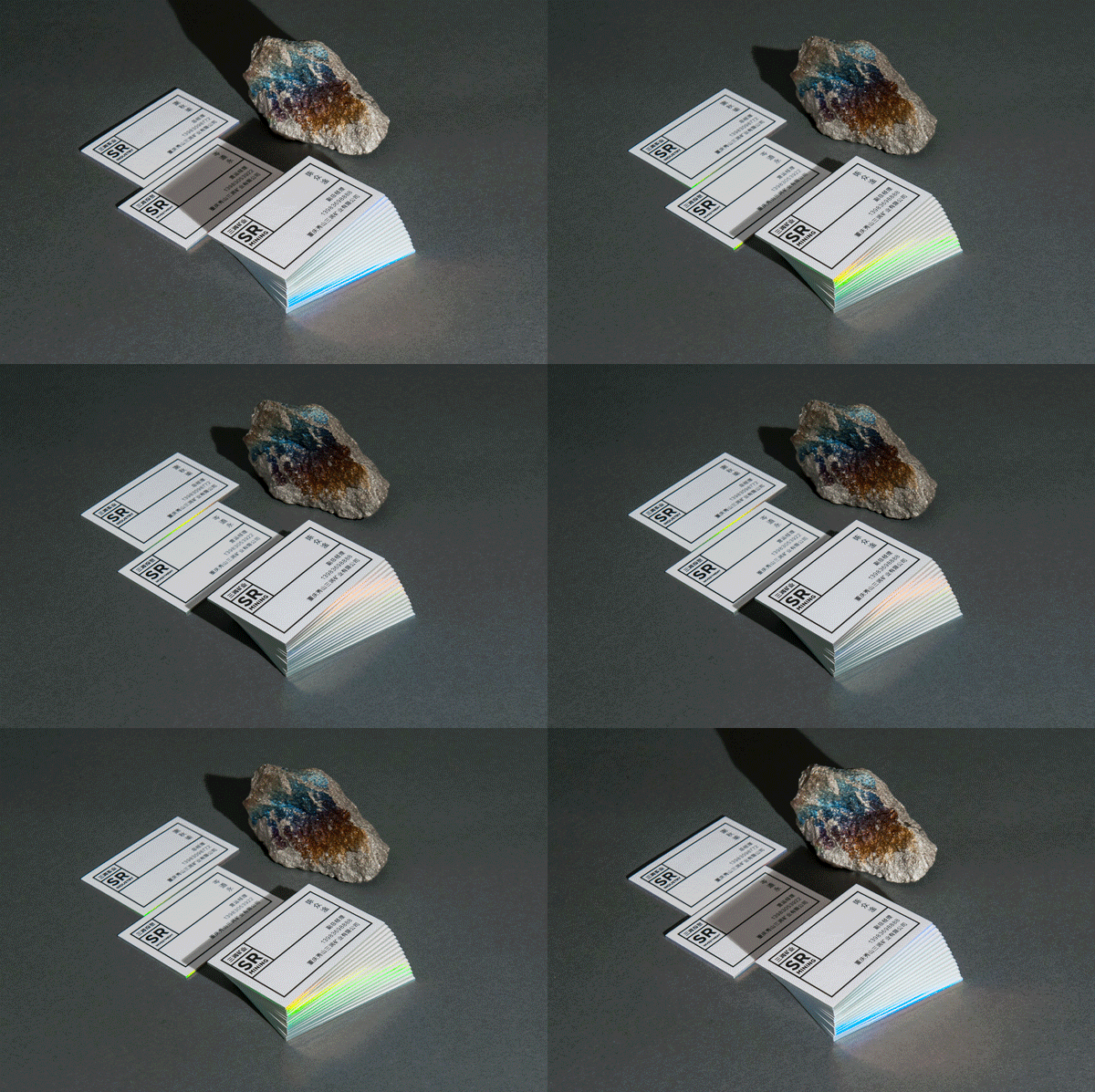
Chinese industrial company famous for its manganese mining got a bold identity developed by Polish design studio Necon
