Illustrative Art by Andrey Surnov
Moscow based artist and illustrator Andrey Surnov creates quintessential digital canvases depicting a mellow beauty of Russian suburb


3rd Wave of Inspiration
Since 2003
Moscow based artist and illustrator Andrey Surnov creates quintessential digital canvases depicting a mellow beauty of Russian suburb

“Biff is a multi-faceted illustrator, designer and creative personality. A limitless imagination and diverse skill-set not only enable him to champion a brief but also stand him in great stead for generating impulsive projects and original ideas. His relaxed yet distinctive and on-point style has won him clients from all over the world, and his ever-expanding use of new tools and media is a testament to his versatility and professionalism. Inspired by every aspect of the world around him. Biff's creations are fresh, current, comedic and instilled with immeasurable character." - Emily Beeson, Young Gold Teeth.


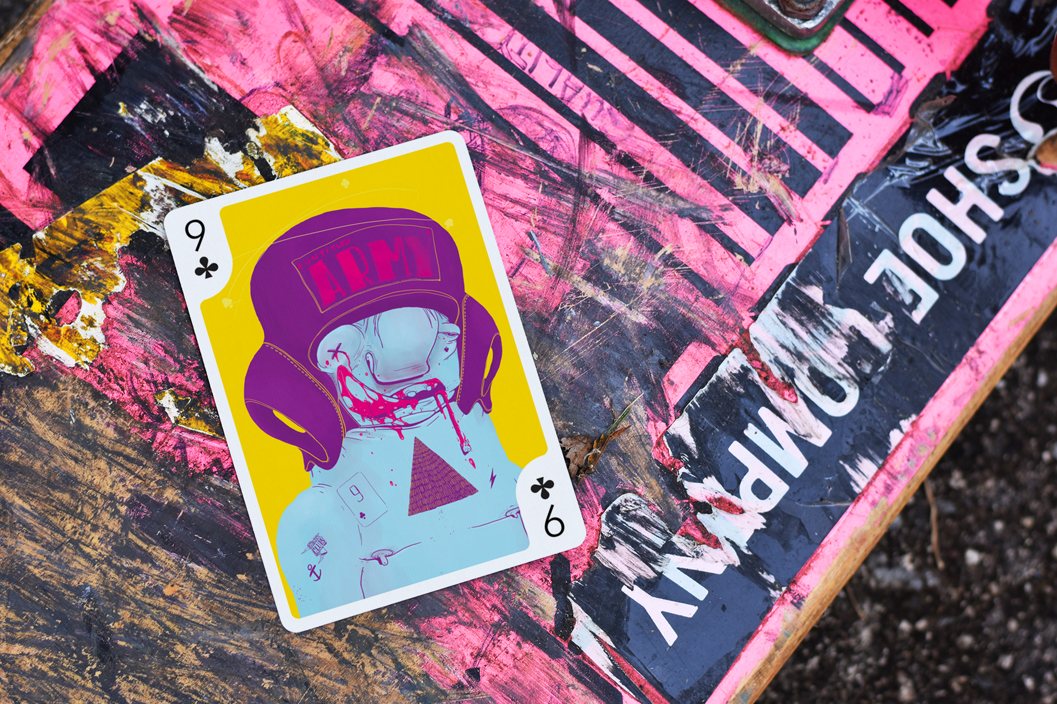
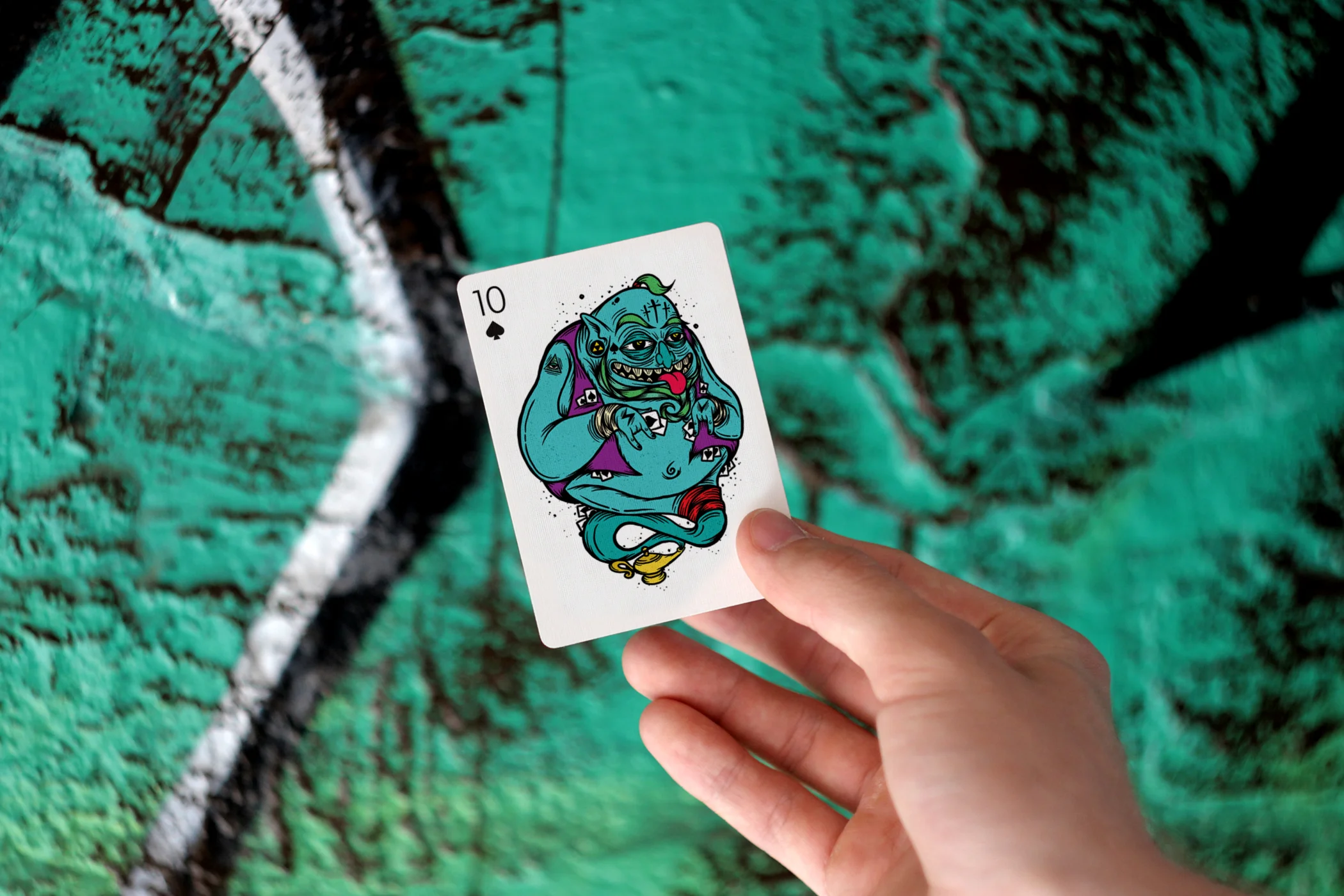
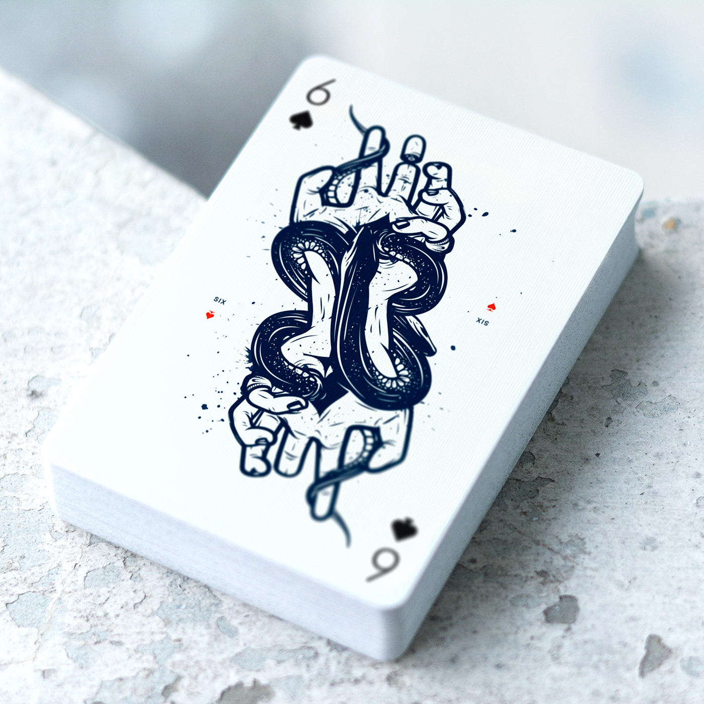
Playing Arts project originally launched in 2012 with the initial sensational playing cards deck called "Creative Cards". The idea of the project was to create a deck of playing cards where each card will be illustrated by different international artist in their own individual style and technique.
Edition ZERO Features
Illustrations for each of 55 playing cards were made specially for this deck by different international artists in their own individual style.
First ever artistic deck with AR experience. Animations will be experienced both on the website and through Augmented Reality mobile app.
Printed by US Playing Card Company on legendary Bicycle® paper with Air-cushion finish for the smoothest feel. It's the highest quality coated playing card stock, perfect for creating beautiful spreads and fans if you are cardist or magician.
The deck will come in poker size (88.9 × 63.5mm) with thin borders, so you can take it all from vibrant and colourful illustrations.
Inside the box you will find 54 playing cards plus info card that features the names of all amazing artists involved in this deck as well as instructions on how to use Augmented Reality app.
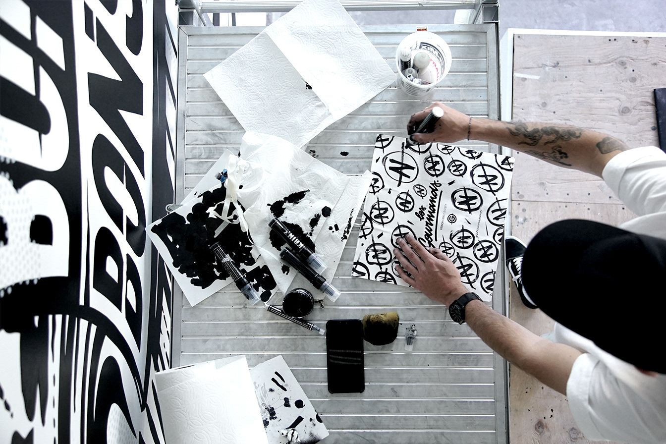
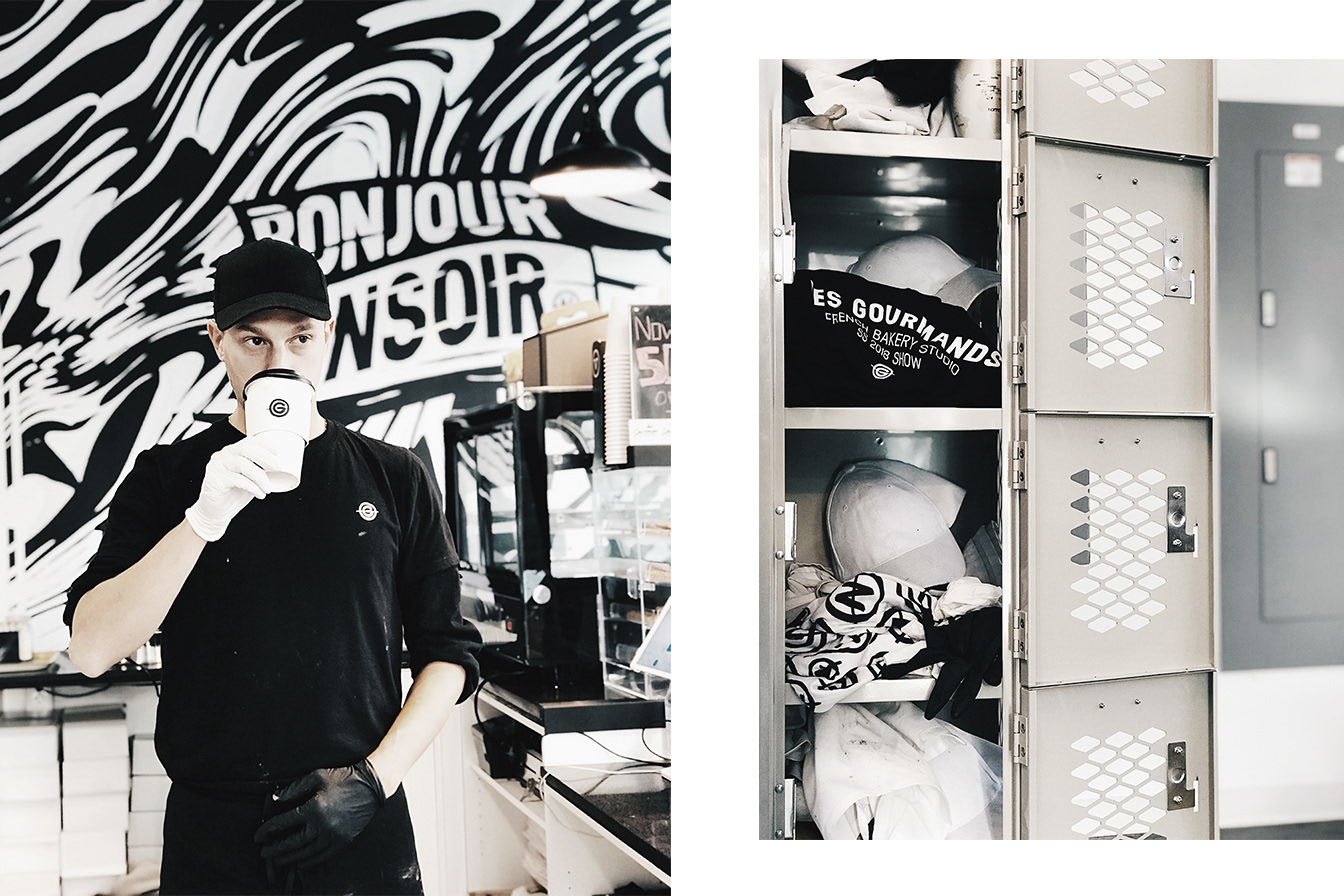
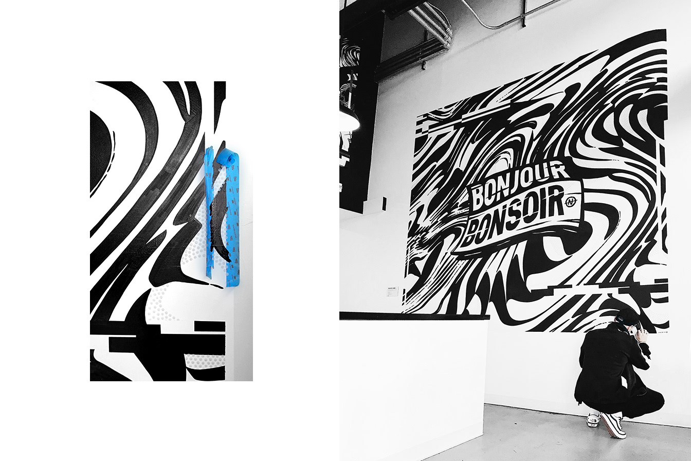
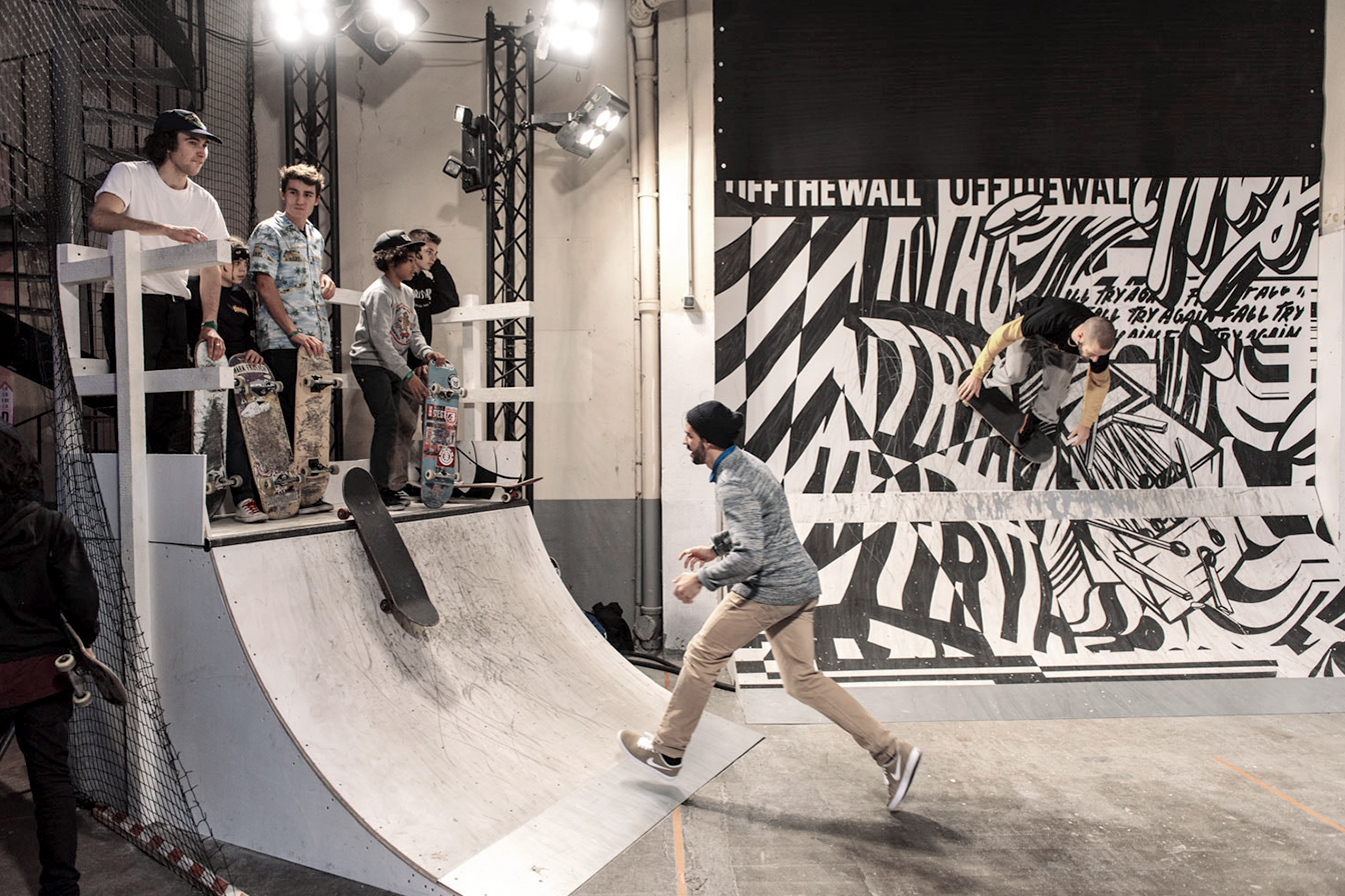
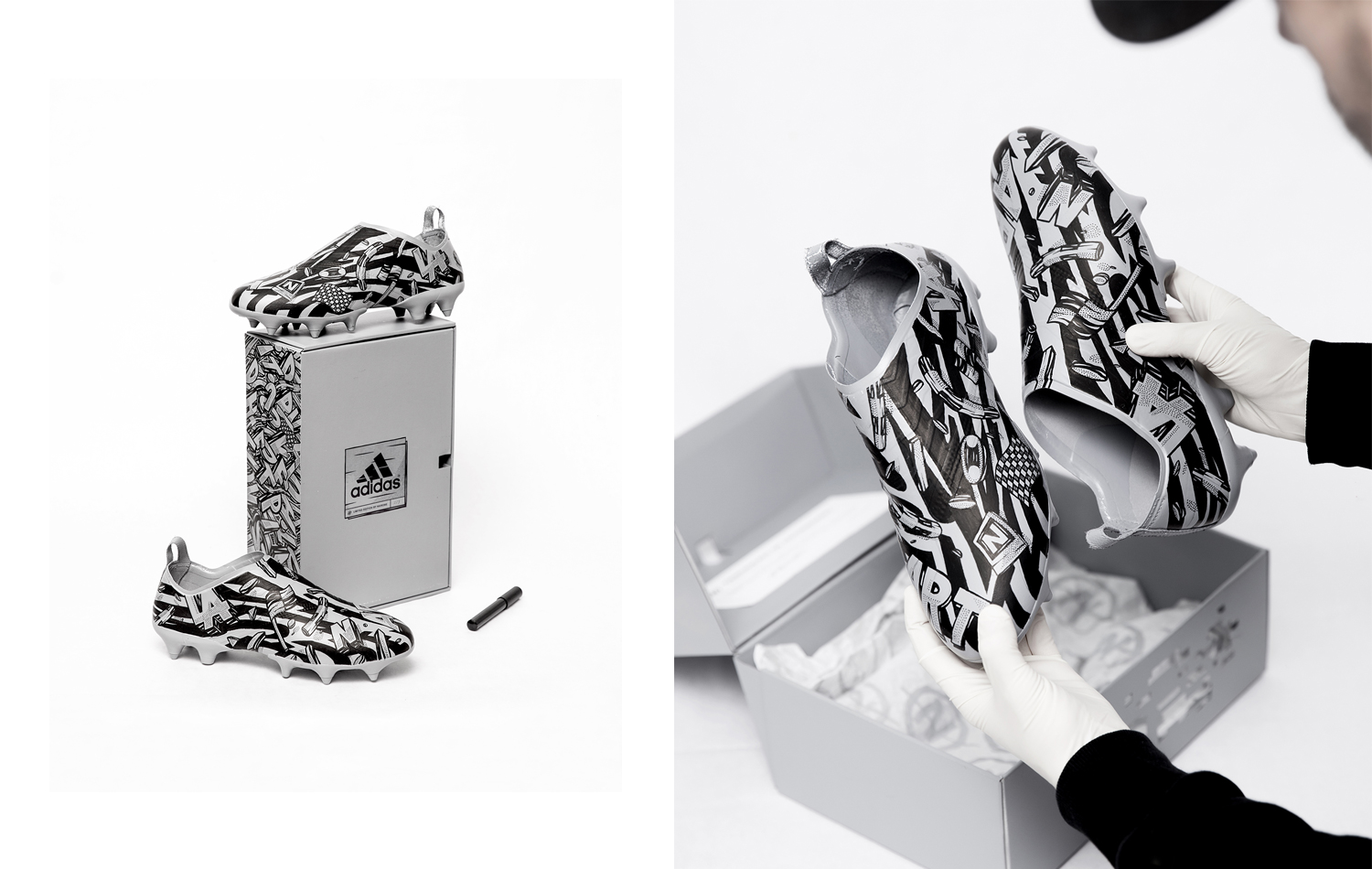
Obsessed with black and white, the contrast is the source of his creativity, fascinated by the pop art movement and our contemporary pop culture, Nairone use elements from everyday life, his work is inspired by personal experiences from his childhood and the links with the milieu in which he lives mixed with his contrasted vision.
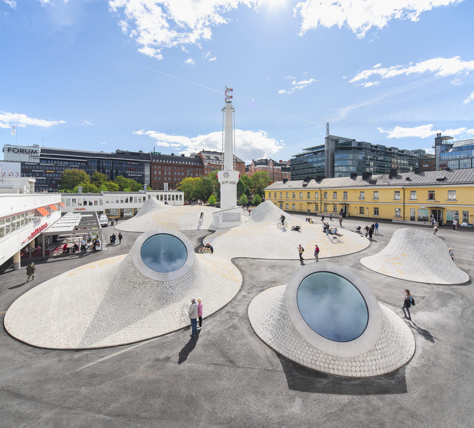
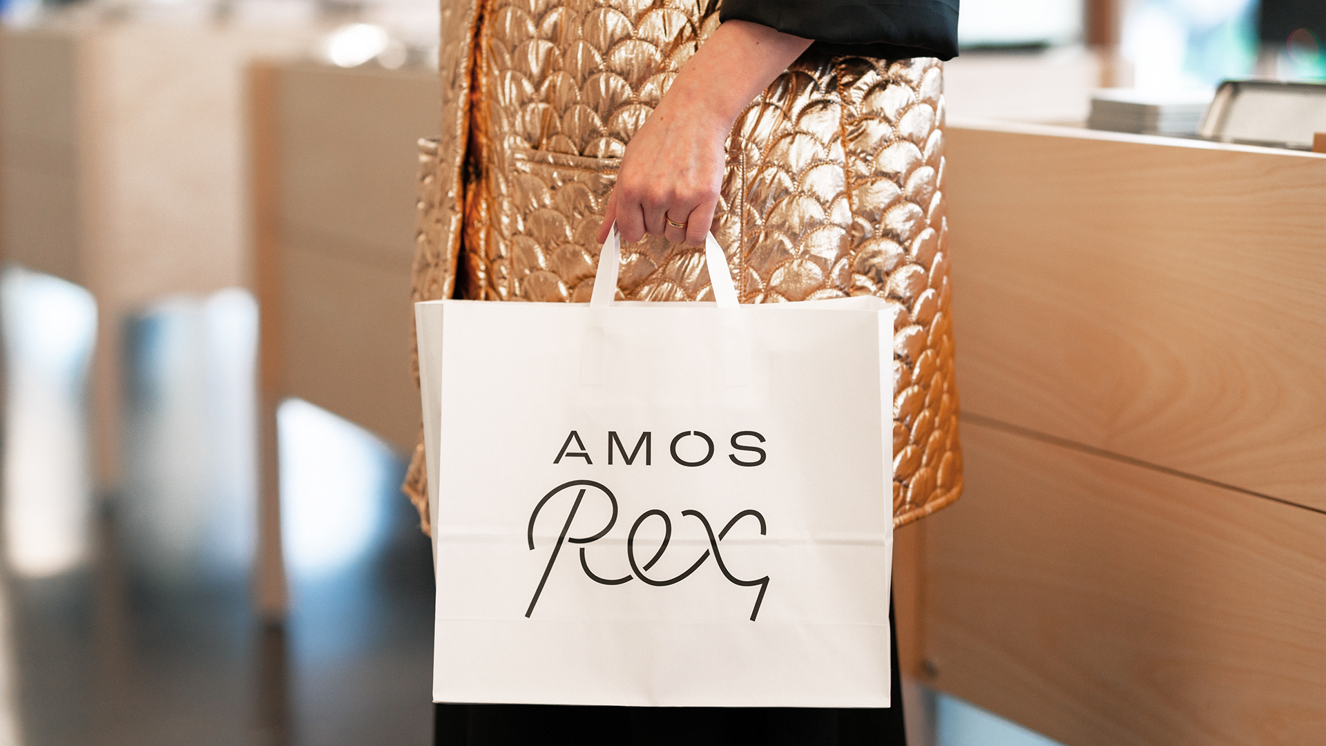
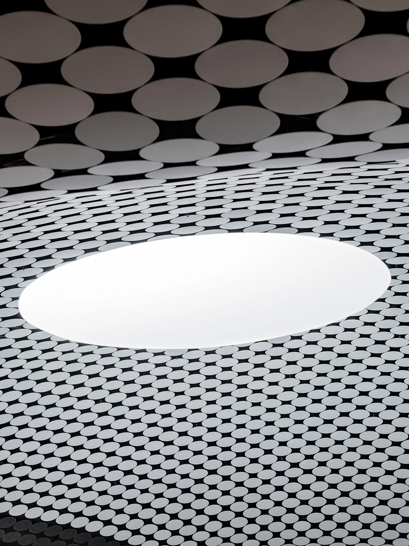
Last autumn, Helsinki got a new art point for visual hunters - Amos Rex space. Built in place of shopping centre parking, Amos Rex is a perfect example of smart architecture designed by JKMM. We already covered the debut exhibition of Japanese teamLab on Instagram and happy to mention their next affair with Studio Drift this Spring brining their anti-gravity show worth of visit.
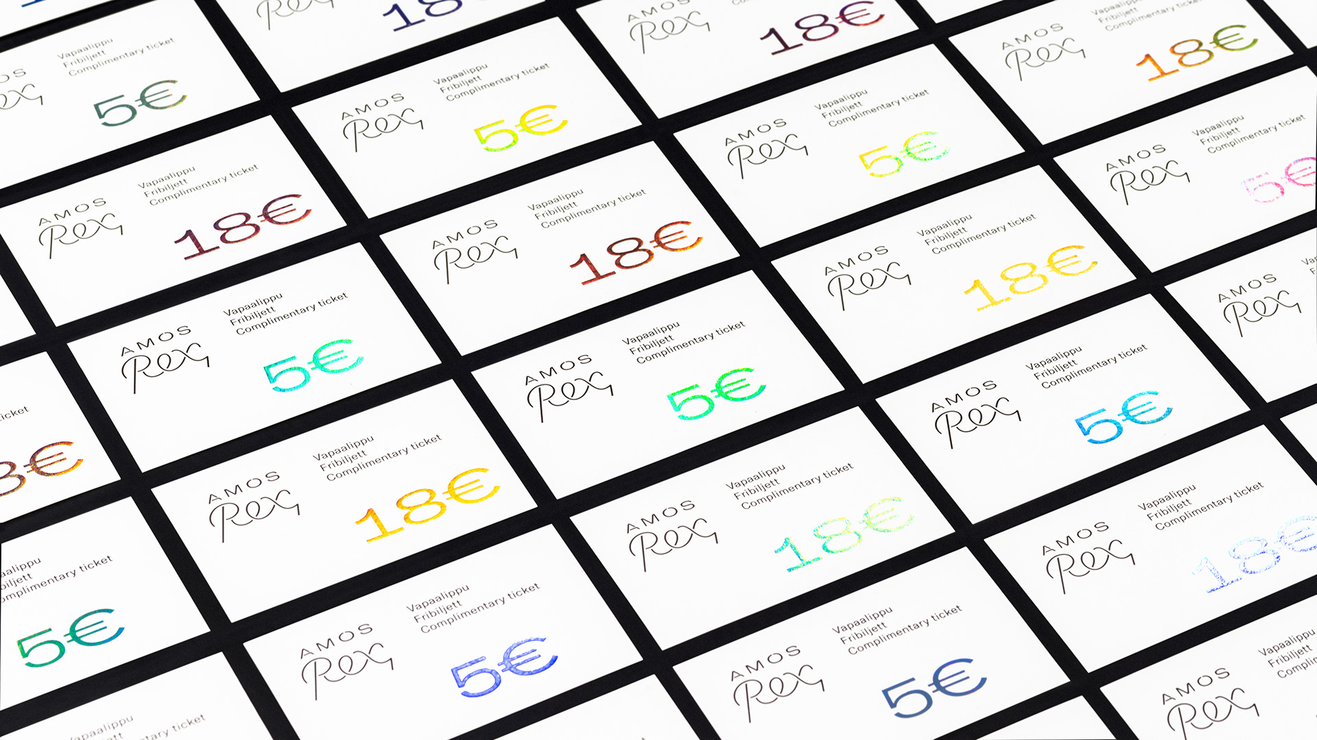
Amos Rex identity was developed by local studio Werklig underlining the idea of a space where past, present and future meet together to create unforgettable experience


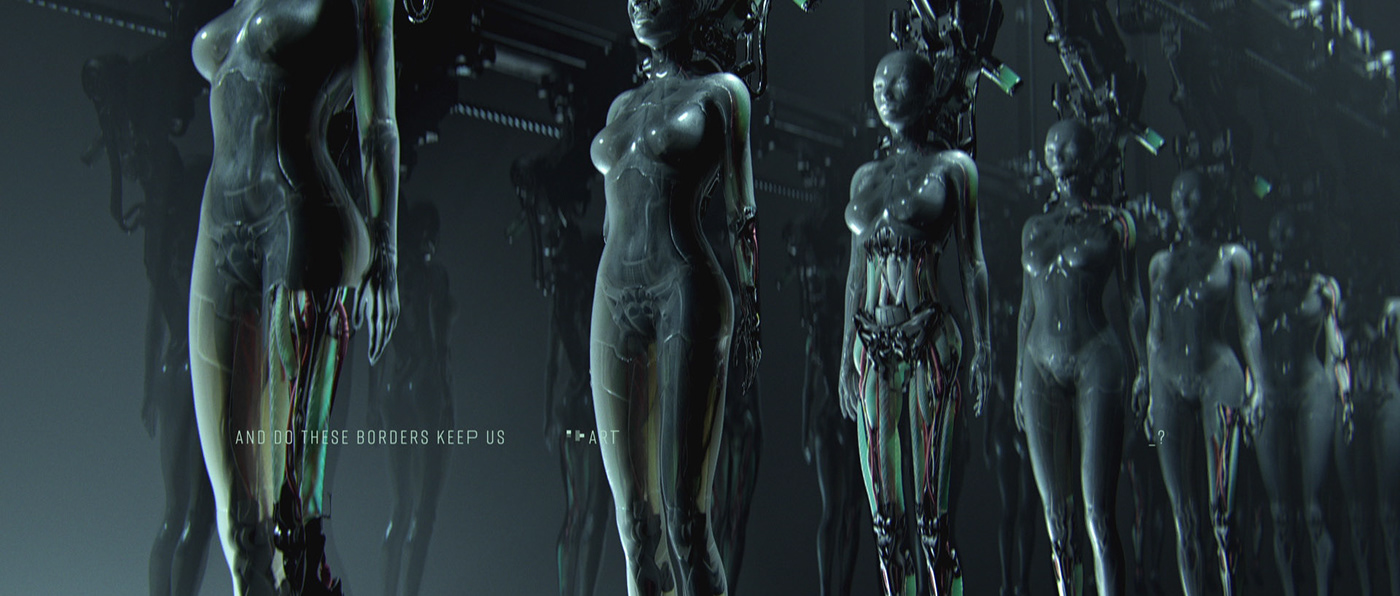
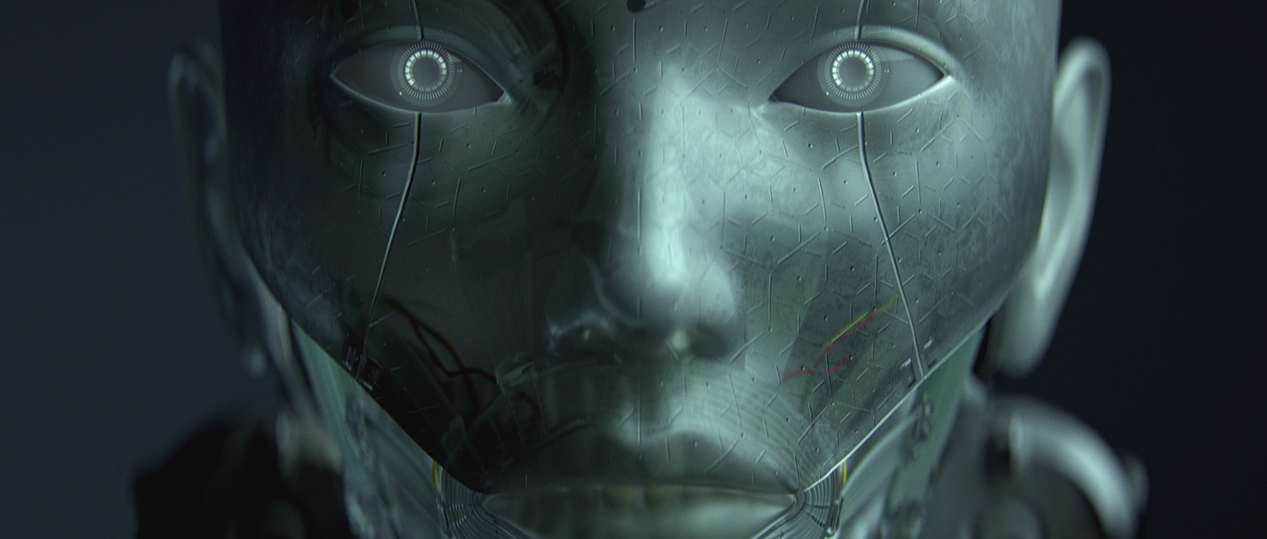
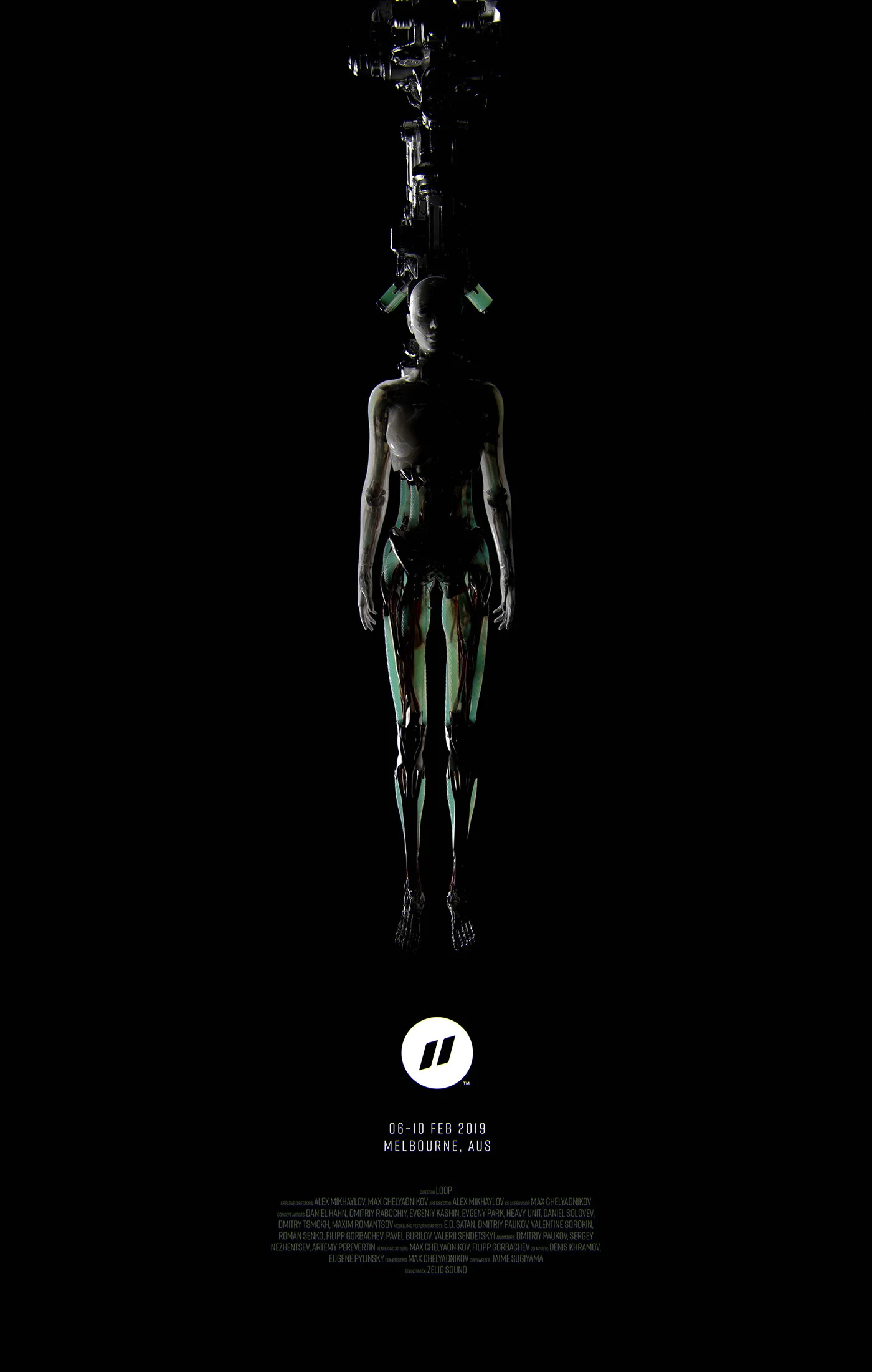
A collaboration between Russian post-production studio LOOP and number of talented artists resulted as a motion reel for the Pause Fest 2019 starting this days in Melbourne.
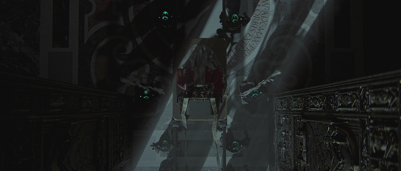
’A New Hope' is a challenging metaphor for everyone affected by the tech age that still considers some developments today as normal in our culture, traditions and society. We are not programmed well enough to foresee what the exponential technology can do to our society. How much are we going to pay for all bad decisions that we are making today? ‘A New Hope’ digs deep into our worst nightmares and what could happen if we loose control over those exponential tech advances. This video depicts how popularity mixed with power can easily transform our society into unpleasant and dangerous place. We have a high hope that our collective consciousness will drive us to a much brighter, safer, happier, inclusive and prosperous place.
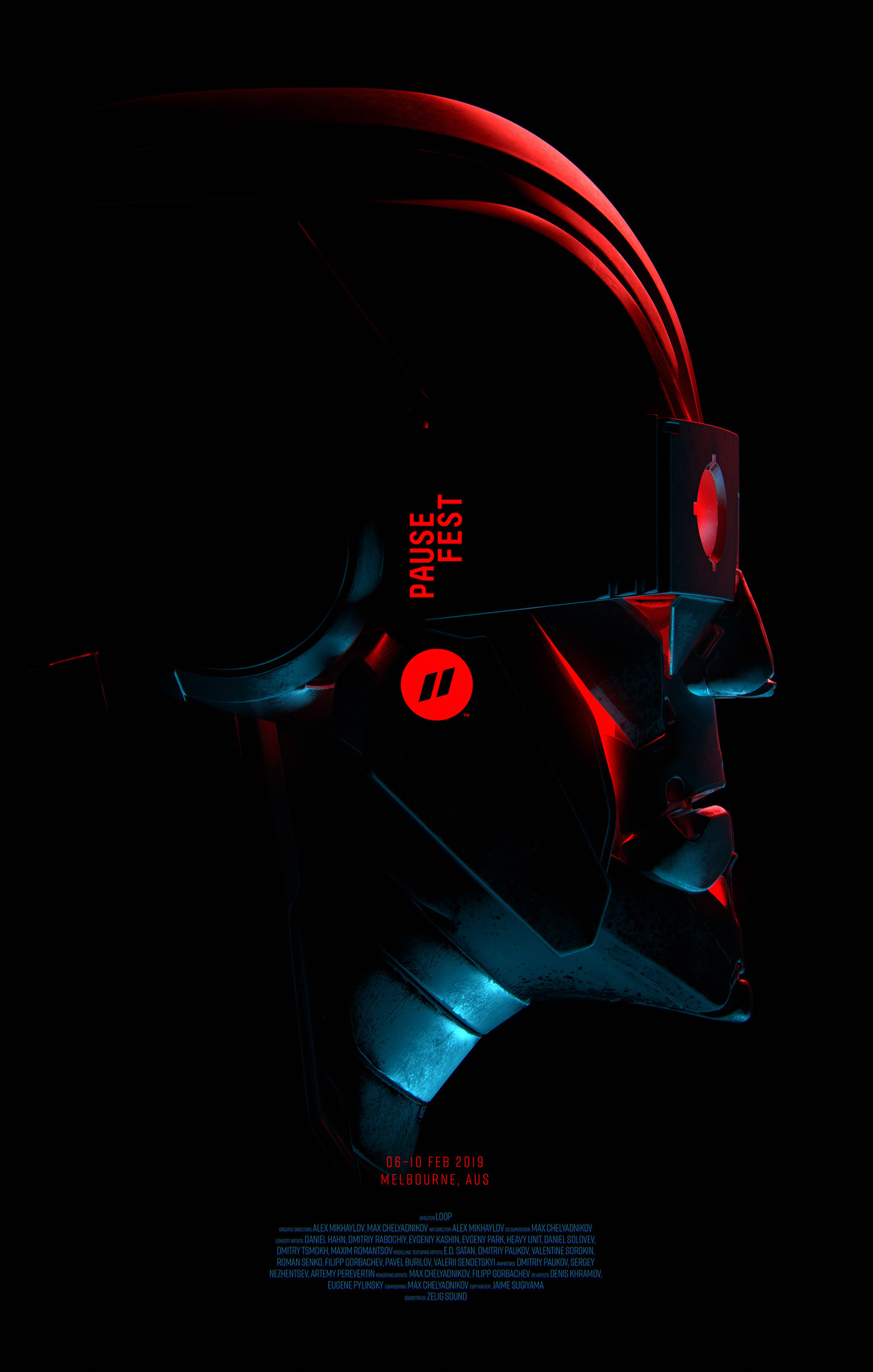
Creative Directors: Alex Mikhaylov, Max Chelyadnikov
Art Director: Alex Mikhaylov
CG Supervisor: Max Chelyadnikov
Concept Artists: Daniel Hahn, Dmitriy Rabochiy, Evgeniy Kashin, Evgeny Park, Heavy Unit, Daniel Solovev, Dmitry Tsmokh, Maxim Romantsov
Modelling, Texturing Artists: E.D. Satan, Dmitriy Paukov, Valentine Sorokin, Roman Senko, Filipp Gorbachev, Pavel Burylov, Valerii Sendetskyi
Animators: Dmitriy Paukov, Sergey Nezhentsev, Artemy Perevertin
Rendering Artists: Max Chelyadnikov, Filipp Gorbachev
2D Artists: Denis Khramov, Eugene Pylinsky
Compositing: Max Chelyadnikov
Soundtrack: Zelig Sound
P–SLab® is an experimental series curated by Australian creative studio @prettysoon_ . Bridge House is this first in this series.
Matthew Lawless imagines a series of ‘Anomalies’ — abstract sculptural forms that respond to and foreshadow the architectural themes of Dan Brunn Architecture's Bridge House. The short film features original music by Detroit-based electronic artist Shigeto
You may remember Dmitri’s works from our earliest reviews in 2000s that were not archived. Famous French advertising photographer is turning more into contemporary digital artists. His recent collaboration with 3D artist Tamal de Canela @tamaldecanela
Read interview with artist on French


Spiros Halaris is a multi-disciplinary award winning Illustrator. Originally from Greece, he was trained at the University of the Arts London and has studios in London and New York, where he's currently based.


For Dolby's ongoing site-specific installations at its unique gallery space in San Francisco, GMUNK and Tool of North America created an augmented reality audiovisual quest across the stars. Asteria, inspired by Nasa's Jet Propulsion Laboratory and cosmic mythology, consists of a 3-act, mobile AR experience for iOS devices synchronized with a 12 minute film that plays on loop on the gallery’s 64-foot LED wrap around wall.

Inspired by the Dolby Gallery itself, Munky and Tool of North America worked to design an AR experience that pairs with the big screen, coupling the two platforms to create this immersive space exploration. Putting the user in the stereoscopic transmissions of the “xO-9 probe” explorer, they’re taken to three different worlds in the year 2027, each world in a different state of worldly evolution; each corresponding to a unique epoch in Earth’s own development.

After giving thought to the space, Munky (GMUNK) decided to pair the screen with an AR experience, using the screen as a backdrop and the source of life and sound for the installation. The smartphone thus becomes an extension of the story that is being told by the film.
In order to create the best experience for the user and to create a smooth transition between worlds and storylines, Munky designed the AR app to pair with the Dolby screen content. By using a remote server to track time-code sync, the AR app on the user’s mobile device is able to detect where the user is within the gallery film, allowing it to stay synced with their location within the film so each act is experienced in a perfect sequence.
In 2027, the xO-9 probe became the first lunar launch module to maintain contact with NASA after successfully jumping an interstellar gate.
Radio contact after the black hole transit located the ship 2 million light years from Earth, near a cluster of exoplanets called Macaca Fascicularis, on the edge of galaxy Andromeda.
Equipped with the most advanced HDR imaging and sound-capturing technologies, xO9’s mission is to navigate, observe, and transmit stereoscopic images from deep space. The Macaca cluster is of particular interest because each planet has it own orbital sun - and in one case, suns.
More astonishing is the discovery that each planet exists in a different state of worldly evolution; each corresponding to a unique epoch in Earth’s own development. And one that may even foreshadow our own uncertain future.
These holographic broadcasts represent the first time humans can experience space as if they are window-seat passengers in an explorer probe. The xO-9 transmissions - miniaturized for viewing as observable micro-universes - create a dimensional experience for the viewer. Like galactic mobiles that float in space wherever the viewer chooses to call them up.
Spanish photographer Ginebra Siddal based in Granada has a special feeling to terracote colour definitely arising from the famous neighbourhood - Alhambra. Take a look!


Talented charcoal pencil artist Chamo San shares his travelling sketchbook full of visual stories captured during his short visit across South Europe


“Alice, 12 year-old girl, is homeless and works as a courier. One day she receives a request - to deliver a big teddy bear to the boss of a criminal gang. Along the way, unexpectedly, the teddy bear comes alive and becomes Alice's only friend. She decides to cancel the delivery and keep a teddy bear. What she doesn’t suspect is that it is stuffed with cocaine and now she is being hunted.”


Written and Directed by Lado Kvataniya
Cinematography by Andrey Krauzov
Starring: Masha Lobanova, Vladimir Voronov
Composer: Niko Cartosio
Producers: Ilya Stewart, Murad Osmann, Ilya Dzhincharadze
Executive Producer: Olga Mitina
Production Designer: Dmitriy Onishenko
Edit: Vlad Yakunin
Casting: Margo Sayapina
Colour: Jamie O'Bradovich, Artem Leonov
Hype Production /// RUSSIA
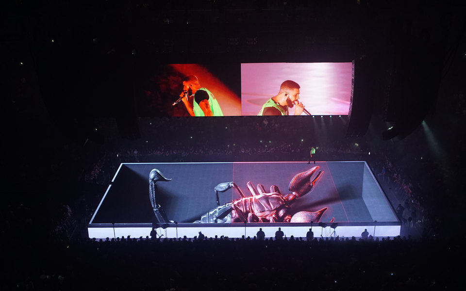
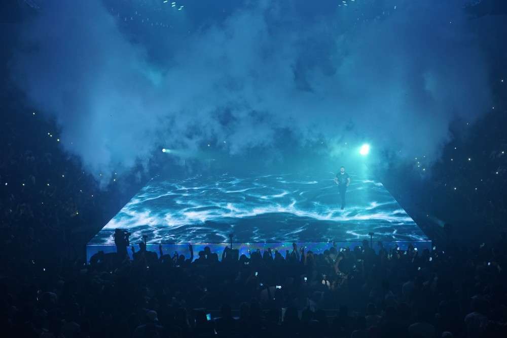
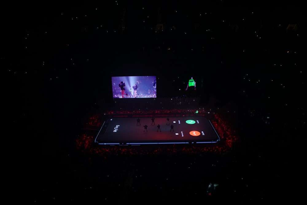
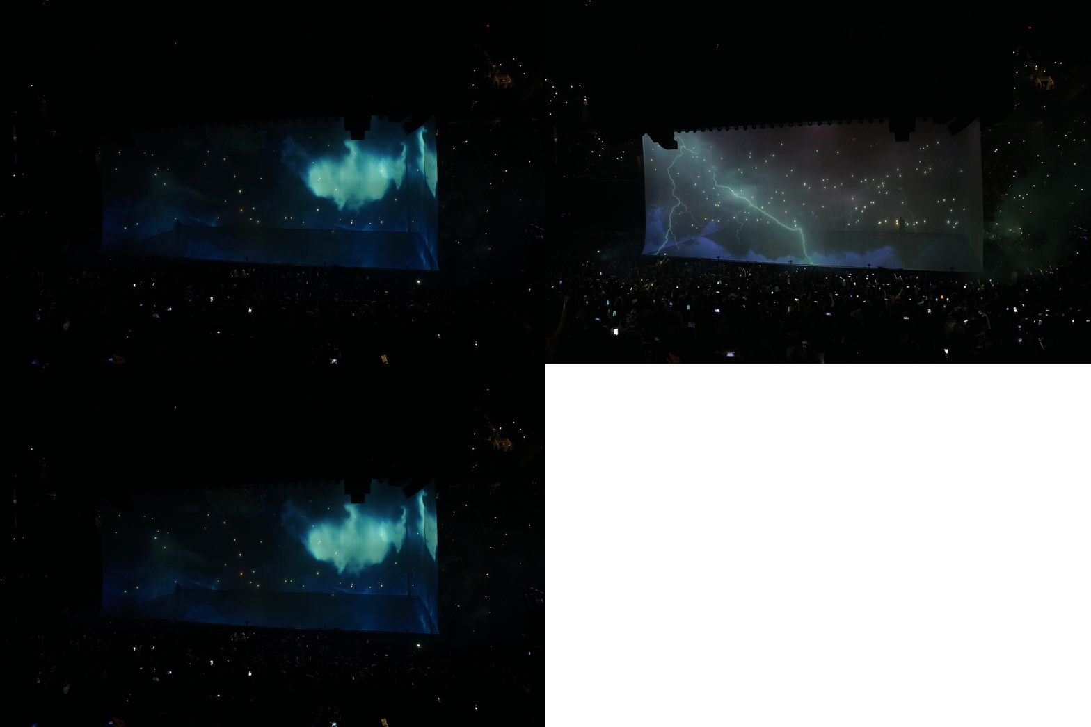
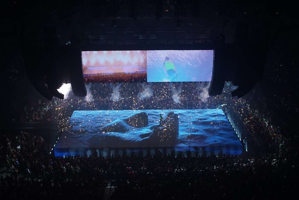
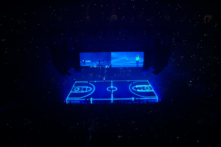
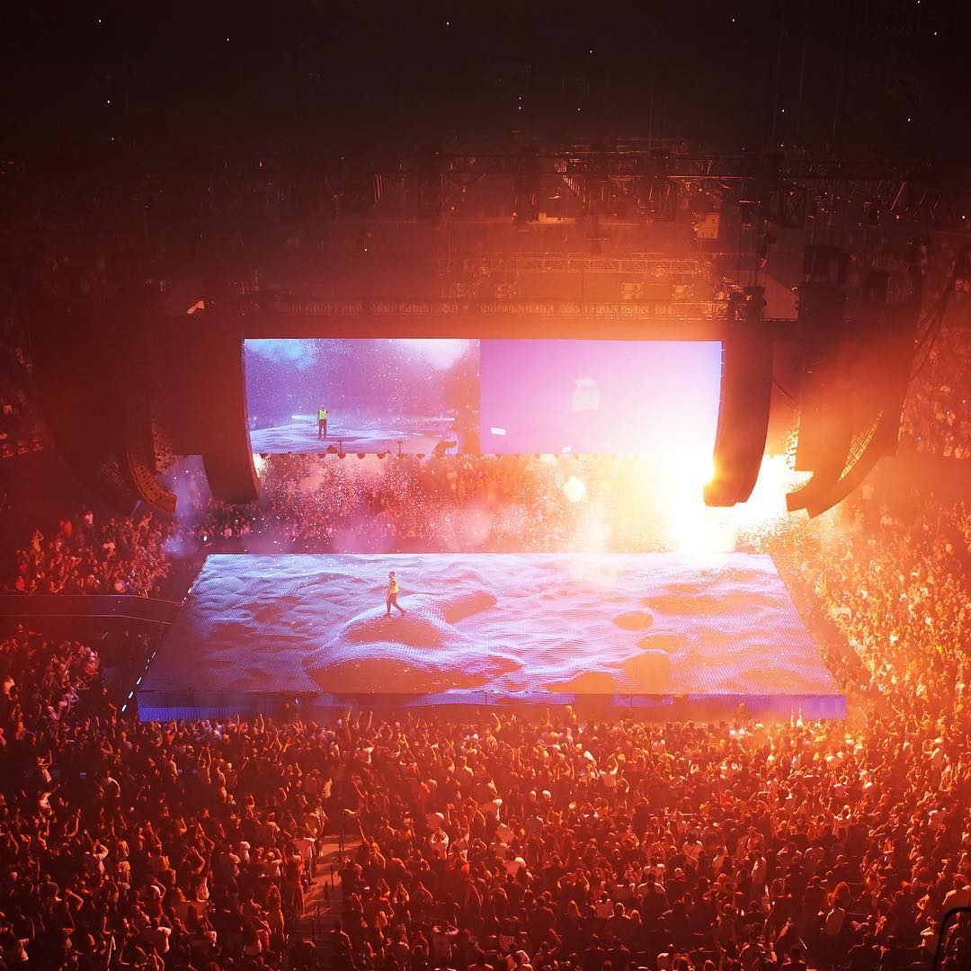
Back in to 2018, it was the most challenging year for the world leading visual effect and stage design studio Sila Sveta, based in Moscow. Through a set of life changing events and creative director Willo Perron they landed with a project for Drake’s tour “Scorpion” - a huge challenge led to 15.6Tb of material and a panic half year of work to release 7 consecutive shows in NYC.


There is always a good chance for designers to imagine their favourite brand having a new identity. This happens with Slack (@SlackHQ) again after they rolled out new visual system designed by Pentagram (@pentagramdesign). We won’t comment on it as there is a huge backslash on social network regarding the new style. But we definitely want to show you another great example of “how it could be if”.. talented Russian art director Oleg Turbaba takes over it. Of course, we are not saying it is perfect, but take a look:

“This is my personal vision of how Slack’s logo could be represented with its new identity. My research was started with exploring brilliant work done by Pentagram with Slack’s redesign. Then I tried to search deeper and simplify both Slack’s old and new logos to their extremum.
As a symbol, I’ve decomposed an old Slack’s logo, taken one component (the message) and used it as a core of my concept. The way I see it, the message is the main theme of the Slack. Then I experimented with some modularity and dynamic logo things”

It took two years for Mat Szulik to complete a personal series of illustrations depicting Paris scenes in low polygonal way. Straight after Paris, Mat started facet cities of Rome and Abu Dhabi, we can’t wait to share them too
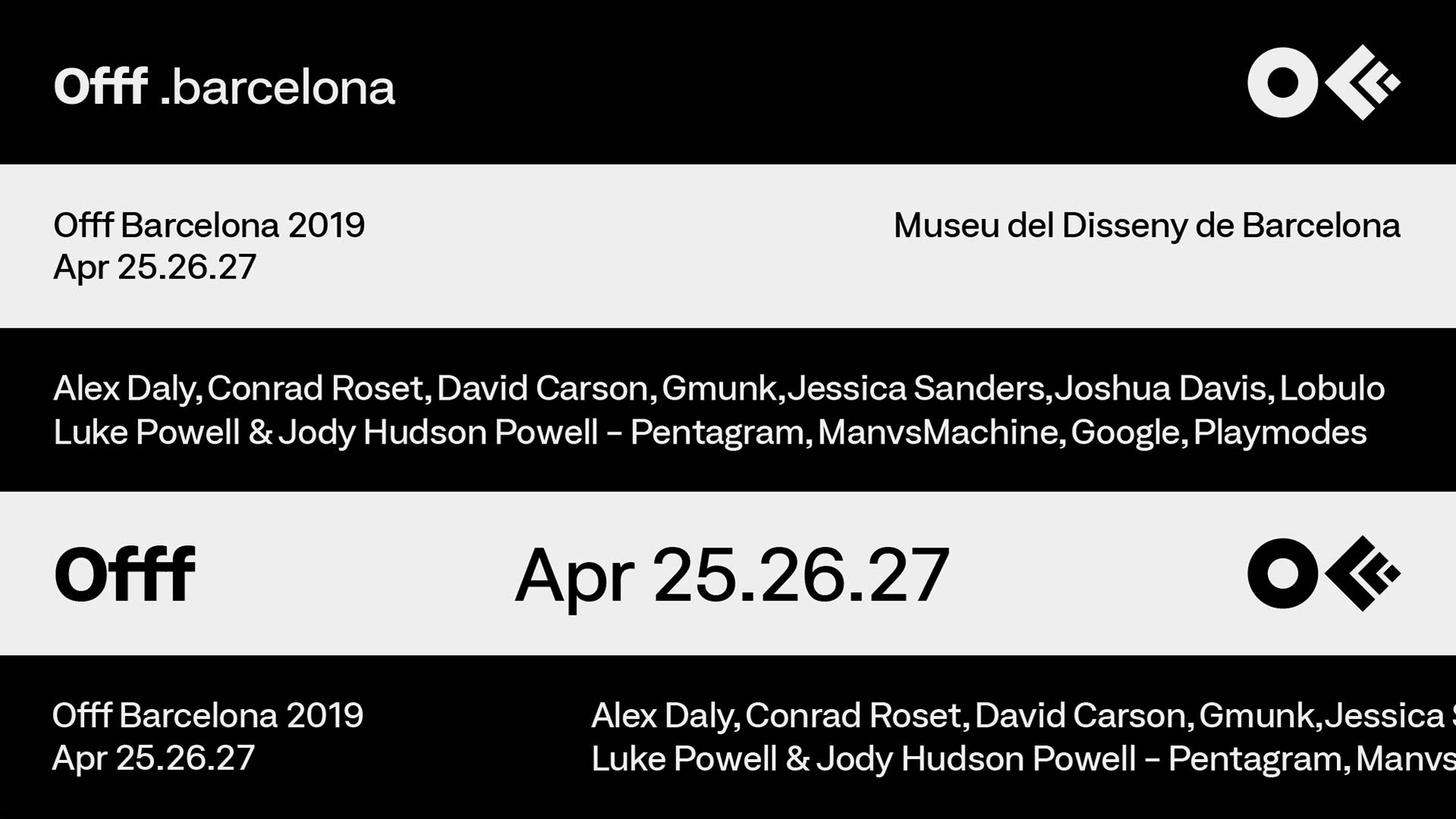
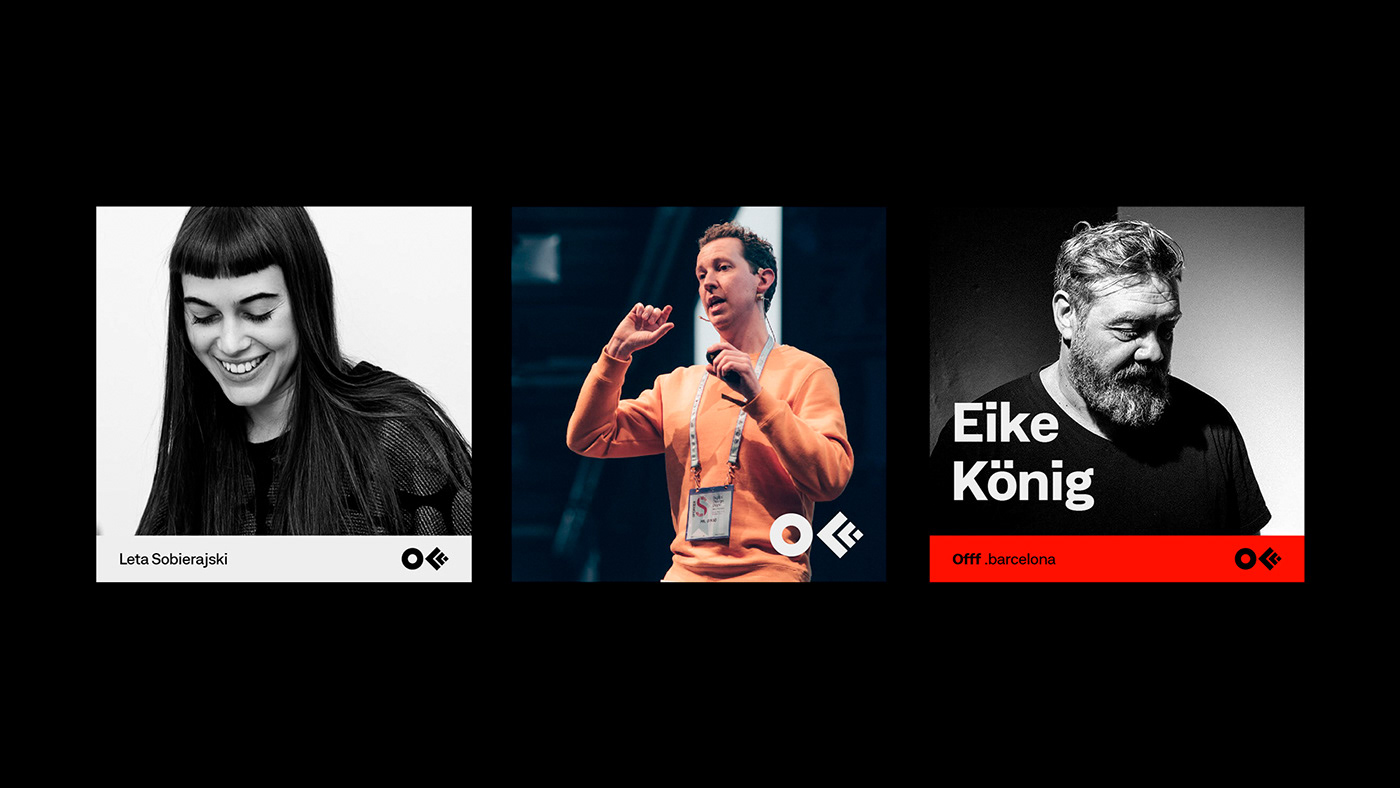
Founded by Héctor Ayuso over a decade ago, OFFF started as a concept that transformed into an event joining creative talents from all around the world all together in one place. The main goal of OFFF is to become the key meeting point for artists who share the same interests to be in one place. Today, OFFF is more than an event, it is more than a Festival, OFFF has become a community providing the ultimate creativity experience.
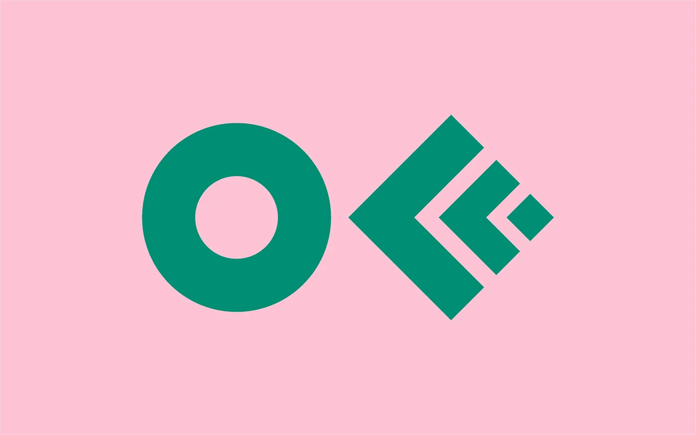
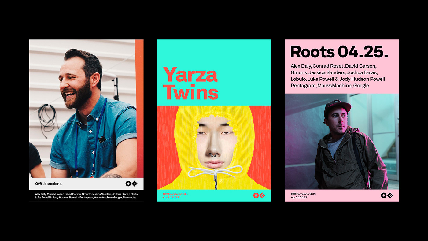
In 2013, CROWD studio, one of the most talented Barcelona based digital and design agency, has transformed the famous 3 “FFF” into one icon, it was the birth of the official OFFF logo that maintained its presence for 5 years. With with over 18 years of content and a Festival that is ever-evolving, growing every year to become one the most important event to attend worldwide while providing endless innovation, it was time for a change. The OFFF icon has finally become visually recognised by everyone, so it became unnecessary to conserve the 3 “FFF” in the logo. The OFFF icon is now visually abstract, simplified and more compact thanks to re-thickness of the symbols.
“OFFF has been conveying one true message: “our audience, our speakers and our attendees are our base. Without them this wouldn’t be possible” so for such an important brand, user-experience is very crucial. We had to create something valuable for both, past attendees and new comers, to understand the message behind OFFF and to be able to navigate through 18 years worth of contents. Starting with the typography, the most important element to the human being’s eyes, we decided to work with a corporate font, showcasing some seriousness yet with a touch of flexibility.”
“From concepts to various visual campaigns in every edition and with over 8 OFFF on Tour cities, OFFF Festival is always changing its aspects. But the unity of the brand and the team behind it is the Festival's foundation. Over the past few years, we have noticed an overall shift in the brand’s identity. OFFF, the brand proving itself with the concept of having no brief and giving the complete freedom plus the invitation to create, this also had its consequence. We noticed that with so many openness, the brand unfortunately lost its visual presence and visual aspect throughout the Festival, online and onsite. So how do we showcase the dynamic aspect of the brand while maintaining its base? By creating a definite strategy in the brand’s communication structure and building a branding system.”
“With this new approach we are adding more control to the brand use, where the brand gets more identified with the ability to adapt to other contents therefore the Festival becomes more firm and more strengthened.”
“While using this new system of communication grid, the website become one dynamic block of contents making it easier for the user to adapt. This allows us to recreate the whole website as a platform and as an archive of news, past speakers, new speakers and events. An organised clean space.”
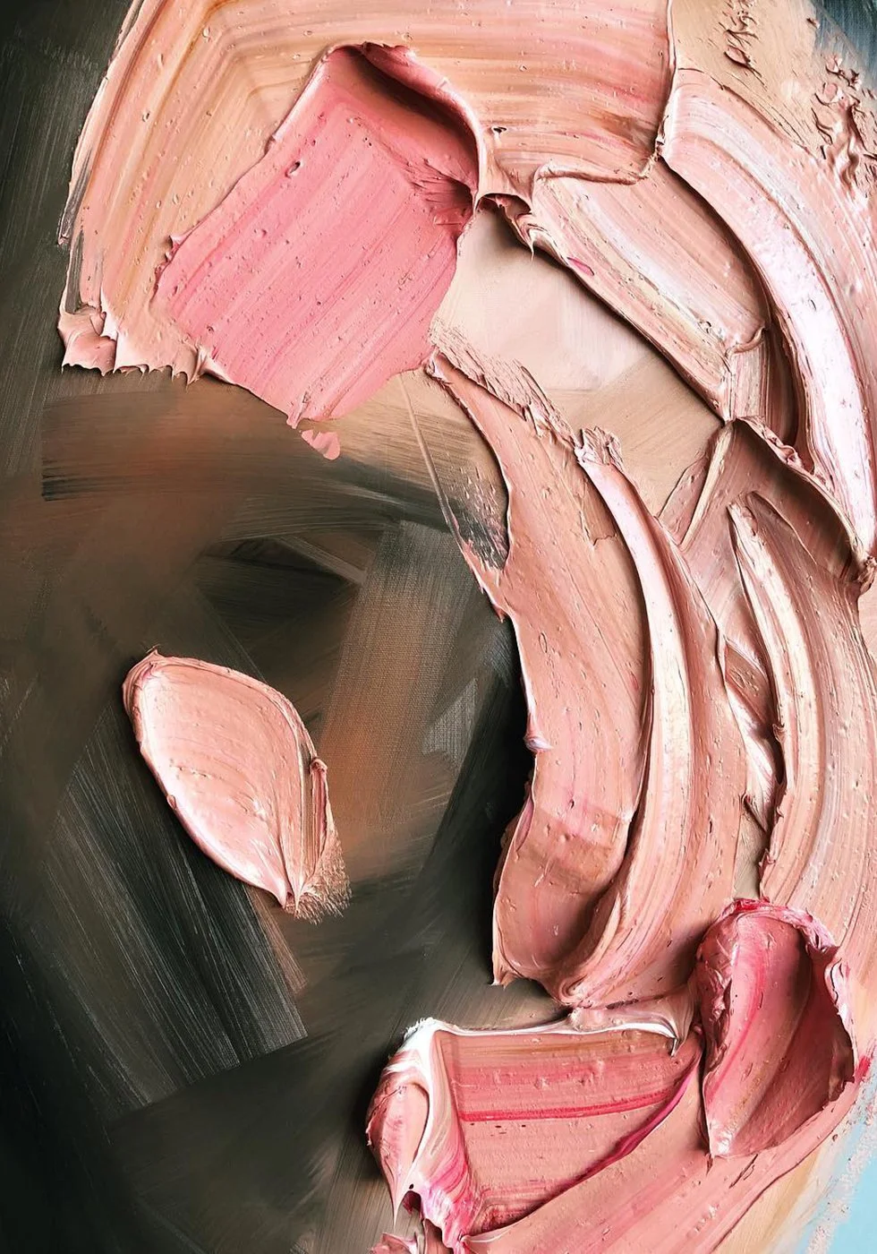
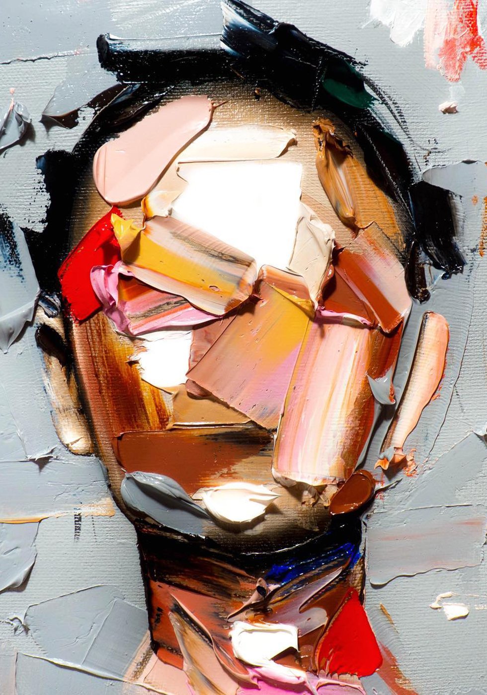
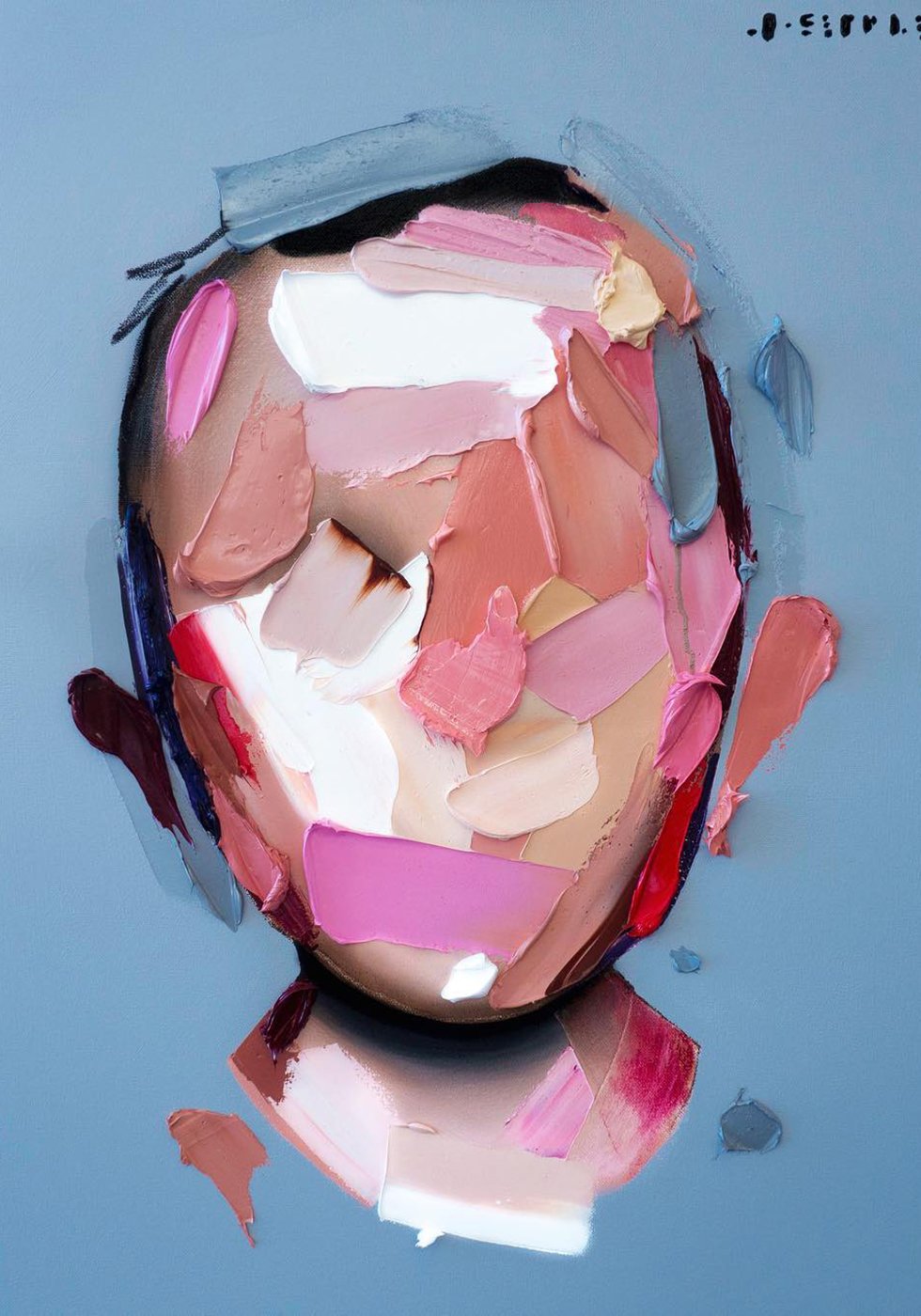
Los Angeles based actor and artist Joseph Lee has spent years studying faces and the feelings that they emote. So it's absolutely impressive that his series of abstract portraits, composed of just a few thick, segmented brush strokes, can convey so much emotion and expression. And all without hardly a single detail of the face exposed! I could study these portraits for hours, while admiring the beauty of each stroke and his brilliant use of colors.
Gentle Monster eyewear released an epic promo campaign by imagining Earth lost its sense of anxiety or hope, leaving the human race to resort to its most basic instincts of survival.
People believing in the power and strength of collective groups join together on what is the only way of transportation in this lost world. Witness the confident thoughts of self-conscious displayed in “Collective behavior”.
Gentle Monster’s ‘13’ Campaign sets place in a world where the moon shifts out of place and axis, slowly floating away from Earth creating the 13th month, Undecember. Animals start to act differently and people develop a dependency on either religion or technology. The changes in climate spark a split between anxiety and hope. Gentle Monster illustrates a message of hope brought from the insight and imagination spawned from the new world.
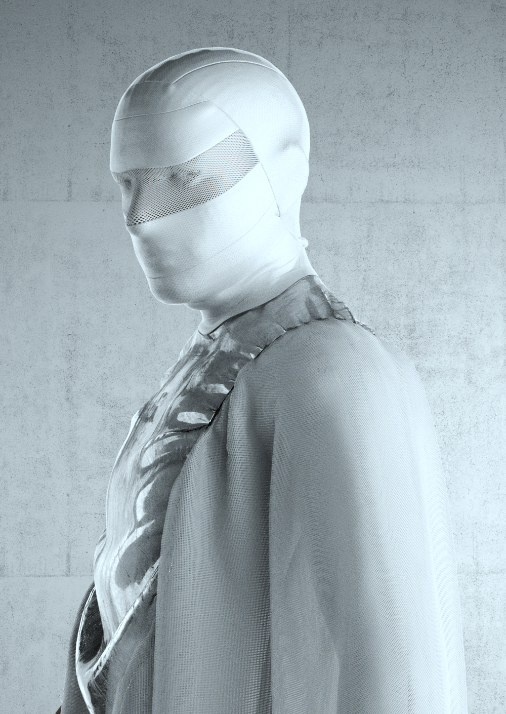
Designed by Frederik Heyman