


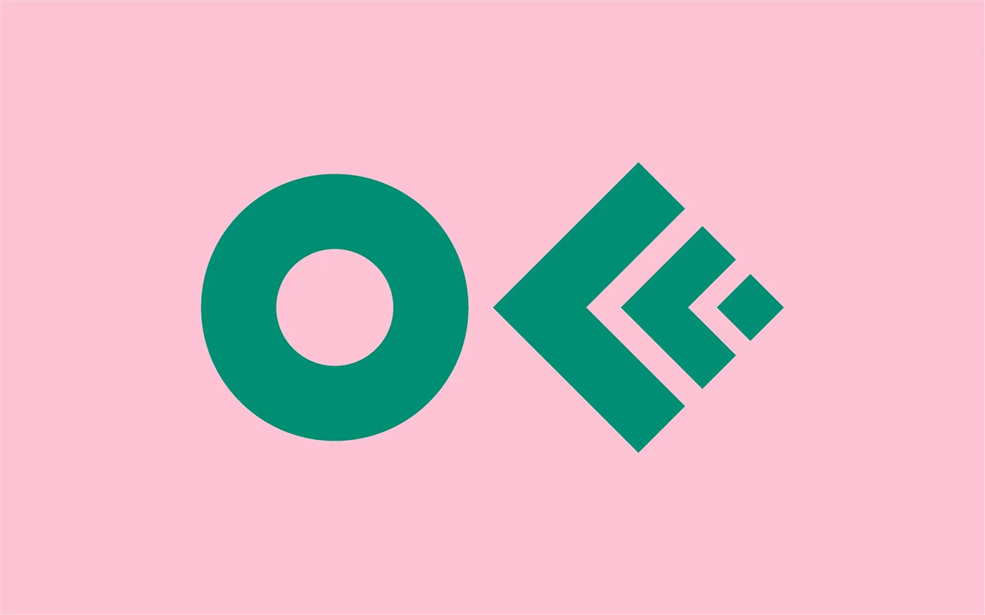
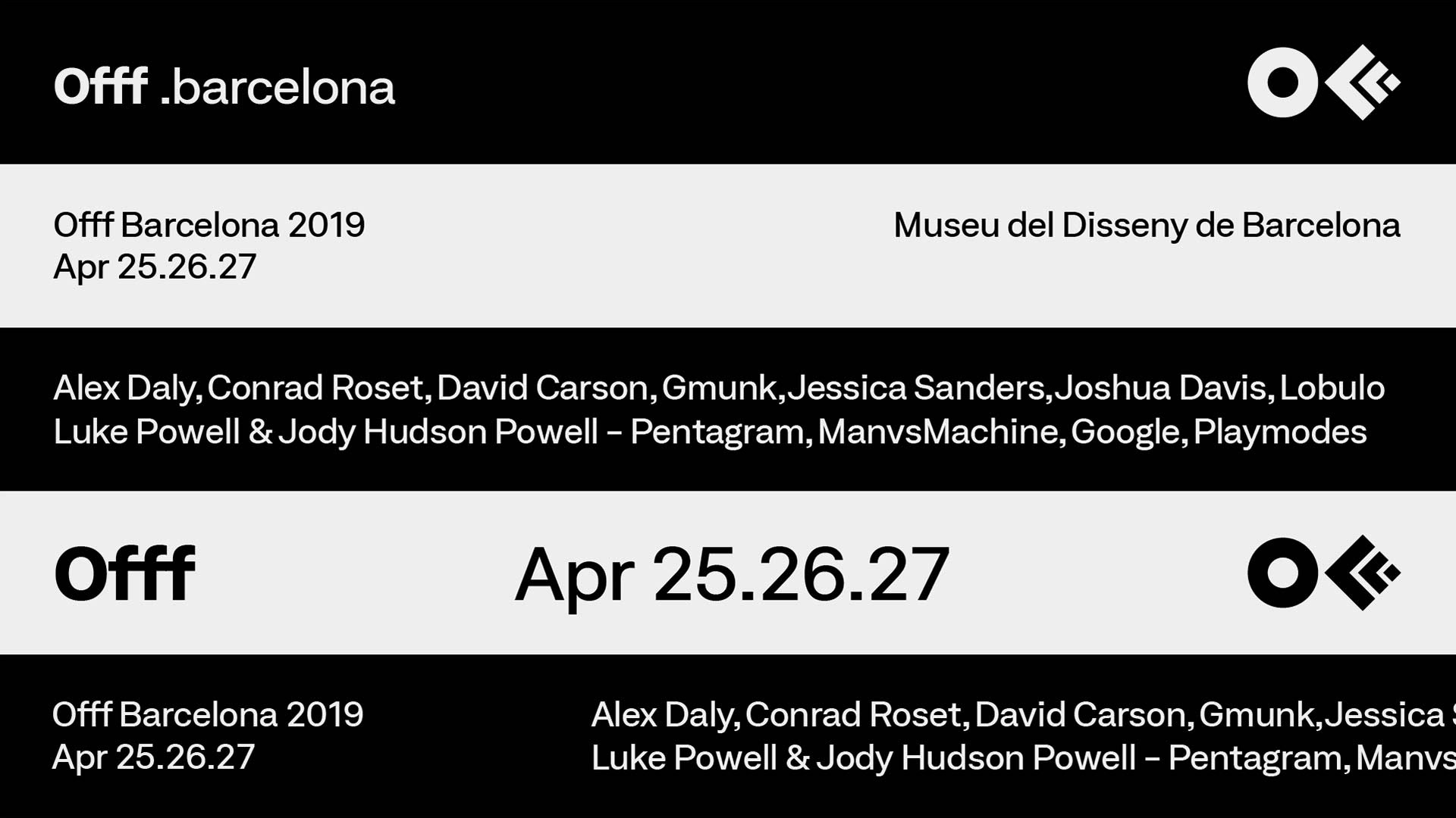
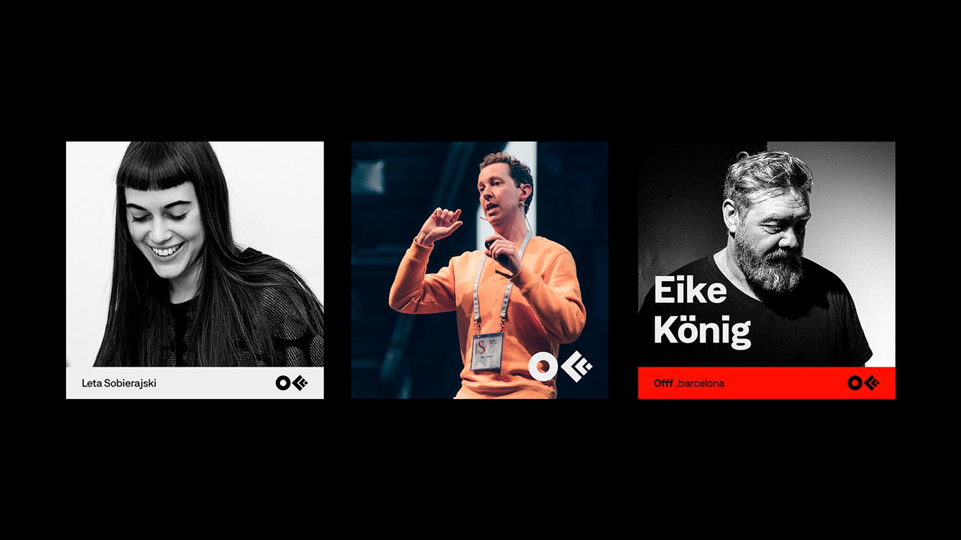
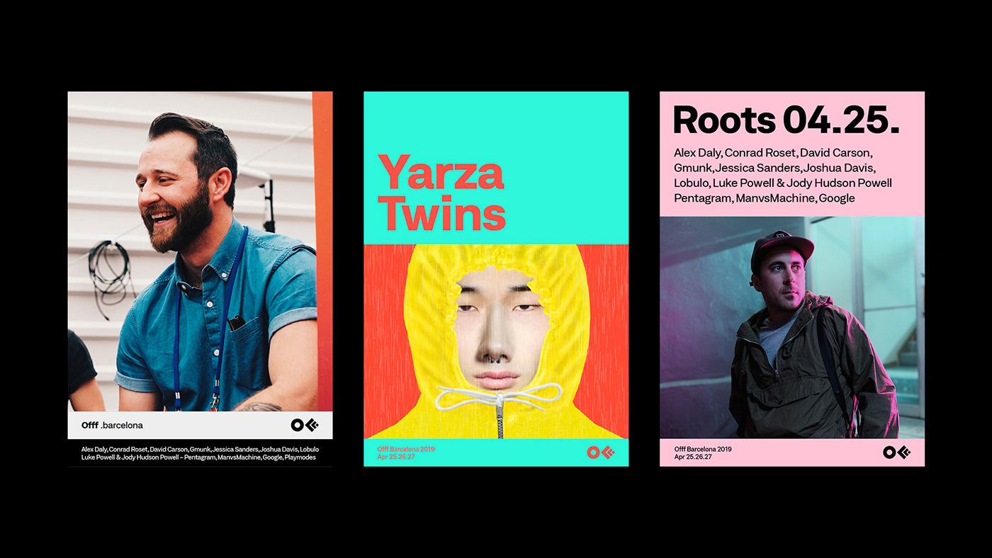
The Rebirth of OFFF
Being a longtime fans, friends and supporters of the best design festival in the world (literally) - OFFF, we cannot skip their recent visual rebirth made by Crowd Studio
Founded by Héctor Ayuso over a decade ago, OFFF started as a concept that transformed into an event joining creative talents from all around the world all together in one place. The main goal of OFFF is to become the key meeting point for artists who share the same interests to be in one place. Today, OFFF is more than an event, it is more than a Festival, OFFF has become a community providing the ultimate creativity experience.


Evolving context
In 2013, CROWD studio, one of the most talented Barcelona based digital and design agency, has transformed the famous 3 “FFF” into one icon, it was the birth of the official OFFF logo that maintained its presence for 5 years. With with over 18 years of content and a Festival that is ever-evolving, growing every year to become one the most important event to attend worldwide while providing endless innovation, it was time for a change. The OFFF icon has finally become visually recognised by everyone, so it became unnecessary to conserve the 3 “FFF” in the logo. The OFFF icon is now visually abstract, simplified and more compact thanks to re-thickness of the symbols.

Typography
“OFFF has been conveying one true message: “our audience, our speakers and our attendees are our base. Without them this wouldn’t be possible” so for such an important brand, user-experience is very crucial. We had to create something valuable for both, past attendees and new comers, to understand the message behind OFFF and to be able to navigate through 18 years worth of contents. Starting with the typography, the most important element to the human being’s eyes, we decided to work with a corporate font, showcasing some seriousness yet with a touch of flexibility.”

Problem solving
“From concepts to various visual campaigns in every edition and with over 8 OFFF on Tour cities, OFFF Festival is always changing its aspects. But the unity of the brand and the team behind it is the Festival's foundation. Over the past few years, we have noticed an overall shift in the brand’s identity. OFFF, the brand proving itself with the concept of having no brief and giving the complete freedom plus the invitation to create, this also had its consequence. We noticed that with so many openness, the brand unfortunately lost its visual presence and visual aspect throughout the Festival, online and onsite. So how do we showcase the dynamic aspect of the brand while maintaining its base? By creating a definite strategy in the brand’s communication structure and building a branding system.”


“With this new approach we are adding more control to the brand use, where the brand gets more identified with the ability to adapt to other contents therefore the Festival becomes more firm and more strengthened.”


“While using this new system of communication grid, the website become one dynamic block of contents making it easier for the user to adapt. This allows us to recreate the whole website as a platform and as an archive of news, past speakers, new speakers and events. An organised clean space.”
OFFF 2019
April 25 - 27

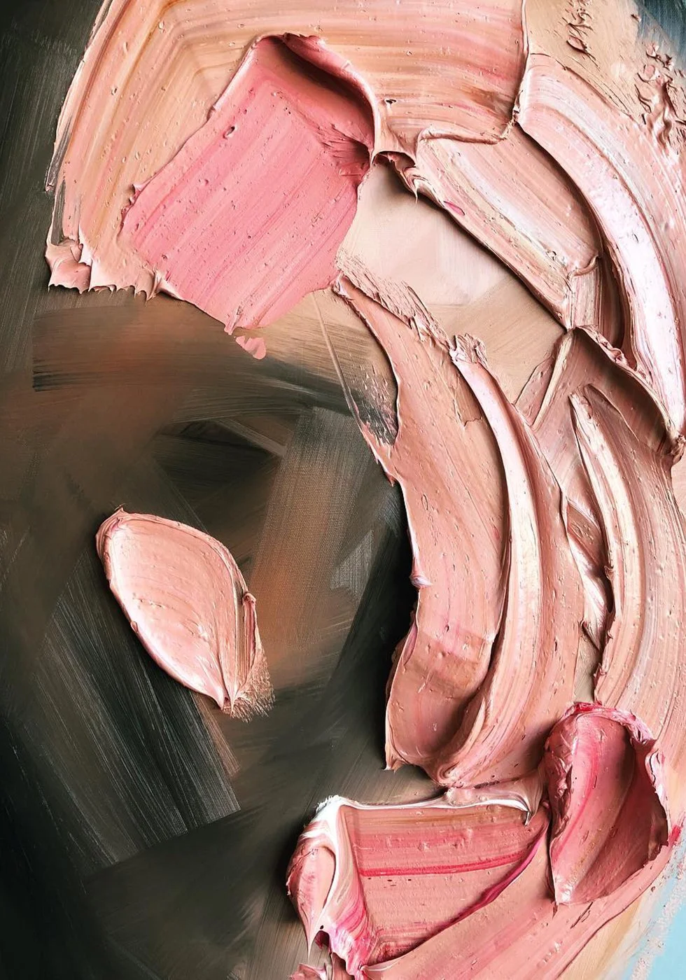
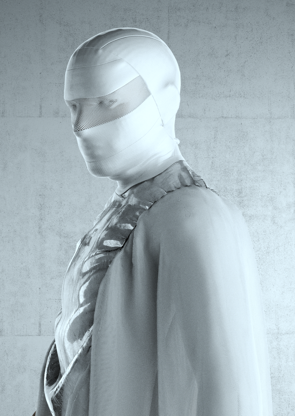
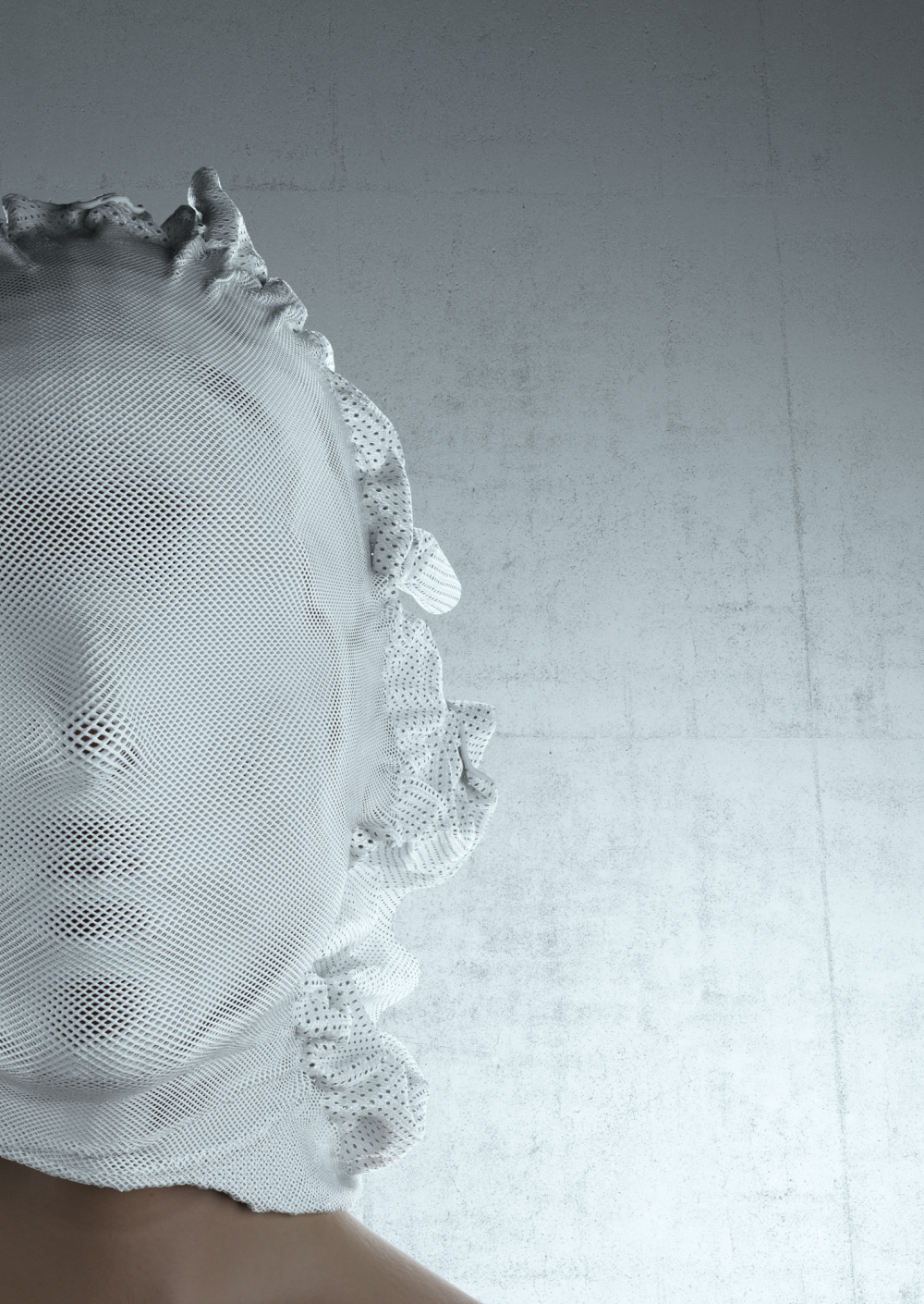
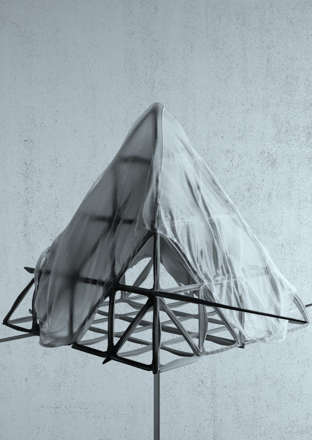
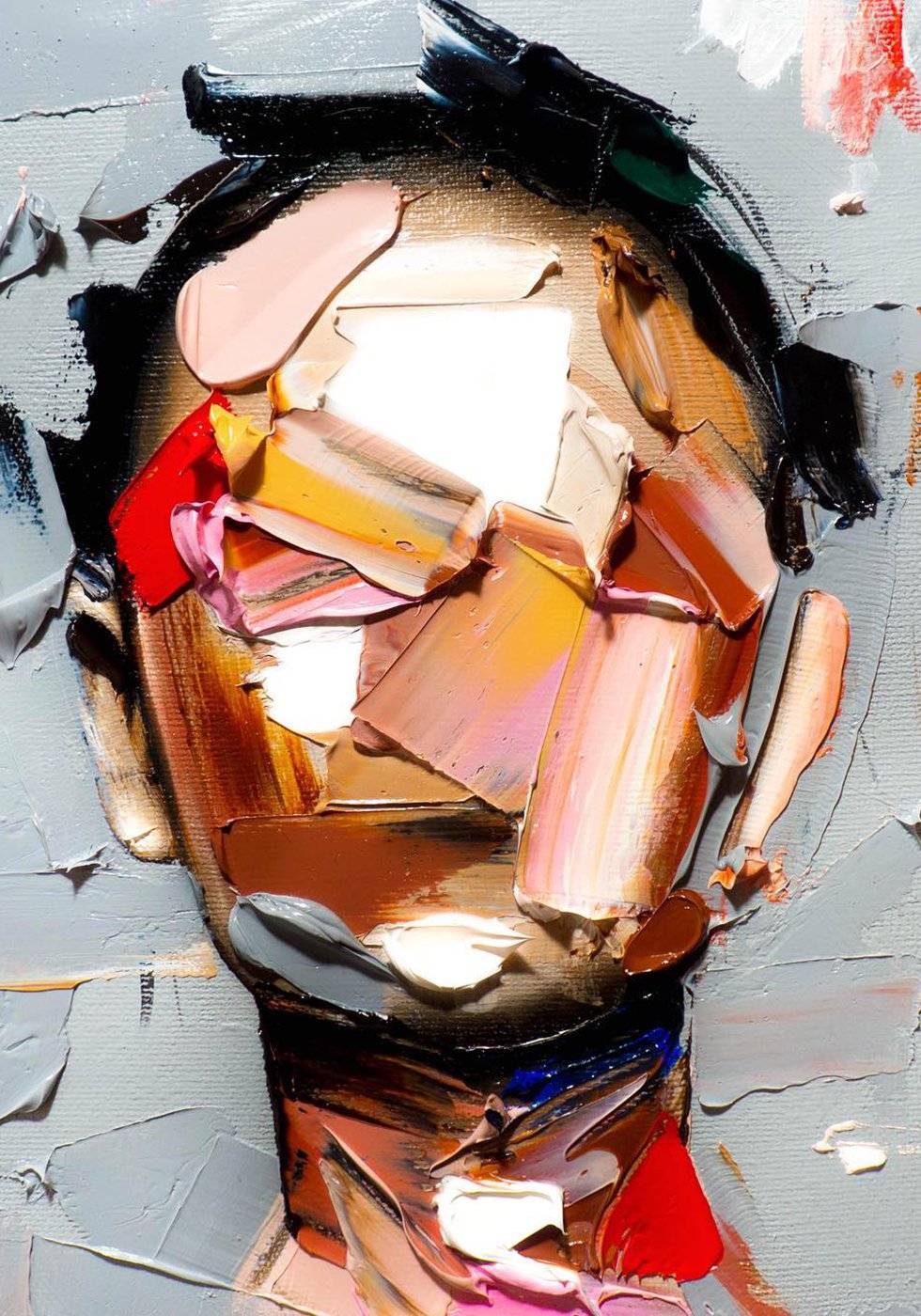
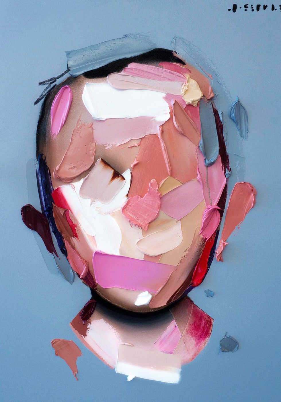
Joseph Lee’s Portraits
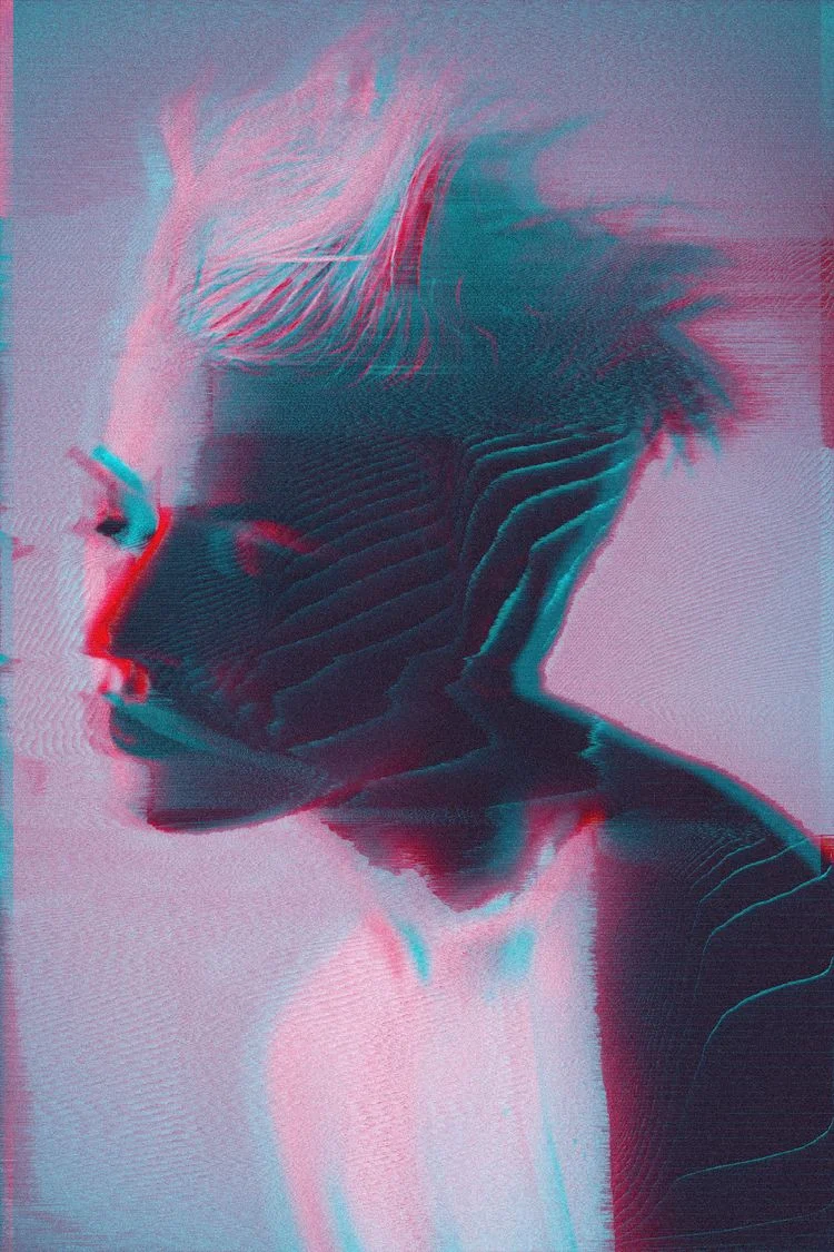
Los Angeles based actor and artist Joseph Lee has spent years studying faces and the feelings that they emote. So it's absolutely impressive that his series of abstract portraits, composed of just a few thick, segmented brush strokes, can convey so much emotion and expression. And all without hardly a single detail of the face exposed! I could study these portraits for hours, while admiring the beauty of each stroke and his brilliant use of colors.


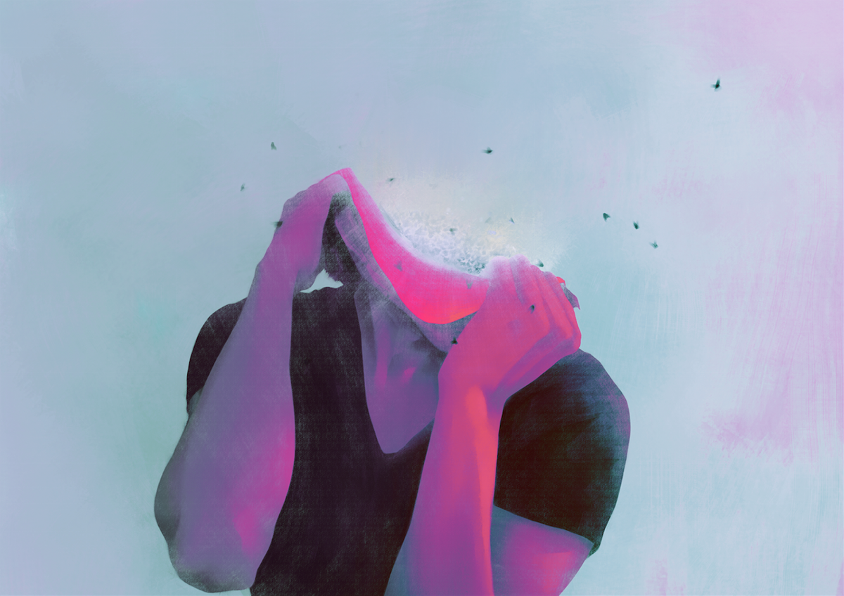
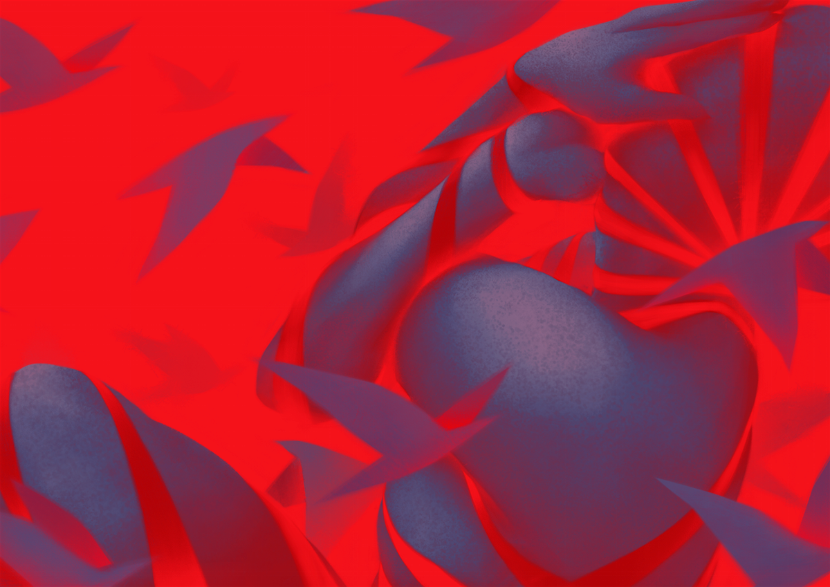
Undecember by Gentle Monster
Gentle Monster eyewear released an epic promo campaign by imagining Earth lost its sense of anxiety or hope, leaving the human race to resort to its most basic instincts of survival.
People believing in the power and strength of collective groups join together on what is the only way of transportation in this lost world. Witness the confident thoughts of self-conscious displayed in “Collective behavior”.
Gentle Monster’s ‘13’ Campaign sets place in a world where the moon shifts out of place and axis, slowly floating away from Earth creating the 13th month, Undecember. Animals start to act differently and people develop a dependency on either religion or technology. The changes in climate spark a split between anxiety and hope. Gentle Monster illustrates a message of hope brought from the insight and imagination spawned from the new world.
Designed by Frederik Heyman
The Art of Essence by Santi Zoraidez
Talented digital artist Santi Zoraides (who once collaborate with us on Digital Decade 5) was commissioned by LGSignature to create their new campaign
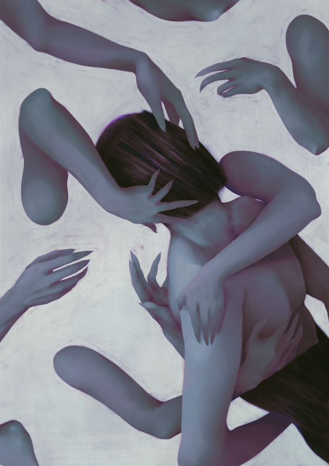
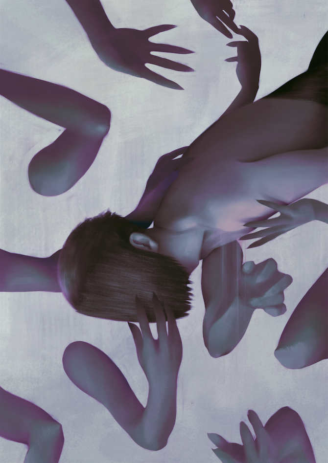
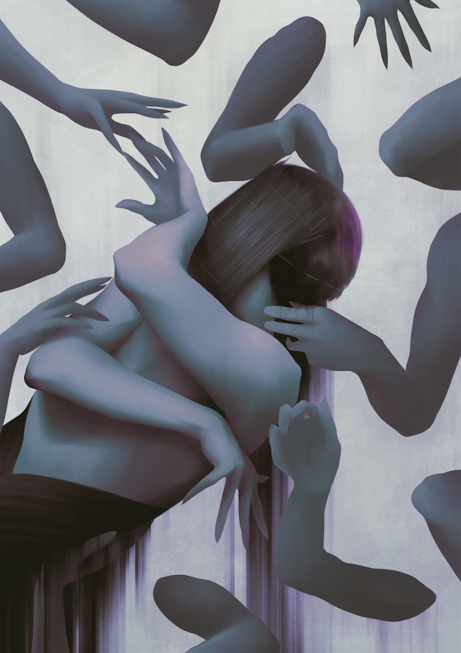
Between Rivers by Mojo Wang
Between Rivers is an ongoing project of illustrator Mojo Wang
Mojo (Chuanjie Wang) is a self-taught illustrator. He was born and raised in Shanghai. Received his BA in Industrial Engineering from Shanghai University of Engineering. Currently pursuing his MFA in Illustration in SVA, NYC.
Kobayashi - The Story of Geisha
The story happened in Kyoto, 1872. The geisha Kobayashi and Hideyoshi fell in love with each other, and he became her lover. However, due to the war, they were separated from eachother forever.
This titles video is a prelude to a self-initiated animation short sequence “KIYOMI KOBAYASHI — Sword and fire” created and directed by Yi Le
“It is the art work I want to make after my first trip to Kyoto this year,I was really impressed by the great temples ,garden and people there,I felt very peaceful when I was in Kyoto.Unluckly,I didnt have a chance to watch the performance of geisha at thattime,but I saw a lots of geisha walking on the streets,It’s like time never passed!
In this video,I portraied the 1872’s Kyoto in my thought, The geisha Kobayashi and Hideyoshi fell in love with each other, and he became her lover. However, due to the war, they were separated from eachother forever. I hope this story will bring people’s attention to the cruelty of war, as well as the status of women during those times.”


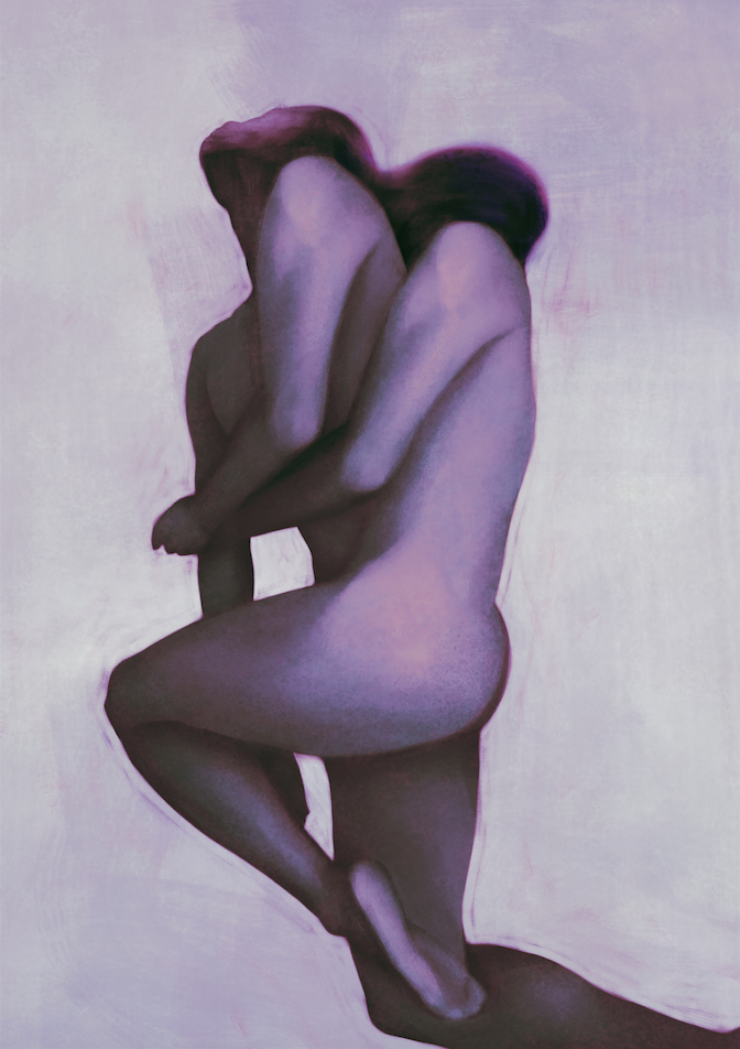
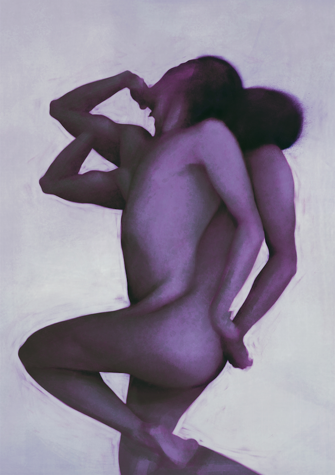
Marta Syrko Photography
Fine arts photographer Marta Syrko strips off her feelings in every shot she makes.


Digital Illusions by Simone Vezzani
Italian CG artist Simone Vezzani creates perfect illusion in phygital world
Jang Dong Won
Master of mellow sunsets and manipulated golden hours artist Jang Dong Won creates illusions we all deserve at the end of the day
Chrome Metal Illustrations by Vasya Kolotusha
Digital artist Vasya Kolotusha creates overhyped images using a lot of chrome metal effect what makes his art works jump out of the screen. He is booked by H+ Agency creating a lot stuff for Elton John, American Music Awards, Variety, Superdeluxe, Future Generations, Billboard Music Awards, Nike etc


Max Cooper Identity by Eugene Pylinsky
A rising star - new media artist Eugene Pylinsky made a tribute to one of his digital art idol - Max Cooper whom we have been following for a decade. The further collaboration of two strong parties released a project called “Identity” where Eugene reflected on the informational field that shapes both their personalities and creativity.

“I was trying to find balance between web and live versions of the video. That’s why I decided to generate strong graphics, like barcode and qr code, in my compositions, with characters melting and disappearing in it. I paid much attention to synchronise the music with graphics to deliver intensity, atmosphere.”
London Fireworks 2019
As a small tradition we share the most beautiful New Year Countdown Firework that’s taking place in London every year. “London is Open” is a new campaign for this multi-cultural melting pot went as a red line during the show last night.
Full recording from BBC Live
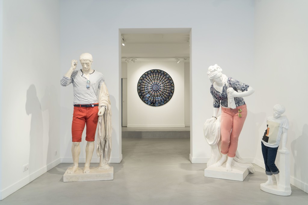
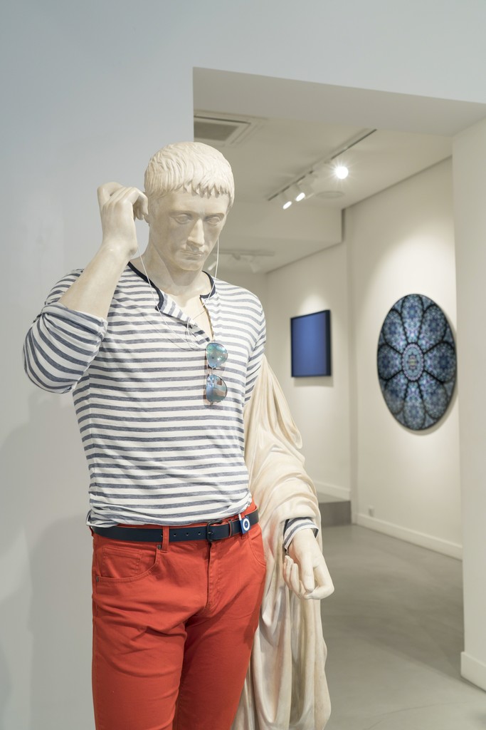
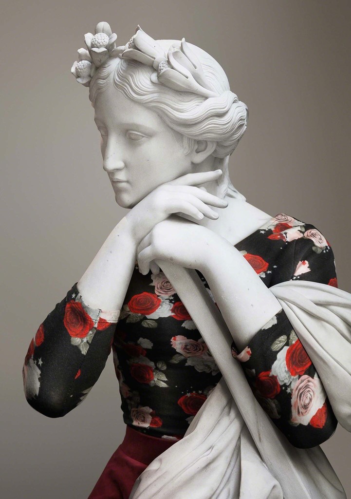
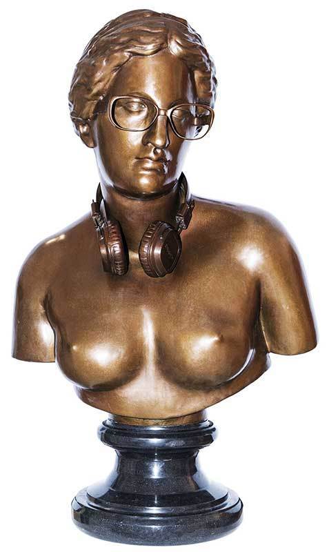
Hipsters in Stones by Leo Caillard
Started as a fun series several years ago becomes a personal art project “Hipsters in Stones” of Leo Caillard, artist and resident of MTArt Agency.
“The statues, with their clothes stripped away reveal a magnificence of shape and balance. But what were the greeks wearing when they weren’t posing for sculptors? Appearance, in all its many nuances, presents character. One’s dress sense indicates one’s priorities, choices, lifestyle — are you ‘in’ or are you ‘out’? Hipster or classic? Which tribe are you a member of? which tribe we the men posing for these statues from? Hipsters in stone presents a twist on these themes — take the ultimate from the classic world and add a modern, contemporary twist”


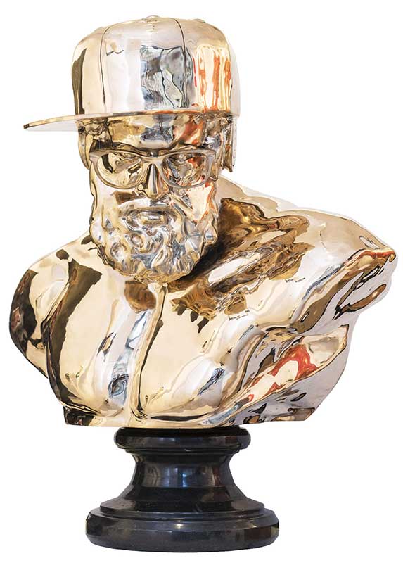
Hipsters in Bronze, 2017
Top 2018 Posts
To finish our 15th year online we decided to select the 18 top visited posts in 2018. We also proud to run and co-run 2 events in London on our digital art platform The Digital Decade this year together with our friends and partners! Next year is going to be huge - we promise! New partners, new friends, new artists and new horizons!
TOP VISITED POSTS IN 2018


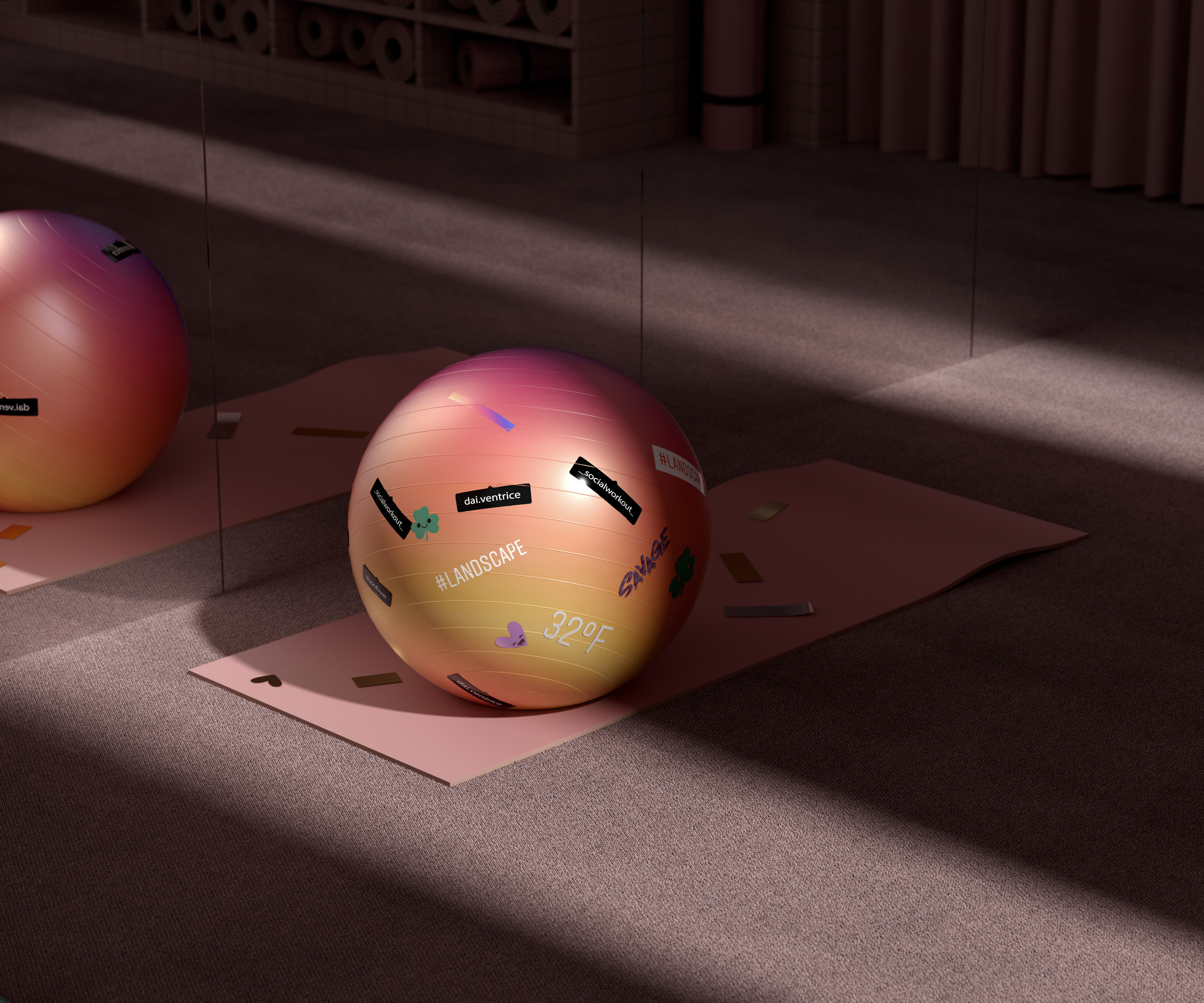
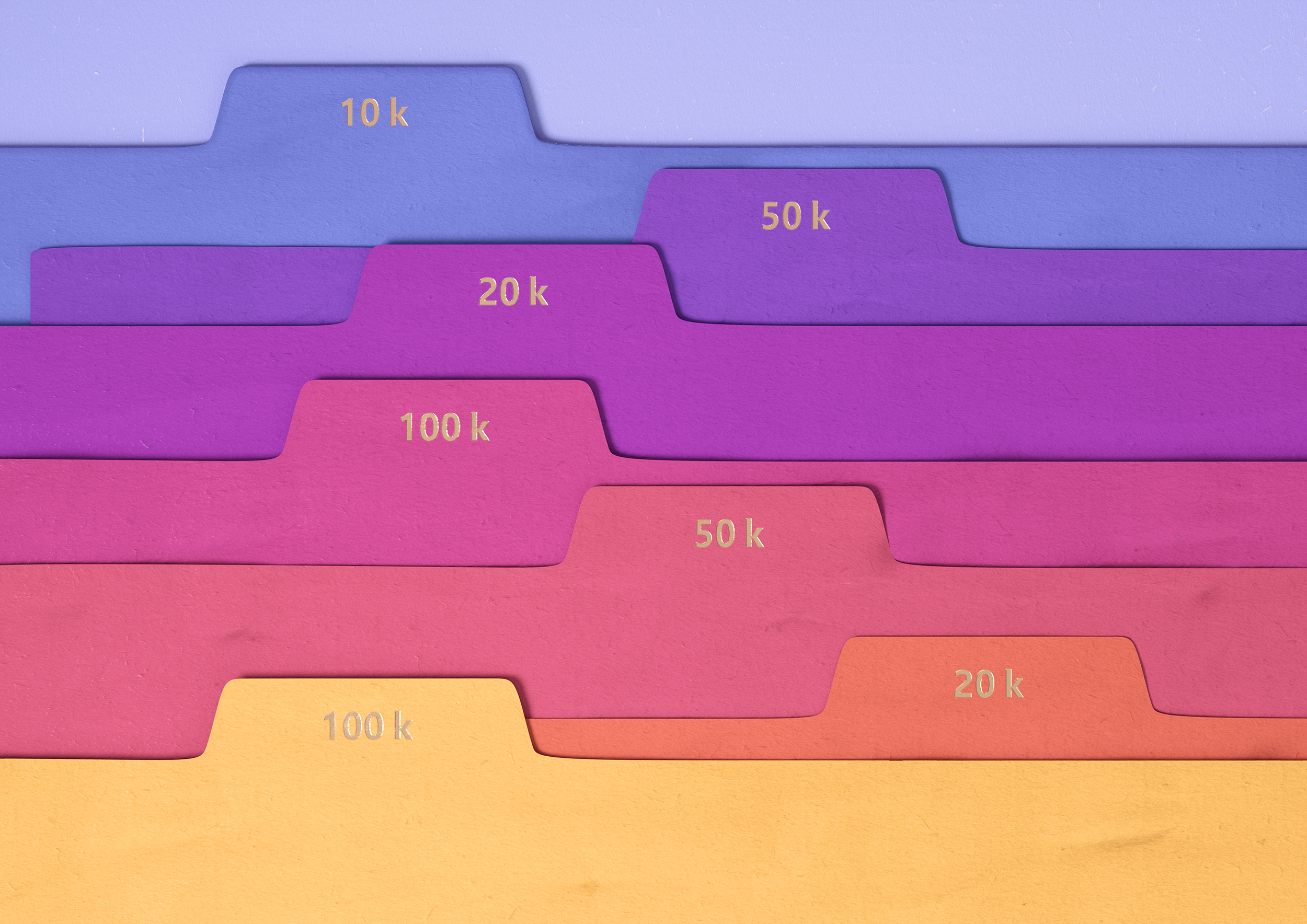
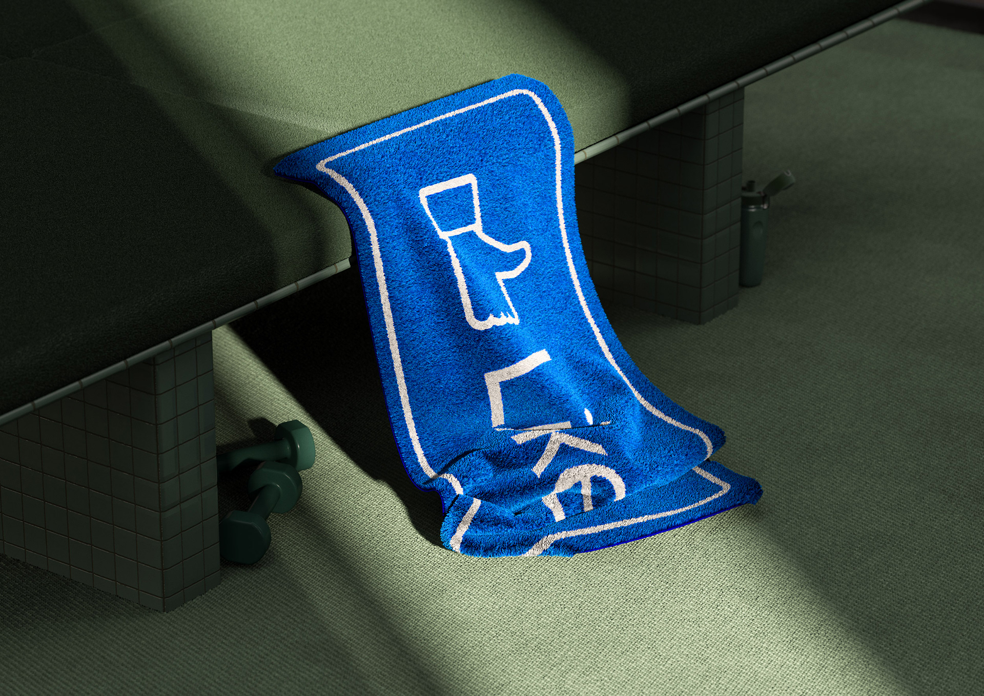
Social Workout
Barcelona-based designer Ezequiel Pini creates an ongoing project “Social Workout” as an art director of Six N.Five team best known for their CG masterpieces
Self-explanatory visual research “Social Workout” is a topical satire on our habits and weaknesses


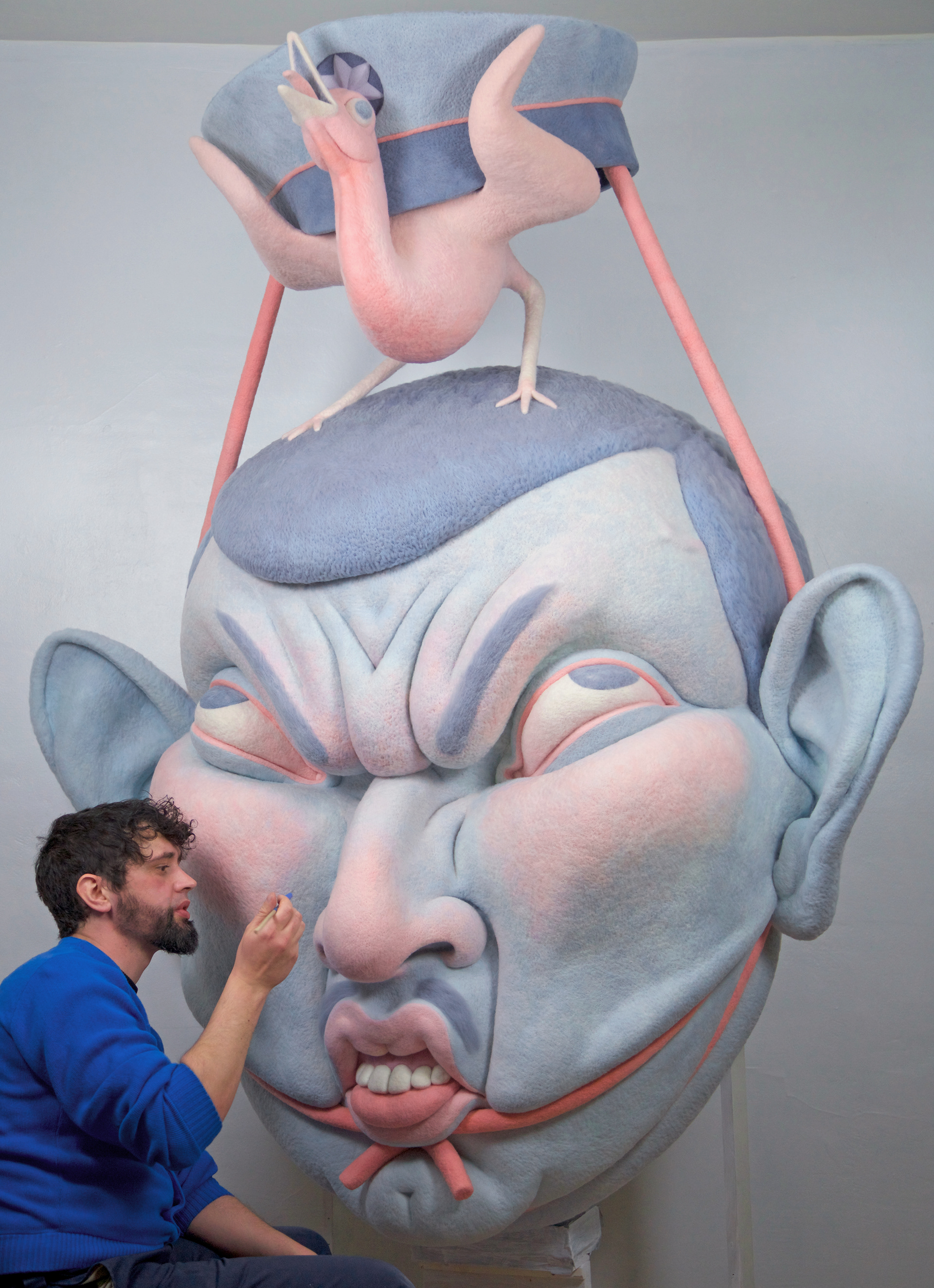
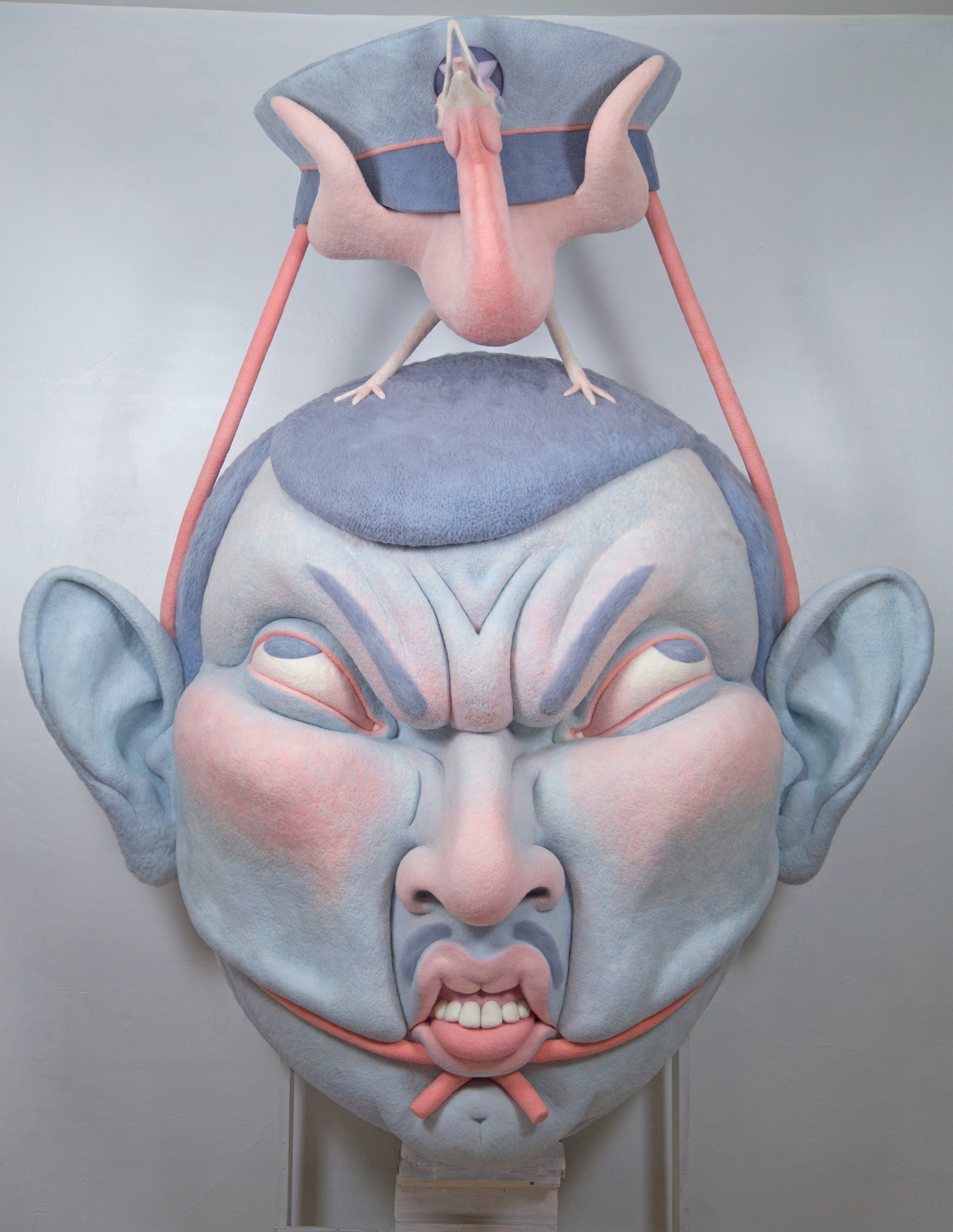
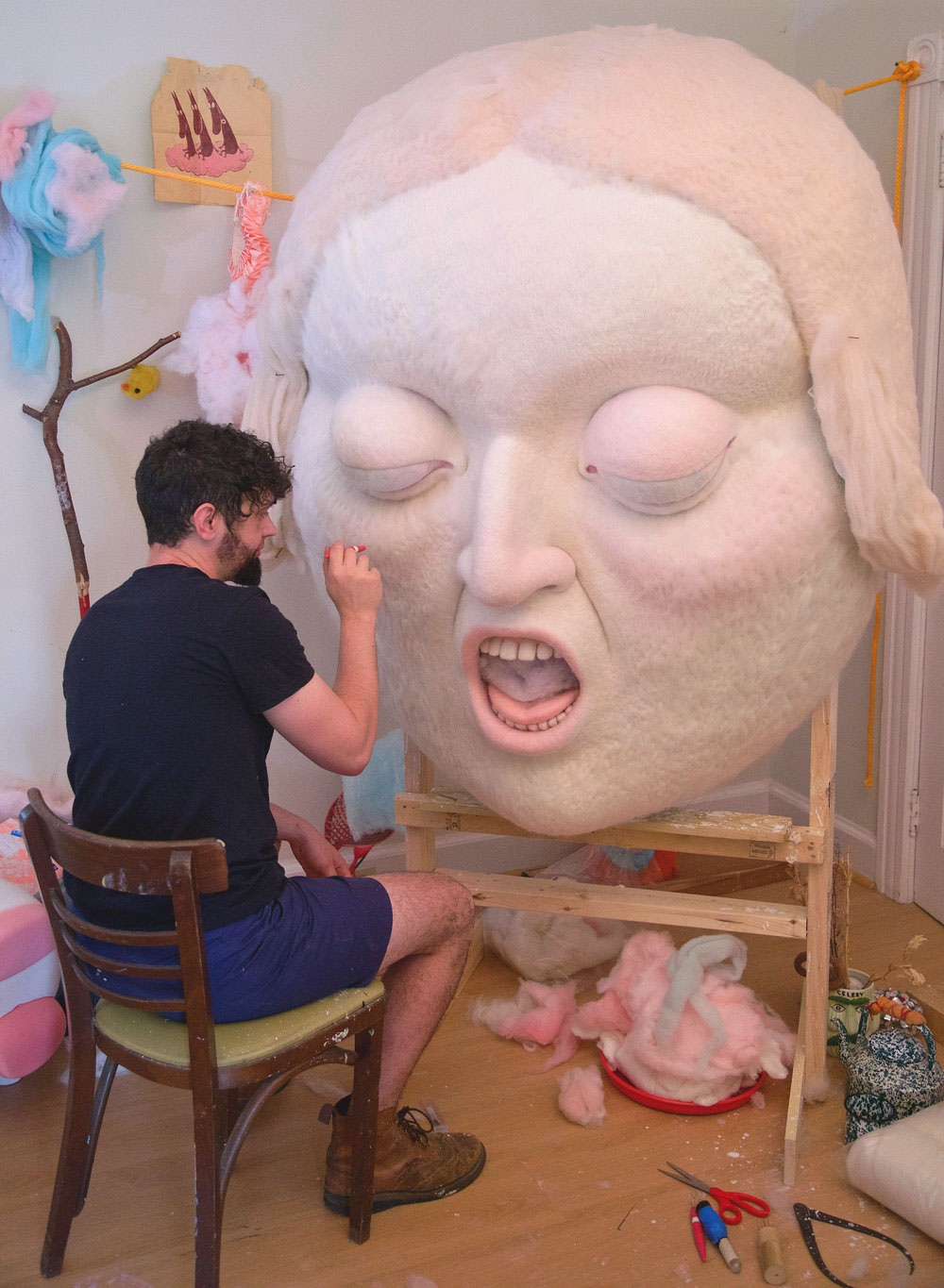
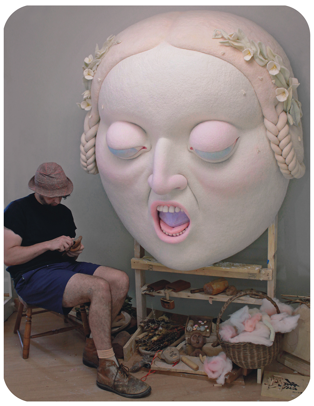
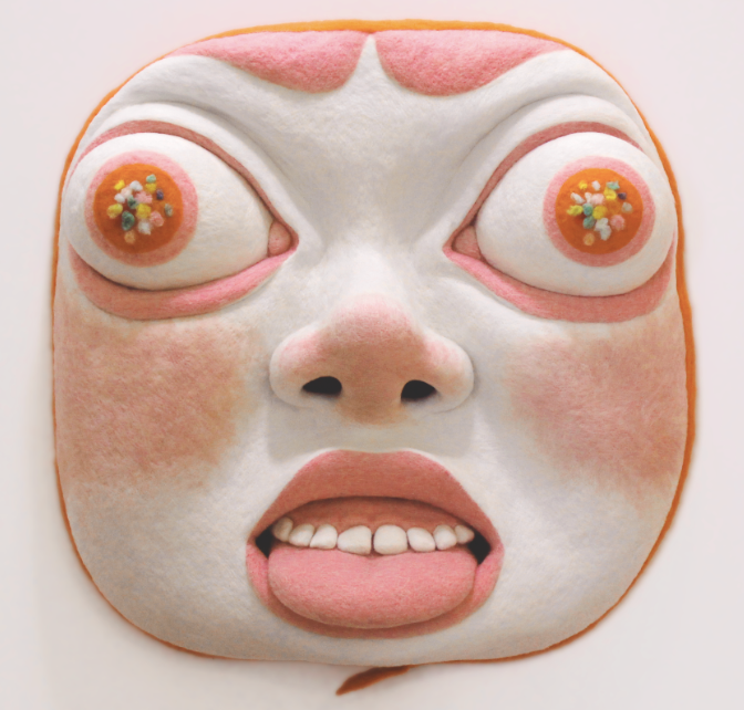
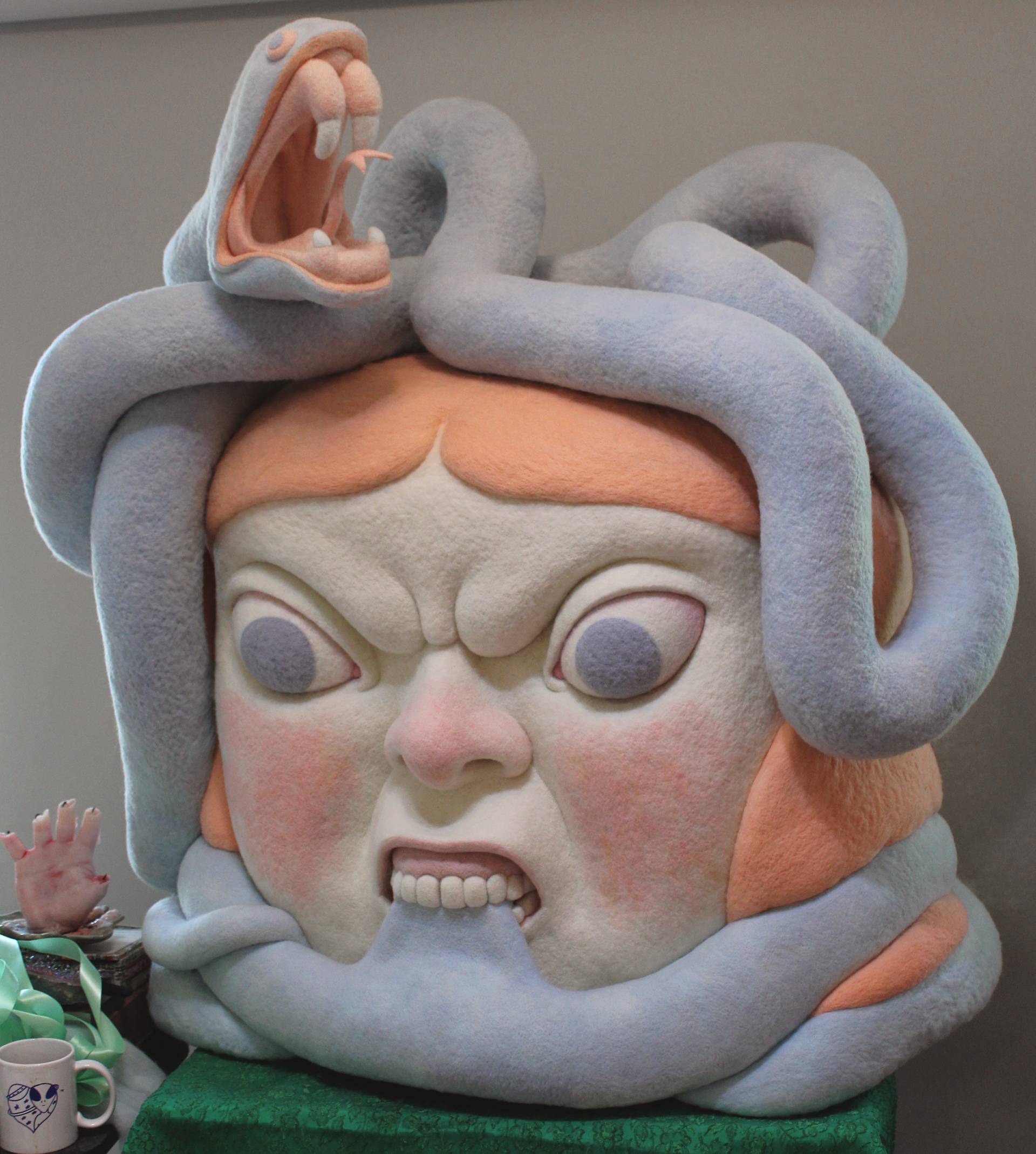
Felt Giants by Paolo del Toro
American artist Paolo del Toro painstakingly creates huge felt heads that appear to us as a mix of ritual and tribal masks from Central and South America and friendly characters from Japanese animations of Hayao Miyazaki.
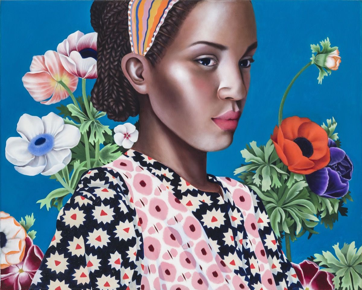
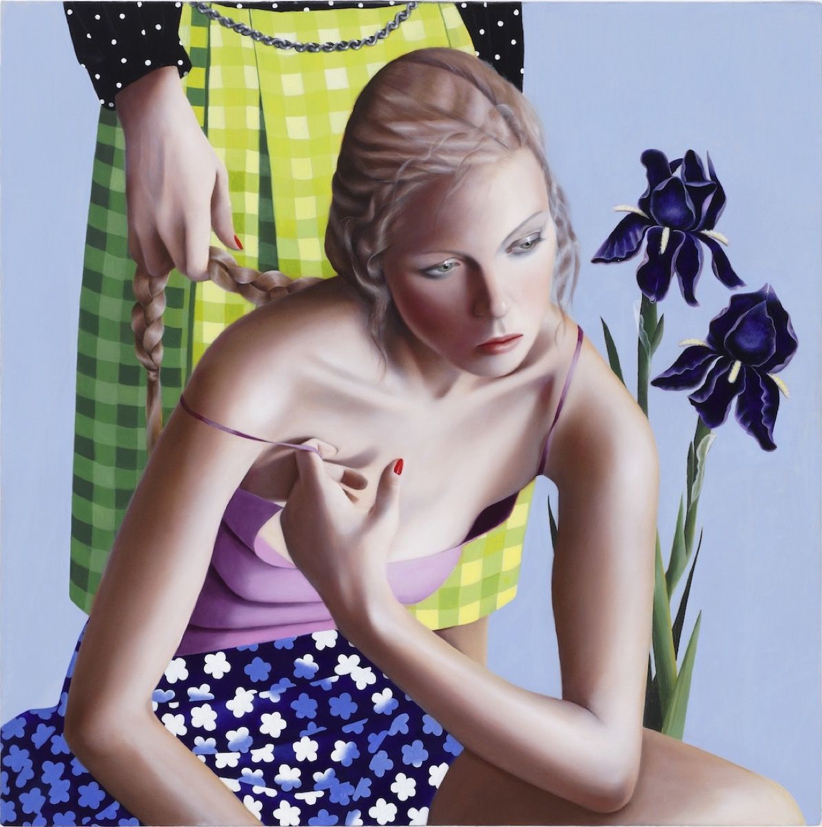
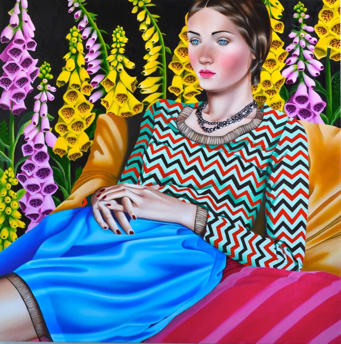
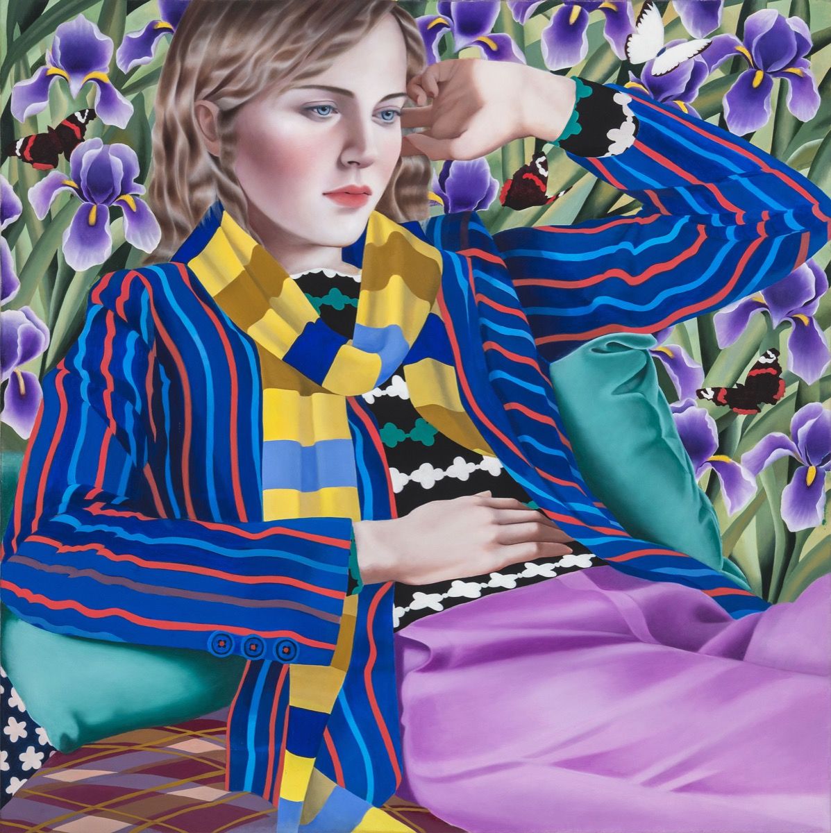
Jocelyn Hobbie Art
Jocelyn Hobbie is a painter known for her hyper-realistic, brightly coloured portraits of women. “Over the years, Hobbie’s style has evolved from early days spent painting in an almost miniature scale to a later body of work that includes multiple subjects and more loaded scenarios.”
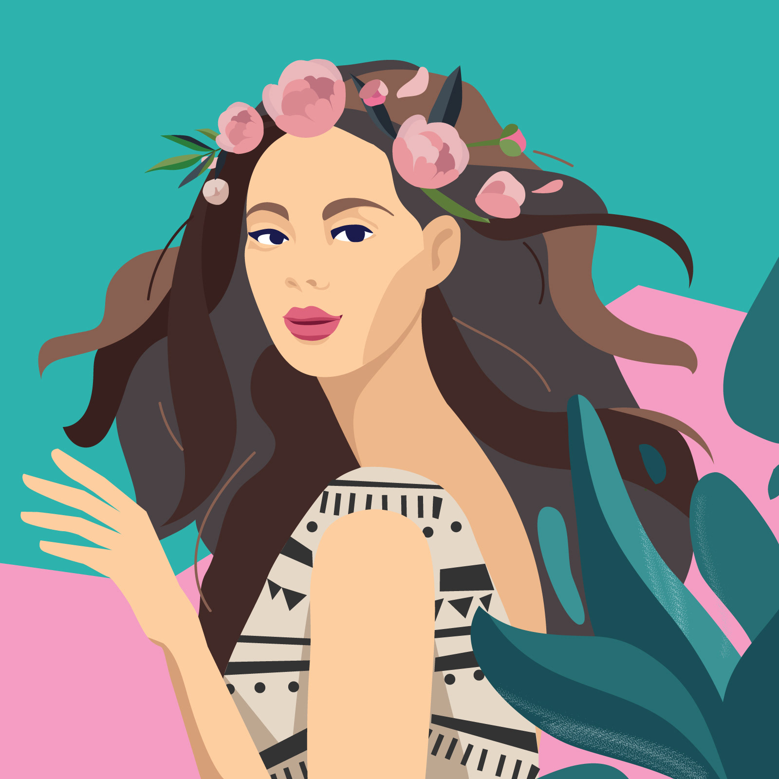
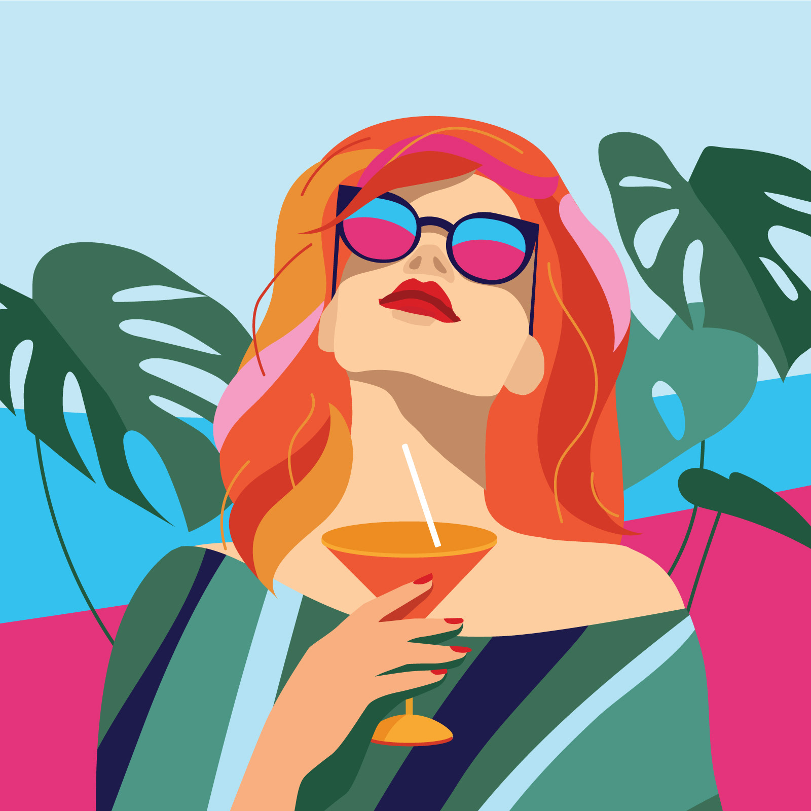
Hair Code by Irina Kruglova
Talented Russian artist Irina Kruglova release her massive illustration project made for Hair Code, P&G


IcoNYC Squarespace
Being a Squarespace running blog we can’t miss their recent update of identity made by our friends from DIA Studio together with François Rappo (Typography), and Optimo
“Squarespace is one of very few technology companies that can truly call NYC home. The city has inspired our attitude, our aesthetic, and our mission to democratize good design for every ambitious entrepreneur, artist, or visionary with a dream. As we began to rethink our brand identity, we knew we needed to find a way to make New York a bigger part of the story.”
“New York is a study in movement; like jazz, it constantly heads in unpredictable directions. Since much of our output is interactive and screen based, we knew the brand needed to make sense in motion. So we developed a kinetic identity system that dimensionalizes our name and reinforces the two syllables in Squarespace.“
