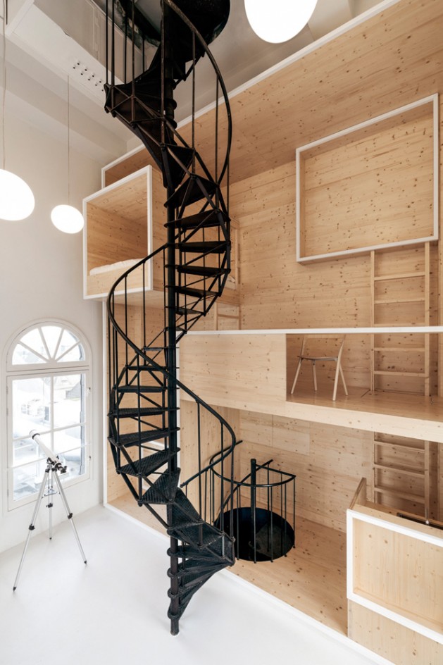
The Room on the Roof by i29 Architects

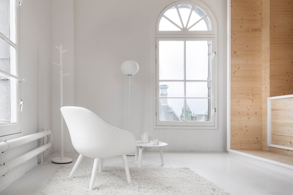
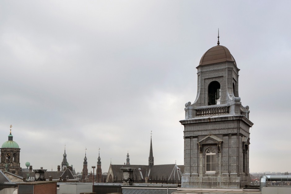
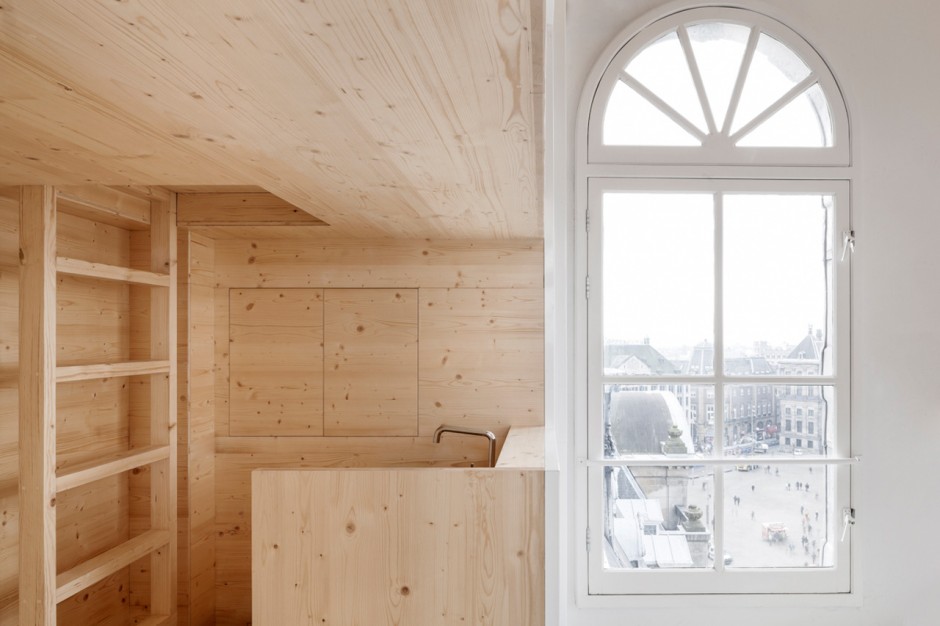
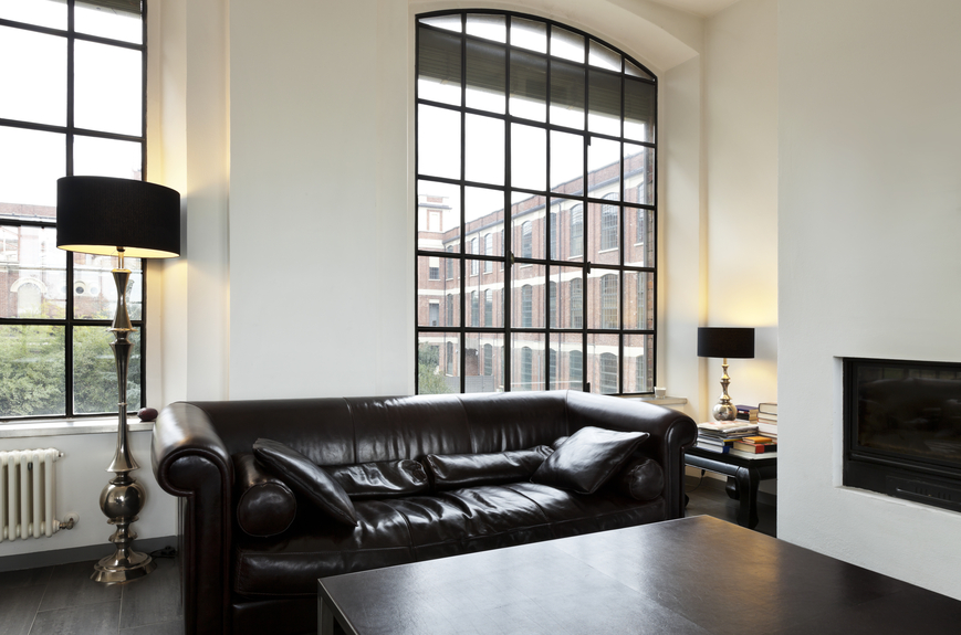
Located in Amsterdam's Dam Square, the De Bijenkorf department store was first built in 1909 as a gorgeously cresselated neo-gothic structure pierced by a distinctive central turret. Since it was built, that tower has been mostly for show, but thanks to a partnership between the interior architects i29 and the nearby Rijksmuseum, De Bijenkorf is now turning the tower into a beautiful design haven. Called the Room on the Roof, the De Bijenkorf tower has been transformed into a bright, modern design studio, complete with a kitchen, a day bed, a sitting room, and a telescope. via

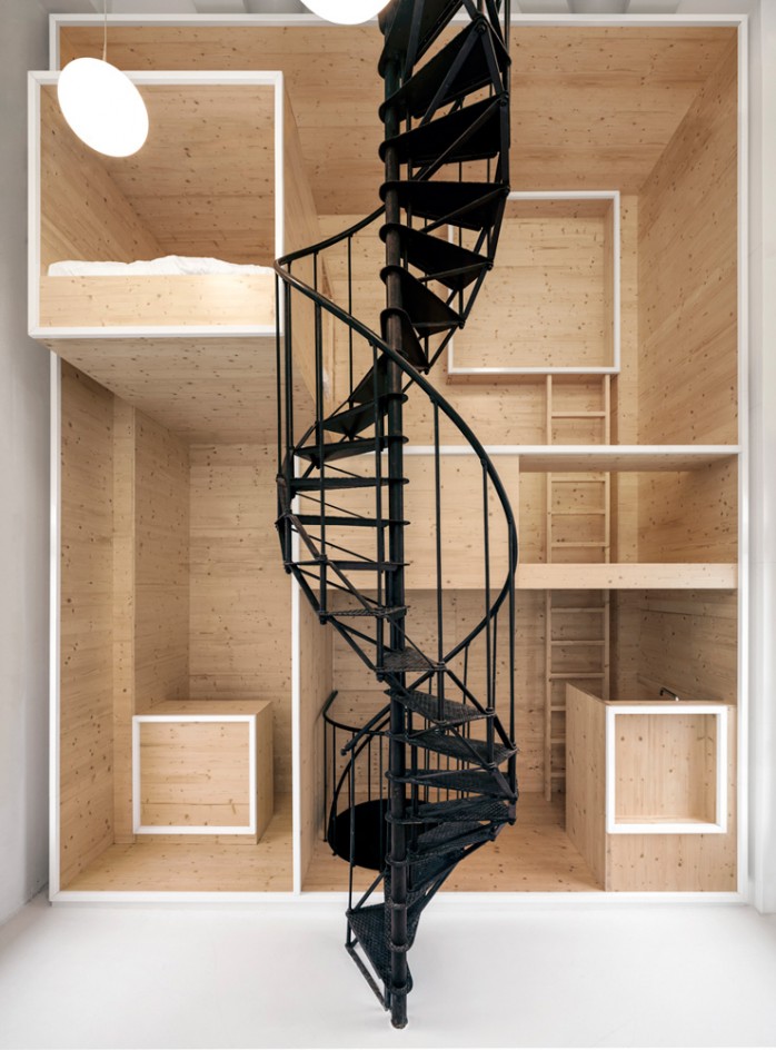
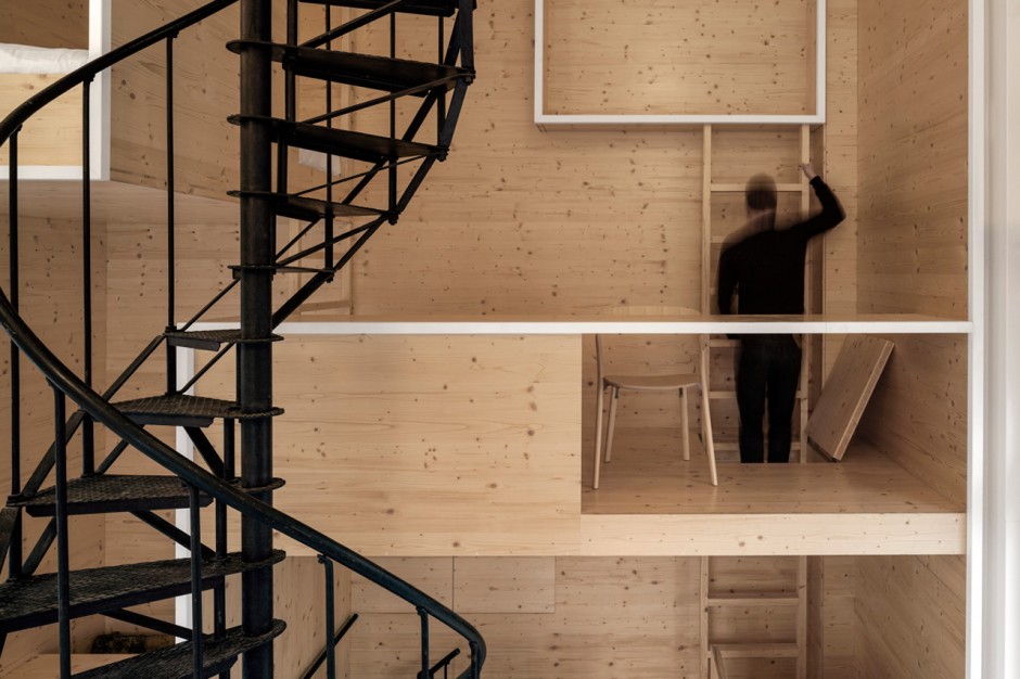
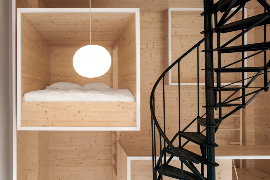
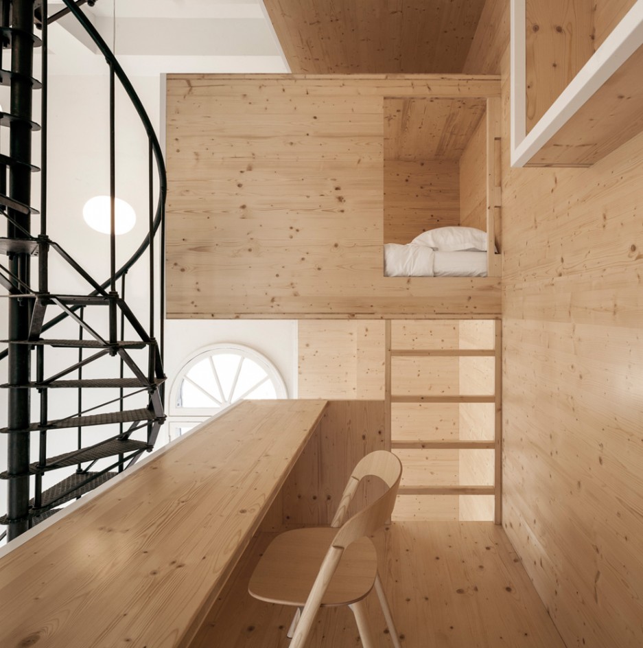
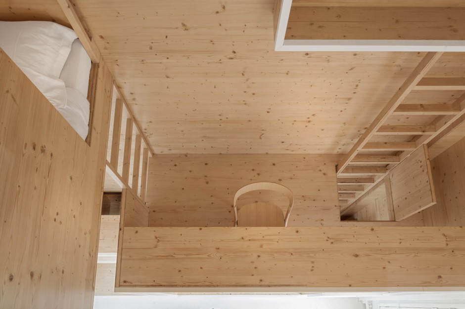
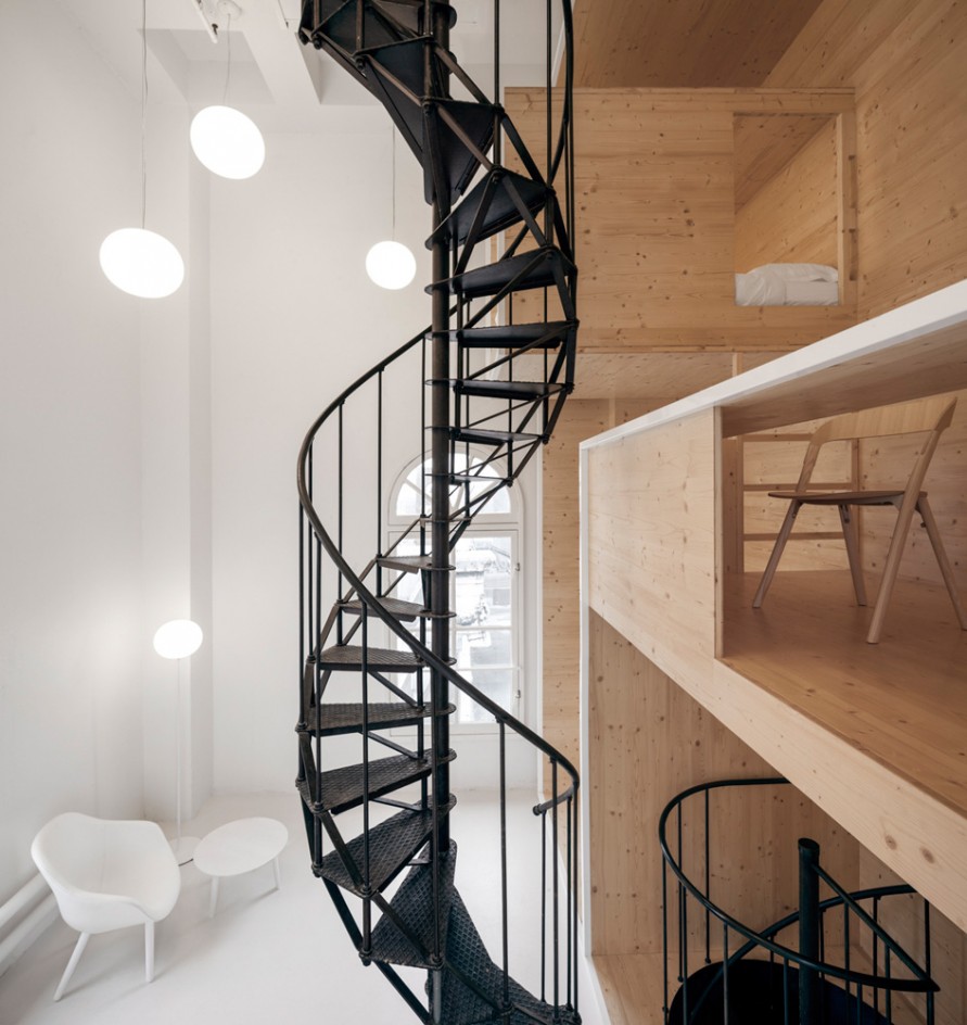
"The biggest challenge of designing the space was simply the size of the floor area: just 16 square meters," i29 directors Jaspar Jansen and Jeroen Dellensen told me by email. "That was one of the reasons why we ended up with a vertical installation, which creates a 'living cabinet' that allows artists-in-residence to experience the tower on different levels."

129interiorarchitects-amsterdam-1 129interiorarchitects-amsterdam-2

129interiorarchitects-amsterdam-3

129interiorarchitects-amsterdam-4

129interiorarchitects-amsterdam-5

129interiorarchitects-amsterdam-6

129interiorarchitects-amsterdam-7

129interiorarchitects-amsterdam-8

129interiorarchitects-amsterdam-9

129interiorarchitects-amsterdam-10

129interiorarchitects-amsterdam-11

Uncommon Places by Reuben Wu

Uncommon Places is a long-term project run by British photographer Reuben Wu (Instagram) whose works have we started to share last year. Nowadays Reuben is back with the new works explaining the project "Uncommon Places" as "An attempt to convey my relationship to landscape and artefact. A perpetual search for unfamiliar terrain.."

reuben-wu2015-1

reuben-wu2015-2

reuben-wu2015-3

reuben-wu2015-4

reuben-wu2015-5

reuben-wu2015-6

reuben-wu2015-7

reuben-wu2015-8

reuben-wu2015-9

reuben-wu2015-10

reuben-wu2015-11

Type Made From Fragments Of Famous Artworks

"The latest project from quirky Israeli typographer Oded Ezer takes one feature of a famous artwork, like the Mona Lisa, Van Gogh's self-portrait or Vermeer's Girl With A Pearl Earring, and uses it to create a typeface, to hilarious and disturbing effect. The typeface made of the surf from Katsushika Hokusai's The Great Wave off Kanagawa is innocent enough. But things get weird when Mona Lisa's finger is used to form a letter V or Van Gogh's mustache to create a T. Ezer's best typeface by far uses a piece Michelangelo's David, but we'll leave the specifics of that one a surprise." writes FastCo

arttype-odedezer1

arttype-odedezer2

arttype-odedezer3

arttype-odedezer4

arttype-odedezer5

arttype-odedezer6

Yuri Shwedoff Creative Illustrations

Yuri Shwedoff is a young artist from Moscow who is still a student in art school but he already has a great talent in illustration. Last year we featured one of his works - Audrey. He made a lot of creative illustrations on various thematics like cinema and futuristic and surrealistic landscapes. A high quality work for a young student, a great promise for the future.

yuri-shwedoff-1

yuri-shwedoff-2

yuri-shwedoff-3

yuri-shwedoff-4

yuri-shwedoff-5

yuri-shwedoff-6

yuri-shwedoff-7

Voyageur du Temps Bakery Identity by Character

You may know that a half of success for any design project is its showcase. Another quarter is a story like this: "An old railway station in Los Altos, California, has been transformed into this exquisite new bakery and café by local entrepreneur Rie Rubin, with the help of the creative people at San Francisco-based design agency Character. Named Voyageur du Temps, which means time traveler in French, the café seeks to preserve the time-honoured art of baking by adding a dash of contemporary life to it. Here you will find freshly baked artisan breads and pastries, as well as a variety of courses that give a playful wink to continental breakfast staples like the Croque Monsieur and crepes with fresh fruit."

Voyageur-du-Temps

Voyageur-du-Temps1

Voyageur-du-Temps2

Voyageur-du-Temps3

Voyageur-du-Temps4

Voyageur-du-Temps5

Voyageur-du-Temps6

Voyageur-du-Temps7

Voyageur-du-Temps8

Voyageur-du-Temps9

Voyageur-du-Temps10

Voyageur-du-Temps11

Voyageur-du-Temps12

Voyageur-du-Temps13

Voyageur-du-Temps14

Marta Gawin Graphic Design

Marta Gawin is a Polish multidisciplinary graphic designer with some great experimental visual identity, sign system, poster, information, exhibition and editorial design work. Since her MA in Graphic Design (Academy of Fine Arts, Katowice) in 2011, she has been working as a freelancer for cultural institutions and commercial organisations. via FFF

marta-gawin1

marta-gawin2

marta-gawin3

marta-gawin4

marta-gawin5

marta-gawin6

marta-gawin7

marta-gawin8

marta-gawin9

marta-gawin10

marta-gawin11

marta-gawin12

marta-gawin13

marta-gawin14

The Mac to the Future, Concept

German tech website CURVED/labs has envisioned how Apple’s design history could be better honored, and the result, even managing to find a new use for the iconic floppy drive on the lower right side of the front panel, is stunning. The ‘Mac to the Future,’ based on the shape of a Mac 128K, would have the respectable inner components of an 11-inch MacBook Air, but with a special twist: it would be usable either as a regular desktop computer or as a Mac OS-based touch-screen device. And where the floppy disk slot once was are now slots for SD cards, the FaceTime camera, speakers and a microphone.

vi psfk

mac-to-the-future1

mac-to-the-future2

mac-to-the-future3

mac-to-the-future4

mac-to-the-future5