The 2012 begins and it's time to renew calendars. With the help of Designmilk and Behance Network we selected the most interesting and creative calendars for 2012.
Typodarium 2010
Typodarium 2010 is the first typographic tear-off calendar, with 366 typefaces from 252 designers hailing from 32 countries. via DesignMilk


urbnCal
"The team from UrbnCal chooses a city to feature each year in a calendar. The team then bikes around that city and photographs number plates to represent each day of the year. This year they chose Helsinki, Finland." via DesignMilk


Art Calendar 2012 by Martin Grohs
Print graphic calendar created by Martin Grohs


Infographic Calendar 2012 by Martin Oberhäuser
Each color/ring represents one month of the year. National holidays (Germany) are highlighted with an icon and pink color. The tabular view at the bottom offers some space to fill in appointments or birthdays. Check it on Behance


The Eyes of Imagination 2012
New calendar by talented illustrator Irina Vinnik features her love to imagination and hand drawing. Available in inverted colours version too. Check it on Behance


2012 Typographic Wall Calendar
The calendar is made of exactly the number of used keyboard keys that represent the year. Created by Harald Geisler, via DesignMilk


Twenty Twelve
A collaboration between Evgenia and Dominic Righini-Brand and Attitude Creative resulted the one-sheet graphic calendar "Twenty Twelve"


Calendar 2012 by GHIN
"Calendar 2012 by GHIN comes with lunar cycles and the Mayan calendar. It’s also available in an Interfaith edition – various prices available on ghin.co.uk" via DesignMilk


Bubble Calendar 2012
Each time I see Calendar using a packaging bubble wrap I remember my university course work in 2002 when I did the same calendar. Enough reflecting here is a real Bubble calendar you can buy and pop everyday.


2012 Typography Calendar
Created by Studi Hinrichs. Each edition of Typography Calendar features 12 unique typefaces, with brief descriptive text about what makes the font distinctive, and a biography of each type designer. All major holidays for the United States and Canada are noted on the calendar, along with the birthdays of the type designers. via DesignMilk


Minimal Calendar
"The minimal black and white illustrations featured in Pawling Print Studio‘s calendar reflect the patterns of traditional textiles that they were inspired by" via DesignMilk


Cut Out Number Calendar 2012
Simple and graphic cut out numbers form this 2012 wall calendar. Choose your colour.






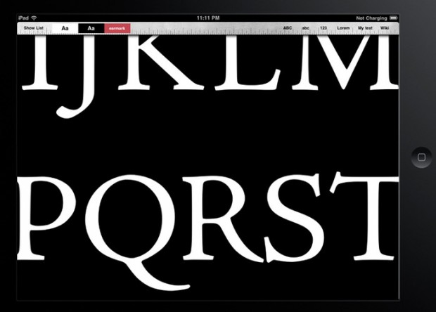


 Young and prosperous
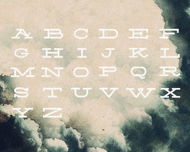
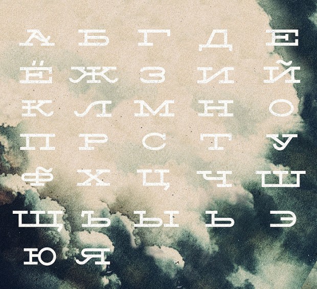
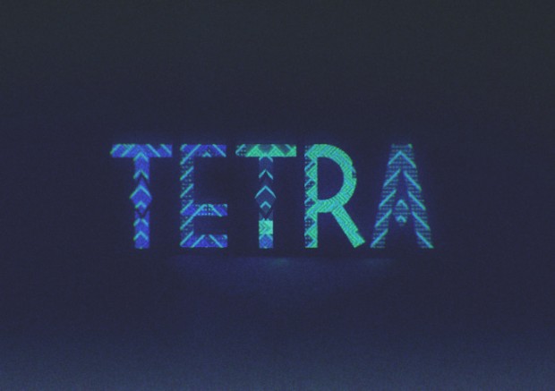
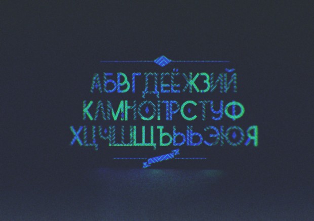
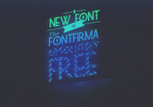
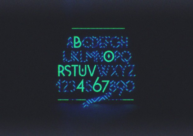
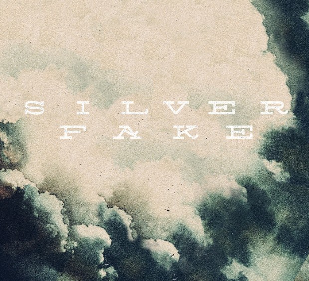
 Ten Dollar Fonts is an online source for low-cost experimental fonts / typefaces. TDF are a group of designers from all around the world, from New Zealand to Mexico.


 "Sydney based designer


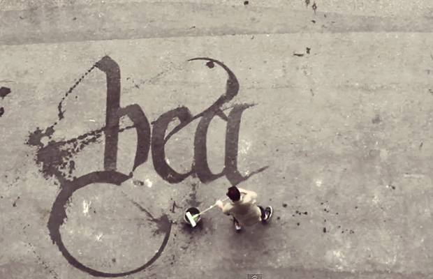 Calligraffiti by


 South Devon-based filmmaker


 The book "
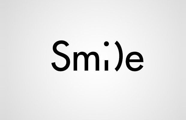
 " showcases nearly 100 of Ji Lee’s head-scratching word images, along with tips to help you create your own.




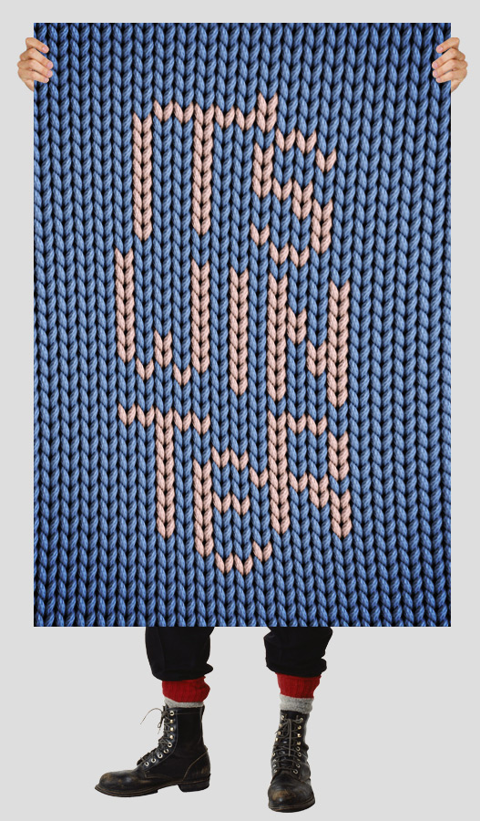
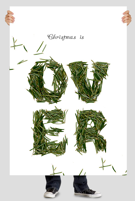
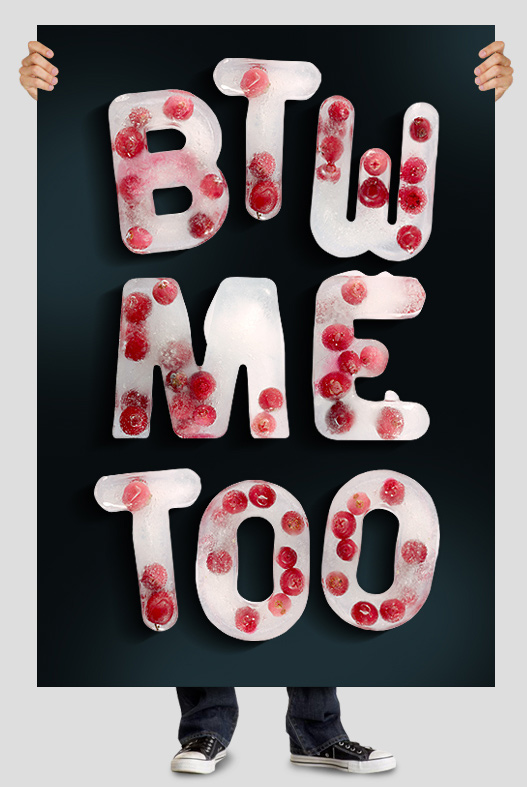
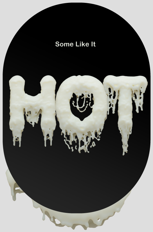
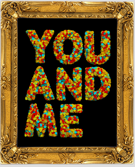
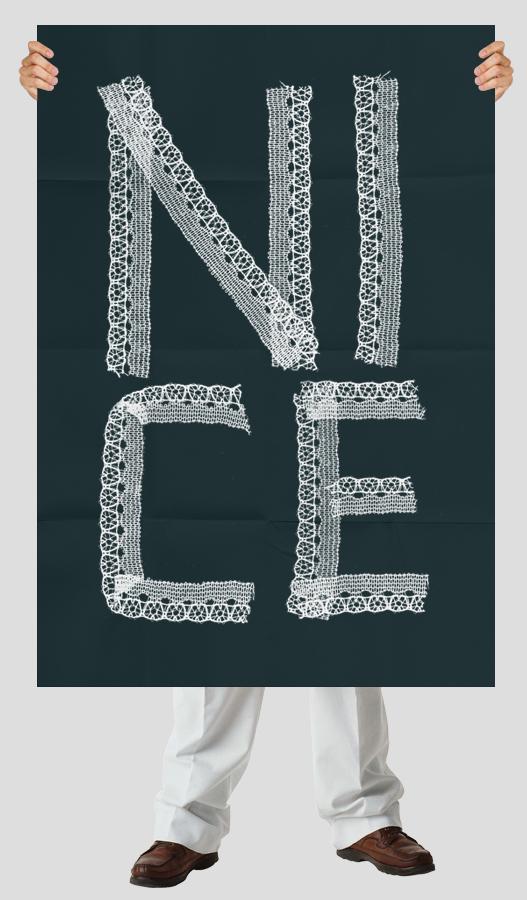
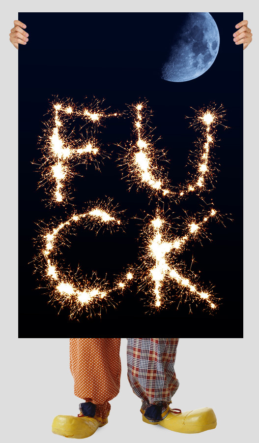 From a graphic design studio with a passion in typography, Tallinn based "Handmade" grown up to a huge laboratory of typography made by hands. They do fonts from everything usual and obviously simple like food, home appliance objects, paper, metal and even meat. Don't miss their Christmas set and all other fonts on a good sale.
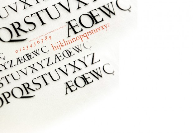
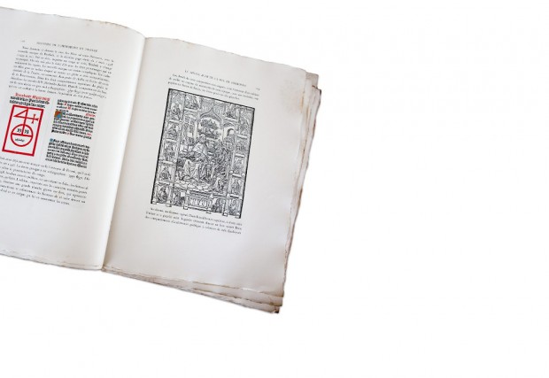
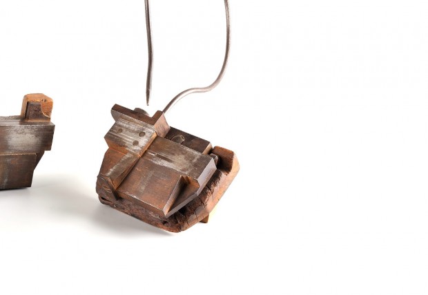
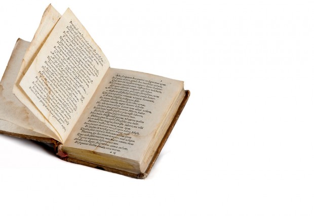
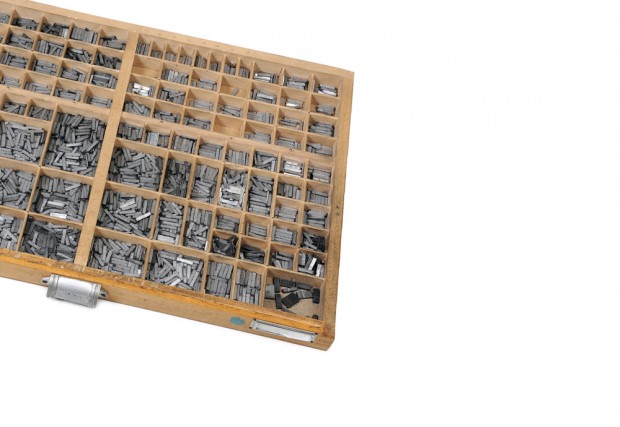
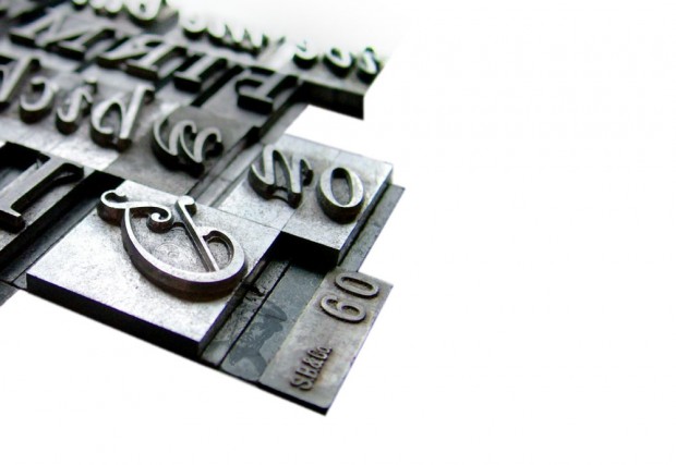 I wish I could read on French but here is a website to celebrate Garamond typeface 450th anniversary. Created in 1461 by Claude Garamont it comes through the ages and still fits the modern life of typography and design. Long life Garamond!
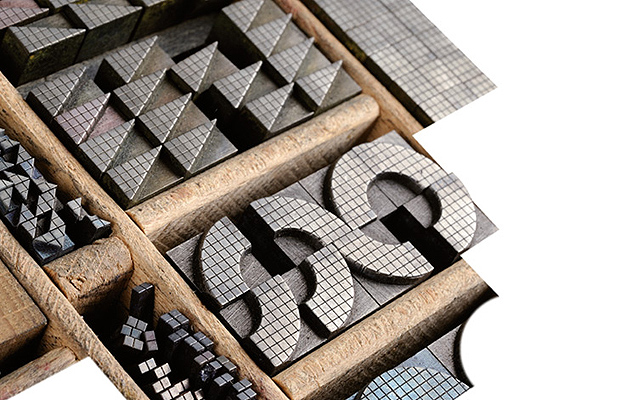


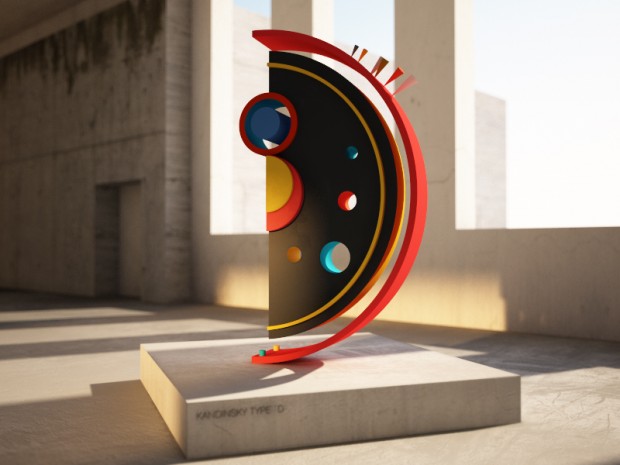
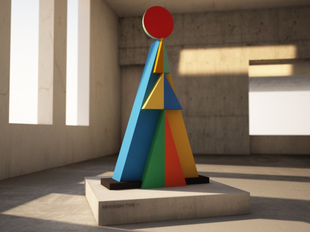
 Moscow based multidisciplinary designer and architect. Eduard is a researcher of interactive and parametric architecture. Works with architecture, interior design, graphic design, 3d animation, interactive and algorithmic installations.


 Communication design by "büro uebele visuelle kommunikation" made for Adidas Design Center.


 We love recent typography work from Chris LaBrooy where he twisted architectural classic in a new 3D way.


