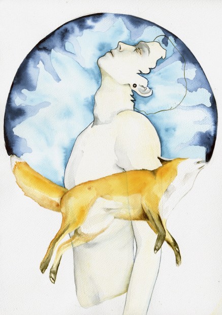
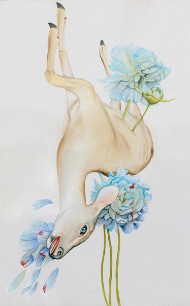
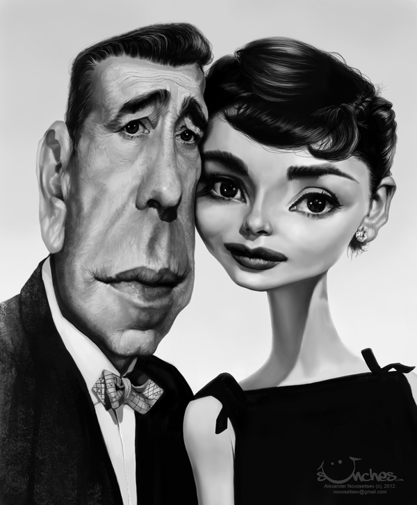
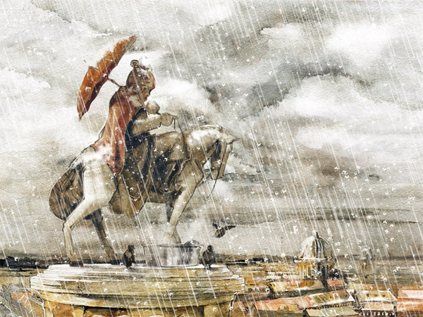
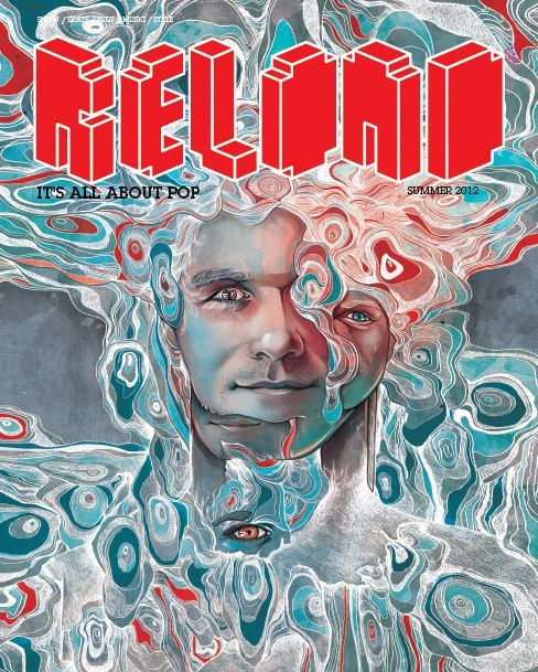
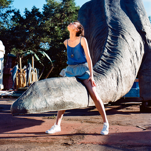
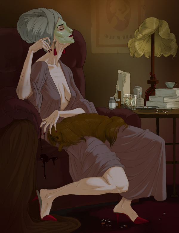
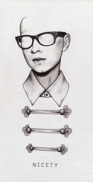
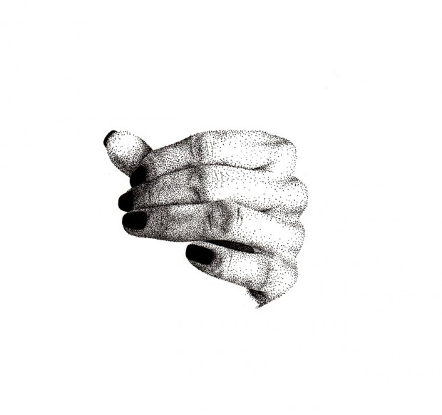
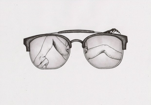
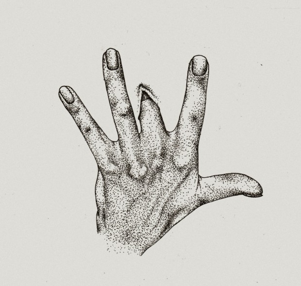
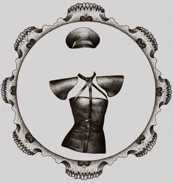
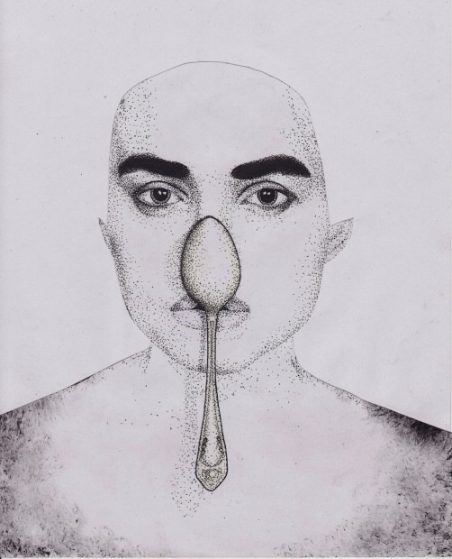
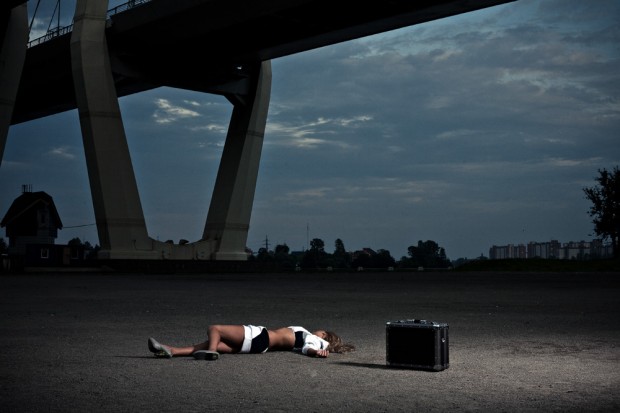
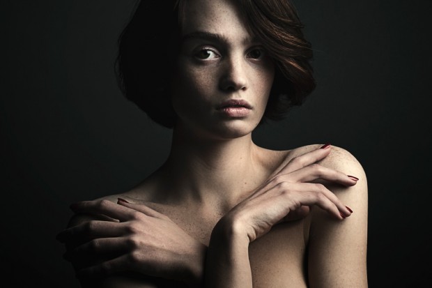
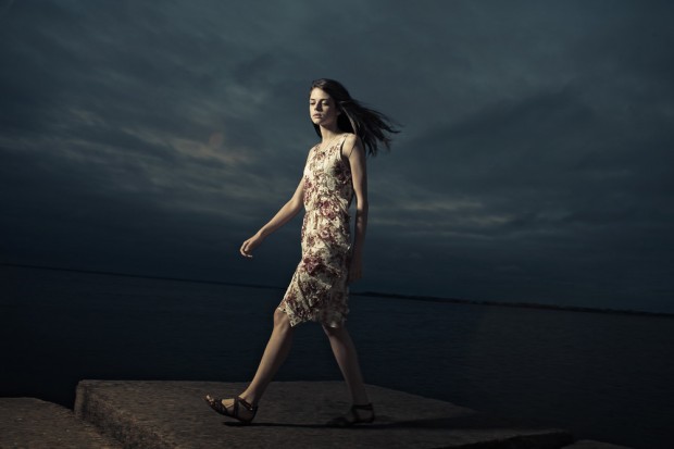
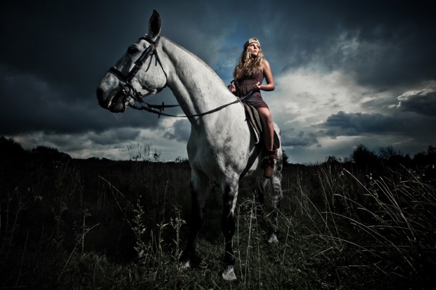
Illustrations by Vika Zobenko
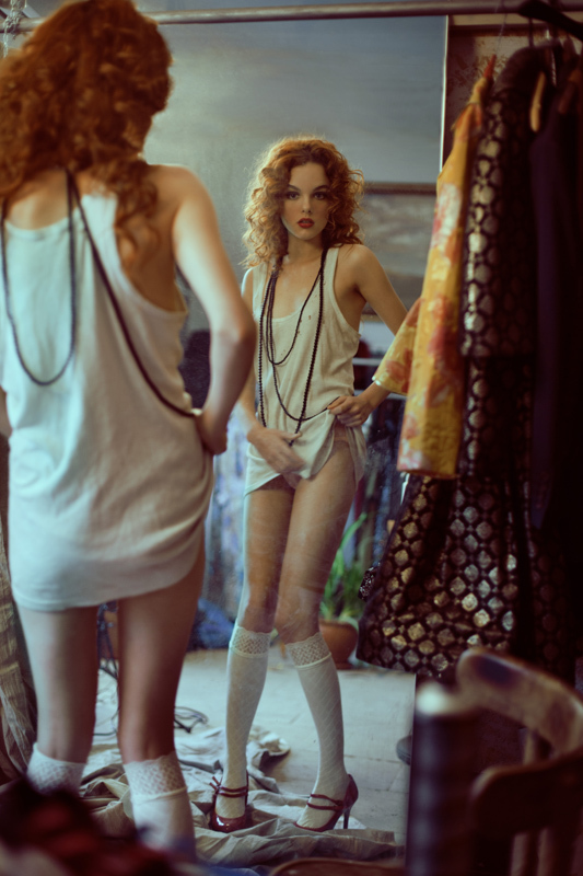
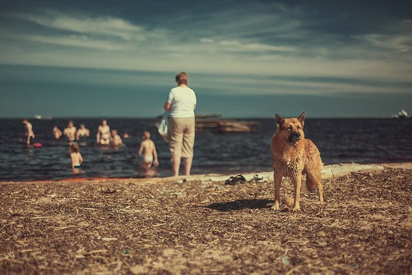
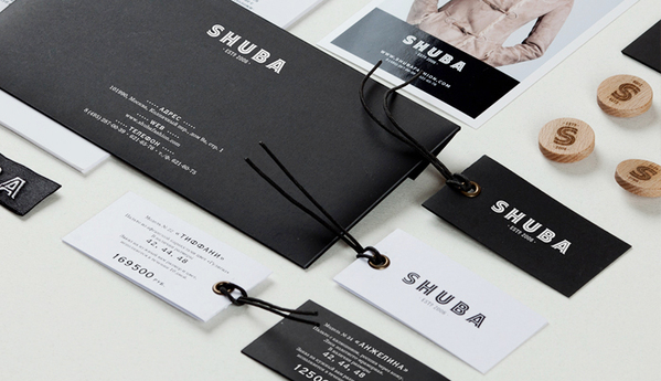
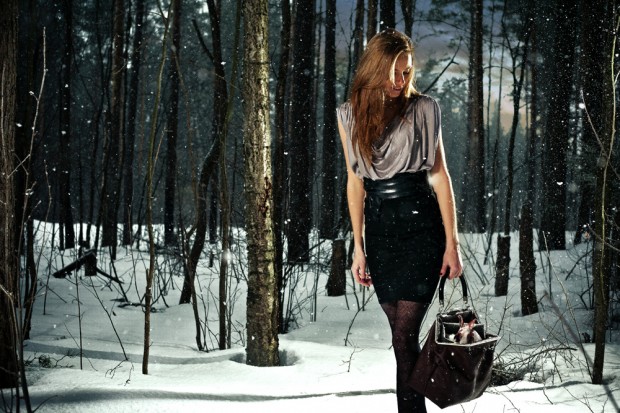
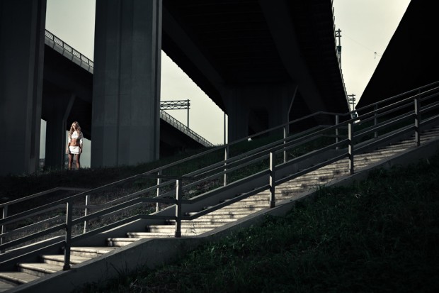
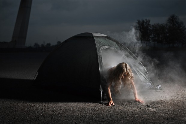
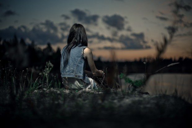
That's really intriguing when less works is more about quality and attraction, like here with Vika Zobenko's few personal illustration works. I like the way she builds and atmosphere with a few details and a strong drawing line especially when it comes to personages. Hope to see more of her works soon on http://www.behance.net/vikazobenko


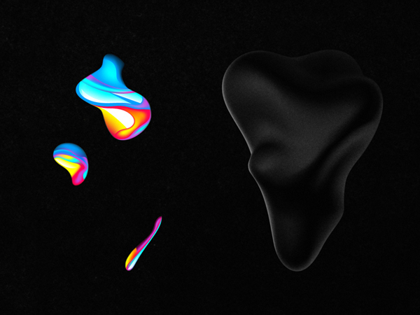
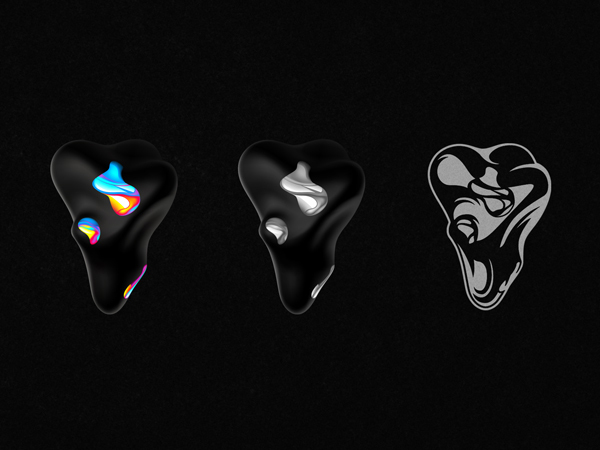
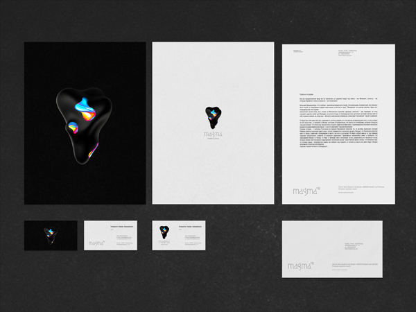
Magma Identity by Ruslan Khasanov
One of the leading Russian digital artist on Behance - Ruslan Khasanov shared an awesome abstract identity made for Magma Creative Group.




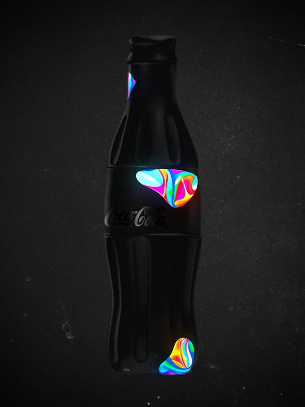
Designcollector inspiration set 82
Designcollector (Arseny Vesnin) - is no more an official Behance Network Ambassador but anyway we selected awesome 18 projects from Russian-speaking members.
Follow the largest collection of Russian projects "Russia Served by Designcollector" on Behance Network.
Присоединяйтесь к сети Behance Russia на Фейсбуке и Твиттере, теперь под руководством Тани Смирновой (Behance Ambassador Russia).
Follow the largest collection of Russian projects "Russia Served by Designcollector" on Behance Network.
Province
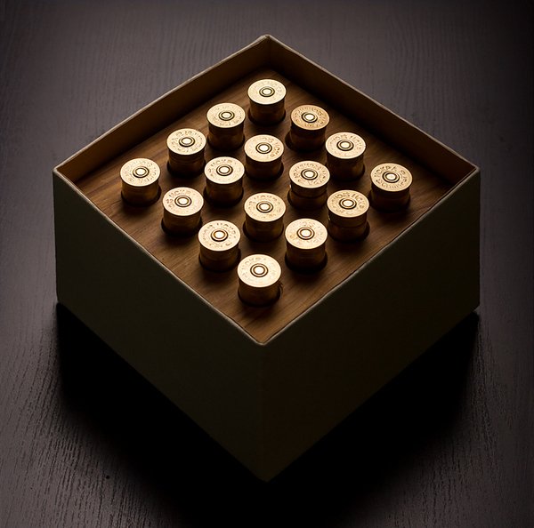
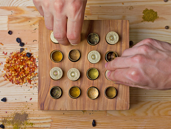
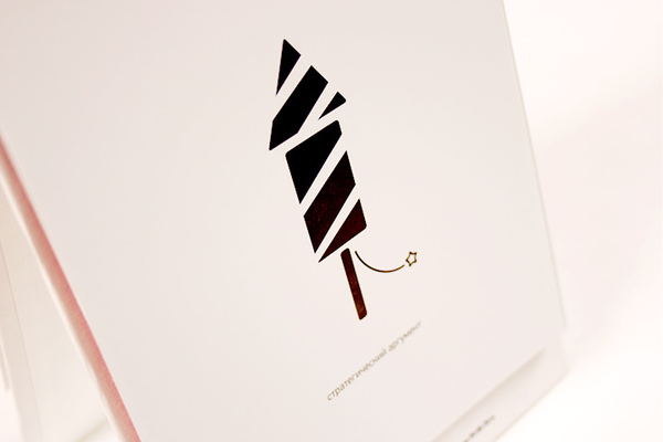
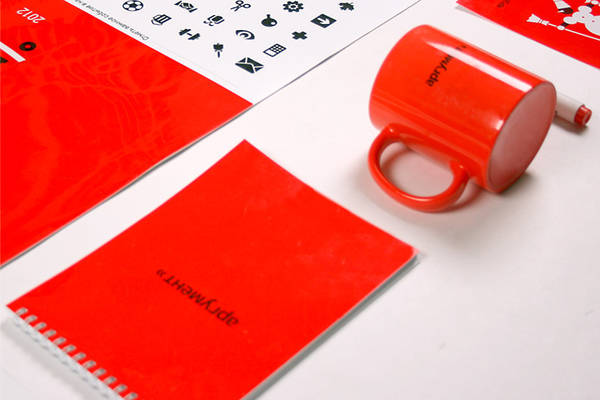
Western Siberia design and production agency "Province" creates outstanding print design and corporate souvenirs with smart humor icing for valuable clients. We spotted their two latest works worth to explore below
A smart gift for a hunter


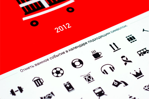
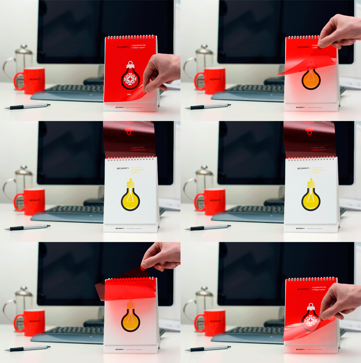
And a daily-sticker calendar named Everyday Argument



Nenuphar organic shelving by Lesha Galkin
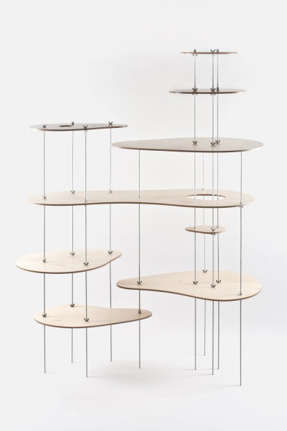
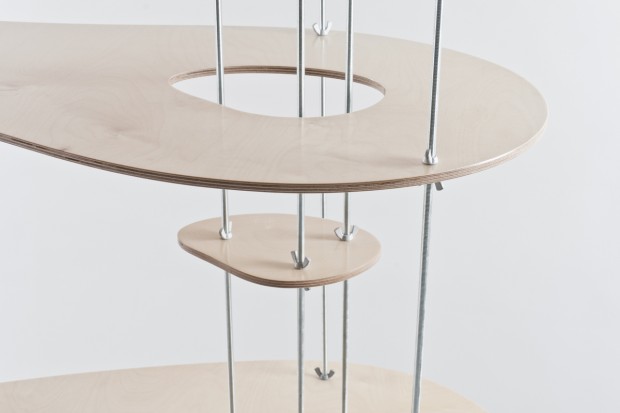
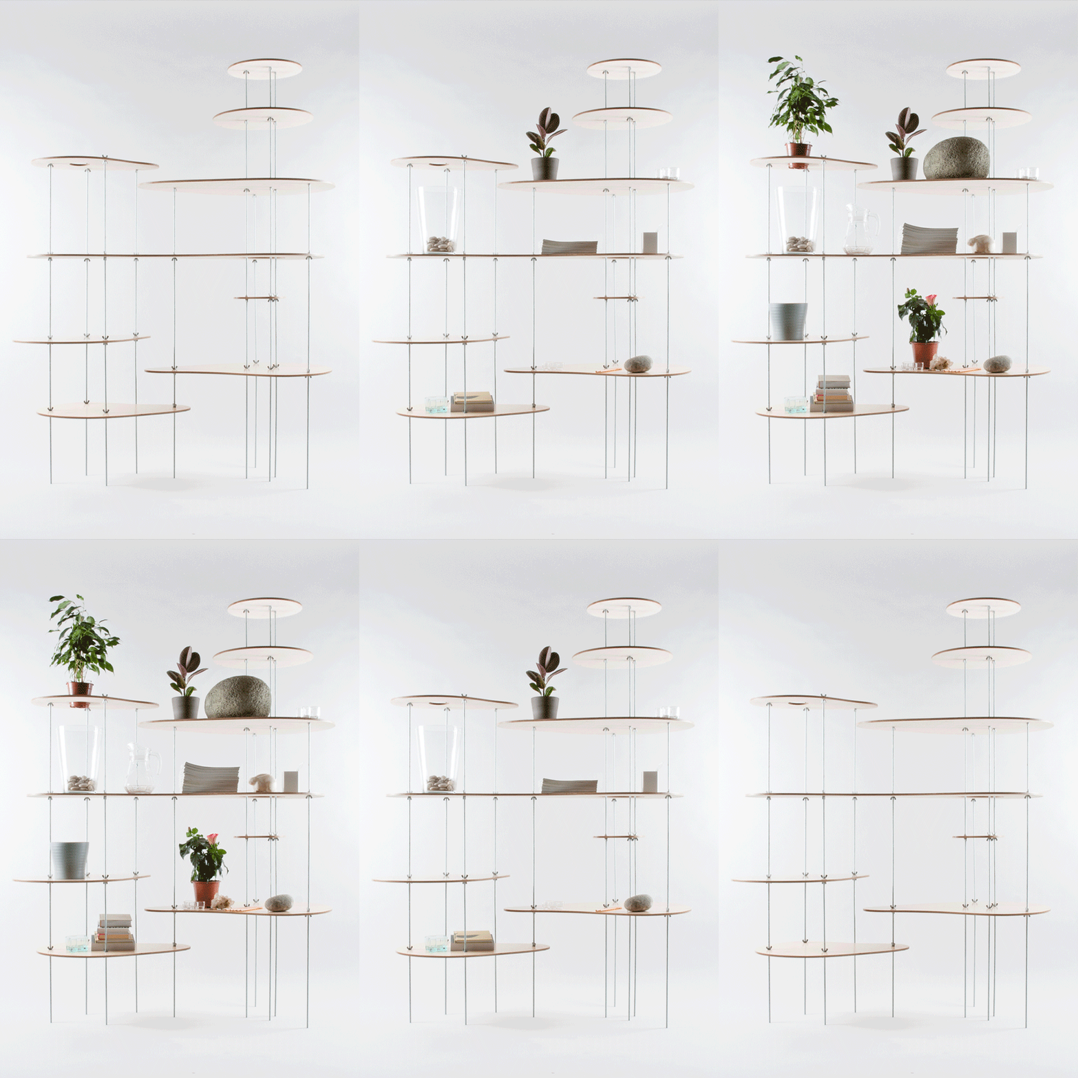
StPete based designer Lesha Galkin (one third of Dopludo Collective) released a new experimental home shelving object - Nenuphar. Floating like a water-lily Nenuphar is a completely eco-born system using metal strings with no fixation and wooden shelves with organic shapes. The distributed weight of the construction rests easily on that 10 rods.

Vadim Skorik
Young Russian talent based in Northern city of Arkhangelsk - Vadim Skorik has some striking ink art that can perfectly fit any t-shirt design or enemy's skin
A Touching Application by Working Title
We had a chance to speak with Russian designers from "Bureau Working Title" that did a commercial short "A Touching Application" using no 3D software, only projection mapping, modeling and classic animation. The ad shows advantages of Russian navigation application published by Yandex Ltd.

DC: What is the main plot of this advertisiment? The touching story tells us about two sentimental creatures from some outer world; nevertheless, they seem to be a lot like humans. As the two plan their date in a telephone conversation, they decide to meet up in a planetarium. From now on, they get any information from a mobile map application, which tells them the best routes, timing and any other – that's important – interactive tips. They face random barriers on their way: she gets stuck in a traffic jam, he forgets to buy her flowers and so on. The application helps them to finally meet each other on a crossroad and make their way to the planetarium "using" the "street view" option. We see them as they watch the stars leaning towards each other. The story ends up with a slogan: "A touching application".
What was the largest challenge in producing and directing the project? The hardest was to deal with time which passed so slowly. Classic animation process requires a lot of patience, and the more patient you are, the more satisfaction you get when the work is done. But russian advertising is always about tough deadlines, so you have to make it really quick. Thanks to the professionals who helped us getting the shootings done in its best ways and shared their skills with us. Furthermore, it was a great challenge to combine various techniques: stop-motion animation with dummies, iPad-freezelight, 3D projection mapping and a little bit of computer graphics.
How long did it take you to complete the whole project? Making of all the stage requisites, creating the script, directing everything to its sterile fancy looks, shooting till the final cut – the whole process took us about 1,5 months to get done.


http://www.youtube.com/watch?v=CcISIVoSZGQ
Credits:
Concept, script, production: Бюро "Рабочее название" (Bureau Working title) www.workingtitle.ru Director, camera: Ivan Proskuryakov Light: Pavel Ukhanov Animation: Alla Solov'eva Projection mapping: Sergey Titov and Sasha Gavrilova (Stain) Dummies: Igor Khilov Stage requisites: Alexey Petrov, Anastasia Zolotilina, Lena Shagieva Freezelight, compositing, CGI: Marina Cherry, Ira Lubomirova Music: DZA (http://soundcloud.com/dza)
Russian Students: Better Harder Stronger Art & Design
That's not a sponsor post or whatever just because we love to feature awesome achievements of Russian Students. That happens a fifth year in a line Moscow based British High School of Art and Design tear apart the international competitions without fanatic roaring but with a methodical wins of valuable awards. Last year BHSAD Students brought 2 pencils from D&AD competition. This year brought the school 3 Yellow Pencil awards.
1) Integrated Communications - Arina Kiseleva, Kseniya Apresyan http://vimeo.com/44983497
2) Moving Image - Lidia Velles, Yana Mironova, Zhanna Nosova http://vimeo.com/45633490
3) Photography - Michael Skachkov
Also there were 3 Nominations for Anastasia Korosteleva, Ann Khokhlova and a team of Arina Kiseleva, Dima Vtulkin, Olga Terekhova
And 3 "Best of the Year" for Sergey Kleschev, Nina Kazimirova and Zhanna Nosova, and Oleg Pashkovsky, Seslavinskaya Anna, Tim Raiter, Vitaliy Urban
Congratulation goes to the BSHAD School!

Rustam Valeev street art
Motherland Russia has enormous quantity of creative gems spread over the land. Today we found Rustam Valeev's street artworks made with chalks. Speechless, just one white chalk 1% of awesome talent and 99% of painstaking perspiration. For now Rustam has no portfolio website but only a page on Russian social network that blocked in most of countries due to a good reason. Hope to see his personal playground one day.
http://www.youtube.com/watch?v=1m3VDirO4_8&feature=player_embedded
Olly Low Poly And The Zombie Tower
Russian motion designer Vladimir Tomin is about to release his first ever video game "Olly Low Poly And The Zombie Tower". It will be available for Mac OS and PC in first release and for iOS in second. After watching the presentation video I have the only words "Olly Low Poly - Holly Macaroni!" it is damn good!
http://vimeo.com/45183619
Evgeny Parfenov illustrations
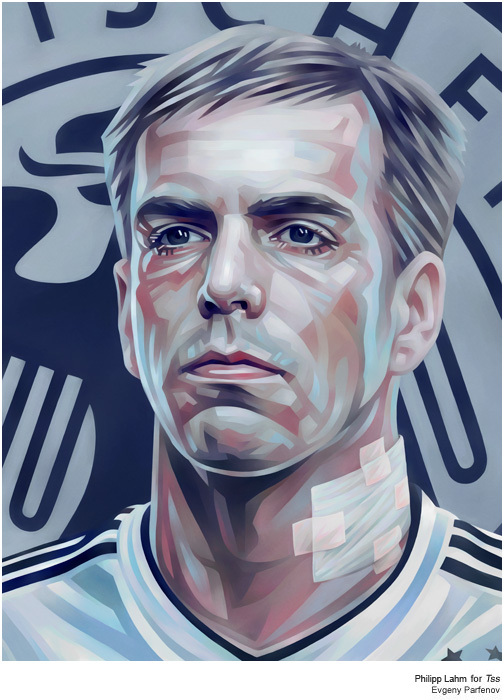
Illustrations of Evgeny Parfenov definitely have a touch of Soviet Realism art shouting out from canvases with the same strength and colourful language. This is a rare type of artist with a strong hand and nothing pick on with his works.




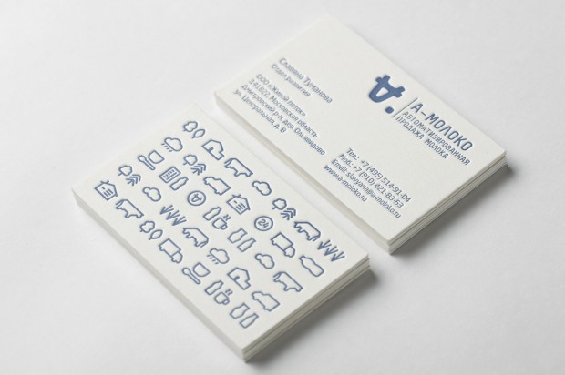
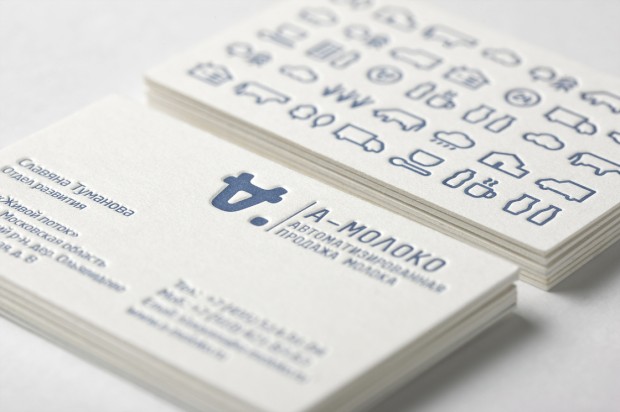
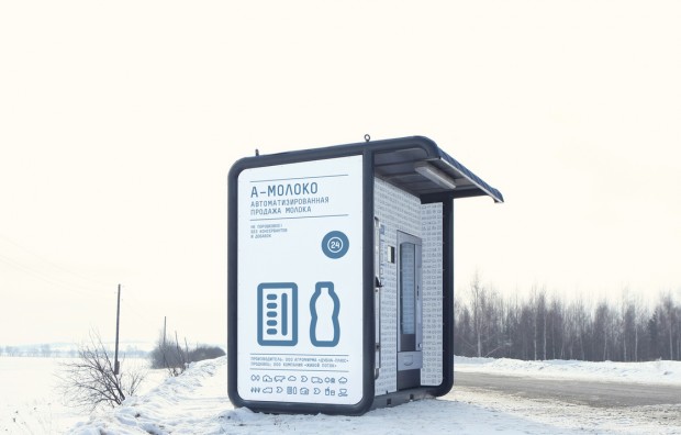
A-Moloko by Ermolaev Bureau
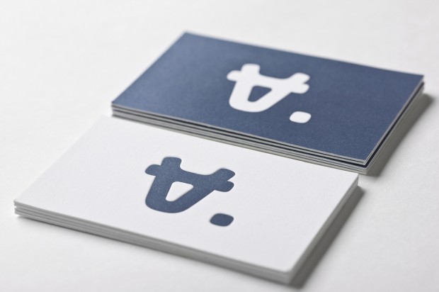
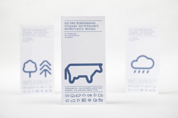
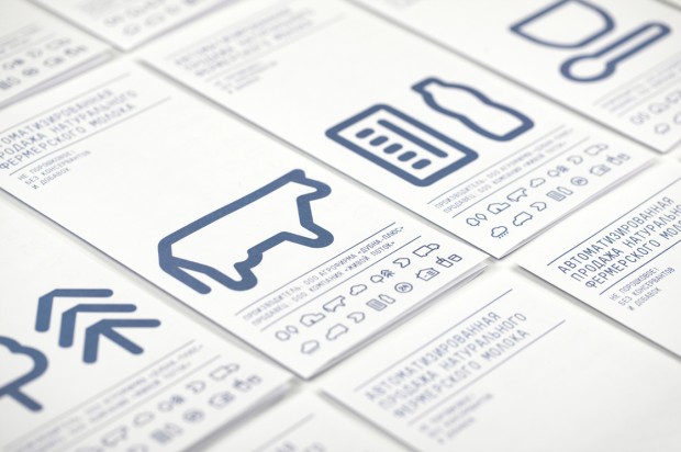
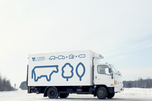
Clever identity gets clever prizes. Ermolaev Bureau was among 4 Russian names rewarded by European Design Awards 2012. Designers Vlad Ermolaev and Olga Balina (designer behind our DCMAG logo and cover design) won Gold in Identity for "A-Moloko" project.
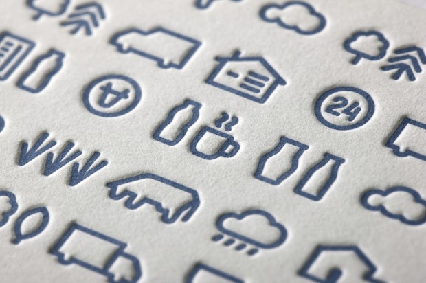
This visual identity developed for a company selling milk through a chain of milk vending machines. The logo concept was suggested by the name of the chain: Automated sale of farm fresh milk. The first letter 'A' which when turned upside down resembles a cow's muzzle was taken as the basis. Visual identity is built on a system of symbols that show the path of the milk from the cow to the consumer.
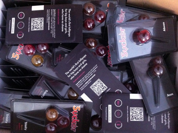
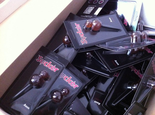
Sucker by FIRMA
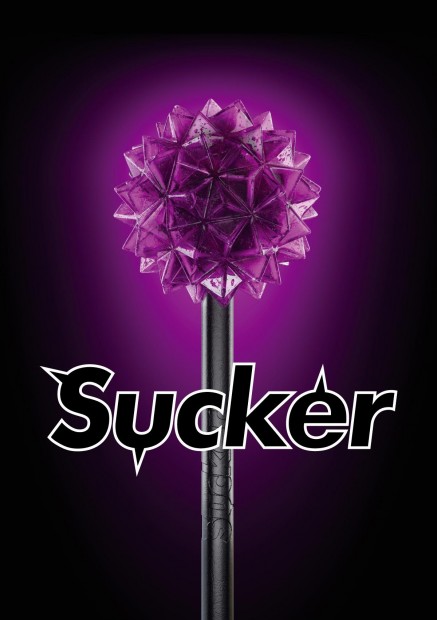
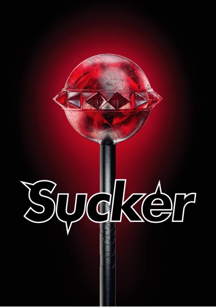
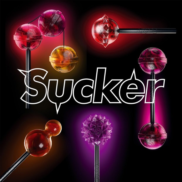
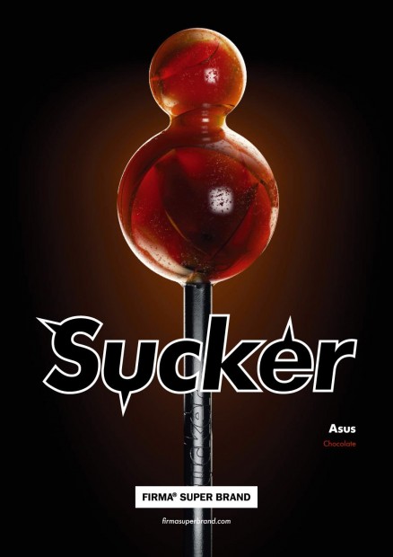
Still controversial culture of the lollipop was fuelled by FIRMASTYLE's Sucker concept in 2008 and now smashed by its production. A series of 5 Suckers is available for every taste and color: Mr. Pain with a taste of blueberry, Abuse with a taste of watermelon, Trinity with a taste of strawberry, cherry and banana, Cherry Twins & Chocolate Asus. A good sense of humour like this can literally save internet from porn invasion.
http://vimeo.com/43987241
Iryna Gorelikova fashion graduation
Designcollector is a place for revealing upcoming artist and cares more when it comes to cover new stars from Russian-speaking community. This time we want to feature fresh fashion graduate from Ravensbourne, London; London College Of Fashion - Iryna Gorelikova. Born in Sebastopol, Ukraine, Iryna first completed same university as me in Saint-Petersburg (SUTD). Worth to mention some coincidence that another university fellow and quite famous London fashion designer David Koma was in jury for Iryna. Clap-clap-clap.

Iryna Gorelikova collection, Ravensbourne 2012
Reflecting today’s time, worldwide crises, natural disasters, the rapid growthof social media is the evidence that the world is transforming into new forms of reality.
A dissertation written, with the lead question ‘What is Innovation in Fashion Today? Rei Kawakubo’s phenomenon’, visited lectures in Economics at LSE and Alan Moor’s ‘No straight Lines: making sense of our non-linear world’ talk, were found as primary sources for the main concept for the final collection. The study shows that the world changes from linear to nonlinear existence and one of the most successful business companies today, due to a crisis condition, the Lego Group, with its flagship product, Lego constructor. Lego consists of colourful interlocking plastic bricks and various other parts. After this case study a ‘LEGO concept’ has been found. The main colour of the collection is black and represents our current linear world in combination with other bright colours, like colourful Lego bricks, that are hidden inside of garments (lining) represent the ‘non-linear world’. The use of special metal buttons that by their shape are very similar to Lego bricks, which give to garments a feeling of bricks of clothes that can be assembled and connected in many ways. Anything constructed can be taken apart again. For instance, a dress can be deconstructed into a skirt and a jumpsuit, and so on.
A classical school of pattern making appears in the heart of each look which during the process of FMP development transforms and reflects today’s shapes and silhouettes. Main techniques and features used for building the collection are hand sewing, felting, mixed texture of black fabrics; hats and rings as accessorises.
Autumn/Winter Avant-garde /Concept womenswear Collection is based on, luxury production, expensive fabrics: different types of wool, cashmere; textured, thickness.
RAVENSBOURNE 2012 LIVE: Gala Fashion Show Skip to 36:00 for Iryna Gorelikova collection
http://vimeo.com/44096504
Max Zhestkov Reel 2012
One of the famous Russian motion designer Max Zhestkov released a new showreel of latest works! Must see on fullscreen
http://vimeo.com/44683468
Parking Douche - Golden Cannes Mobile Lion
Russian online city-guide portal "The Village" (a part of Look At Me) recently won Golden Mobile Cannes Lion for the uprising mobile equiped platform "Parking Douche". Update: The app exists, download it for iOS and Android and join the project on http://specials.the-village.ru/pages/specials/parking


http://vimeo.com/42188610
Indy Typeface by Kir Rostovsky
Beautiful experimental typeface based on lines and geometric structures created by Moscow based graphic designer Kir Rostovsky. For presentation he used unique silkscreened poster and a poker-work on wood - trop bien! Go grab you typeface copy on http://www.behance.net/gallery/Indy-Typeface/4192363


Oleg Oprisco photography
Kiev-based artistic photographer Oleg Oprisco beside simple magic applies some surreal practices to his works. Some of you in Saint-Petersburg can have a chance to study magician photography from him later this month, follow him on Livejournal, Flickr or 500px


Antonio Rijoa's photography
Antonio Rijoa (Behance profile) is a young photography student from Saint Petersburg, Russia. His portraits reveal a dark and obscure universe. Specific light and scenes make his photo act as a fairy tale stills.


