Ling Jian art
China-born and world based contemporary artist Ling Jian creates captivating and sometimes provoking canvases portraying faces in a strange and surreal way.
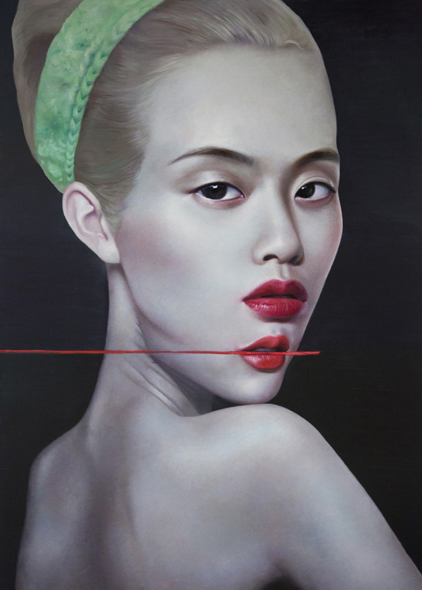
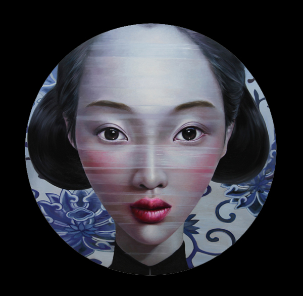
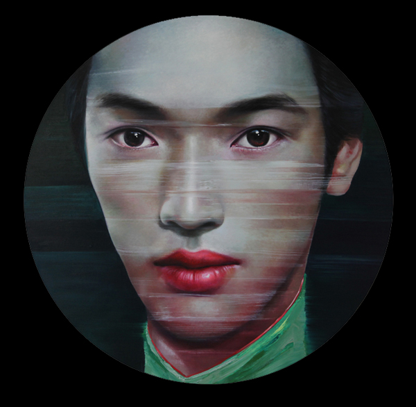
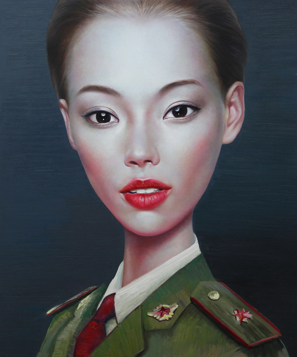
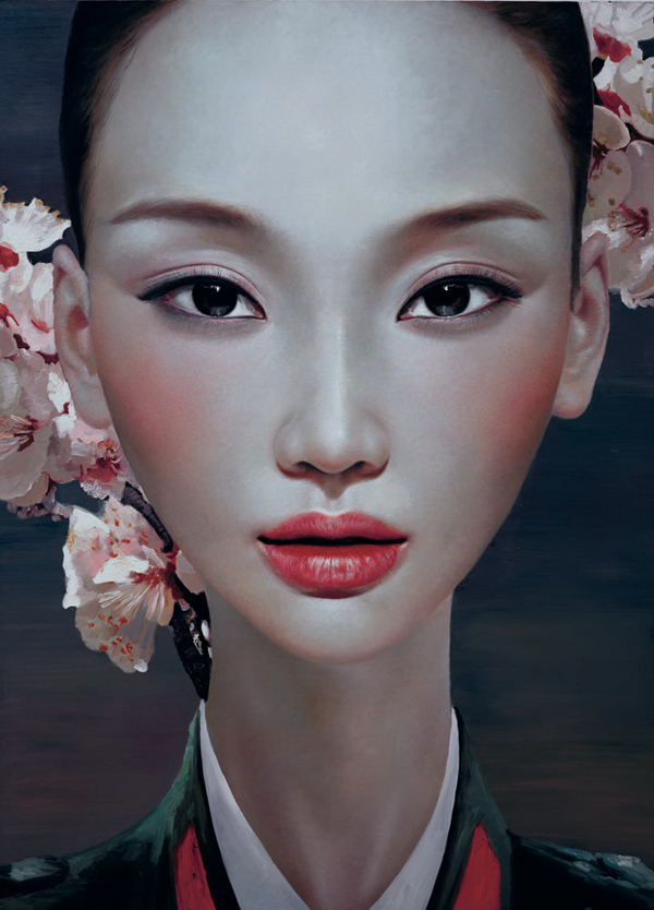
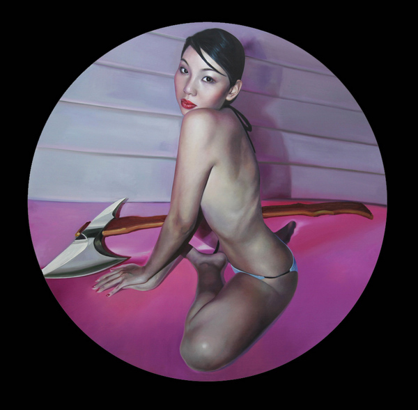
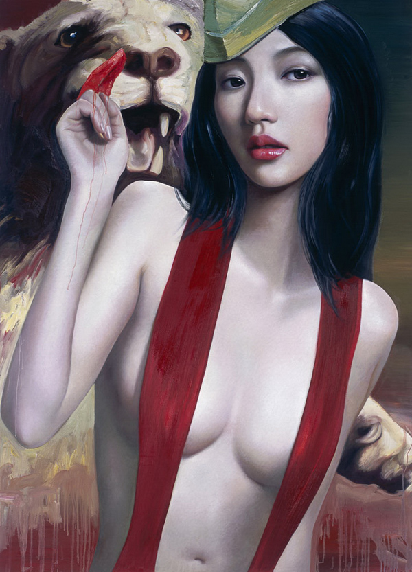
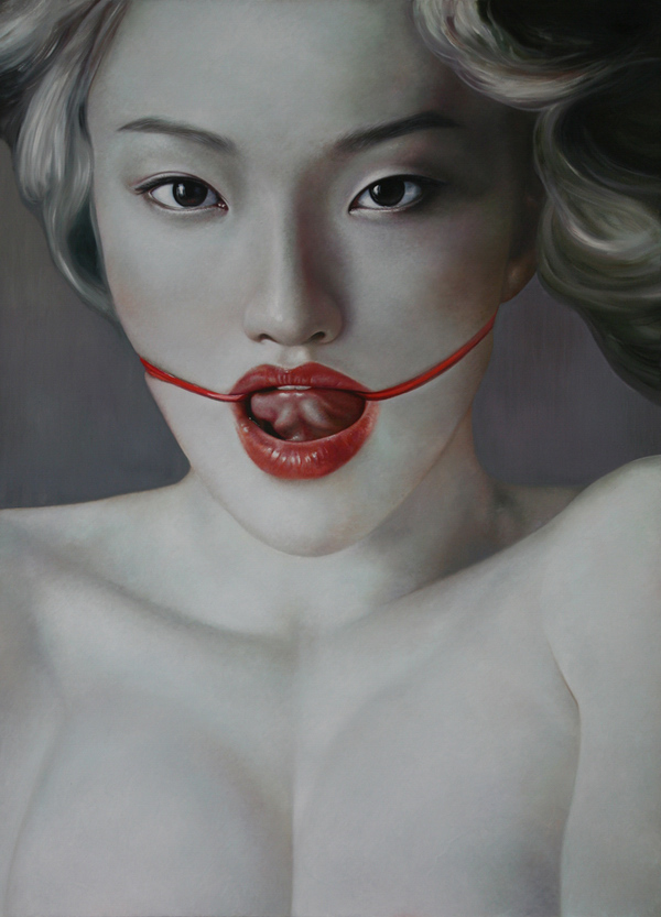
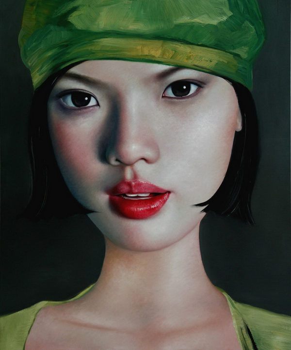
China-born and world based contemporary artist Ling Jian creates captivating and sometimes provoking canvases portraying faces in a strange and surreal way.


Captivating outdoor installation made by Benoit Paille for the photography series "Alternative Landscapes"
"This is a photography of light installation (real light, real square 1x1 meter) i set in nature or where during the night you have usually no lightning, I try to redefine the space/landscape for my own purpose: create a poetic space/time moment. And questioning the reality of what is a landscape"
View full series on http://www.flickr.com/photos/benoitpaille/sets/72157628994434029/
via Colossal
We spotted Tom Lane's graphic design few years ago just in time he graduated from college. Now it is a time to revisit and check his new directions.


http://vimeo.com/30392705


http://vimeo.com/45436061

Gifted figurative artist Dan Witz has something to say us about human being. His last series depict the hypnosis state of a person writing a short message on mobile. Definitely, this is a really biblical moment accompanied by an absent mind of a subject.


All over the world office procrastinators must be jealous after exploring the unique art made by Gregory Euclide on whiteboards with a single black marker and some water. Definitely there is no limit for an artist in materials if he really wants to express himself.
http://vimeo.com/42278456
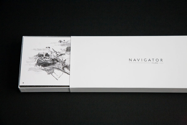
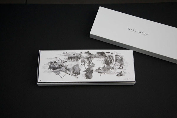
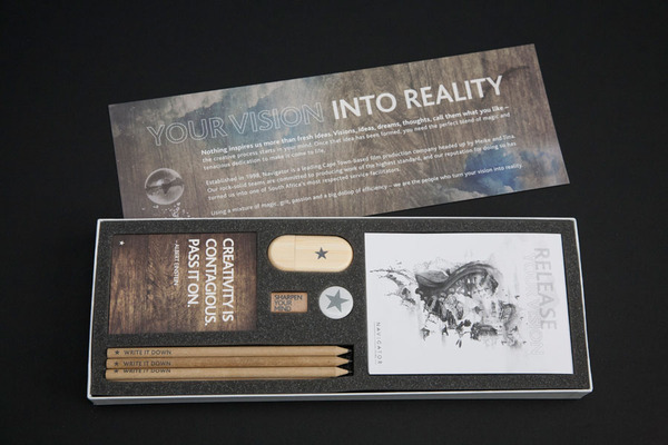
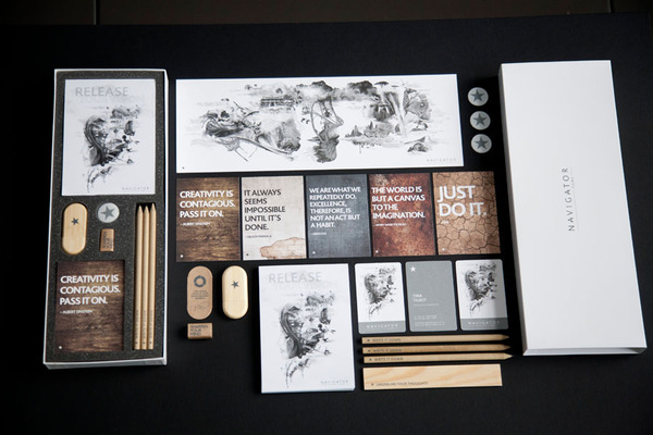
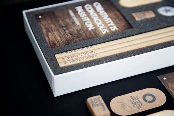
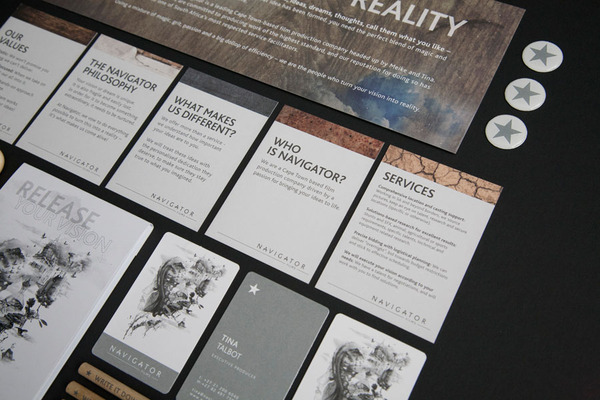
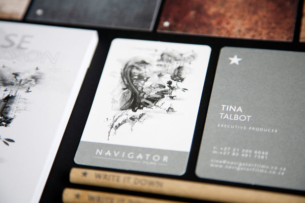
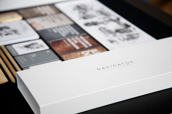
Cape Town based graphic designer Brett Atherstone just completed mouthwatering identity for local film production company Navigator Films
Read more on Behance project

Motherland Russia has enormous quantity of creative gems spread over the land. Today we found Rustam Valeev's street artworks made with chalks. Speechless, just one white chalk 1% of awesome talent and 99% of painstaking perspiration. For now Rustam has no portfolio website but only a page on Russian social network that blocked in most of countries due to a good reason. Hope to see his personal playground one day.
http://www.youtube.com/watch?v=1m3VDirO4_8&feature=player_embedded
Epic sci-fi artist and gifted illustrator Jon Foster has so much to show. He welcomes us to the inner world of imagination, post digital steam punk personages and awesome stories. Jump in! http://www.richardsolomon.com/artists/jon-foster/
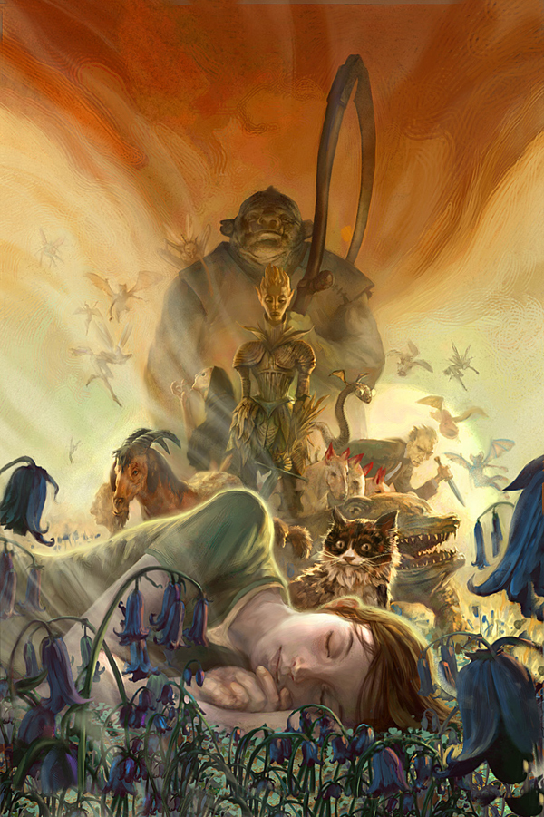


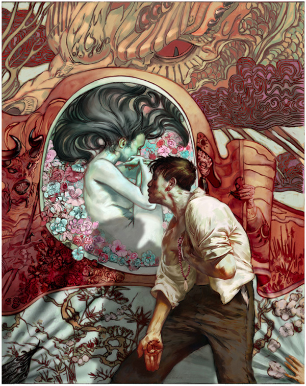
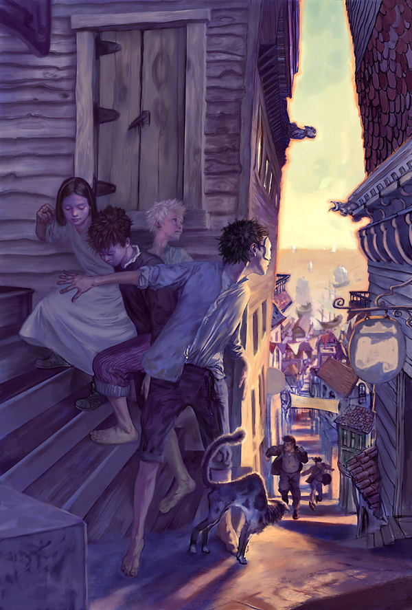
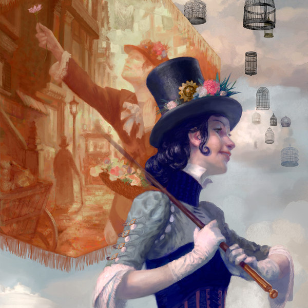
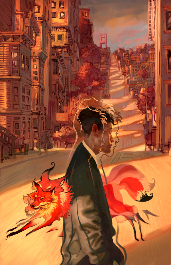

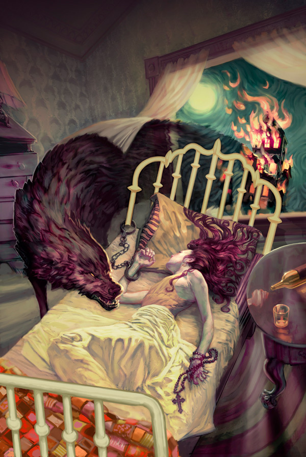
Also pay attention to Jon's Behance profile
"Disassembly" is a set of photographies made by Todd McLellan who literally disassembled outdated home appliances making them as a sort of an art statement.
This is kind of a creep situation when less and less Russian designers calls to national history of art and design in their work (even most of them are fashion designers). The history that literally gave a birth to European and American schools of Design that is developing nowadays. Take a look at amazing research and development of Kandinsky's works that later became a typography study created by Sinan Buyukbas.
More on Behance
Lorena Prain - illustrator based in Madrid works in recognizable manner mixing fashion related illustration with puberty female portraiture what emphasize the fault world of fashion.
"I'm more drawn to the feminine world than the masculine, it's easier for me to express myself through that language"
she says for Dazed Digital in objective interview.


Photographer Christoffer Relander just finished a new series of double exposure photograps called ‘We Are Nature’. Christoffer is graphic designer and self-taught photographer from Finland, Raseborg.
View full series on artist's website http://www.christofferrelander.com/projects/we-are-nature/
via iGNANT
Inspired by brash light, vivid color and glitter, and the punk music scene, Natalia Fabia paints photorealistic images of after-hours bars and parties. Her 2010 series “Punk Rock Rainbow Sparkle” was based on staged photo shoots of lingerie-clad girls that captured a raw yet decadent sensibility. The provocatively posed models, many of whom are Fabia’s friends, sport glitter, tattoos, and clunky jewelry, seeming both tough and heartbreakingly vulnerable at the same time. http://www.nataliafabia.com/ via art.sy
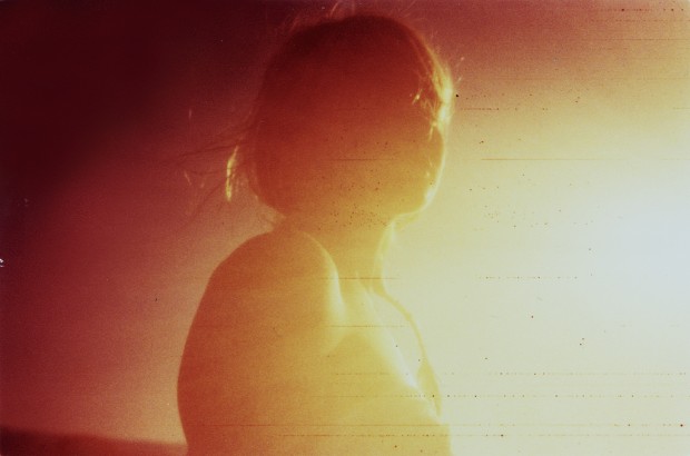
Orange Bubblegum is a photographic playground of talented Mr Robert Moses Joyce. Airy and washed out world of his shots fed by strong composition and colours flicks between reality and a dream.
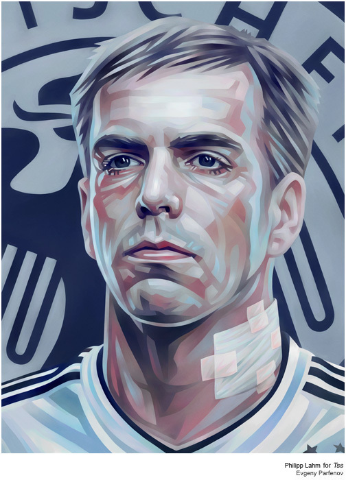
Illustrations of Evgeny Parfenov definitely have a touch of Soviet Realism art shouting out from canvases with the same strength and colourful language. This is a rare type of artist with a strong hand and nothing pick on with his works.




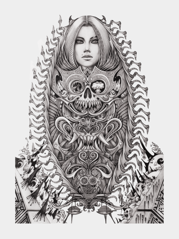
Toronto based Hong Kong raised gifted illustrator Chris Lo works with paper as it is a client's skin, tattooing artworks with pencils with heraldic sense of composition.


Clever identity gets clever prizes. Ermolaev Bureau was among 4 Russian names rewarded by European Design Awards 2012. Designers Vlad Ermolaev and Olga Balina (designer behind our DCMAG logo and cover design) won Gold in Identity for "A-Moloko" project.
This visual identity developed for a company selling milk through a chain of milk vending machines. The logo concept was suggested by the name of the chain: Automated sale of farm fresh milk. The first letter 'A' which when turned upside down resembles a cow's muzzle was taken as the basis. Visual identity is built on a system of symbols that show the path of the milk from the cow to the consumer.
Hilo Chen is a Taiwanese-American painter best known for his amazing erotic photorealistic figurative paintings. His work is in major museum collections throughout the world. Currently presented by Bernaducci Meisel Gallery