I LOVE UGLY's Studio
Highsnobiety Magazine visited menswear label studio I LOVE UGLY in terms of their Highsnobiety Visits. We are pretty jealous of them having the experience to meet people of the label and take awesome photos of their space. "Based in Mount Eden, New Zealand, the primarily black space has been home to ILU for three and a half years and perfectly reflects the feel and style of the brand – the black walls are also present throughout all their flagship stores. Originally the building was used as a shared creative space, housing several different artists and other creative agencies. To encourage collaboration, the workspace is fairly open in an effort to promote the sharing of ideas. However, the design and marketing departments are segregated from the rest of the business, and every month or two they switch everything around to promote fresh thinking."

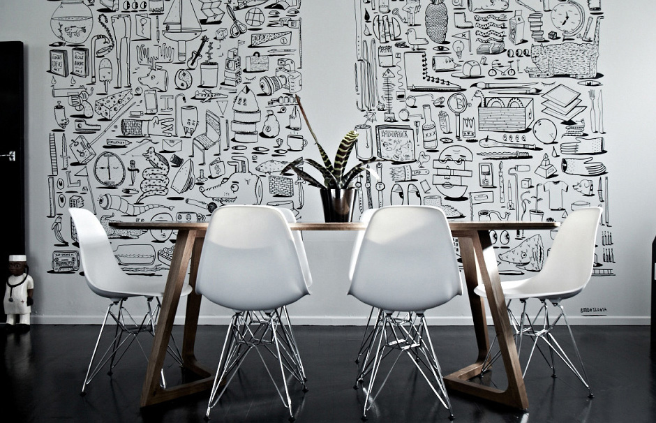
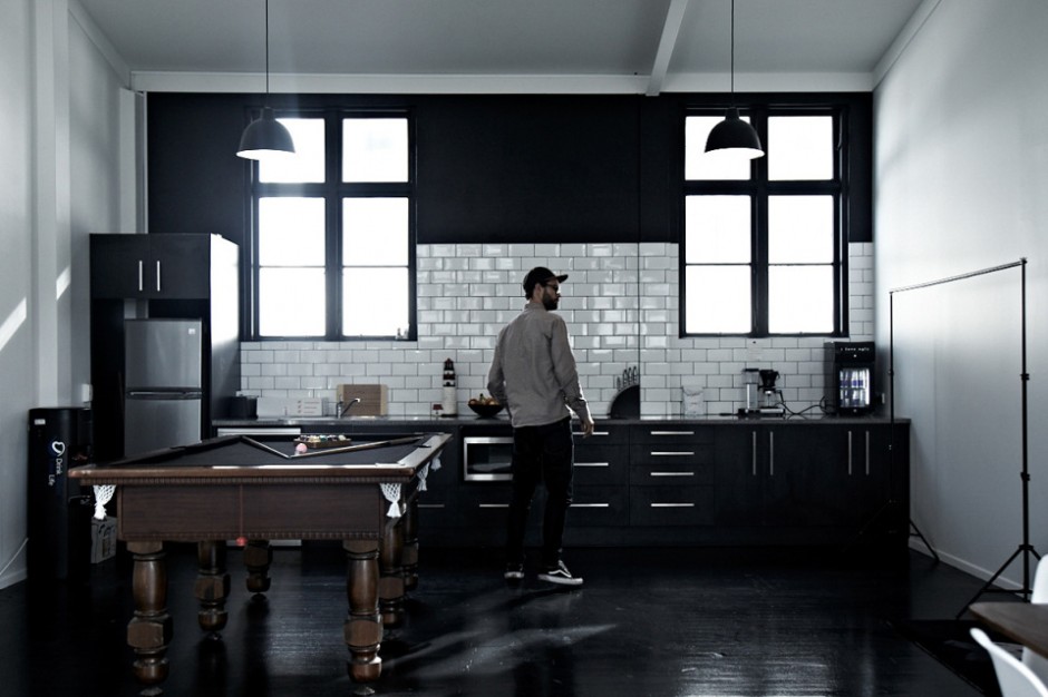
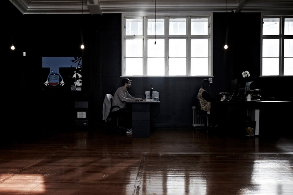
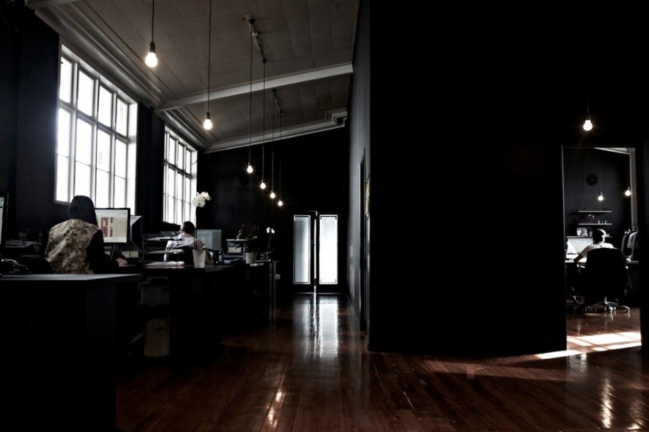
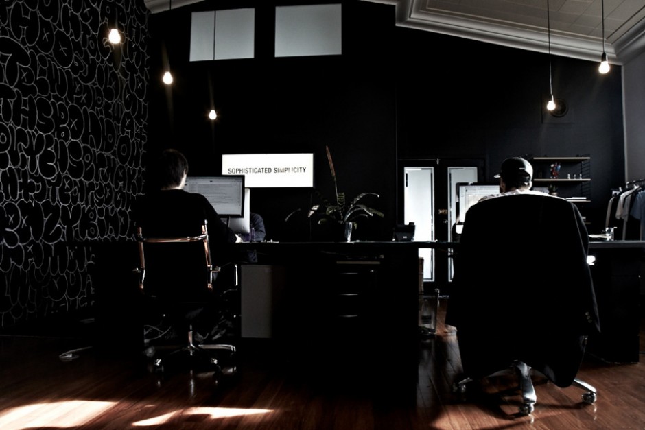

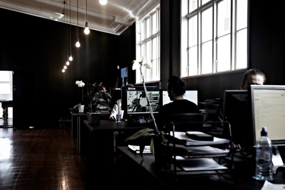
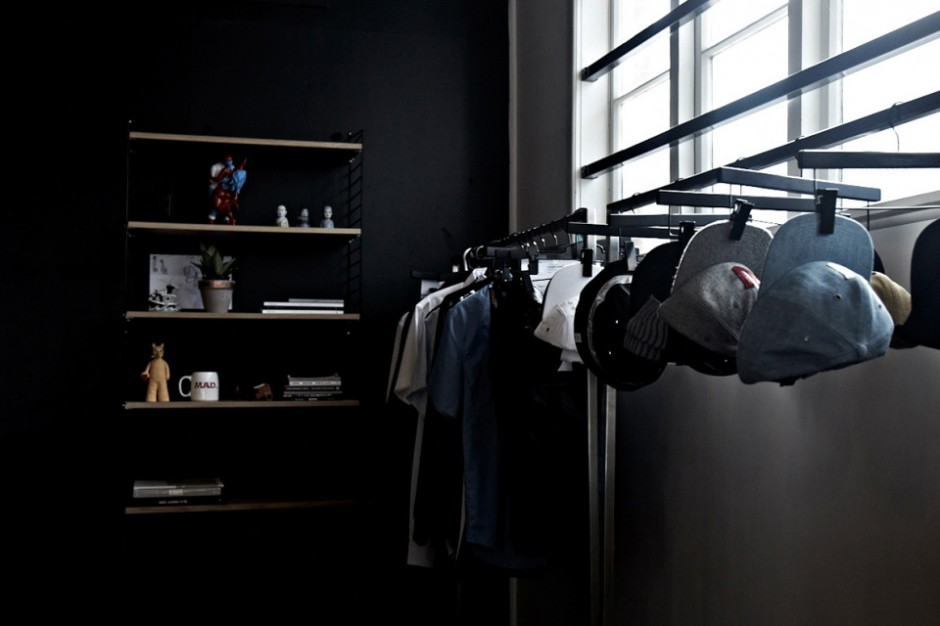
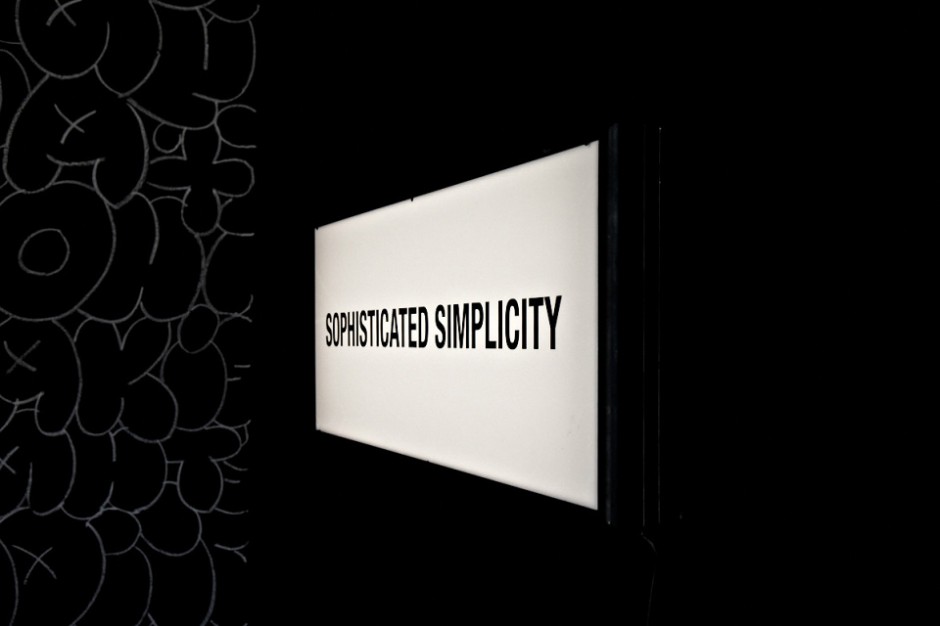
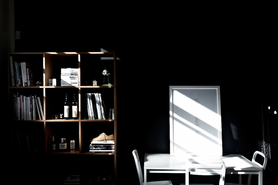
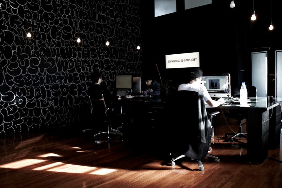
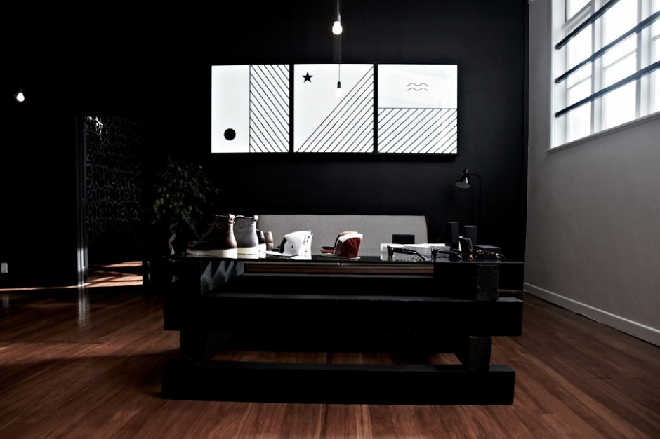
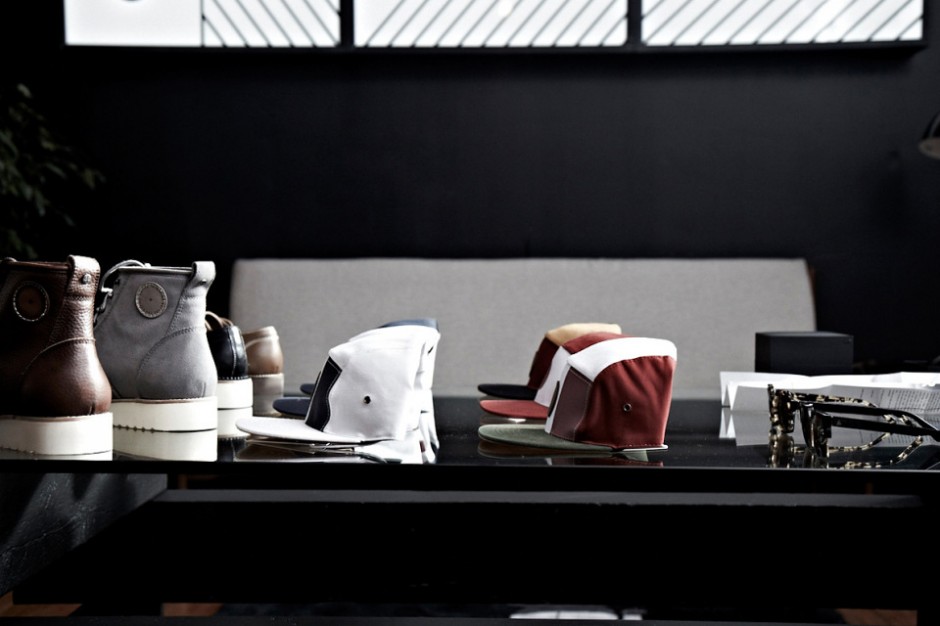
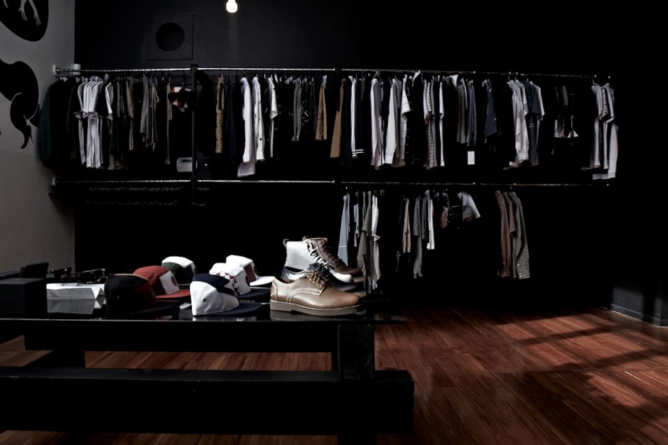
Photo Manipulations by Joseph Alexander
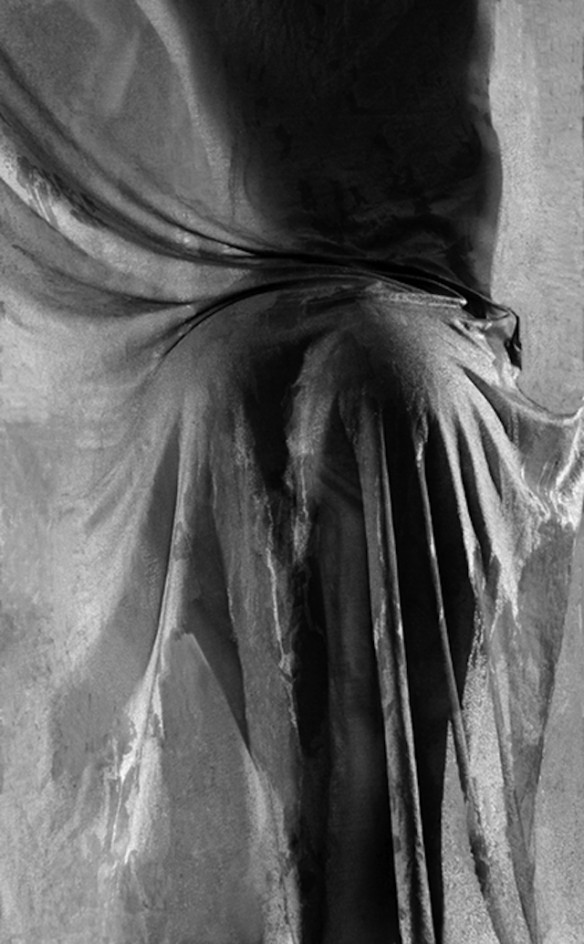
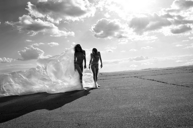
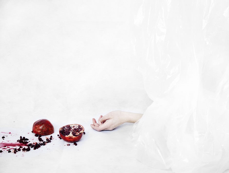
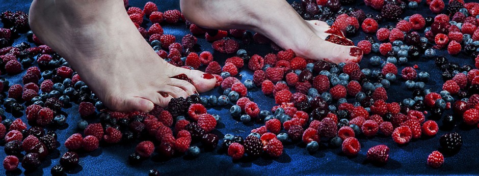
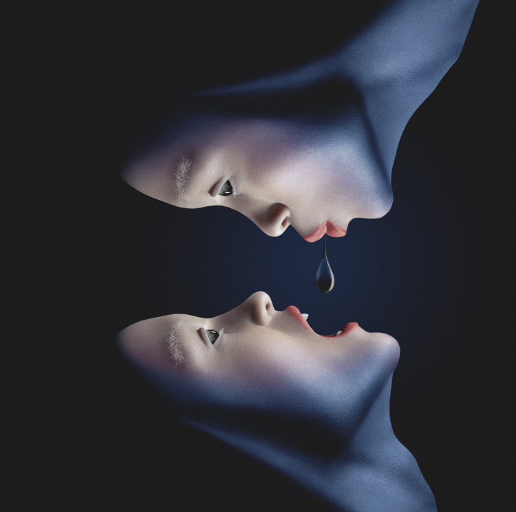
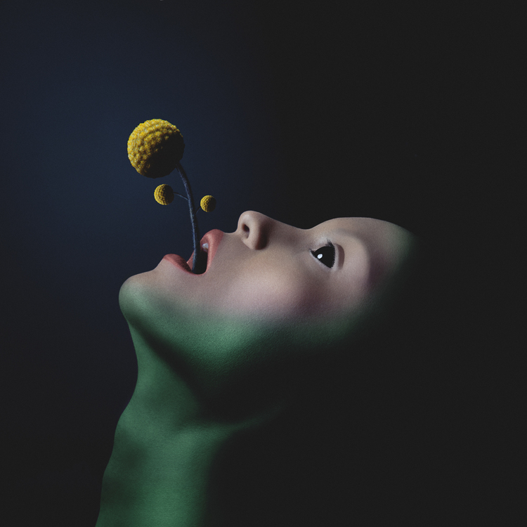
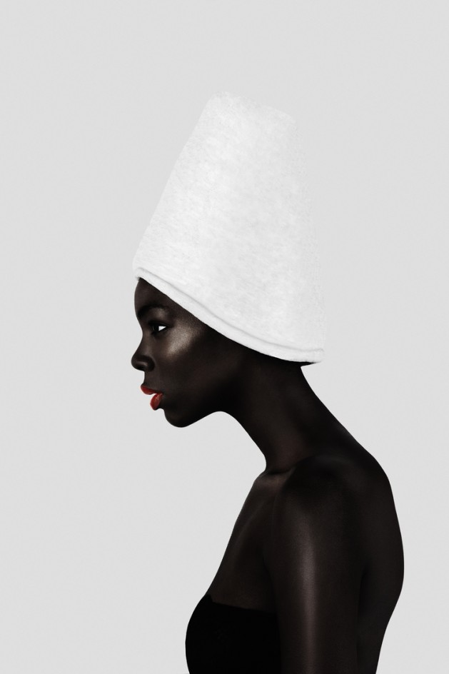
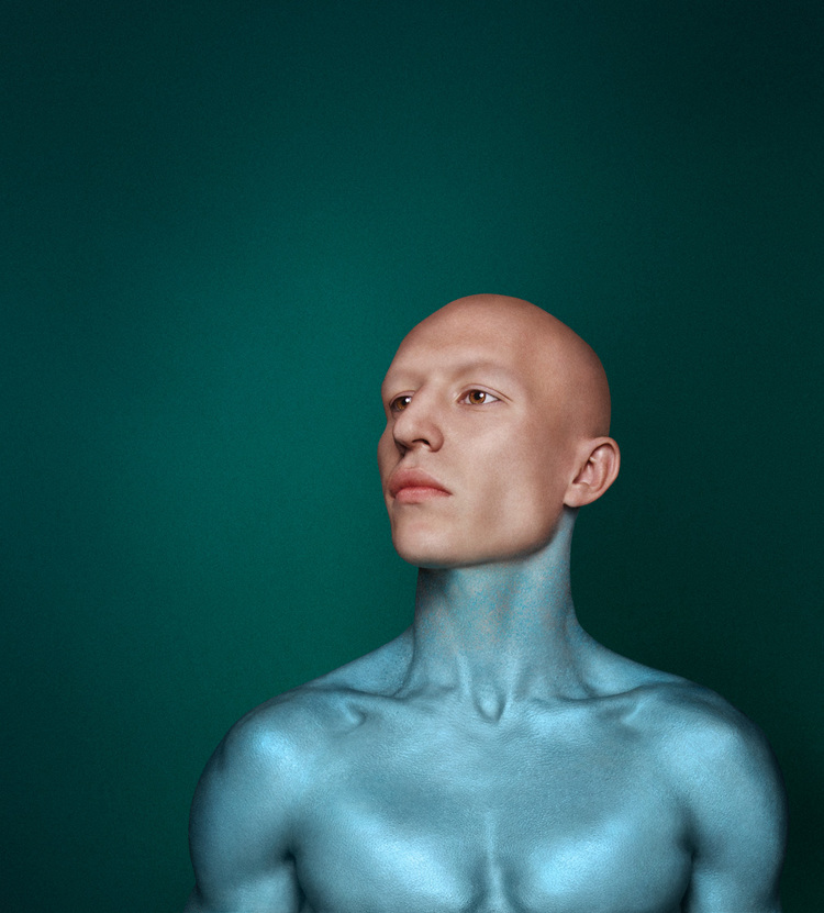
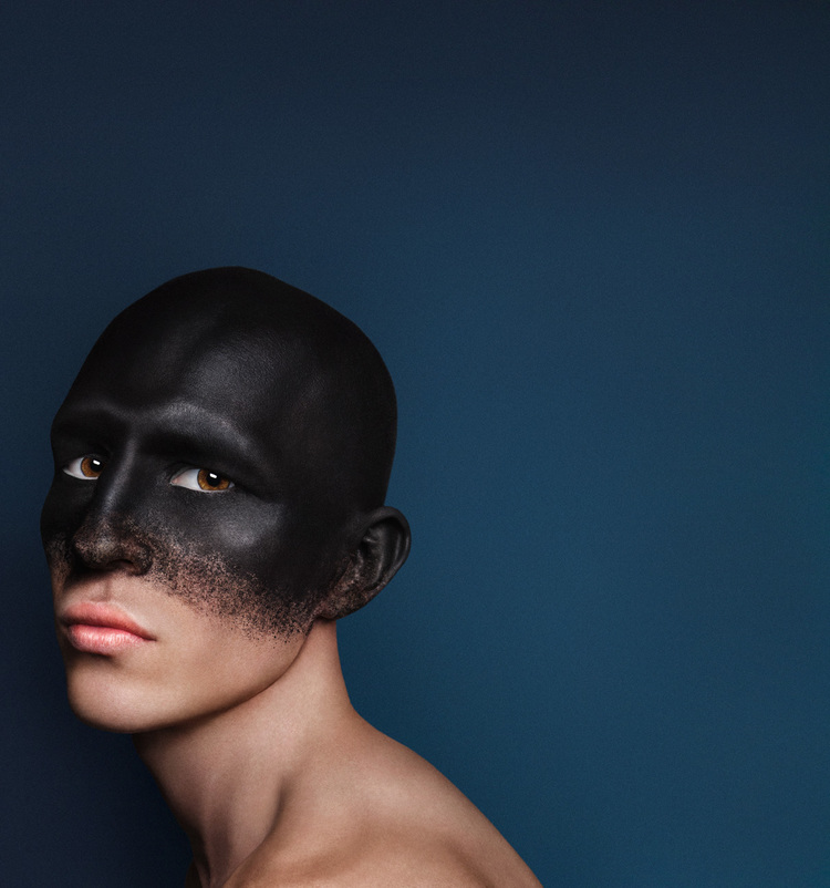
LA-based photographer Joseph Alexander creates impressive images with a strong emphasis on photo manipulation and retouching. Joseph explores androgyny and intersexual themes - not only gender but also something more of an inter-species. He again uses negative space, simple composition and lots of colour. via

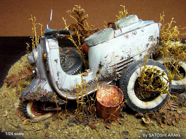
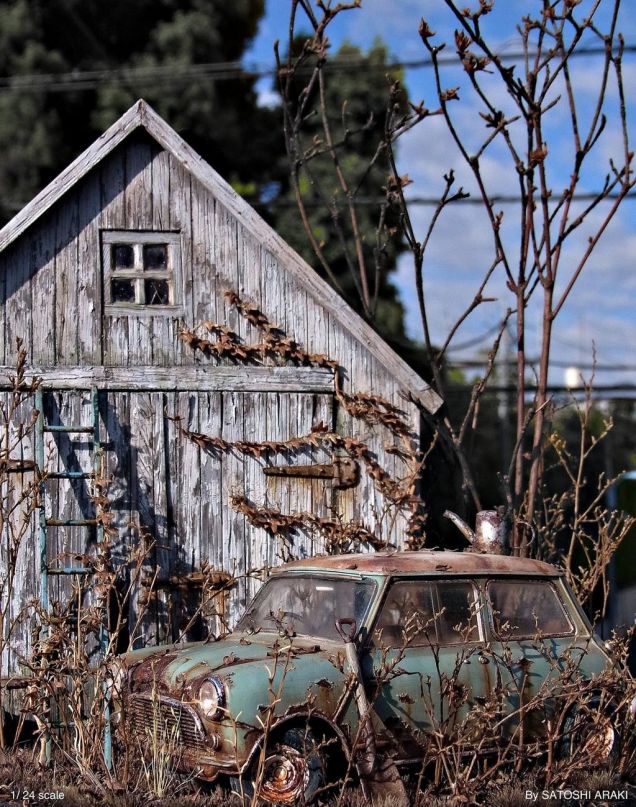
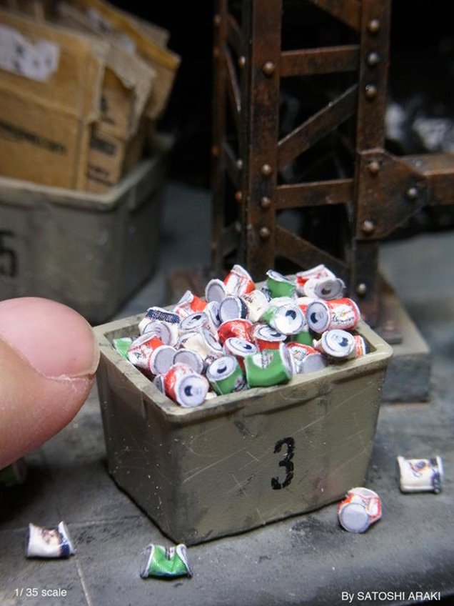
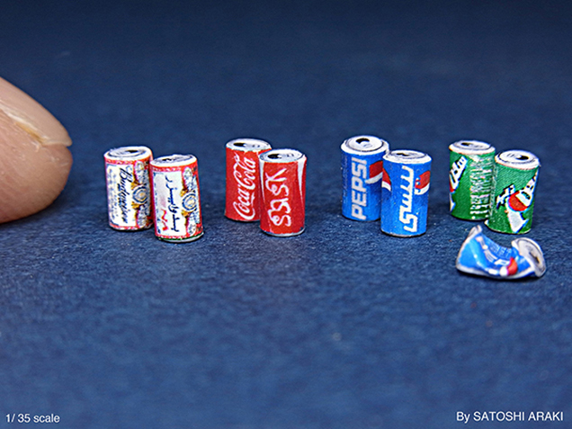
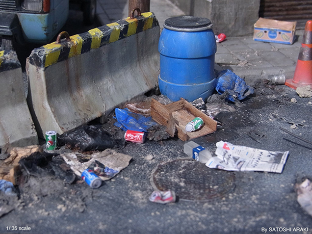
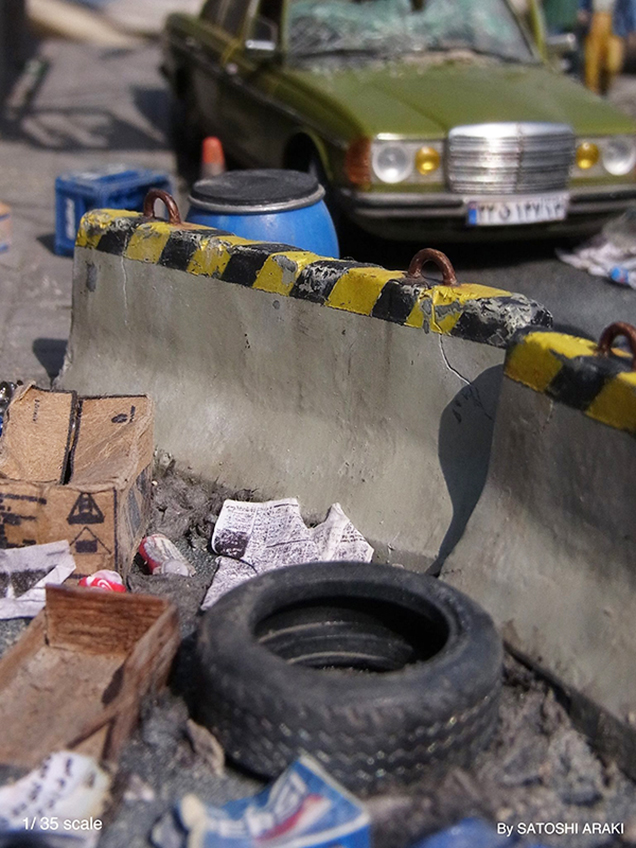
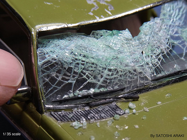
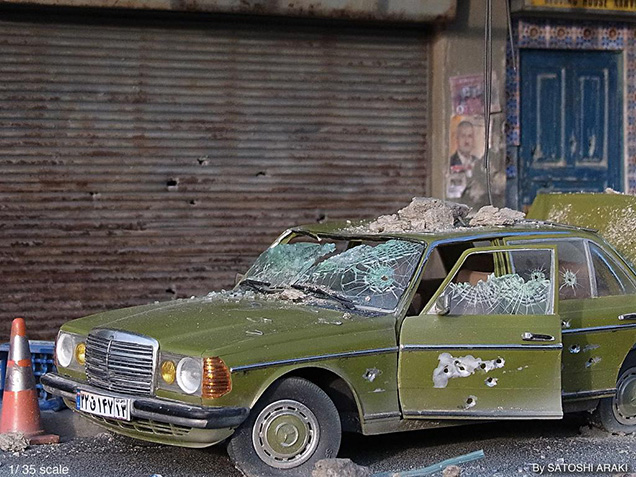
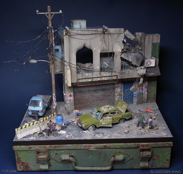
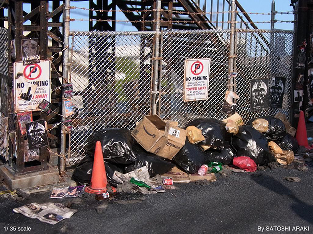
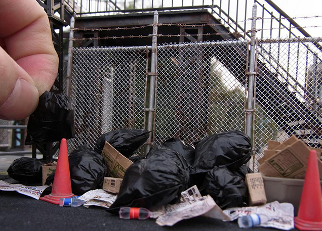
Miniatures by Satoshi Araki
Satoshi Araki's obsessive attention to detail makes his work simply stunning. If it wasn't for the reference of the finger that appears in some of the pictures, it would be very hard to distinguish these miniature dioramas from real pictures of garbage dumps, bombed cities, or abandoned neighbourhoods.
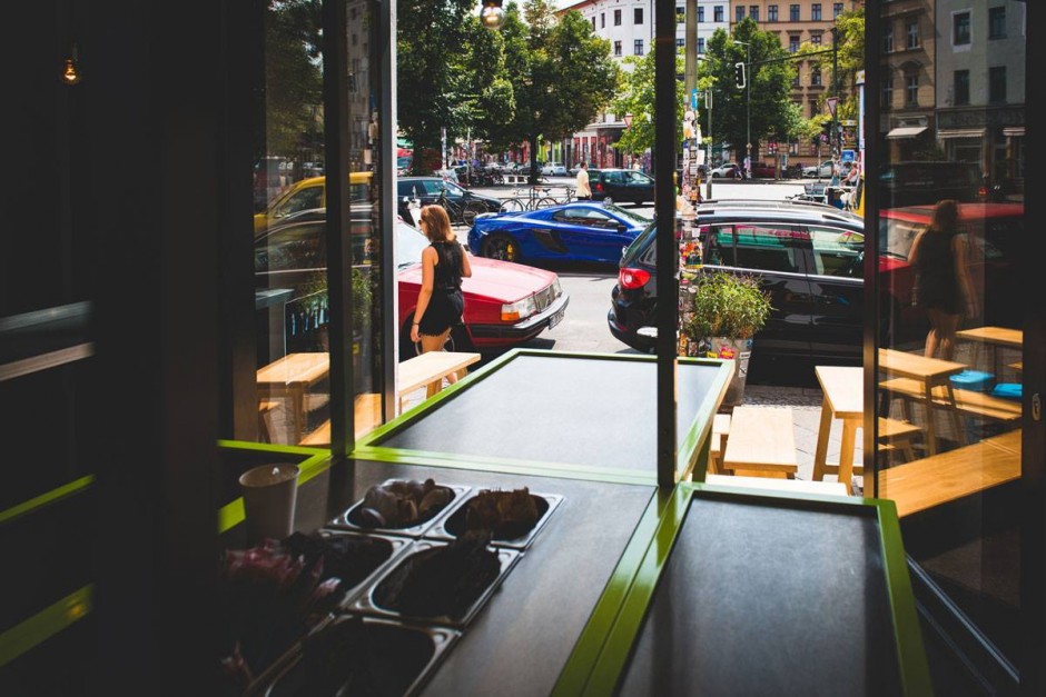
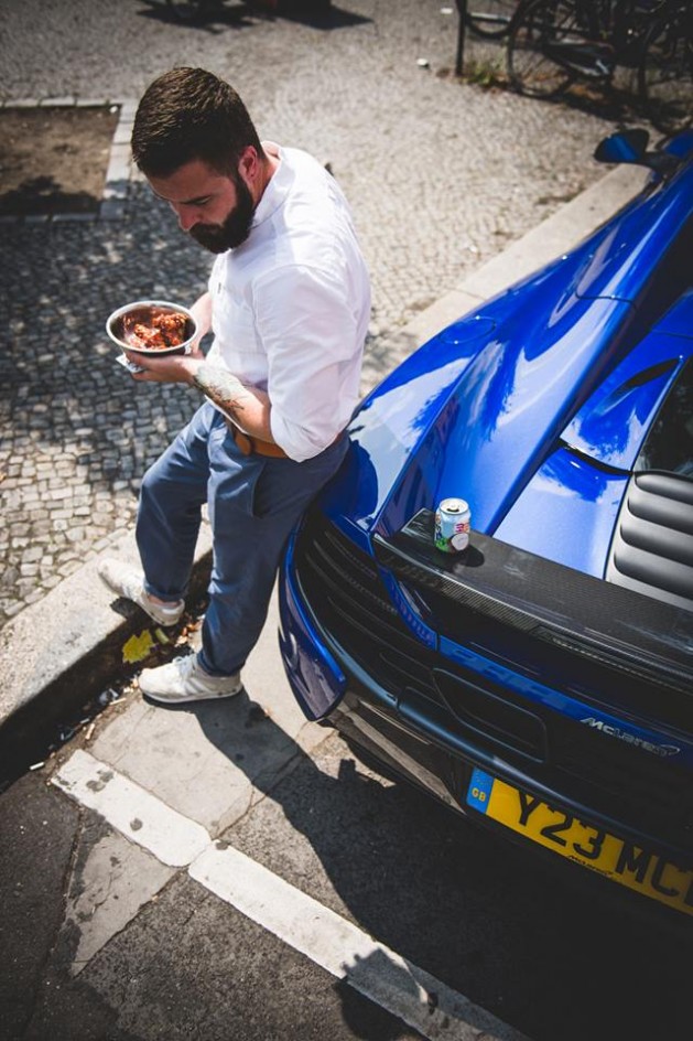
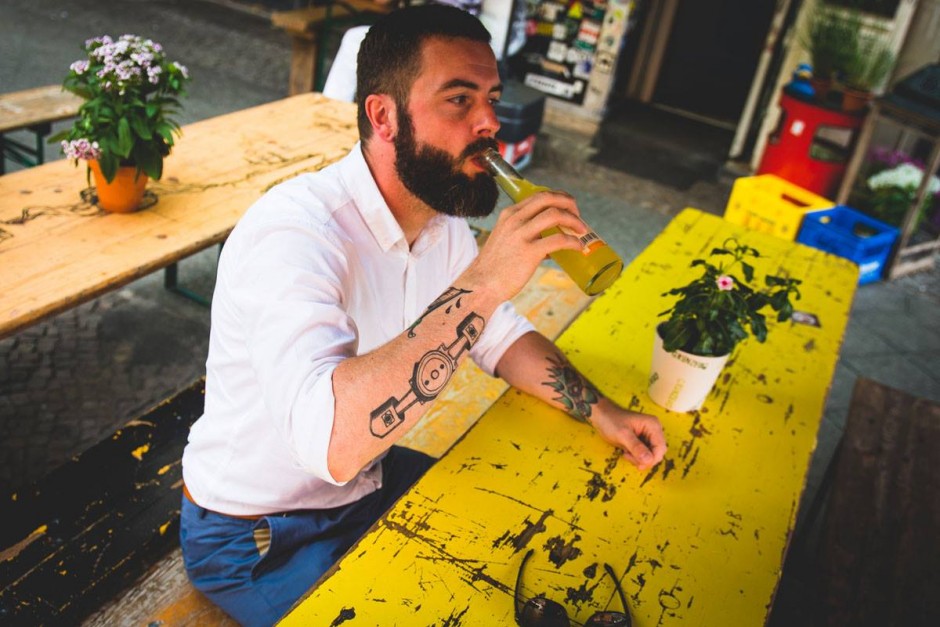
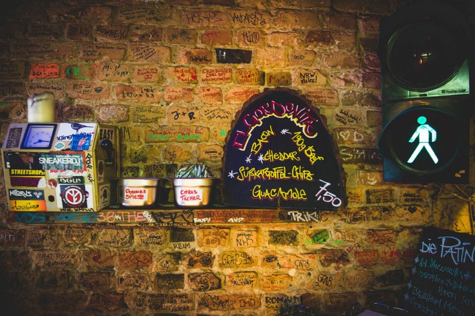
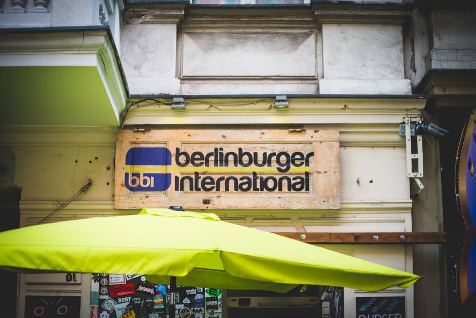
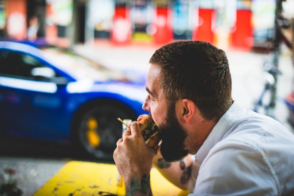
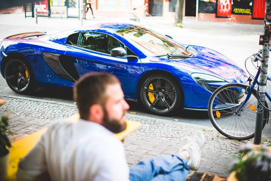
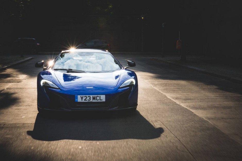
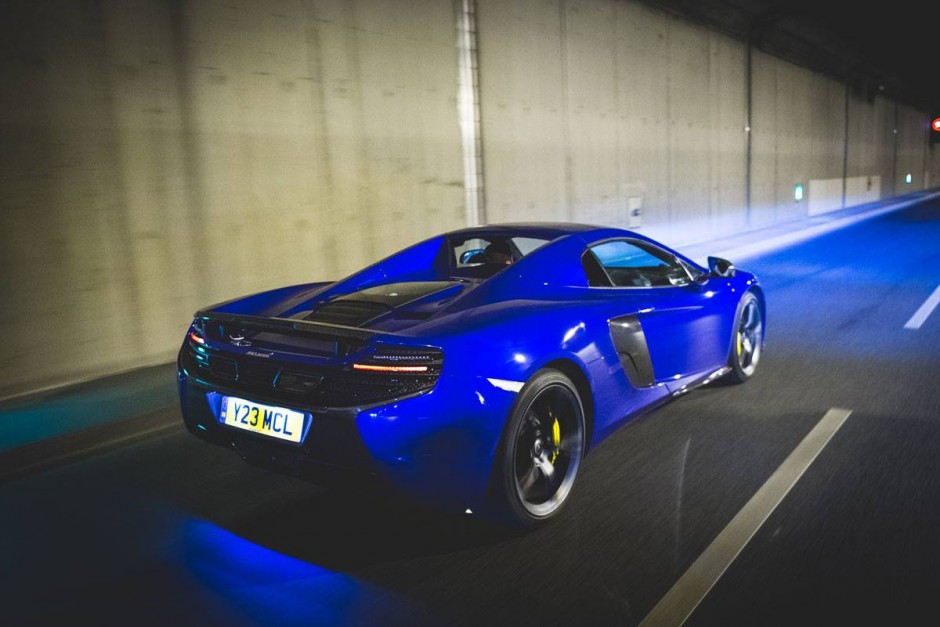
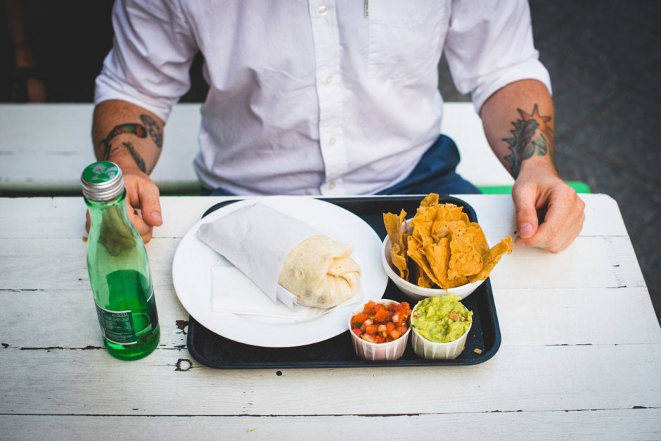
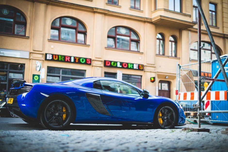
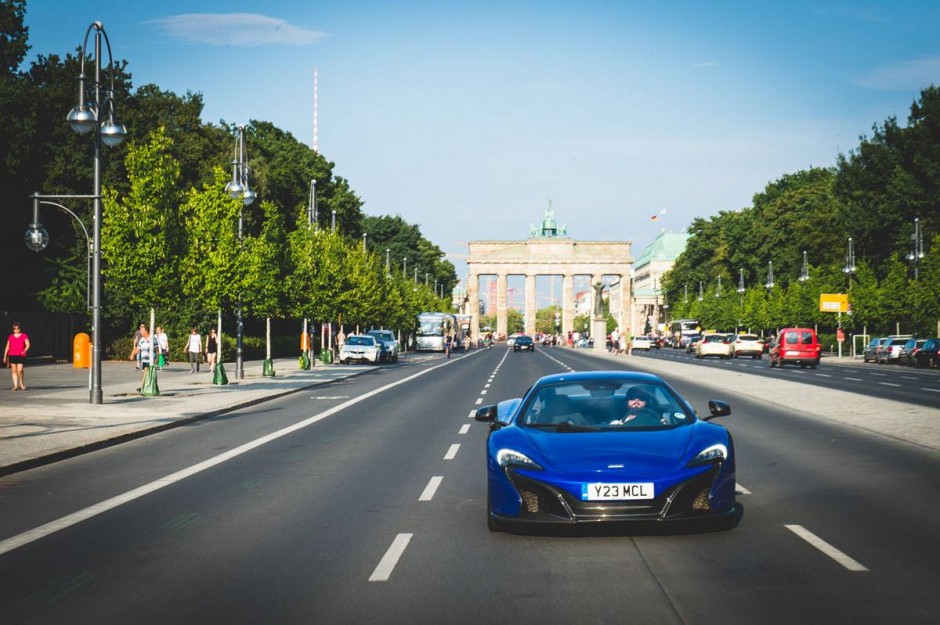
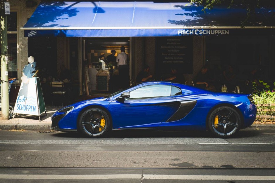
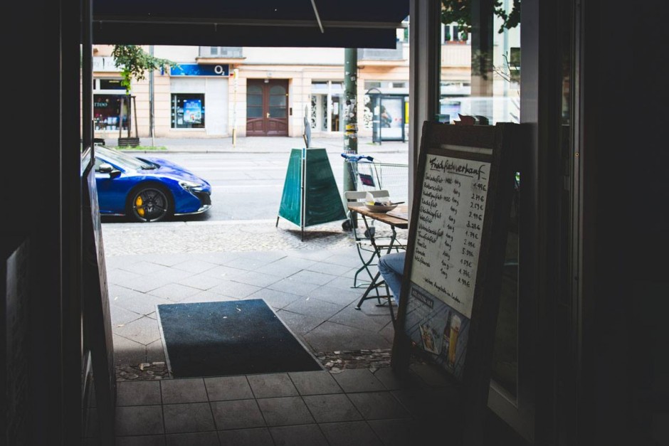
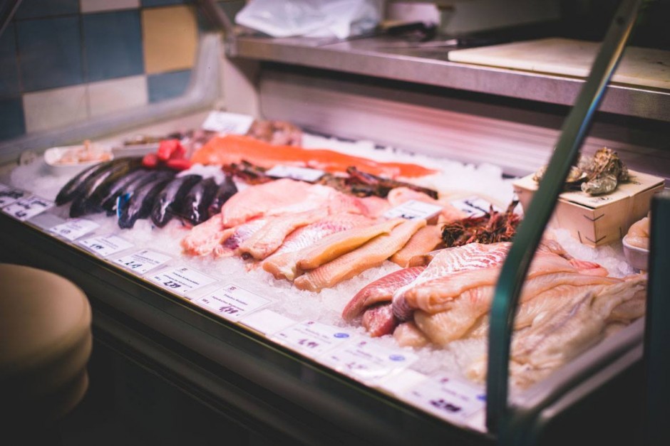
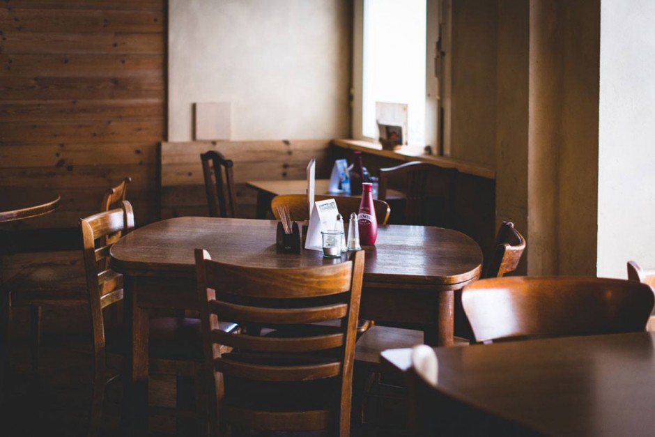
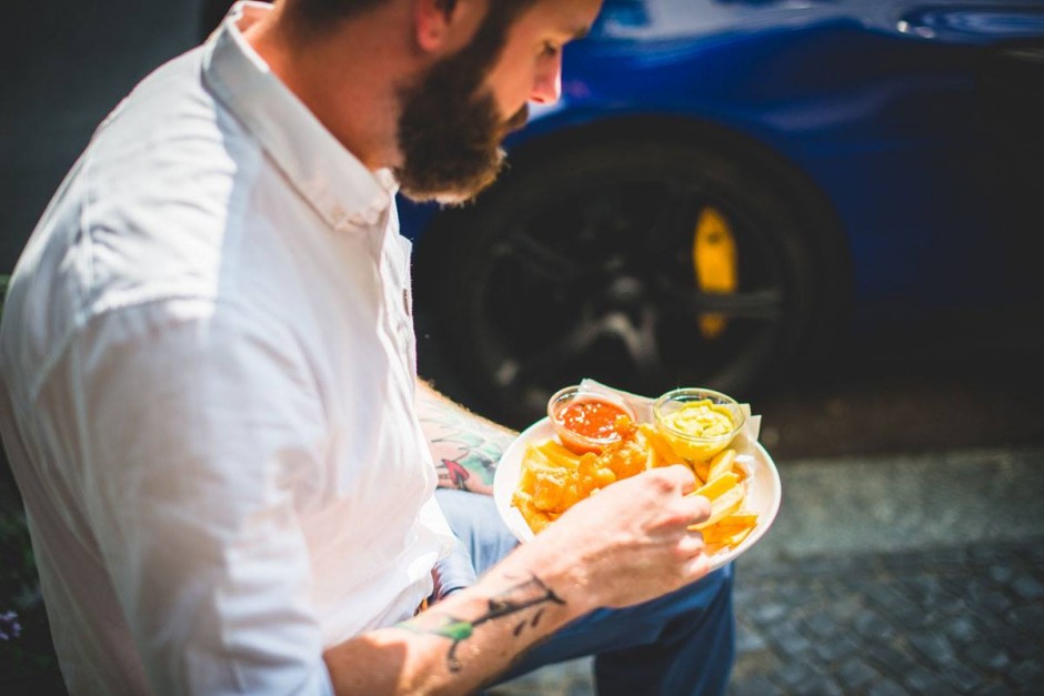
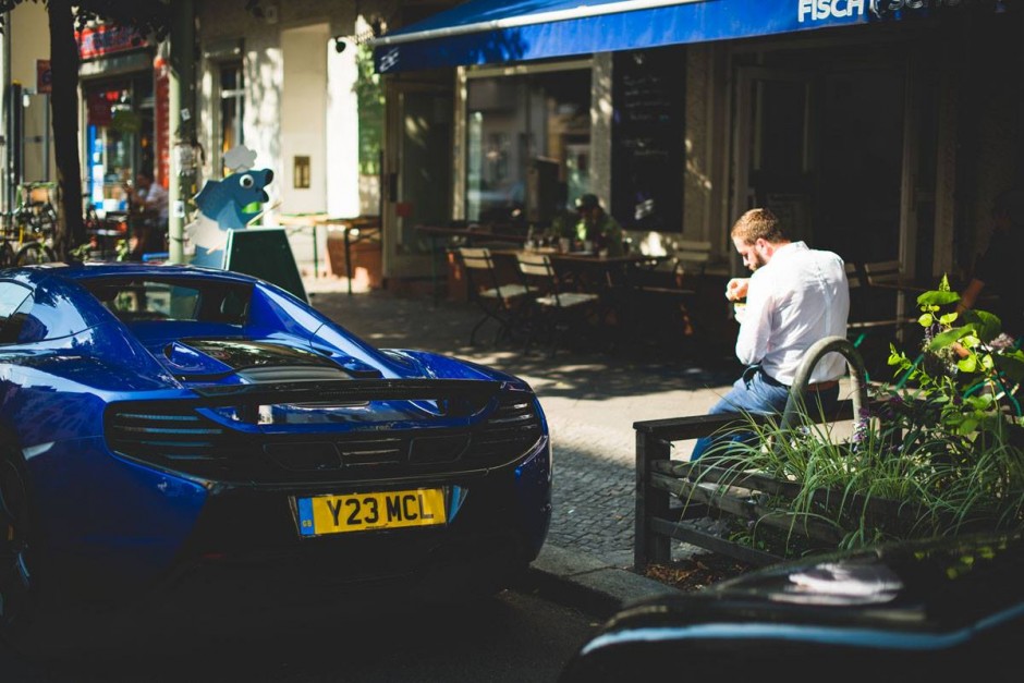
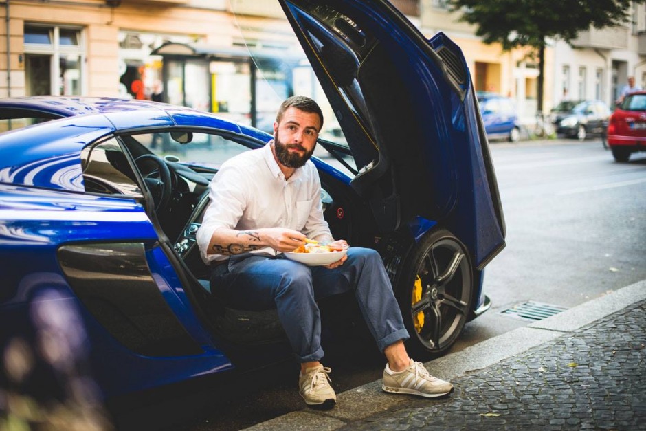
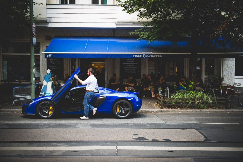
Fast Food & Fast Cars – McLaren 650S Spider vs. Berlin
German lifestyle portal Heldth gave Berlin-based readers the unique experience by visiting top city's Fast Foods drive a real Fast Car - McLaren 650S Spider. Visit their page to find out details of an each place meanwhile we enjoy the aesthetics of the photo set shot by Teymur Madjderey





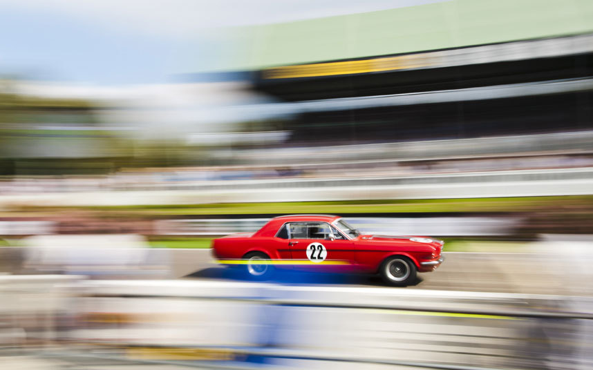
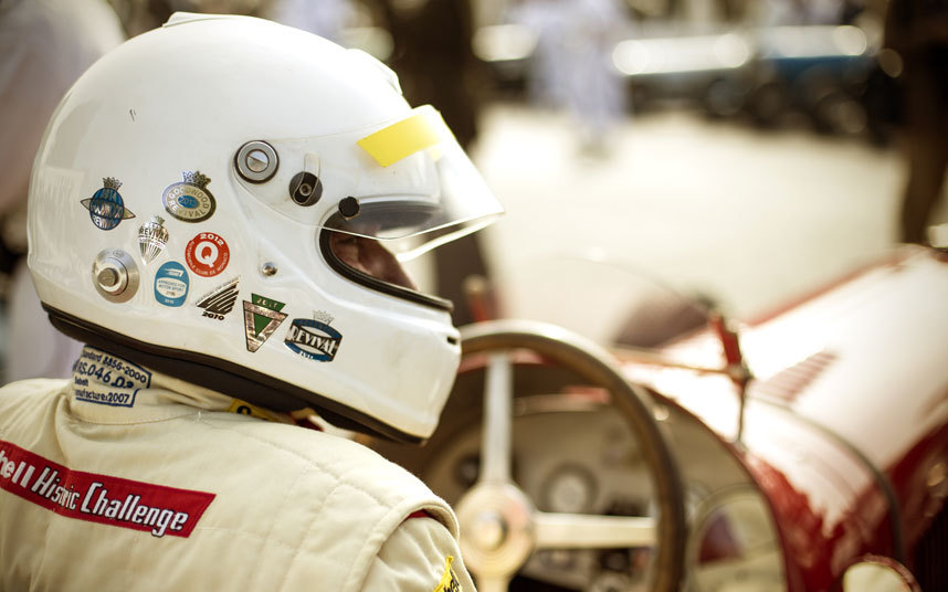
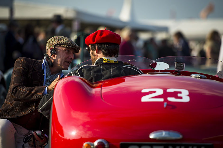
Goodwood Revival 2014
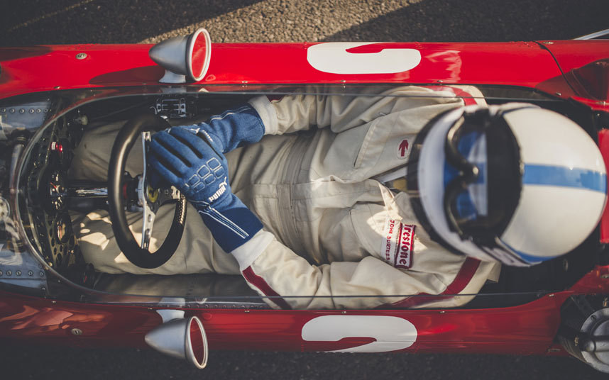
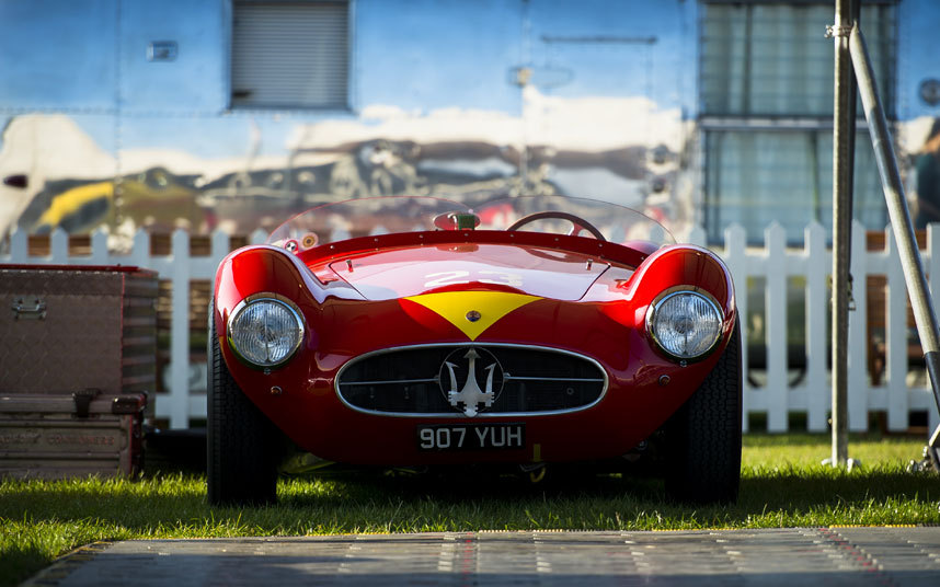
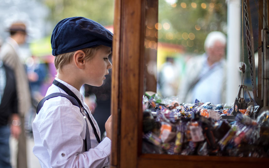
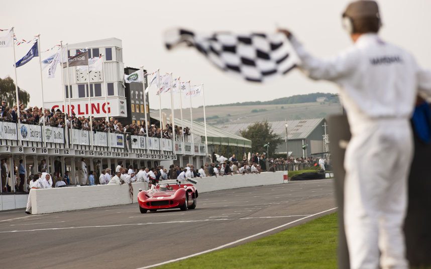
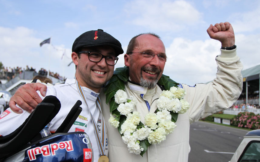
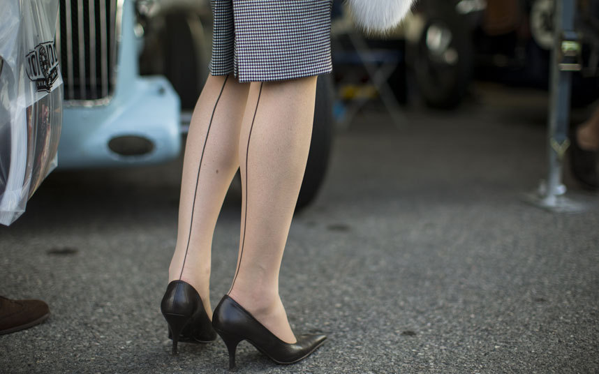
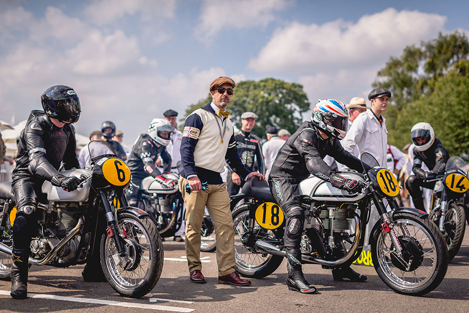
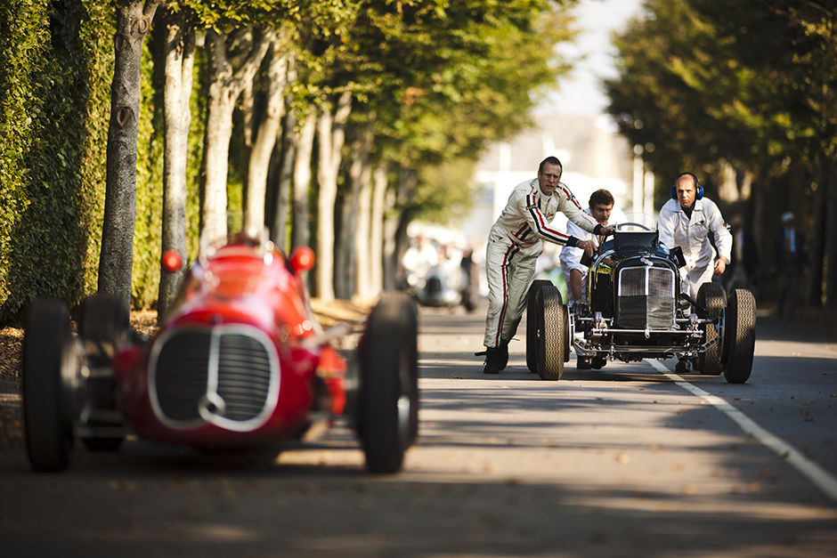
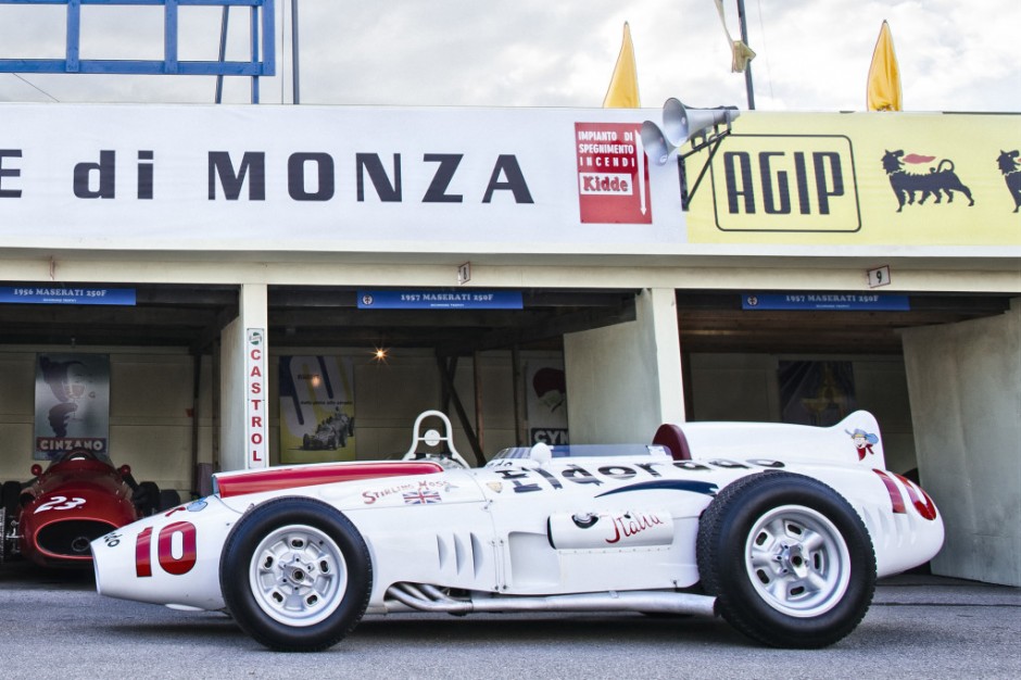
Goodwood Revival was a thriller once again this year, with highly competitive racing, grids full of important, rare and exotic racing cars, and of course a wonderful crowd of beautifully turned-out entrants, enthusiasts and fans who help turn the Motor Circuit into a little slice of petrolhead heaven for three days every year.






A Renovated Blacksmith's Warehouse
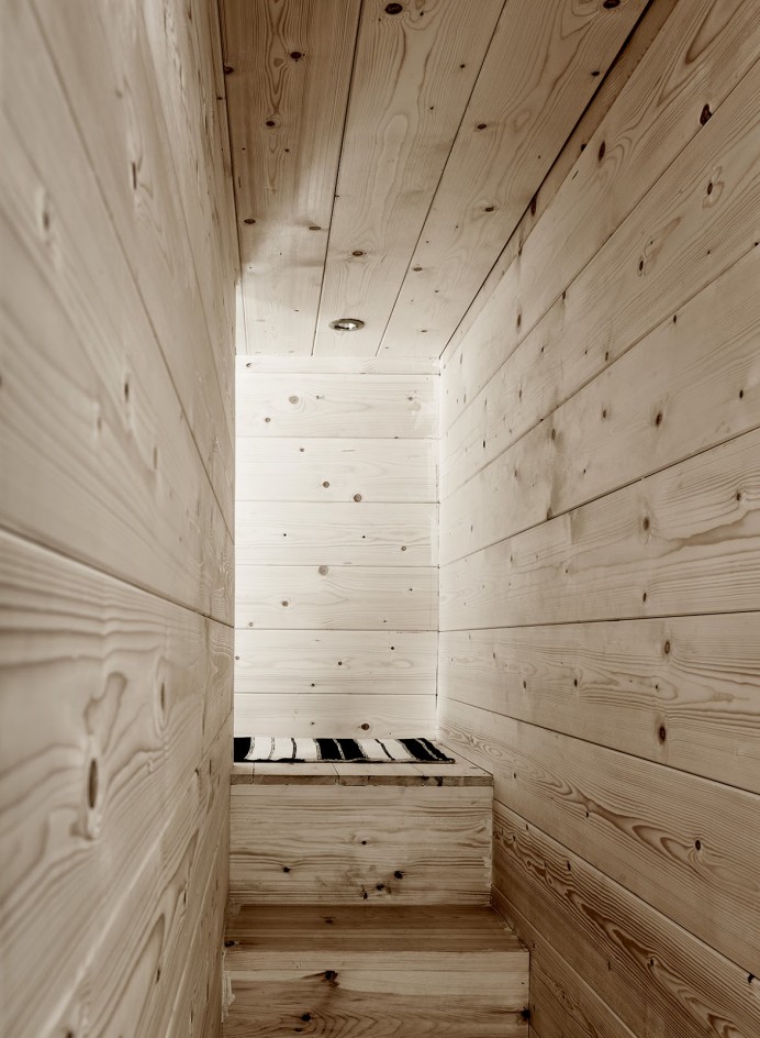
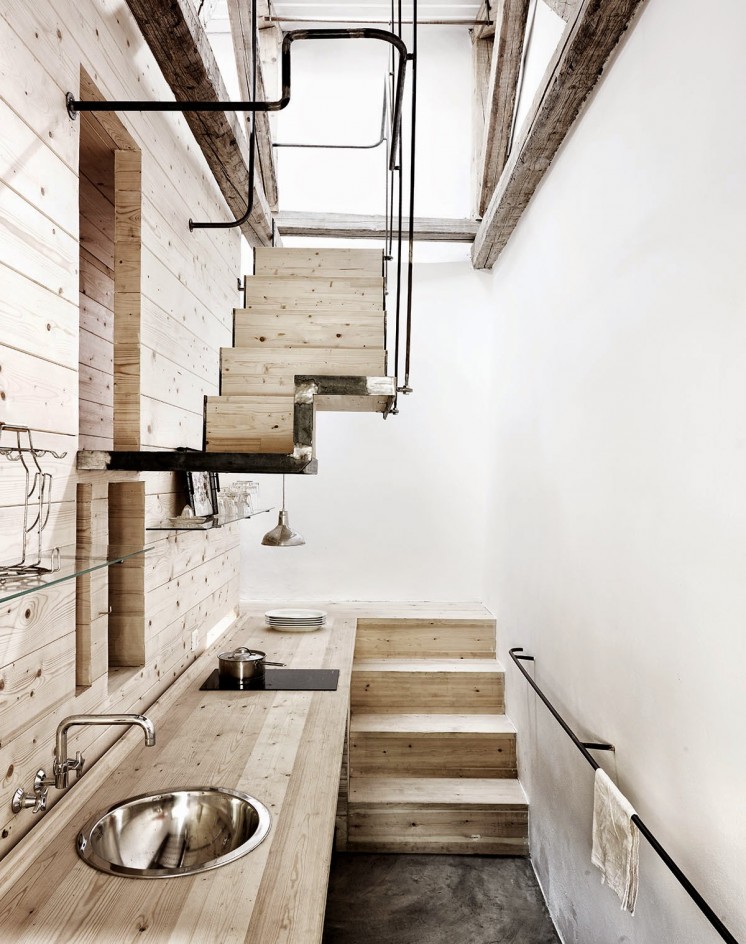
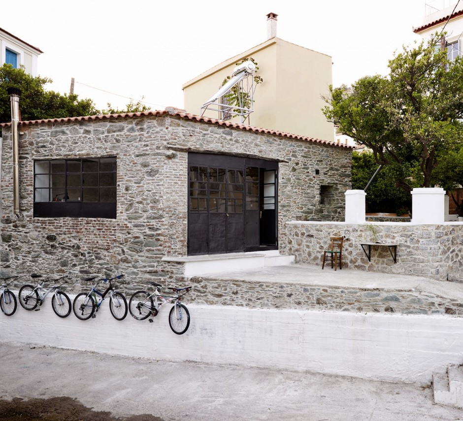
This stunning old blacksmith's warehouse has been converted with lots of light wood, bright white walls and concrete floor. It's the second home of Dorte Mandrup-Poulsen and two other Danish architects (Louis Becker and Jens Thomas Arnfred). “It’s important when you convert an old building to be careful not to remove the soul of what was there. If everything is renewed, it becomes too perfect,” Dorte says. Therefore they preserved the blacksmith equipment, like the traditional iron stove, old metal tables and the original iron windows, which are among her favorite features because they frame the seaside views throughout the home. Imperfections tell the history of this home.
Photo credits and the complete story - Kinfolk issue thirteen
VuTheara Kham Photography
Paris based commercial photographer beside his awesome shooting sets has an Instagram feed to die for. With over half million of followers VuTheara dreams about the perfect city on Earth. Enjoy your Paris too


Depositphotos Inspiration Set 2: Weddings
Designcollector and our partners at http://depositphotos.com selected the second Inspirational Set using unique stock images dedicated to the delicate topic of Weddings. Chin chin!
Read MoreMike Campau
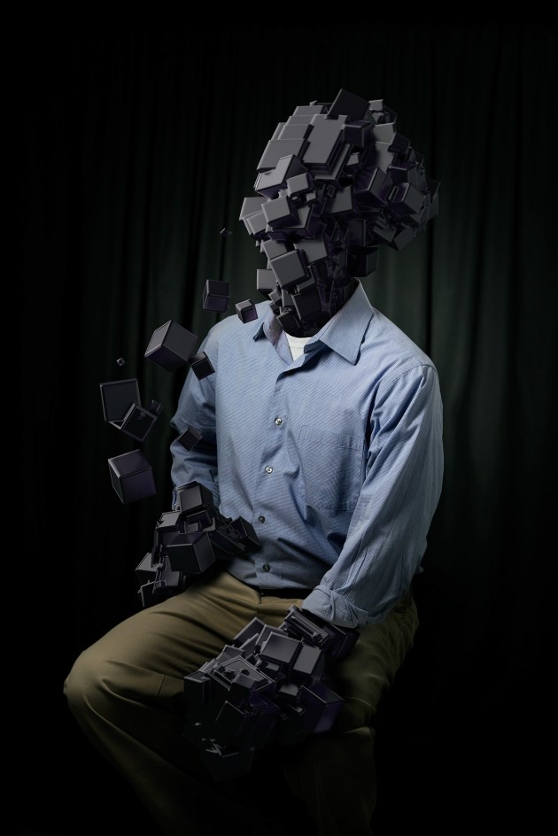
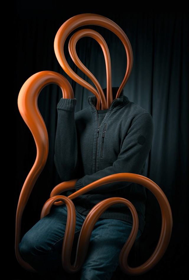
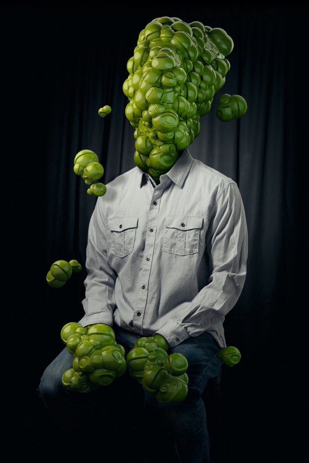
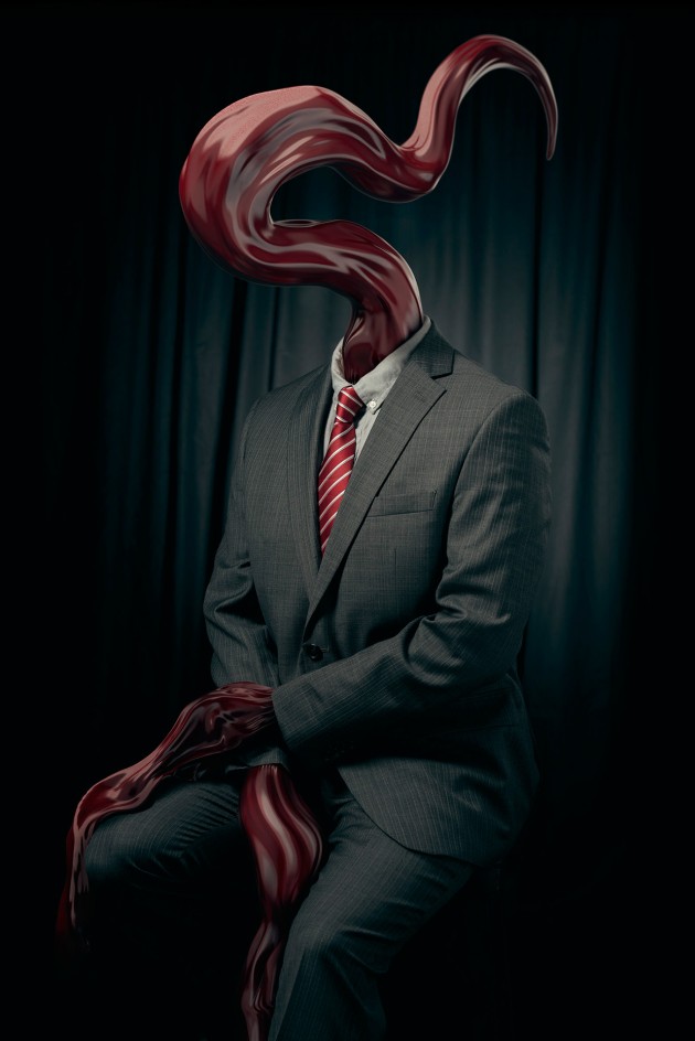
Digital photography retouch is taken to the next level - this is what I feel when reviewing Mike's portfolio. Check his digital sculptures, artworks and commercial works both on personal website and behance profile


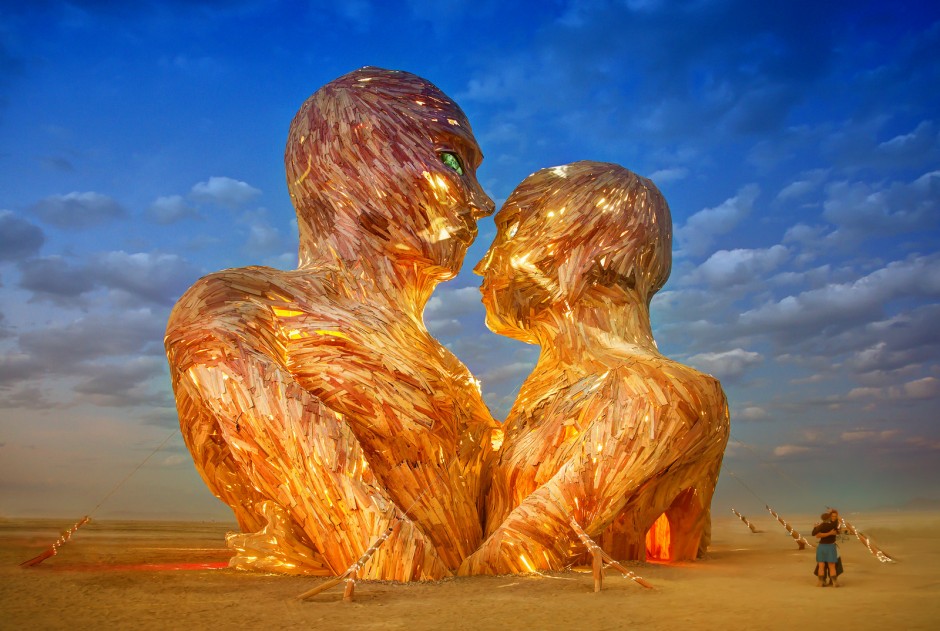
Burning Man 2014 Moments by Trey Ratcliff
Embrace was a 72 ft wooden, cathedral-like sculpture of two human figures, “in celebration of all our relationships”. The site-specific artwork was created by the Pier Group for Burning Man 2014.It was the largest project to date for the Pier Group, which gained acclaim for its previous Burning Man installations The Pier, Pier 2, and the Ichthyosaur Puppet Project. Crews began construction on Embrace in October 2013 at the Generator community art space in Reno, and in studios in Vancouver and Portland. During this year’s festival the massive wooden sculpture was set aflame and Trey Ratcliff was on hand to capture the incredible moment. Below you can see what the interactive sculpture looked like before it was burned. You can also see a video tour of the interior here. For more information check out the official Website and Facebook page. via



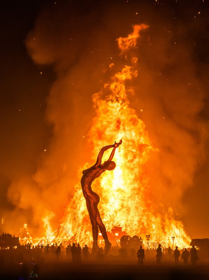

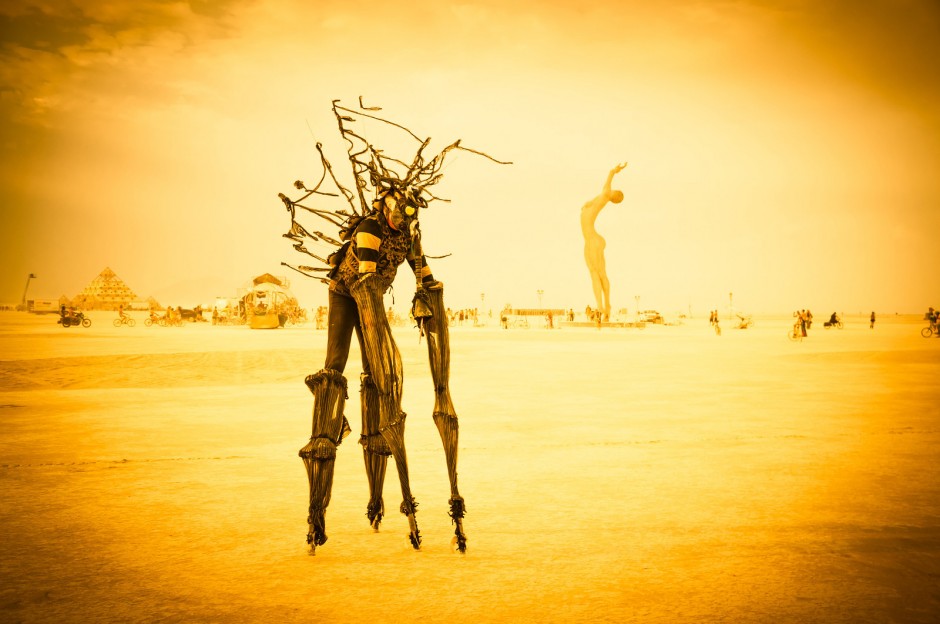
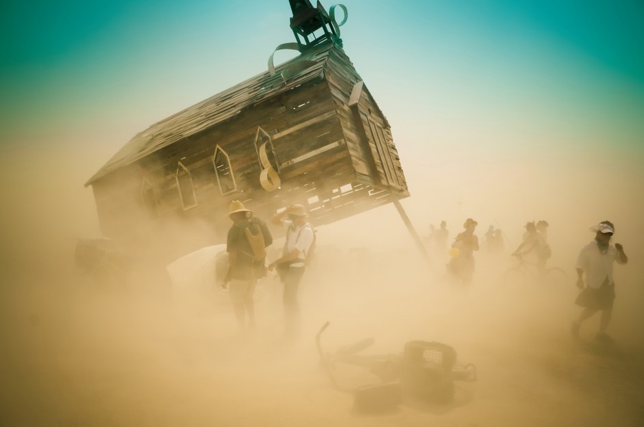
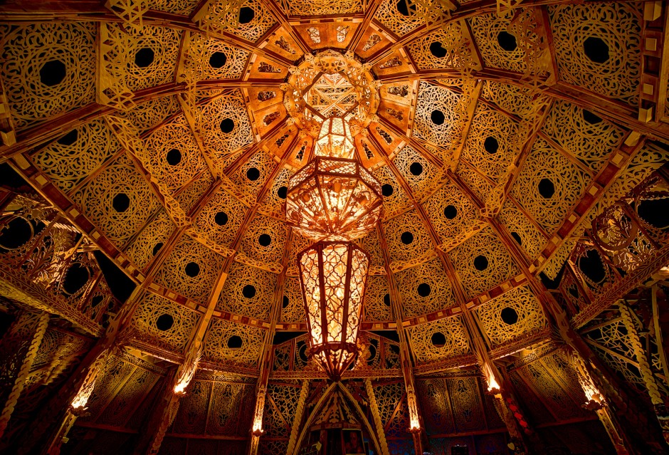
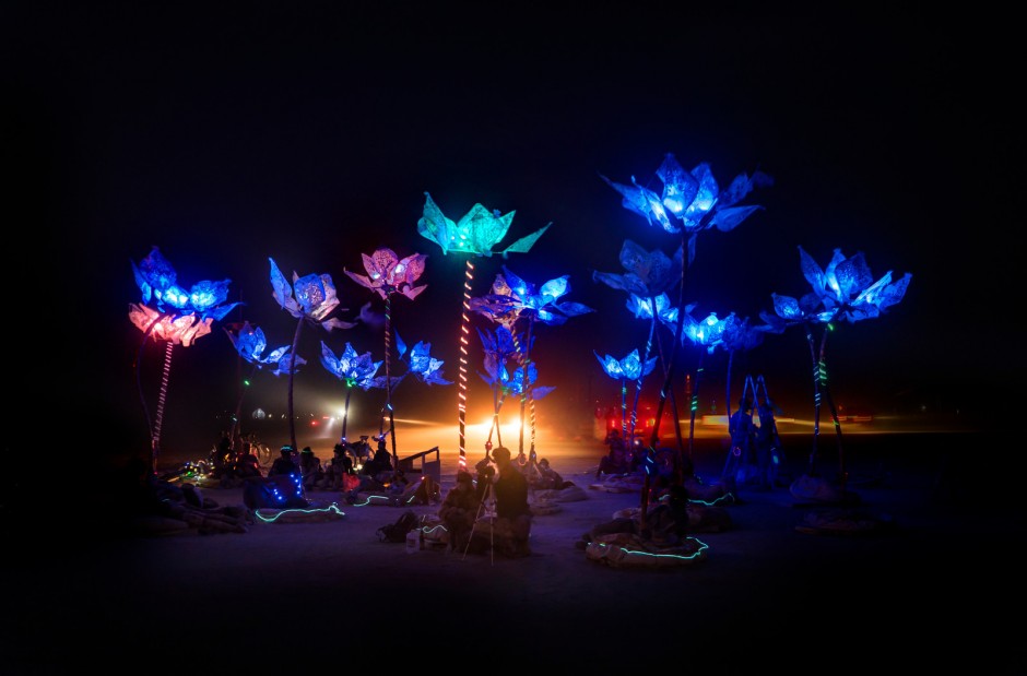
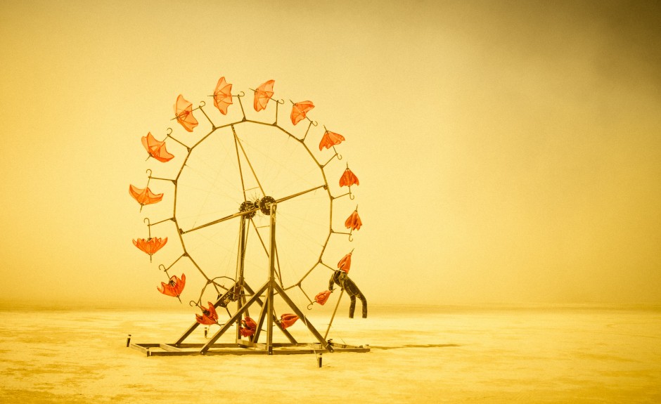
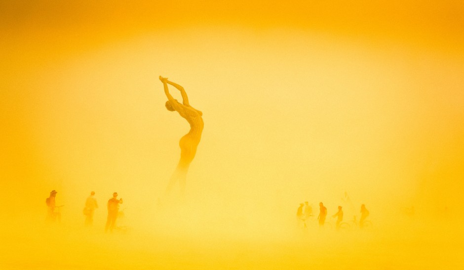
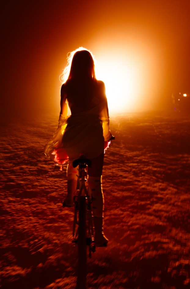

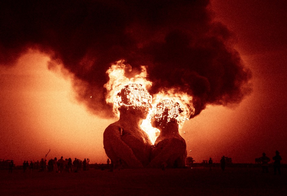
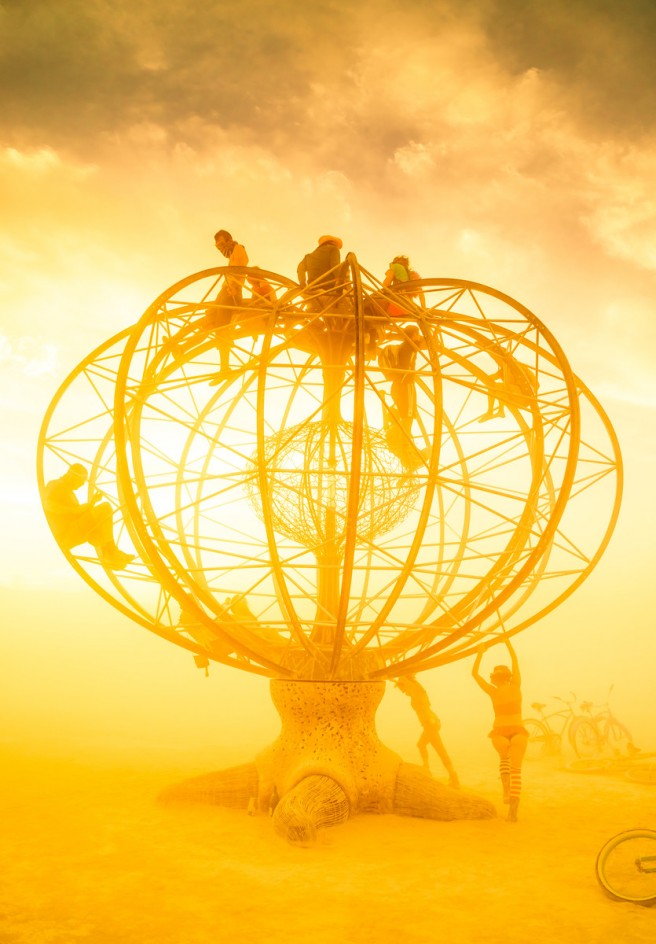
View more (A LOT MORE!) on Trey's Portfolio
A New York Sketch by Christian Borger
Christian Borger a Boston based photographer is exploring New York in a different way. Check his Instagram as well


Cliff House concept by Modscape
Living on the edge has never been so close until we found this Cliff House concept designed by Australian architects at Modscape
From the website: "A five storey modular home clings to the side of a cliff in this conceptual design by Modscape. The Cliff House is a design response for Emma and David, a couple who approached Modscape to explore design options for a holiday home on an extreme parcel of land they own on the south-west coast of Victoria. Inspired by the way barnacles cling to the hull of a ship, a concept was developed for a modular home to hang off the side of a cliff as opposed to sitting on top of it. The home is visualised as a natural extension of the cliff face rather than an addition to the landscape, creating an absolute connection with the ocean. As the design itself would make conventional construction prohibitive, the concept utilises Modscape’s modular design and prefabrication technologies to deliver a series of stacked modules that are anchored into the cliff face using engineered steel pins. Entry to the home is through a carport on the top floor, where a lift vertically connects you through each of the descending living spaces. Internally, the living spaces feature minimalistic furnishings to ensure that the transcendent views of the ocean and the unique spatial experience of the location remain the integral focal point of the design."


Food in 60 seconds
You have never seen food motion video like this. The team of Food Film directors Michael Roulier and Philippe Lhomme together with food stylists Emmanuel Turiot and Gilles Poidevin created a short spot for Marks & Spenser Food. Don't forget to check their portfolio, especially if you work with food photography, pretty awesome examples over there www.foodfilm.fr
http://vimeo.com/105039041
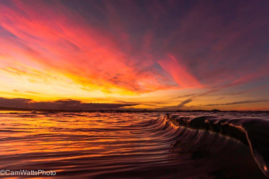
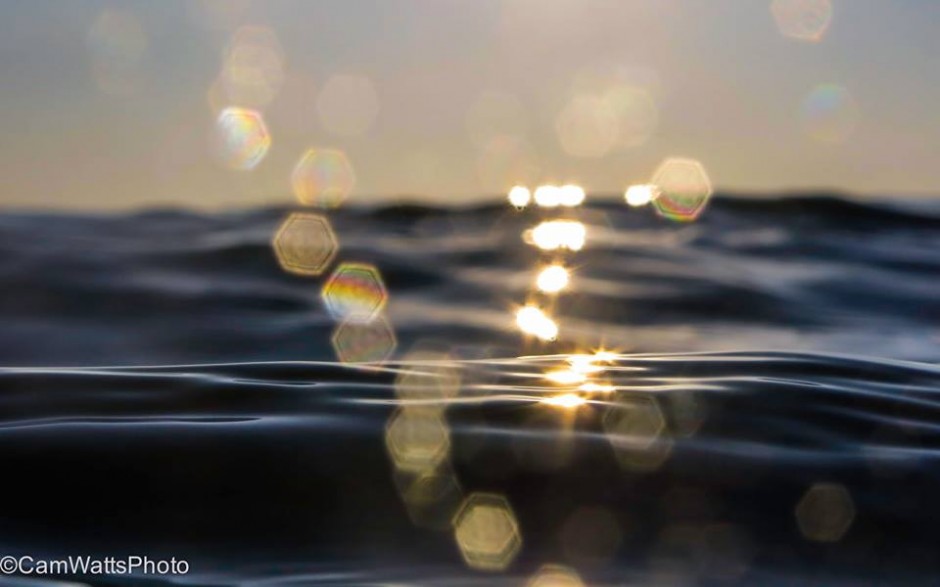
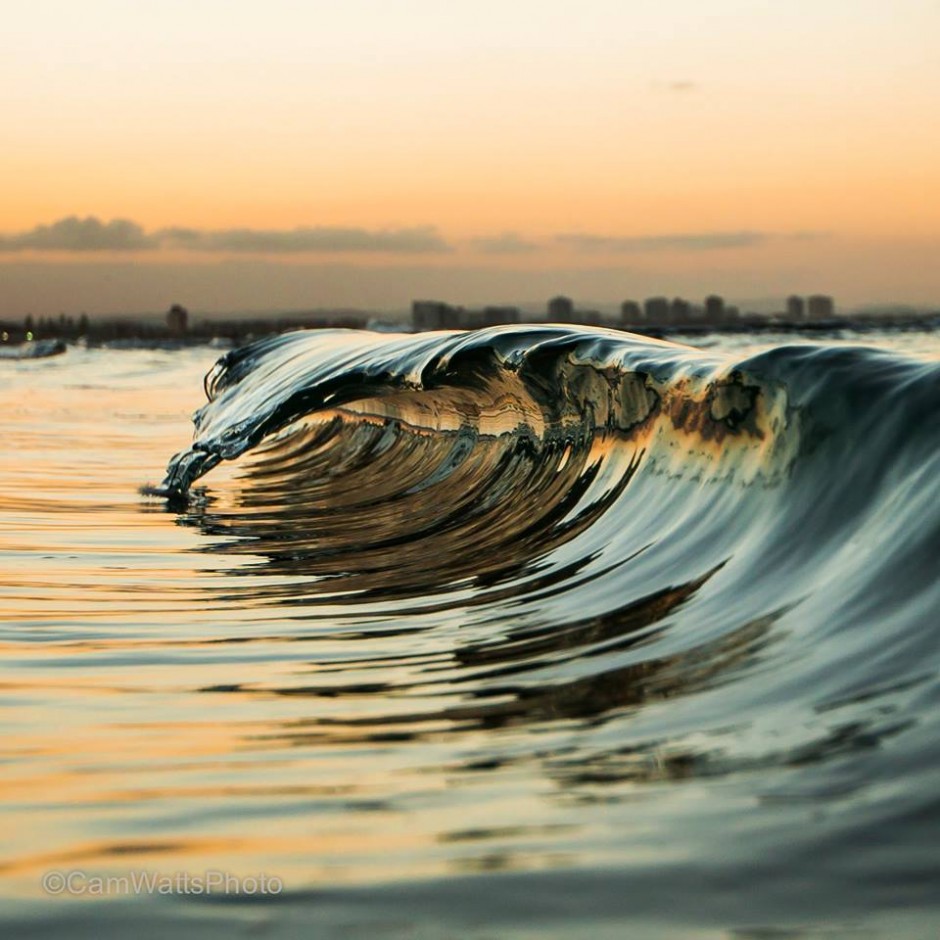
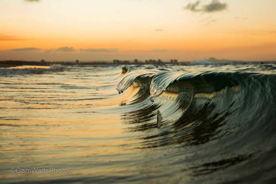
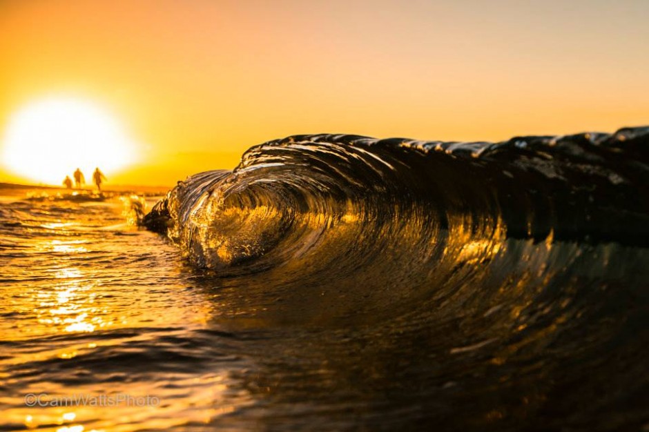
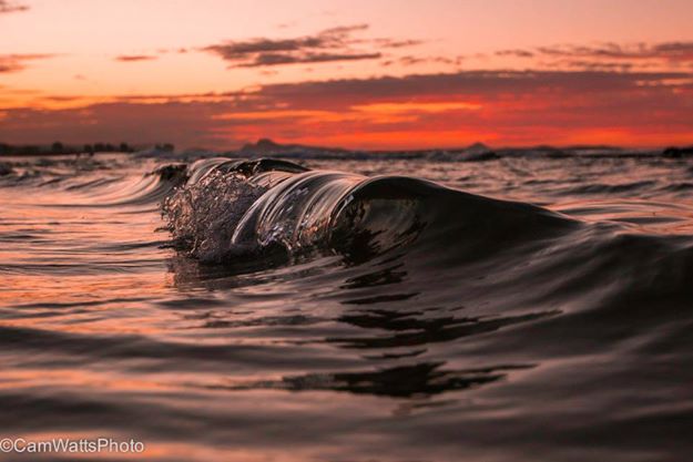
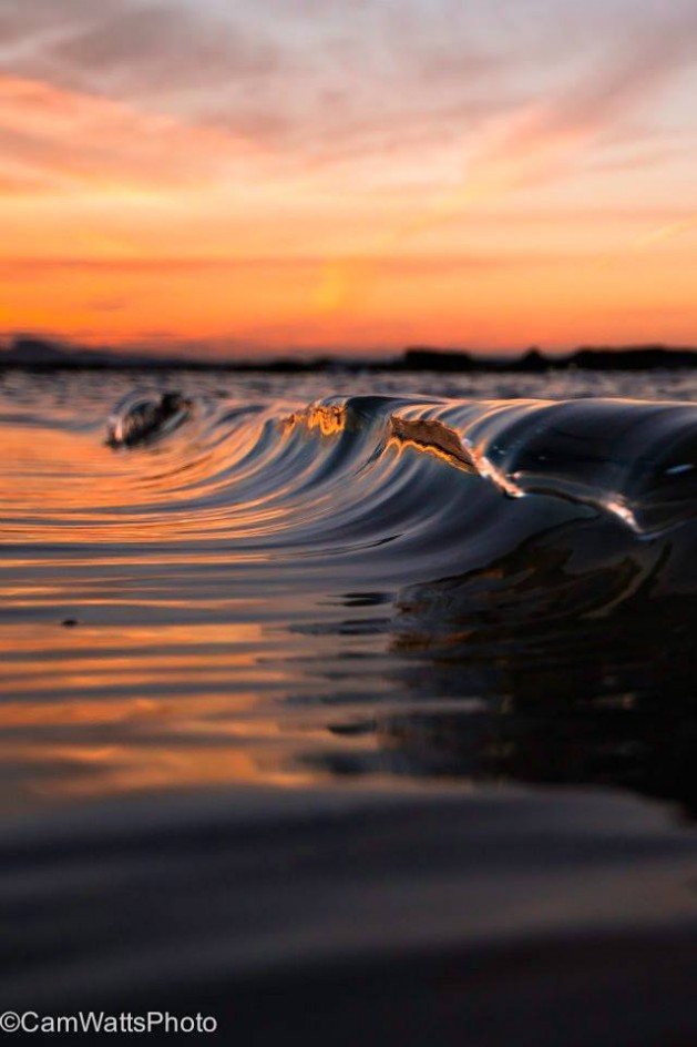
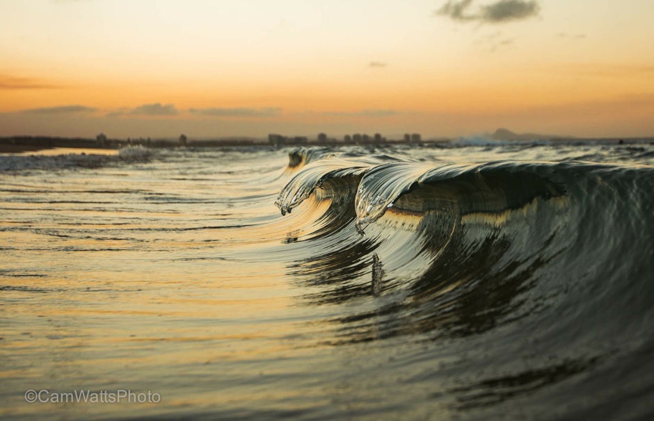
Cameron Watts
Check these beautiful waves on Cameron Watts portfolio, nature photographer based in Queensland, Australia

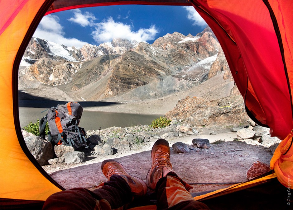
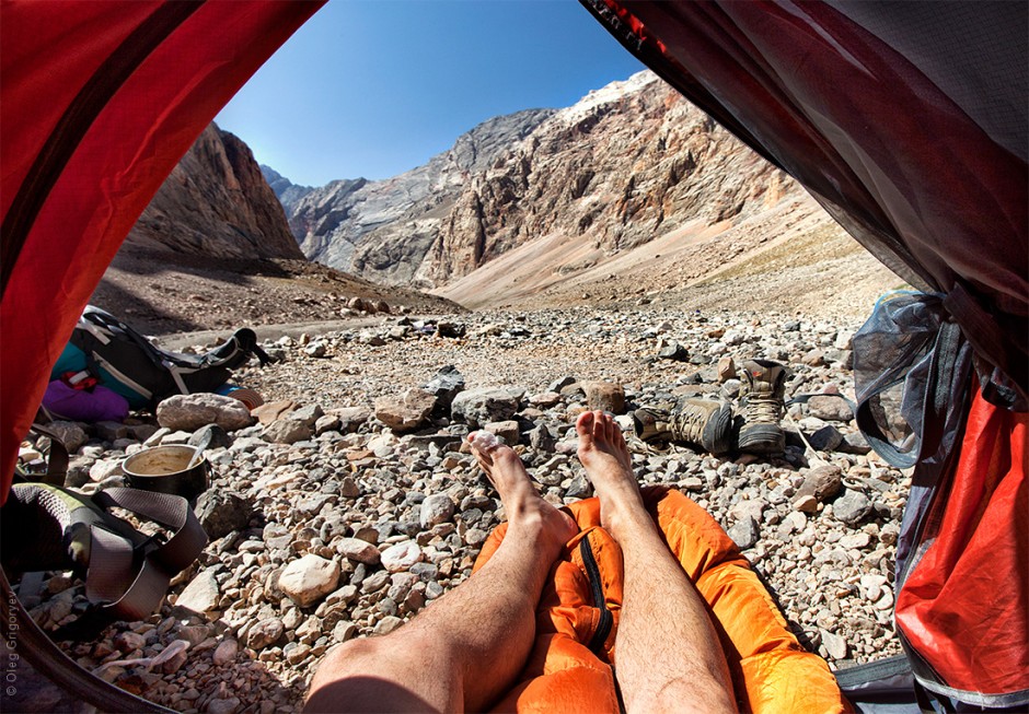
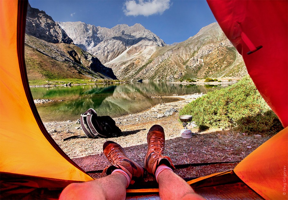
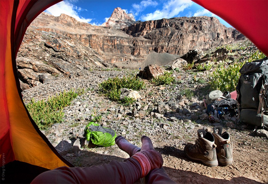
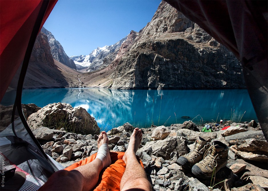
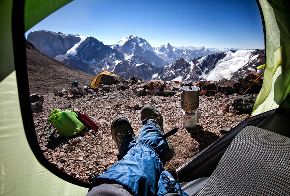
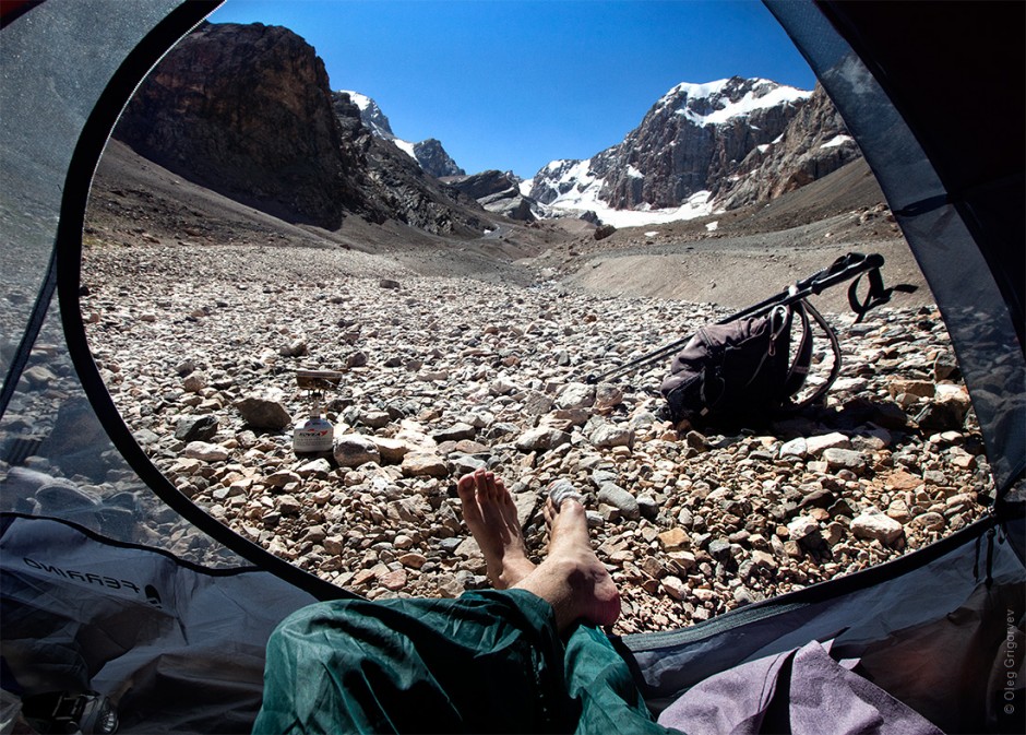
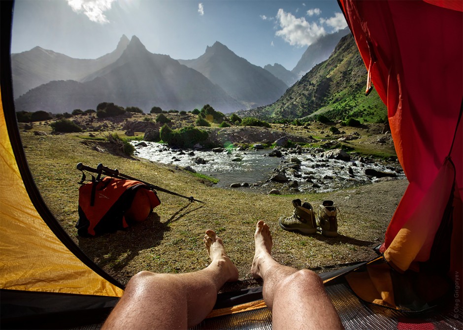
Morning Tents by Oleg Grigoryev
This playful collection of photographs features one man's view from the inside of a tent. Simply called Morning Views From the Tent, the inspirational travel series was created by photographer Oleg Grigoryev. Each image offers a unique glimpse of the Tajikistan landscape from the eyes of an adventurer traveling through the Fann Mountains.via

Parisian rooftops photographed by Michael Wolf
"For a photographer living in a major city filled with iconic architecture, museums, and myriad tourist destinations, the struggle to capture an authentic image is great. This was the exact situation photographer Michael Wolf found himself in after moving to Paris from Hong Kong in 2008. Surrounded in a city filled with sights that could easily be interpreted as cliché, Wolf pointed his camera away from the recognizable landmarks and instead focused on the dense rooftops surrounding the city. Packed with stout chimneys, tv antennas, graffiti, and numerous geometric forms, these shots present a strange abstracted view of a usually recognizable place." text by Colossal


Food Art by Dina Belenko
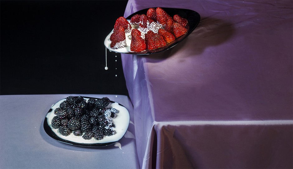
Russian self-taught photographer Dina Belenko creates alluring still life images which she calls “photoillustrations”. Combining creative and well arranged compositions with photography and a little bit of photo manipulation skills, Belenko creates beautiful food photography starring various inanimate objects: food products, utensils and other props.
I prefer still life because the role of chance is incredibly limited here. You may feel as a director < …> Each failure is your own failure, but every victory is also completely yours.
Belenko is participating in an ongoing project called “An Endless Book”. Each week, participants have to upload an artwork under a self-selected topic. At the end of 2015, a huge panoramic image will be made featuring all of their works. You can read more about it at the official website.
text by Beautiful Decay


