Illustrations by Juan Carlos Paz
A cosy tribe of tiny monsters from South America is waiting to be adopted by a good family. These are the illustration works by Juan Carlos Paz, talented artist from Madrid. Find more monsters on his Behance profile.


3rd Wave of Inspiration
Since 2003
A cosy tribe of tiny monsters from South America is waiting to be adopted by a good family. These are the illustration works by Juan Carlos Paz, talented artist from Madrid. Find more monsters on his Behance profile.
Madden is a graphic designer at Abercrombie & Fitch but she injects her personal work with playfulness and femininity. A look through her portfolio features some cool branding and graphic design, and we love that her skills include a distinct talent for illustration.


Feline Zegers is an artist with a love for illustration and photography. "My work plays with the combination of good and evil, beauty and degeneration. I’m often dealing with relationships between people and their environments. My work offers alternate views of reality. The value of storytelling and it’s ability to connect us to each other through our cultural, humanistic and emotional similarities is very present in my work. The figures displayed take on different roles, although the role itself is sometimes vague, flickering between seducer and victim, preacher and sinner, woman and child. Riddles which may, or may not, have a solution."


STYN is the graduation project of Dutch designer Sam van Doorn. It is an interactive pinball table that generates drawings with the help of a players. A poster is placed on top of the machine, which has a grid printed on it. Based on this grid you can structure your playing field to your desire. By playing the machine the balls create an unpredictable pattern, dependent on the interaction between the user and the machine.


Katrin is an independent german graphic designer based in Offenbach am Main. She is working interdisciplinaryin many fields of design, including editorial design, book and catalogue design, conception and visualization of images by the use of illustration, installation and photography, as well as exhibition design, poster design, identities and web-design


New-York based Russian artist Nastya Kaerfkrahs KFKS just completed here next indoors mural art for the local book store ZAKKA SHOP "I spent around 5-6 hours of drawing per day for 1 month. During the process many people were wondering if I made sketches on canvases with a projector? The answer is that I used free hand drawing ONLY. As all of you may (or may not) know this is a drawing done by hand without the use of guiding or measuring instruments." Materials: canvases, black mat acrylic, brushes (01, 2, 8).
http://vimeo.com/54257395


Celebrating the landmark 1977 Eames film, Powers of Ten™, The Powers Project invited 40 innovative artists from around the world to produce original segments for each power of ten using a variety of digital and film techniques. This new, collaborative homage playfully transplants the film’s journey from the physical universe to a unique, imagined universe of graphic abstractions.
View all projects on http://cargocollective.com/powersproject meanwhile watch the short we liked, created by British artist MRK called The Powers of Ten: Lymphocyte.
http://vimeo.com/53439232
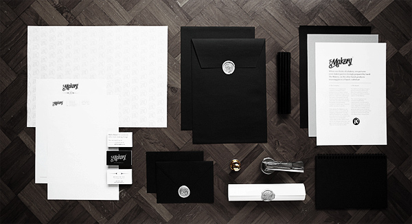
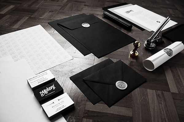
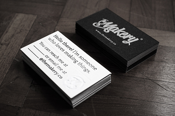
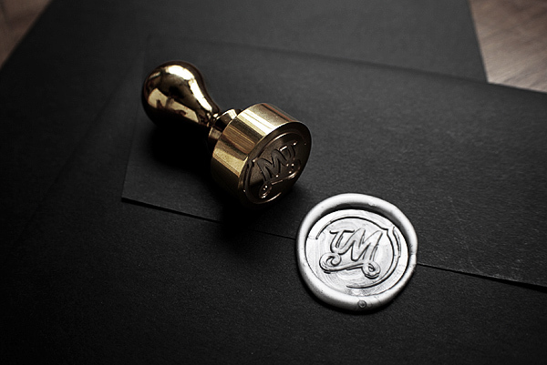
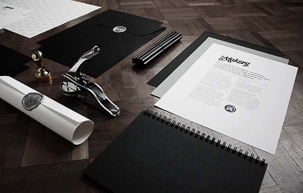
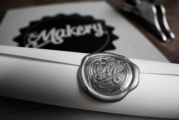
Young graphic designer from Singapore - David Goh shows off his mature skills in visual solutions for different brands. Let's explore his recent work for "The Makery" a creative consultancy with a primary focus on hand-crafted models.

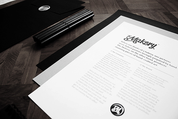
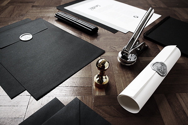
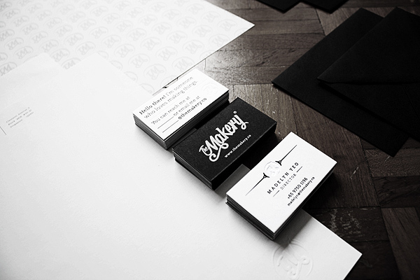
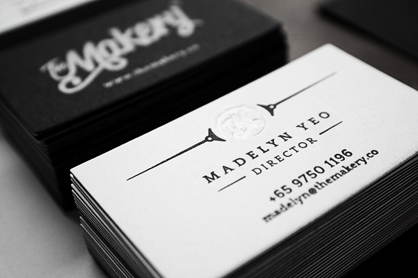
Moscow-based graphic designer Sergey Shapiro developed unique skills in hand lettering and calligraphy. He successfully applies it in logotype design. Check his website to explore a lot of handwritten logotypes and appreciate his work on Behance


“I choose drawing over painting as this allows me to create many layers over layers of lines and dots, which react to each other in order to create a vibrant texture with directions and movement,” says figurative Dirk Dzimirsky


Teaching Characters is a series of indoors illusions (typography anamorphism) created by Stephen Doyle. A unique idea is cropping up in some American Schools, and that is the idea of teaching character as well as academics. In the story, seven traits are characterized: Grit, Optimism, Curiosity, Self-Control, Gratitude, Zest... and that old chestnut, Social Intelligence.
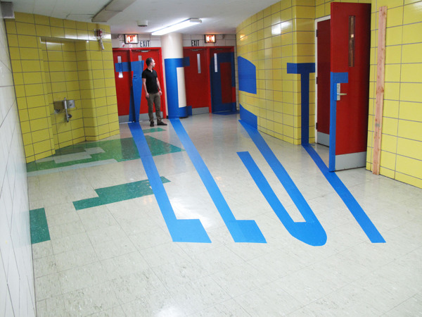
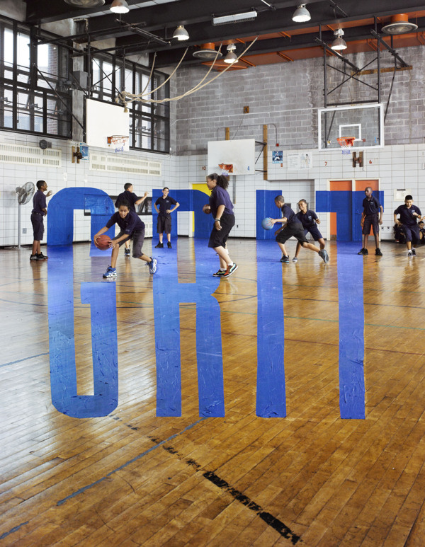
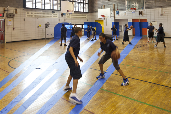
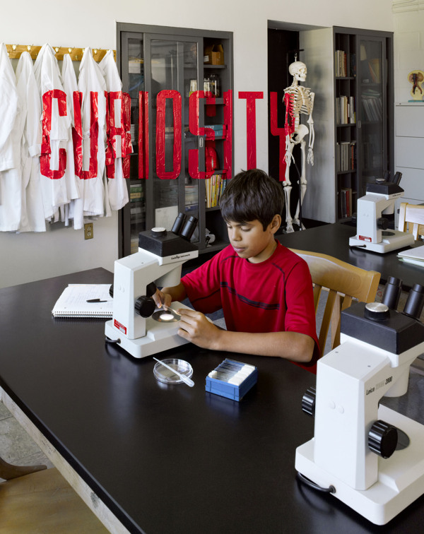
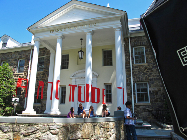
View full set on http://www.behance.net/gallery/Teaching-Character/5537699 Photography by Stephen Wilkes
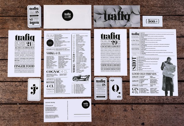
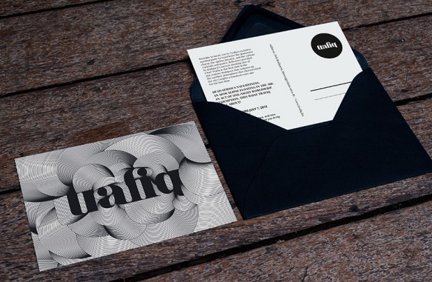
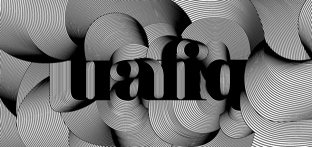
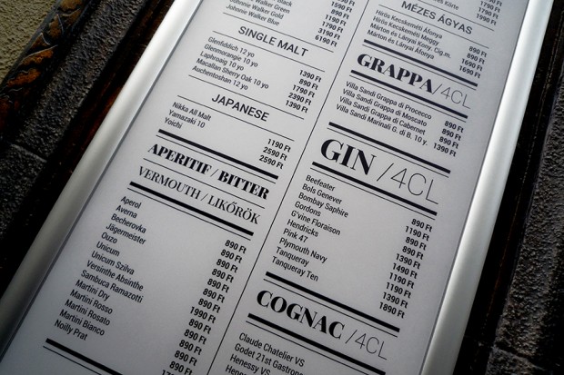
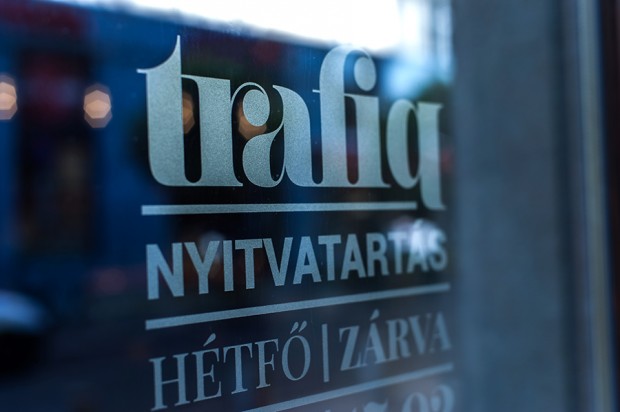
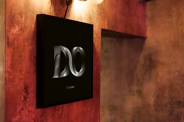
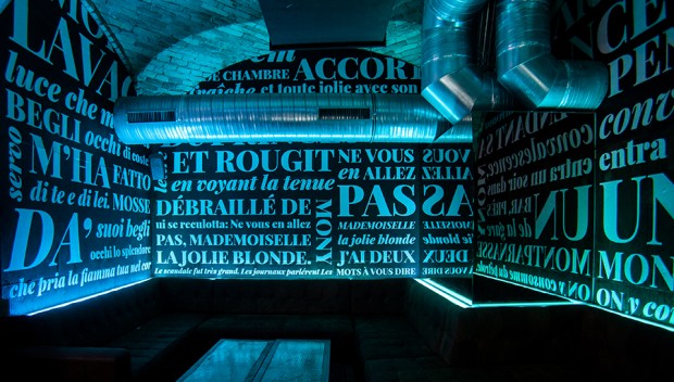
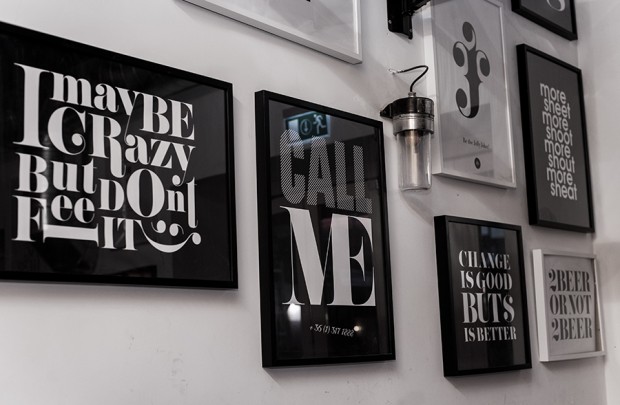
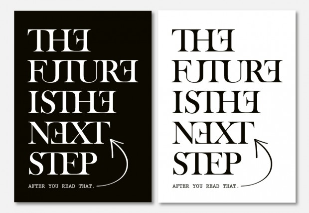
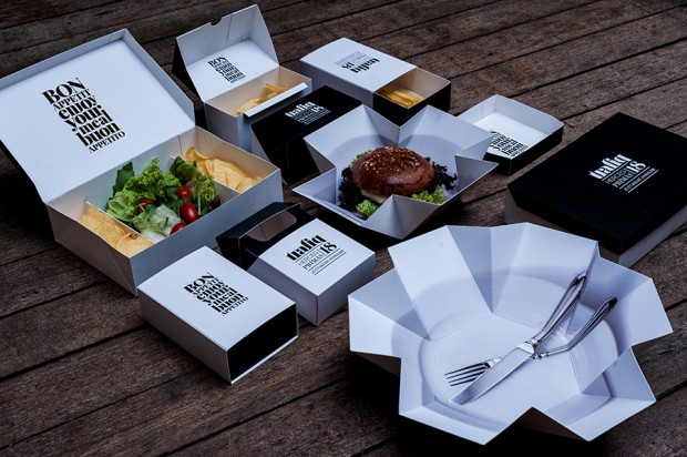
Kiss Miklos is a Hungarian graphic designer that has a huge amount of great branding and graphic design works worth of a dozen of agencies. From the various projects we selected the lates made for local club Trafiq together with interior designers at 81Font but you must visit his site to check all other identities and typography works.
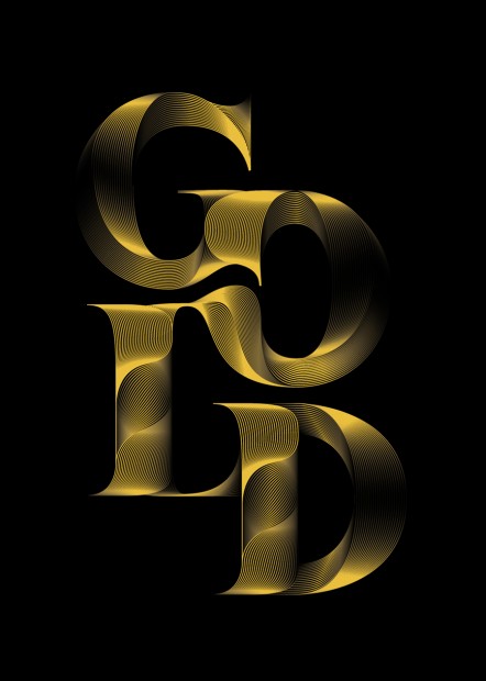


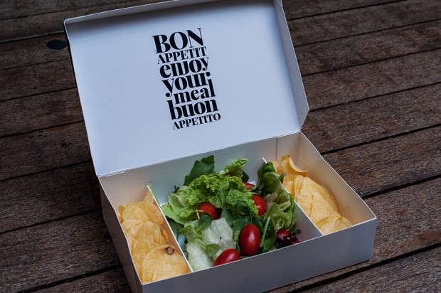


Colors And The Kids formed in 2008, having originally bonded over a mutual love of Bauhaus when they first met some years earlier in Weimar, Germany. Before long, Elisabeth Schulze (Fine Art, Visual Art), Sebastian Gerbert (Media Systems, Media Art) and Maik Bluhm (Media Art, Visual Art) discovered a shared fascination for film, photography, philosophy, architecture, design and art. It wasn’t until two years after they moved to Berlin, however, that they decided to unite their talents. They’ve never looked back since.

http://vimeo.com/52154082


http://vimeo.com/52156982


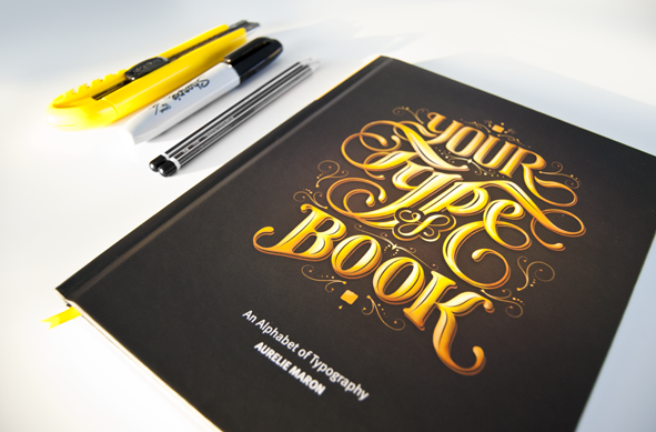
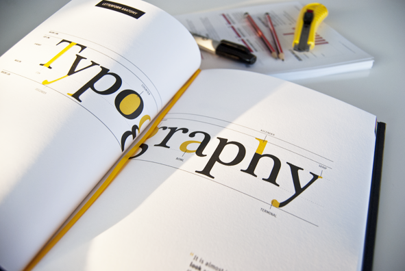
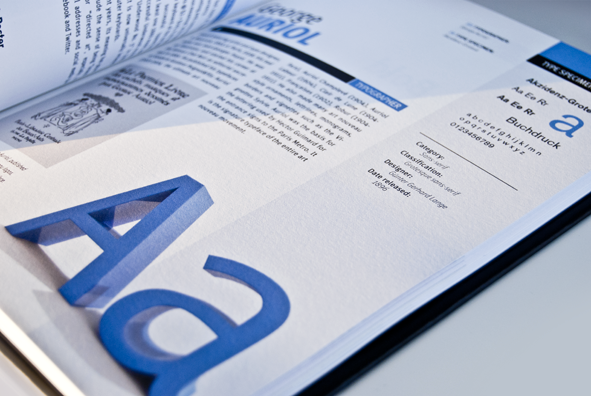
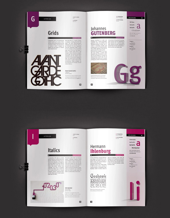
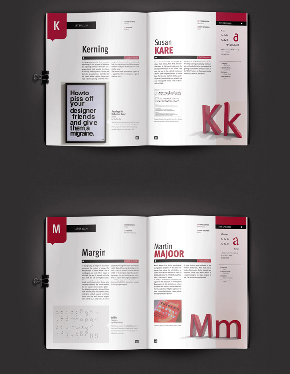
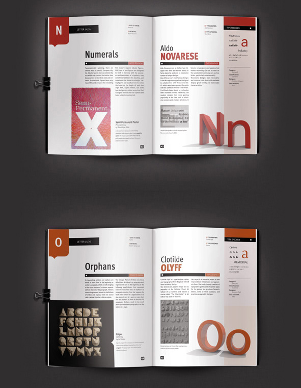
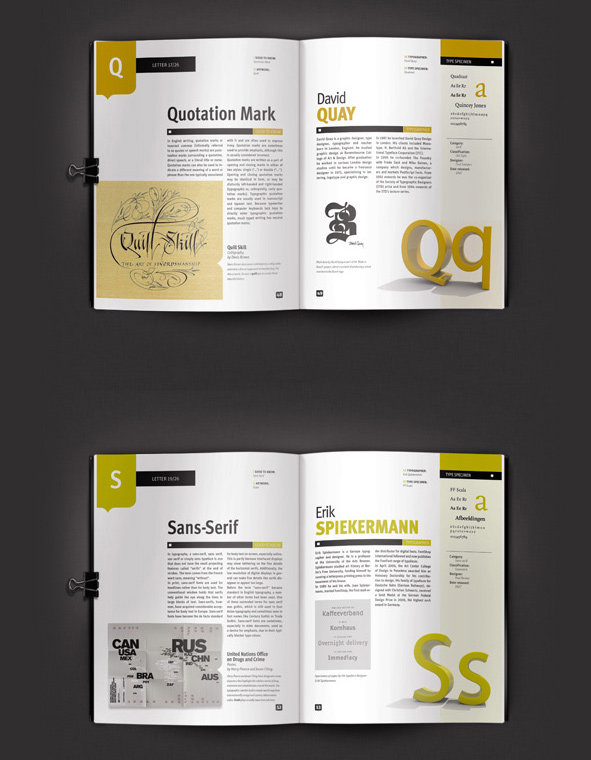
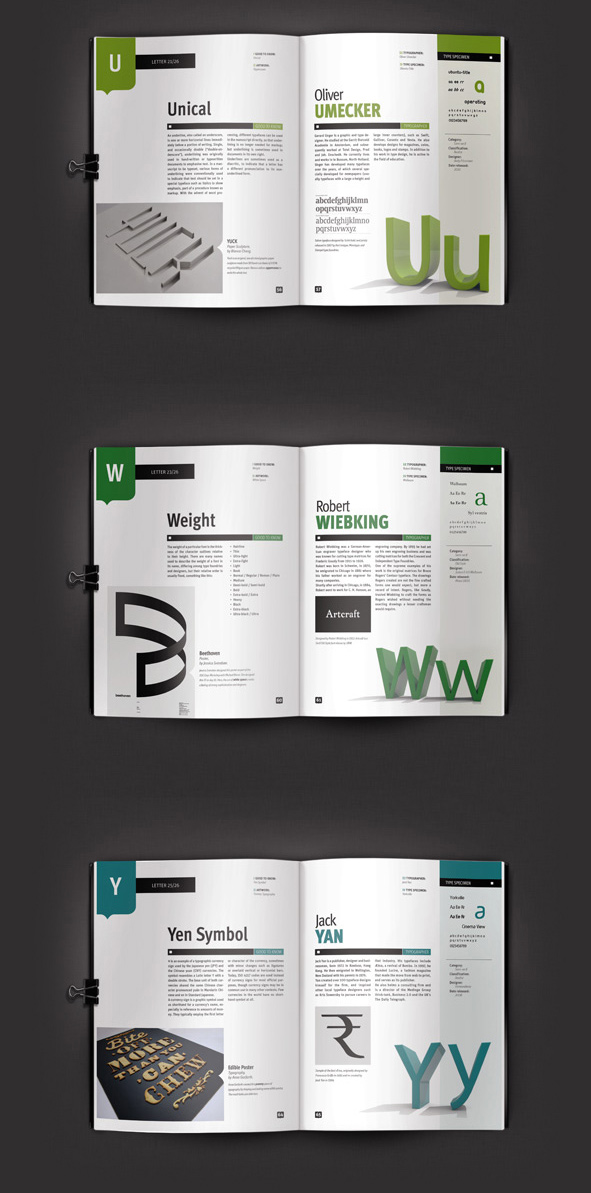
"Your Type of Book" is a student project from Aurelie Maron studying Digital Media at Griffith University in Brisbane, Australia. The book is a kind of a research of typography term through visual citations and quotes. "I decided to produce an alphabet of typography containing useful information related to a typographic term, a typographic artwork, a typographer and a typeface. In fact, the quote from Gerard Unger is what inspired me: "It is almost impossible to look and read at the same time: they are different actions." Every good typographer should have knowledge of both the art and science of typography and my aim in making this book was to create a source of inspiration and reference." Pity and due to copyrights issues this book can never be published. Don't hesitate to check all typography related project of Aurelie on http://www.aureliemaron.com/


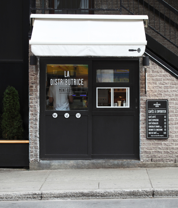
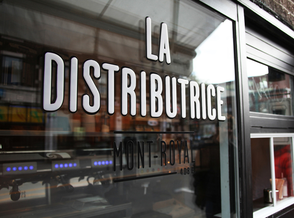
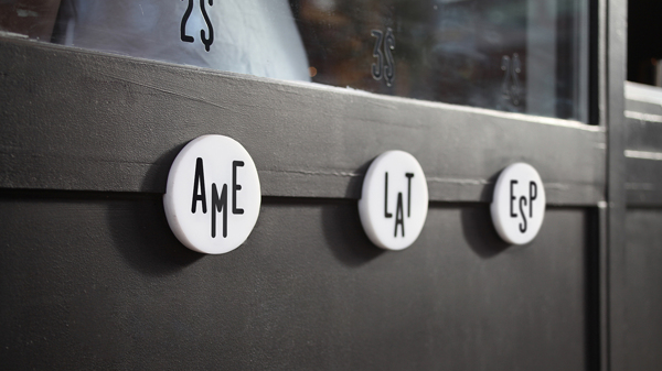
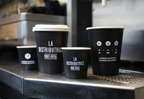
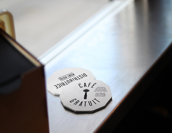
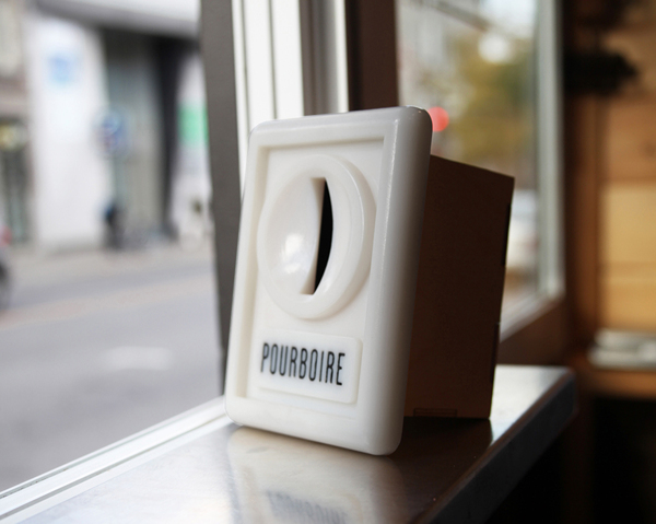
Designers duo Gabriel Lefebvre and Rachel Lecompte did a top-notch identity for a small coffe shop. The Distributrice reinvents the takeout coffee service by taking over the smallest commercial space in Montréal.



She Was Only are an independent design studio based in London specialising in graphic design and art direction
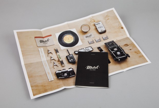
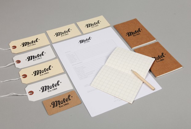


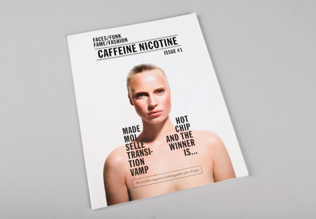
Independent creative company from London relaunched new portfolio website http://www.movingbrands.com/
http://vimeo.com/22694374
Paris based illustrator Jules Julien has new updates on personal website esince our last visit last year


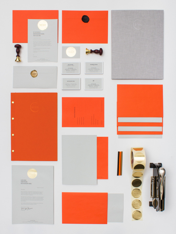
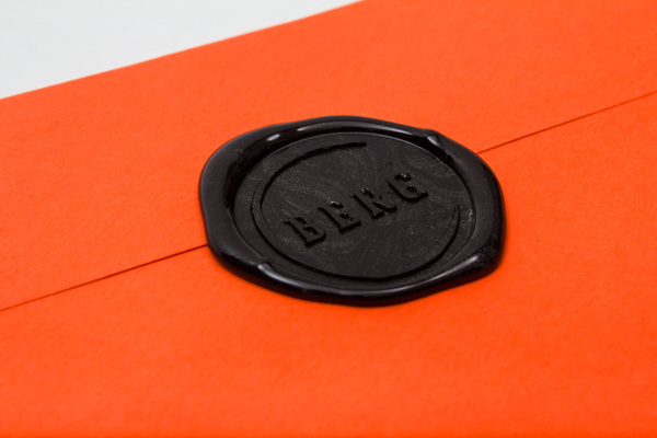
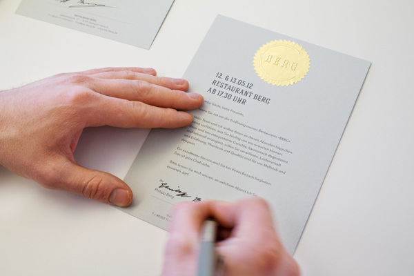
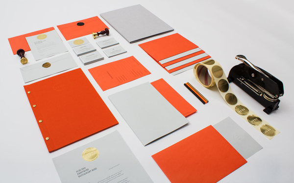
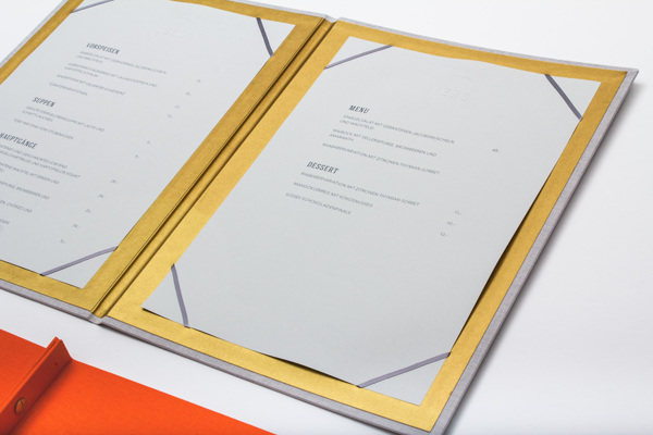
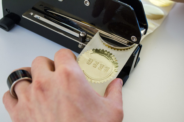
Branding buro from Stuttgart - LSDK, did this nice identity solution for restaurant worth to check inside the post and enjoy Project details: "The stylized imprint of a wine glass enfoldes the geometrical majuscule Letters of the Restaurants Name „BERG“, a reference to the owners reputation as a sommelier aswell as to the focus of the Restaurant. Main colours are a bright, vivid orange and a distinguished cool gray. Business cards and 500 invitations are refined with hand embossed gold foil stickers. Their envelopes are sealed with the emblem on a golden sealing wax. Menu and the list of beverages have a blind embossing on their wrapping which is made of Toile-du-Marais-Linen."
http://www.behance.net/gallery/RESTAURANT-BERG-branding-print-web-design/5763251