Vectors in Plywood by Aske Sicksystems
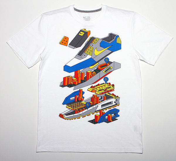
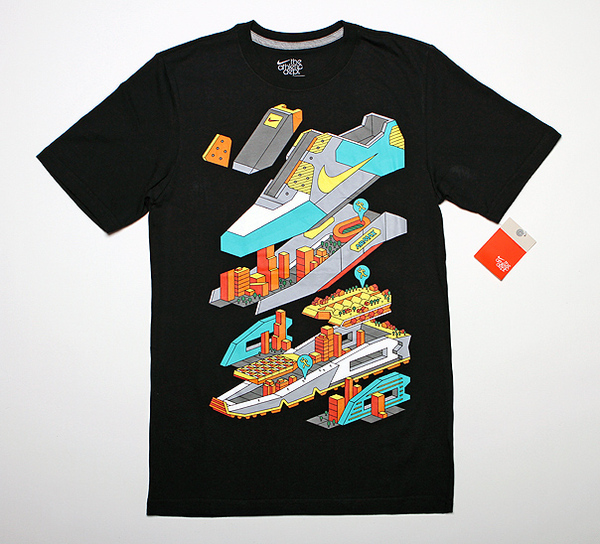
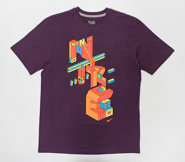
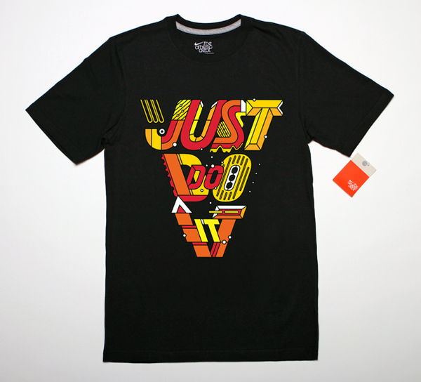
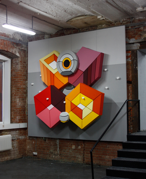
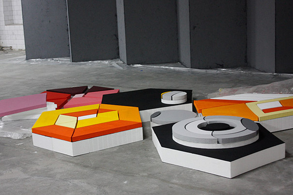
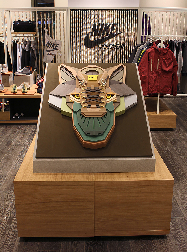 Russian illustrator and artist Aske Sicksystems synthesizes elements of Soviet era cubism, constructivism and futurism through vector art into semi-sculptural works of art.
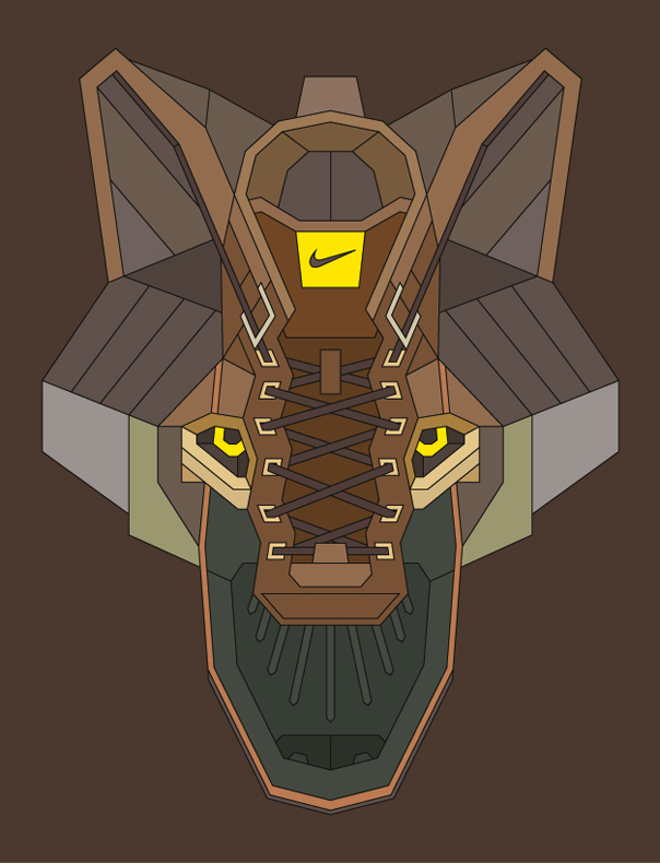
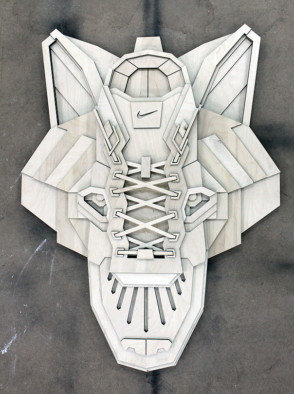
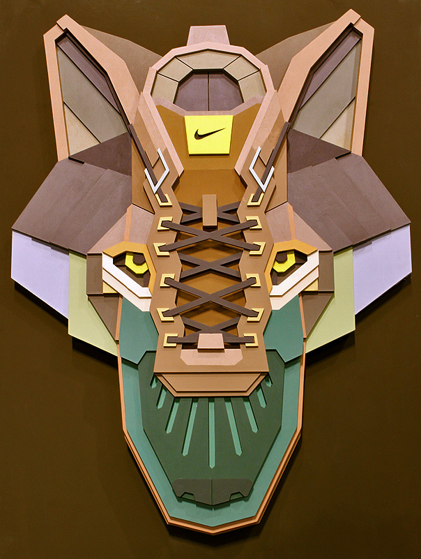
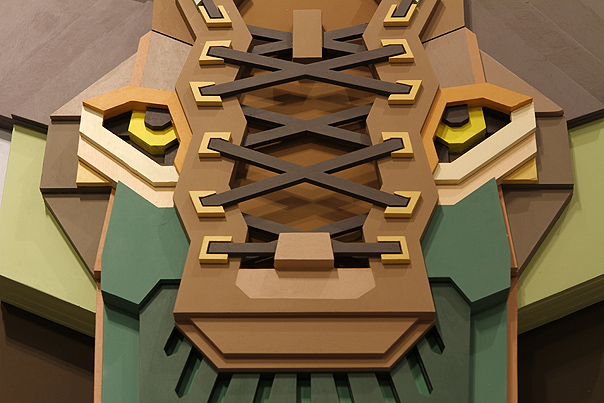
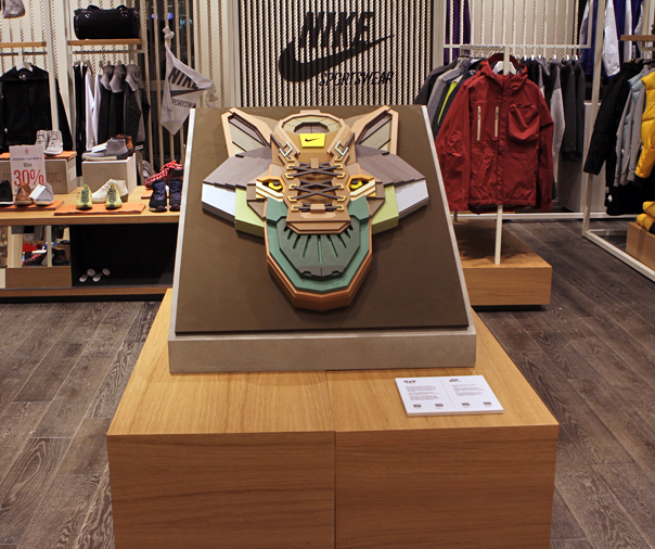
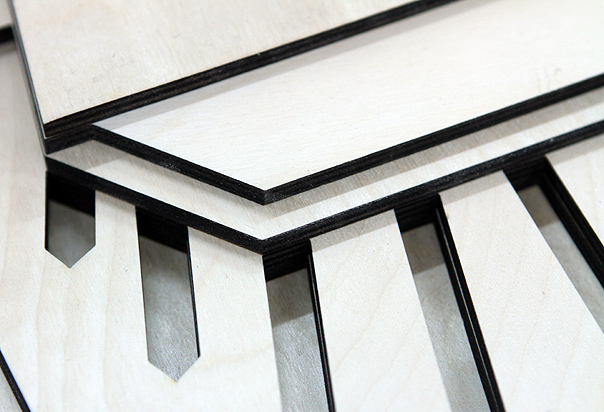
His latest project is a "Sneaker Head," so to speak: a cross between a Nike Air Force 1 Duckboot and a wolf's head, executed as a painted plywood artwork for the Nike Store Moscow.
Also check another Aske's plywood installation created for International Festival of Contemporary Music and Media Arts MIGZ.
http://vimeo.com/29182974
For his earlier works check our post from October 2011



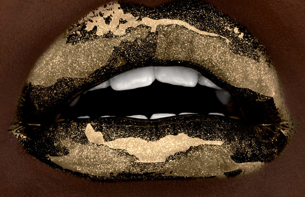
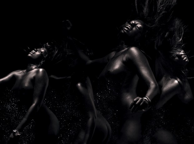

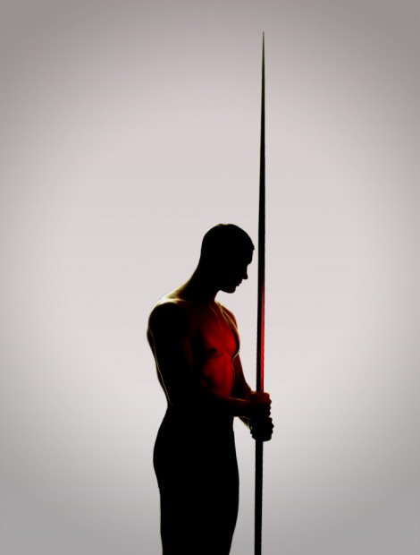
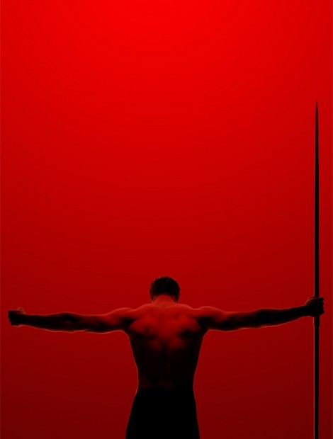
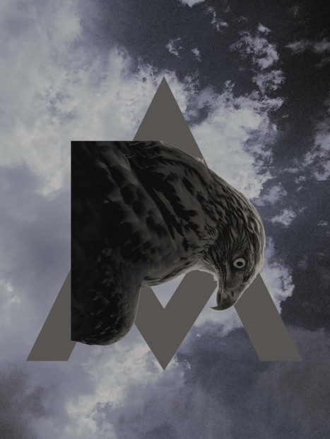
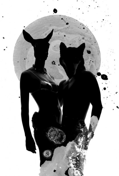
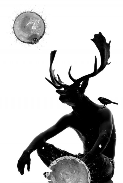
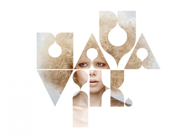



 After winning a competitive pitch, Channel 4 commissioned ManvsMachine to create a new brand identity and on-air look for More4. The package aligns with a re-focussed range of content on the channel.


 The book "
 " showcases nearly 100 of Ji Lee’s head-scratching word images, along with tips to help you create your own.




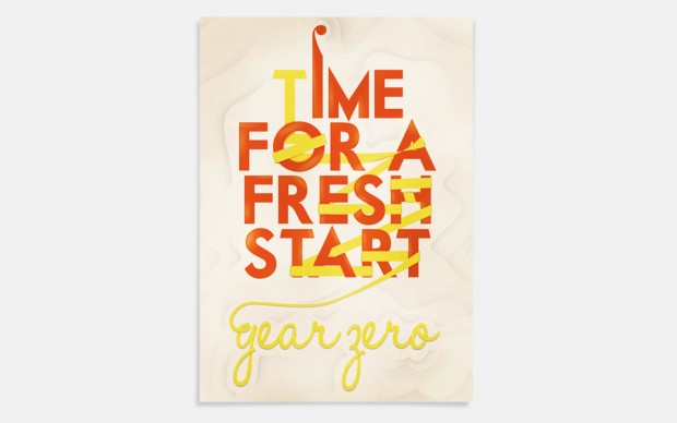
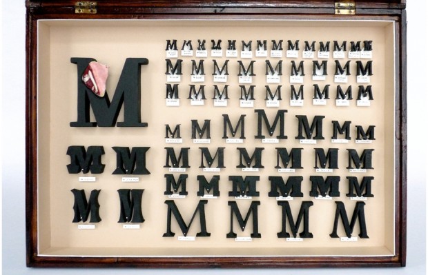
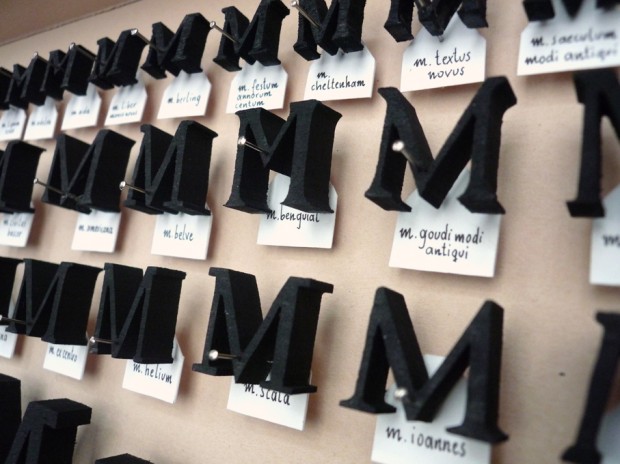

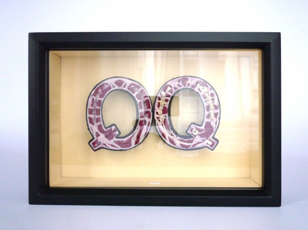
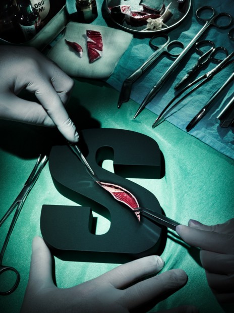
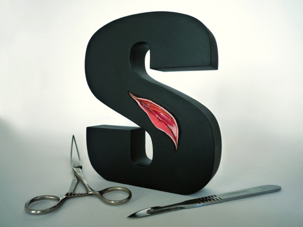
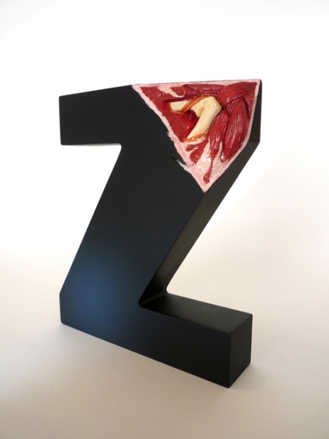
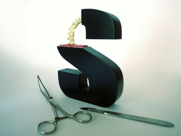
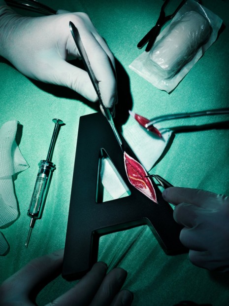
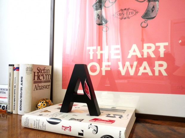
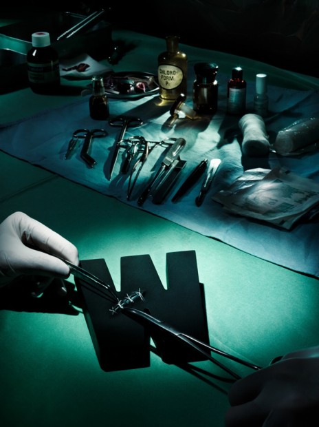
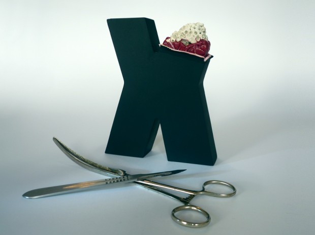

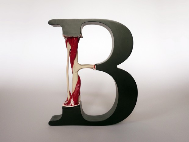

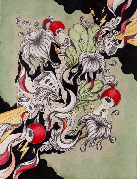
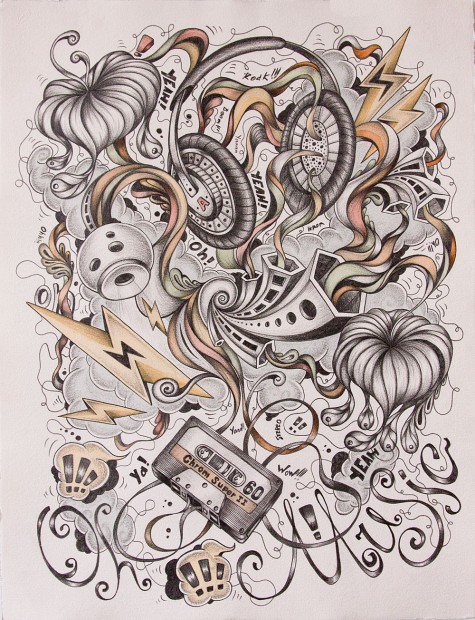


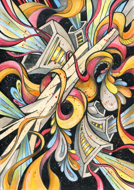
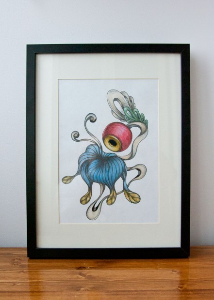
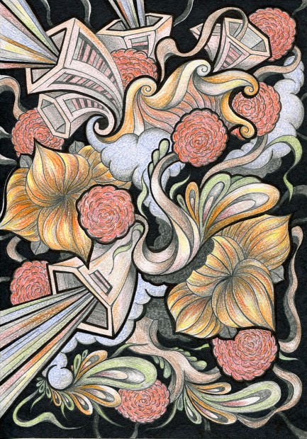
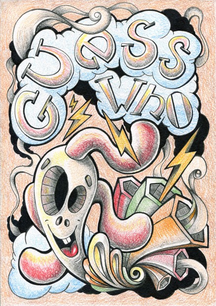
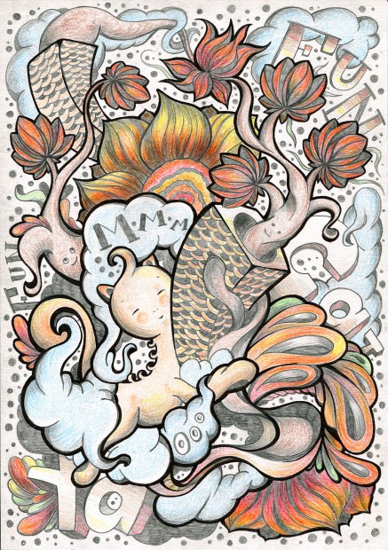


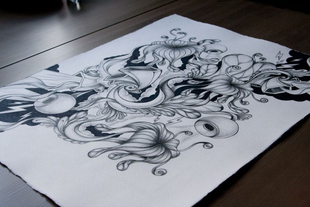
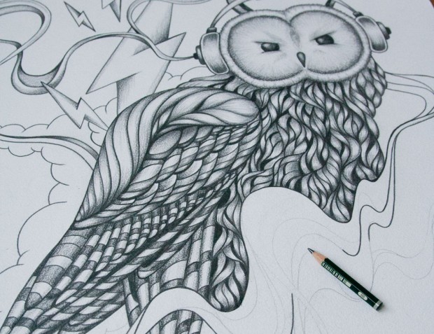
 Here is a new set of stunning paper works from well-known Russian-born and UK-taught graphic artist


 "
"


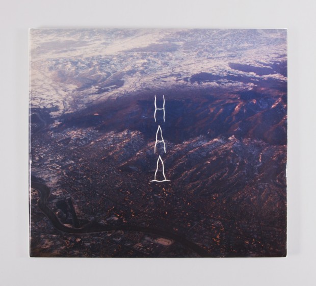
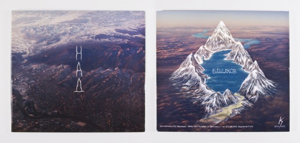
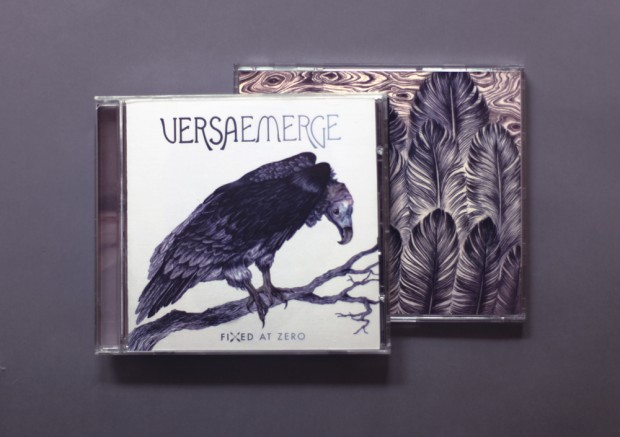
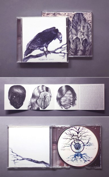
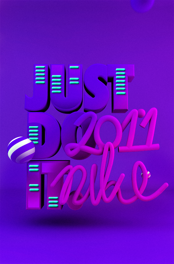 Super talented graphic designer from Poland -





 Moscow based design studio TOMAT specializes in branding and graphic design. We fave their series of dynamic experimental identity based on four simple fours that creates myriad of brand's graphic presentation.
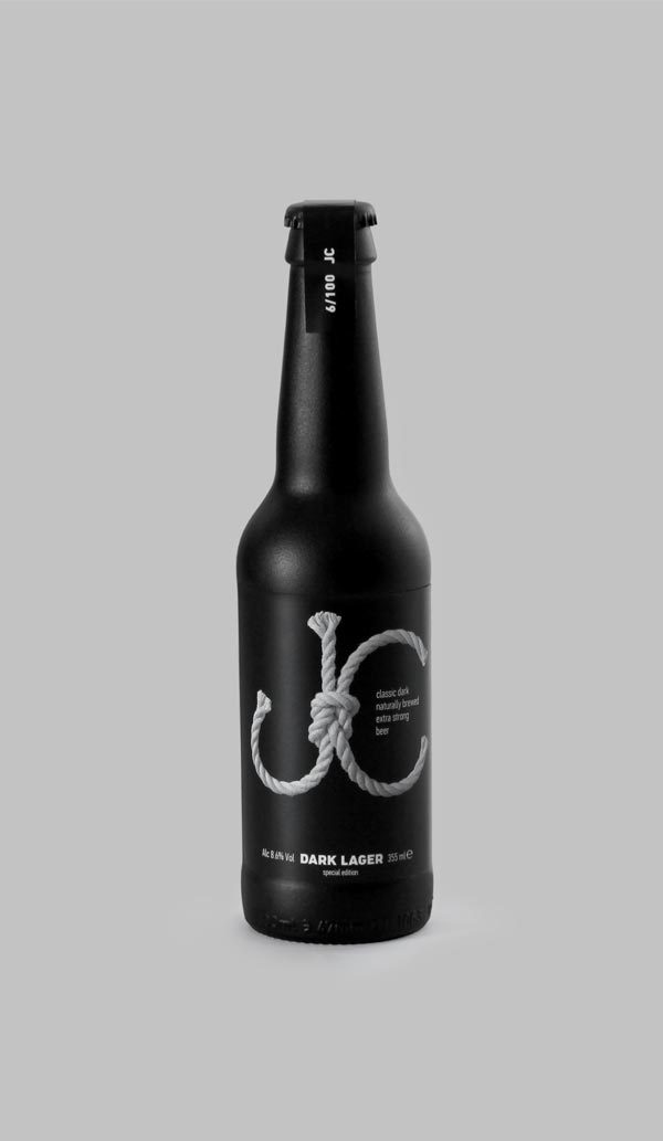


 We Are Draft™ is the London design studio of freelance designer and art director Chris Smyth. Excellent portfolio of interactive, branding and print projects.


 Toormix is a creative studio specialising in art direction and graphic design established in Barcelona a decade ago. Despite their strong portfolio we invite you to check the logotypes they make for customers, in overall they are awesome still few of them remind us ariston and casa da musica and few other are fun shit. Don't forget to check their portfolio.


 According to the Museum of Modern Art in New York, Susan Kare is “a pioneering and influential computer iconographer. Since 1983, Kare has designed thousands of icons for the world’s leading software companies. Utilizing a minimalist grid of pixels and constructed with mosaic-like precision, her icons communicate their function immediately and memorably, with wit and style.”


 Melbourne based designer just started a project of an iPad/Android storybook "The Paper Fox" and he is selling the fine-arts prints to fund the app development.


