Benas Staskauskas Jewellery
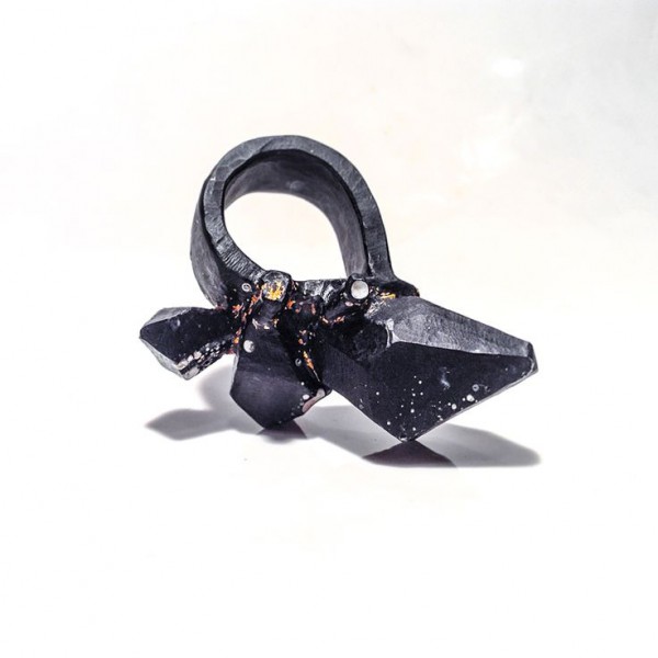
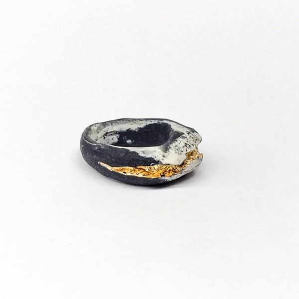
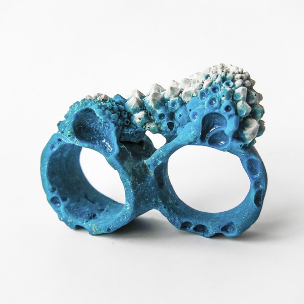
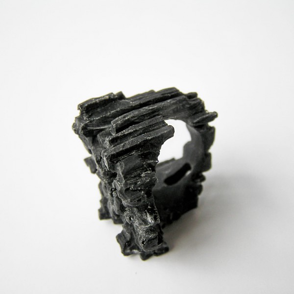
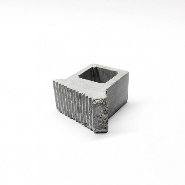
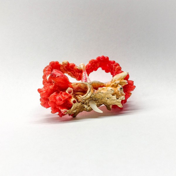
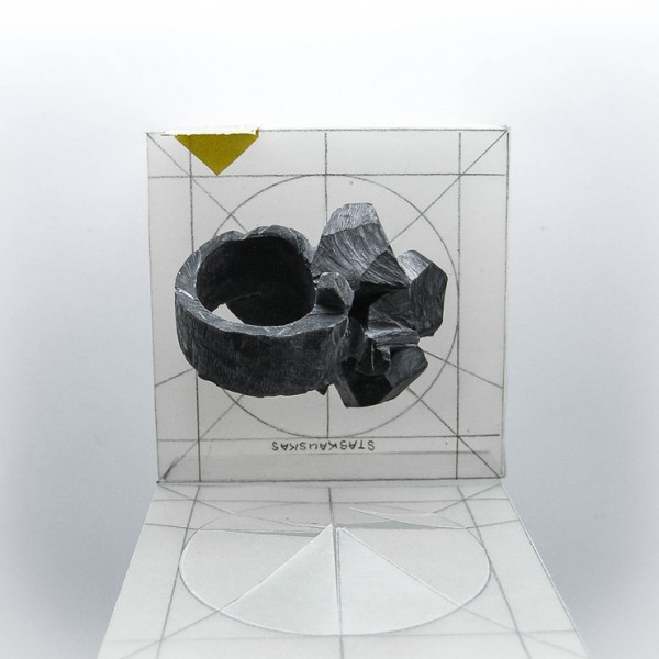
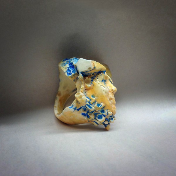
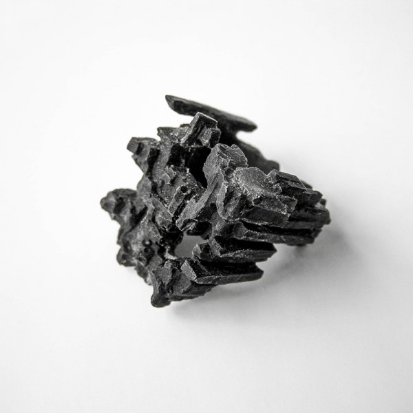
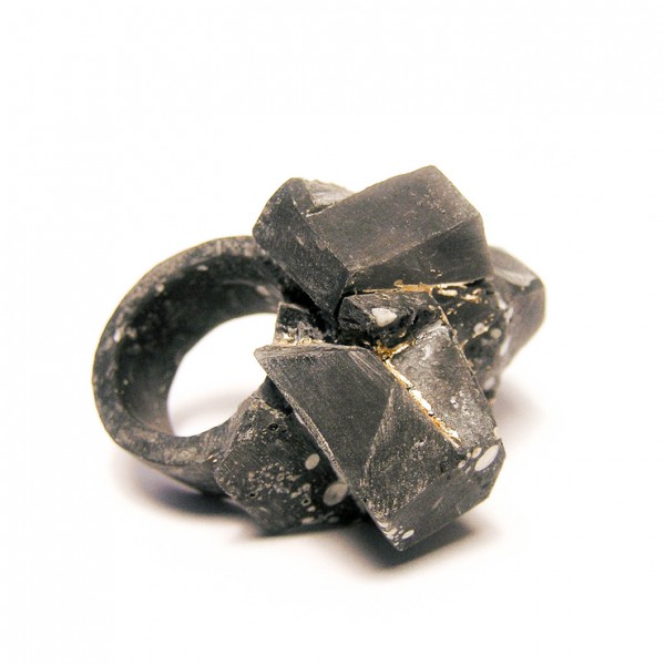
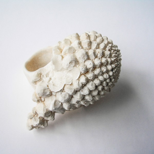
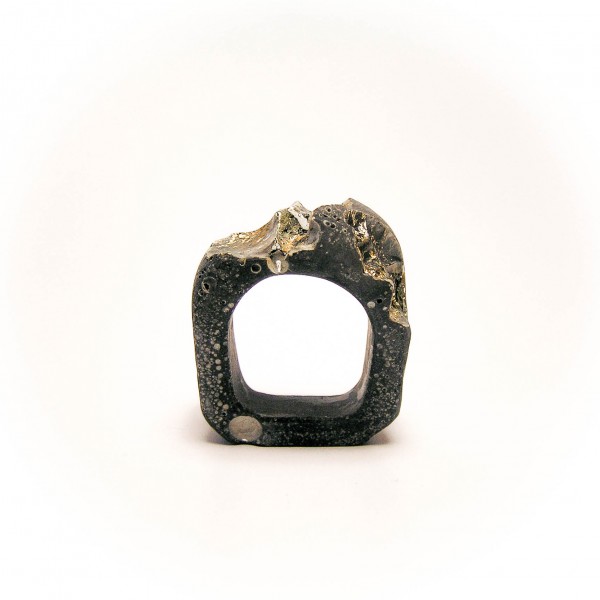
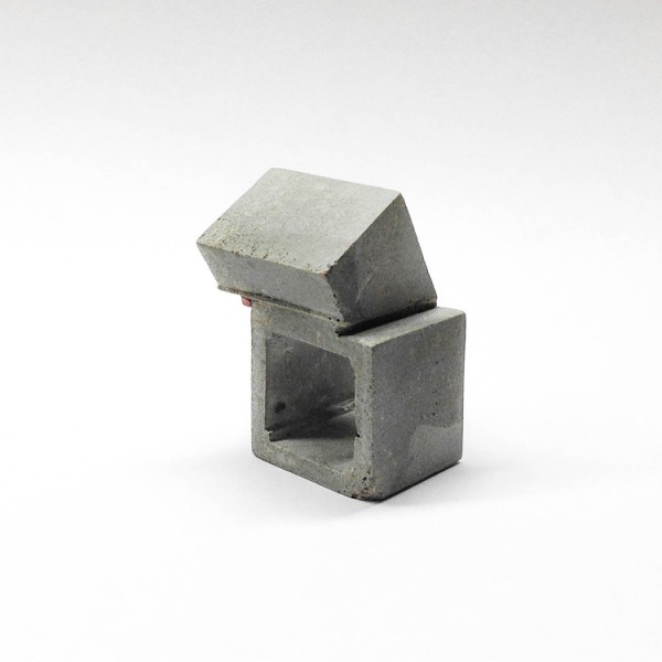
Benas Staskauskas is a Lithuanian born artist who has created a wonderful handmade jewellery collection one-of-a-kind pieces.He spent a year in Iceland working on his first jewelry collection, learning more about nature, landscapes and cultural differences. This served as a great inspiration for his distinctive jewelry style and socially responsible methods of production. You can support and purchase his works on https://www.born.com/view/349/staskauskas-jewelry
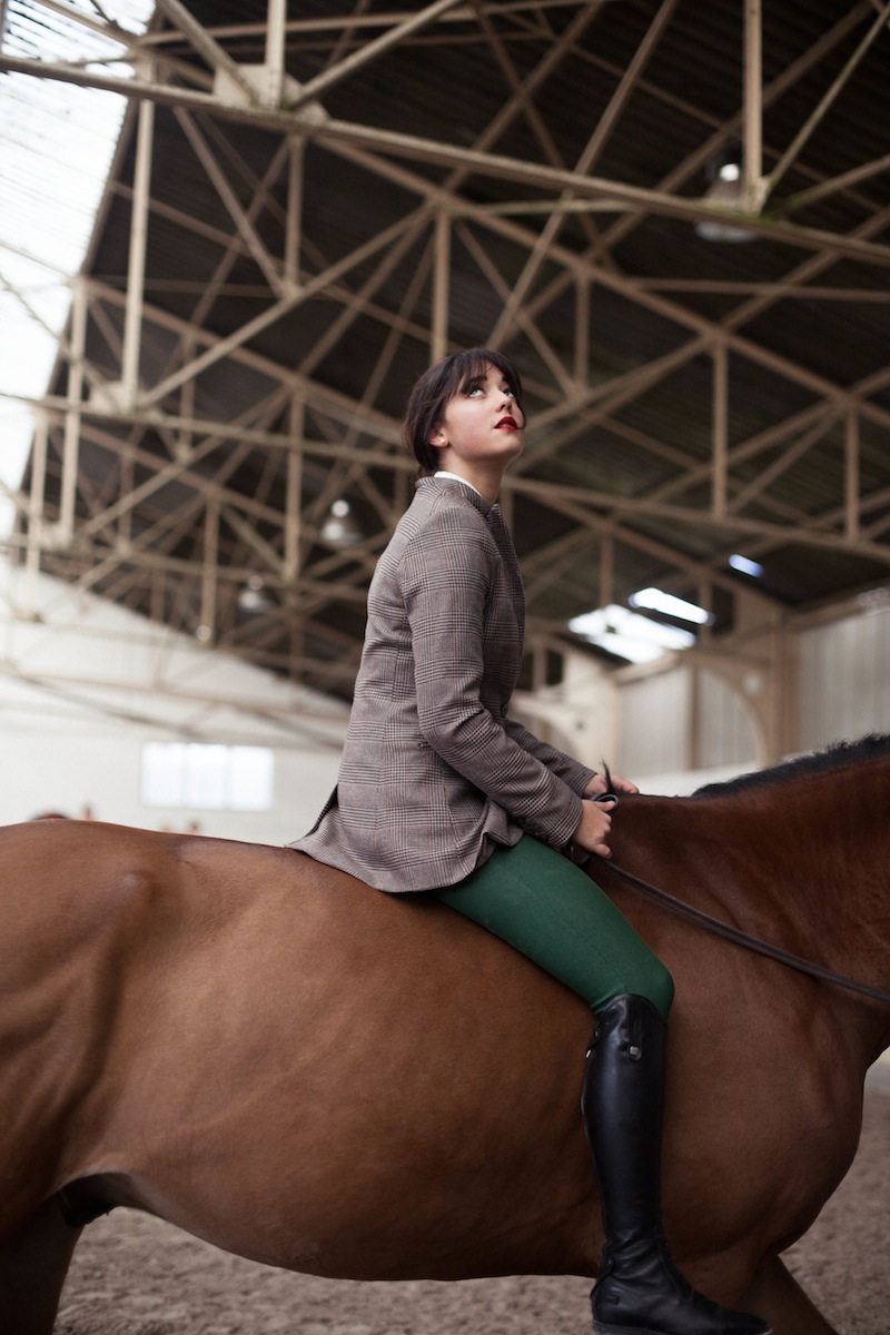
The Equestrian Photography of Charlotte Abramow
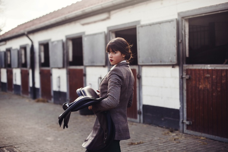
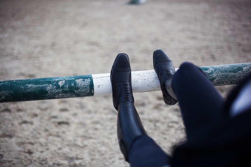
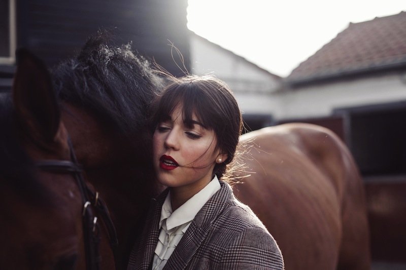
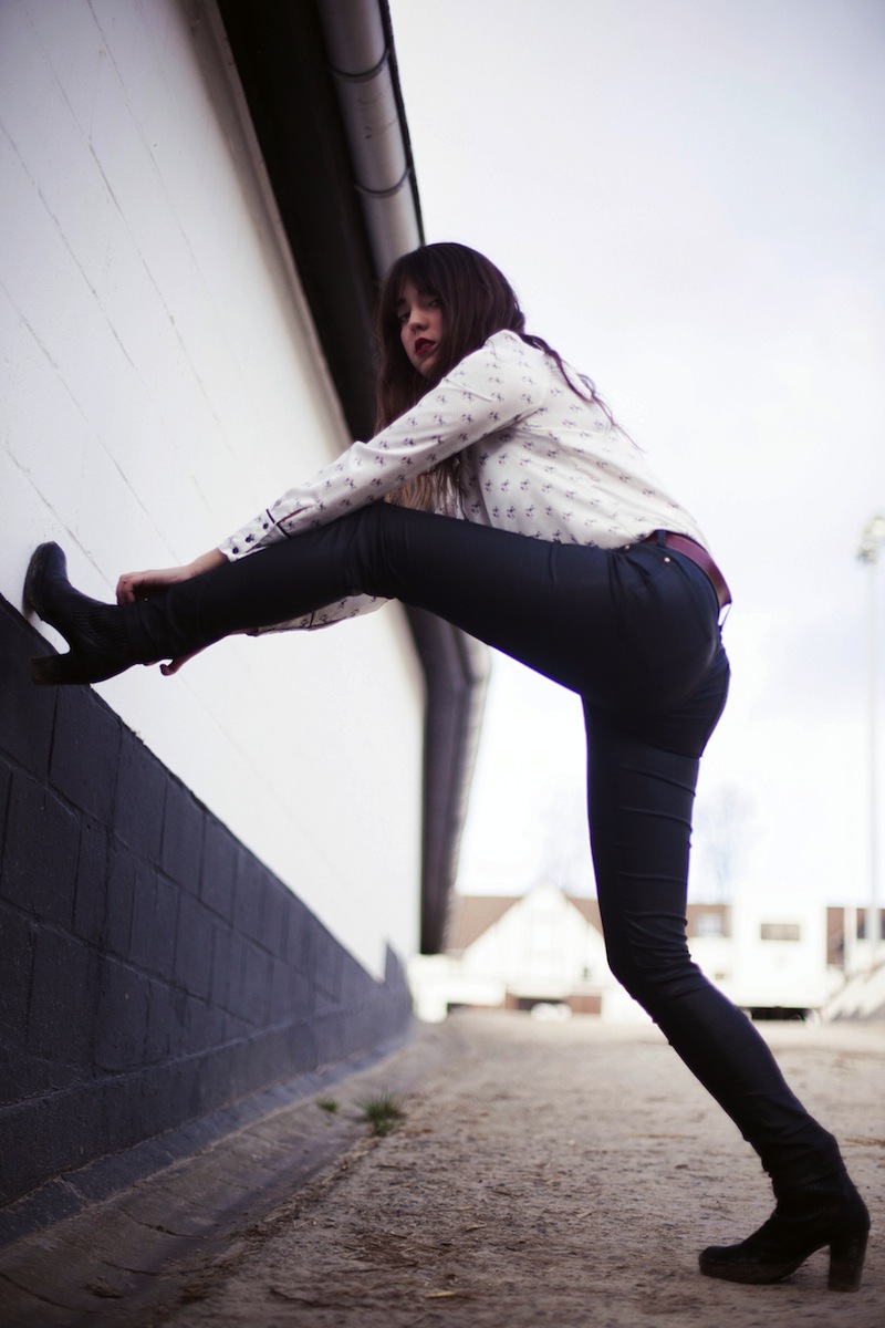
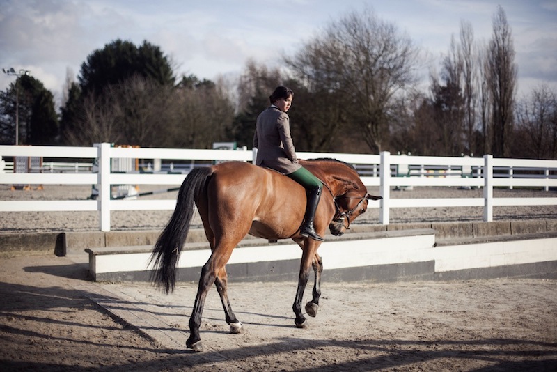
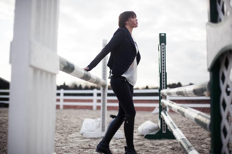
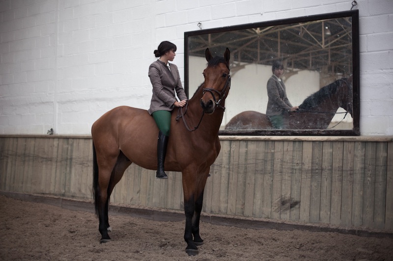
In her series, “Allure Cavalière,” French photographer Charlotte Abramow captures the horse and rider in the intimate setting of the stable yard. For the young Abramow, to do so was to return to her equestrian roots. The most beautiful match on earth - beauties and horses


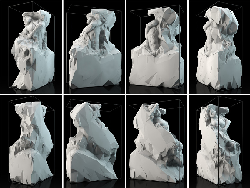
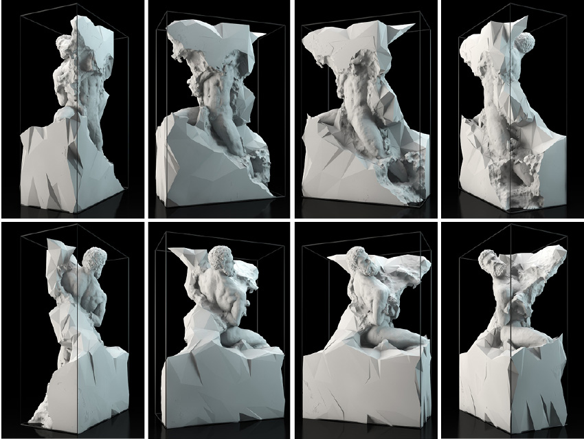
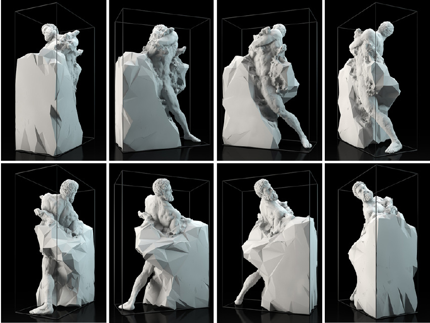
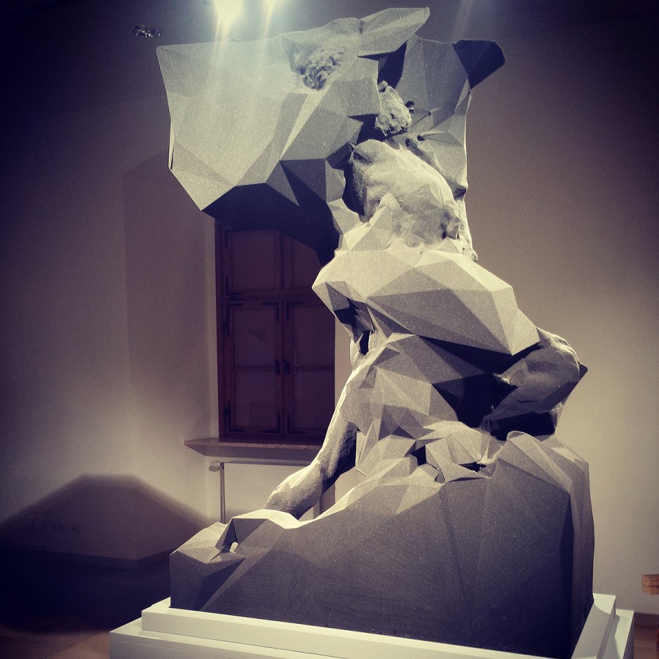
Quayola + Deskriptiv
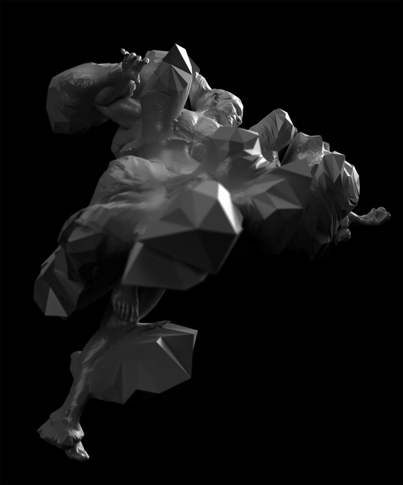
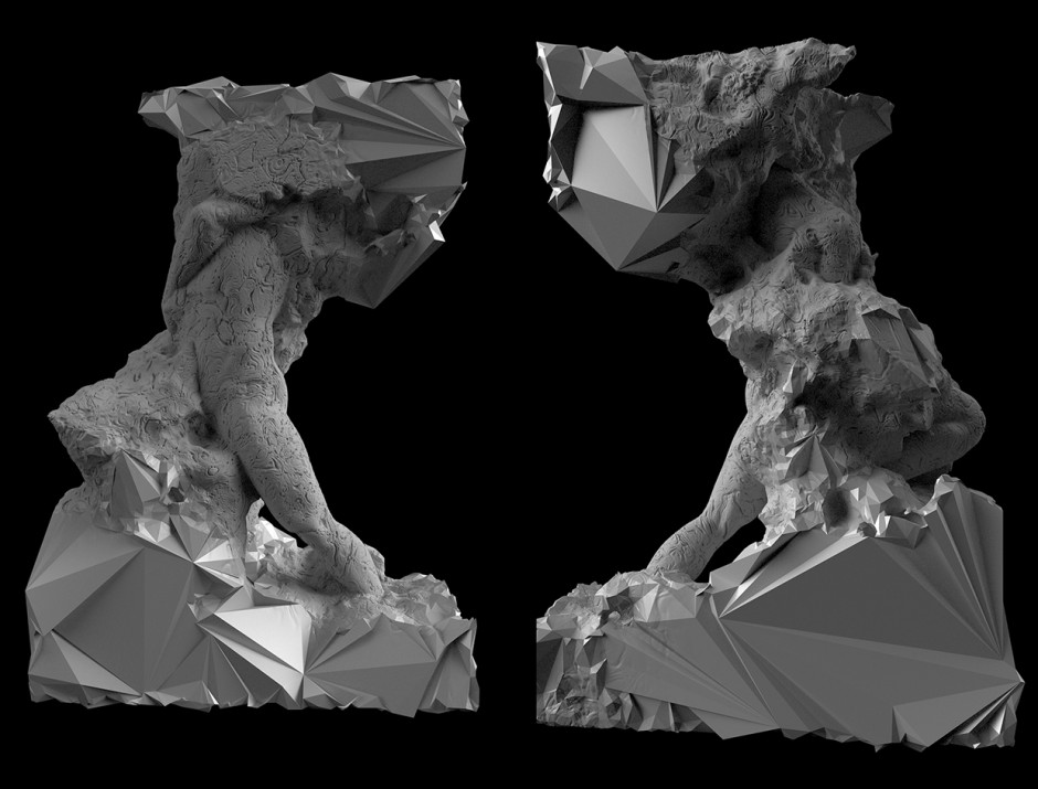
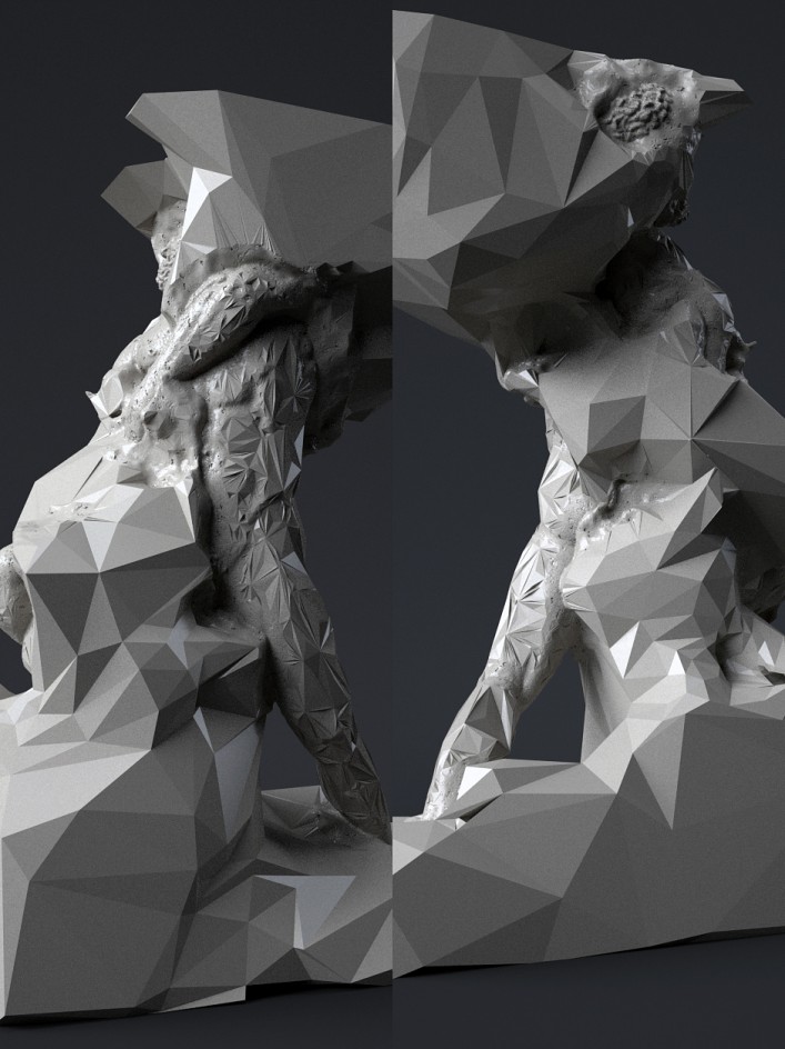
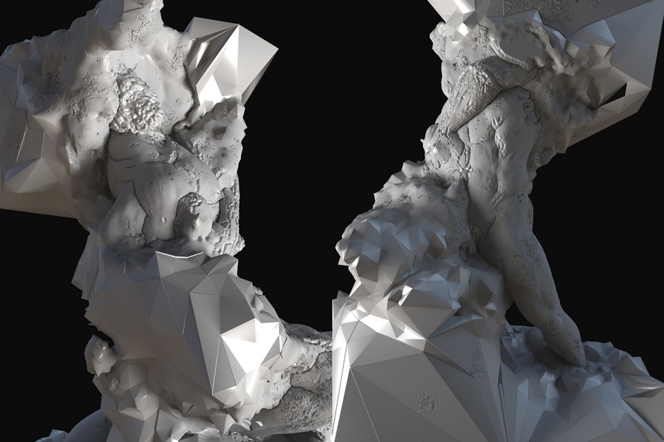
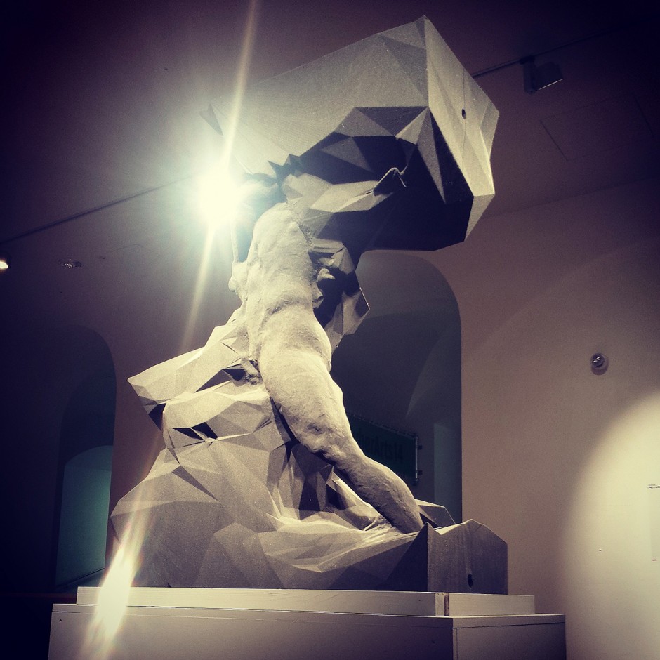
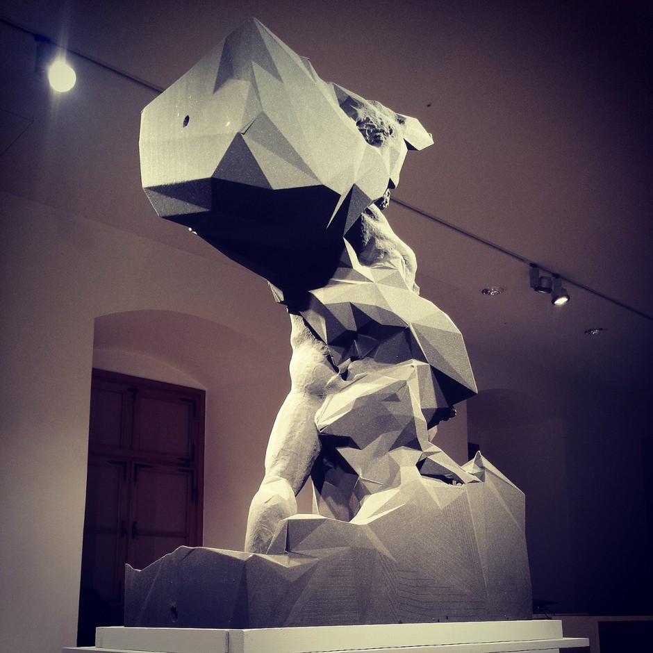
"We helped artist Davide Quayola with his newest piece of the captives series. The sculpture was printed in one piece by voxeljet in Germany and is now exhibited at the ars electronica in Linz." says Christoph Bader from Deskriptiv
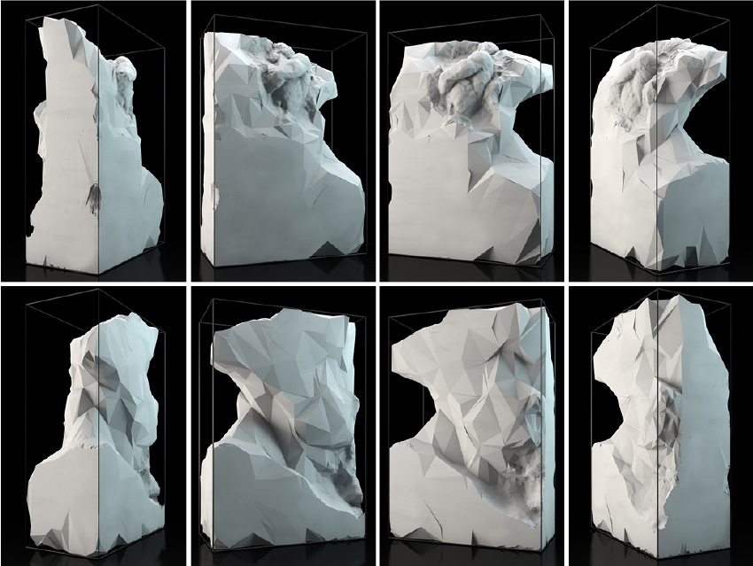
Captives is an ongoing series of digital and physical sculptures, a contemporary interpretation of Michelangelo’s unfinished series “Prigioni” (1513-1534) and his technique of “non-finito”.
The work explores the tension and equilibrium between form and matter, man-made objects of perfection and complex, chaotic forms of nature. Whilst referencing Renaissance sculptures, the focus of this series shifts from pure figurative representation to the articulation of matter itself. As in the original “Prigioni” the classic figures are left unfinished, documenting the very history of their creation and transformation.
Mathematical functions and processes describe computer-generated geological formations that evolve endlessly, morphing into classical figures. Industrial computer-controlled robots sculpt the resulting geometries into life-size “unfinished” sculptures.
Stella Maria Baer
Stella grew up in Santa Fe, New Mexico. In her work she explores her memory of the desert - the lines, the color, the space. She now lives in New Haven, Connecticut. One day she will move back to the desert.

Photography by Emily Blincoe
We have covered the works of Emily Blincoe few times with the narrow view on her Arrangements series. This time we'd like to invite you and discover her lifestyle and portrait photography
Marks & Spencer's 2014 Christmas Advert
Magic and Sparkle are out transforming Christmas on behalf of Marks & Spencer. Moving Pictures completed over a hundred visual effects shots in RKCR/Y&R’s 2014 Christmas campaign for M&S, directed by Philippe Andre through Independent Films. A cheeky fairy named ‘Magic’ and her fledgling cohort ‘Sparkle’ take to the skies over Christmas to transform it with the help of M&S, swapping a dull alarm clock for a brassiere, revamping a drab wardrobe into a clothesline of glittering dresses and bringing two lovers together.
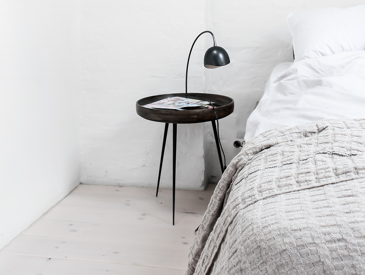
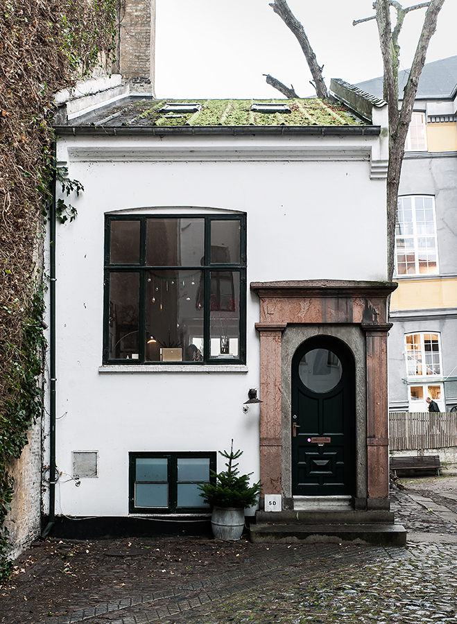
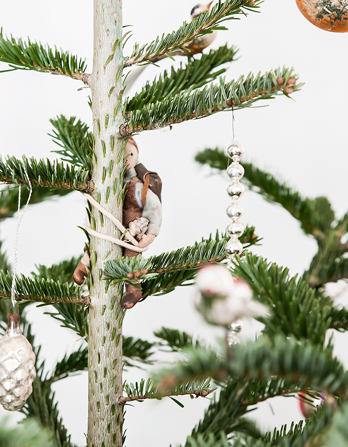
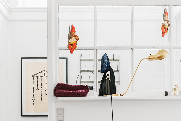
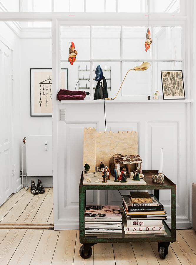
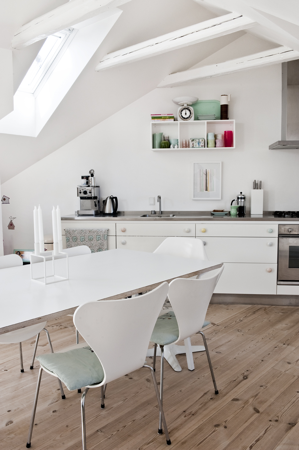
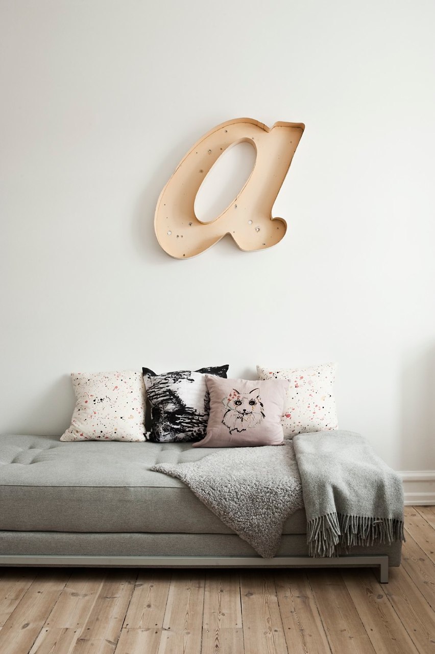
Lifestyle Photography by Peter Kragballe
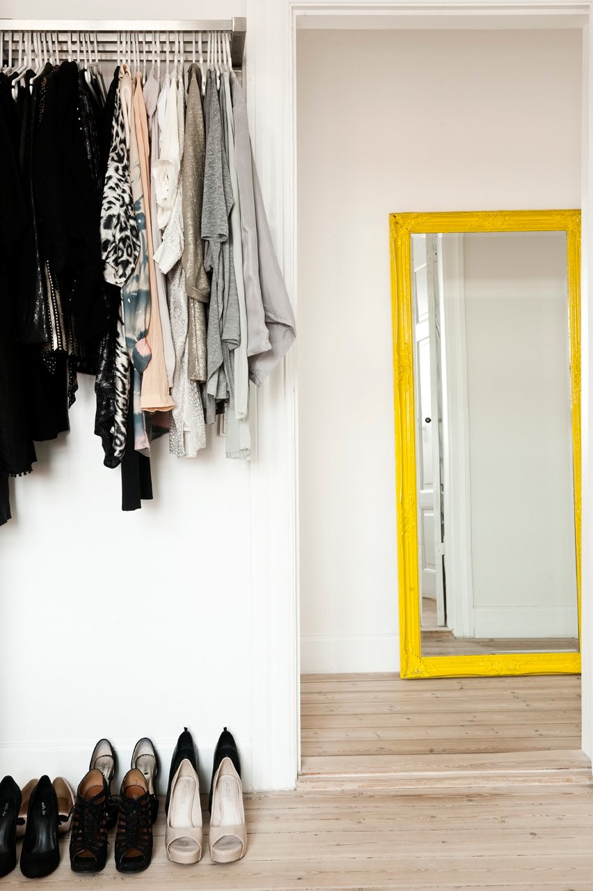
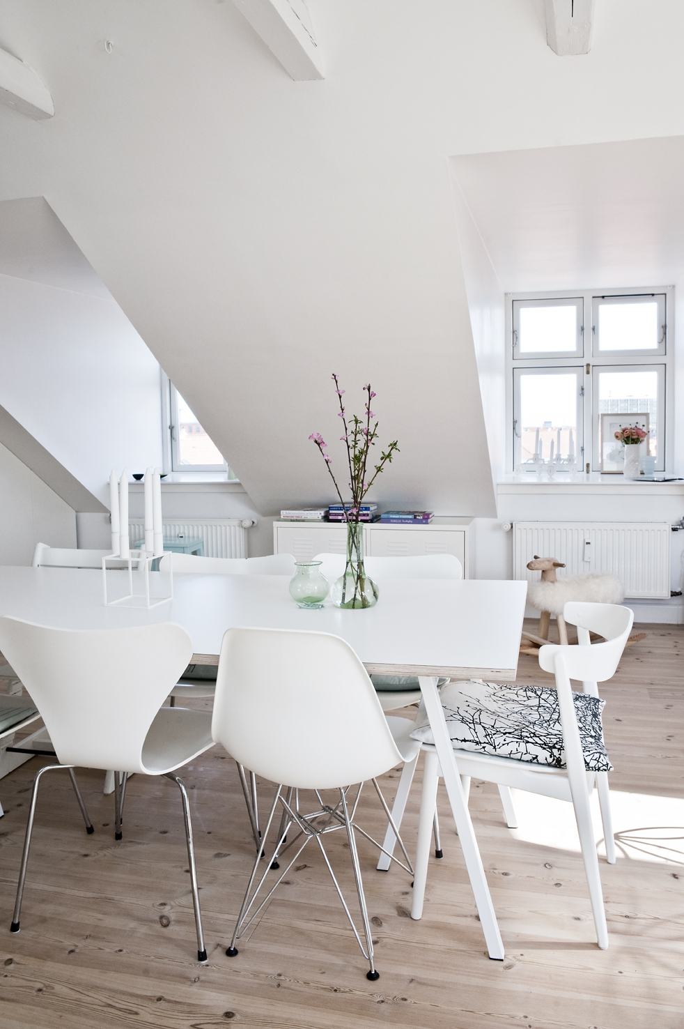
Recently spotted in Kinfolk magazine the photography works of Peter Kragballe from Copenhagen that captivates with the warmth of unknown homes. His obsess to details on photos is beautiful and perfectly aligned to the whole set of pictures of each house


Ines Kozic
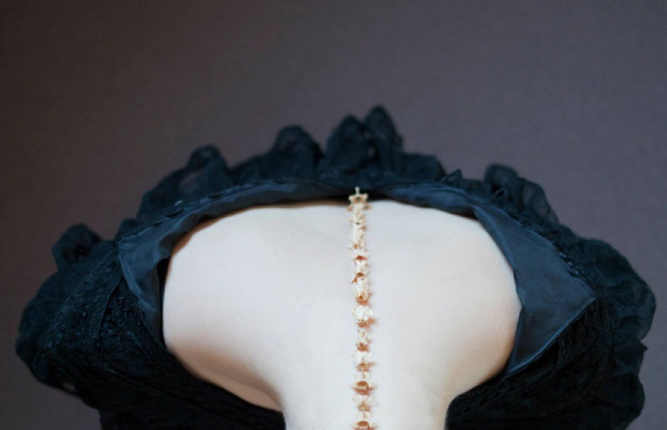
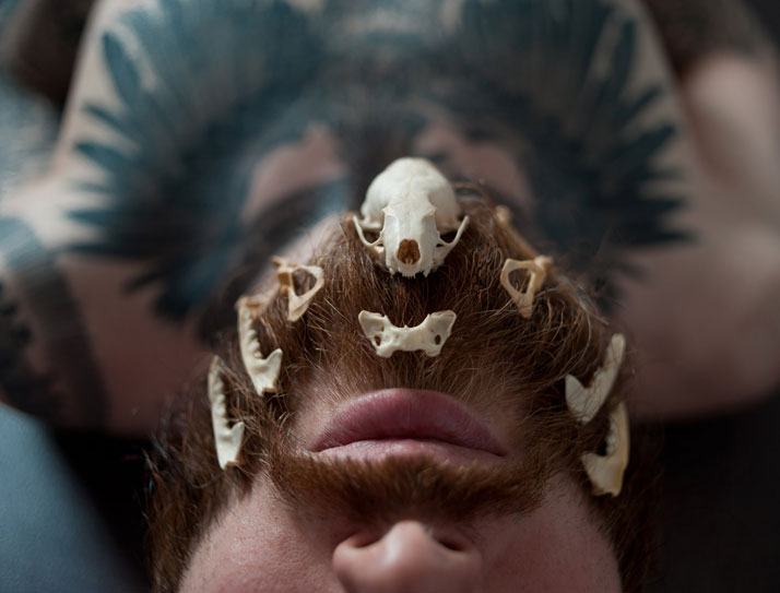
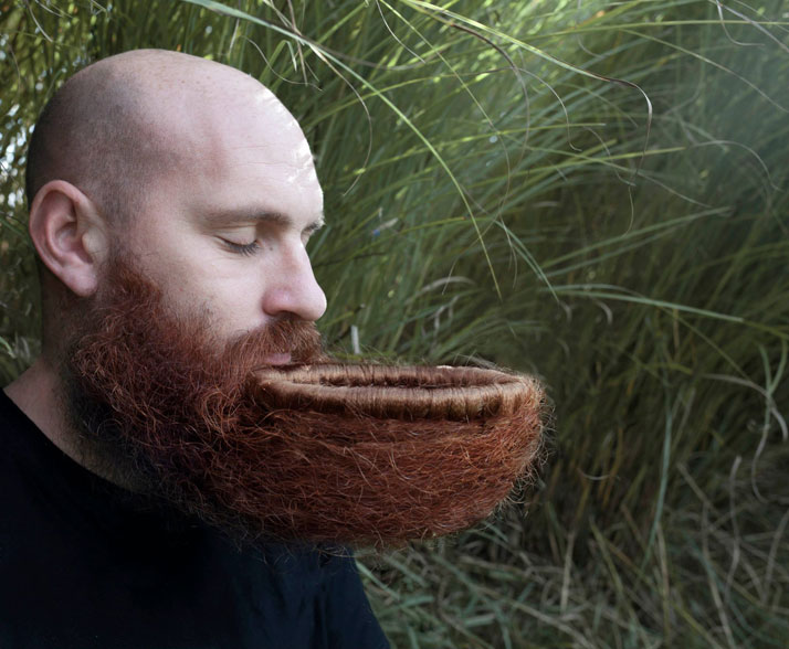
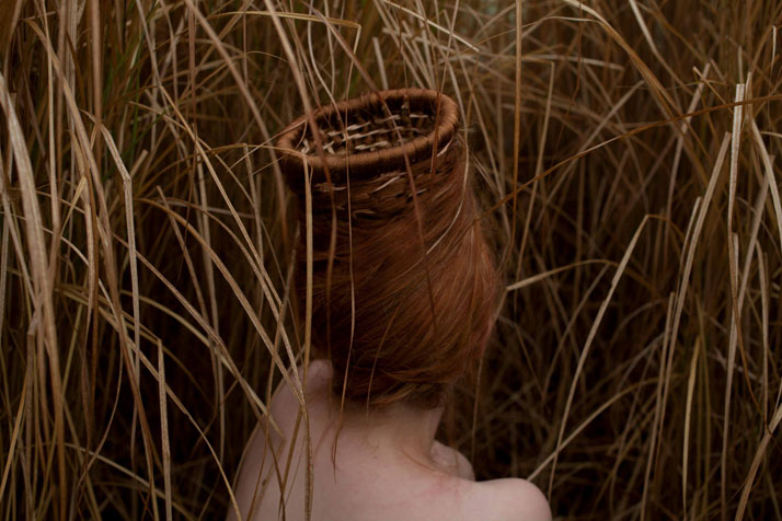
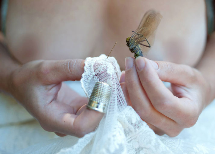
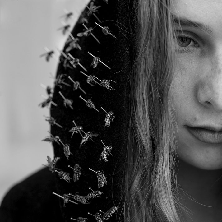
"The photography of young French artist Ines Kozic (Instagram) is hard to overlook. Hailing from Lyon, the 22-year-old dancer and professional model, who is currently a postgraduate student at the school of Fine Arts in the French city of Rennes, has been capturing images using her father’s camera from a young age. Kozic’s photography, a body of work of disarming simplicity with a character all of its own, is inspired by fairytales and body ornamentation like jewellery and tattoos." via Yatzer




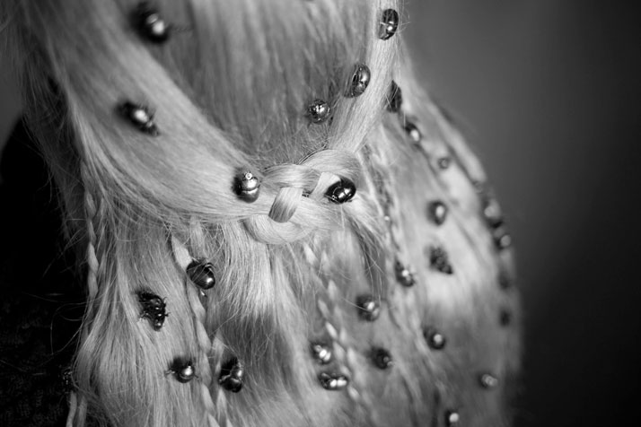

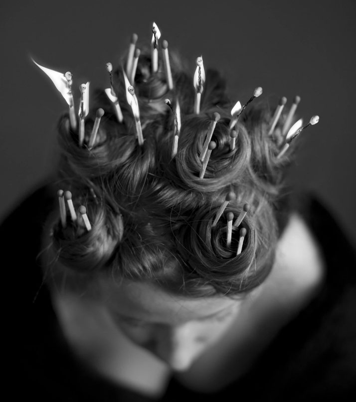
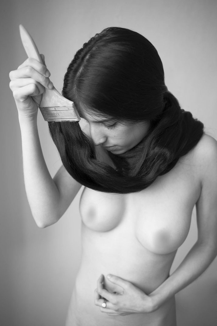
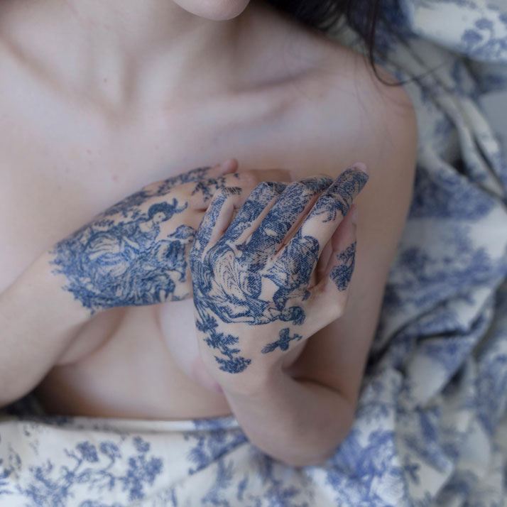
Lifestyle Photographer Kara Rosenlund
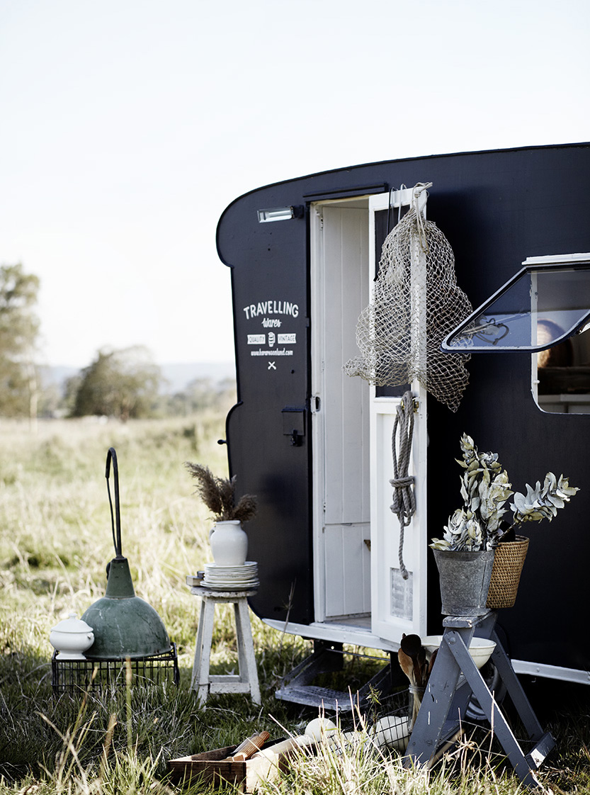
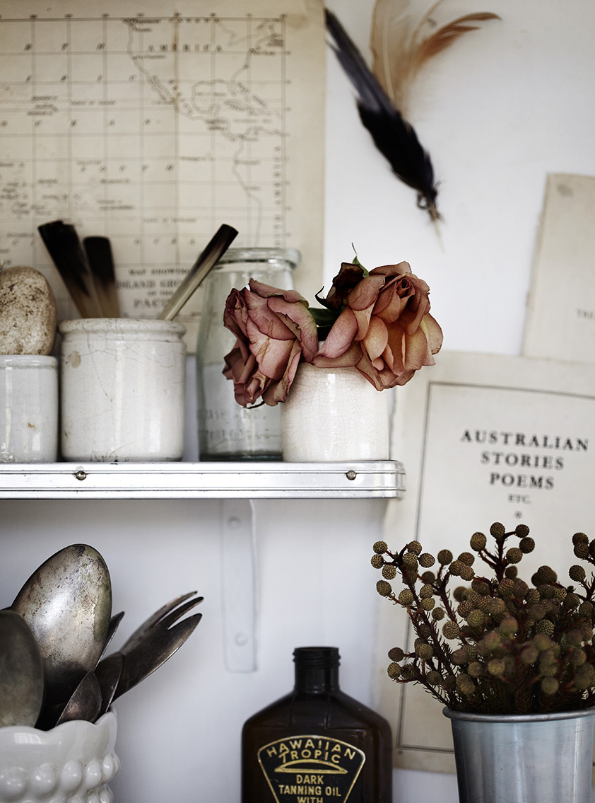
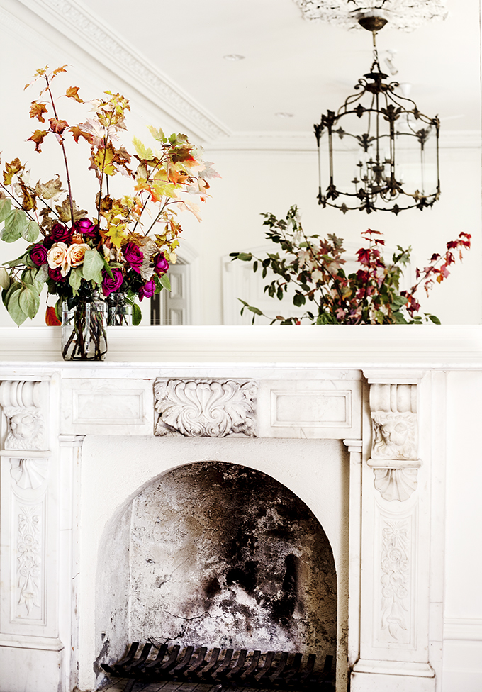
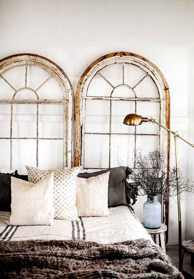
Kara is an Australian photographer, stylist, adventurer and travelling wares retailer. " I celebrate my love for authenticity and adventure through my photography, styling and travelling wares retail experience. I’m passionate about Australia and how we all live within its vast surroundings. My visual story telling is inspired by the everyday people and landscapes I encounter on my adventures." Explore her road trips, photography, blog and a lot more on www.kararosenlund.com
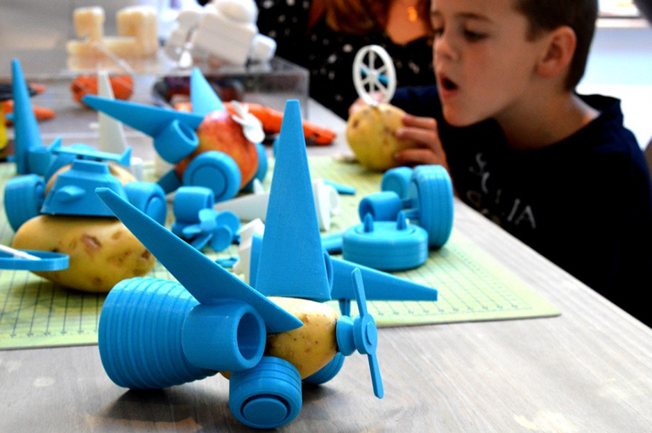
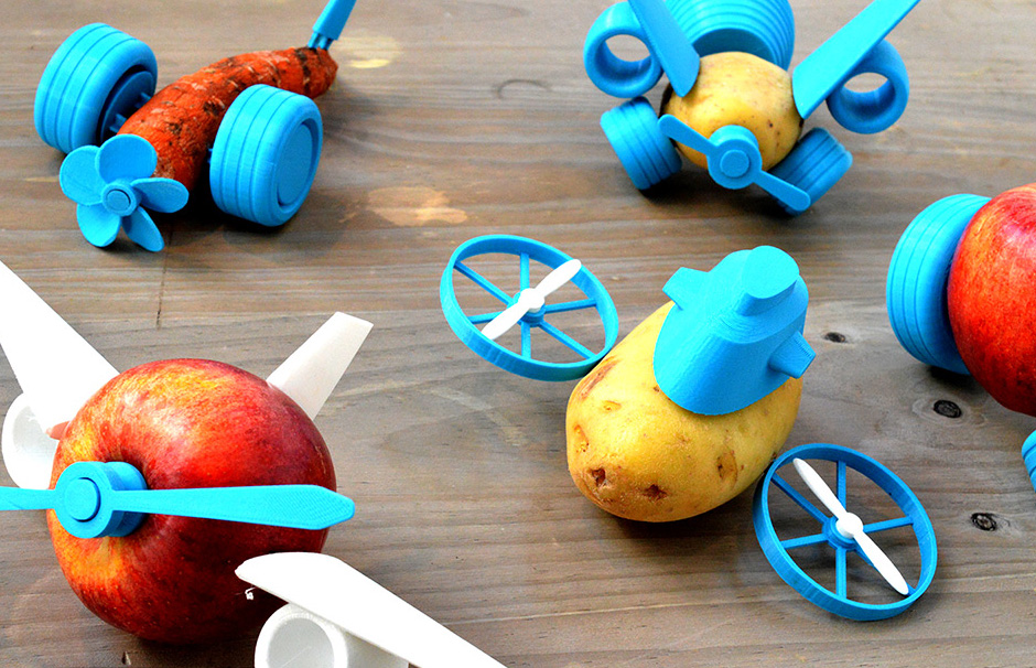
Open Toys 3D Printed by Le FabShop
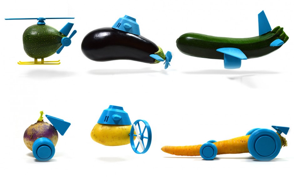
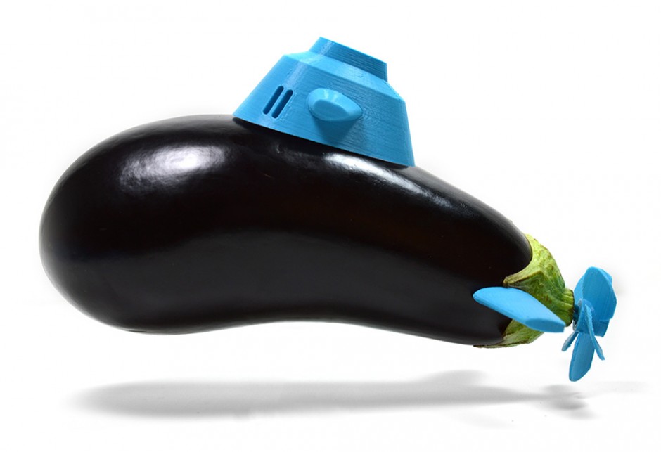
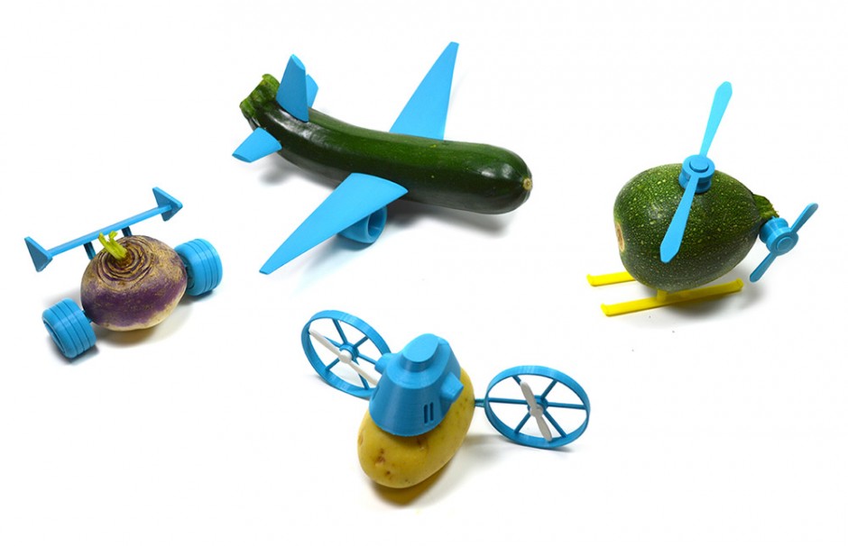
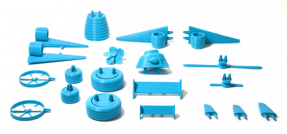
How awesome is that to bring a fresh idea and the meaning for boring things like veggies? Especially when it comes to playing with kids. The team at Le FabShop (Facebook) just released a series of 14 components you can download, print, and attach to your favorite vegetable, effectively transforming turnips into helicopters and eggplants into submarines. The free accessories are called Open Toys, and all 14 components can be downloaded here.
A New Design for Norway Passports
Seems Norway can't stop being the most expensive country in Europe they need more attention. Last time they drew it with innovative Money Banknotes design and not long ago they released a new update of the National Passport design.Oslo based studio Neue won the competition by giving a modern, simple, but still attractive new design as a result. Titled ”The Norwegian Landscape,” this design shows nature as the “essential part of the Norwegian identity and tradition” as Neue Design Studio puts it.
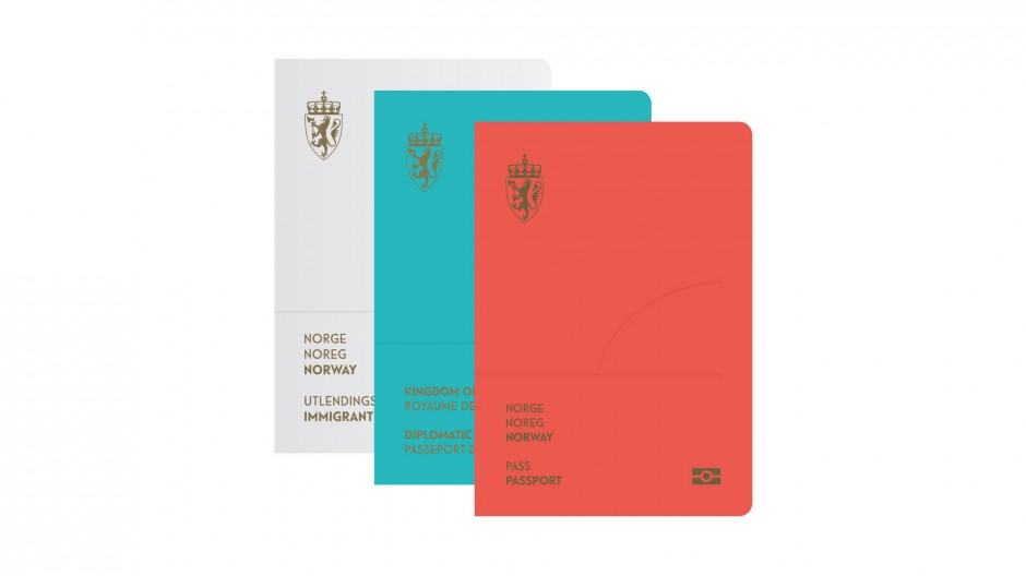
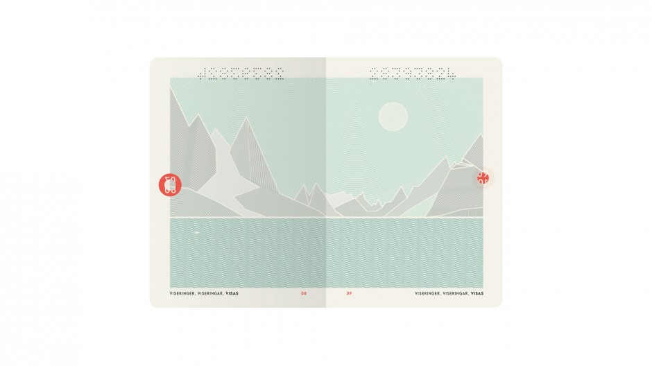
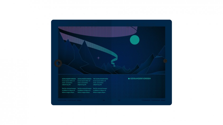
Philipp Zurmöhle
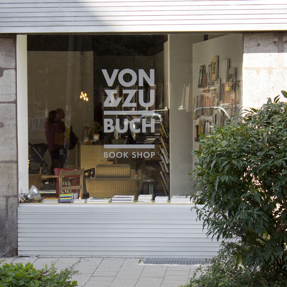
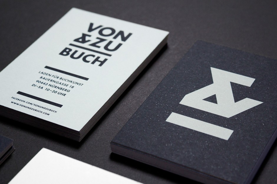
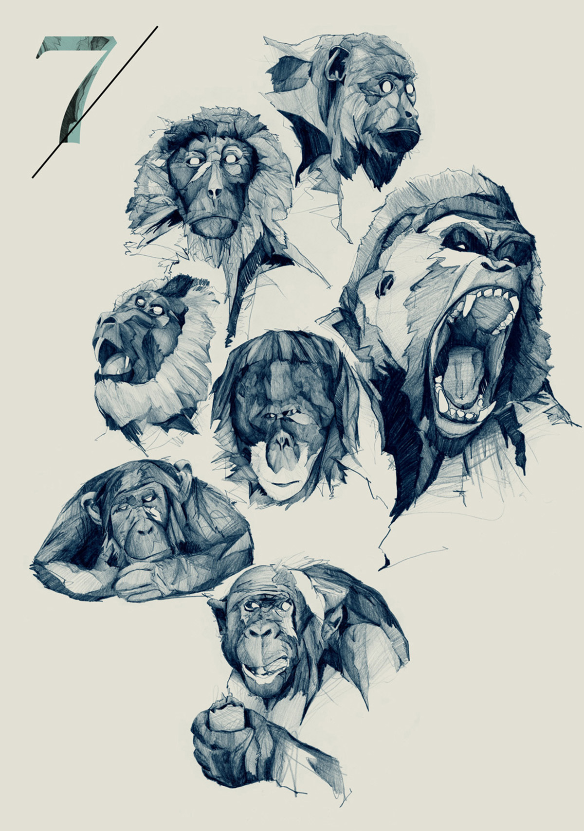
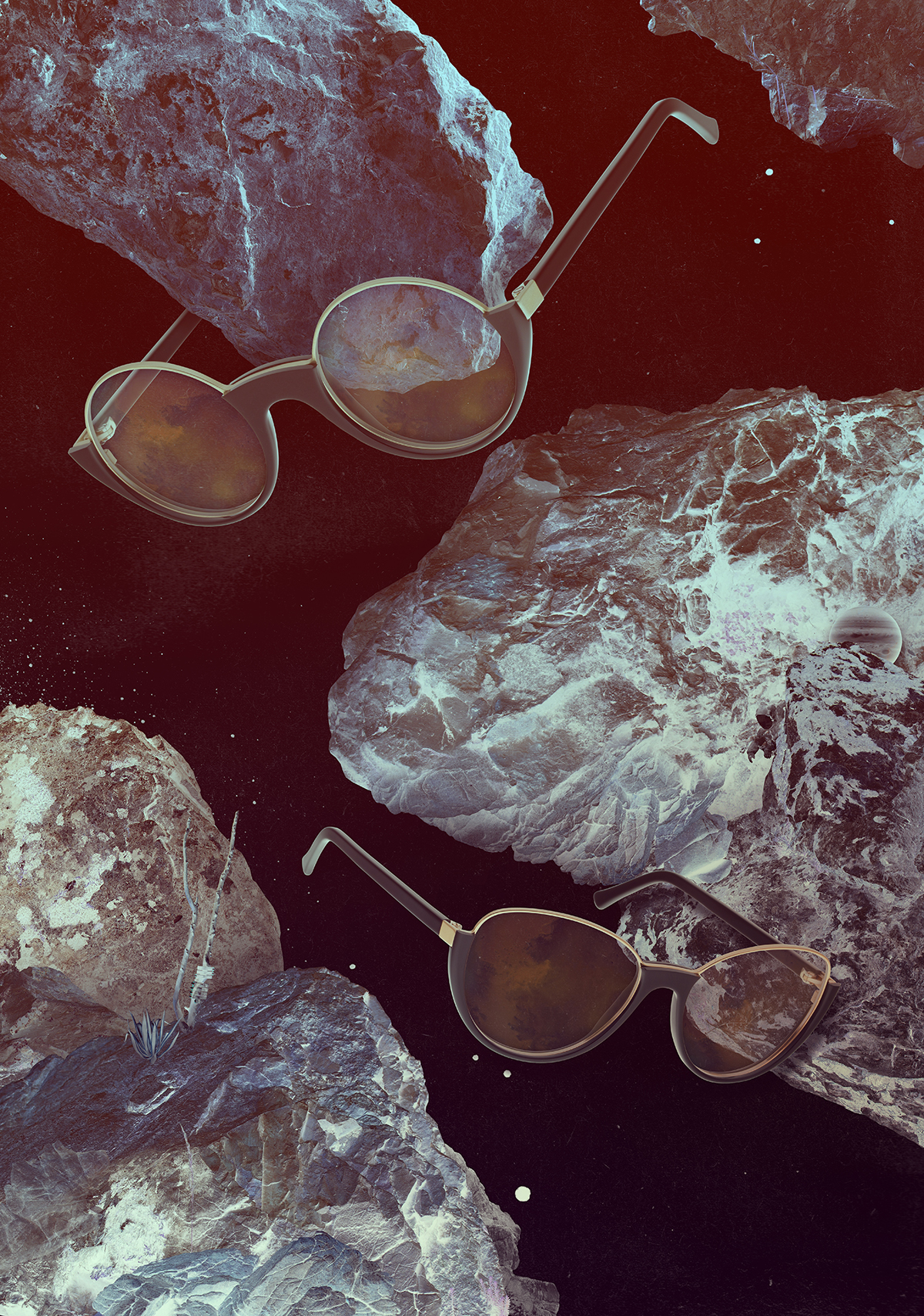
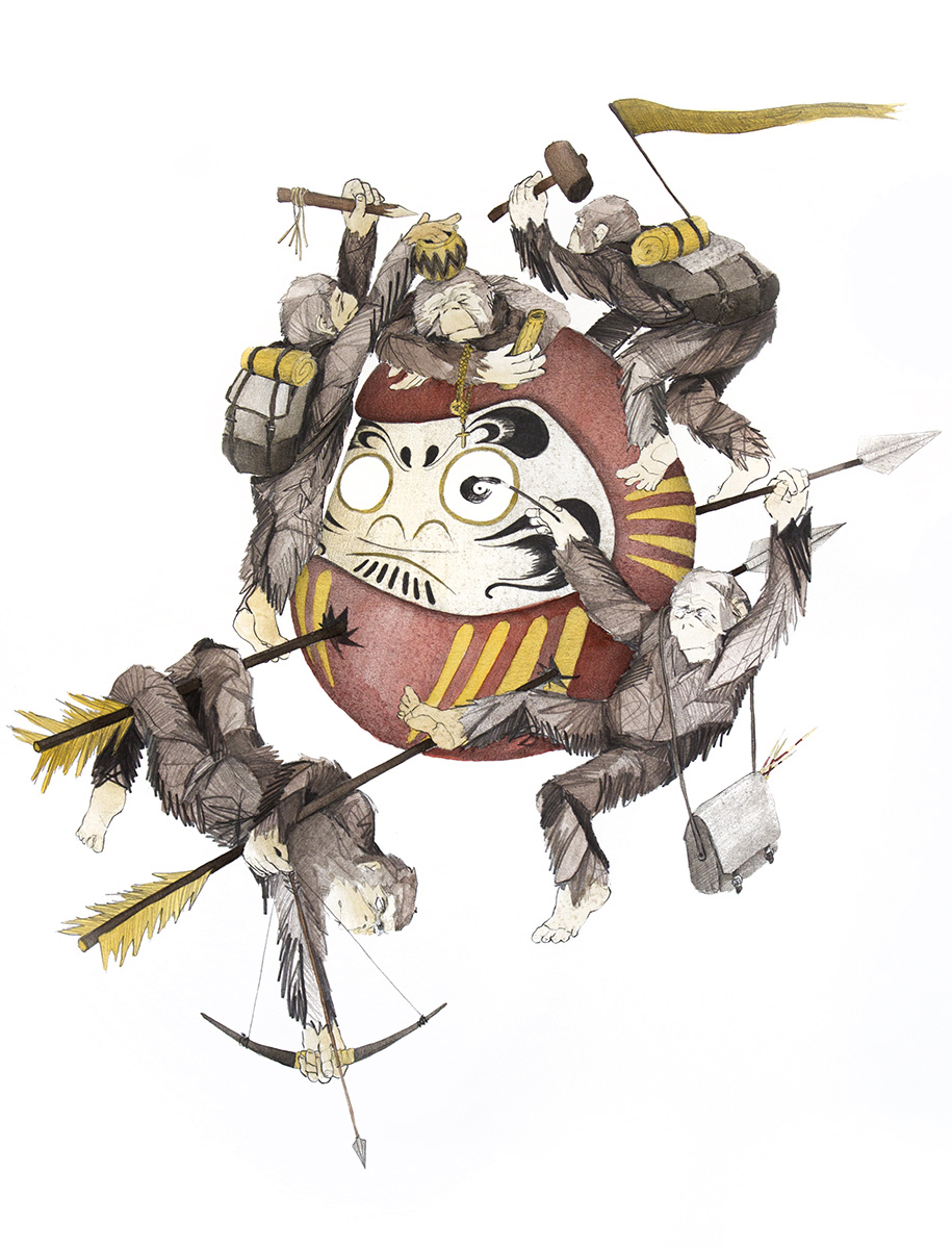
Born in Hannover, design-breed in Oslo and living in Nürnberg, Philipp Zurmöhle has a portfolio of a classy European designer. Rooted in illustration Philipp creates clean and minimalistic graphic design worth to review on his portfolio website www.philippzm.com
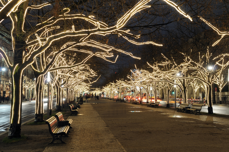
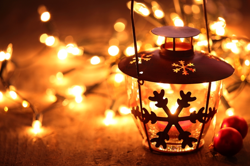
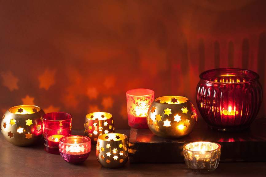
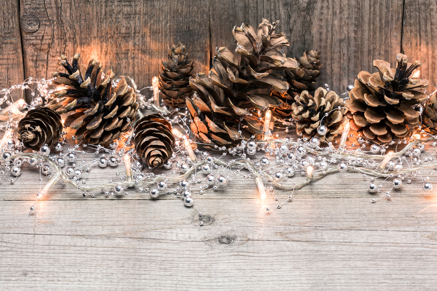
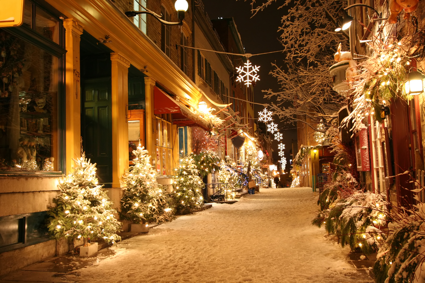
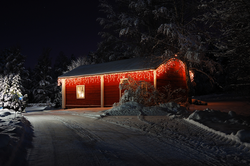
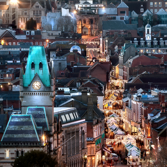
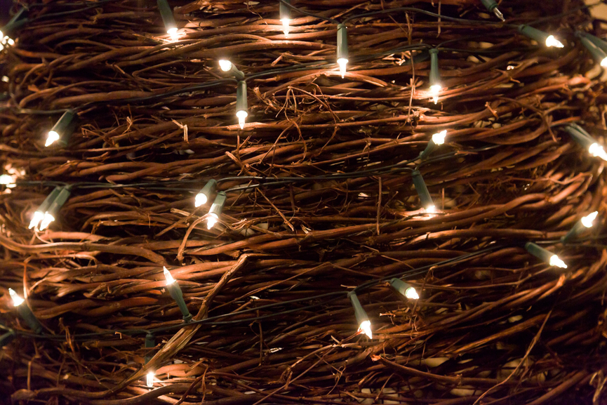
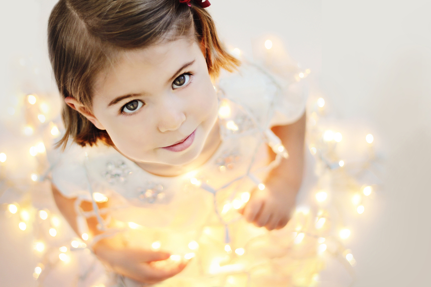
Depositphotos Inspiration Set 6: Lights
Our friends and partners at Depositphotos come up with a nice idea to share the new inspirational set of photography with you today. Bring up the Lights they say, and so we did. Enjoy it now
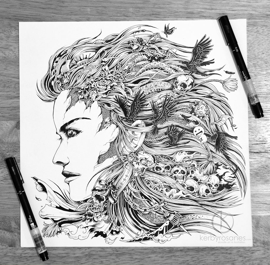
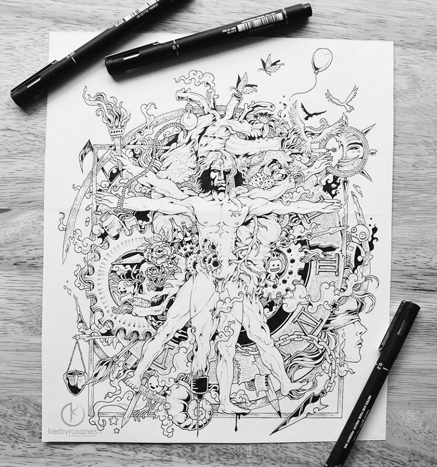
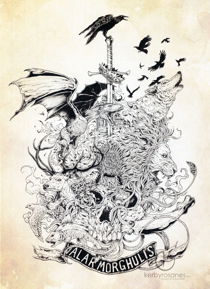
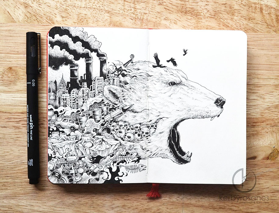
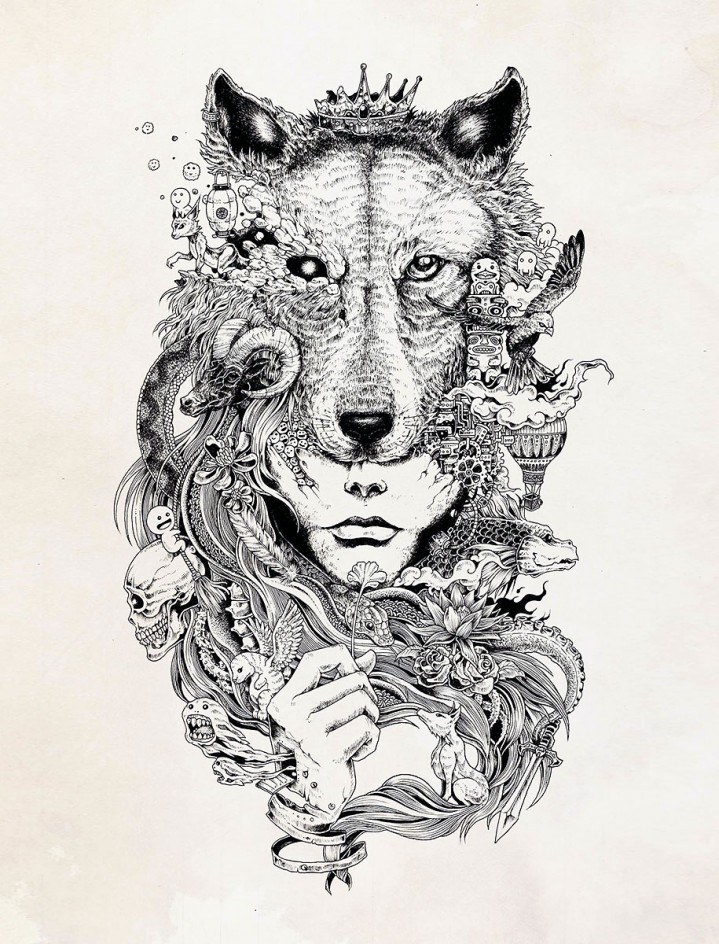
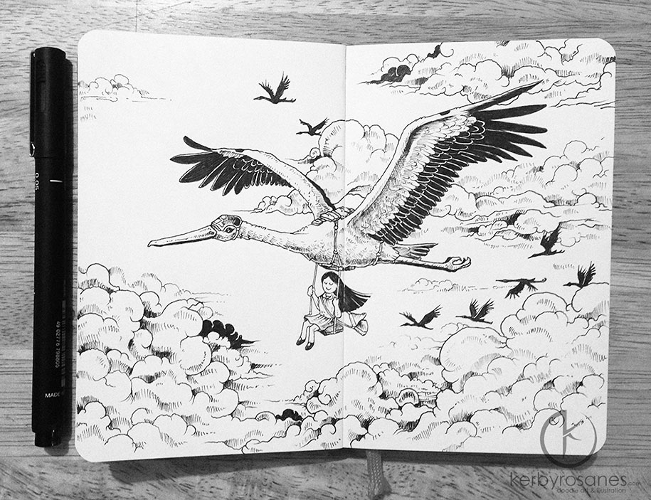
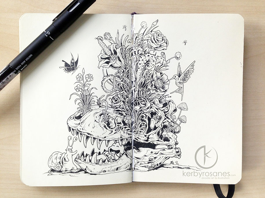
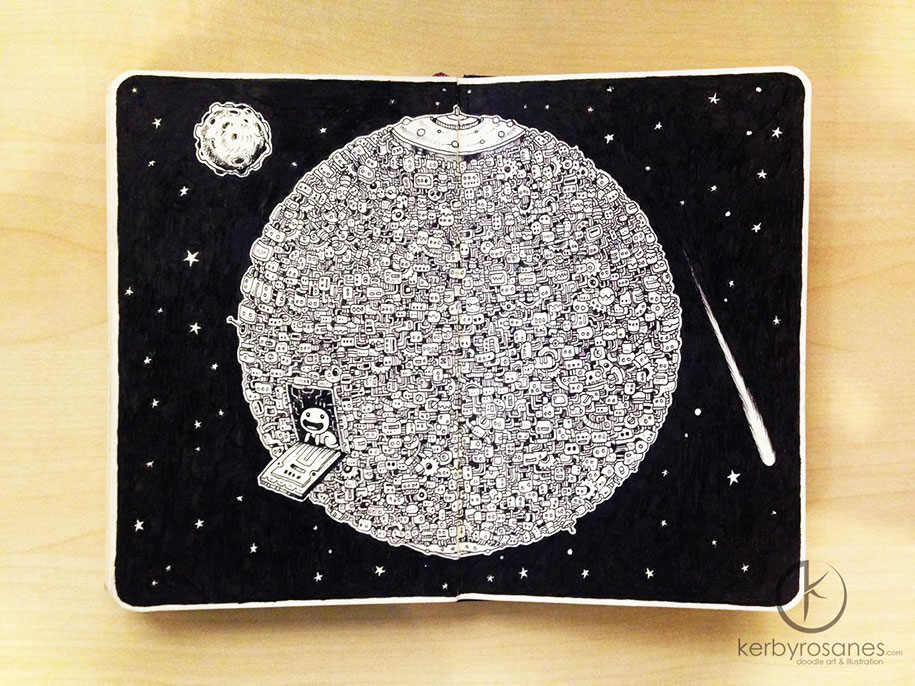
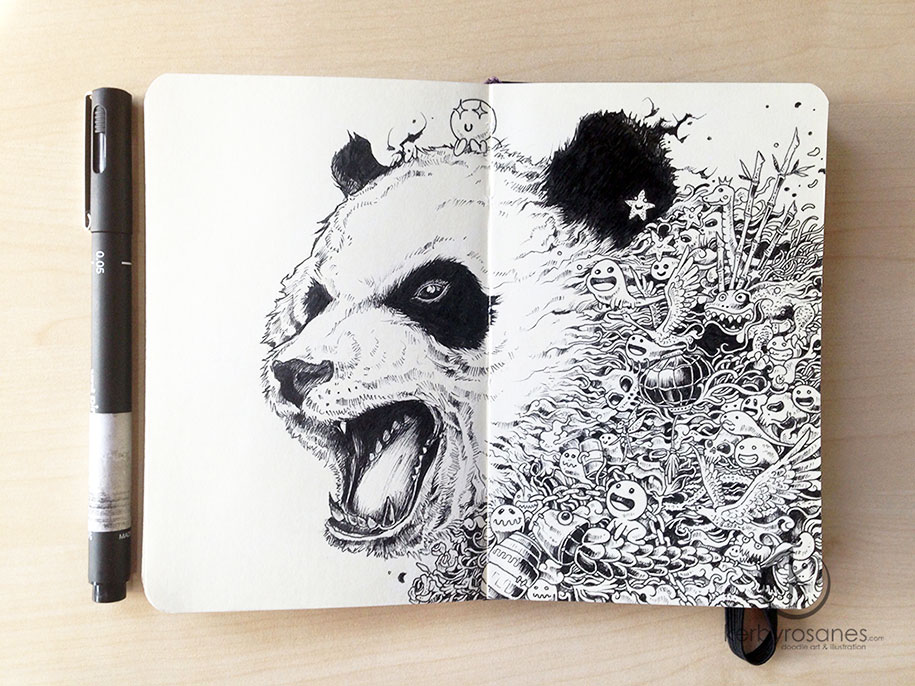
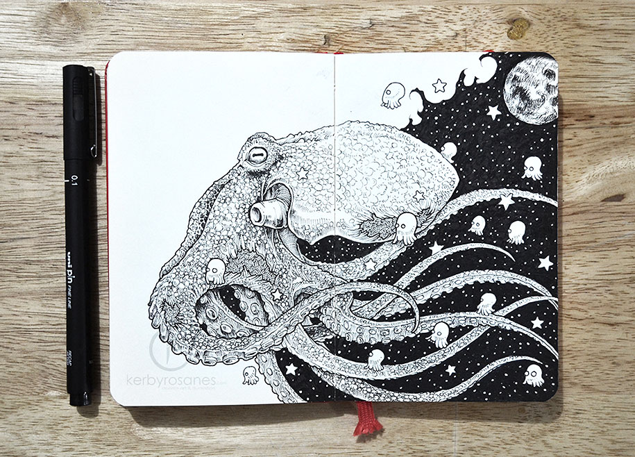
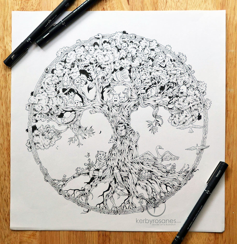
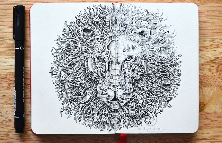
Sketchbook Illustrations From Kerby Rosanes
Philippines-based illustrator Kerby Rosanes has created a new stunning series of doodles and sketchbook illustrations
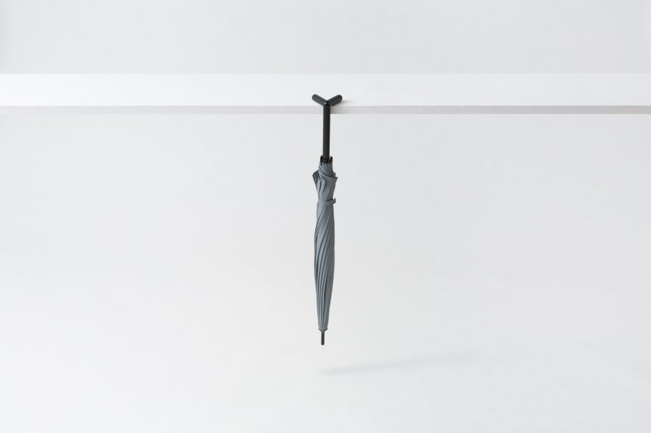
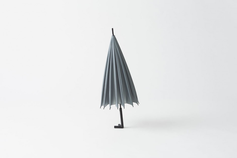
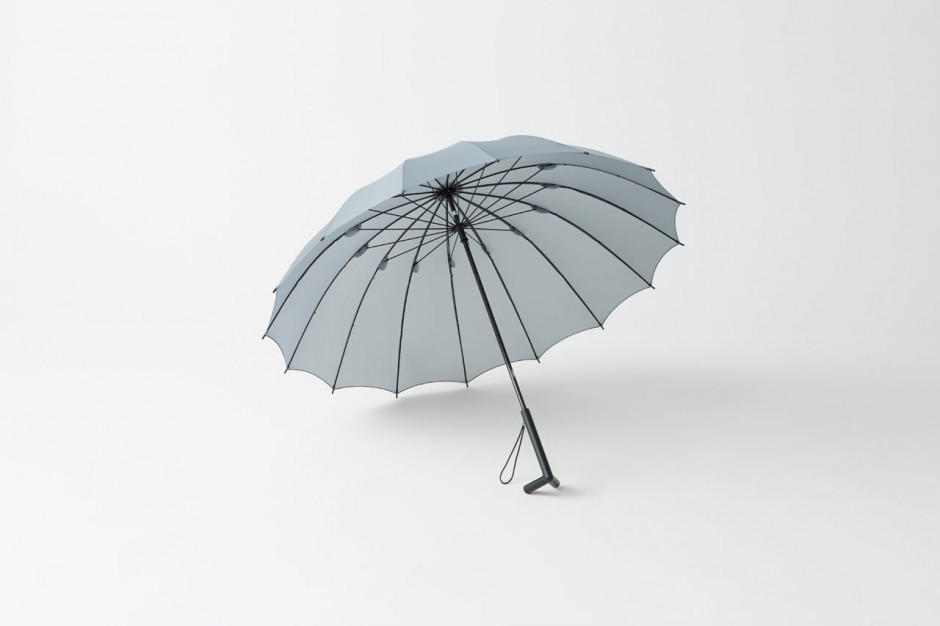
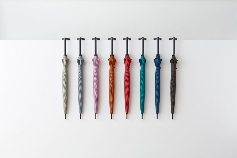
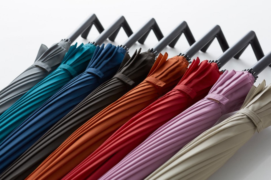
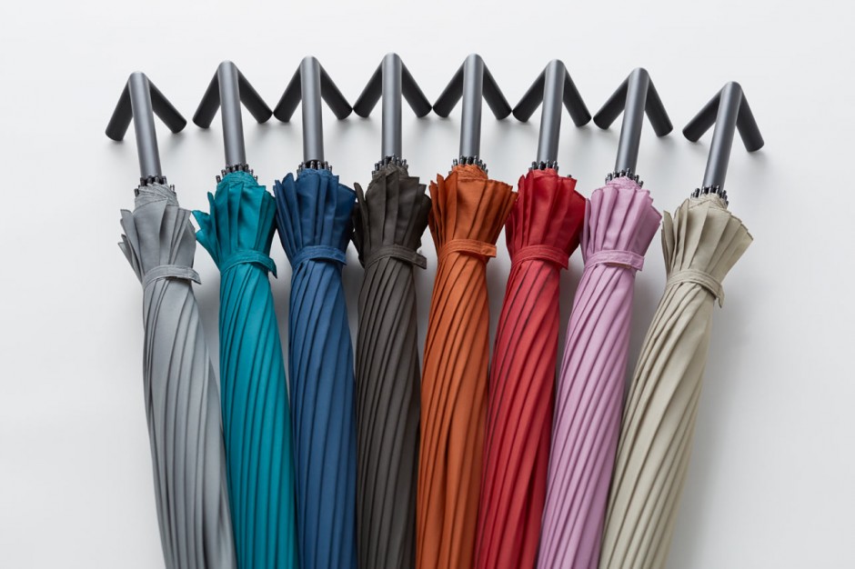
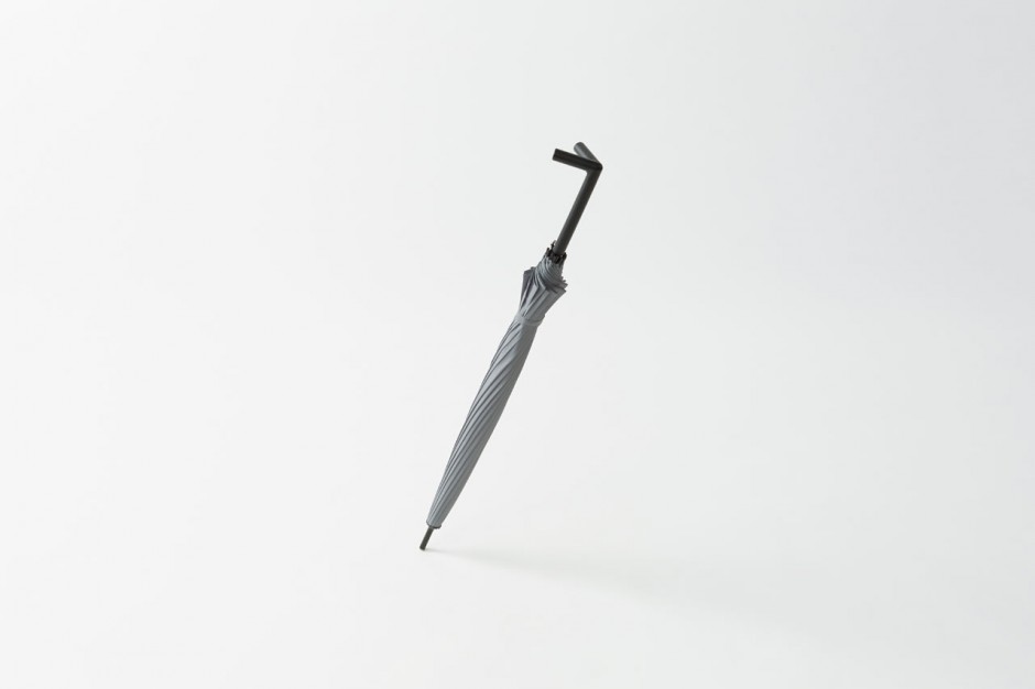
Upstanding Umbrella
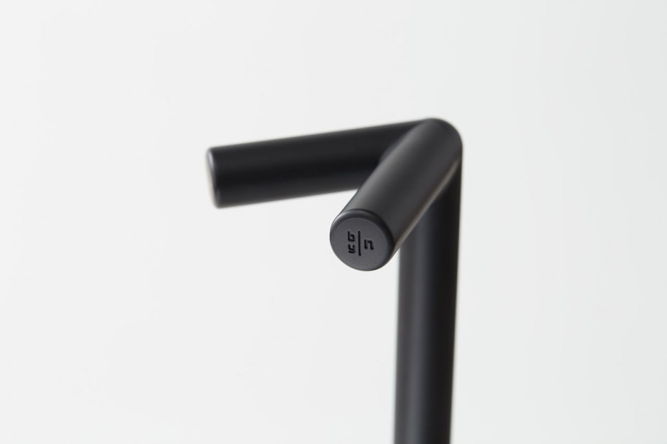
Japanese designer Nendo rethinked umbrella and came back with the stay-brella. The umbrella comes with a sturdy handle that lets you not only hang it from a table, but it will stay propped up against a wall.
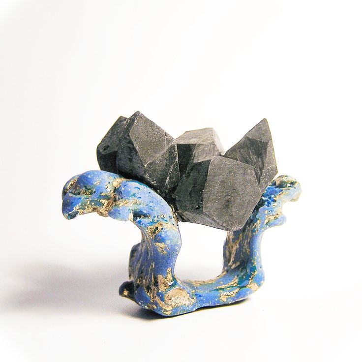
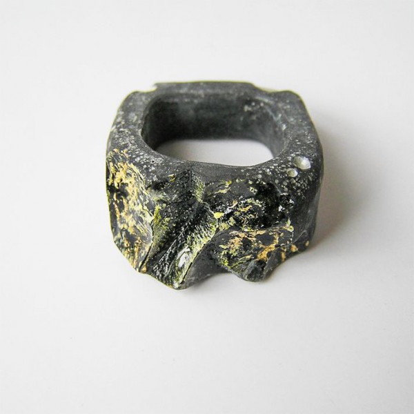
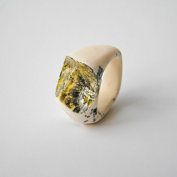
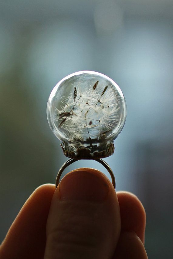
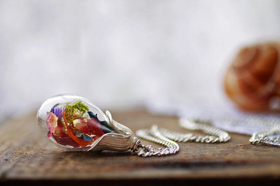
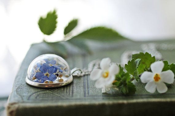
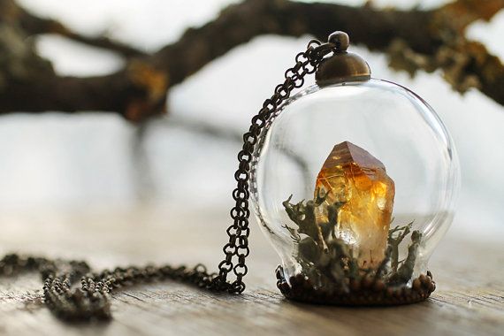
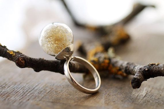
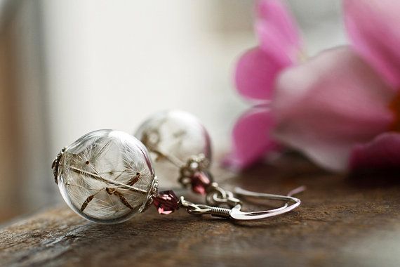
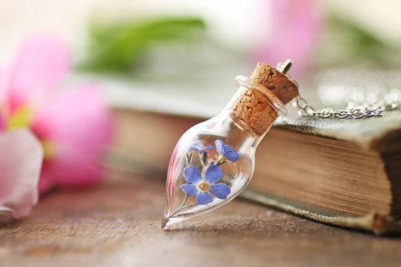
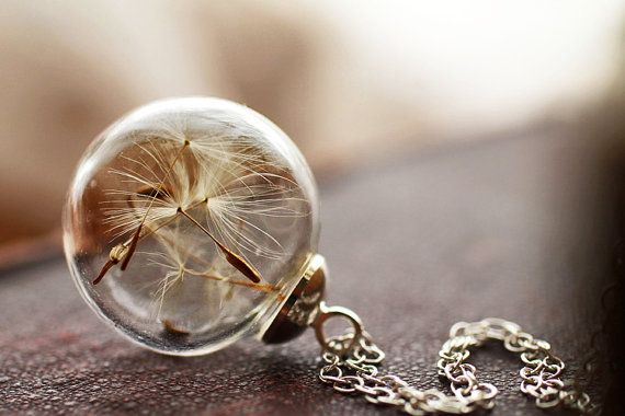
Poetic Jewellery by Ruby Robin
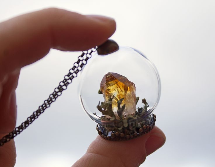
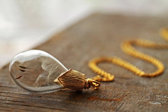
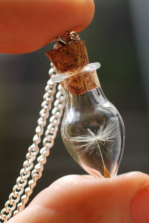
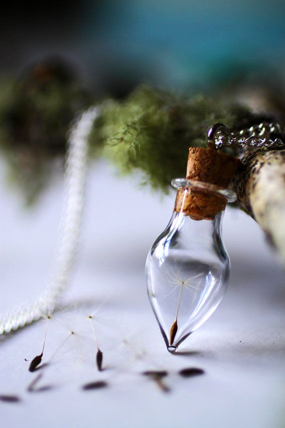
Irish artist Ruby Robin (Facebook) creates handcrafted jewellery that contains little bits and pieces of nature.
My handcrafted jewellery is designed to allow the quiet beauty of nature to shine, to stir the imagination, inspire wonder and encapsulate a microcosm of long forgotten memories. I make my jewellery using a range of strange and beautiful curiosities, found in the woods and on the mountain sides, on the windswept beaches and wild meadows.
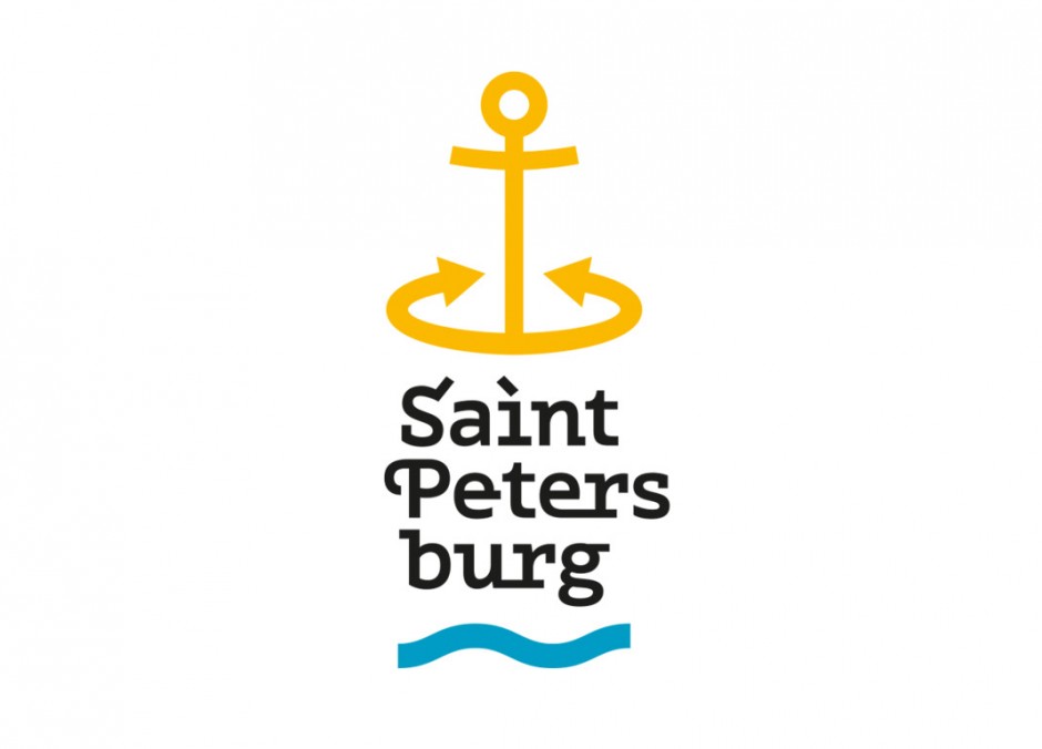
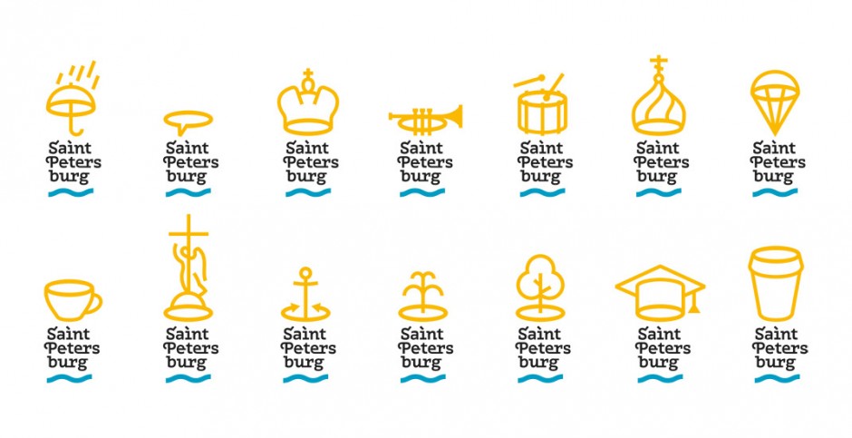
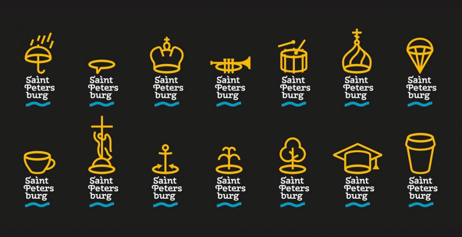
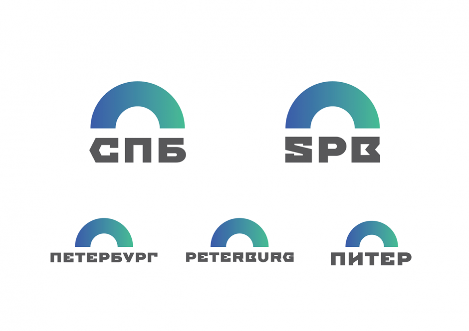
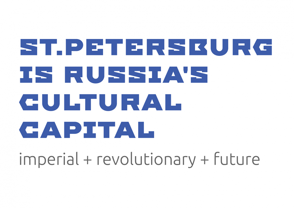
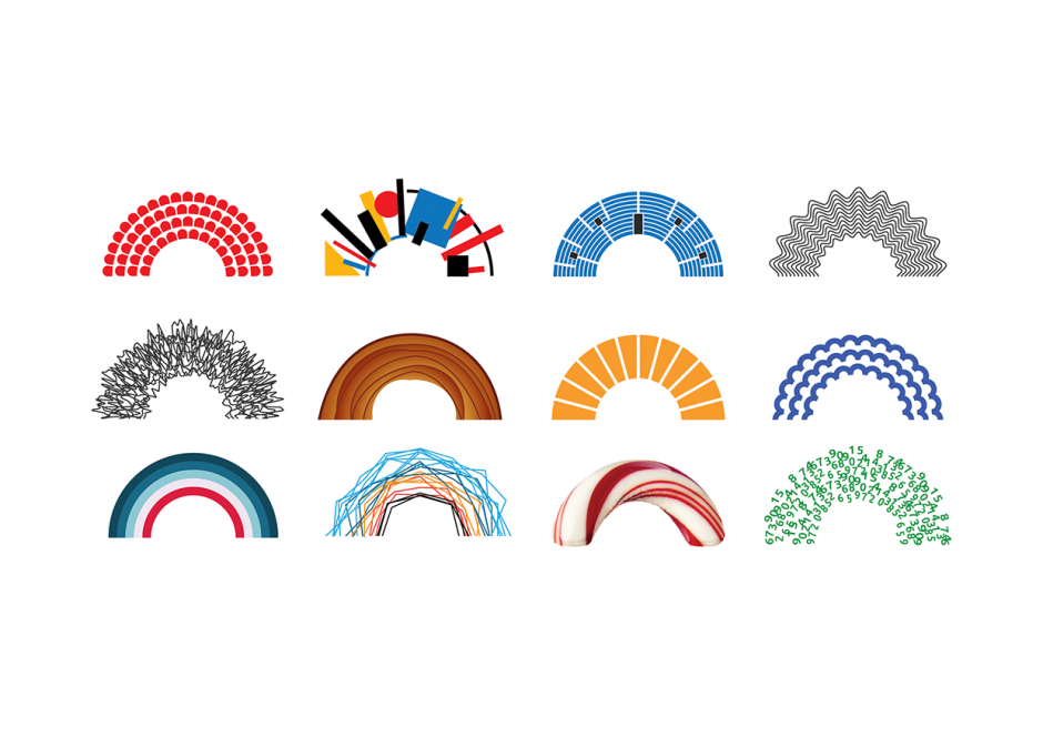
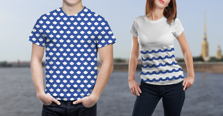
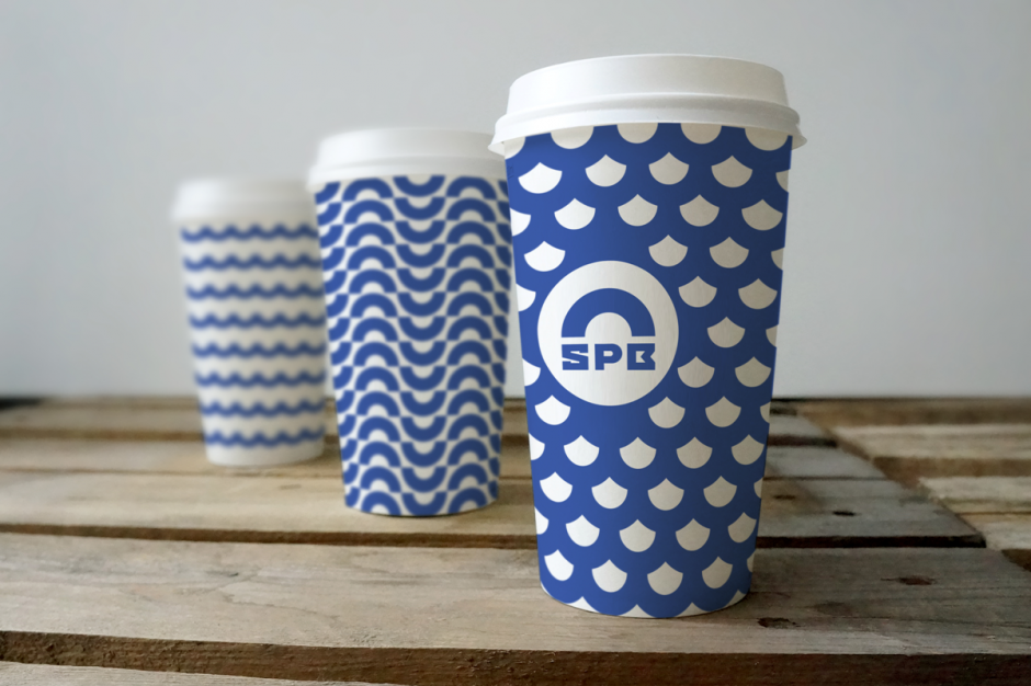
Saint Petersburg City Logotypes
Who said it will be easy? To create logotype for the city like Saint Petersburg is like to direct a play of "Lady Macbeth" or "The Master and Margarita". Everybody knows it but nobody got close to it, dead or alive. The city identity requires a lot of everything: starting from a very complicated history ending with citizens that has a lot of doubts and bits about living here. To understand the city as someone said you must "drown" in it, or it will spit you outside or even leave you dying. Literally, Saint Petersburg has a lot of faces, and everyone who gets here see its own face. So let's check the three version of Saint Petersburg City Logotypes.
1. Unknown Pitch
The first one is said to be done by Moscovian (sic 1!) design studio "Art.Lebedev", but it is not approved. Please take this in consideration while studying the logo. First posted on German website (sic 2!), it spread across Russian web with a lot of doubts over iconography and some typography issues.
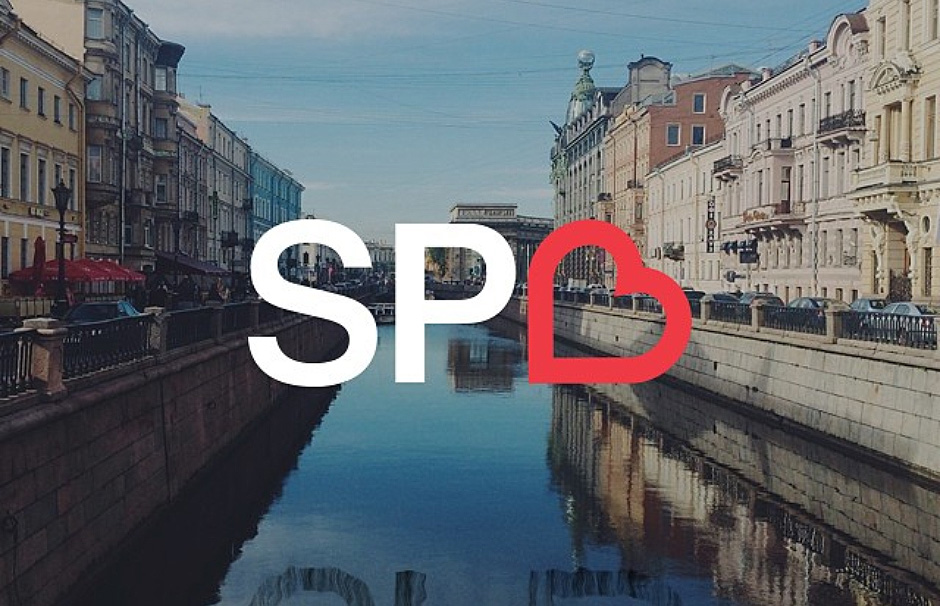
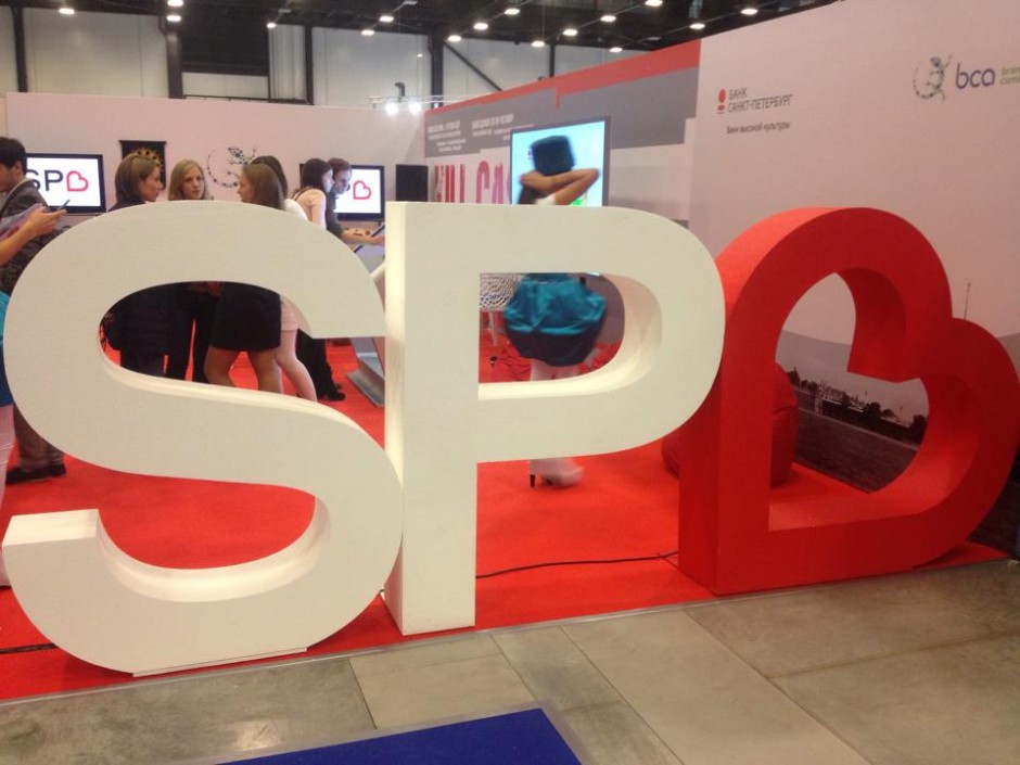
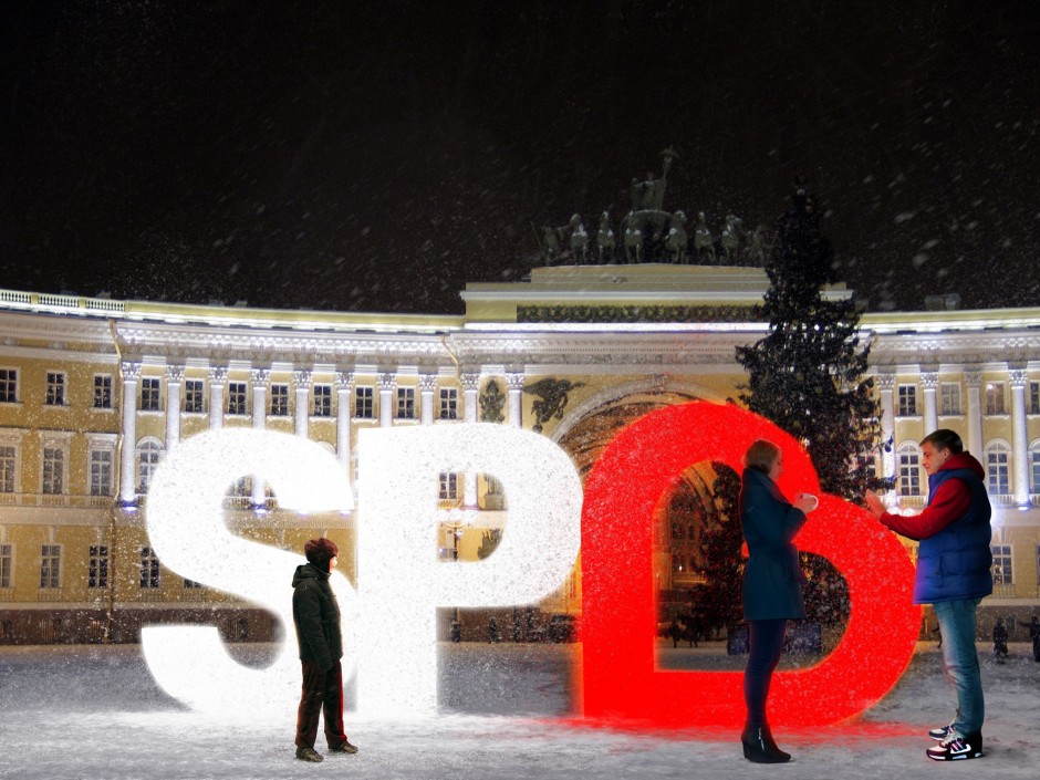
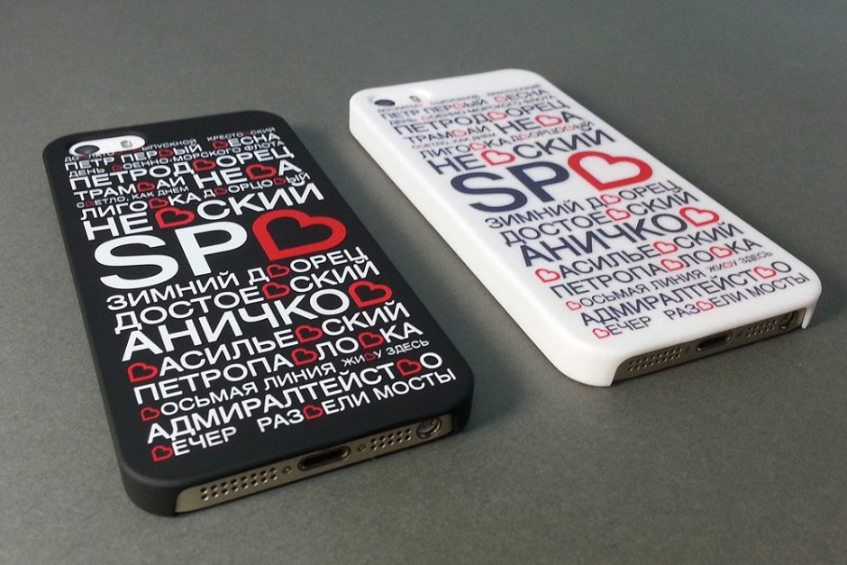
2. I Love SPB
Done by initiative group lead by Ruslan Chernobayev (St.Petersburg Design Week) and talented illustrator Alex Andreyev and supported by BCA Agency, ILOVESPB is a next pitch to have pros and contras. The logo has a personal website http://ilove.spb.ru/ and hope has a long journey to be real.
3. Yakushev Design Studio Pitch
The third pitch is again from Moscovian studio of Yakushev Branding has a good typography designed by Ivan Gladkikh and lemon-faced trend of "generic" logotype, that we'll leave on your consideration. Personally, this project is a good moodboard and research of possible graphic design trends, but hardly represents the Saint Petersburg City itself.
Meanwhile please enjoy the beauty of the city in different timelapse motions we collected all this time
The House Of Patrick Gilles & Dorothée Boissier In Paris
Belonging to architect and design duo Patrick Gilles & Dorothee Boissier, their Paris apartment is a study in art, design & beauty. They renovated their 19th century apartment retaining the original woodwork & paneling. via Yatzer


photos © Sisters Agency / Birgitta Wolfgang Drejer.

