Illustration Mix 2012 by Andrey Gordeev
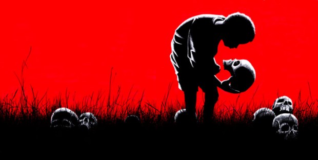
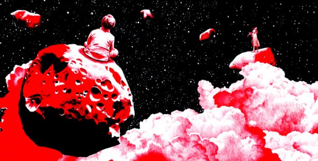
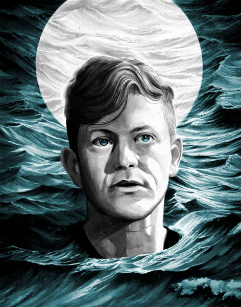
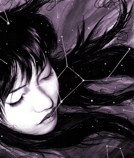
The most prosperous and award winning illustrator in Russia - Andrey Gordeev released a new mix of commercial illustrations worth to see and enjoy
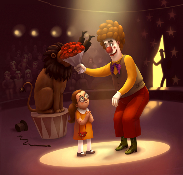
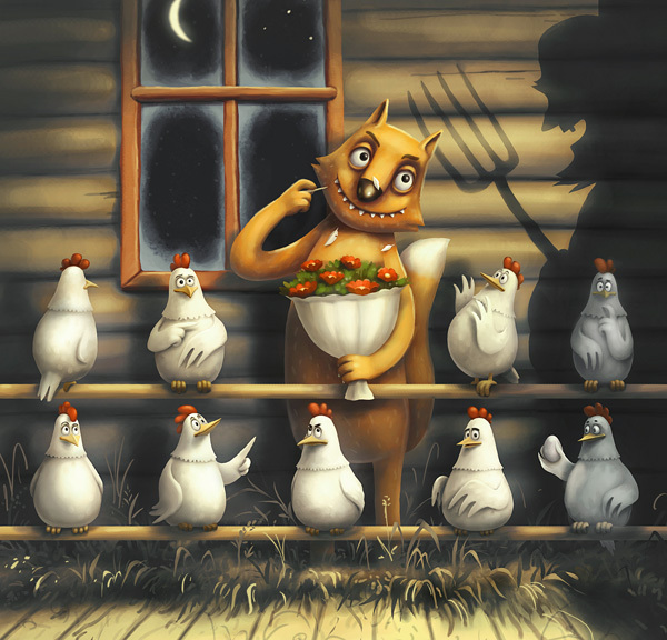
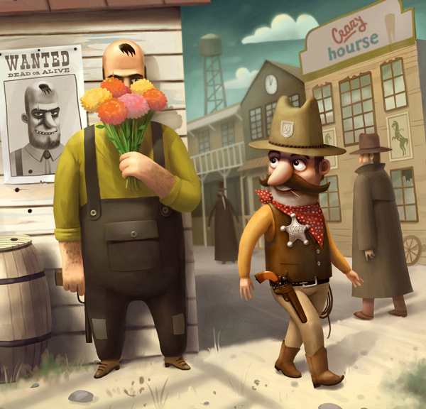
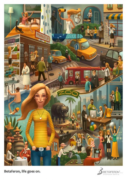

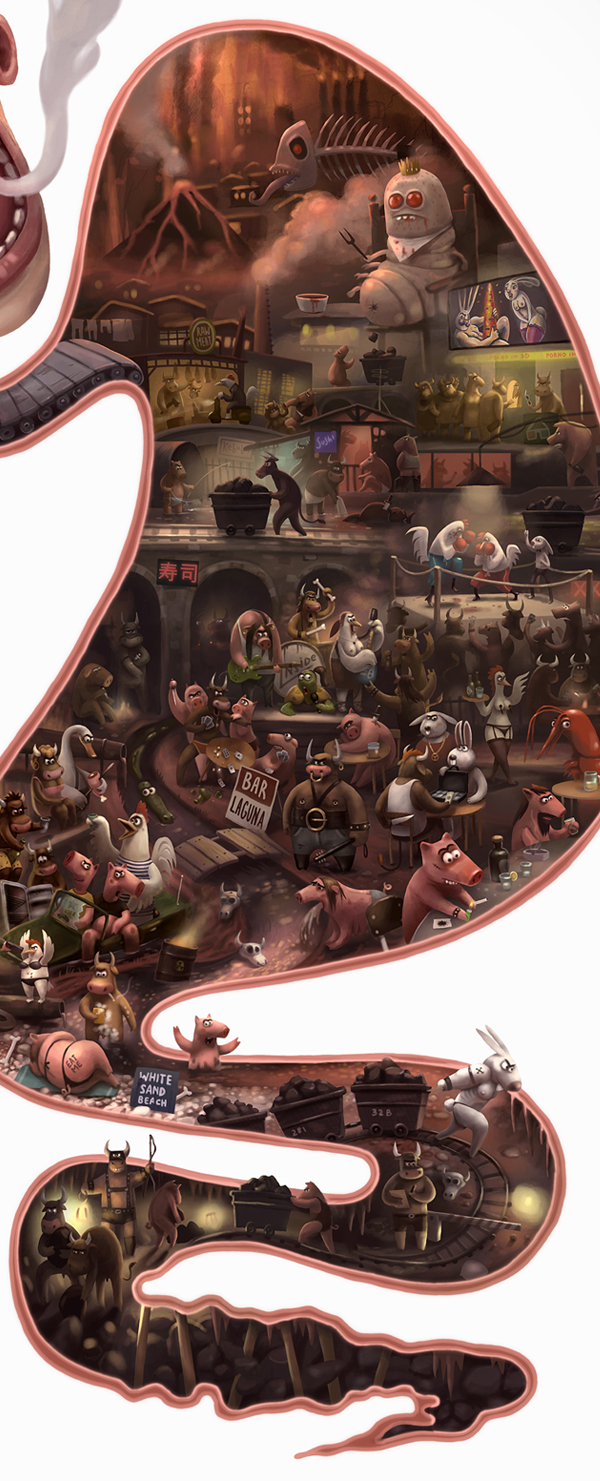
The most prosperous and award winning illustrator in Russia - Andrey Gordeev released a new mix of commercial illustrations worth to see and enjoy


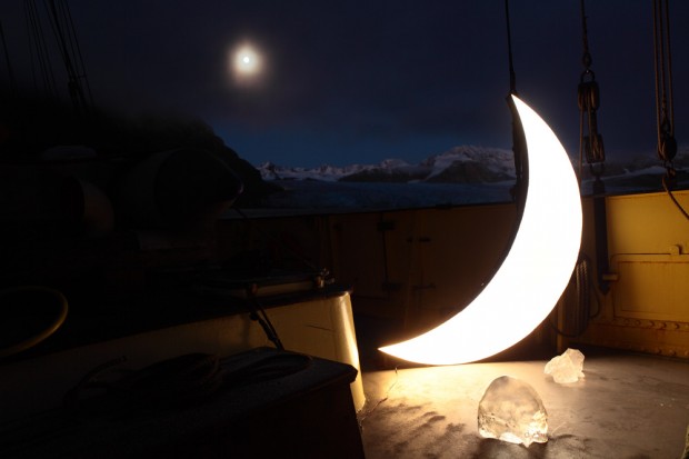
You might remember few photos of Leonid Tishkov's personal project "Private Moon" that had been circulating on the web few years ago. Here are new photos of Private Moon traveling around the world.
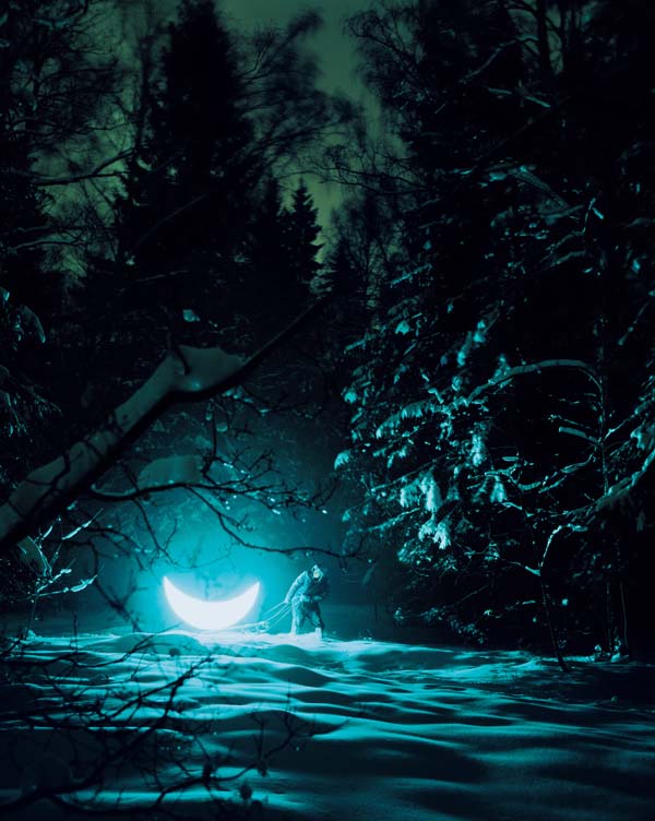
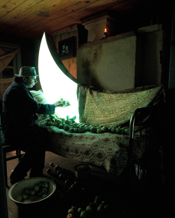
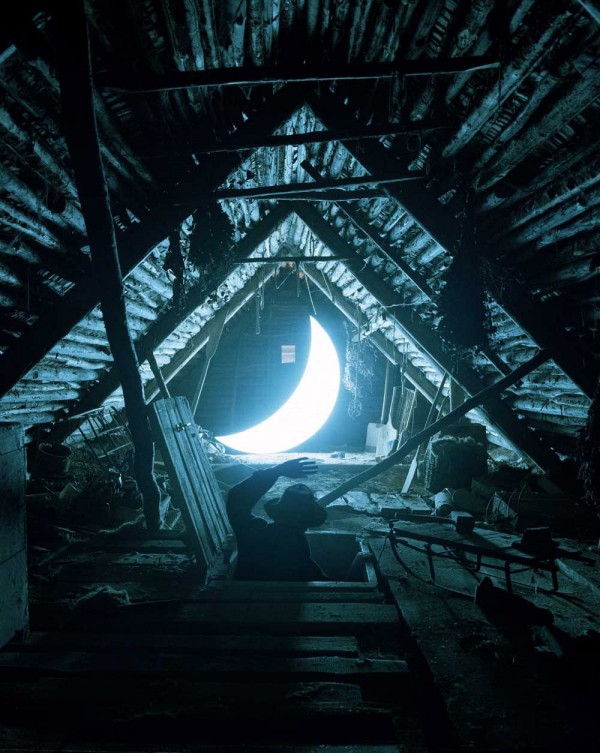
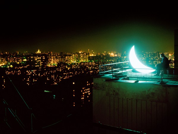
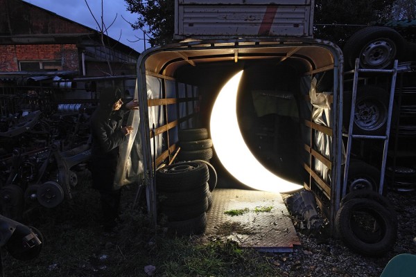
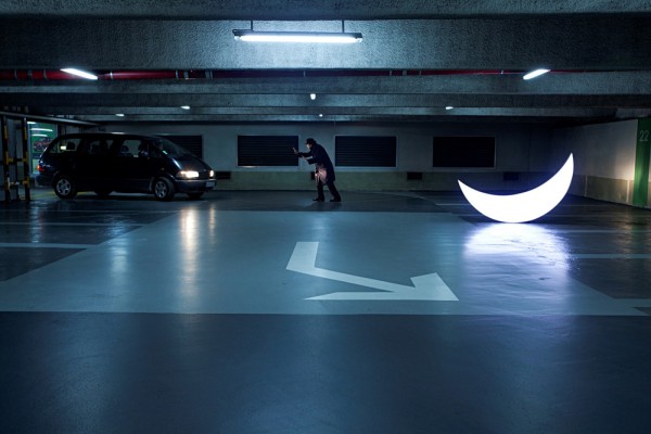
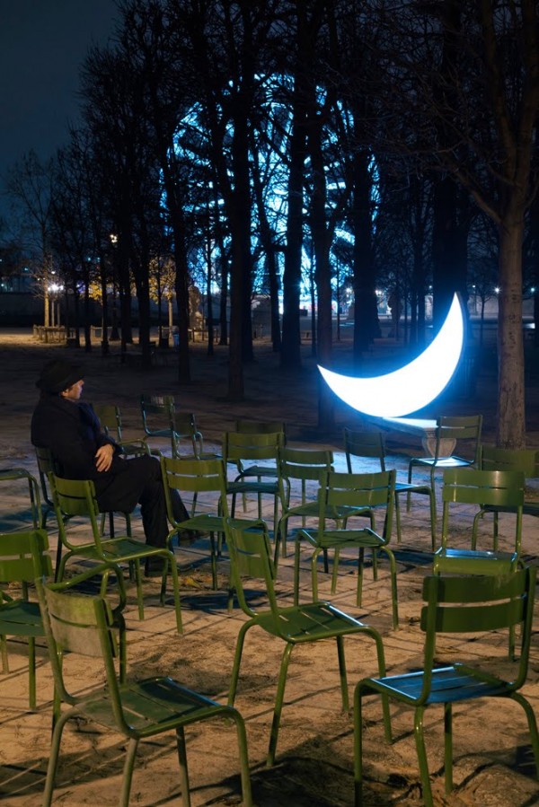
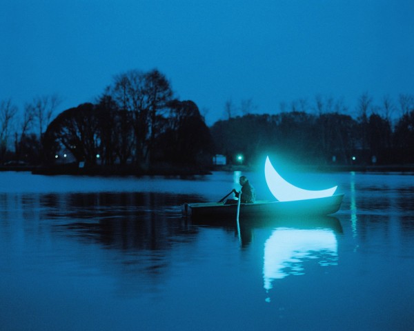
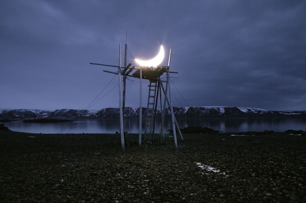
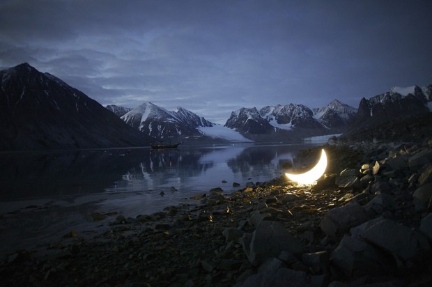
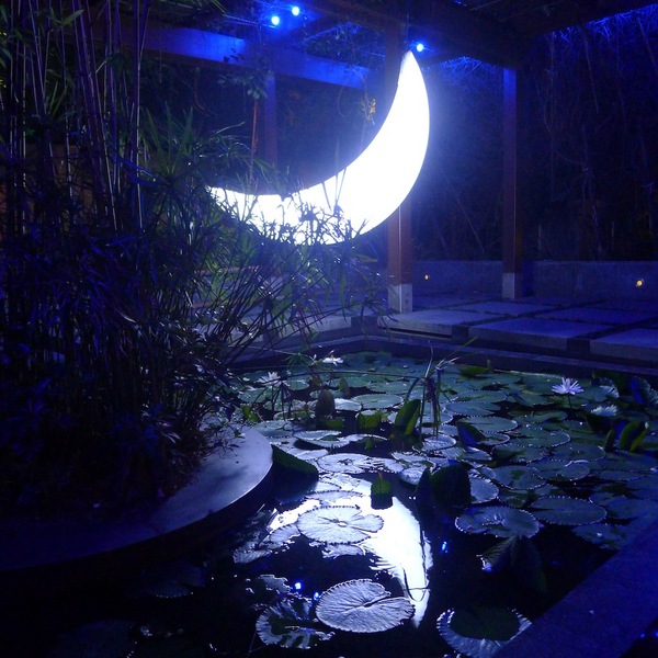
Production and art direction — Death in ParisDirector of photography — Rémi Chapeaublanc
http://vimeo.com/42704598
Modern, hip pop art sculpture of Mauro Perucchetti plays around with obvious and well-known objects in topical and critical context.

The world leading social network - Russian Vkontakte reveals its new office designed by Gullstén - Inkinen Design&Architecture in a very short time (two weeks for the concept). Designers recently won Office Next (Moscow) award in office design. VK occupies two floors in a modern business center right in the heart of St Petersburg.
Russian duo SELFBURNING released a new short experimental motion work "Collapse". We've asked guys to speak a little about the project: DC: What is this video about? Selfburning: It shows catastrophically rapid contraction of the body under the influence of a strange force.
DC: What was the main challenge while directing this video? Selfburning: I was searching for a visual style that would not require long render sequence. So I was able to spend more time on the setup of the particles and animate objects.
DC: How long did you make this? Selfburning: Usually I do all in parallel with other projects and work. Customary I begin,then put aside, then start again,and so untill I finished conceived. Therefore, it took somewhere 3 months.
http://vimeo.com/42397960
There are few works on Arthur Alimguzin's portfolio and maybe because of this I feel a hunger for his hyper-realistic drawing. Frankly speaking there are only three works that will be never enough and of course they are worth to watch and enjoyhttp://alimguzin.com http://www.behance.net/goodja
http://www.youtube.com/watch?feature=player_embedded&v=YSKJGSwVv-s
This is a sort of showreels that must enjoyed on huge screens in festival halls stuffed with like-minded people just as we had at all OFFF festivals. Onesize has born a new sleek showreel worth to watch on fullscreen


http://vimeo.com/42783827
We like this ad for the mess and no football at all, just a mess :) http://www.youtube.com/watch?v=QMv8g8CO4cQ
Designcollector is revealing a sneak peek of artwork created by Sara Blake for upcoming Designcollector Magazine #2 - DCMAG.NETThis time we challenged selected artist to make a cover versions of other artists that contributes to DCMAG, so called battle "Artist vs. Artist" will spread on pages of this small and brave magazine. Meanwhile we are asking you to become a sponsor or support us to be able to release DCMAG in time http://dcmag.net/support and of course we are looking for contribution authors or artists, in any case please contact us by designcollector@gmail.com
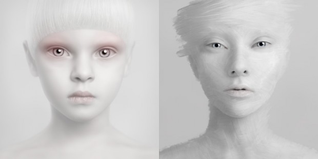
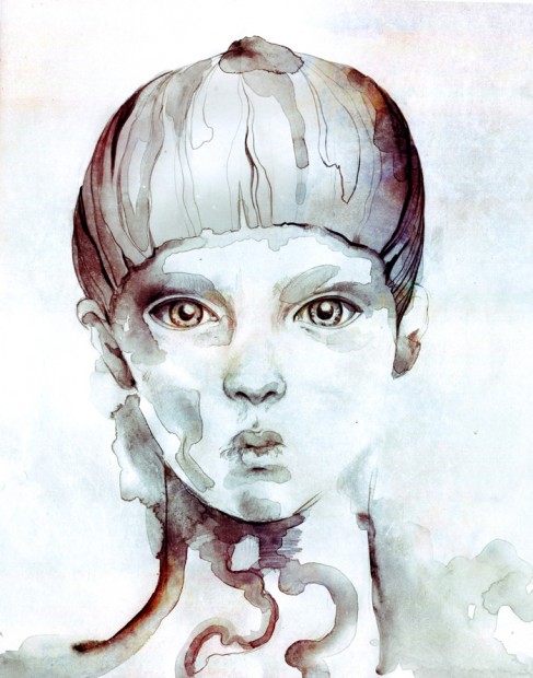
We asked Sara Blake to make a cover version on Oleg Dou's artworks - the results are amazing.That what she writes on personal blog:
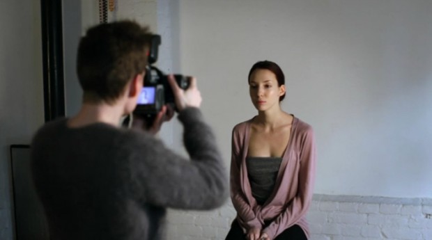
"To follow the first issue of the printed magazine for friends at Design Collector, I was invited to collaborate with the amazing, incredible, fantasic Oleg Dou for the second issue coming this summer. I've been mesmerized by Oleg's imagery for some time now. I never knew quite how to categorize his art for myself. I've always gravitated to more handmade work even if it's finished digitally. I feel that same handmade quality in Oleg's work, despite its more digital guise at first glance. In Oleg's words, "I'm an artist, but sometimes, some people call me a photographer. It's not true. I'm an artist who uses photography as a medium for my works." (Check out the full video of Oleg's work process presented by Adobe here.)
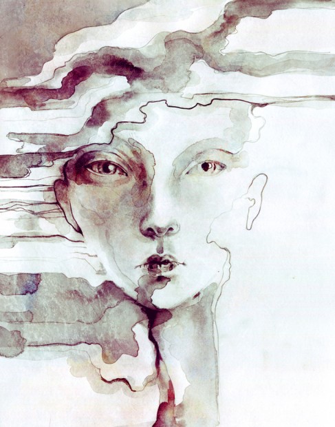
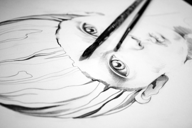
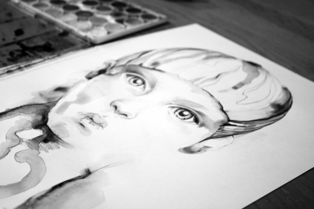
I had Oleg's hi-res files for Masha and White (below) for over a month and toyed with several ideas for a collaboration. I have to admit I was a little stumped for a bit. I had thought to do a "tear-out" effect and only illustrate certain features of his characters and place them over the original. I had thought also to embellish filligree in the negative space and lightly over the face... the usual fair of illustration/photographic collaboration. After sketching and brainstorming however, I reallized anything I were to add to Oleg's originals would not be an improvement, but would instead detract from their simplicity and power. I didn't want to tamper. Let a good thing alone—they were perfect as they stood. Instead I decided to create illustration "based" on his pieces, redrawn in my style, whatever that means. The two would sit side by side for a spread. The following 2 images were created quickly in a few hours (pencil, watercolor, digital). They will appear in the second issue of Design Collector Magazine, along with more artist collaborations from some friends. Huge thanks to Design Collector and to Oleg for having the trust to let me mess with his beautiful work."

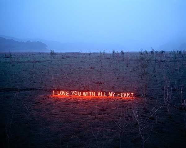
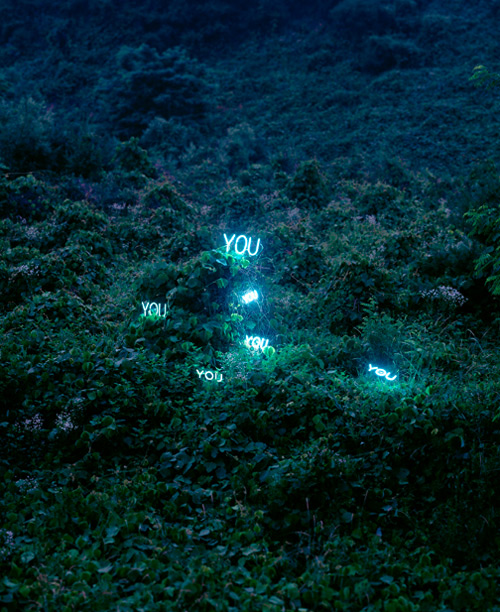
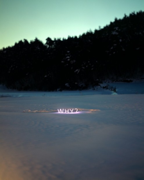
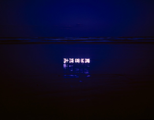
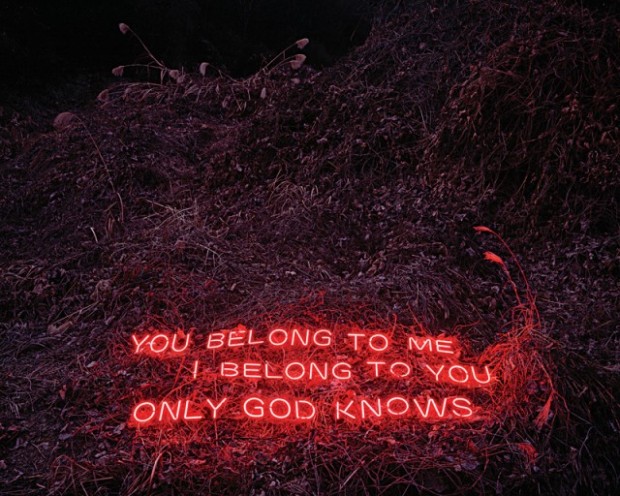
Seoul based artist Lee Jung uses neon lights in a philosophical manner. "Lee Jung was born in 1972 and currently lives and works in Seoul, Korea returning to Korea upon completed her M.A. in Photography from the Royal College of Art, UK. She also received her B.A. with honors in Photography from Kent Institute of Art & Design, UK and a B.A. with honors in Mass Communication & Journalism from Kyung Hee University in Seoul, Korea. Lee Jung most recently participated in 2010 Gwangju Biennale “10,000 Lives” under the direction of Massimiliano Gioni, the contemporary Korean photography exhibition “Chaotic Harmony” at the Museum of Fine Arts (Houston) and “Writing Paintings, Painting Words” at the Seoul Museum of Art."
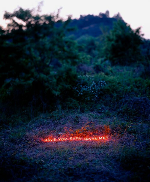
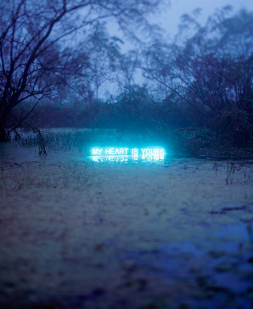
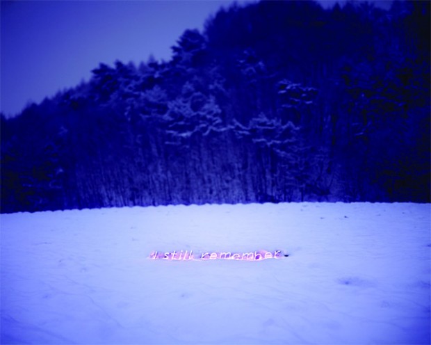
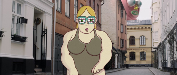
Designcollector was a Media Partner for OFFF2012 festival this year and was the only online media that tried to make a life visual report from the fields with the help of Alexander Kalachev. Also we will try to make a full report this week with festival photos send us by our friends. BUT for now please watch Official Festival Titles created by Brosmind and UpperFirst. Brosmind and Upper First redefined the format, mixing cinema, illustration and 2D/3D animation with paper, adding to their highly anticipated video a double-feature comic book that was given for free, alongside plastic masks with the face of the characters, to a crowd that enjoyed all the presentation feeling that they were the real protagonists of the party.
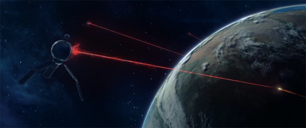

http://vimeo.com/42614184
Also check OFFF2012 Bumpers directed by Jellycubes
http://vimeo.com/41738224
Proposition One is a series of x-ray photography made by Max de Esteban, revealing the nature of the obvious objects. http://www.maxphotos.es
I think @Radiohead or @MassiveAttackUK might be inspired as same as us by the latest and the longest project "An Anatomy" created digitally by hands of Saint-Petersburg based conceptual illustrator Olga Feldman aka Linzza. Why I mentioned Radiohead, because this work reminds me their project http://www.aaronkoblin.com/work/rh/index.html with the only difference in creation - Aaron Koblin did it with code, Olga - by hands and without 3D dummies.
We had a chance to speak with Olga about her project.
DC: What was the concept behind "An atomy"? Olga: First there was no concept. All I wanted is improve my vector technic and connect it with classical anatomy studies. 3D models that I’ve used before are too rough and I refused them.
DC: What was the main challenge while creating this series? Olga: Once I saw that this “studies” could be joined like a puzzle . It was such a conversation between two hands at every picture – they care, love, protect each other and at the same time all of them are linked – in a human that implied. And this hands relationships are very simple, elementary. Soon, pictures became words – give, you, love and so on. Probably, this words I should say a long time ago, but I never did. This serial artwork is about a mother.
DC: How long did it take you to complete the project? Olga: It took time. I started to vectorise first picture about a year ago. Every little thing could bring me down, there were months of doing nothing between pictures, I changed title of the series three or four times, but came back to very beginning – “an atomy” – and unfortunally, there is no correct Russian analog for this title. Sometimes it seemed like I’ll never finish this work – some new details, meanings, nuances, technics appeared and made it all endless. So I just stopped.
The latest finding from Russian design scene - digital manipulated photography from Stas Stankovskiy (on Behance) "I photograph in multiple genres but staged photography attracts me the most. I trust my intuition, and philosophy. This is why I try to give mystical flavour to some of my pictures. Fantasy creates capturing stories with their own rules, their own circumstances and actions. I aim to create unusual pictures which will touch your inner world and will not leave you indifferent." that what he says on personal website http://www.stas-stankovskiy.com
From Description: An illumination installation of seemingly floating lights that create a fantastic afterimage, this work centers around an organically spiral-shaped rail construction on which a number of balls with built-in LEDs are rolling while blinking in different time intervals, resulting in spatial drawings of light particles in all kinds of shapes. The illumination's three-dimensional design, achieved through a fusion of the rail construct's characteristic features and communication control technology, takes on various appearances depending on the viewer's position. This installation combines generally entertaining ideas and sophisticated information technology in everything from LED devices and other hardware to programming. More info: http://particles.ycam.jp/en/


http://www.youtube.com/watch?feature=player_embedded&v=xE8uy_L9dLw
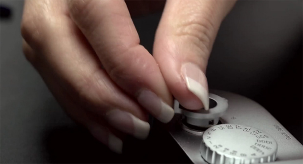
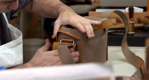
300 Edition Hermès digital rangefinders will ship this summer for $25,000, as well as 100 Série Limitée Jean-Louis Dumas models which will go for $50,000 each. This not an ad, this is an act of visual fetishism.

http://www.youtube.com/watch?feature=player_embedded&v=LAfSfnykXfo
Realistic art of Serge Marshennikov reveals Russian beauty in all its virginity with dignity. Each painting is captivating by the play of light and other things that excite and inspire. Personally, I found his works standing out of modern figurative art, maybe because the techniques deep into the Russian classic art of 19 century.There is something between the picture and the eye that makes me to stay mesmerized and watching..

Illustrator Chris Koehler recently updated personal portfolio. "His work has a very graphic quality although Koehler works with traditional media which is a bit of an ironic breath of fresh air in the now heavily digital world of illustration," says Changethethought
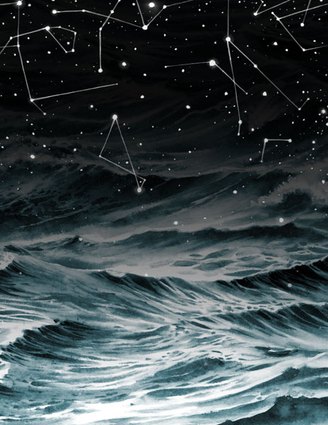




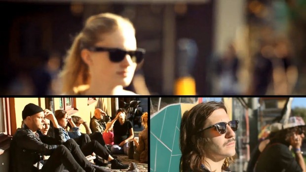
Bright Light is an app concept for Ray-Ban (apparently a briefcase) that will help you finding the sunny spots in your city, the places where you can enjoy the sun without the visual noise of the buildings. This app can help people to get the most out of the sun and their sunglasses. Wish it exists in Saint-Petersburg!App concept is created by Eva Wallmark, Rick Beskow and Michal Sitkiewicz from Swedish Berghs School of Communication http://cargocollective.com/evarickardmichal

http://vimeo.com/41000314