Food lettering by Marmalade Bleue
Graphic designer Danielle Evans is based in Columbus, Ohio. She is a wonderful letterer and food typographer, exhibiting through brush pen, paper cutting and most notably, dimensional type.
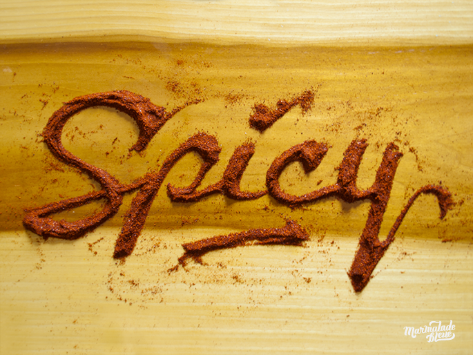
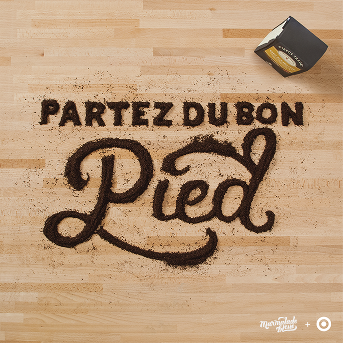
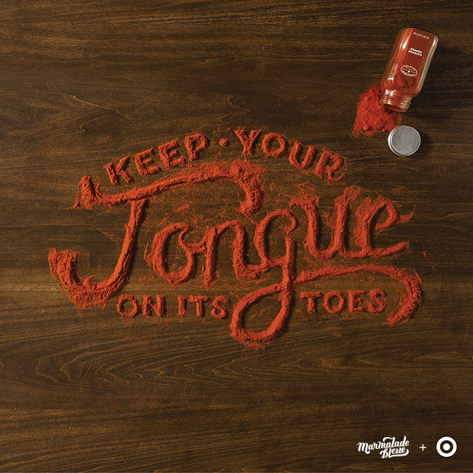
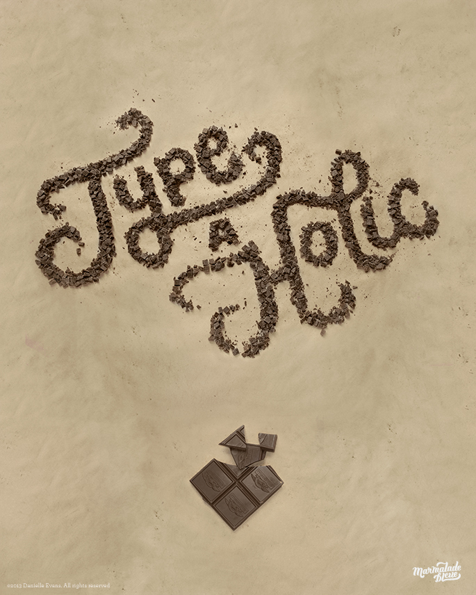

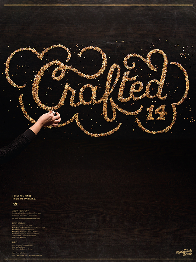
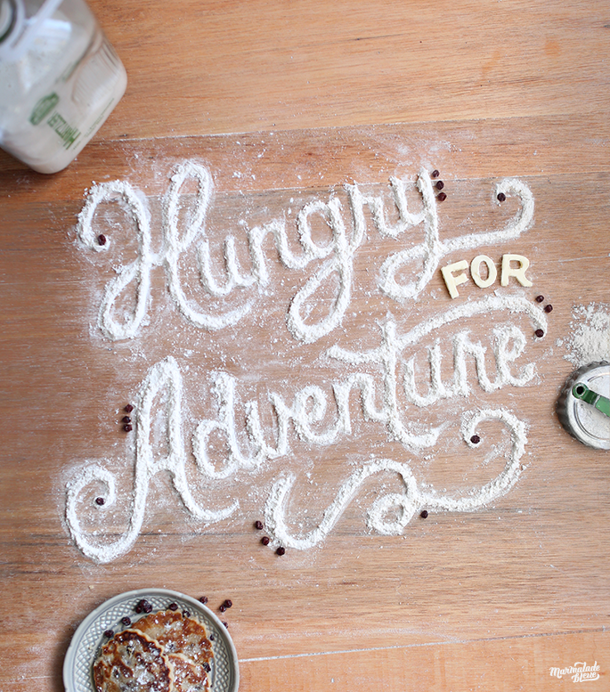
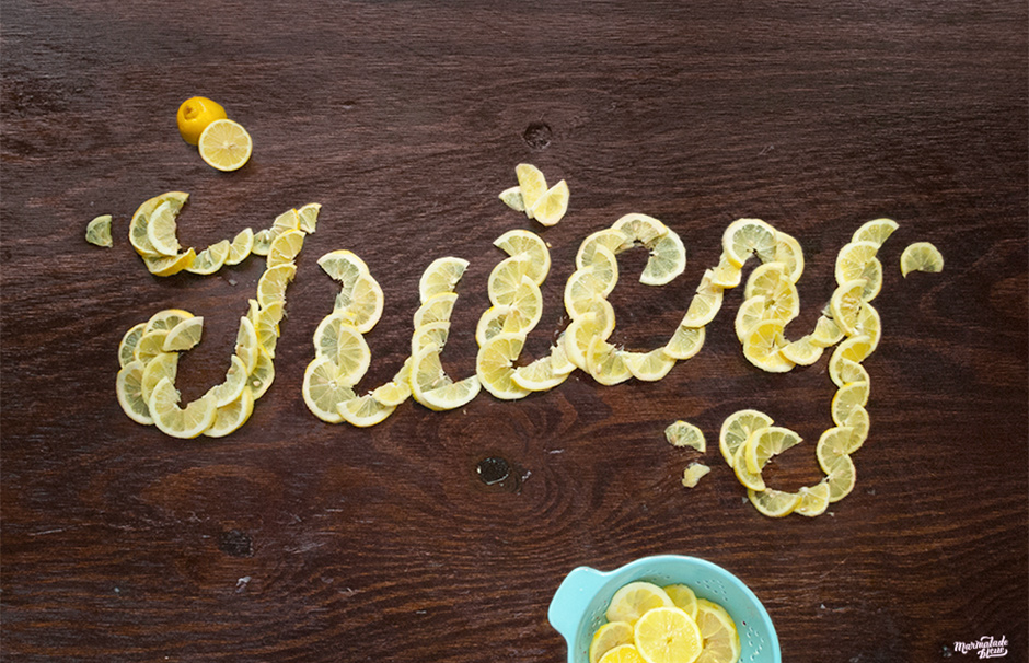
Graphic designer Danielle Evans is based in Columbus, Ohio. She is a wonderful letterer and food typographer, exhibiting through brush pen, paper cutting and most notably, dimensional type.


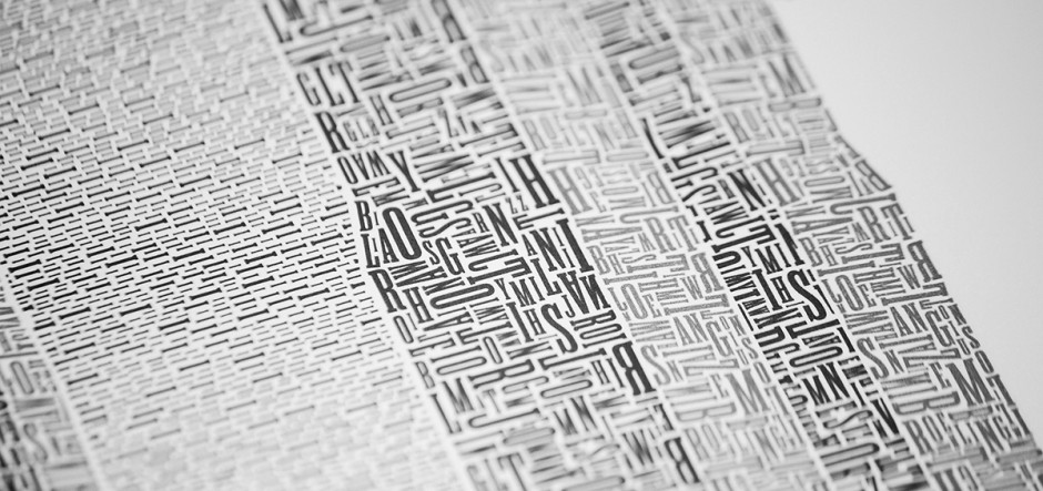
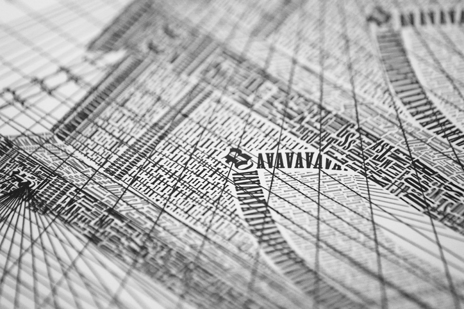
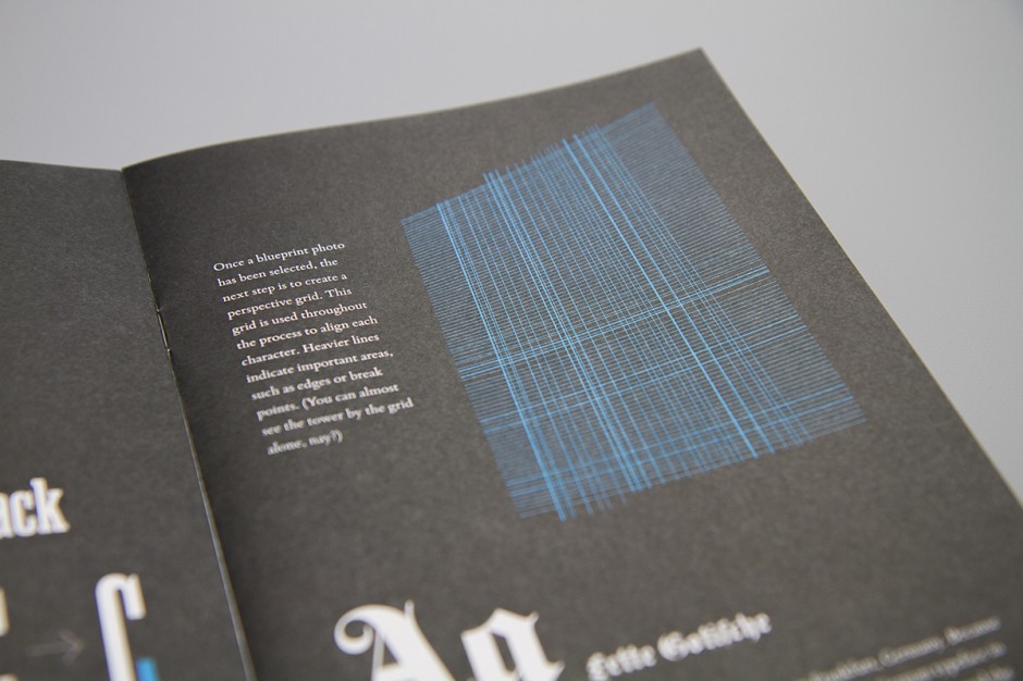
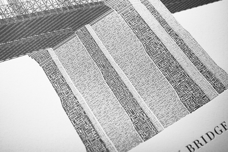
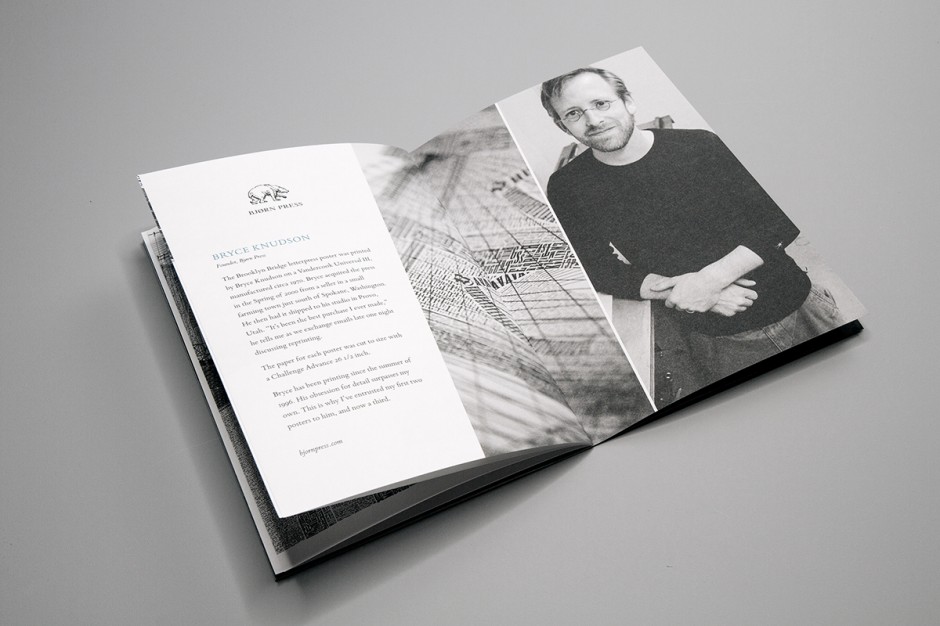
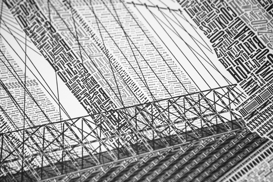
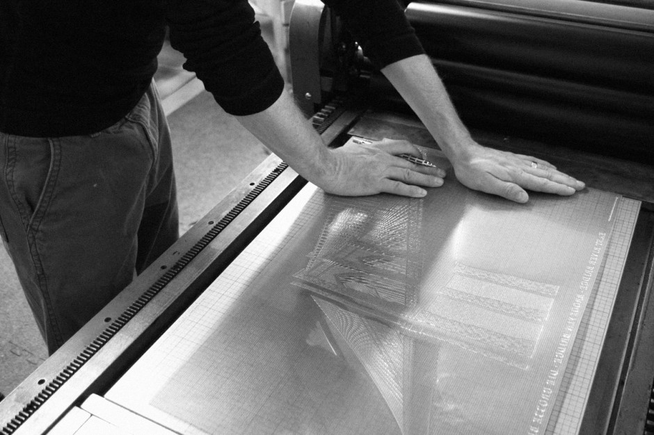
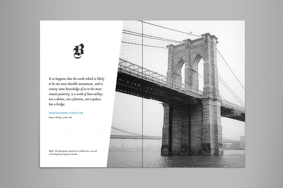
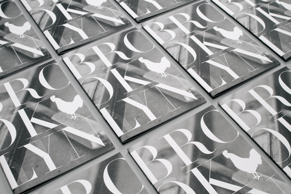
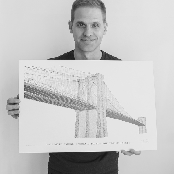
Once, I was happy to listen Cameron Moll live during @Media06 conference in London - talented typographer and one of the font web standards pioneer. Later last year he successfully funded a kickstarter project following his hobby of recreating famous architectural locations in type. Thus was about The Brooklyn Bridge, re-imagined as if constructed entirely with type. Upon the beautiful project itself Cameron shares the details on how Kickstarter project went for him.
http://vimeo.com/76697805
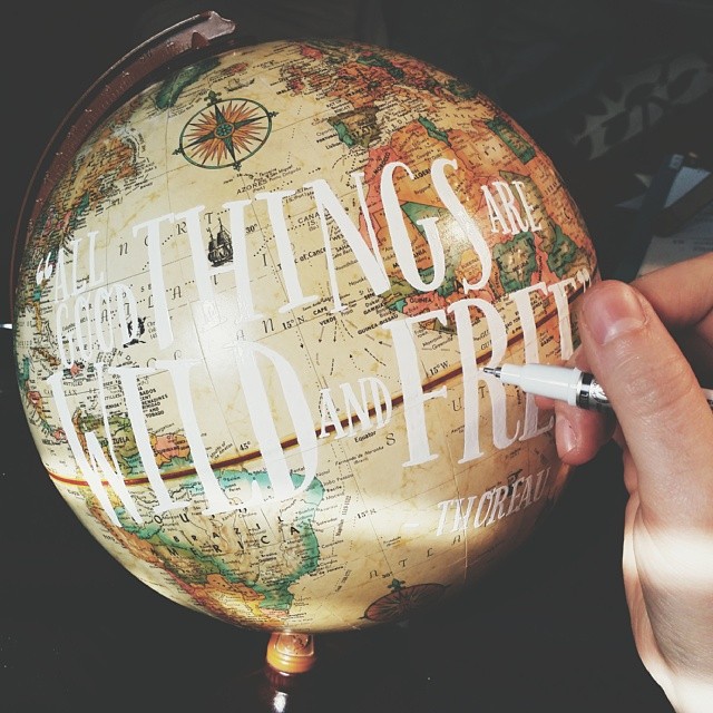
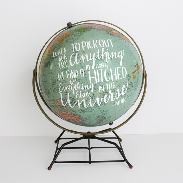
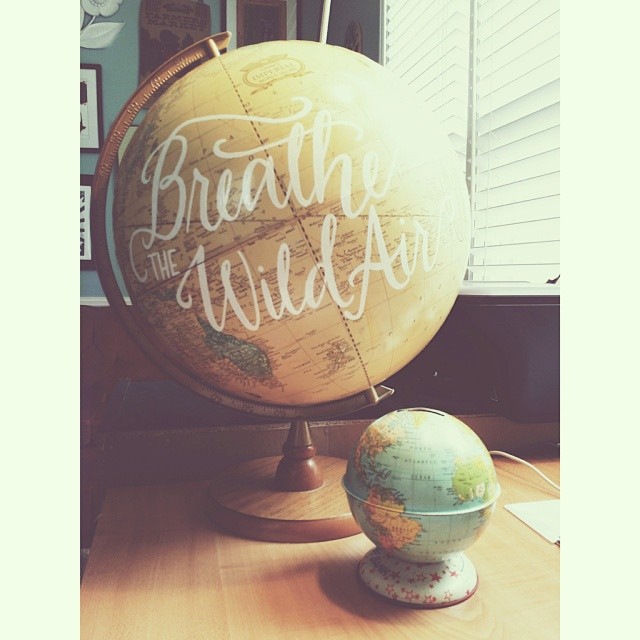
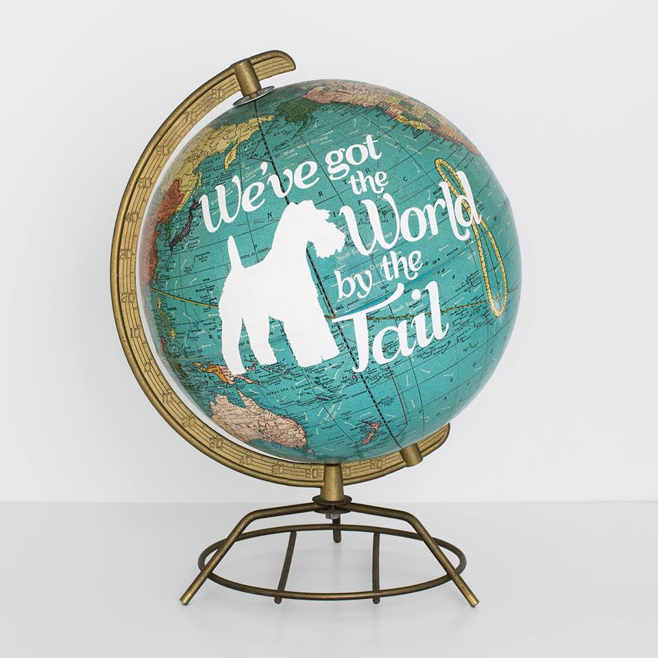
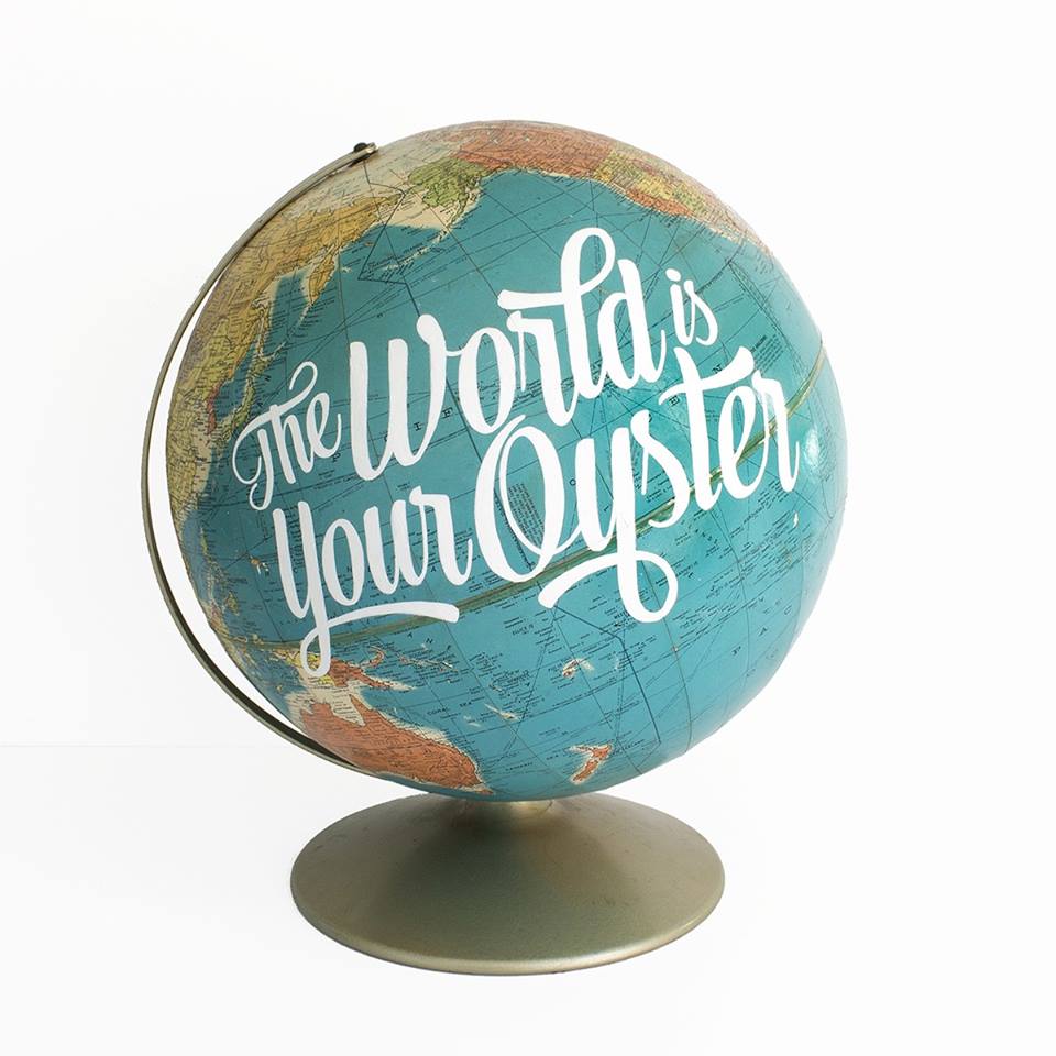
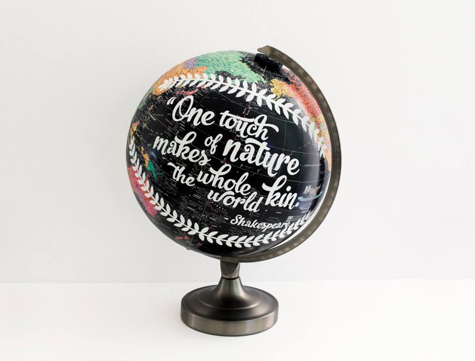
Wild & Free Designs came about from Laura Maxcy's background in graphic design, a love of reclaimed vintage, and inspiration from the Transcendentalist writers' works on nature. Her passion is covering vintage globes with hand-written quotes and clever clogs.
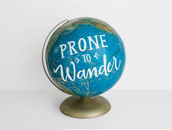
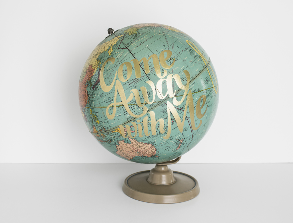
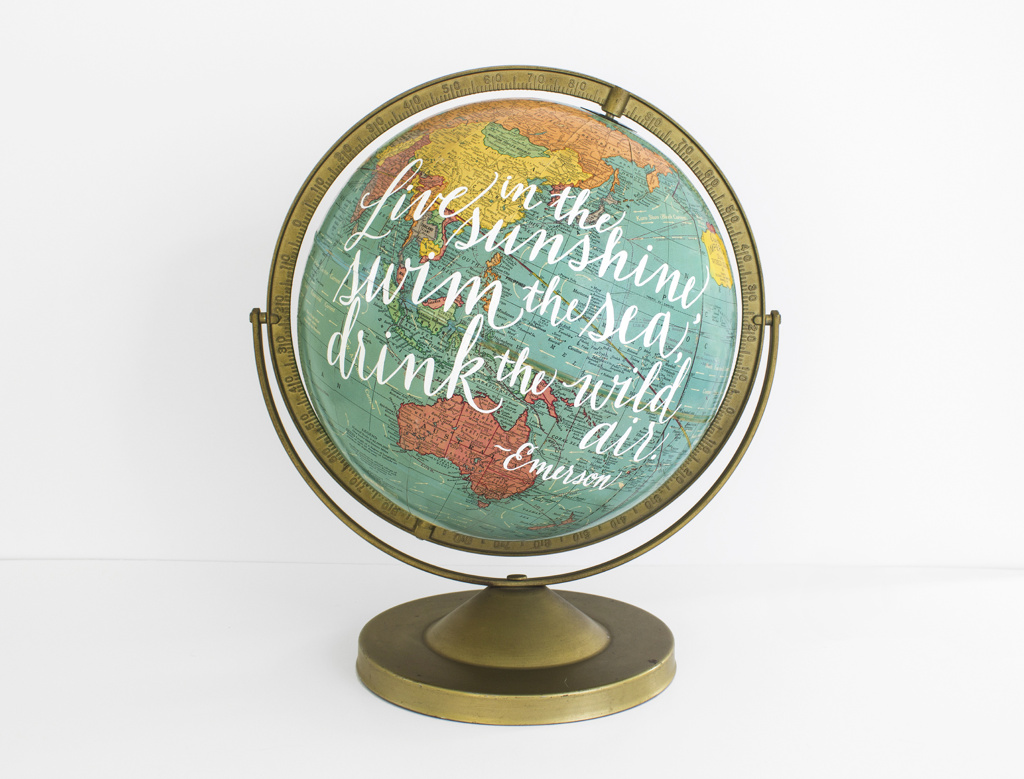
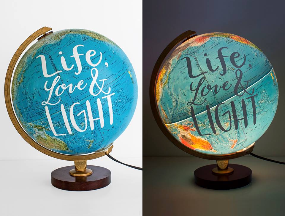
“MAKING IT” is a Art Documentary about the daily struggles of making a living, staying creative, and making it all up as we go along. The Documentary features three Illustrators, Andrew Bawidamann, Eric Fortune, and Brian Ewing.
View more interviews and making of on makingitpictures.com
Multitalented designer based in St Petersburg - Masha Portnova creates outstanding identities in the best traditions of European graphic schools. Each of her work has a unique visual language based on decomposed grids and flexible typography boundaries. You may check her work on Behance as well as on her website


Having featured Niels Shoe Meulman’s calligraphy in 2012 and 2013, it seems like a good time to check up on the artist. This year he is using pearlized acrylic paint which changes colors when viewing at different angles. It is also fascinating to see images of his painting process showing the various brushstroke layers that form his eye-catching work.


There is a tendency in today's world, associated with plastic surgery craze. Many people have a severe psychological dependence chasing the elusive perception of beauty. A person falls under the plastic surgeon's scalpel again and again. It seems that we have forgotten the simple truth that each of us is perfect and unique from birth.
CLASSICS VS PLASTICS is non-profit social project reminding the public about the problem of depence from the plastic surgery. Because the natural beauty is more important than imaginary aestetic standarts. How we are bringing this idea? Quoting the truly great men — the classics of their time.
Project team:
Pokras Lampas Calligraphy artist
Alexey Kuzin make-up artist
Alex Tsvetkov photographer
Artem Sanin model
Chris Strange model
Igor Duibanov brand-designer
Ilya Tekhlikidi creative producer
Zaal Danelia director & cameraman

classic-plastic-3

classic-plastic-2

classic-plastic-1
A short film on Mike Langley, Brooklyn based sign painter, for Vassilaros & Sons Coffee Co directed by Dress Code
Talented graphic designer and illustrator Jen Mussari has all that custom lettering and typography experiments we like. Check her portfolio here


Russian designer Ruslan Khasanov shows of new typography experiments. They include typography artworks based on chemical reactions, film disposals and even edible stuff as a part of his I Ate Alphabet Tumblr page. Check the full Typography Set on Behance and enjoy the selected works below


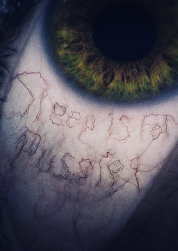


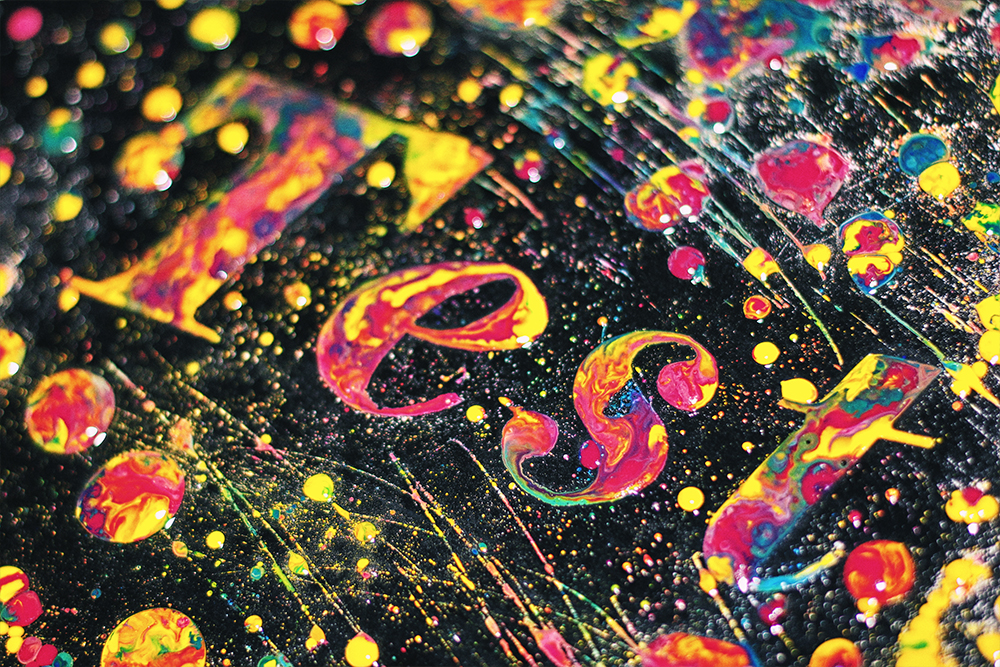
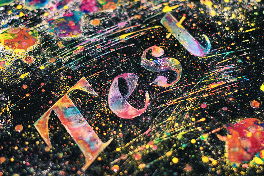
While watching Evgeny's latest calligraphy video my brain was pulsating with "It is impossible" warning messages. Lettering is still the most impressive handcrafted state of art we are able to enjoy in 21 century. Ink pens and precious hand's movements will leave your mouth agape till the last dot in Evgeny Tkhorzhevsky portfolio.
http://www.behance.net/gallery/Calligraphy-Lettering-Logos-Behind-the-scenes/11535983
http://www.youtube.com/watch?v=Rp3Nz8C3kjE


Foster Type is the typographic work of Dave Foster, an independent designer based in Sydney, Australia where he draws typefaces and lettering for design studios, type foundries, brands and individuals around the world.


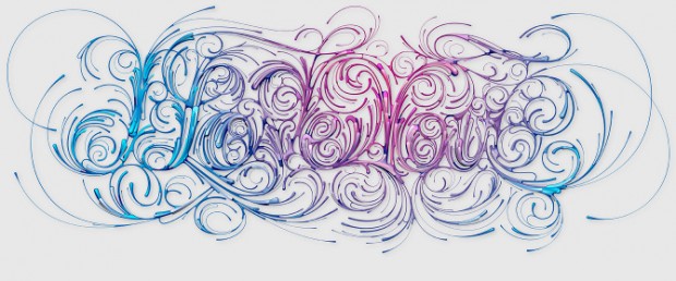
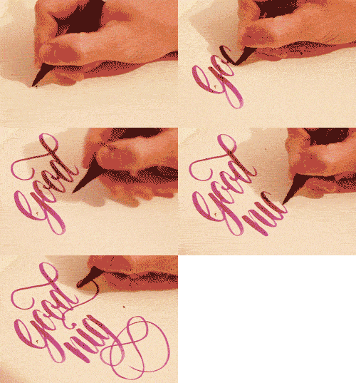
London-based graphic design student Sam has already gained a lot of attention for his calligraphy works on Tumblr. The best thing is that most of his works has GIF animated drawings that captivates with the precocious movements of his hand.


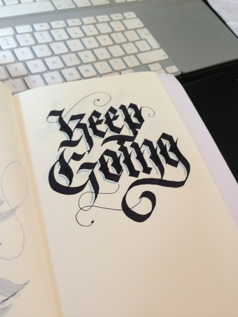


London-based graphic design student Sam has already gained a lot of attention for his calligraphy works on Tumblr. The best thing is that most of his works has GIF animated drawings that captivates with the precocious movements of his hand.
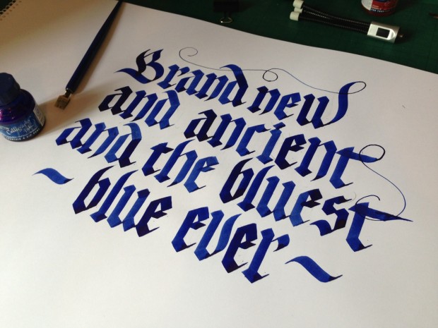
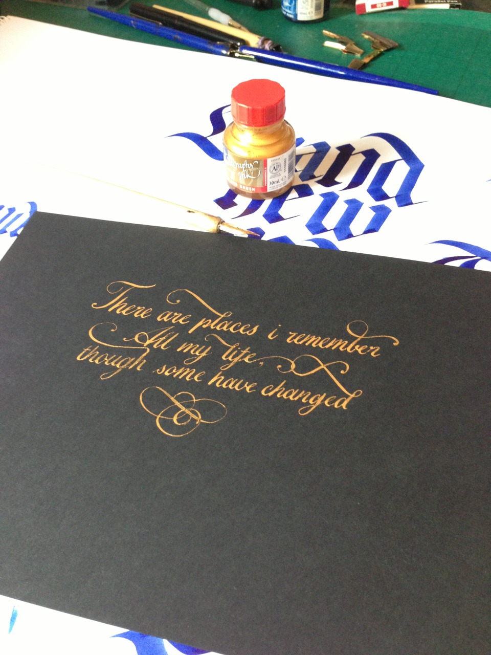
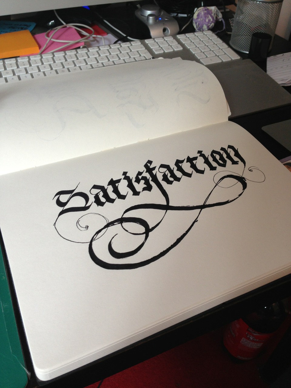


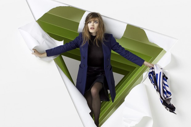
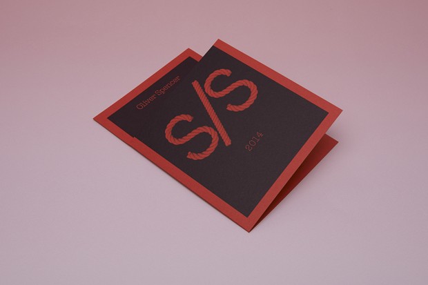
Joseph Burrin is a graphic designer and art director based in Amsterdam. He specializes in brand identity, print advertising and editorial design across art, culture and commerce.
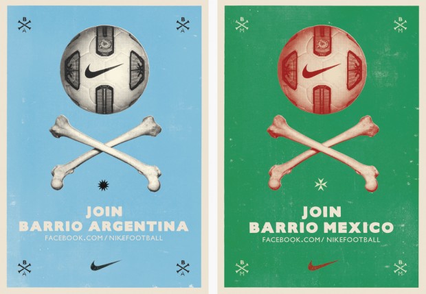
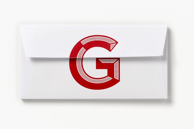
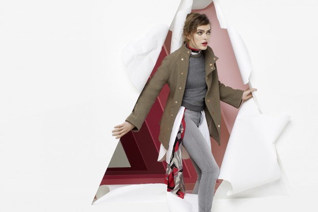

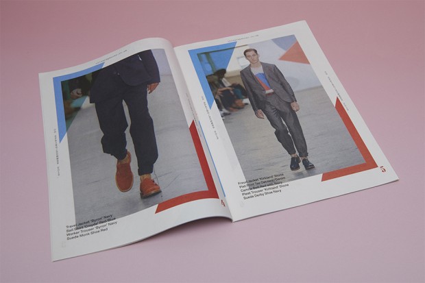


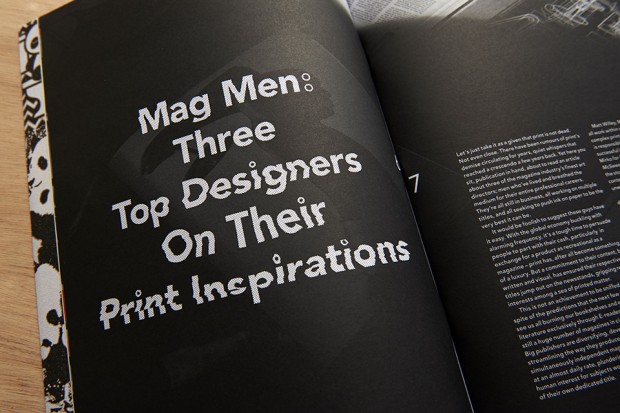
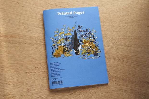
Joseph Burrin is a graphic designer and art director based in Amsterdam. He specializes in brand identity, print advertising and editorial design across art, culture and commerce.



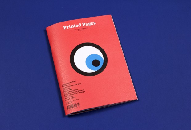


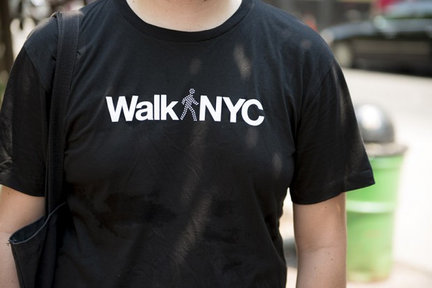
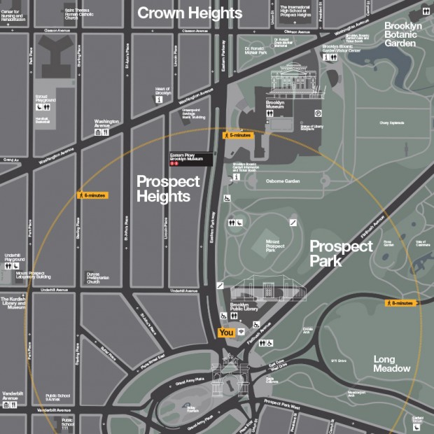
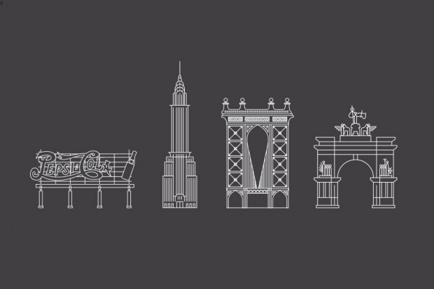
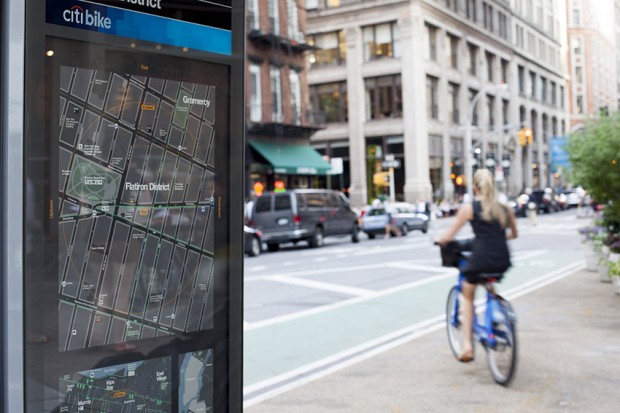
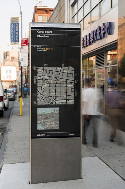
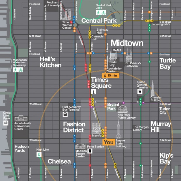
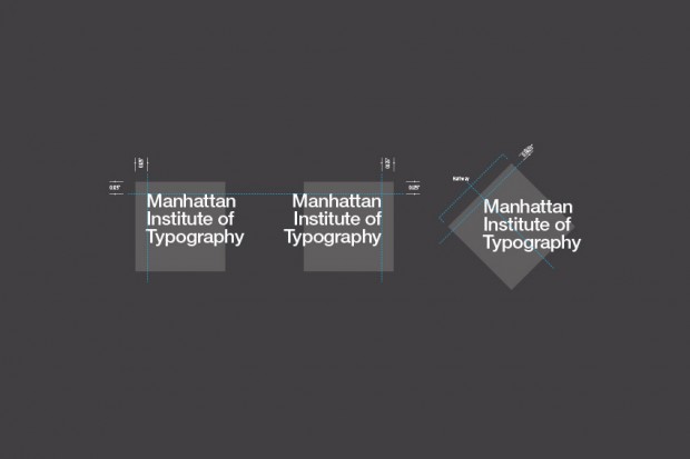
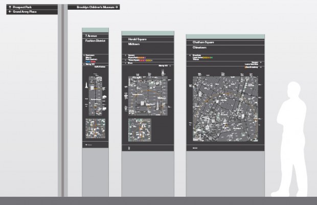
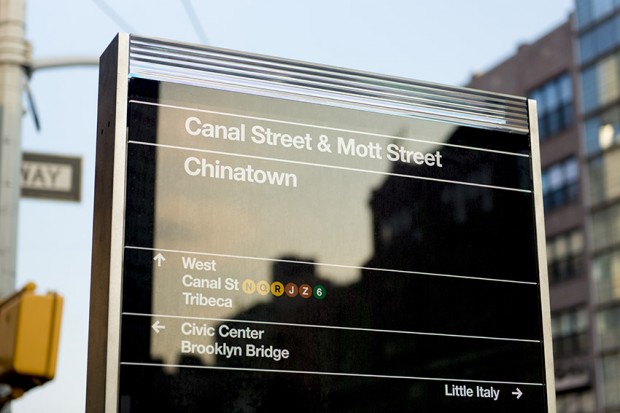
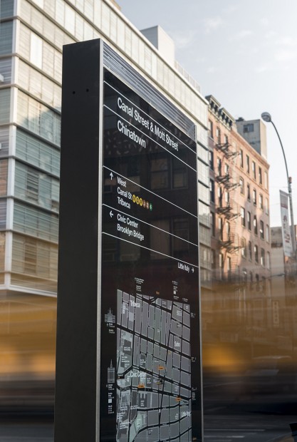
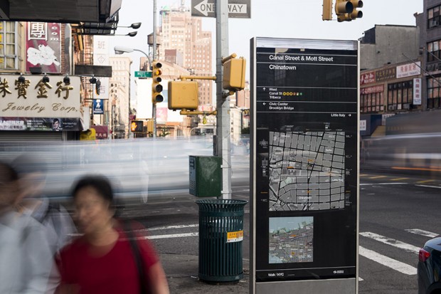
WalkNYC is a project led by the NYC Department of Transportation to build a network of wayfinding products to help New Yorkers and visitors orient themselves and find their way through the streets of New York.
http://new.pentagram.com/2013/06/new-work-nyc-wayfinding/
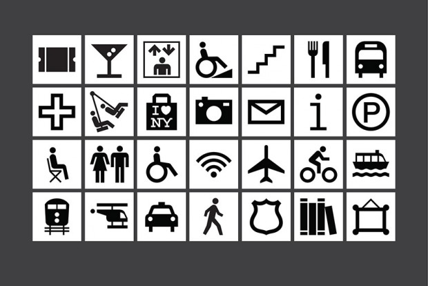
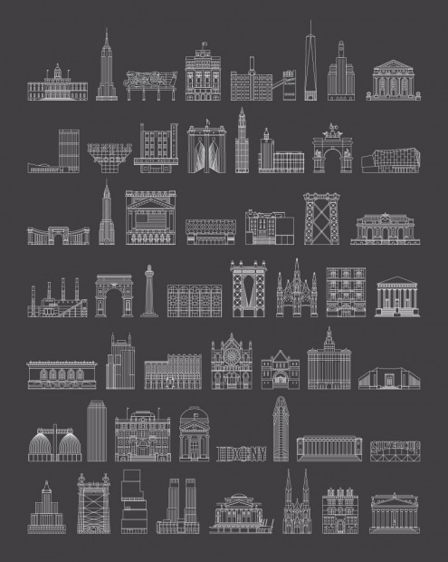
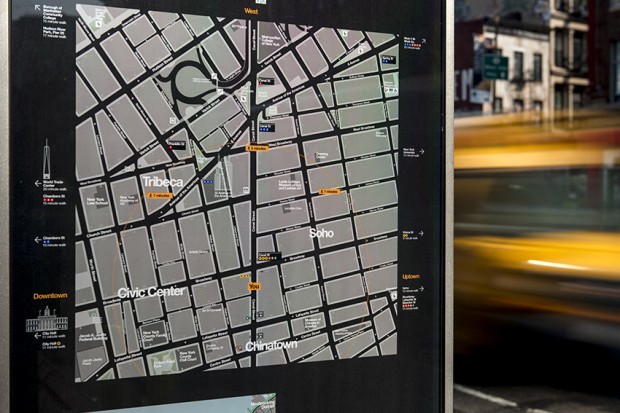
The maps are designed to encourage people to walk, bike and use public transit, and feature all local streets and major landmarks and destinations, as well as bike lanes. The kiosks will be located near subway stations, business districts and other high-traffic pedestrian areas
Designed at Pentagram. Michael Bierut, partner-in-charge and designer; Tracey Cameron and Hamish Smyth, designers; Jesse Reed, icon designer; Tamara McKenna, project manager.
