SAMSARA trailer

After spotting the name of director Ron Fricke (Koyaanisqatsi, Baraka) in the description of "SAMSARA" trailer , my hairs stood on end. The most awesome director in the world is back after filming for 5 years in 100 locations of 25 countries around the world. My eye's pupils got visual orgasm registering the beauty in each frame of this short trailer and I can't wait for the release and prepare yourself for an unparalleled sensory experience..

Samsara is a Sanskrit word that means “the ever turning wheel of life” and is the point of departure for the filmmakers as they search for the elusive current of interconnection that runs through our lives. Filmed over a period of almost five years and in twenty-five countries, Samsara transports us to sacred grounds, disaster zones, industrial sites, and natural wonders. By dispensing with dialogue and descriptive text, Samsara subverts our expectations of a traditional documentary, instead encouraging our own inner interpretations inspired by images and music that infuses the ancient with the modern.

http://vimeo.com/46273869

Colossal

Google Web Lab by Bibliotheque

Google Web Lab is a series of interactive digital experiments, brought to life at the London Science Museum. It enables worldwide participation both online and from within the exhibition space, to control machines which explore and demonstrate a range of web technologies. http://vimeo.com/46314040

via http://vimeo.com/45703836

Bibliotheque created the environmental graphics and signage, working as part of the team alongside UniversalDesignStudio and MAP (the research and development design consultancy, founded by Edward Barber and Jay Osgerby). The Web Lab website and identity were created by B-Reel, and the machines were built by Tellart.

Traffolyte panels introduce each of the 5 areas, and explain the science behind each experiment: Orchestra, Teleporter, Sketchbot, Data Tracer and the Lab Tag Explorer. Floor graphics aid navigation and visitor flow, helping create the feel of an experimental 'test area'. The exhibition is open at the Science Museum, London until June 2013.

A Thousand Reasons

"A thousand reasons is a short animated spot directed and animated by Daniel Britt. Created for the WMD Awareness Programme, Daniel Britt and the foundation wanted to raise awareness around nuclear weapons and the thousand reasons why they shouldn’t be made." via Whitezine

http://vimeo.com/45150640

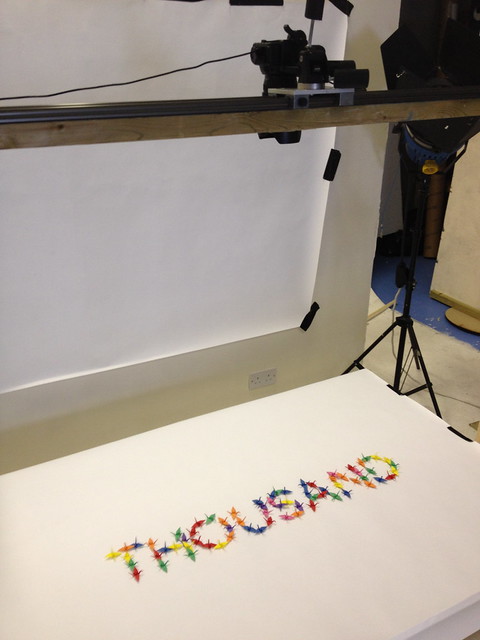
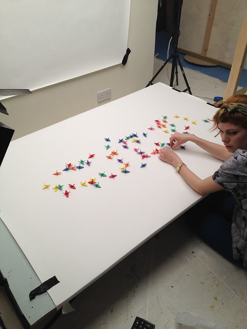
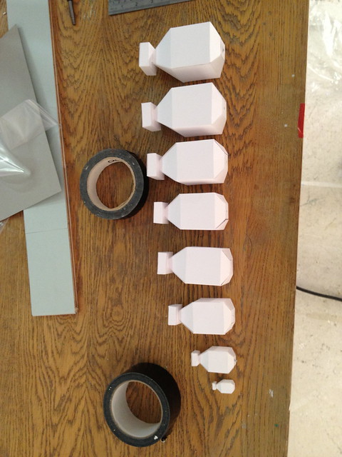
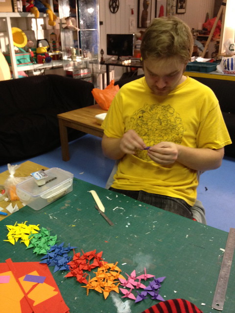
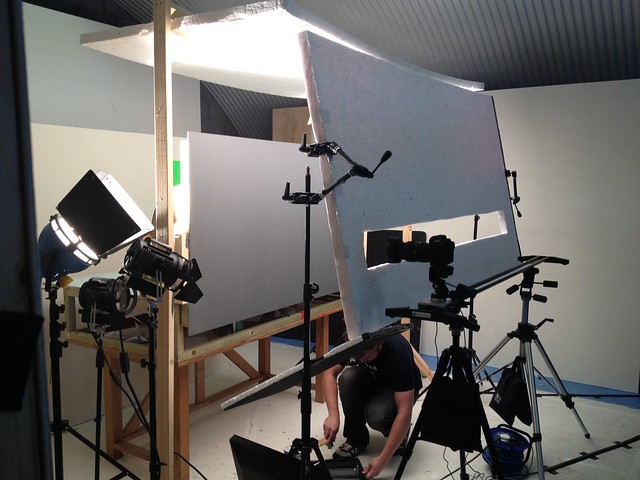
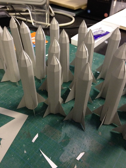
I also liked the way the video was crafted by hands from paper

IMG_0646

IMG_0645

IMG_0638

IMG_0600

IMG_0584

IMG_0558

A Touching Application by Working Title

We had a chance to speak with Russian designers from "Bureau Working Title" that did a commercial short "A Touching Application" using no 3D software, only projection mapping, modeling and classic animation. The ad shows advantages of Russian navigation application published by Yandex Ltd.

DC: What is the main plot of this advertisiment? The touching story tells us about two sentimental creatures from some outer world; nevertheless, they seem to be a lot like humans. As the two plan their date in a telephone conversation, they decide to meet up in a planetarium. From now on, they get any information from a mobile map application, which tells them the best routes, timing and any other – that's important – interactive tips. They face random barriers on their way: she gets stuck in a traffic jam, he forgets to buy her flowers and so on. The application helps them to finally meet each other on a crossroad and make their way to the planetarium "using" the "street view" option. We see them as they watch the stars leaning towards each other. The story ends up with a slogan: "A touching application".

What was the largest challenge in producing and directing the project? The hardest was to deal with time which passed so slowly. Classic animation process requires a lot of patience, and the more patient you are, the more satisfaction you get when the work is done. But russian advertising is always about tough deadlines, so you have to make it really quick. Thanks to the professionals who helped us getting the shootings done in its best ways and shared their skills with us. Furthermore, it was a great challenge to combine various techniques: stop-motion animation with dummies, iPad-freezelight, 3D projection mapping and a little bit of computer graphics.

How long did it take you to complete the whole project? Making of all the stage requisites, creating the script, directing everything to its sterile fancy looks, shooting till the final cut – the whole process took us about 1,5 months to get done.

http://www.youtube.com/watch?v=CcISIVoSZGQ

Credits:

Concept, script, production: Бюро "Рабочее название" (Bureau Working title) www.workingtitle.ru Director, camera: Ivan Proskuryakov Light: Pavel Ukhanov Animation: Alla Solov'eva Projection mapping: Sergey Titov and Sasha Gavrilova (Stain) Dummies: Igor Khilov Stage requisites: Alexey Petrov, Anastasia Zolotilina, Lena Shagieva Freezelight, compositing, CGI: Marina Cherry, Ira Lubomirova Music: DZA (http://soundcloud.com/dza)
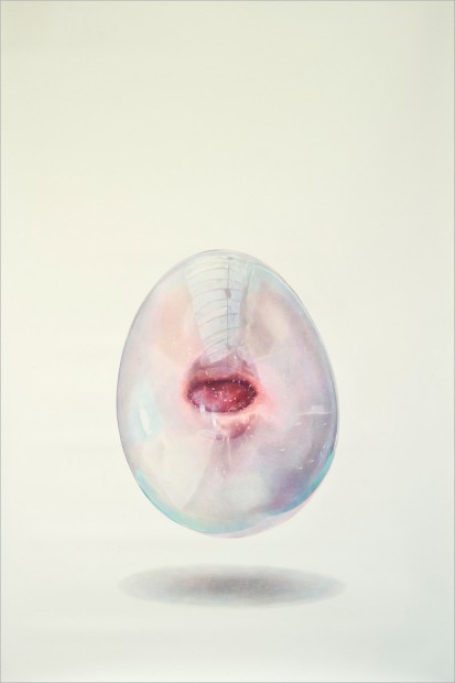
Alternative Landscapes by Benoit Paillé

Captivating outdoor installation made by Benoit Paille for the photography series "Alternative Landscapes"

"This is a photography of light installation (real light, real square 1x1 meter) i set in nature or where during the night you have usually no lightning, I try to redefine the space/landscape for my own purpose: create a poetic space/time moment. And questioning the reality of what is a landscape"
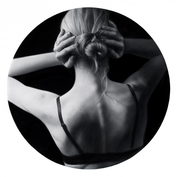
View full series on http://www.flickr.com/photos/benoitpaille/sets/72157628994434029/

via Colossal

Gregory Euclide whiteboard drawings

All over the world office procrastinators must be jealous after exploring the unique art made by Gregory Euclide on whiteboards with a single black marker and some water. Definitely there is no limit for an artist in materials if he really wants to express himself.

http://vimeo.com/42278456

Hard Graft

This is a rare type of post when we feature craftsmen but Hard Graft wins a full attention. The masters of premium italian leather and wool felt knows how to keep all you gadgets and other urban nomad things all together with a modern twist.

Hard Graft is a perfectionist duo - monie.ka and James based in London, UK. They do design and produce sleek objects of desire in Italian workshop called "The Brothers". Stitch to stitch, button to button their products are a real aesthetic heritage available for purchase and delivery right now (pity they don't deliver with DHL or UPS to Russia, and that is a real torment for us).

Olly Low Poly And The Zombie Tower

Russian motion designer Vladimir Tomin is about to release his first ever video game "Olly Low Poly And The Zombie Tower". It will be available for Mac OS and PC in first release and for iOS in second. After watching the presentation video I have the only words "Olly Low Poly - Holly Macaroni!" it is damn good!

http://vimeo.com/45183619

A-Moloko by Ermolaev Bureau

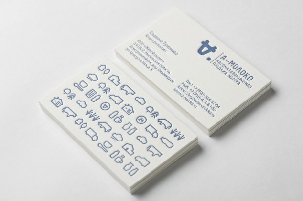
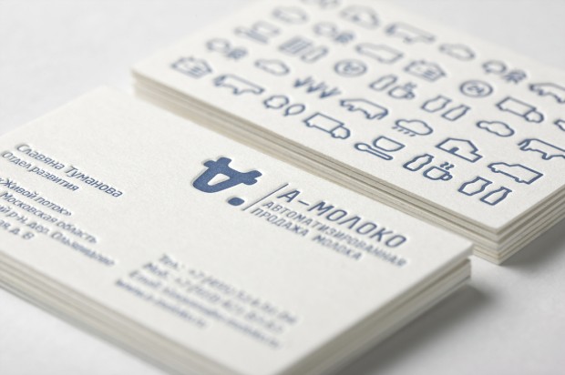
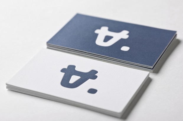
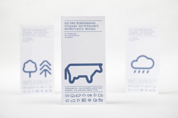
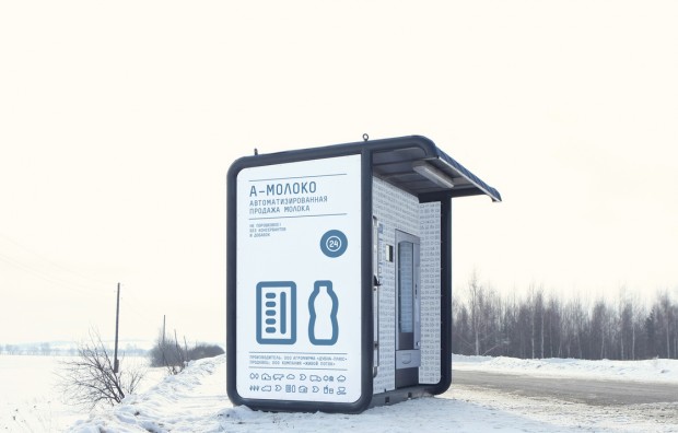
Clever identity gets clever prizes. Ermolaev Bureau was among 4 Russian names rewarded by European Design Awards 2012. Designers Vlad Ermolaev and Olga Balina (designer behind our DCMAG logo and cover design) won Gold in Identity for "A-Moloko" project.
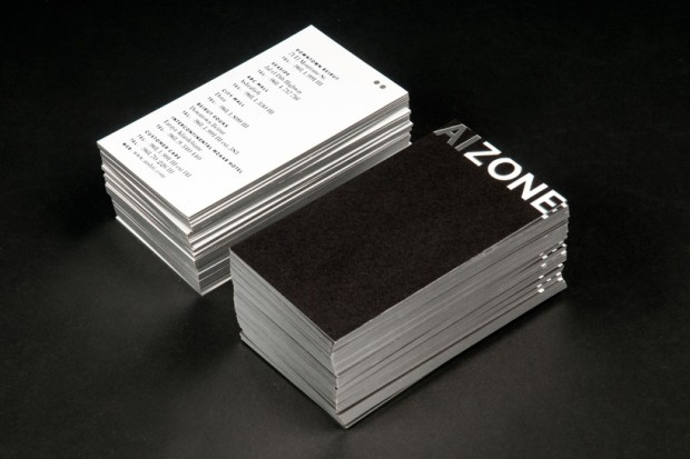
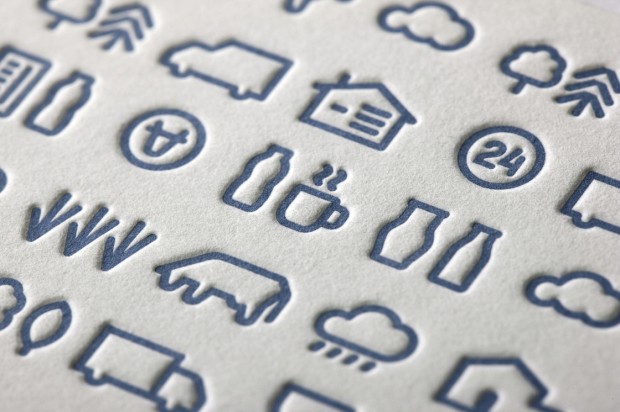
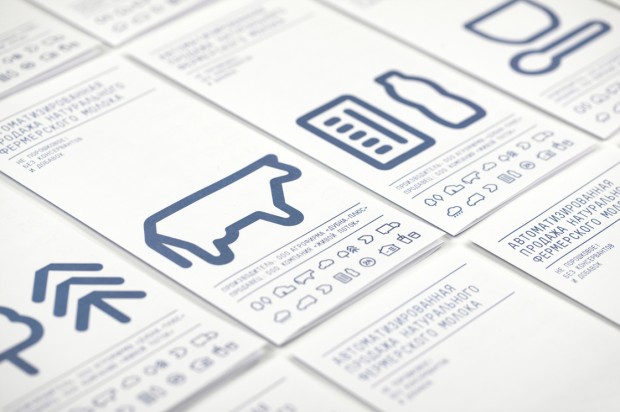
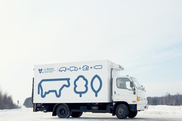
This visual identity developed for a company selling milk through a chain of milk vending machines. The logo concept was suggested by the name of the chain: Automated sale of farm fresh milk. The first letter 'A' which when turned upside down resembles a cow's muzzle was taken as the basis. Visual identity is built on a system of symbols that show the path of the milk from the cow to the consumer.

Sucker by FIRMA

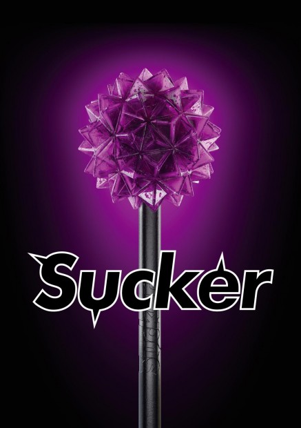
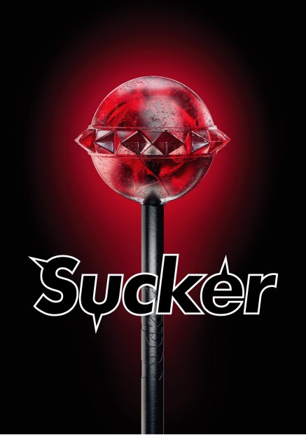
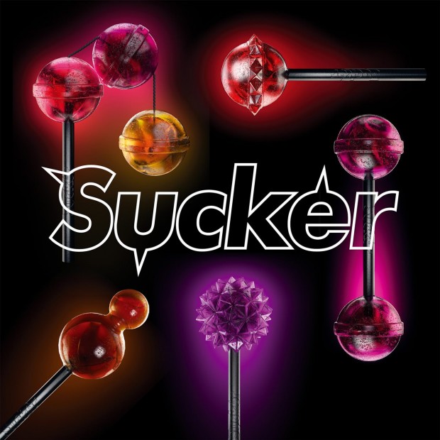
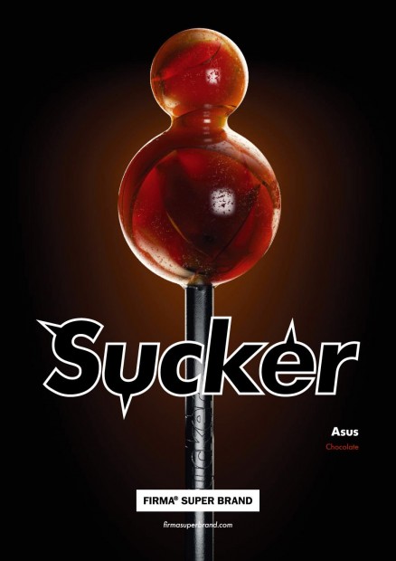
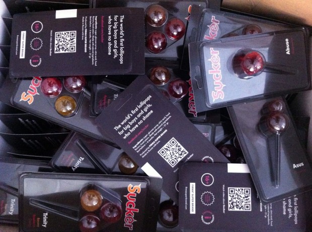
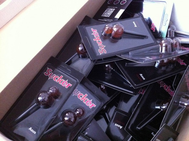
Still controversial culture of the lollipop was fuelled by FIRMASTYLE's Sucker concept in 2008 and now smashed by its production. A series of 5 Suckers is available for every taste and color: Mr. Pain with a taste of blueberry, Abuse with a taste of watermelon, Trinity with a taste of strawberry, cherry and banana, Cherry Twins & Chocolate Asus. A good sense of humour like this can literally save internet from porn invasion.

http://vimeo.com/43987241

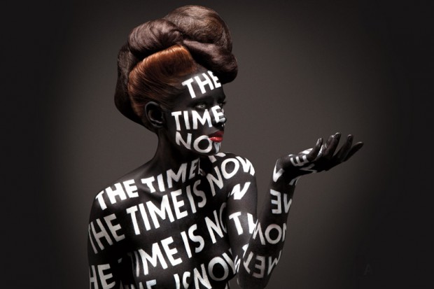
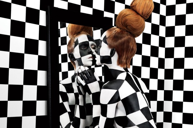
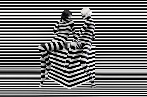
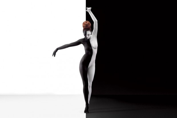
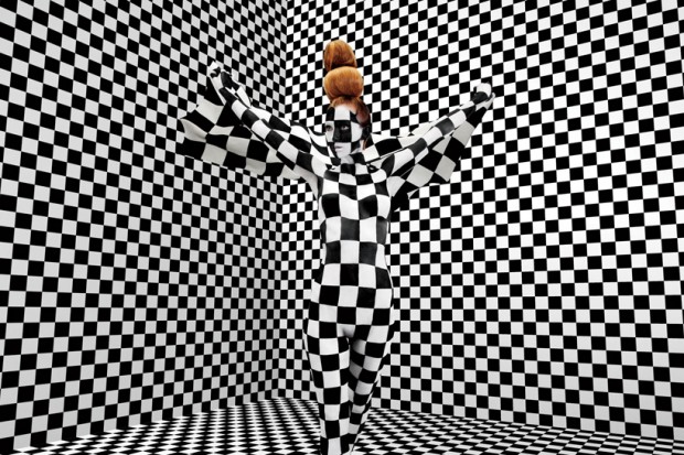
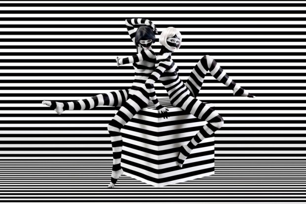
Jessica Walsh graphic design

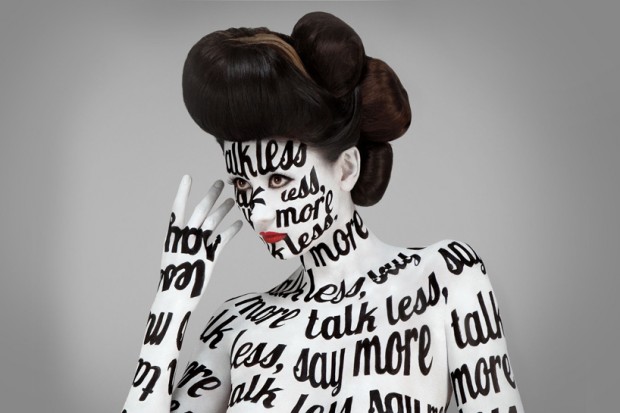
Jessica Walsh (@jessicawalsh & now @sagmeisterwalsh) is a multidisciplinary designer living and working in NYC. Her work has been featured in numerous magazines and books, and won design awards from the Type Directors Club, Art Directors Club, SPD, Print, Graphis, among others. Recently he joined almighty Stefan Sagmeister as an art director and started working together on "Happy film" expected in 2013. Now they named Sagmeister&Walsh and you might seen that nude photo of them both circulating on design web. Designboom has a nice interview with them, read it out

Here are the works Sagmeister & Walsh did together, for a full Jessica's profile visit http://jessicawalsh.com/ (on Behance)

http://www.youtube.com/watch?v=jUhm_beGBoA

Instaglasses

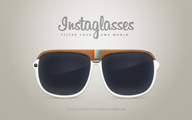
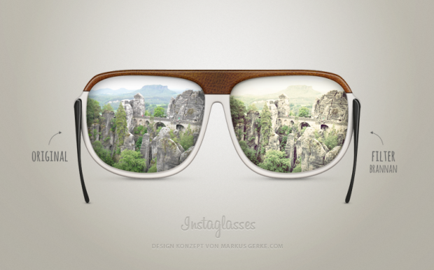
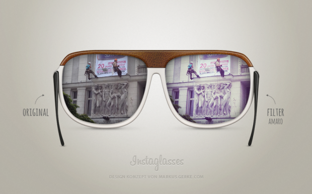
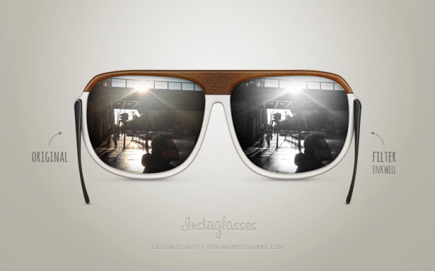
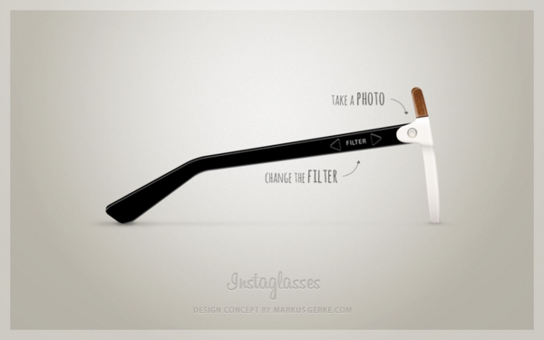
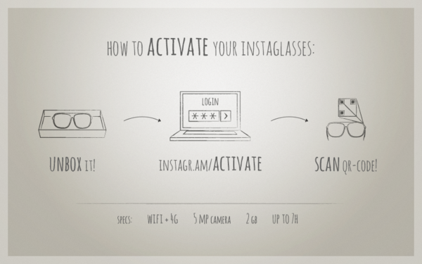
After Instagram Camera concept that we actually did not like for it's form lose function here goes a smart concept of Instagram Glasses from Markus Gerke.Instaglasses is a smart way to live "la vie en rose" or just "en Instagram". You activate the glasses by pushing “Insta” and option to choose between different filters. Then take a picture with your glasses and upload the image straight to Instagram. Voila!

Also worth to mention a concept made by Mauricio Thomsen for Ray-Ban Instagram (Ray-Ban has so many concepts floating around and still doing glasswork as it is still the 90ss of 20 century, shame on them).

Design Made In Germany

Elroy Photography

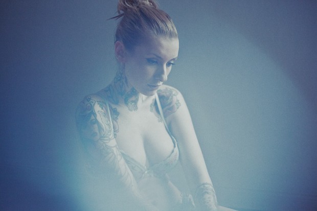
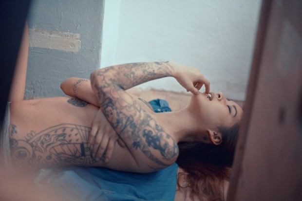
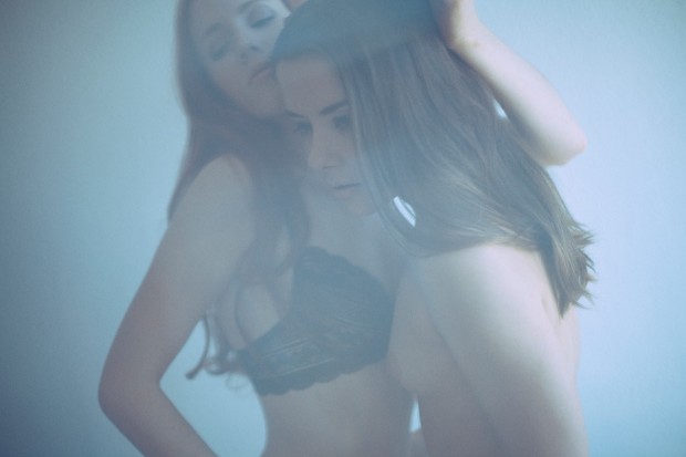
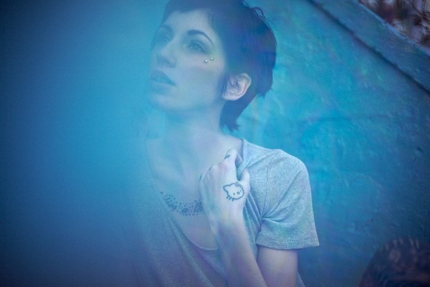
Berlin based French visual artist and photographer Damien Vignaux aka Elroy shares his portfolio as 2 in 1. Today we will focus on his not that safe for work (NSFW) Photography portfolio top up by tattooed model shots and some fashion collaborations. Apart from portfolio he has a photo Tumblr with full sets of uncensored but still awesome shots.

http://vimeo.com/39964396