Tattoo and dot painting art by Evan Lorenzen
Denver based artist Evan Lorenzen creates outstanding dot painting miniatures and tattoos
Whatever it is, the way you tell your story online can make all the difference.

Whatever it is, the way you tell your story online can make all the difference.
German artist Pierre Schmidt, born in 1987 and also known as “drømsjel”, creates mind-bending imagery that combines digital illustration and collage techniques. He takes old-fashioned 20th-century style (sometimes pornographic) photographs and puts his own twist on them by manipulating each photo with his own vision of surrealism. Using photo manipulation, illustration, and collage, Pierre has found the perfect balance within each medium he utilizes, creating a diverse set terrifyingly beautiful pieces of art. His art can be found in Cosmopolitan, Vogue Italia, Hi-Fructose Magazine and Vice.
Nastplas are an international creative duo based in Madrid, Spain and formed in 2006 by illustrator Fran R. Learte 'drFranken' and creative director Natalia Molinos 'Na' (together 'Nastplas Team'). Their work combines an impressive range of digital elements and abstract patterns with which they develop elaborate pieces of art with a deeply aesthetic. As many of other artists they are successfully entering NFT marketplace right now

HAVOC, 2021

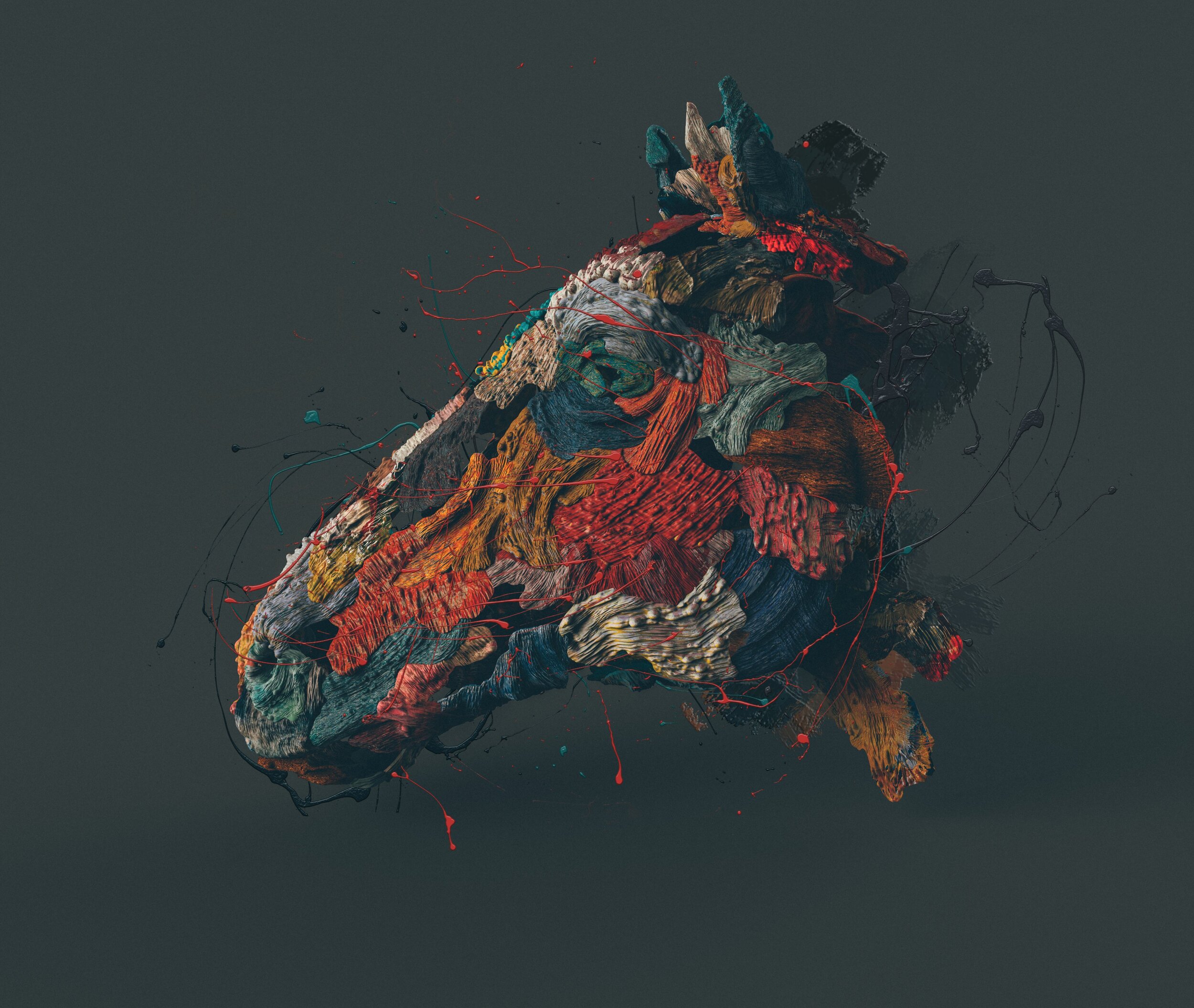
QUO Horse

DEIMOS


Cameron Burns known as CaptvArt specialises in music album cover art and animation. He's worked with Run The Jewels, Daddy Yankee, summer walker, ACER computers, The Lumineers, Neon trees, The Word Alive, Juice Wrld, MGK and many more. Recently he is into NFT scene doing his drops on Foundation and Knownorigin

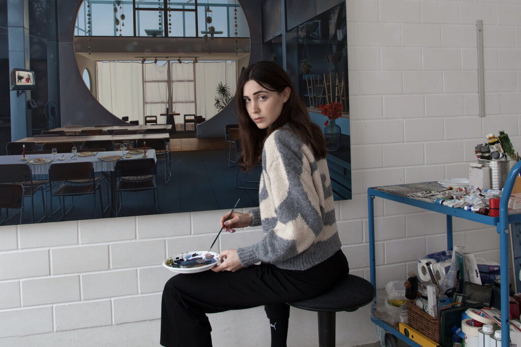
“I am a painter and I mostly work in series and in large scale and oil on canvas. Each series is based on a specific location, that I try to examine more closely in my paintings. I have just finished the work on my last series „Sculpting in Time“, which was on view at Fridman Gallery in NYC until early January. The paintings show rooms of the urban utopia Arcosanti, which was designed by Frank Ilyod Wright student Paolo Soleri in the desert of Arizona. Ideally, my work is shifting somewhere between fact and fiction. The rooms shown in „Sculpting in Time“ become chambers of wonders, in the sense of baroque imaginariums. I try to fill a ruin, so to speak, with life again. But you will never find people in my paintings.”

Jon Ching is a self-trained artist originally from Kaneohe, Hawaii and currently lives and works in Los Angeles, California. Steeped in natural beauty of O’ahu, Hawai’i, his island upbringing instilled in him indigenous lessons of appreciation and respect for nature, forming the foundation of his fascination with the natural and wild world, which deeply influences and drives his current work.
Jon’s devoted art practice and detailed realism is inspired by the interconnectedness of nature. His work is a surreal imagining of what limitless wonders and combinations nature can produce. New creatures and symbioses emerge in his meticulously rendered oil paintings, exemplifying the endless potential of life on Earth through metaphor and allegory.
Jon’s ultimate hope is to inspire love and admiration for the universally unique beauty and intrigue of our planet. He regularly works to bring awareness to endangered species, the current mass extinction crisis and climate change and continues to partner with environmental organizations in fundraising and educational efforts.

Meet the Ksoids, an impossibly addictive NFT collectible that not only creates a world all its own, but also helps protect our world.
Each one of these curious creatures was generated by a hand-crafted algorithm and then lovingly selected by creator Danil Krivoruchko to join an elite group of 1,000 Grade-A Ksoids, all available to the discerning investor.
The first few drops will be sold on the NFT marketplace OpenSea, and available in randomly selected packs of 1, 4, and 10. It’s also possible there will be a few easter eggs thrown into the mix, but that’s all we’re saying for now.
We reserved an original release format for a special #collectable. A group of 1,000 Grade-A Ksoids dropping by the pack! Randomly selected by an algorithm, each pack has 1, 4, and 10 Ksoids. Available on the #NFT marketplace @opensea, the first batch of 100 KSOIDS dropping today! pic.twitter.com/gd6OpSD6Pf
— One Thousand Ksoids (@ksoids_home) April 22, 2021
Clap your hands! Mind your head! Make some noise! Here they drop! KSOIDS! #NFT debut is tomorrow on @opensea! Made in 2013 by award-winning studio @myshli_com finally coming as NFTs! We will bring more news out about the KSOIDS cutielicious project! #NFTcommunity, stay with us! pic.twitter.com/y7L6ECj5rN
— One Thousand Ksoids (@ksoids_home) April 21, 2021
Thankfully adopting a Ksoid doesn’t have to mean decimating either their habitat or ours. In an attempt to counteract NFTs’ negative environmental impact, Ksoids will work to reduce their footprint through the purchase of carbon offsets.
Not only that, but 20% of all profits will be donated to the Orangutan Outreach, an organization dedicated to protecting orangutans in their native forests, while also caring for orphaned orangutans.
Brooklyn-based Myshli Studio was founded by Danil Krivoruchko, a motion designer, director, and visual effects artist. Krivoruchko's NFT works are already well-known to digital art collectors, having been featured on platforms such as KnownOrigin and Foundation; the Ksoids will mark his premiere on OpenSea. His digital art work is also well-known in the film community. Last October, a collaborative group of designers and artists under the direction of Krivoruchko used 3D-imaging to transform the sci-fi novel "Blindsight" by Peter Watts into a short film. The movie has won over a dozen awards, including the Best Animation Award at the Miami International Science Fiction Film Festival. In the past 17 years, Danil has collaborated with clients such as Apple, Nike, Boeing, Verizon, and Intel, to name a few.
These days you cannot be 100% sure what you see on the screen, things can be real, virtual or mixed as physical and digital what is called simply “Phygital”. Here is artist Ikeuchi Hiroto creating her cyborgs with elements of phygital armory
We are very proud to welcome new and prominent artist Schoony to the NFT scene on Superrare platform.
Schoony’s background is rooted in special effects and prosthetics for the film industry. His career spans over 30 years. Since the age of fifteen he has worked on over a hundred films. His work and reputation for high quality and pioneering techniques has reached far corners of the world thanks to the representation of Maddox Gallery. Schoony uses 3D technologies alongside the more traditional methods in his art pieces. He continually pushes boundaries within this discipline.
Designcollector: What inspired the work in your first NFT drop?
Schoony: For the first drop with SuperRare I thought I would go back to one of my early works. Where The War Things Are is a variation on my Boy Soldier that has been a motif that has stuck with my work over the years and been very symbolic. Where the War Things Are is a throwback to my time spent in Melbourne, Australia where I was working on the film Where the Wild Things Are. I thought I would celebrate my first drop on SuperRare by recreating the piece digitally.

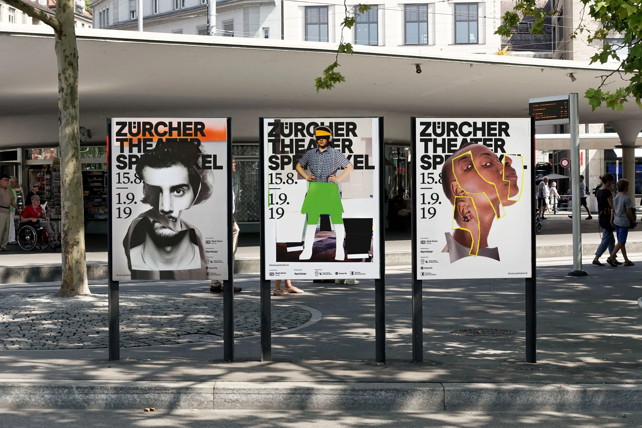
Zurich-base Marcus Kraft studio is celebrating its 10th anniversary of delivering top-notch graphic design projects with the bigger picture in mind, great attention to detail, and typographic quality. They strongly believe that design should be more than ‹just› beautiful and aesthetic. The following ten principles* build the foundation for Marcus Kraft work and available as a Manifesto
Rukmunal Hakim (b.1983) is a self-taught artist and illustrator based in South Tangerang, Indonesia. he takes inspirations from all living, natural creatures, and personal anecdotes in his monochromatic visual artwork.
Being born with colour blind condition this does not stop him to keep creating and experimenting with artworks using color, both digital and traditional
His works have been exhibited in Jakarta, Bandung, Japan, Scotland, and the Netherlands, among others.
"The life of a person who goes up and down, is uncertain" is another meaning of "Yang Rebah Bangun, Karena Terinjak". Summarizes the many things that have happened during my nearly eleven years as a self-taught artist. The collection of visual works here are stories of how I see the path of my journey as an artist who has never been on a flat and straight path. It is boring to hear about someone's struggles when they become an artist, such as the love and heartbreak pop songs that are repeated over and over again. This is also a question for myself, until when to make works that are always about self-internalization? How about a work in the form of social commentary? Does the work I create have a place and function for society? Or is it just an artist's creative masturbation?
These questions are part of my work journey. Intertwined with the inability to identify self-image, low self-esteem, to the urge to commit suicide. An extreme ride like a roller coaster. These ten works summarize the journey, as a visual record for me, a reminder that so far, the road has not been easy. Do I keep walking, taking a break, or stop?
The online solo exhibition showed 10 digital artworks that I created from 2019-2021. This collection is also special because apart from digital working techniques, these 10 artworks are also a collection of my works with color. A big step for me as an artist, after years of getting used to black-and -white and monochromatic color schemes. This solo exhibition is held on my personal website : www.rukmunalhakim.com

Digital artist Auguste Lefou creates works that can be seen as a perfect illustrations for any of your favourite sci-fi book
Young UK-based illustrator Tomasz Mro specialises in creating ethereal portraits with a haunting mood and atmosphere, often exploring different emotions and expressions within his pieces.


Manuel Fernandez is a Spanish artist making internet art projects since 2011. His artistic practice begins at the intersection of art, popular culture and Internet. He explores the impact of technologies on society and their consequences in the way we perceive and experience reality.
Manuel investigates on new processes involved in the creation and production of the art object, in its distribution, presentation and in their consumption in the era of Internet of things.

Seoul-based architects WGNB shares their latest design project created for Juun.J flagship store. Under the slogan “See the same thing but think differently”, WGNB pursues creating a new perspective through connecting the various inspirations of our daily lives with the spatial design. With the new perspective and flexible thoughts, WGNB redefines the boundaries between design that ranges from architecture, furniture to product design. Based on this creative goal, we seek to create a new sense of experience by collaborating with various genres of art.

Juun.J
by WGNB
It’s the first flagship store of the fashion brand of Juun.J. It’s divided into two floors; the first floor comprising cafe and women’s wear, while the second floor men’s wear. We used natural elements such as light and shadow in order to express darkness within space using black – identity color of Juun.J brand. The shape of the architecture was initiated from geometry that is the basic form in all designs. Juun.J’s flagship store surely has a certain form but in the shape like a shadow without exact shape, which is similar to Juun.J as it invites endless curiosity to people.
We built our first flagship store where customers are able to experience at once all lines of not only men’s and women’s wear collections but of limited collaboration products at Dosan Park, Sinsa-dong, Gangnam-gu, Seoul.
The flagship store is composed of the first and second floors with the total size of 396㎡. The first floor is arranged centred on women’s line and collaboration products, while the second floor displays men’s products. We at Juun..J provide differentiated brand experience to customers by arranging a garden as well as the best specialty coffee brand FELT COFFEE on the first floor so that they can experience a diverse range of brands at the same space.
“Black is a color symbolic of Juun.J and the most beautiful shadow out of the shapeless existences is also black.“
If we look at the traditional house structure in the East, large roof files are put above the house basically and the whole structure is absorbed into within the deep and wide shade generated by the awning. Deep darkness below the awning is shadow as well as black within the space.
In an attempt to turn black into space, we organised space by either hanging plenty of objet or separating them and generating shadows. All spaces except white part for women’s wear on the first floor are composed of varied densities of darkness. While the first floor has contrasts with some white part, clothes here are also hung in darkness. The space of cafe generates various darknesses due to natural light dramatically penetrating from the ceiling. And eaves spreading forward work as an awning and make visitors feel natural light coming as a result of reflection on the garden. They can see the garden from within the space and find another shadow as a tree is floating in the garden.
The shape of the architecture is composed of circle, quadrangle and triangle, basic forms in all designs and the architecture is designed with the concept of dark matters of the universe. Especially, the garden-shaped circle, which is a space drawing natural light, plays an important role in making this dark matter a striking contrast.
This architecture and space started very much from the Orienal way of thinking, and the structure of space and formative approach were complete based on the Western style. We expressed achromatic color of black as darkness within the space instead of a simple painting and, as far as the used materials are concerned, we diversely applied materials that black has intrinsically instead of painting them in black.

Lee Madgwick’s mysterious and emotive paintings depict scenes of abandonment, seclusion and dereliction. Both his urban and rural pictures portray parts of the modern British landscape that are often overlooked by many (with occasional sprinklings of the surreal). With an undercurrent of mischievous menace throughout, the subject matter is at once thrown into question. Who inhabits these places? What lives do they lead? What is happening or about to happen? “I hope to achieve a sense of drama in my work. Presenting a familiar image yet placing it in an intimate and moody setting. A narrative is very important – but intentionally never fully explained. I like to leave it for the viewer to come up with their own interpretation.”

Lee paints on canvas in oils and acrylics. A play of light is used to generate an abundance of seemingly inexplicable moods to contrast with a brooding sky. Lee has exhibited throughout the UK including London and Edinburgh as well as Dublin, Amsterdam, Rome, Milan, Stockholm, Madrid, Singapore and New York.

Photographer and art director Paolo Pettigiani combines graphic design and photography playing with colours, shapes and contrasts.
Infraland™ is a graphic and visual exploration of nature that aims to highlight the beauty that surrounds us and that is too often forgotten. For this project I used digital Infrared photography. This technique enables the full sensitivity of the camera’s sensor, making it sensitive to UV, visible, and IR light.
Elements with chlorophyll, such as grass, leaves and trees, strongly reflect IR light on the invisible wavelength.
The Taiwan-based photographer Zhong Lin is exploring art and solitude during isolation with ‘Project 365’
“Project 365 is a year-long project I started in April 2020 during the pandemic to rediscover myself and do what I like without restrictions. I must admit the idea of making a new image every day is indeed very ambitious. The shoots are not always planned; there are days that I need to improvise within a short time. The challenge of Project 365 is pushing my boundaries under different circumstances and making the fullest out of everything I have. I wasn’t sure if I could manage to deliver as I wish daily.”
Read interview on thefashionography.com/zhong-lin-interview

Working at the intersection of long exposure photography and exploration of the built environment Tom Blachford’s Fine Art Photographs seek to transform predictable and known environments into surreal and dreamlike worlds.
Obsessed with capturing the moments of clarity, colour and mystery that exist just beyond the limits of our human perception Blachford explores the ability for his camera to bridge our worlds to dark worlds beyond our reach.
Captivated by architecture, not only for its sculptural forms, Blachford’s images of homes, towns and suburbs act as the the stage for unwritten narratives that implore the viewer to script their own drama happening behind the walls of each scene.
Using only existing light sources – the moon (Midnight Modern), The neon Lights of Tokyo (Nihon Noir) or the harsh street lights of LA (Noct Angeles) Blachford hunts for the overlooked cinematic moments in the everyday and works to distil them with a sense of mystery, unease and wonder.
