Juun.J Flagship Store by WGNB Korea
Seoul-based architects WGNB shares their latest design project created for Juun.J flagship store. Under the slogan “See the same thing but think differently”, WGNB pursues creating a new perspective through connecting the various inspirations of our daily lives with the spatial design. With the new perspective and flexible thoughts, WGNB redefines the boundaries between design that ranges from architecture, furniture to product design. Based on this creative goal, we seek to create a new sense of experience by collaborating with various genres of art.
Juun.J
by WGNB
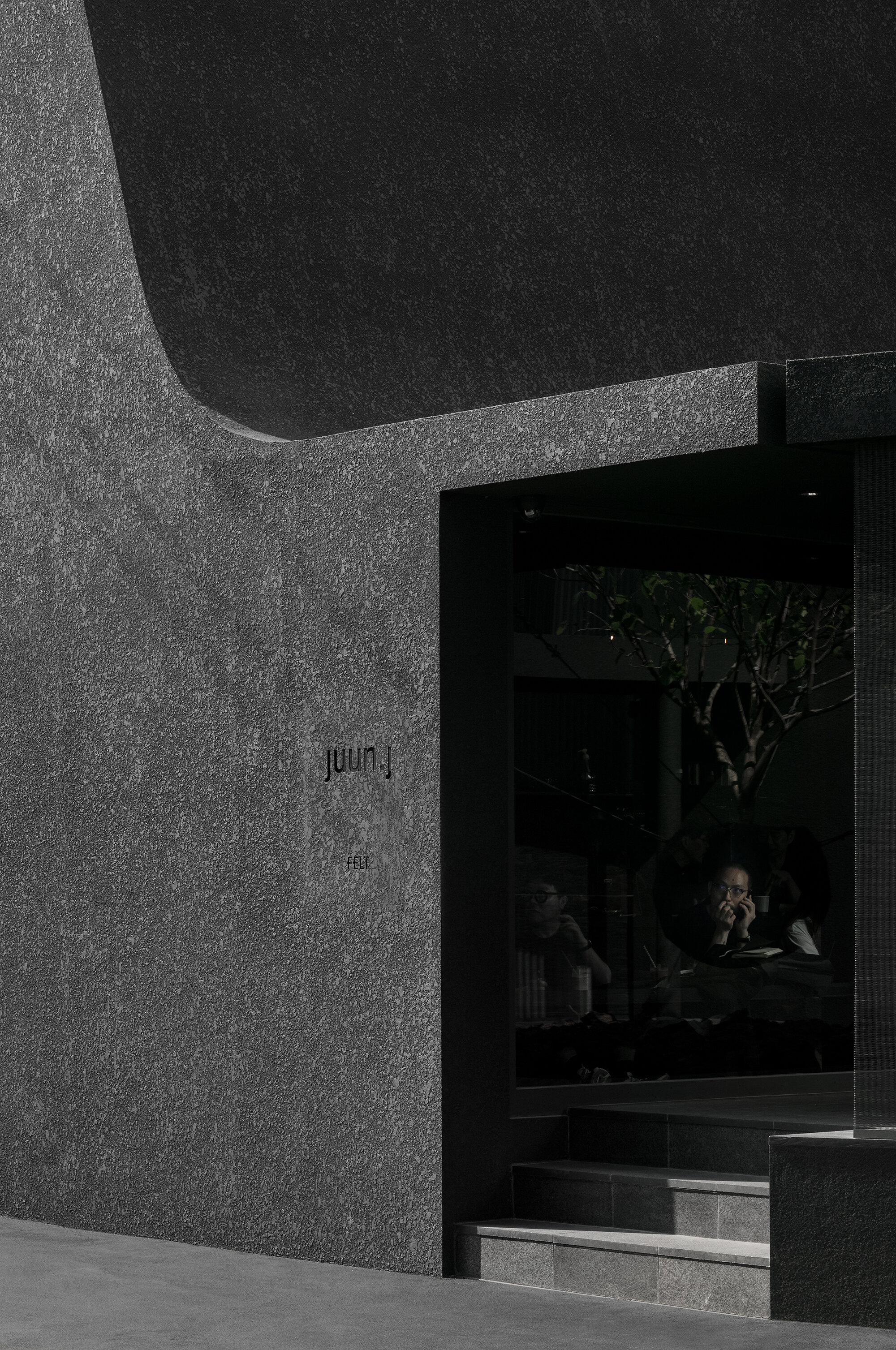
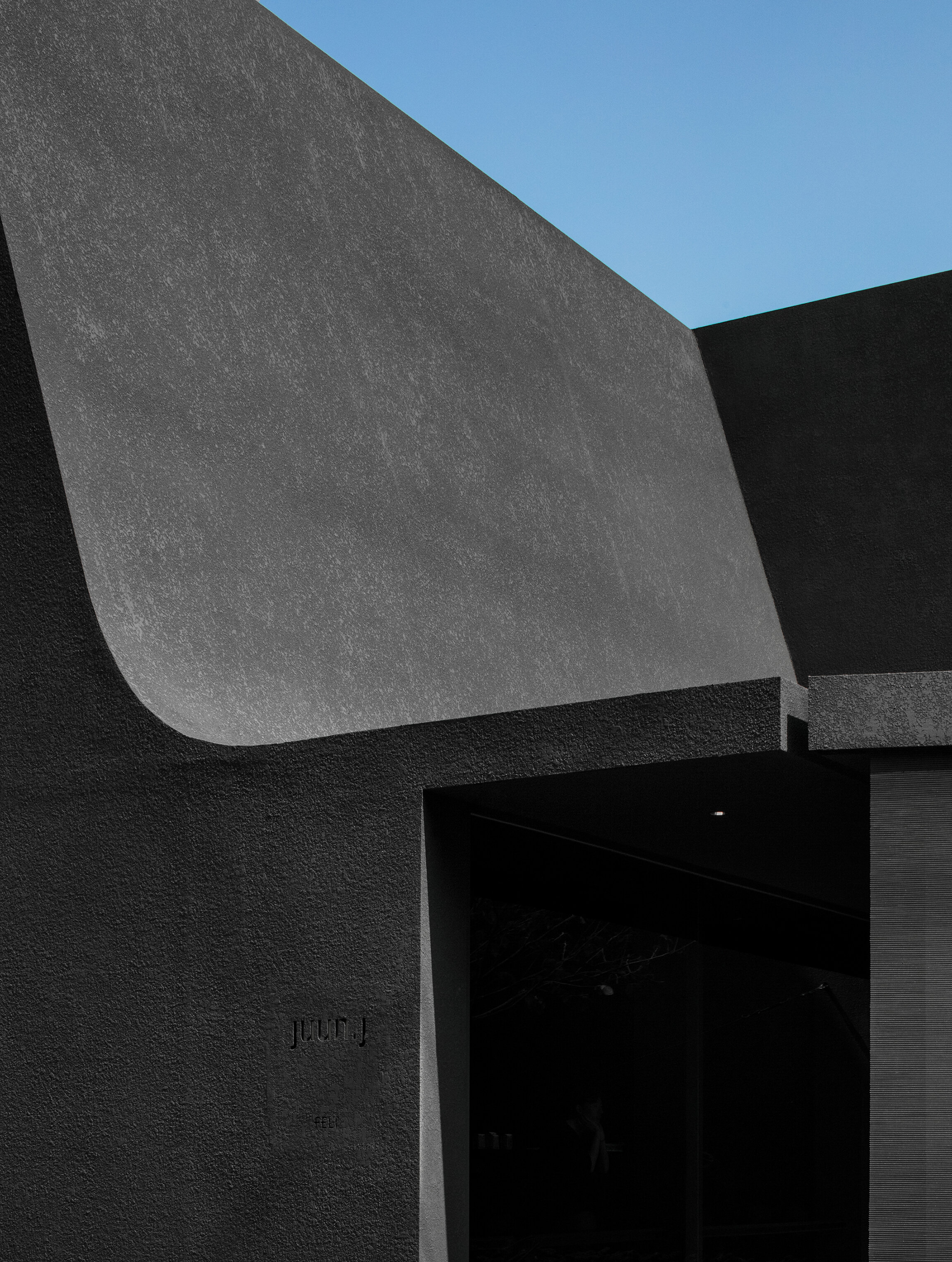
It’s the first flagship store of the fashion brand of Juun.J. It’s divided into two floors; the first floor comprising cafe and women’s wear, while the second floor men’s wear. We used natural elements such as light and shadow in order to express darkness within space using black – identity color of Juun.J brand. The shape of the architecture was initiated from geometry that is the basic form in all designs. Juun.J’s flagship store surely has a certain form but in the shape like a shadow without exact shape, which is similar to Juun.J as it invites endless curiosity to people.
We built our first flagship store where customers are able to experience at once all lines of not only men’s and women’s wear collections but of limited collaboration products at Dosan Park, Sinsa-dong, Gangnam-gu, Seoul.
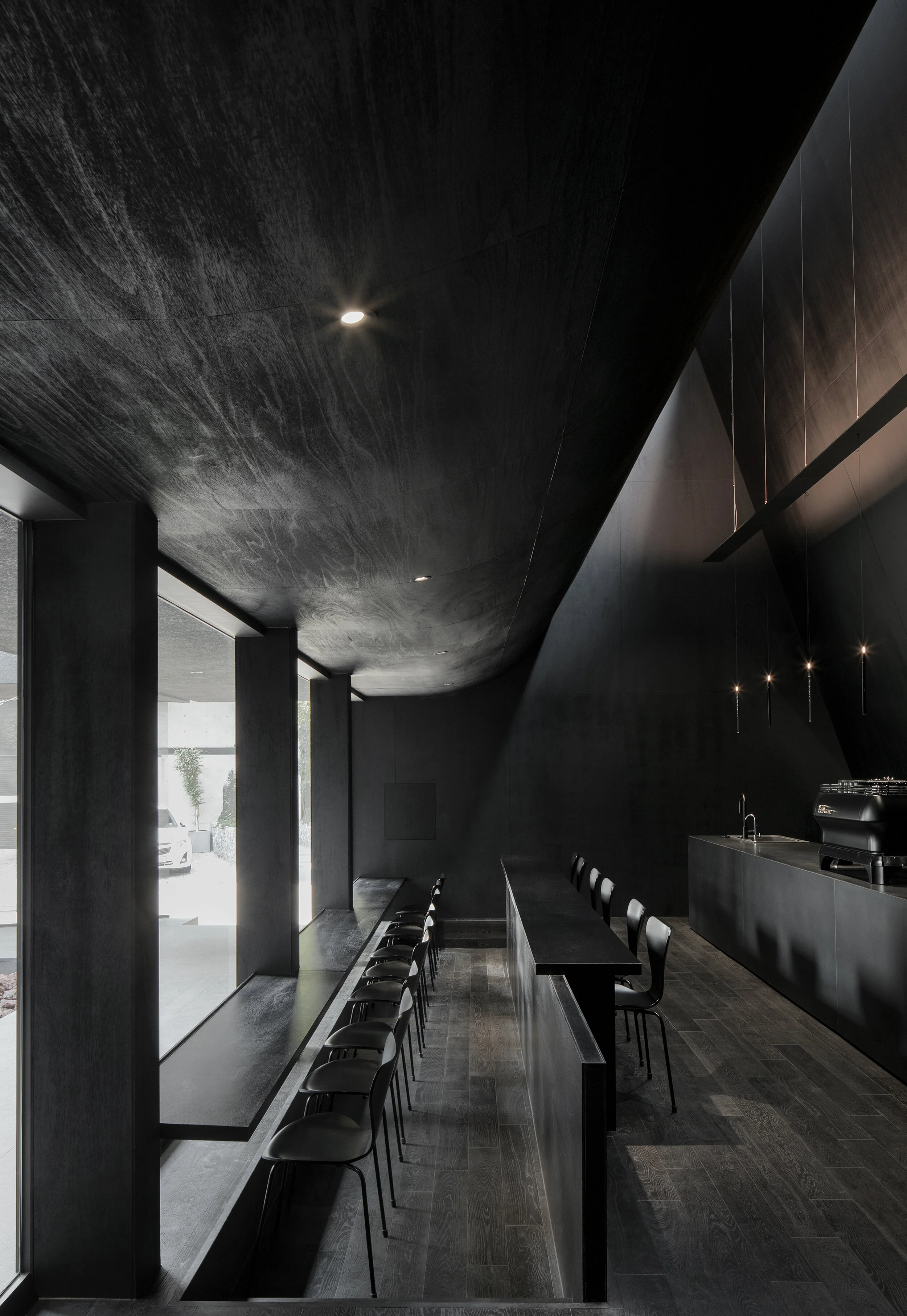
The flagship store is composed of the first and second floors with the total size of 396㎡. The first floor is arranged centred on women’s line and collaboration products, while the second floor displays men’s products. We at Juun..J provide differentiated brand experience to customers by arranging a garden as well as the best specialty coffee brand FELT COFFEE on the first floor so that they can experience a diverse range of brands at the same space.
Concept
“Black is a color symbolic of Juun.J and the most beautiful shadow out of the shapeless existences is also black.“
If we look at the traditional house structure in the East, large roof files are put above the house basically and the whole structure is absorbed into within the deep and wide shade generated by the awning. Deep darkness below the awning is shadow as well as black within the space.
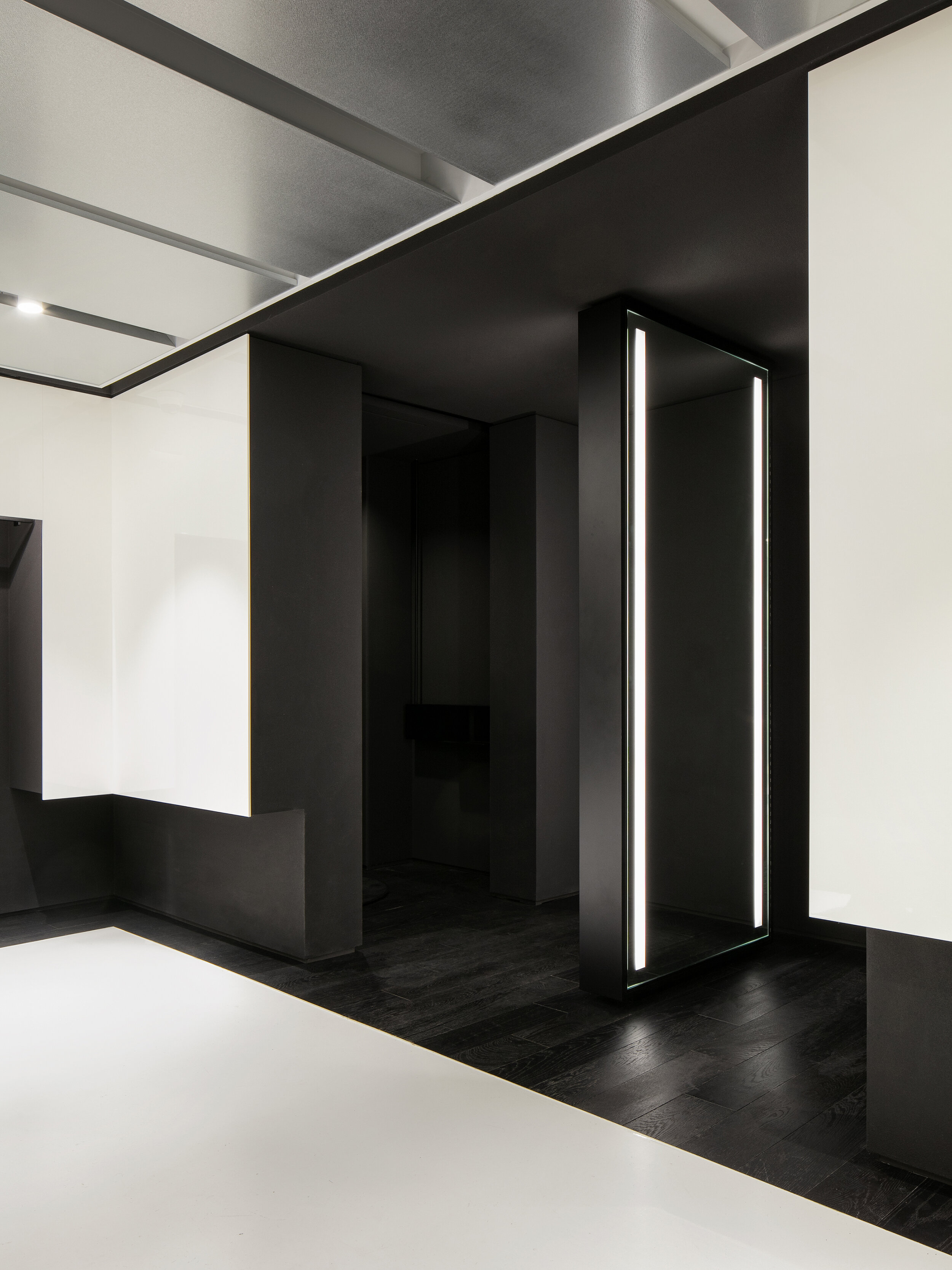
In an attempt to turn black into space, we organised space by either hanging plenty of objet or separating them and generating shadows. All spaces except white part for women’s wear on the first floor are composed of varied densities of darkness. While the first floor has contrasts with some white part, clothes here are also hung in darkness. The space of cafe generates various darknesses due to natural light dramatically penetrating from the ceiling. And eaves spreading forward work as an awning and make visitors feel natural light coming as a result of reflection on the garden. They can see the garden from within the space and find another shadow as a tree is floating in the garden.
The shape of the architecture is composed of circle, quadrangle and triangle, basic forms in all designs and the architecture is designed with the concept of dark matters of the universe. Especially, the garden-shaped circle, which is a space drawing natural light, plays an important role in making this dark matter a striking contrast.
This architecture and space started very much from the Orienal way of thinking, and the structure of space and formative approach were complete based on the Western style. We expressed achromatic color of black as darkness within the space instead of a simple painting and, as far as the used materials are concerned, we diversely applied materials that black has intrinsically instead of painting them in black.


