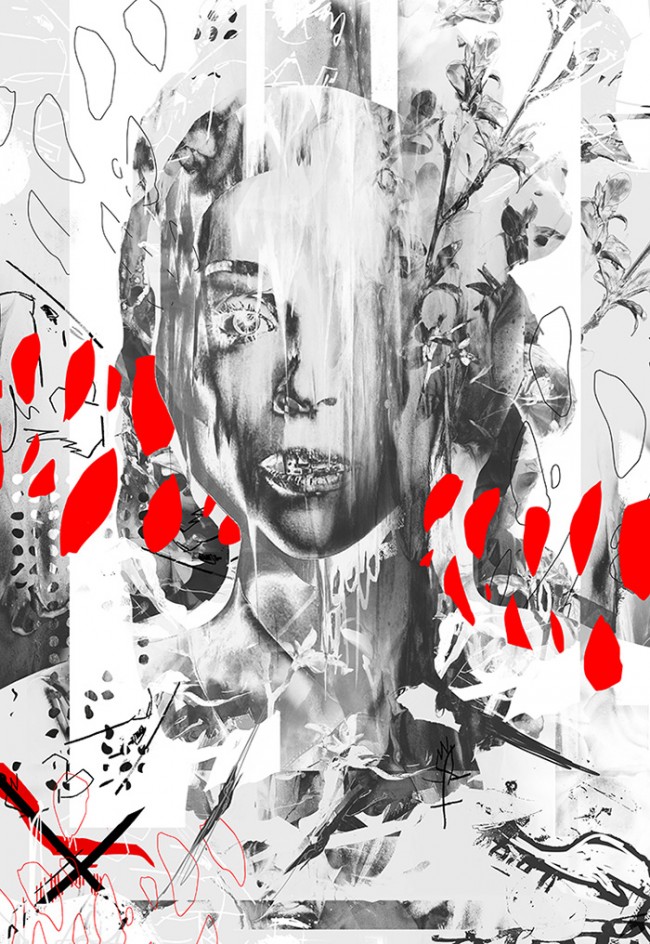
Anonymous by Giga Kobidze
Anonymous is ongoing series of digital artwork released by Tbilisi-based artist and Designcollector resident Giga Kobidze
3rd Wave of Inspiration
Since 2003
Anonymous is ongoing series of digital artwork released by Tbilisi-based artist and Designcollector resident Giga Kobidze
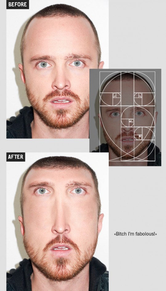
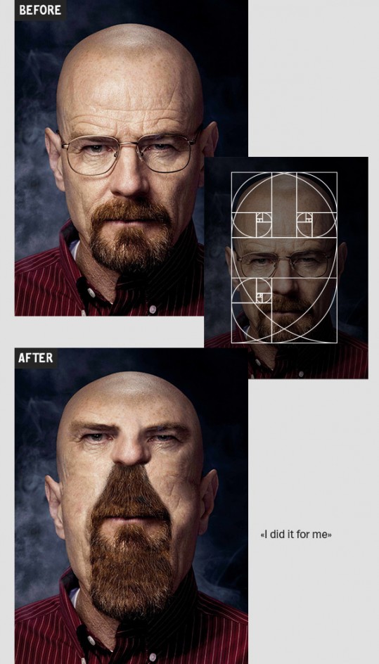
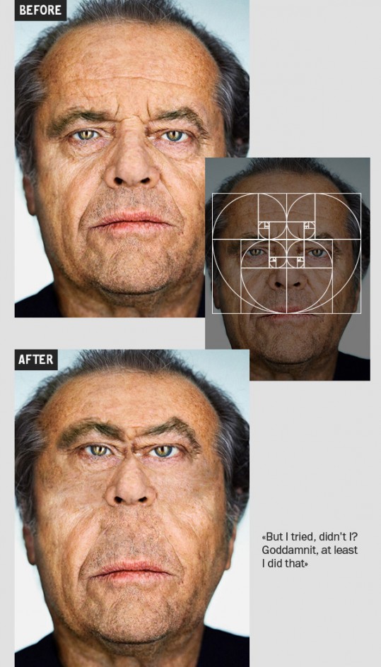
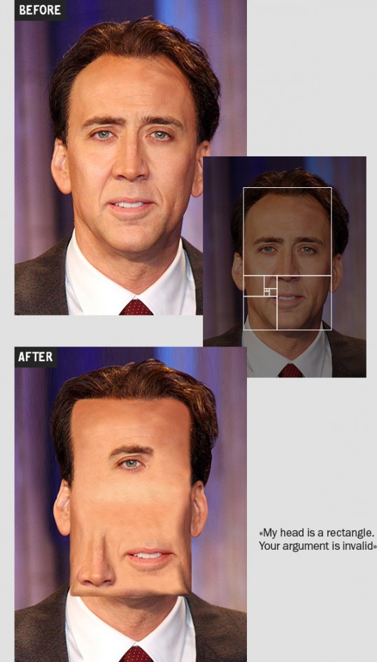
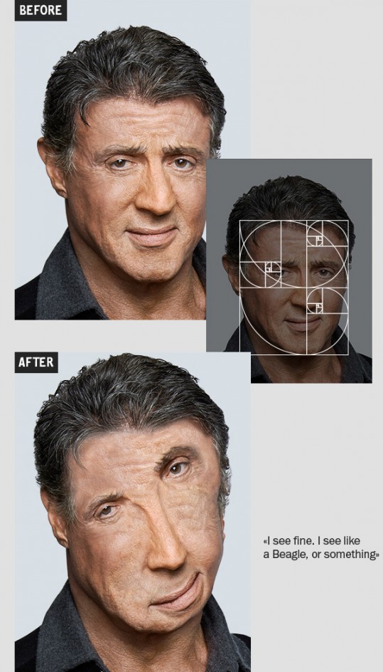
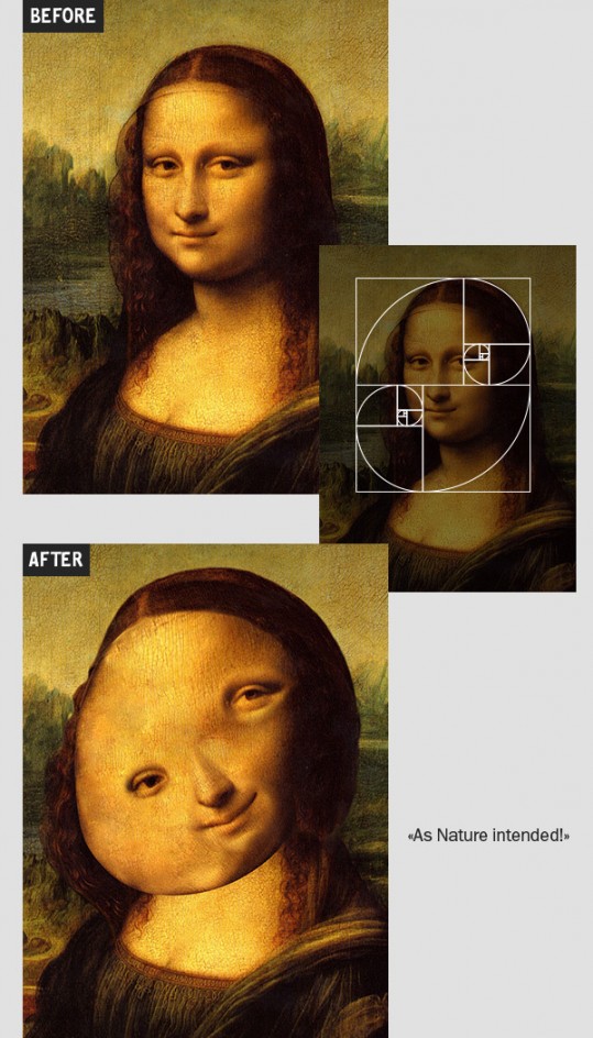
Students at Moscow BHSAD were asked to experiment with facial correction using Golden Ratio. One student did his best and you won't believe what happens next :D
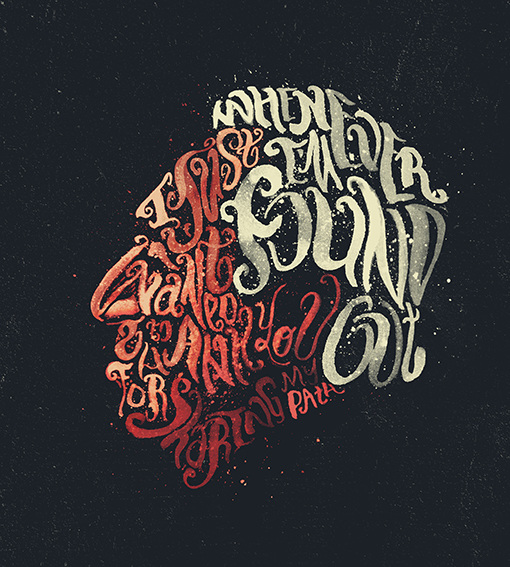
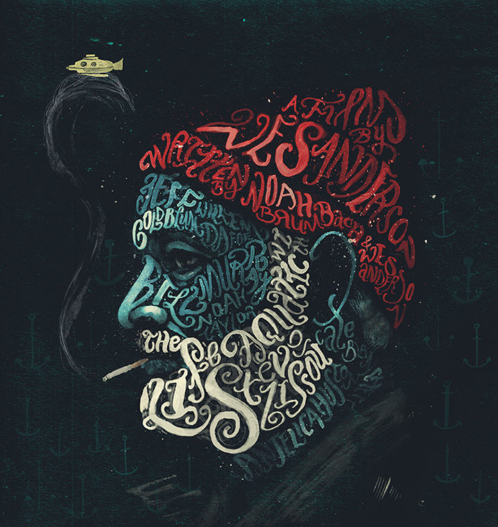
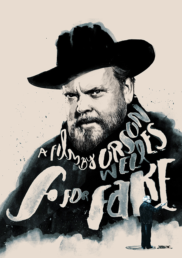
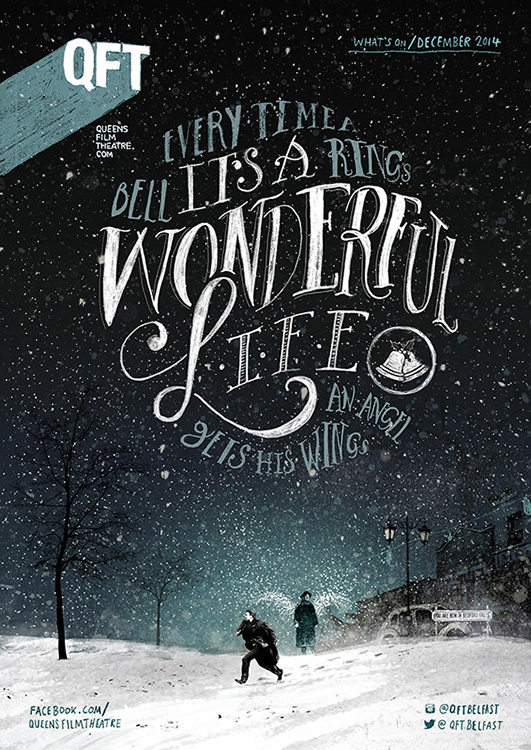
Talented illustrator Peter Strain from UK creates artworks using lettering to form objects and silhouettes

 http://vimeo.com/121987515
Masquespacio completed the interior design for 2Day Languages, a Spanish school in Valencia, Spain. The space is developed on an area of 183 square meters and contains three classrooms, a staff room and a lounge. Each of the classrooms and common rooms are a defragmentation from the brand identity of 2Day Languages and also incorporate parts of the Spanish language and the architecture of Valencia. The classrooms were imagined in the three brand colors, which in turn are a representation of the three levels A, B and C established by the Common European Framework of Reference for Languages, here seen as the colors blue, yellow and pink.

masquespacio1

masquespacio2

masquespacio3

masquespacio4

masquespacio5

masquespacio6

masquespacio7

masquespacio8

masquespacio9

masquespacio10

masquespacio11

masquespacio12

masquespacio13

masquespacio14

masquespacio15

masquespacio16

masquespacio17

masquespacio18

masquespacio19
"Reflexió" is a typography project of Catalonian artist Ramon Carrete experimenting with simple effects that lead to impressive results.
http://vimeo.com/117475191

ramoncarrete-4

ramoncarrete-0

ramoncarrete-1
ramoncarrete-2

ramoncarrete-3
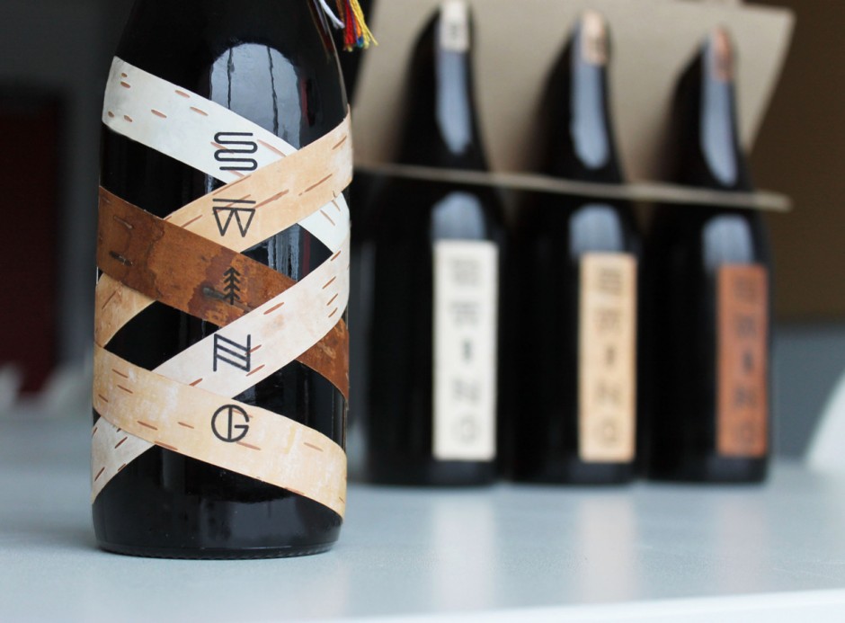
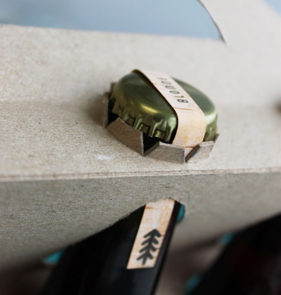
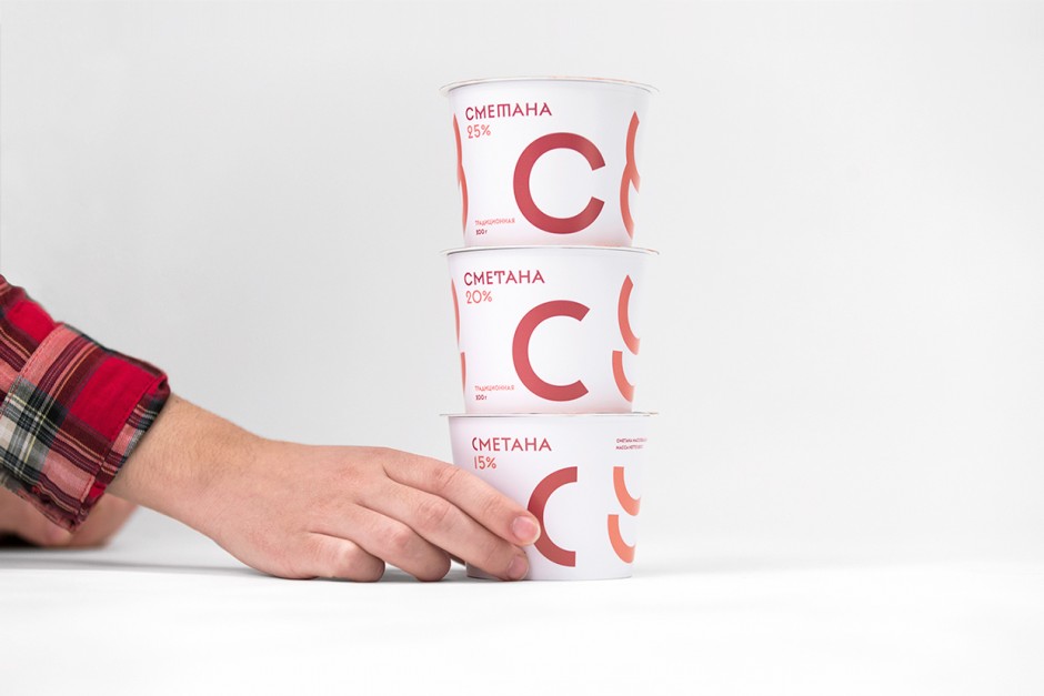
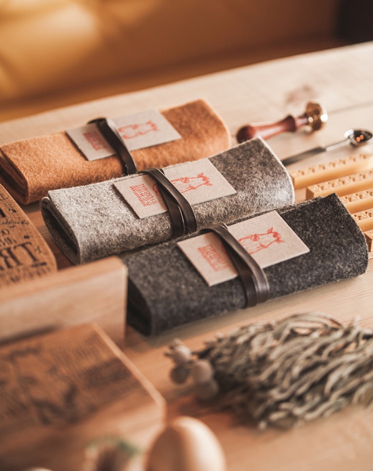
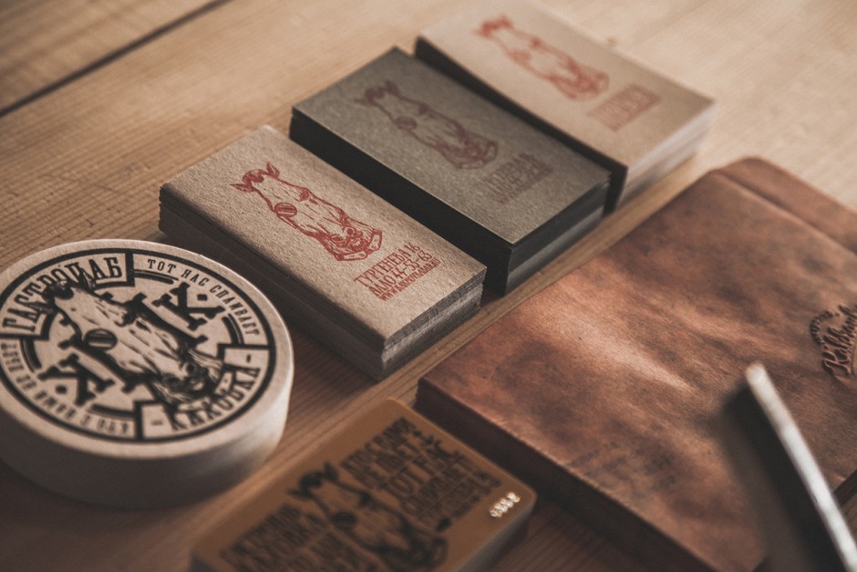
The family farm of Cheburashkini Brothers is a challenging project for the Russian market. Cheburashkini brothers are real people, who have restored four old farms in an ecologically clean Moscow region, transported highly productive European cow breed, and built up an ultramodern dairy factory. The called award-winning Ermolaev Bureau (Facebook) to create unique visual system for their dairy packaging.
The main idea of packaging design is based on typography, where initial letters of products are central elements of the design. We have designed a display sans-serif typeface with a set of weights, and for the text setting we have used the Cyrillic version of Euclid typeface from Swiss Typefaces.

chebueashkini-ermolaev1

chebueashkini-ermolaev2

chebueashkini-ermolaev3

chebueashkini-ermolaev4

chebueashkini-ermolaev5

chebueashkini-ermolaev6

chebueashkini-ermolaev7

chebueashkini-ermolaev8

chebueashkini-ermolaev9

chebueashkini-ermolaev10
chebueashkini-ermolaev11

chebueashkini-ermolaev12

chebueashkini-ermolaev13

chebueashkini-ermolaev14

chebueashkini-ermolaev15
The Spanish masters of digital illusions, branding and other visual solutions Serial Cut are back with the brand new website

serialcut2015-1

serialcut2015-2

serialcut2015-3

serialcut2015-4

serialcut2015-5

serialcut2015-6

serialcut2015-7

serialcut2015-8
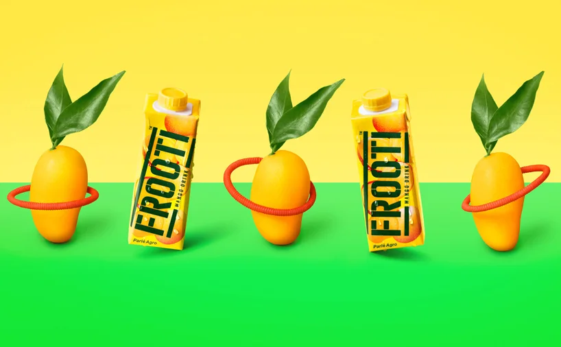
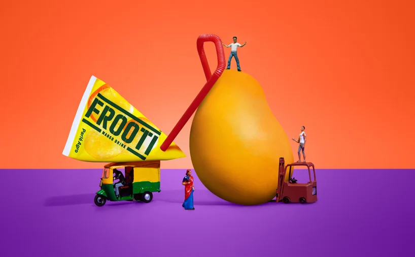
Sagmeister & Walsh created the graphic identity and everything else visual for Frooti, one of the largest and oldest mango juice brands in India.

sagmeister-walsh-frooti-mango1

sagmeister-walsh-frooti-mango2
sagmeister-walsh-frooti-mango3

sagmeister-walsh-frooti-mango4

sagmeister-walsh-frooti-mango5

sagmeister-walsh-frooti-mango6

sagmeister-walsh-frooti-mango7
sagmeister-walsh-frooti-mango8

sagmeister-walsh-frooti-mango9

sagmeister-walsh-frooti-mango10

sagmeister-walsh-frooti-mango11

sagmeister-walsh-frooti-mango12

sagmeister-walsh-frooti-mango13
http://vimeo.com/121712272
http://vimeo.com/122351423
http://vimeo.com/123092635
http://vimeo.com/123101124
http://vimeo.com/123130269
http://vimeo.com/123221222
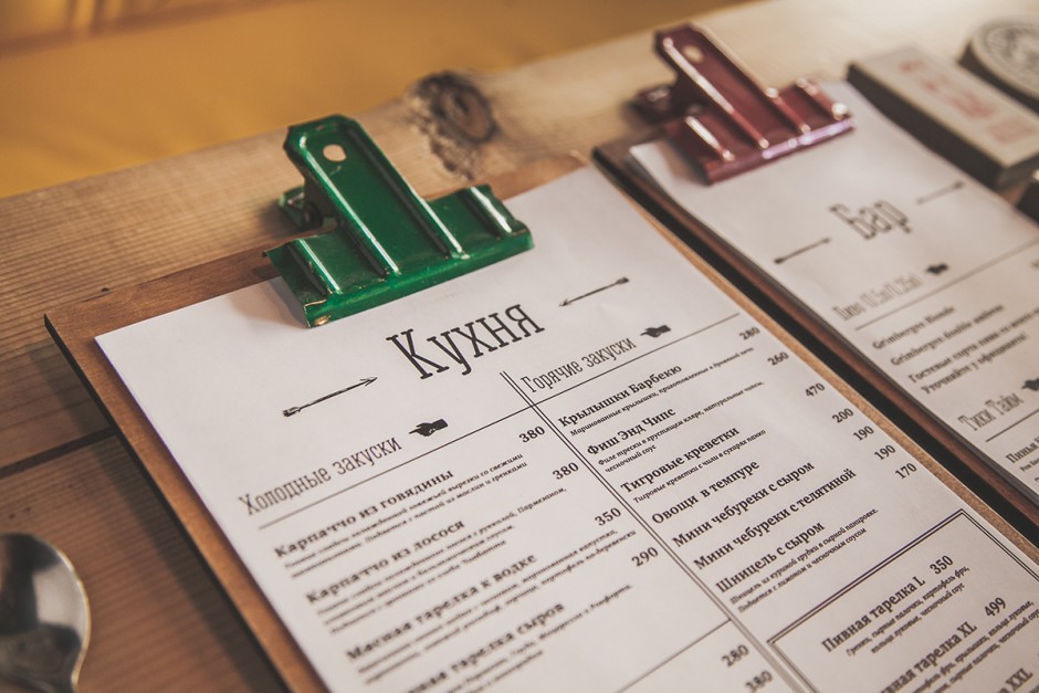
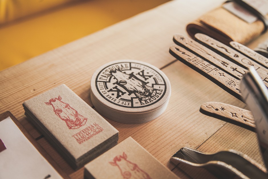
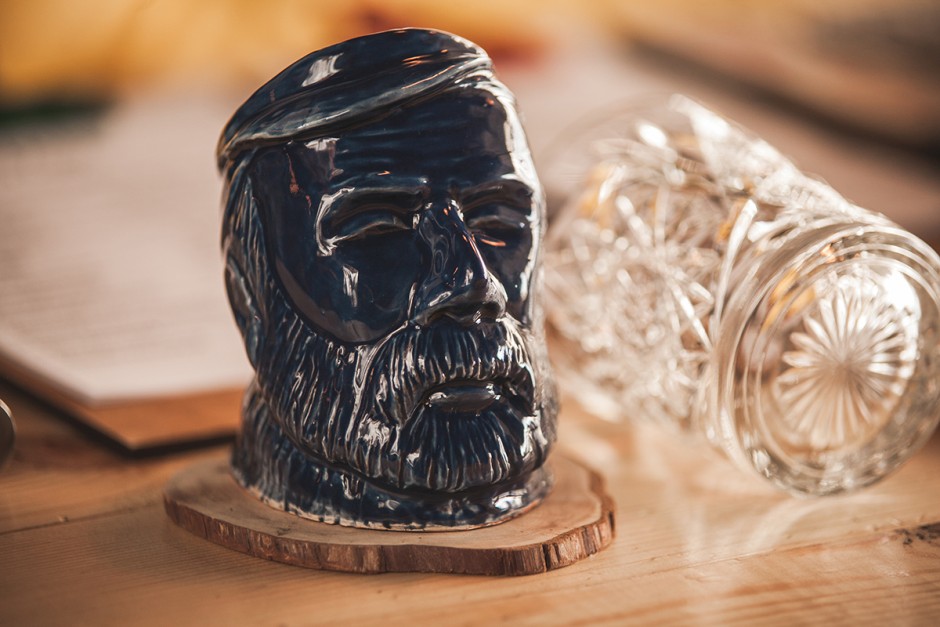
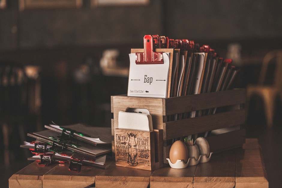
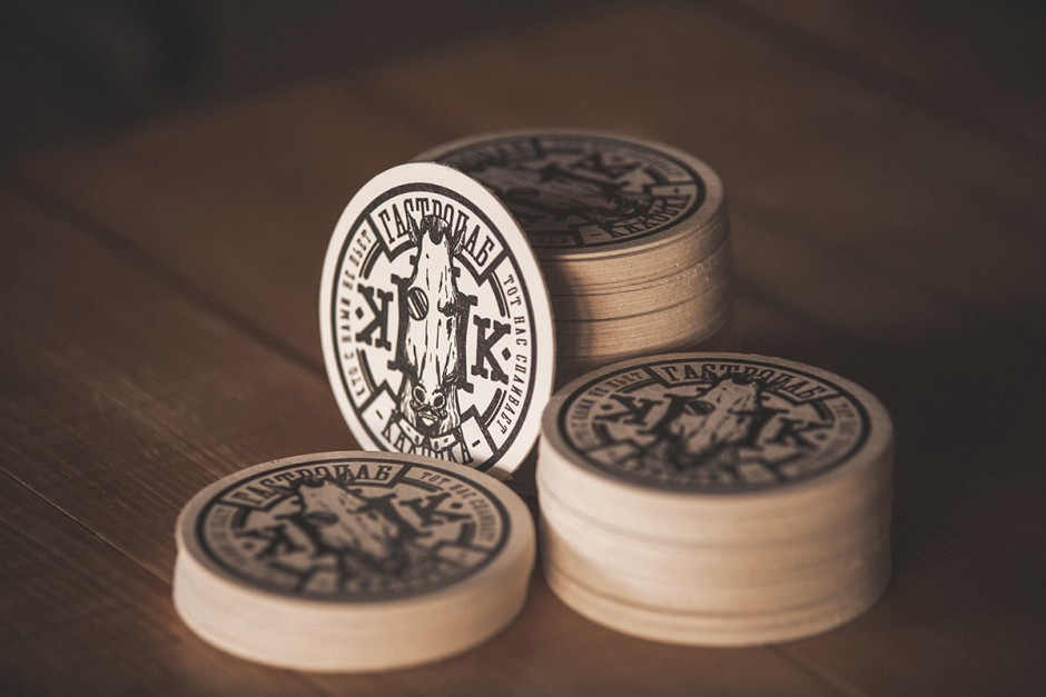
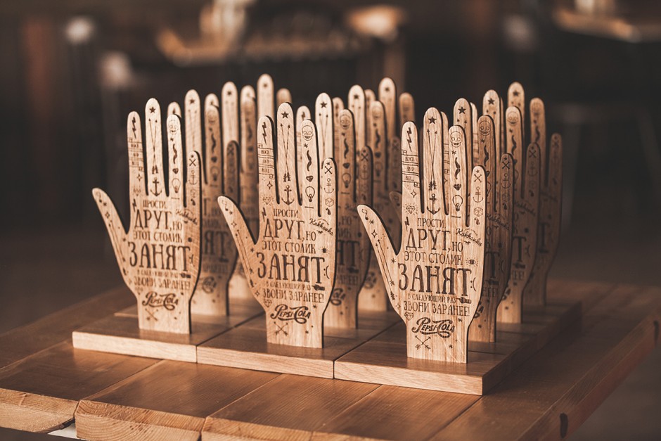
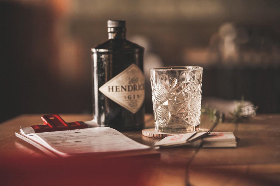
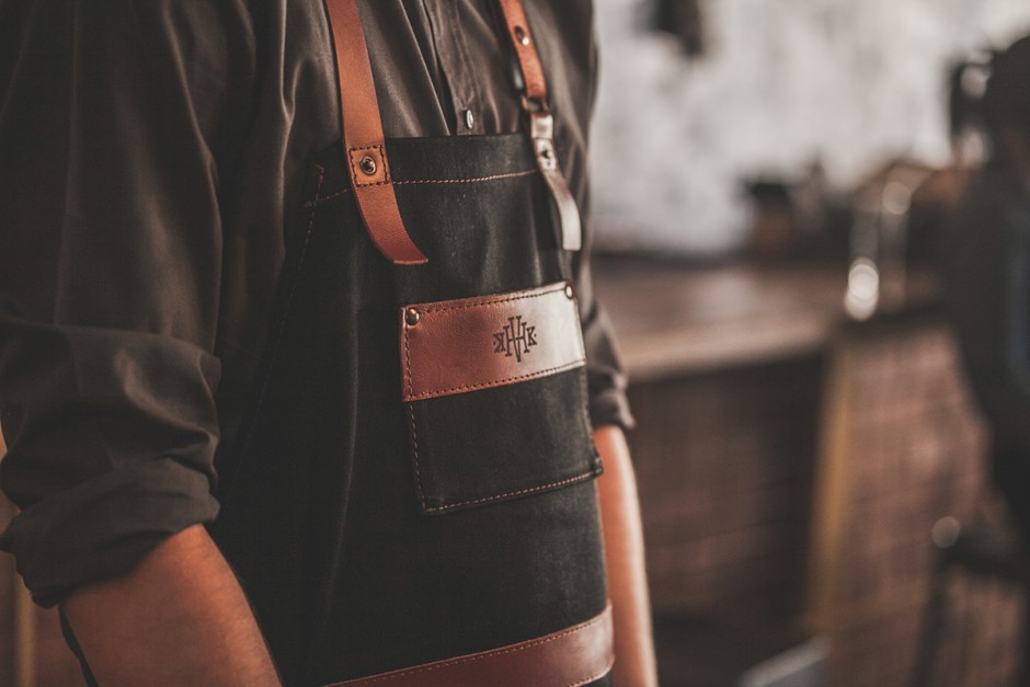
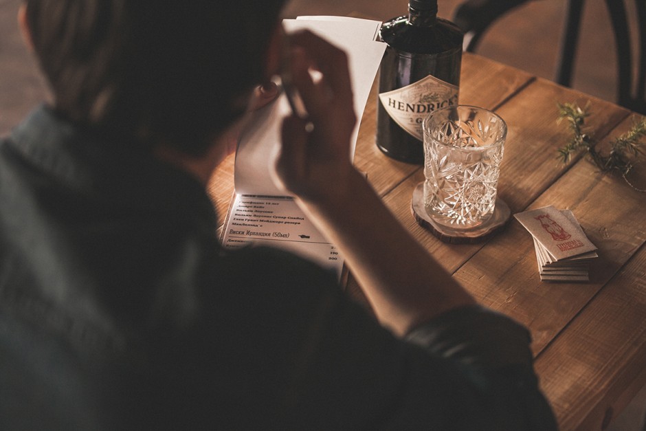
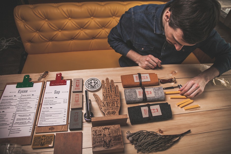
Hemingway-styled Kahovka Gastro Bar got its very special identity designed by Dmitry Neal from Orel city, Russia. Check it out!
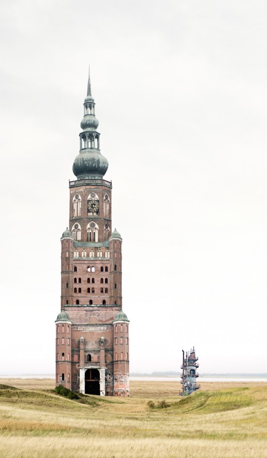
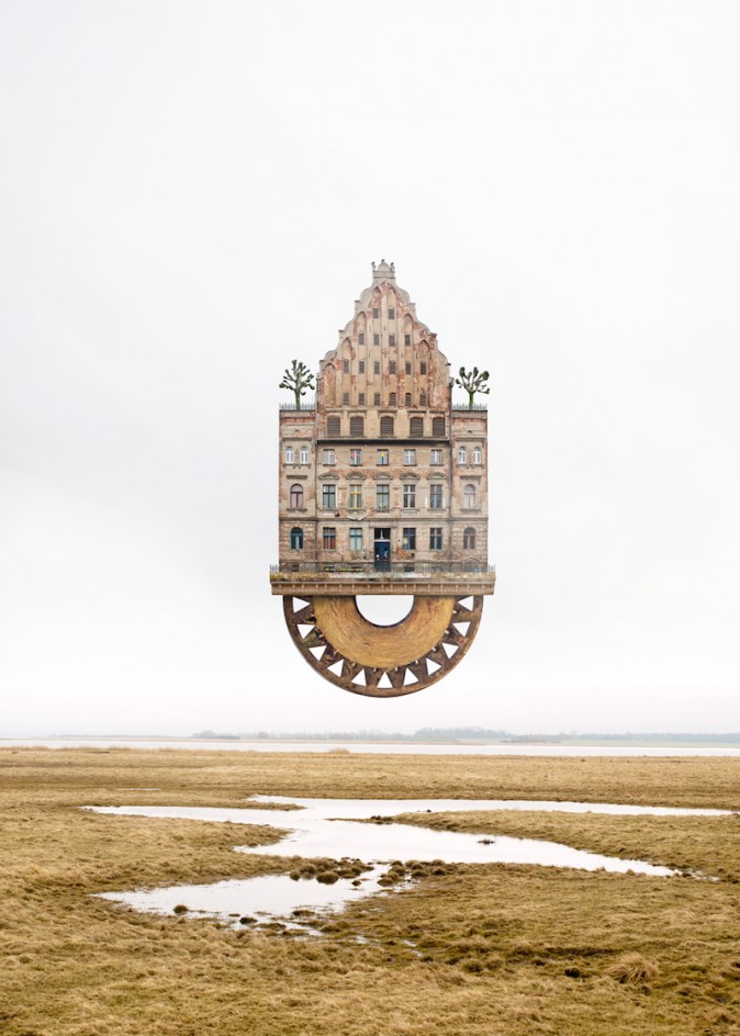
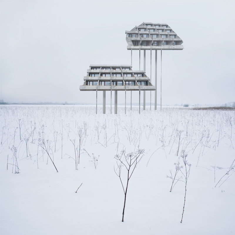
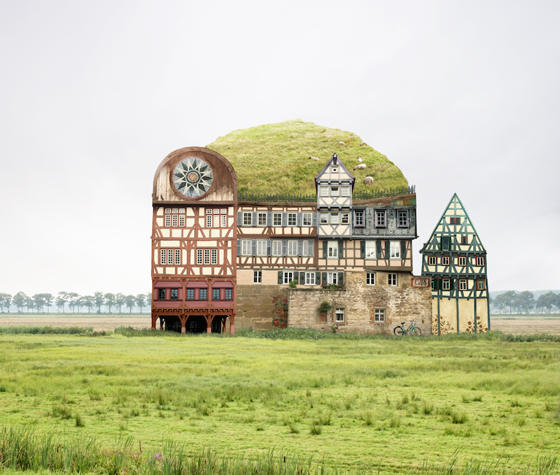
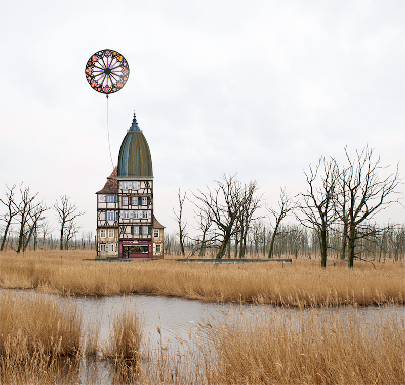
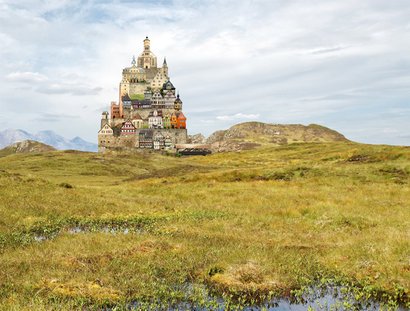
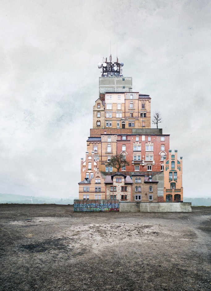
German-based graphic designer Matthias Jung creates imaginative houses and calls them "architectural short poems"
We loved what we found, and that are the graphic design works of Paris-based art director Alain Vonck. Here we show his latest project for Notebook Tamyras but please don't hesitate to explore the full set of his talents on Behance, Tumblr and personal website


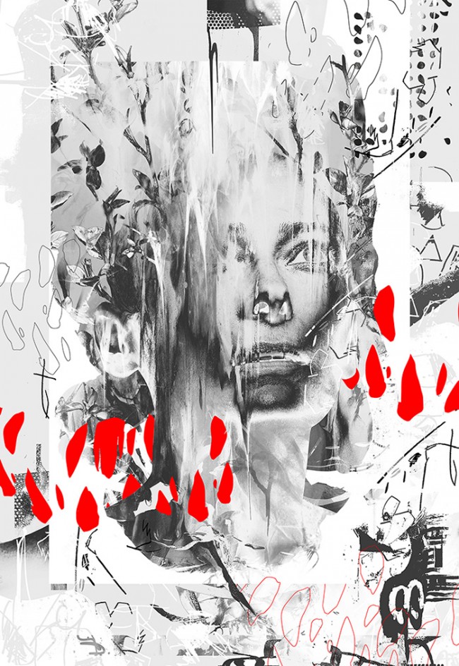
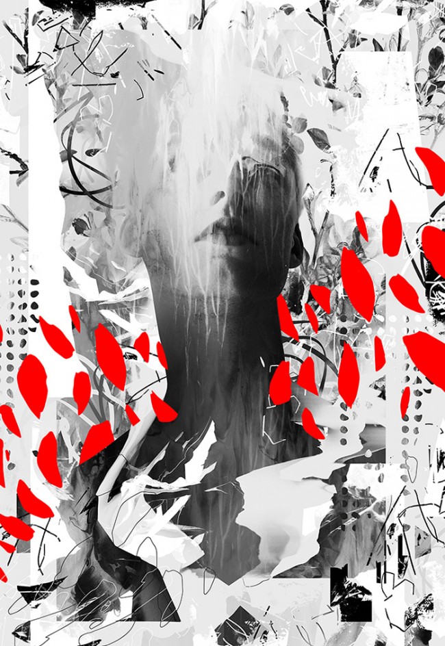
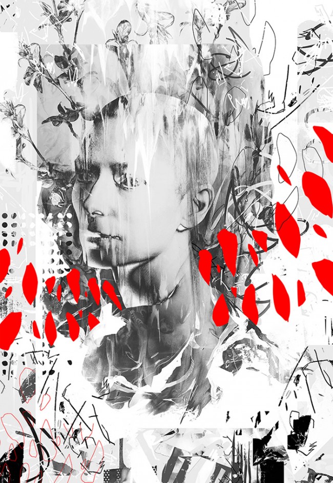
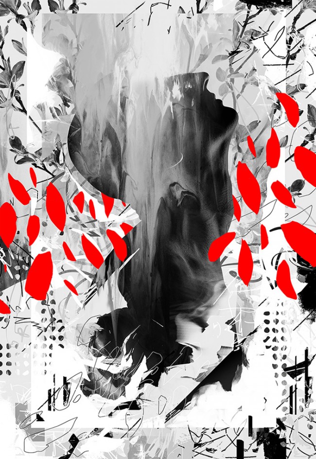
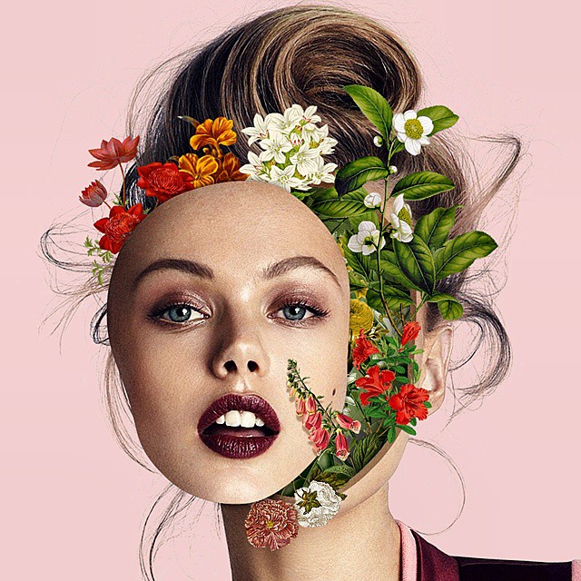
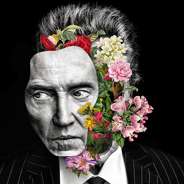
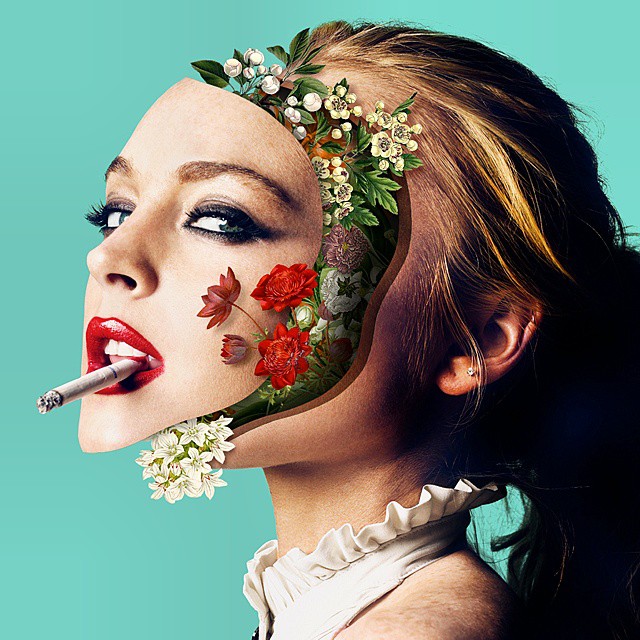
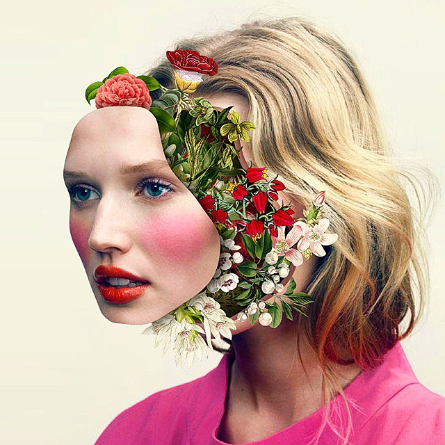
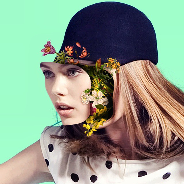
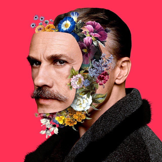
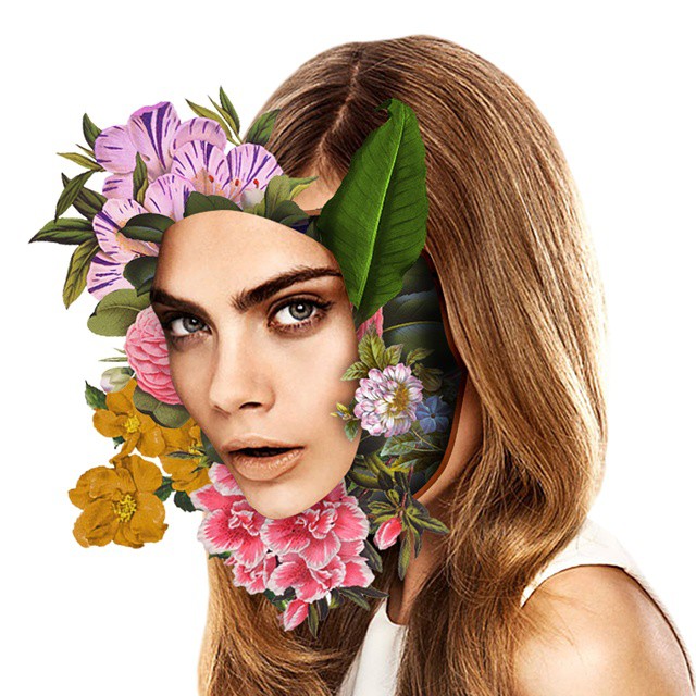
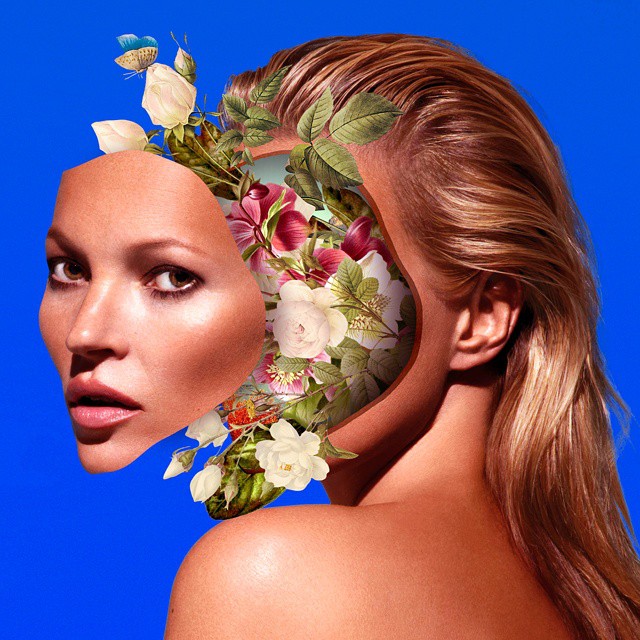
Faces [UN]bonded - A surreal and impressive series, signed by the talented Brazilian artist Marcelo Monreal (Instagram, Facebook).
”Faces I always drew attention. And if i stressing? If the let loose from the rest of the body, which would be within? Well, to me, still I think that people have a little bit of beauty within them by more that this is saved and only revealed in rare moments. The result of this reflection gave rise to this series called: Faces [UN]bonded.” – Marcelo Monreal
3D paper modeler, illustrator and set designer Lydia Kasumi Shirreff (Tumblr) creates festive and imaginary worlds using primarily paper and a youthful love for craft.
http://www.youtube.com/watch?v=gna9yJbw8_c


I think I found a heaven for visual and art addict like me. Check out the hundreds of talented collages where modern vanity fair juxtaposes with classic art to create a satyrical clash for a modern society. Meet Eisen Bernard and his "Mag + Art" project
"My Mag + Art series is a collection of magazine cover and classical painting mashups. Famous paintings of artists like Boticelli, Ingres, Klimt and Picasso were overlain with iconic covers of popular magazines like Life, Time, Harper’s Bazaar and Rolling Stone to produce funny and interesting visual combos. This ongoing project on Tumblr is my way of giving homage to the magazines – as venue of human artistic expression and vehicle of popular culture."


Just in time of Chinese New Year we rolling out the awesome project of Mehmet Gozetlik called "Chinatown". The project shows our weak knowledge of the most populated nation in the world still saving its traditional culture and mentality.


http://vimeo.com/117655202
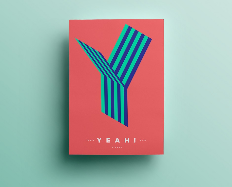
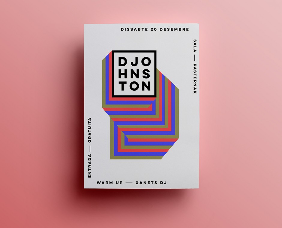
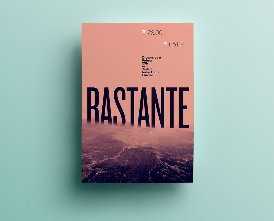
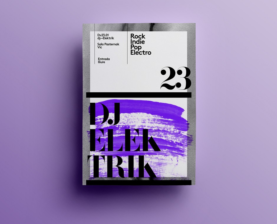
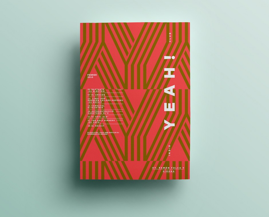
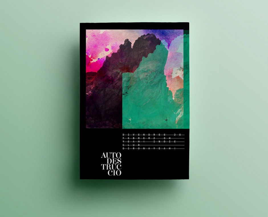
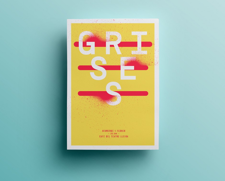
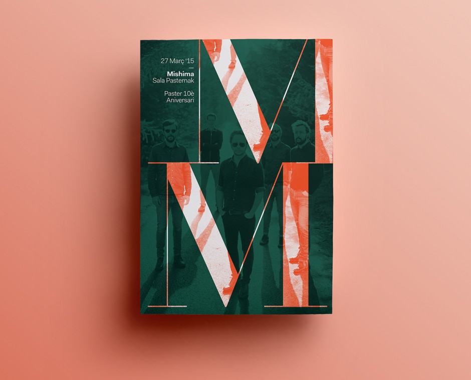
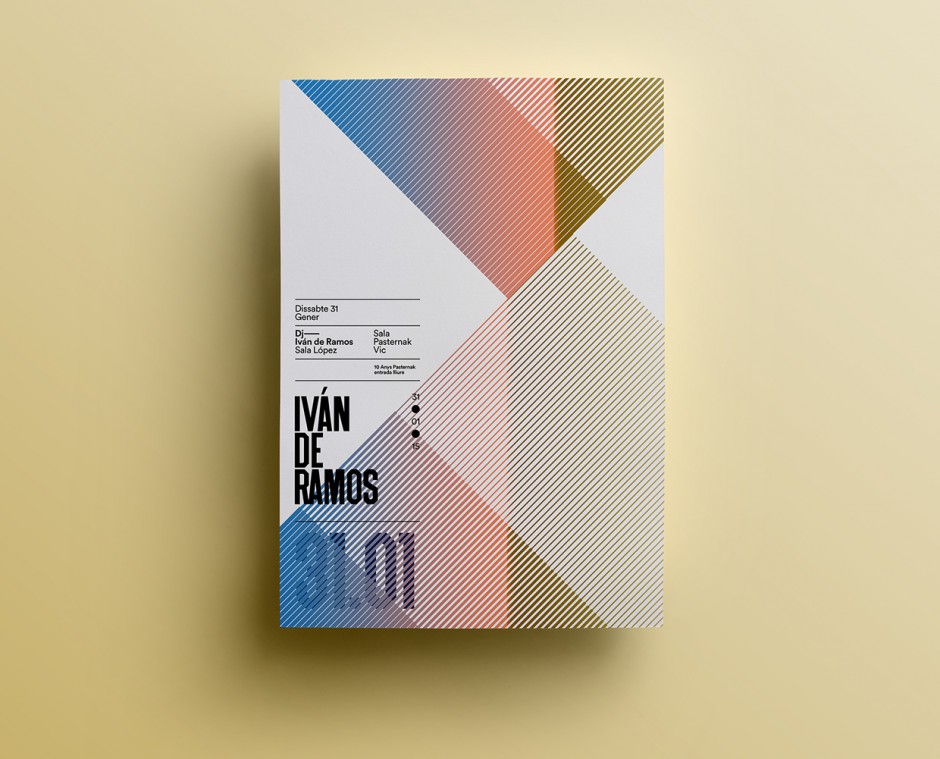
Quim is Catalonian designer and graphic artist working mainly with identity systems and poster language.
"Looking at the visual identity for http://aruliden.com/work/cooklyn, a Brooklyn restaurant specializing in "micro seasonal cuisine," is like wandering into a 19th-century warehouse inhabited by cowboys and cleaned by Mary Poppins." says FastCo, and we can't disagree. This "authentic rustic chic" design system built by Aruliden is something to study or collect as an inspiration for further projects.


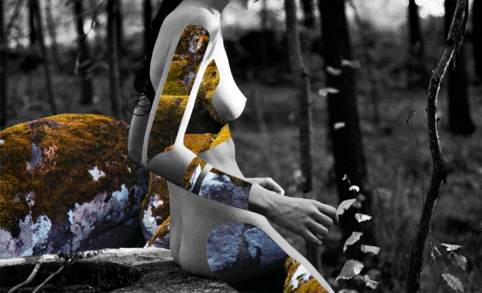
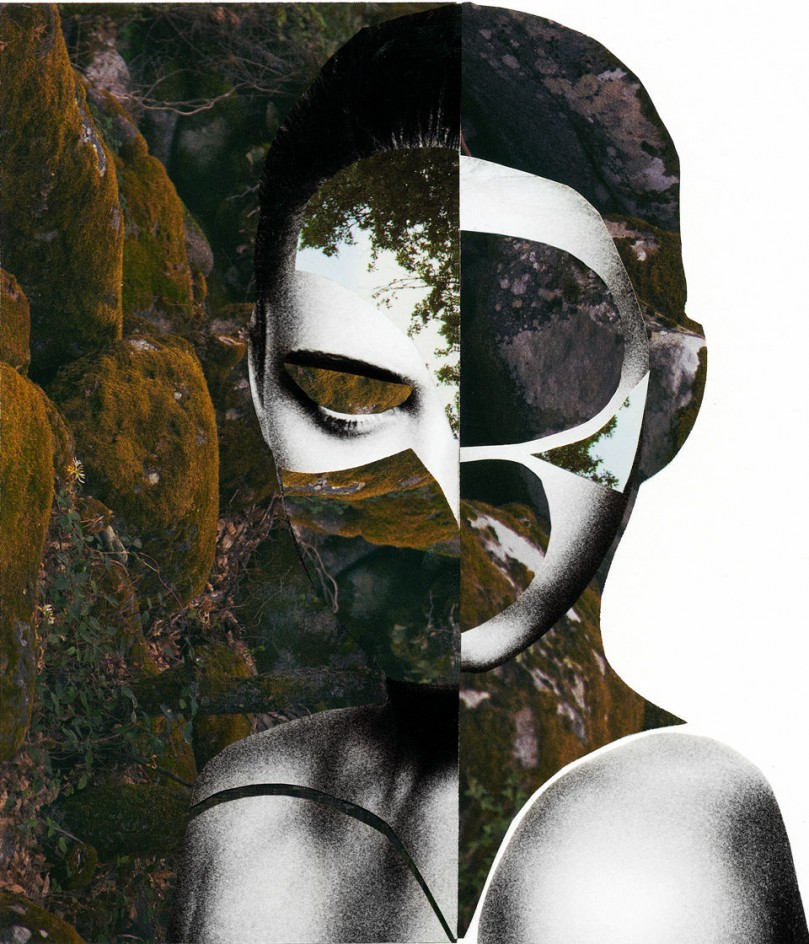
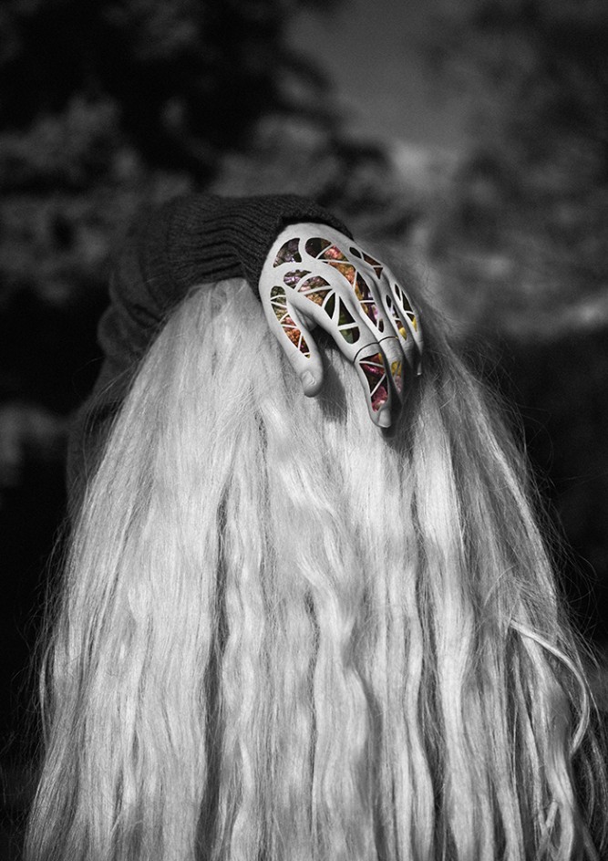
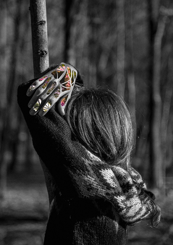
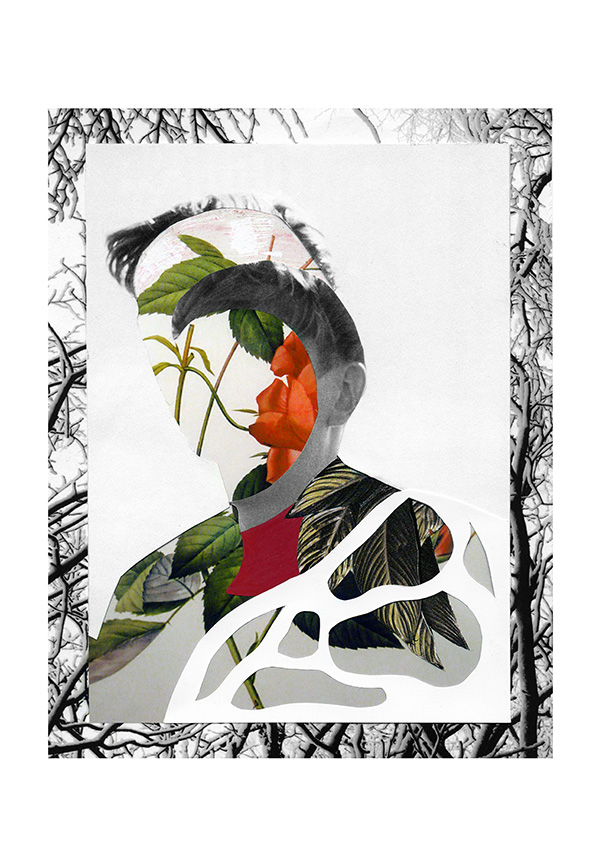
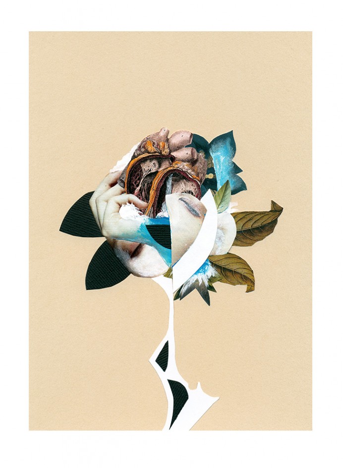
Rocio Montoya is a photographer, designer and editor based in Madrid. Her specialty is the experimental photography, land on which has moved from its creative inception.
Her interest is particularly focused on the experimental portrait, approached through different plastic techniques and always with photography as the essential basis of each final artwork . Throughout her career as an artist she make a personal exploration of behaviors and emotional states of the human being, transforming reality by manipulating the image to convey their perception of the environment through aesthetic experiences.