Sara Cwynar
Talented photographer and graphic designer from New York, Sara Cwynar now working at the New York Time Magazine. This is her latest and longest series of photography works called "Study of Color"
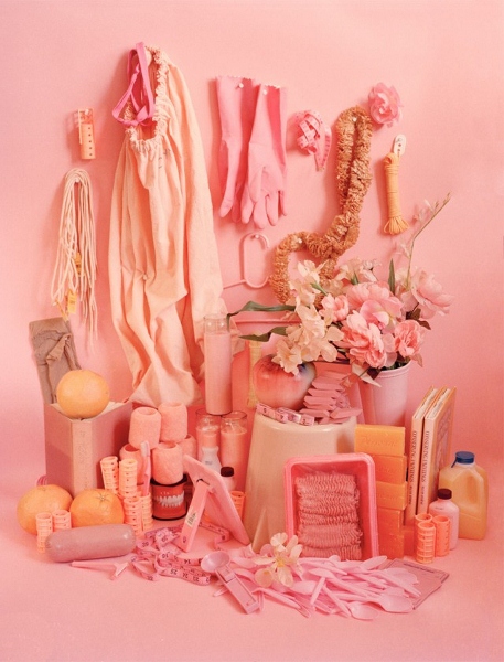
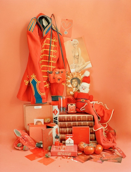
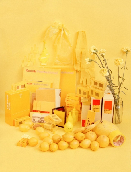
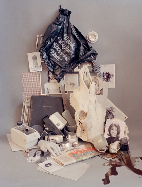
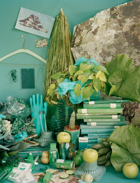
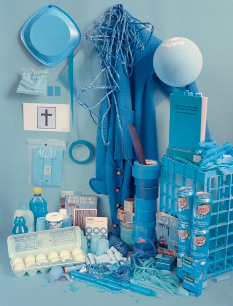
Talented photographer and graphic designer from New York, Sara Cwynar now working at the New York Time Magazine. This is her latest and longest series of photography works called "Study of Color"


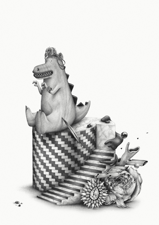
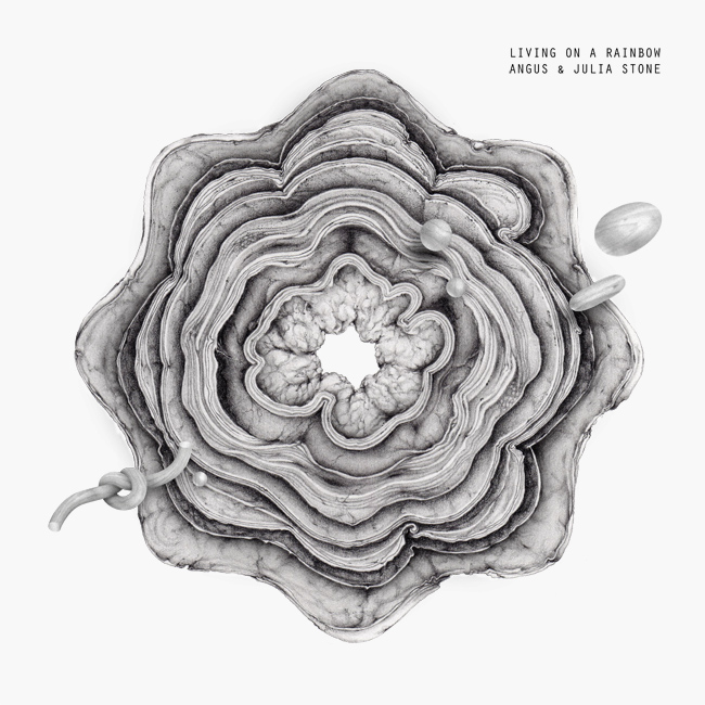
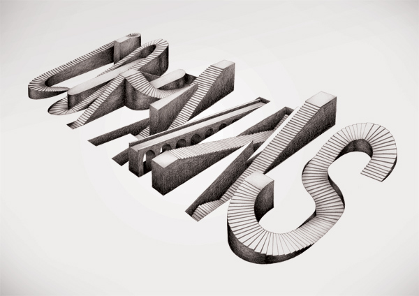
Young French freelance art director Ugo Gattoni has mature works scattered over portfolio website http://www.ugogattoni.fr/



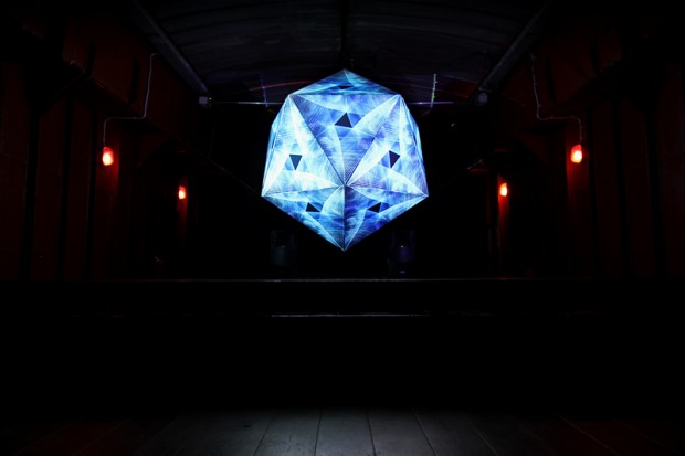
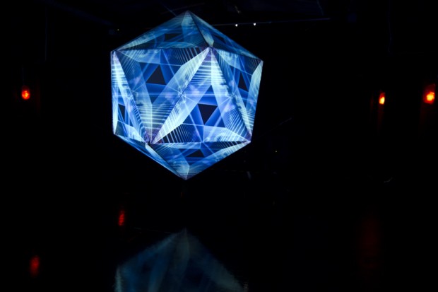
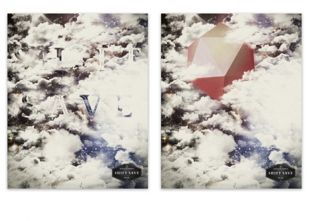
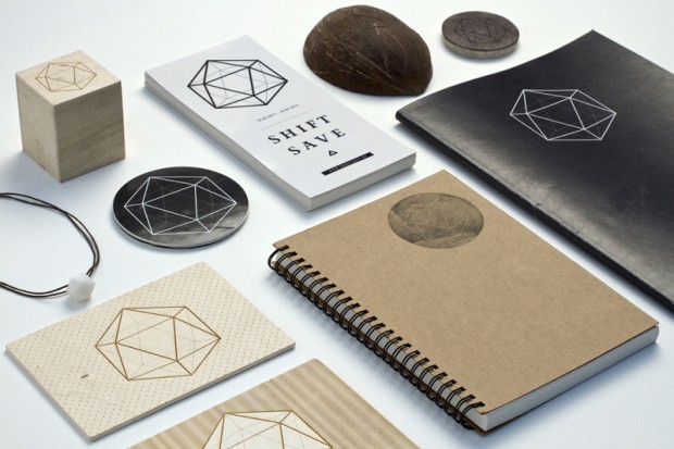
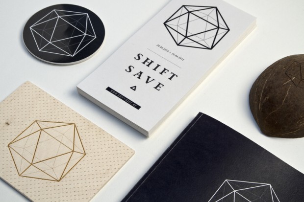
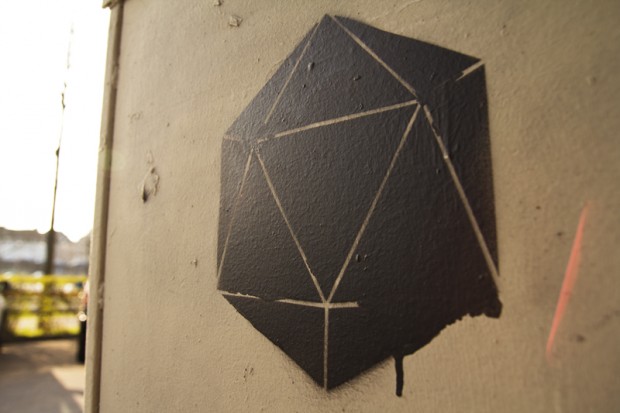
How to make simple hedron sexy and appeal? Here is the answer from German students Hojin Kang and Fabian Mansmann. Their diploma project "Shift - Save Movement" is kind of reflection on a metaphoric triangle: Human Nature, the Creator and Technology. The installation shows the blend of Human and Technology and digitally explores the boundaries of this collision.
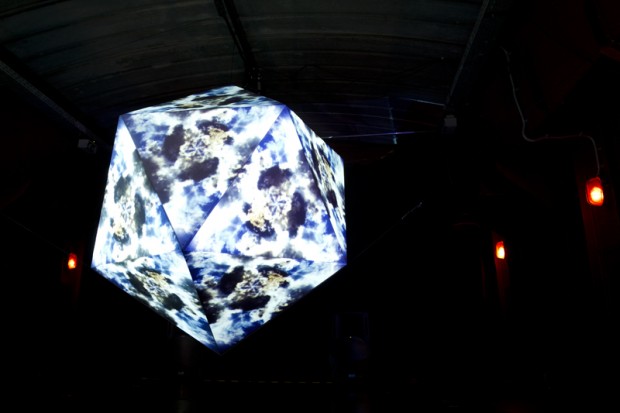
http://vimeo.com/43910360
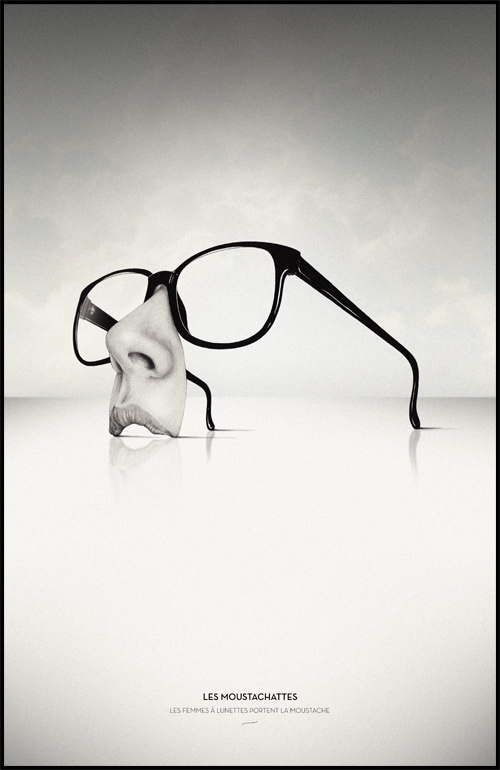
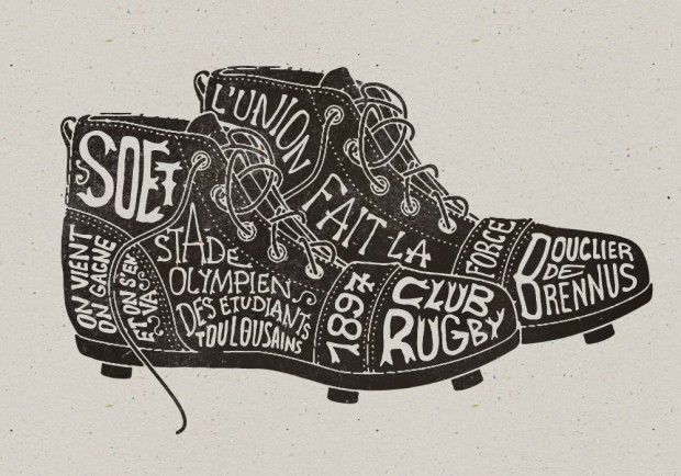
A creative group of awesome designers from Bordeaux, France shows off their mastership in logo design, typography compositions and textile prints. Their work is a proof that good graphic design never vanishes and die.
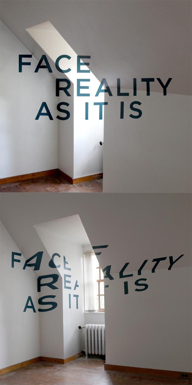
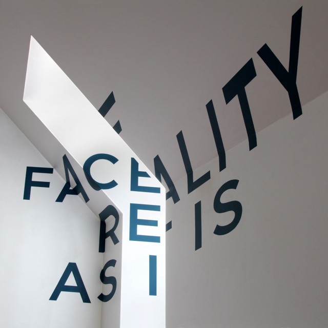
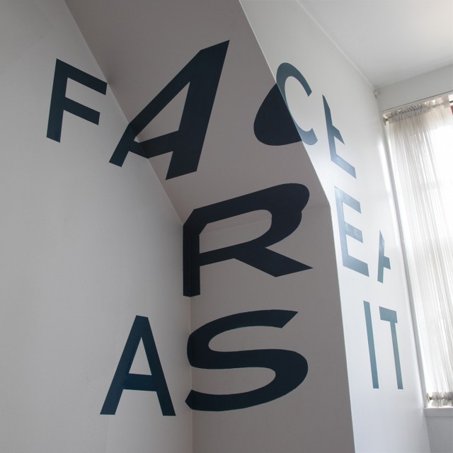
Briefly "Anamorphic Typography" is an illusion where the type in the space or any location looks just right when viewed from the exact right spot, but it looks stretched and warped on the walls when viewed from elsewhere in the room. Chicago based designer Thomas Quinn did this famous trick with elegance and good results
http://vimeo.com/14817245
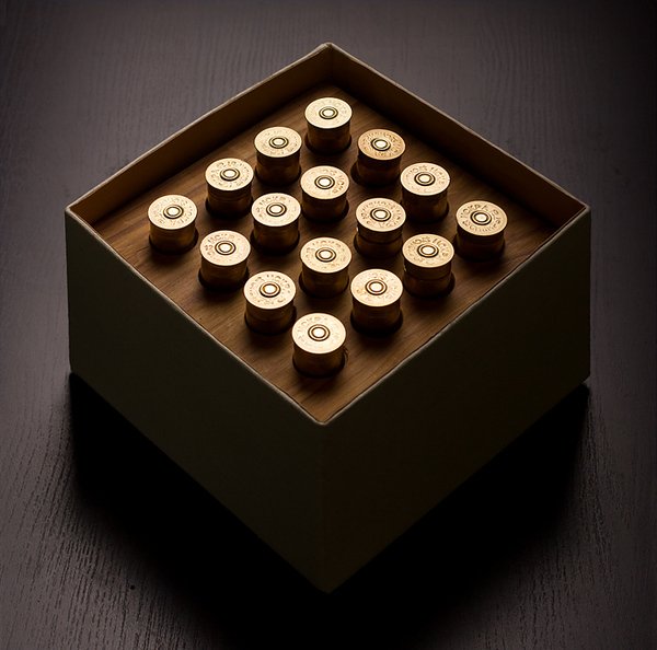
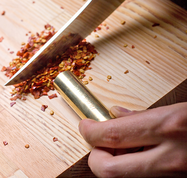
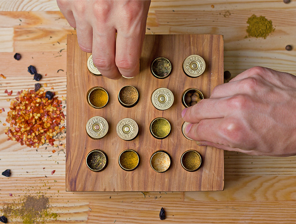
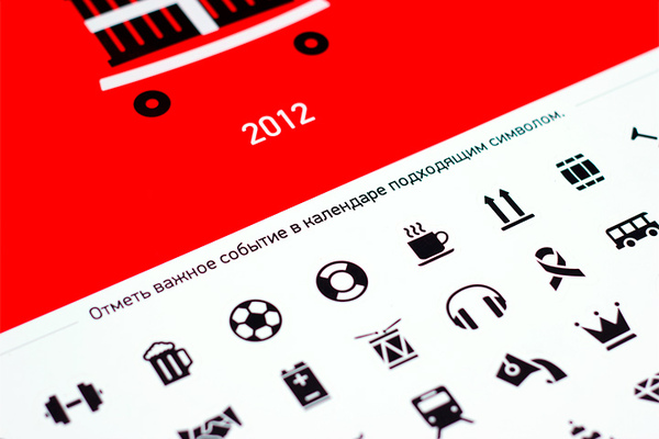
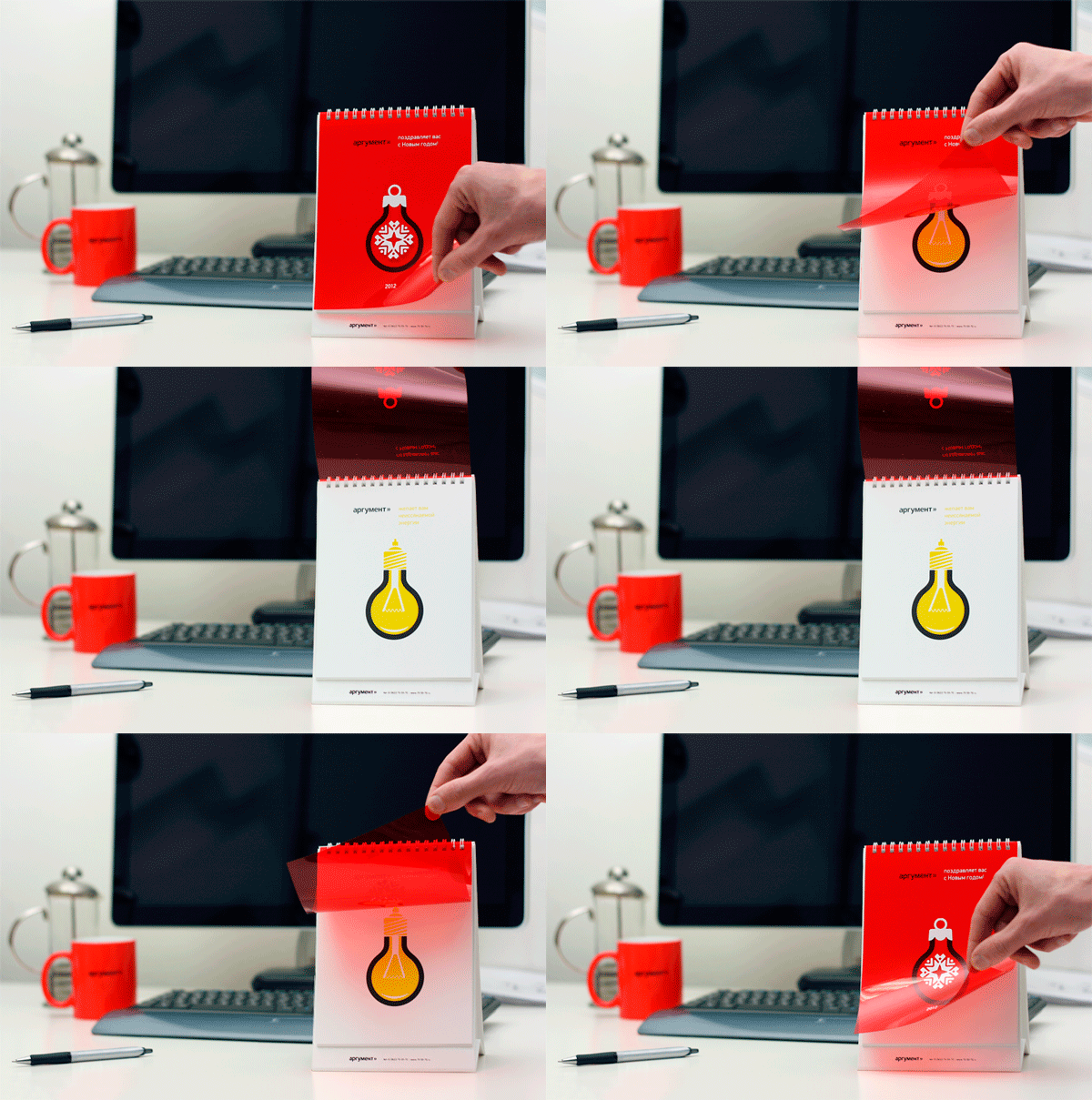
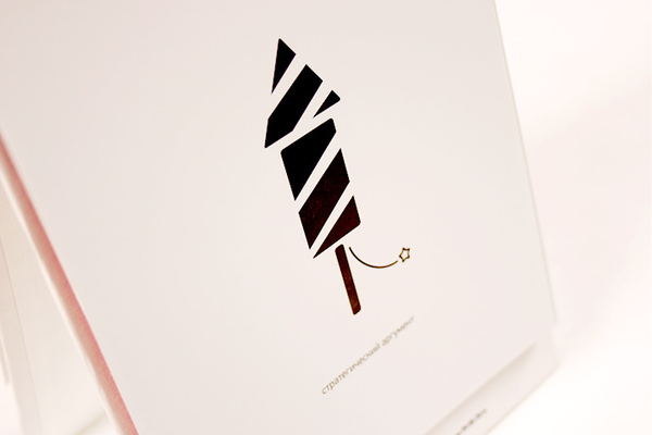
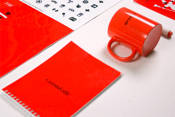
Western Siberia design and production agency "Province" creates outstanding print design and corporate souvenirs with smart humor icing for valuable clients. We spotted their two latest works worth to explore below
A smart gift for a hunter



And a daily-sticker calendar named Everyday Argument


London Olympics 2012 starts this week and here is a creative way to tune up for this amazing hope not spoiling by politics event. The Berlin-based artist Jens Ullrich explorers the collision of antics and modern sports by using collage techniques.


"Lithuanian artist duo Terrible Twins (Ruta Pu & Urte Janus) use photography as their tool for creating new experiences rather than capturing a moment. The duo builds sets, designs costumes, and uses make up and styling elements in order to bring their subjects out of their actual identity and into a surreal character " writes Trendland

” Nine Circles of Heaven is an exploration of Sin as a concept perpetuated by western Catholic society and aims to question the authority of such doctrines when describing concepts like virtue and sin, good and bad," say Ruta Pu & Urte Janus


View full series on http://terribletwins.co.uk/NINE-CIRCLES-OF-HEAVEN
London based Bobby "The Slighted" forms "Department International" duo together with Brian Okarski. All of their links contains a heap of very good magazine designs but better we shall take a look on Bobby's covers shared on his Flickr


We spotted Kashiwa Sato flash website five years ago and it is still an example of Japanese way to organize information. This time he is back to shock us with new iPad experience. Check his Portfolio application or watch the video below http://itunes.apple.com/app/kashiwasato.com/id502367977 http://kashiwasato.com/


http://vimeo.com/43805654
That's not a sponsor post or whatever just because we love to feature awesome achievements of Russian Students. That happens a fifth year in a line Moscow based British High School of Art and Design tear apart the international competitions without fanatic roaring but with a methodical wins of valuable awards. Last year BHSAD Students brought 2 pencils from D&AD competition. This year brought the school 3 Yellow Pencil awards.
1) Integrated Communications - Arina Kiseleva, Kseniya Apresyan http://vimeo.com/44983497
2) Moving Image - Lidia Velles, Yana Mironova, Zhanna Nosova http://vimeo.com/45633490
3) Photography - Michael Skachkov
Also there were 3 Nominations for Anastasia Korosteleva, Ann Khokhlova and a team of Arina Kiseleva, Dima Vtulkin, Olga Terekhova
And 3 "Best of the Year" for Sergey Kleschev, Nina Kazimirova and Zhanna Nosova, and Oleg Pashkovsky, Seslavinskaya Anna, Tim Raiter, Vitaliy Urban

Awesome photo manipulation work of Paris statues photographer by Leo Caillard and digitally dressed by Alexis Persani


http://www.youtube.com/watch?v=52ak299RqHI&feature=player_embedded
We spotted Tom Lane's graphic design few years ago just in time he graduated from college. Now it is a time to revisit and check his new directions.


http://vimeo.com/30392705


http://vimeo.com/45436061

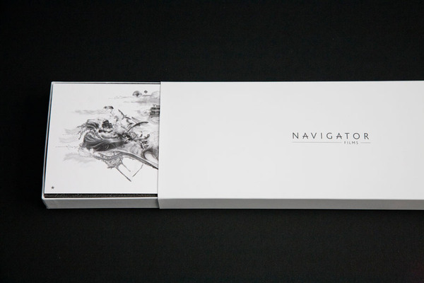
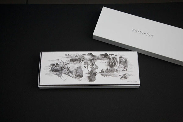
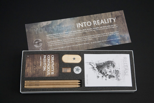
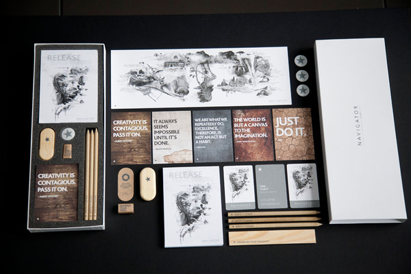
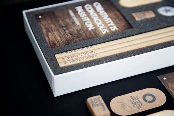
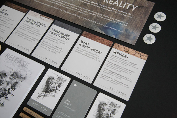
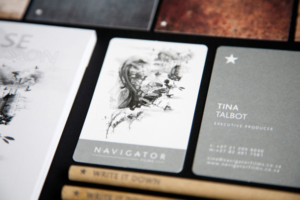
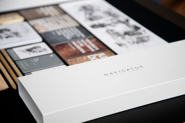
Cape Town based graphic designer Brett Atherstone just completed mouthwatering identity for local film production company Navigator Films
Read more on Behance project

Clever identity gets clever prizes. Ermolaev Bureau was among 4 Russian names rewarded by European Design Awards 2012. Designers Vlad Ermolaev and Olga Balina (designer behind our DCMAG logo and cover design) won Gold in Identity for "A-Moloko" project.
This visual identity developed for a company selling milk through a chain of milk vending machines. The logo concept was suggested by the name of the chain: Automated sale of farm fresh milk. The first letter 'A' which when turned upside down resembles a cow's muzzle was taken as the basis. Visual identity is built on a system of symbols that show the path of the milk from the cow to the consumer.
Freelance is a great part of design process but what about mobility? Here is a great example of movable freelancer - Axel Peemöller works and live on a boat in Mediterranean Sea and is able to visit any customer around the shores. But even living as a sea wolf-designer he has established a remote team of developers and creative people able to pick up tasks with collective efforts.

Jessica Walsh (@jessicawalsh & now @sagmeisterwalsh) is a multidisciplinary designer living and working in NYC. Her work has been featured in numerous magazines and books, and won design awards from the Type Directors Club, Art Directors Club, SPD, Print, Graphis, among others. Recently he joined almighty Stefan Sagmeister as an art director and started working together on "Happy film" expected in 2013. Now they named Sagmeister&Walsh and you might seen that nude photo of them both circulating on design web. Designboom has a nice interview with them, read it out
Here are the works Sagmeister & Walsh did together, for a full Jessica's profile visit http://jessicawalsh.com/ (on Behance)
http://www.youtube.com/watch?v=jUhm_beGBoA
Beautiful experimental typeface based on lines and geometric structures created by Moscow based graphic designer Kir Rostovsky. For presentation he used unique silkscreened poster and a poker-work on wood - trop bien! Go grab you typeface copy on http://www.behance.net/gallery/Indy-Typeface/4192363


