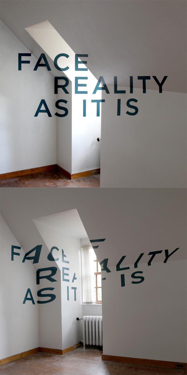
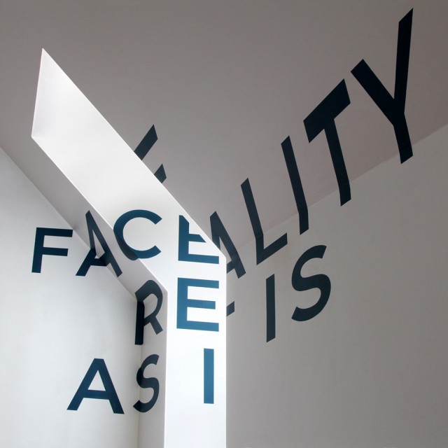
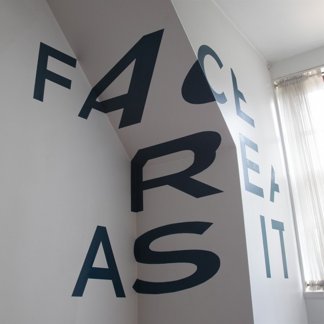
Anamorphic Typography by Thomas Quinn
Briefly "Anamorphic Typography" is an illusion where the type in the space or any location looks just right when viewed from the exact right spot, but it looks stretched and warped on the walls when viewed from elsewhere in the room. Chicago based designer Thomas Quinn did this famous trick with elegance and good results
http://vimeo.com/14817245


