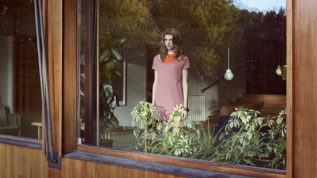
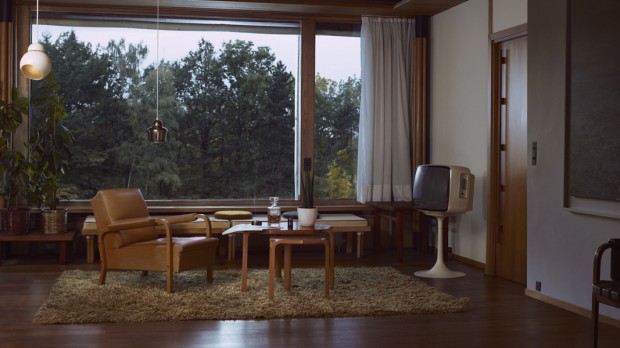
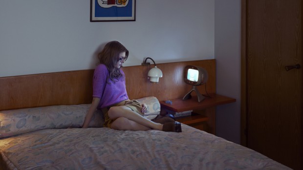
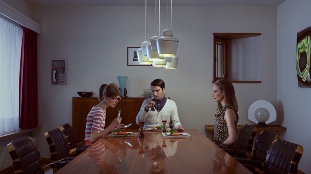
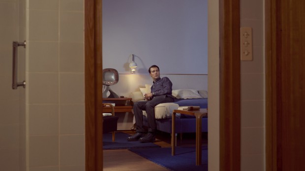
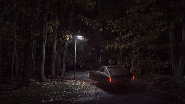
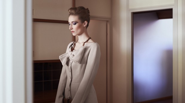
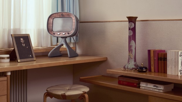
Sundays - A Film About Our Future by PostPanic

"Sundays (working title) is a feature film idea created and written by Dutch commercials director Mischa Rozema. It is a project he has been living and sleeping with for the past years. It is the result of stories inhabiting his head, images that need to be visualised and the the desire to create a film completely different to anything we’ve seen before. The story is there, so is the research. What we are asking your help with is the opportunity to create a short film - the first step on the path to realising a feature film - using the skills and passion of Mischa and his team at PostPanic and Savage."

"We're raising money through Kickstarter to make this short film. We want to show what is visually possible when creative integrity is closely guarded from the beginning. We don’t want to risk diluting Mischa’s vision by 3rd parties forcing him to become more mainstream and commercial. We want to show what he is capable of as a storyteller when he has complete control over the direction."

Please check out details on www.postpanic.com/kickstarter/

http://vimeo.com/44102825

See also "OFFF 2011 Titles" by PostPanic

Behance

LiquiData Multitouch

LiquiData is a multitouch application to explore your personal movement profile and to show other people engaging places by adding photos and comments with the help of your smartphone. It can be seen as a rating system that offers people the possibility to discover new spots in an unknown surrounding e.g. during a city-visit. Although a smartphone is not necessary to interact with the system, it offers you the possibility to give insights to your movements through the city and lets you compare your mental map with the reality. For instance, this system could give guests of a hotel (lobby) the option to share their walked trails and show other visitors their favorite coffee shops or parks.

Team: Gunnar Friedrich David Ikuye Pierre La Baume Christopher Pietsch Luis Grass

http://vimeo.com/43120464

Emergence by Susi Sie

Cologne based visual artist Susi Sie released her latest motion film "Emergence" and we had a chance to speak with her about it

DC: What is the main plot and idea of "Emergence"?

Susie: Primarily this film (like my other films "BLACK" and "FLOAT") started as an experiment with liquids. At the beginning I had totally no idea which images I would get and which story I wanted to tell, so everything developed time after time. I like the conclusion of less being more, so I´m always looking for a way to tell stories in an abstract way, giving the observer the opportunity to interpret my films in his own way.

DC: What was the hardest challenge in the project you get through?

Susie: I think the hardest challenge in this project was to keep my motivation on a high level, even after months of failing and testing and filming and editing everything again and again until I was satisfied with the final result. Sometimes I forget, that making art, which I regard as my passion, is attached with a lot of really, really hard work. Good work takes time to develop, and interestingly, the final result is always something which you couldn´t have imaged at the beginning.

DC: How long did it take you to complete the video?

It took me about 9 months to complete this film... In the first steps, I made a lot of experiments with the black fluid, mixed with water and soap and tested many lenses to find out the best way to film the fluid. It also took me a while to develop a story behind these images. I think it´s important not to totally focus on a certain idea, to give the project the opportunity to develop itself in unexpected directions.

http://vimeo.com/43156247

Collection Ten by Fotolia - Takeshi

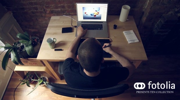
@Fotolia launches the TEN Collection (@takeshiwan Emeric Trahand for June), a gathering of 10 top international digital artists. Each image has been created with a specific theme, then exposed through a detailed Photoshop PSD layers file. Each month, you will find a new theme, a new artist, a new image and a deep dive into the artist's PSD file! This extremely rare look into our artists' secret techniques is in the spirit of education and community, helping designers go further in their own artist endeavors.

This month is presented by acclaimed artist Emeric Trahand aka Takeshi. Well known for his photo editing skills and surreal & colorful art, Emeric Trahand is one of today's most influential designers. His different texture effects, 'urban' style and ability to relate to nature are amongst many qualities that make him a unique artist. Originally from France, this now New Yorker produces work for internationally renowned companies like Ubisoft, Honda, Adidas and Swatch...He is also a member of the KDU and Depthcore, and posts his art on the Amkashop website.

Go download Takeshi's PSD for FREE, today only

http://www.youtube.com/watch?v=e1LfNfINwnQ&feature=plcp&list=PL3536444B4BCCFABA

http://cargocollective.com/stillontherun Ten by Fotolia (Russian)

Efteling - Winter Projections by PostPanic

Dutch agency PostPanic has been busy with 3d projections with Amsterdam agency Muse over the past year or so, but this is the first time they have been able to create something for the Netherlands.

http://vimeo.com/32959248

More details on the project

Director: Matthijs Joor Production Company: PostPanic Agency: Muse

Semi-Permanent titles by GMUNK

Munkowitz first participated at the Semi-Permanent Sydney conference back in 2004 as an alternate to a last-minute cancellation named Nando Costa.. So when Andrew and Murray invited him to design their 10th anniversary Title sequence in addition to participating in both their 2012 Sydney and Auckland events, it was an offer he couldn't refuse Read more about the work on http://work.gmunk.com/Semi-Permanent

http://vimeo.com/41954766

Director: Bradley G Munkowitz Director of Photography: Kevin Gosselin

Olga Feldman Linzza - An Anatomy

I think @Radiohead or @MassiveAttackUK might be inspired as same as us by the latest and the longest project "An Anatomy" created digitally by hands of Saint-Petersburg based conceptual illustrator Olga Feldman aka Linzza. Why I mentioned Radiohead, because this work reminds me their project http://www.aaronkoblin.com/work/rh/index.html with the only difference in creation - Aaron Koblin did it with code, Olga - by hands and without 3D dummies.

We had a chance to speak with Olga about her project.

DC: What was the concept behind "An atomy"? Olga: First there was no concept. All I wanted is improve my vector technic and connect it with classical anatomy studies. 3D models that I’ve used before are too rough and I refused them.

DC: What was the main challenge while creating this series?
 Olga: Once I saw that this “studies” could be joined like a puzzle . It was such a conversation between two hands at every picture – they care, love, protect each other and at the same time all of them are linked – in a human that implied. And this hands relationships are very simple, elementary. Soon, pictures became words – give, you, love and so on. Probably, this words I should say a long time ago, but I never did. This serial artwork is about a mother.

DC: How long did it take you to complete the project? Olga: It took time. I started to vectorise first picture about a year ago. Every little thing could bring me down, there were months of doing nothing between pictures, I changed title of the series three or four times, but came back to very beginning – “an atomy” – and unfortunally, there is no correct Russian analog for this title. Sometimes it seemed like I’ll never finish this work – some new details, meanings, nuances, technics appeared and made it all endless. So I just stopped.

Stas Stankovskiy

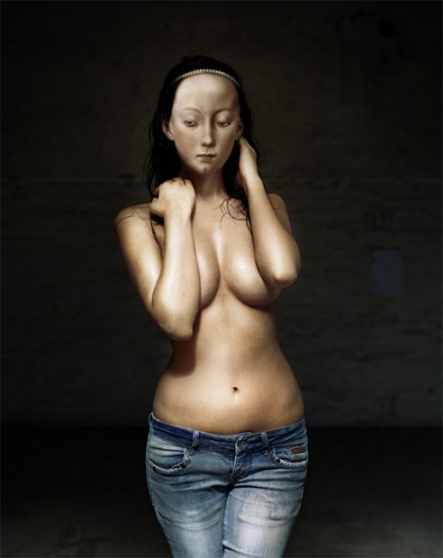
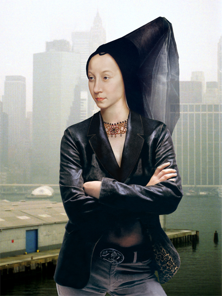
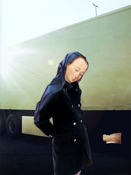
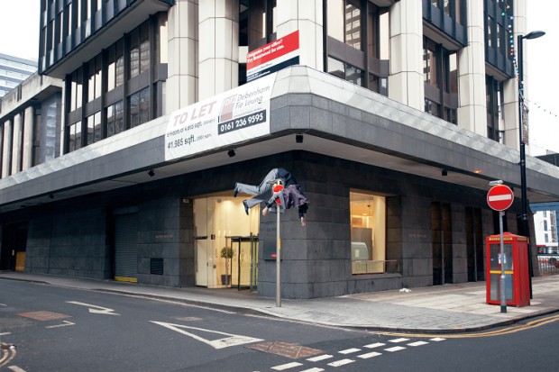
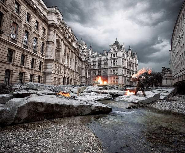
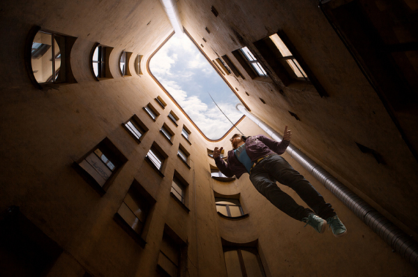
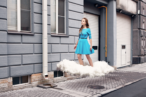
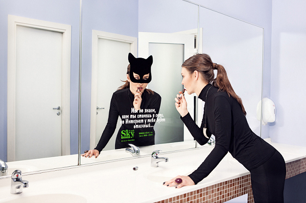
The latest finding from Russian design scene - digital manipulated photography from Stas Stankovskiy (on Behance) "I photograph in multiple genres but staged photography attracts me the most. I trust my intuition, and philosophy. This is why I try to give mystical flavour to some of my pictures. Fantasy creates capturing stories with their own rules, their own circumstances and actions. I aim to create unusual pictures which will touch your inner world and will not leave you indifferent." that what he says on personal website http://www.stas-stankovskiy.com

100 Frames - The A to Z of London

100 Frames is a brand new collaboration between Animator and Director - Fraser Davidson, Actor and Writer - Dan Jones and Producer - Matthew Harvey. The idea is simple - to create 4 second animation (exactly 100 frames) for each alphabet letter representing something very London-ish and special.

http://vimeo.com/41152488

http://vimeo.com/41153119

http://vimeo.com/41344421

http://vimeo.com/41152897

More to come, check Fraser Davidson's Vimeo

Anton Marrast

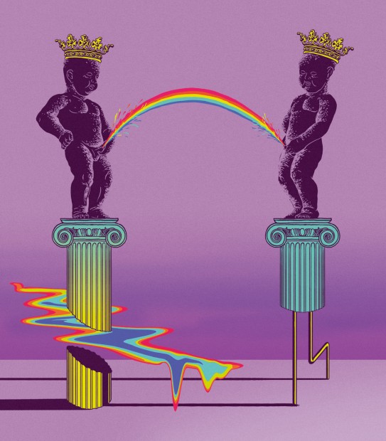
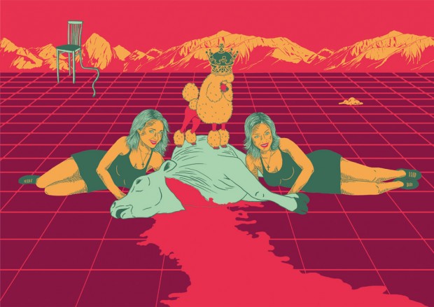
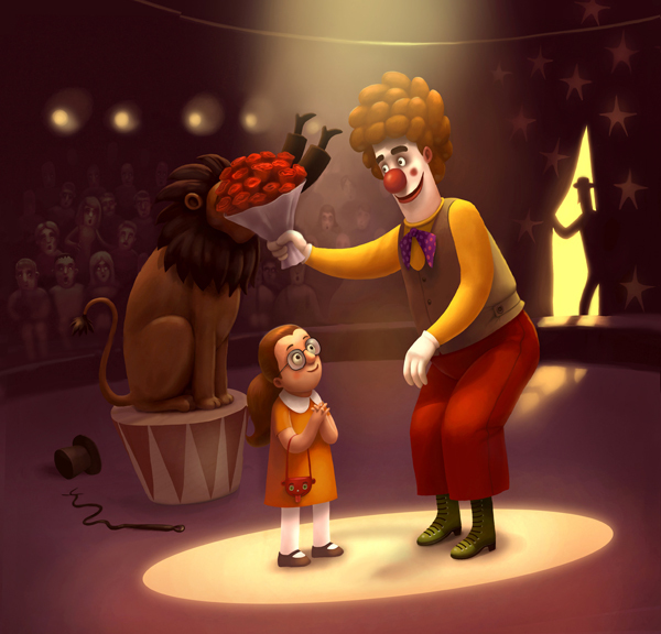
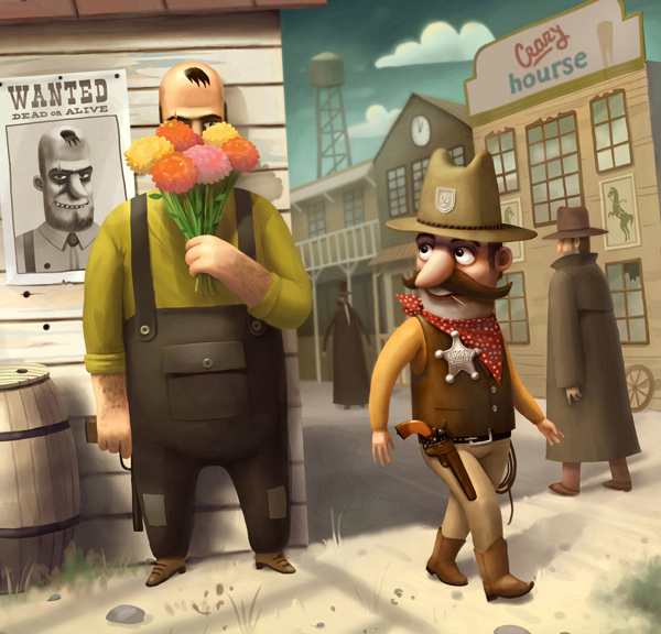
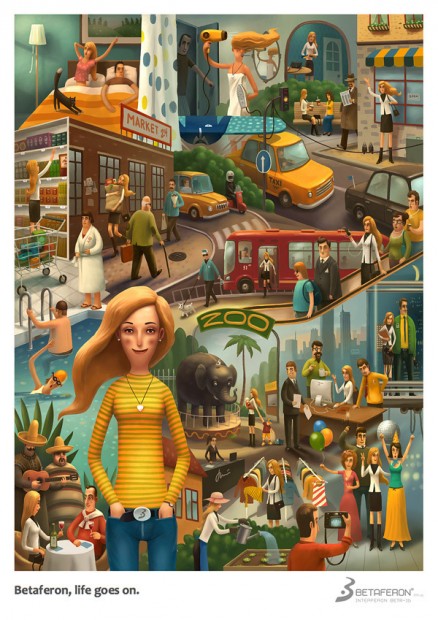
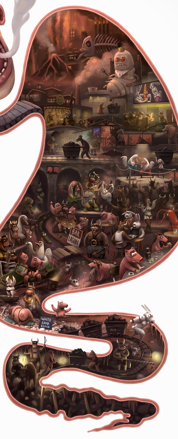
Gifted Russian illustrator Anton Marrast recently finished few new artworks that illustrate Gabriel Garcia Marquez stories. What I prefer in Anton's works is a perfect sense of surreal art mixed with deep thoughts of a subject and polished with awesome skills in digital techniques. We follow Anton's works since old times and were really happy to collaborate with him for our iPad Mag Zero last year. We also featured Anton works at OFFF 2011 (pity we will miss OFFF 2012 that happens in next two weeks).

Original Prints, T-shirts and other goodies are available for purchase on Anton's online store http://society6.com/Marrast