2012 Creative Calendars
The 2012 begins and it's time to renew calendars. With the help of Designmilk and Behance Network we selected the most interesting and creative calendars for 2012. Typodarium 2010 Typodarium 2010 is the first typographic tear-off calendar, with 366 typefaces from 252 designers hailing from 32 countries. via DesignMilk

urbnCal "The team from UrbnCal chooses a city to feature each year in a calendar. The team then bikes around that city and photographs number plates to represent each day of the year. This year they chose Helsinki, Finland." via DesignMilk

Art Calendar 2012 by Martin Grohs Print graphic calendar created by Martin Grohs

Infographic Calendar 2012 by Martin Oberhäuser Each color/ring represents one month of the year. National holidays (Germany) are highlighted with an icon and pink color. The tabular view at the bottom offers some space to fill in appointments or birthdays. Check it on Behance

The Eyes of Imagination 2012 New calendar by talented illustrator Irina Vinnik features her love to imagination and hand drawing. Available in inverted colours version too. Check it on Behance

2012 Typographic Wall Calendar The calendar is made of exactly the number of used keyboard keys that represent the year. Created by Harald Geisler, via DesignMilk

Twenty Twelve A collaboration between Evgenia and Dominic Righini-Brand and Attitude Creative resulted the one-sheet graphic calendar "Twenty Twelve"

Calendar 2012 by GHIN "Calendar 2012 by GHIN comes with lunar cycles and the Mayan calendar. It’s also available in an Interfaith edition – various prices available on ghin.co.uk" via DesignMilk

Bubble Calendar 2012 Each time I see Calendar using a packaging bubble wrap I remember my university course work in 2002 when I did the same calendar. Enough reflecting here is a real Bubble calendar you can buy and pop everyday.

2012 Typography Calendar Created by Studi Hinrichs. Each edition of Typography Calendar features 12 unique typefaces, with brief descriptive text about what makes the font distinctive, and a biography of each type designer. All major holidays for the United States and Canada are noted on the calendar, along with the birthdays of the type designers. via DesignMilk

Minimal Calendar "The minimal black and white illustrations featured in Pawling Print Studio‘s calendar reflect the patterns of traditional textiles that they were inspired by" via DesignMilk

Cut Out Number Calendar 2012 Simple and graphic cut out numbers form this 2012 wall calendar. Choose your colour.


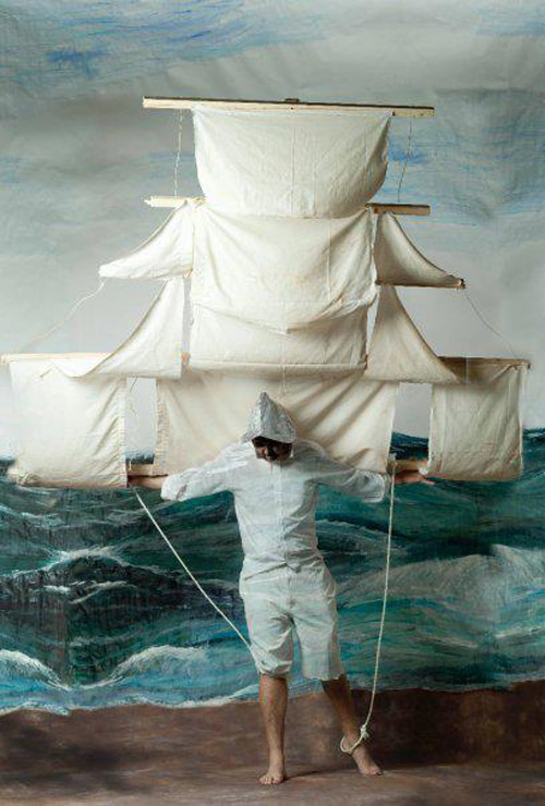
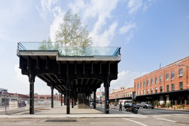
 Awesome project fixed between art and engineering featuring hand made cube kite created by Ivan Morison and Heather Peak in collab with Sash Reading and "Queen and Crawford". Commissioned by Dandara Ltd for the Chart Room, Castle Quay. Photography by




















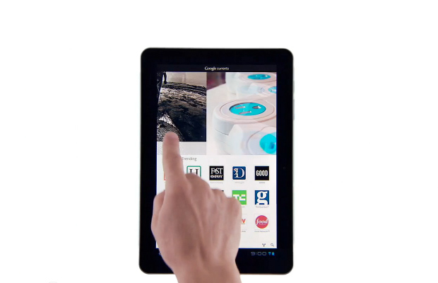 Okay, Google official came to curating industry bringing on
  Washington-based painter Tyree Callahan modified a 1937 Underwood Standard typewriter, replacing the letters and keys with color pads and hued labels to create a functional “painting” device.


 Sweden products designers are not creating new bicycles, they understand people needs and enhance products. All of their work is conceptual product design but I believe they will find a decent partners and make people happier. Now check their latest project of transparent sound system.
How they designed it for people. "The transparent design lets the speaker blend in to any living room out there. The size can be big enough to offer a good sound quality, yet the speaker takes little visible space. The box is transparent, but the sound creating components are clearly emphasized."


 Katy Beveridge presents her student dissertation as a part of proto animation research. She proves that all simple ideas are awesome. As she added "This is more like a phenakistoscope which uses the shutter speed of the camera to create the strobe effect instead of the slits." Watch the video under the cut.


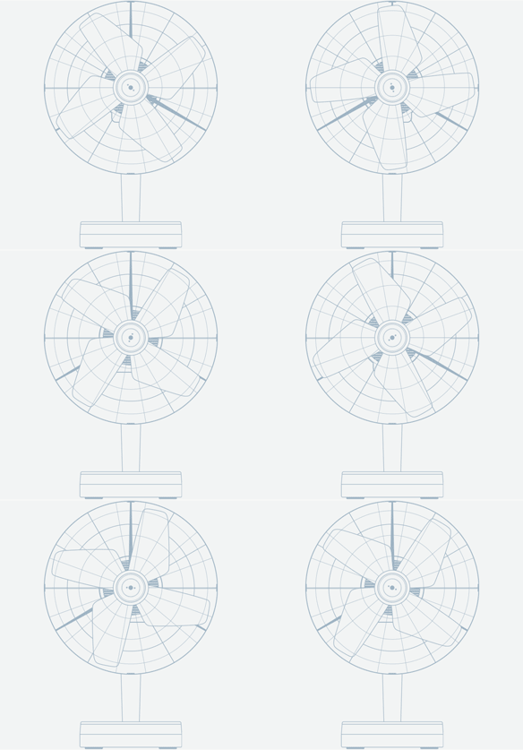
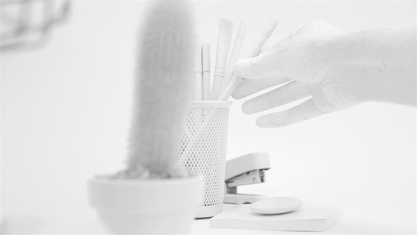
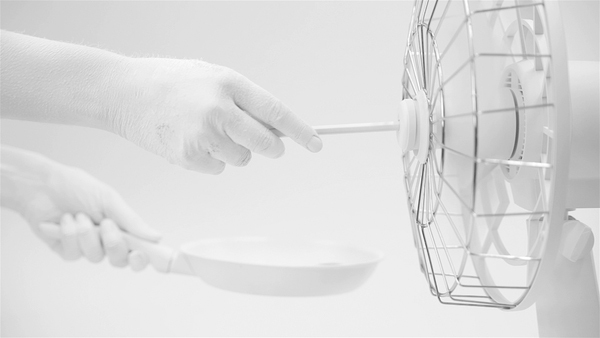
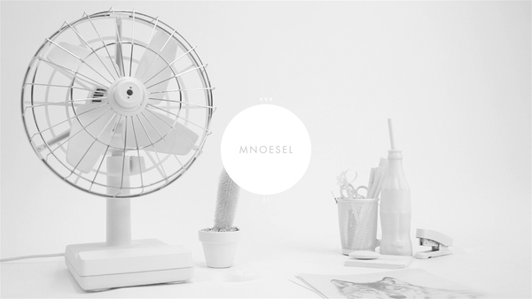
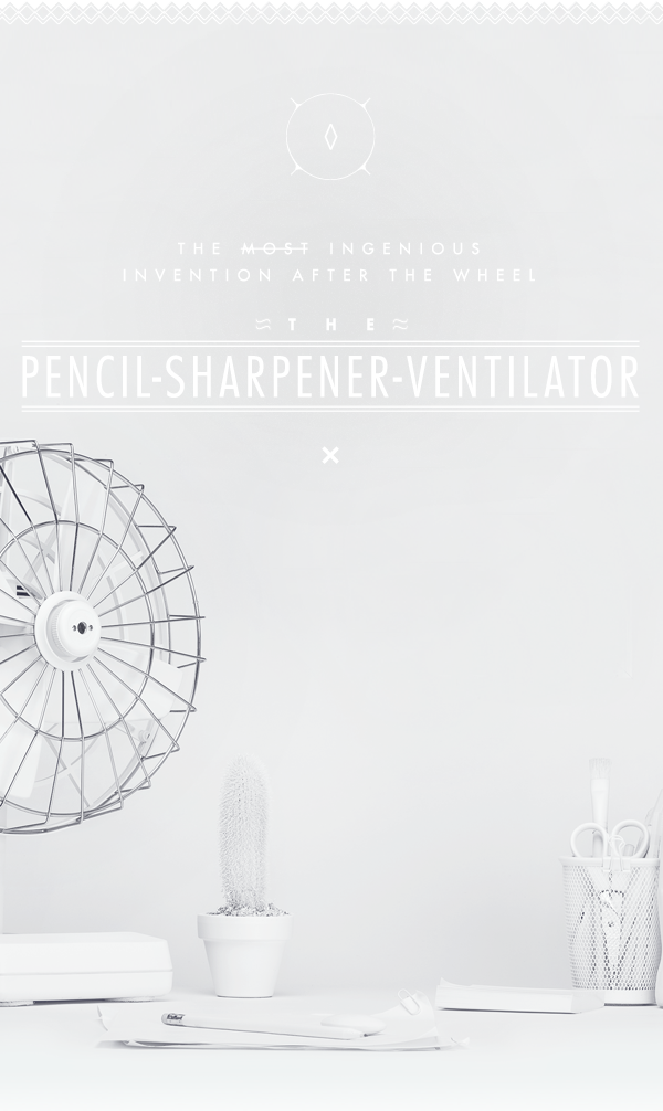 We love the nonsense and hence the sense of an object demonstrated by Mathias Nösel, a young art director from Germany. Together with friends they gave a new life to old grandpa's fan and breathe a new function of a pencil sharpener in it. Simple, clean and fun idea makes our day.



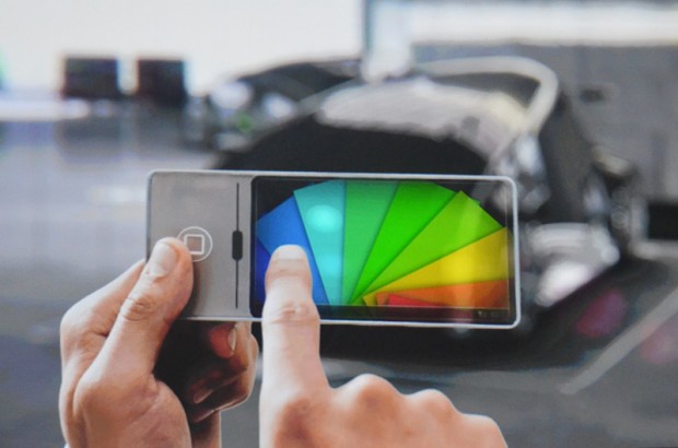


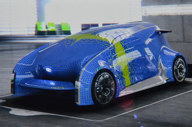






 The beauty of the cars from the past revealed in this nice app. An experience designed like a digital, interactive museum, Road Inc. plunges the user into a universe of cars that have reached legendary status. The app is paid but I think it's worth of it.