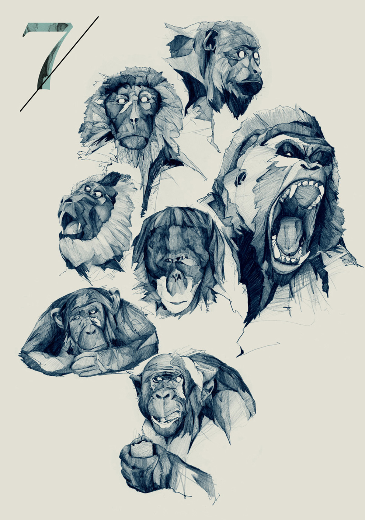
Posters by Quim Marin
Quim is Catalonian designer and graphic artist working mainly with identity systems and poster language.
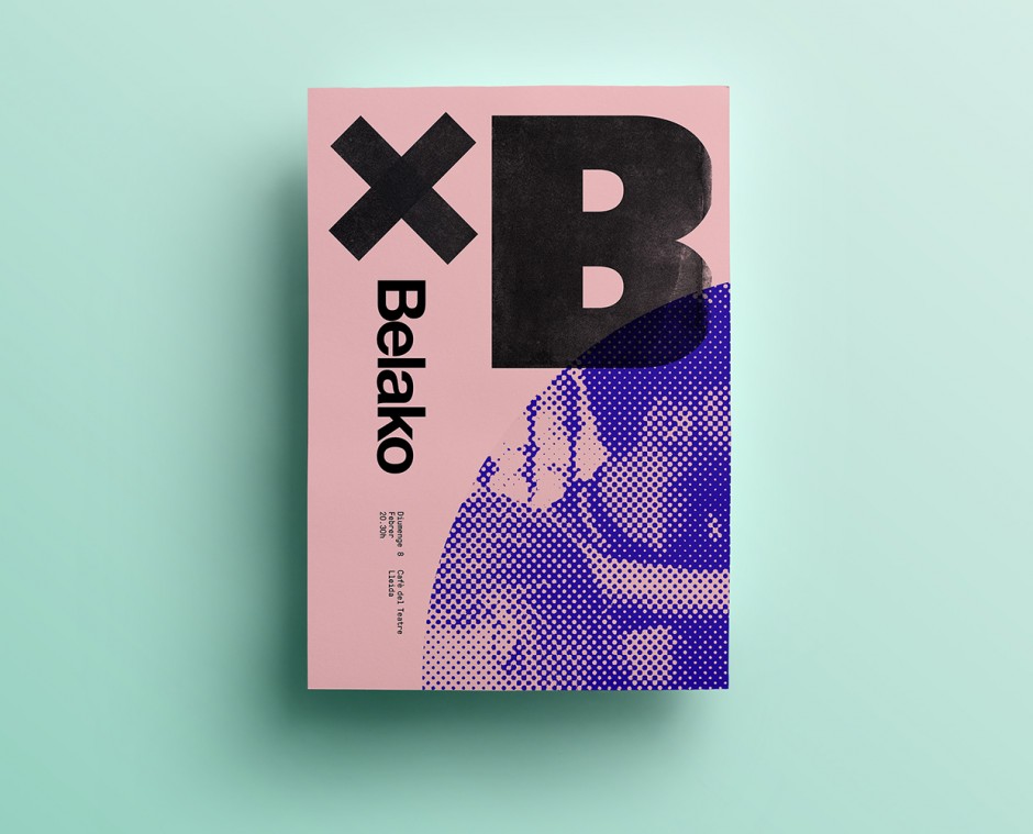
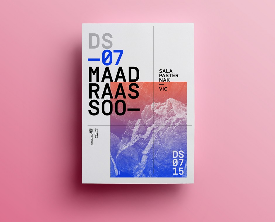
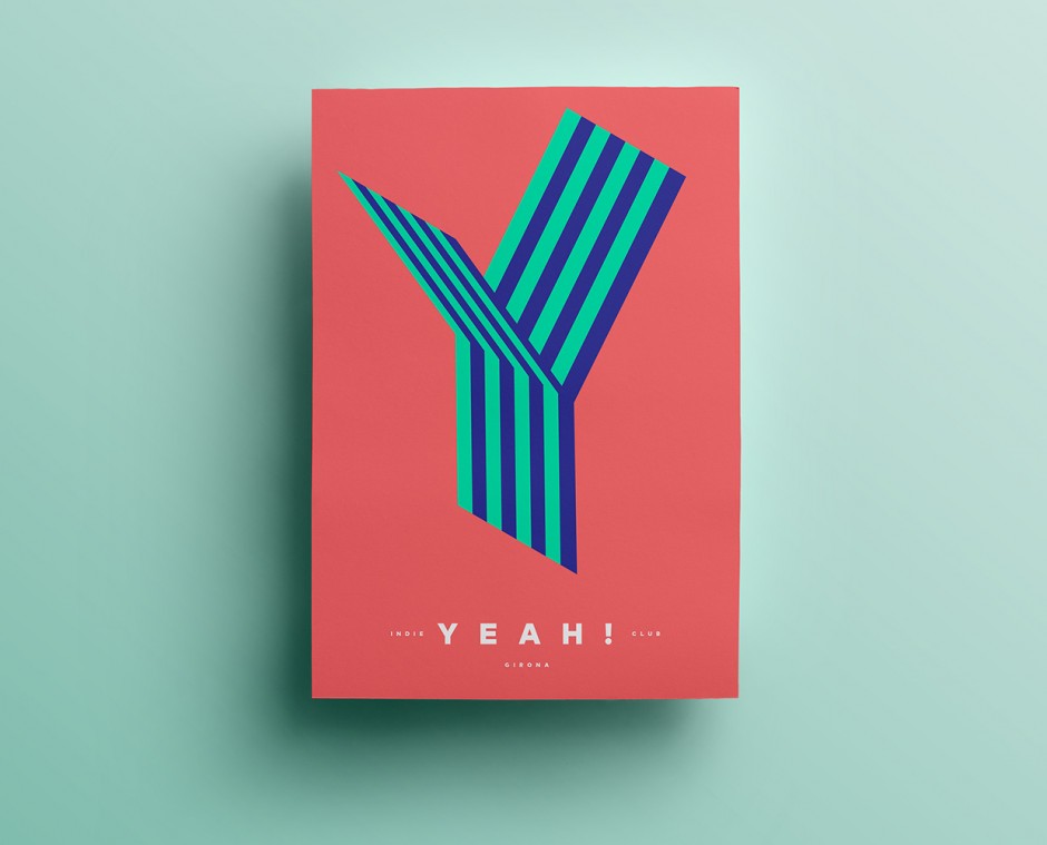
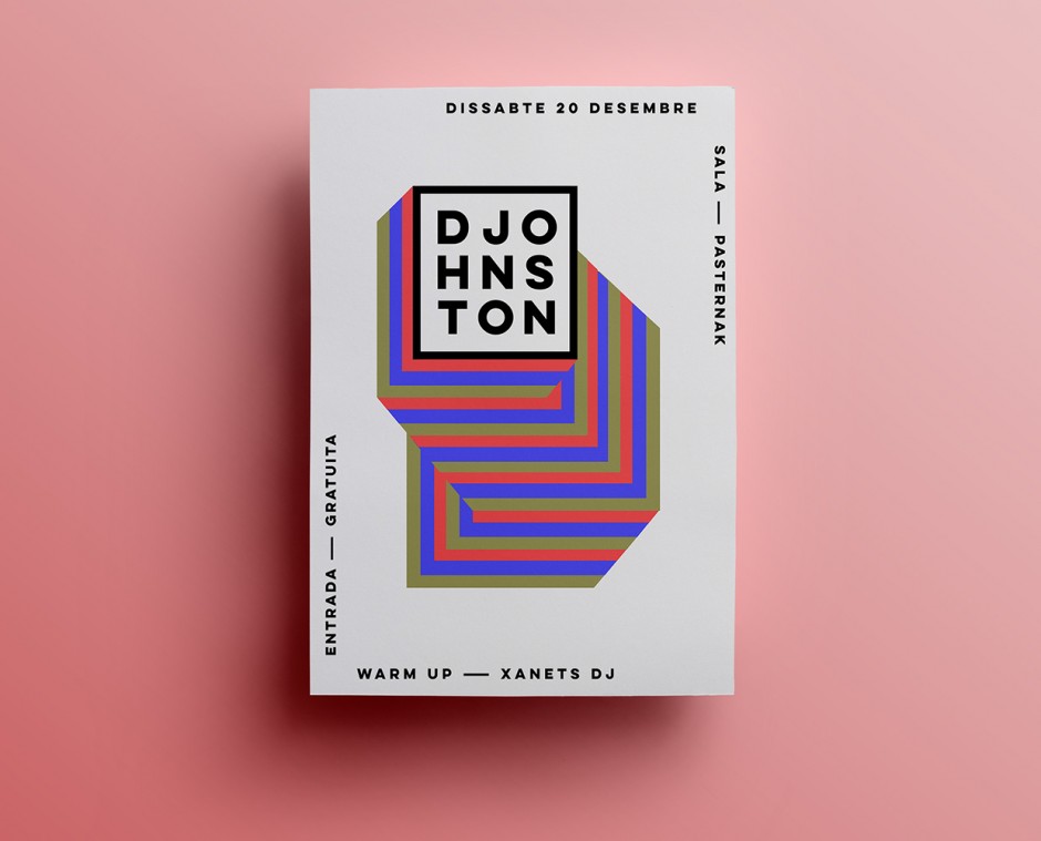
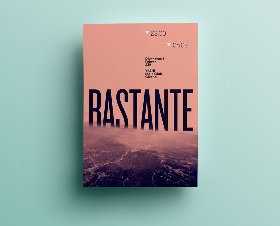
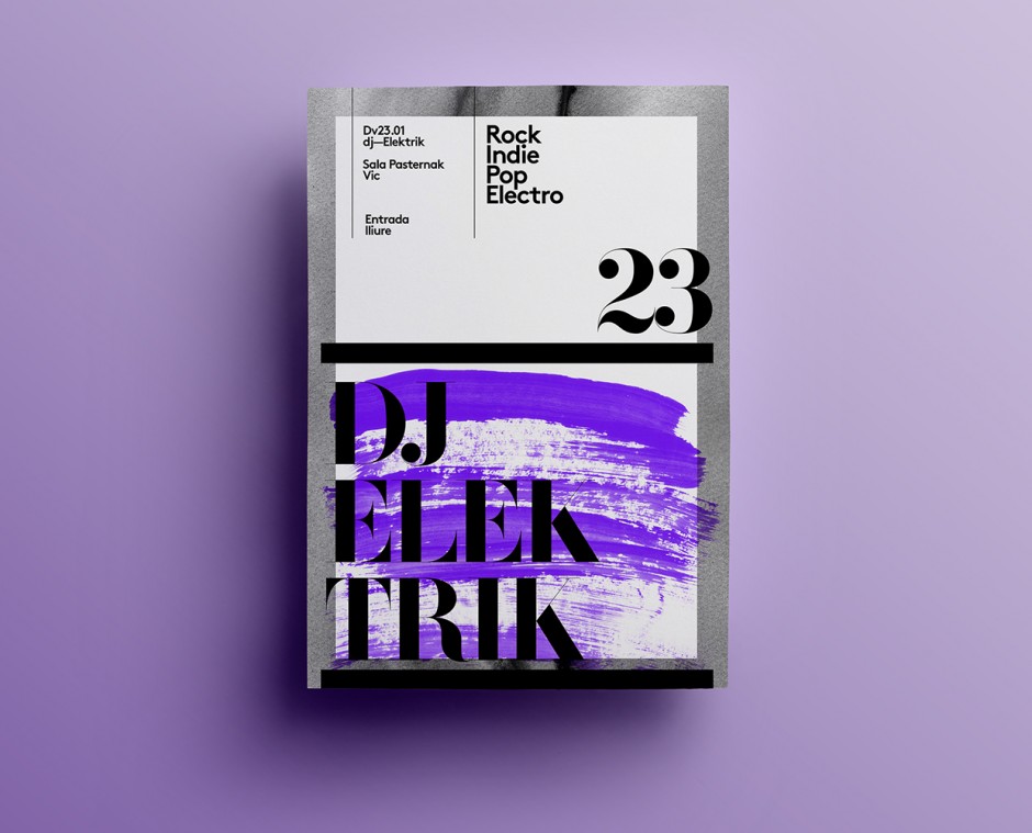
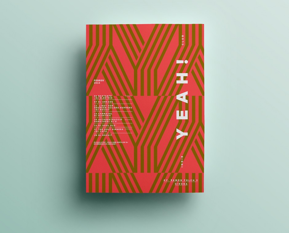
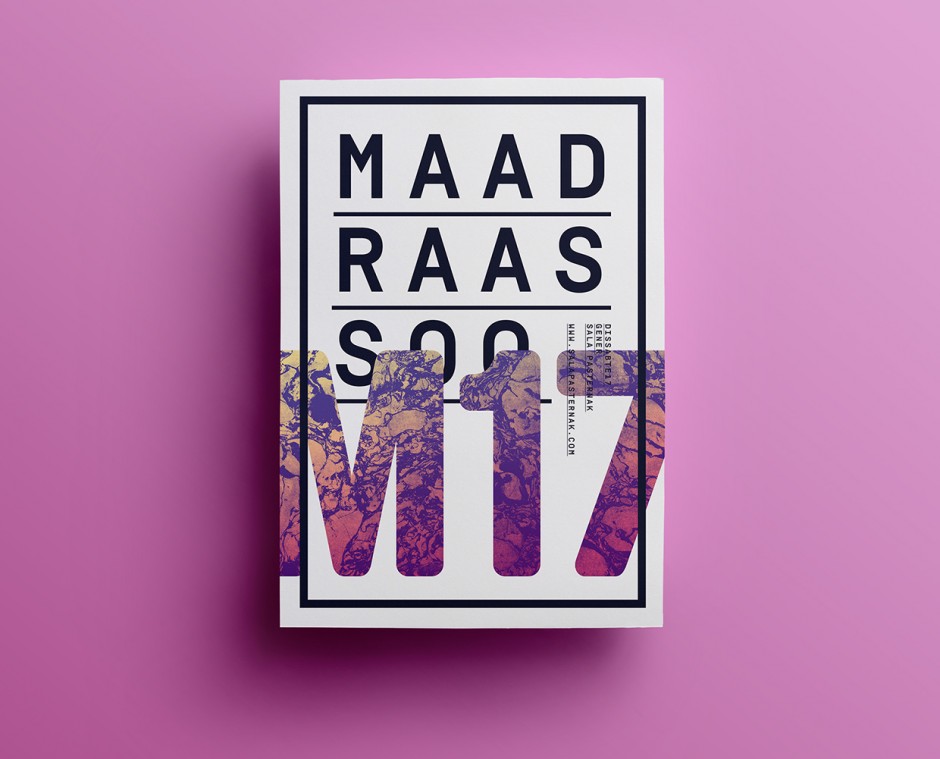
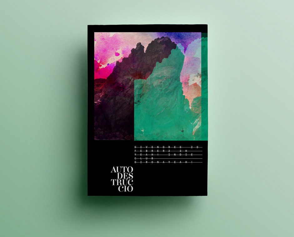
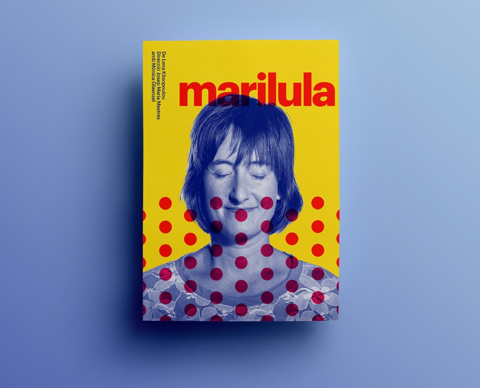
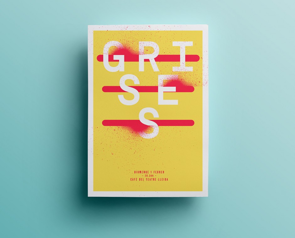
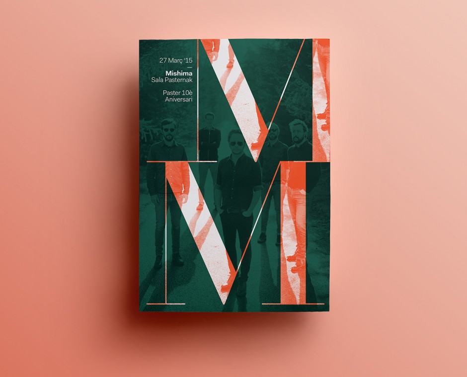
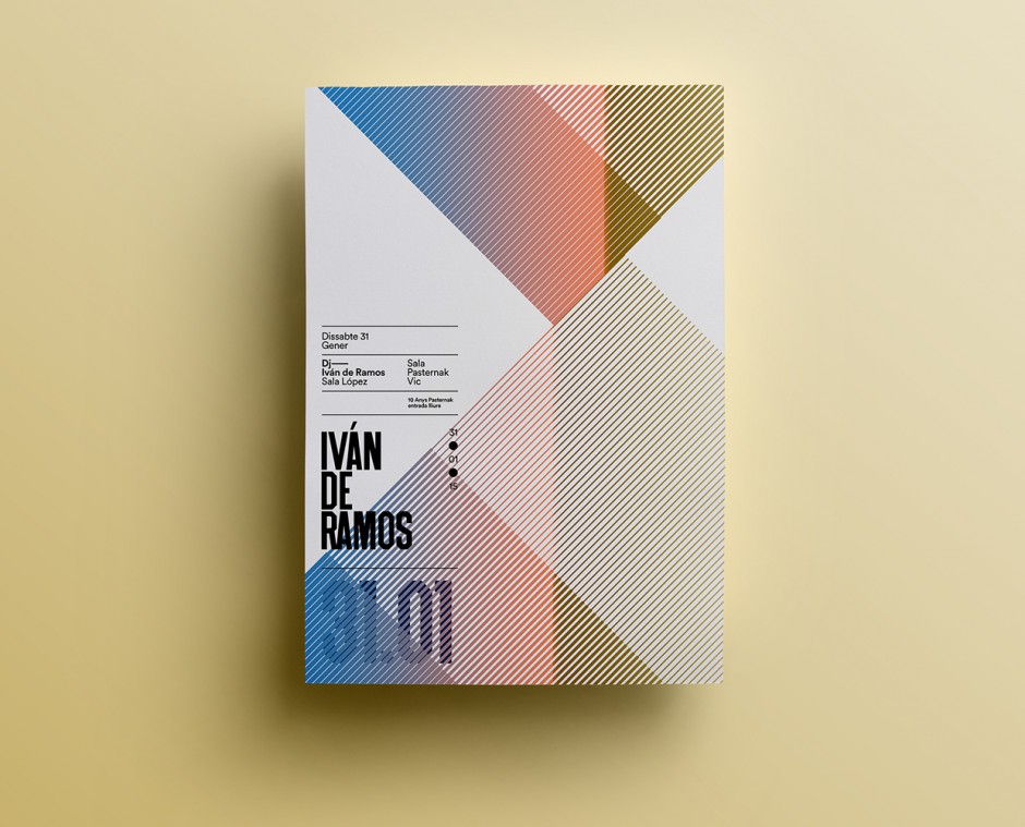
Quim is Catalonian designer and graphic artist working mainly with identity systems and poster language.


"Looking at the visual identity for http://aruliden.com/work/cooklyn, a Brooklyn restaurant specializing in "micro seasonal cuisine," is like wandering into a 19th-century warehouse inhabited by cowboys and cleaned by Mary Poppins." says FastCo, and we can't disagree. This "authentic rustic chic" design system built by Aruliden is something to study or collect as an inspiration for further projects.

Barcelona-based design studio TAVO has updated their portfolio with new showcases. Worth to check them on www.tavo.es
http://vimeo.com/77444617
You may know that a half of success for any design project is its showcase. Another quarter is a story like this: "An old railway station in Los Altos, California, has been transformed into this exquisite new bakery and café by local entrepreneur Rie Rubin, with the help of the creative people at San Francisco-based design agency Character. Named Voyageur du Temps, which means time traveler in French, the café seeks to preserve the time-honoured art of baking by adding a dash of contemporary life to it. Here you will find freshly baked artisan breads and pastries, as well as a variety of courses that give a playful wink to continental breakfast staples like the Croque Monsieur and crepes with fresh fruit."


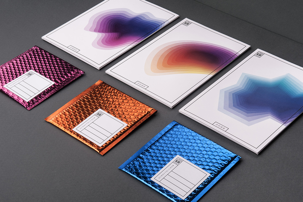
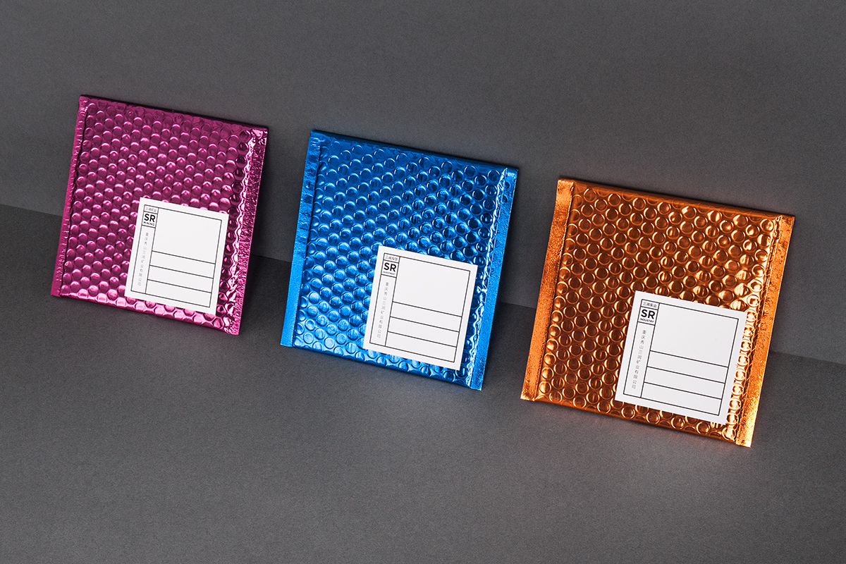
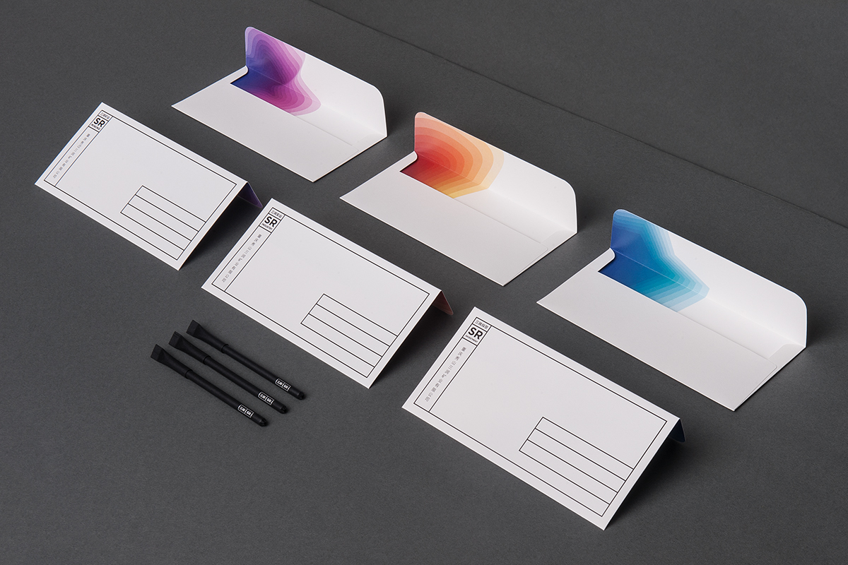
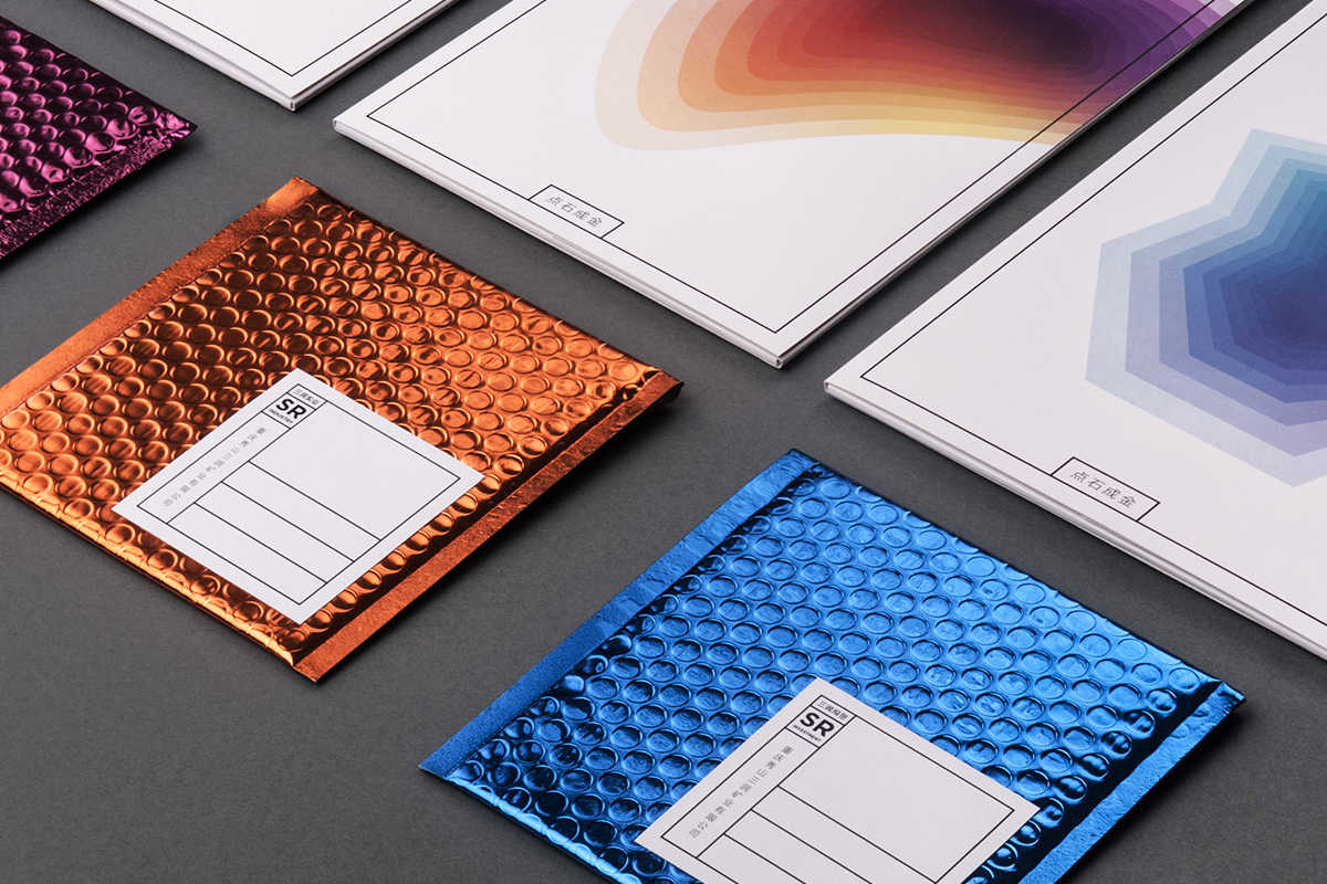
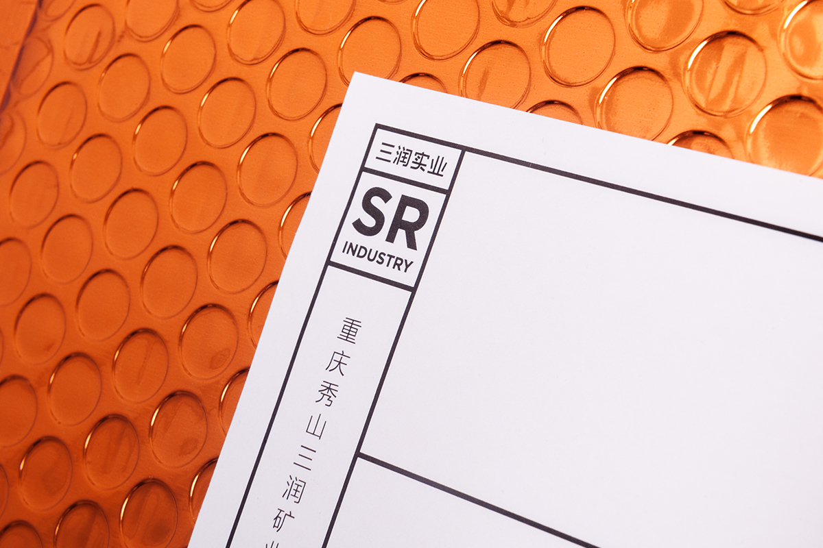
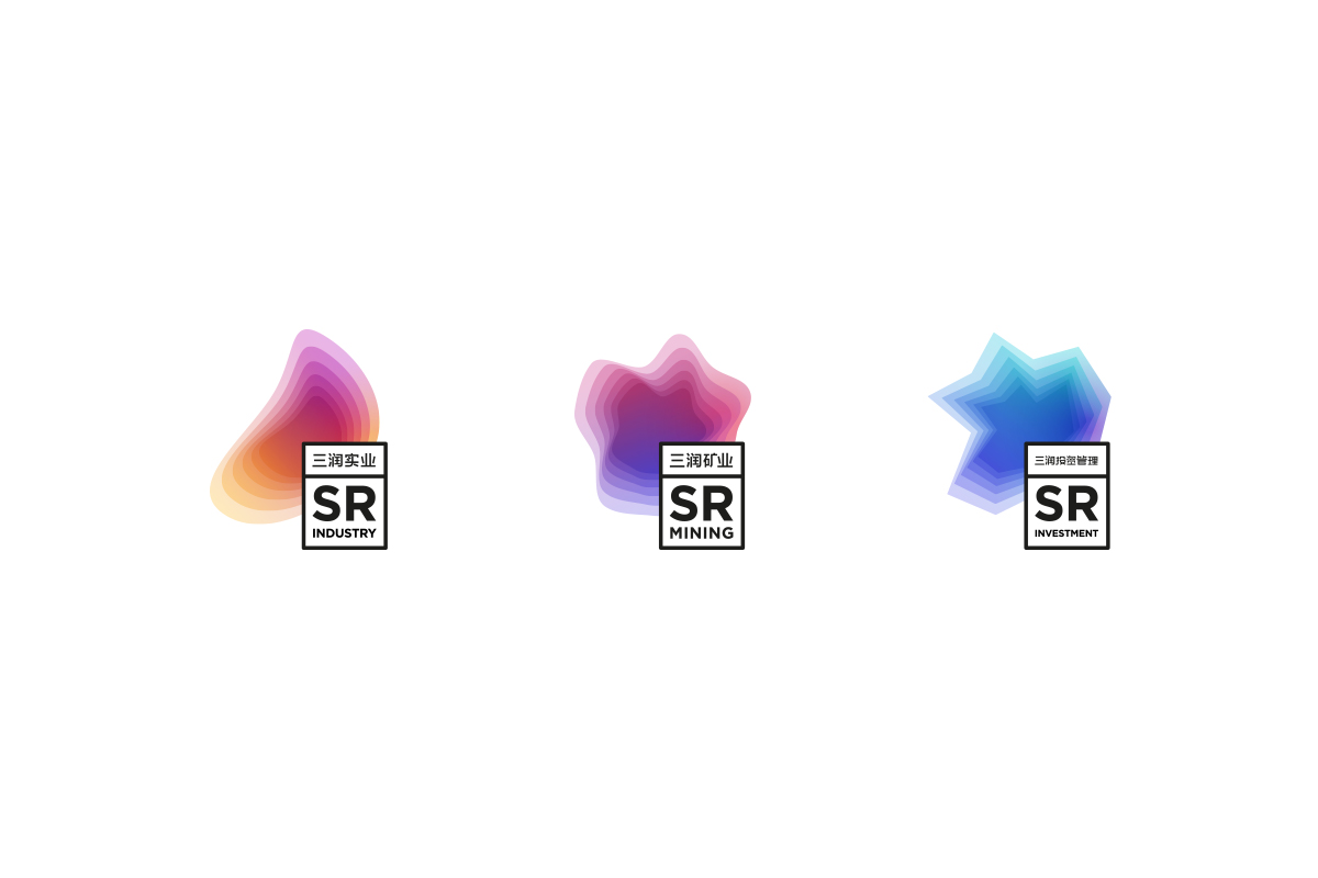
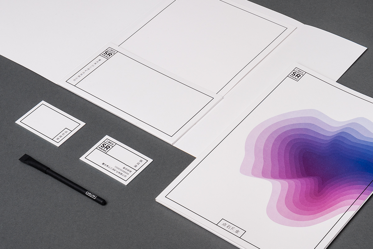
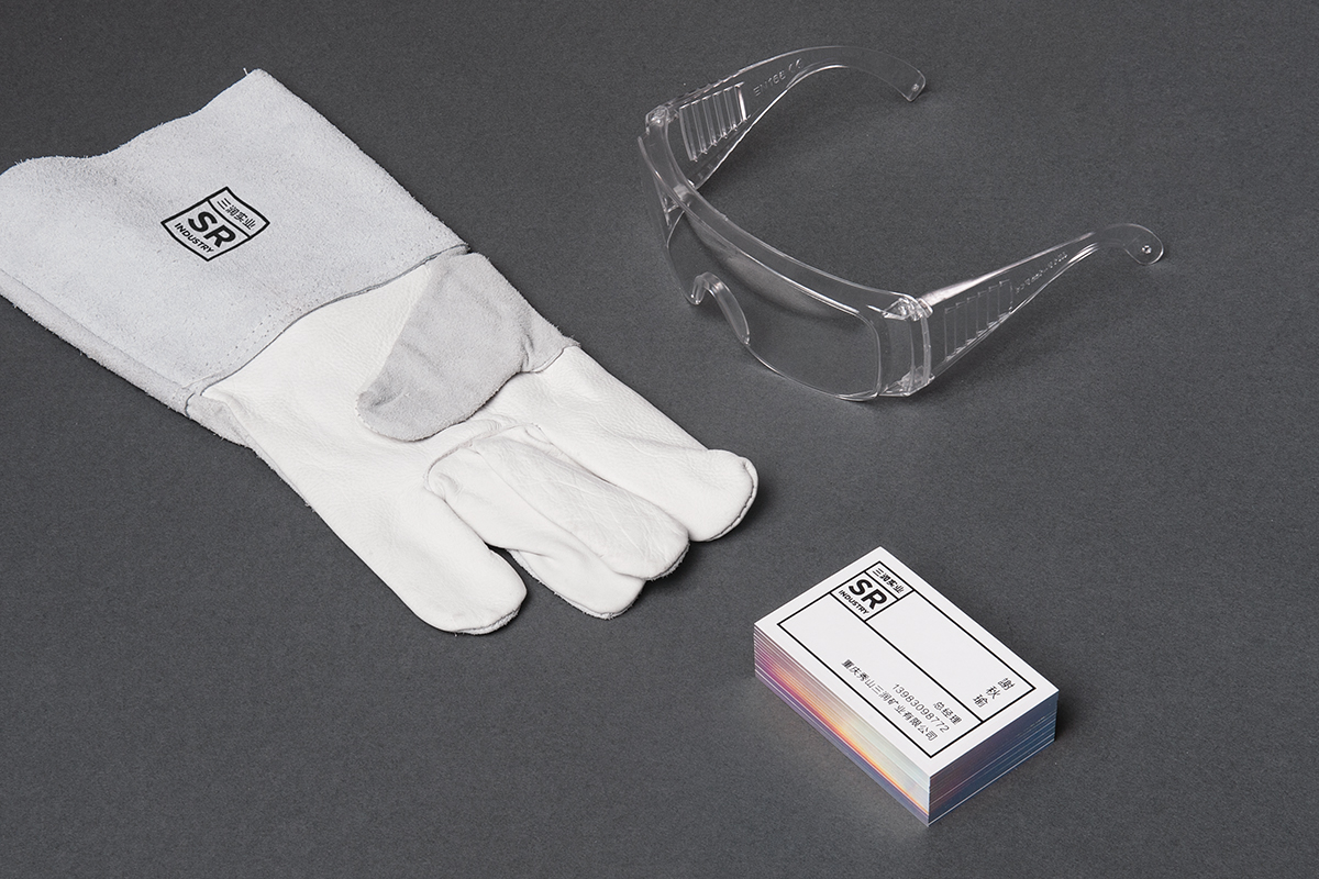
Chinese industrial company famous for its manganese mining got a bold identity developed by Polish design studio Necon
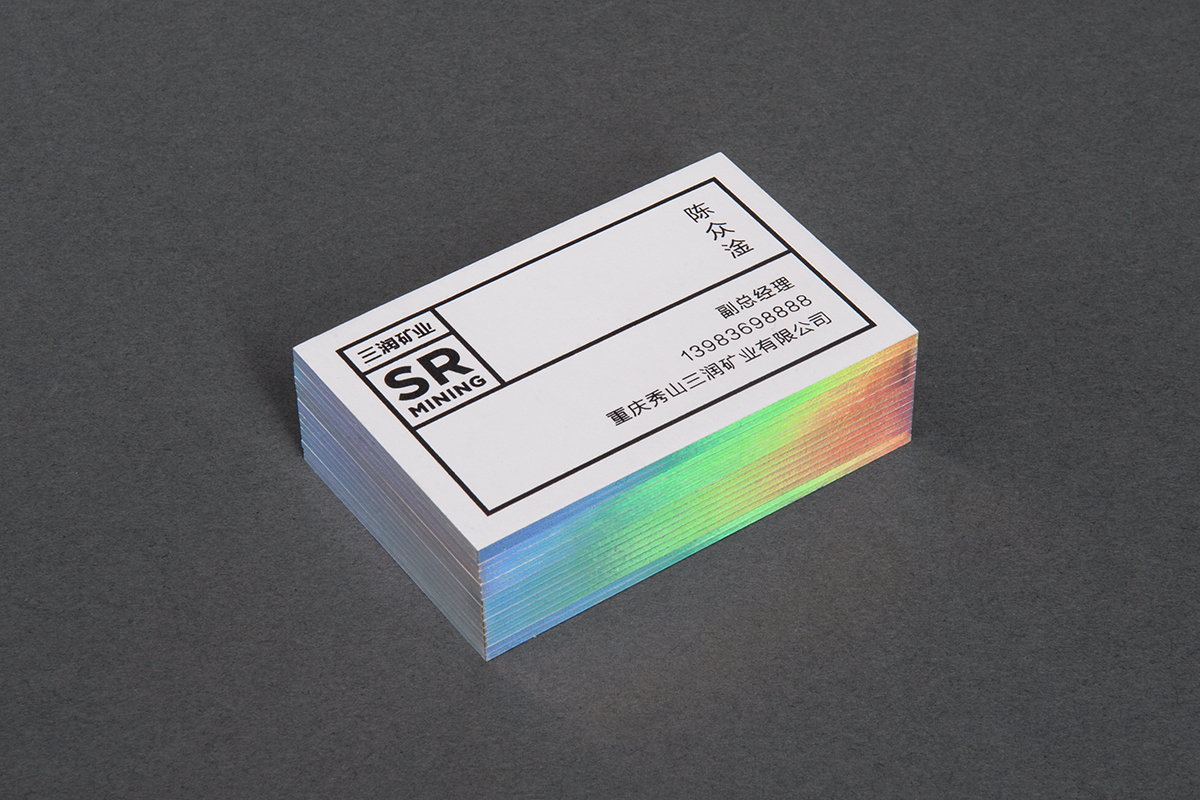
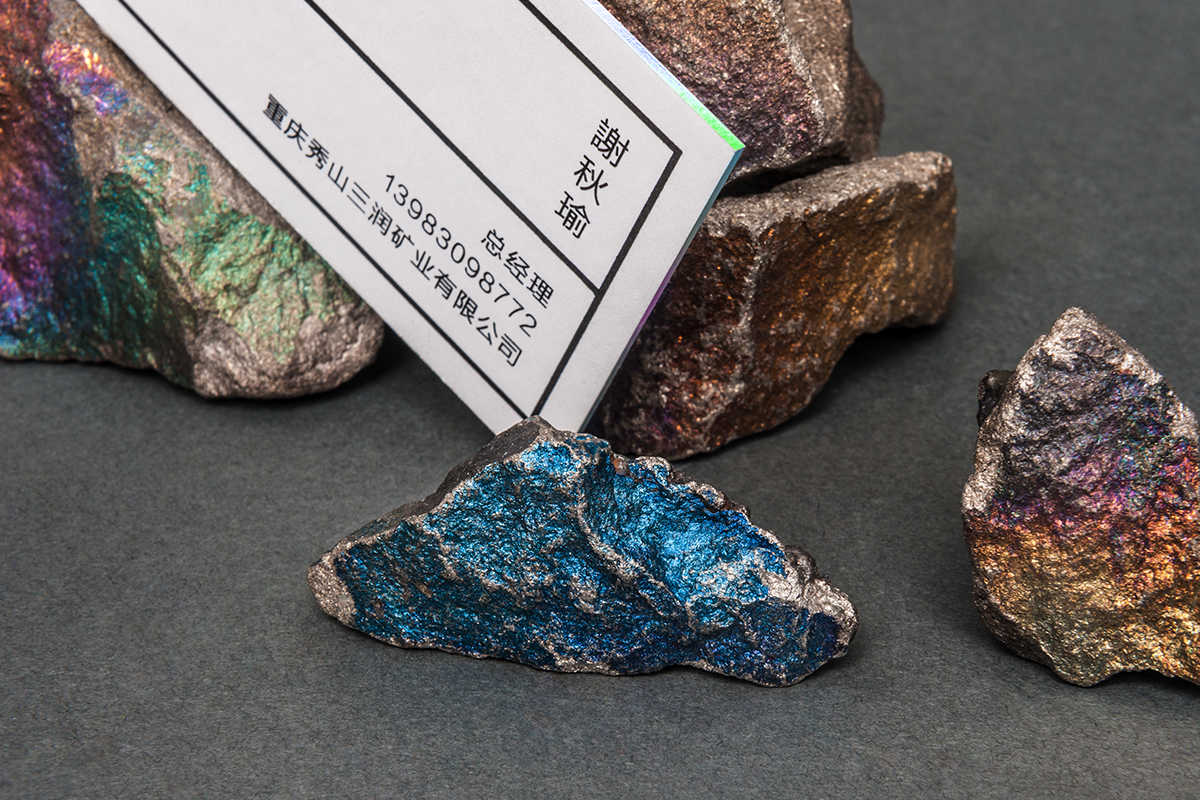
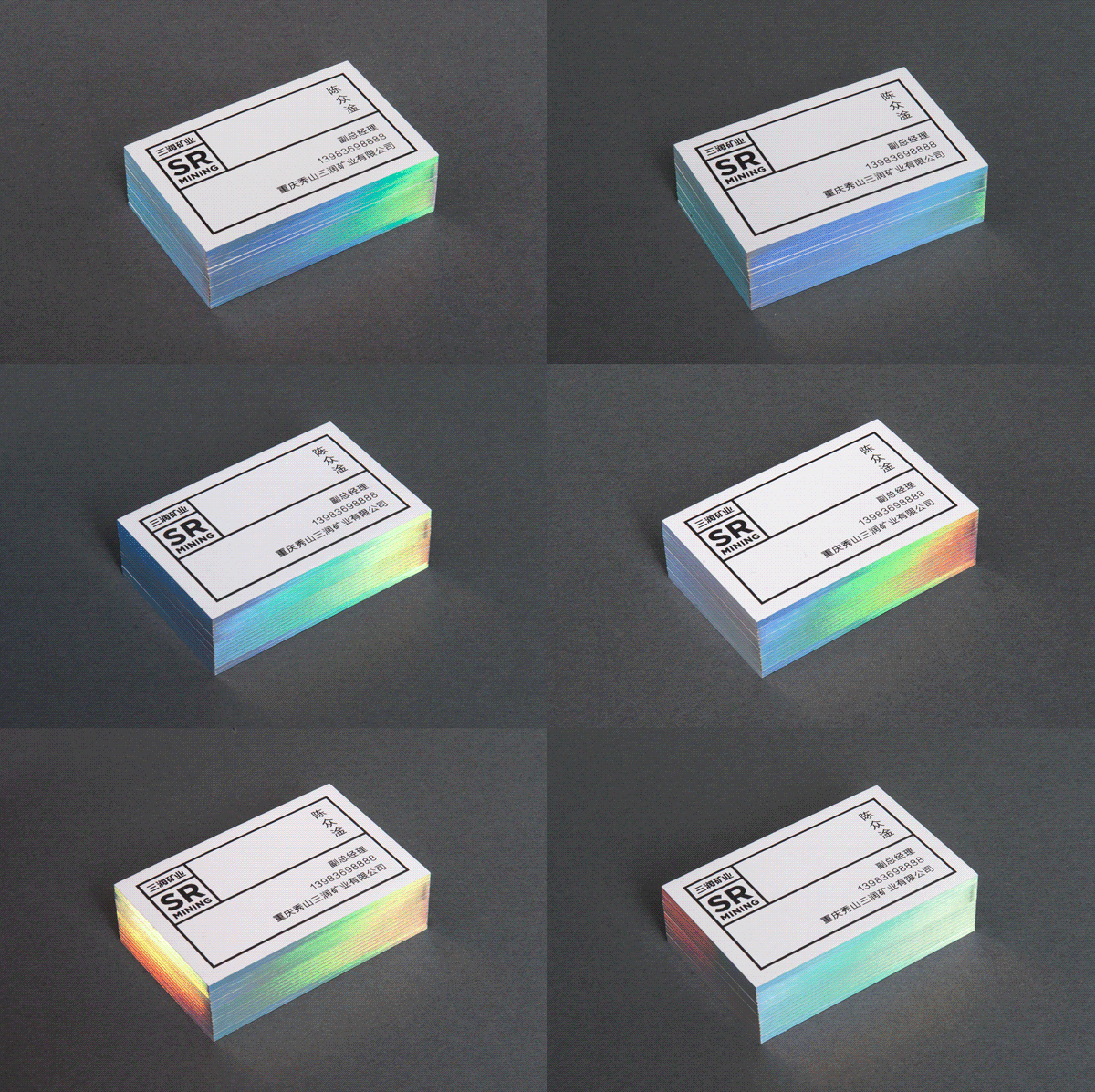
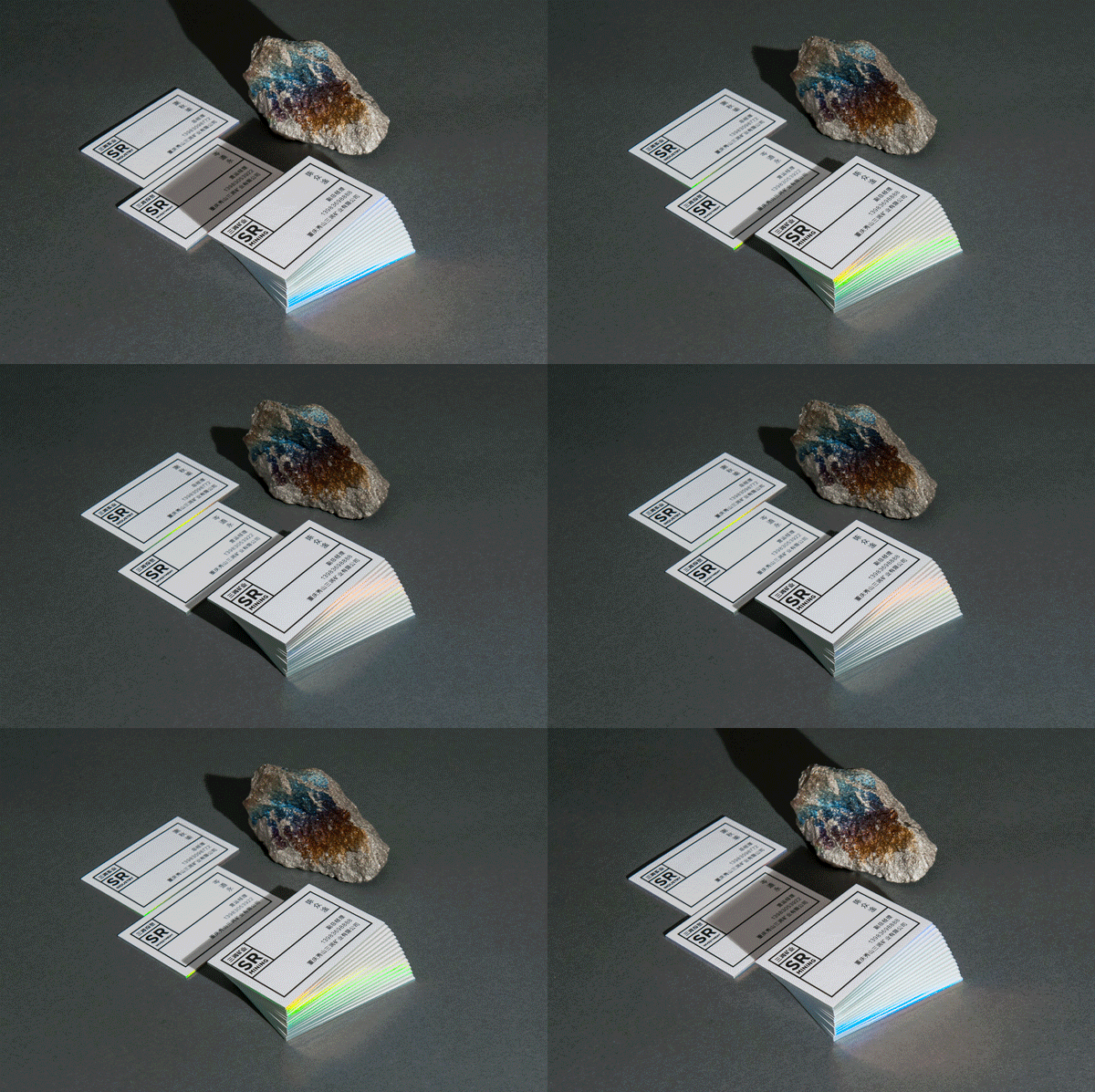
Barcelona agency BLOCD sent an awesome bottle of wine for their clients including a lovely silkscreened packaging indulging them to take colour pencils and draw together over the illustration printed on it.
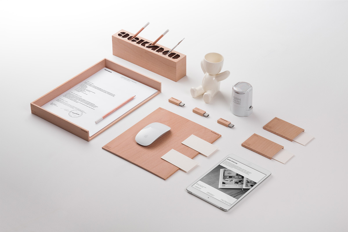
Leading Russian graphic design and identity systems studio Eskimo released their new personal branding. Check it out and find previous works of studio chief Pavel Emelyanov posted on our blog
By Sarah Maloy at Shutterstock: "Every December, Pantone announces its upcoming Color of the Year, and every year most designers can’t wait to start searching for images and creating lightboxes inspired by the new hue.This year’s color, Marsala, is a dusky burgundy that draws its name and its shade from the Marsala wines of Italy. Its deep, reddish tones are perfect for the cranberries, crackling fires, and cuddly sweaters of the upcoming winter season, and they’ll guide us all the way to autumn 2015, when leaves the color of Marsala begin to fall.
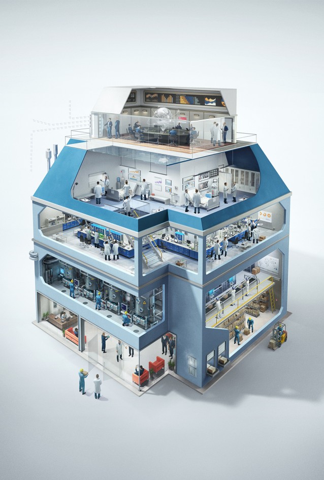
EDB Singapore is a lead government agency that hired a great bunch (with the help of The Secret Little Agency) of digital magicians from Ars Thanea. Creative guideline was clear – the illustrations must presents three different subjects, which follow a common style - a housing objectwith connected scenes. The results of this awesome collaboration can be seen below and find the full design process on Behance
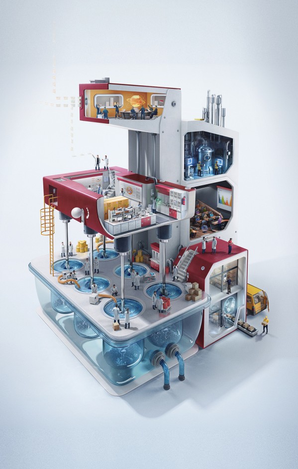
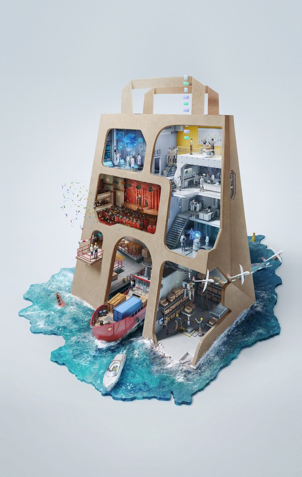
Ars Thanea Showreel 2013 http://vimeo.com/77584293
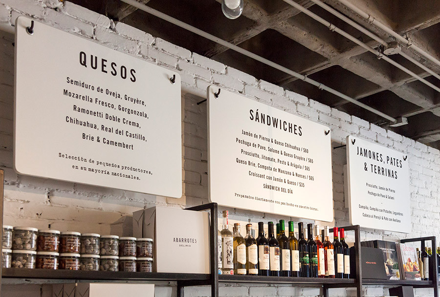
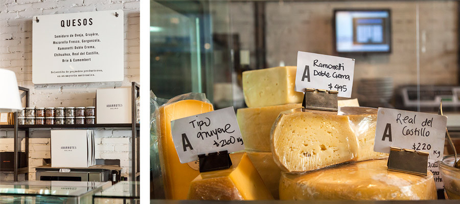
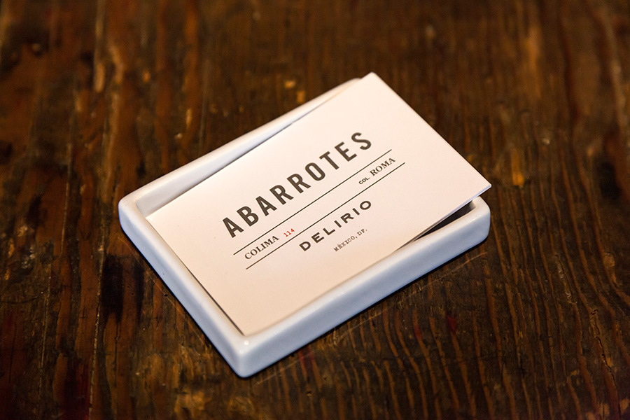
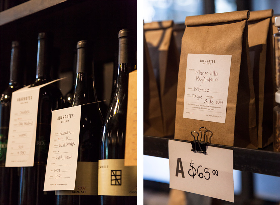
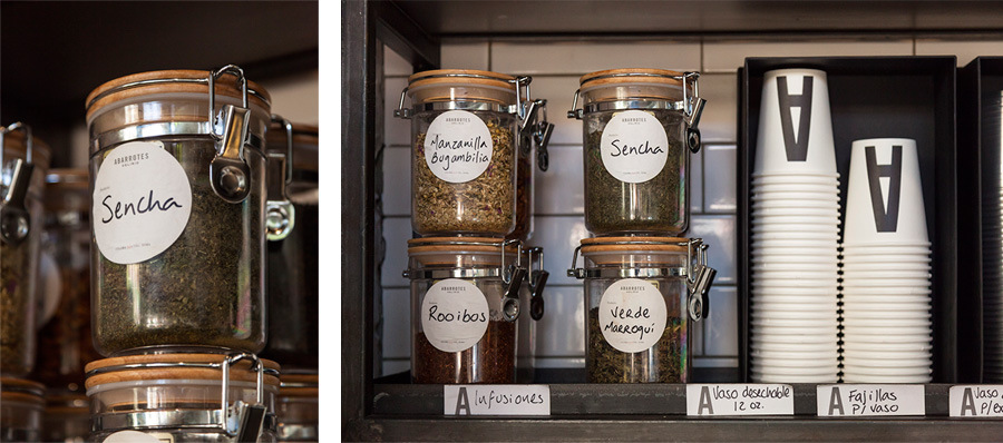
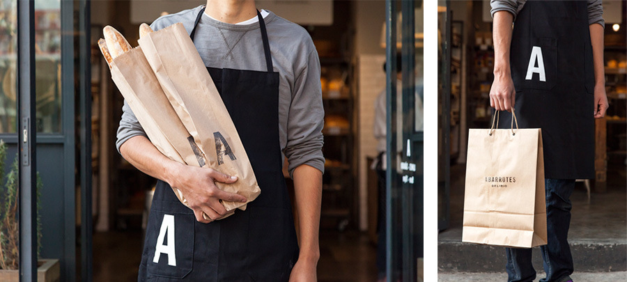
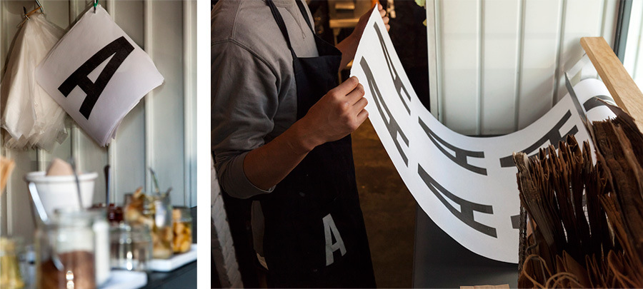
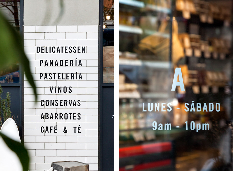
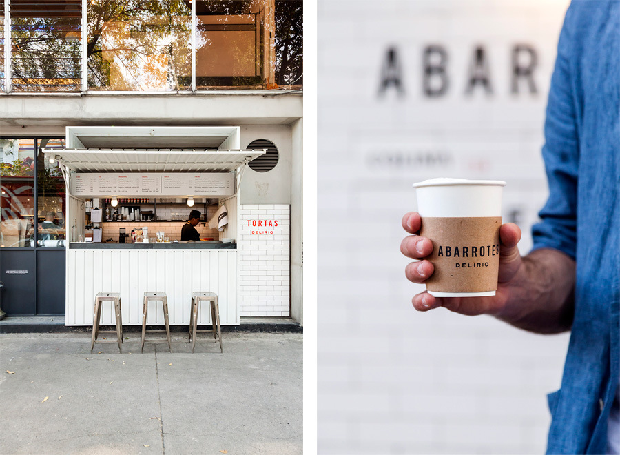
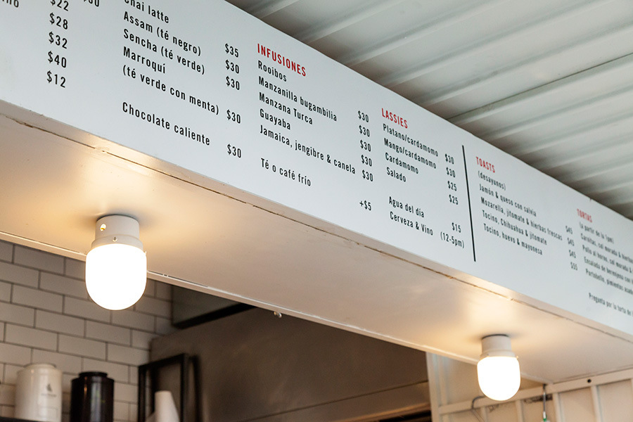
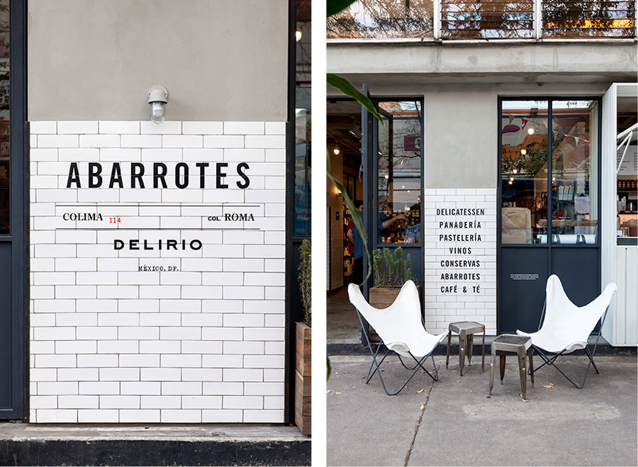
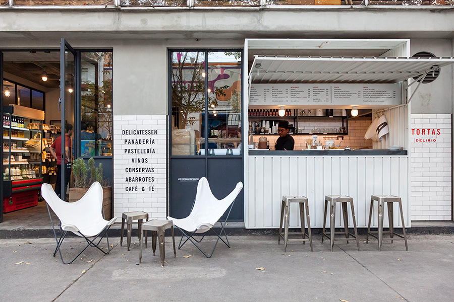
Mexican design studio SAVVY released a nice stationary work for local restobar Abarrotes Delirio. Check savvy-studio.net for more identity cases like this
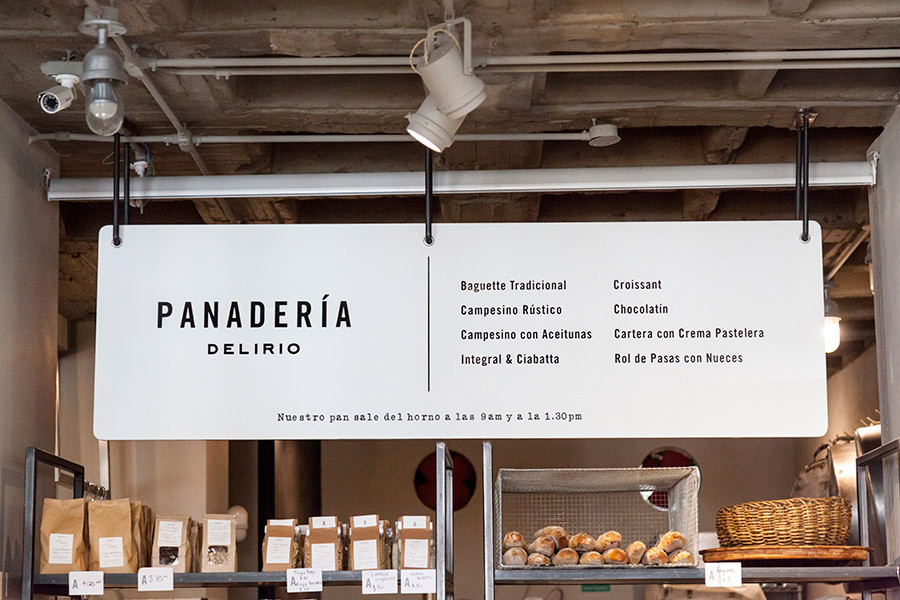
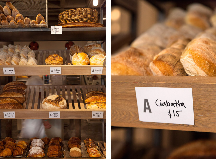
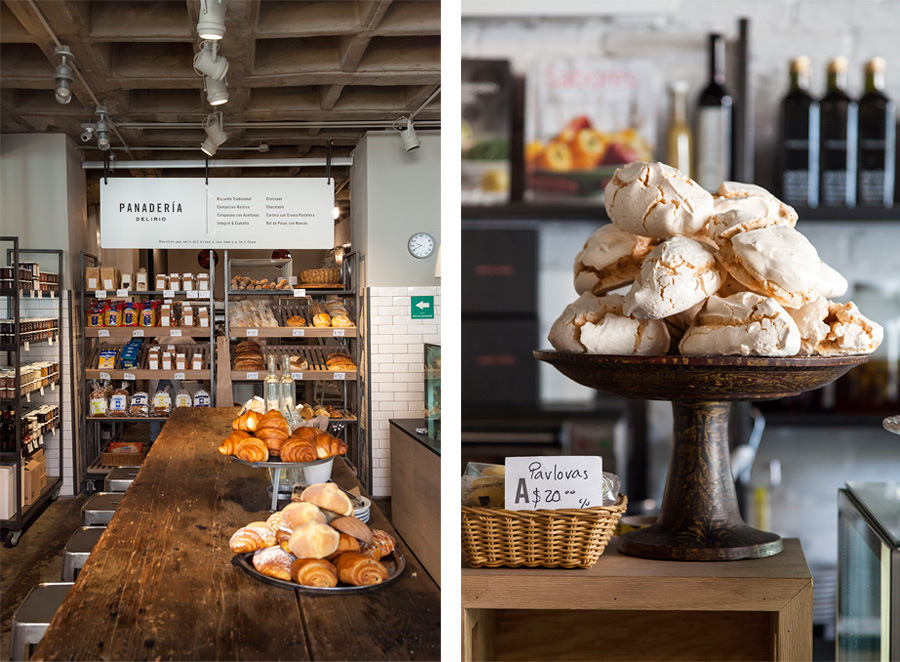
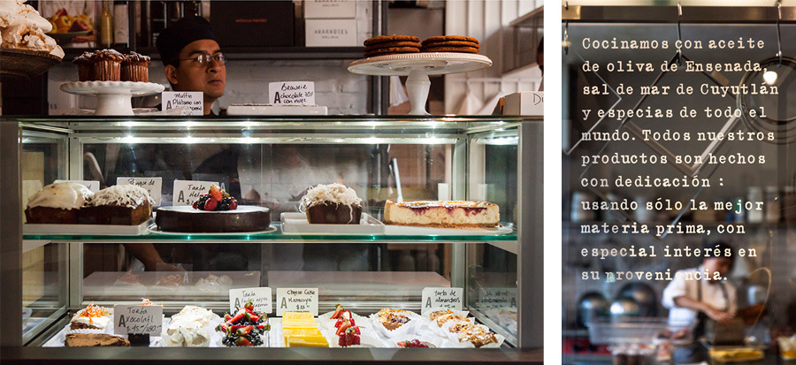
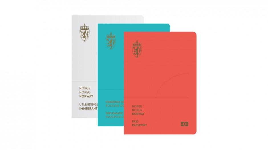
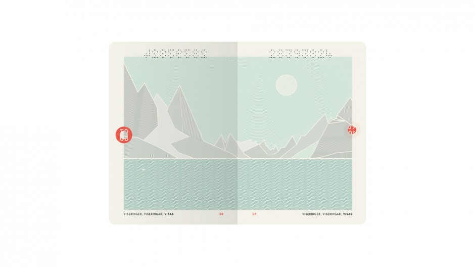
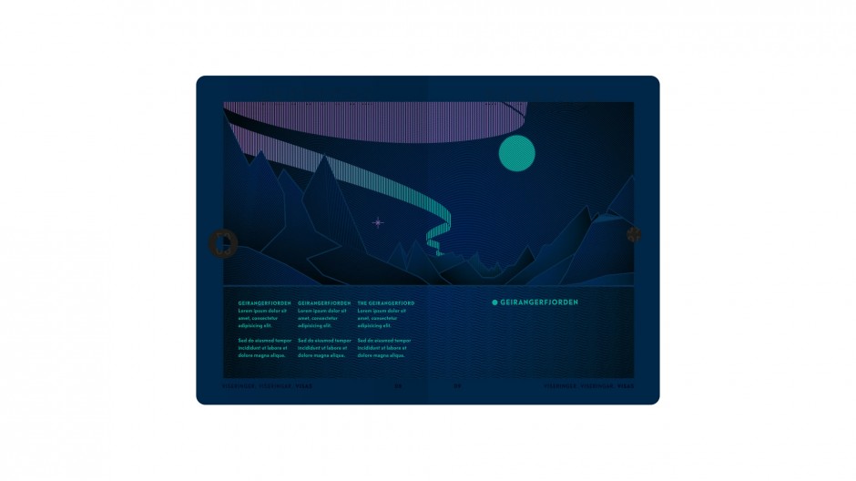
Seems Norway can't stop being the most expensive country in Europe they need more attention. Last time they drew it with innovative Money Banknotes design and not long ago they released a new update of the National Passport design.Oslo based studio Neue won the competition by giving a modern, simple, but still attractive new design as a result. Titled ”The Norwegian Landscape,” this design shows nature as the “essential part of the Norwegian identity and tradition” as Neue Design Studio puts it.
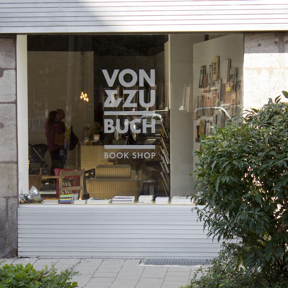
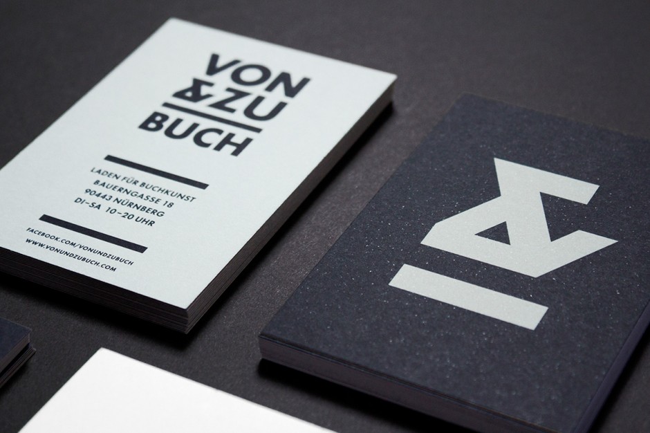
Born in Hannover, design-breed in Oslo and living in Nürnberg, Philipp Zurmöhle has a portfolio of a classy European designer. Rooted in illustration Philipp creates clean and minimalistic graphic design worth to review on his portfolio website www.philippzm.com
Who said it will be easy? To create logotype for the city like Saint Petersburg is like to direct a play of "Lady Macbeth" or "The Master and Margarita". Everybody knows it but nobody got close to it, dead or alive. The city identity requires a lot of everything: starting from a very complicated history ending with citizens that has a lot of doubts and bits about living here. To understand the city as someone said you must "drown" in it, or it will spit you outside or even leave you dying. Literally, Saint Petersburg has a lot of faces, and everyone who gets here see its own face. So let's check the three version of Saint Petersburg City Logotypes.
The first one is said to be done by Moscovian (sic 1!) design studio "Art.Lebedev", but it is not approved. Please take this in consideration while studying the logo. First posted on German website (sic 2!), it spread across Russian web with a lot of doubts over iconography and some typography issues.
Done by initiative group lead by Ruslan Chernobayev (St.Petersburg Design Week) and talented illustrator Alex Andreyev and supported by BCA Agency, ILOVESPB is a next pitch to have pros and contras. The logo has a personal website http://ilove.spb.ru/ and hope has a long journey to be real.
The third pitch is again from Moscovian studio of Yakushev Branding has a good typography designed by Ivan Gladkikh and lemon-faced trend of "generic" logotype, that we'll leave on your consideration. Personally, this project is a good moodboard and research of possible graphic design trends, but hardly represents the Saint Petersburg City itself.
Meanwhile please enjoy the beauty of the city in different timelapse motions we collected all this time
With the nostalgic flashback to Soviet epoch designer Anastasia Genkina and art director Misha Gannushkin have created these beautiful branding and packaging designs for Gorky Park ice-cream, which are also shot in a fantastically playful way by Grigory Sobchenko.
“This ice-cream has been a treat inseparable from a walk in the Moscow Gorky Park for decades. It`s special taste of creamy vanilla and waffle cone became a memory of childhood for several generations, and it has remained true to the old fashioned recipe. The aim to connect the historical value with modern recognition through design was achieved by developing patterns, inspired by key symbols of the Park`s life. Each pattern corresponds with one of the six flavours.”


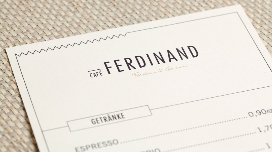
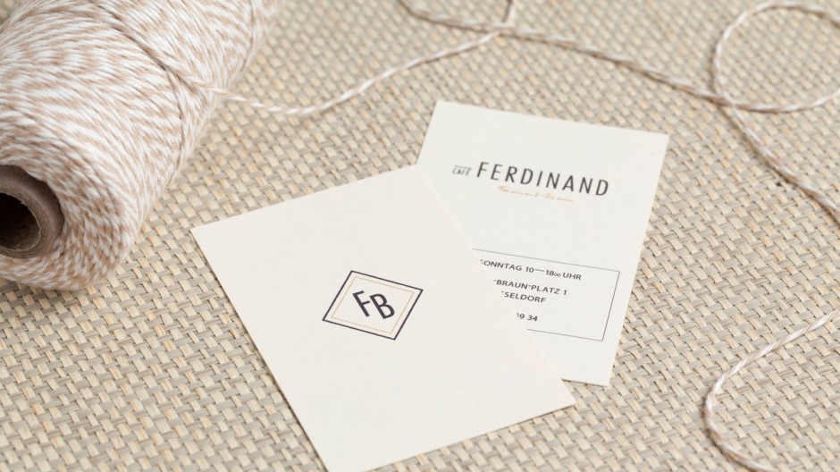
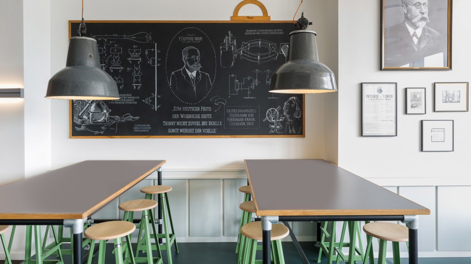
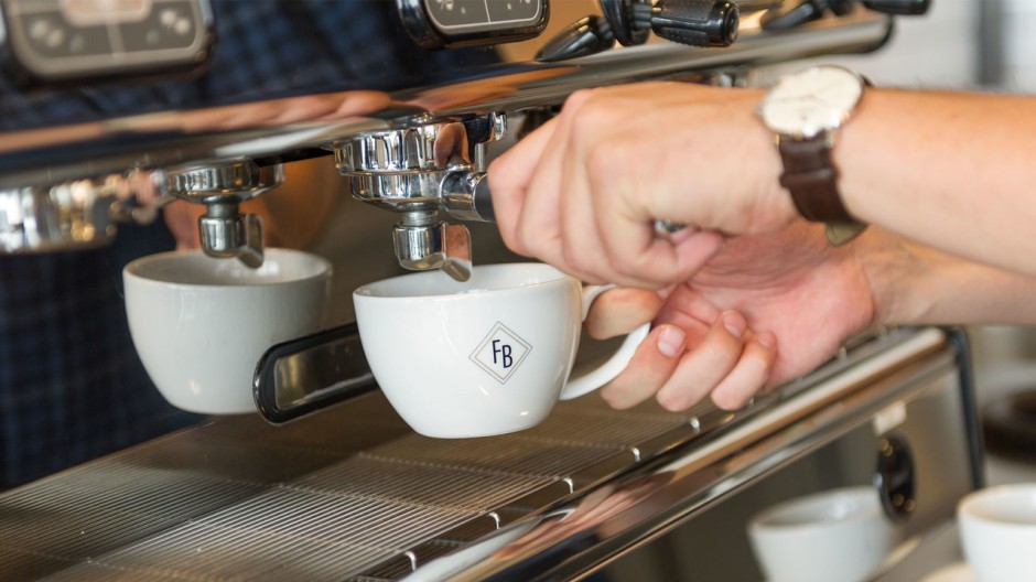
Text via Yatzer: "The young international design agency Aerogram Studio has designed the interior and identity for this retro-looking café in Hamburg, Germany. Overlooking the Jungfernstieg shopping street and the picturesque Binnenalster Lake, the Café Ferdinand which was commissioned by Vodafone, also occupies the first floor of the company’s new flagship store in the city. The client chose to name the café after Ferdinand Braun, the German inventor, physicist, Nobel laureate in Physics and pioneer of modern telecommunication."
More details on www.aerogramstudio.com/cafe-ferdinand
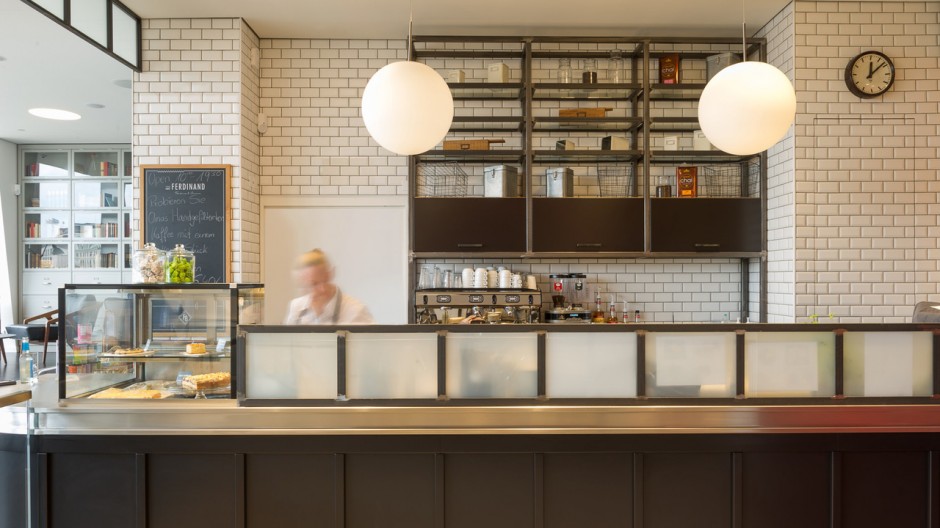
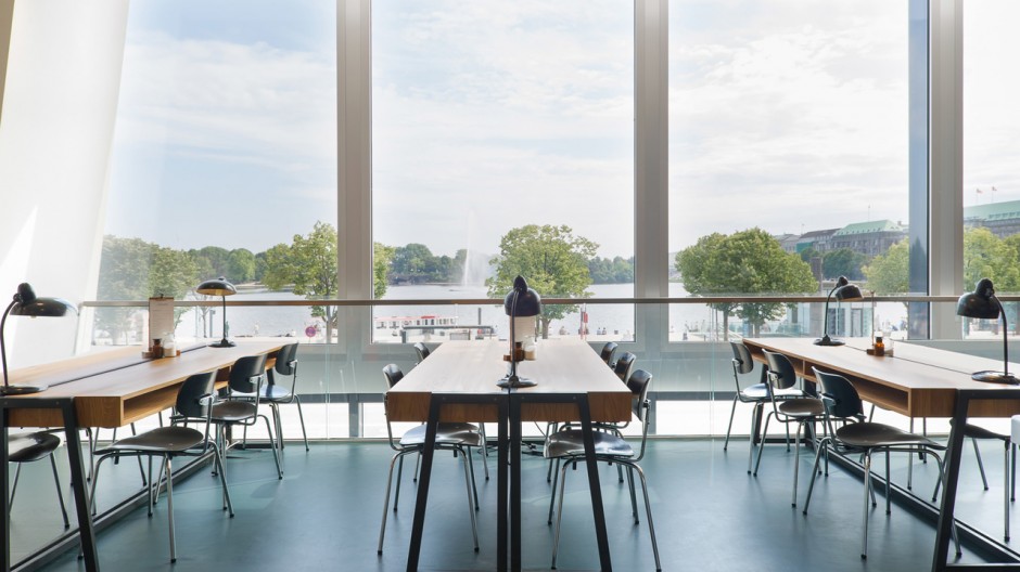
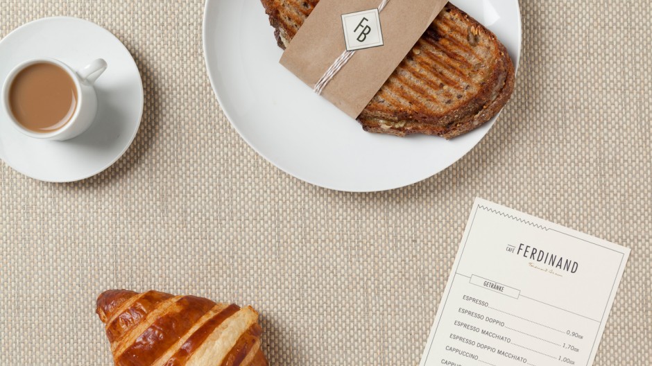
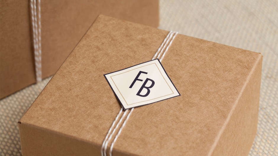
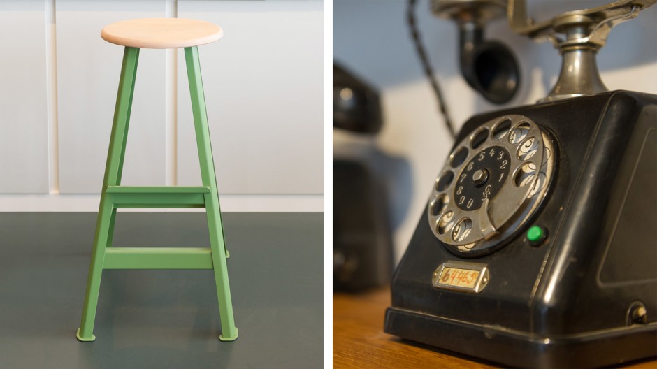
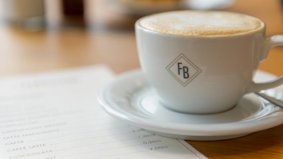
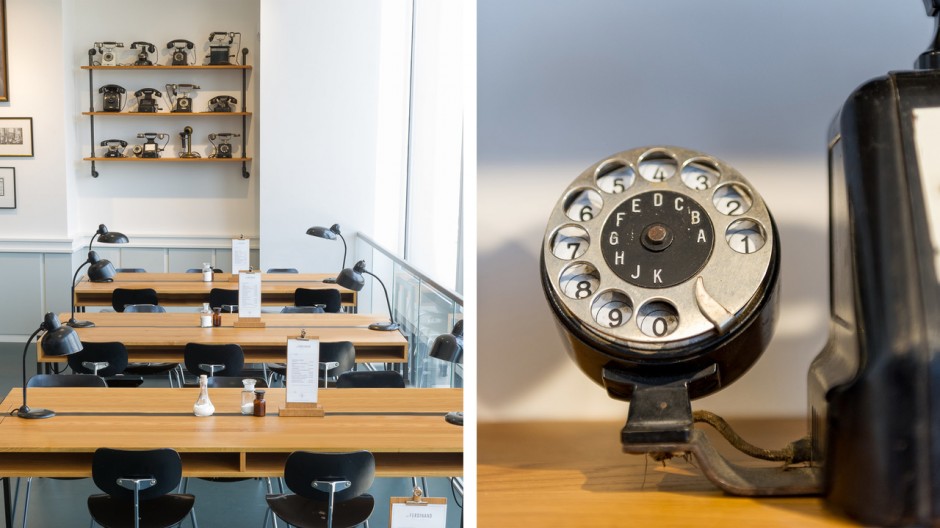
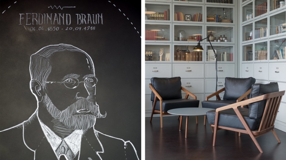
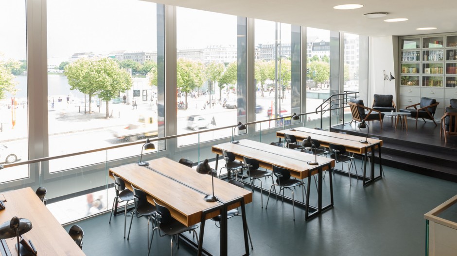
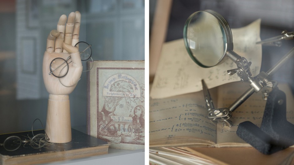
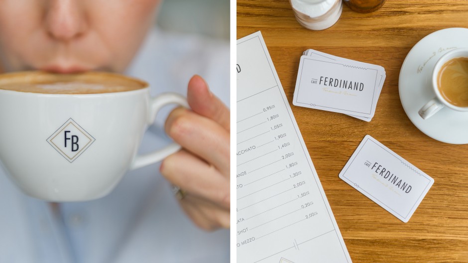
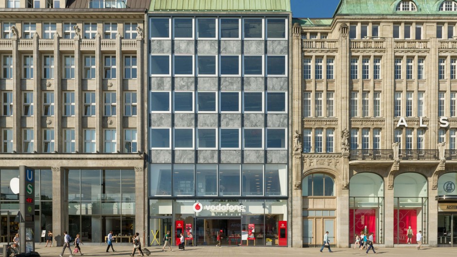
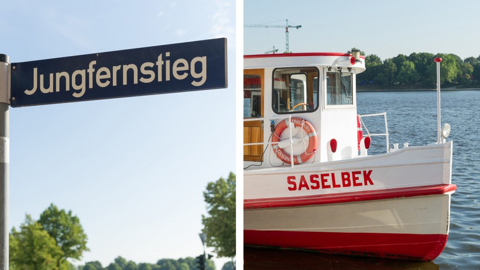
Photos © Christian Köster, Aerogram studio.
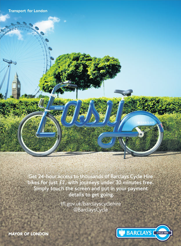
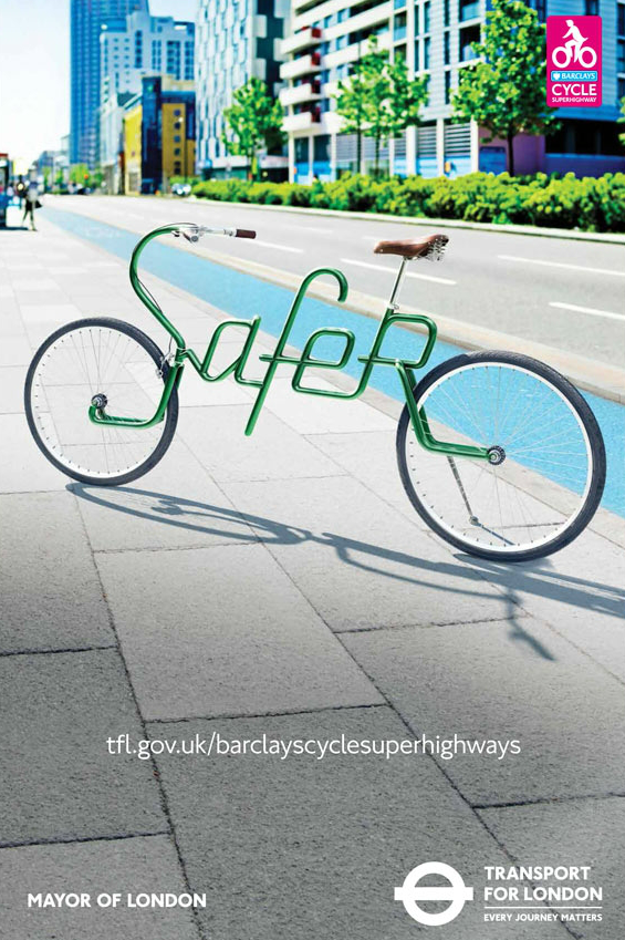
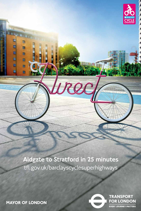
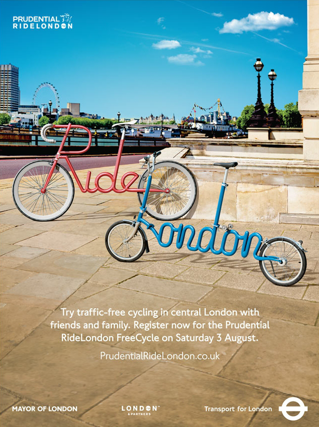
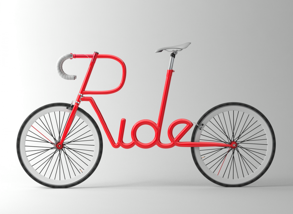
"Transport for London" commissioned famous artist Alex Trochut to create a series of typographic posters for their latest City Bike Campaign
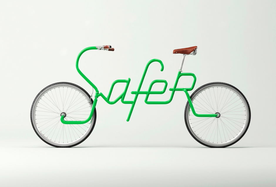
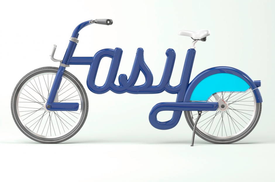
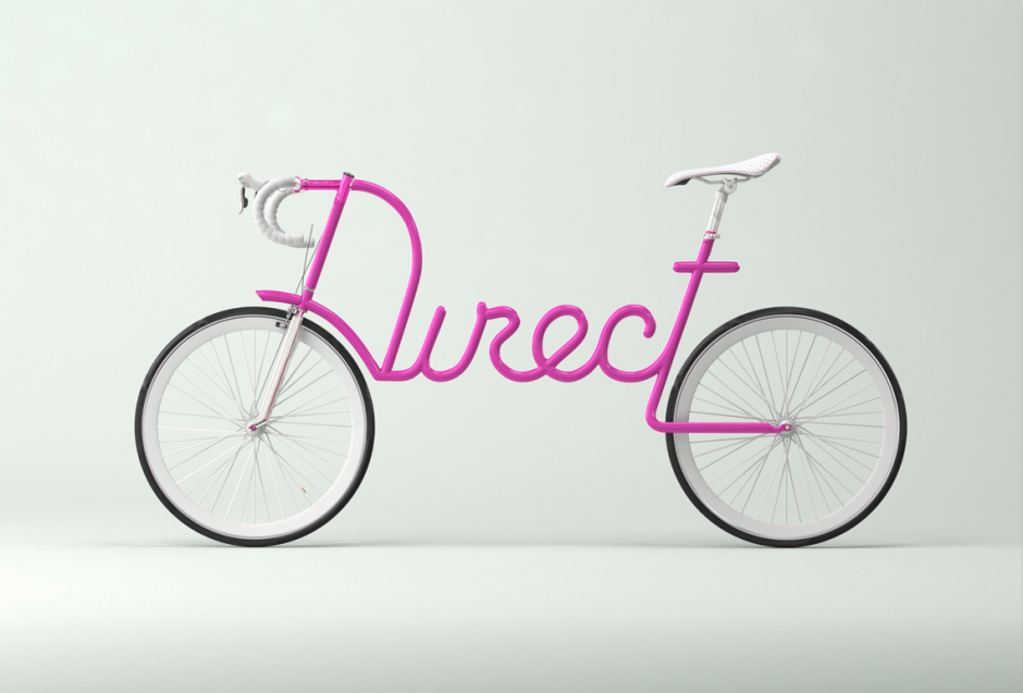
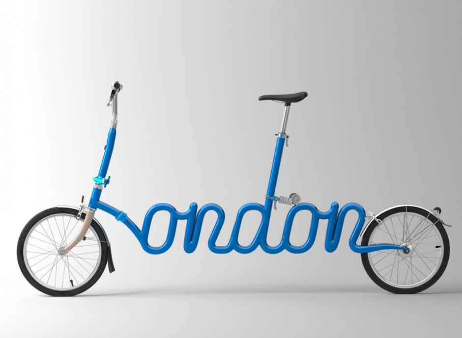
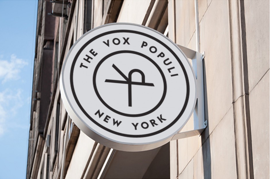
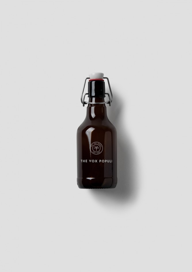
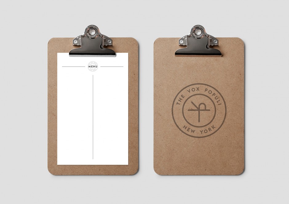
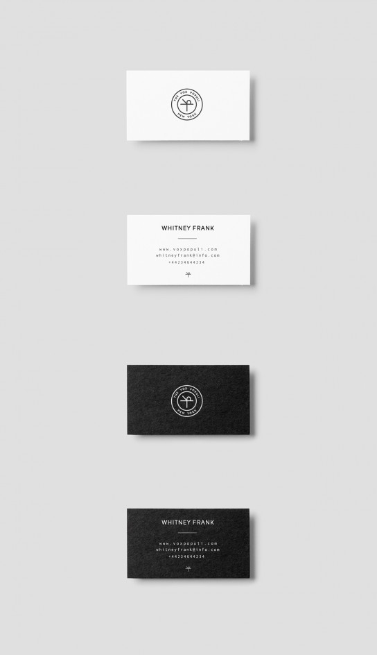
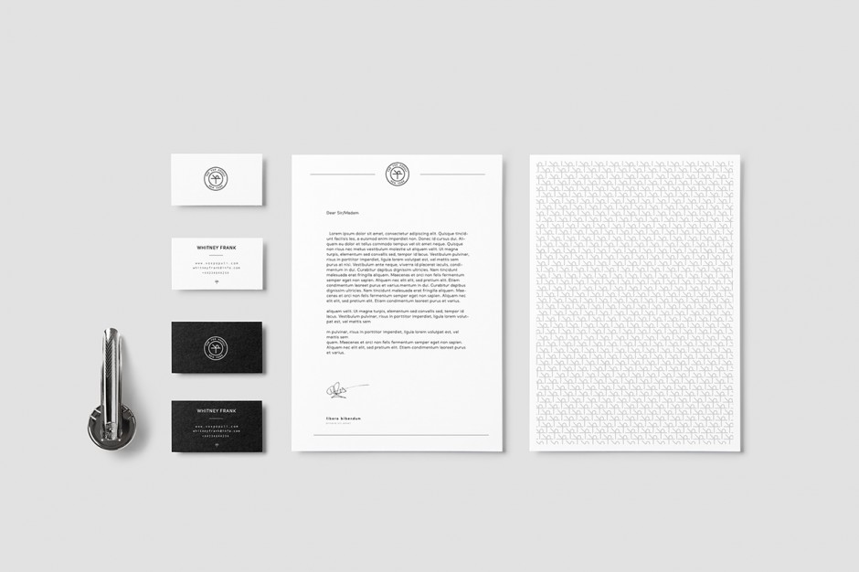
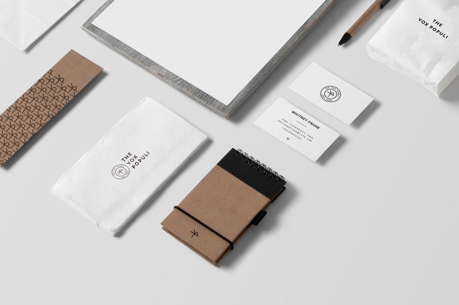
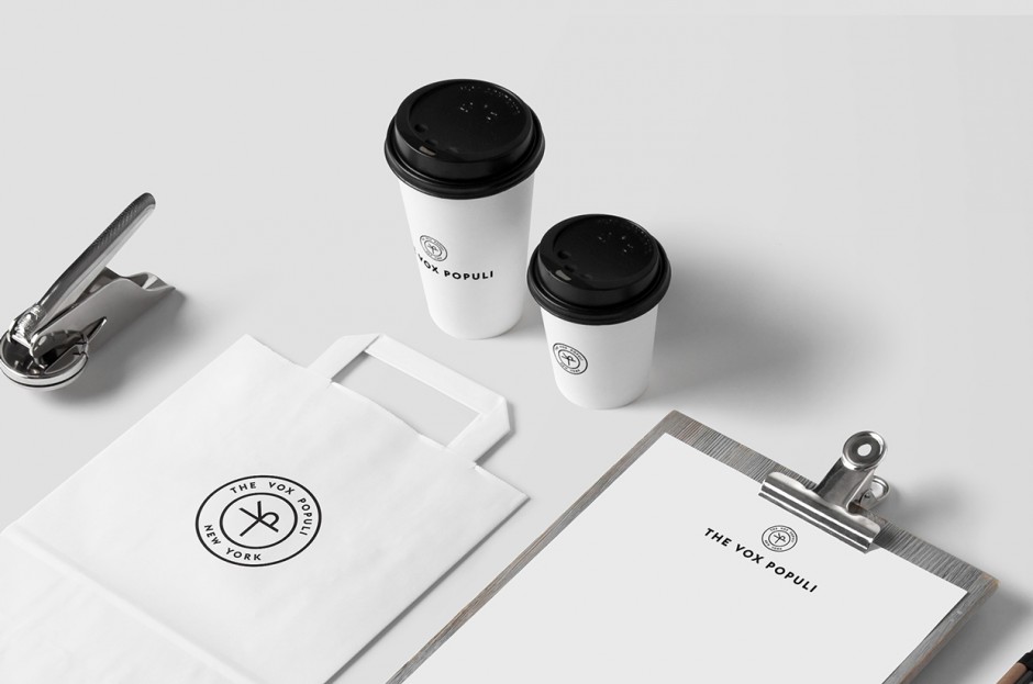
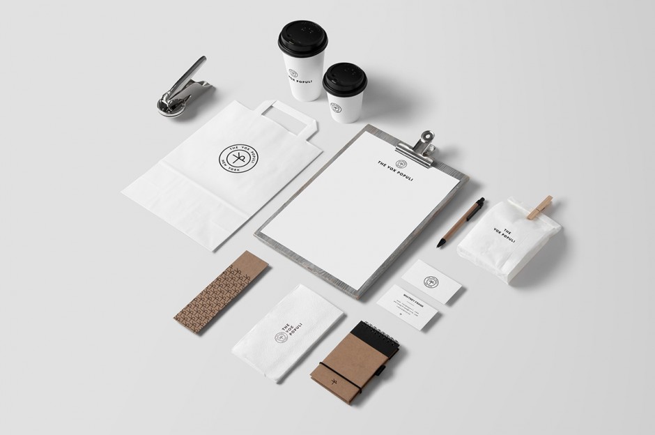
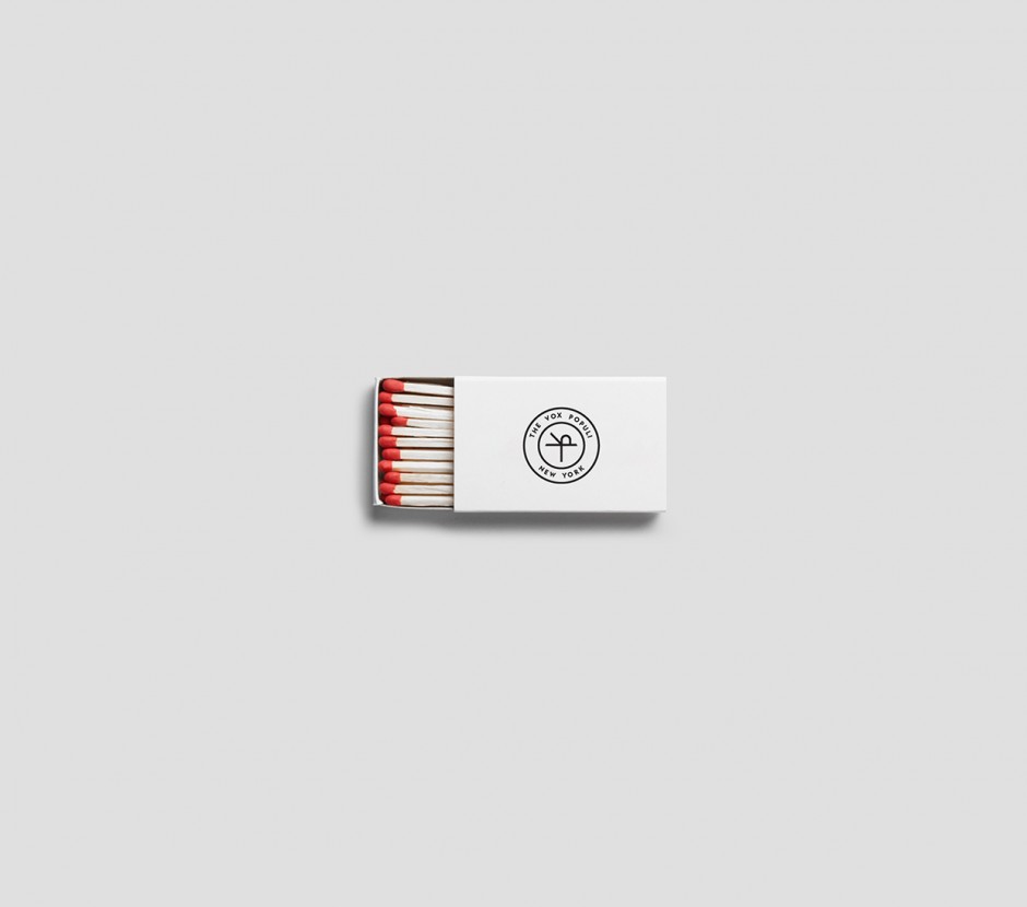
London-based graphic designer Sam Curtis created a clean and neat identity for The Vox Populi – A series and ever-changing evening experience filled with curated art, music, dialogue and gastronomy within a private residence in New York City.
Bilingual Identity for a new international British Council exhibition Dressing the Screen: The Rise of Fashion Film. The work has been created by a Moscow-based trio of young designers Roma Lazarev, Kir Khachaturov and Vladislav Poliakov and recently won the Yellow Pencil at D&AD 2014 New Blood The basis of our concept is a well-known optical effect animating static images discovered in the early XIX century by a prominent English scientist Peter Mark Roger. Today it is mostly known as “motograph” or “scanimation”. This breakthrough played a significant role in the history of filmmaking. Inspired by the “motograph” effect and experimental photoworks by a great fashion photographer Erwin Blumenfeld, we created a special font and developed a system reflecting the high-fashion and moving image nature of the exhibition and reminding of the pioneering role that Great Britain played in the development of fashion film.


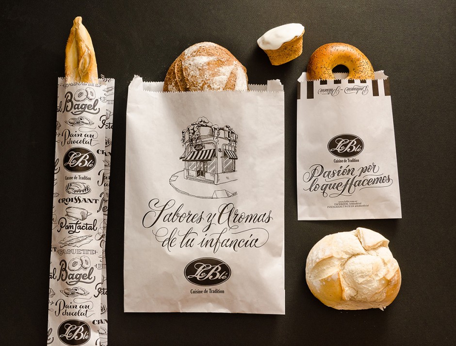
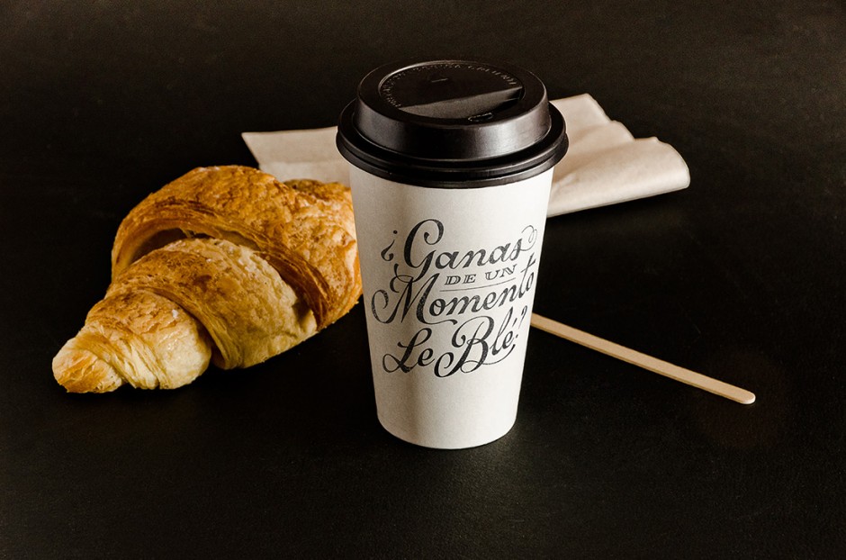
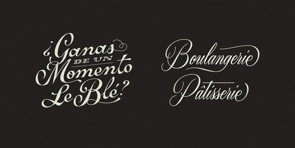
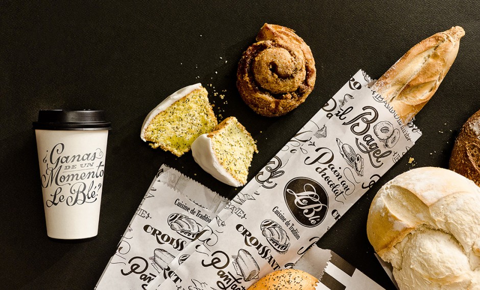
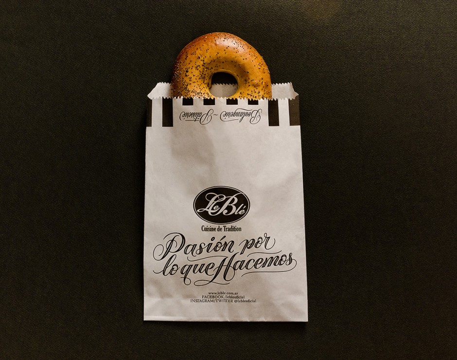
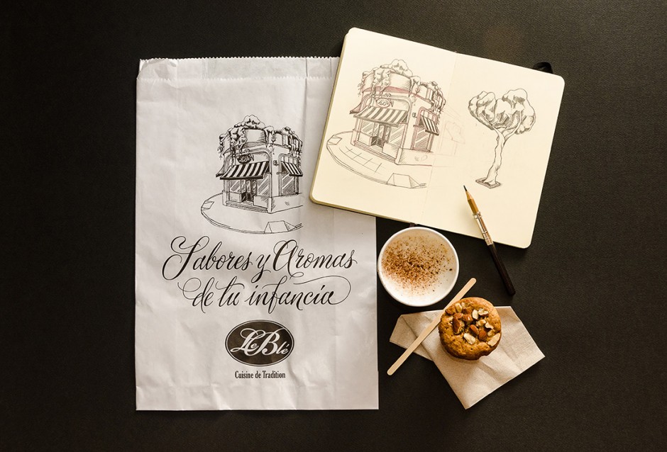
Check the latest awesome packaging and lettering design projects from Buenos Aires based designers Yanina Arabena and Guillermo Vizzari or simply Yani&Guille
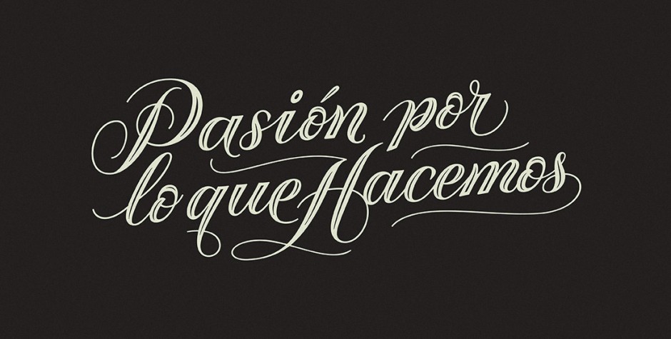
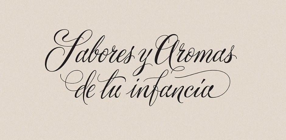
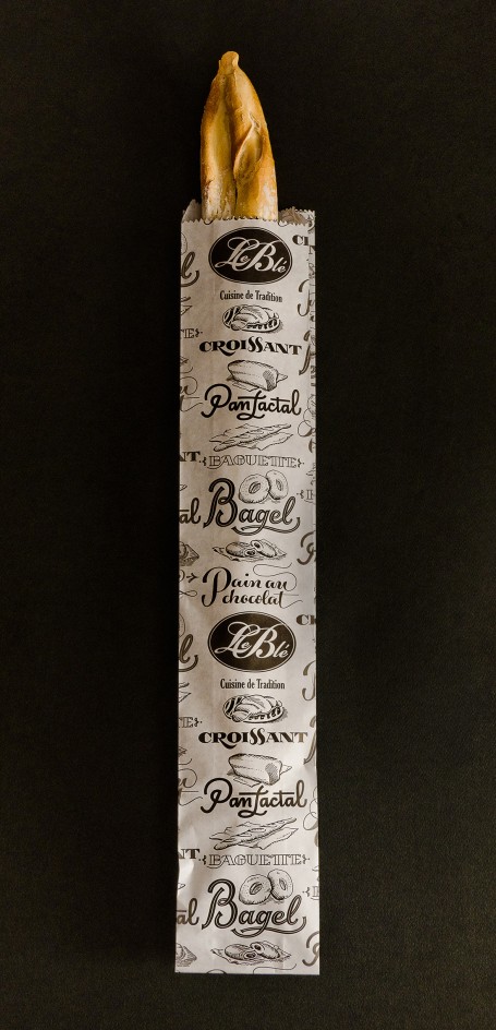
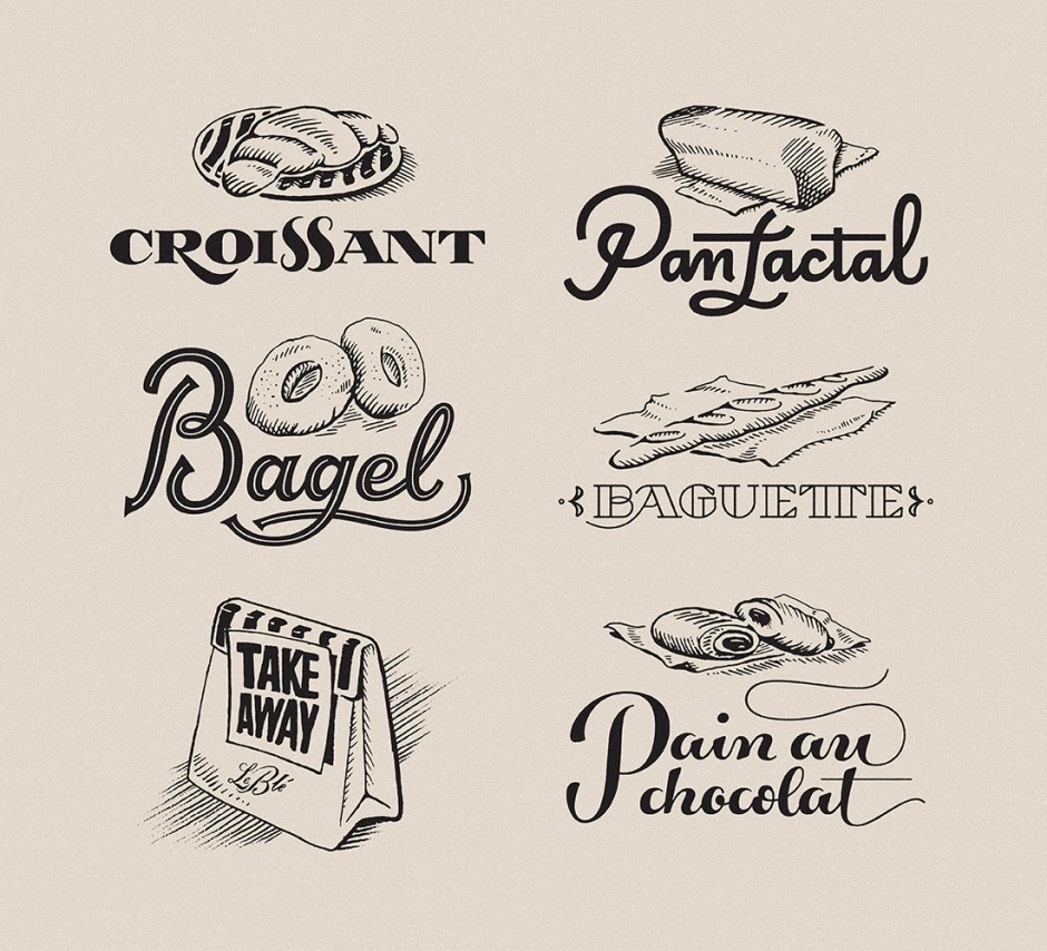
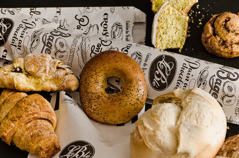
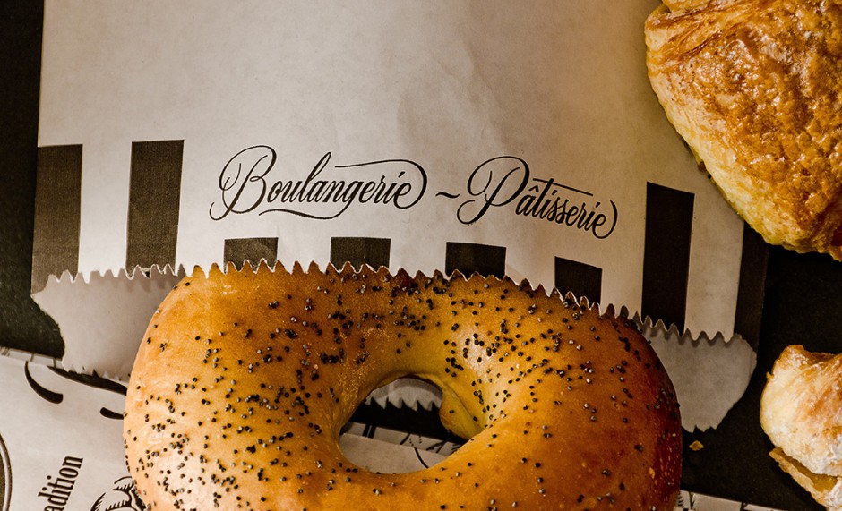
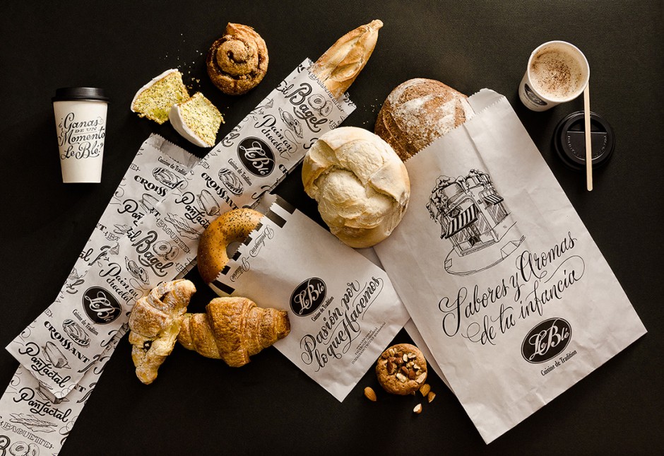
«Le Blé» is a deli restaurant, with homemade and French kitchen, offering several locations throughout the city of Buenos Aires, Argentina. We designed a new line of paper bags and packaging, along with a series of illustrations and lettering that accompany the experience of the place.
