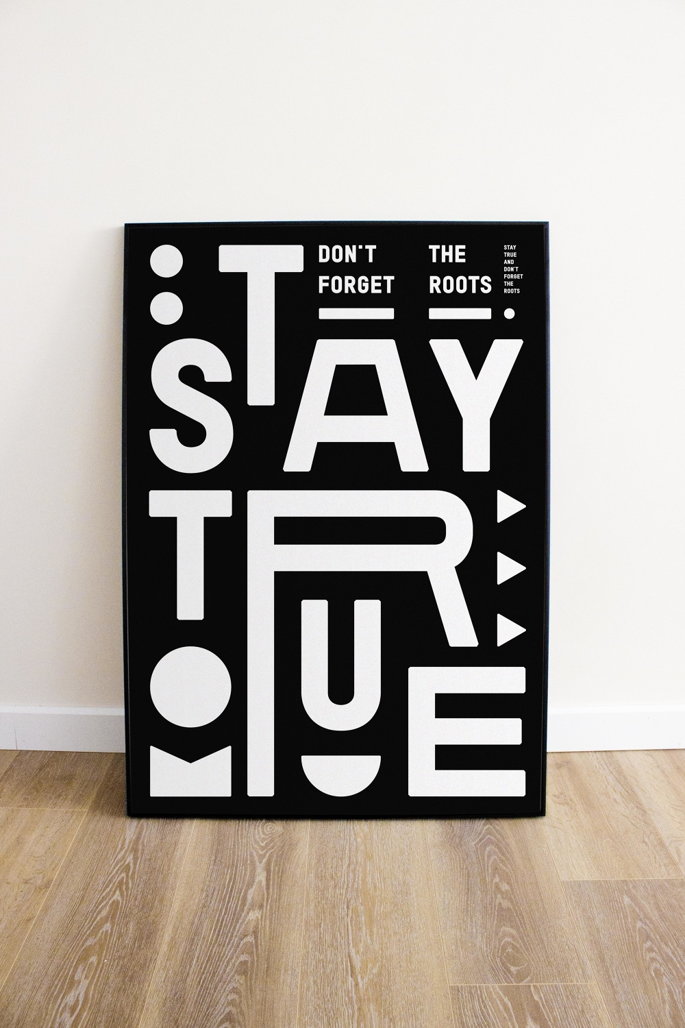
Transcriptions
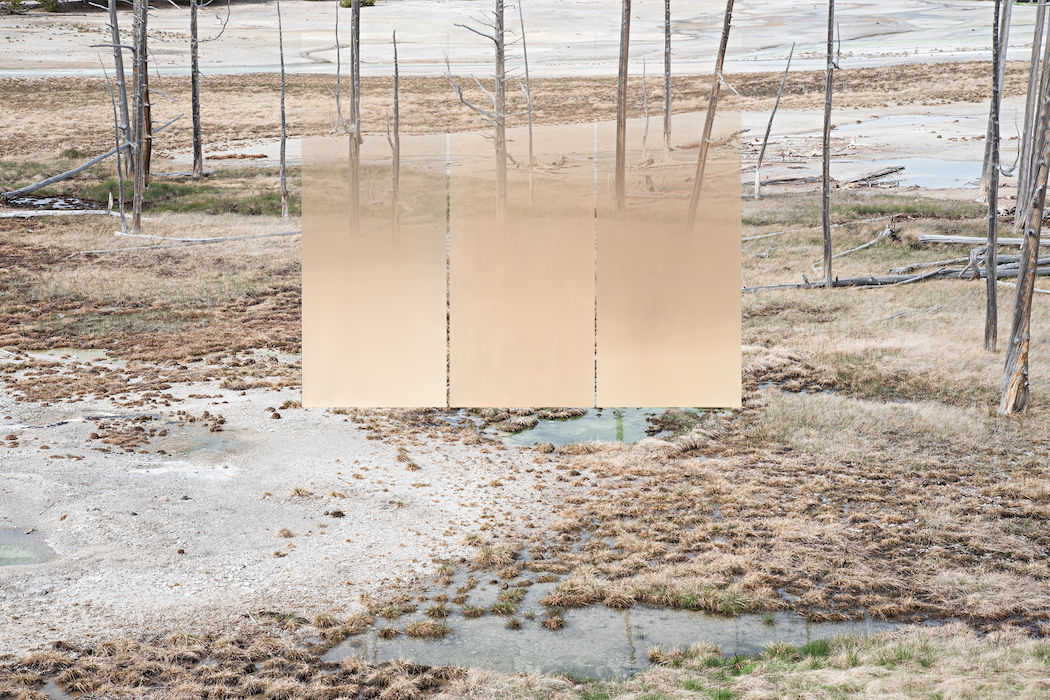
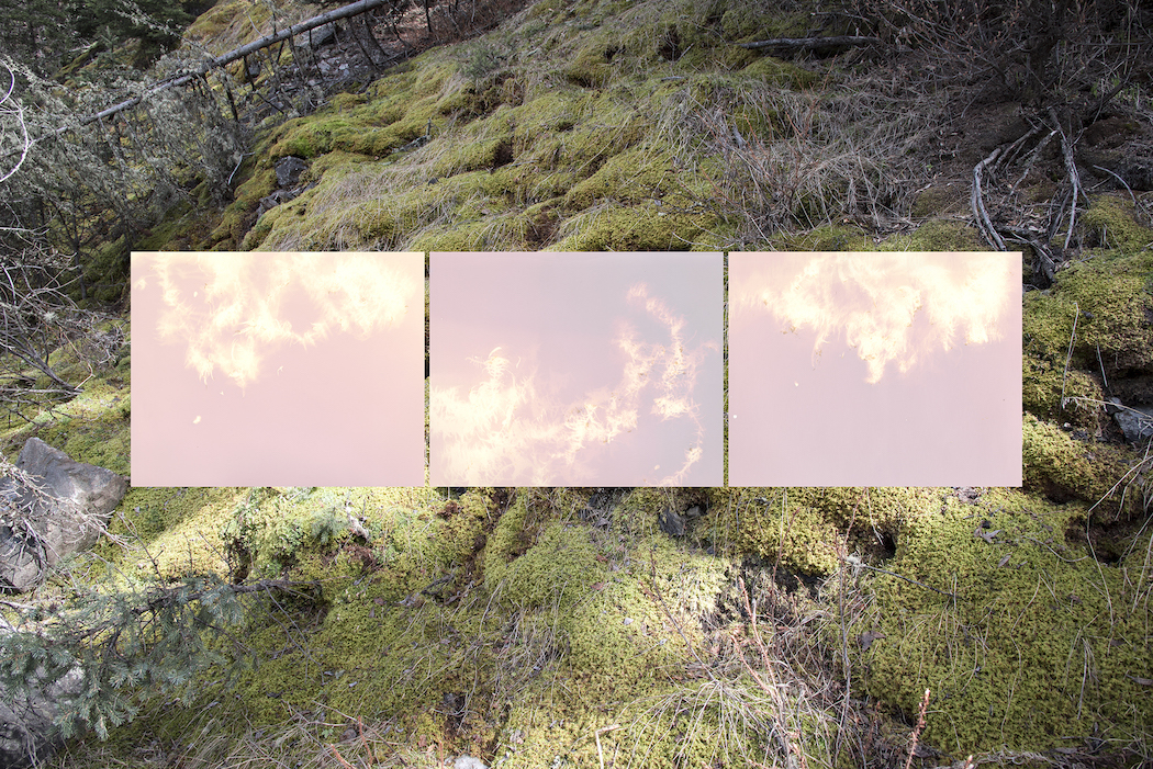
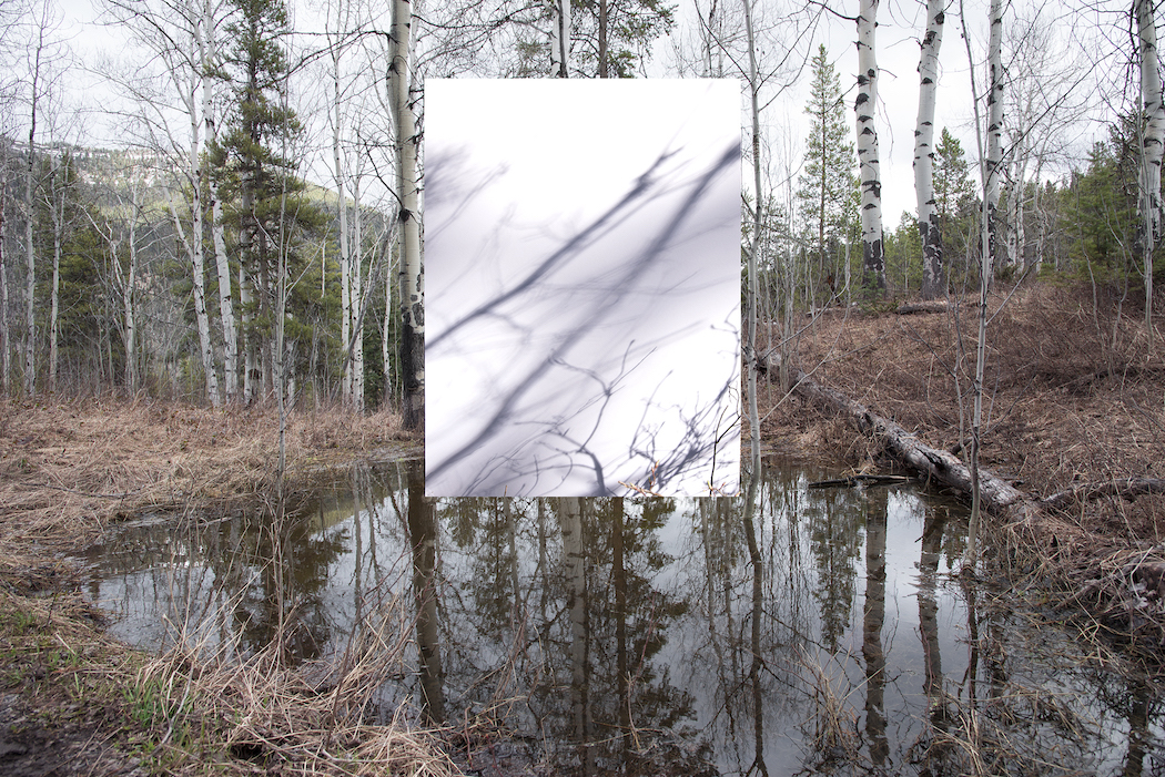
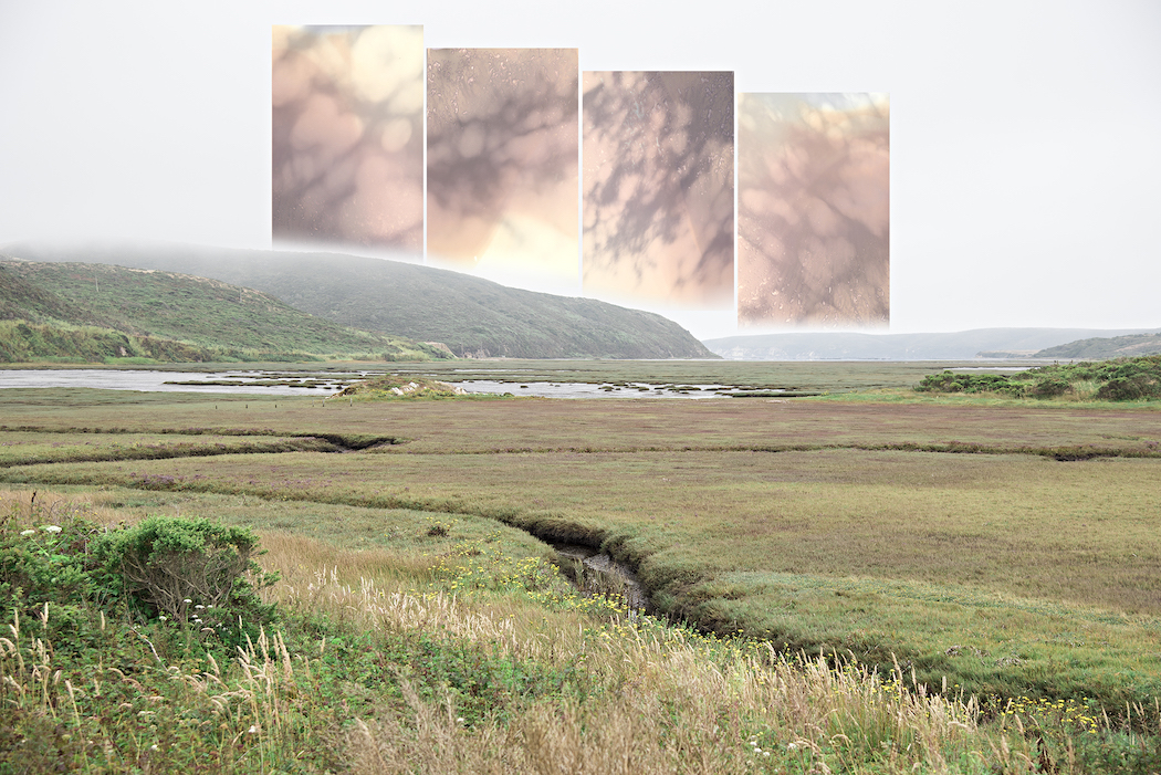
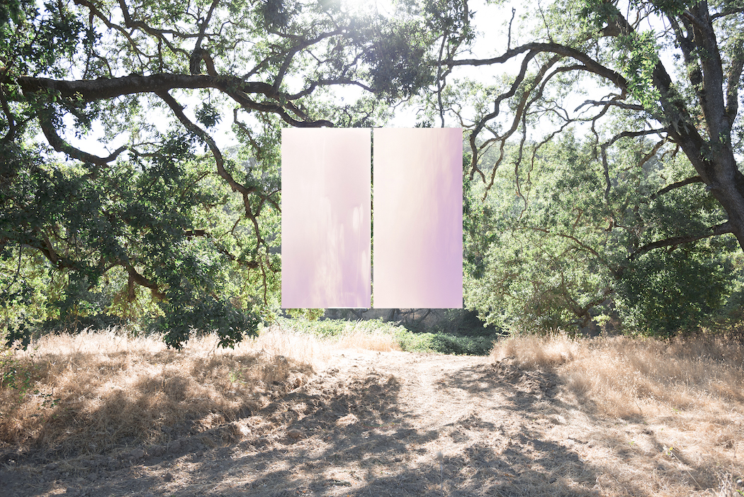
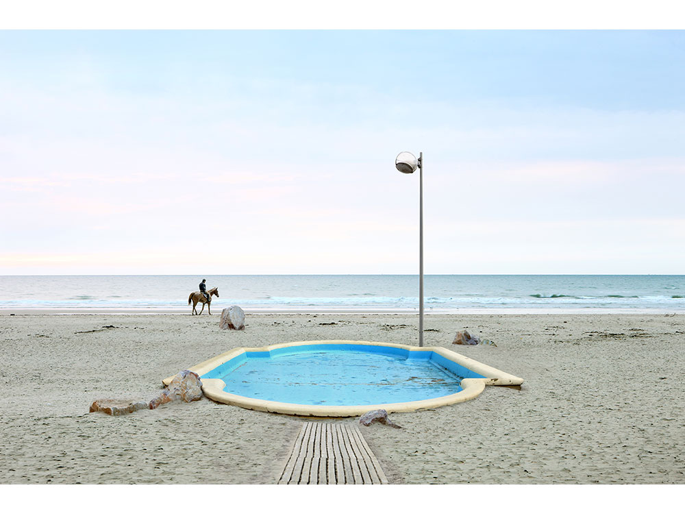
Montana-based artist and photographer Kyra Schmidt triggers an increased consciousness of landscape with her ‘Transcriptions’ series.

3rd Wave of Inspiration
Since 2003
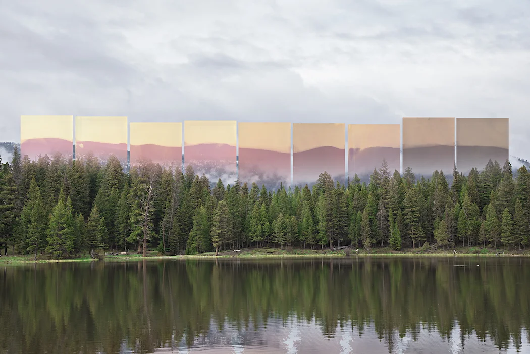
Montana-based artist and photographer Kyra Schmidt triggers an increased consciousness of landscape with her ‘Transcriptions’ series.

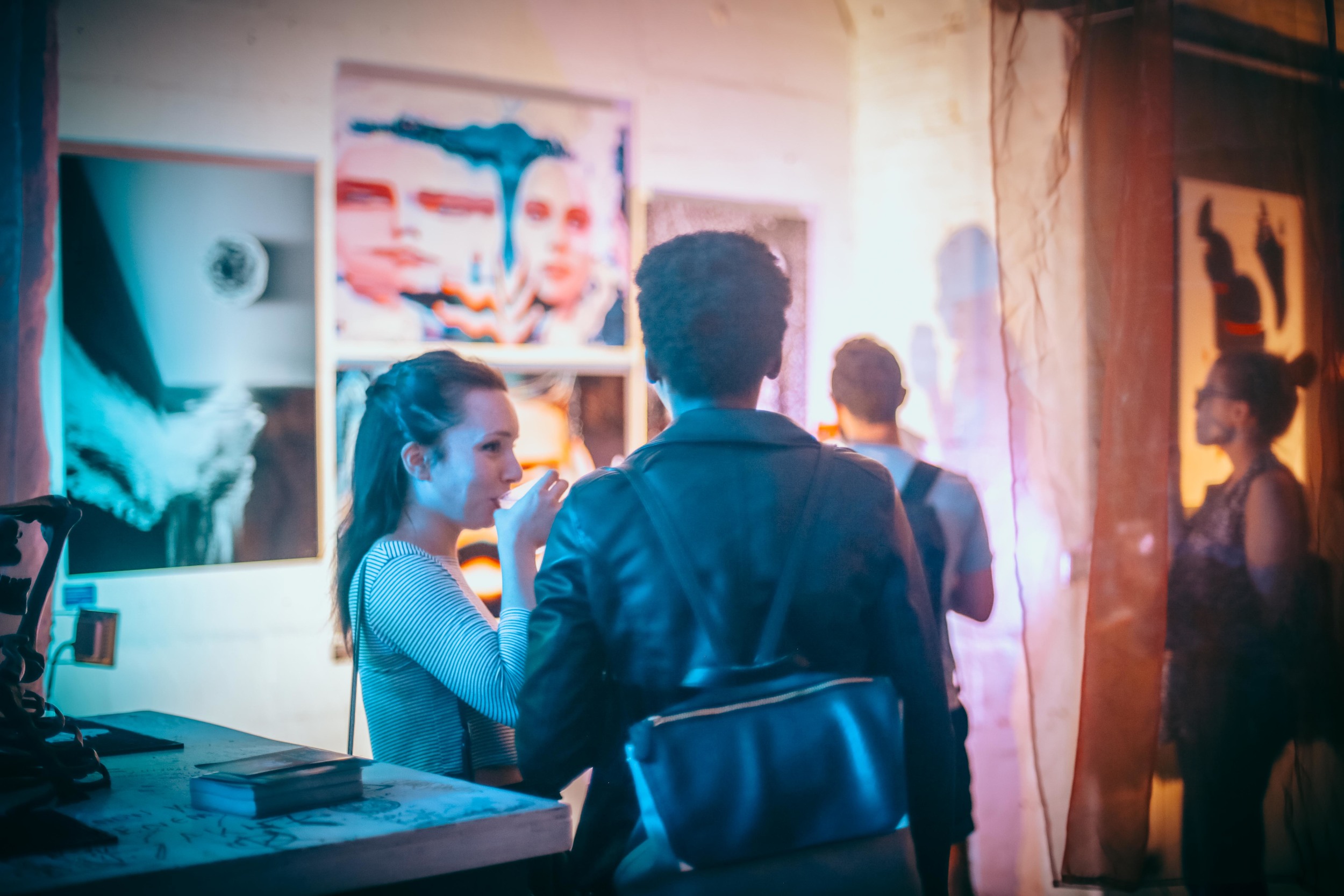
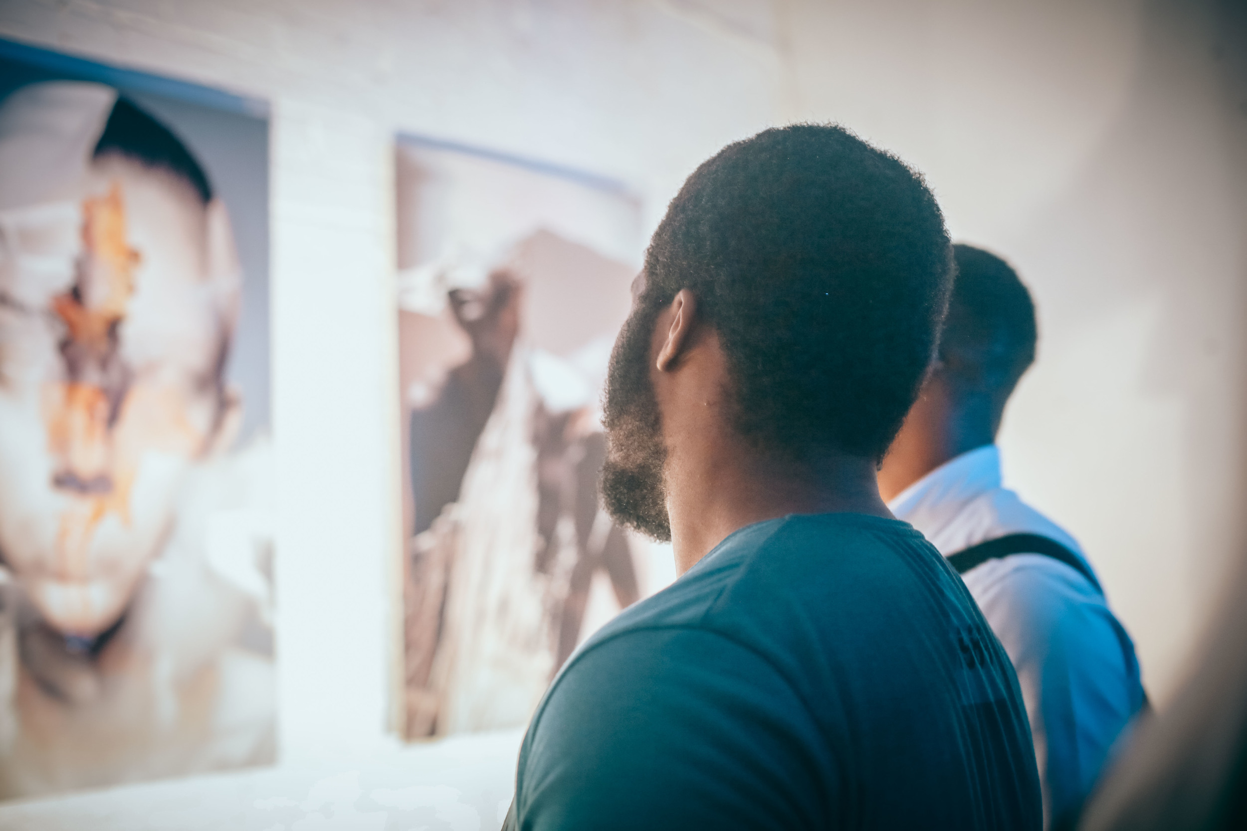
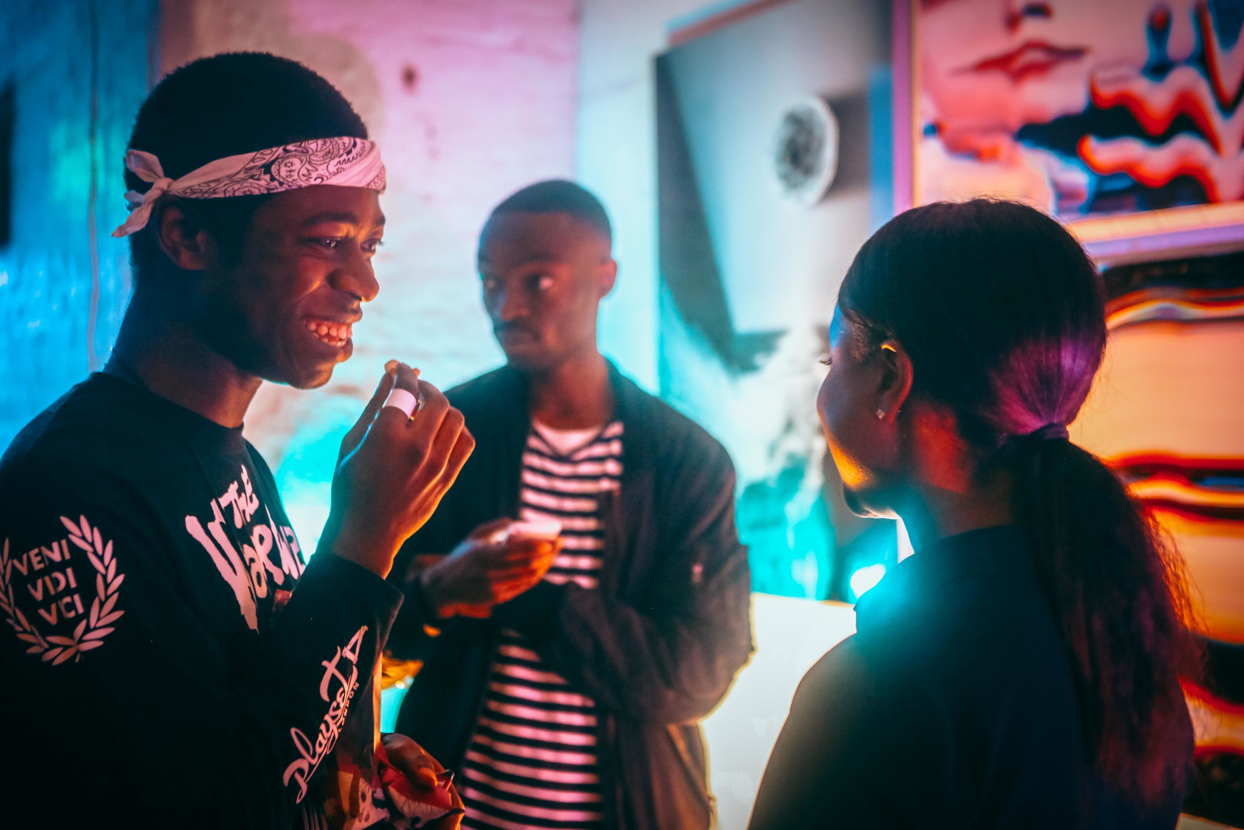
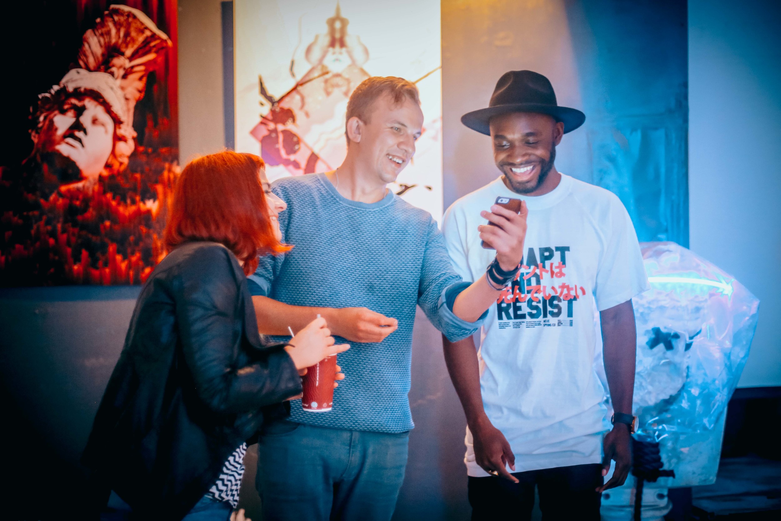
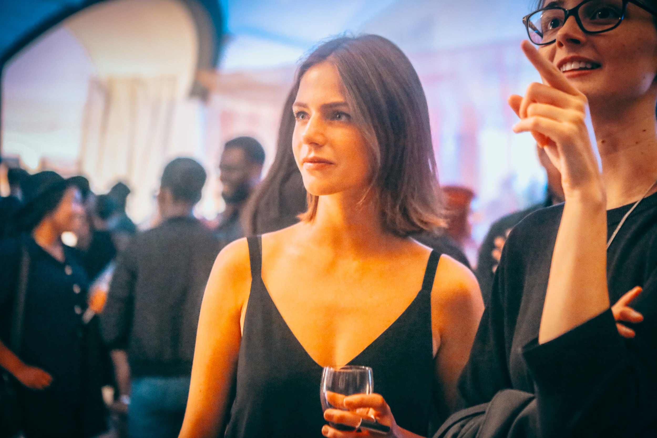
Photos by So!Fraiche
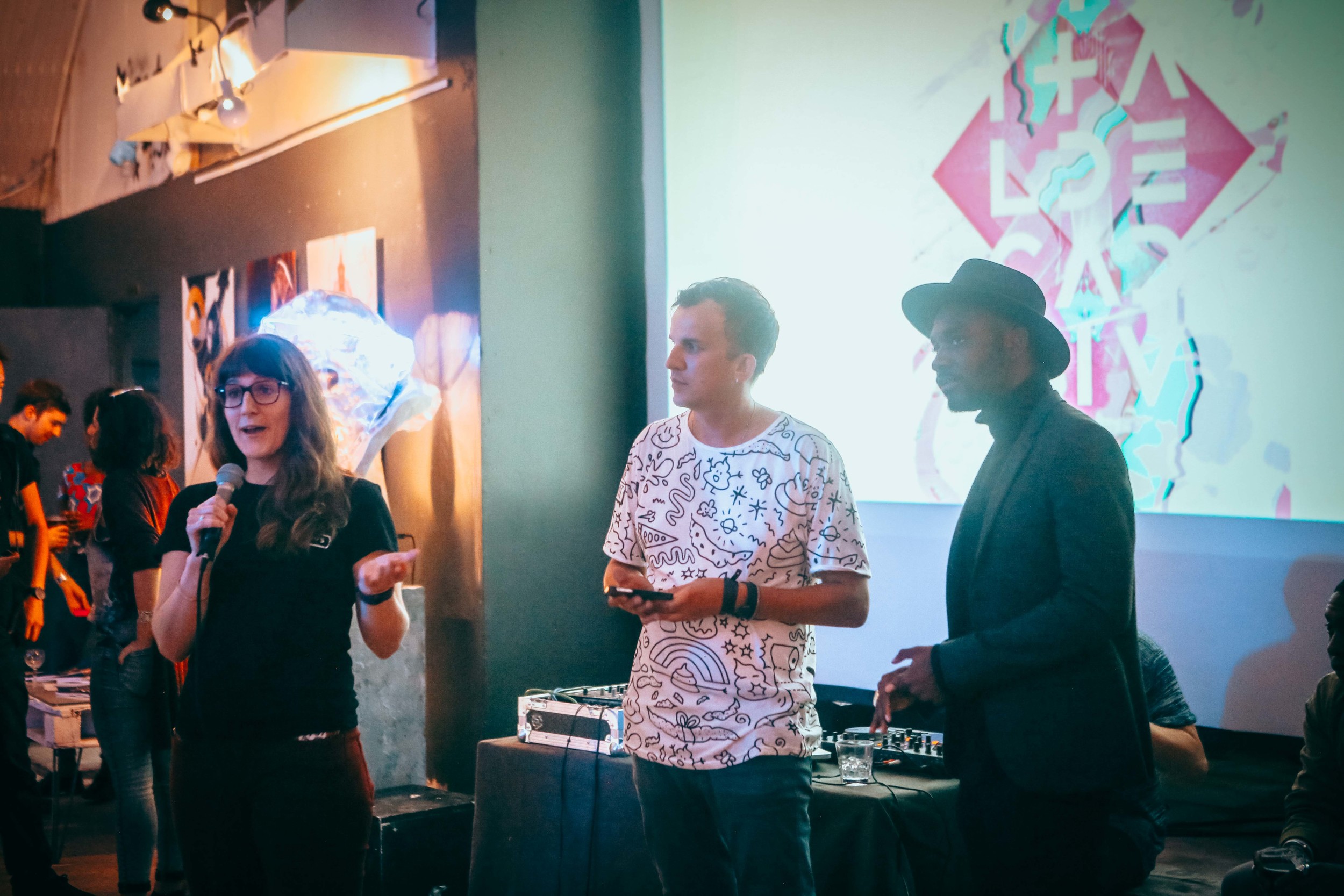
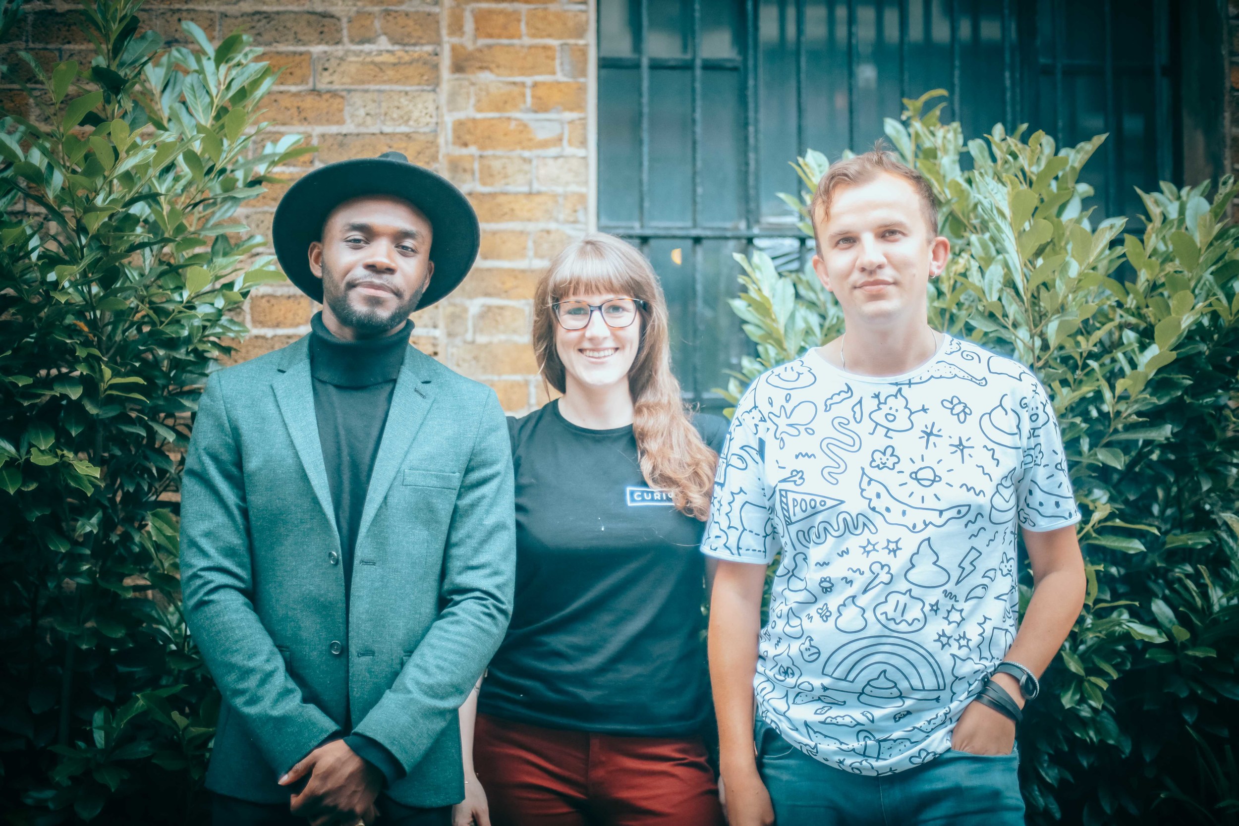
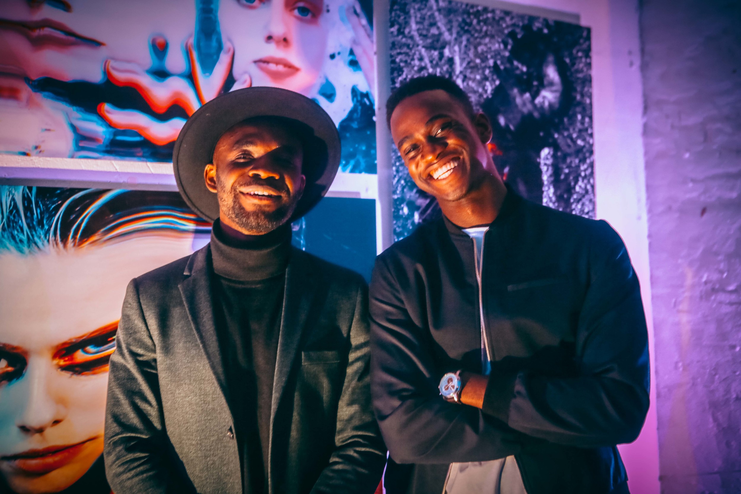
Samuel (Youth Worldwide), Kalyn (Curioos) and Arseny (Designcollector)
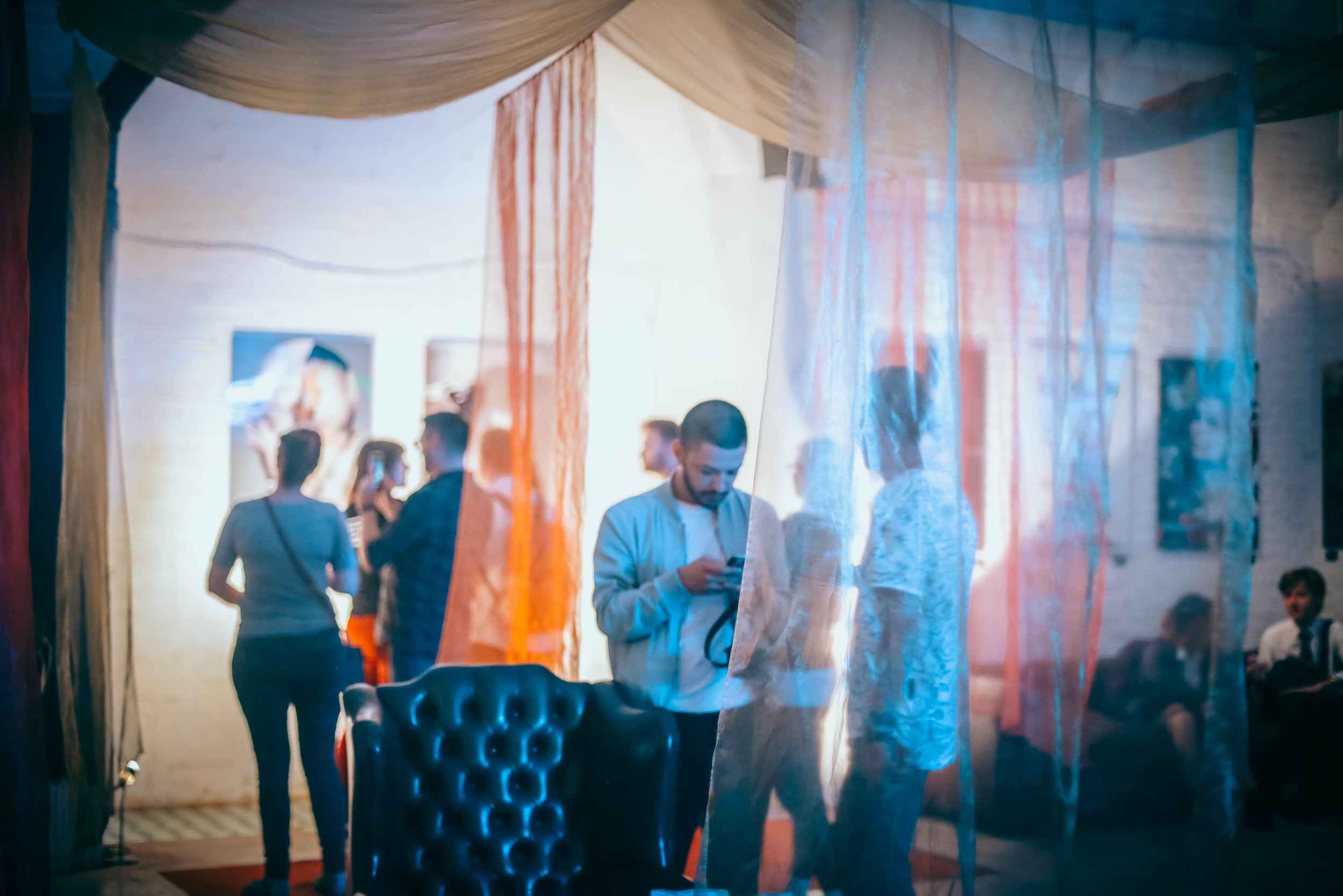
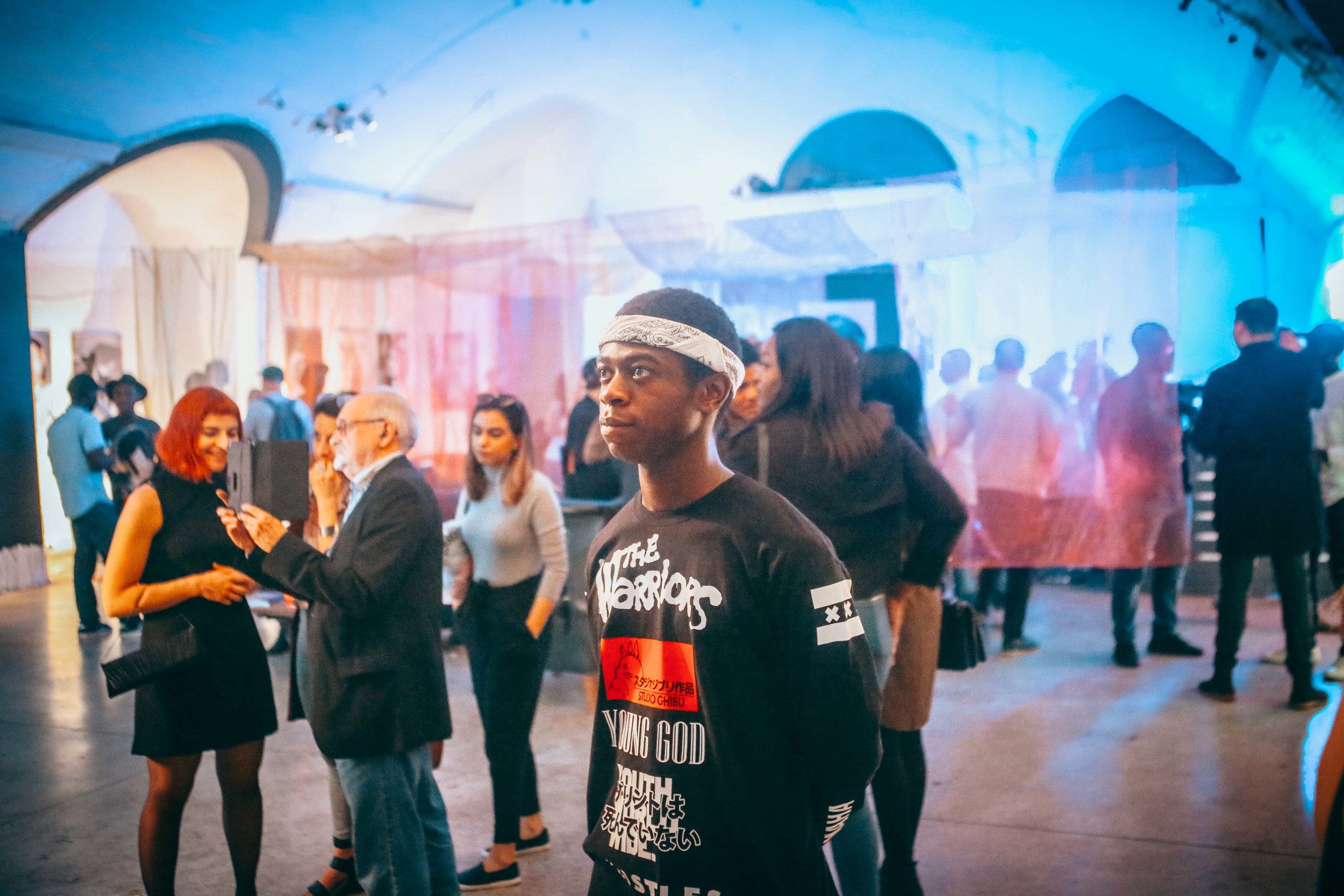
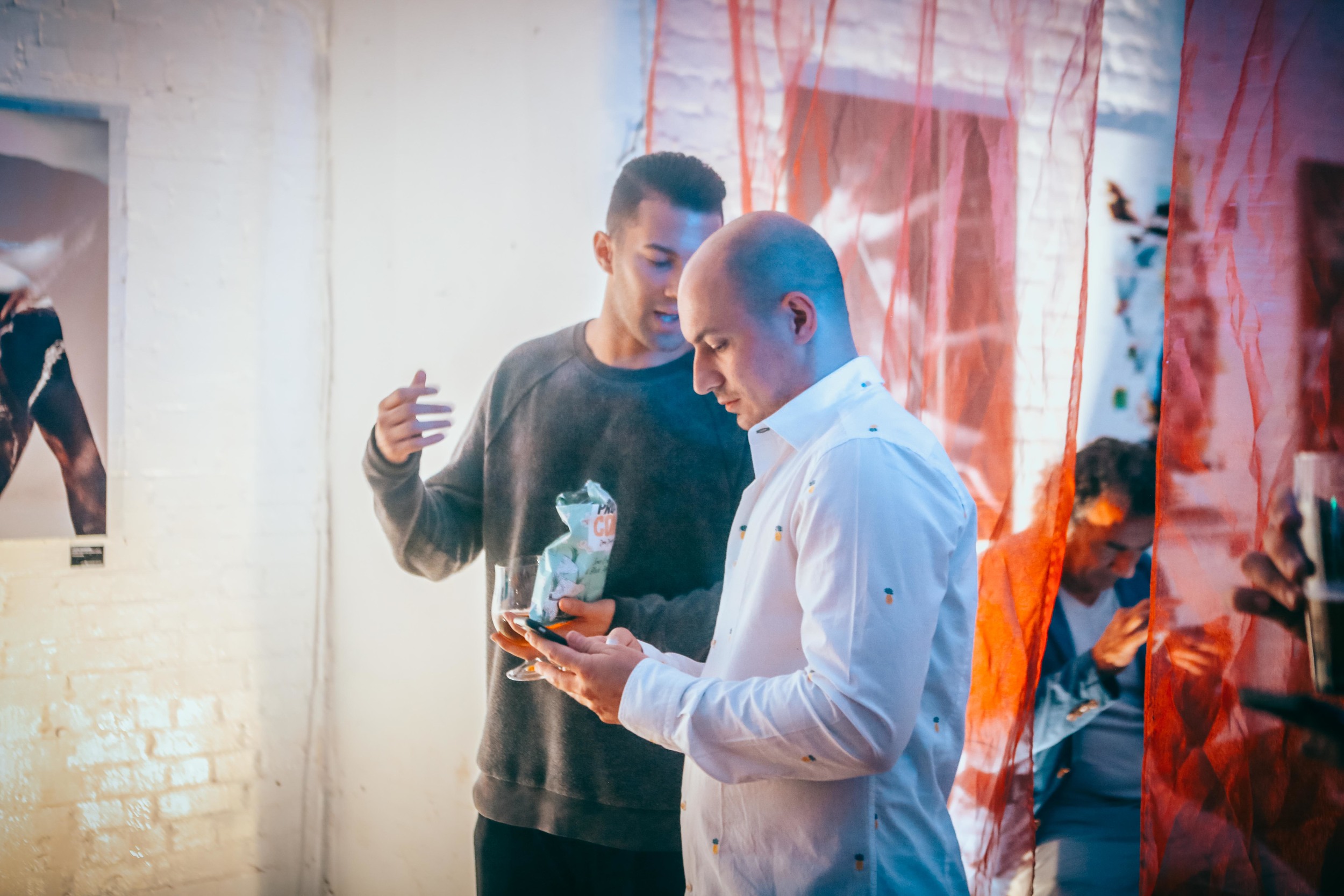
Photo by So!Fraiche
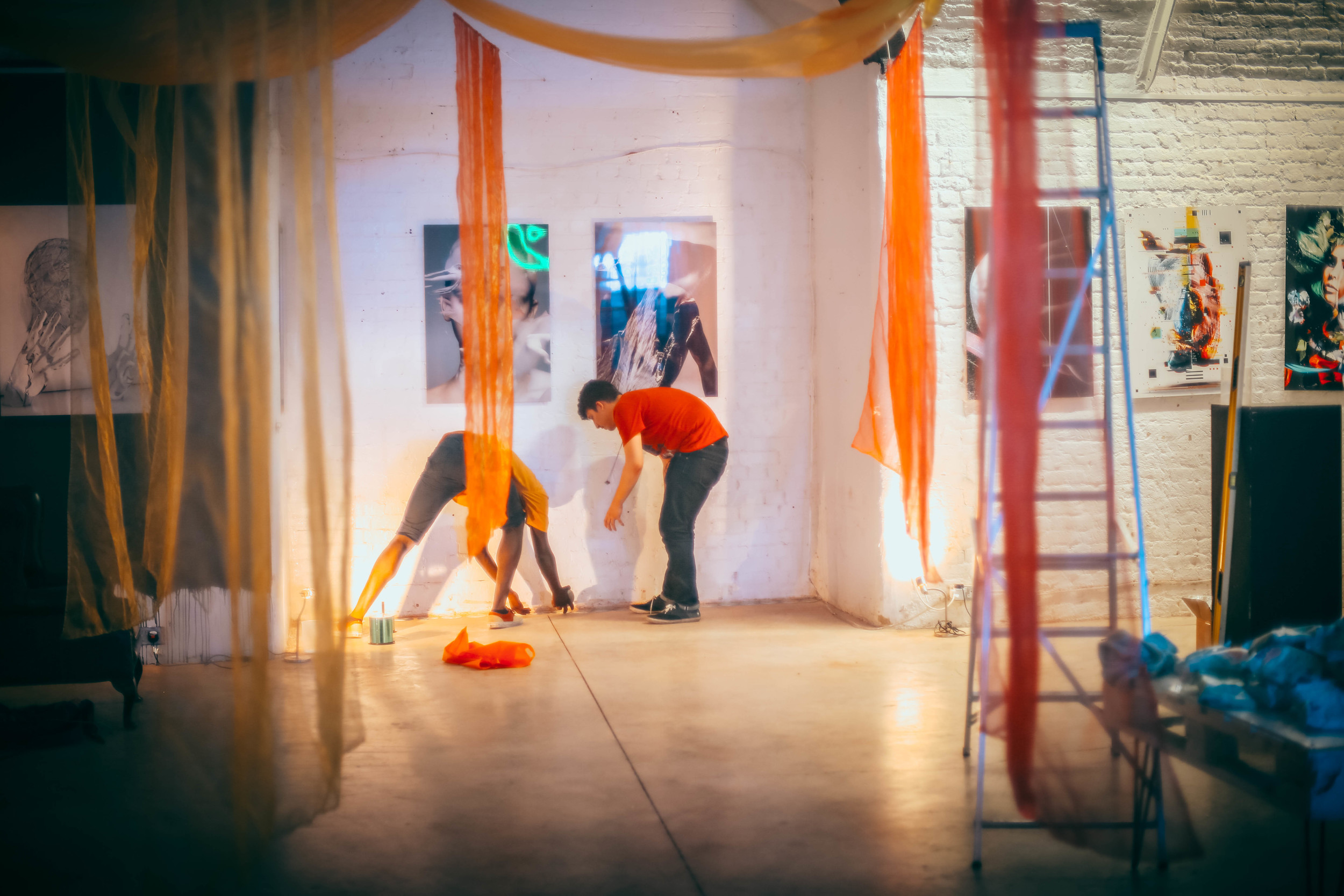
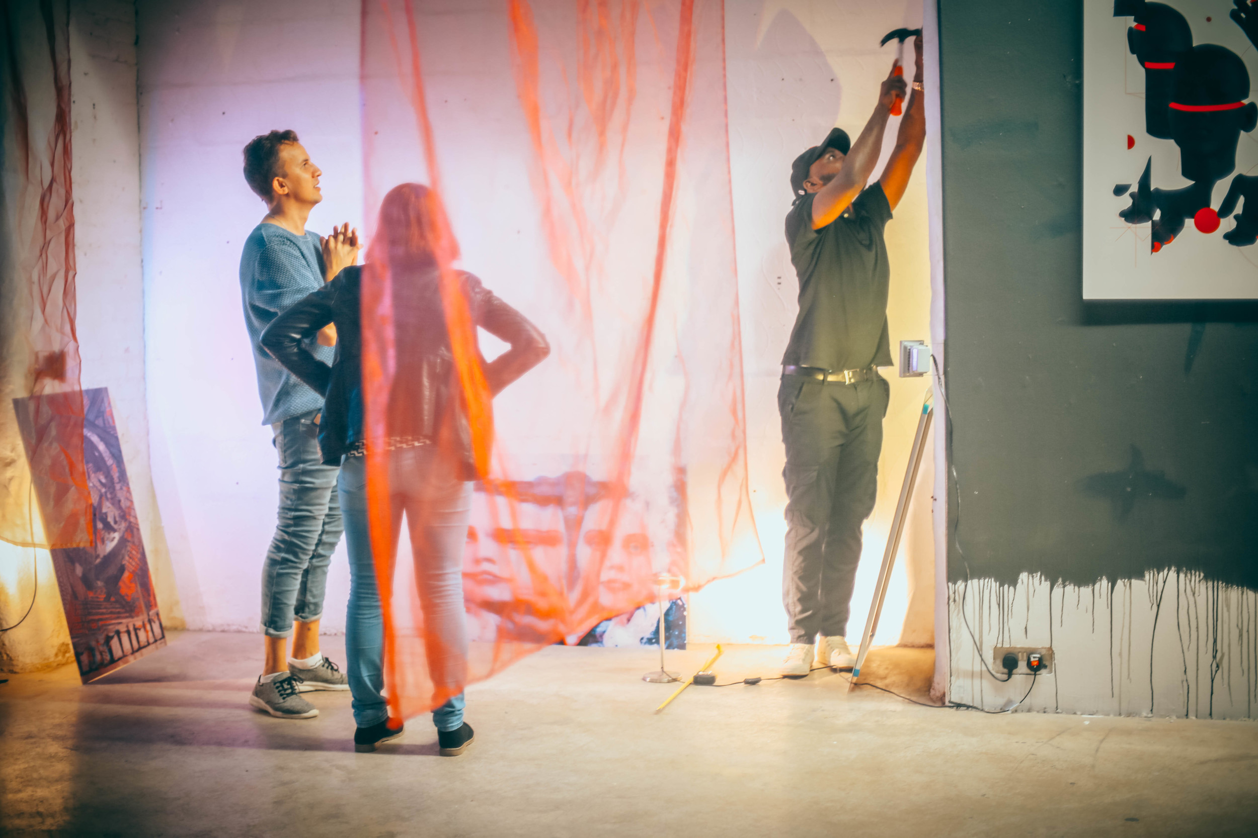
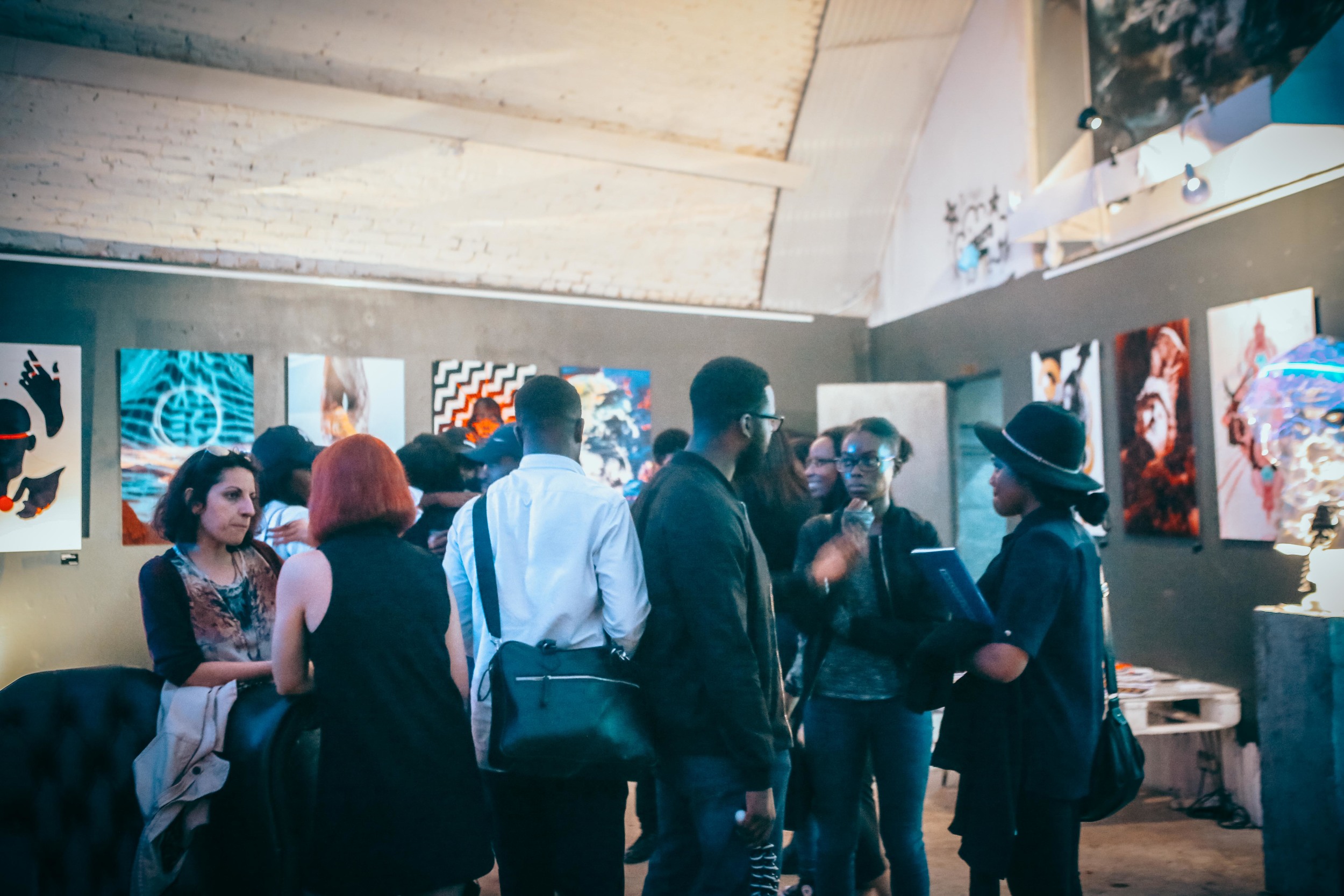
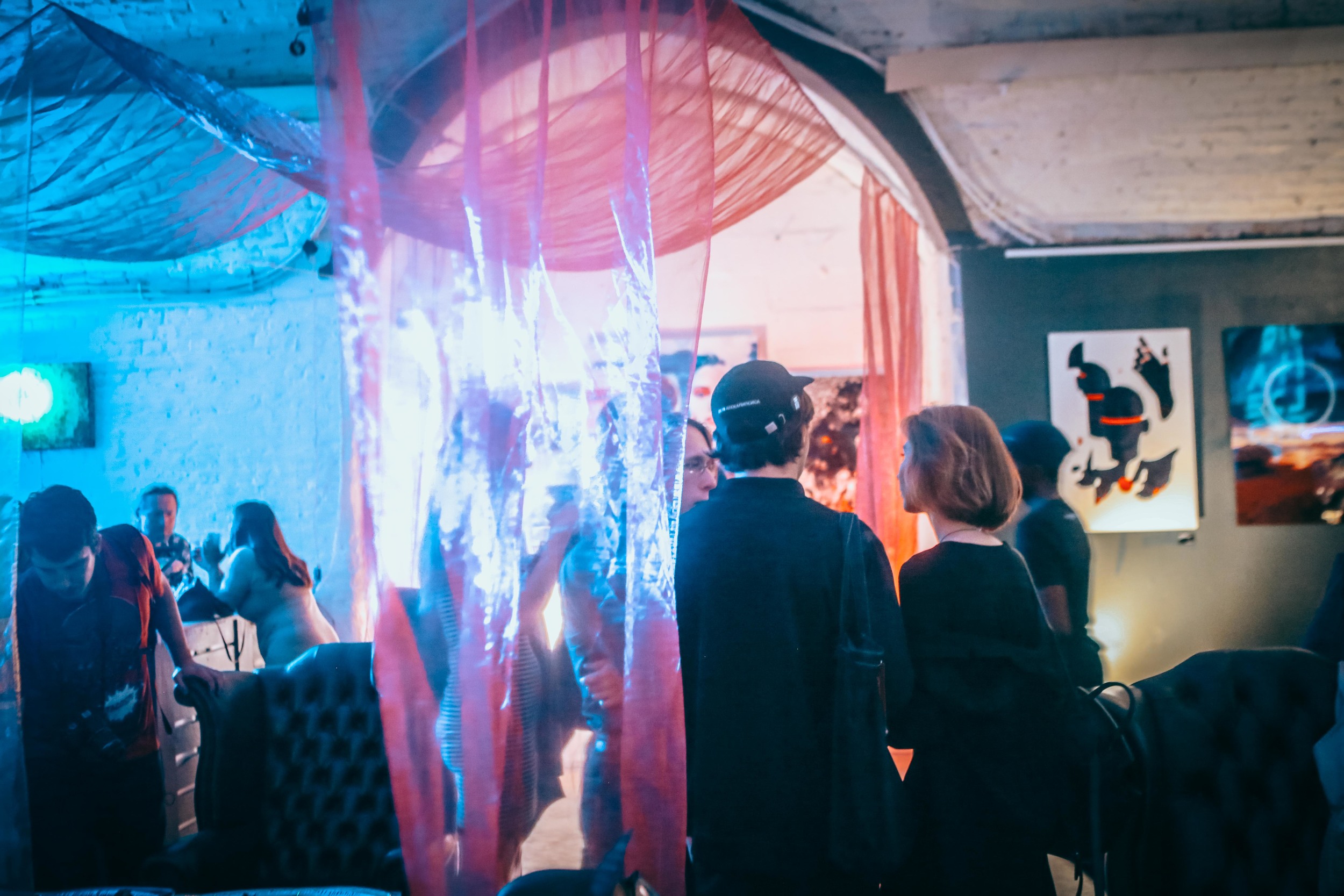
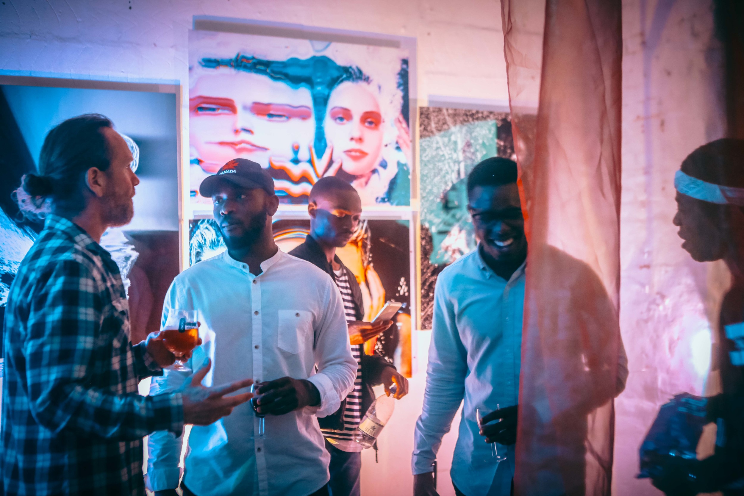
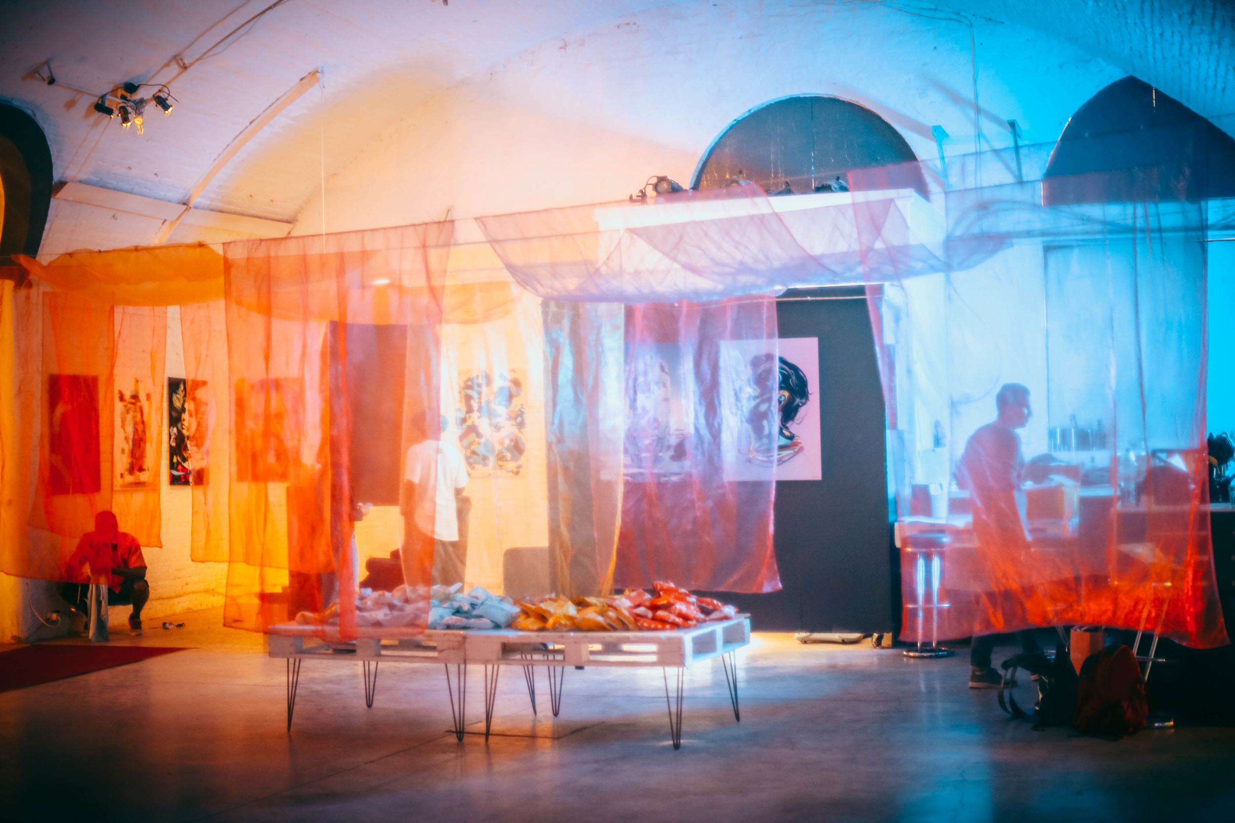
We were lucky to have a team of Youth Worldwide and ToandTo helping us a lot with exhibition instalment.
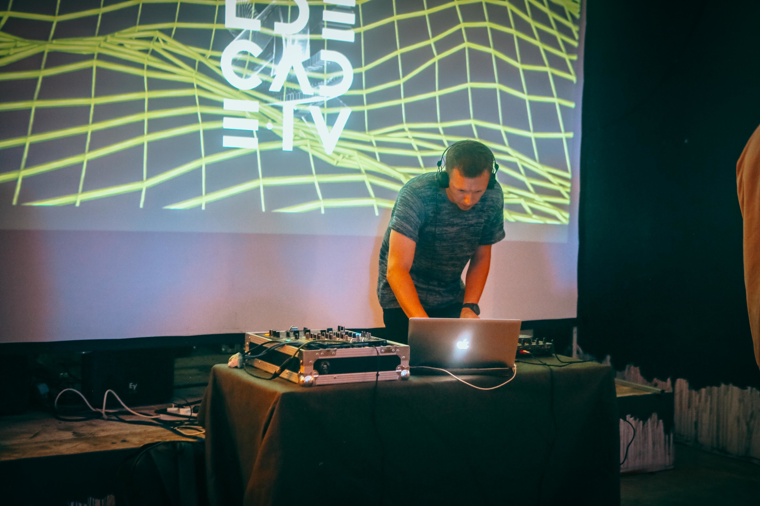
YWW and Toandto installing exhibition


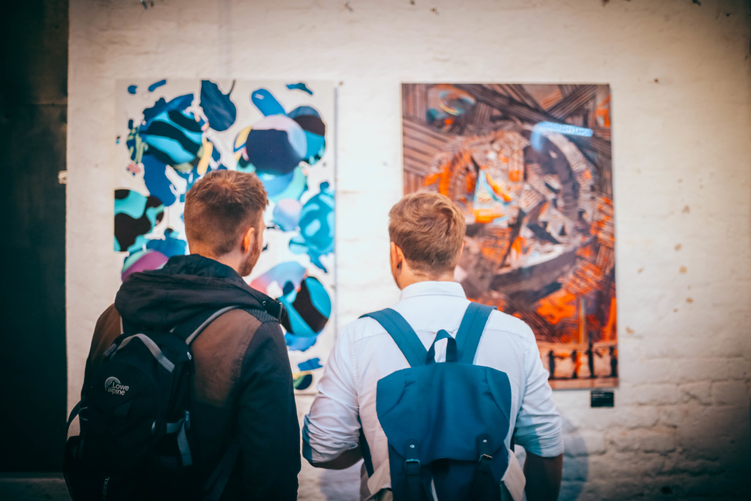

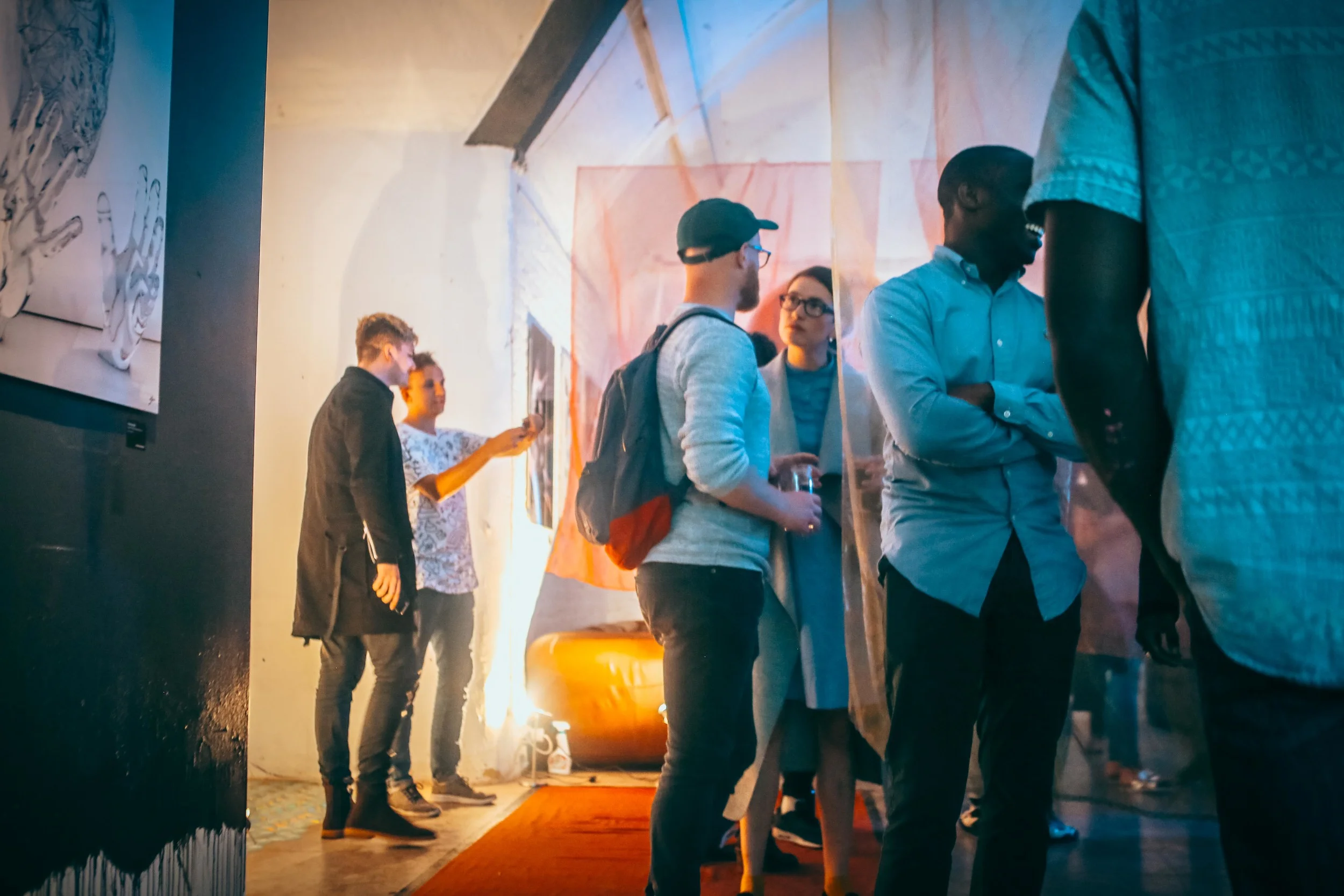

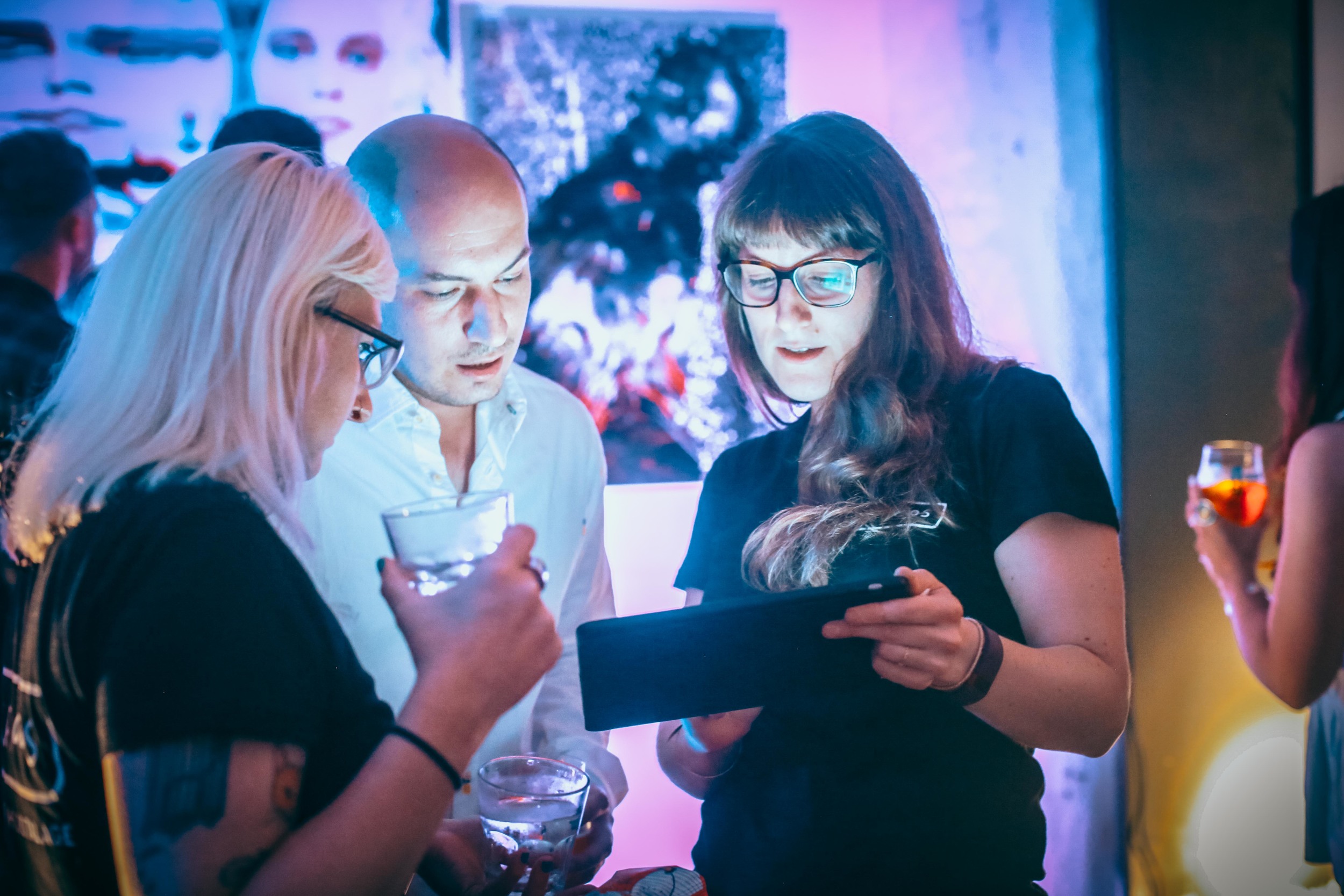
David Marinos, Min Htet Dipar and Nicolas Monin-Baroille
Min and Nicolas with ARTISTMARK on the right
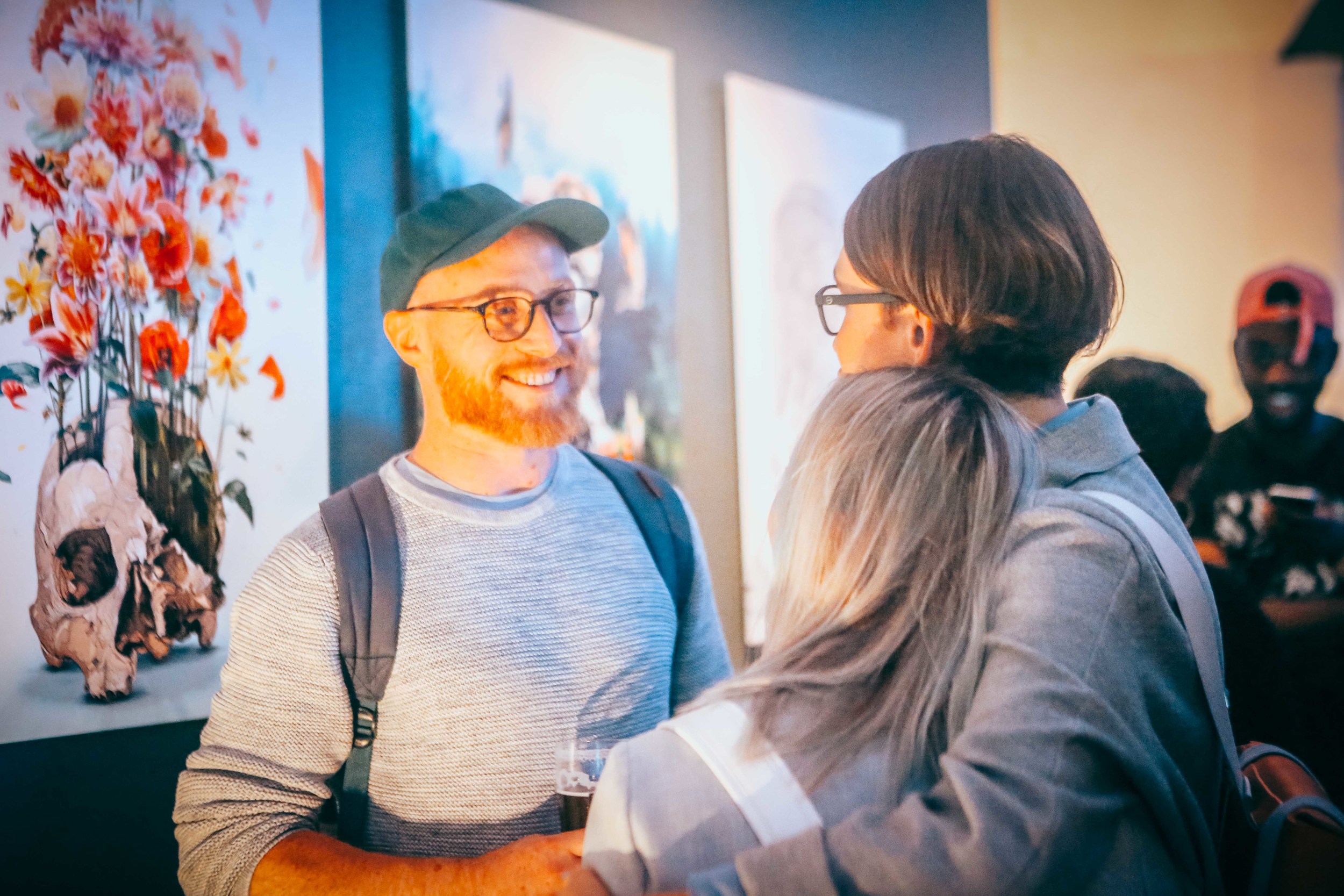
Cityabyss and Alexander Gish
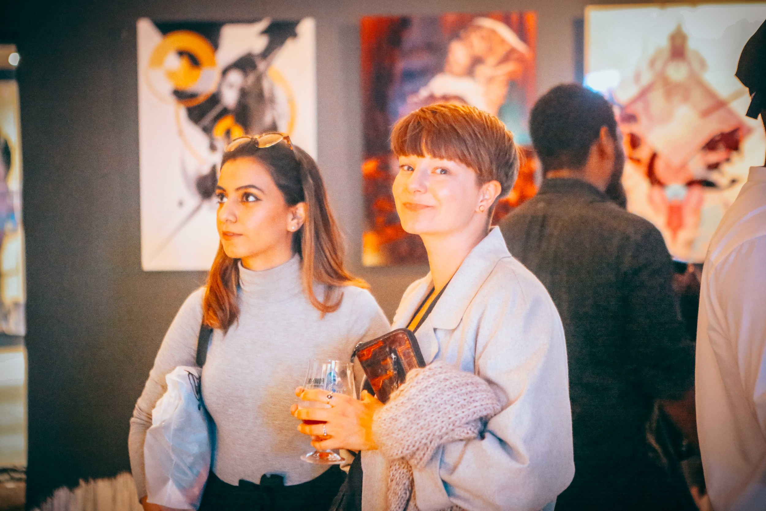
Louise Mertens and Calvin Pausania
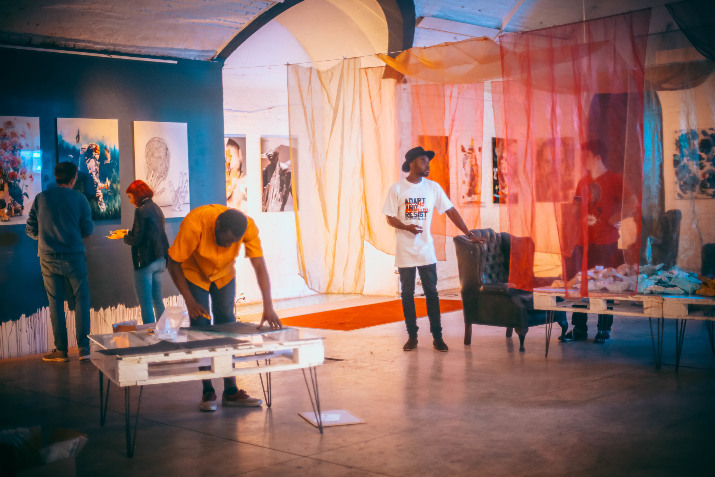
Corner setup
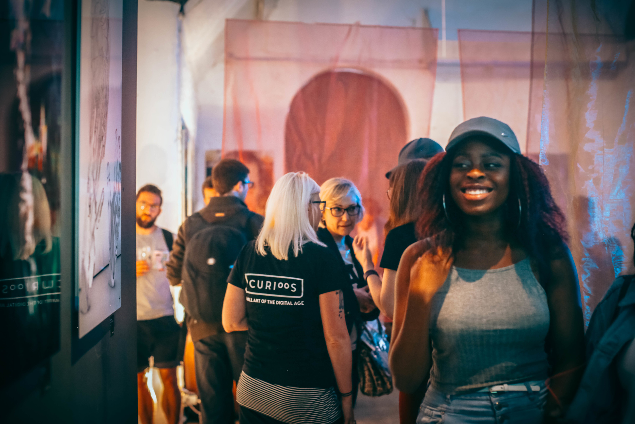
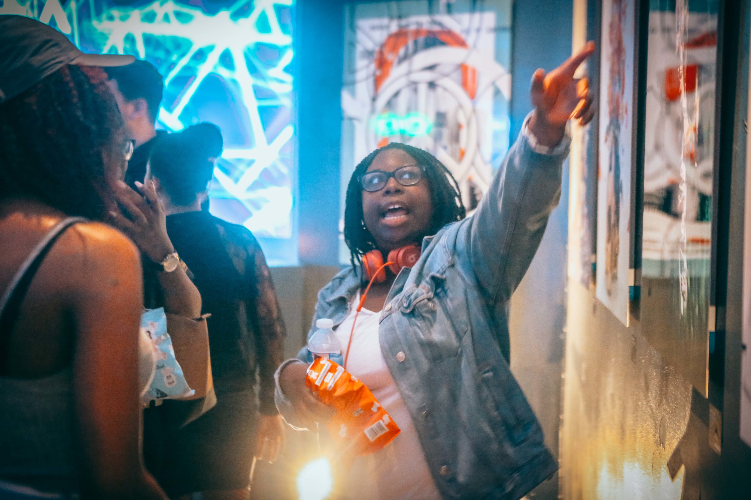
Contest winner Daria Po with 2x Elena Kulikova and Thompson Ekong
Giga Kobidze and Gregoire Meyer
Gregoire Meyer, Mart Biemans, Moe Pike Soe and Salim Adam
Antony Kitson and Louise Mertens
Xavier Bourdil, Cy Tone, Evgenij Soloviev, Anatoly Shabalin and Zouassi
Tilemachos Michailidis, Giacomo Carmagnola and Desislava Desseva

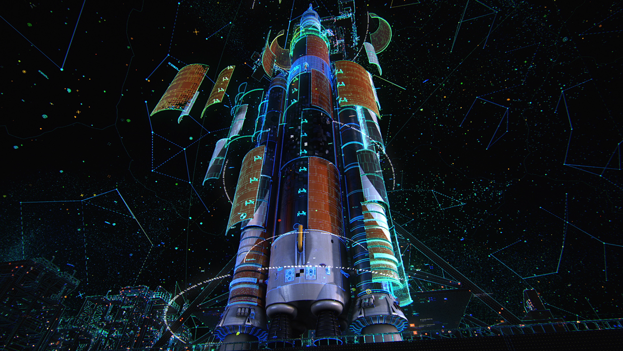
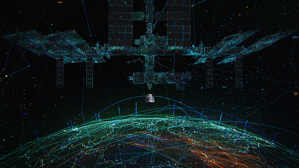
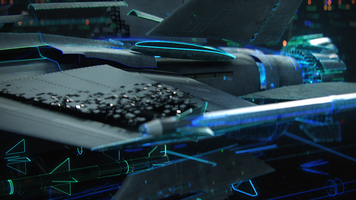
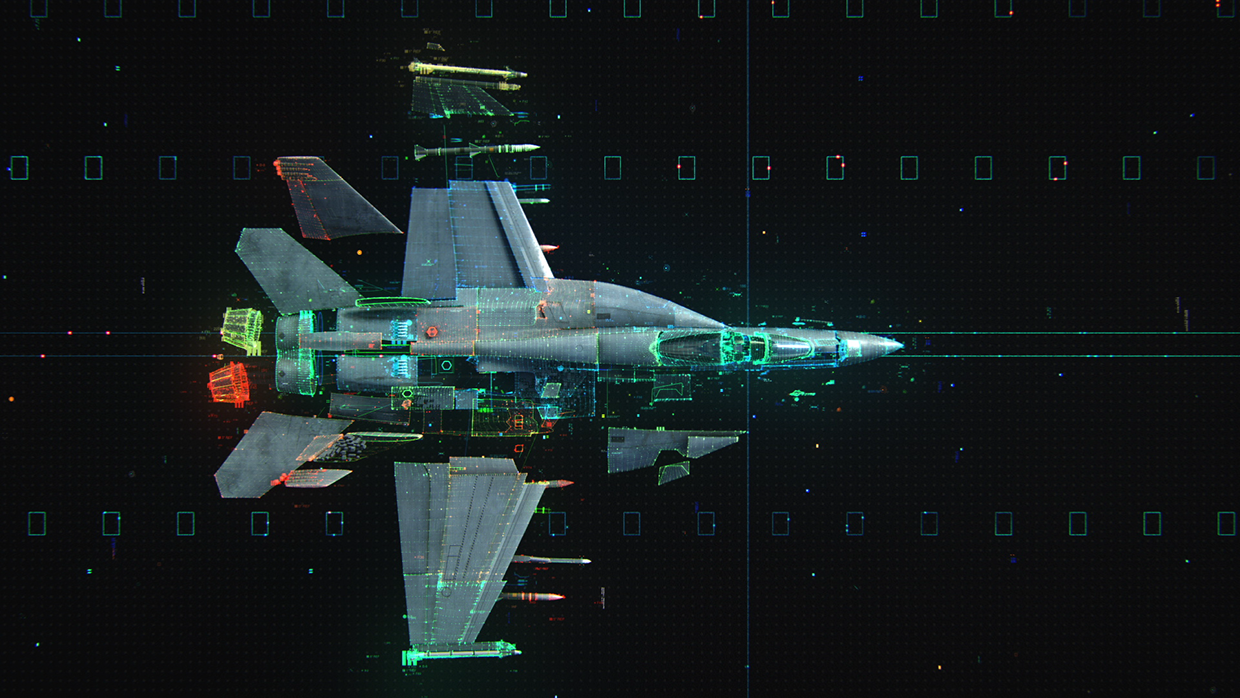
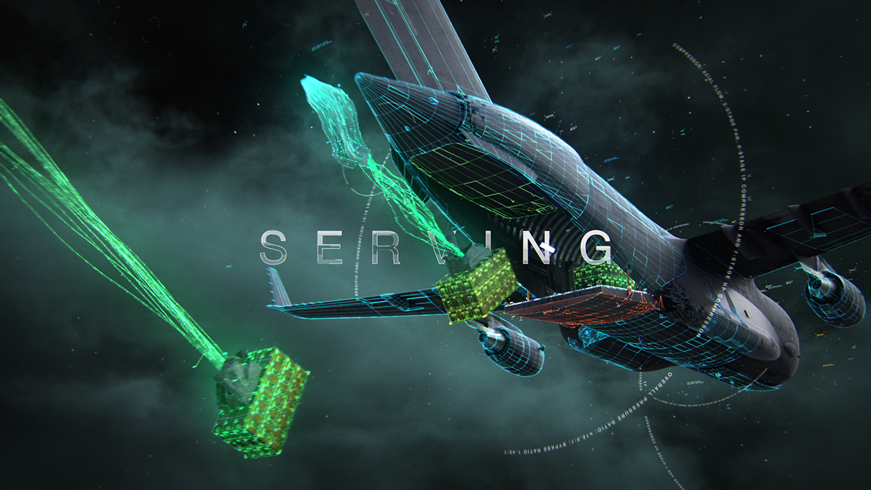
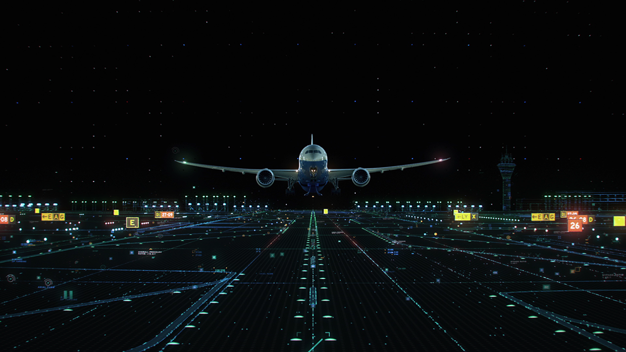
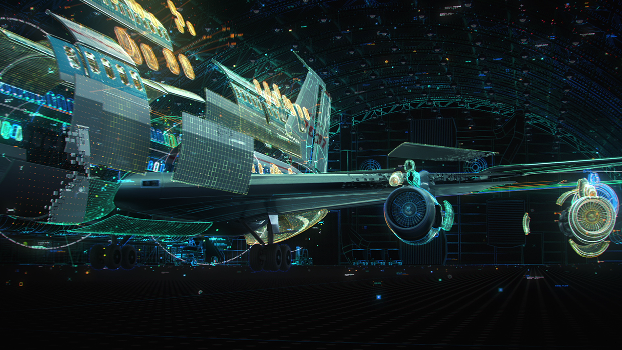
“We created three spots to celebrate Boeing’s 100th anniversary. Executed using seamless design and hyper-real CG, we drew inspiration from engineering blueprints, as each spot captures the awe-inspiring process that starts with a single spark in the mind of a Boeing engineer, and finishes with a gravity defying roar of an engine taking a machine to unprecedented altitudes. From the historical, 1916 B&W plane to the 787 Dreamliner, Boeing products come alive, celebrating 100 years of technological triumphs in Space, Defense and Commercial travel.”
Created by Aggressive
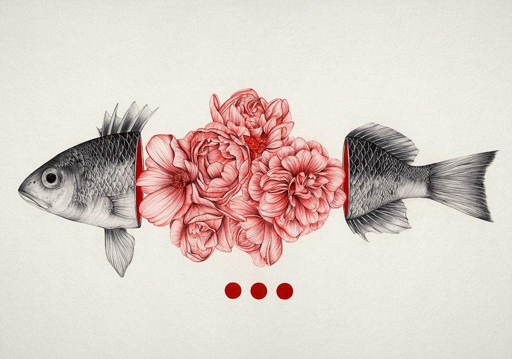
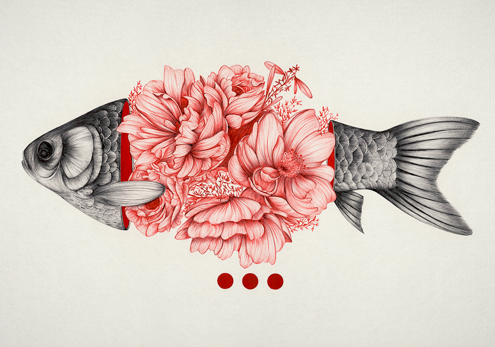
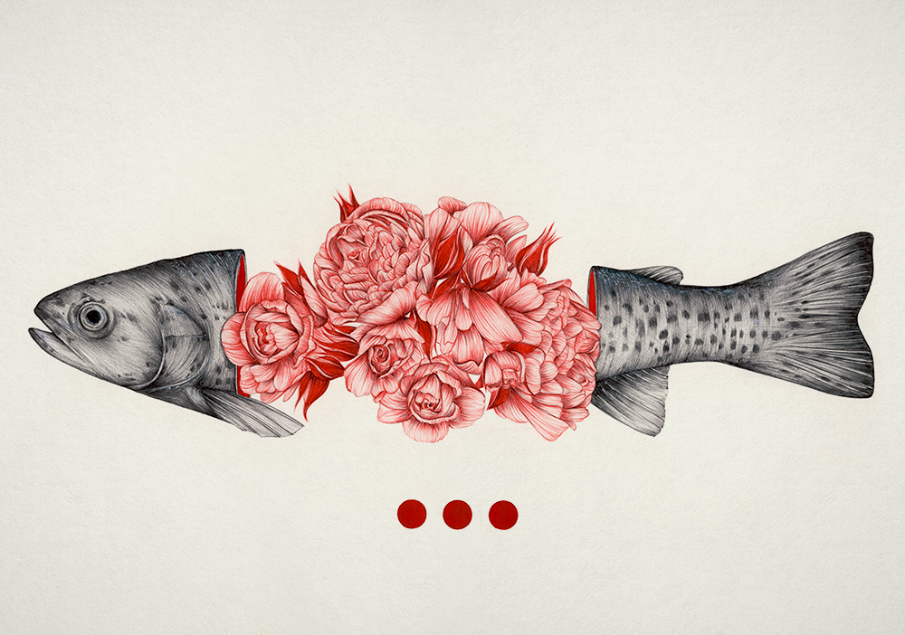
“What if, instead of oozing blood, we sprouted flowers? “To Bloom Not Bleed” by Peony Yip illustrates this idea, portraying “the fine line between the grotesque and beauty of death.” A gutted fish, instead of looking limp and lifeless, reveals its insides to be a bouquet of peonies and roses. It’s a notion that makes death appear almost romantic.”

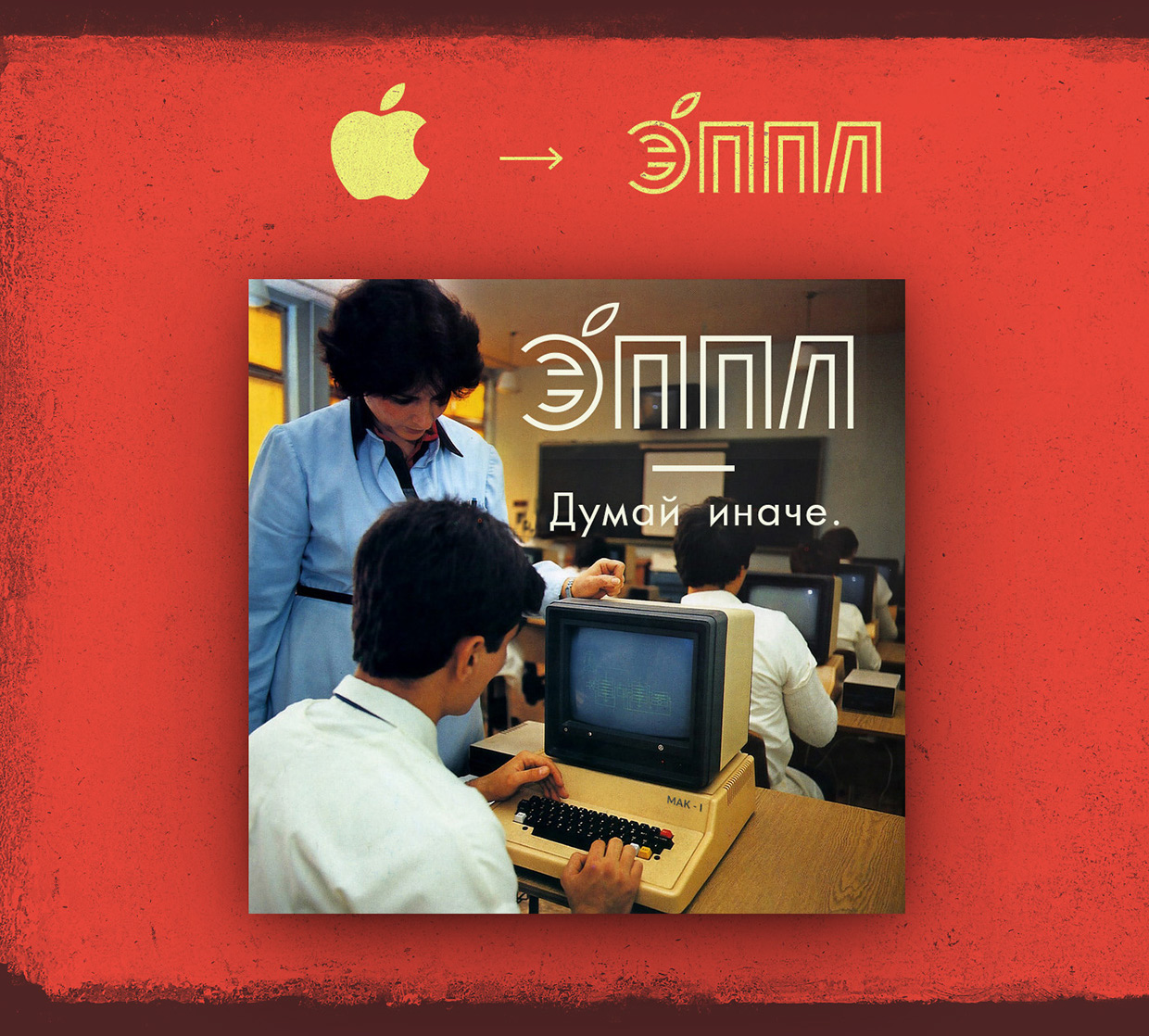
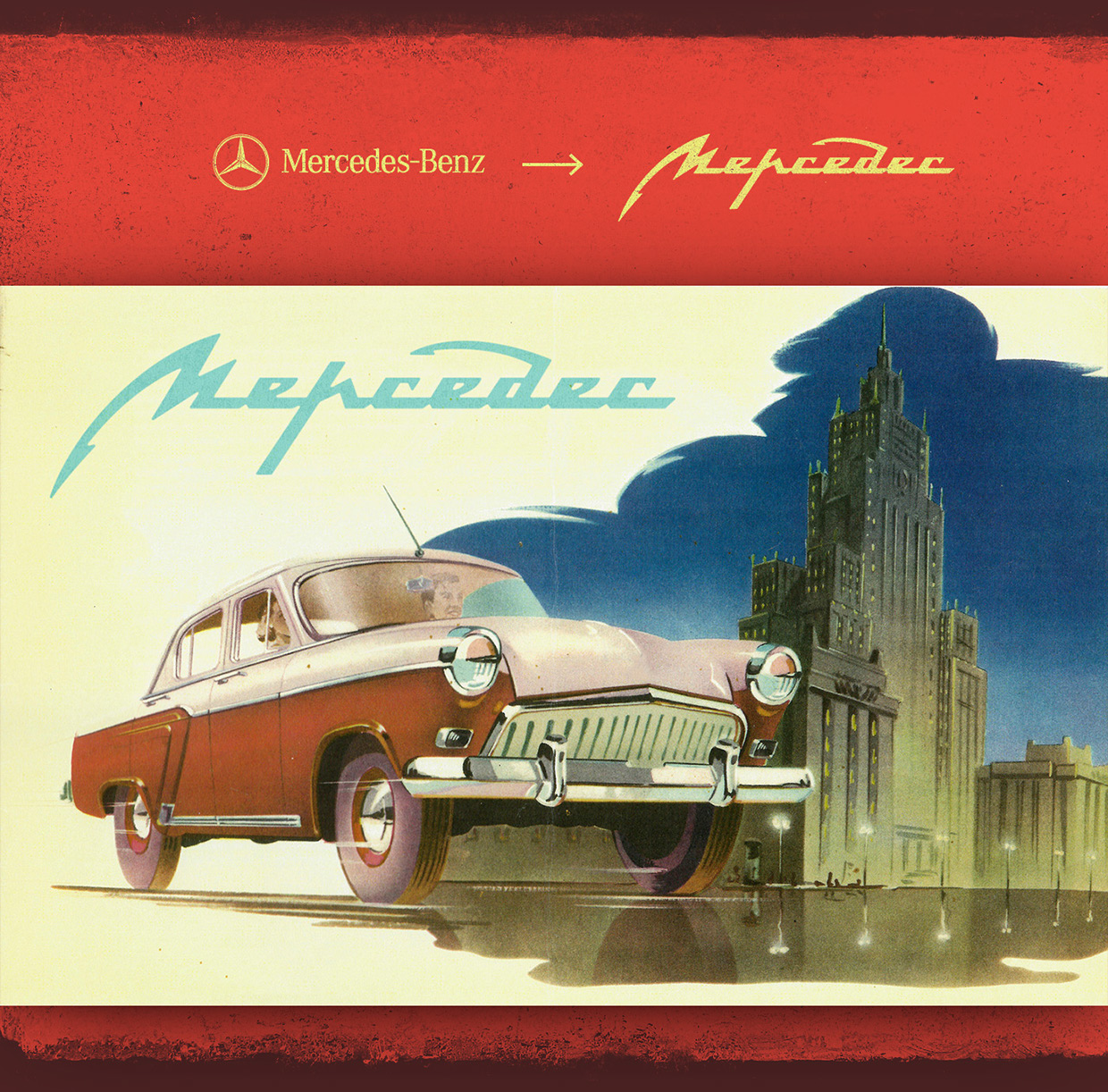
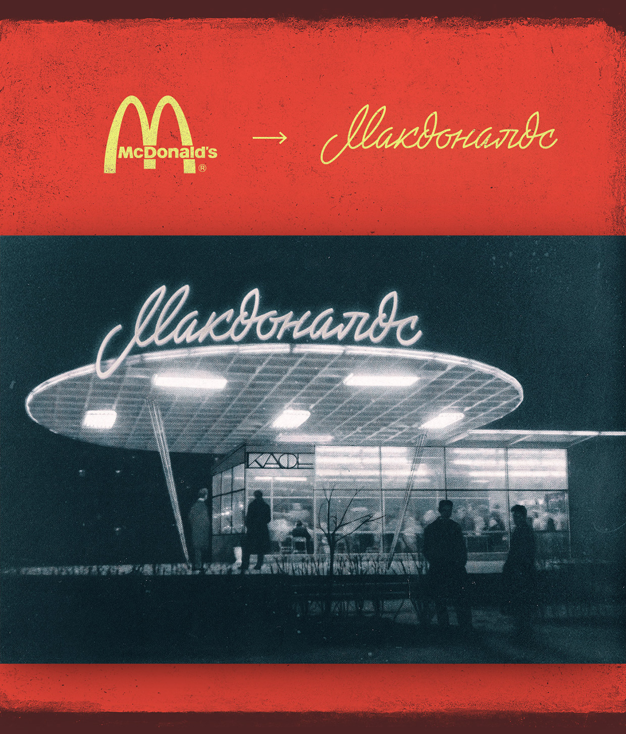
As a kid born in the USSR I can't admit I have a lot of nostalgia for that period but it definitely has a good examples of graphic design especially typography. Keeping this in mind Saint-Petersburg based designer Mike Levchenko approached the idea of rebranding famous global trade marks using so say "USSR" or "Soviet" style.

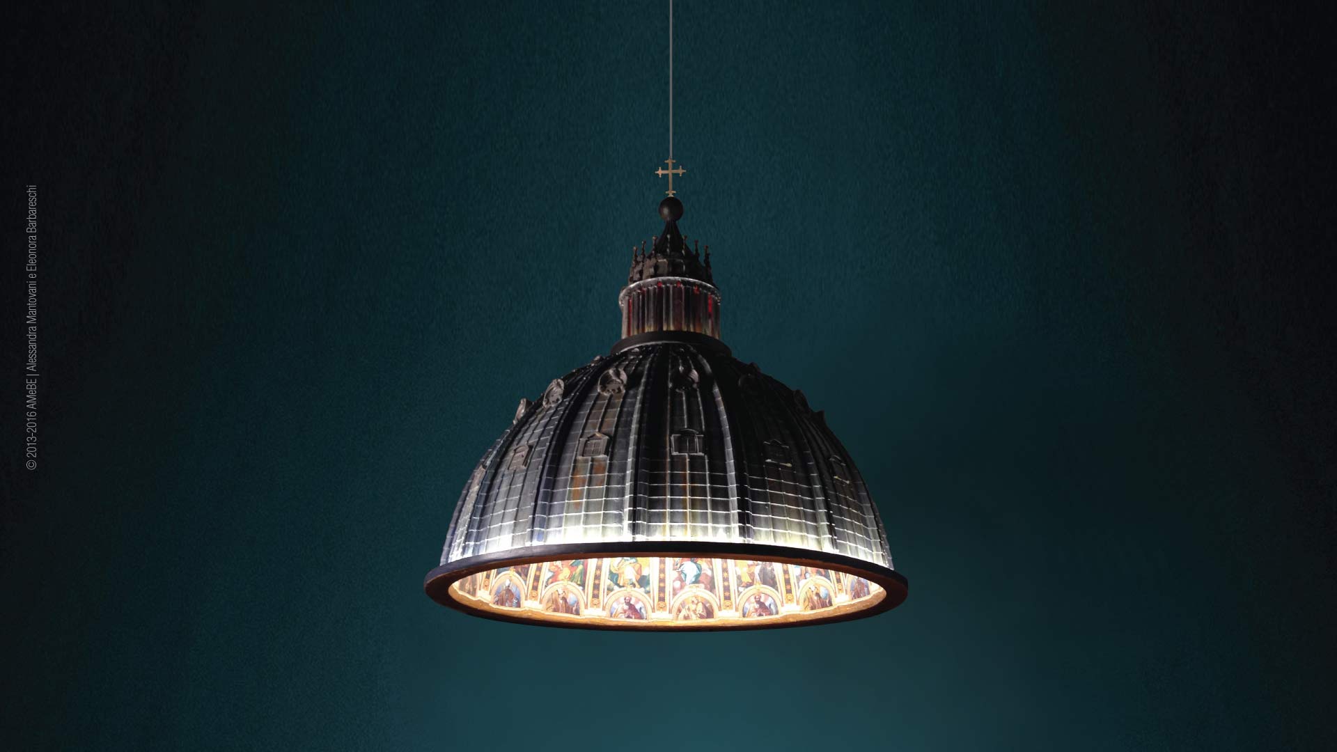
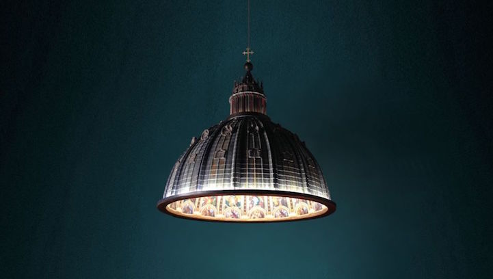
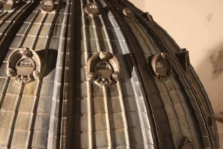
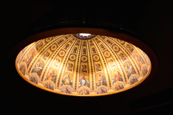
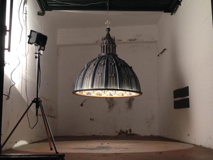
“Italian Studio AMeBE pays homage to the stunning architectural beauty of Saint Peter’s Basilica by recreating it as a magnificent lamp. The hanging light fixture focuses its attention on the Vatican City’s iconic dome, using a hyperrealistic approach to craft a striking likeness. Designers Alessandra Mantovani and Eleonora Barbareschi—the duo behind Studio AMeBE—hand painted the ornate and weathered exterior as well as the religious scenes that line the inside. From certain angles, the miniaturized structure could be the real thing.”


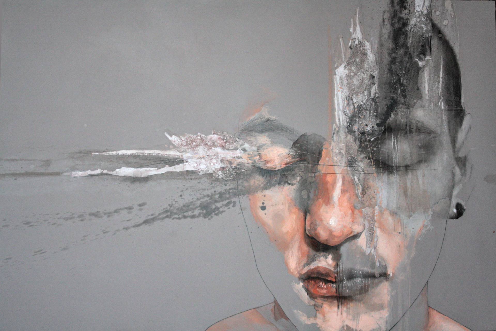
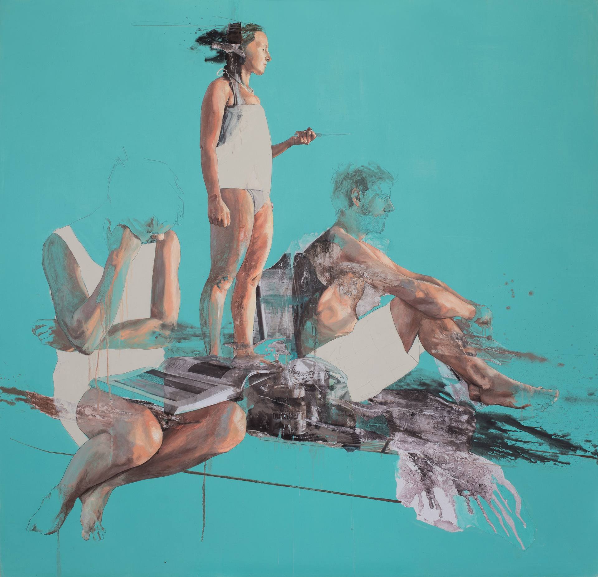
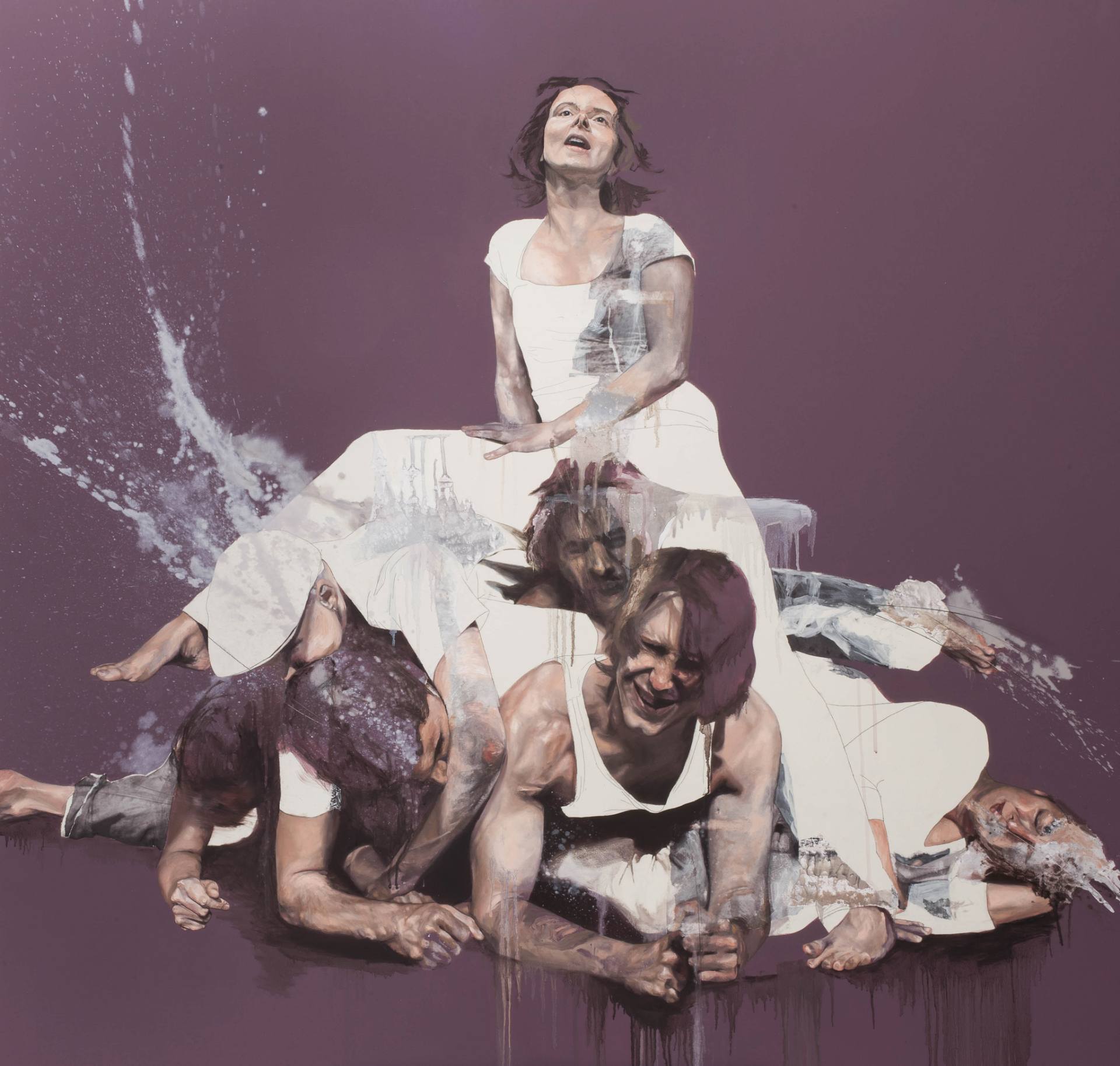
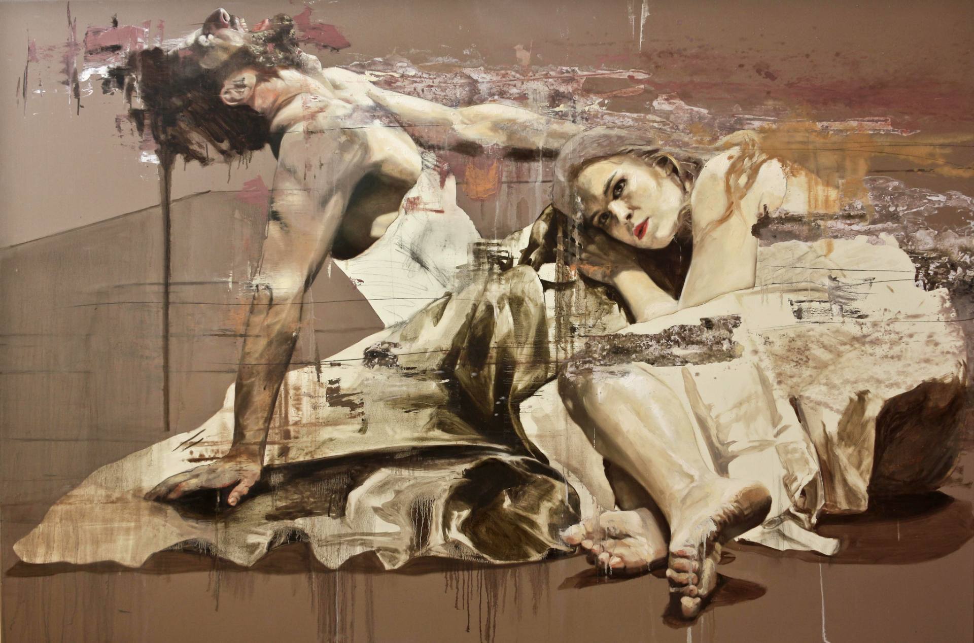
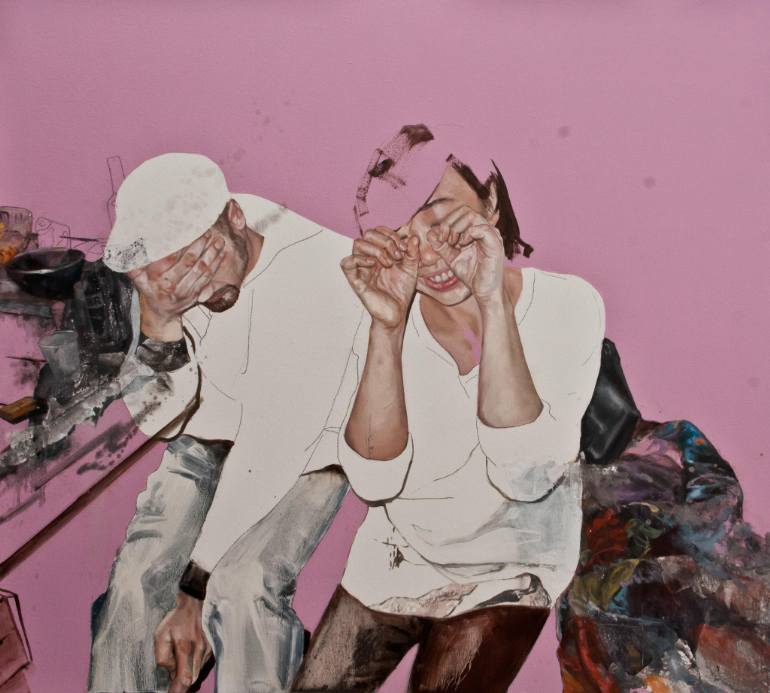
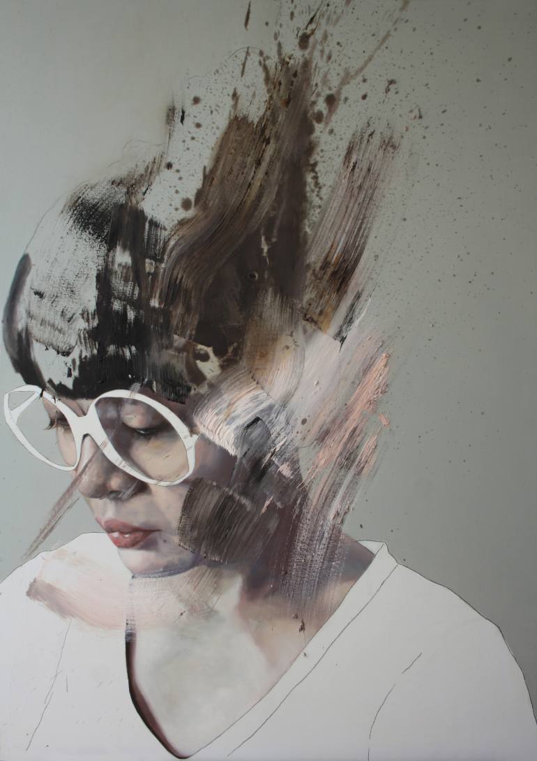
Jessica is an Italian artist studied at the Academia Albertina di Belle Arti of Turin and now lives and works in Berlin.
“My work is a challenge to find a paint method that could be sensory, emotional but cruelly true and real at the same time. I take people I know or find and I get inspired from their natural gesture and the sensation that I find in them. I observe what they evoke in me, and I want to transfer this kind of emotional feeling to the people that observe my paintings. I try to find a way to let my figures breath, move, think – but not only in their physical appearance. I don’t want to make a realistic paint, but a real painting, with all the sensation of their action. This is why I start from gesture, because is instinctive, it is pure, it is just a reaction to something external about us. Then I arrive to work on flesh with this caducity or freshness. This is the approach on my artwork, a continuous curiosity in development, life, communication, exchange.”


As there is literally no Planet B we must think not only about our relationship with environment but with the people around us, especially the ones in need. It is still unclear how we can raise millions in kickstarter for another gadget and avoid helping a bunch (in terms of percentage) of homeless people. British sculptor Maxwell Rushton approached by similar thoughts has created a "Left Out" piece on streets of London where nearly 7000 slept rough on streets during last year.
Filmed by Liam Thomson
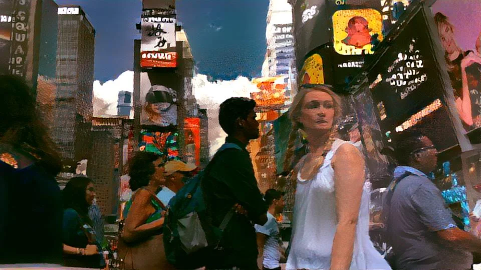
Using open-source neuro-style code Daniil Krivoruchko, Viktoriya Yakubova and Tatiana Stolpovskaya created awesome video depicting New York in it's neuromantic beauty

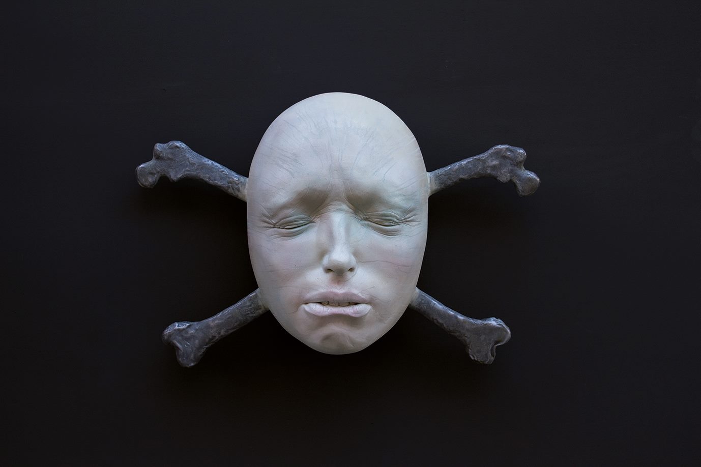
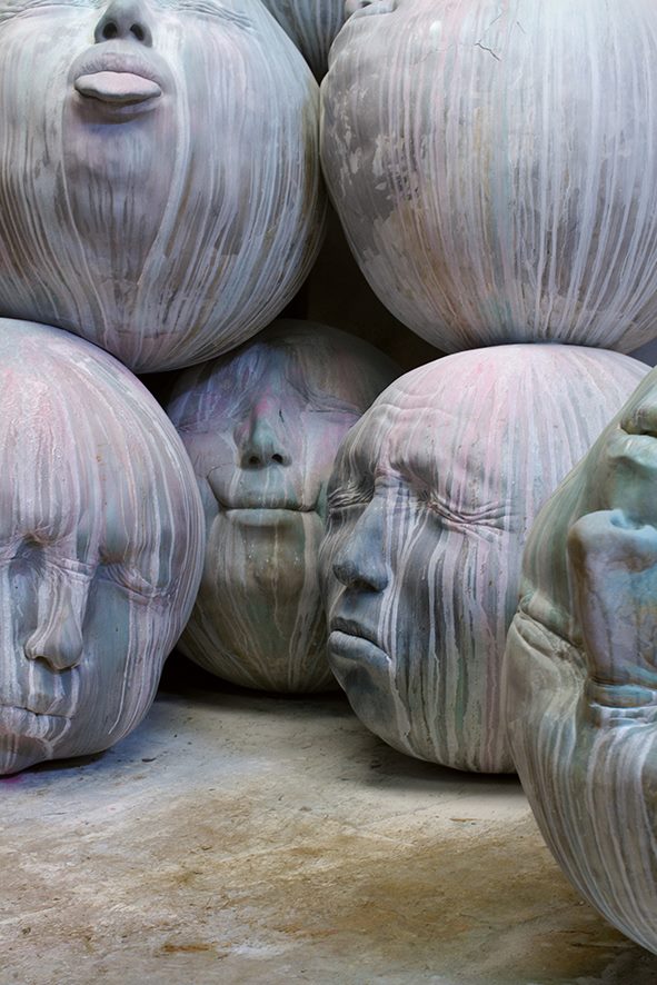
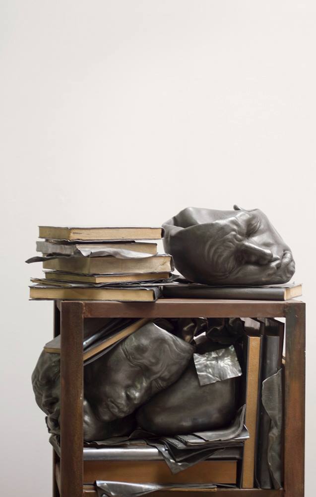
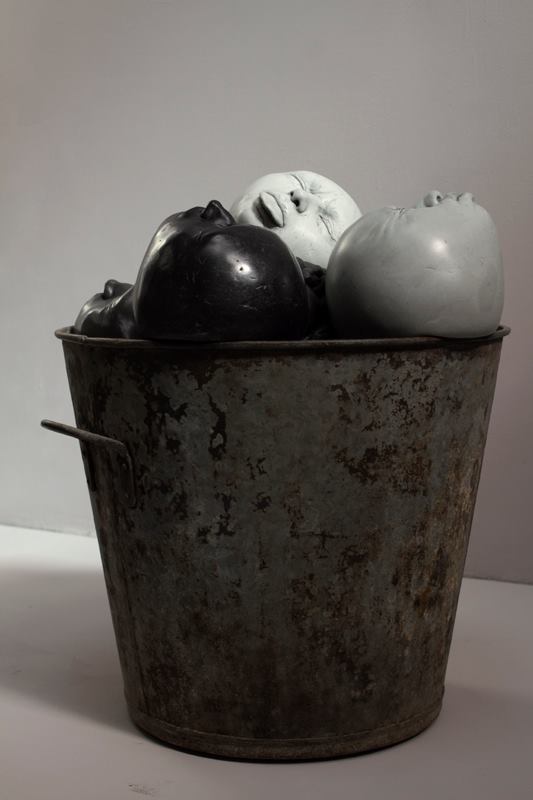
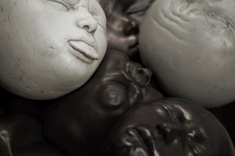
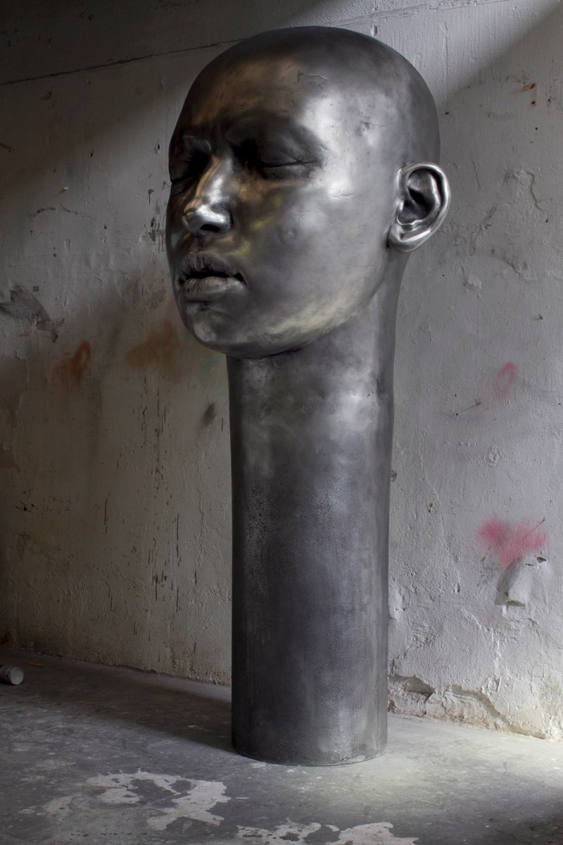
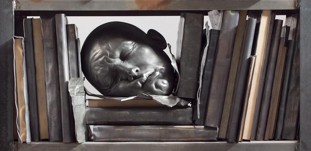
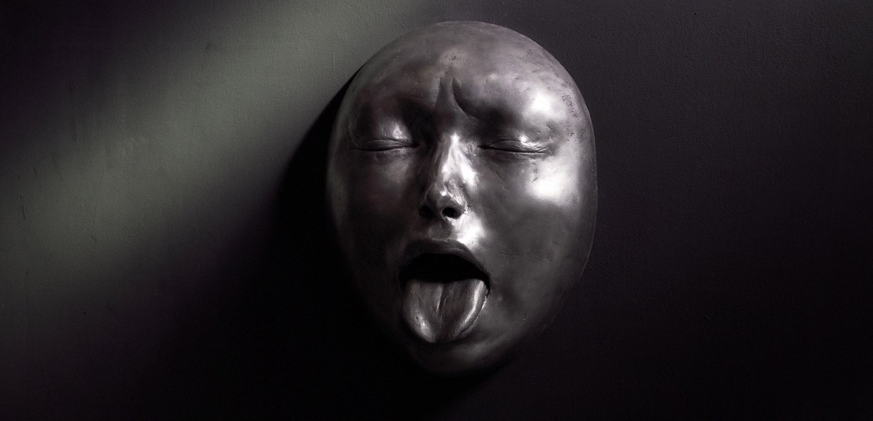
“I invent during the process, so I don’t know what will happen at the end of the sculpture. I don’t always remember what I have done. Every time I stop, it’s something new”
Samuel has a degree in Fine Arts from the University of Barcelona and has exhibited at various venues throughout Spain.

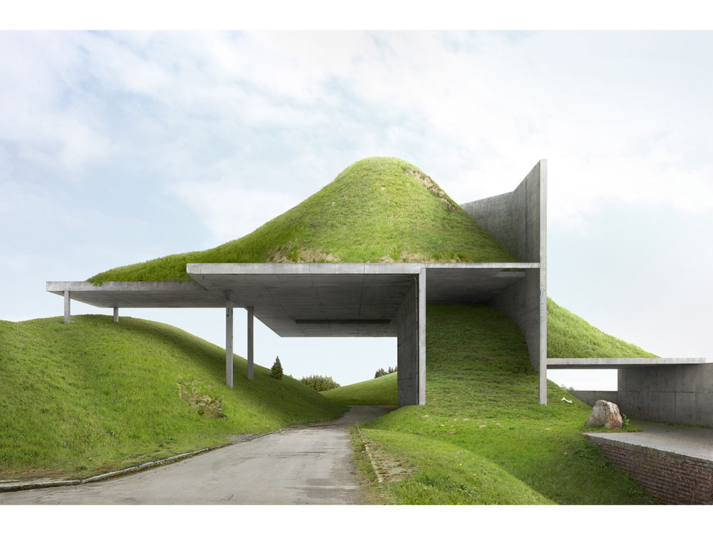
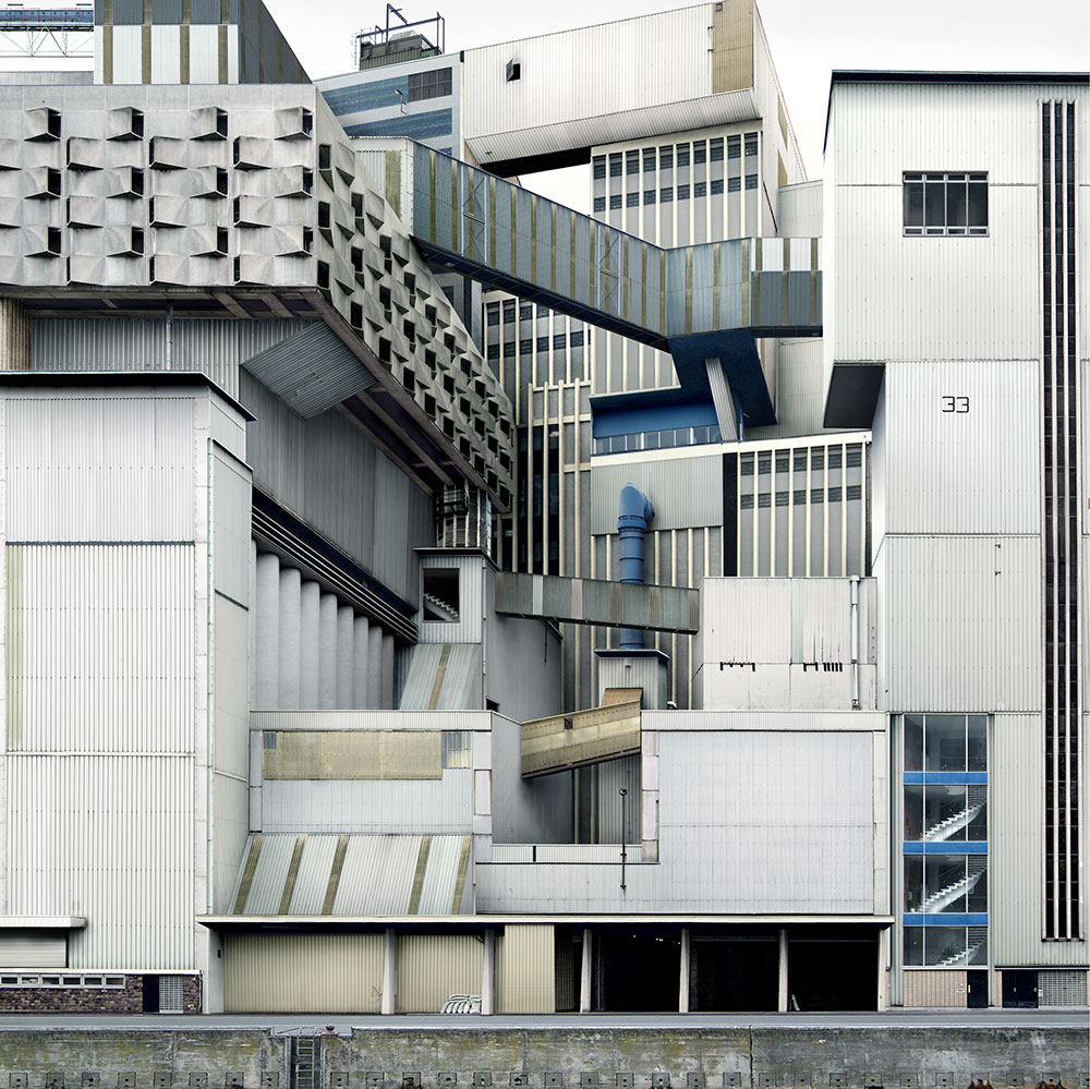
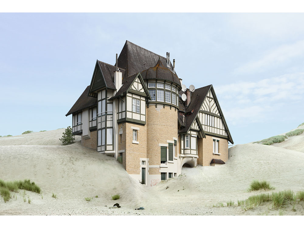
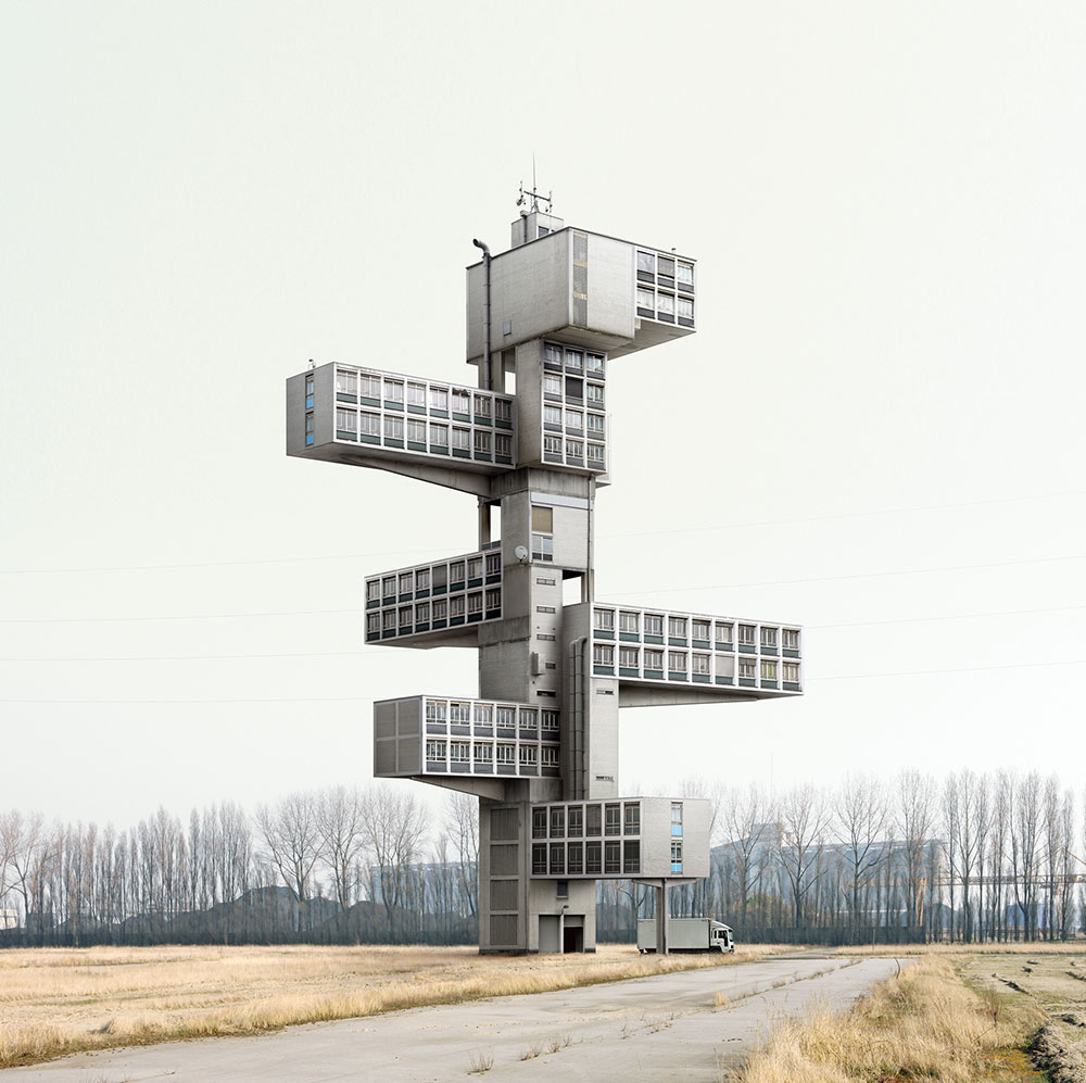
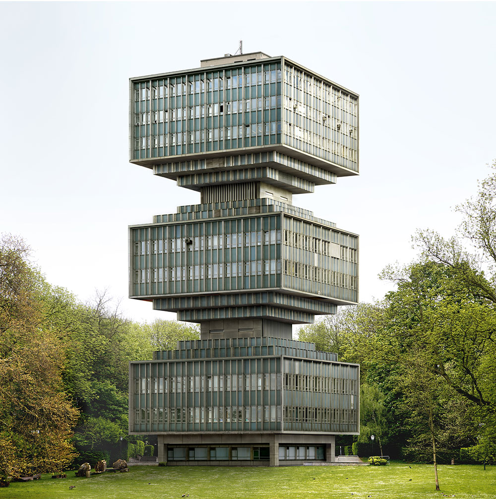
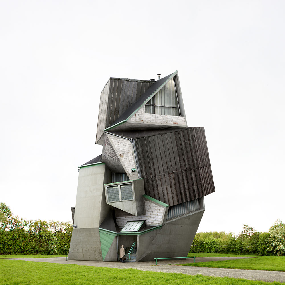
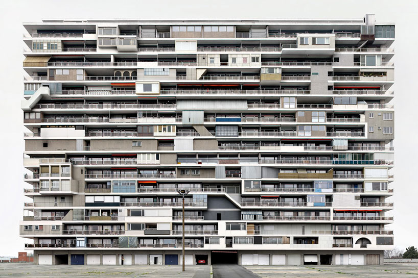
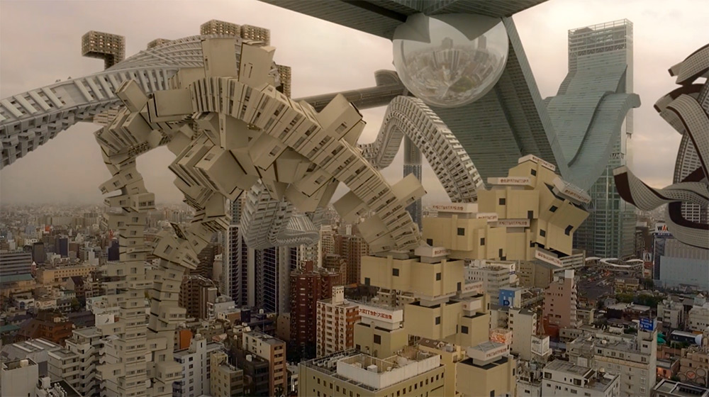
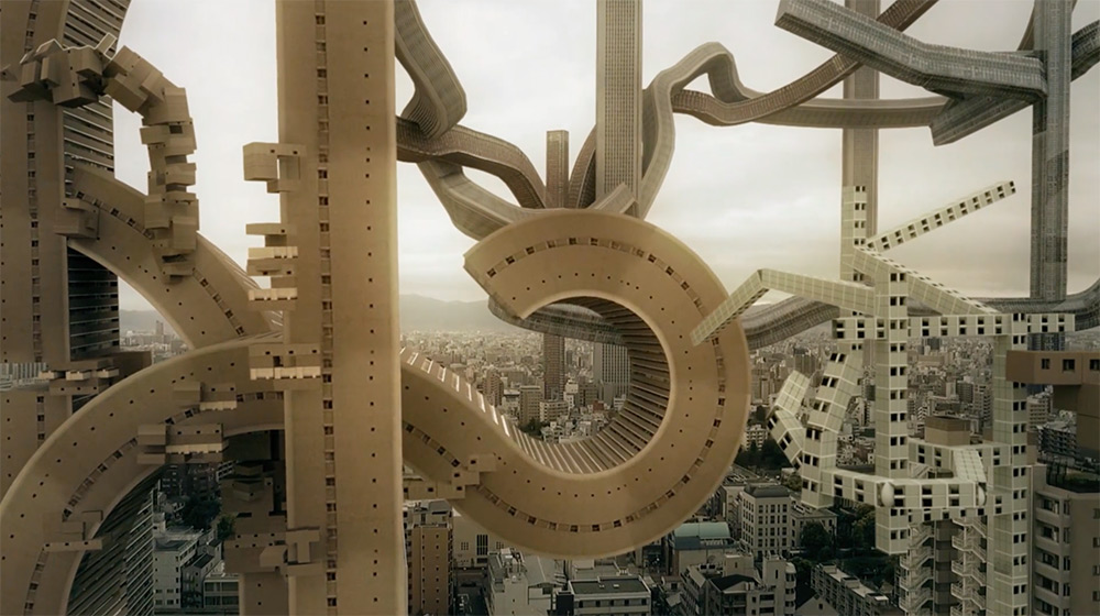
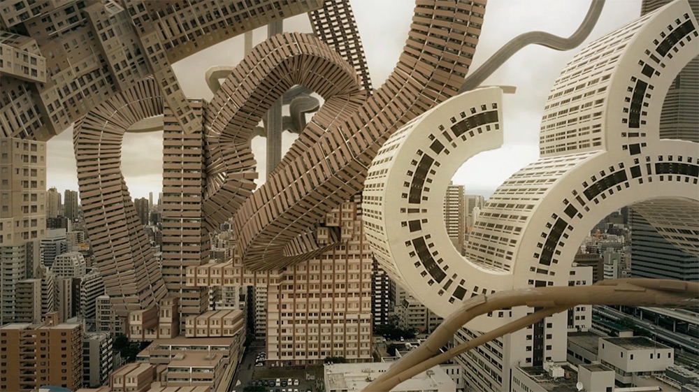
"Filip Dujardin makes digital photo montages of impossible structures. In some, modernist buildings are stacked like towers of mislaid Jenga pieces, with cantilevered sections shooting out in every direction. Others show passageways leading nowhere, like Escher drawings made real. Each is meticulously constructed, teetering on the fine edge between reality and absurdity"

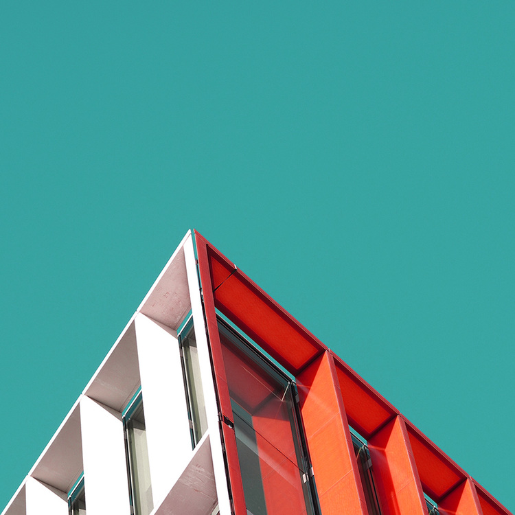
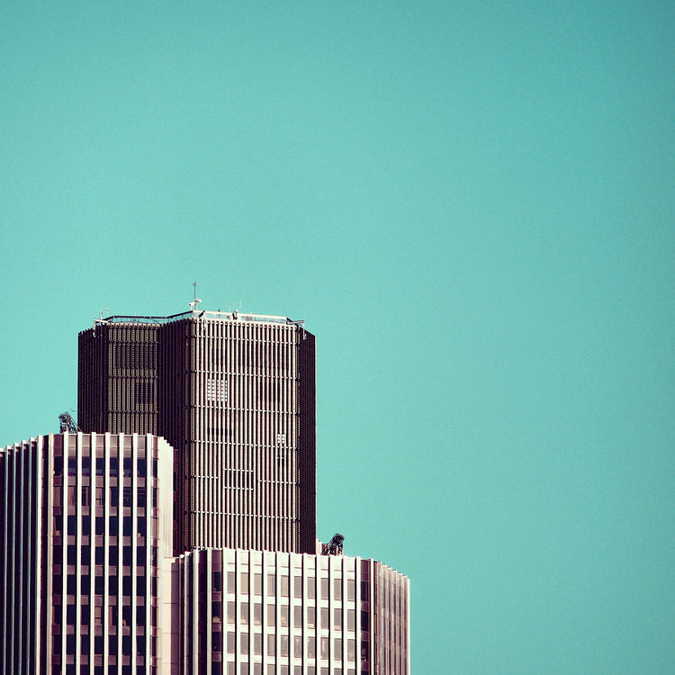
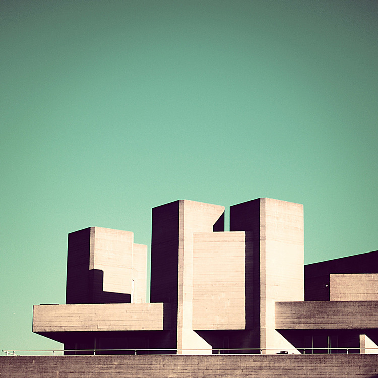
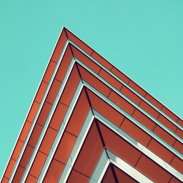
London photographer specialising in urban photography, street photography Nicholas Goodden has a lot of project to show on personal website but we selected the striking one featuring minimal urban shots.
OLYMPUS DIGITAL CAMERA
OLYMPUS DIGITAL CAMERA

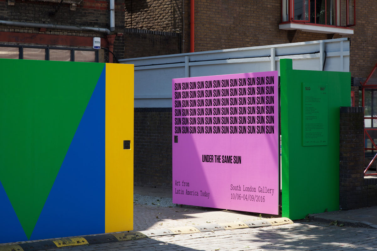
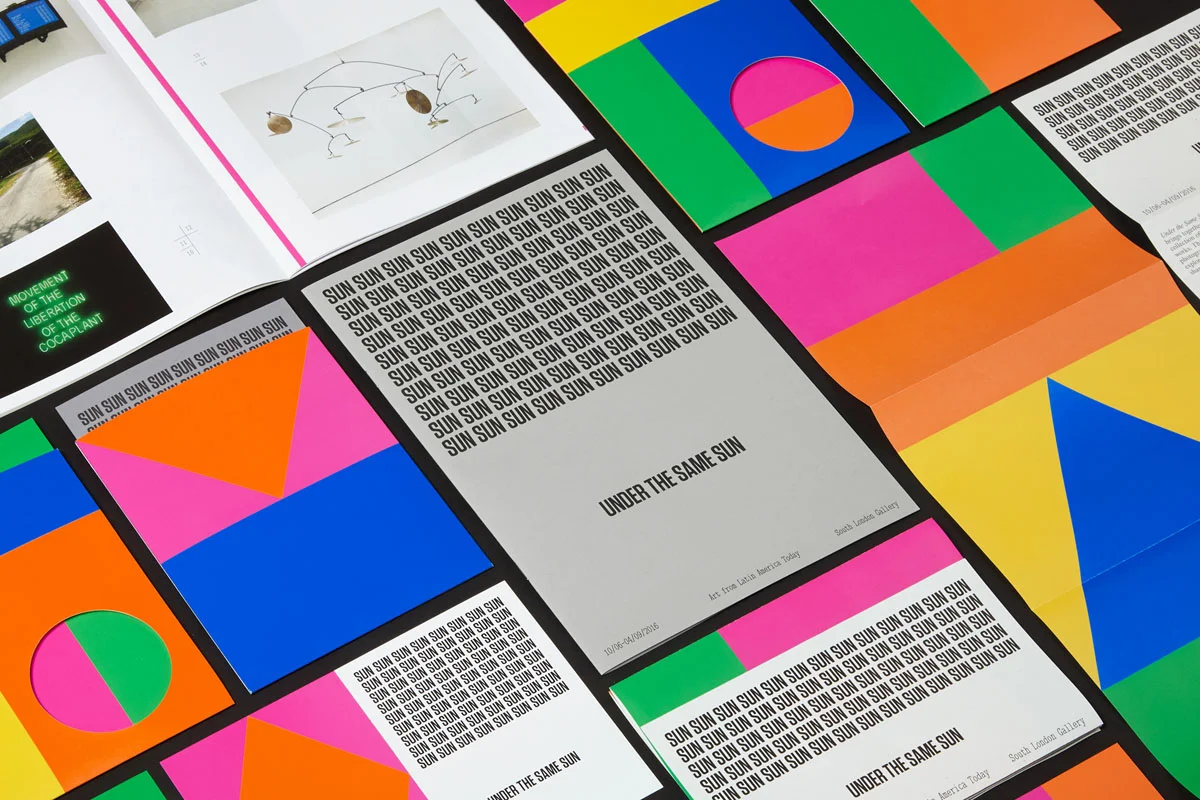
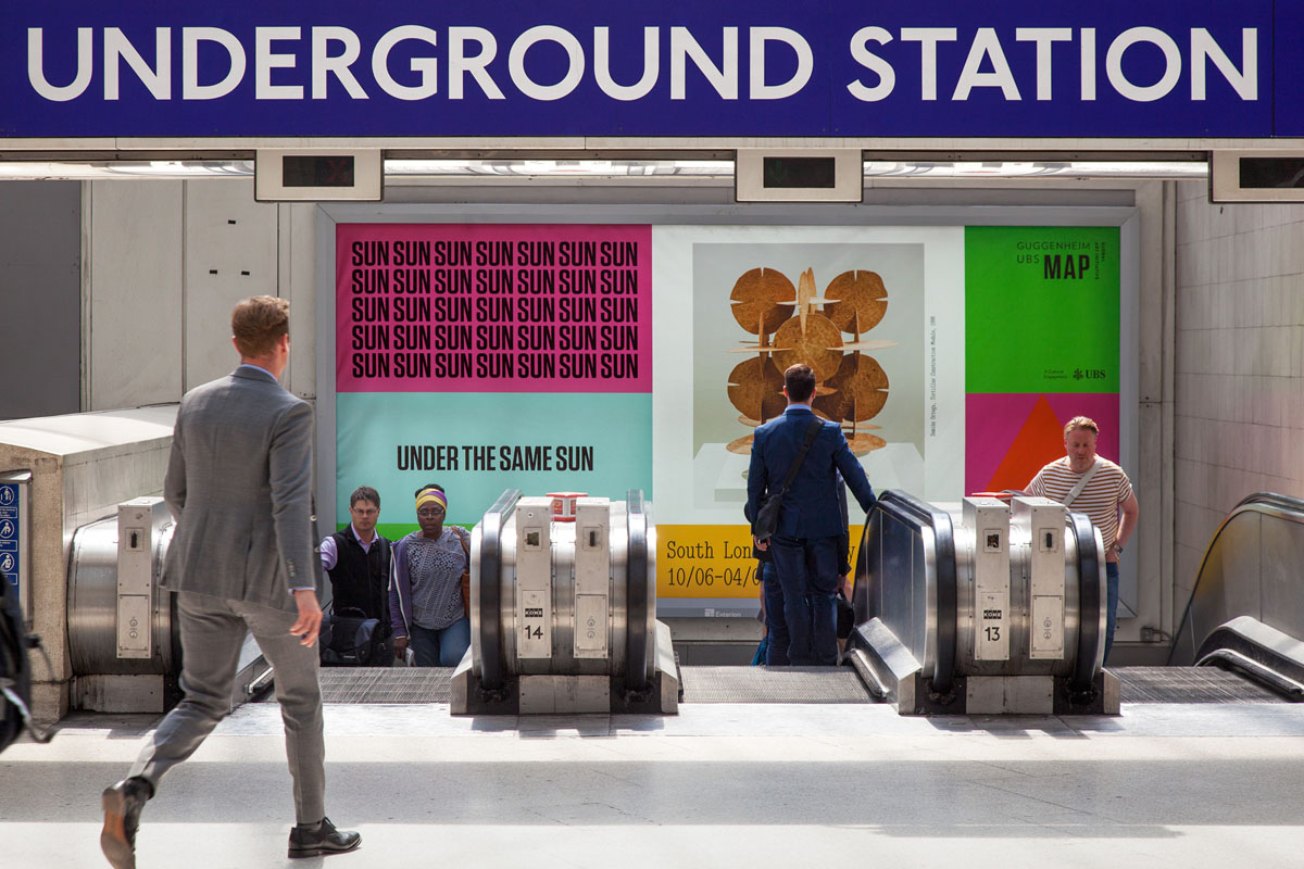
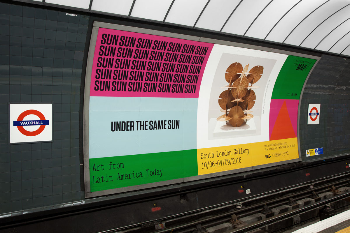
Design studio OK-RM has devised a striking graphic identity for Under the Same Sun, an exhibition of contemporary art from Latin America at the South London Gallery.
OK-RM created a new identity for the exhibition to coincide with its move to London. The design combines eye-popping brights with playful type and bold graphic shapes: OK-RM says it represents “an embedded energy in Latin American art and culture” and “a unique relationship with the Modernist canon.”

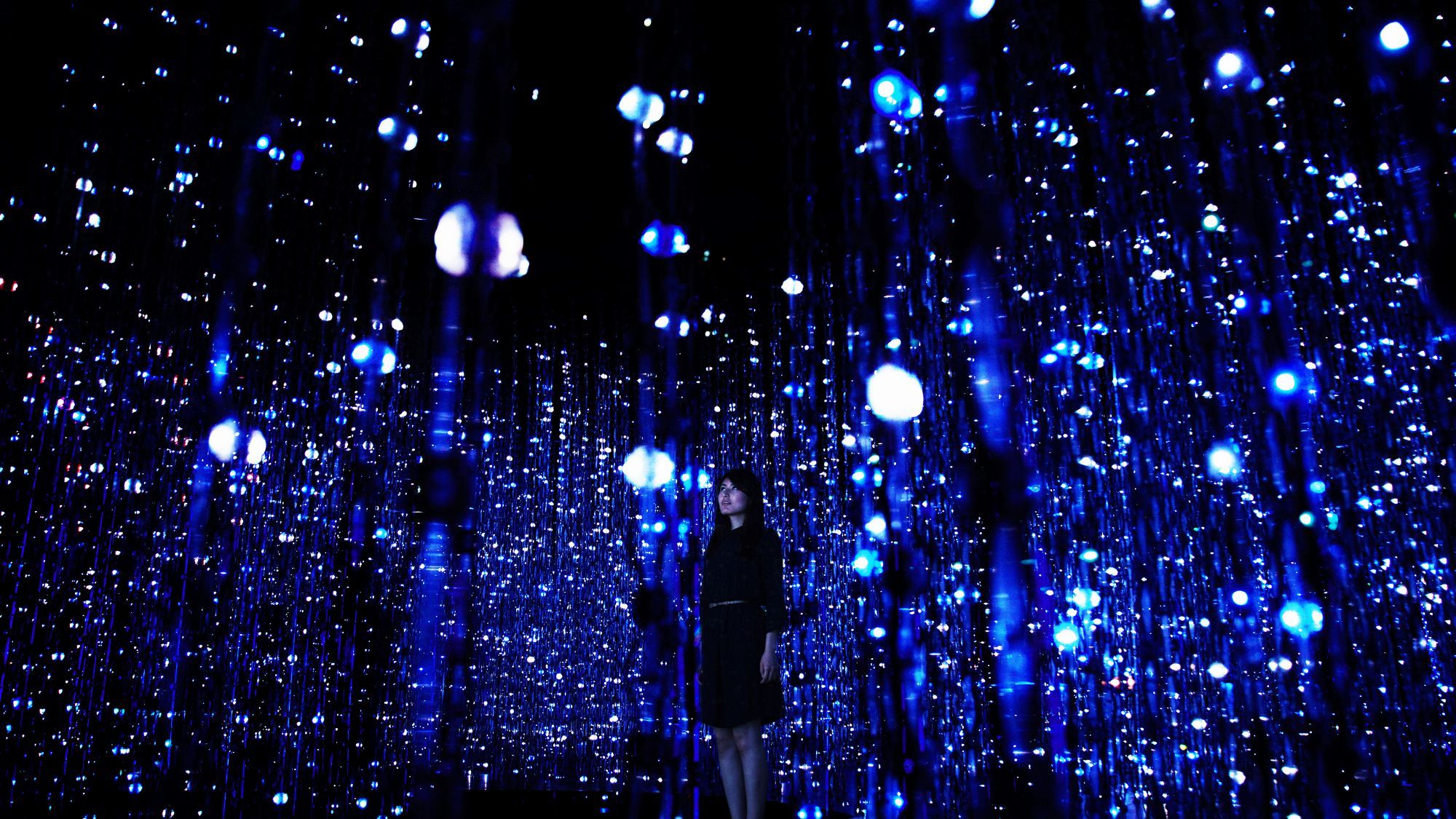
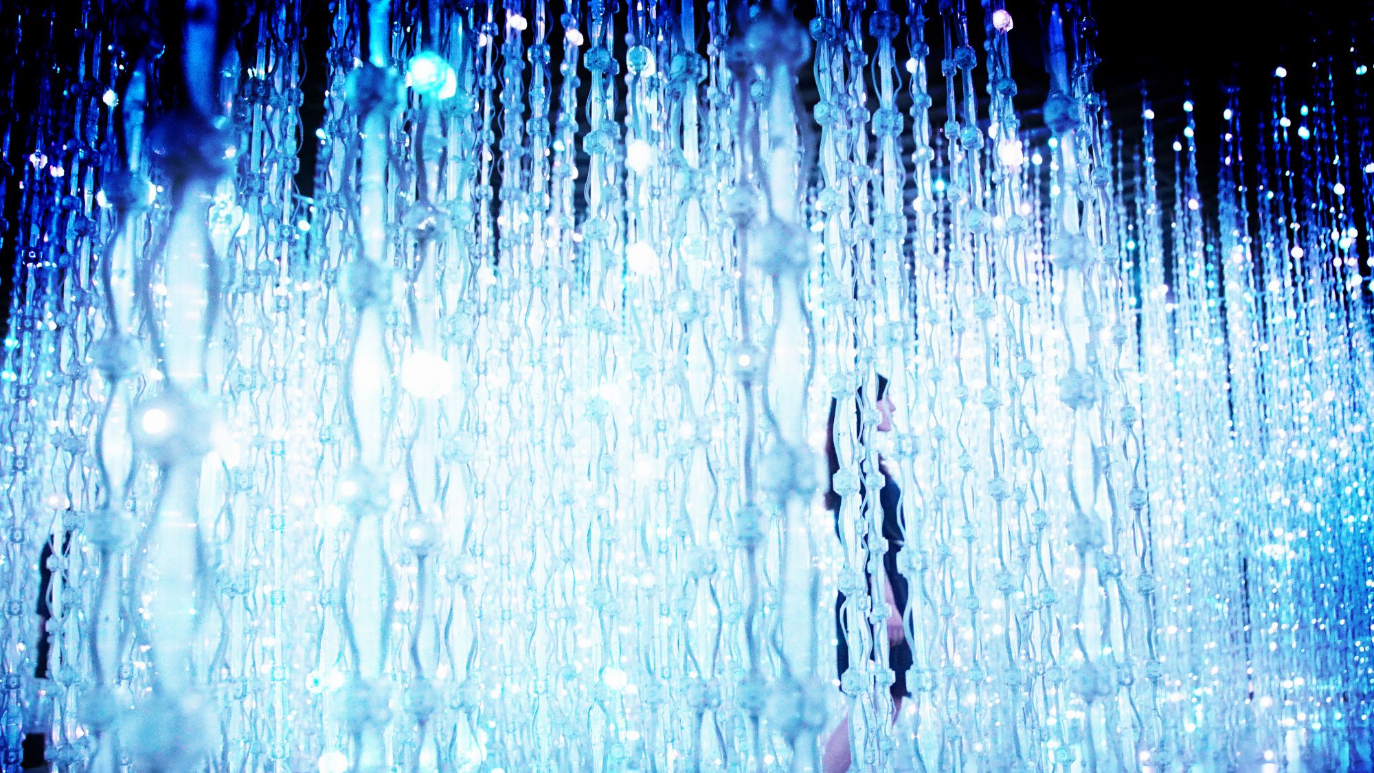
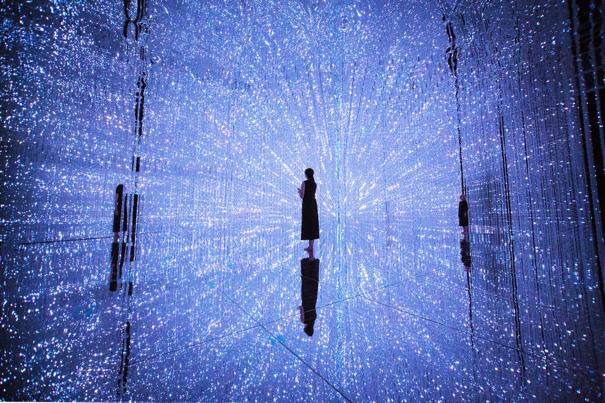
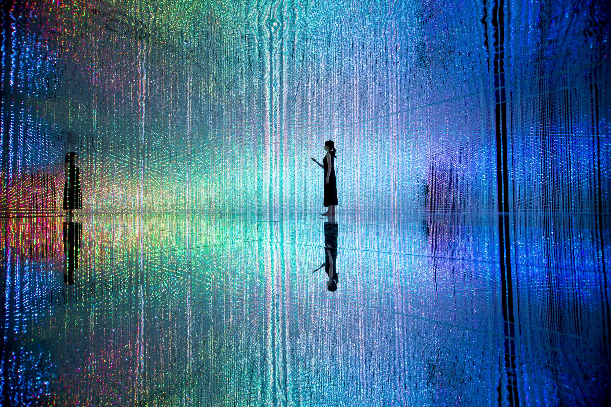
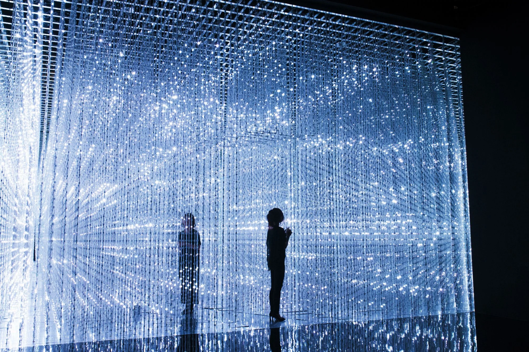
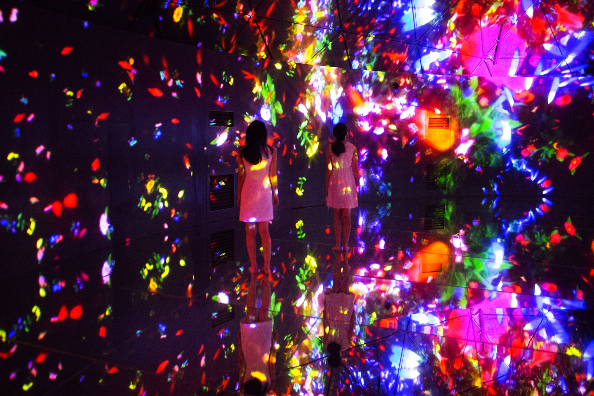
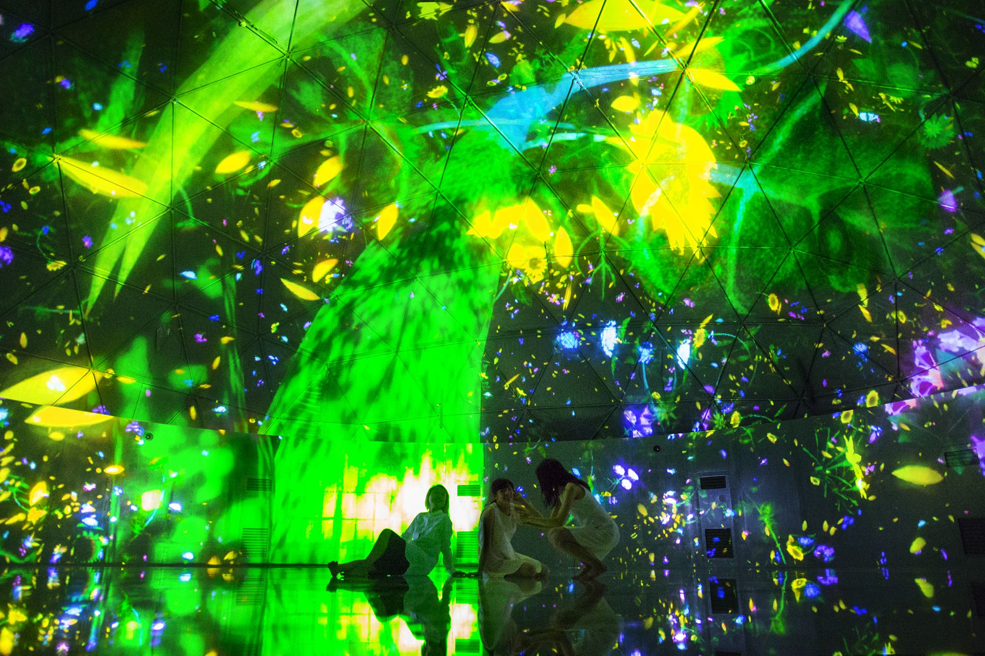
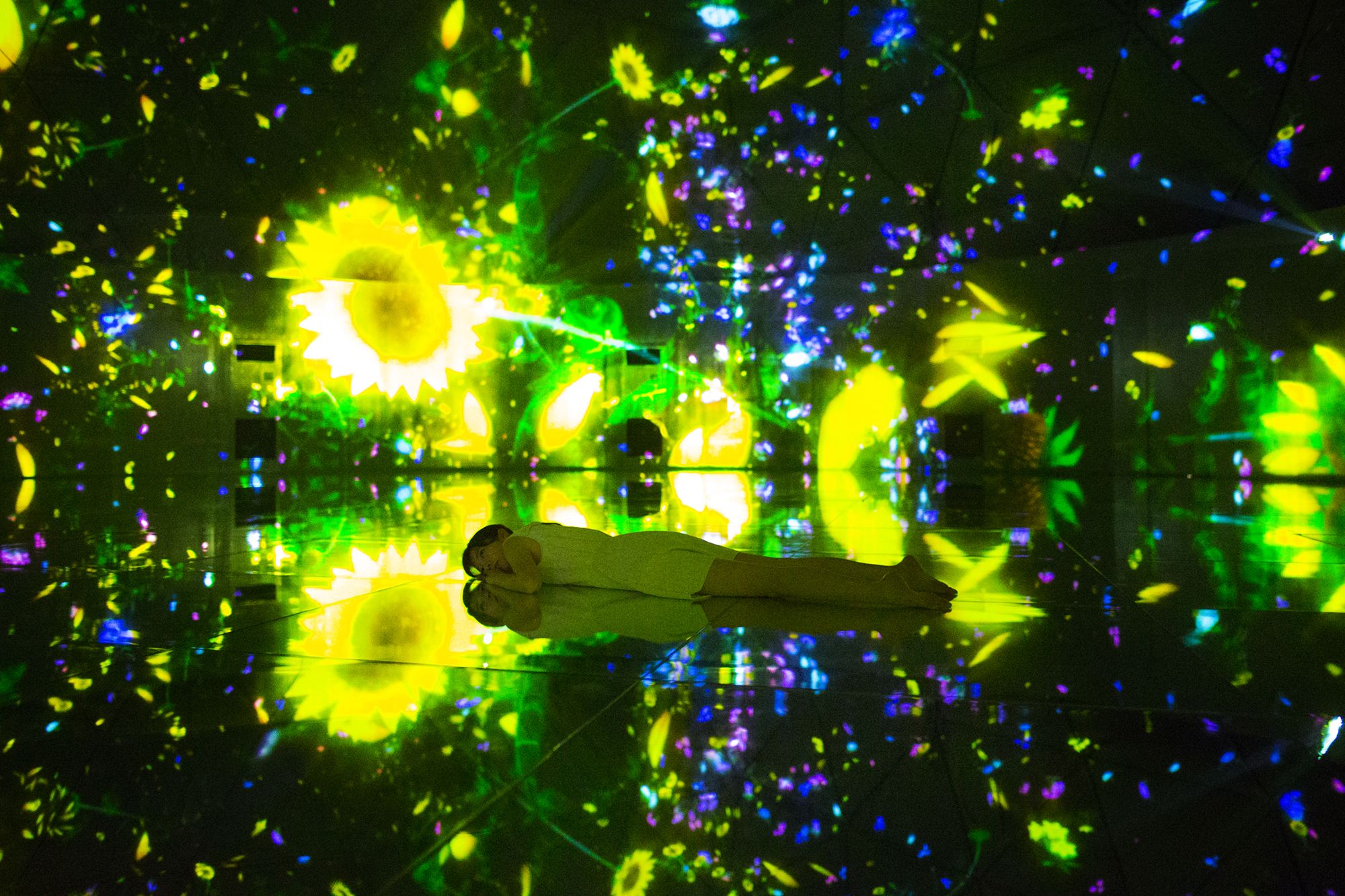
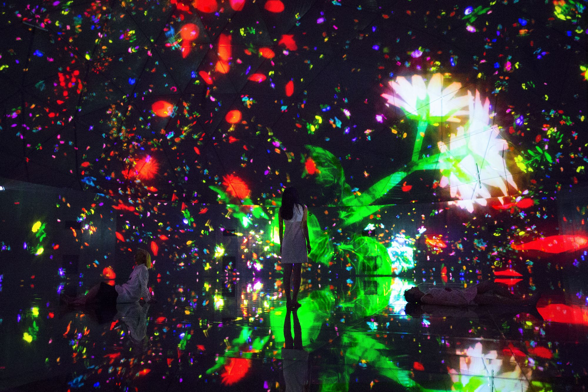
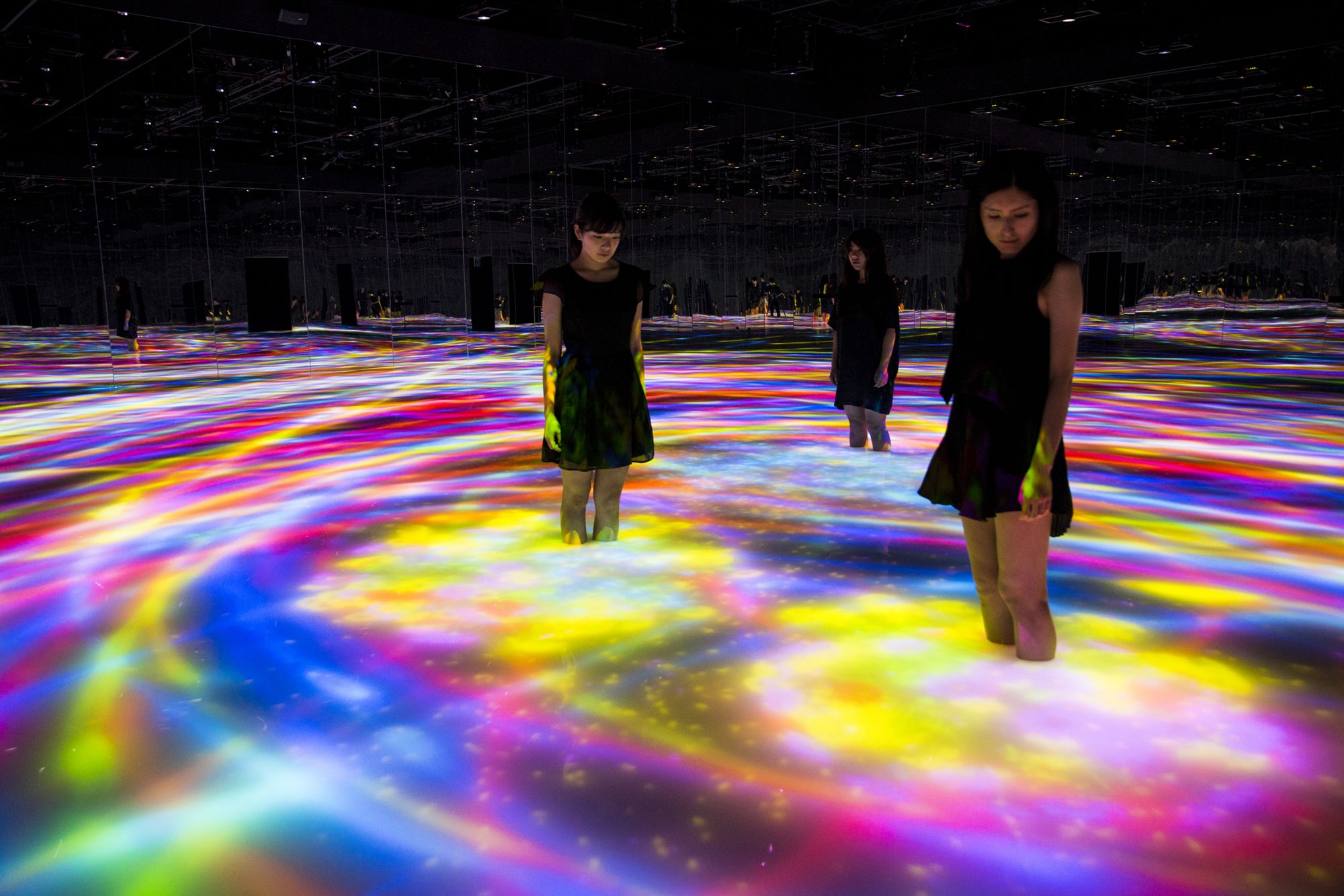
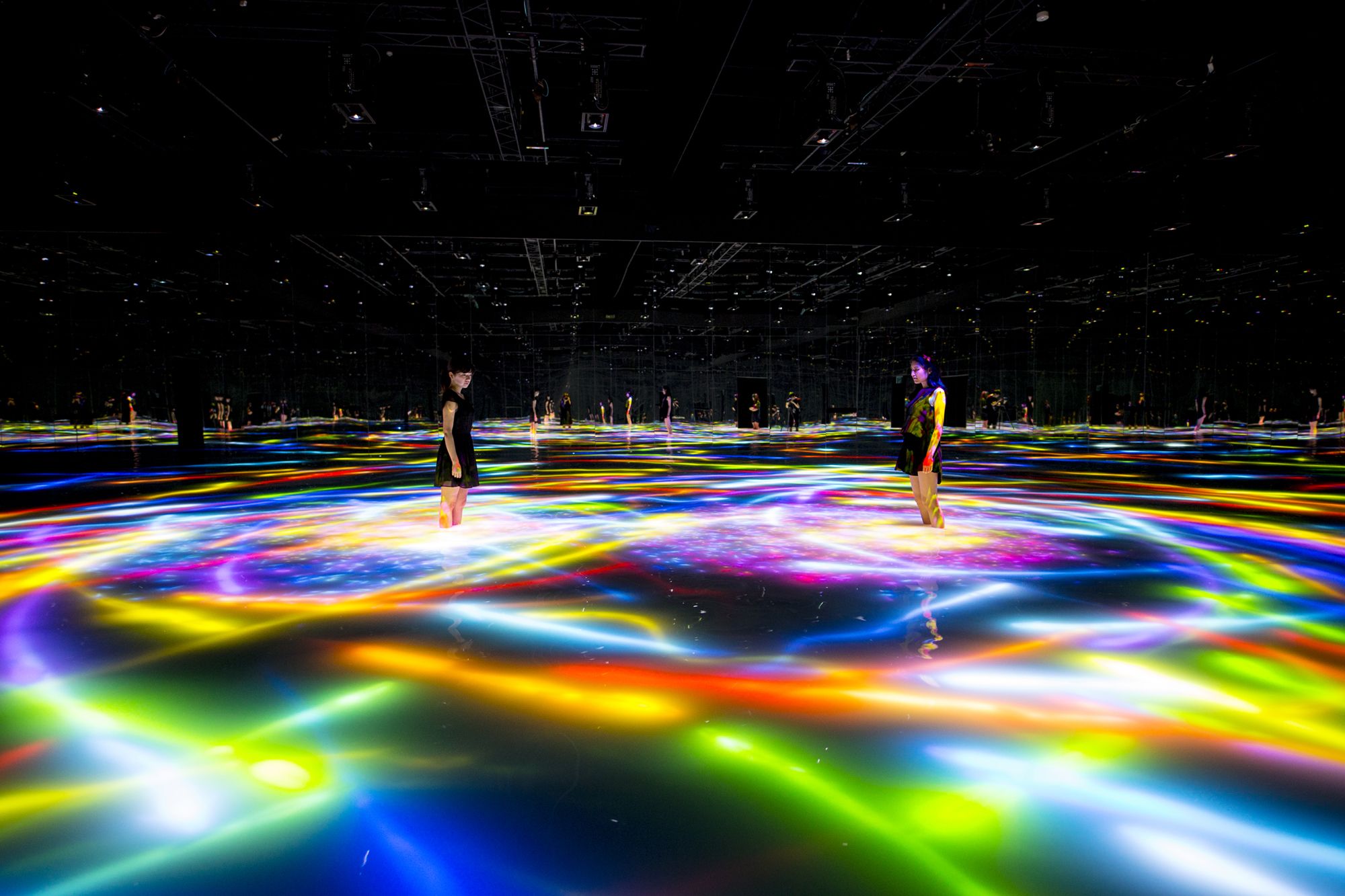
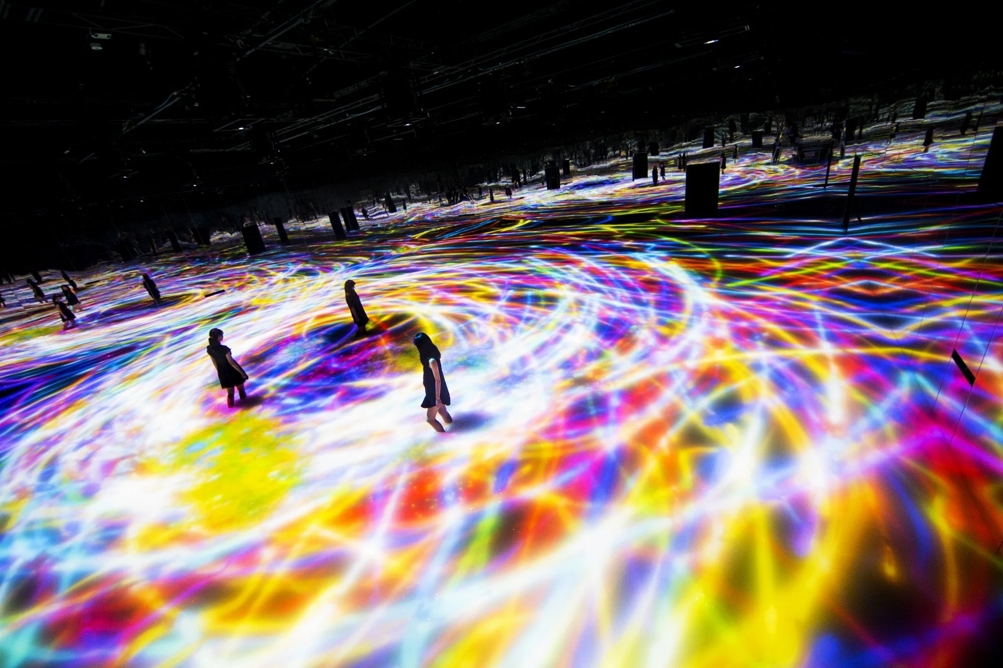
"When you stand among the handiwork of teamLab, a Japanese tech art studio, you’re seemingly transported to a sprawling foreign land that engulfs you in a vibrant, light-filled splendor. This immersive approach is now the focus of a massive exhibition that spans 3,000 square meters (over 32,000 square feet) and is called DMM.Planets Art by teamLab. It showcases a variety of the group’s digital work throughout the years, including new pieces just revealed to the public.
The exhibition features four spaces that offer kaleidoscopic colour schemes and multi-sensory activities. Each piece has its own distinct smell, including: the aroma of flowers, a forest, and “the universe”—a scent that astronaut Naoko Yamazaki helped create."


Mining Gold is a West Australian coastline exploration on the first day of the Southern Hemisphere winter. Directed by Chris Gurney & Tom Jennings

Talented graphic designer and than young nuclear physics Marco Oggian born in Italy and working in Spain as a part of True Color Studio He started to do commercial works in his early ages, Zara bought his work when he was 15, since than Marco never stop dreaming of being big name in design


Spatial Bodies is the next motion design episode of ongoing series Polygon Graffiti (previously) created by Japanese artist AUJIK
Watch it below

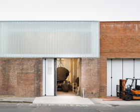
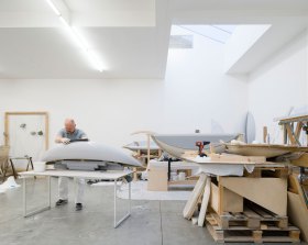
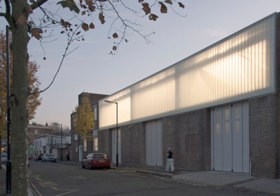
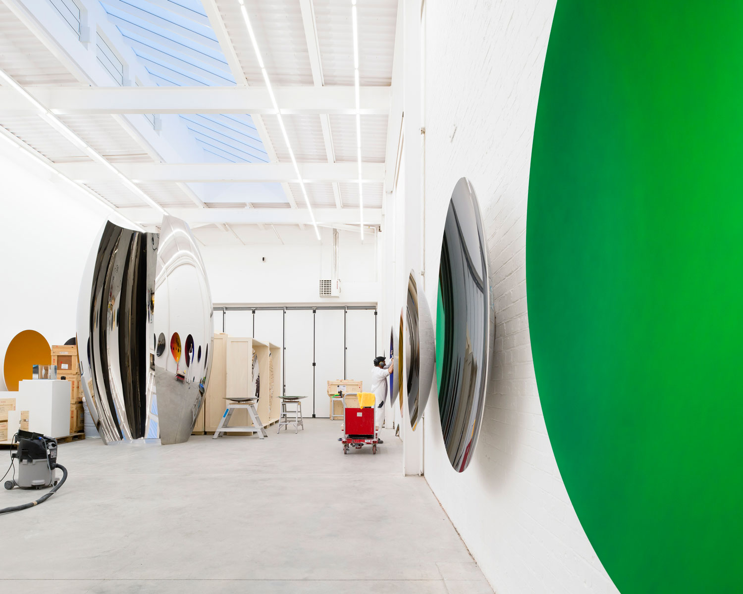
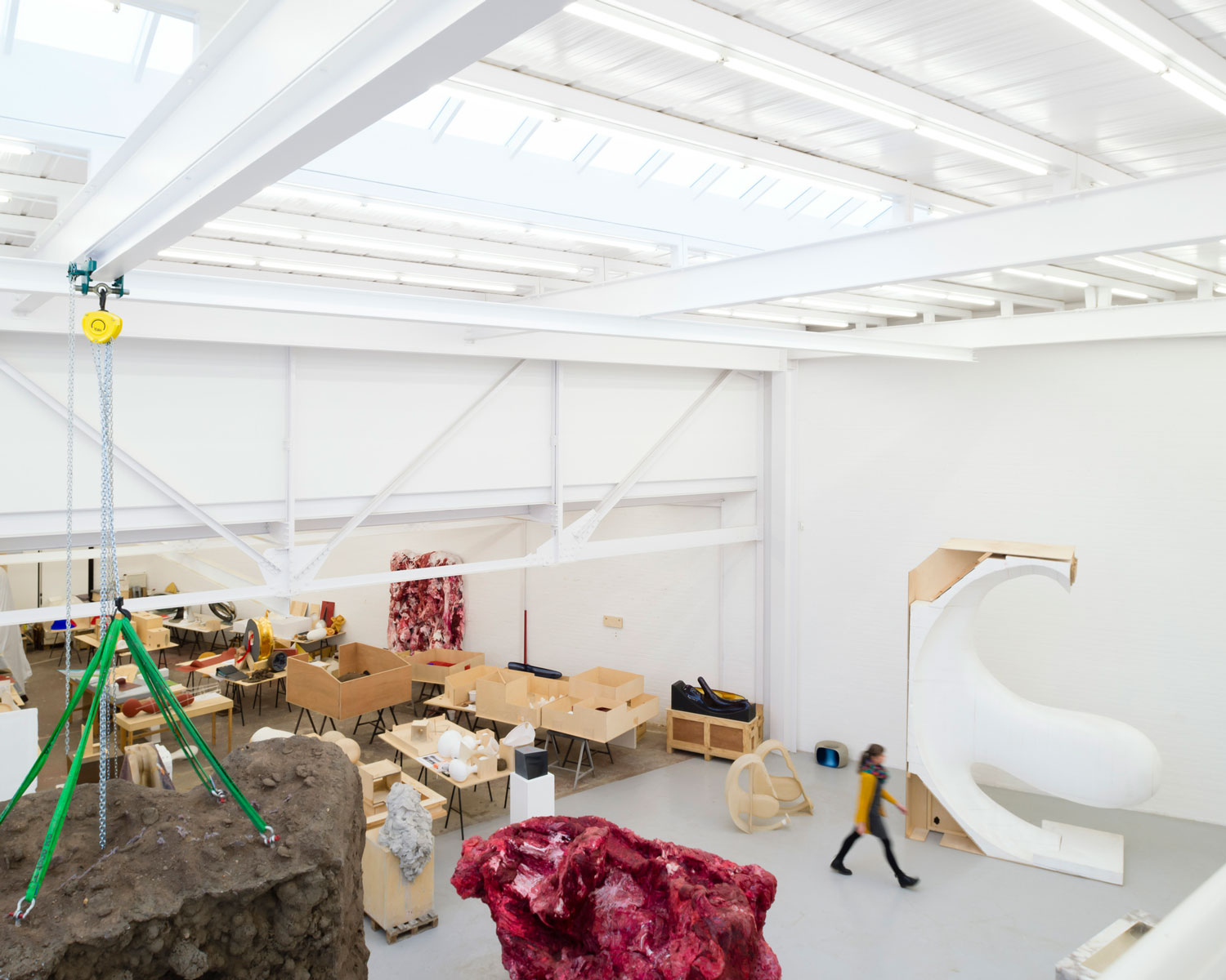
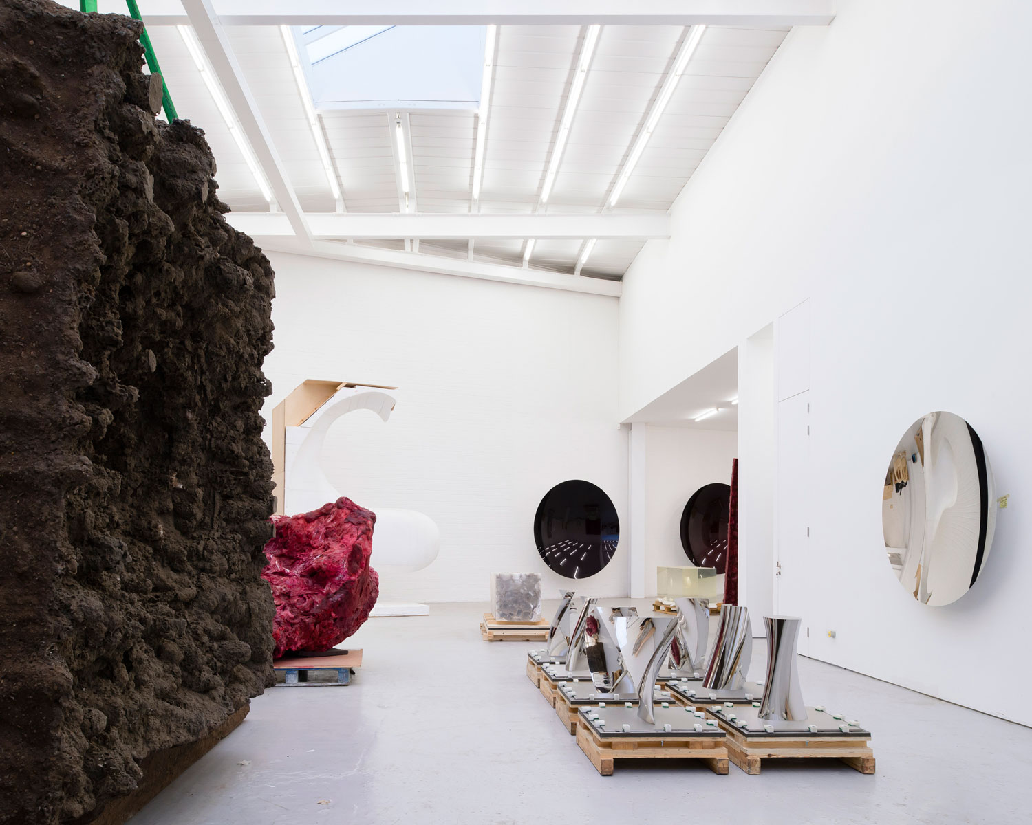
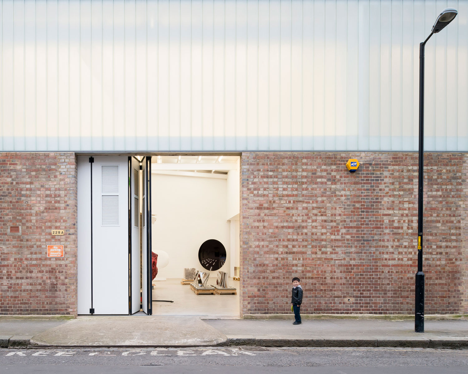
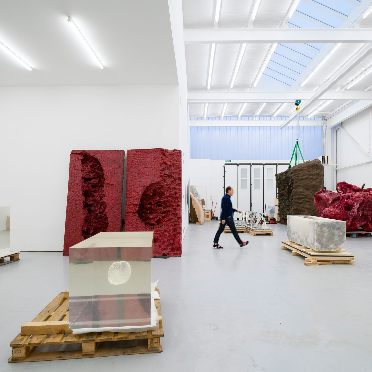
For the past 20 years, Kapoor has been creating enormous sculptures from his studio in a converted dairy factory in south London
Five years ago, Kapoor approached Michael Casey of London-based Caseyfierro about renovating his studio and the buildings he had purchased next door, which altogether take up an entire city block. Caseyfierro went about turning the 3,100 square metres of space into a series of six studios that vary dramatically in scale and function. Each space is designed around a specific act – forming, finishing, testing, painting, drawing, documenting & archiving – with each carrying a distinct atmosphere responding to a material or process. As one would expect, each studio space is designed to be highly flexible, having the ability to morph with Kapoor’s practice.

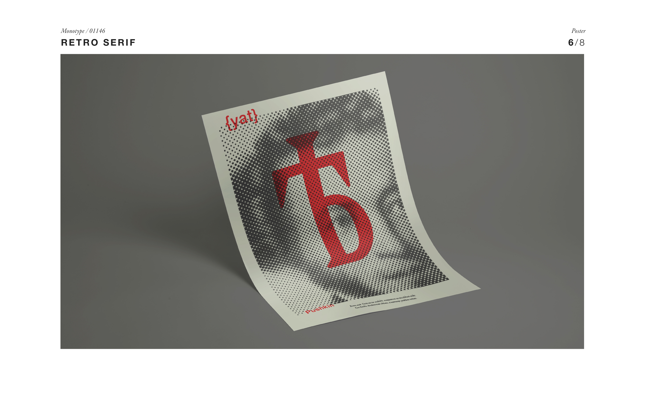
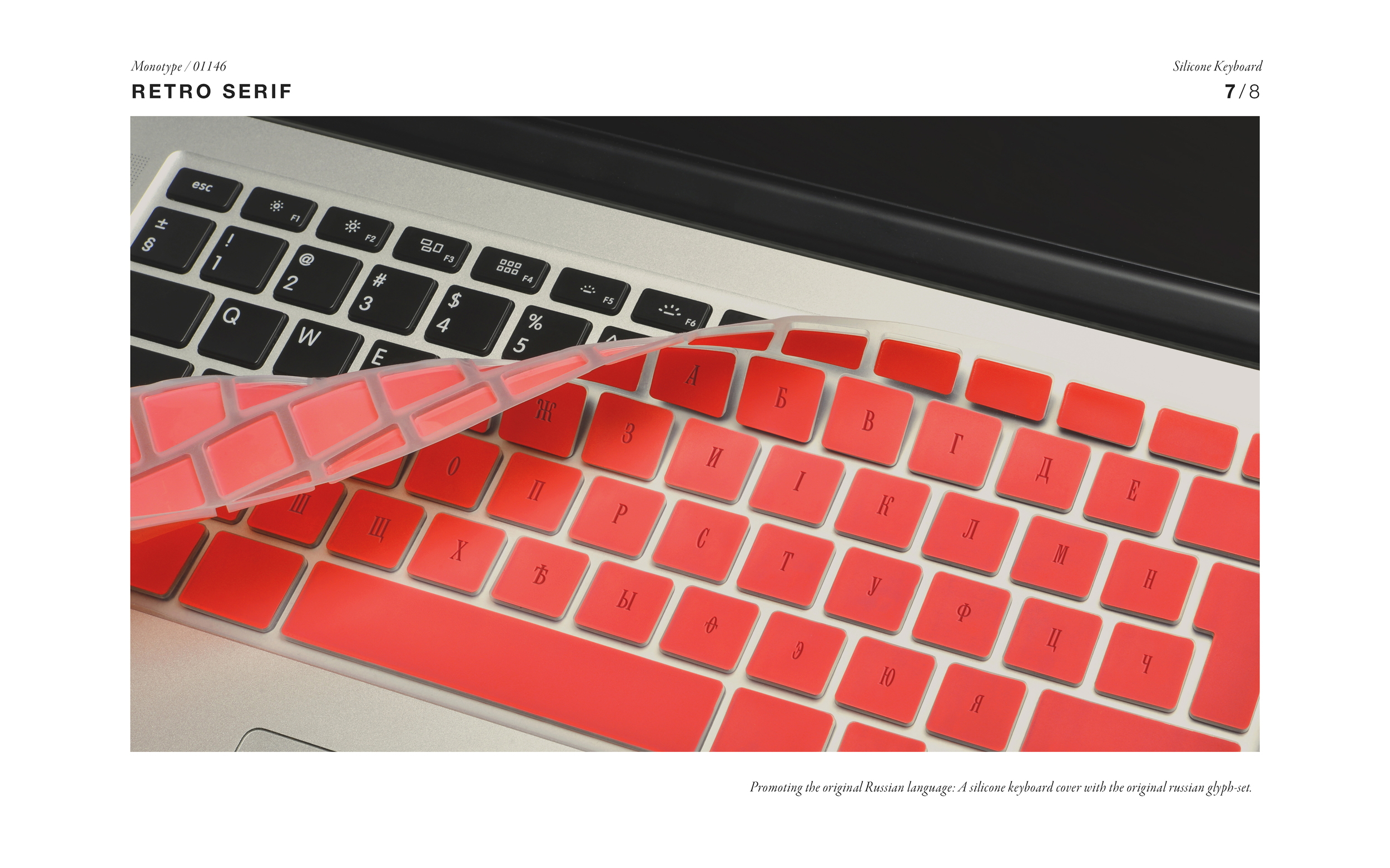
London based graphic designer Polina Hohonova was recently awarded by D&AD Yellow Pencil (Gold) for her graduation project at Chelsea College of Arts (Tutor: David Barnett)
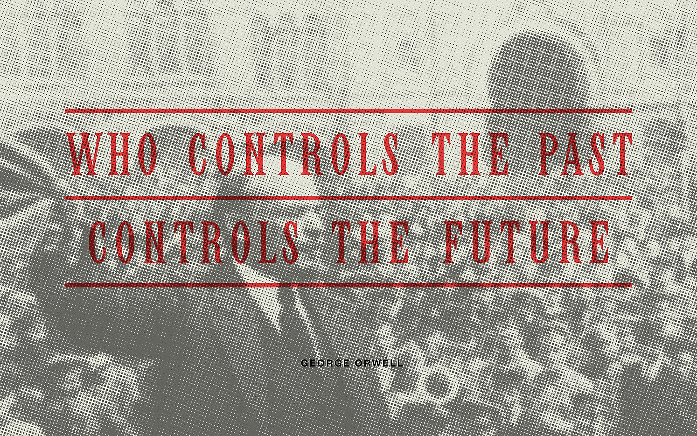
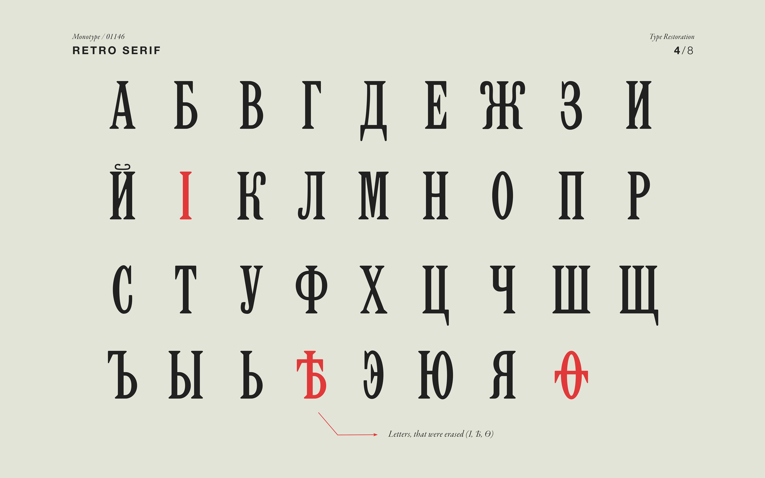
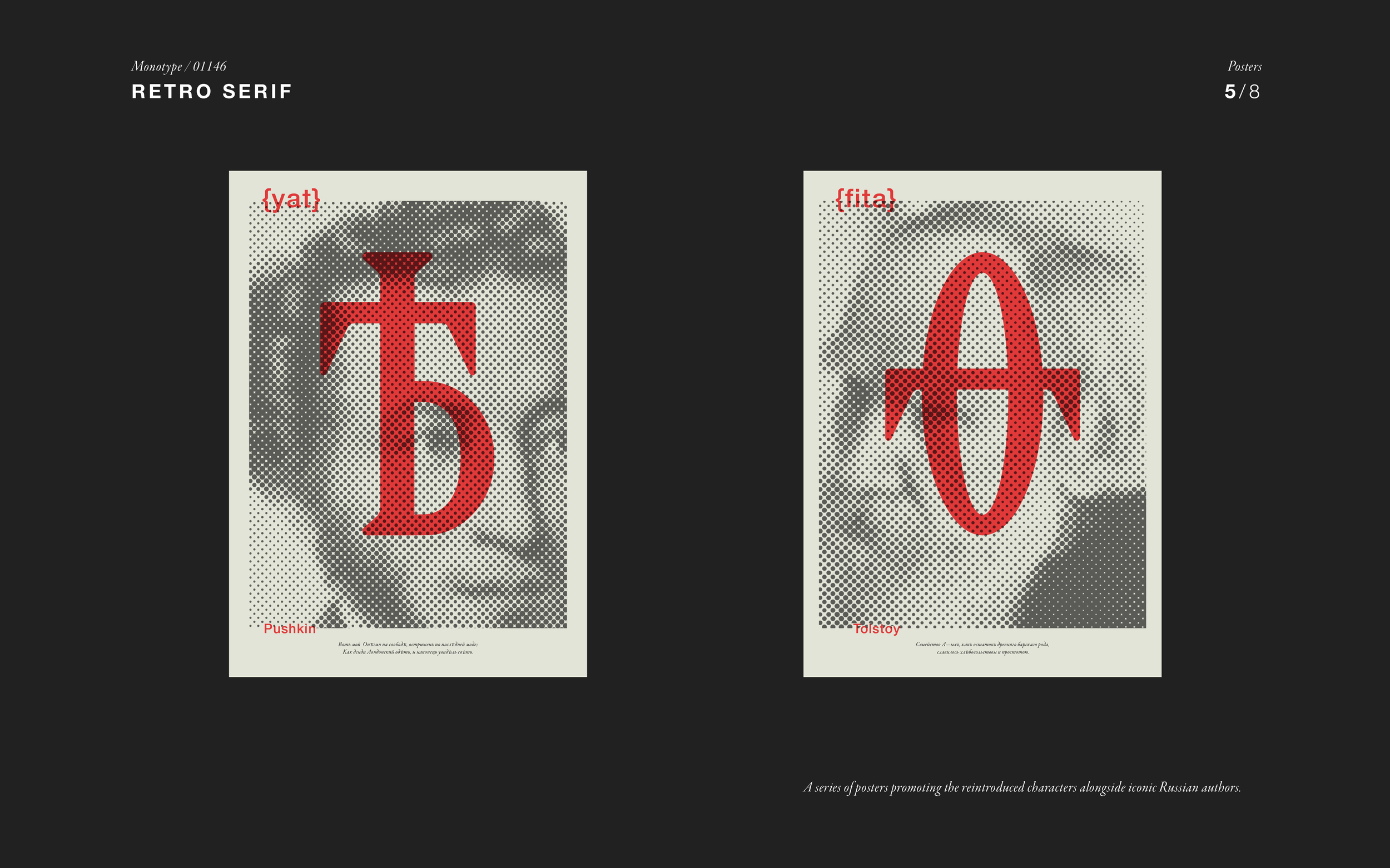
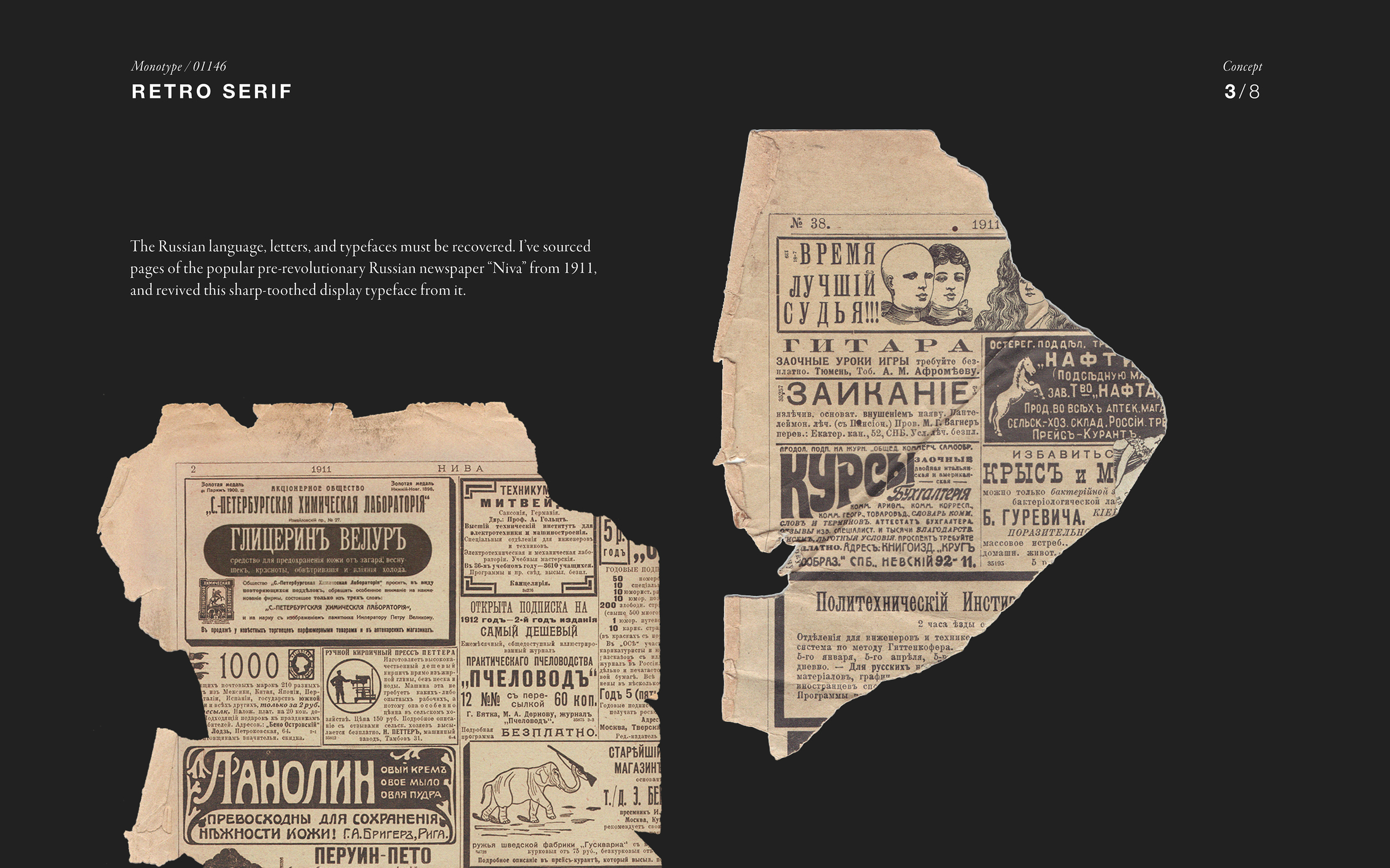
Retro Serif is a project about the revival of glyphs in the Russian alphabet that had been omitted after the revolution. When the Bolsheviks came to power, says student Polina Hohonova, the letters I, Ѳ, Ѣ were omitted from the ‘new’ Russian alphabet as they were regarded as symbols of the aristocratic ‘High Russian’ and therefore representative of the defunct Tsarist Russia. Those symbols were part of the language of Pushkin and Tolstoy. “Reviving these characters is a protest against the prescribed dictatorship of the language,” she says.