Jacopo Severitano
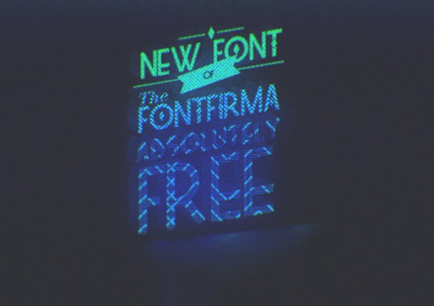
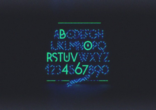
Berlin based graphic designer Jacopo Severitano likes to experiment with typography as well as with music. Check his portfolio for latest free font types and posters.


Berlin based graphic designer Jacopo Severitano likes to experiment with typography as well as with music. Check his portfolio for latest free font types and posters.


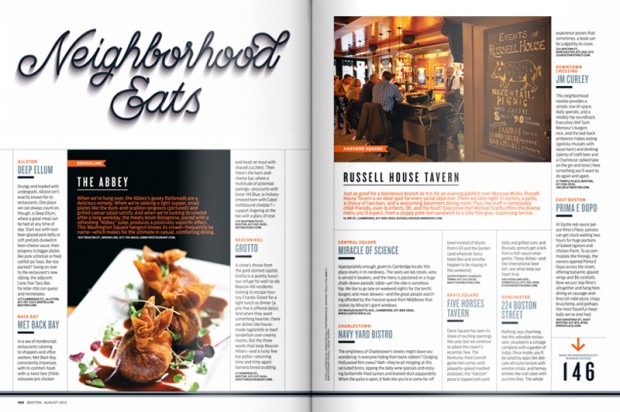
Cape Town based graphic designer and artist Jordan Metcalf was asked by Boston Magazine to create a toolkit for their 2012 ‘Best of Boston’ issue. The work includes a lock-up for the table of contents, an opening DPS for the section, and various sub-section headers. via Trendland


"As a Croatian born designer, I have lived most of my life in Australia’s design capital, Melbourne. My direction towards the design world connects with my passion for photography, my lust for typography and the thrill of creating something from nothing. When I think about Graphic Design, I feel as though it is everywhere. It is a mix of storytelling, craft, science and philosophy. The world is constantly changing and as a designer, I believe I need to adapt. Learning new techniques and stepping outside my comfort zone is how I want to grow as a designer." - Josip Kelava


Inspired by Bob Dylan´s Subterranean Homesick Blues video, where he flips cards with the lyrics as the song plays, Leandro Senna decided to recreate those cards with handmade type. He ended up doing all the lyrics, and not just some of the words, as Dylan did.


http://vimeo.com/49556689
Erik Marinovich is a letterer and designer based in San Francisco. He is a co-founder of Friends of Type and has worked for clients such as New York Times, New York Magazine, Newsweek, The Atlantic Monthly, Wired, Metropolis magazine, GAP, Diageo, Nike; while also freelancing for various studios such as: Landor, Brand Union, Greatworks, Anomaly in New York.
We have spotted Mash Creative studio from East London year ago let's take a fresh look on their new works now


Awesome hand-writing graphic and typography designer Jon Contino shows off his skills on personal website and in intimate video directed by Kevin Steen


http://vimeo.com/49155684
Sydney based graphic designer and typography lover David McLeod shows experiments in lettering and illustration.
New York-based graphic designer Evan Robertson takes the cleverest lines written by his favorite writers such as Oscar Wilde and Ernest Hemingway and turns them into brilliant literary posters. “I took little snippets of text and ideas from some of my favorite authors (with some notable exceptions that I’m saving), and let the words be a springboard for an illustration. The illustrations incorporate and interact with the text and hopefully add up to something that engages the mind as much as the eye.”
Evan has a plan to complete around 50 illustrations in a year. He has already completed 24, which you can see in his Etsy shop. via Demilked
I think we become addicted by identity works of Pavel Emelyanov and his büro "Eskimo". This time the luck came to unknown but brave Moscovian jeans store "Denim Pavilion" and they get this awesome set of branding as a reward for taking a good challenge with awesome designers.
Another experimental typography research from talented Russian digital artist Ruslan Khasanov


http://vimeo.com/47589311
via Behance Network
This is everything your loved about typography but afraid to ask.Welovetypography.com is all about good or inspiring typography insights brought you by ILT and contributors
We spotted Tom Lane's graphic design few years ago just in time he graduated from college. Now it is a time to revisit and check his new directions.


http://vimeo.com/30392705


http://vimeo.com/45436061

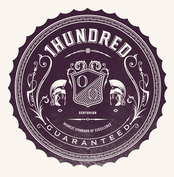
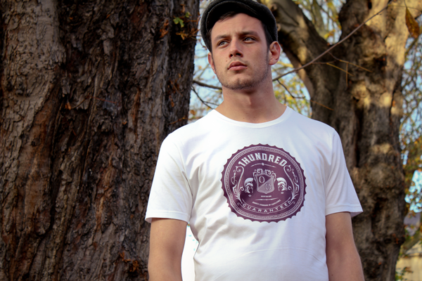
This is kind of a creep situation when less and less Russian designers calls to national history of art and design in their work (even most of them are fashion designers). The history that literally gave a birth to European and American schools of Design that is developing nowadays. Take a look at amazing research and development of Kandinsky's works that later became a typography study created by Sinan Buyukbas.
More on Behance
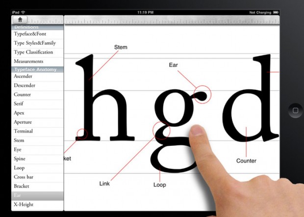
Typography Insight, developed by Parsons design student Dong Yoon Park, is sort of like an iPad typeface encyclopedia. Only encyclopedias are boring, and Typography Insight is beautiful and fun. With a wonderful and decently responsive interface, you can beef up on type terminology (do you know what an ascender is? A baseline?) compare fonts with a nifty overlay mode, or just get all up in their perfect formed faces to appreciate and learn nuances. via Gizmodo App designed and created by Dong Yoon Park Available for both iPhone and iPad

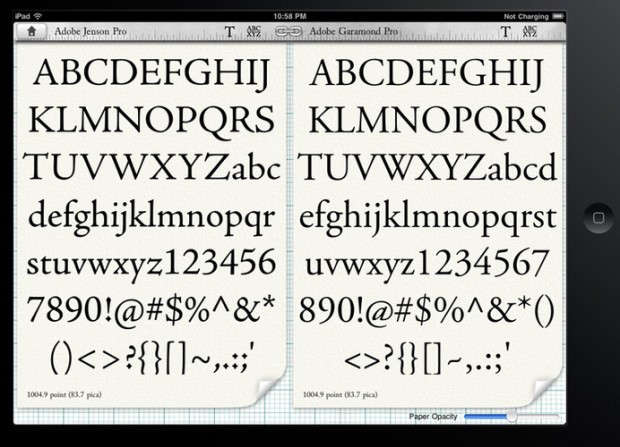
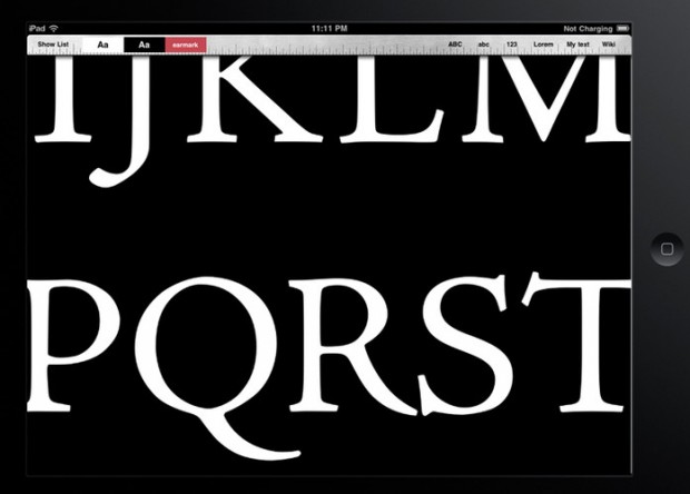
http://www.youtube.com/watch?v=v_YwvlchXrY&feature=player_embedded
Beautiful experimental typeface based on lines and geometric structures created by Moscow based graphic designer Kir Rostovsky. For presentation he used unique silkscreened poster and a poker-work on wood - trop bien! Go grab you typeface copy on http://www.behance.net/gallery/Indy-Typeface/4192363


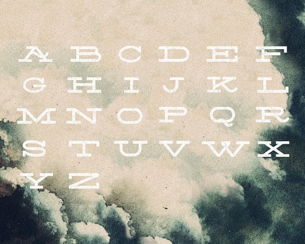
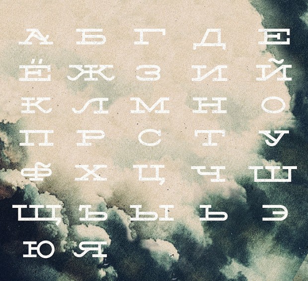
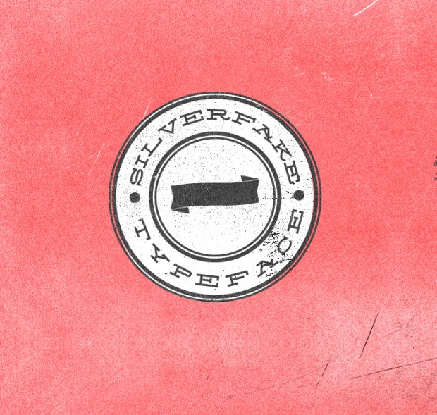
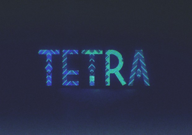
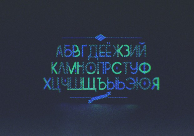
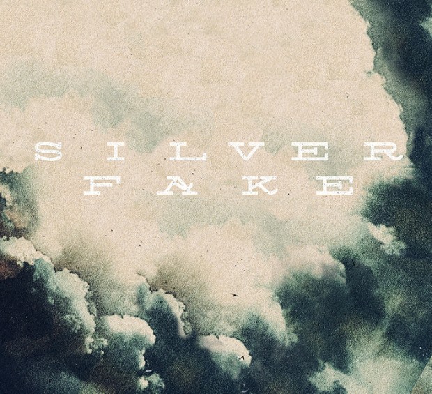 Young and prosperous Russian designer Alexey Frolov released free new typefaces both featured on Fontfabric typefoundry.
Silverfake is a contemporary slab serif wide free font and Tetra is a decorative sans serif typeface both available for download and appreciations.
 Ten Dollar Fonts is an online source for low-cost experimental fonts / typefaces. TDF are a group of designers from all around the world, from New Zealand to Mexico.
http://www.tendollarfonts.com/


