Tag Collective
NY based design studio Tag Collective with a true passion for brand development delivers awesome visual and tactile solutions for local brands.
NY based design studio Tag Collective with a true passion for brand development delivers awesome visual and tactile solutions for local brands.
Moscow House of Photography and Nokia along with AR-Door and SILA have created the projective animated navigation across the building and its expositions. SILA is a small but brave Moscow-based media design studio did a number of good identity and conceptual design works that are worth to explore on http://s-i-l-a.com/
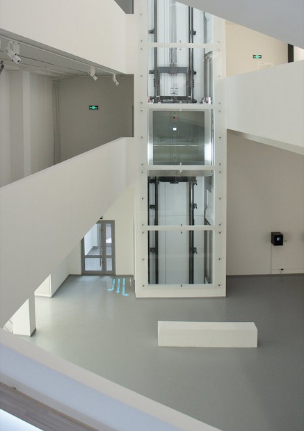
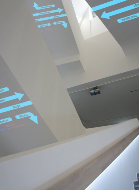

http://vimeo.com/50855618
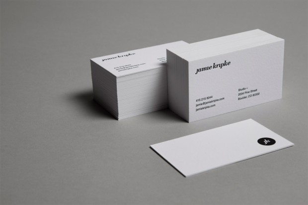
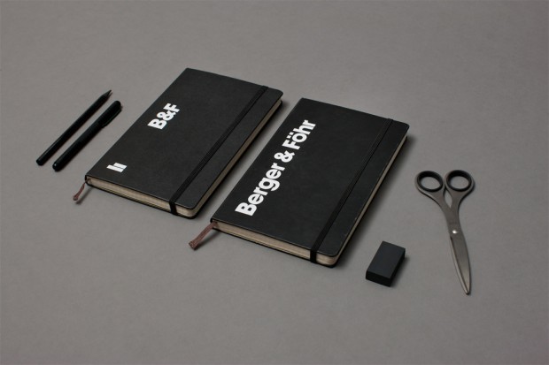
Berger & Föhr is a Boulder-based (US) multidisciplinary small design Studio creating branding and design projects that matters
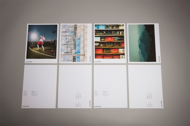
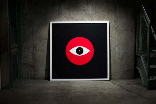
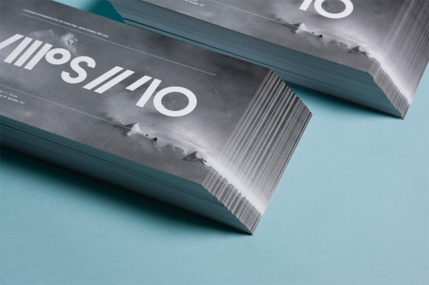
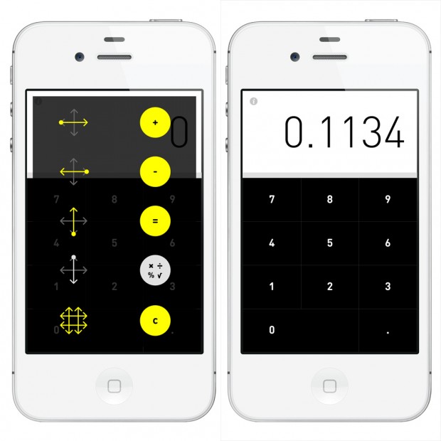
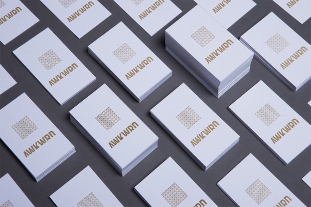
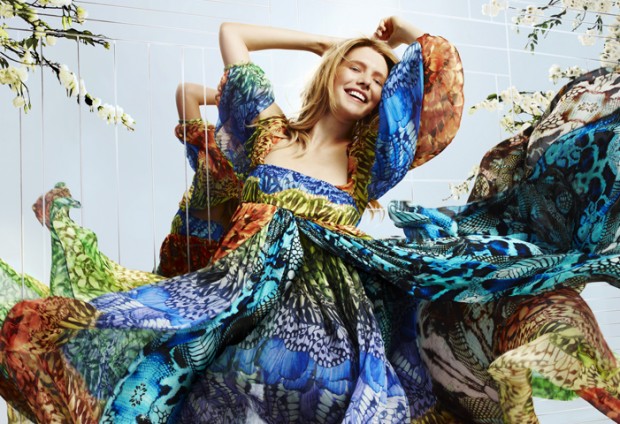
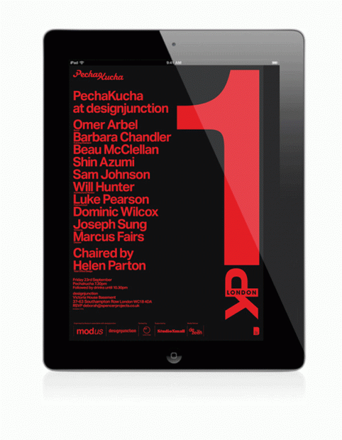
Diverse set of works is coming from London based Studio Small covering most of online, digital and outdoors advertising industries with experience across fashion, lifestyle and luxury. Well done
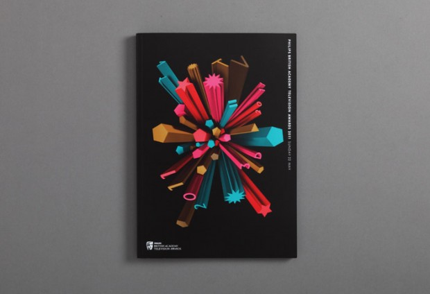
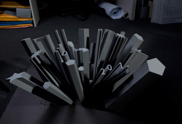
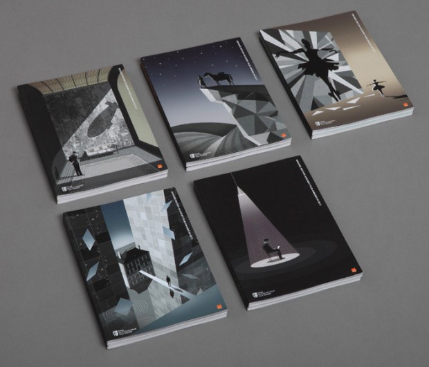
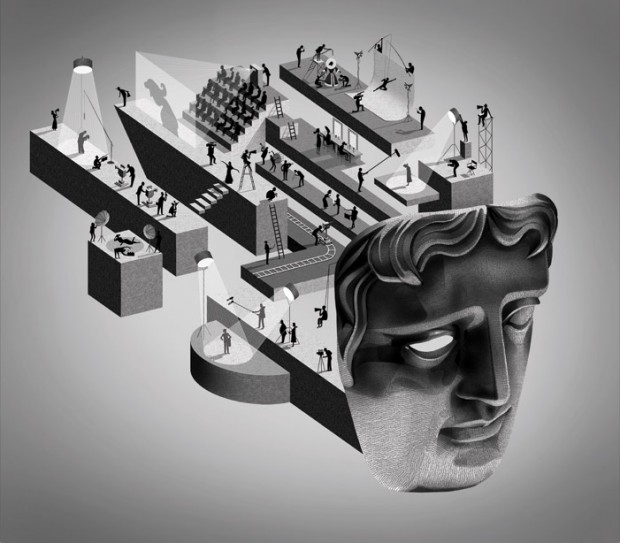
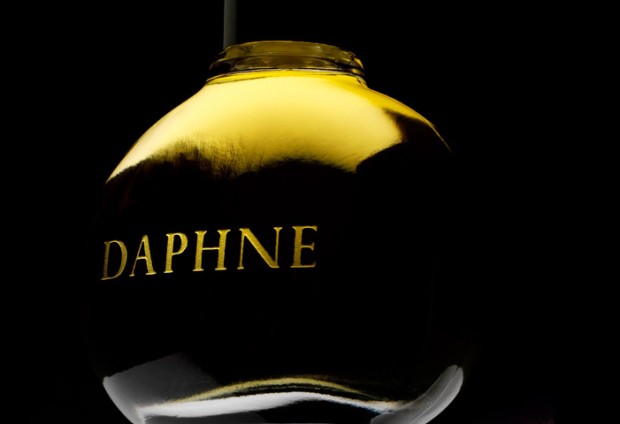
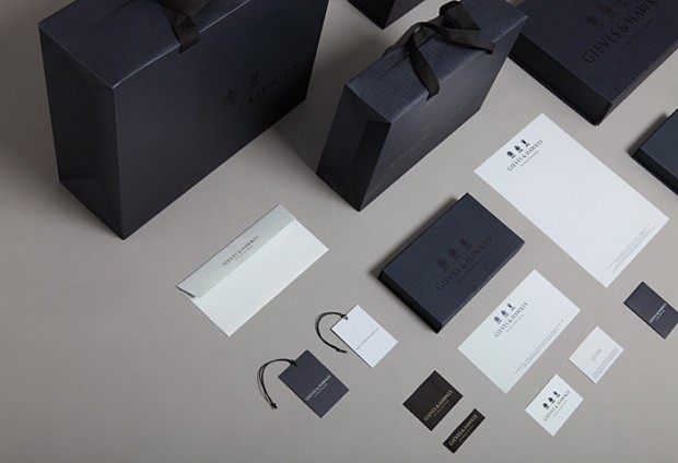
Stranger & Stranger is a packaging design and branding company specialising in alcoholic drinks. They create over 100 drinks brands every year in markets all around the world. You can stick to the screen now, exploring some awesome picks in the post or later revealing the very best examples on their website http://www.strangerandstranger.com/
Dutch media and motion design studio formed and named for Menno Fokma just released their new showreel and has updated website with new projects worth to see and explore the details - http://mennofokmastudio.com/


http://vimeo.com/48210274
We just like what studio Berg does for the lucky customers delivering interdisciplinary media including branding and identity, digital- editorial- and environmental design


Death in Paris is creative bureau from Paris specializing in motion and advertising graphics just released their latest showreel summarizing projects of this year.
http://vimeo.com/49679285
We have spotted Mash Creative studio from East London year ago let's take a fresh look on their new works now


Vilnius, Lithuania based motion design studio KORB released an epic showreel featuring their latest works in the mix.
http://vimeo.com/48792900
Herring & Herring is american studio is born in NYC from the meet up of Dimitri Scheblanov & Jesper Carlsen. The Russian-American & Danish-American artists are passionate about photography and fashion. Creating great images, they ended up working with big media and brands from around the world, including Vice, Zink, Surface Magazine & Gucci. via Whitezine
I think we become addicted by identity works of Pavel Emelyanov and his büro "Eskimo". This time the luck came to unknown but brave Moscovian jeans store "Denim Pavilion" and they get this awesome set of branding as a reward for taking a good challenge with awesome designers.
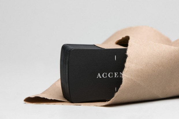
Accent Decoration is a branding project made by La Tortilleria studio for local decoration store. It is an awesome example of all-in-trend branding to die for
One of the leading media design company The Mill shares their latest showreel


http://vimeo.com/46367404
via Fubiz
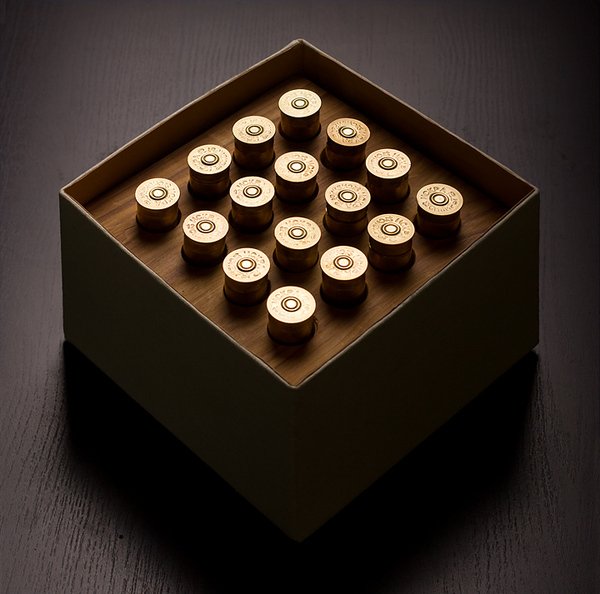
Western Siberia design and production agency "Province" creates outstanding print design and corporate souvenirs with smart humor icing for valuable clients. We spotted their two latest works worth to explore below
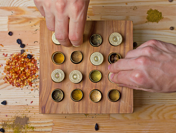
A smart gift for a hunter


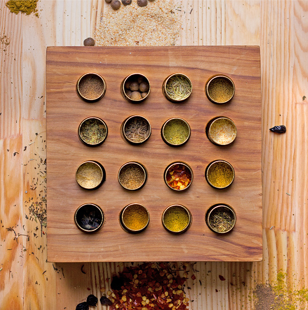
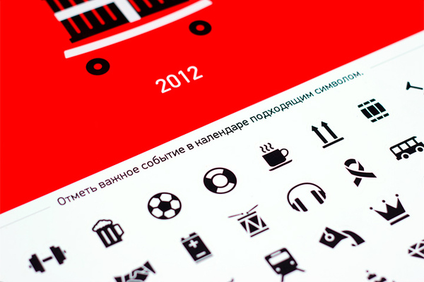
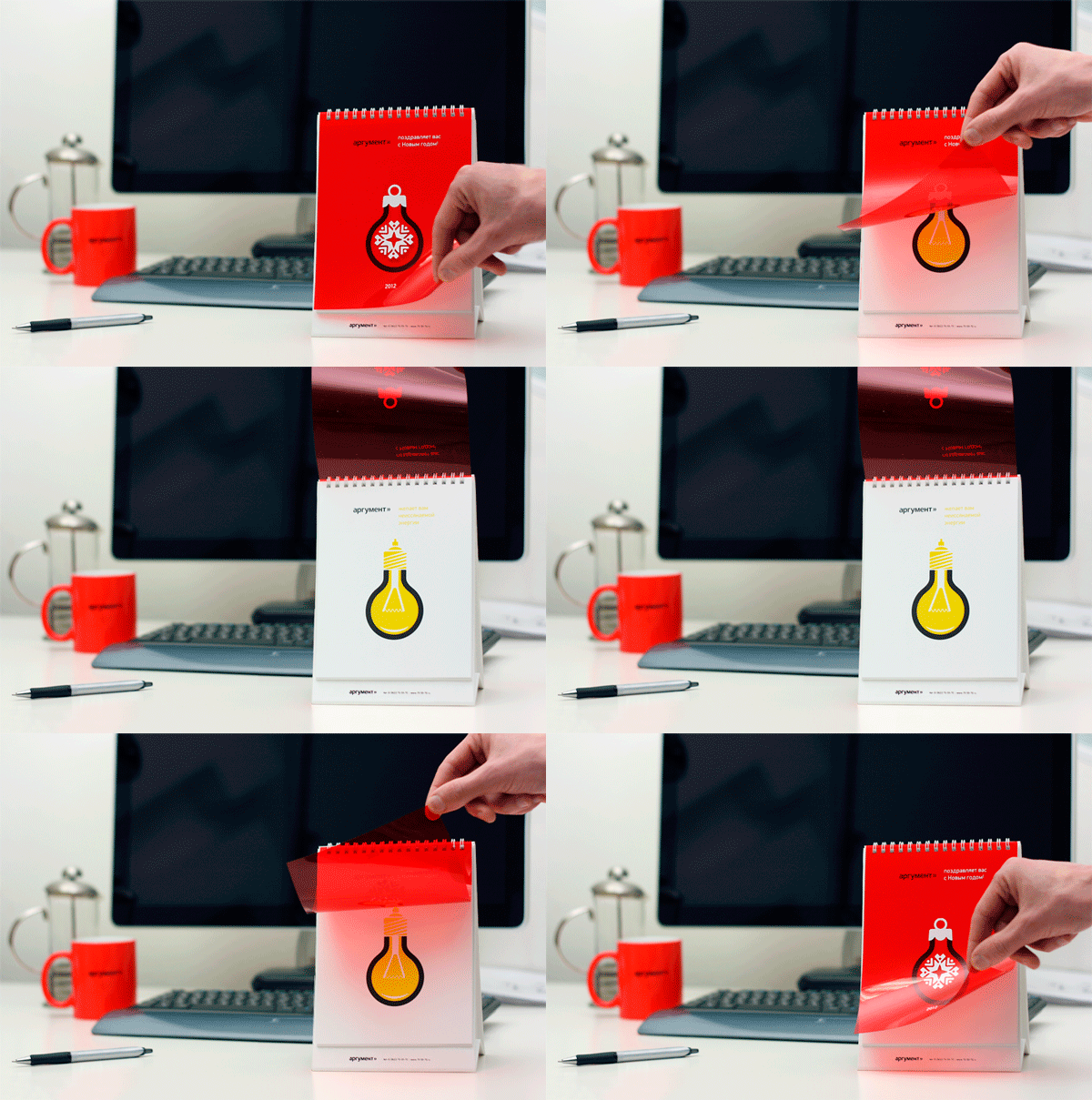
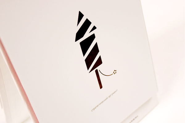
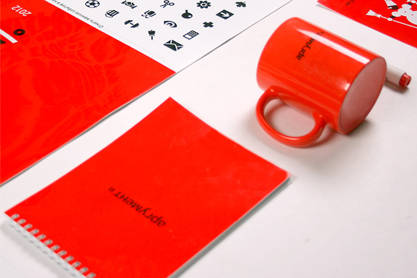
And a daily-sticker calendar named Everyday Argument


We had a chance to speak with Russian designers from "Bureau Working Title" that did a commercial short "A Touching Application" using no 3D software, only projection mapping, modeling and classic animation. The ad shows advantages of Russian navigation application published by Yandex Ltd.

DC: What is the main plot of this advertisiment? The touching story tells us about two sentimental creatures from some outer world; nevertheless, they seem to be a lot like humans. As the two plan their date in a telephone conversation, they decide to meet up in a planetarium. From now on, they get any information from a mobile map application, which tells them the best routes, timing and any other – that's important – interactive tips. They face random barriers on their way: she gets stuck in a traffic jam, he forgets to buy her flowers and so on. The application helps them to finally meet each other on a crossroad and make their way to the planetarium "using" the "street view" option. We see them as they watch the stars leaning towards each other. The story ends up with a slogan: "A touching application".
What was the largest challenge in producing and directing the project? The hardest was to deal with time which passed so slowly. Classic animation process requires a lot of patience, and the more patient you are, the more satisfaction you get when the work is done. But russian advertising is always about tough deadlines, so you have to make it really quick. Thanks to the professionals who helped us getting the shootings done in its best ways and shared their skills with us. Furthermore, it was a great challenge to combine various techniques: stop-motion animation with dummies, iPad-freezelight, 3D projection mapping and a little bit of computer graphics.
How long did it take you to complete the whole project? Making of all the stage requisites, creating the script, directing everything to its sterile fancy looks, shooting till the final cut – the whole process took us about 1,5 months to get done.


http://www.youtube.com/watch?v=CcISIVoSZGQ
Credits:
Concept, script, production: Бюро "Рабочее название" (Bureau Working title) www.workingtitle.ru Director, camera: Ivan Proskuryakov Light: Pavel Ukhanov Animation: Alla Solov'eva Projection mapping: Sergey Titov and Sasha Gavrilova (Stain) Dummies: Igor Khilov Stage requisites: Alexey Petrov, Anastasia Zolotilina, Lena Shagieva Freezelight, compositing, CGI: Marina Cherry, Ira Lubomirova Music: DZA (http://soundcloud.com/dza)
Clever identity gets clever prizes. Ermolaev Bureau was among 4 Russian names rewarded by European Design Awards 2012. Designers Vlad Ermolaev and Olga Balina (designer behind our DCMAG logo and cover design) won Gold in Identity for "A-Moloko" project.
This visual identity developed for a company selling milk through a chain of milk vending machines. The logo concept was suggested by the name of the chain: Automated sale of farm fresh milk. The first letter 'A' which when turned upside down resembles a cow's muzzle was taken as the basis. Visual identity is built on a system of symbols that show the path of the milk from the cow to the consumer.
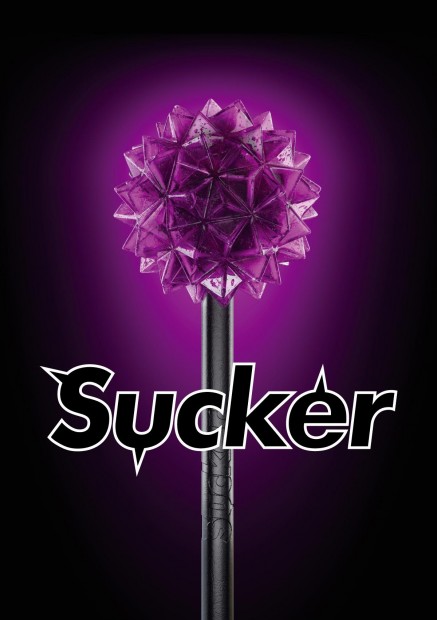
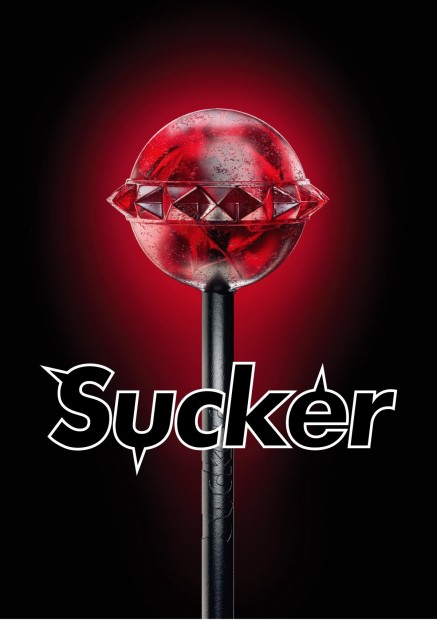
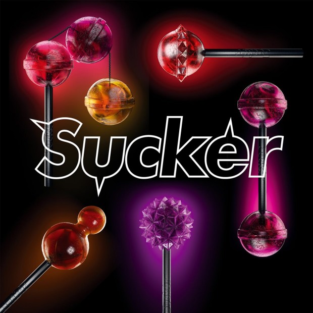
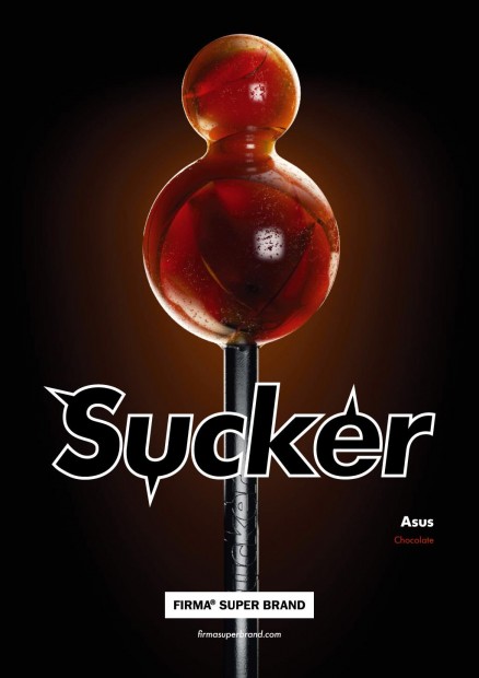
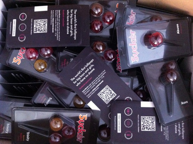
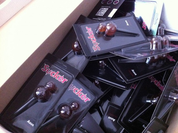
Still controversial culture of the lollipop was fuelled by FIRMASTYLE's Sucker concept in 2008 and now smashed by its production. A series of 5 Suckers is available for every taste and color: Mr. Pain with a taste of blueberry, Abuse with a taste of watermelon, Trinity with a taste of strawberry, cherry and banana, Cherry Twins & Chocolate Asus. A good sense of humour like this can literally save internet from porn invasion.
http://vimeo.com/43987241