A Touching Application by Working Title

We had a chance to speak with Russian designers from "Bureau Working Title" that did a commercial short "A Touching Application" using no 3D software, only projection mapping, modeling and classic animation. The ad shows advantages of Russian navigation application published by Yandex Ltd.

DC: What is the main plot of this advertisiment? The touching story tells us about two sentimental creatures from some outer world; nevertheless, they seem to be a lot like humans. As the two plan their date in a telephone conversation, they decide to meet up in a planetarium. From now on, they get any information from a mobile map application, which tells them the best routes, timing and any other – that's important – interactive tips. They face random barriers on their way: she gets stuck in a traffic jam, he forgets to buy her flowers and so on. The application helps them to finally meet each other on a crossroad and make their way to the planetarium "using" the "street view" option. We see them as they watch the stars leaning towards each other. The story ends up with a slogan: "A touching application".

What was the largest challenge in producing and directing the project? The hardest was to deal with time which passed so slowly. Classic animation process requires a lot of patience, and the more patient you are, the more satisfaction you get when the work is done. But russian advertising is always about tough deadlines, so you have to make it really quick. Thanks to the professionals who helped us getting the shootings done in its best ways and shared their skills with us. Furthermore, it was a great challenge to combine various techniques: stop-motion animation with dummies, iPad-freezelight, 3D projection mapping and a little bit of computer graphics.

How long did it take you to complete the whole project? Making of all the stage requisites, creating the script, directing everything to its sterile fancy looks, shooting till the final cut – the whole process took us about 1,5 months to get done.

http://www.youtube.com/watch?v=CcISIVoSZGQ

Credits:

Concept, script, production: Бюро "Рабочее название" (Bureau Working title) www.workingtitle.ru Director, camera: Ivan Proskuryakov Light: Pavel Ukhanov Animation: Alla Solov'eva Projection mapping: Sergey Titov and Sasha Gavrilova (Stain) Dummies: Igor Khilov Stage requisites: Alexey Petrov, Anastasia Zolotilina, Lena Shagieva Freezelight, compositing, CGI: Marina Cherry, Ira Lubomirova Music: DZA (http://soundcloud.com/dza)
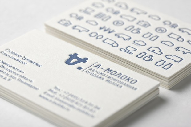
A-Moloko by Ermolaev Bureau

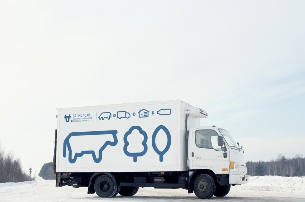
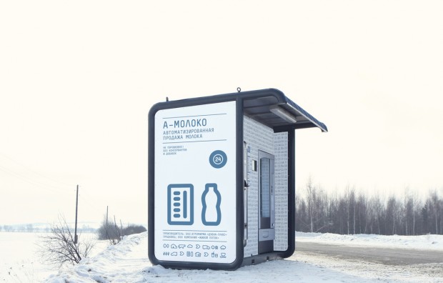
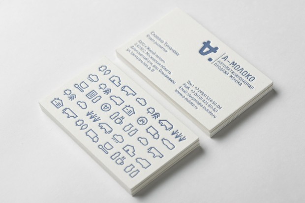
Clever identity gets clever prizes. Ermolaev Bureau was among 4 Russian names rewarded by European Design Awards 2012. Designers Vlad Ermolaev and Olga Balina (designer behind our DCMAG logo and cover design) won Gold in Identity for "A-Moloko" project.

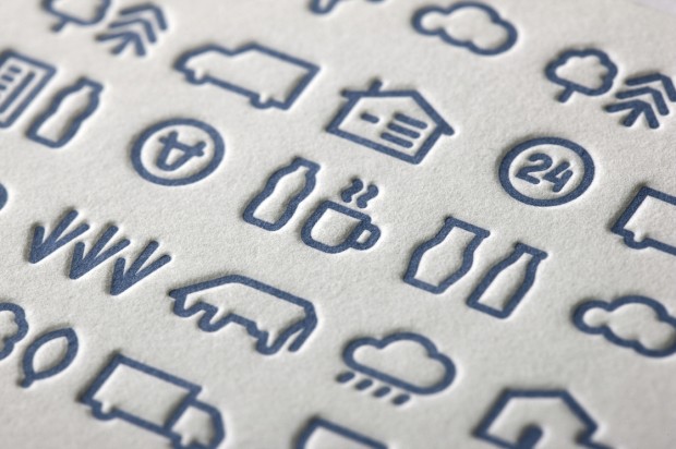
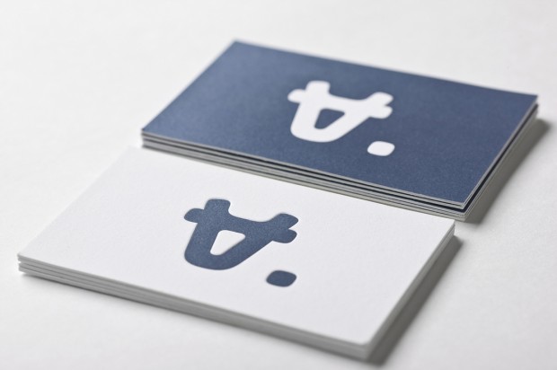
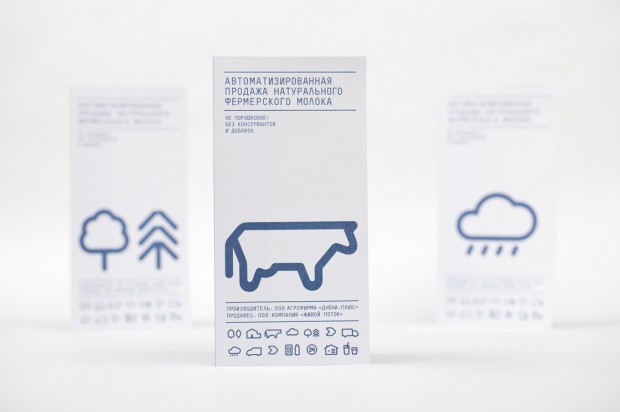
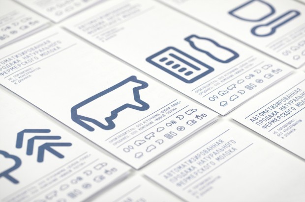
This visual identity developed for a company selling milk through a chain of milk vending machines. The logo concept was suggested by the name of the chain: Automated sale of farm fresh milk. The first letter 'A' which when turned upside down resembles a cow's muzzle was taken as the basis. Visual identity is built on a system of symbols that show the path of the milk from the cow to the consumer.

Sucker by FIRMA

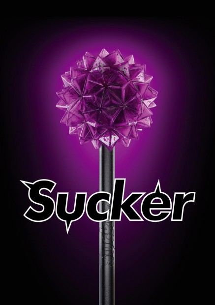
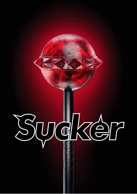
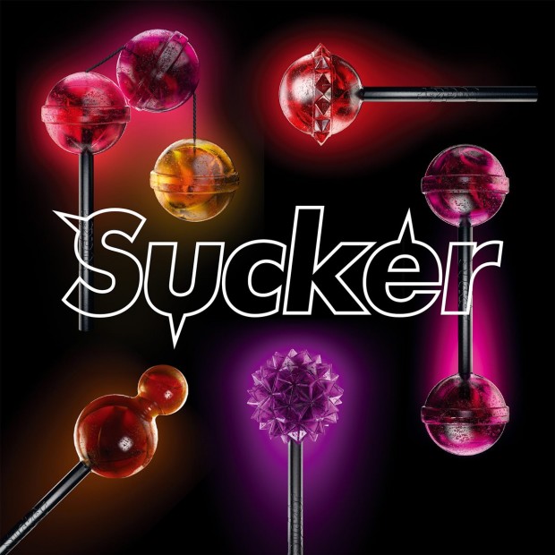
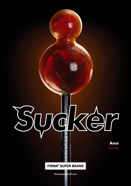
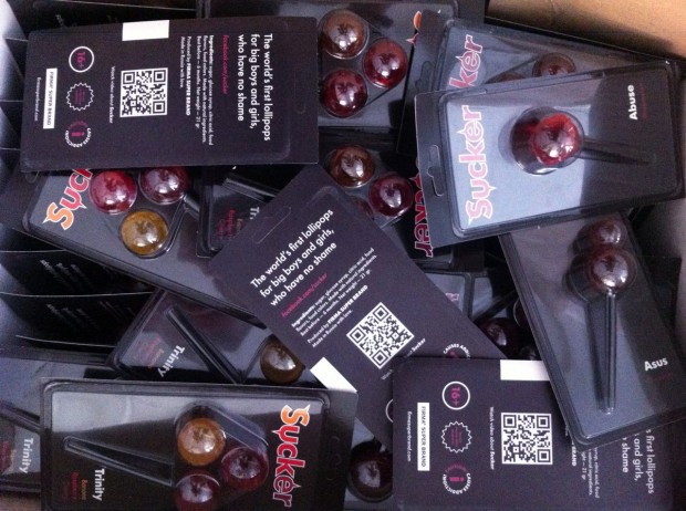
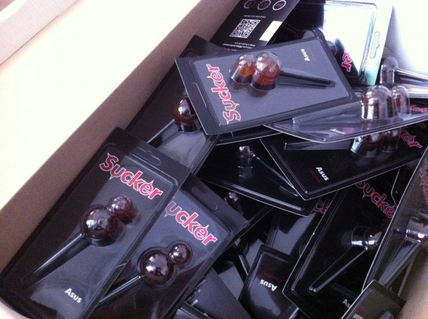
Still controversial culture of the lollipop was fuelled by FIRMASTYLE's Sucker concept in 2008 and now smashed by its production. A series of 5 Suckers is available for every taste and color: Mr. Pain with a taste of blueberry, Abuse with a taste of watermelon, Trinity with a taste of strawberry, cherry and banana, Cherry Twins & Chocolate Asus. A good sense of humour like this can literally save internet from porn invasion.

http://vimeo.com/43987241

Jessica Walsh graphic design

Jessica Walsh (@jessicawalsh & now @sagmeisterwalsh) is a multidisciplinary designer living and working in NYC. Her work has been featured in numerous magazines and books, and won design awards from the Type Directors Club, Art Directors Club, SPD, Print, Graphis, among others. Recently he joined almighty Stefan Sagmeister as an art director and started working together on "Happy film" expected in 2013. Now they named Sagmeister&Walsh and you might seen that nude photo of them both circulating on design web. Designboom has a nice interview with them, read it out

Here are the works Sagmeister & Walsh did together, for a full Jessica's profile visit http://jessicawalsh.com/ (on Behance)

http://www.youtube.com/watch?v=jUhm_beGBoA

Murmure

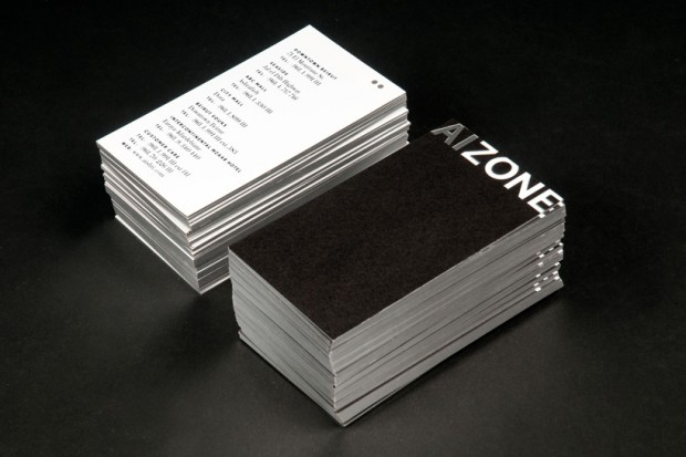
"Murmure is the 4 creatives agency based in Caen, France. They love to push the limites between graphic design and art, using unusal materials and playing with inks and printing process", - says Graphic-Exchange mentioning concrete business card and personal identity of Murmure. But we want to add here their recent project - fluorescent identity for night festival meeting "Nördik Impakt 13".

Iconic Movie posters from Different Angles

I really liked this smart advertisement made by Young&Rubicam from Brazil for LG 3D TVsets

Advertising Agency: Y&R Sao Paulo, Brazil Chief Creative Officer: Rui Branquinho Creative Directors: Rui Branquinho, Flavio Casarotti, Victor Santanna, Jorge Iervolino Art Director: Guilherme Rácz Copywriter: Lucas Casão Photographer: Lúcio Cunha

Punk You

Founded in 2009, Russian design studio "Punk You" based in South Siberia. Now they are proud to be in a first top ten of Russian branding design companies having a good set of award-winning projects in portfolio. Also Punk You organized the first and unique "Fake Advertisement" festival in Russia. We really enjoyed digging their website with a smile put on the face http://www.punk-you.ru

RAAD by This Is Pacifica

The new identity project for architects at RAAD from literally the best design firm in Portugal "This Is Pacifica"

This is Pacifica™ is an independent graphic design studio that brings a wealth of knowledge and enthusiasm to every new project and offers a scope of capabilities that includes editorial, exhibition, signage, websites, motion, and brand identity systems. Don't forget to check RAAD case-study on their Behance profile.

PLENTY

Sunny motion design studio PLENTY from Argentina released a lot of nice projects worth to watch and enjoy.

http://vimeo.com/33805143

Plenty was born from the merger between Gula and Playful (Mariano Farías and Pablo Alfieri), a bureau of young professionals with a strong passion for graphic design and motion graphics. During the last few months they have worked on several projects in areas such as advertising and TV branding, joining the art direction and motiongraphics of Pablo, Mariano and their group of great talents. We work with clients like MTV LA, MTV International, VH1, NatGeo, AXN Japan, Schweppes, Gancia One & Pilsen.

http://vimeo.com/38257429

http://vimeo.com/38259685

http://vimeo.com/38259138

http://vimeo.com/38258854

http://vimeo.com/38258345

Ars Thanea for QE Prize

"The Polish agency, Ars Thanea, created a simple yet vibrant animation to promote the Queen Elizabeth Prize for Engineering. As one of the most appreciated projects on Behance, it's clear that Ars Thanea was successful in communicating such an important message in a unique way." ᔥ Behance Team Blog

http://vimeo.com/38644875

DCMag Sponsor: Bang Bang illustration Agency

Russian Illustration Agency "Bang! Bang!" has been already recommended as one of the largest illustration studio working with world based customers. They have about 65 awesome talents from 13 countries on board and release over 130 final illustrations a month. That's huge work for a small agency like them, operated only by 7 beautiful young ladies. Their portfolio is always a collection of mouthwatering illustration and their blog is worth to read.

[box]Designcollector's new magazine DCMag is happy to receive a support from Bang! Bang![/box]

Maud

Maud is a D&AD award winning design studio based in Sydney, Australia. As passionate about the core idea as the images they create, Maud continually strive for creative excellence through consultation, collaboration and detailed execution, tailoring a strategic process for each and every client they work with to deliver effective and creative communication. http://www.maud.com.au/

More4 identity by Man vs Machine

After winning a competitive pitch, Channel 4 commissioned ManvsMachine to create a new brand identity and on-air look for More4. The package aligns with a re-focussed range of content on the channel.

Concept, design & direction: ManvsMachine "The re-brand is centred round a bold, flexible logo that morphs through a series of flips, folds and reveals. The colour palette reflects the vibrant nature of interiors, food culture, fashion and other contemporary lifestyle programming."

Installation design: Jason Bruges Studio "Channel 4 in-house creative agency, 4Creative and ManvsMachine commissioned Jason Bruges Studio as Production Designers for the new More 4 live-action idents for the channel. The studio created the production design, build and installation across 4 different locations including 2 outdoor and 2 indoor sites. With just 4 weeks from commissioning to installation the studio drafted in production help from Middlesex University. All of the production was completed in the studio’s workshop in Old Street, London."