Brett Atherstone graphic design
Cape Town based graphic designer Brett Atherstone just completed mouthwatering identity for local film production company Navigator Films
Read more on Behance project
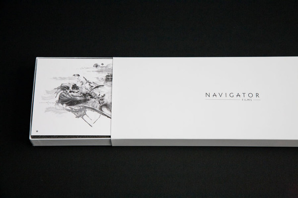
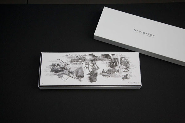
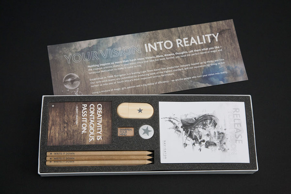

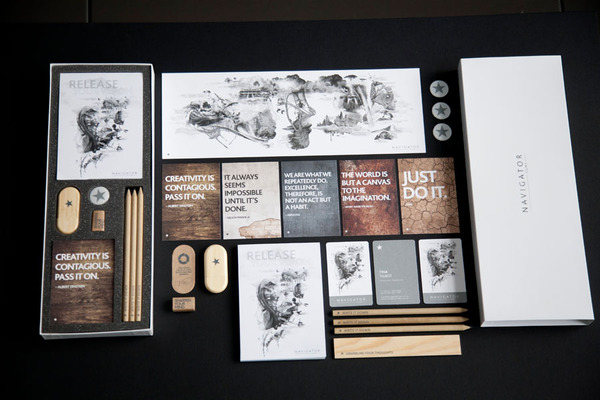
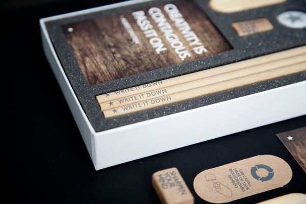
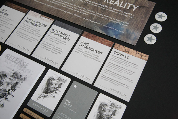
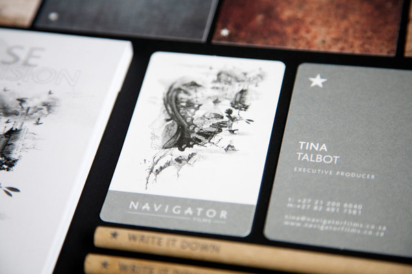
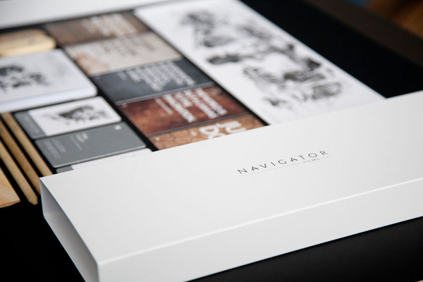
Cape Town based graphic designer Brett Atherstone just completed mouthwatering identity for local film production company Navigator Films
Read more on Behance project


Clever identity gets clever prizes. Ermolaev Bureau was among 4 Russian names rewarded by European Design Awards 2012. Designers Vlad Ermolaev and Olga Balina (designer behind our DCMAG logo and cover design) won Gold in Identity for "A-Moloko" project.
This visual identity developed for a company selling milk through a chain of milk vending machines. The logo concept was suggested by the name of the chain: Automated sale of farm fresh milk. The first letter 'A' which when turned upside down resembles a cow's muzzle was taken as the basis. Visual identity is built on a system of symbols that show the path of the milk from the cow to the consumer.
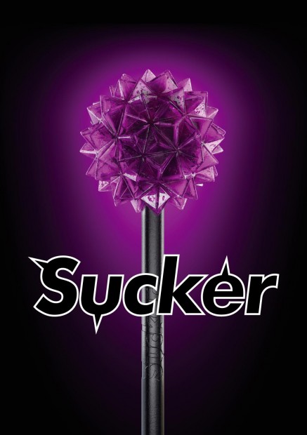
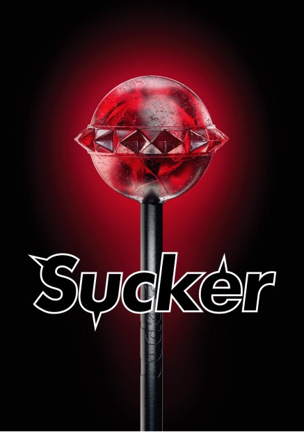
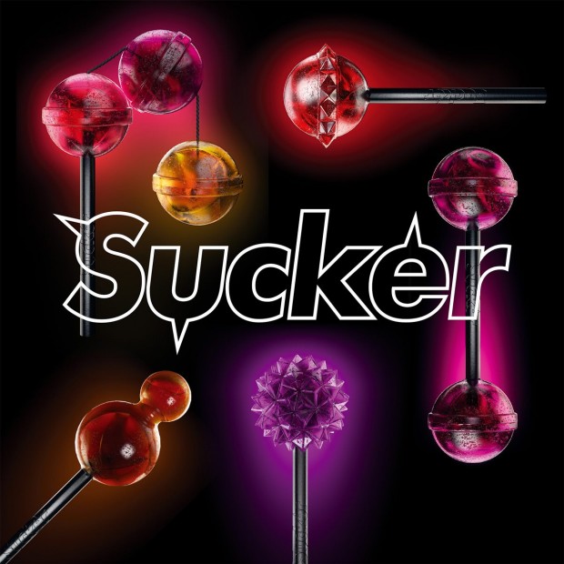
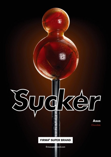
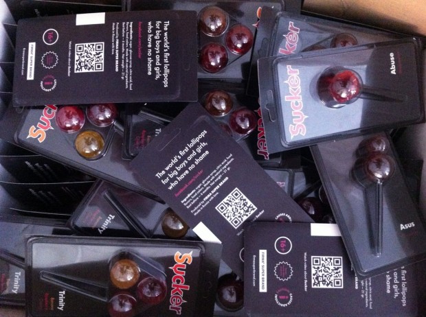
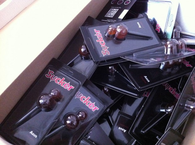
Still controversial culture of the lollipop was fuelled by FIRMASTYLE's Sucker concept in 2008 and now smashed by its production. A series of 5 Suckers is available for every taste and color: Mr. Pain with a taste of blueberry, Abuse with a taste of watermelon, Trinity with a taste of strawberry, cherry and banana, Cherry Twins & Chocolate Asus. A good sense of humour like this can literally save internet from porn invasion.
http://vimeo.com/43987241
Freelance is a great part of design process but what about mobility? Here is a great example of movable freelancer - Axel Peemöller works and live on a boat in Mediterranean Sea and is able to visit any customer around the shores. But even living as a sea wolf-designer he has established a remote team of developers and creative people able to pick up tasks with collective efforts.

Jessica Walsh (@jessicawalsh & now @sagmeisterwalsh) is a multidisciplinary designer living and working in NYC. Her work has been featured in numerous magazines and books, and won design awards from the Type Directors Club, Art Directors Club, SPD, Print, Graphis, among others. Recently he joined almighty Stefan Sagmeister as an art director and started working together on "Happy film" expected in 2013. Now they named Sagmeister&Walsh and you might seen that nude photo of them both circulating on design web. Designboom has a nice interview with them, read it out
Here are the works Sagmeister & Walsh did together, for a full Jessica's profile visit http://jessicawalsh.com/ (on Behance)
http://www.youtube.com/watch?v=jUhm_beGBoA
Whether you are visiting Glastonbury 2012 or just having a romantic camp these tents from @FieldCandy will cheer up mosquitos and loafing bears.

"Murmure is the 4 creatives agency based in Caen, France. They love to push the limites between graphic design and art, using unusal materials and playing with inks and printing process", - says Graphic-Exchange mentioning concrete business card and personal identity of Murmure. But we want to add here their recent project - fluorescent identity for night festival meeting "Nördik Impakt 13".

Robert Murdock aka Postmammal has an awesome sense of form, function and colour when it comes to create user interface design for any kind of project. Working as principal designer at Method he managing personal work pretty well, and his personal website is a real prove of that.
 Alvin Diec (@alvindiec) gifted branding craftsmen from Atlanta. Check his selected works on our blog and visit http://www.alvindiec.com
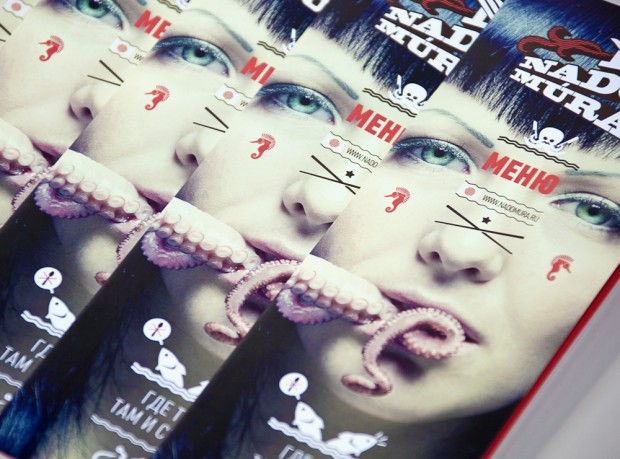 Founded in 2009, Russian design studio "Punk You" based in South Siberia. Now they are proud to be in a first top ten of Russian branding design companies having a good set of award-winning projects in portfolio. Also Punk You organized the first and unique "Fake Advertisement" festival in Russia. We really enjoyed digging their website with a smile put on the face http://www.punk-you.ru

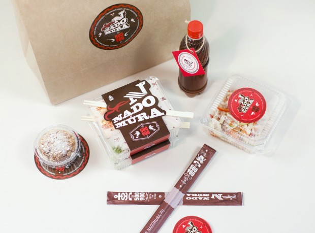
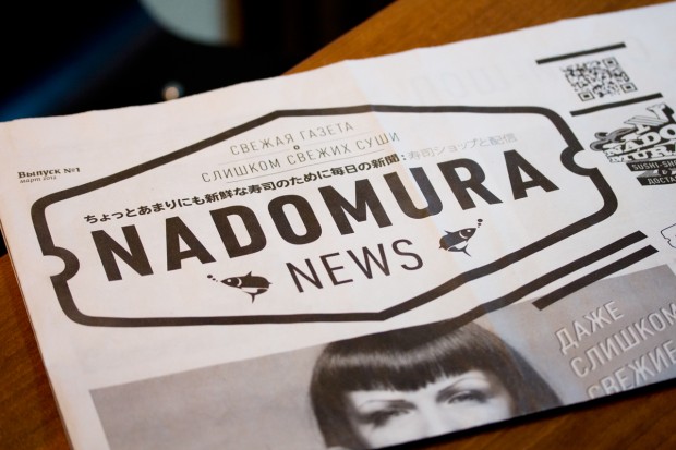


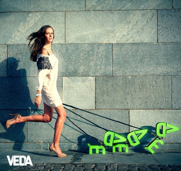

 Moscow based art director Alex Mikhaylov created video identity for TV channel of the leading Russian radio.

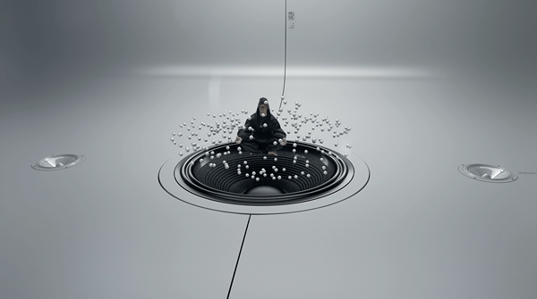

http://vimeo.com/38911403
Directed by Alex Mikhaylov Production producer: Elena Orlova DoP: Maxim Zhukov Sound: Anna Lavrenko Stylist: Kirill Vychkin Hairs: Leonid Romanov Make up: Savva
Art-director: Alex Mikhaylov CG Supervisor: Max Chelyadnikov Modelling / animation: Alexander Sokolov Lighting / rendering / compositing: Max
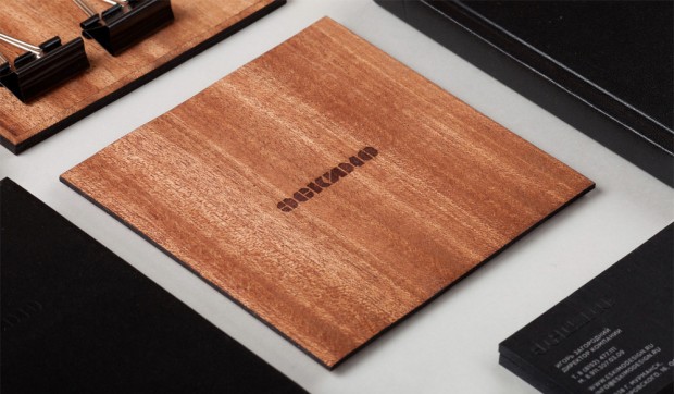 A third work by Pavel Emelyanov on our pages that we can't wait to share with you. This time it's a branding design for Eskimo (yes: wood, hot emboss, paper and suede). Even it is handicraft made in few copies the work itself is professional and balanced.
Irina Batkova is a vivid example of Russian freelance graphic movement. Unlike of worldwide freelance positioning, Russian has its own hard places of friction between weak law and weak market that entails great difficulties to work alone.
Read MoreThe new identity project for architects at RAAD from literally the best design firm in Portugal "This Is Pacifica"
This is Pacifica™ is an independent graphic design studio that brings a wealth of knowledge and enthusiasm to every new project and offers a scope of capabilities that includes editorial, exhibition, signage, websites, motion, and brand identity systems. Don't forget to check RAAD case-study on their Behance profile.
 Awesome branding for The Las Caglias using hot wax seals from Danish design studio Ineo
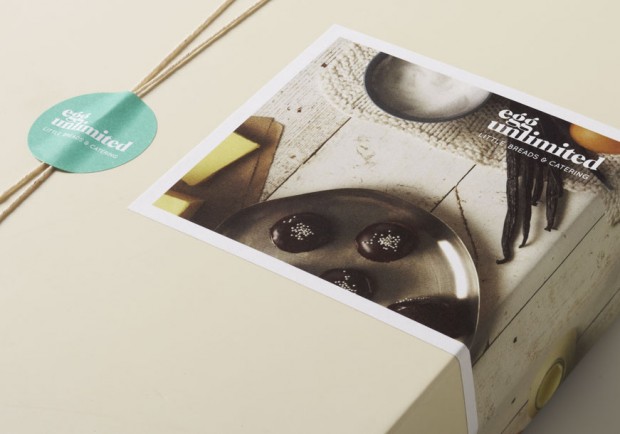 Studio Brave is a Melbourne based design studio driven by brand identity and visual communication that differentiates. They definitely have a deck of graphic design aces under the sleeves.
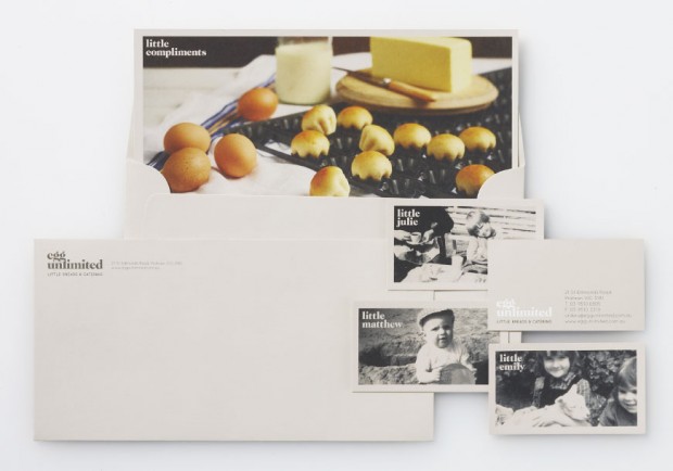


 "Sydney based designer Sam Pemberton has launched his online portfolio, featuring some beautiful branding projects you may be familiar with; City of Melbourne, Woolmark, National Museum of Australia and a few others you may not know as well."
ᔥ FormFiftyFive


Katya Leontyeva is talented graphic designer based in Paris and works mainly with identity projects. She is at the career start having a university degree and few awesome branding works in portfolio worth to explore. Portfolio online


http://vimeo.com/26828198


http://vimeo.com/26830327


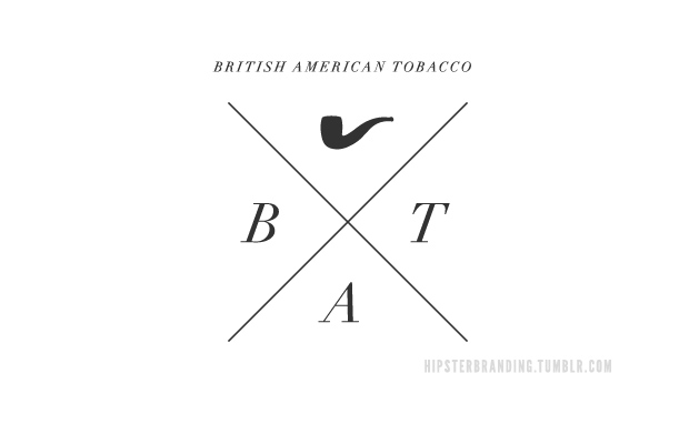
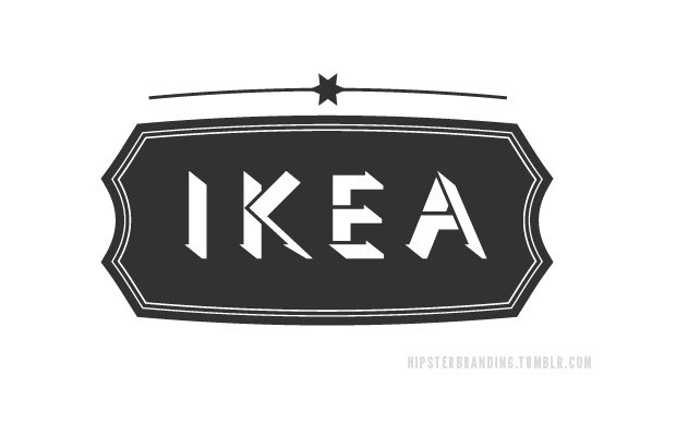
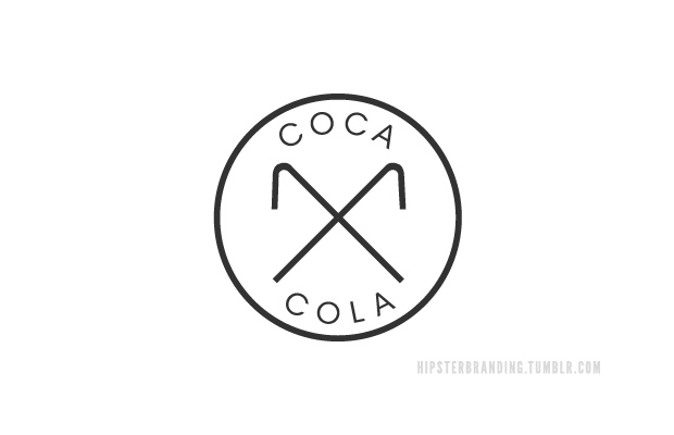
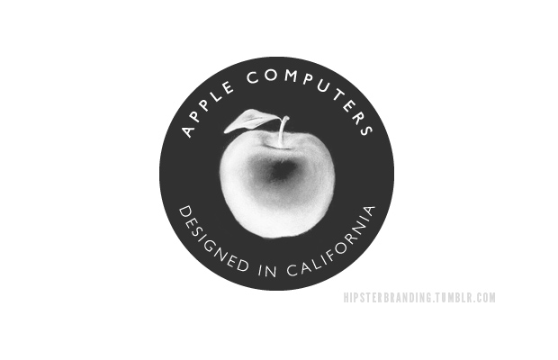
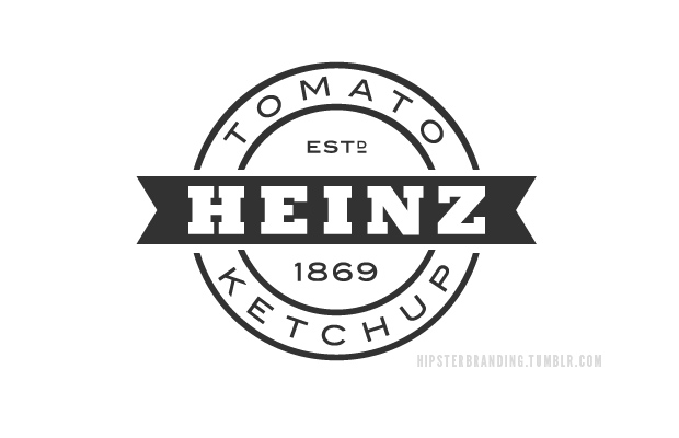
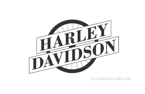
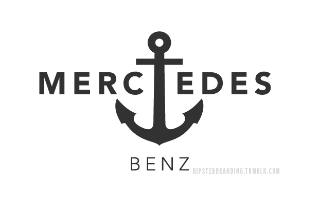
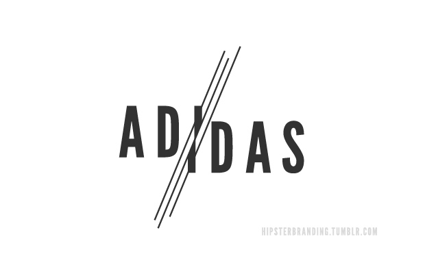 Dave Spengeler, a 22 years old graphic designer & illustrator from Switzerland reviewed the branding of famous brands to create their own logo in a new “old” version, featuring typographies and styles appreciated by what he calls the hipsters community. We love them, and don't look back on our DCN Logo it was also made to reflect modern trends, we never stop doing our identity - it is flexible.


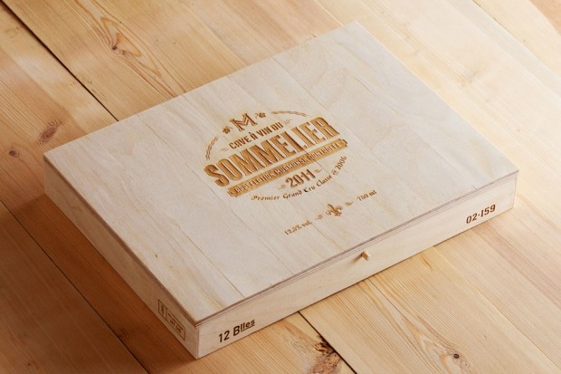 Murmansk based graphic designer Pavel Emelyanov appears again on our radar with his latest identity set for local Sommelier Markov.
P.s. Check also Wooden Letterpress Calendar by Pavel Emelyanov